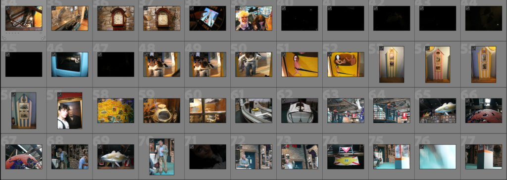


I took these photos a week after I took the first ones, on the 18th of September. This time the sea was a lower tide, As well as being more sunny. We went around the maritime museum for the first 1-2 hours of our trip. Then after lunch we went around the harbour, but to different areas of the piers around. I focused more on portrait photography this time since I already have many photos of the piers, as photos with people normally tell more of a story.

here are some local fishermen who I asked for some photos. I would like to of positioned my camera more to the right so the man on the left wont be cut off by the pole. However I do think the composition is nice as there is not much negative space (as most areas have a face in), and the pole can be a leading line towards the right person. The right person also has a lot of character in his face so it helps add more story to the photo. To edit I added a black and white filter, and changed the contrast slightly. I also cropped it a little bit.

I like this photo because the bad boys paddle contrasts the subject on the left who seems a bit nervous.

This photo was taken inside a shell fish area, It was very dark and had containers with different shell fish in each.


Here is a montage of 3 images (plus 1 large image), each of buildings around the harbour. I chose these photos to be next to each other since each building is very large, showing the scale of the harbour in jersey. For editing I bumped up the saturation and contrast slightly, while adjusting the blacks and whites to make each image a similar style.


here are some photos from the maritime museum. Unfortunately a lot of my photos came out full of noise because I needed to increase the ISO to above 2000 since it was very dark.


Here is some photos of a worker changing the chains along the sea floor. I edited it so the neon green safety jacket would be the only object with saturation. This method of selective saturation can reduce the busyness of an image and allow the subject to be more obvious.

I tried again but with this dock workers shoes and it looks a bit naff. I will increase the workers exposure so he doesn’t blend into the background more, I will also try cropping the image to reduce background noise and to make the subject larger.

This looks a bit better in my opinion but still not the best.


Here is are 4 images that I edited with these settings:

These are all quite similar images In my opinion. They all don’t has an obvious main subject, meaning the eyes don’t have an obvious place to rest, making it more chaotic. They are also different in some ways as well, the first image and second image have a foreground and background where as the third and forth image is mostly all background.

Here is a one off image I took through a little gap in curb. It has good composition and reminds me of picture cards that you get while on holiday.
