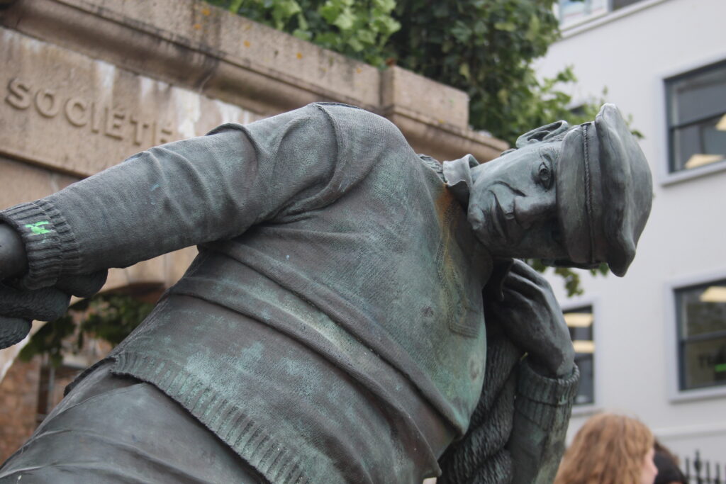
Before:
Editing:

Lowering the saturation and increasing the texture, clarity and dehaze, this helped add more of a dramatic effect to the image. By making the image darker it allows for more attention to be brought craftsmanship of the statue.
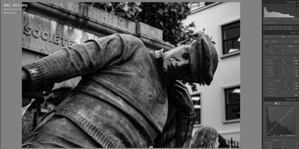
After:
As a result I am happy with how this turned out, with relation to the topic of harbours this image fits well due it featuring a statue dedicated to Jersey’s Fishermen, Wearing a Jersey Jumper and outside the Jersey Museum here it signifies there importance.

Before:
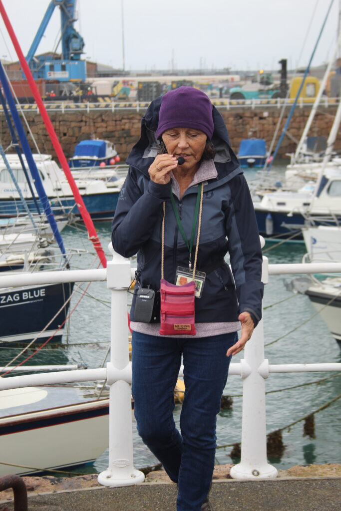
With these 2 images, taken in the same timeframe and location I decided to edit them in a set.


Editing:
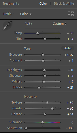
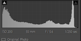
Like in the previous image I made these images grey through removing the saturation. Using similar settings as before I made some slight differences with the use of temperature.
After:
Taken together, I find that these images work well together in there set. In relation to the theme of the harbour, the characters present, Bryan Nibs, the former captain and the tour guide tell a story within this context.


Before:

Editing:

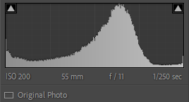
Sticking to the aesthetic of black and white images, I continued with this image, Adding more depth through texture, clarity and dehazing, this allowed for more detail to come pop out in its greyscale appearance.

Cropping the image, this allows for more of a focus on the main focal point of the image. In my opinion this lessened the clutter in the original composition and made the 2 subjects appear closer to the camera.
After:
Overall, I am happy with the outcome, with the difference between subjects such as hair colour and posture, to me this makes for an interesting image.
Before:


Editing:

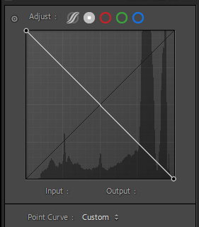
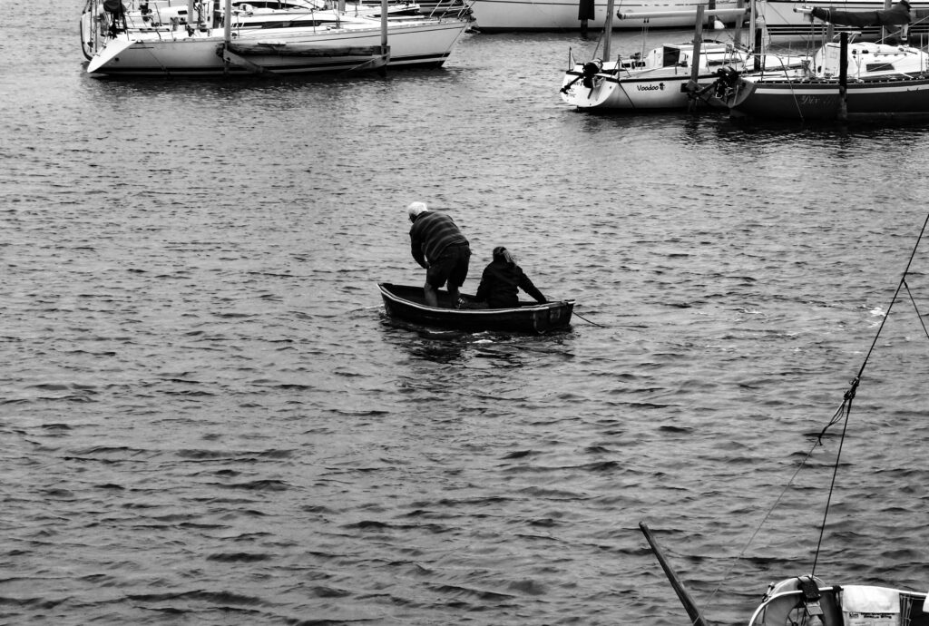
Using the tone curve I inverted each corner till I was able to create an image negative of my original photograph. By adjusting some of the settings this created an interesting effect.
After:
Through my research into the origins of photography, the appearance of negative images always gave a cool impression to me, through Lightroom I was able to recreate this effect.

Before:
Editing:

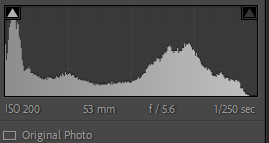
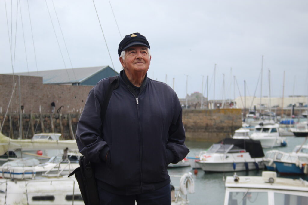
Since I found that this image was already taken well, I only used some slight editing to improve upon some parts of it. Since I found it was a little to bright I lowered that with the dehaze tool.
After:

Overall I am quite happy with the outcome of this image, to me it resembles a lot about Brian Nibs and Jerseys harbour.
Before:


Editing:

Using quite a bit of editing, I aimed to make the textures of the image and make them stand out more. By lowering the shadow and highlights and increasing the rest, this to me made the image stand out more.
After:
Overall I like this image, as the grey shadow conflicts with the lighter tones coming from below.

Before:

Editing:

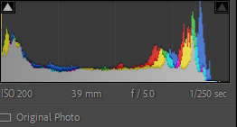
Using mainly shadows, as well as the white and black, my aim was to make this image stand out with its natural colours.
After:

I like how this image came out as the framing and composition really help make the image good.
Before:

Editing:

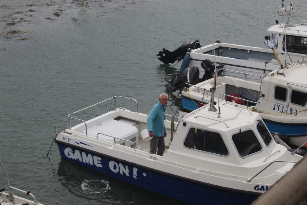
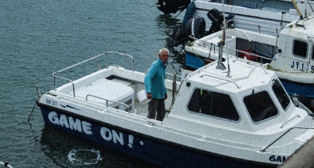
Trying to make a vintage digital camera aesthetic, I used both tone and presence settings to make this image look older, adding grain this further added to the older look.

After:
As a result I think this came out really well, to the style I was trying to achieve.
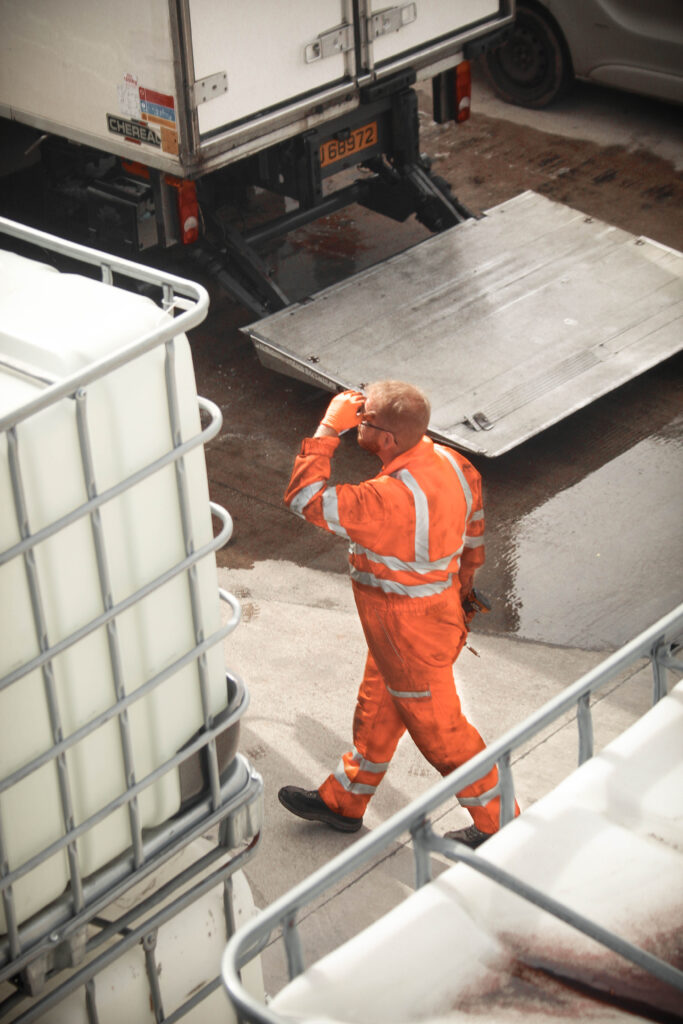
Before:

Editing:

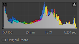
Highlighting the mans fluorescent coverall’s, I aimed to make them look lighter in the image.

Adding a gradient filter, this helped tone the upper part of the image and creating more of a focus on the man working.

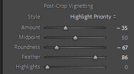
With these editing settings, as well as a vignette this allowed me to darken the images corners some more to bring out the detail of the image.
After:
Overall, I’m happy with this outcome as I like the colours and texture of this image.
