To create this zine, I first created a page with specific things. For example, a width of 148 mm, height of 210mm, 16 pages, 2 columns with a gutter of 5mm. Then for margins, I selected 10mm for each subcategory. Finally, I made a bleed of 3mm. Once I had this blank page created, I then created a box using the rectangle frame tool. I then chose an image to put in the box which would go on my first page. I decided to use a Jersey Archive photograph as the idea of my zine is the harbour through time so I wanted to start with the oldest image I had. I decided to make this image fill up almost the whole page as it is the title page. To do this, I made the box I created initially larger then right clicked the middle of the photograph and selected fit frame proportionally. I then added a boarder to this image and made the background a grey colour to make the colour scheme of the image. Finally, I added a title to the top of the page. I decided to call it ‘St Helier Harbour through time’. Finally, I experimented with different fonts. I ultimately decided on ‘Modern No. 20’.


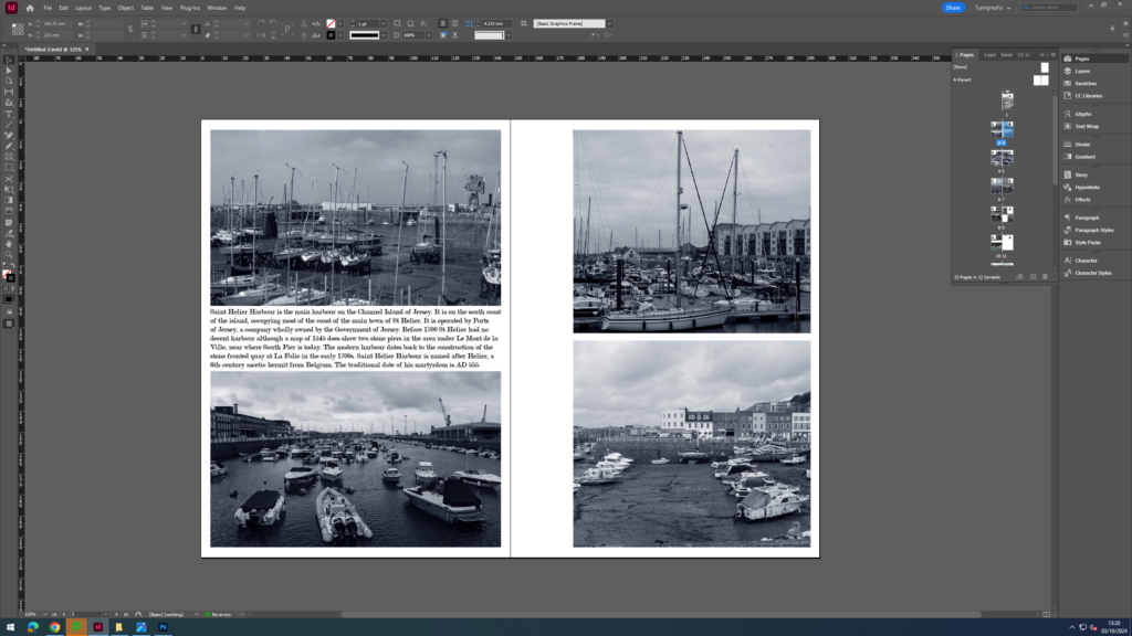
For my first double page, I decided to create 4 boxes where I would input 4 of my landscape images from my harbour photoshoot. At first, I made the images a bit smaller and left a lot of room for text but as I added the text I realised that I wanted to show more of the images rather than text as it looked cluttered. In the end, I made the images of the right side longer and cut down on the amount of text I had. Next, I added boarders around my images and created a background using a rectangle shape then changing the colour of the shapes to make them grey like the images. Finally, I added a drop shadow to the shapes in order to give my page some more depth.


The next page I decided to make more simpler as the last page was very full of text. So, I made one big box covering both sides of the page then added one of my landscape photographs. I then finished up this page by adding a boarder to the image and using the rectangle shape tool to create more shapes in the background (adding a drop shadow to these too).


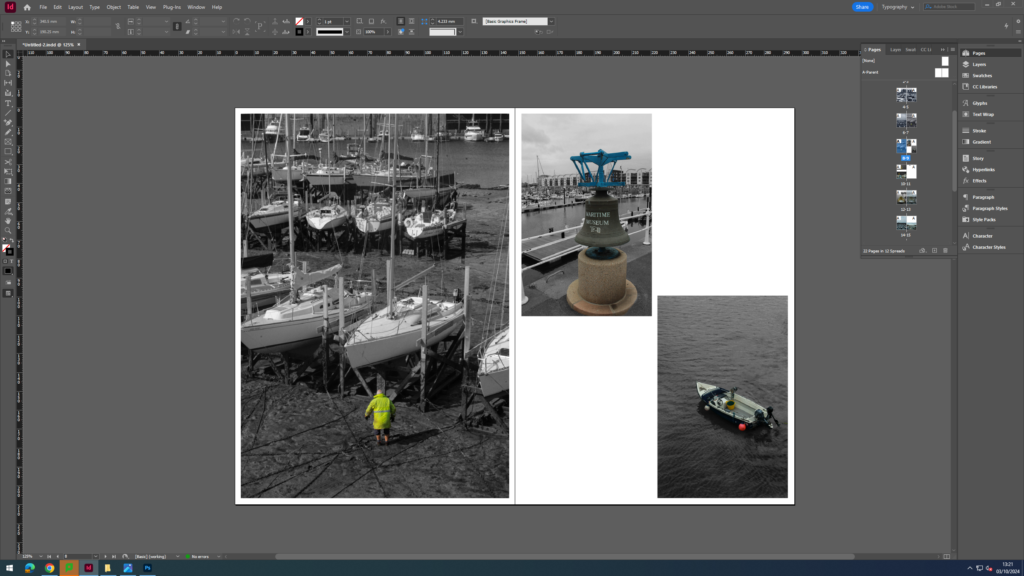
On this page, I made two boxes, one filling up each page. I then added portrait images I had taken. This time, I decided to use the circle shape tool instead to create some contrast in my backgrounds. I layered these on top of each other, making the smaller circles darker. Finally, I made a boarder around the two images.


On this next page, I decided to add some text as I hadn’t in a while and wanted to experiment more with my layout. However, this time I decided to make one page just filled with one big image to ensure it wouldn’t look messy. On the right page. I created two rectangular boxes in the corner of each side. Then, I added text into the empty space which talked about the history of St Helier Harbour. Once I had added boarders to the images, I then used the rectangle shape tool once again to make rectangles going horizontally across the page, making each rectangle smaller and darker. Finally I added drop shadows to each of the rectangles.


This next page changed drastically to what I originally had planned. Initially, I intended to add a whole page of writing on the right page but ultimately decided against it as it was becoming overwhelming with text. So, I instead decided to use some more images from the Jersey archives such as maps and old pictures of Jersey Harbour. Also, I had first added a background of the sea but then decided to change it for just plain shapes as the vast amount of pictures and texture in the sea made it look clutter and not nice to look at.


Similarly to earlier, for this page I just added two big images to either side of the page. However, this time I made the images go right to the end of the page with no boarders on the pictures. I felt this helped to create a contrast between the writing pages previously.


In this next page, I wanted to experiment further with my layout and so I decided to create a polaroid like shape around one of my images then added a text box below it. Finally, I added rectangles going down the pages and added a boarder to the left image.


When I first added images to my zine, I put this one in but as I went through again, I decided to delete this page as I felt the image didn’t fit in with the colour scheme of the other images as the others were very blue and vibrant but this one was more dull and brown and looked out of place. This also meant I had 20 pages instead of 22 which was required for printing.

Again, this page consisted of two big images on either side. I then elevated the page by adding shapes in the background.


For my final double page, I decided to fill it up completely with one image that covered it entirely.


Finally, to finish off my zine, I added a grey background to the final page which matched the colour of the background in the first page of the zine to give it a seamless effect. I did this by adding to rectangle shapes to my blank page then using the pipette tool to get the exact colour as seen on the first page.


