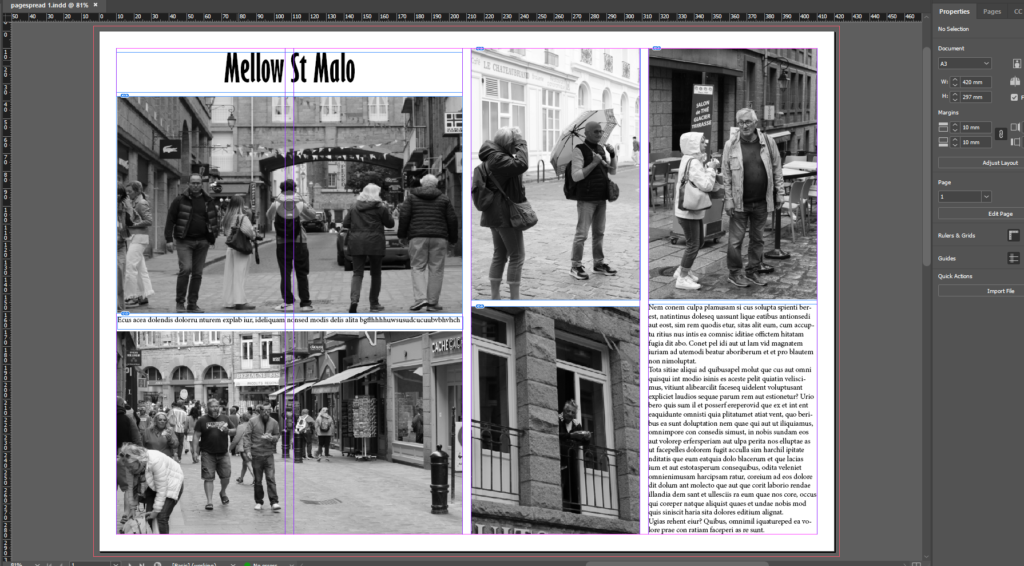
In the print screen below I have edited it so that the layout of the photographs is even. I moved around the images so that everything is put together and so the writing is placed together and not that it would un-interest the reader if it were outside the images. I like the photographs I have chosen and I believe that the black and white adds to the element of of the “Mellow” title and overall atmosphere of it.


In this print screen I have included the development of the first picture story. I included the rearrangement and movements I made of the photographs as well as the rearrangements I made to the text. I liked the arrangement of the text at the top at first but then realised that the text appears more better in between the two landscape photographs.


In this print screen I have included different variations of my photographs that I took whilst in St Malo. The development of my picture stories can be shown as the title has changed, I played around with the words and made it bolder, the text writing had some adjustments and I decided to include a drop shadow. I have included as well a border around my images so that they differ a bit from the blankness of the background.
I like how it turned out as the picture story looks full of naturey colours and it doesn’t look too in the viewer’s face.

I believe that the picture story looks good with the drop shadow as it adds to it and doesn’t make it as blank and simplistic as it could appear in general. I decided to keep the white background as I feel it would look tol heavy wih am image behind to other imges.
