Image 1:
Before –
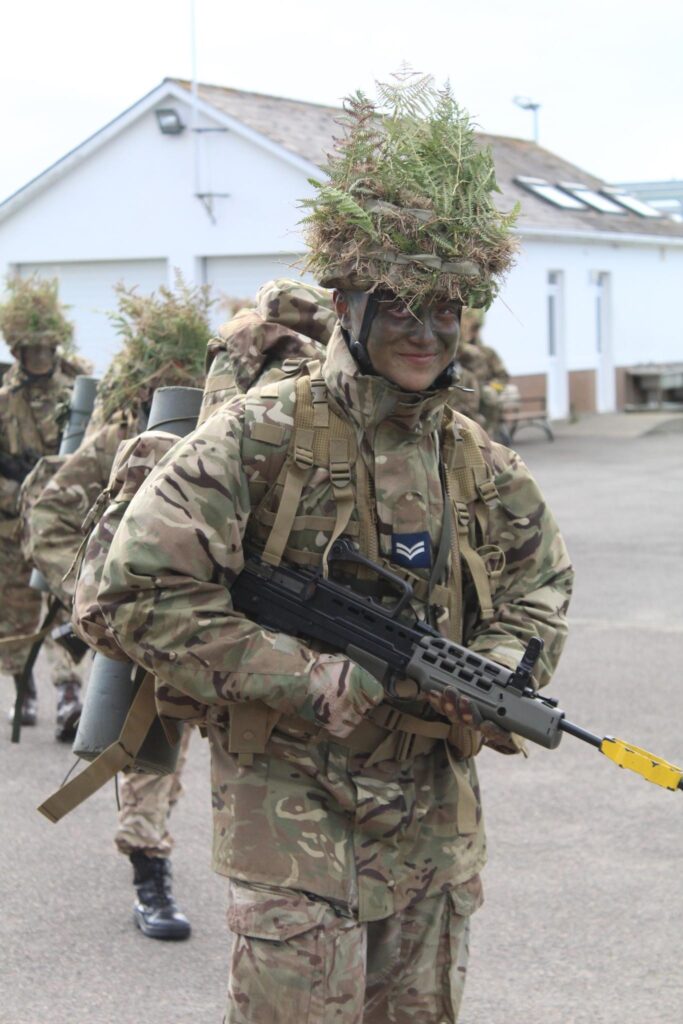
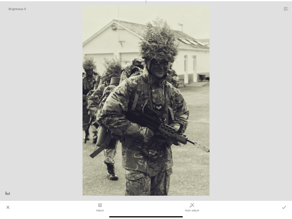
Editing:
Adding a filter from the app Snapseed, I lowered the saturation and temperature to add an aged Hue to the image, Altering the highlights, I aimed to make my facial features stand out more.
Adding grain to the image, this further helped add to the desired aesthetic of a grained image.
After –
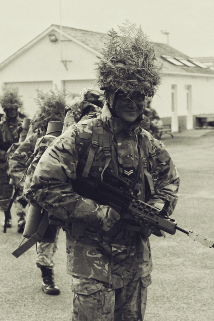
Image 2:
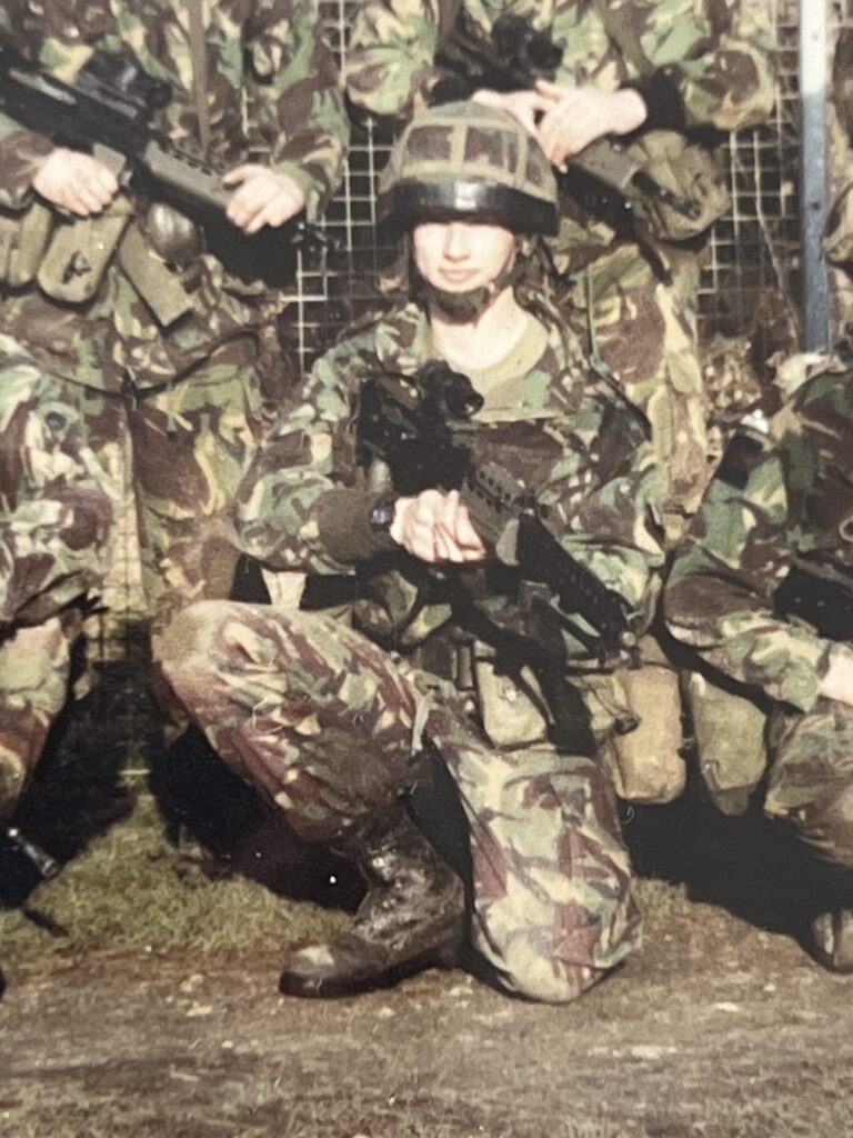
Before:
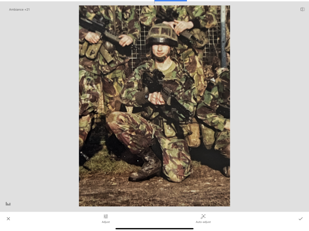
Editing:
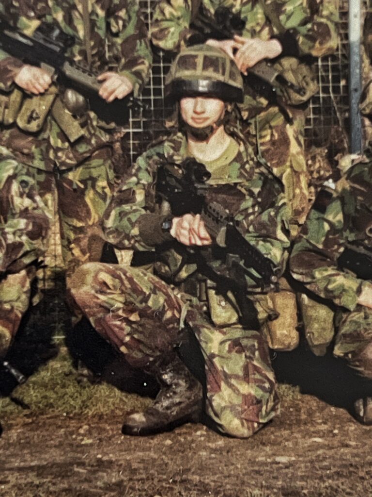
In attempts to make this vintage image look more modern, I tried to bring out the colours more to seem more plausible to be taken from a modern camera/phone.
brightening up the image allowed for a more natural skin tone, compared to the over-saturation which has come from the camera at the time. By also adjusting the ambiance, this created a more realistic impression of warmth of the image, since the image was taken on a sunny day.
After –
Combining the works –
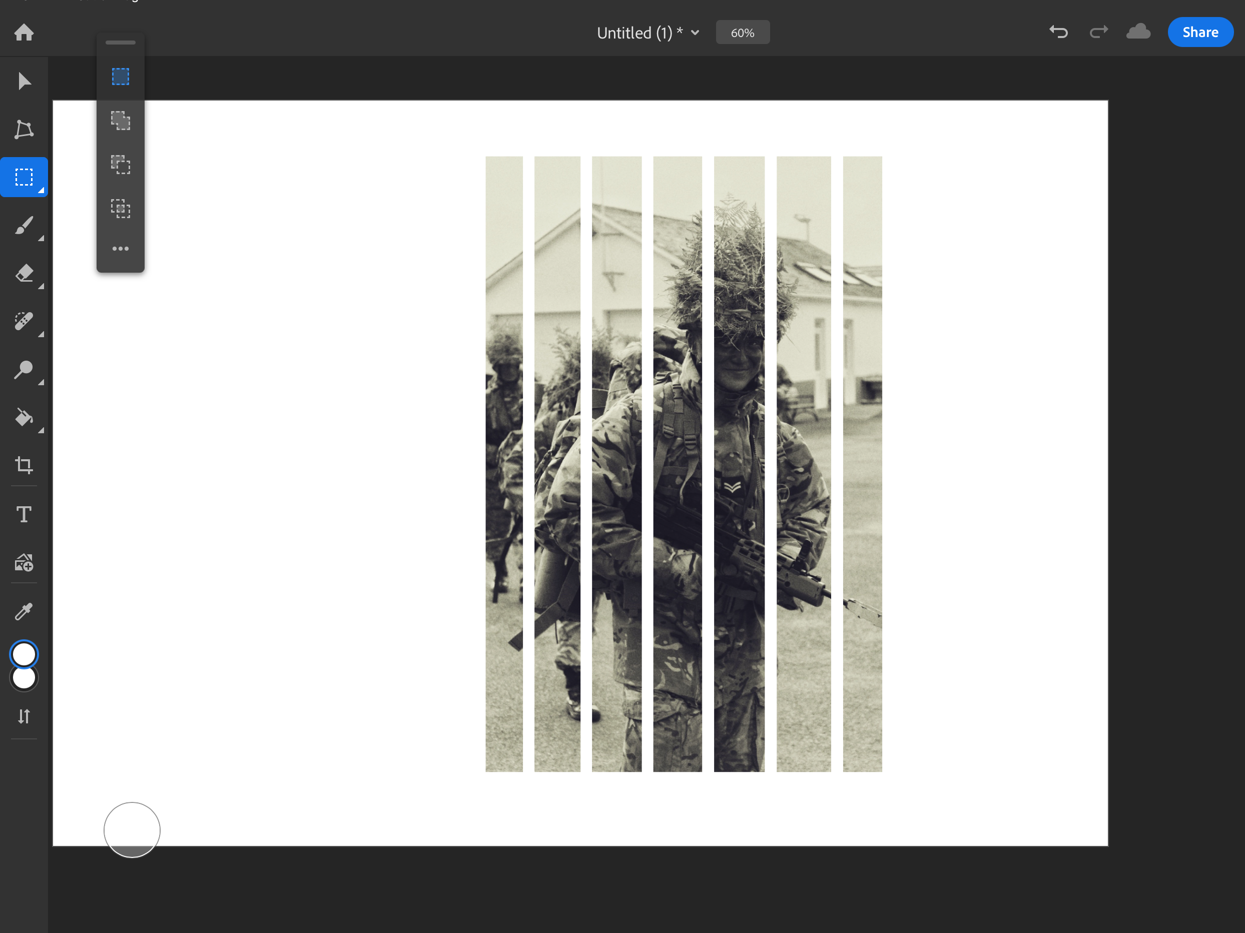
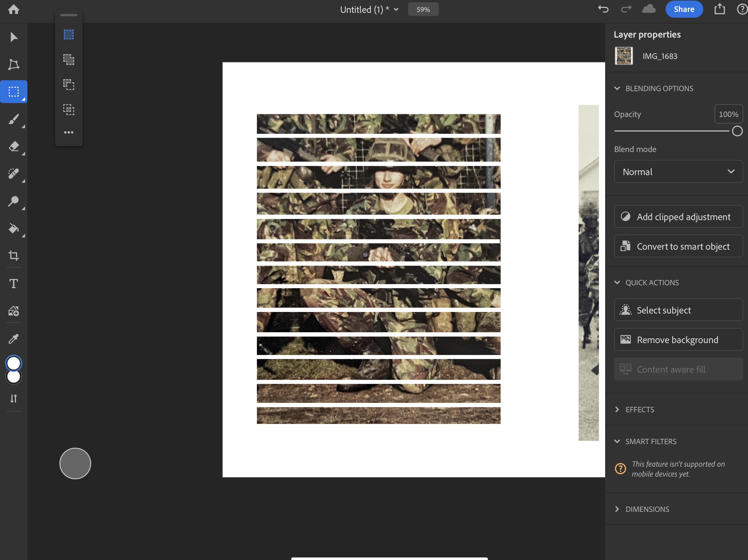
To make these edits more interesting I’ve taken an abstract approach to my images by merging with a cut-out pattern within each of them.
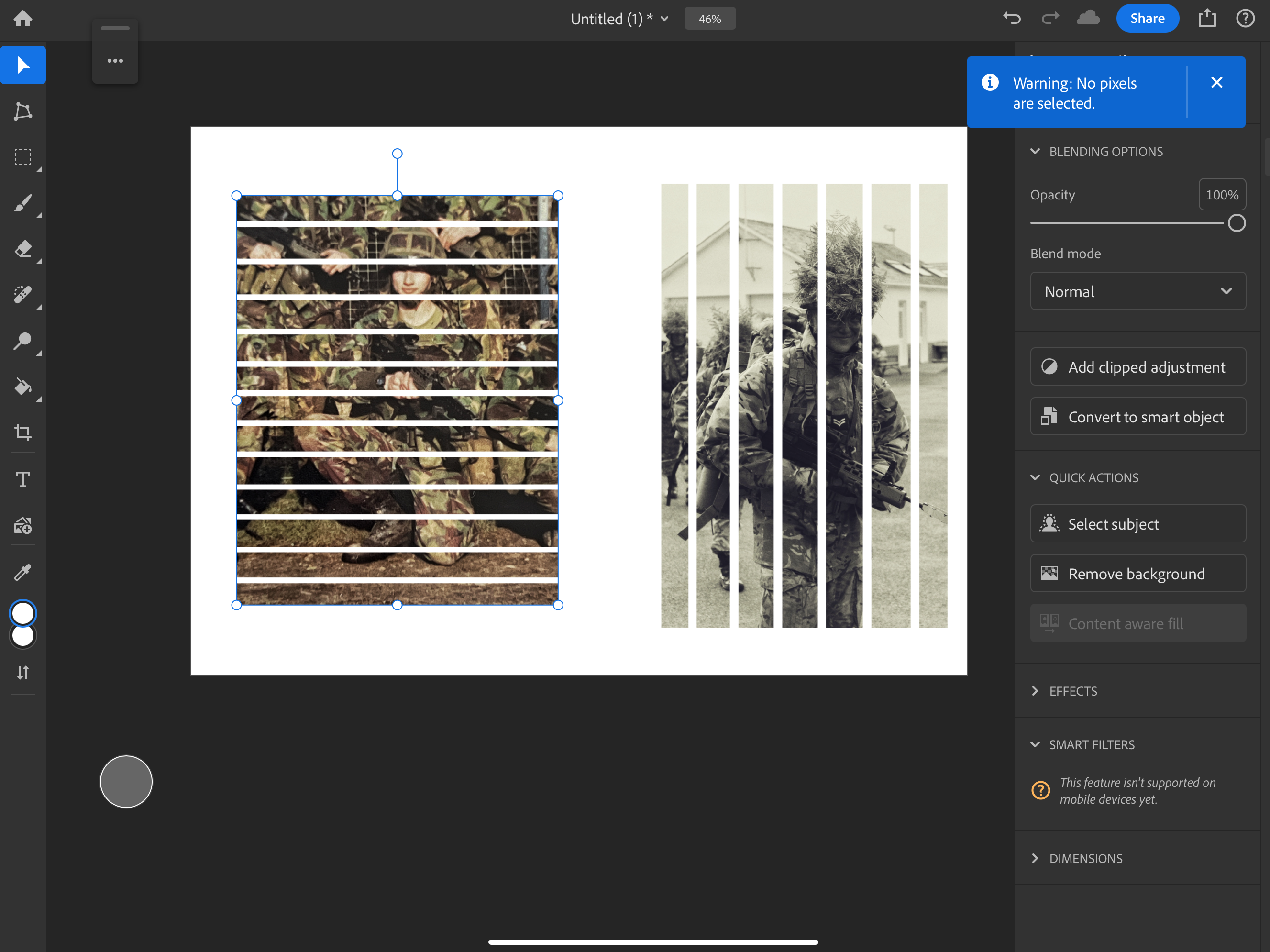
Doing vertical lines on the image of myself and horizontal on the ones of my dad It created a really interesting composition of a checkered design where both subjects (me and my dad) are visible in their pictures.
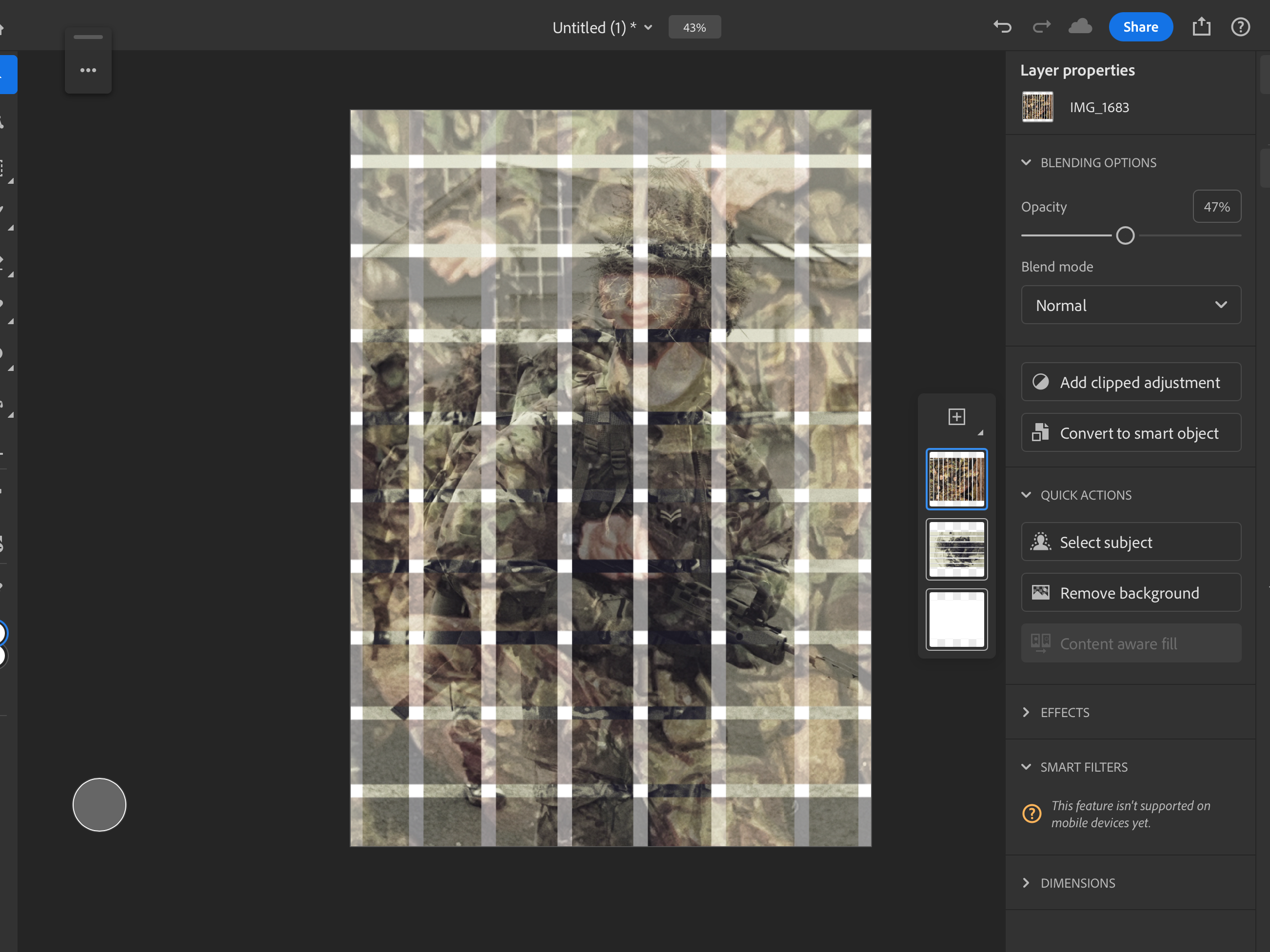
By lowering the opacity of the image of my Dad, this was how I created that subtle fade.
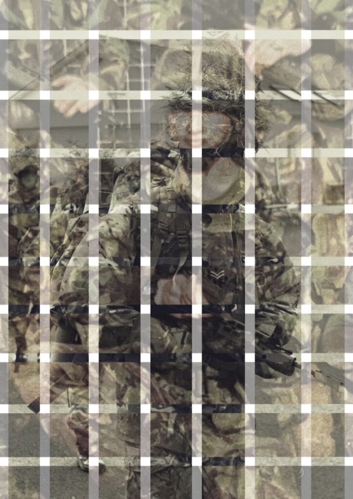
Image 3:
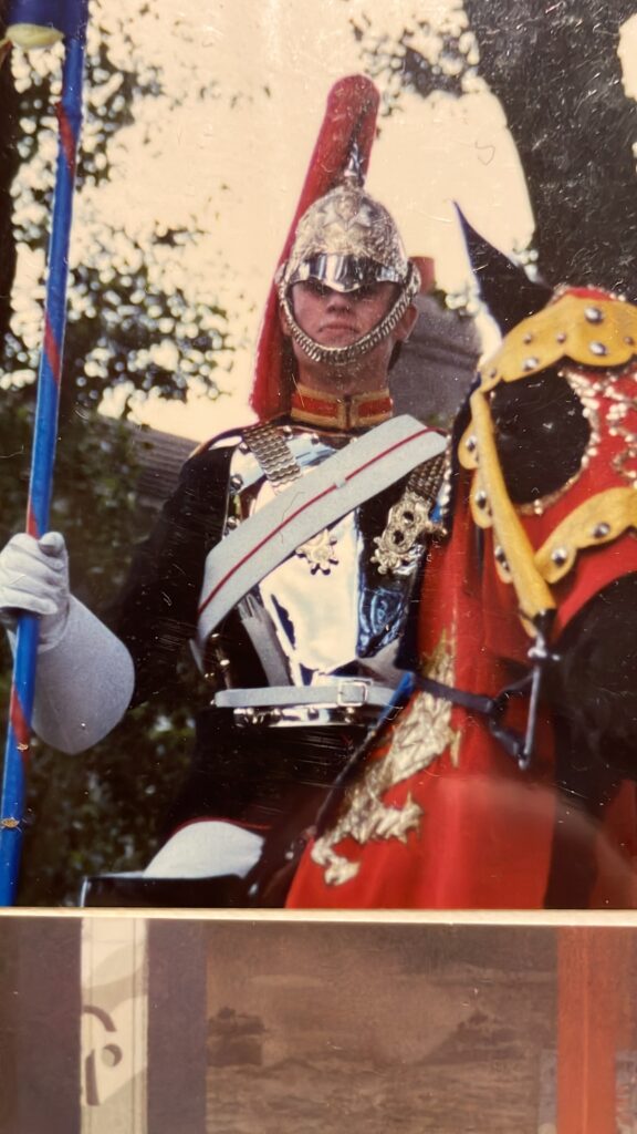
Before –
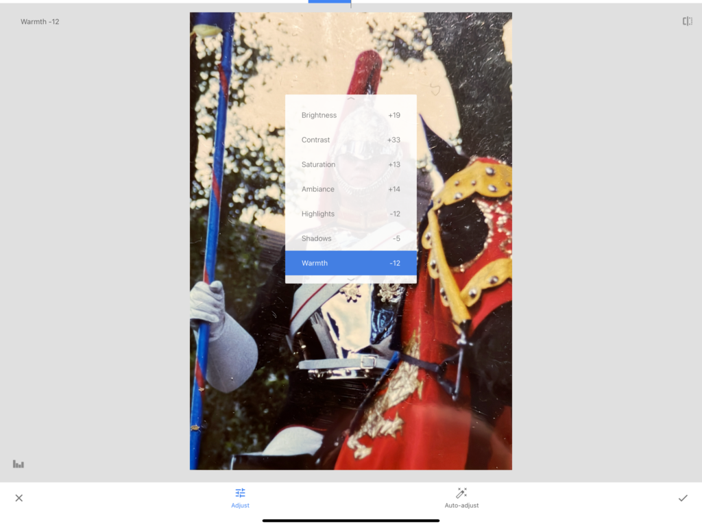
Editing:
Using the editing settings shown, I did this in order to the bright cracks due to aging of the original photograph.
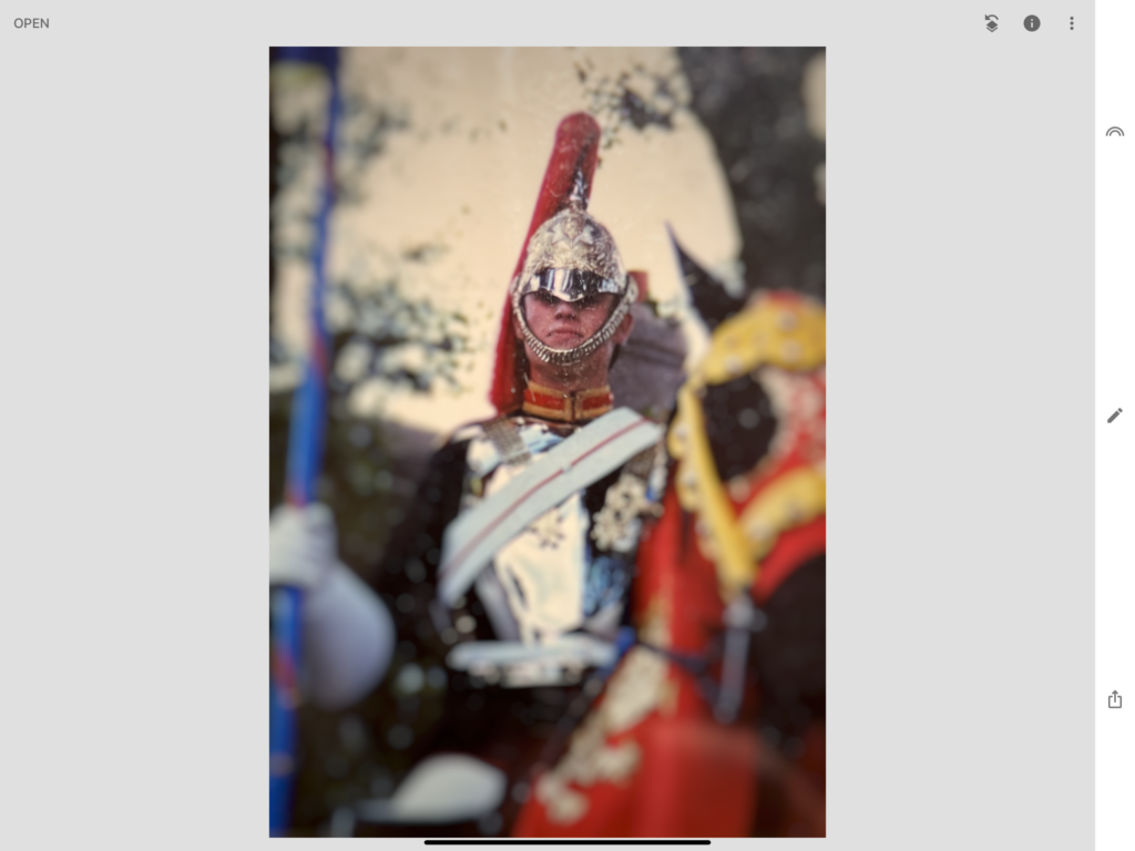
Furthermore I added a blur to image surrounding my Dads head, this was intentionally done as for my images final outcome I wanted to create an interesting effect which would become apparent when finished.
After –
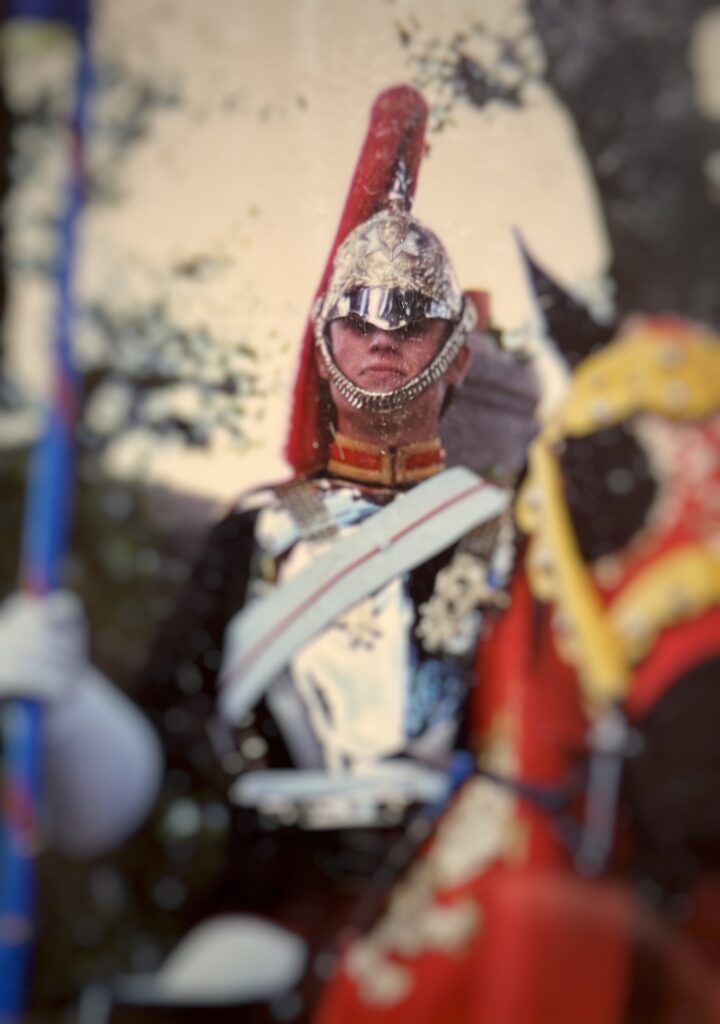
Image 4:
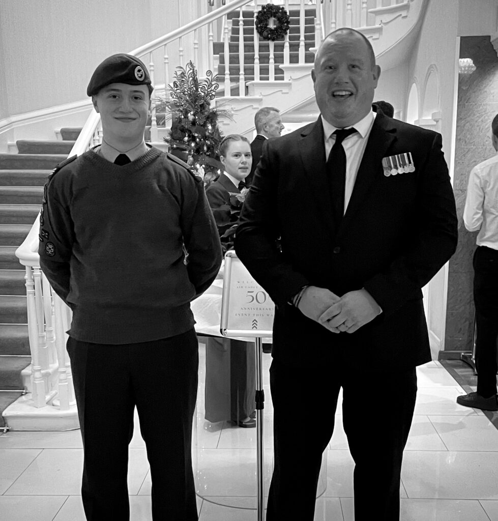
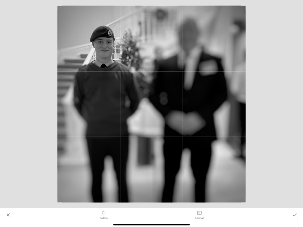
Editing:
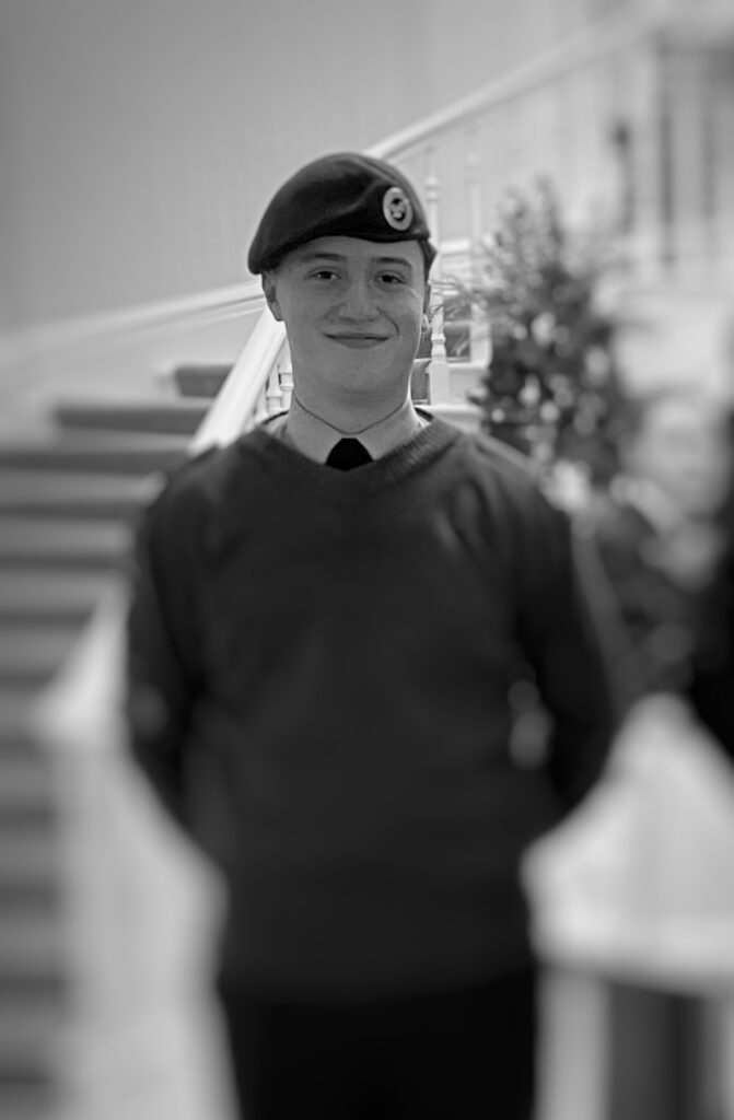
For this image, I had already altered it previously by converting it into greyscale, for it to work for my final project I cropped the image down and added the blur affect like my previous edit.
After –
Combining the works –
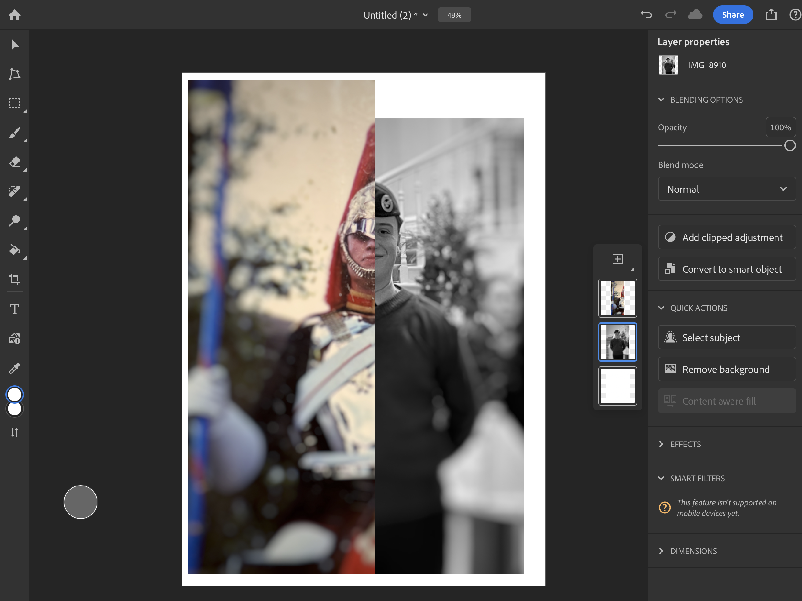
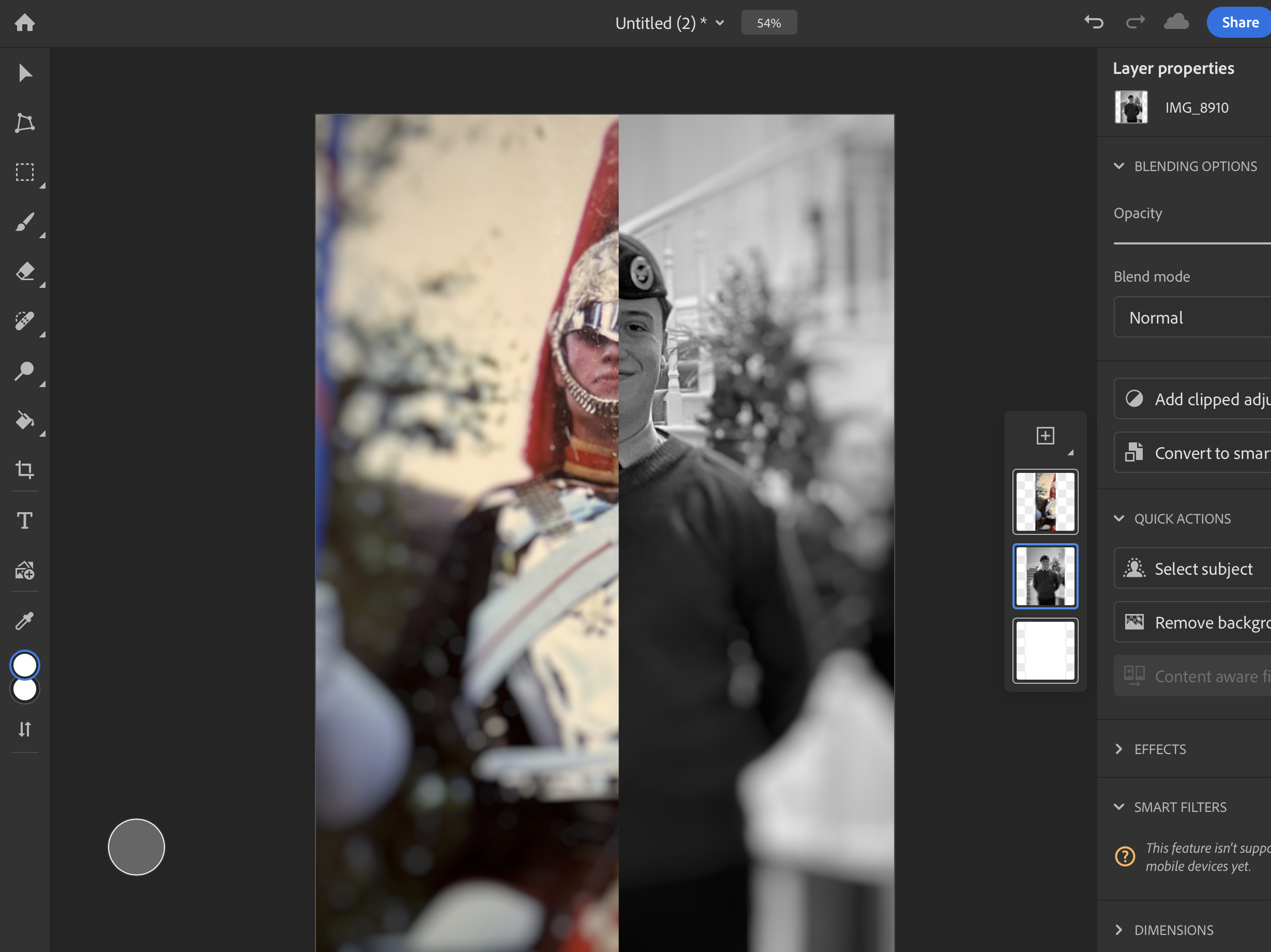
Cutting the first image in half, this allowed for me to line up the second image, with the blur effect surrounding both of our heads, this created an interesting effect, as due to the majority of the image being blurred it forces them to focus on the faces.
As a result this is what turned out.
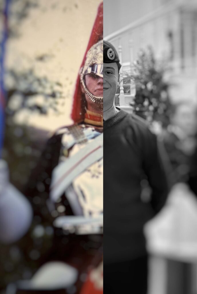
Image 5:
Before –
Editing:
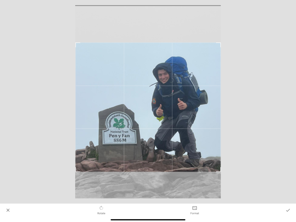
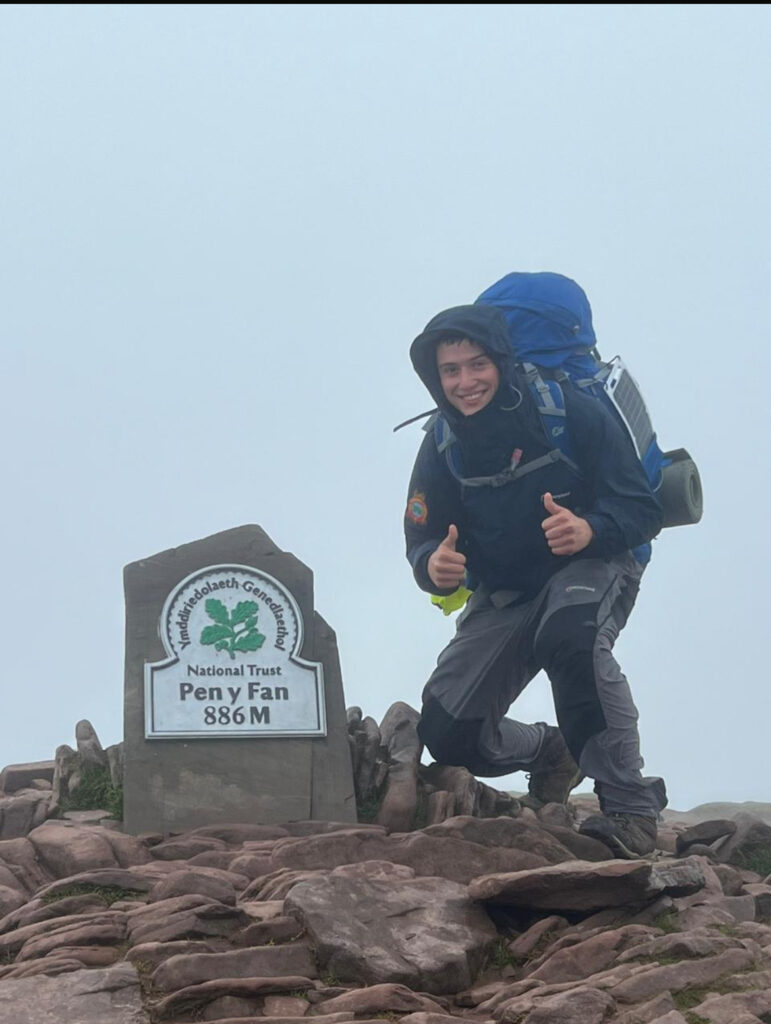
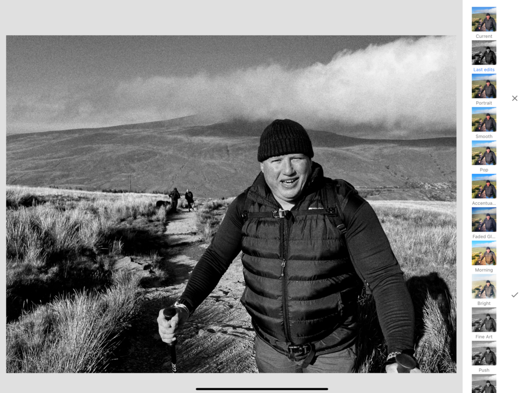
Firstly, I cropped this image to make the composition smaller and focused on what would be added to it later. With to much room I felt this would takeaway from what the outcome would look like.
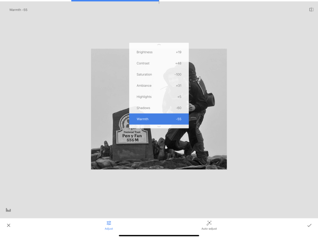
Using the following settings, I altered this image to make it greyscale, but also to make parts of the clothing I was wearing stand out more once converted. To do so I mainly lowered the shadows, and increased the brightness and contrast to what suited it best.
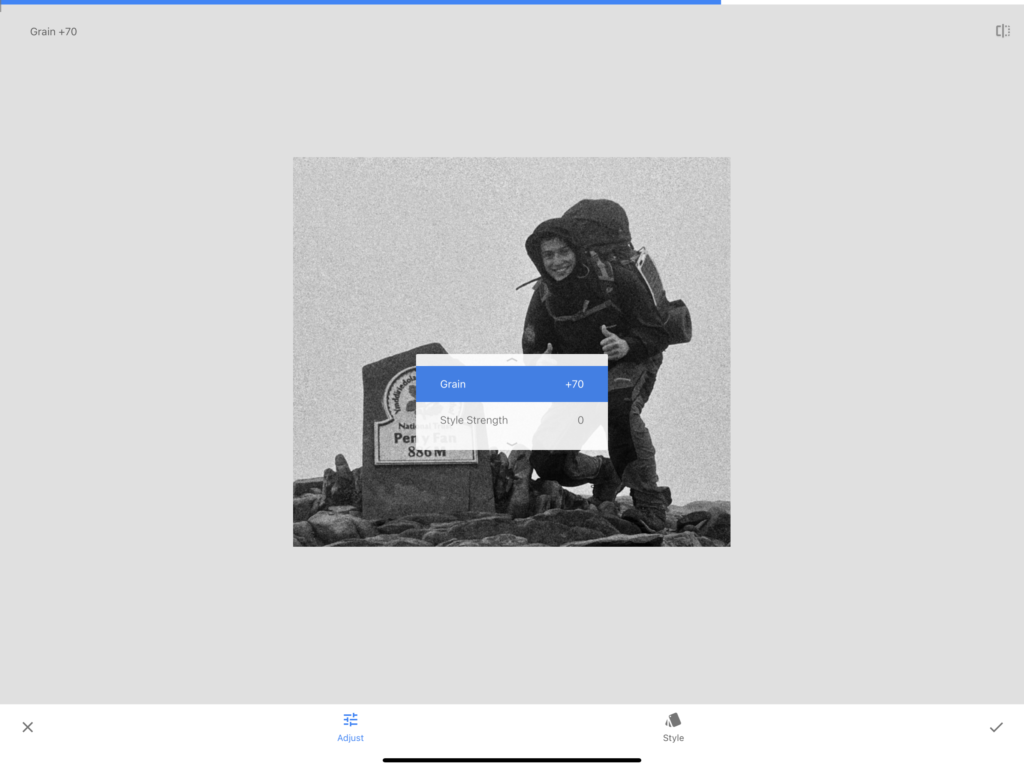
Adding grain to the image, this took inspiration from my artist reference, John Stezaker. The aim was to create the effect of a vintage photograph which is usually the subject of his work.
After –
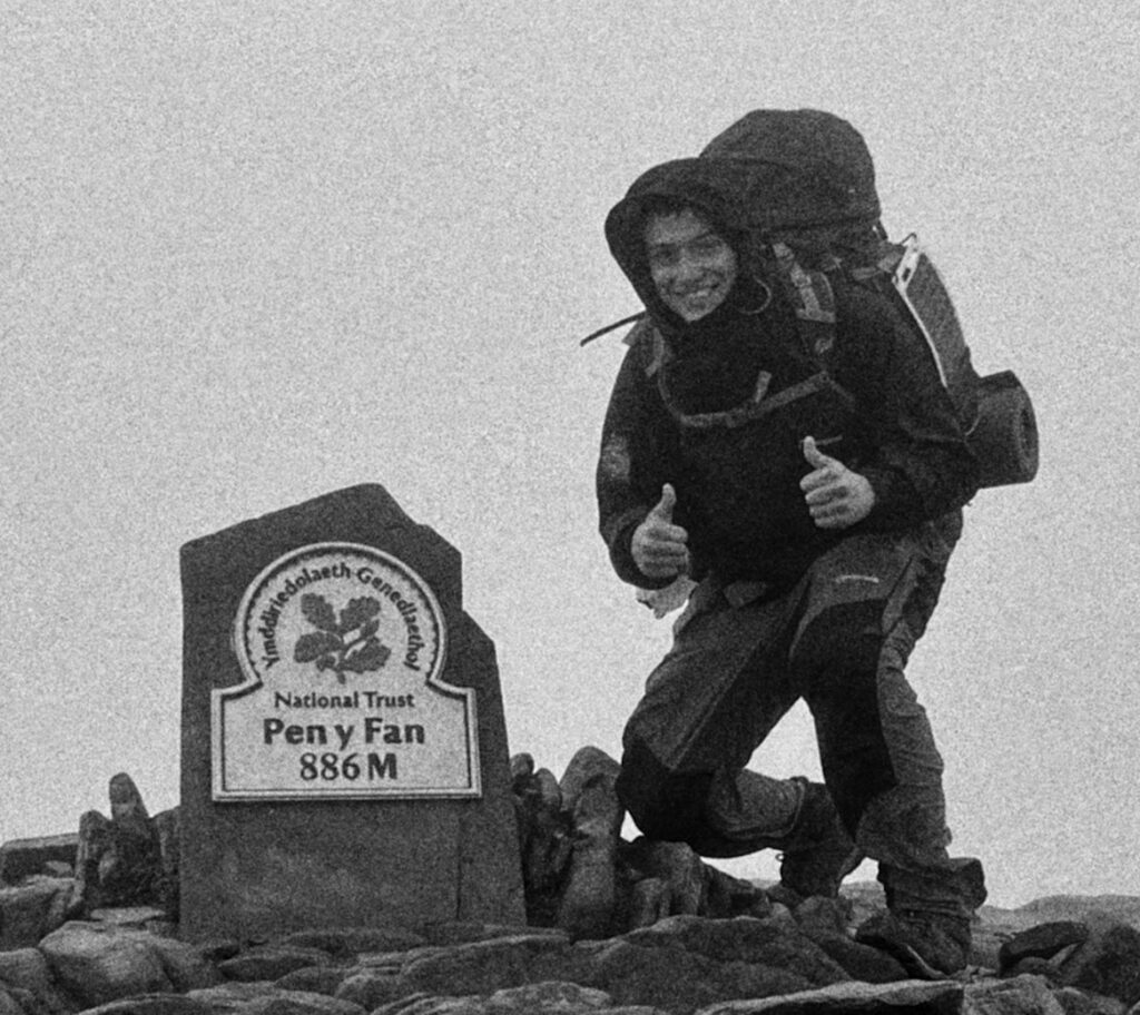
Image 6:
Before –
Editing:
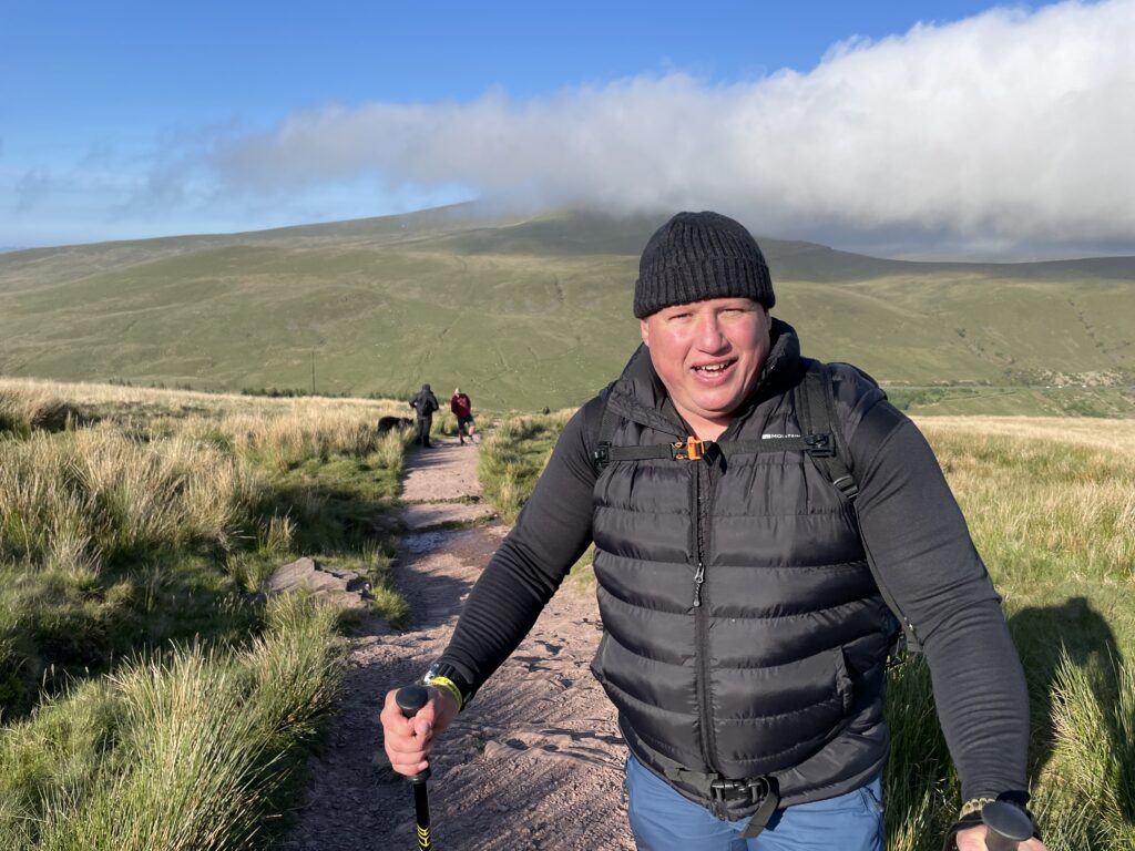
For the second edit of the image set, I applied the same edit settings as the previous image.
After –
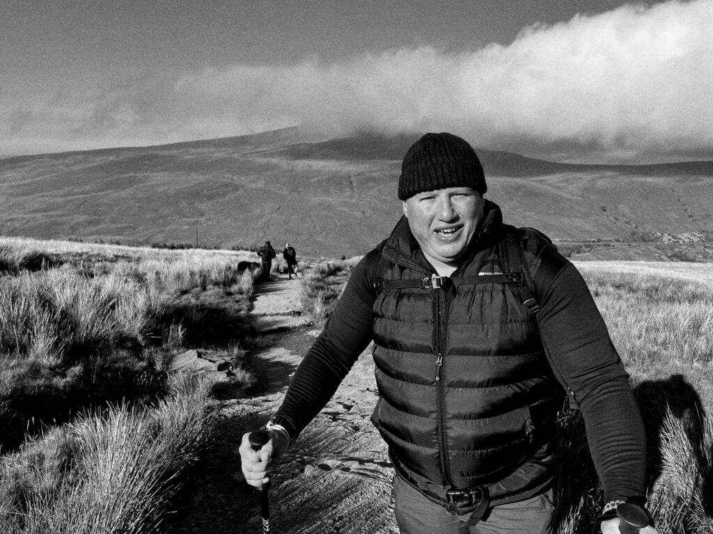
Image 6:
Before –
Editing:
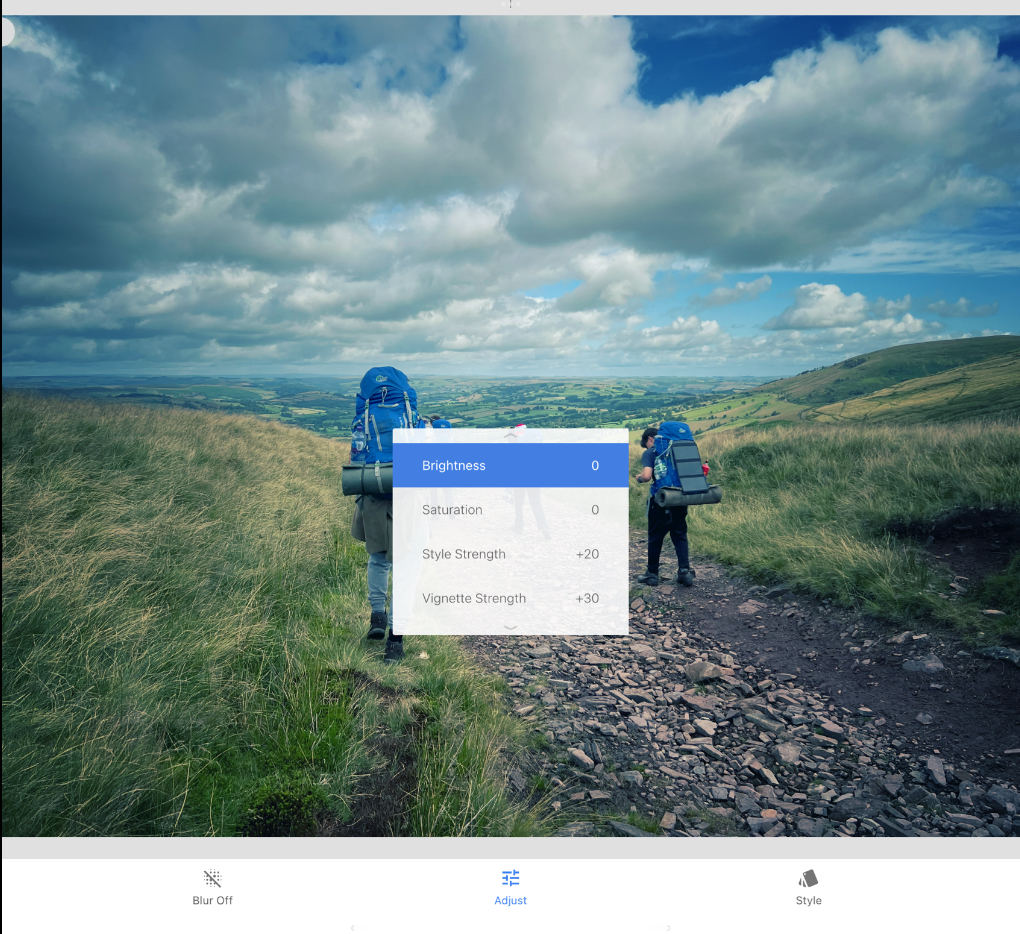
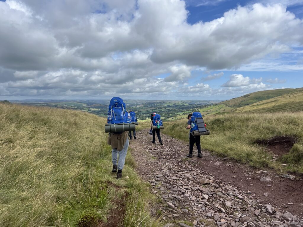
Using a pre-set style from ski seed, This allowed the image to have that old-digital camera look which was what I hoped to create.
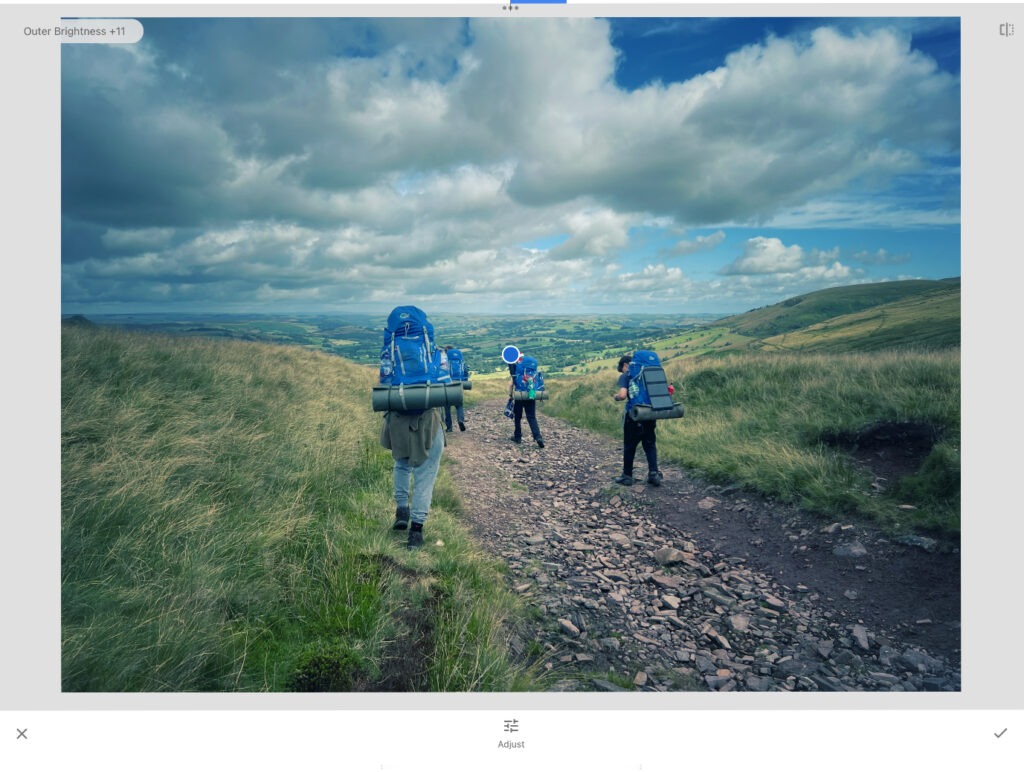
adding another vignette, this helped made the image look more realistic for when i added it to the final outcome.
After –
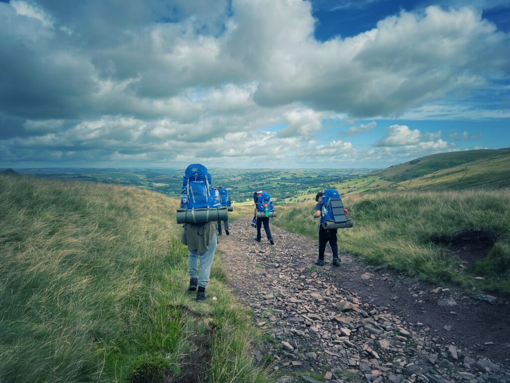
Image 6:
Before –
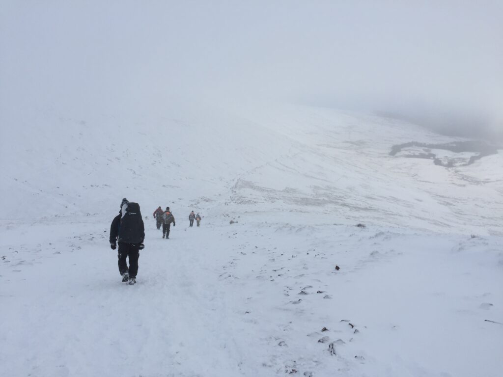
Editing:
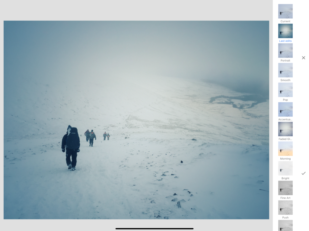
Using the same settings as the previous image, I liked how this image came out, To me it really does replicate that early 2000’s camera style.
After –
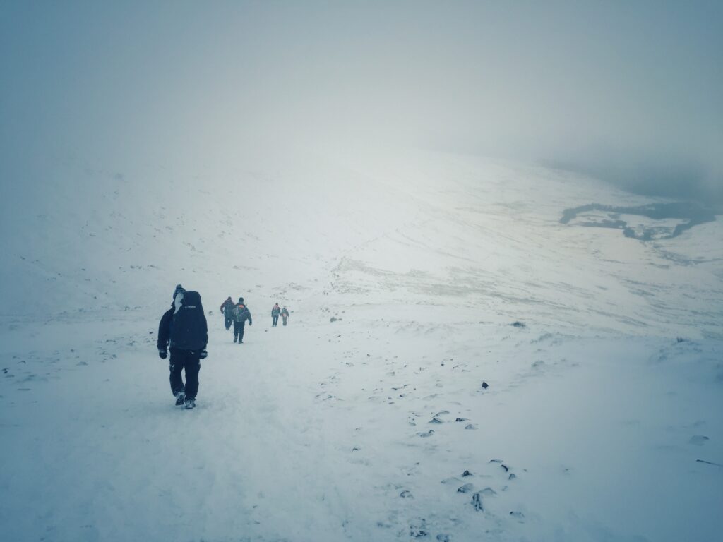
Combining the works –
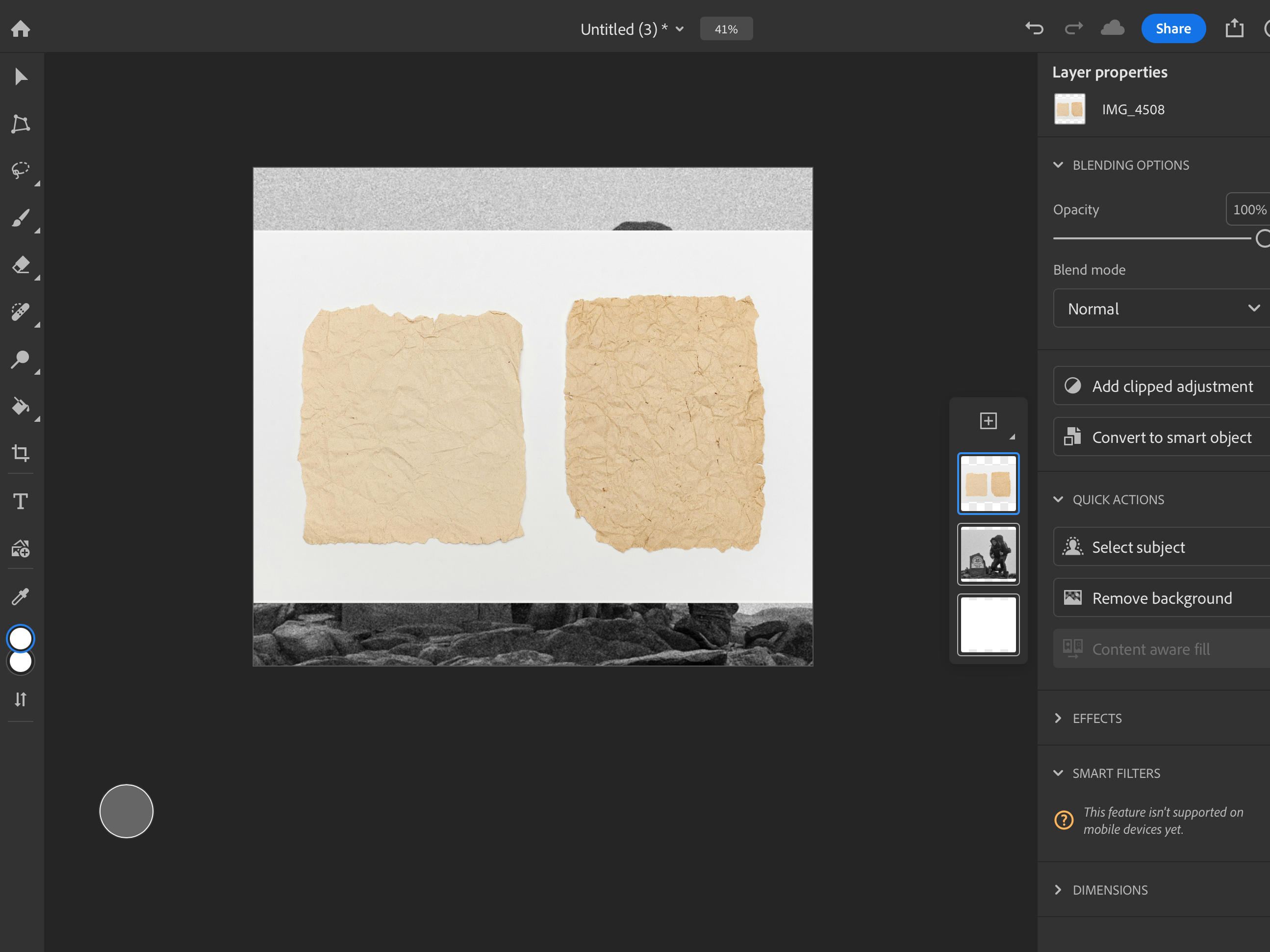
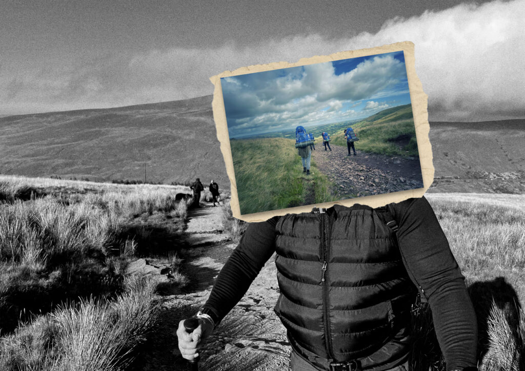
With Stezaker work, some of his images within images contain a ripped paper effect as if a post card has been glued on. To replicate this I found a stock image and copied the effect.
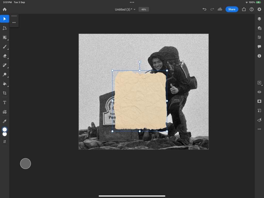
Using the Object select tool, I was able to cutout the stock image.
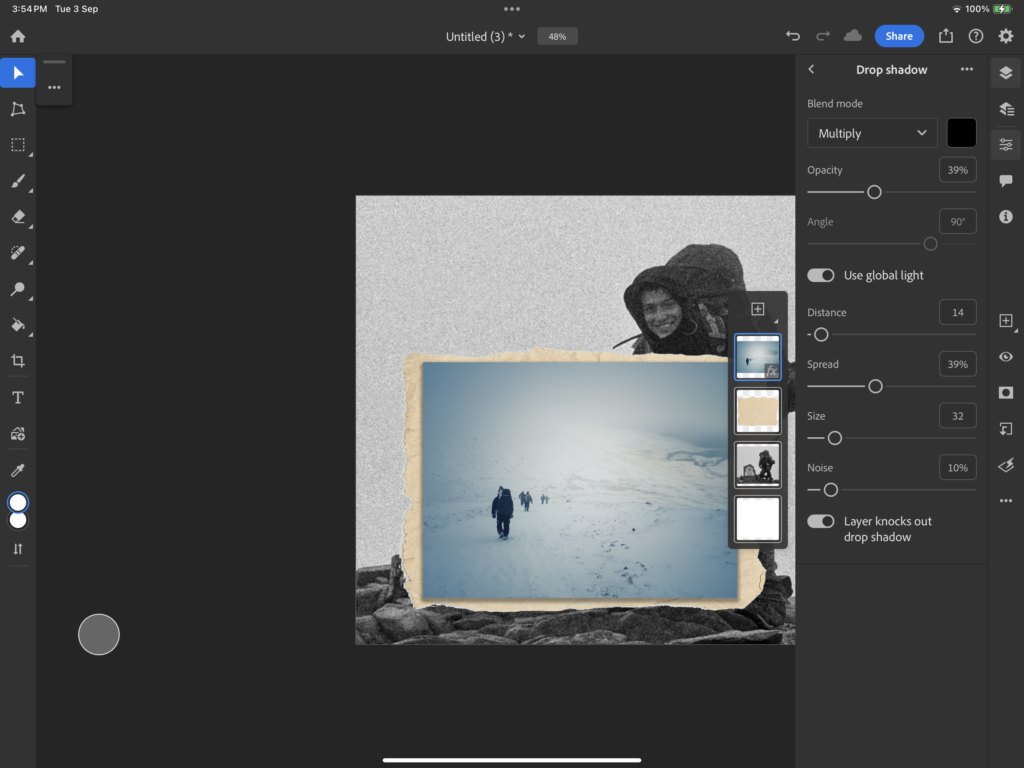
Combining this with the edited image, I added a drop shadow to make it seem as if the edited image looked like it wasn’t properly stuck down to the paper.
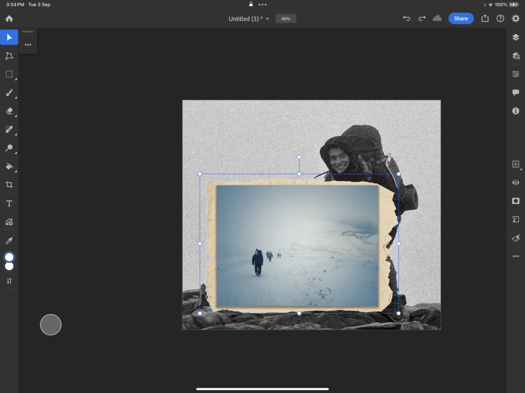
After merging the 2 I then adjusted the image to how make it seem more naturally placed like how Stezaker had done with his work.
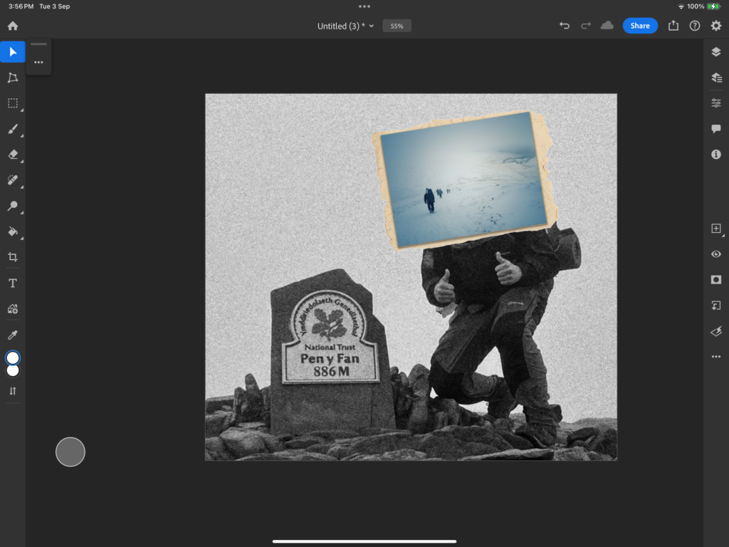
As a result this is what turned out.
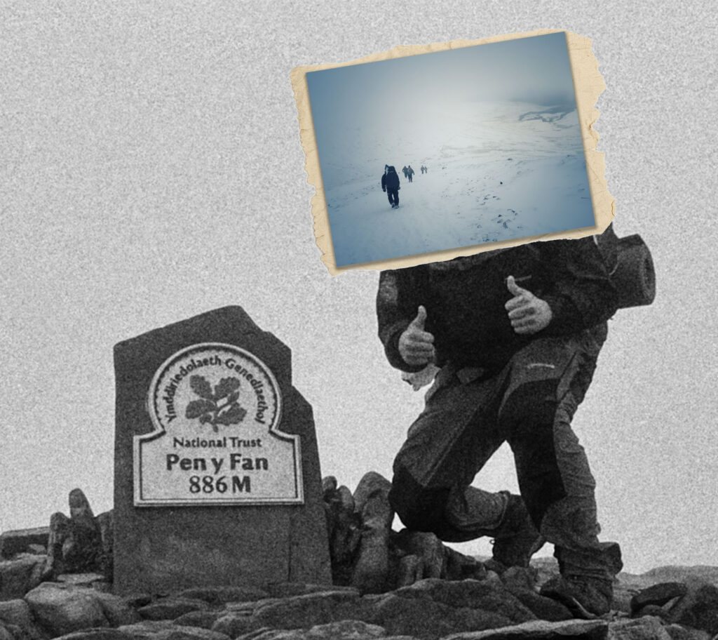
Combining the works –
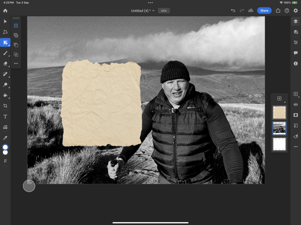
Like the image before I repeated the process of cutting out the paper to have that postcard effect.
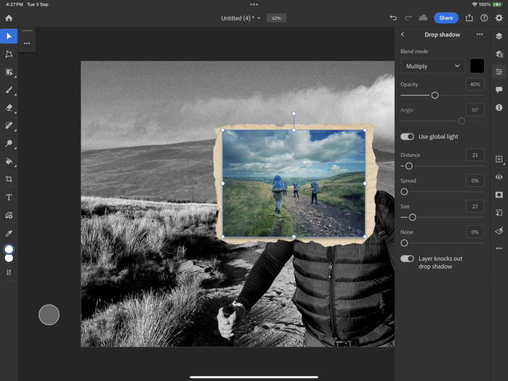
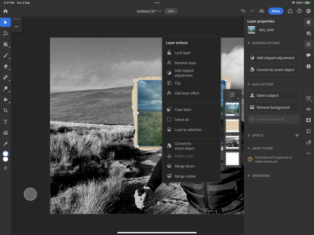
Again, adding a drop shadow, and merging the imported image and paper this then allowed me to place it in the desired place for my final outcome.
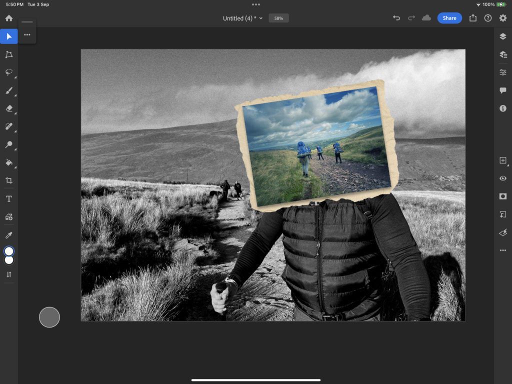
As a final result it turned out like this.
