Final Image outcomes:
Here are my Final outcomes of my St Malo Page spreads.
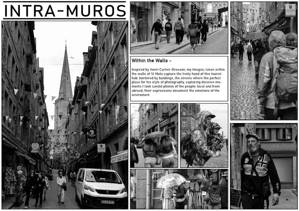
Physical outcomes:
Printed out physically, I have mounted them on foam board for display.

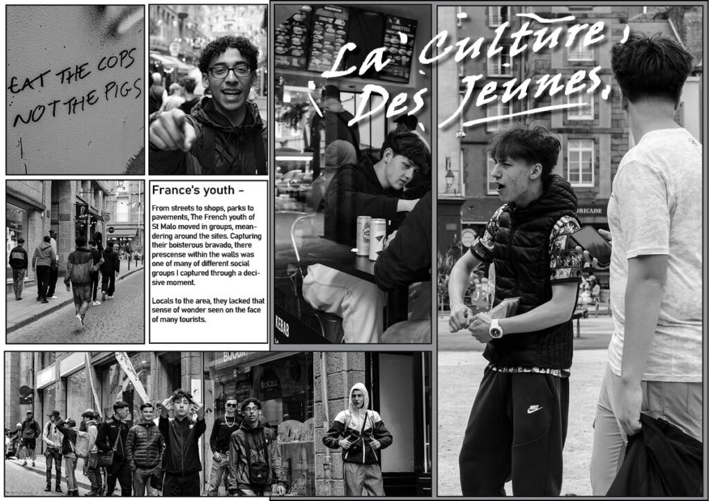
Final Image outcomes:
Here are my Final outcomes of my St Malo Page spreads.
Physical outcomes:
Printed out physically, I have mounted them on foam board for display.
for this project I wanted to use AI on images that I had taken to try and show how we are damaging the planet in many different ways. so I want to use my images to make people think what can we do to stop it?

the idea behind this three piece image was inspired by Michael Marten’s sea change however I made my piece different to his and interpreted it in my own way by getting a picture in town and using AI to make a past and present image of what this image could have possibly looked like in the past and future. I thought this fit the theme of Anthropocene as it shows much we have changed the planet from the past to the present and possibly what the planet could like in the future.
this image that I edited aims to show Anthropocene through pollution that we have caused in the sea and on the surface of are planet I done this by using AI to add things to the image such litter and a construction site to the image. I think this image helps shows what we need to change in order to stop these problems we have that have been happening for a long period of time. I liked how this came out because the shadow is creeping up slowly on the other side of the image to represent the fact that the damage humans have done has almost taken over everywhere. I also like how the image looks similar to a painting which gives it more of a dramatic effect to the image.

in my opinion I think this image was a bit over the top with everything that was happening in it but I also think it still achieves what I wanted to produce and I think it does a great job at that. this is because, it demonstrates everything that is a problem in the modern day planet such as planes that are polluting the air all-over the globe along with the abundance of litter that’s been left in this location even the fact that there is a bin in plain sight

i think these three images perfectly showed off over population as you had all these buildings pilled up on top of each other with narrow streets filled up to the brim with cars everywhere which would get in your way when trying to navigate the small town. also another issue these three photos may represent is mass tourism which could be the reason why these small towns maybe over populated in holidays such as the summer and winter.
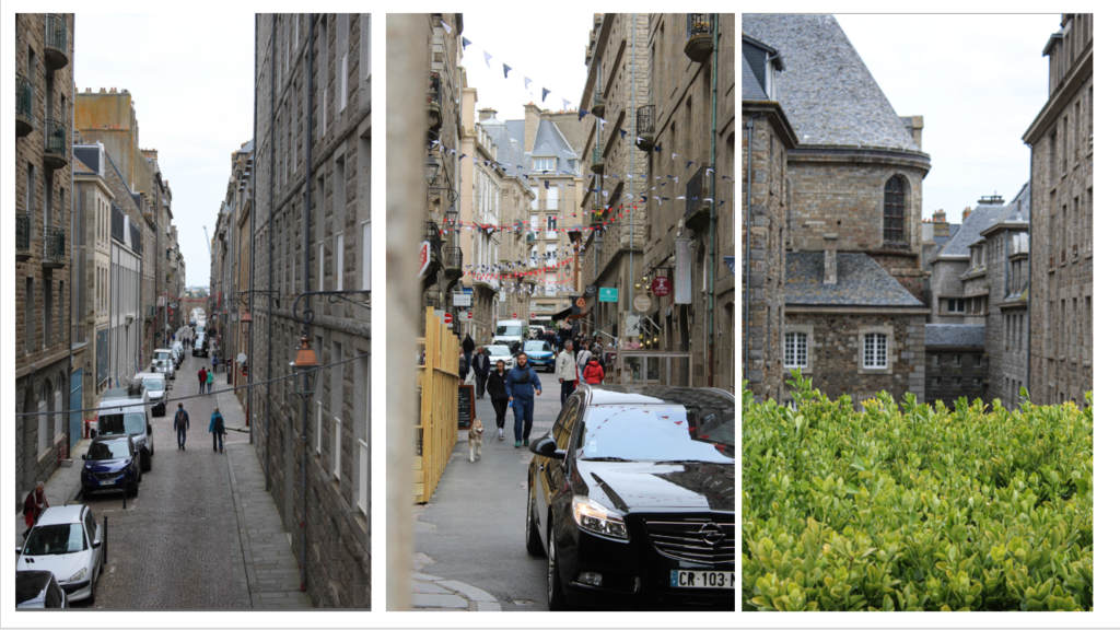
inconclusion I believe that I was successful with portraying Anthropocene in many different ways by showing various different ways we pollute the planet (overpopulation, air pollution, littering, construction and polluting are seas).
virtual gallery
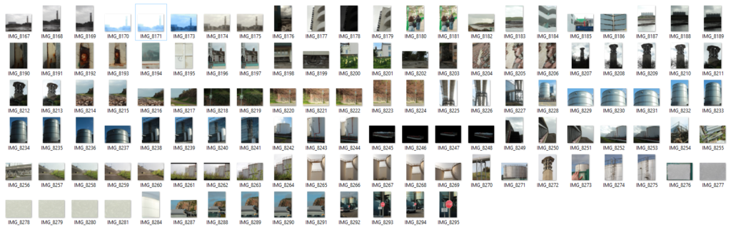
for my virtual gallery I decided to use the images I decided was the best images out of all of my final outcomes. I decided to put them in a gallery of there own so they stand out and speak for themselves which suits the topic of Anthropocene. I also included some of my typography images as well to go along with them in a separate gallery as I didn’t want them to get jumbled up with my Anthropocene images. for next time I think I should take more photos so I can come out with more final outcomes and more photos to edit for next time.


Typography


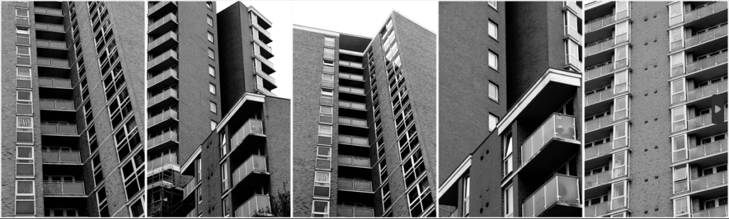
The geometric nature of these post-war modernist buildings drew my eye to them as their repetition was mesmerising but also strikingly contrasting to the natural world’s arbitrary shapes.
The human obsession with uniformity I find very unsettling, especially when realising how dominating it is in built up and man-altered natural landscapes. I’ve tried to highlight the dominance of and cramped living spaces in the buildings by filling the frame, worms eye view and the black and white theme because it emphasises the grid-like lines and boxy arrangements.


The mid-tones make up most the images but to balance this out I made sure to increase the presence to add depth to the bricks and windows.
For extra texture I added grain which is a subtle but nice touch to make the photo look more worn, something that exaggerates their age and brutal style.


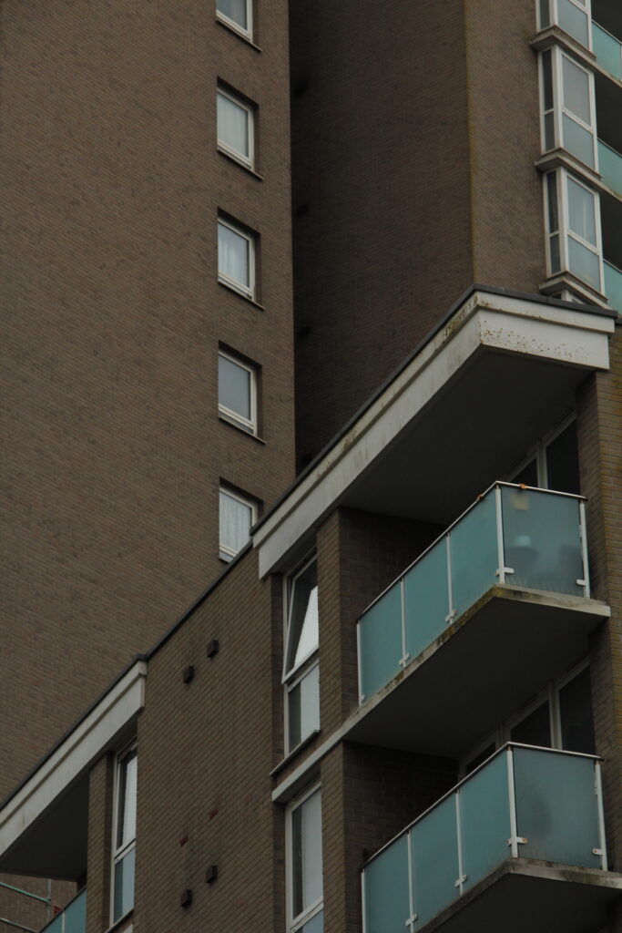
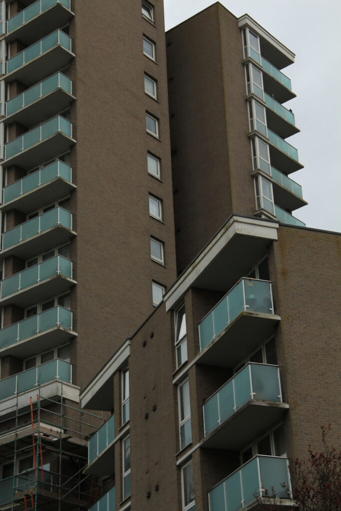
The final edits are moody and brutal which was the idea I thought fit the images best. Put in black and white and unsharpened, they give a murky impression. The colour would have almost glamorised these buildings when in actuality I find them all to be just eyesores that are perceived across much of town.


Overall I’m satisfied with my final set of images, the composition, ideas and editing achieved more than I expected they would. Though a small focus, I believe I have successfully delivered the message of Anthropocene in my work by displaying the towering and cramped feel of how we’ve designed our own living conditions and how we’ve transformed natural materials into these brutal and unnatural blocky buildings which shows the disconnected relationship between some of humanity and nature.

These 2 pipes going into and from the incinerator at La Collette. I decided to emphasise the reflective and battered texture of the pipes by increasing the overall presence, shadows and whites of the image. This also helped the lens flare stand out on the left pipe.
The beautiful clouds in the background of the image gave nature a presence in an image of mostly manmade components. To reveal them I lowered the exposure of the sky using the LRC masking brush.
Just to add a bit more tone contrast I used a graduated filter to the bottom with -2 exposure.
Like Albert Renger-Patzsch, I’ve made the most of the subjects fundamental shapes and lines photographing the pipes at a warped perspective.

The bricks, cracks and metal rail going up this chimney are all made more interesting and given more depth with the use of the shadow that takes half of the left half of the chimney. It’s important that the shadow isn’t too dark that it hides the bricks.
Similarly to Renger-Patzsch, the shadows on the underside of the pipes are just bright enough to see the detail of the scratches and welding, whilst the bright light hitting the top and right of the pipe reflects onto the underside making the tubes less flat. Additionally, the symmetry is broken with the same rail looking thing on the side.
Renger-Patzsch wanted to capture objects as interestingly and objectively as he could. Compared to my image, the blending between tones is smoother and tonal range is lesser so the environment doesn’t effect the subject too much. Though I have included a lens flare and brightened the highlights, the environment doesn’t effect the subject too much and still gives an accurate representation of the pipes.
My next few photos take some influence from Hilla and Bernd Becher as I wanted to capture the texture and shapes within the industrial structures but with a less dead pan and more cropped approach.
[Hilla and Bernd Becher ->]
To uniquely enhance the grate-like texture on this container of sorts I increased the highlights and blacks of the shadows of the image. Because this was quite harsh and unbalanced I added a brush mask around the ladder not only to draw your eye to it but to lower the exposure.
Additionally the spotlight was too dark so I made it sharper and brighter with a brush mask.

The crop gives more attention to the lamp post and ladder with the grate-like texture in the midground being quite distracting to the eye.
Slightly blending a navy blue in the shadows and mid-tones actually softened the grate-like texture further whilst giving it a more metallic appearance.


I think the composition of my image takes great influence that of Hilla and Bernd Becher, but emphasises the lines that wrap around the industrial structures.
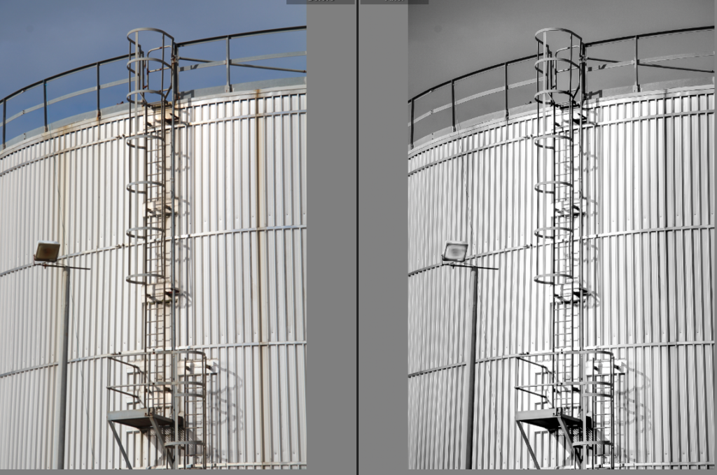
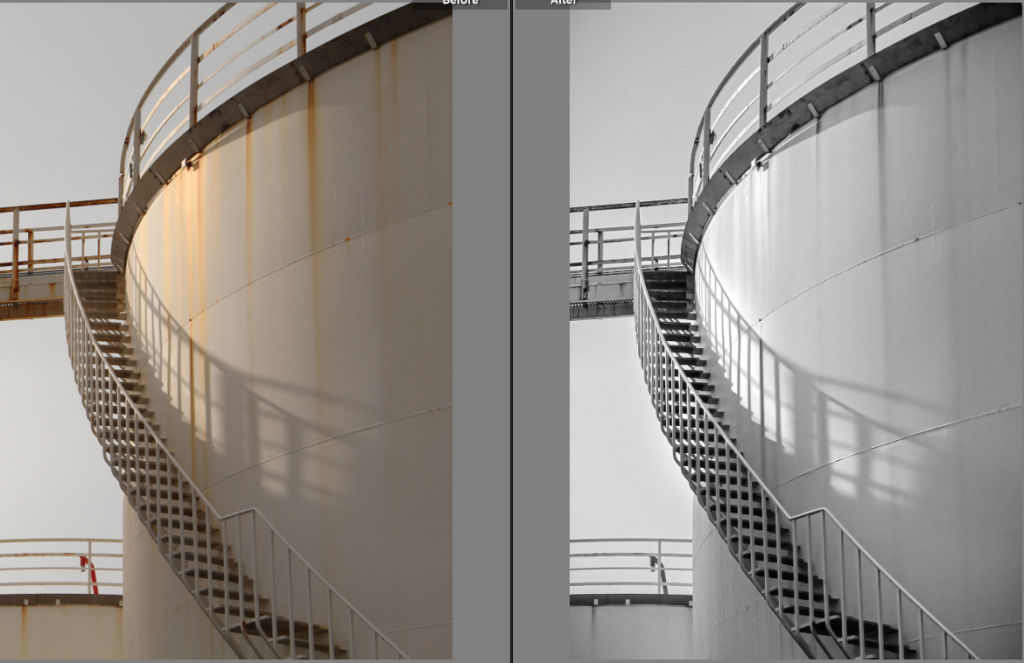
My use of shadows is more similar to that of André Kertész in this image here. The shadows almost paint over the scene.


The subtle blue added to the mid-tones makes the image whiter and cleaner.

The final B&W version came from an edited copy of the original


In comparison to Hilla and Bernd Becher, I’ve tried to include sharp shadows to add contrast and add lines in my photos. Whereas their photos feature quite diffused and blob-like shadows.

Originally cropped to focus on the the shadow of staircase
After this version I realised a splash of colour made the image more interesting. Colour grading the mid-tones an aqua blue gave the de-saturated cream a cleaner, whiter hue.

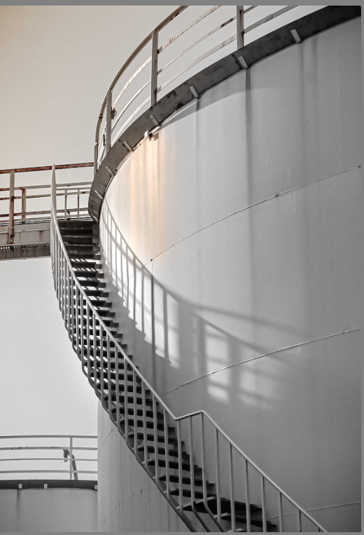


Looking back at the original composition of this image made me realise the negative space was important in effectively establishing the forms of the subjects in my image. The new coloured area proved to help the negative space give depth to the structures and divide the image into two sections. Additionally, the added warm colours narrates the direction of the light source some more.

The basic geometric shapes around La Collette’s flats intrigued me after seeing a variety of architecture photography on Instagram. My final images are going to be from this photoshoot.
This photoshoot was based around Havre Des Pas and La Collette with the photography duo Bernd and Hilla Becher in mind.

I was attempting to do some HDR photos with this photoshoot but it didn’t go to plan as the lighting, some of the composition and exposure settings weren’t at all very good.

I narrowed down my overall collection of images to these 6, but to by removing images one and two my final images could focus more on the geometry of the flats. This is because otherwise I find the other 2 less interesting and irrelevant when it comes to analysis.

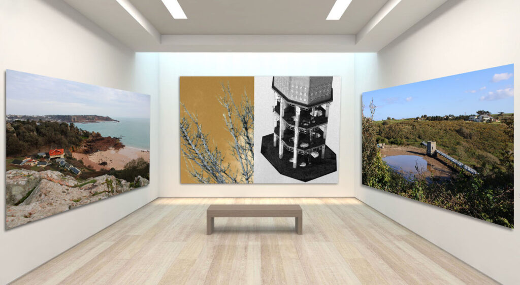
In final pieces I decided to put them together, not in the way I shall compose final prints when mounting but in the virtual gallery as if it were in a exhibition. I find it important for the final pieces to be in the order similarly when presenting as it gives the effect of opposing features to juxtapose the anthropocene inspired photographs with the input of artificial intelligence.
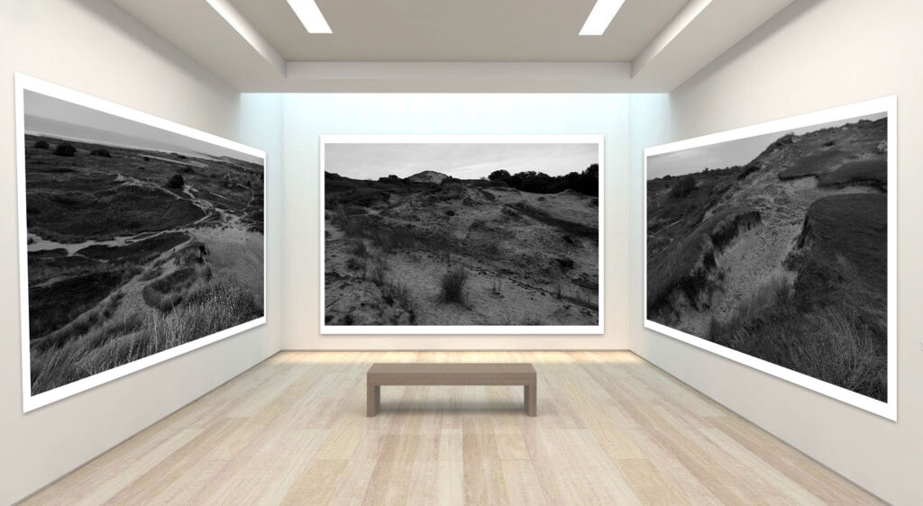
In terms of this virtual gallery, I feel that the three landscapes demonstrated look like a continuation of a project as the photographs are very similar in terms of location, colour scheme and general appearance. The textures and shapes are obviously different, making the three photographs work well.
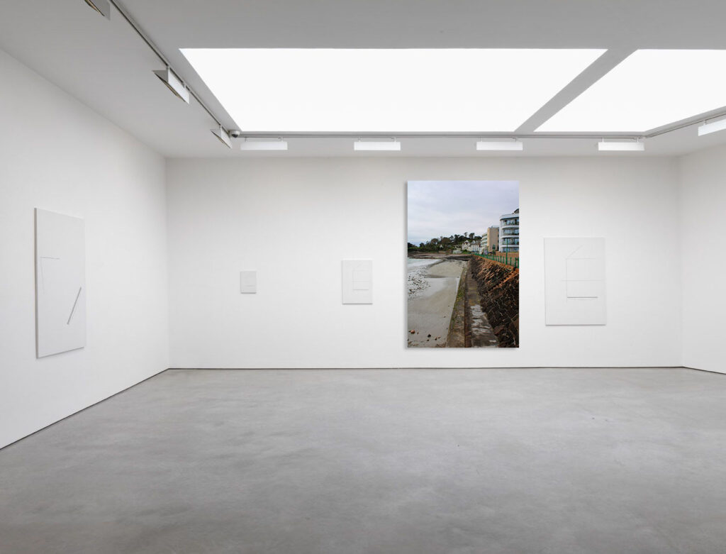
In terms of this urban landscape photograph I like the fact that it is the centre of attention and that it is very much singular as it does not correspond with the other photographs well. If I were to change anything in my virtual gallery above I could have removed the other plain white frames so the main urban landscape frame is the most prominent or had placed the urban landscape frame onto a smaller virtual gallery with a portrait like border.
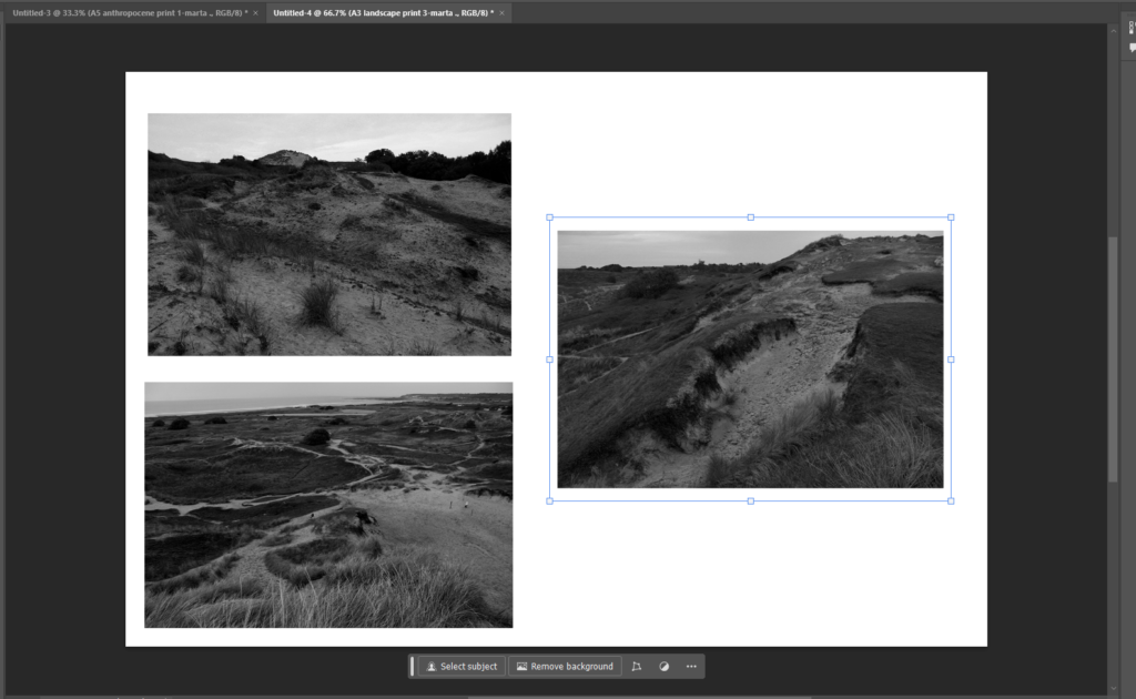
In my final piece plan I plan to present my three black and white landscape photographs mounted and presented. I feel that the triangular composition looks effective and playful as it’s an odd number of images so it’s not exactly symmetrical yet the outcome still looks interesting and unique.
I believe that the composition between the photographs is good as the white blank space breaks apart from the rest of the photographs.
I decided to do this arrangement/composition of these photographs as it would have looked not as effective having the three landscape photographs individually mounted and presented by itself.
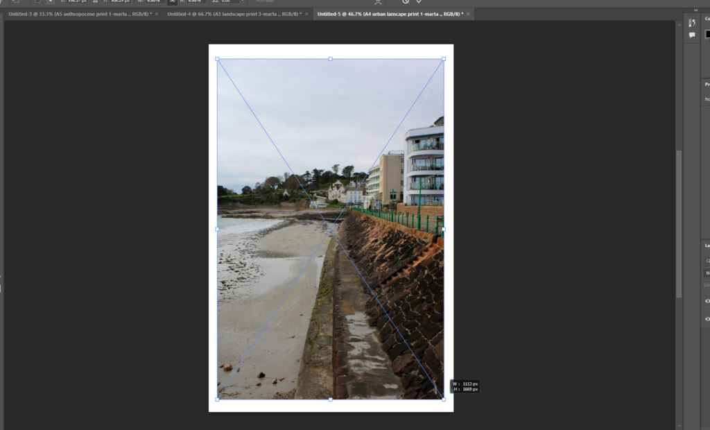
In this urban landscape image I decided to present it on it’s own as it would add to the photograph, not collaging/grouping the photograph means that it would be singular and individual compared to the others, that’s how it would be different and therefore make it unique.
I like the idea of presenting it by itself as there are many colours and textures included in the photograph which don’t need to be paired with any other image to add to it.
The image almost looks split as the coast line is directly contrasted from the sand textures from the bottom of the image to more than half way through it.
The opposing locations look symbolic and deserve to be individualised in this composition as it is presented better.
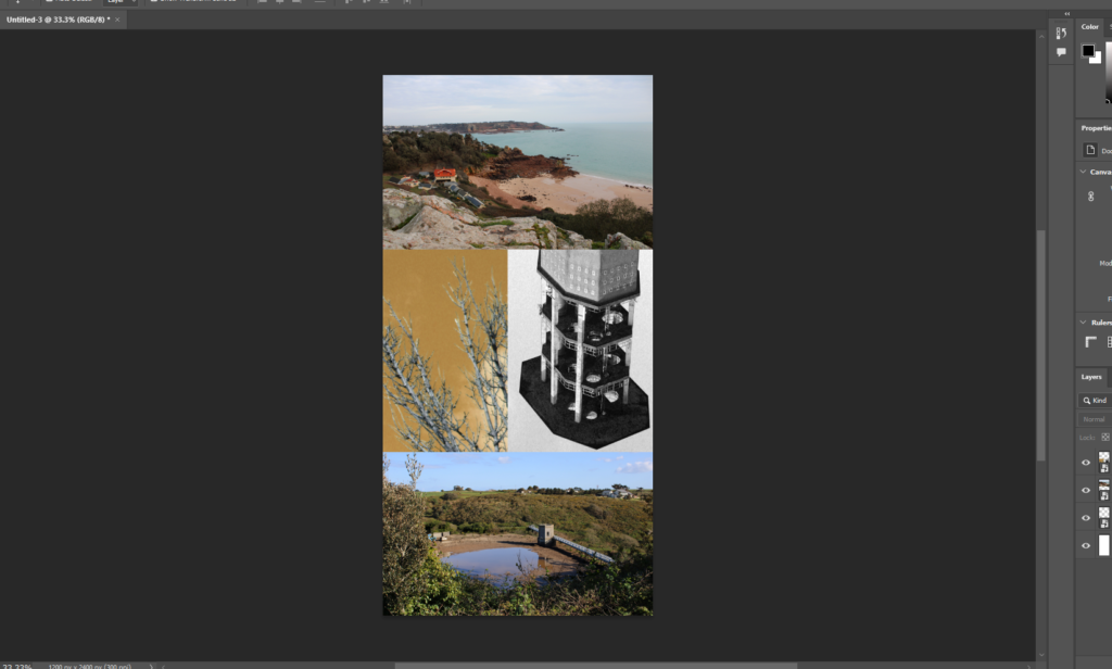
In terms of the anthropocene photographs, I’m planning to present the photographs mounted up and in a collage with the anthropogenic AI impacted images and in between those two image, I plan to put photoshop made collage as a contrast to the naturally coloured anthropocene photographs.
I believe this will look interesting as despite all three of the images being from the same topic, I feel that the black and white/ yellow coloured collage will oppose the other two images and will appear fascinating.
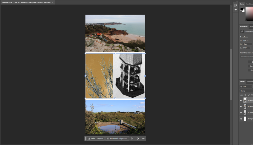
The screenshot above demonstrates what I may do, I will either separate the images and keep the white border around them as it may look effective rather than keep it all together.
Each of the photographs has a different colour scheme despite being similar structures/ land. The photograph in the middle counterbalances the others as the middle image is of a tower similarly to the one at the bottom photograph despite the in in the middle being more close-up, flipped as well as in black and white and the nature of the middle left
What are Picture Stories?
Picture stories are a sequence of images that tell a story when displayed together. These types of stories don’t require words to convey the message as the images speak for themselves.
Examples of Picture Stories


Different Types of Images in Picture Stories:


Establishing shots are often images which can provide an overview on the topic of the picture story and they are usually displayed larger than the rest of the images. They also may display important locations and details which can be seen in other images to tie them together.


Relationship shots are shots which capture the connection between two or more people, objects, animals, etc. An example of a relationship shot could be a couple after their engagement.


A detail shot is a photograph which clearly focuses on the details and textures of a particular subject. An example of a detail shot could be portrait mode on an iPhone, where the background is blurred and subject clear.


An environmental portrait is a type of image that displays the subject in their usual environment, such as their home or workplace.


A formal portrait is a typical portrait of a person where poses and lighting conditions have been carefully arranged to get the best shot.


I was inspired by these photos because I like how the colour in the background is used to make the buildings stand out and is clear that they are the main subject in the photo. However, though the main subject of the image is the buildings, it could also be interpreted that these images are focussed on the sky. He may have created these images to portray that the sky is polluted and he has shown this with colour in attempt to create a happy image even though it is showing us the disasters that are happening in the world in terms of pollution.


These images were inspired by Nick Frank who focussed on the idea of creating images where the focus is on the buildings and not the foreground or the background. He made the background of the images a different colour which I have done here.
On photoshop, I started by levelling my image to ensure that the buildings stood out and weren’t white washed. I then took the quick selection tool to select the background. I had to zoom into some parts of the picture and make the quick selection tool brush smaller to be more precise especially in the trees. After I did this, I right clicked and selected layer via copy to create a layer on top of the background layer. Before I did anything else I made sure I was on the layer that I had copied. I then took selected the colour picker and chose what colour I wanted, I then proceeded to select the paint bucket tool to colour in the background by selecting the sky.
I like how my images turned out because I like the bright colours which make the images stand out. I have done my own twist on these images related to Anthropocene to show that the air is polluted with all the toxic fumes that are being released on human’s terms. I have made the colours stand out where the sky was because it infers that the sky is being hidden by something pleasant and aesthetically pleasing and shows that as humans, we are oblivious to the things we do in our day-to-day life that is polluting our air.
Henri Cartier Bresson was most known for his photo at Place de l’Europe Behind Gare Saint Lazare which is when his “decisive moments” project really grew popular . He would say that he would like to connect humanity through photos.
he would bring a camera everywhere with him in order to capture every/any millisecond in a moment. He described his camera as an extension of him as if he was hunting so he needs to be patient wait for that perfect shot.
His camera
Henri Carter Bresson was particularly fond of using a Lecia Rangefinder this is because it was considered one of the most inconspicuous of the cameras. That was because they were a lot smaller than most other cameras available at the time it also didn’t have a loud sound when it took the photo. This helped him with his photos as his aim was to get candid photos so the more invisible he could be the better. He was also very fond of using a 50mm lens as he felt that it offered the most realistic point of view as its what’s closest to our eye.

His background
Henri grew up quite wealthy with his family in France which is where he was introduced to art.to begin with he had a big interest in painting however he later found that photography is what he was most passionate about. He found photography to be an extension of the eye.
He felt this was able to interreact the world with his camera which lead him to start travelling he went to Europe, Africa, China, Indonesia, India, Burma, Pakistan and many more… The experiences he got out of his travels influenced him to start his project “decisive moment”
image analysis

leading lines-

In the photo you can see that he’s using leading lines from the railings to draw attention to the man in the image. Although you can argue it doesn’t draw your eyes perfectly because it does kind of draw your attention off the page if you were to follow the railing it does help frame the image and then I find that the ladder of the left of the man helps to draw attention to him.
framing and negative space-


I find in this image it uses negative space really effectively it frames the subject really well drawing a lot of attention to it due to it being really calm and not having much going on. It helps balance out the image as the middle has lots going on and has lots of detail so the calming upper and lower sections helps it feel more organised and less chaotic. I also find the shadow and the clock really help balance out the image as they are both on leading lines but opposite sides of the photo making it look more even and aesthetic pleasing otherwise for example it might look too top heavy.
Colour and texture-
In his photos he has them in black and white this is because at the time technology had not advanced enough to have a camera ion colour. However I think the having it in black and white really works the viewer tends to see more detail within the actual I’m age this way as they are not being distracted by colours.
I think due to there being no colour in the image i think it helps with texture as it draws more attention to it and makes it stand out. you can see all the texture on the walls and the ground very clearly
Camera techniques-
In this image you can tell that he has used a small aperture as there lots of depth in in his image. This meant that everything in the image was in focus including the foreground and the background.
You can also tell he uses a fast shutter speed because for the time the image was taken its considered very sharp so he would have had to use that fast shutter speed to be able to capture the quick movement.
Lighting-
You can tell that this image is really relying on natural lighting and you can tell that it was most likely mid day when he took this photo based off the man shadow in the water. Some people can struggle with taking photos midday because of how bright the sun can be making it more difficult as it can cast some very harsh shadows however instead of fighting that Henri Carter Bresson leant into that and wanted to capture those shadows.
Symbolism-
Henri Carter Bresson focused on the deceive moment which he achieved very successfully he started the shift from very staged photos to these spontaneous candid images which shows the human experience a lot more as people are unaware they are trying to look a certain way or do a certain thing for the camera is people is their true and raw form.