Henri Cartier-Bresson and the ‘decisive moment’

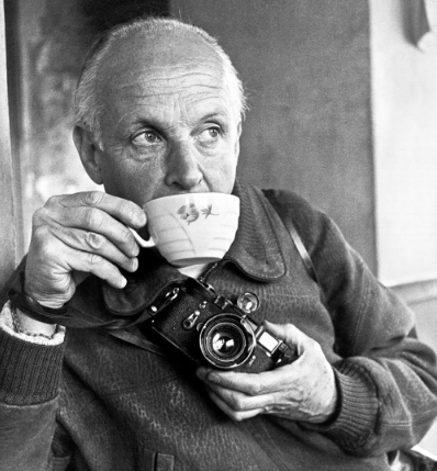
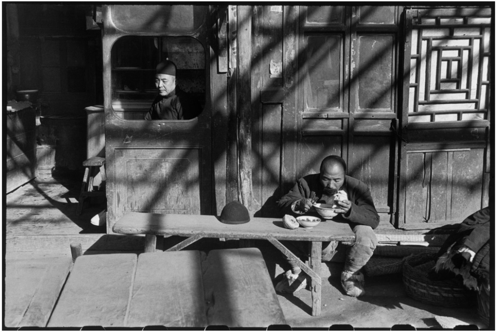
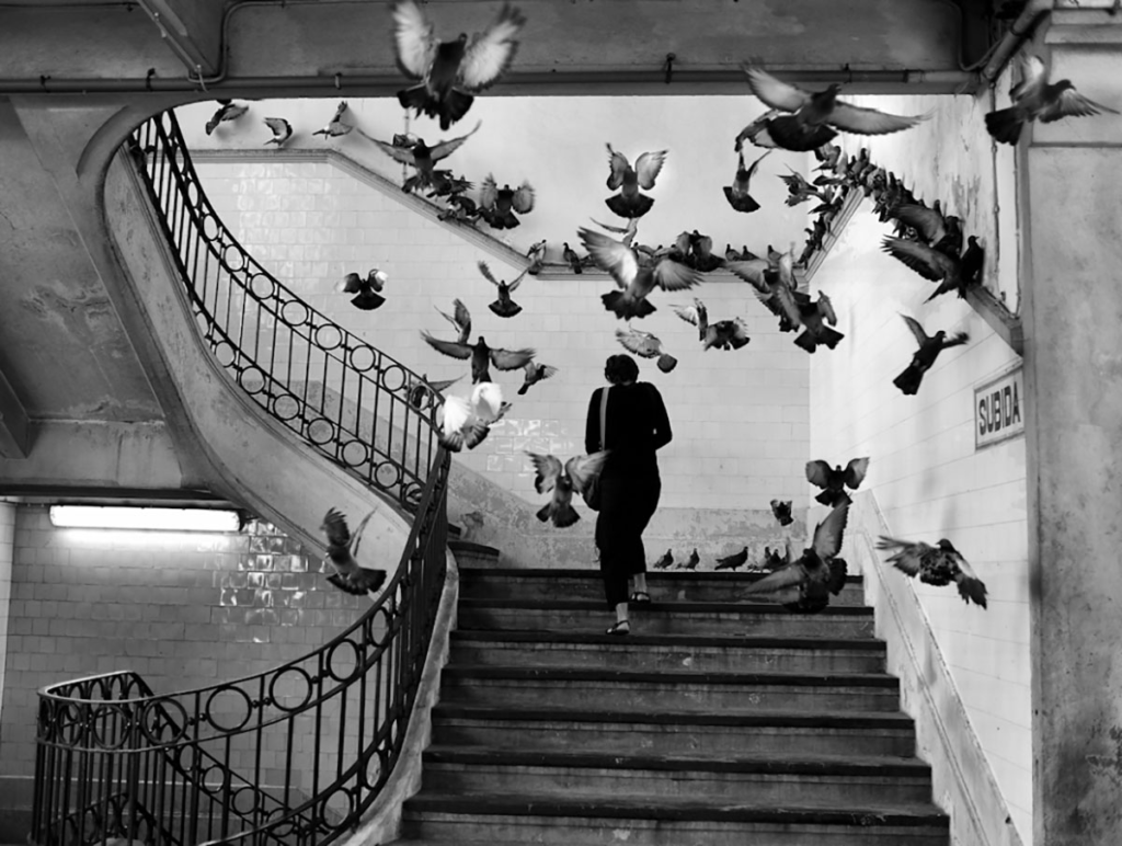
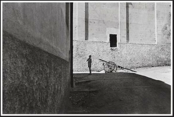
Henri Cartier-Bresson was a pioneer of humanist photography. He was born in 1908 in France and was considered to be a master of candid photography.

His approach to photography was treating his camera like an extension of the eye and photographing things connecting humanity.

Henri grew up in a wealthy family, he was initially into art with him starting to paint at just five years old. in 1927 he went to a boarding school called the Lhote Academy which was ran by a cubist painter and sculptor called André Lhote. Henri Described André as his teacher of “photography without a camera.”

In 1929 Henri Cartier met Harry Crosby who had an interest in photography and gave him his first camera and they would take photos together, which was the awakening of his photography legacy and gave him an interest in it.

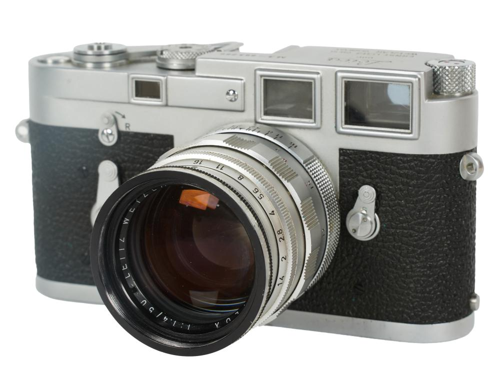
Henri would take his photos with a Lecia Rangefinder camera which had a 50mm lens. He used these cameras as they were more compact and smaller, making them easy to use and take candid photos with, in comparison to a large camera. He also used to the 50mm lens as it has a similar view to the human eye so the photos felt more natural.

His work

The Decisive Moment

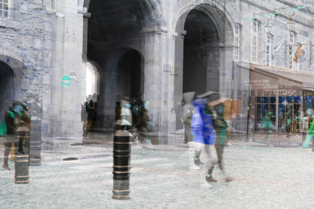
One of the things Henri was famous for was coming up with the concept of the decisive moment, He described it as “There is a creative fraction of a second when you are taking a picture. Your eye must see a composition or an expression that life itself offers you, and you must know with intuition when to click the camera. That is the moment the photographer is creative, oop! The Moment! Once you miss it, it is gone forever.”

In summery Henri is basically saying the decisive moment is the moment in candid photography when the composition is all perfect and you take the photo which can never be naturally re-created again, making it a once in a lifetime photo.

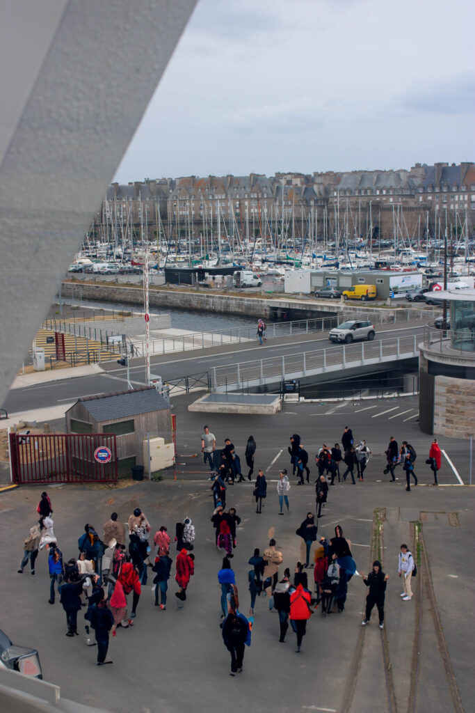
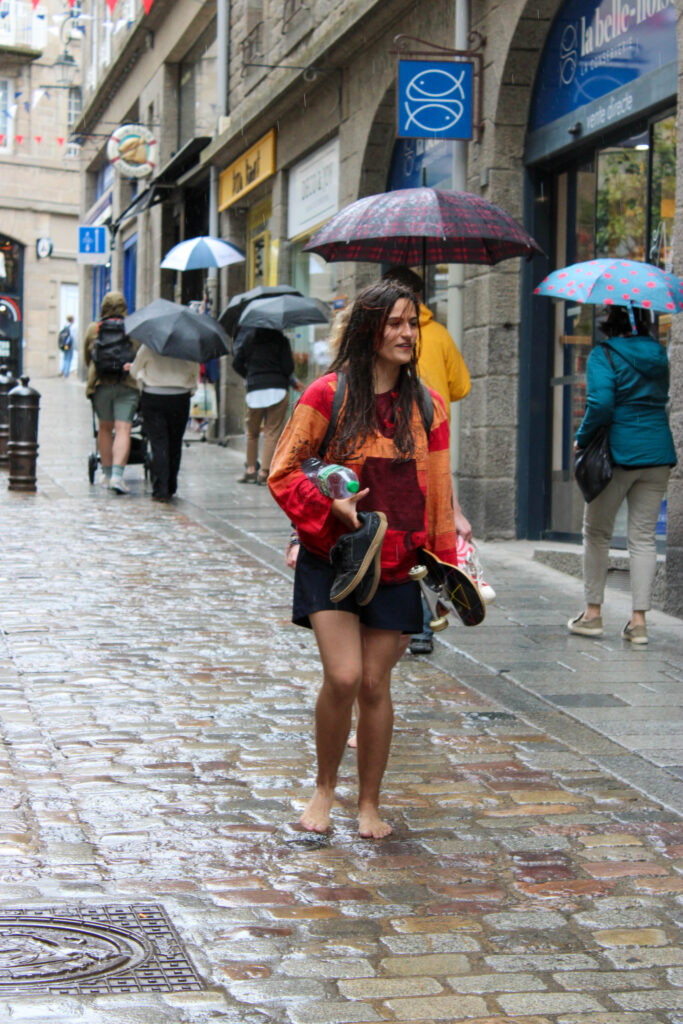
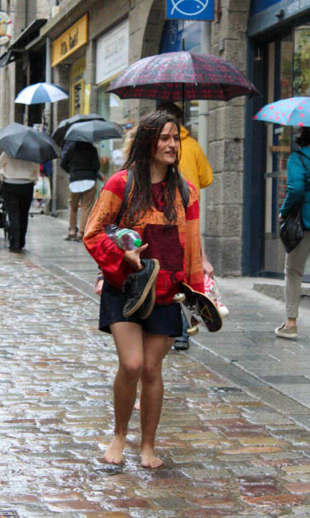
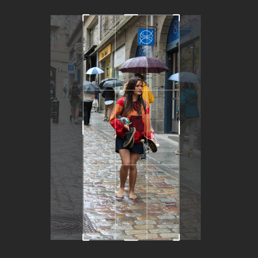
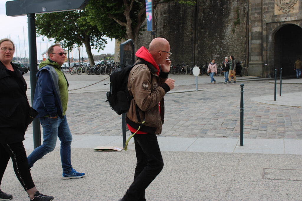
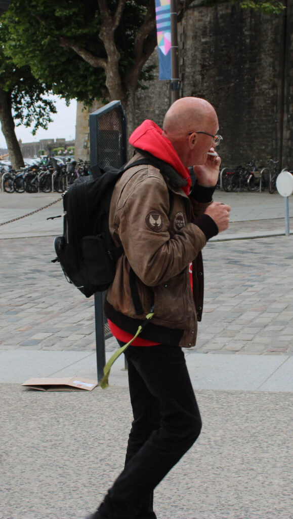
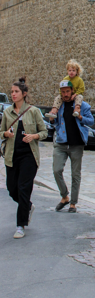
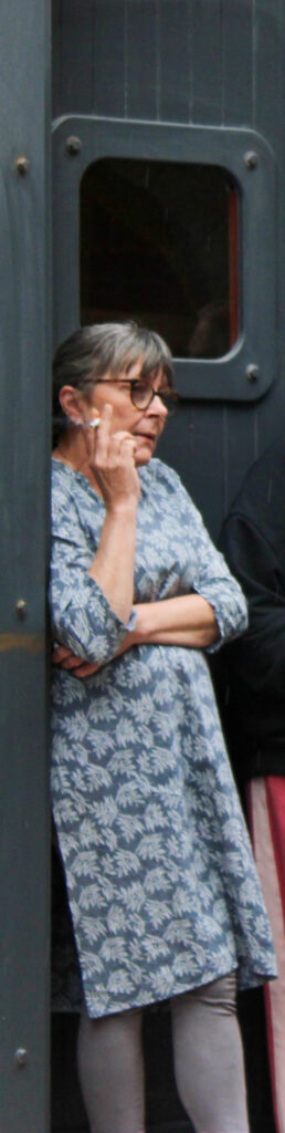
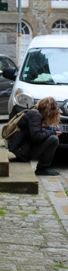
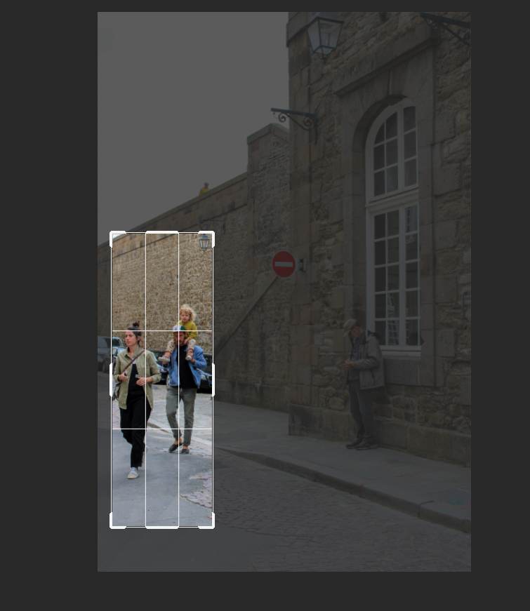
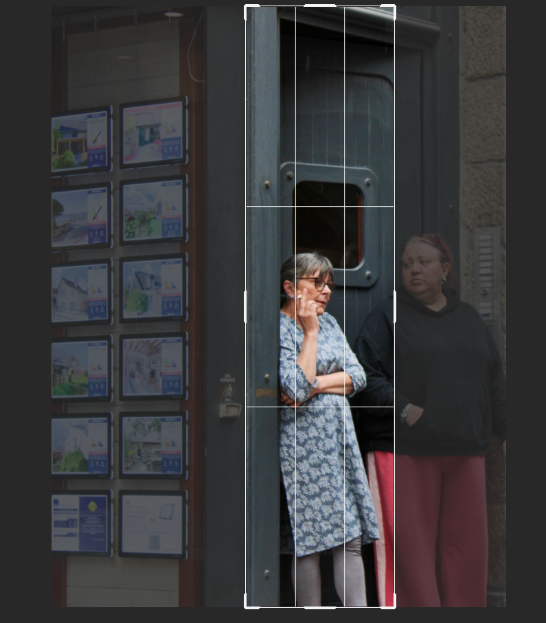
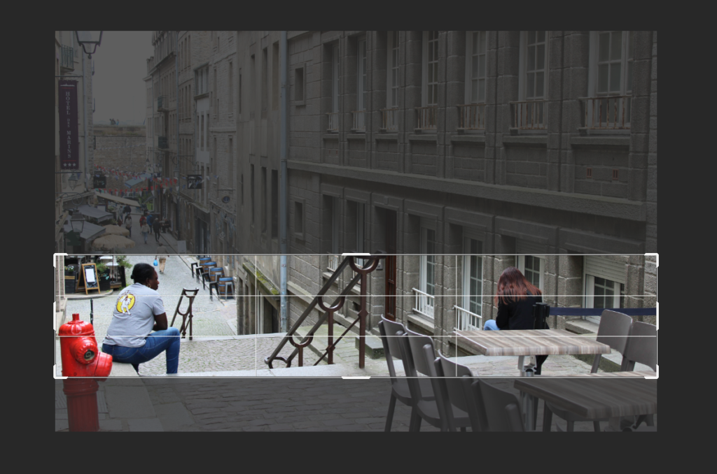
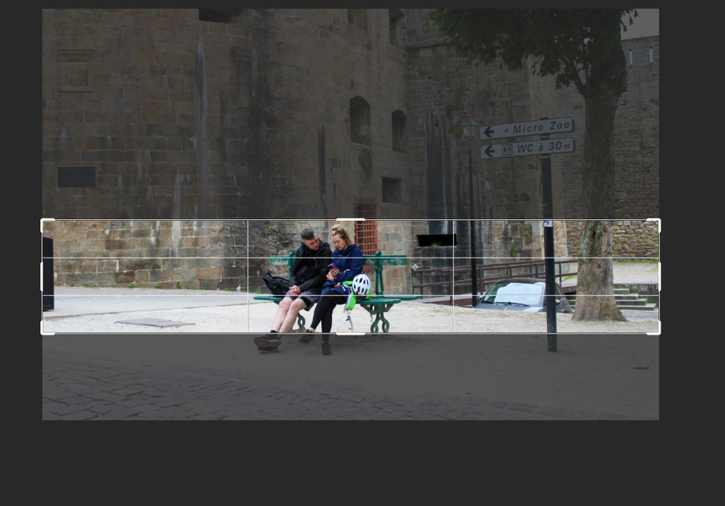
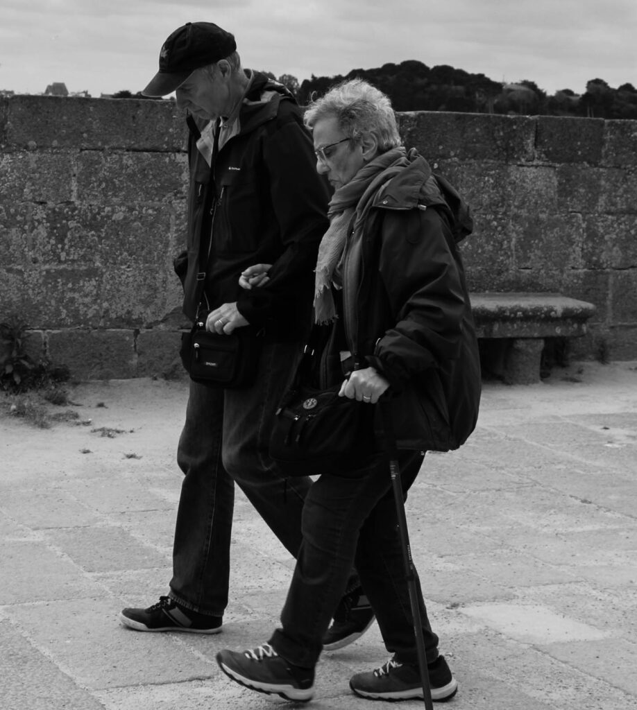
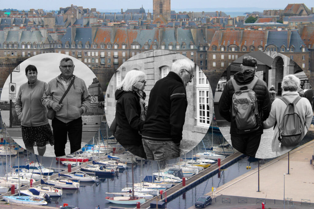
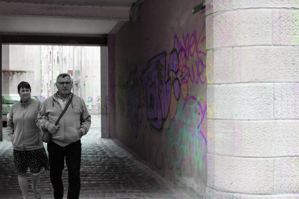
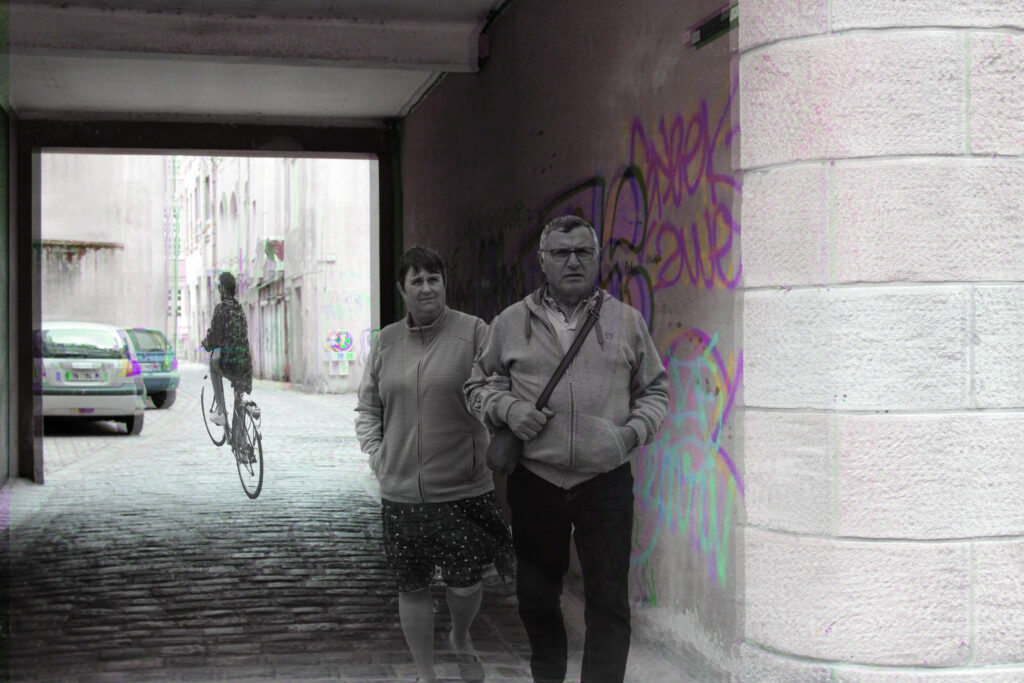
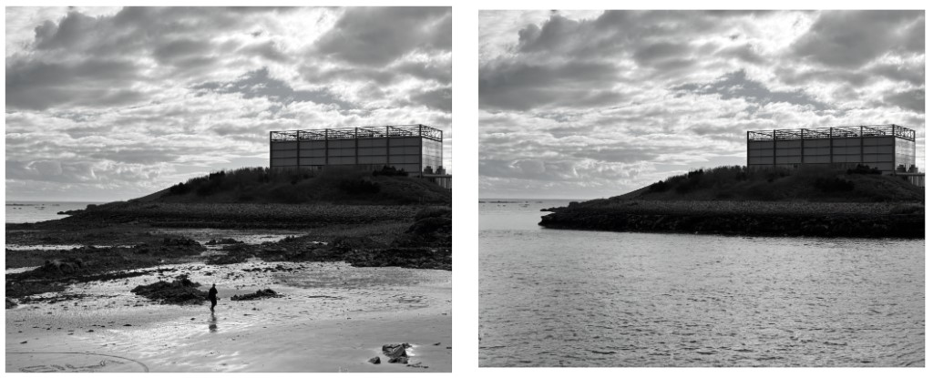
Candid photography is a type of photography which captures natural expressions and moments which can’t be recreated in the studio.

Basically taking photos in the moment so they are natural and authentic, which means the subjects won’t be posing/focusing on the camera like in portraiture photography.

Image Analysis

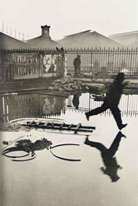
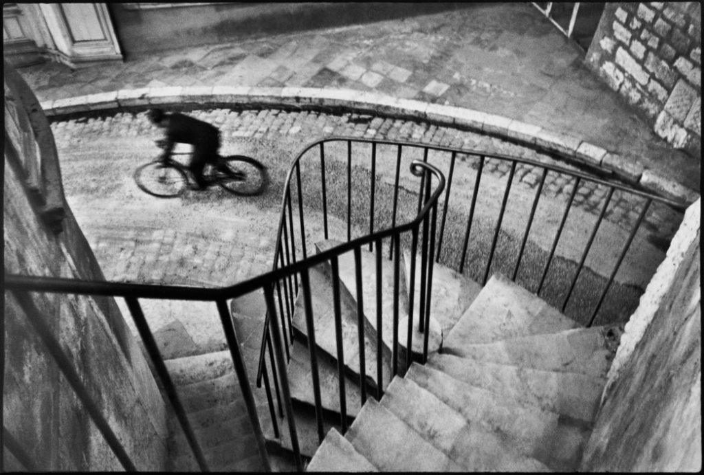
The photo which Henri Cartier-Bresson took was at the Gare St.Lazare train station in 1932 and captures a man trying to jump over a puddle. The photo uses the rule of thirds, with the man jumping over the puddle being in the last third of the image and the man standing in the background being in the middle third of the image.

The photo is in back and white and contains no colour but there is still good a contrast between black and white, especially in the reflections in the water. Furthermore the Water also gives the bottom half of the image a smooth texture which contrasts with the top of the railings in the background, as the top of the railings look quite sharp and pointy.

There is a bit of shape in the photo. The roofs in the background create a triangular shape which makes the photo more interesting to look at compared to if the roofs were flat. The railings/fences in the photo create diagonal lines which gives the photo a bit more depth. They also help distinguish between the foreground and background of the photo.

St Malo InDesign Page Spread

Page Spread Planning and Designs

After being introduced to InDesign in class, I played around with the tools to become familiar with the Software and this is what I created. As you can see, I have inserted some random images. These images won’t be the selection that I will use for my final design, I just used them to learn how to add images and move them around.

These are some other layouts which I came up with and, as you can see, I have decided to go for the title ‘Within the Walls’. Another good title would be ‘St Malo through Phone’ as I took these images using my iPhone as it is more distinct, however, I think this title would be informal and doesn’t look as good.

I then added some placeholder text in the areas which I am planning on putting text within my Page Spreads.

I also added the French flag behind one of my layouts by using coloured shapes and sending them to the back.

Another layout option which I tried was to have an image behind the text. I inserted this image like I would any other then moved it to back and lowered the transparency to 24%.

I also added some borders around my images which are the colour of the French flag as it is much more minimal than having it as the entire background. I did this by making the edges of the images have a 3pt border then colouring the borders to be like the French flag.

I designed another layout with some more smaller images, rather than having a clear establishing shot. This will allow me to display more of my images and works better for my images as the majority of them are vertical.

After this, I added images to one of my design layouts, as seen below:

Here is my reasonings for each of the images’ positions:

I also tried this same layout in B&W to see what I think would look best:

I have decided that I am going to keep the images in colour as I believe that it is more pleasing to the eye and St Malo is a very colourful place so it represents it well.

After this, I put an image of a woman eating ice cream behind the text to see how it would look, however, I think that it just looks a bit messy.

Here is another image layout which I have created:

I made this page spread monochrome by exporting it and putting it into Lightroom, rather than using B&W images.

Once again, I think that I prefer in colour as it strips the character from the images when in B&W.

These are the 2 layouts for me to choose between:

I have decided to go for the second layout as I think it is a better way of positioning the text and will allow me to write 2 separate paragraphs on different topics, rather than one big one. One the other hand, there are some images which I don’t think quite fit with the rest, therefore I am going to change them.

I have swapped the image with the church to the one where the man is walking past the 2 ladies sipping their drinks. I prefer this layout much more now compared to how it was before and I think that this image is a better representation of the decisive moment.

I then made another change to my images as I thought the image of the woman eating the ice cream didn’t really fit in so I replaced it with the image of the man cycling and replaced that image with people walking their dogs. I strategically placed these images here as they draw your eyes into the page spread.

This is the text I would like to add to my page spread:

1st text box:

Saint Malo is a historic walled city on the coast of Brittany, France. The city has a long history of piracy and has been home to numerous sailors and explorers. At the end of World War II, it was set on fire and 80% of it had been destroyed. 680 buildings were demolished at this time, including Saint-Vincent Cathedral, which was under reconstruction for 21 years and completed by the beginning of the 1970s. The reconstruction of this city had begun in 1947 and it is now a popular tourist attraction for its coastal location, distinctive architecture, privateer history and more.

2nd text box:

Packed with French culture and history, the walls of Saint Malo offer many experiences such as shopping in unique French shops, eating at tasteful restaurants, exploring the historic attractions and more. The city is also located on the coast and has beautiful beaches which are known for their large tides. Overall, this city is perfect for those who are eager to create new memories, have a love for history and food and want to explore the French culture.

Here are my layouts with text:

I have decided to go for the first text option as I think that it best fits the boxes I have left for text and also matches the title as they are both serif fonts. I have also put made sure that the text was displayed with my most recent layout. Here is my final result:

This image has an empty alt attribute; its file name is image-1444-1024x722.png

Page Spread: InDesign

Using InDesign, I created my picture stories to depict St Malo. I used these pre-sets:

This meant that my pages would be an A3 size with borders at the side. This made it easy for me to ensure my images worked well together and fit suitably on the page. As well as this, I could make sure that the small gaps between each image would be identical so that the picture story would look formal and structured. I began with 3 pages however I could add more by simply just using the pages button and creating more on he document to experiment.

To create my picture stories, I used the rectangle frame tool to create the size of the image I wanted to add:

Then I used the place button in the file section and selected an image:

Once I selected my image, I used the fitting button to make sure that the image fit proportionally inside of the frame, then afterwards I could move around the image to my liking. By doing this, it made sure the entire frame was filled and that as much detail was in it as possible.

After I had filled the page with the all the images that I wanted to include within that picture story, I could then use the rectangular framing tool once again and fill it with text depending on the context of the picture story and images in order to provide more information and detail on what it was about and the contents of the images featured.

I created 7 different experimental picture stories, some in colour, black and white and with graphic design behind them. These are the picture stories before the writing within the captions in changed from placeholder text to mine. Once I was happy with the layout of each one, I either kept the placeholder text there or wrote some information about my images. In my picture story on ‘The Life Of St Malo’, I used google translate to add in some French words as I felt that it seemed more realistic.

I used my initial picture story as a template to build off of to create these two slightly different images. For the one below, I used the same rectangle frame tool as I did for my photos, however I laid it over the text I had written and filled it with a solid grey, then lowering the opacity to make my writing stand out bolder.

And for this one:

I used the polygon frame tool to create two hexagon shapes and right clicked each to send it behind my work and settled on a monotone colour scheme to make my work look more interesting as everything had been rectangular.

For the background on this one, I used an ombre effect to lighten the title and make it stand out in a bold way, whilst creating a gradient diagonally across the page.

For this background, I used a pastel yellow as yellow and orange tones were frequently shown in practically all of the images, however I didn’t want to make it too saturated as this would have been too bold and could have possibly distracted the viewer from the actual story taking place through the photographs.

For this picture story, I used the rectangle frame tool to create an opaque background of one of the small lanes I found in St Malo. Then, I used the polygon frame tool to depict a story of the heavy rain there was during my time in St Malo by using different images of people in the rain, structures and umbrellas. I chose not to add text onto this one as I felt that the images were able to carry and tell the story itself as well as the title.

Finally, in this picture story I used the same traditional layout for my images and text however, I used the same framing tool to create a red and blue rectangle in order to show the flag of France so my picture story was more cultural to France. Also, this meant that to those who are unaware of what/where St Malo is, this provides a more muted and simplistic explanation.

Experimentation – Ai

In my St Malo images, I wanted to try to experiment using the generative fill Ai tool in photoshop. With this, I wanted to try and show peoples impact on these more city-based stills, more specifically the heavy use of graffiti scattered around the town of St Malo and how teenagers may use this to make these areas feel like their own alongside the heavy ‘hustle and bustle’ and fast-paced lifestyle that the city life brings.

Unfortunately, this tool didn’t work effectively within my images as the people generated look unrealistic and out of place, sometimes not generating correctly either. Within this project I won’t be using Ai as I feel that this also takes away from the ideology behind the ‘decisive-moment’ as it adds a sense of falsity and doesn’t contribute to my perception of what I want to explore.

Graffiti:

Busyness within cities:

Experimentation – Cropping

For this experimentation, I wanted to play around with different formats of presentation for my images, arranging them in different ways to usual:

Original:

This removed any vacant space around the subject, making her the centre and appear closer to the camera.

Process..

Original:

Process…

Vertical:

The process of each:

Horizontal:

The process of each:

The process:

The process:

For this format of cropping, I used the elliptical marquee tool to select a circular outline of my image. I then inversed this selection and pressed delete to remove the entire background and keep what I selected. I put this onto a white square for the background so that the colour wouldn’t be disruptive of the image.

Afterwards, I went back into layer style and added a drop shadow, manoeuvring around with the angle, size, distance, and opacity I wanted. By doing so, this meant that the image looks more 3 dimensional and comes to life.

After using the circle crop, I wanted to experiment more with the different ways I could merge images using different cropping techniques.

I chose an image with red in the background to match the red illustrated on the subjects mug.

For this format, I decided to use a combination of 3 – 9 images and lay them onto another image. The process was the same as the circle cropping just more images are added.

Anonymity:

I chose images of people with their back turned away from the camera to create an image filled with anonymity and confidentiality, as if they are hiding away their identities, living in a small city where everybody knows everybody.

I added a slight drop shadow to each image to ensure that they didn’t blend into the background and still stood out to the viewer.

Relationships:

I really like the way that there are 3 images from 3 different perspectives – front, side and behind – because it’s as if the subject are turning slightly within each image. I turned up the saturation of the harbour of St Malo to make it more colourful and contrasting stronger to the black and white cropped images. I chose this for the background as it is a vitally historic aspect of the culture there so I felt that it was important to involve this too.

The process:

To create this, I firstly opened two versions of the same image, one in black and white and one in colour. I then cropped each image to get rid of blank space as this wouldn’t have contributed to the finished outcome of the polygon cropping as I was selecting small, triangular sections of detail to rearrange the structure of this building.

I did this in the same way as my circular cropping, using the inverse button on my selection so that I could pick out specific areas. However, I used the freehand selection tool as this allowed me to choose the height and width freely, while also using different features of the free transform button to stretch and distort the section I had created.

After this, I opened up another document of a black background in order to lay out the desired result, being able to rearrange them to fit into place with one another like a puzzle.

Picture stories: Research and Analysis

When were picture stories first used?

Picture stories have been around for many years ranging all the way back until 1849 which is when the first picture story was ever created and published in a newspaper. A few years later in the 1850s there was a huge rise for paper photography and that’s where the rise began and since then photography has increased now being one of the most popular things to ever be on the internet.

Experimentation – Double exposure

For this experimentation of my images from the St Malo shoot, I used partial inspiration from Stephanie Jung in addition to Henri-Cartier Bresson.

Stephanie Jung is known as a fine art photographer who is based in Germany. Studying in Visual Communications until 2010, she discovered her passion for this experimental form of photography. Since 2012 she is working as a freelance photographer, focussing on fine art photography.

Stephanie Jung’s work is known to consist of cityscapes in a double exposure manner, either created through shooting multiple exposures directly within the camera or processing multiple images after in a combinative manner. I really wanted to create this effect experimentally with my St Malo images initially inspired by Henri-Cartier Bresson as I believe that these images symbolise the ‘hustle and bustle’ alongside the rapid pace of life within cities, with things consistently changing and people always moving.

This is my favourite experimental piece using double exposure because I feel that all the images involved have worked very cohesively and I am really pleased with the outcome. I feel that this encapsulates many different parts of St Malo and ties all together nicely to show the culture.

First of all, I used my image of a graffitied alleyway and used colour selection to select only the large hot pink design as this was the main focal point and the most establishing piece of the image. I then created 2 layers of a low-shot building I took and reduced the opacity, flipping one version upside down and onto the right. I did this because I thought it would add a deeper texture and context of St Malo. I then opened up an image I took of an elderly woman conversing with a homeless man in a kind nature, used the quick selection tool (defining it using the Alt button) and imposed it into the image into the left corner as if it took placed within the alleyway.

The subjects within this image were taken as double exposure through a slow shutter speed within the camera, however I thought it would be appropriate to add this image into here. I created this by simply using the quick selection tool and selecting different subjects walking through the street and dragged them into the image, playing around with the sizing to make it appear more realistic and fit to scale. I chose to use this as my background image because not did I like the low angle I used, facing up towards the top of the building to make it appear as if it is towering over the camera – distorting the depth of the image – but I really liked the composition within in it. For example, a classic motorbike peeking out from another building’s corner alongside and old fashioned café placed ever-so-slightly behind, only just visible. Alongside this, I really liked the way the buildings gave off a rustic tone, looking old-fashioned and filled with memories, having flowers placed onto the windowsills. It looked like a location that would’ve been around many years ago, standing still in time.

For this image, I duplicated the layers and increased the tonality and saturation of one. I then arranged these into a distorted way to give the effect of a double exposure. Afterwards, all I had to do was duplicate each layer over again until I could create a mirrored reflection.

I think this worked really nicely as not only does it appear as if they are more people in the image, making it busier and more chaotic, but it adds vibrancy and volume to the image in a ‘bounced’ way.

Similarly:

For this image, I used the same technique of duplicating the layers and changing the tonality of one, then slightly shifting it. However, I then opened up a separate image of this couple in black and white. I used the quick selection tool as traced around them, using the Alt button to go back and make miniscule fixes. I then inversed the selection and cut them out, and brought them across onto my street image.

I think this worked really well because the contrasted shift between the neon colours adjacent to the black and white figures can be looked at as if they are frozen in time.

For this image, I made one layer monochrome whilst the other in a bright neon tonality because I felt that this would add a more urban edge to it, nodding to the bright graffiti fond through the alleyways within St Malo streamed across the grey walls. This was already a double exposure image due to the slow shutter speed used when it was taken, however I wanted to create it over the top in Photoshop as it makes it look even more chaotic. I particularly like the way the stop sign located towards the left hand sign of the image looks because it appears unusual and is completely wrong.

I used the same background I used on my second image and made the subjects in it appear more translucent as I felt this would add an ominous and almost ghostly effect.

For this experimentation, I used my image of a small boy on a carousel looking down at his pocket whilst he goes past. I duplicated this layer 3 times, making each layer less visible and a different scale of tonality. I arranged them placed slightly behind each other as I felt this would give a motion blur yet in the theme of a carousel, something associated with bright colours, music and happiness.

Anthropocene Evaluation & Virtual Gallery

Anthropocene overall Evaluation

For this project, I enjoyed learning about what Anthropocene was through the use of images and artist research and think I have been able to capture this in my own images. I managed to do a handful of different photoshoots and though I didn’t get a large sum of photos for each photoshoot I think the ones I chose to be my main images turned out well. For my pollution photoshoot I focused on pieces of rubbish I would find while outside. this photoshoot wasn’t exactly taken in a set time as I just took photos when I found something that would work well. Most of my photos were found on the beach which I found to be a very common environment for pollution to occur. this largely included the waste of plastic scattered along the sand.

Another photoshoot I did was overpopulation. The environment I chose for this photoshoot was mostly St Malo where I was able to capture images of busy streets which included people, cars and buildings. I think some of my photos did well to represent overpopulation, however, I think it would have been improved if I had focussed on this photoshoot a lot more and managed to get more decent looking photos.

My other photoshoot was the photoshoot that was inspired by Michael Marten where he focusses on rising sea levels. This photoshoot was only taken in the environment of beaches as the sea was a necessity to this photoshoot linking to Marten’s work. My photoshoot included many random beaches where the tide was either in or out and then I could come back and a later time where the tide times would be opposite to what is was when I took the first image. I found this photoshoot to be quite challenging as it required some planning to be able to know when the tides would be good to go back and get more photos. I found that my photos had mostly consisted of high tide images so I was limited to which ones I could use that included high and low tide. I liked my final image of this shoot as it also demonstrated using the AI skills to alter the photo and make it into my own.

My final presentation of images was mostly using mount board but arranged in different ways. The pollution photos were included in 3 of my final pieces. with the singular pieces of plastic, I chose to print them all on A5 and then put them all on a large piece of mount board all together to create the arrangement shown on the virtual gallery above. I think this worked well as they are all very similar photos so putting them all together looked right and two photos were landscape so they were able to fit in well underneath the three portrait photos. My other pollution final piece was with the use of AI. i positioned these photos one under the other as one was the original photo and the other was the photo that had been affected by the outcomes of pollution. Both these photos were printed in A4 so that the piece was quite big. I liked this piece as it has a deeper meaning behind such as how the world could eventually turn out if pollution carries on. My third piece was laid out in a different arrangement than the rest as the sizes didn’t match up to what I originally was planning to do. This meant I had to do one landscape beside a portrait and then another landscape. it would have worked better if the portrait was A4 but as they are all A5 it didn’t work as well. however, I do like the images that I produced as they were ordinary photos with the addition of AI to create scattered plastic around to further demonstrate pollution.

The overpopulation photos final piece only included 2 of my photos and I printed them one under the other in A4 and put them both on mount board. this photo was quite basic and i didn’t like it too much. My Michael Marten inspired piece was printed in A5 due to the AI giving it a lack of quality so making it larger would have looked worse. however, I did like this final piece.

Anthropocene Artist Comparison

Michael Marten (Artist Photo)

My Photo

I think my inspired photo turned out well and I was able to capture the same effect as Marten’s photo. Both images represent the rinsing tides and how a landscape can be completely altered with one simple change such as water. Marten has done well to stay in a very similar position and been carful not to change the angle of both shoots. as well as this, the weather hasn’t changed and it still provides a grey sky. This is a similarity but also a difference when looking at my image.

The similarities are my photo are also kept in the same position as well as the weather being the same. However, the difference is that my take on the image was created using AI so that I added my own ideas into an inspired piece. So both images are the same as the left image but just with the input of the sea using AI. Another difference is I decided to edit mine into black and white rather than keep it in colour like Marten has done. I decided to do this so that the AI would be even more discrete as there was a slight colour different when the artificial sea joined to the actual sea in the original image. I also decided to place both photos in the same format Marten usually does by placing the two images side by side.

Yves Marchand & Romain Meffre (Artist photo)

My photo

I found it difficult to find somewhere in jersey which can relate to the artist image so I used the skills of AI to change an image that I had originally taken to be more inspired by Yves Marchand & Romain Meffre.

Both images represent destruction of buildings and landscapes. in Marchand & Meffre’s image, the destruction is visible where the windows are smashed in, leaving empty holes in the building and where the sea wall has crumbled, leaving debris scattered everywhere. In my image, the destruction is visible where the wall has cracks in it and marks down the sides. it also has rubbish scattered on the beach near the building and the air pollution coming from buildings in the background. Both images are examples of destruction of manmade things, however, both images are in similar environments where they are near/surrounded by natural landscapes such as the oceans and the beach.

The artists image does well to create some juxtaposition where the destruction is directly opposite to the sea which creates a contrast of colour and feeling as the sea is bright and the destruction is not. My image doesn’t do that as I decided to put it in black and white and so I am unable to see the colour differences. Another difference is where the photographer is positioned when taking the photo. in Marchand & Meffre’s photo its clear they are alongside the building and capturing the image from that position. However, in my image I decided to take it straight on and include a large portion of background and other surrounding areas as well as the main focus which is the building.