St. Malo Photography trip

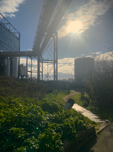
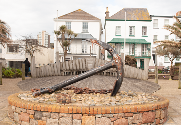
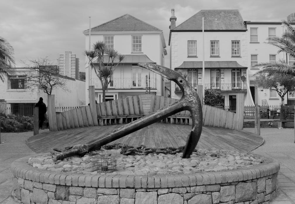
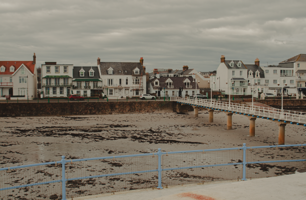
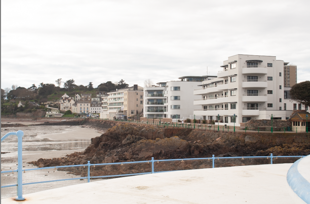
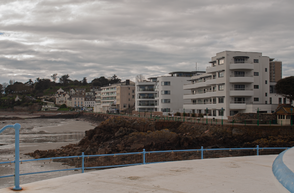
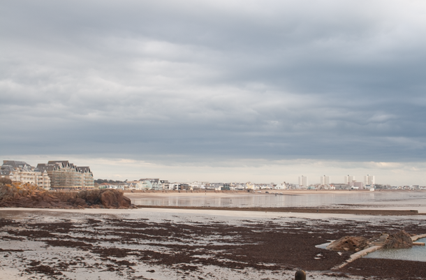
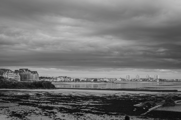
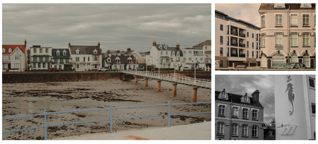
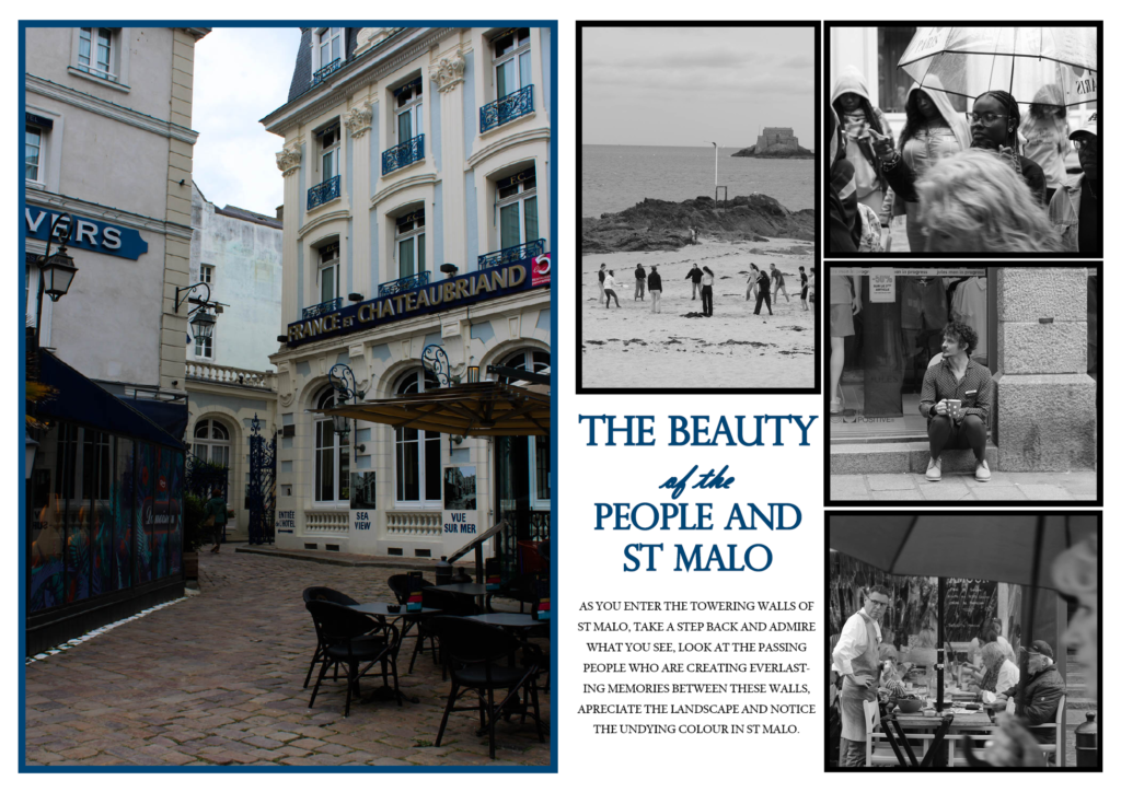
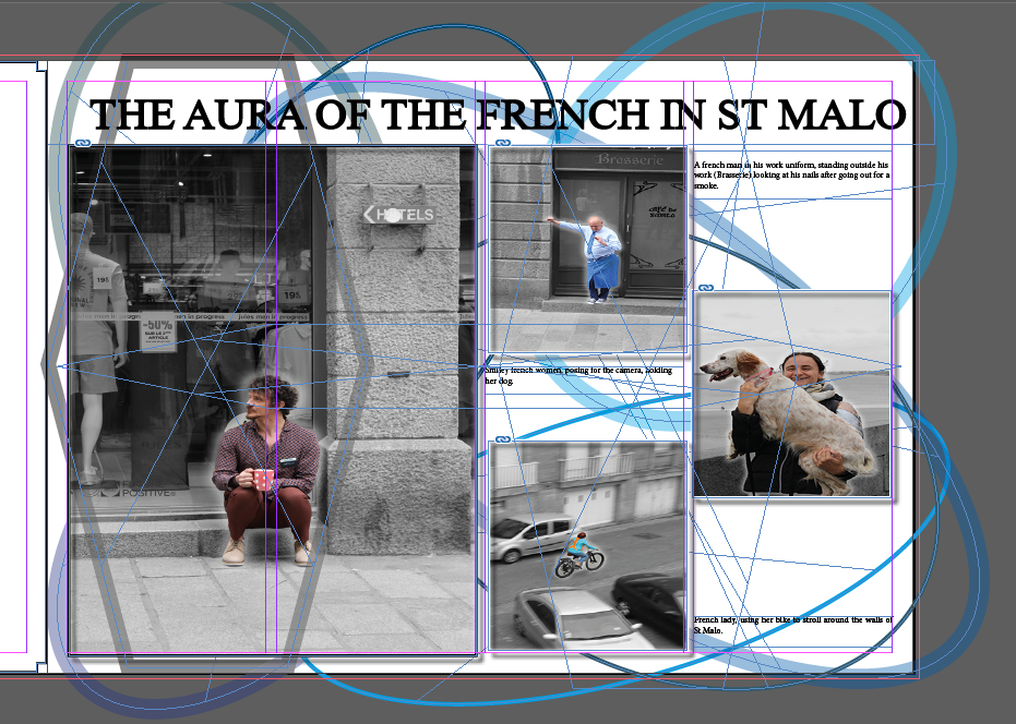
Saint-Malo is a Port City located in Brittany, in the North-West of France. its Old city is surrounded by granite walls, which you can walk around. St.Malo is a popular place for tourism with lots of restaurants, hotels and shops.
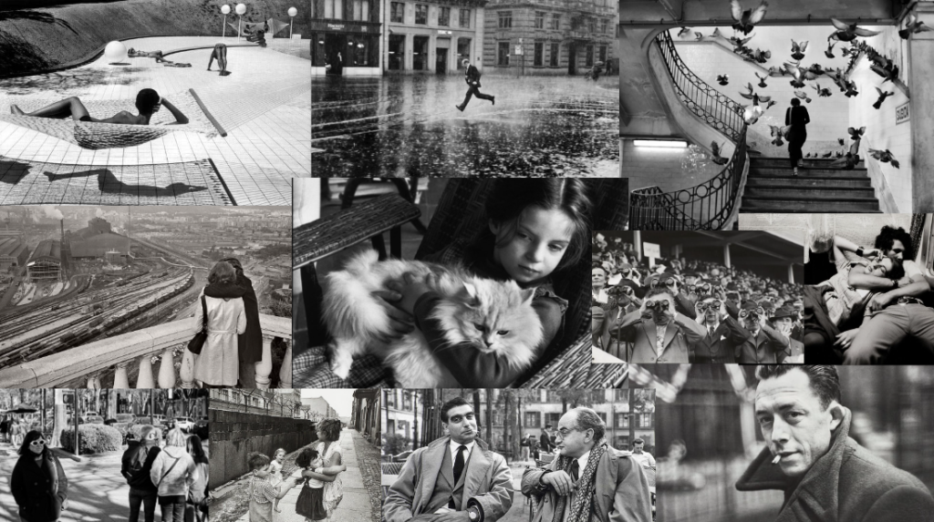
Selected photos

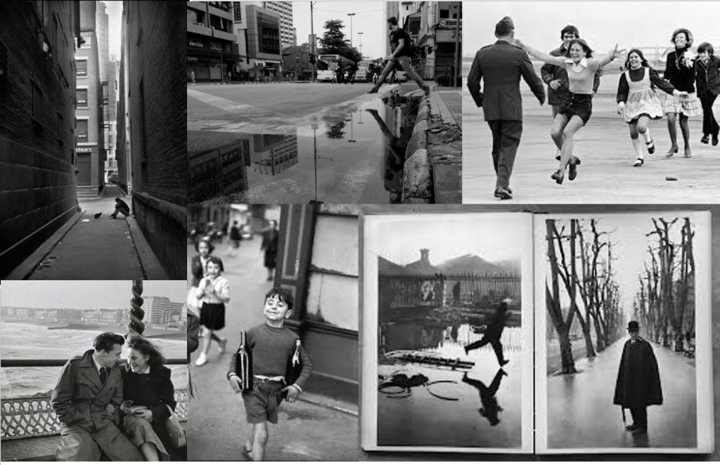
Below are the images from the photoshoot I selected based off of how good/successful I felt they are and ones that best fit the decisive moment. n.b. Some of the photos I selected may have been taken by Tama as we were taking photos together.

Edits

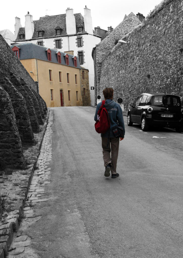
For this photo above I made the photo black and white except for the subject (Tama) and the house in the background, this makes the photo more interesting than the whole photo being in Black and white.

Edit 2

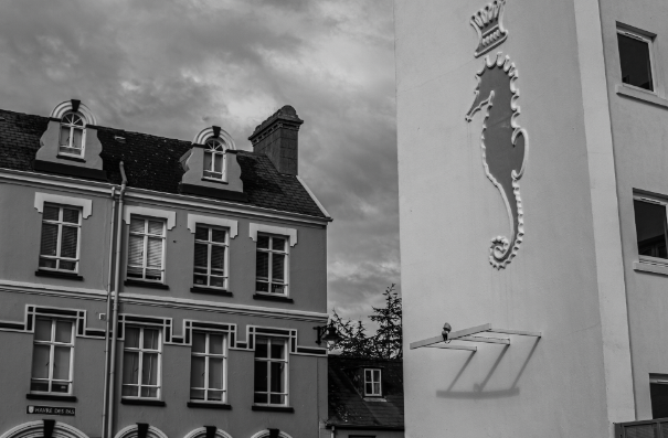
For the photo above of the man on the roof I cropped the photo to make him more lager and centred as well as applying a black and white with a higher contrast, as Henri Cartier-Bresson’s photos are in black and white and I wanted to incorporate his style. I decided to go a step further and add a Vignette which gives the photo more depth and tone and in my opinion makes the photo look a lot better.

Edit 3

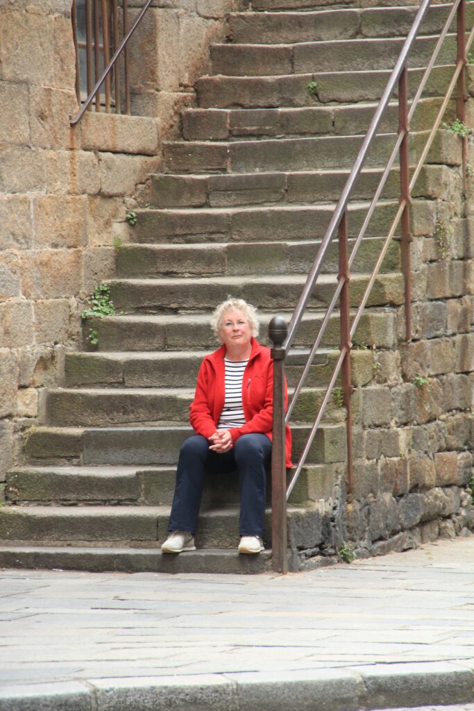
For this photo of the lady sitting on the stairs I did selective colour for the lady to make her stand out as the subject of the photo as well as providing a contrast to the whole image being in B&W, I also cropped to image to make her look closer in the photo.

Edit 4 & 5

I edited this photo of the pigeon by cropping it to make the pigeon more bigger and centred as well as making the background black and white so that the pigeon stands out. I also added a vignette which isn’t incredibly noticeable but creates depth, it works really well on black and white candid photos. I like this photo as I try and be a bit different by capturing the deceive moment for the pigeon instead of just for people.

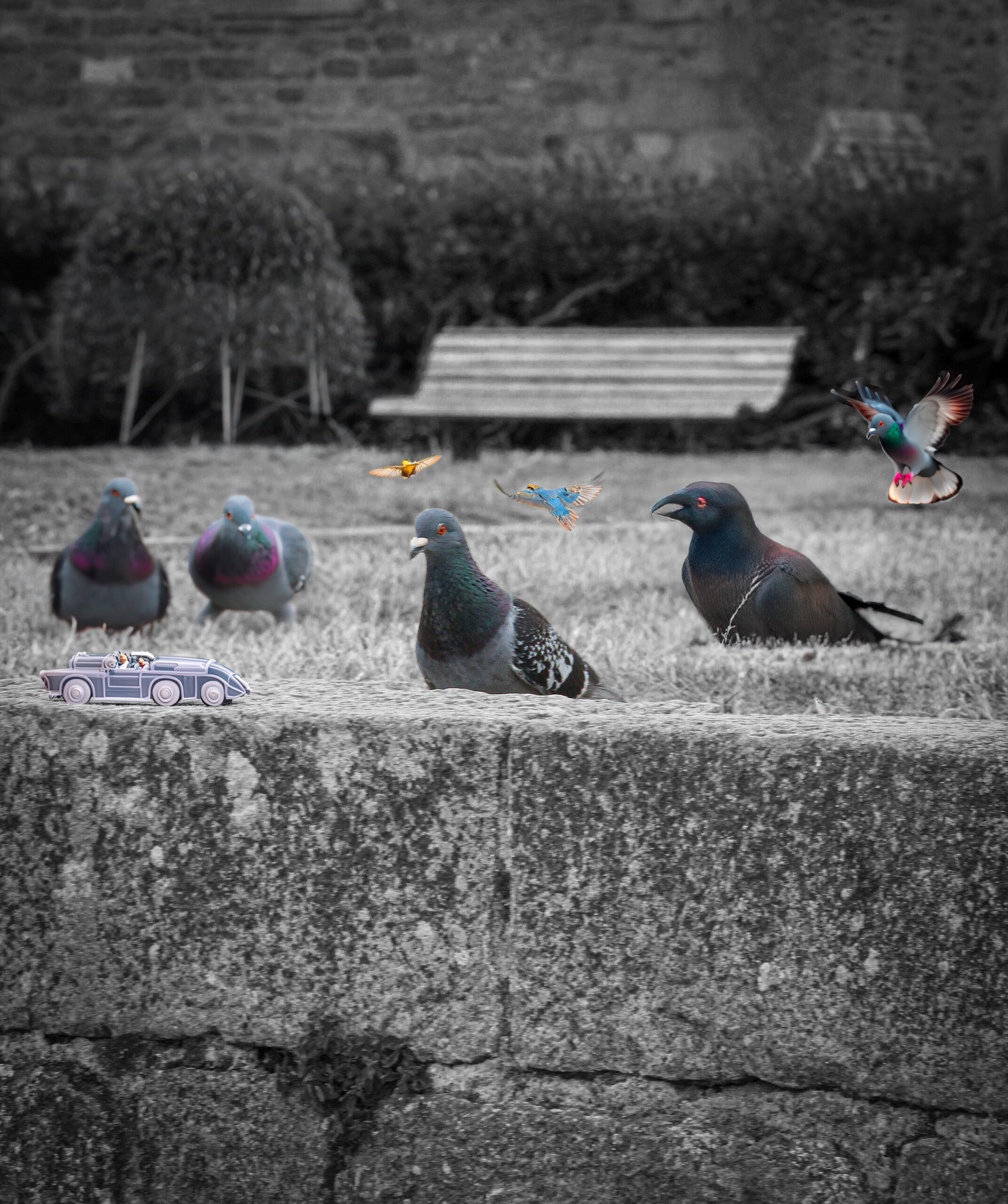
I also experimented with generative AI to add more pigeons and birds to the photo.

It makes the photo look more lively and was just a bit of creative fun.

Edit 6 & 7

In the photo above of the man looking at the parking meter I experimented with blur by adding a Gaussian Blur in the background and made it black and white. I added a vignette and lowered the saturation of the person and the parking meter to make the colours blend in with the background more.

However, I wasn’t that pleased with the previous edit and felt like it can be better as I felt it looked too overedited and messy and the man’s face was grainy due to trying to make him look sharper.

So I edited the photo again but this time I made the background a less intense Lens blur this time and made the man and parking meter in black and white as well. Now I think the photo looks better than the previous edit and more simple yet effective.

-Choosing a final image-

Out of all the edits and photos I would say this is my final image, as not only is it interesting seeing a person on the roof, but I also like the way I edited this photo with the vignette and the contrast in the photo.

This photo is also a quite similar style to Cartier-Bresson’s as the photo is candid and there is the a sort of ‘intellectual pleasure’ as Henri Cartier would have said, with the composition of the rooftops in relation to where the guy is sitting and how it lines up.

Assessment Criteria JAC

Coursework Marking Criteria
Grade Boundaries 2024

Follow the 10 Step Process and create multiple blog posts for each unit to ensure you tackle all Assessment Objectives thoroughly :

  1. Mood-board, Mind-map of ideas (AO1)definition and introduction (AO1)
  2. Statement of Intent / proposal
  3. Artist References / Case Studies (must include image analysis) (AO1)
  4. Photo-shoot Action Plan (AO3)
  5. Multiple Photoshoots + contact sheets (AO3)
  6. Image Selection, sub selection, review and refine ideas (AO2)
  7. Image Editing/ manipulation / experimentation (AO2)
  8. Presentation of final outcomes (AO4)
  9. Compare and contrast your work to your artist reference(AO1)
  10. Evaluation and Critique (AO1+AO4)

IMAGE ANALYSIS MATRIX

Picture

Image Analysis Guiding Questions

OBSERVE: Identify and note details

  • What type of image is this (photo, painting, illustration, poster, etc.)?
  • What do you notice first? Describe what else you see.
  • What’s happening in the image?
  • What people and objects are shown? How are they arranged? How do they relate to each other?
  • What is the physical setting? Is place important?
  • What, if any, words do you see?
  • Are there details that suggest the time period this image relates to? Is the creation date listed in
    the bibliographic record? If the creation date is listed, was this image created at or around the
    same time period the image relates to?
  • What other details can you see?

REFLECT: Generate and test hypotheses

  • What tools might have been used to create this image?
  • Why do you think this image was made? What might have been the creator’s purpose? What
    evidence supports your theory?
  • Why do you think the creator chose to include these particular details? What might have been
    left out of the frame?
  • Who do you think was the audience for this image?
  • What do you think the creator might have wanted the audience to think or feel? Does the
    arrangement or presentation (lighting, angle, etc.) of the details affect how the audience might
    think or feel? How?
  • What do you feel when looking at this image?
  • Does this image show clear bias? If so, towards what or whom? What evidence supports your
    conclusion?
  • What was happening during the time period this image represents? If someone made this image
    today, what would be different/the same?
  • What did you learn from examining this image? Does any new information you learned
    contradict or support your prior knowledge about the topic or theme of this image?

Lighting Studio JAC

Once you have been instructed on how to use the lighting studio safely and respectfully, you will be able to use the studio during lesson times or in study periods. You must book the facility in advance via one of your teachers JAC / MM / MVT / CMK

You must always leave the studio in a clean and tidy, safe manner. All equipment must be switched off and packed away. Any damage must be reported and logged.

Studio lighting setup - Arch Viz Camp
Typical studio set up with infinity screen back-drop

Types of lighting available

  • Continous lighting (spot / flood)
  • Flash head
  • Soft box
  • Reflectors and coloured gels
Image result for single point lighting portrait effects
Chiarascuro effects and single point lighting
Image result for 2 point lighting studio diagram

Still Life Photography and using the product table / copy stand

Image result for manfrotto product table photography
Product table set-up, with back light and infinity screen

Still-life Studio Shoot:

You can choose to photograph each object individually or group together several objects for a more complex still life arrangements.

Technical stuff

Continuous Lights – photograph objects three dimensionally

Camera setting: Manual Mode
ISO: 100
White Balance: Daylight
Aperture: F/16
Shutter: 0.5 sec to 0.8 sec (depending on reflection of each object)
Lights in room must be switched off to avoid reflections

Continuous Lights – portrait

Camera setting: Manual Mode
ISO: 100
White Balance: Daylight Shutter Speed 1/125 sec Aperture f/16

Flash Lights – photograph images, documents, books, newspapers, etc or portraits

Camera setting: Manual Mode
ISO: 100
White Balance: Daylight
Aperture: F/16
Shutter: 1/125-1/200 (depending on reflection of each object)
Flash heads set to power output: 2.0
Use pilot light for focusing

PORTRAITS

Camera settings (flash lighting)
Tripod: optional
Use transmitter on hotshoe
White balance: daylight (5000K)
ISO: 100
Exposure: Manual 1/125 shutter-speed > f/16 aperture
– check settings before shooting
Focal lenght: 105mm portrait lens

Camera settings (continuous lighting)
Tripod: recommended to avoid camera shake
Manual exposure mode
White balance: tungsten light (3200K)
ISO: 400-1600 – depending on how many light sources
Exposure: Manual 1/60-1/125 shutter-speed > f/4-f/8 aperture
– check settings before shooting
Focal length: 50mm portrait lens

RESOURCE LINK HERE

ELINCHROM LIGHTS GUIDE HERE

ANTHROPOCENE PHOTOSHOOT PLAN

1st Photoshoot Plan:

For my first photoshoot I am going to go to the beach, still don’t know what beach though, most likely frigate. I am going to take photos of the sea when is high tide and when its low tide. I’m also going to takes three different pictures but all in the same place but just different angles just like Michael Marten did because I found it more interesting. These are the photoshoots Michael Marten inspired me to copy.

2nd Photoshoot Plan:

For my second photoshoot I am going to take photos of bunkers and abandoned places all inspired by Yves Marchand & Romain Meffre. These are the photoshoots that inspired me to copy Yves Marchand & Romain Meffre.

HAVRE DE PA PHOTOSHOOT

These are the photoshoots I took at Harve de pa.

best images:

I love the way they came out looks so aesthetic. I tried not to make the images that light and bright because I feel like it looks better with less light but bit more detail. My favourite one is probably the last one, the one with the sea horse because I like the way it is set and how it’s black and white. You can also see nice shades of black and white which makes the image more interesting.

Henri Cartier-Bresson seek, observe, challenge

How does Henri Cartier-Bresson view the activity of photography?

Henri Cartier-Bresson once said “for me the camera is a sketch book, an instrument of intuition and spontaneity, the master of the instant which, in visual terms, questions and decides simultaneously… It is by economy of means that one arrives at simplicity of expression” basically meaning that creating a great “decisive moment” in photography is to combine your head (intellectual abilities), your eye (vision), and heart (emotions) on the “same axis”.

‘Decisive moment’

‘Biography’

Henri Cartier-Bresson (French, born August 22, 1908–died August 3, 2004) turned into an influential artist and photographer of the 20th century. Considered an early pioneer of photojournalism, Cartier-Bresson commenced his creative profession analysing portray with André Lhote. He took his first pix whilst he travelled to Africa in 1931, and he persisted with this medium upon returning to Europe. Cartier-Bresson`s pix had been posted the subsequent 12 months in Arts et Metiers Graphiques. The next years introduced the photographer`s exhibitions to Spain, Mexico, and the United States. While in New York, he studied the artwork of movement pictures, and later assisted the director Jean Renoir with Partie de Campagne, a brief movie taken into consideration exemplary of Impressionist cinema. In 1937, Cartier-Bresson directed a documentary on healthcare in Spain, and photographed the coronation of Great Britain`s George VI. His travels and topics once in a while introduced undesirable attention, inclusive of whilst he turned into incarcerated in Nazi Germany in 1940, at the same time as serving within side the French army. Escaping on his 0.33 attempt, he later blanketed the liberation of France, and filmed a documentary on battle reparations. Many within side the United States believed him to have perished within side the battle, so Cartier-Bresson travelled to New York in 1946 to open an exhibition at The Museum of Modern Art. The following 12 months, he hooked up Magnum Photos, a photographer-owned cooperative, with Robert Capa, David Seymour, William Vandivert, and George Rodger. The following years determined the photographer within side the Far East, protecting the demise of Ghandi, the upward thrust of Communist China, and the Indonesian independence movement. Cartier-Bresson spent maximum of the Nineteen Fifties lower back in Europe publishing books of his photographic essays. The subsequent decade, however, supplied many extra tour opportunities, consisting of visits to Fidel Castro`s Cuba, Japan, and the United States. While in America, he directed documentaries for CBS News. In 1975, he gave up pictures to go back to portray. His photographic legacy is summarized via way of means of his very own book, Images à los Angeles Sauvette, or The Decisive Moment. Cartier-Bresson`s capacity to seize the cut up 2nd whilst a choice turned into made or whilst a direction turned into reversed introduced energy to his pictures, a energy many succeeding generations of photographer nevertheless are seeking to re-create. The artist died on August 3, 2004.

‘Camera & Lens’

His technique: Henri Cartier-Bresson almost exclusively used Leica 35 mm rangefinder cameras equipped with normal 50 mm lenses or occasionally a wide-angle for landscapes. He often wrapped black tape around the camera’s chrome body to make it less conspicuous.

‘Photo Analysis’

Henri Cartier-Bresson photo analysis

In this photo you can see that the railings, even the pigeon, are locking into the reciprocals and the women in the middle are on the baroque diagonal. He’s capturing all of the repeating verticals of the railings which also helps with depth. But the hard part, and one that takes a bit of thinking, is to capture the diagonals. Here we can see he’s repeating three diagonals. The middle diagonal, with the line of women, is the exact line of direction (even though some of the women can be found on the baroque diagonal). He’s even got a few coincidences where he planned to press the shutter button. The one that impresses me the most is the one that comes down from the top middle and coincides with the woman standing and the railing.

Henri Cartier Bresson

Introduction

Henri Cartier Bresson was born into a wealthy family in France and was introduced to forms of art at an early age. At first Bresson was drawn to painting, however once discovering photography he developed a larger passion for taking photographs. He viewed photography as an extension of drawing, as well as an extension of his eye.

Bresson felt as if a camera enabled him to connect with the world and in his earlier years he travelled extensively, visiting places from Europe to Africa, this enabled him to connect with the world and absorb various cultures.

Bresson captured the movement of people through the world. He was a humanist photographer who is often described as a master of candid photography, where the subject is often unaware the photo is being taken and they are not posing. Bresson looks for the perfect moment using his heart to find things which connect humanity. He described his approach to photography as hunting as he was constantly looking and waiting for the perfect moment to capture, like an animal searching for prey.

His camera:

Henri Cartier Bresson was known for using a Leica rangefinder with a 50mm lens. Leica rangefinders were seen as a revolutionary tool, especially during Bresson’s time, and they were a huge step forward in the world of photography. These cameras were compact, reliable, and their design was more discreet compared to the other larger cameras of this era, this meant they were a great tool for Bresson as it enabled him to take more photos without the subject being aware. These cameras were an essential development for street photography as they had a quick and unobtrusive shooting style. Another reason why Bresson favoured the Leica rangefinder is due to their stealthy nature.

The Decisive Moment:

The Decisive Moment (Images à la Sauvette in French) is one of the greatest photography books ever published. It brings together photographs from the first twenty years of Henri Cartier-Bresson’s career. The book was published in 1952 by Verve, with an original cover by Matisse. It was the result of a collaboration between the photographer, the famous art critic and publisher Tériade, and the painter, at the peak of his career. The American version, published the same year by Simon and Schuster, was the first to introduce the now-famous expression “decisive moment.” It reveals the intrinsic duality of Henri Cartier-Bresson’s work, the combination of intimate interpretation with documentary observation, received tremendous critical acclaim within the art world and is considered a “bible for photographers,” in the words of photographer Robert Capa. It remains an essential reference for photographers to this day. The original book, now out of print, has become a collector’s item. Henri Cartier-Bresson aimed to make this classic photography book accessible again, in a smaller and practical format, at an affordable price.

Analysis:

This black and white image by Henri Cartier Bresson contains leading lines which guide the viewers eyes to the figure who is jumping. The silhouette of the figure in the reflection in the puddle creates a sense of balance with the tower that is in the background as they are in opposite corners and almost symmetrical. The outer frame contains a negative space which allows the detail within the inner frame to have space to breath.

Evaluation and presentation of final Picture story

Reflect on your final design ideas and explain in some detail how well you realised your intentions and reflect on what you learned/ What could you improve? How?

Picture story 1:

After editing all the images seen above, I realised exactly what I wanted to do for my first picture story. I really liked the blue in the right picture so I knew that I had to have blue and I also liked the images that I produced in black and white so I also knew that black and white had to be included in my picture story. I learned that boarders make the picture story look better so I applied this realisation towards all of my picture stories. I realised that I had produced many pictures of people and landscapes of St Malo, so I knew that for this picture story I wanted to include loads of people and little landscapes as I thought that St Malo was about the people. However making the landscape in blue meant that even though it was the only picture in this picture story that had no people, the colour attracted attention towards the image. The title was definitely my highest point. I really loved the contrast of fonts in the title and I think that it look perfect. However I think that the placements of images, especially the ones in the left, could have been better and more spaced out. The picture story could have been more colourful to attract even more attention. Like putting the boarders around images as the colours of the french flag.

Picture story 2:

In all honesty, I don’t really liked this final product. The random shapes and colours make it look quite tacky and strange. My intention towards this paper story was to make it as colourful as possible to show how bright and important the French are, hence the title. I wanted to have the images in colour with the people highlighted to highlight the ‘aura’ they have. However I think it looks quite random and boring. Although I like how colourful the picture story is, I don’t like the different colours. I feel like if I had used different shades of the same colour like pink, and placed the shapes more strategically, the picture story would have looked bette. However I do like the contrast between the people being selected in colour and the background being black and white. It looks really unique. I learnt that I should have taken more time and patience towards this picture story so that it would reach the potential it had.

Picture story 3:

For this picture story, I realised that most of the images I produced for this picture story, had brown tones, so I knew that I wanted to make a picture story that had a brown theme. However I soon realised that I shouldn’t have decided a brown theme as the two photos on the bottom had nothing to do with brown so those two images look quite random and out of place. I should’ve looked for images that had brown tones or brown obstacles. I definitely knew that I wanted to make the title brown and French so I did and I really liked the outcome. It makes it ‘authentic’. The two images above were one of my favourite images I produced and edited. I loved the tones and aesthetic of the images. I loved everything about it. This picture story would have been perfect if I had all the images in it with a brown theme. I do like this picture story but I think that this picture story could’ve had many improvements.

Evaluation:

Overall, I’m satisfied with my final picture stories. My images are high quality and edited nicely. I also think that I had good concepts and ideas towards my picture stories.

In summary, my picture stories has many improvements to overcome, improvements that I need to take into consideration in the future. My picture stories could’ve been more creative and out of the box and so could’ve my titles. I think that my second and third picture story, specifically, lacked creativity. I need to incorporate different styles and techniques like cropping and maybe presenting the images differently, like formatting the images into shapes.

However, I think that when it comes to simplicity, I was really good at doing that even though it is something that I need to change. I feel like the simplicity of my picture stories make them quite firm and willing so I have to admit that I am satisfied with that.

Lastly, I should have thought better about my picture stories, I should’ve planned them better and I should’ve made sure that I knew exactly what I was doing and what I was intending to do. Having this certainty, would mean that I would be more confident and maybe even more creative as I would have more time to create a plan of what I really wanted to do, especially in creativity terms.

5. Experimentation- picture stories

Experimentation 1, 2,3,4 and 5 of picture story 1 :

1: in this experiment, I layered a bunch of different shapes with a various of shades of blue, thickness and opacity and although I liked the blue, I found it overwhelming therefore started to add different shades and colours. I also didn’t really like how the shaped overlapped the images, so this was rejected. I stuck with the title throughout the whole of the experiment because I really liked it.

2: For this experiment, I stayed with the blue shapes and didn’t change much from the first experiment however decided to add a black shape but immediately disliked it.

3: I started to find what I actually wanted to create with this picture story, in this experiment. I played with different colours like pink and grey and also played with the opacity and thickness. I liked how colourful it was getting and realised that I wanted to make it colourful so I carried on with the experimentation with colours.

4: Now her was where I was really having fun with the colours, I liked the contrast between the feminine colours and masculine colours and the different shapes. However I still did not like how the shapes were overlapping the images so thus was rejected.

5: This was my final product. I had finally figured that the coloured shapes would stay as the background and the pictures would overlap the shapes. I also decided to ass some shading and frames that coordinated with the images to enhance the images and really highlight the title in the mention of ‘aura’

Experimentation of picture story 2 (didn’t really experiment as I just went with the flow and liked the end products so kept it like that)I did however, play with the colours of the outlines of the photo frames. I debated wether the left side should be black and the right side all blue, however my main picture had lost of blue, so I put the larger frame on the left as blue to form a correlation between the image and frames. I also played with the thickness of the title especially the part where is is cursive. I thought the cursive words gave it a ‘Chique’ tone to it:

Experimentation 1 and 2 from the 3rd picture story :

1: with this experimentation, I played with the title in terms of size and font. I really liked the font and the size of it, especially the thickness and as seen on further blog posts, this ends up being my final product. I noticed that lots of my images in this picture story had brown in it so decided that I would put the frames for the image in brown.

2: in this experimentation, I changed the thickness and font of the title to see if it gave it a more rustic look to it however, I did not like the look that the font made the picture story look like. It made it look like really messy and childish, therefore it was rejected.

Final Images

For my final images I went for Black and White as the main theme. I chose this because of the structures I was taking photos of were mainly old and looked best in black and white.

Decisive Moment

For these pictures I chose to put filters over them and selected the thing that stood out the most in each image (people) and I kept them in colour so there was a nice contrast of dark filters and a pop of colour.