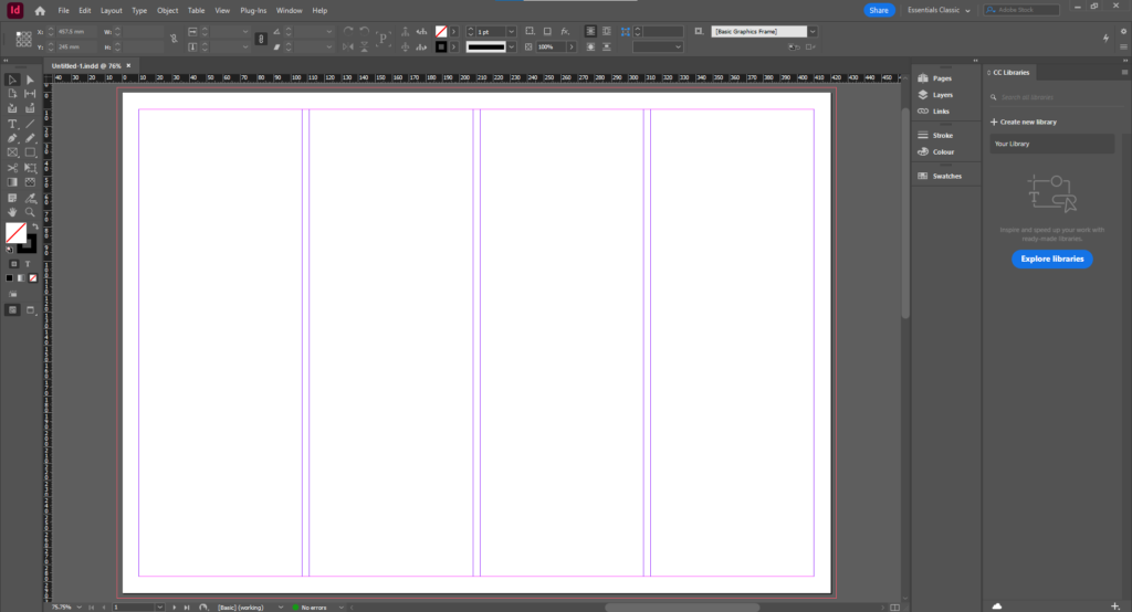
Experimenting with layout of images
With a photo used as texture as the background:
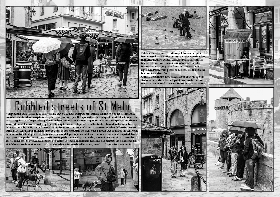
Layout with a title and placeholder text:
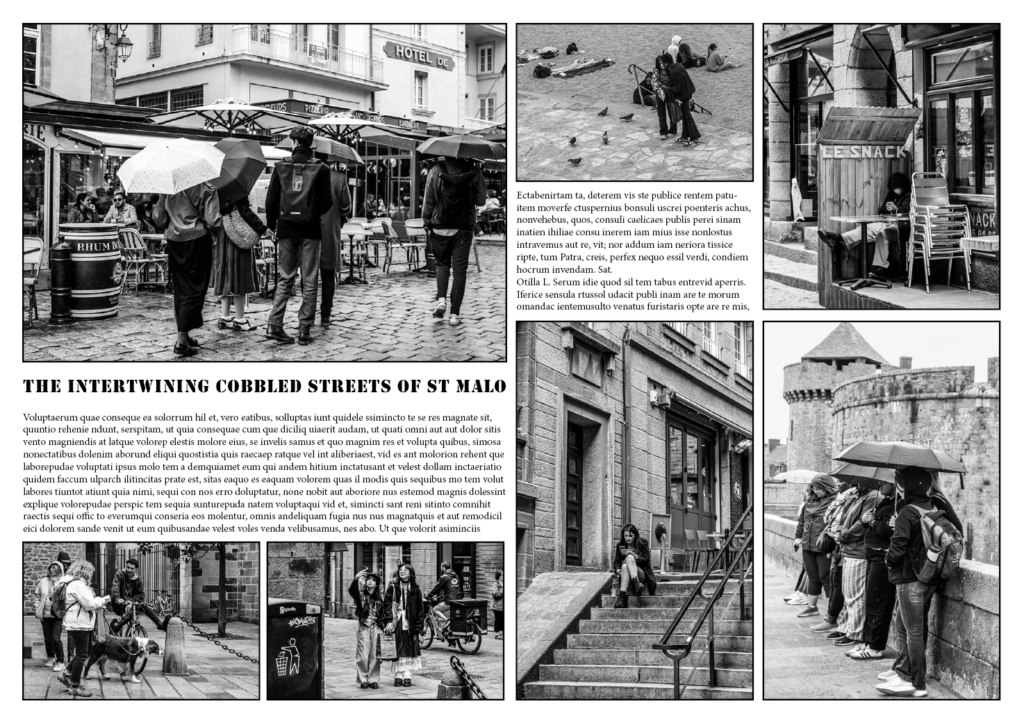


With a photo used as texture as the background:

Layout with a title and placeholder text:


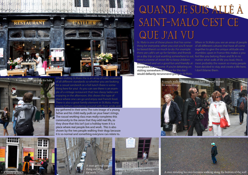

Picture stories are meant to show a story through pictures and not actually the words therefore the writing shouldn’t really be a source to rely on, the naked eye should be attracted to the picture, figure out which photo is the main source of information.


here are some samplers of picture stories, these examples looks very differed from one another as they all have different stories behind them, they all represent a different meaning. Each one has a different colour that can symbolise different things such as emotions, a countries flag colours and what colour makes there chosen photos to stand out. I really like the black and white photos with a brown and yellow background, it has a strong powerful meaning and really helps to engage the viewers eyes onto those photos. I don’t really like the stories that have many different colours and shapes in the background as it distracts the viewers attention away from the photos, it make the photo look less important. However some could view it as the colours attract the naked eye towards the photos, makes them look noticeable especially if they are in black and white as there isn’t any other colours to direct the eye towards.
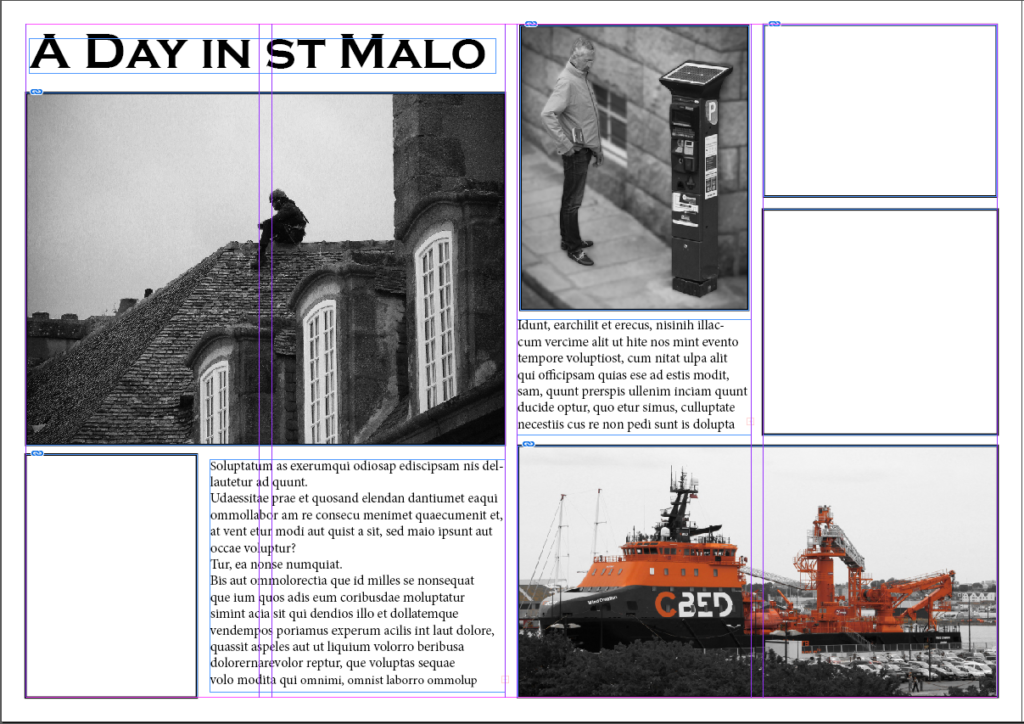
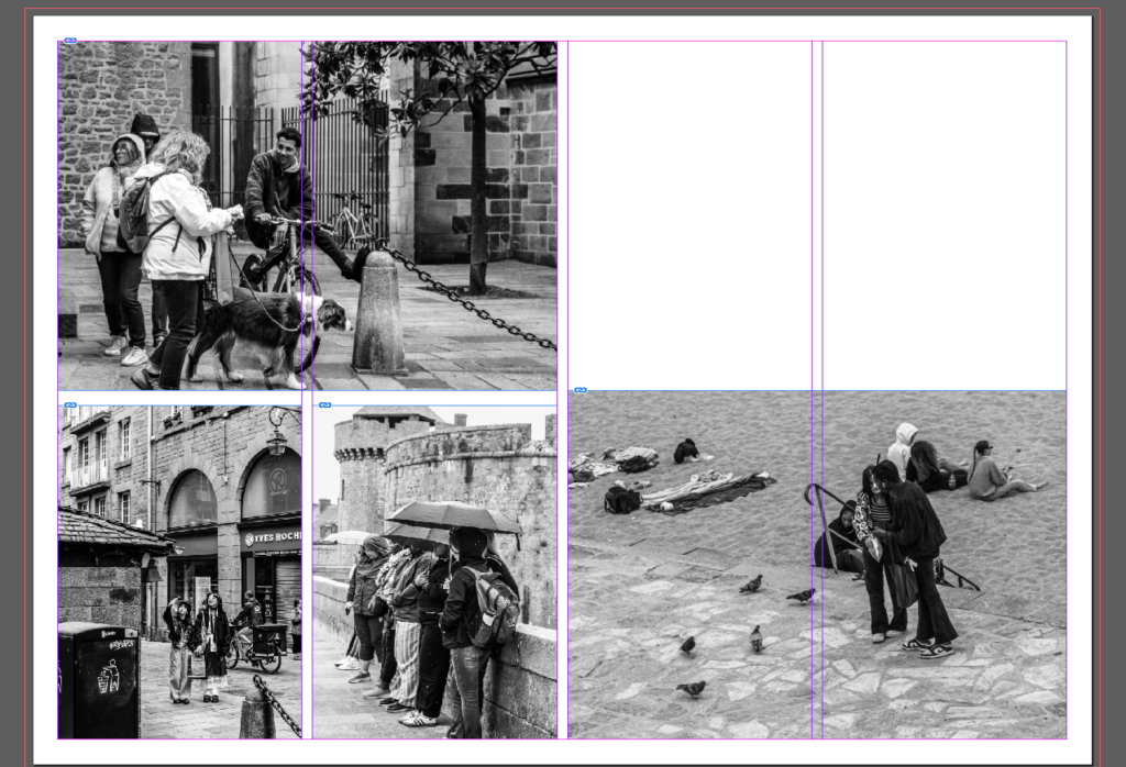
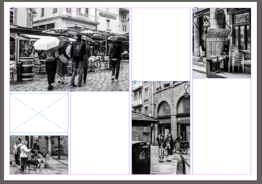
First I started by creating the layout for my spread by using placeholder text for the text areas as well as starting to fill in the images such as the establishing shots. I also created the Headline and chose an appropriate font for it.
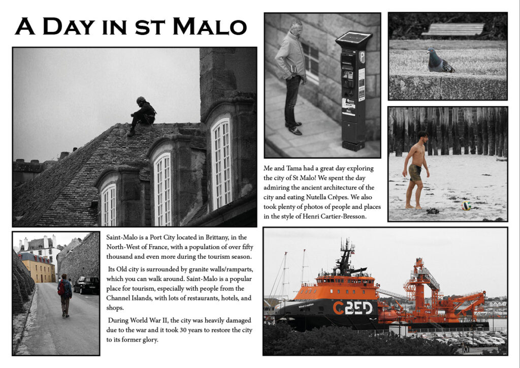
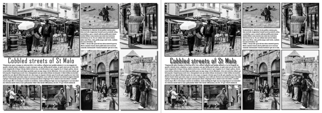
For this I added the text in and the photos. I might change some of the photos to see if I can improve. but for now I’m going to experiment with the background.
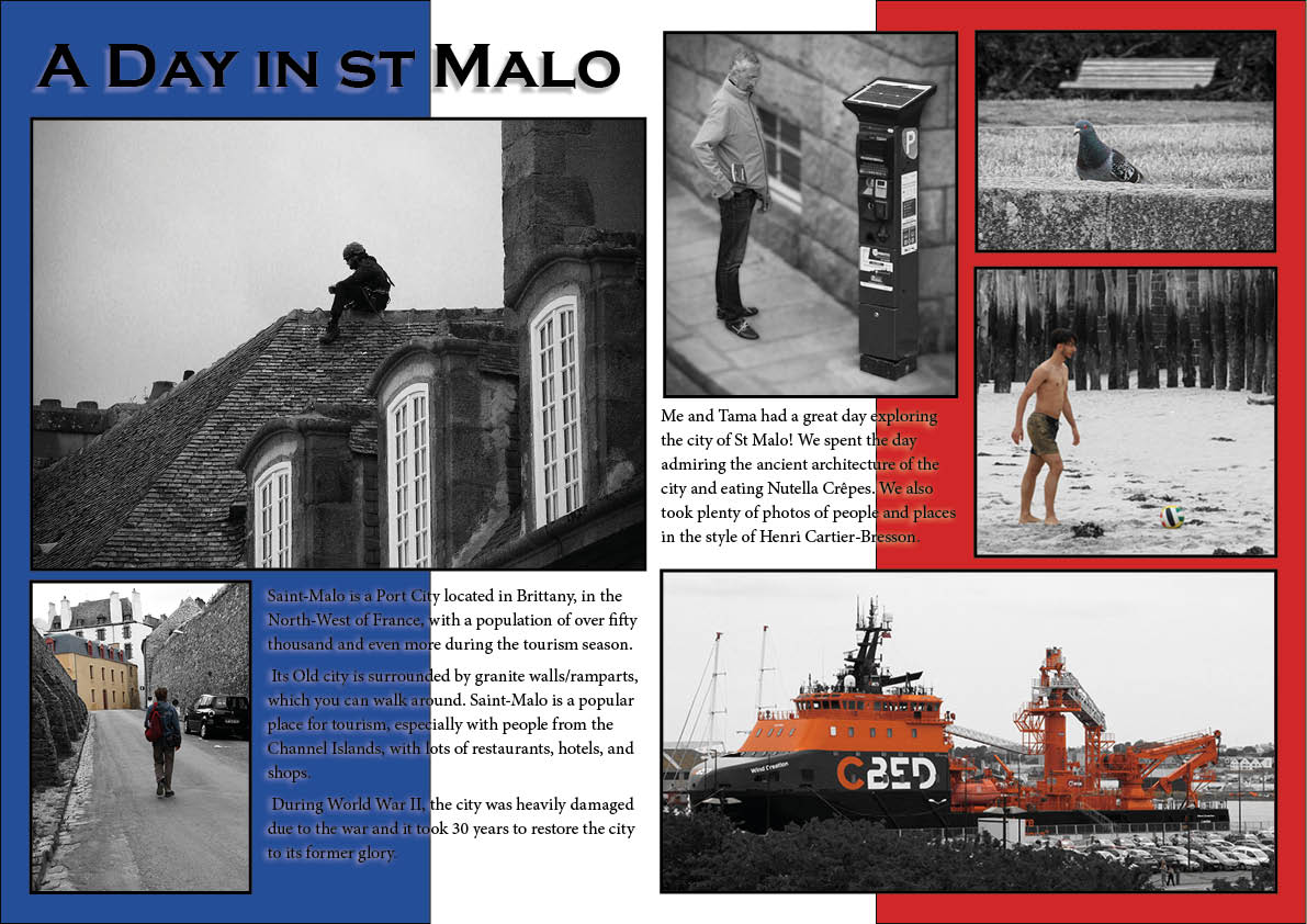
For this one I experimented by making the background the French flag as St. Malo is located in France. I did this because I wanted to experiment with having a simple colour background instead of an image which I will try doing next.
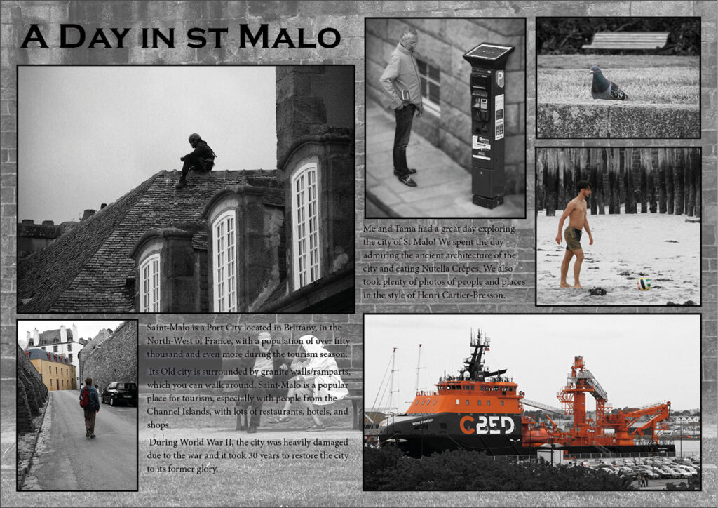
for this I got one of the photos and put it as the background. The text was hard to read because the background is also in black and white but I lowered the transparency a bit and it looks better and makes the text a bit easier to read.
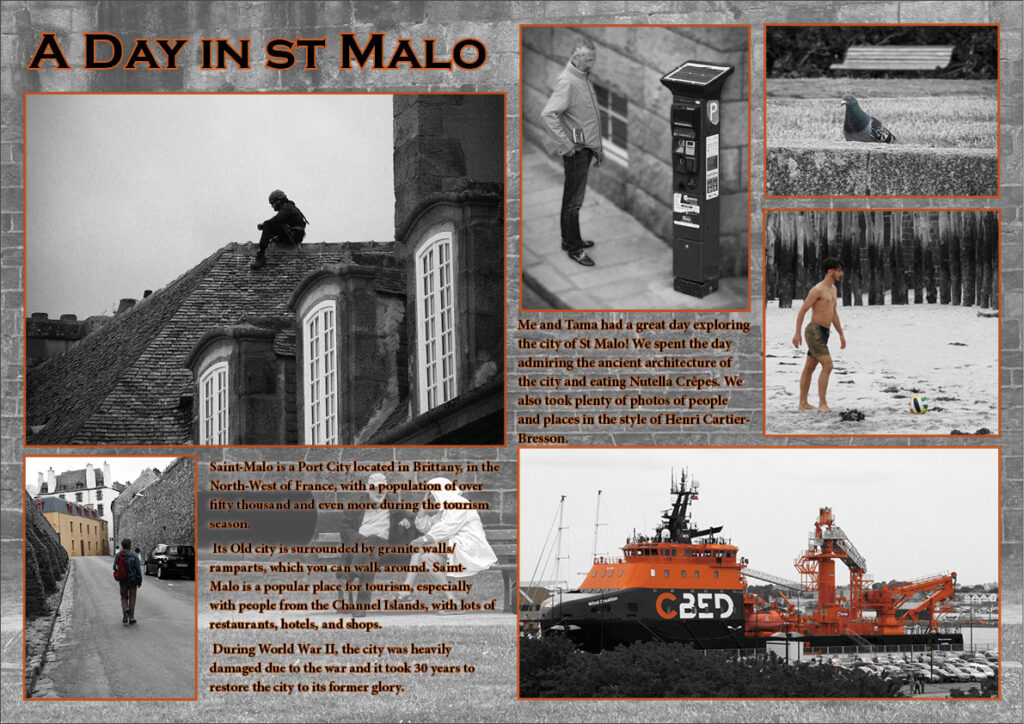
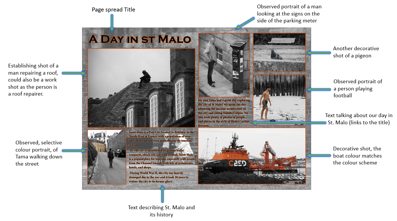
I wanted to experiment with adding colour, so I took the orange colour from the boat in the bottom left and used it as part of the colour scheme.
I stared by adding a small orange text stroke to the text and then went a step further by changing the frame/boarder around my photos to the orange colour as well. Overall I am pleased with how it turned out.
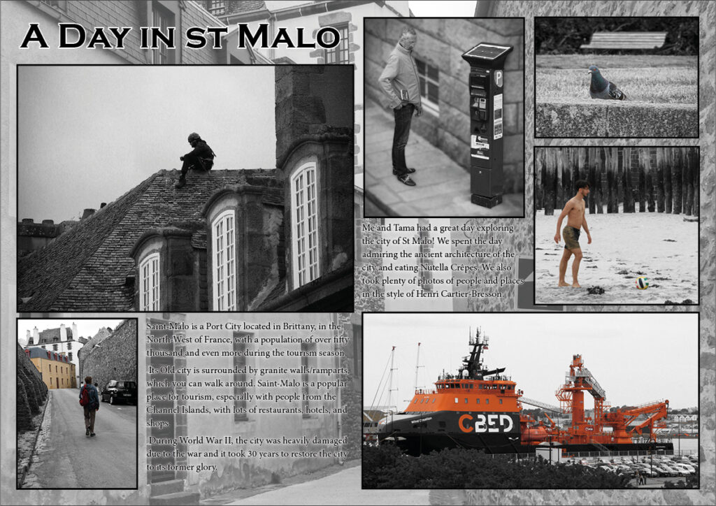
For this version I changed the photo to one of a street in St. Malo I took.
Personally I prefer the previous image as this one of the street doesn’t look as good because the stone texture in the previous version looks better as the background on my page spread, compared to this photo as the background.
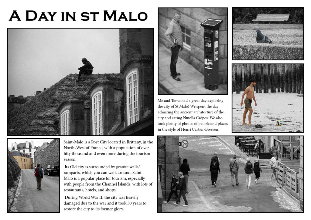
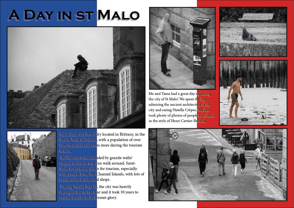

Out of all the designs I feel like these ones are the best outcomes. I replaced the image of the boat on the first two page spreads to make it fit the theme of the images and designs. Overall I am really happy with how it all turned out.
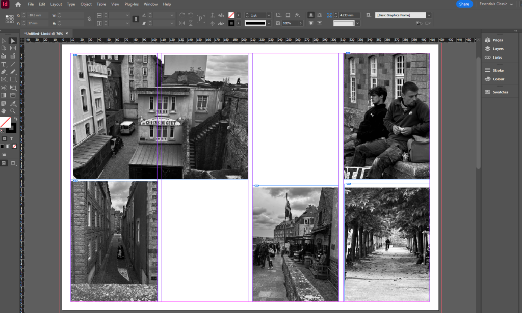
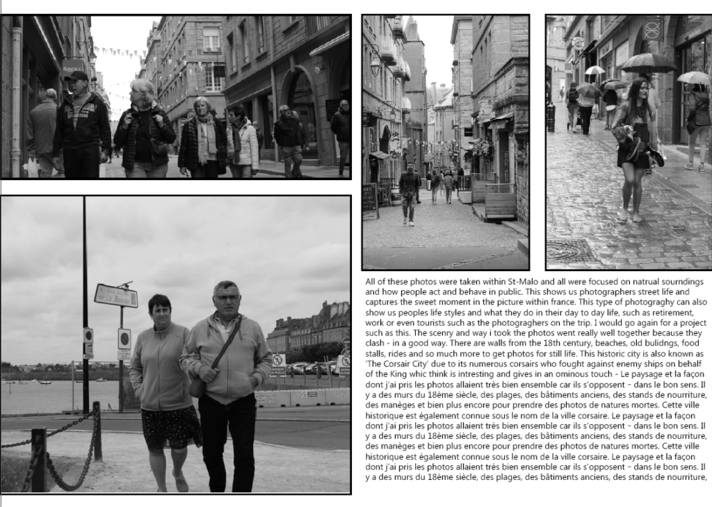
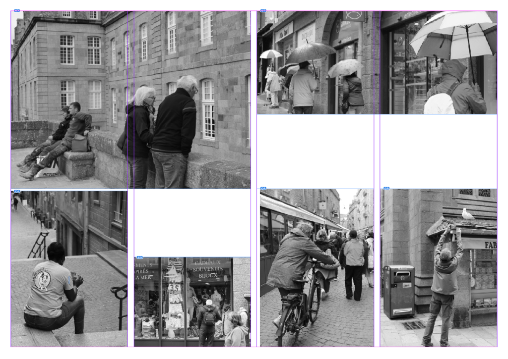
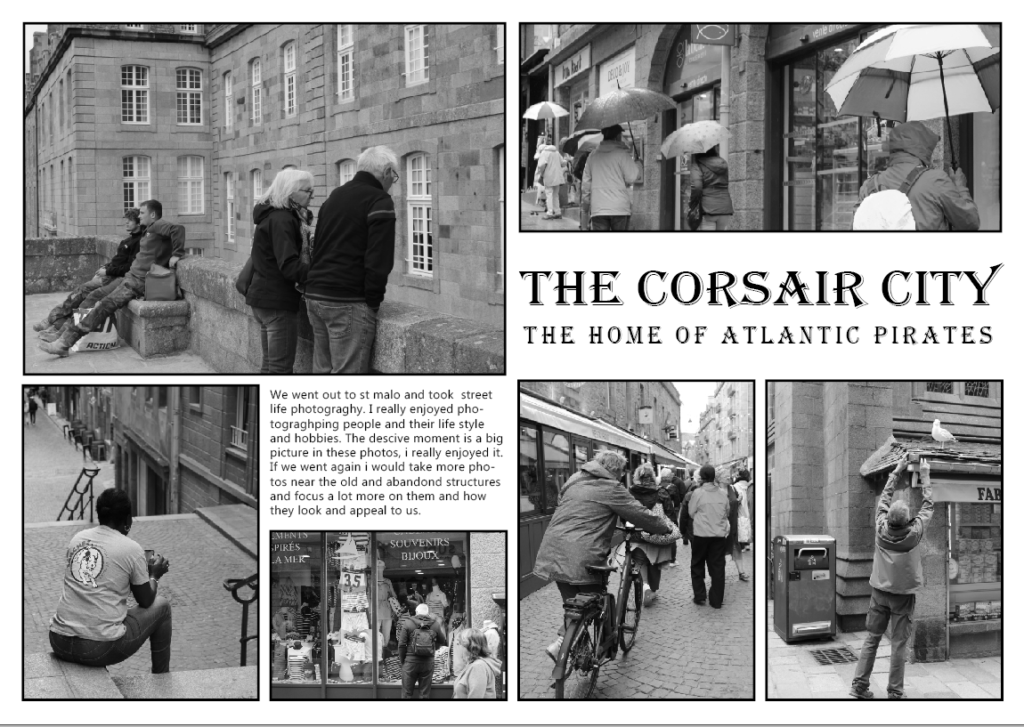
I used the tool to create a box where I then added the photos I wanted to use from my St Malo photoshoot in the areas of the page I wanted them to be. I used photos that link together and tried to use photos that were different kinds of shots like establishing shots and observed shots.
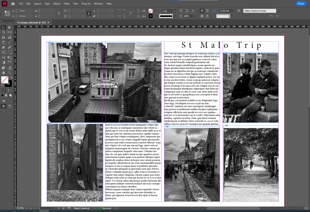
I then added a text box to the top right hand corner of the page layout and added a title, I then changed the font of the title to make it fit the way I wanted the page layout to look. After this I added a text box in the spaces I wanted to leave blank and filled them in with text.
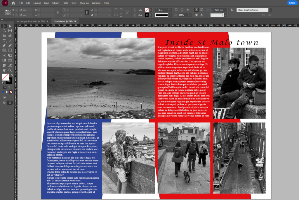
I then did the same thing with a different set of images that told a different story and then created a title and filled in the blank spaces with text. I then wanted to get some colour in the background of the page spread so created a box and filled it with the colour I wanted and clicked move to background so the colour was behind the text and the images. I then changed the colour of the text to white so that it stood out more.
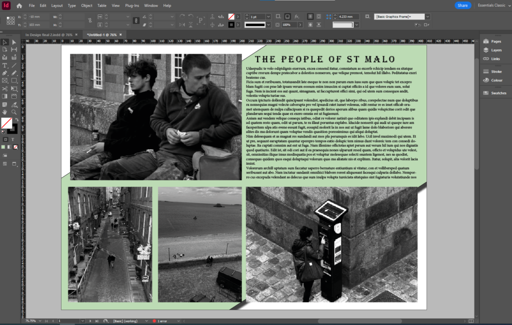
With this page layout I added a different set of images and then added a blank box and filled it in with a light green to put in the background of the page to make the writing stand out more.
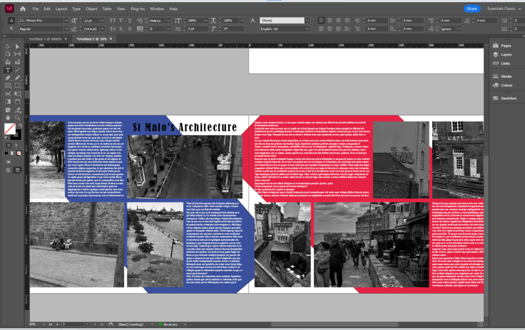
This is my double page spread and I added two sets of images for each page and added text to both pages. After I added a blue colour box and sent it to the back and then added a red colour box on the other page and sent that to the back as well. I then changed the colour of the text to white to make the writing stand out.
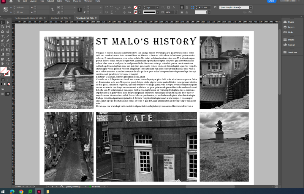
This is another layout of my images showcasing the history of St Malo from the statues and sculptures to the historic buildings and cafes.
Evaluation
I like my final page spreads because they are all different are unique and tell a different story each time. I think that to improve them I would of added my own text about the decisive moment rather than use the prompt text. The page spread with the red and blue boxes in the background is my favourite because it emphasises the writing and the photos a lot clearer.
Mood board


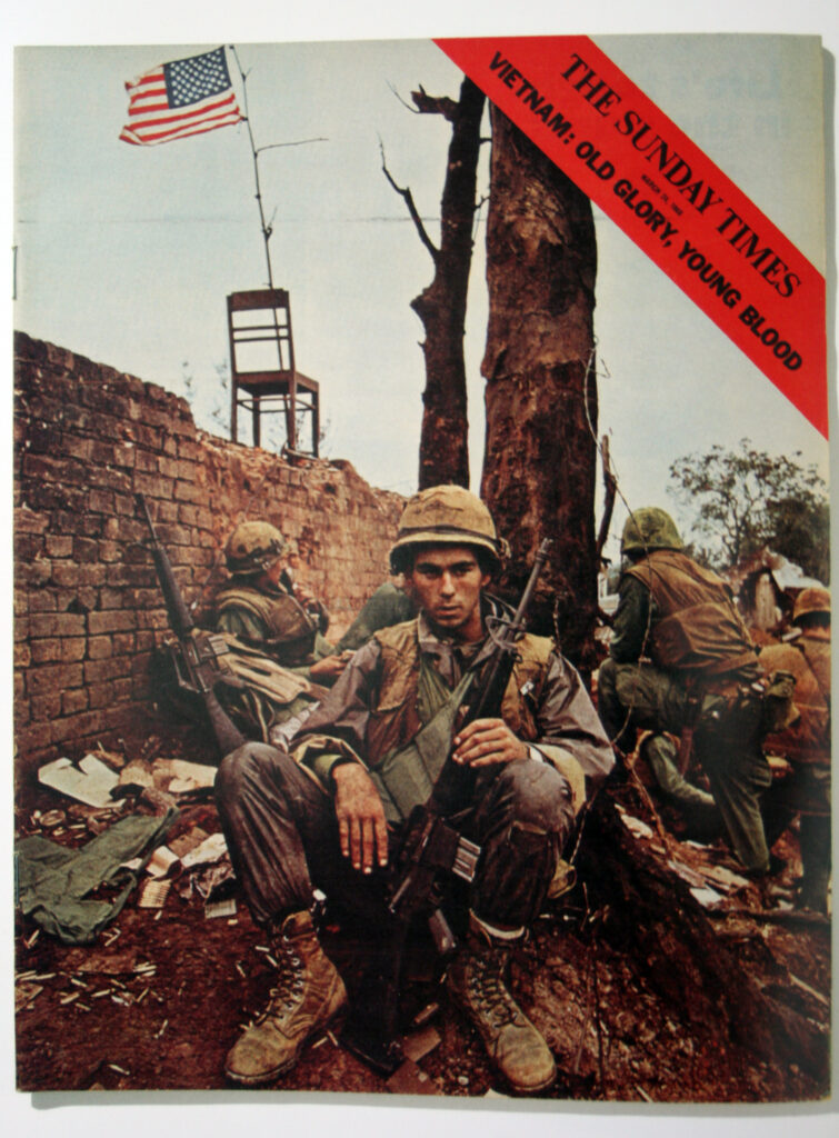


These picture stories are all related to the Vietnam war and the war in Budapest. These picture stories show a lot of information about these events and describe what happened from these tragic photos.
Types of photos used in picture stories
Analysis of Picture story

In this photo page spread there are four different photos and you can see that there is a few detail shots which have been taken close up and show clearly what is happening. There is a relationship shot at the bottom right hand corner which shows a man and a woman walking along the street after the war that has just broken out in the street. Most of the photos that have been taken are observed shots and have been captured when no one knew they were being photographed there were no formal shots of anyone in the photos. The establishing shot is the largest photo at the top of the page which shows what is going on in the series of photos.

What is the Rohingya Experience?
The Rohingya Experience, is a photographic exhibition offering an intimate view into the lives and experiences of the Rohingya refugee community in Cox’s Bazar, Bangladesh. this exhibition marked its European premiere in Jersey. The exhibition shines a testament into the resilience and dignity of the Rohingya people, demonstrating the transformative power of photography. This powerful medium gives voice to the stateless, offers a platform for visual storytelling, and provides a glimpse into life in the world’s largest refugee camp through the eyes of Rohingya youth.
Where did the exhibition take place?
The exhibition took place around St Helier here is a map of where it was:

Photographs from the exhibition


Street photography is a genre of photography that records everyday life in a public place. The very publicness of the setting enables the photographer to take candid pictures of strangers, often without their knowledge. Street photographers do not necessarily have a social purpose in mind, but they prefer to isolate and capture moments which might otherwise go unnoticed.
Does there have to be a ‘street’?
No. The term is both limiting and misleading. Sounds like a street photography should be photos of a streets, however its all about capturing a moment. All street photographers, except for a small number of absolute beginners, will fully appreciate that a street is not the key component to street photography, and actually if it’s a picture of a street with maybe a few boring people doing nothing of interest, that’s not street photography, that’s a snapshot of a street.
Mood Board

Virtual Gallery

I done this on photoshop
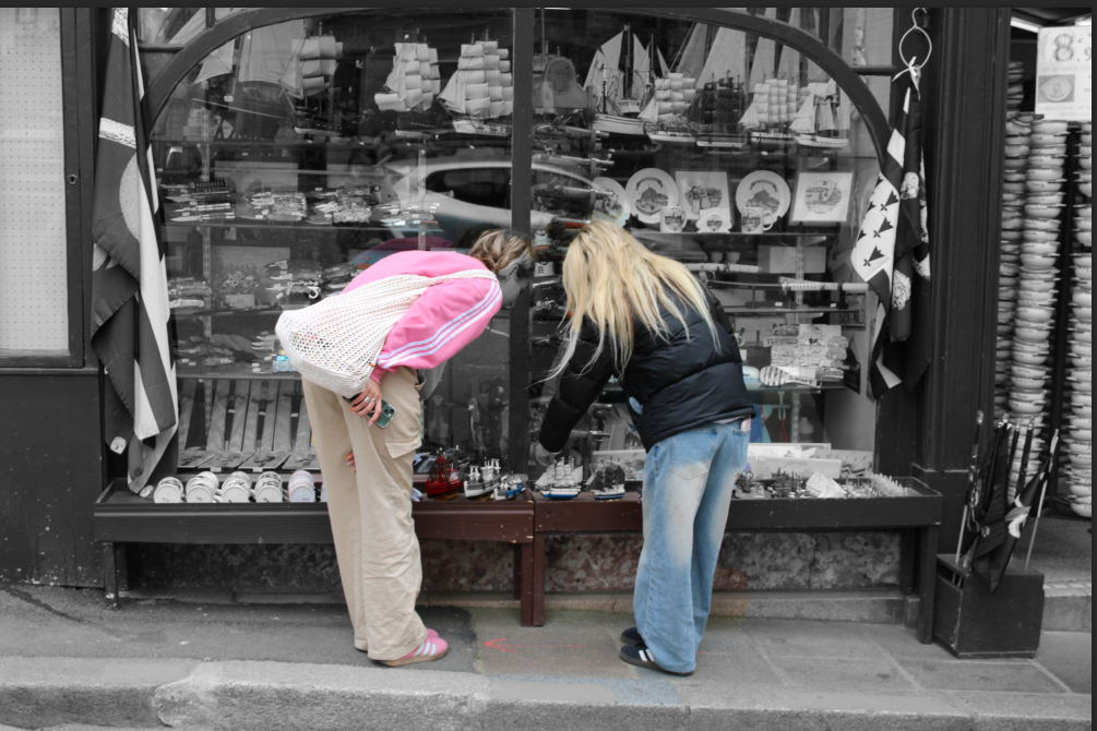
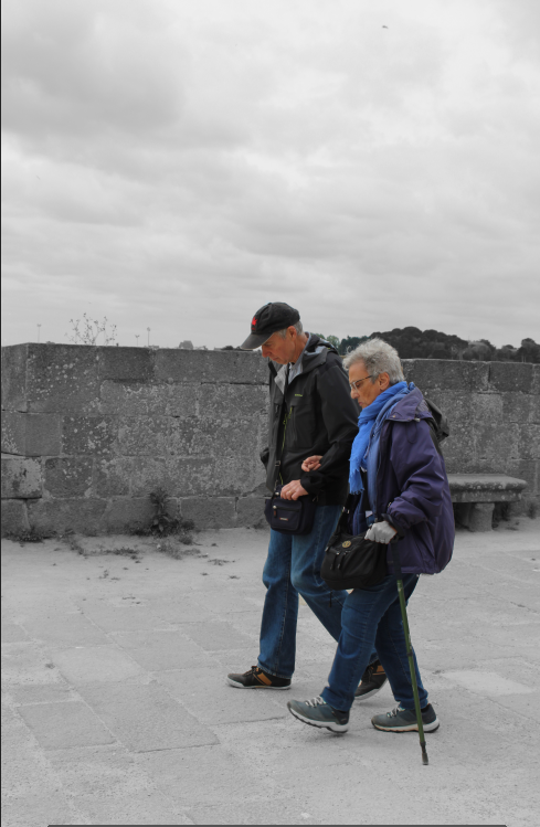
In this photo the only two classes are black and white.
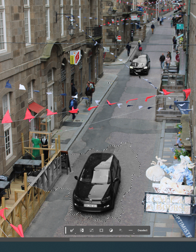
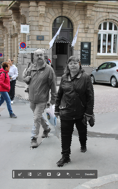
page 1
page 2
