“Devant leurs yeux” – “In front of their eyes”



“Devant leurs yeux” – “In front of their eyes”


Different Types of Images:


Establishing shots are typically wide or extreme wide shots of buildings or landscapes. These shots might include signage, landmarks, or other obvious signals of place and time.


Person at work shots are someone in their ‘element‘ at work doing their job.


A relationship shot may capture the way in which two or more concepts, objects, or people are connected. This may be human relationships such as partners, family or friendships.
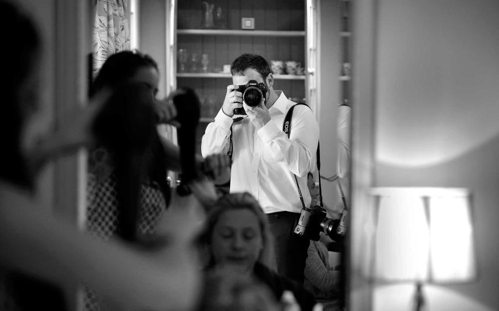


A detail shot is a close-up photograph or artwork that focuses on a specific part or element of the subject, highlighting its intricate details and textures. The area or people around the subject are often blurry, whilst the subject is in high-quality focus.


An environmental portrait is a portrait executed in the subject’s usual environment, such as in their home or workplace, and typically illuminates the subject’s life and surroundings. The term is most frequently used of a genre of photography.


A portrait is an image of a person’s face that clearly displays their likeness and may often display some aspect of their personality. A formal portrait is not a snapshot but a carefully arranged pose under effective lighting conditions.
INSPIRATION.


Student Examples of Work

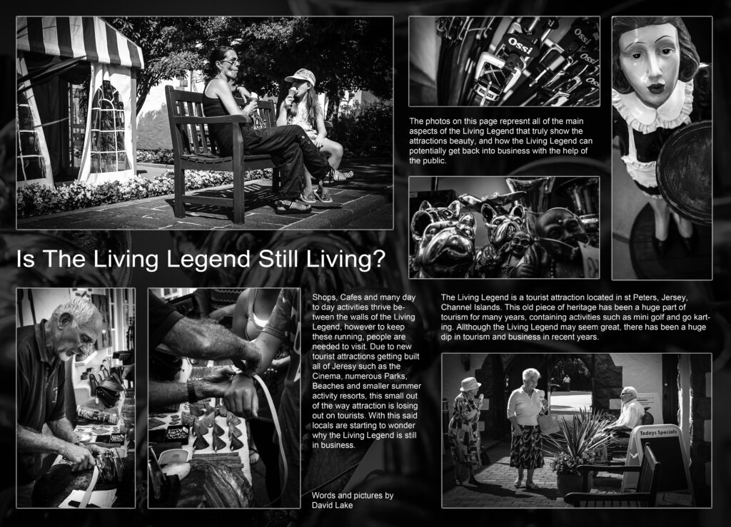
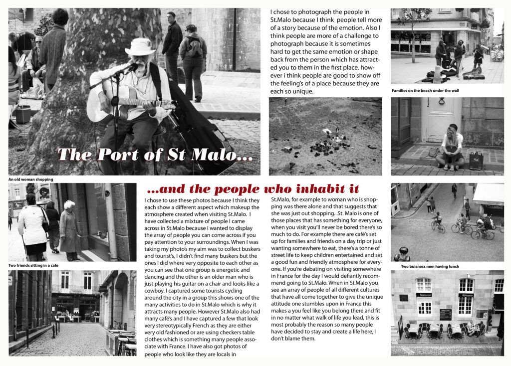

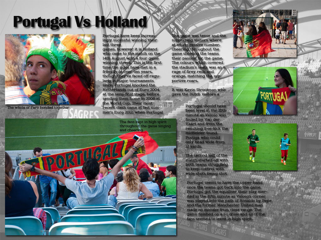

By examining other students work, I am able to take ideas for my layout, titles and photo arrangement,. This is very helpful as I can see the calibre and expectations from finished work from this project before making my own picture story.
Student Picture Story Analysis.

Here I have taken a students picture story of St Malo and analysed it by identifying the types of images and different techniques they have used. I used arrows to identify different components such as the different types of pictures, poster/ picture story techniques and taking inspiration for my own picture board.
French Street Photography Inspiration.


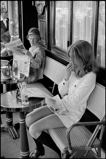


Here are some photos I have attempted to replicate with my own street photography in St Malo.


Here are my virtual galleries displaying my images from St Malo. I used Adobe Photoshop to create this gallery and incorporated an ’empty gallery’ image from google. I then imported my images from Adobe Lightroom and displayed them in a layout I think suited the images and then added a ‘drop shadow‘ and ‘distorted‘ the images to fit the wall at an accurate angle.
What is the Rohingya crisis?
The Rohingya crisis is about the ethnic minority group The Rohingya who have been denied citizenship in Myanmar and faced decades of persecution. Currently nearly one million Rohingya refugees reside in neighbouring Bangladesh’s district. They are living in highly congested camps which makes them prone to bad weather crisis’s, insecurity and disease along with not having access to basic services such as health, sanitation and education along with many other things.
My response to the exhibition


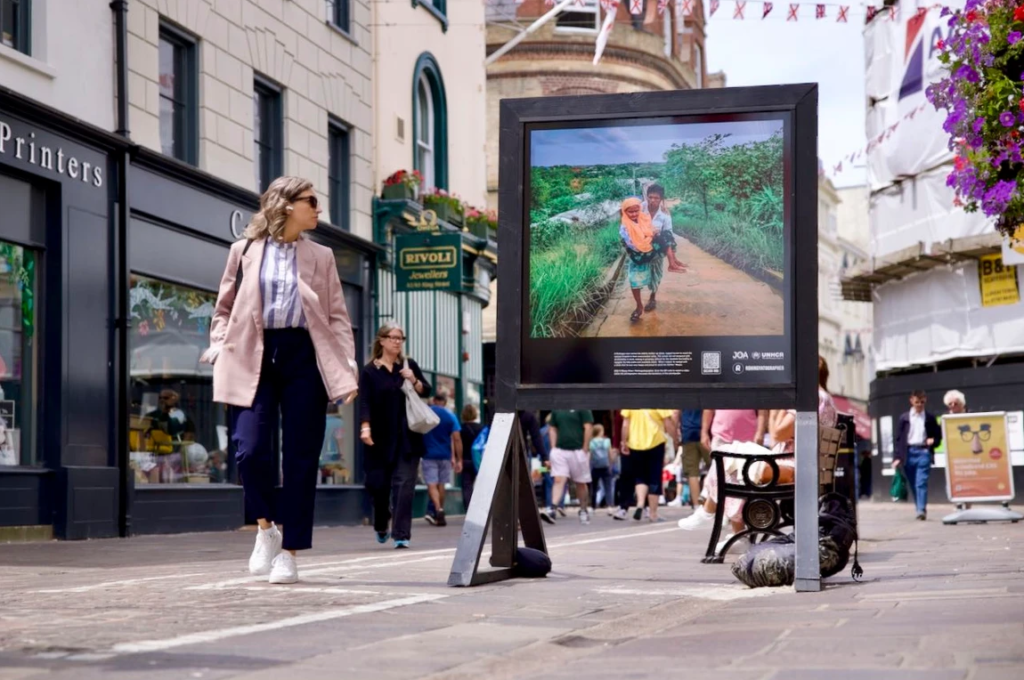
My Evaluation
This exhibition of photos made me feel incredibly fortunate as children and families are living in congested camps which puts them at risk of catching diseases and illnesses and there are also dangerous weather hazards that they could face where they are living. However the Rohingya have a great sense of community which is something that I value because they stick together and help each other out as a community instead of being an individualist community. The publics response to the photos shows how some people have strong emotions towards the images and other people just walk past and don’t even acknowledge that they are there which shows the importance of these images and by putting them on display in a public area like town they are encouraging people to take notice and take action about the situation that is happening in Bangladesh.
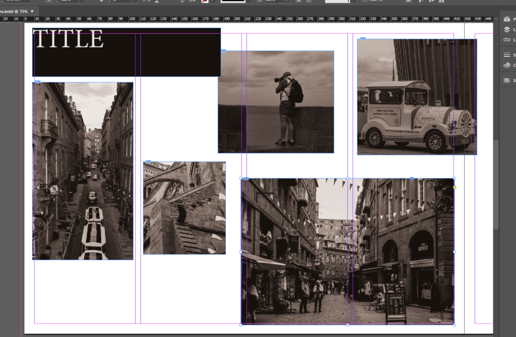
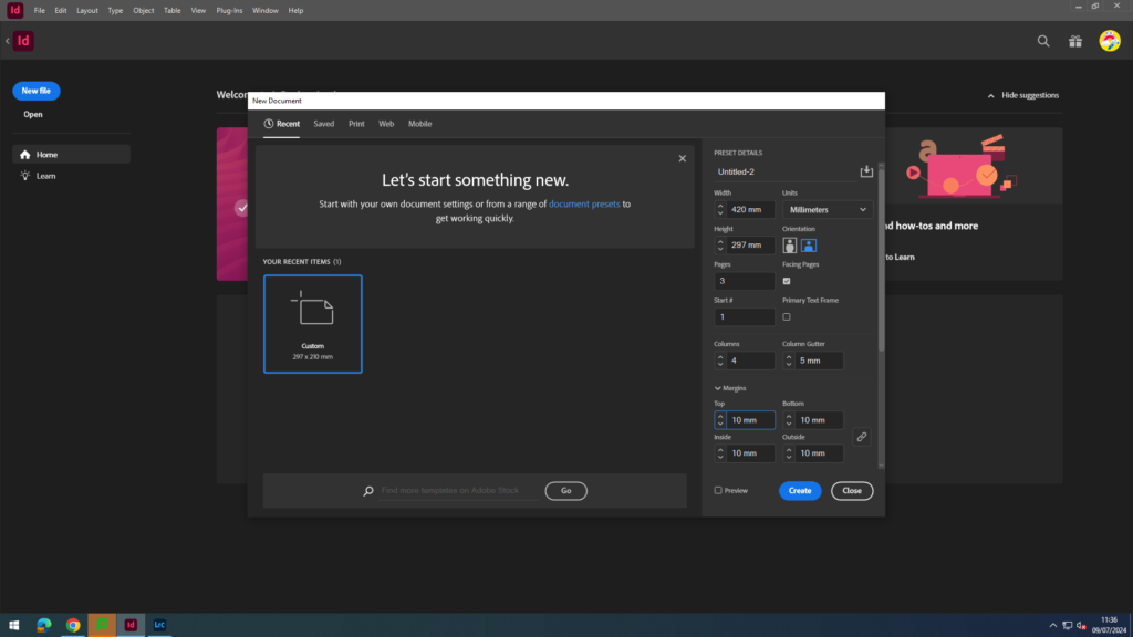
Firstly, I selected my page spread size and layout, I could have an A3 spread. I used the measurements and layouts below.
Experimentation
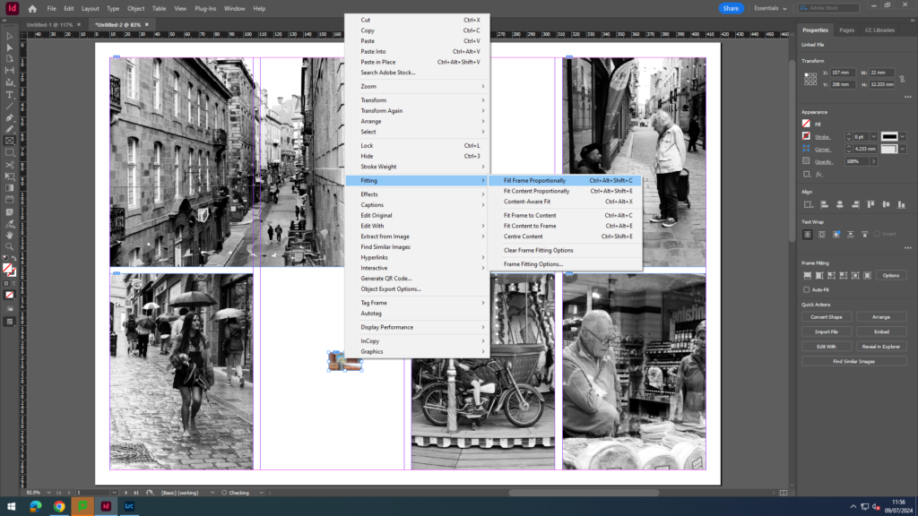
Next, I selected the area of where I wanted my image and went to file and place and selected which images I wanted to use. Once they are on my page spread I right clicked selected fitting and selected fill frame proportionately.
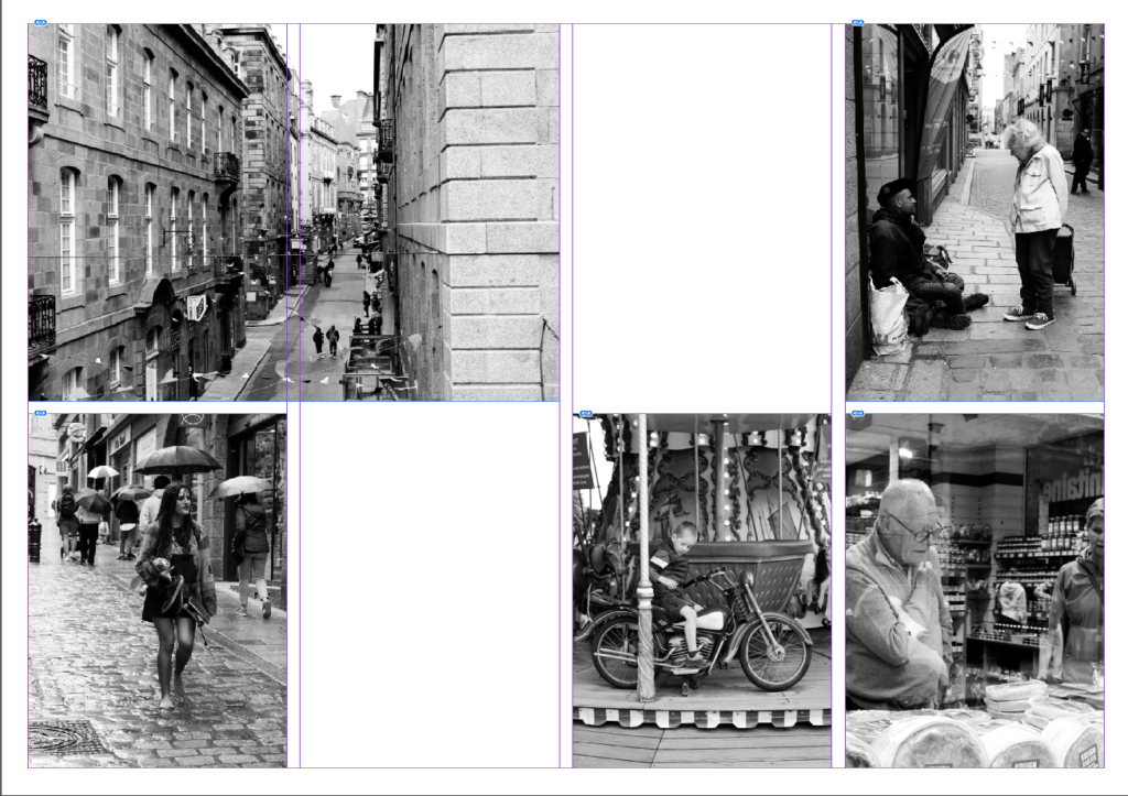
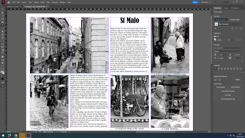
Next, I added a title, captions and some placeholder text for now.
Next, I experimented with different images and coloured images and repeated the same steps. I also experimented with creating a drop shadow for my title.

I also wanted to experiment with the colours of the French flag (red, white and blue) for one of my page spreads. I selected an area and then filled the area with a colour. Then, I went to file, arrange and then send to back, so that the colour was behind my writing and images, instead of on top. Finally, I adjusted the size and angle of my coloured blocks.
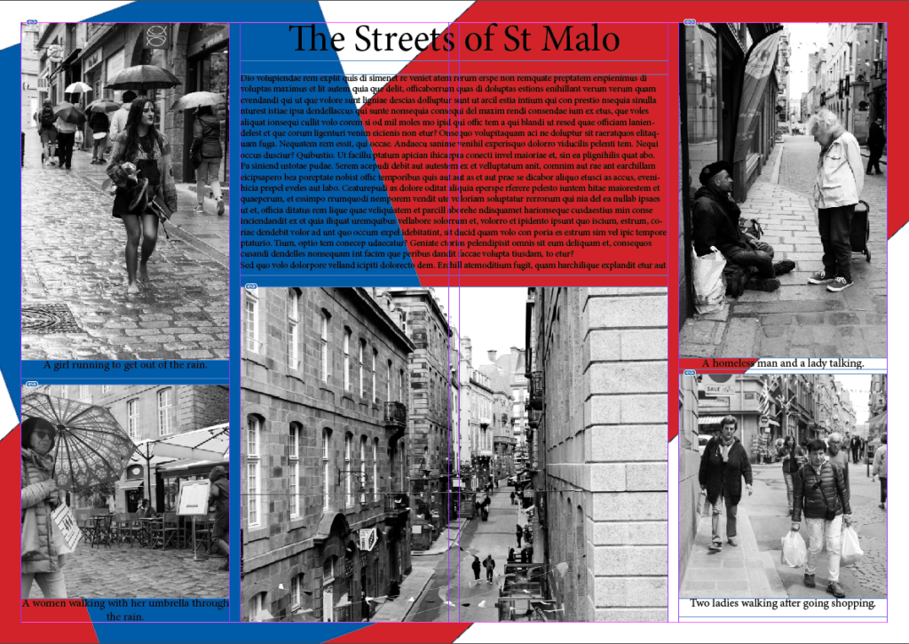
Next, I experimented with making the writing white, so I could see if it would be more visible than the black.
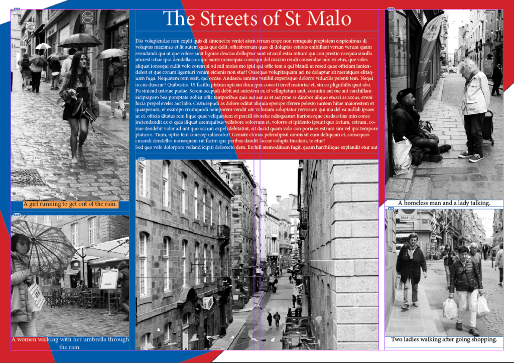
Finally, I started to replace to placeholder text with my own text.
Images I have used
Establishing shots:
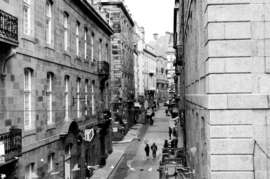
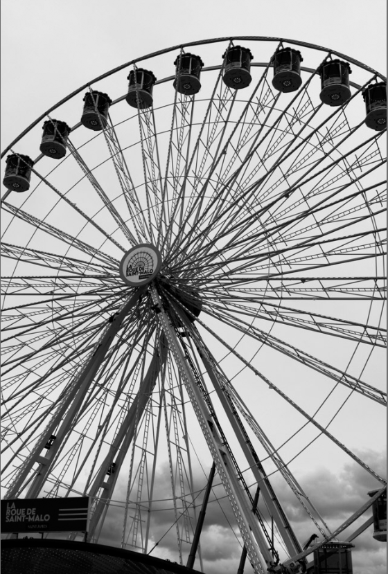
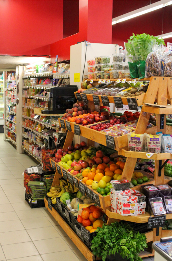
I used these images in my book, so that I could present St Malo, so it is clear in my book where these images have been taken and where all the other images have been set.
Relationship shot:
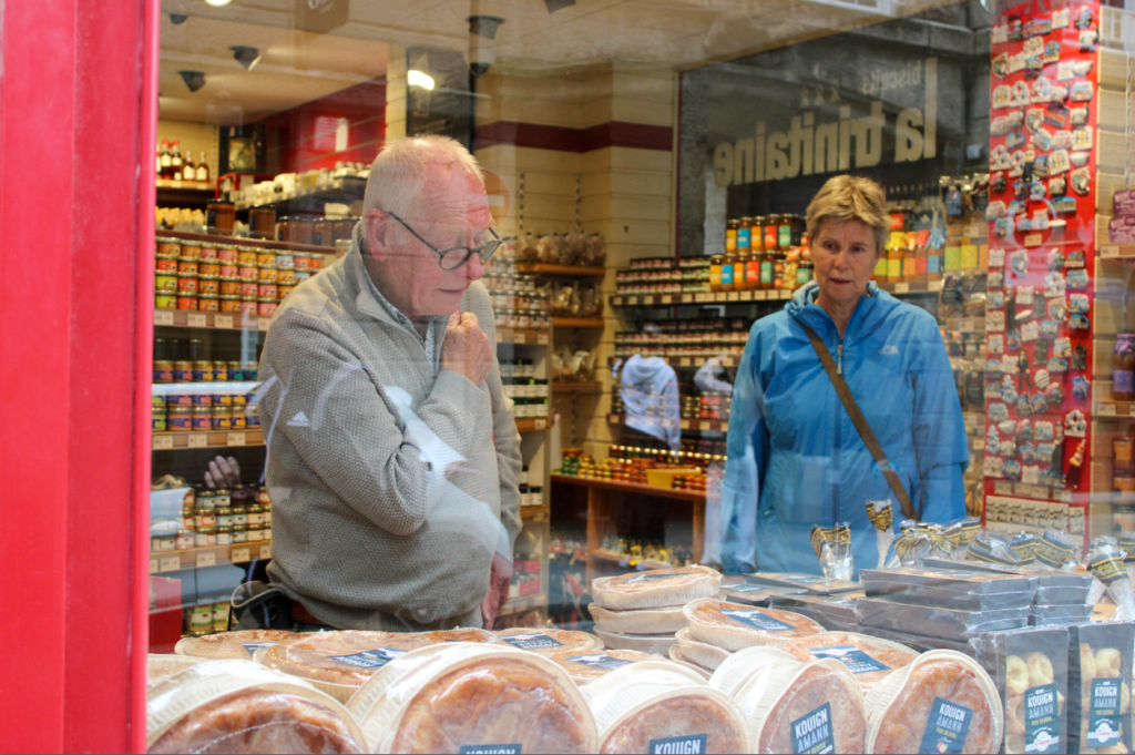
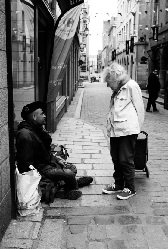
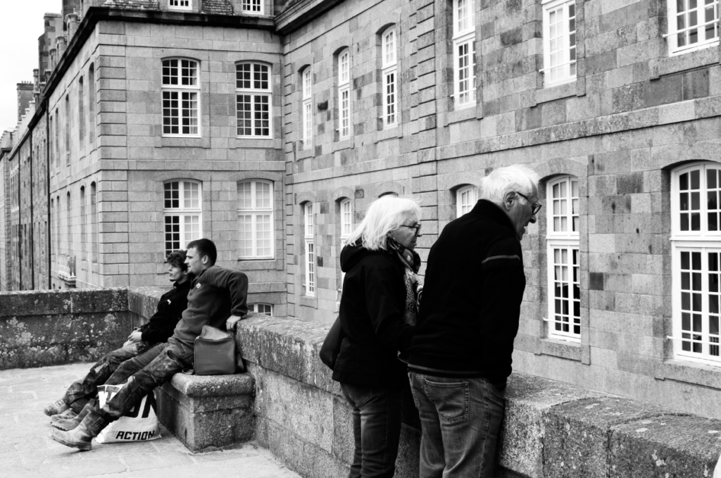
I used these relationship shots in my book to display the different relationships (lovers, friendship, colleges etc.) all through St Malo that I witnessed.
Person at work:
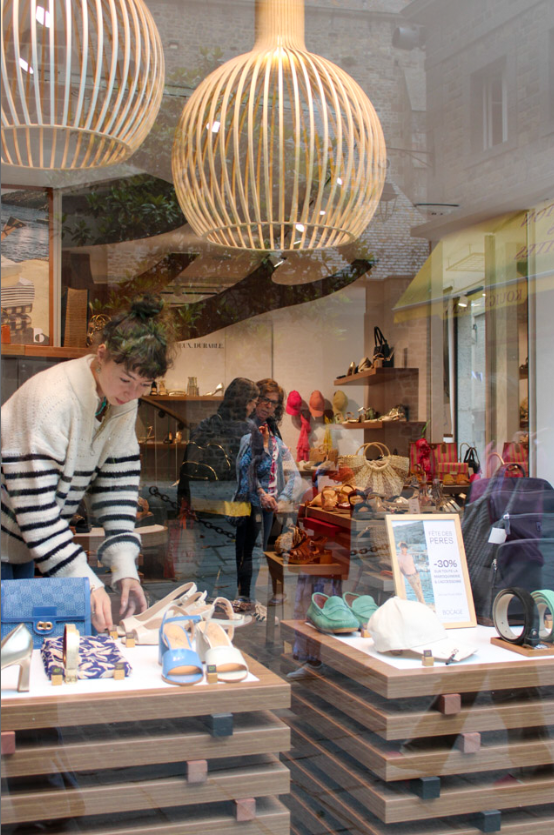
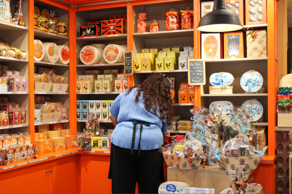
I took these images of people at work, so I could explore the different shops and places in town, so I could display the uniqueness of all the small businesses in St Malo.
My Book
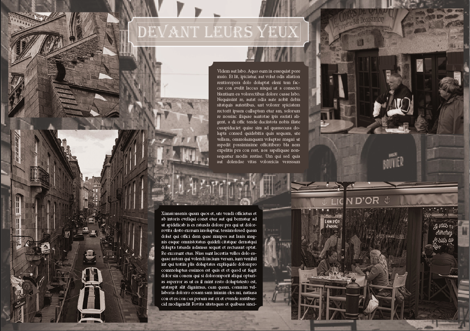
Once, I had finished experimenting, I decided that the front page of my book would be through the window of St Malo, and that would be my title.
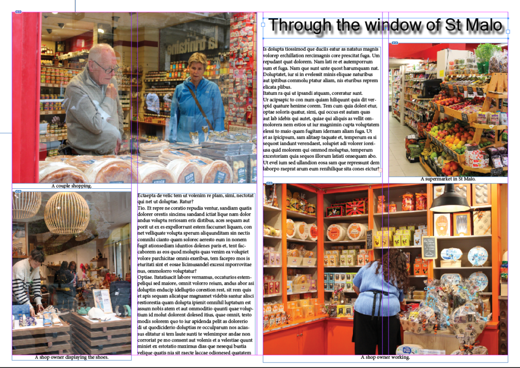
For my double page spread, I decided to use the colours of the France flag on both pages, because I liked the look of the colours, so I wanted both pages to match and work well together.
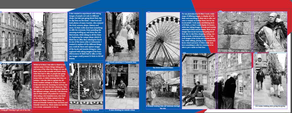
Evaluation:
In conclusion, I like my book, because I enjoy the exploration in it and in my images. I like how I explored with the colours of the French flag on my double page spread. I also like the concept of my book of ‘looking through the window of St Malo,’ but I would of liked to explore this concept more with my images. I should of used images of more shops and used my images experimenting with window reflections more, but I felt like they were not my stronger images, and the ones I did use were. I also like how I have explored with coloured and black and white images, but next time I think I will keep the images either all coloured or all black and white, as I think they go together better. I also like how I have used different types of images (establishing shot, relationship shot, person at work, etc.) because I feel like it displays St Malo as a whole very well.
Design 1

This was my first design I made but I didn’t like the way the three images on the side looked in a row because I thought it was too squished and if I put the filling writing in it would be a lot going on in one place and be boring to look at because everything is set out for you and it wouldn’t make you look around.

This is my final look the page spread I chose the to use the pictures that I took in Edinburgh. I edited these images originally on Lightroom to edit each image slightly before moving onto photoshop. On photoshop I used the same coloured filter on each image called ‘Septa’. I chose this filter because I thought it looked old and vintage and I took these pictures in the Old Town in Edinburgh so I thought it matched well. After I selected the filter I wanted I outlined each of the most prominent thing in the image and kept them in colour, the main accent colour in the page spread was blue. I then went on InDesign and created the page spread. I picked the big main image as a woman posing for a picture with a church/cathedral in the background. The image underneath is of a man in a blue tracksuit which goes with the blue in the big main image. The rest of the images are smaller on the side going down in a zig zag pattern. I chose to lay it out this way because I liked the way it goes with the writing next to each image.
Design 2


For this page spread I mixed pictures that I took in Paris and Edinburgh together. I chose to mix these two together as the ‘old’ vibe was still carried through in Each city. On my first attempt for this design I chose no text and three images but I didnt like the way the three images looked squashed together so I decided to use one less image and spread out the right two images from the others instead of all being joint together and put filler text in the fill the space where the other image was.
Explanation
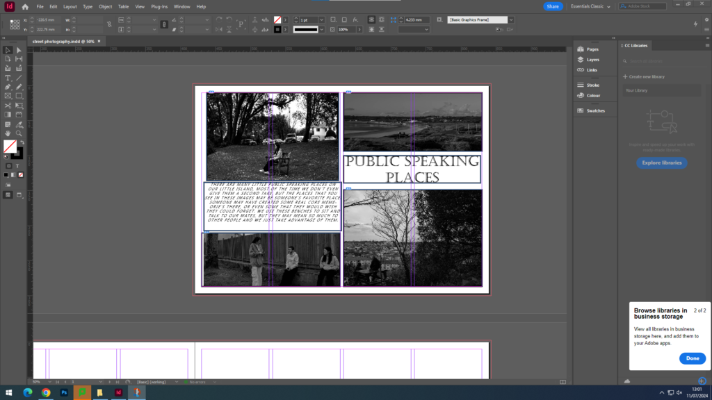
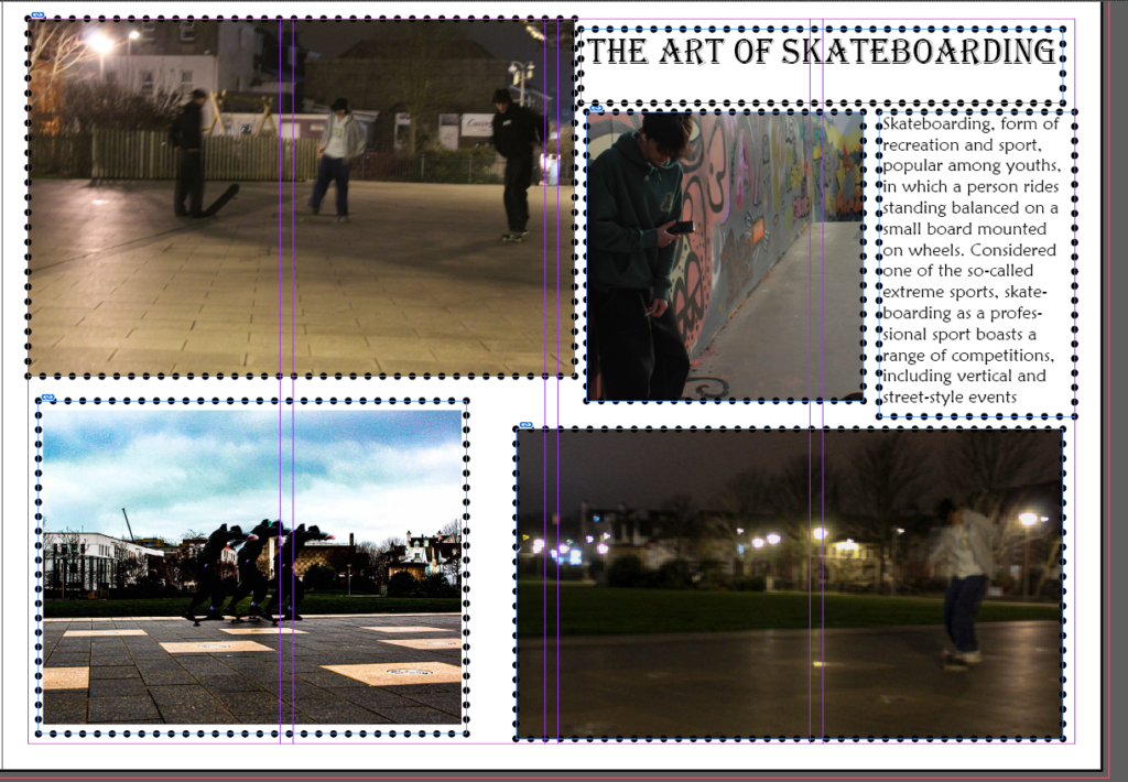
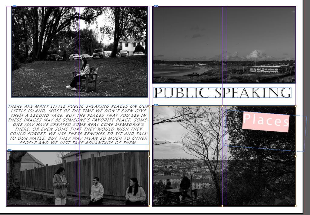
The reasoning for my immature photobooks is that I wanted to promote teenage culture in Jersey. I wanted to make a story describing what we do in Jersey and how we act. That is the connotation of “Public Speaking Places”, I wanted to promote just how open Jersey is, there’s places everywhere to sit and talk, it creates an amazing environment that allow people to socialise.
The reason behind the art of skateboarding, was to show that its more than just a hobby. Some people don’t even look at it like its a sport, they think its just a bunch of teenagers messing around, when in reality the art of skateboarding has changed so many peoples lives. Things are changing in out world, for example skateboarding now being a sport in the Olympics.
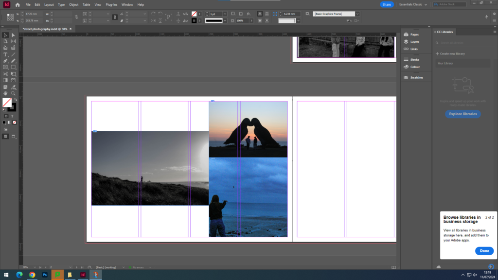
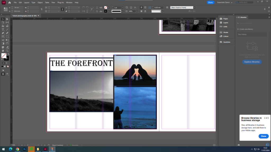
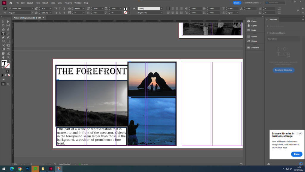
The reason behind my the forefront book, was to create a set of images which are plain and bland. People are amused by plain things because it boots there ego, allowing them to figure everything out will make them want to look longer. Hence why such boring paintings and images sell for such a high price.
About the island
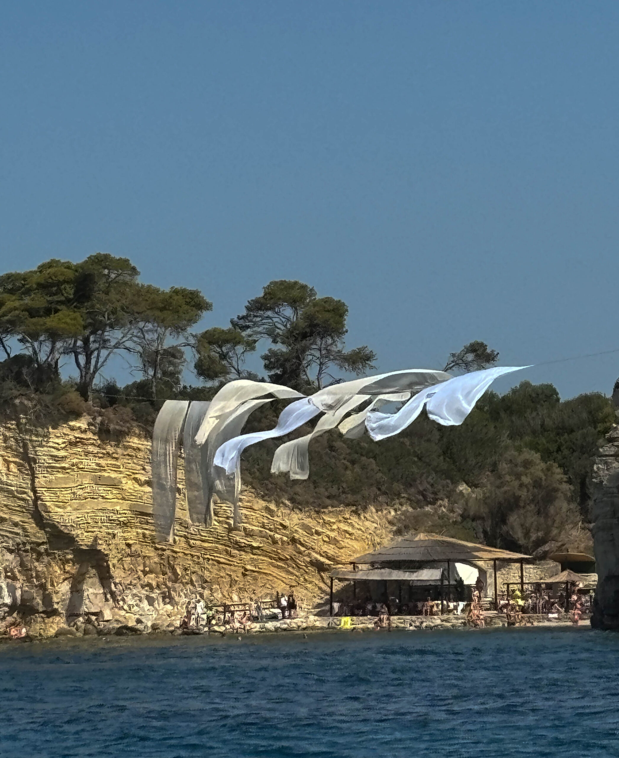
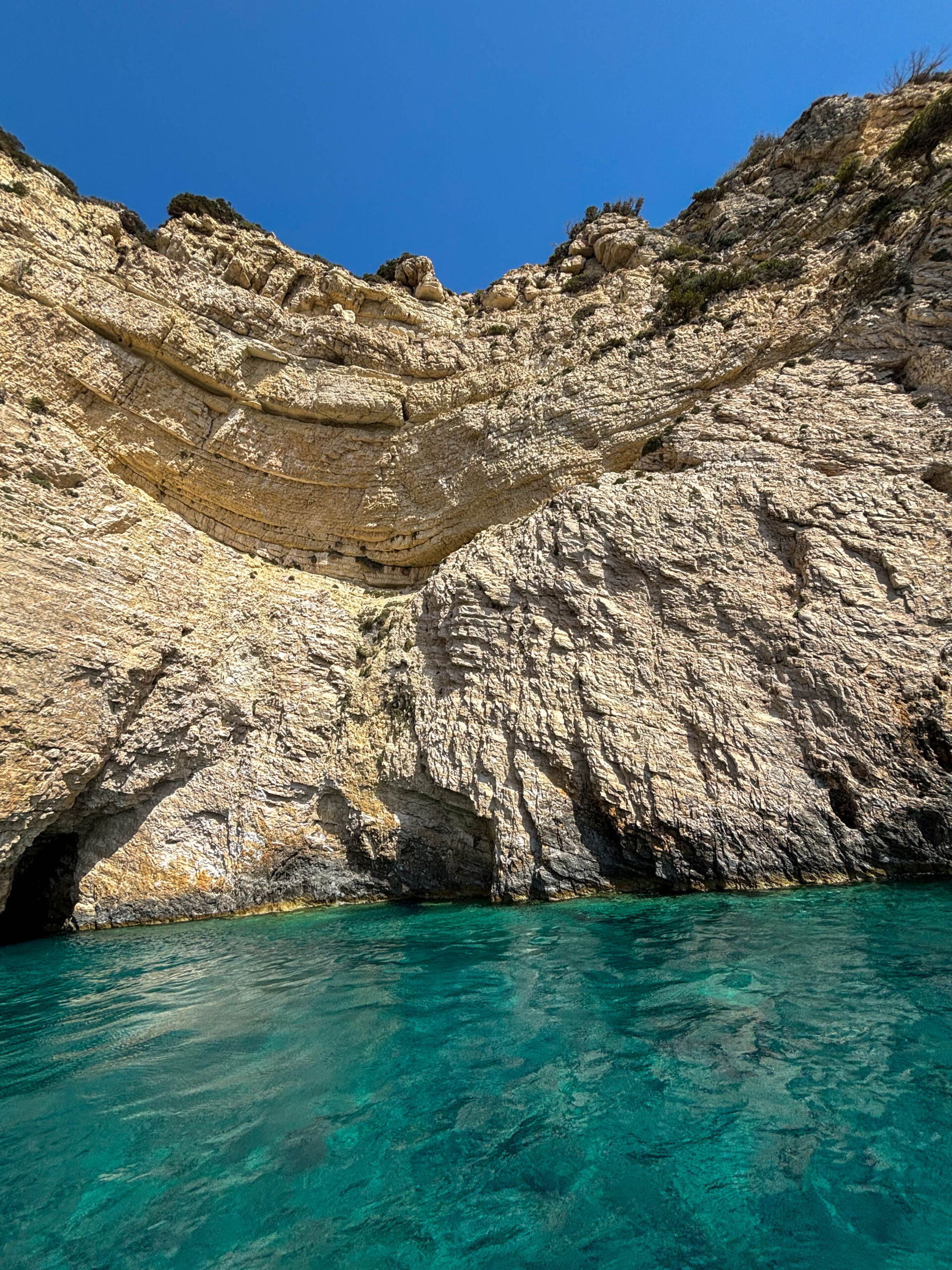
Zakynthos is a Greek island in the Ionian sea. it is a major tourist destination with gorgeous beaches with crystal clear beaches, and the Zante strip drawing loads party people to the designation.
The island is home to 2 million olive trees which are turned into olive oil on island which can be found in a any store. The beaches are nothing like those that are found in jersey and are perfect for snorkelling, with an abundance of saddle seabream, mullet and the odd cuckoo wrasse and maybe even a octopus.
The island has been through many occupations including the romans and the Germans during ww2. However the Zante joined the Ionian islands in 1864, the year the Greek flag was raised.
Photos
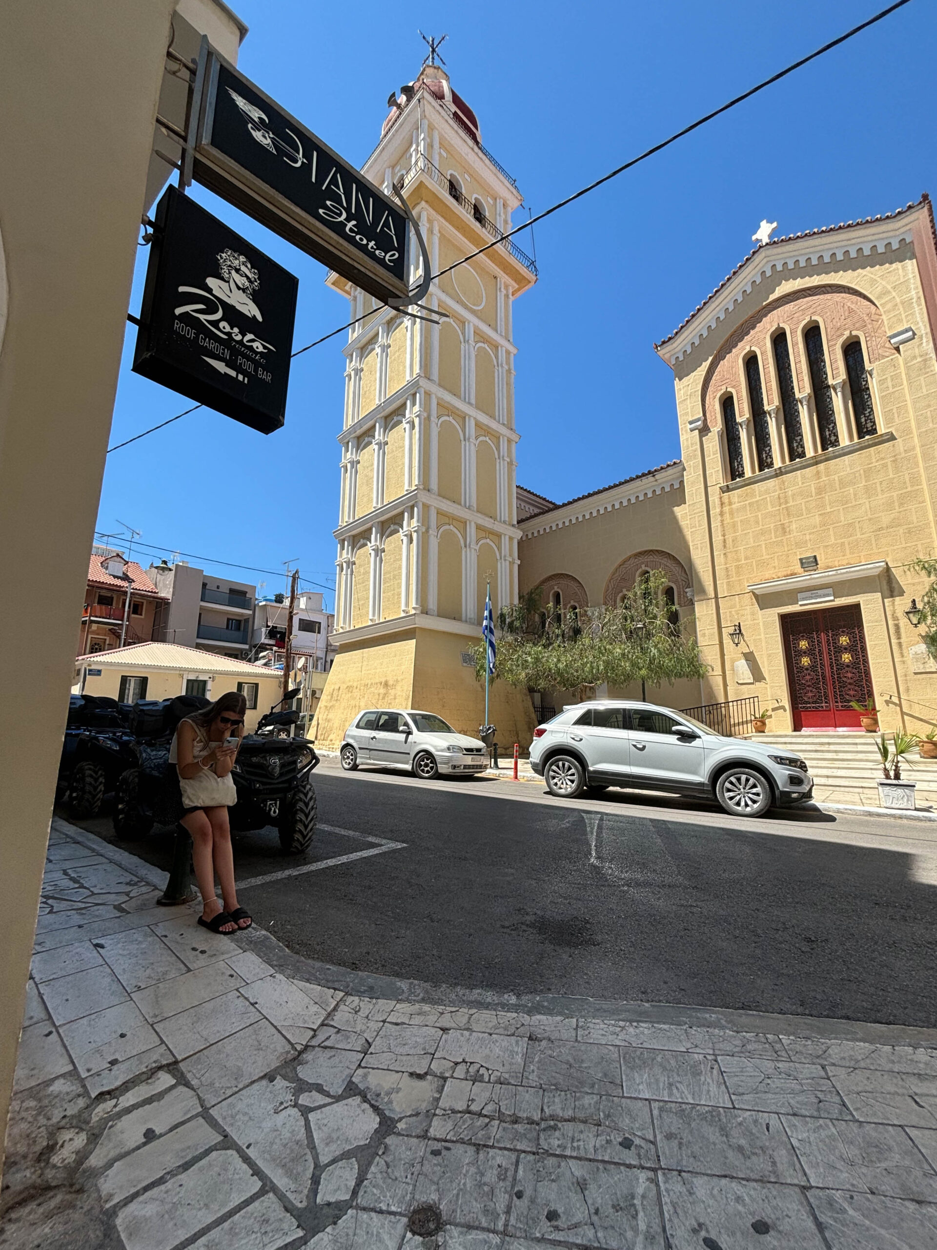
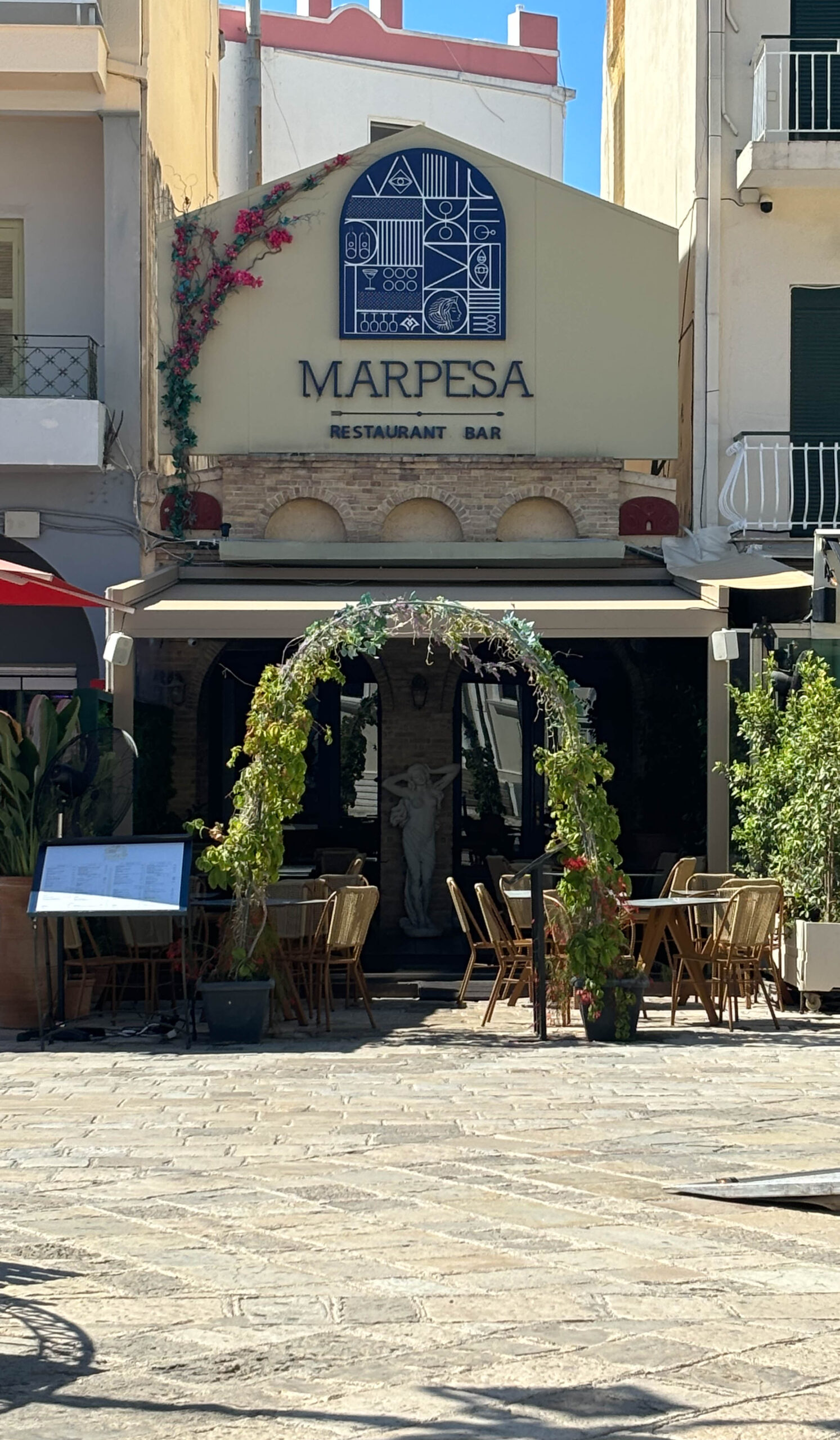
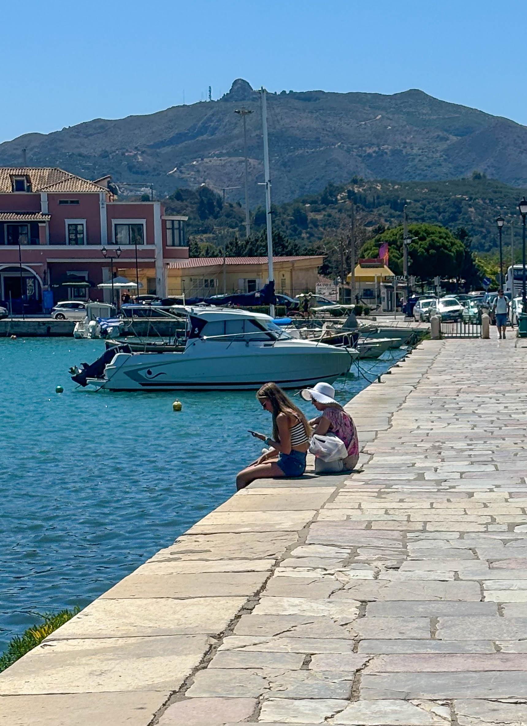
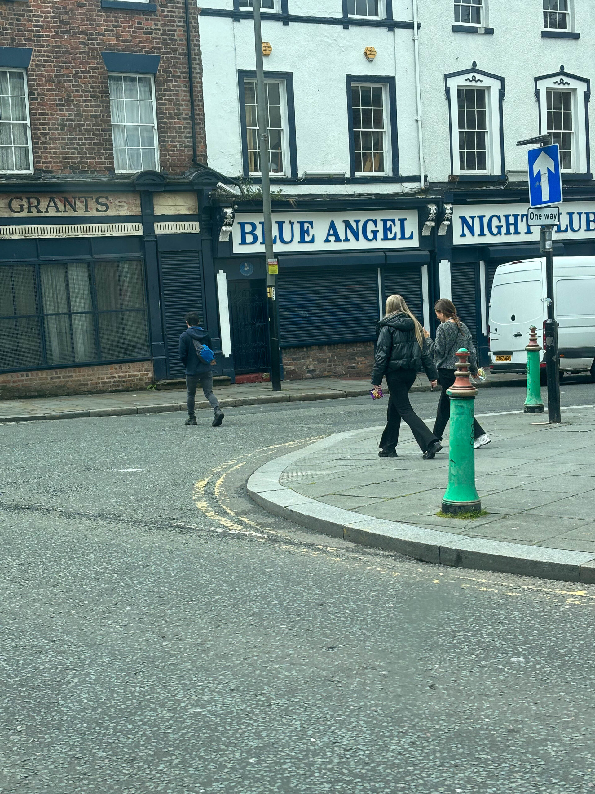
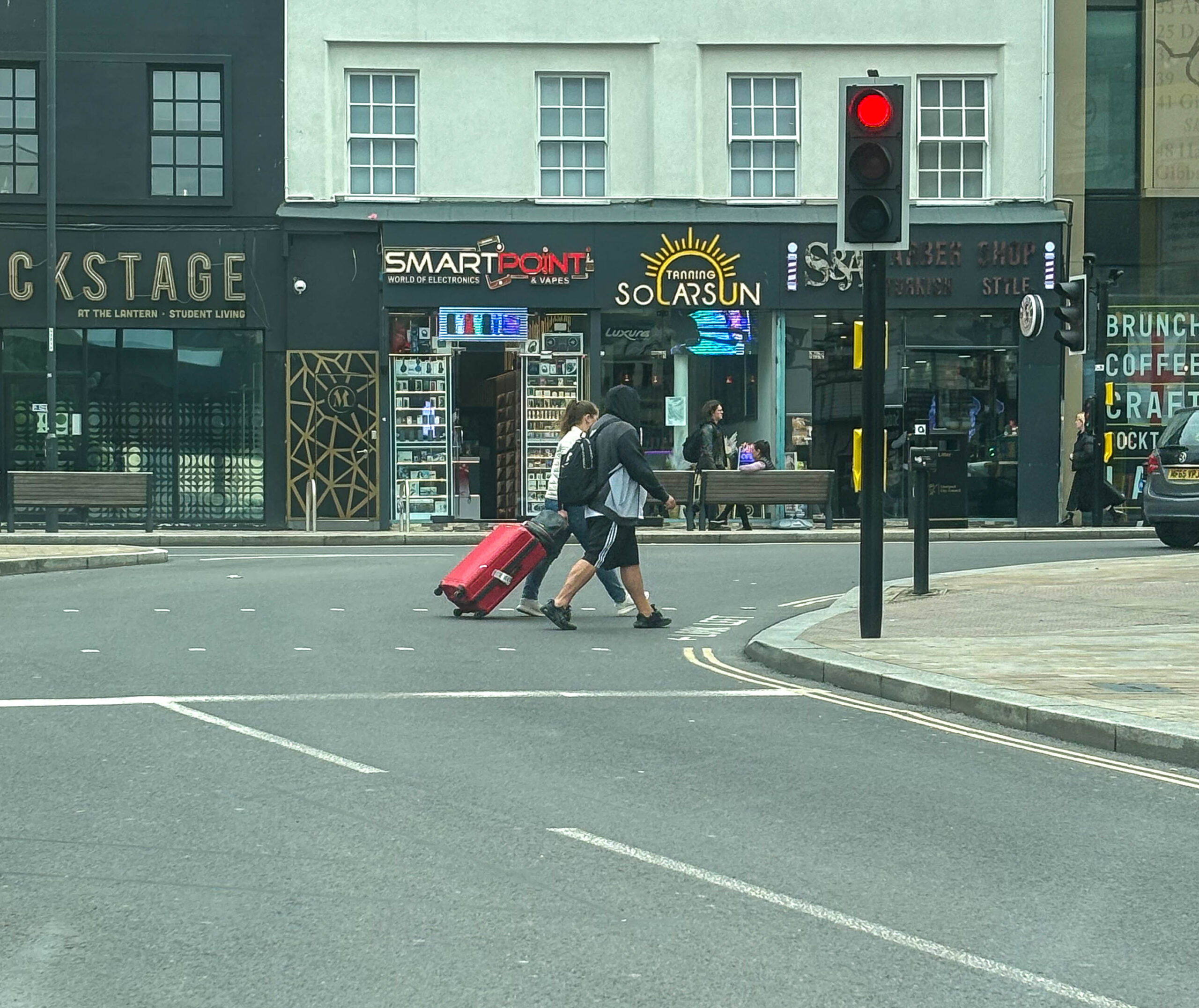
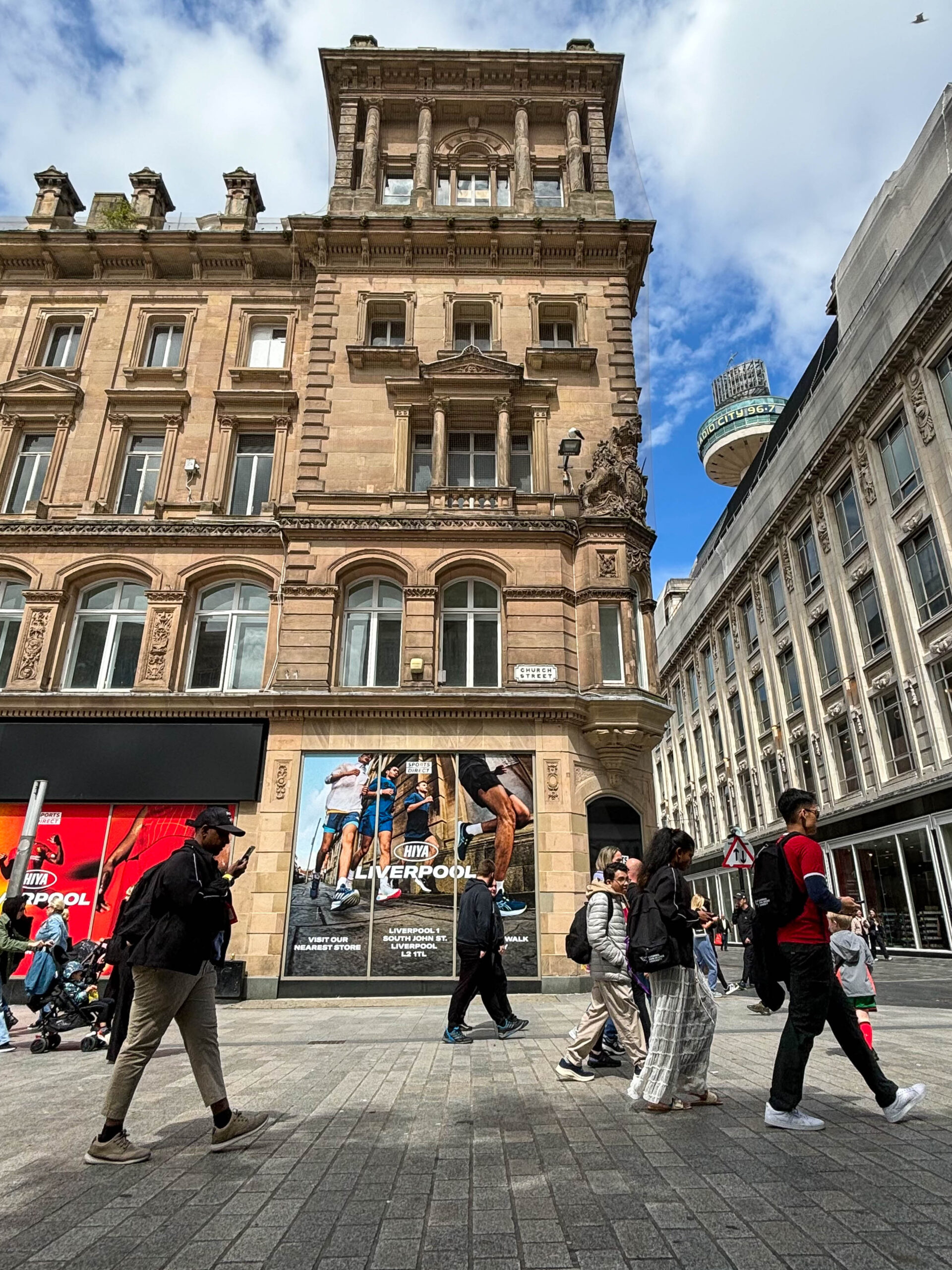
After speeding a week on the beautiful island that is Zakynthos, and experiencing the town, the beaches and the food, and a couple of days in Liverpool, I have come out with some beautiful photos.
ZANTE




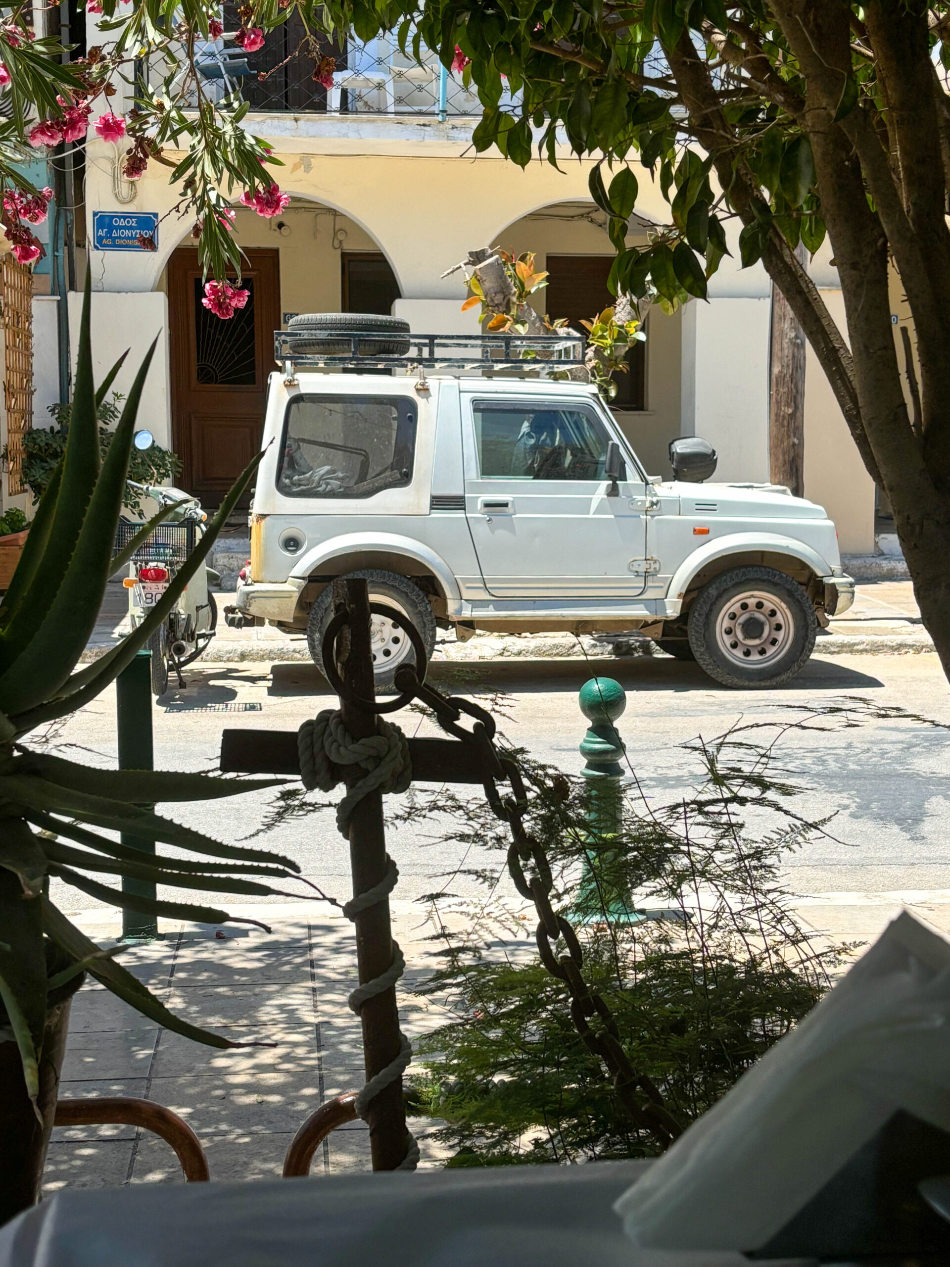






LIVERPOOL





Best Picks
As with any photoshoot there are favourites.

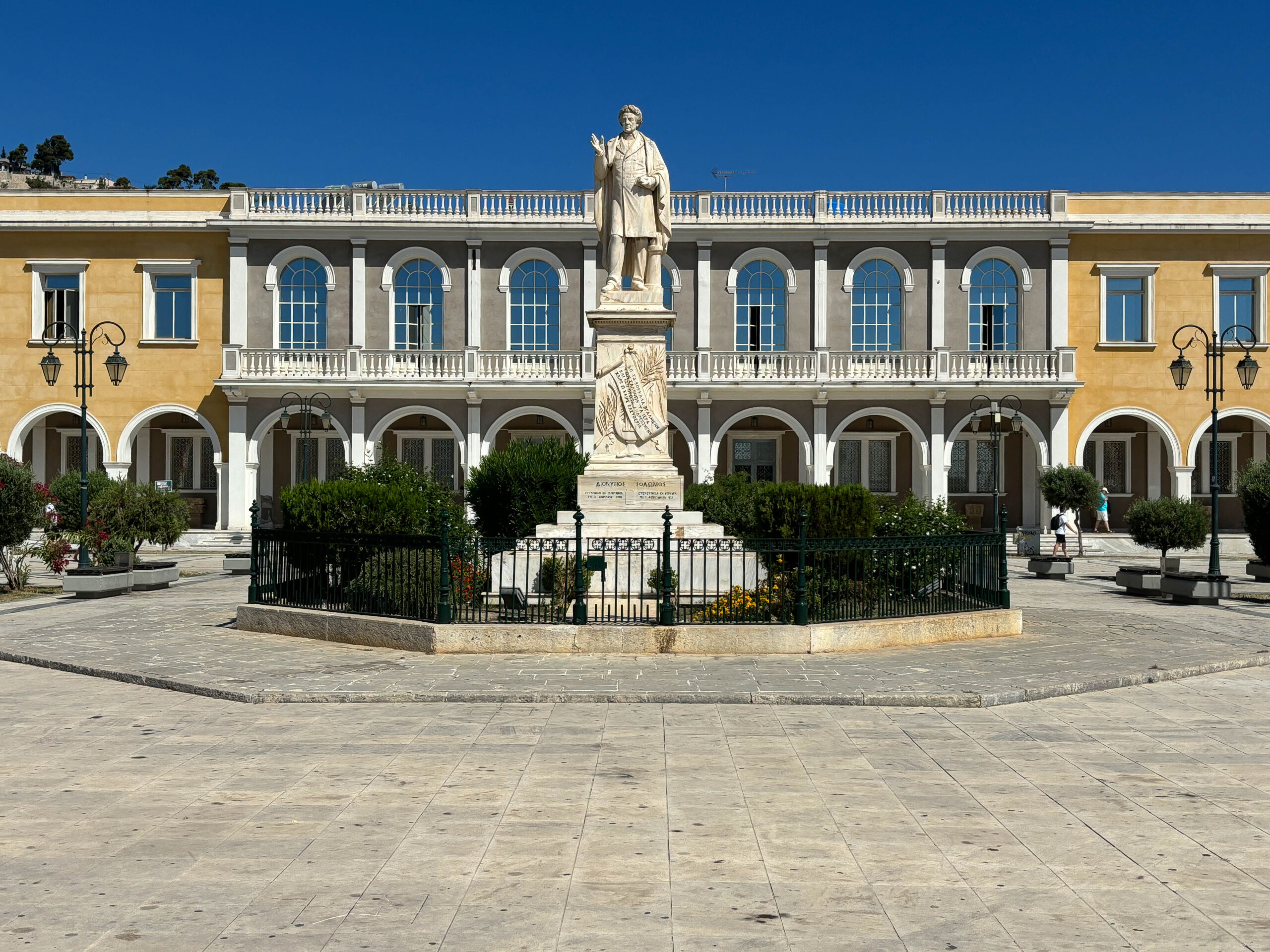
This photo, for example, this photo. It is a statue of Dionysios Solomos who was a Greek poet from the island and is considered Greece’s national poet. This feel majestic with with the ways the yellow and blue of the sky compliment each other and the negative space of the pavement and the sky help to make it feel spaced out more that it is.


Experimentation
I experimented with this picture of my dad sat on the side of the road, in photo shop.

I layered an semi-transparent dark blue over the to then removed elliptical shapes. I then created a layer of light blue over the top of both layers and, again, removed elliptical shape from that layer. Making sure the him and his hat are visible through the gaps.

This project was based on street photography, capturing someone/people in the moment. I used Adobe InDesign to create this spread sheet. I used pictures from my street photography project, and set them out in three different ways.


This is my final outcome of my spread sheet. I picked this one as I like how all the pictures correspond with each other. I also like the layout of the sheet. For the writing, I played around and put a shadow behind it, as well as the pictures.

As i didnt go to St Malo, i did this project on the island of jersey.
These are the worthy edited pictures of jersey.

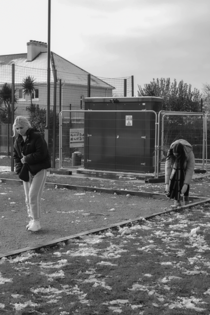
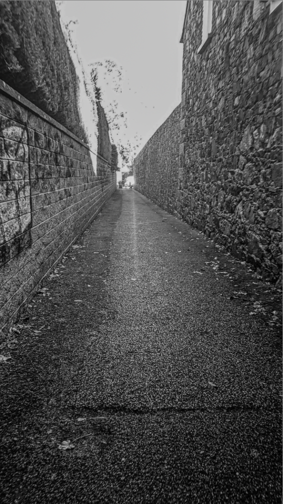



I like all these images as they retell the memory in the picture.