Anthropocene Photoshoot 2:

(Damn/Reservoir La Mer)

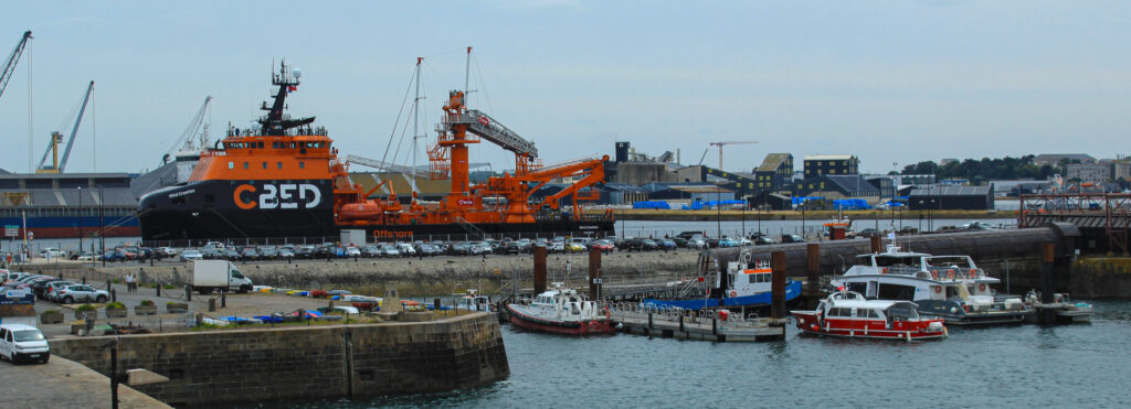
In this photoshoot I wanted to explore the impact of man/man-made on the world, and including the topic of Anthropocene and how it plays into it.

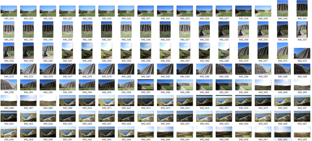
I explored the Val de la Mare reservoir down at St Ouens as I believe that it is important too to get many perspectives as from one perspective the reservoir may look very small and not full indicating that potentially due to environmental changes the damn has decreased. From the bottom the structure looks huge, it contrast to the photographic perspective from above as its not evident how extensive the damn is.

In terms of using photoshop and artificial intelligence, I think it would be interesting to paint the reservoir in a different outlook. Adding connotations such as “drought”, “desert”, “dryness” and “empty” etc. , this makes the AI undersand i mpre and adds the ffect as if climate change has

Anthropocene Photoshoot 1 + Contact Sheet:

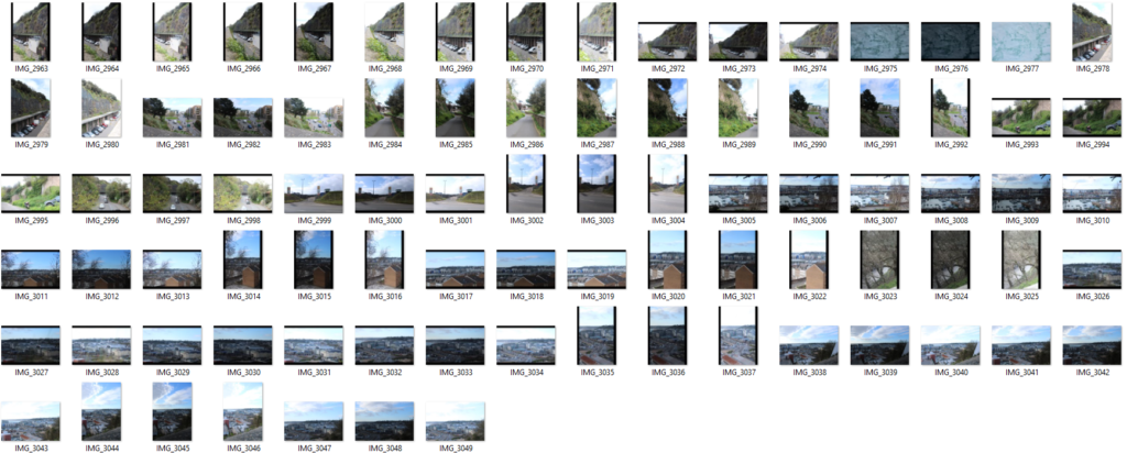
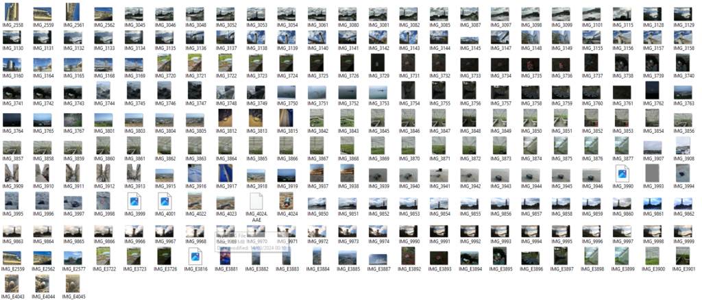
For this photoshoot I decided to take photographs inspired of Anthropocene, I felt it was important to include the walls of nature and rock above snow hill car park as the opposing worlds between machinery below and the nature above looks quite appealing to the eye as well as the overcrowding of buildings in the islands centre, I took photographs overlooking the centre, the square and the lively streets . The second section of the photographs on my contact sheet appear busy and actively overpopulated due to the crowding.

I like this photoshoot as I feel it explores the topic of Anthropocene to a degree, the ideas of overcrowding and the opposing element of nature and rock are presented and show St Helier in a complex of structures having the coast right by it, alongside many buildings located in one area as well as the roads being busy meaning more pollution. Whereas one thing I would have changed is taken more photographs exploring other locations with the same if not similar ideas like these.

Cropping

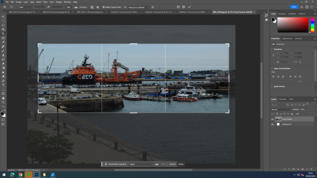
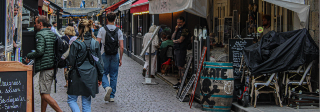
For these edits, I used my photographs I took in St Malo. I decided to experiment with different cropping styles eg portrait, landscape, panoramic, square and circle. These lead to some unique, different images.
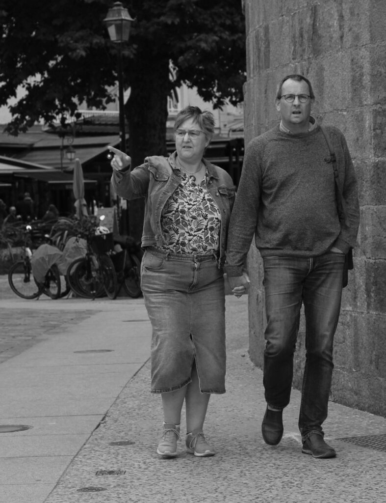
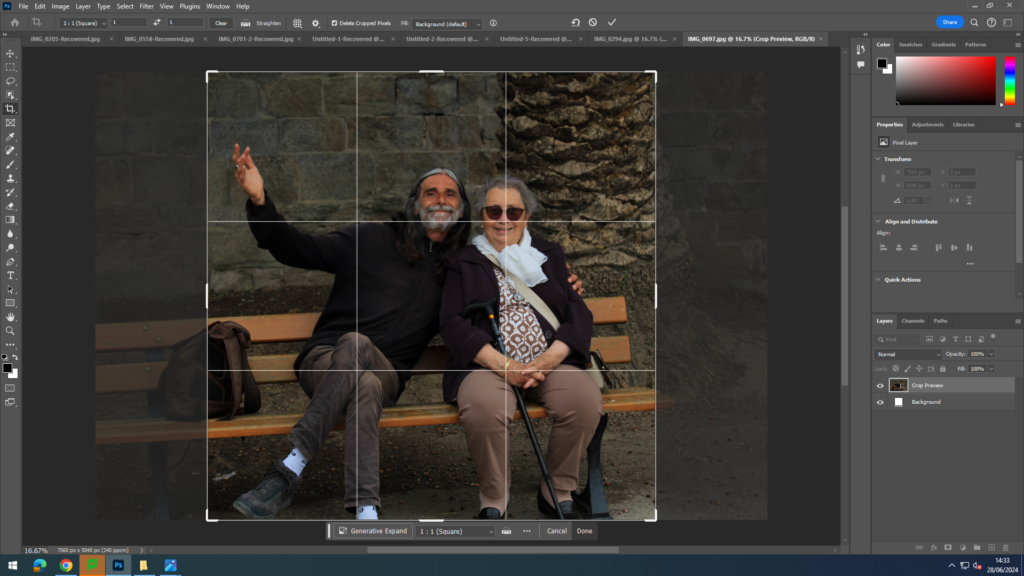
Portrait crop:

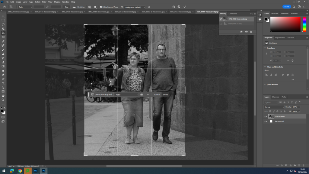
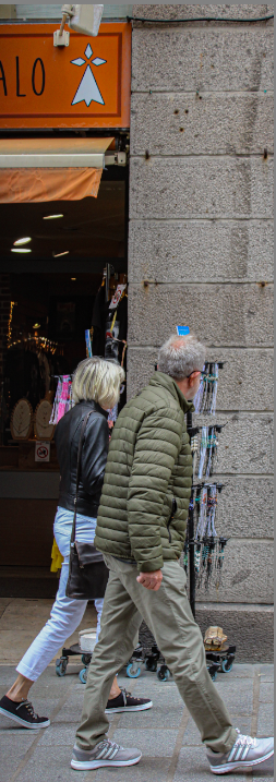
For this type of crop, I opened up a landscape image I had taken then used the cropping tool on photoshop in order to turn it into a portrait image. I decided to off centre the people in the image slightly and include a bit more of the background in it for context. The decisive moment in this image is the lady pointing.

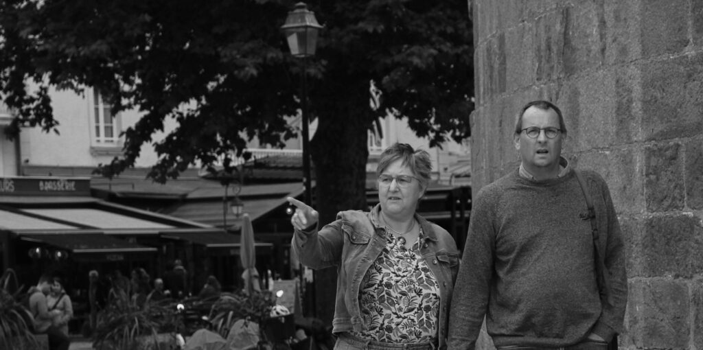
Panoramic Crop:

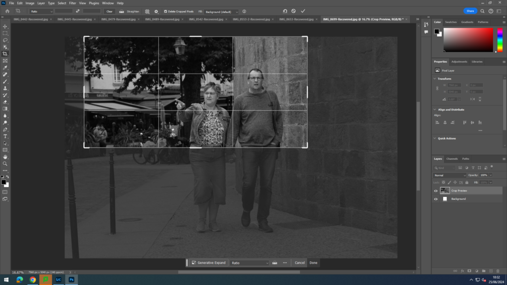
For the panoramic crop, I used the same landscape photograph but this time used the cropping tool to create a panorama which involved only the top halves of the peoples bodies being in the image and some more of the background.

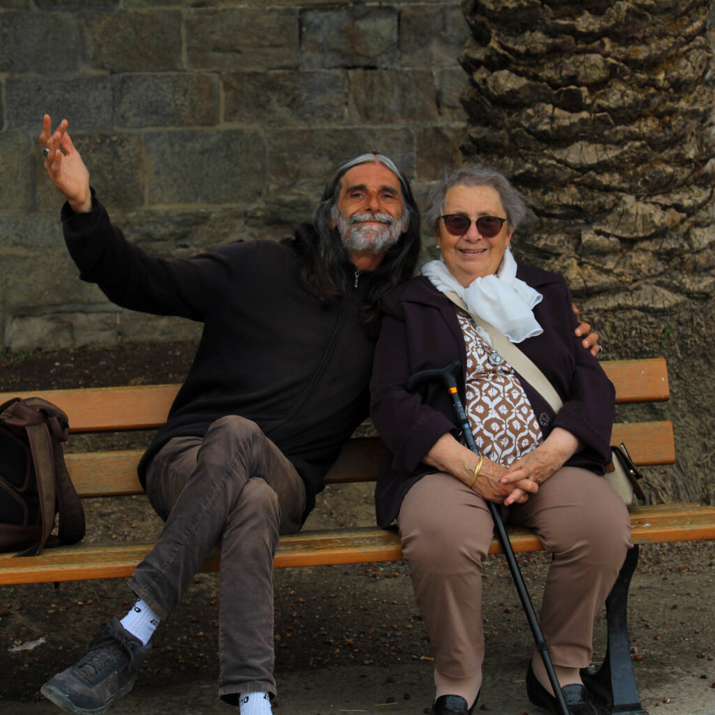
Square crop:

In order to create this square crop, I opened up an image I had taken then selected the crop tool then changed it from ratio to 1:1 (square). I then adjusted the image to ensure the two people were in the centre of it.

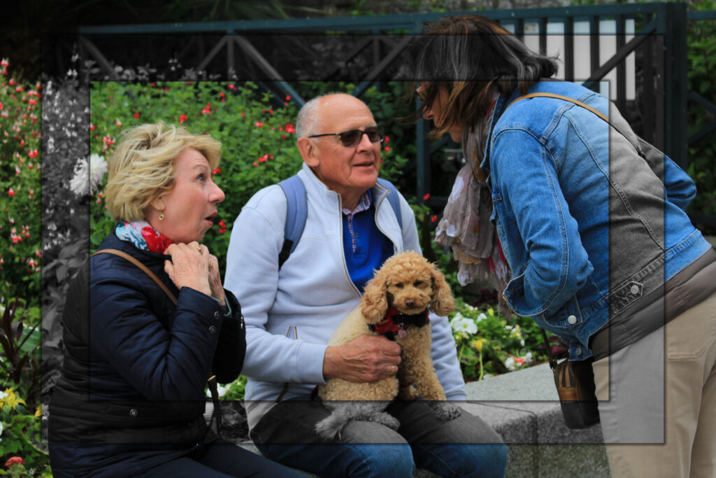
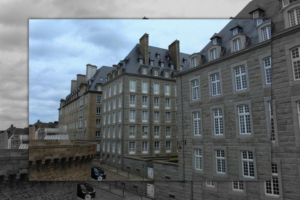
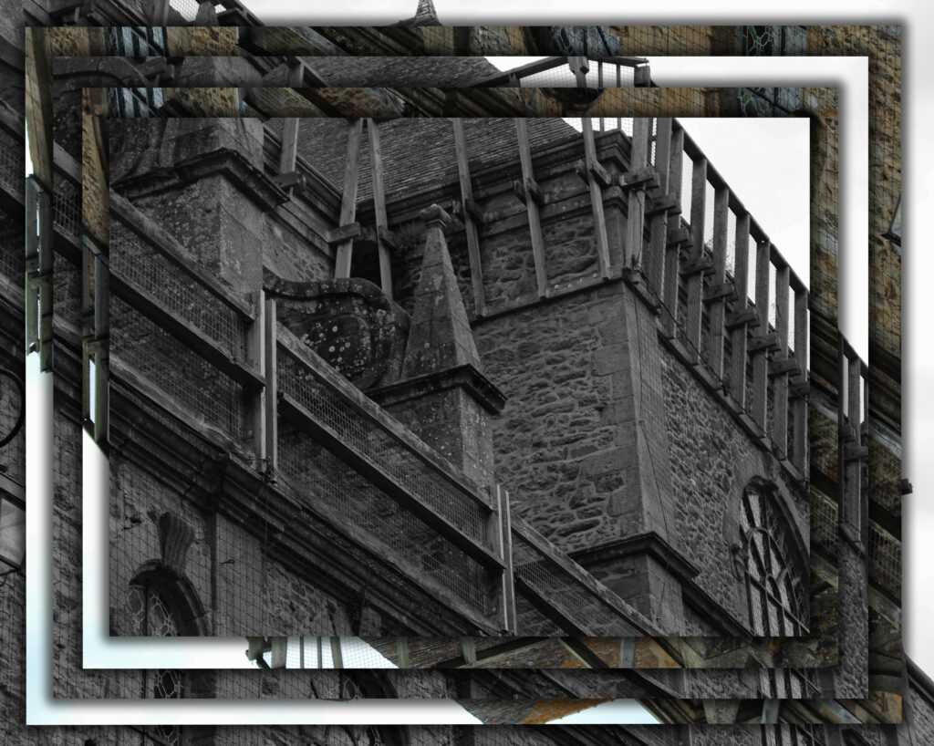
For these next set of images, I wanted to experiment further with using the different crop tools and other various tools. Firstly, I used the rectangular marquee tool to create a rectangle slightly smaller than the whole image in the centre. I then right clicked on the rectangle and pressed layer via copy. Once I had created this new layer, I then decided to colour it black and white. Next, I created a smaller rectangle inside of the rectangle I had just made. I then selected the bottom layer (colour layer) then right clicked on the rectangle and clicked layer via copy. This ensured that my rectangle was in colour and not black and white like my previous one. To finish this idea off, I added a drop shadow to the rectangles. This helped to enhance the contrast between the black and white rectangle and the colourful ones.
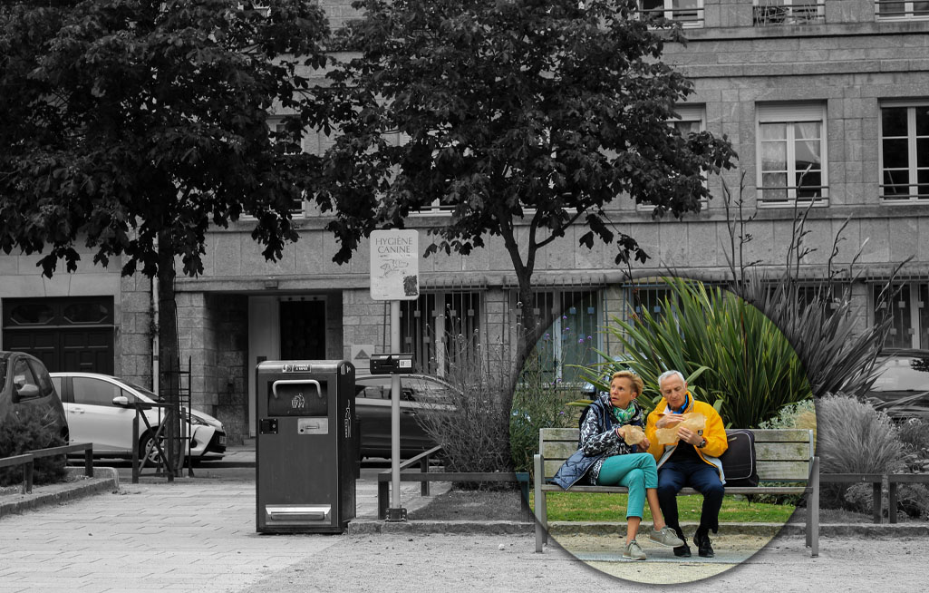
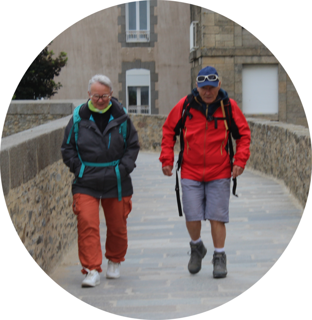
For this idea, I used the elliptical marquee tool in order to create a circle shape. I decided to draw the circle around the two people, highlighting the decisive moment in the image. I then right clicked on the circle and pressed layer via copy. Then in order to make the circle stand out I decided to make the background black and white and keep the circle and people in colour. Finally, I added a drop shadow to create some depth and contrast in the image.

For the next few images, I created a colour splash in which I made the people in the image have colour and then make the background black and white. I did this by using the object selection tool to select the people I wanted to highlight then pressing layer via copy. Once I had them all cut out, I then made the background black and white by going onto image then adjustments then pressing black and white. Finally, I decided I wanted to enhance the colours of the people so I exported them into Lightroom then used the colour section on it to change the hue, saturation and luminance. I like how these images turned out as they bring attention to the people as the bright colours seen on their clothes contrast drastically with the black and white background.

Panoramic crop:

I then experimented with creating a panoramic crop again but this time with a landscape picture. I think this crop was successful as it only shows the necessary parts of the image and got rid of any random objects at the bottom of the image.

Circle crop:

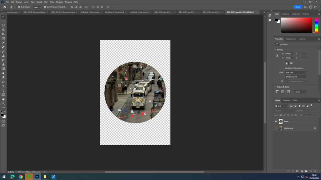
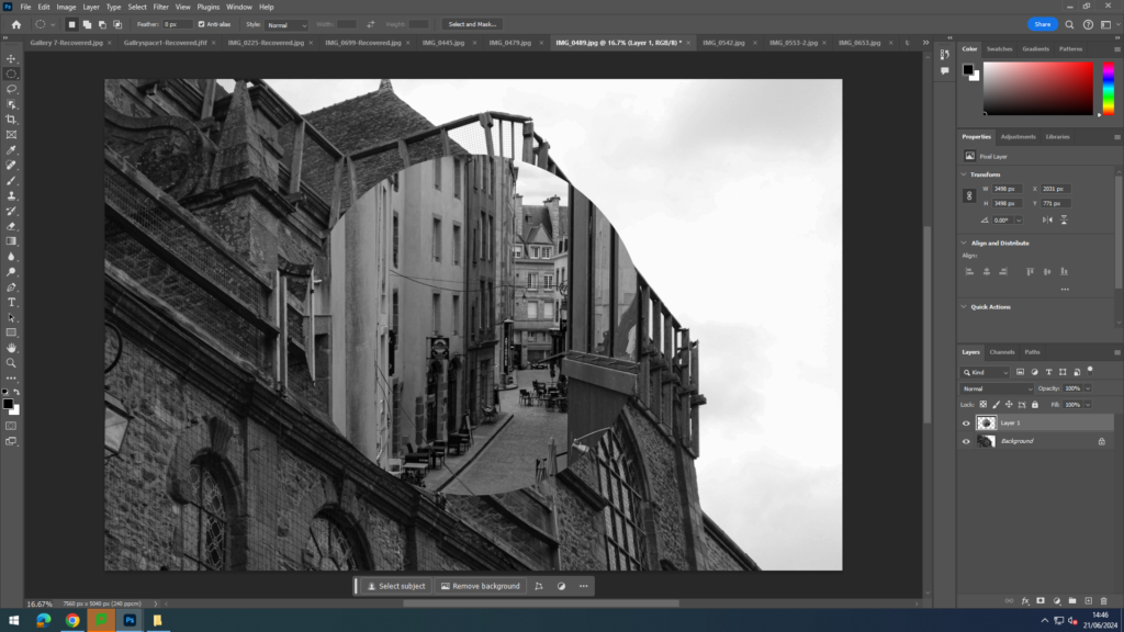
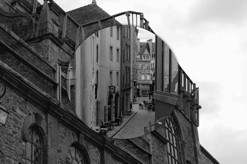
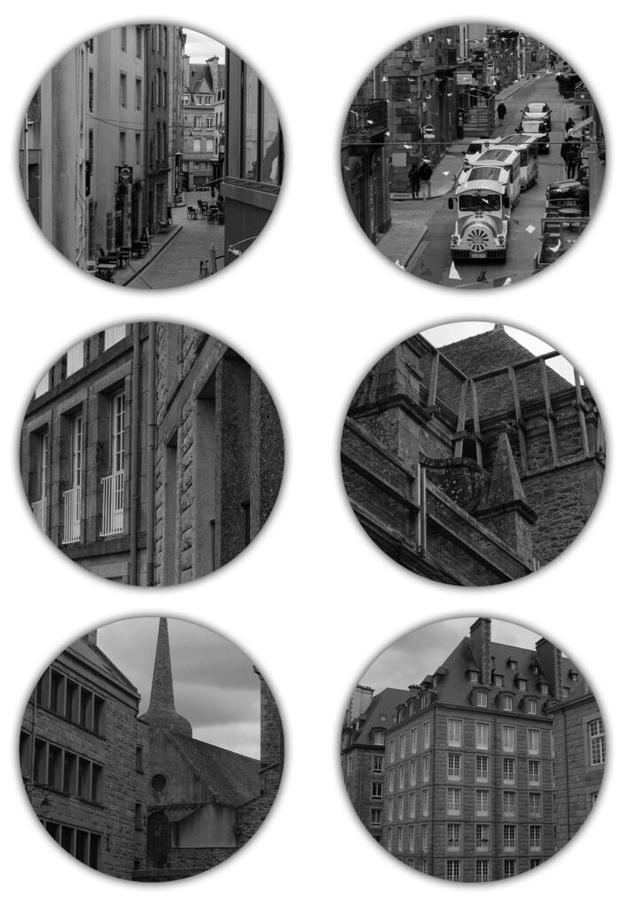
I then experimented with using a circle crop. I did this by using the elliptical marquee tool on photoshop in order to create a circle shape around a certain part of one of my images. However, I didn’t like how just one circle looked on a plain white background and so I decided to try out different things. For example, I opened up a new, different image and then dragged the cut out from the other image onto it. Then added a drop shadow to the circle in order to make the difference more clear and prominent.

Next, I used the elliptical marquee tool on 6 different images. Once I had all of my cut outs, I then opened up a plain sheet of paper and dragged them all onto it. To finish this idea off, I added a drop shadow to all of the circles. I think the many circles instead of just one looks better and more interesting and allows you to see more of St Malo.

Polygon crop:

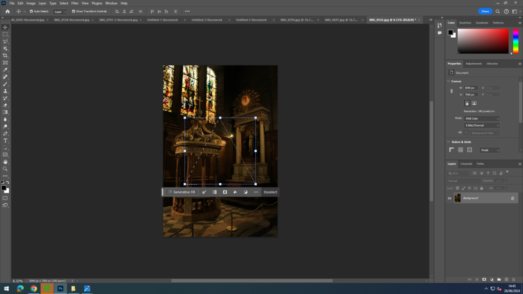
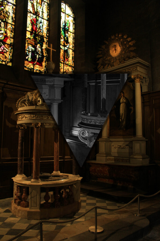
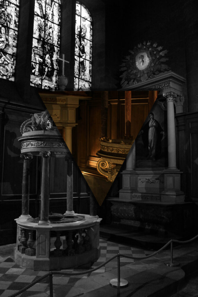
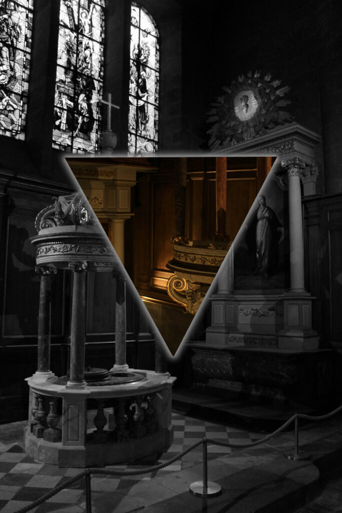
For the final crop, I used the polygonal tool. With this tool, I drew a triangular shape on my image and then right clicked on it and pressed layer via copy. I then tried different colour scenarios eg making the triangle black and white and the background in the colour, and making the triangle in colour and the background black and white. I also added a drop shadow to both. Finally, I tried using an outer glow effect on the triangle as a way to emphasise it more due to the image being quite dark already.

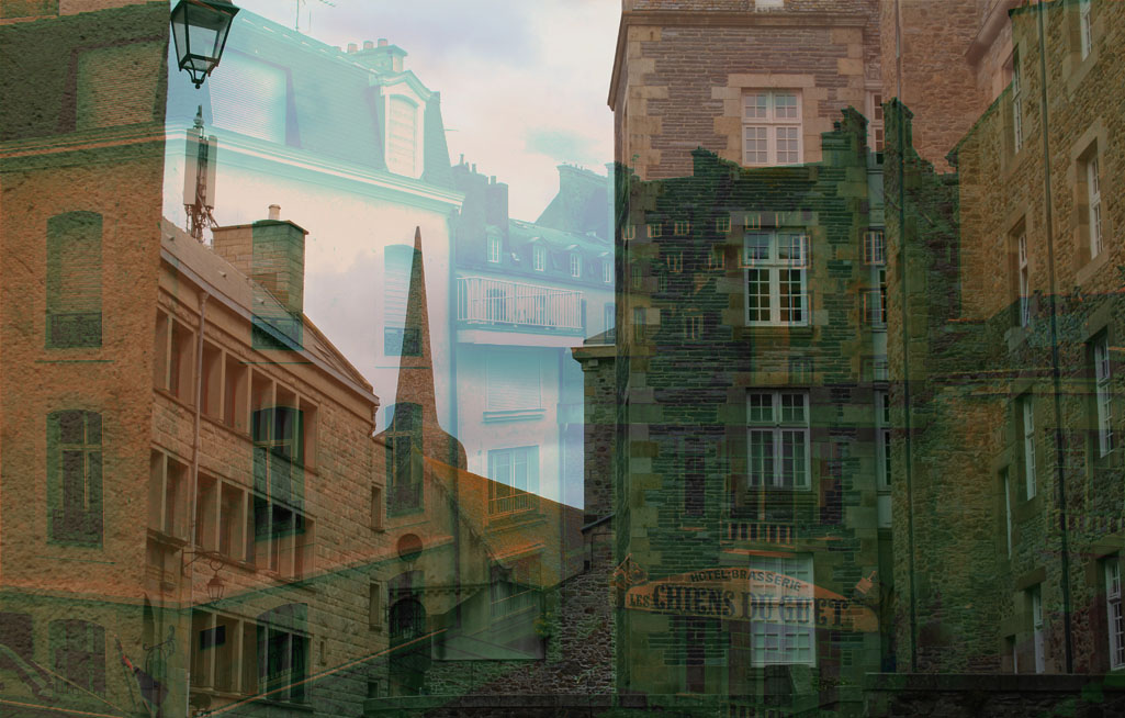
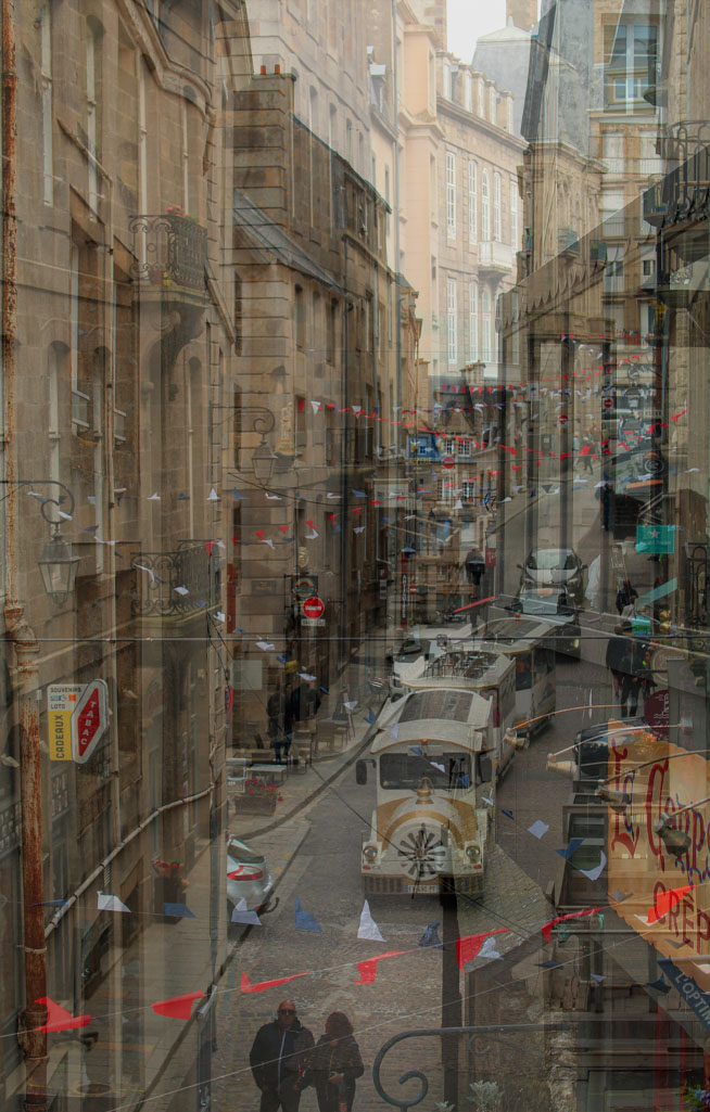
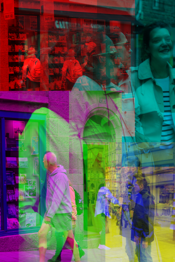
For the next two images, I superimposed two images. I did this by opening up on image to start with then opening up another one and dragging it on top of the original one. I then readjusted the size of it so it filled the page. Next, I lowered the opacity of the top layer in order for the bottom layer to become more visible. Finally, in one of the images I selected the top layer and then pressed on adjustment pre-sets then selected ‘cinematic-split tone’ in order to add a green-red colour to my image.

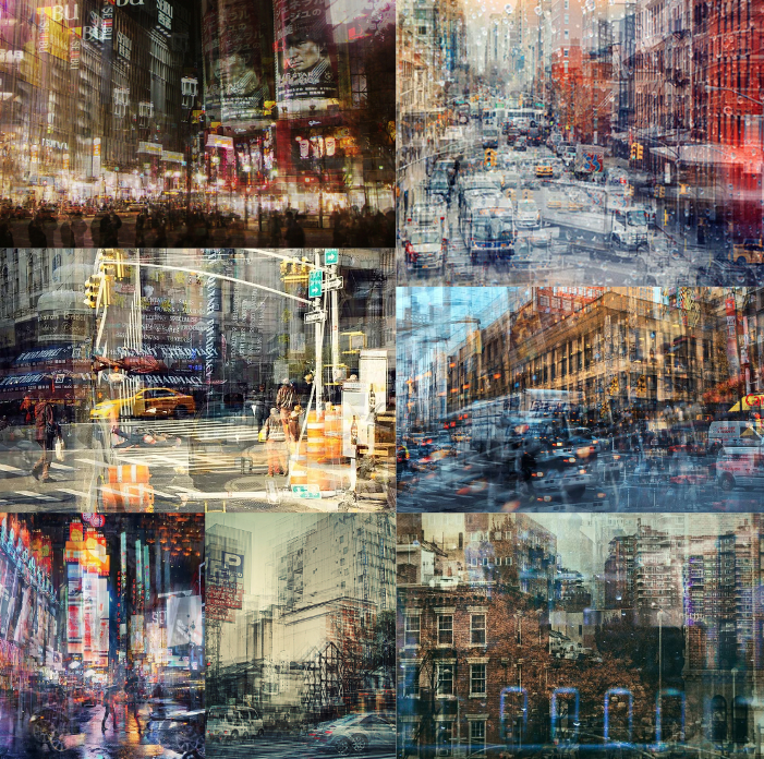
These were inspired by Stephanie Jung.

Photoshoots

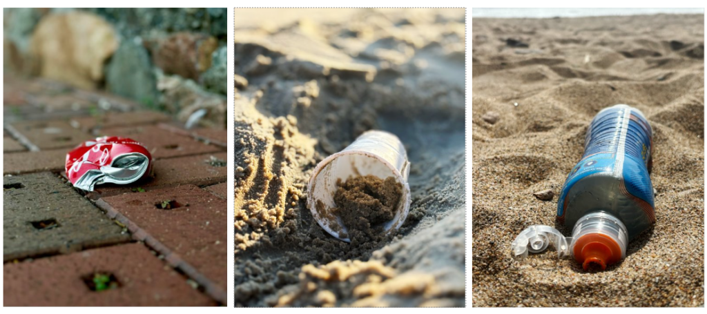
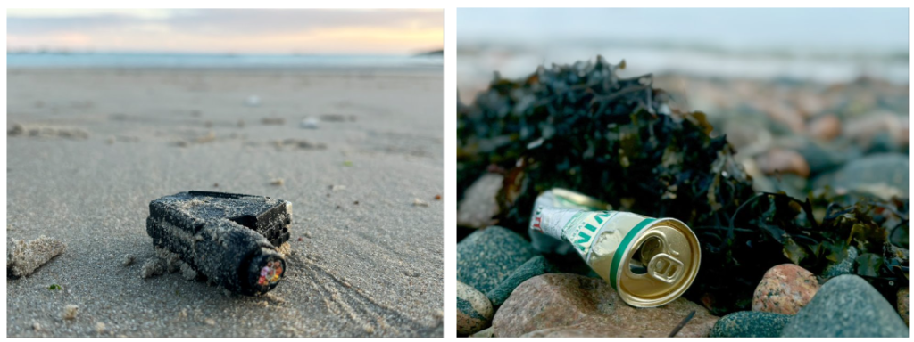
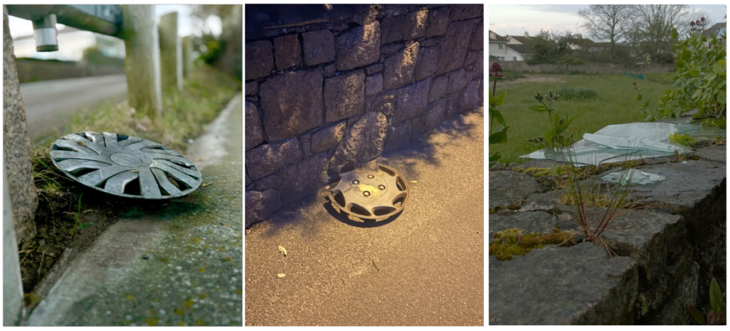
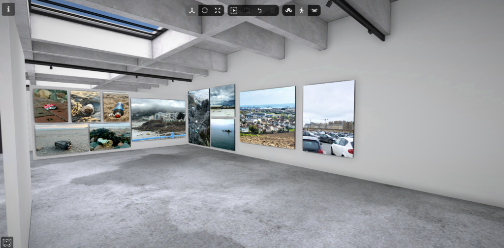
Photoshoot 1: Pollution favourite images (Waste, fly tipping)

For this photoshoot, I decided to focus on each individual piece of waste on its own and not group them together. I think this worked well because it meant I could capture many angles of the waste and make sure that that was the main aspect of the image. I focussed on places such as beaches or sides of roads. the beaches were the main location in chose as you can find so much as they are large locations and we have loads of beaches on the islands. the main waste product I came across was plastic, this worked well as I wanted to focus on plastic the most, however, discarded drinking cans were also a popular finding. One thing I liked about my image is how in each photo I used a shallow depth of field. I think this worked well as it meant the image fully focuses on the main piece of waste. though the background is blurred it can also be clear to the viewer where the location is. For fly tipping, my pictures mostly consisted of discarded car pieces, however, I did not manage to capture many photos in this topic.

Edits: My original images were taken by phone camera and after I had gathered the images I wanted I first edited them on the photos app by focussing the image on the object by generating portrait mode and it then produced my image by blurring the background. After transporting the images onto my computer I used photoshop to auto edit the levels and curves of the image and then adjusted it if it didn’t work well. I had to crop some of the images as the object was off-centred on some of the images which didn’t look right.

Final piece plan: I am planning to print the top 5 photos out on A5 and put them all together to create one piece. Ima planning to arrange them like they are arranged above however this may change depending on what fits the best

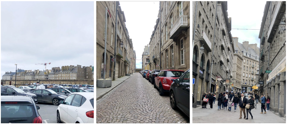
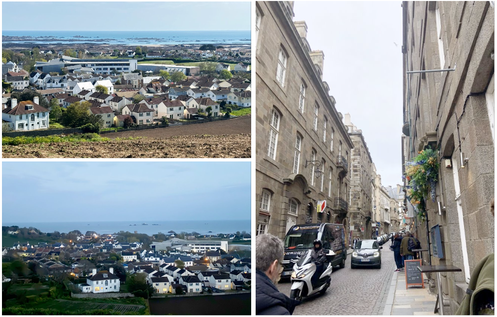
Photoshoot 2: Overpopulation

For this photoshoot I looked at a few different types of overpopulation including people, cars and buildings. the first photo shows a large group of cars in a car park which shows overpopulation quite clearly because of how busy/packed the carpark is. the presence of the cars also destroys the view of the buildings behind which hold historical meanings. This can also be a contribution to pollution since cars do have a part in the cause of air pollution.

Edits: The edits I made to these photos were fairly simple as I put them onto photoshop and edited the levels and curves. The bottom left photo was produced quite dark so that was brightened when I edited it

Final piece plan: I am planning to use the car park photo and the two house landscapes from above. I want to use these to create one piece by putting the car park photo beside the two house ones.

Michael Marten Inspired photoshoot (& AI)

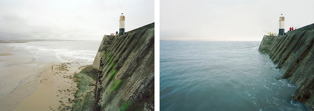
Inspired Photo from Michael Marten

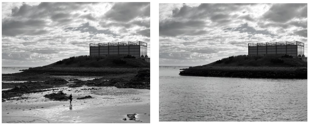
For this photoshoot I needed to photograph the same location twice at different times. the main different of each photo is the tides being out and being in. However, this was one of my creations using the AI generator on photoshop. I chose to use this photograph as my favourite as I think it turned out quite well even though its not real. I also like the original photo itself as well because I think the black and white works well to make the clouds stand out more.

Edits: The main image of the right image was the AI generator by adding the sea to the original photo. I decided to turn both photos to black and white so that I made my own change to Marten’s photographs as he doesn’t use black and white frequently. I also chose to use black and white to further try and hide the AI and to make it look more natural even though its not.

Final Piece plan: I am planning on printing these out on A5 as I think if I went bigger the quality wouldn’t be that good. I want to put them side by side on foam board.

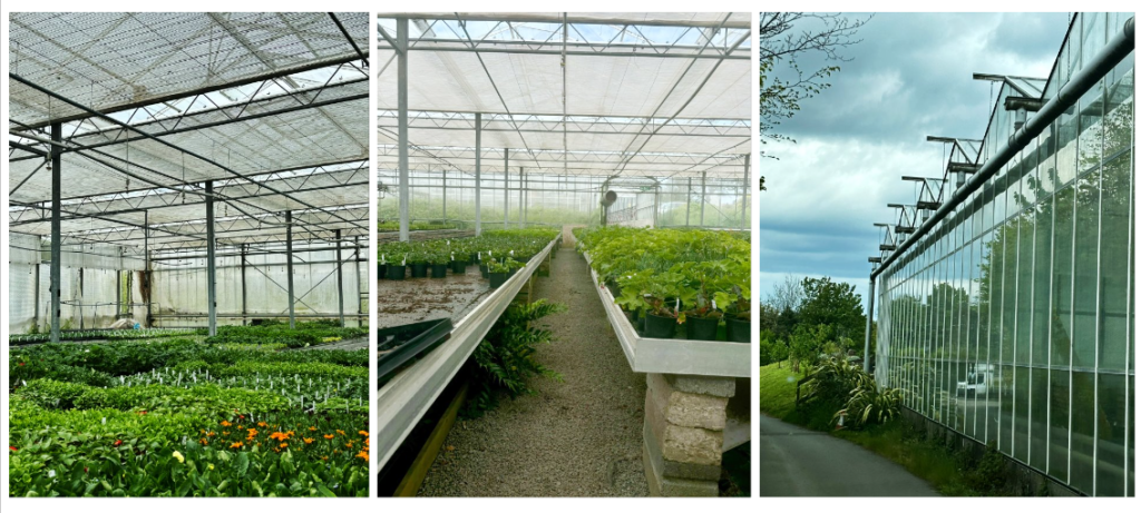
Photoshoot 4: Glass houses

This photoshoot didn’t consist of many photos as I didn’t go to any greenhouses other than this shop. I don’t really like this photoshoot as the main focus was meant to be abandoned green/glasshouses and the one I took a photo of is currently in use as its a shop. However I do like the right photo with the reflections coming off the side of the glasshouse. I could’ve done better to take time with the photographing as you can see in the middle image it is wonky so the photo doesn’t look good. I think I took photos too quick and that limited the quality of images.

Edits: I edited these images on photoshop by changes the levels ands curves and also lowered or heightened the brightness. the left photo was originally more zoomed out but i think the corner is the part of the green house that may link with the theme of abandoned.

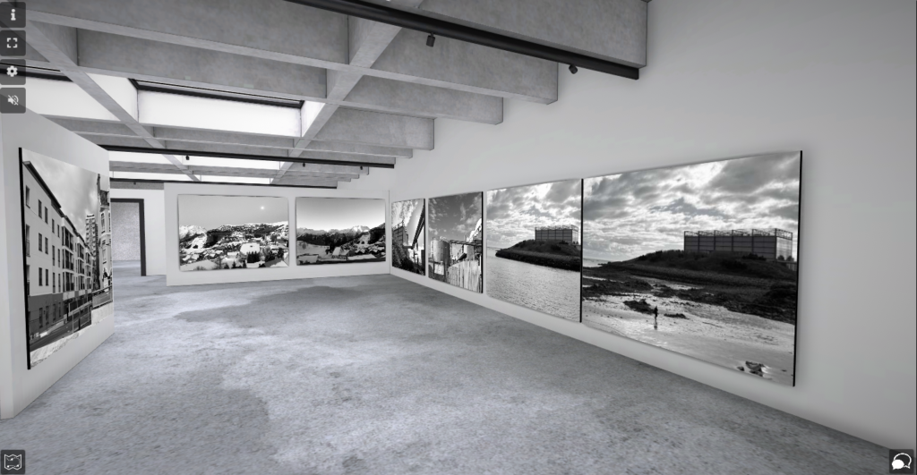
Virtual Gallery:

Picture Stories – Research & Analysis

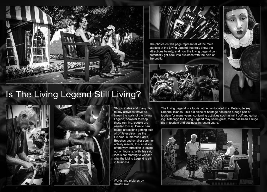
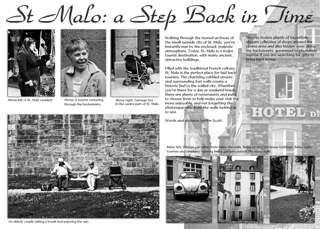
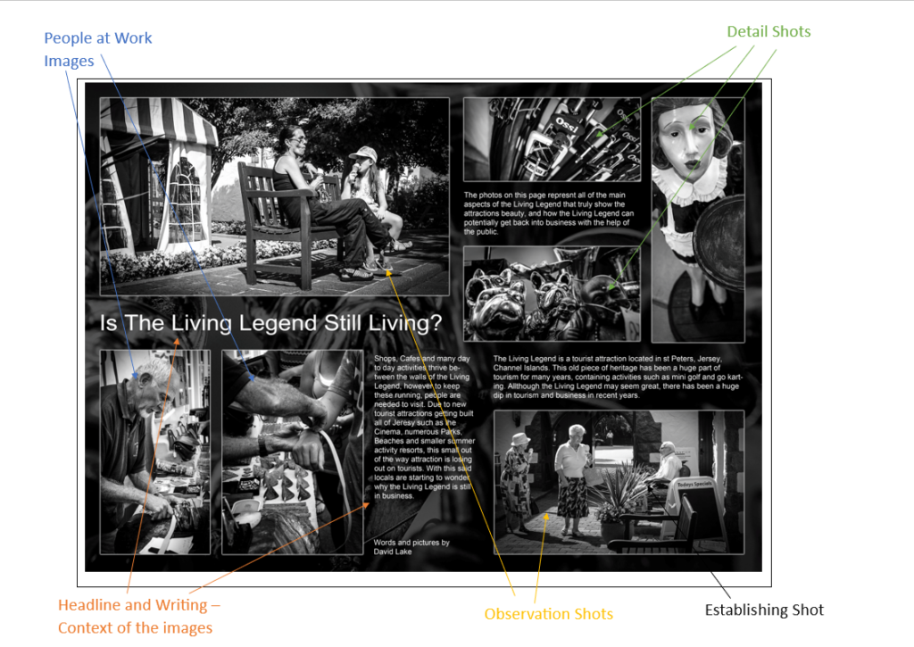
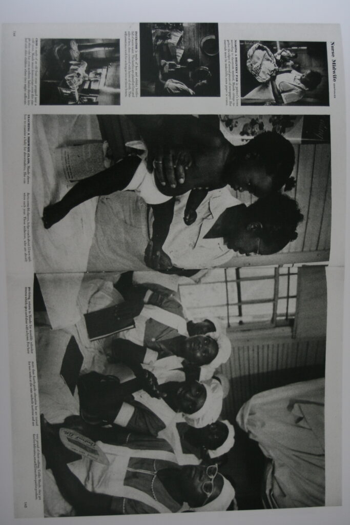
Analysis and Deconstruction of a Picture Story

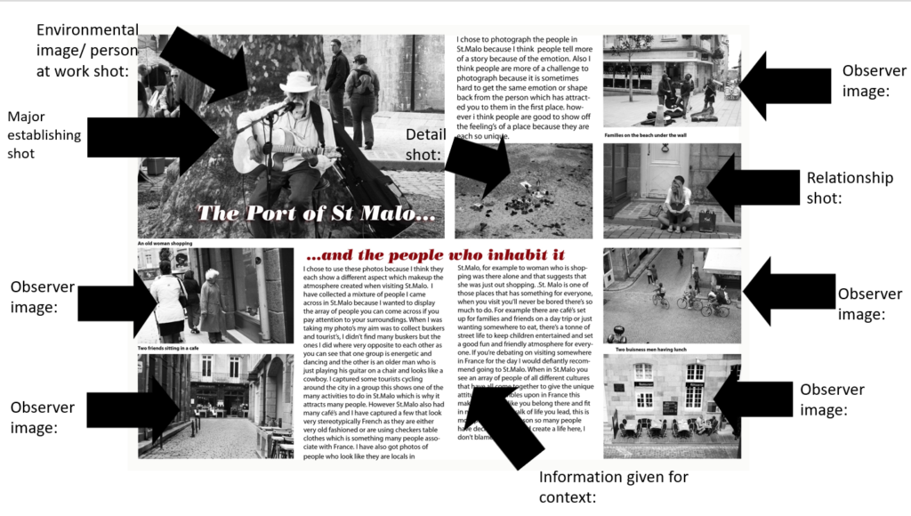
Establishing Shot – A photograph that gives meaning and context to all the images in that project.

Picture Stories: Research and analysis – George Blake

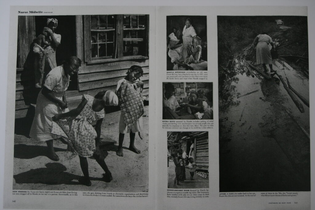
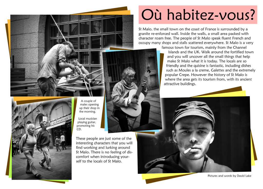
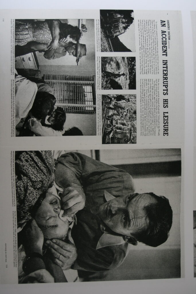
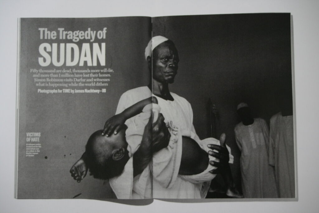
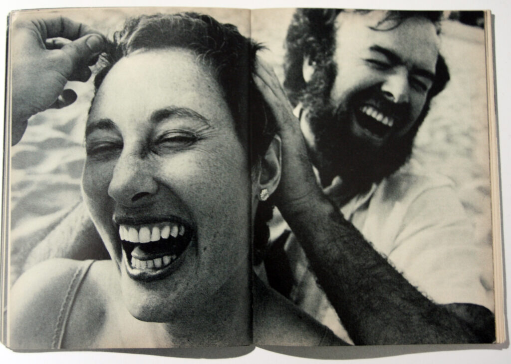
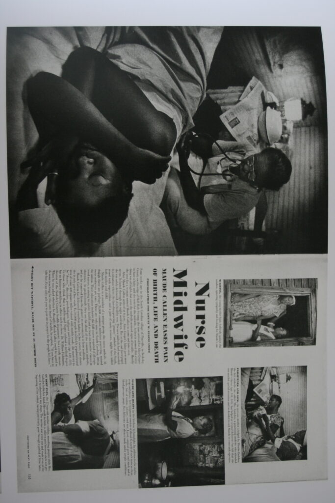
This page layout where a subject covers an entire page is something I’d like to try and incorporate into my work, I chose this as it simplifies viewing the work and can provide more impact to contents within that image.

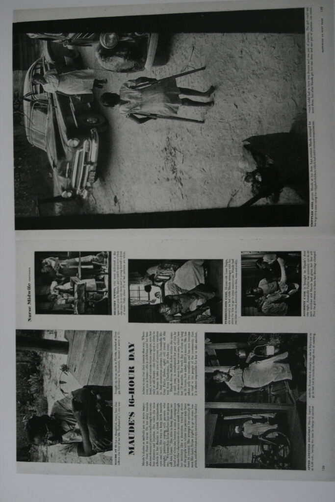
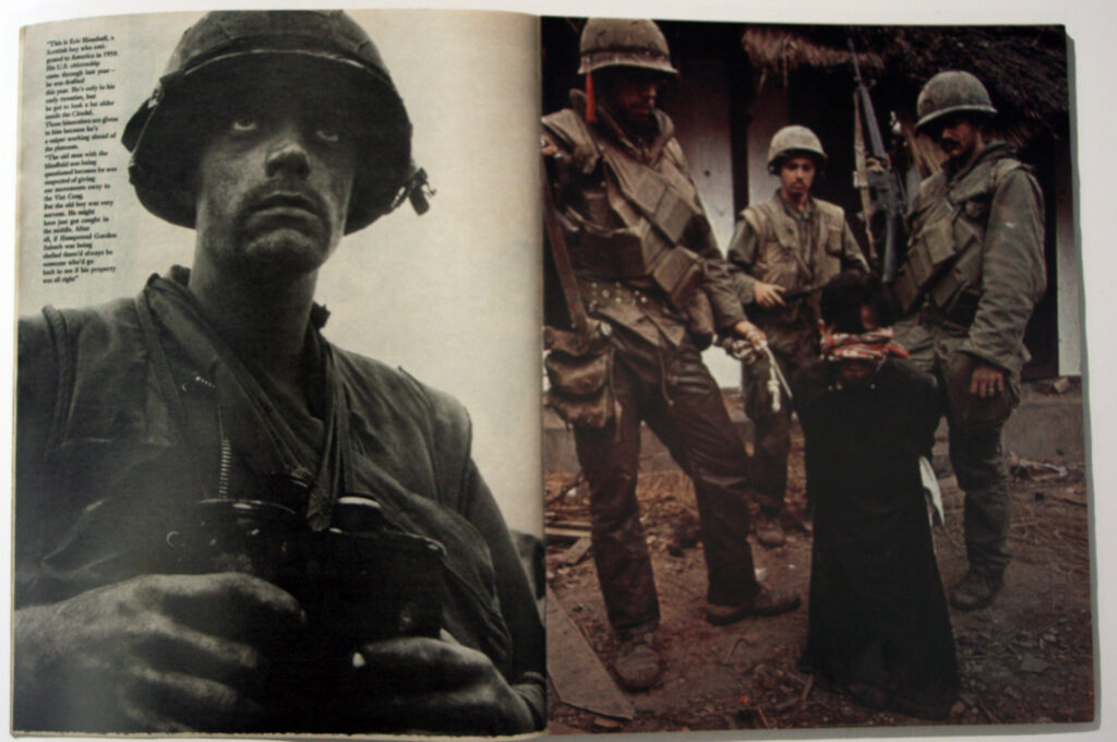
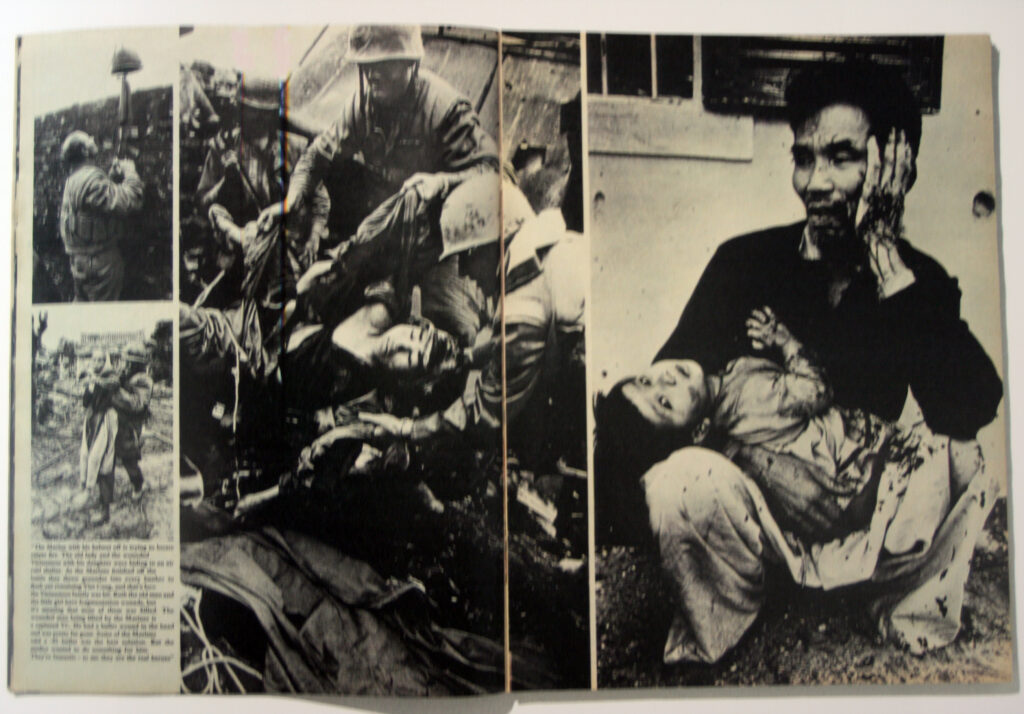
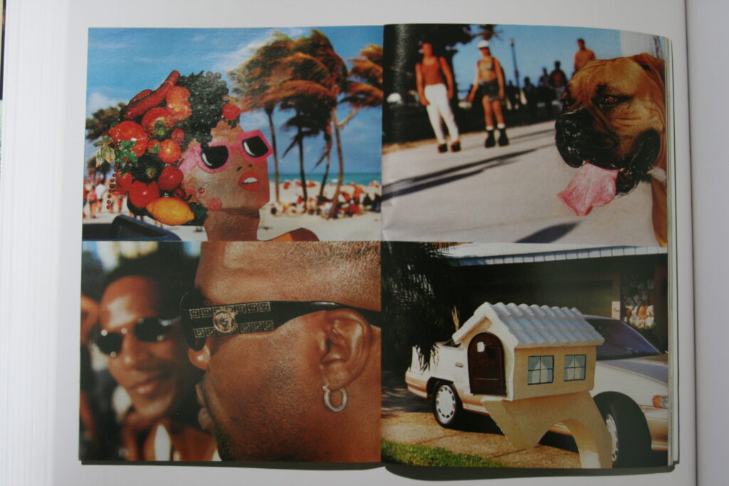
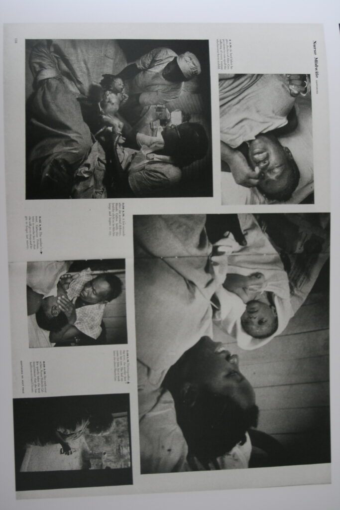
These Layouts with a combination of very large and small images attracted my attention due to its interesting composition. Something like this could work for images that are taken within the same area, like how in these references they all take place within a combat zone or a village .

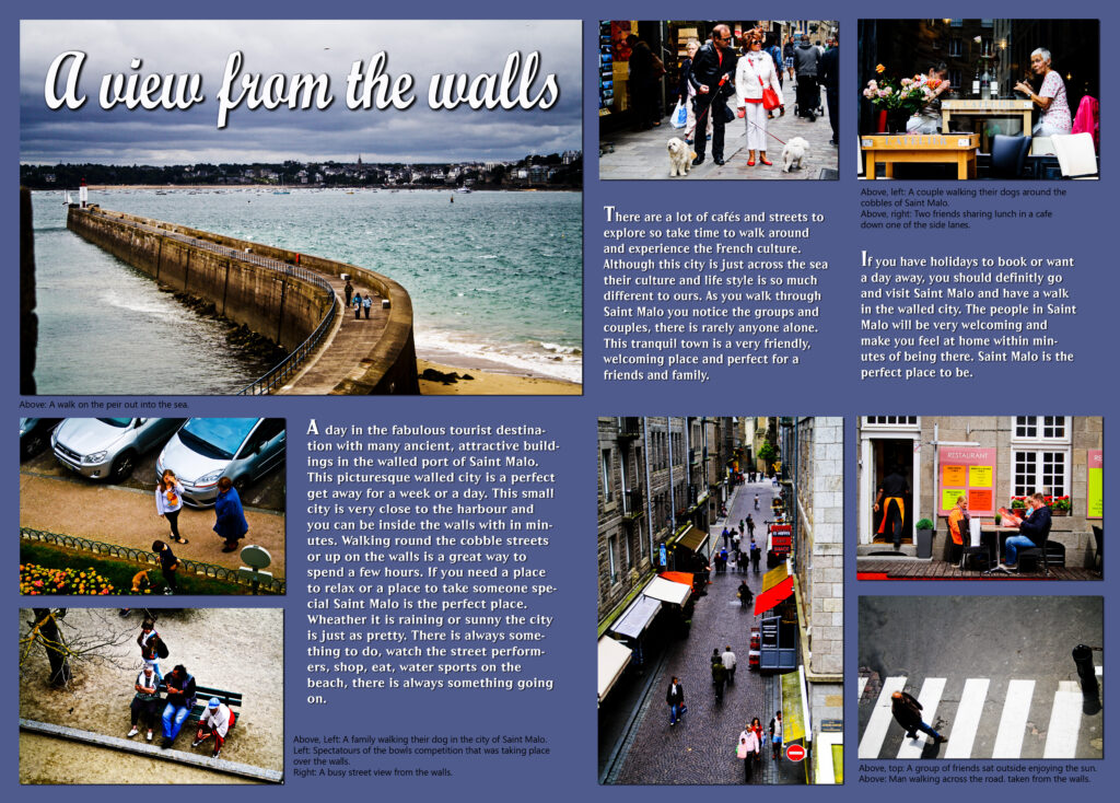
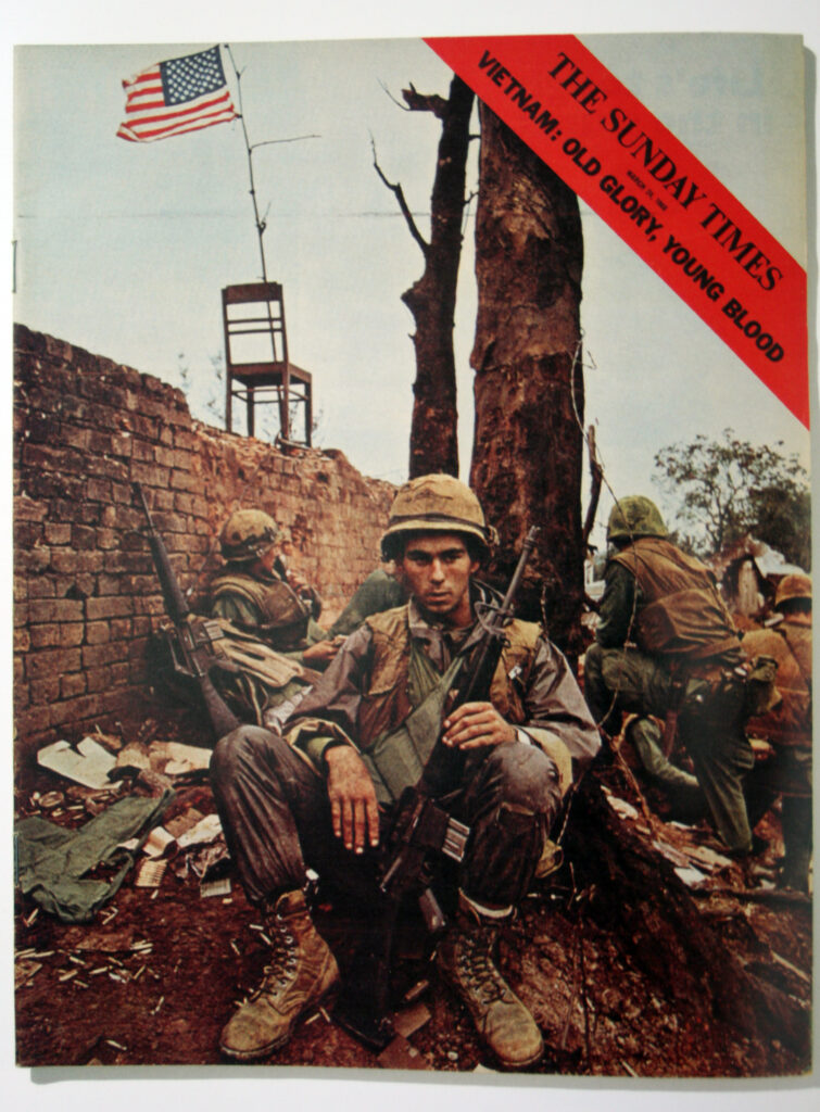
this picture story’s use of a full image for the front cover, with limited text is a good example of how to present my work. By having one area sum up the contents this could apply for my St Malo images.

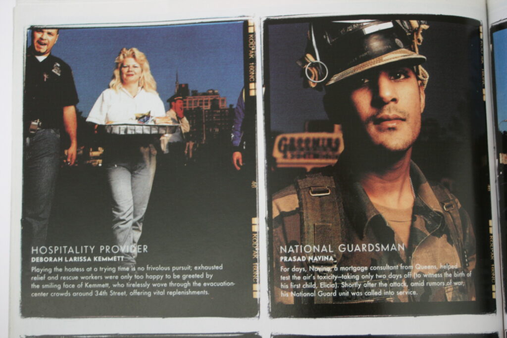
This picture story is a good reference for its, easy to follow narrative through inter-connected photos and text description. By added context this creates and interesting story to follow.

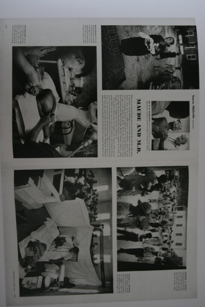
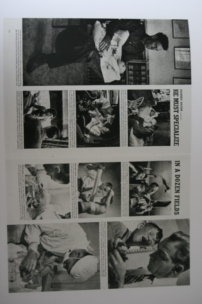
Without text, multiple images on a double page spread is another unique way of presenting images. As mentioned previously, this would apply well to my images taken within the same context.

Having a singular image spread over an entire page, with or without text, is another method of picture story design I might incorporate into my work, depending on the picture and its contents this could make it stand out a lot more to viewer.

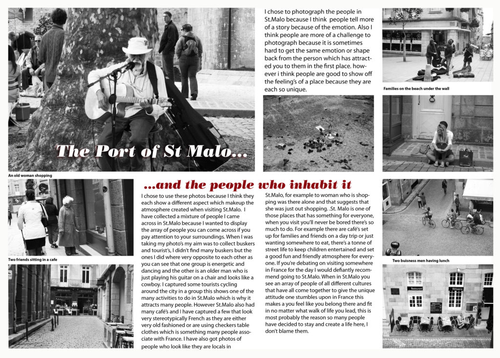
Text overlaid images is another interesting way to incorporate information about the contents of your image. Darker areas of images are best for this as it acts as a back drop within the image for your text.

Photoshop Editing.

CROPPING.

Panoramic crop (horizontal)

Panoramic crop (vertical)

Square crop

Circular Cropping

Selective Colouring.

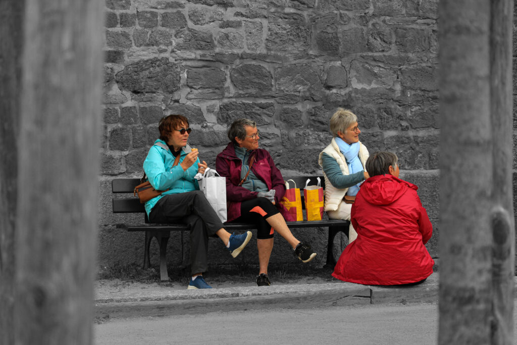
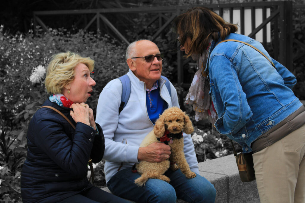
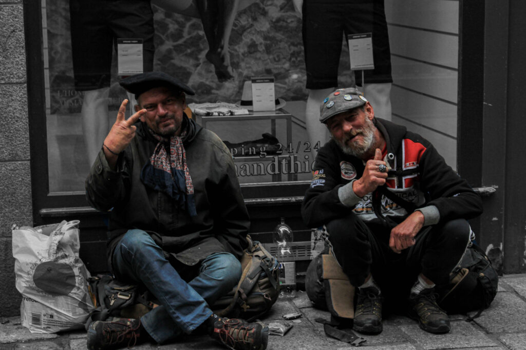
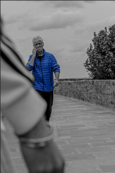
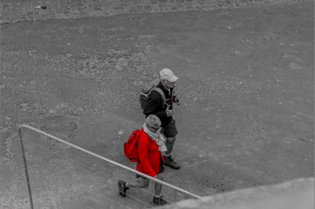
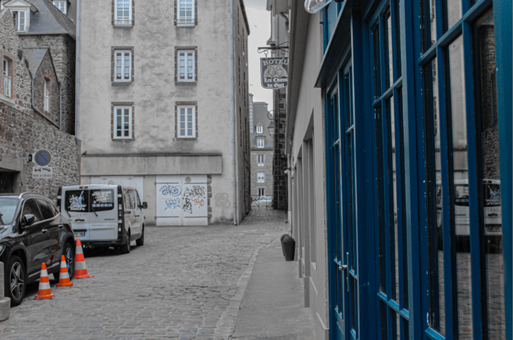
In Photoshop, I attempted to edit my images by using selective colouring. This is by having a black and white image with one singular colour or object being colour. This makes the person or object eye-catching and can add meaning to a photo.

I chose the blue coat to be coloured as he is the focal pint of the image and would be the most eye-catching.

I decided to choose the woman’s red coat to be illuminated as it is a very bright colour.

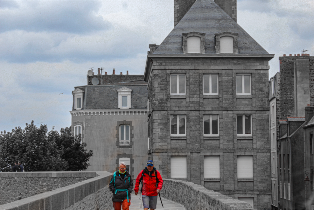
In this photo I chose to have two colours both blue and orange colour. Having the background not fully black and white makes the atmosphere look gloomy and cloudy.

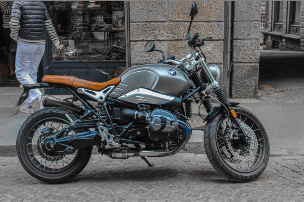
I chose for the orange/brown and the blue of the image to be coloured to make the bike stand out more.

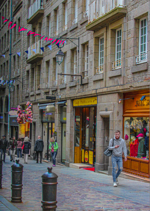
For this image I chose for all the colours including pinks, yellow, orange, green and reds to be very colourful. This was to experiment with selective colouring on Lightroom.

For this image I decided to keep both the people in colour and have the background black and white.

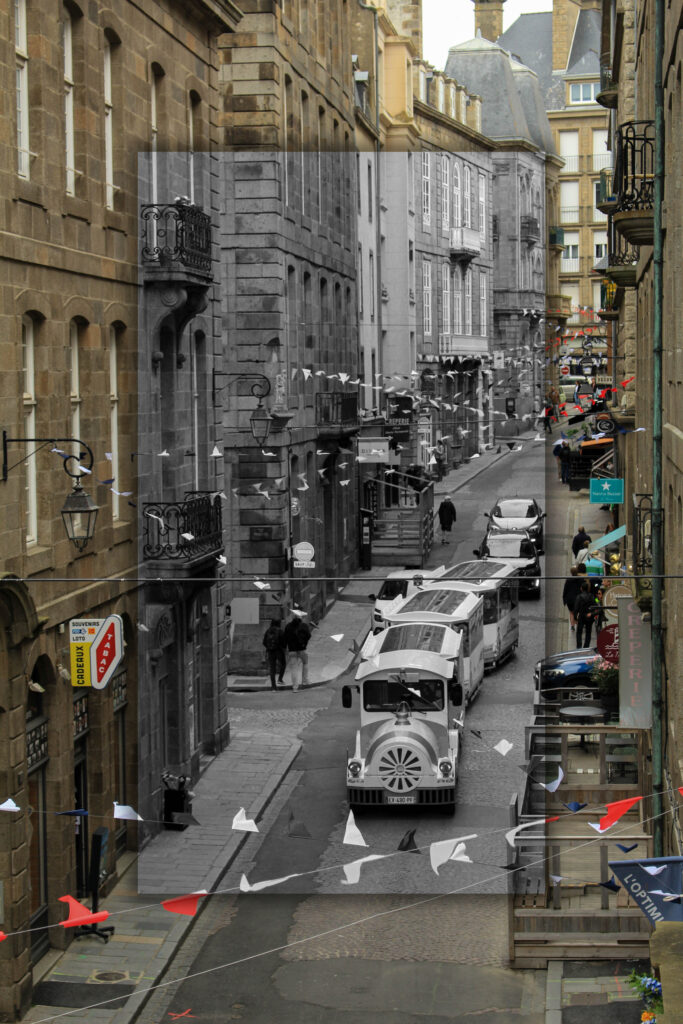
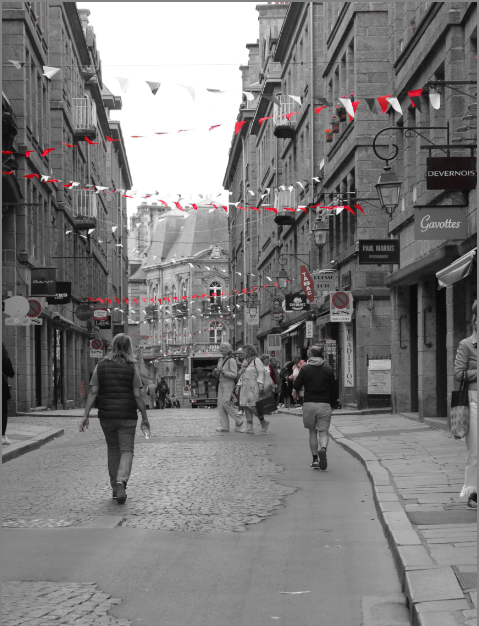
For this image I decided to make the flags in the street both red and white, whilst having the image in black and white. However, this made some red coloured signs stay red also, which I think slightly takes away from the quality of the photo.

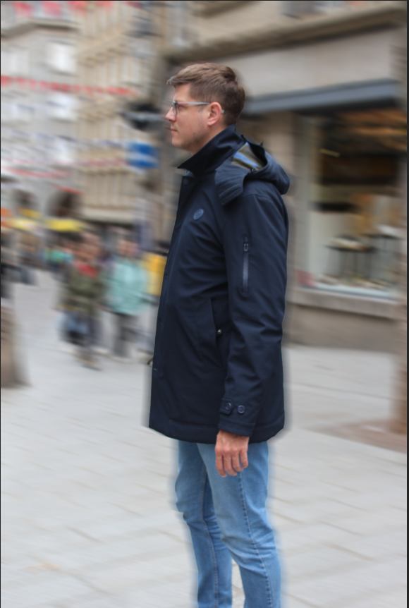
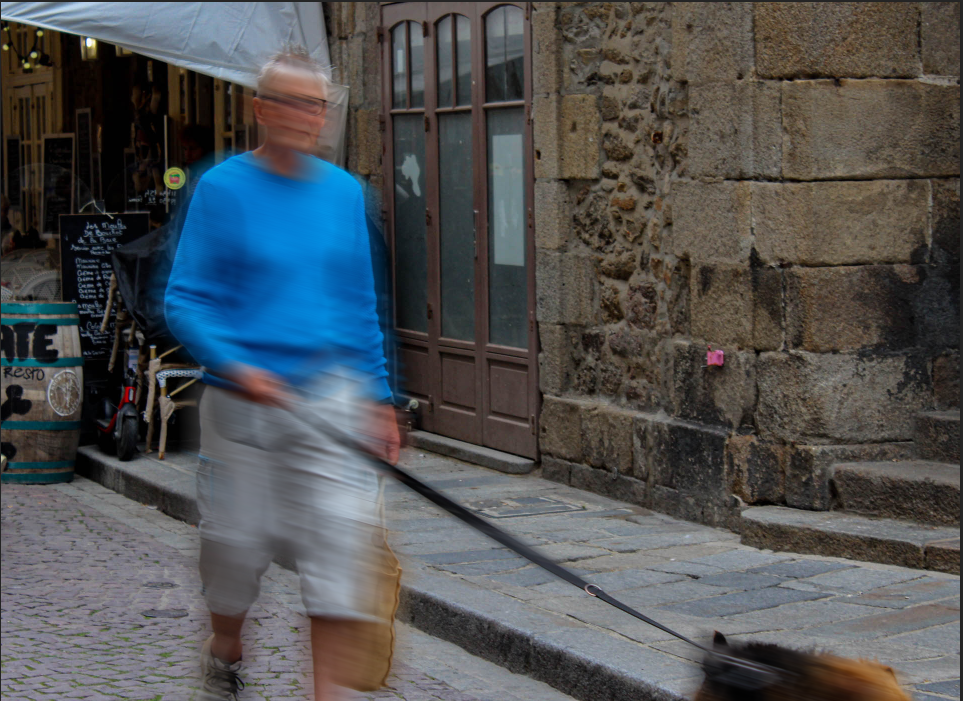
Motion Blur Practice.

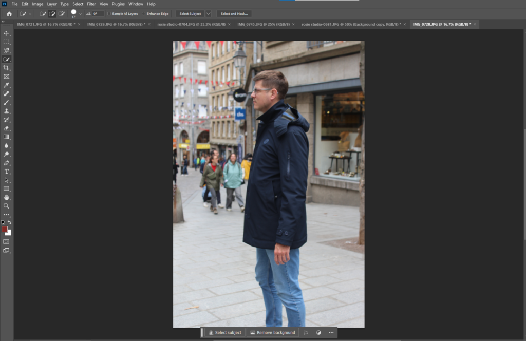
  1. Select an image and import into Photoshop

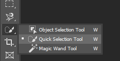
2. Select the ‘object selection tool‘ and right click to change the setting to ‘Quick Selection Tool‘.

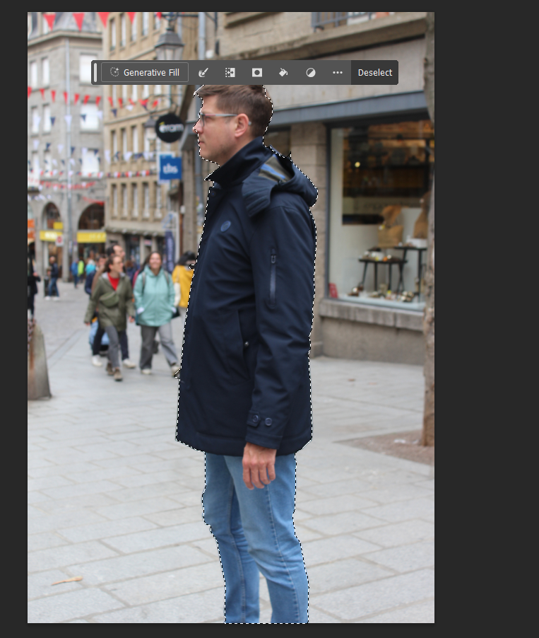
Select around your person using the quick selection tool, to remove some outline press ALT. To select more press, SHIFT.

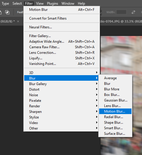
Go into Filter and press Blur and then Motion Blur.

Select Inverse to blur the background of the image and keep your chosen person or object in focus.

Here I have blurred my chosen subject instead of the background.

Experimenting with cropping

I cropped this image to get rid of the brick floor to frame the image better. By making the image cropped and getting rid of most of the floor I’ve created a more interesting image as you cant see what is being looked at and it creates a unique composition.

I cropped this image so that the only thing that would be in frame would be the ladies eating their lunch. This narrows the focal point of the image down as now its just them in the image.

With this image I cropped the photo to get rid of the stone step and then added the banana peel to make it look like he was disgusted by the banana peel being on the floor.

For this image I added a peacock to the original image as the lady who is sat down eating was directly looking at the empty space where the peacock is.

St Malo Photoshoot

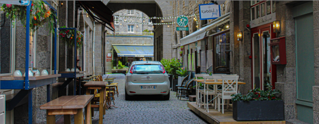
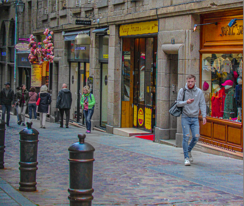
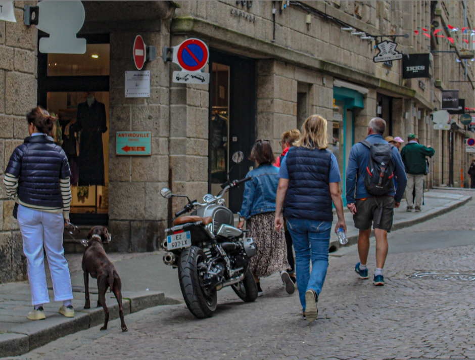
For this photoshoot, we went to St Malo for a day in order to photograph the different buildings and take pictures of people without manipulating their poses/ what they were doing by not making them aware they were being photographed. The aim was to mimic the work of Henri Cartier-Bresson and the decisive moment. To do this, we ensured that we didn’t try to bring attention to ourselves or get people to purposefully pose for a photograph as the goal was to capture natural, real behaviours. However, sometimes this wasn’t possible due to people spotting the camera and then asking for photographs or changing their behaviour. When we visited, it was quite cloudy which meant we had to adjust the camera to cloudy mode. Additionally, we wanted to test out using different shutter speeds in order to get movement in our images. To do this, we lowered the shutter speed which allowed us to capture the movement of different things eg people and vehicles. On the other hand, if we wanted a sharp, in focus images, we increased the shutter speed.

In order to minimise down the many photographs we had taken, we imported them into Lightroom then began by giving each image either a white flag (if we wanted to use them) or a black flag (if we didn’t want to use them). This narrowed it down by a half approximately but there were still too many. So, next I ranked each of the images out of 5 stars (5 being the best and 1 being the worst). Once I had completed this, I then selected the filter button and made it so I could only see the images with 3+ stars. Finally, to finish narrowing down my selection I assigned each of my images a colour: green (I wanted to use as a final image), orange (potentially use) and red (not going to use).

Once I had narrowed down all of my images, I then gathered all of my images with people in and put them into a folder. I then used Lightroom to adjust each of my images eg the exposure, contrast, highlights, shadows, blacks, whites and colour hue, saturation and luminance. These were my final outcomes:

Overall, I like how these images came out as I think I manged to successfully photograph some decisive moments where people were acting naturally and unaware they were being photographed. However, I also liked the images were people were aware of the camera and looked at it/ posed as I feel from each image you get a slight insight into that persons life and highlighted to me how different everyone is.

Finally, I decided to turn some of my favourite images black and white. I think these images are good as the people are acting naturally and not looking into the camera. Its also interesting to see the different types of emotions people were displaying whilst I was taking the photograph. I think the image with the lady holding the umbrella is mysterious as you cant see any of her face and I like how she is in focus and the background isn’t. This brings the attention to her yet the viewer cant work out anything more about who she is or what she looks like due to the umbrella covering her. Additionally, I think the image with the man holding the dog is interesting to look at due to the lady’s facial expression which makes you curious as to what they were talking about in order for her to produce that reaction. Finally, I think the last two photos are good due to the framing of the people due to the trees on the bottom left image and the unique positioning of the people in the bottom right image (as usually the people are in the centre of the image but this time they’re to the right). Finally, they are both in good focus and sharp.

I then put all of the images without people in into another folder. Next, I edited all of the photographs the same way I did for the ‘with people’ images.

I think this photoshoot was good as I managed to capture a wide variety of different buildings from a range of different angles. For example, in some of my images I zoomed out quite far in order to get the whole building/ street in but in others, I zoomed up into certain parts of the buildings. Additionally, some of my photographs were taken from head on but some were taken from a side angle. This helped to create more variety in my work and make it more interesting to look at. Most of my images had high focus and sharpness. However, one problem I encountered whilst taking my photographs was that due to the sky being cloudy, it meant that lots of my images looked quite dull where the sky was. I tried to minimise this by using the burn tool on photoshop and experiment around with the colour section on Lightroom in order to enhance the blue in the sky.

Finally, I made some of my images black and white. I think these images turned out well and create more of a gloomier atmosphere. They’re in good focus and sharp/clear.