Anthropocene mind map & mood board

This photographer has taken this image to show the dramatic problem of plastic. This image shows a bird who has ingested plastic and has unfortunately died. However, the photographer has added more plastic onto the dead bird to emphasise the idea that plastic is killing the animals. Photographers want to create awareness as to what dangers result from our waste products and that we should recycle and advise others too as well to save the animals.

This image shows all the plastic waste that has been collected. The photographer of this image has portrayed this image as happy and bright because of the different colours, however the back story of this image has a different meaning. If you think deeper about this image it actually shows us the amount of plastic we use and shows us that plastic is killing our planet. This plastic gets burned and the fumes will pollute the earth.

What is Anthropocene ?

Anthropocene is the time in which humans had a substantial impact on the planet. Photographers have started to spread awareness on the dangers of climate change, over population, pollution, deforestation, global warming and many more. Photographers have started documenting different images of the issues on the planet for everyone to explore an in depth understanding of the reality of the world.

ANTHROPOCENE

These are some images from photographers who have taken a interest in representing the disasters in the world. Something that most of these images have in common is that they are filled with bright colours. Bright colours are usually associated with happiness however this significantly contrasts with what the images are actually made for. Anthropocene is awareness of the dangers in our planet such as cars, plastic and toxic fumes that we pollute the air with. Anthropocene photographers take pictures of these disasters to warn people of the damage us, as humans are causing to our world. I really like the topic of Anthropocene because as young people we are the ones that have to try to help change the way we live.

I particularly like this image, this is because it shows the consequences of our actions when it comes to plastic. This image shows a bird that has unfortunately died and the body is full of plastic. The photographer who took this image wanted to show people how dangerous plastic is and if we don’t recycle or reduce our use of it, this is what will happen to all of us.

Landscape topic photo gallery

Editing Process

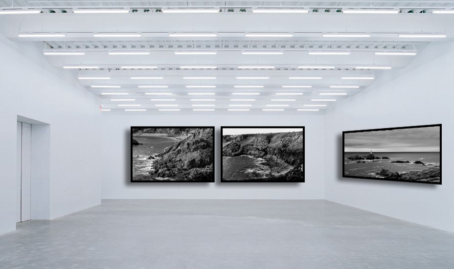
To create one of my online photo gallery’s all that I have to do is find a picture of a blank gallery room like this. Then I just need to find the images that are the most successful then I will drag them onto the gallery in photoshop. After that i can play around with the perspective as in order for it to look more natural it needs to be able to bend and follow the wall. Finally after doing that I like to add a boarder around my images to make it look like a photo frame so I will add “stoke” in FX and then I also like to add “drop shadow” as it give it more dimension

Anthropocene

Landscapes

Topographics

Storm Damage

Overall opinion

I picked all of these photos the way I did because I wanted each “room” to have a certain look to them so I didn’t really want any coloured photos in the same room as a black and white one so if I were to want just one of two in colour and the rest black and white I would create a whole new “room” for it otherwise it wouldn’t look cohesive and would just look quite messy.

For the photos I picked only some of the very best I wanted to make sure it was only my strongest photos in order to make it look so successful. I feel like even though the image look quite small because of the way they are laid out you can still see lots of the detail within the images I believe having them in black and white helps that because they colours contrast so well making it appear more dramatic and making it stand out.

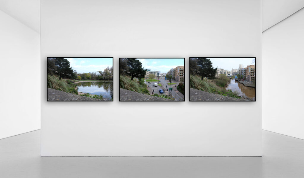
I think my favourites would be the topographic images as I feel the AI photos tell a story so clearly and successfully them being right next to each other so you can clearly see the similarities and the differences works so well.

Final piece plan

For these final pieces all I will be doing is taking these individual images and splitting them up and sticking them onto a larger piece of card so that they tell a story and look cohesive together.

For the mounting I will be using a large black sheet of card and the a slightly smaller white sheet on top of the to create that small boarder around both the white and black card. Then I will be sticking the images onto that top layer of white card with even spacing in-between.

I have chosen to use these three photos for one of the final pieces based on Anthropocene. I picked these three as I felt they showed off the main idea of anthropecne as you can see how the natural beach has now had lots of additions like the buildings because of us. You can see the structure that’s already been built on the left and then the middle is a close up of a section of that structure then the last image on the right is of construction machine which suggests that there will be more built on top of the beach.

I would also like to have my final piece of landscapes to look like this although it doesn’t tell a story I feel as if by having both of them together it helps it look more cohesive and less random I also think having both the black and white backing card works well with the images as there are in black and white so its monochromatic and also having just white makes the image a lot brighter and the sky from the photo can kind of blend in but by having the black behind it creates this contrast which really helps.

This will be my last final piece which is for Anthropocene for this is similar to the landscape final piece as I don’t feel as if its trying to tell a story however having those two images which are quite different locations and yet they look so similar works. It shows how built up and overcrowded it actually is in jersey.

Page Spread: design + layout – George Blake

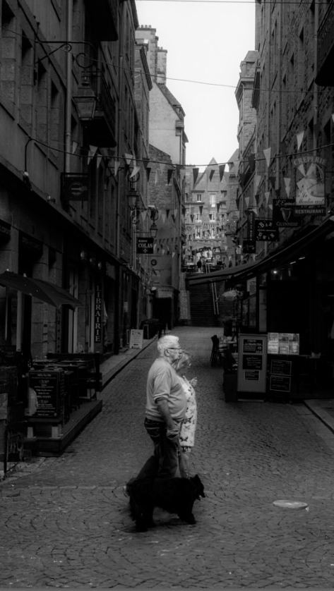
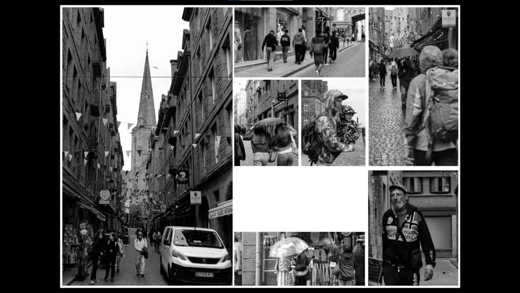
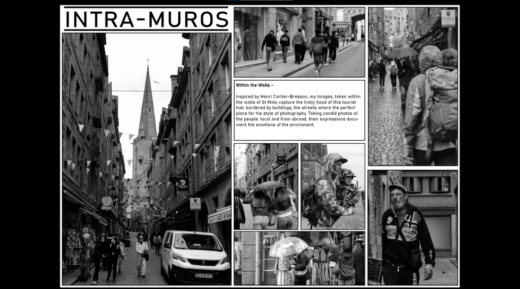
Here I will show the design process of how I made my page spreads of my images from St Malo.

1st design –

After arranging out a design I liked, as well as adding the images I believed best suited with it, I left a gap for text to be included.

By adjusting the Images again I made some room for my page spread title, by also moving my text box higher up this made it closer to the top of the page and more easier for the eyes to be guided when looking at the work. Inside Its text, I wrote about my inspiration, Henri-Cartier Bresson.

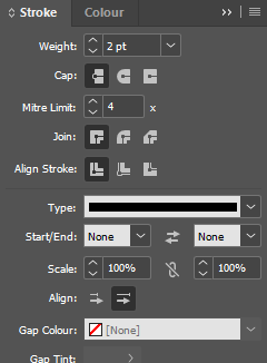
Adding stroke borders, This help defines the image more on the page and matches to the text box, which also contains a bordered.

2nd design –

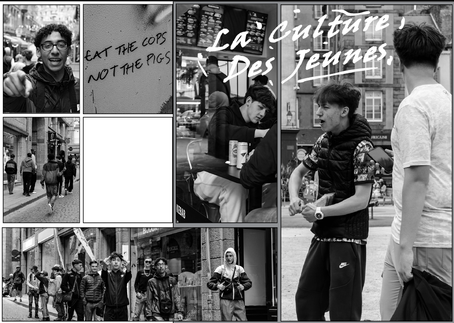
Designing the layout of the second design, I focused on the examples of male youth culture/hooliganism I saw within St Malo. Through selecting my edited images I have composed a similar aesthetic between these images inside this picture story page spread.

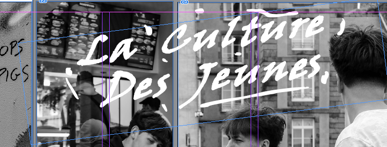
Whilst in St Malo I noticed that graffiti was quite common in the area, with masculine connotations being a quite common idea behind the idea of graffiti, I decided to include this in my work. Using a font that to me looked like it was created with a spray can, I used the pencil tool to add a rough level of detail of paint marks to further generate my impression of my title.

With the final text added, This came out quite well in my opinion and creates an interesting composition around the aesthetic I chose to present.

Picture stories: Research and Analysis

This is a classic picture story taken from the ‘Nurse Midwife’, placing black and white images onto an off-white creamy background. However, picture stories can be created into a more modern format, for example:

I chose this picture story to analyse as I feel it works very cohesively due to the black and white, alongside the way many of the images are the same side down the edge, for example, as this ensures the images tell a continuous story and makes sense. Picture stories are laid out in an newspaper-styled/ magazine page structure. They typically consist of:

  • A major establishing shot
  • A person at work
  • A detail shot
  • Relationship shots
  • Environmental shots
  • Formal or informal images
  • Observer shots

This is the largest image on the spread, the image which provides the most context about the article and can represent the story the best out of all the images. It should be the most eye-catching image within the structure to draw and entice the viewer in as this will be the largest part to catch eyes from a distance. In this case, this involved the candid nature of an older man playing the guitar in public. This would have been the major establishing shot due to this being the image most cohesive with the title – about the people of St Malo. Sat in the centre of the image, this becomes the main storyteller of the spread as it provides an insight into the life around the port of St Malo and the culture which inhabits it.

This particular image on the picture story must consist of four different assets. These are ensuring the person can be seen, their actions are visible, the way they are doing it is visible and including the context of their surroundings (where they are carrying out their work). This leads the image to describe a story within itself and add more detail to the entirety of the topic that the picture story is based on. This can also be seen within the major establishing image through the use of the busker, this can be assumed that this may be his job or hobby.

These images are usually minor within the picture story, however it provides context to the location that it is based on. These are typically images that are zoomed in on small areas and sections, using a short depth of field to capture a specific part. For example, in the images of the St Malo trip, this could be an image of something native to France, such as directional signs or seagulls. This provides a subtle approach to the culture of the topic or location, usually in a format of being the smallest or one of the smallest images within the picture story. In this picture story, for example, this consisted of a cluster of birds on one of the many beaches of St Malo, showing how hundreds of them inhabit their coasts and are a part of the rich culture there.

Relationship shots are those consisting of two or more people engaging with one another, candidly or in a more formal way. The relationships shown within the image may be romantic, platonic, hateful or a way that boosts family relationships. Many emotions can be conveyed through the body language captured; jealousy, love, anger, sadness, happiness – the list is infinite. This adds a sense of humanity into the image as it portrays the experience of average, everyday human life in a raw or memorable way. In this example, a loving relationship can be seen in a way that has the absence of posing, sitting on the floor together and happy. Whilst this is a small image, it is still significant in a way as it tells a story about how life is within St Malo.

Observer shots are those taken within the absence of posing – candidly and raw. This was the main ideology behind our trip to St Malo in inspiration of Henri-Cartier Bresson and his use of the ‘decisive-moment’. People within the image will be unaware of the shot as this means that emotion and actions can be captured in a more truthful, honest and genuine way. In this example, practically all of the images are observer shots however the actual ones show the culture of cycling within the town, the ambience of cafes and restaurants the regularity of busking throughout the streets and the continuous cycle of shopping. By shooting these images in a subtle way, it provides the viewer with a way to see the pace of life and how St Malo differs from many other places.

Stephanie Jung Artist Research


Stephanie Jung is a Berlin-based photographer. She’s known for her experimental take on multiple exposures. Her constructional shots show cities that represent reality but lead to a different as well as surreal dimension apart from our real world. She shows her infinite multiple exposure technique, this time with the help of the “Lomo’Instant camera”.

Stephanie holds a B.A. in art history and literature from Harvard University. She also worked as a translator, international affairs officer, and junior curator for the Three Shadows Photography Art Centre in Beijing for three years. Such as she organised exhibitions such as “Ai Weiwei: New York Photographs 1983–1993” (2009) and “WATW: We Are the World” (2009).

I believe that her work can be considered to be a creative and memorable hallucination as the images look deformed and look clear that two photographs have been layered on top of each other creating a very special and unique effect for the audience’s eyes.

I think Stephanie’s work is very admirable as she uses opposing photographs and creates something special with them. What to must special effects only using specific camera settings and layering images on top creates a sci-fi/ science fiction movie effect, something that could be seen in the movie Blade Runner possibly where cinematic effects are presented through the streets and roads, this could send a link through the audience’s mind if they see something that looks similar to a hobby or just a pleasant memory.

Themes that Stephanie’s photographs could link to are Distortion, Complexion, and Disfigurement.

Anthropocene Photoshoot 2:

(Damn/Reservoir La Mer)

In this photoshoot I wanted to explore the impact of man/man-made on the world, and including the topic of Anthropocene and how it plays into it.

I explored the Val de la Mare reservoir down at St Ouens as I believe that it is important too to get many perspectives as from one perspective the reservoir may look very small and not full indicating that potentially due to environmental changes the damn has decreased. From the bottom the structure looks huge, it contrast to the photographic perspective from above as its not evident how extensive the damn is.

In terms of using photoshop and artificial intelligence, I think it would be interesting to paint the reservoir in a different outlook. Adding connotations such as “drought”, “desert”, “dryness” and “empty” etc. , this makes the AI undersand i mpre and adds the ffect as if climate change has