Photoshoot in response to Henri Cartier Bresson

Photoshoot plan:

To respond to Henri Cartier Bresson I will go to various areas of Jersey such as the royal square, parks and cafes as these areas are likely to be occupied by people. I will take these photos using a camera in manual mode as well as Tv mode. In some photos I will use a slower shutter speed in order to capture movement of people.

First photoshoot:

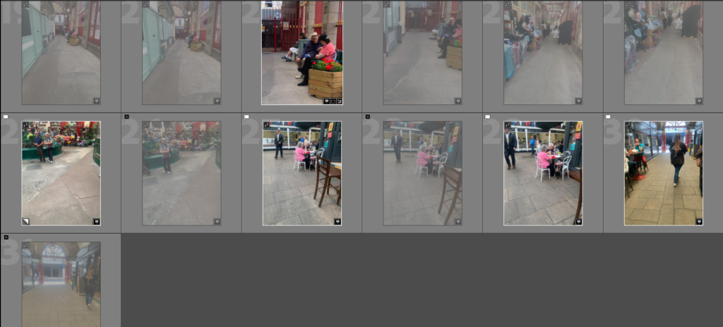
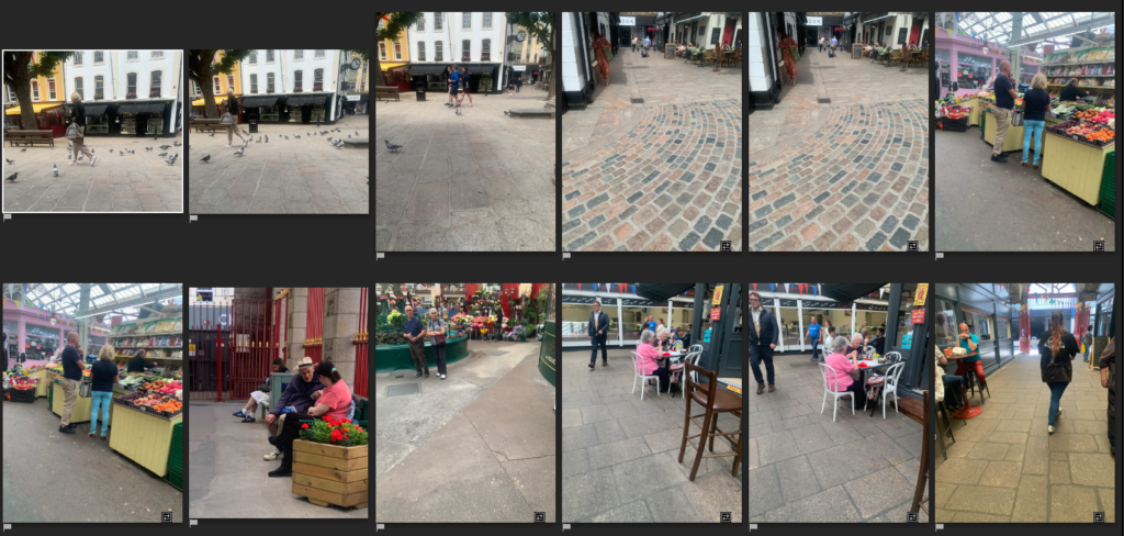
I started by doing a quick photoshoot in town with my phone where I went to the Royal Square as well as the Market in town. To improve during my next photoshoot I will take them in other areas and take more photos.
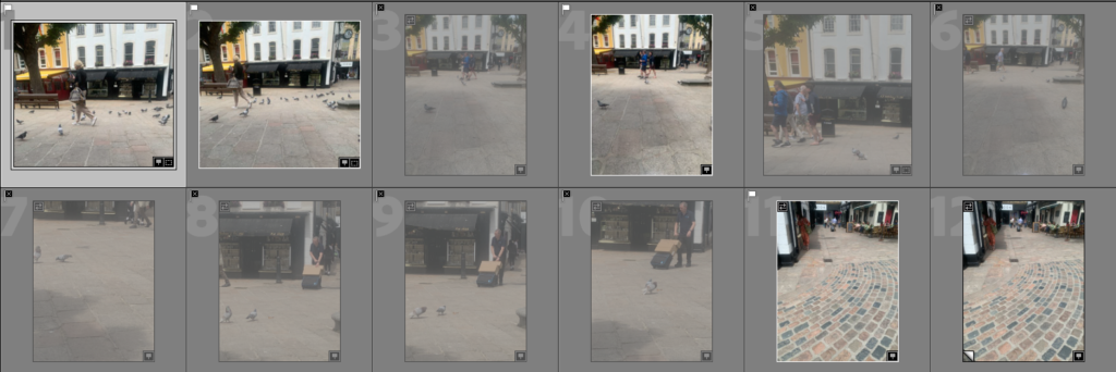
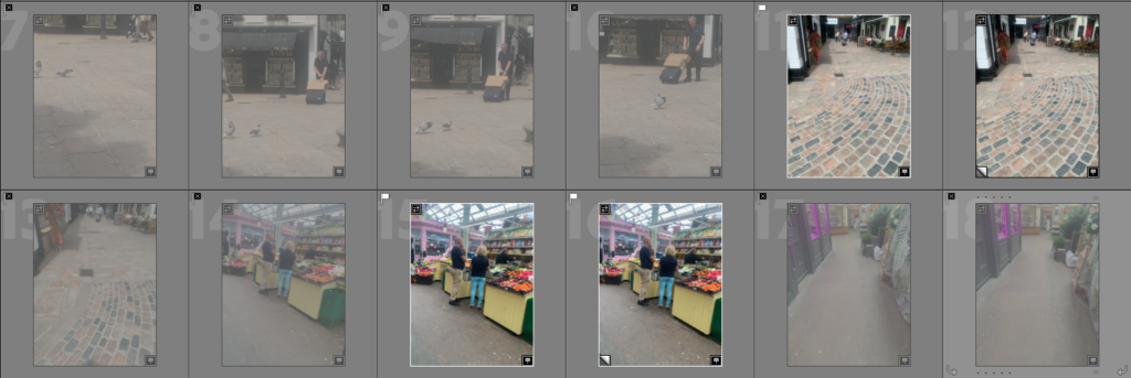
Best photos: (from first photoshoot)
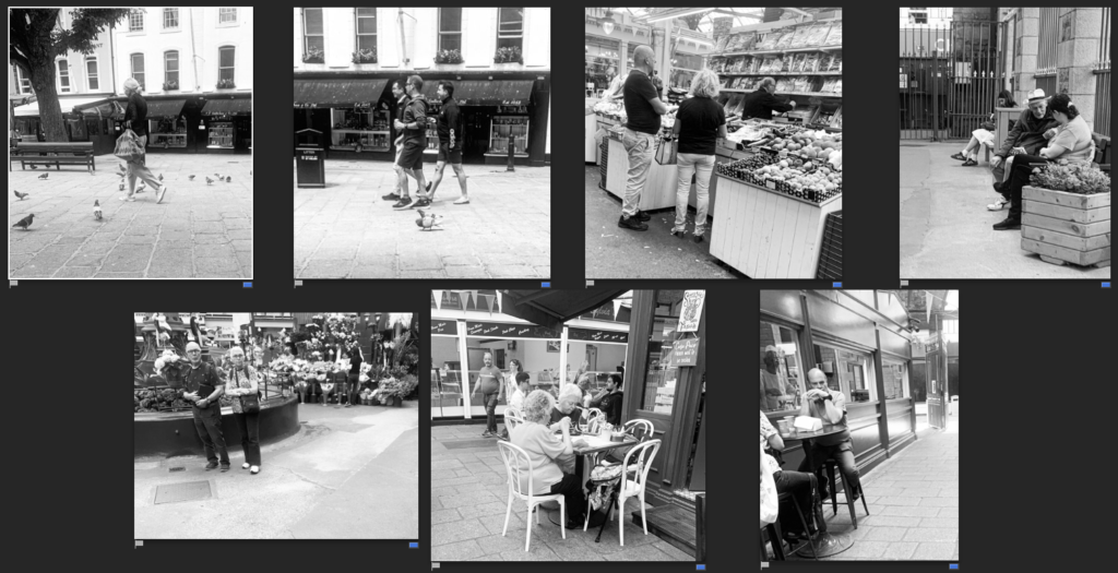
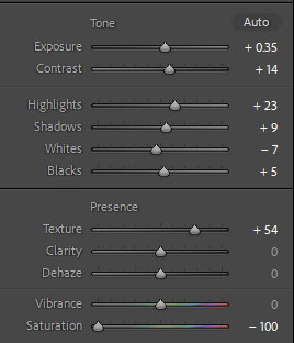
To start I made the basic adjustments to these images making them black and white similar to Henri Cartier Bresson’s photo style. I will next go into photoshop to do additional edits to the photos.

Edits:
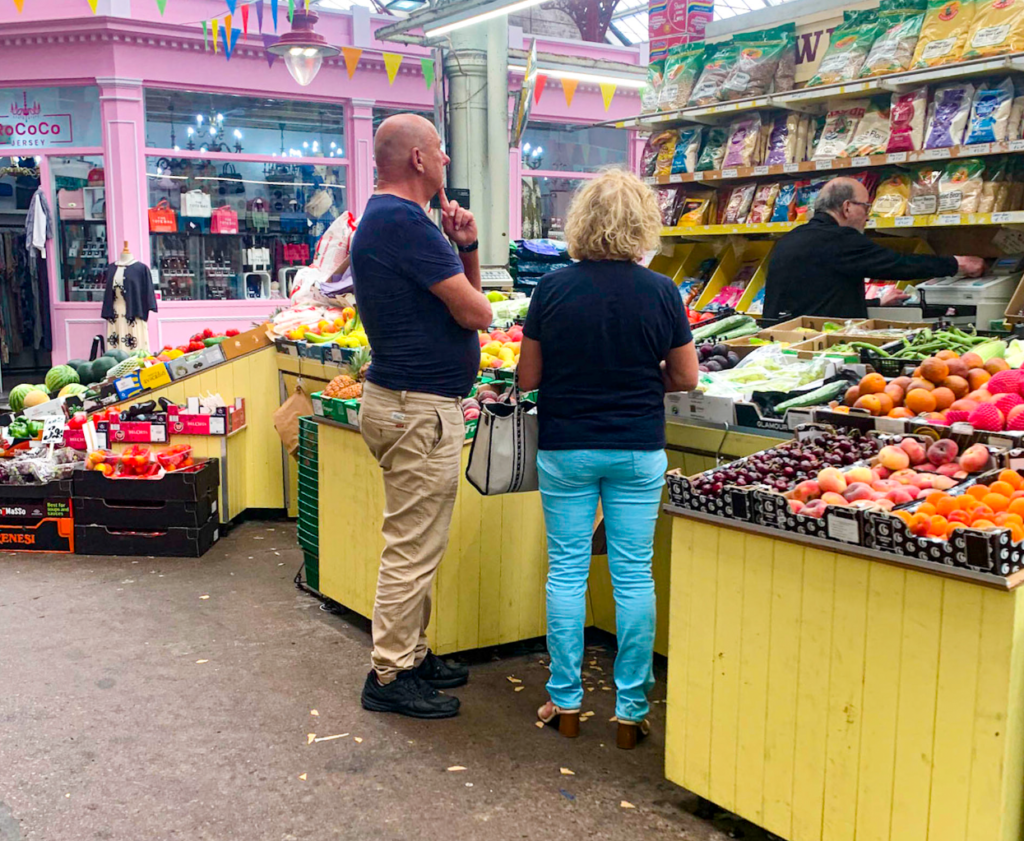
For this edit I wanted to make it brightly coloured to see how it would look however I prefer the black and white image as the coloured one has too much going on due to the many different coloured fruit and shops in the market.
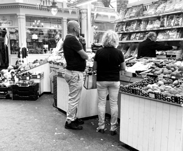
This photo shows the decisive moment as the people are deciding on what to purchase from the market stool. I prefer it in black and white as it looks similar to Bresson’s style where as the colourful one did not.
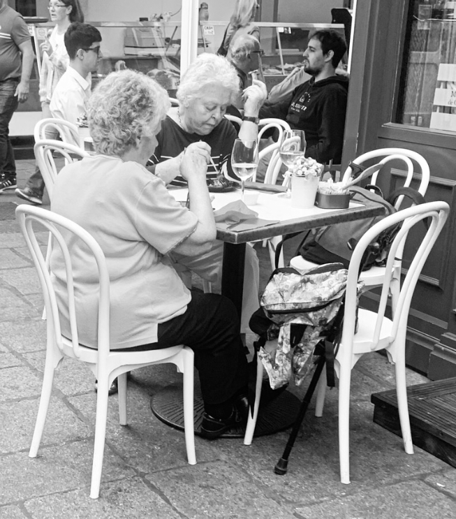
In this image I feel it really captures the decisive moment of the people eating their food at the café. I decided to make this one black and white as Bresson’s images are mainly black and white and I wanted to achieve a similar look to his.
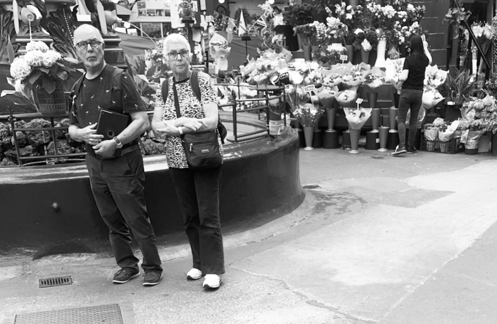
I like this photo as it captures two people in the foreground of the image and another person in the background arranging flowers, this shows the decisive moment of her adjusting the flowers and making decisions.

Picture Stories; Research and Analysis

Mood Board

Types of Images

Relationship shot – Shows the connection between themes, objects of people.

Work shot – These show a person at work or in their ‘element’.

Establishing shot – Establishing shots are typically wide shots to show context. This might be through landmarks or signs.

Detail shots – Closer to focus on a specific detail or element.

Using Indesign for a Pagespread: Design & Layout

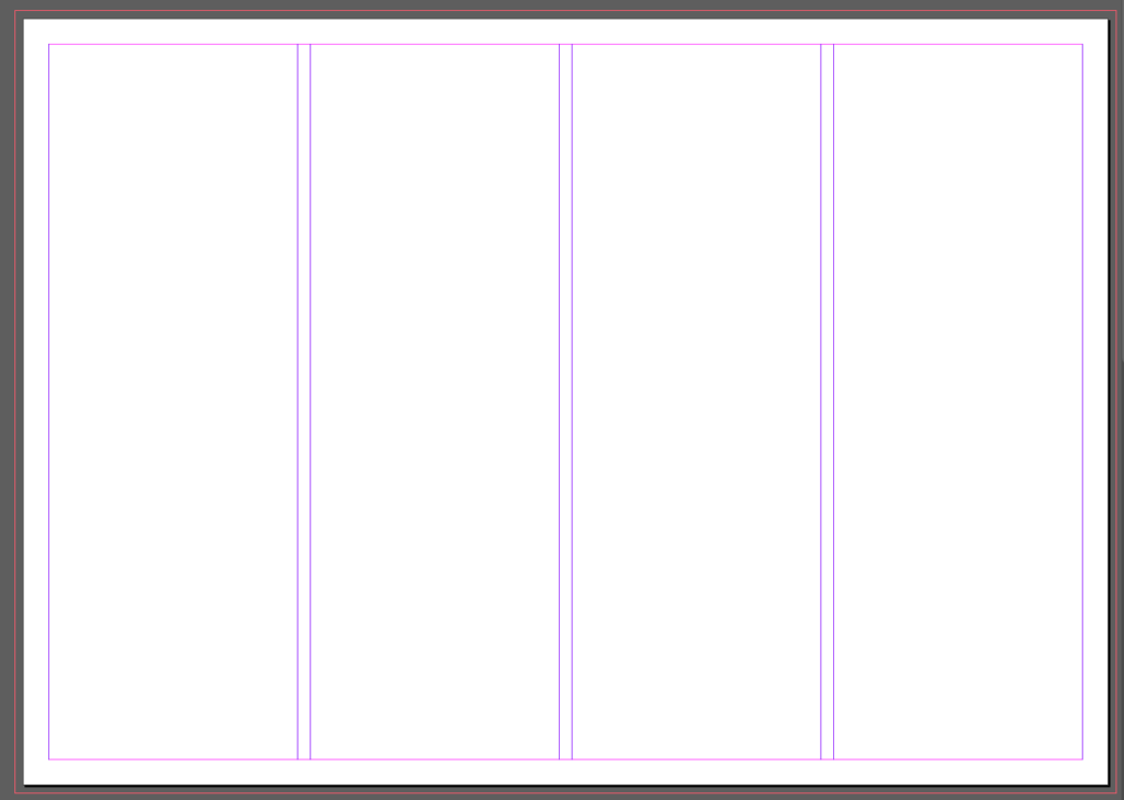
For setting up an A3 page I used these settings:

This created a layout of 3 pages laid out with 4 columns in purple. The red outline was created with the ‘bleed’ option so that when printing images can fill the whole page without white edges.

To add an image the rectangle frame tool is useful for creating a specific size on the page.

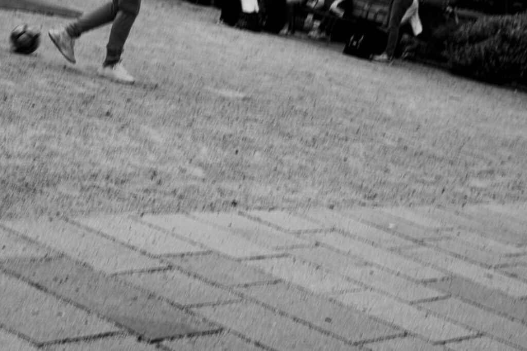
For my first page spread I tried to create a picture story about people playing football. I chose for the establishing shot to give some context and was the only image that showed more then just feet. I set this one in large on the left. I also decided to split one image into to squares as it was originally a landscape action shot. For the additional images I wasn’t sure how to arrange them or which ones to select so I created a few drafts

The final 3 I created were:

Final Layout:

I decided that this final one was my favourite becauce the text wouldnt need to be split and the title could still sit at the top of the page.

Street Photography

From the hip

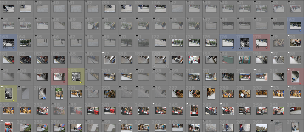
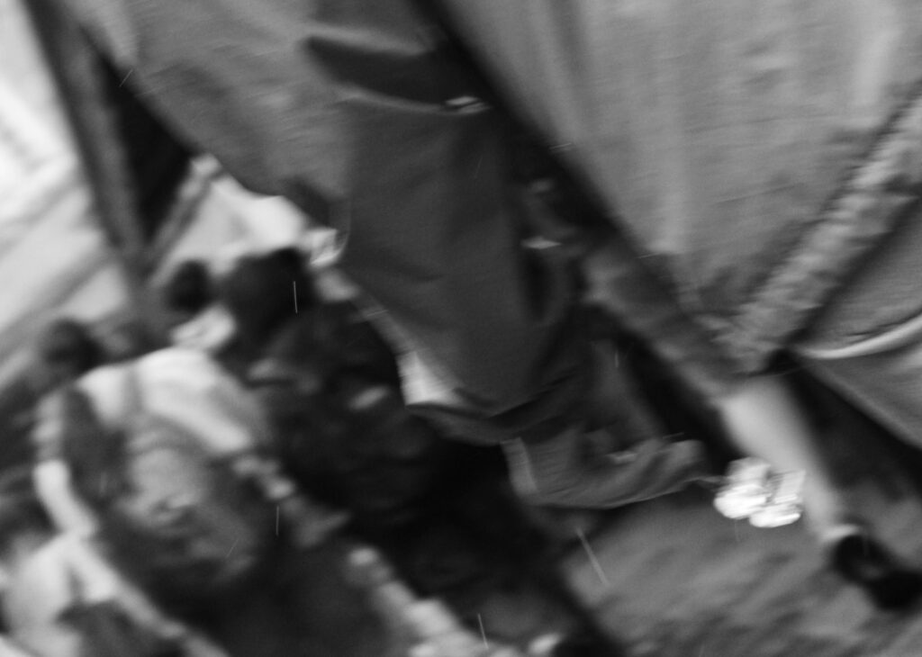
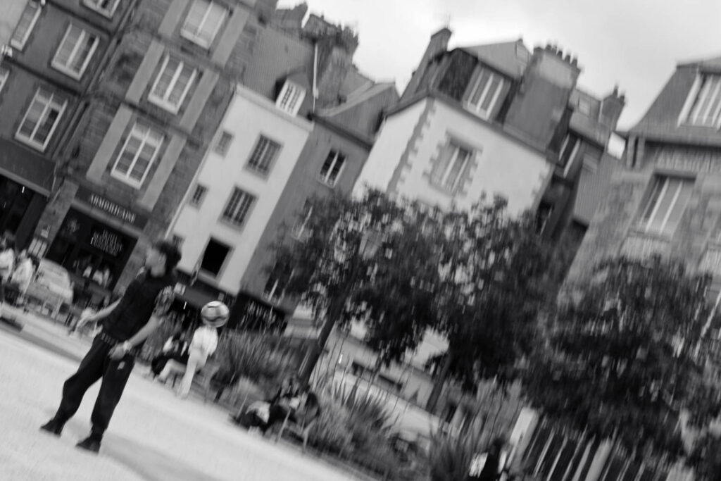
Of a total 406 images, I narrowed these down easily to 34 as many were purely of the ground. All are at an angle and out of focus which otherwise wouldn’t look great however as a collection I think can work together.

These images work best in sequences to tell a story as they aren’t technically great since they have lots of motion blur or are just generally out of focus for example:

Sequence

The decisive moment

I narrowed down 438 images to 46. These 46 could be summed up into 4 main groups: colour, black and white, motion blur and the church.

I think that these three together create a nice sequence however I shouldn’t of zoomed in on the final one so that all three would be the same. I spotted the lady because of her red coat and trousers which stood out against the grey stone.

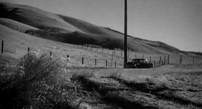
I tried adjusting the shutter speed to capture a moving object. I tried moving the camera with the car however most attempts were completely blurred. This was the only one where the vehicle was still in focus.

I accidently took these photographs when I adjusted the shutter speed in a dark church. The streaks were the chandeliers which naturally stood out against the dark background. The first was an accident when I moved the camera after taking the photo however the shutter speed was much lower than I thought. Once I saw the outcome I tried making additional shapes and I think the spiral one worked out also.

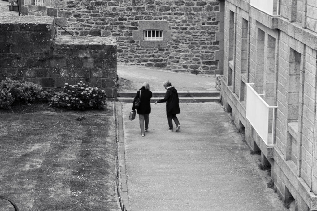
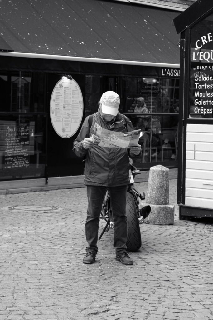
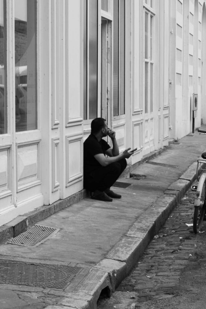
I think I had the most success when photographing people around the town. I think that the set ups had varying success and I liked the ones taken further away most. I set all of them in black and white which was the same as Henri-Cartier Bresson which meant that colours wouldn’t be distracting and the focus would be purely on the subjects. Additionally I think that the quieter backgrounds looked better.

I tried the photographs in colour with some colour adjustments and while the colours looked alright I didn’t like them as much. I found that the colour sometimes takes attention away from the people and while in some cases I want the photograph to be about the colour, the majority had nothing to do with colours at all so I made them greyscale.