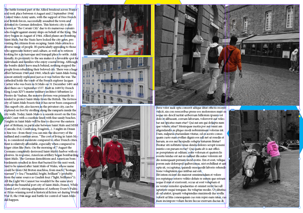
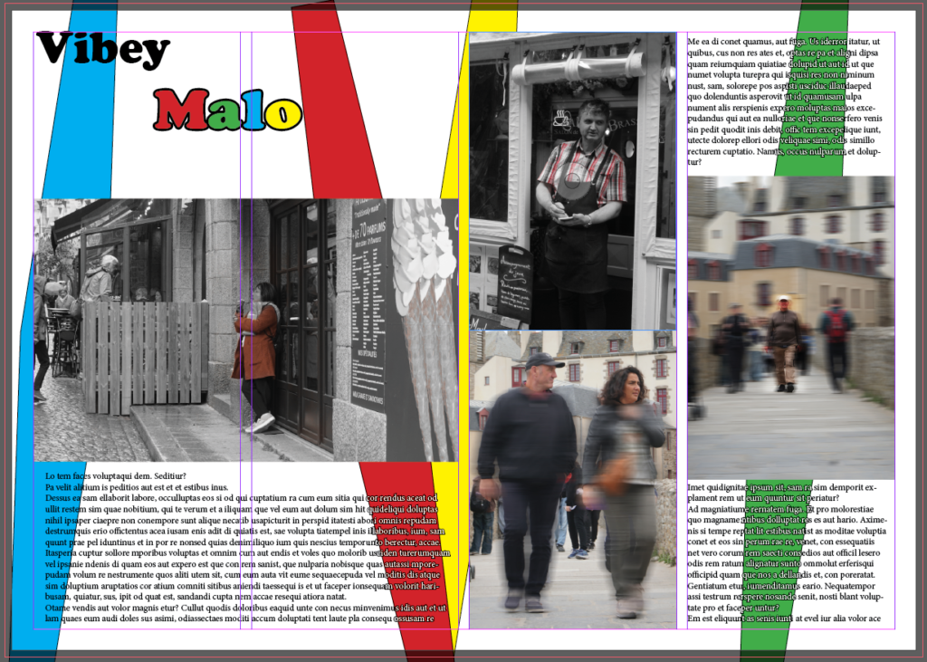
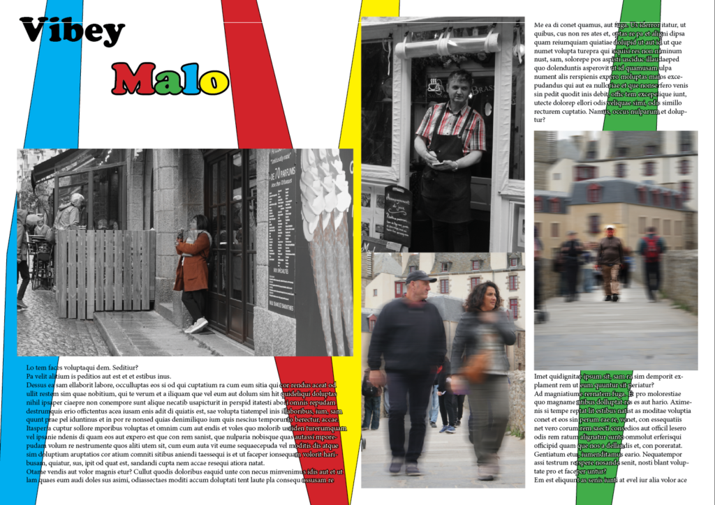
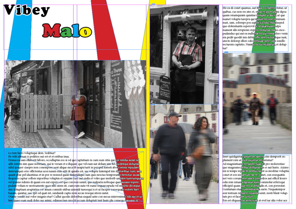
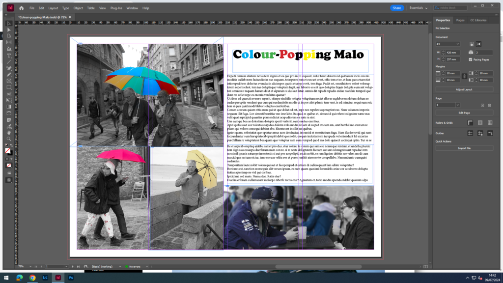
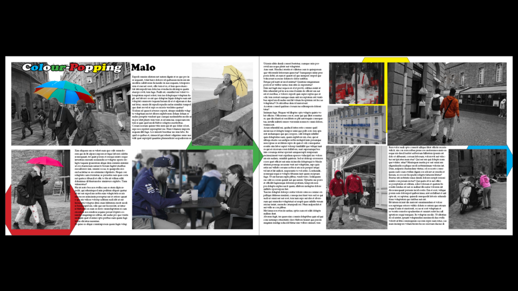
I wanted to create a page spread with a lot of my photos that I used the colour saturation for. With these photos, I came up with a title called, ‘Colour-Popping Malo’. This matches the theme because in my photos I have the colours saturated out so you can only see the bright, colourful ones. I even changed the title to match the theme by making some of the letters the same colours as in my photos.
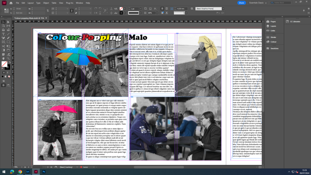
After this photo spread, I changed the layout around because I felt like the photos were too crowded on the bottom left area, so I moved one of the photos top right which also cut some of that big paragraph in half which was even better. Then added some more separate text in that middle left space. Also, I moved the title from the top right which stood out a bit and looked unnatural, to on top of the coloured umbrella photo which is my establishing shot. But, I kept the word ‘Malo’ outside of the photo with it maintaining the all black look to create difference and stand out more.
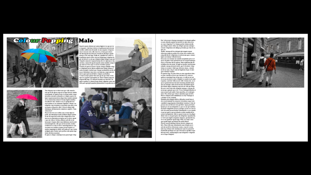
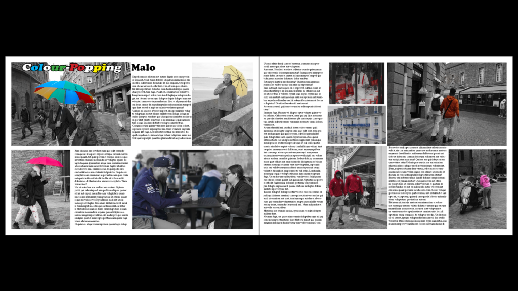
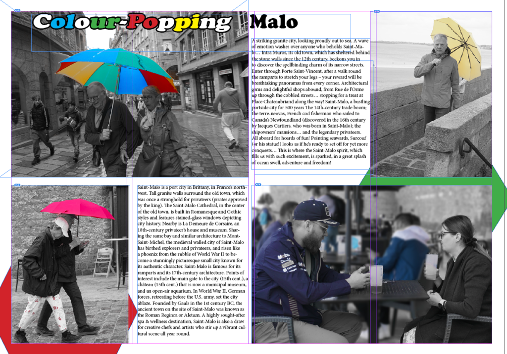
I changed the AI generated waffle text into actual English talking about different things to do, see, and go to in St Malo.
