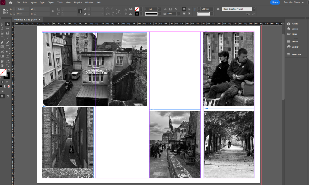
I used the tool to create a box where I then added the photos I wanted to use from my St Malo photoshoot in the areas of the page I wanted them to be. I used photos that link together and tried to use photos that were different kinds of shots like establishing shots and observed shots.
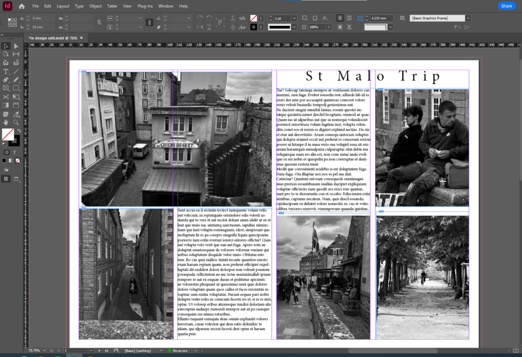
I then added a text box to the top right hand corner of the page layout and added a title, I then changed the font of the title to make it fit the way I wanted the page layout to look. After this I added a text box in the spaces I wanted to leave blank and filled them in with text.
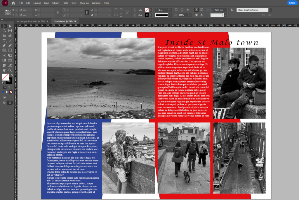
I then did the same thing with a different set of images that told a different story and then created a title and filled in the blank spaces with text. I then wanted to get some colour in the background of the page spread so created a box and filled it with the colour I wanted and clicked move to background so the colour was behind the text and the images. I then changed the colour of the text to white so that it stood out more.
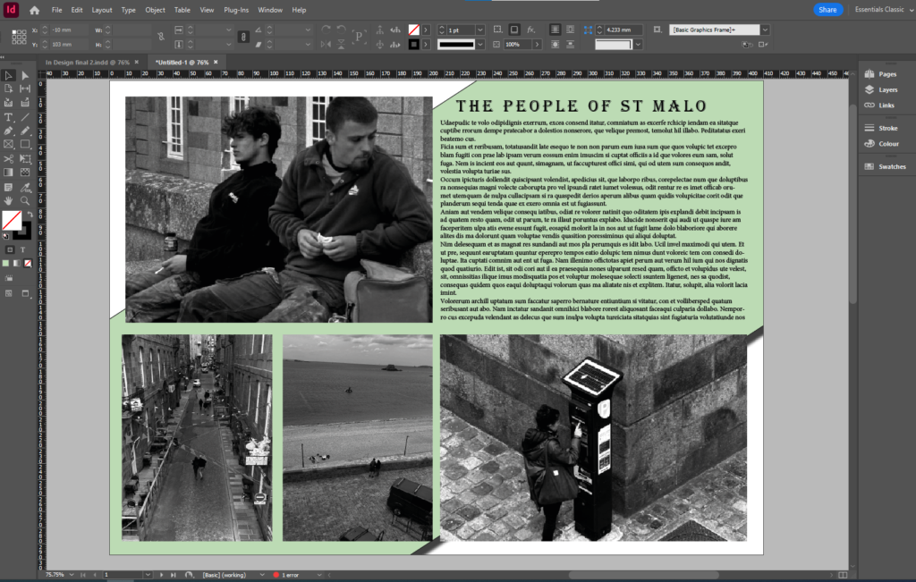
With this page layout I added a different set of images and then added a blank box and filled it in with a light green to put in the background of the page to make the writing stand out more.
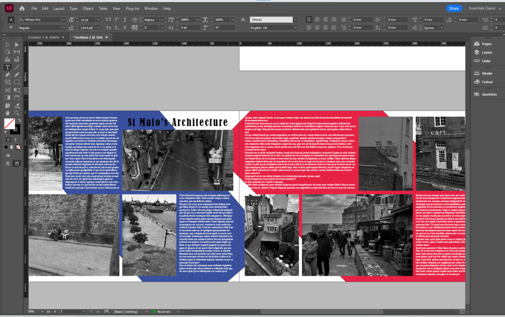
This is my double page spread and I added two sets of images for each page and added text to both pages. After I added a blue colour box and sent it to the back and then added a red colour box on the other page and sent that to the back as well. I then changed the colour of the text to white to make the writing stand out.
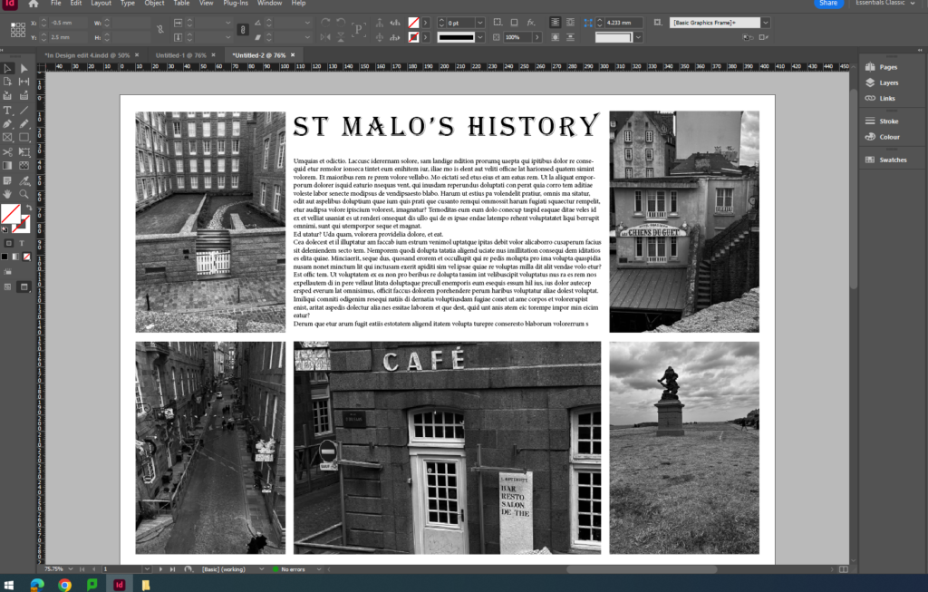
This is another layout of my images showcasing the history of St Malo from the statues and sculptures to the historic buildings and cafes.
Evaluation
I like my final page spreads because they are all different are unique and tell a different story each time. I think that to improve them I would of added my own text about the decisive moment rather than use the prompt text. The page spread with the red and blue boxes in the background is my favourite because it emphasises the writing and the photos a lot clearer.
