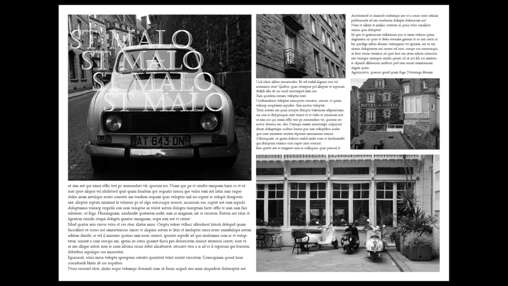
Here Is my first Attempt at InDesign, I used the rectangle frame tool to design where I wanted the pictures to go, then I inserted pictures that I thought went well in those areas. I wanted this slide to be entirely building and motor vehicles so that my next slide can be full of pictures showing the decisive moment. I saw a few picture magazines having text duplicated going across the screen so I replicated that here with the St Malo title.
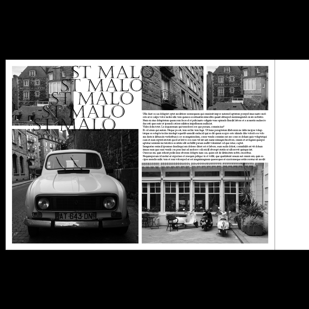
Here Is my second attempt, I reogranised some of the photos but It doesnt look as good as the first so I thought I could add some colour to the image.
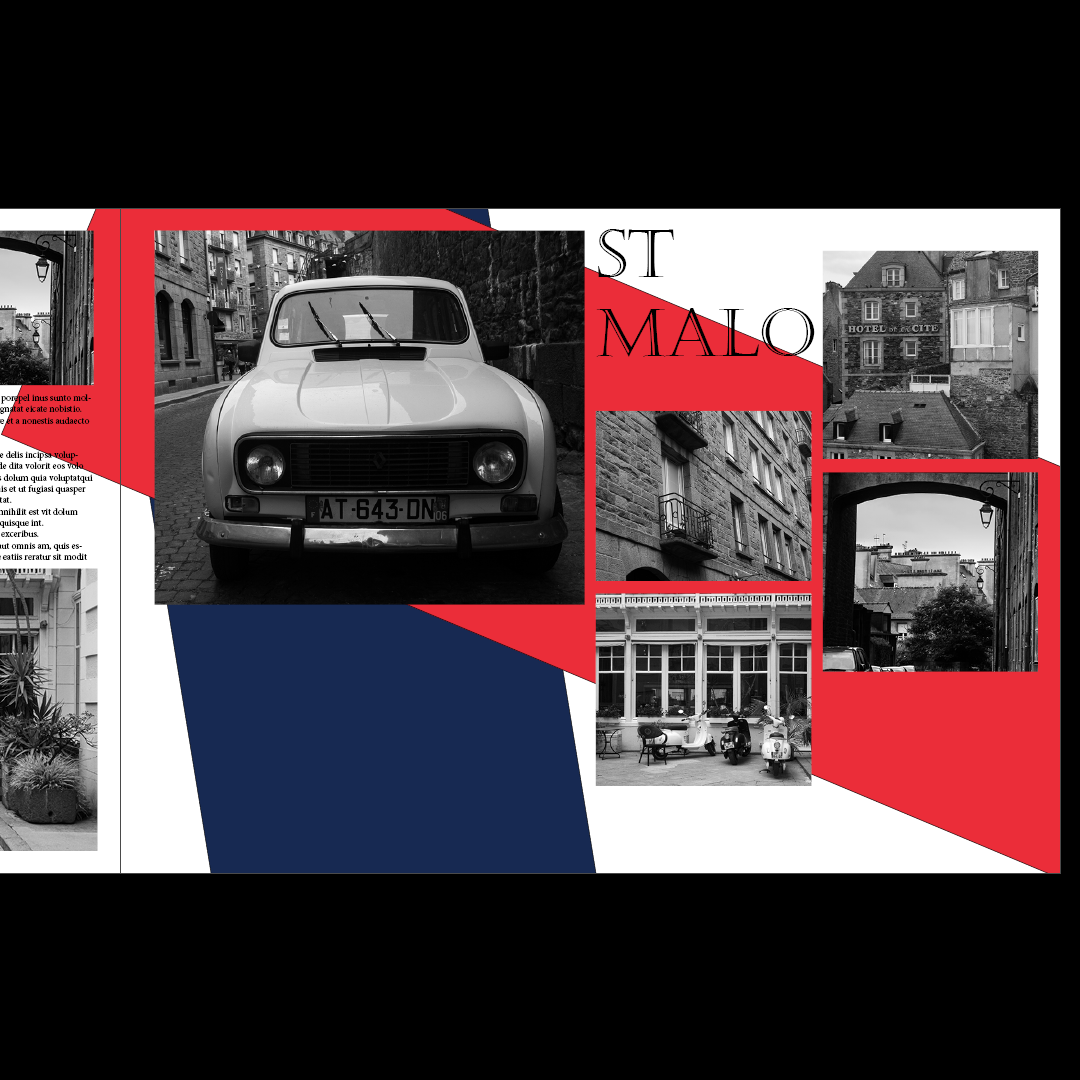
I reorganised the photos again and changed the title to a normal title, I think this is my best one so far.
Using New Photos:
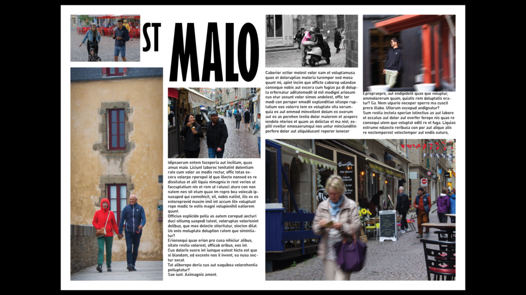
I’m now using photos of people to present the decisive moment, I used a quirky font for the title, however I don’t think it looks French enough so I will add some next.
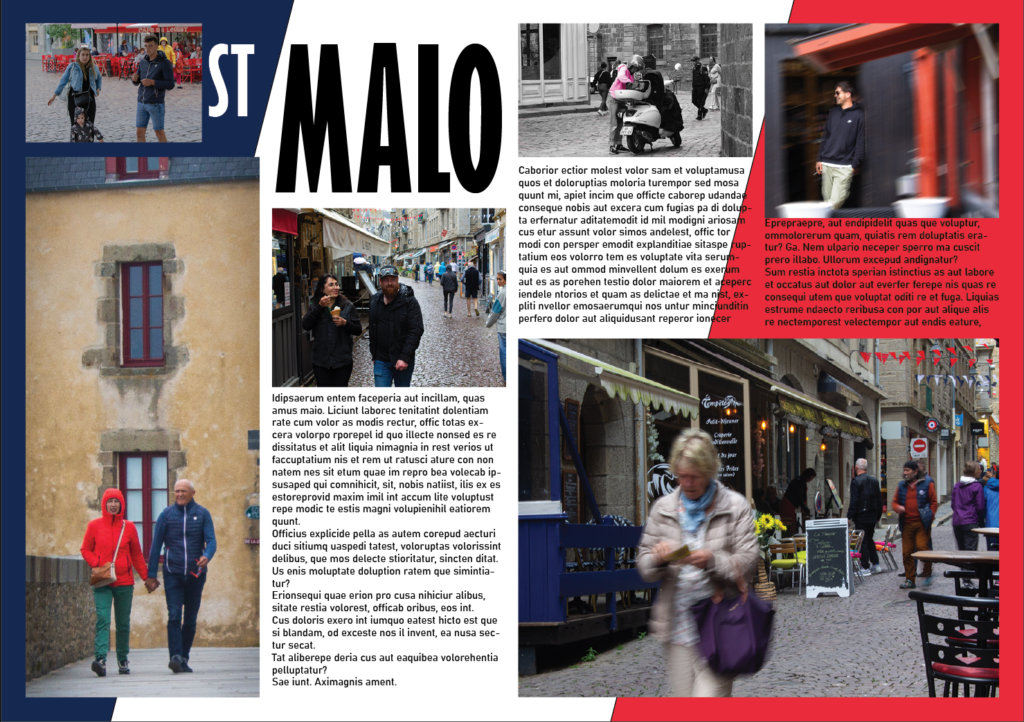
Here I added the French flag with a slight angle at the back of the image. The ‘st’ in the title was hard to see so I changed it to from black to white, to contrast the dark blue behind it. Next I feel like I could improve the title, and maybe experiment more with the background:
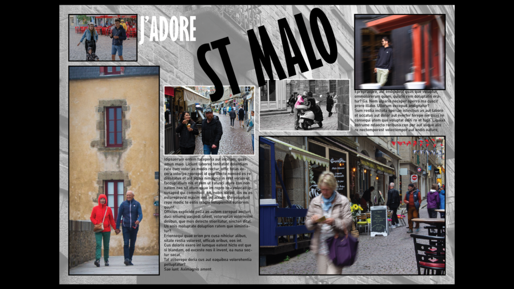
I used a picture of a wall in st malo that I took for the background Image, also decreasing the transparency. I also changed the title to something French. Next Im going to try reducing the noise in the centre by shrinking some images and removing some text:
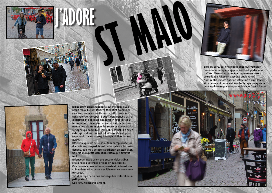
I also added a drop shadow to some of the title and tilted some of the image a little bit but not too much where it looks wrong.
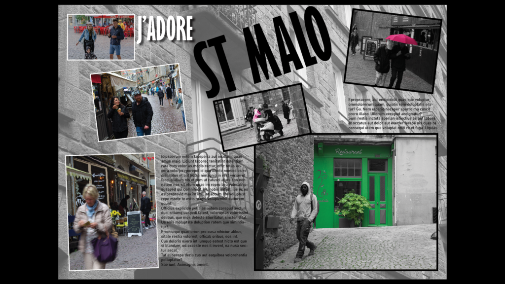
Above is my final iteration, I changed the photos and added different borders to images. I also decreased the transparency for the background image.
