First spreadsheet:
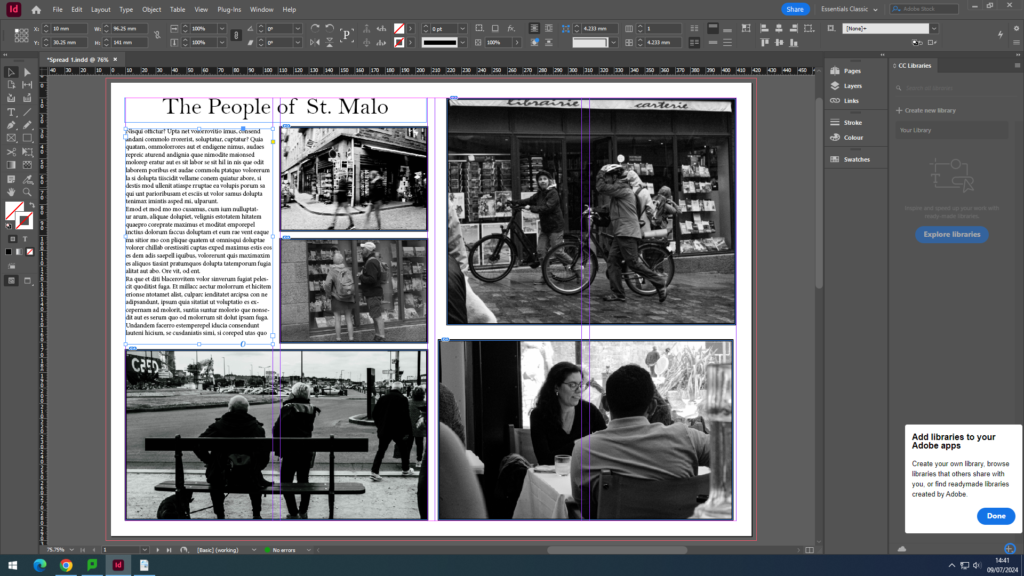
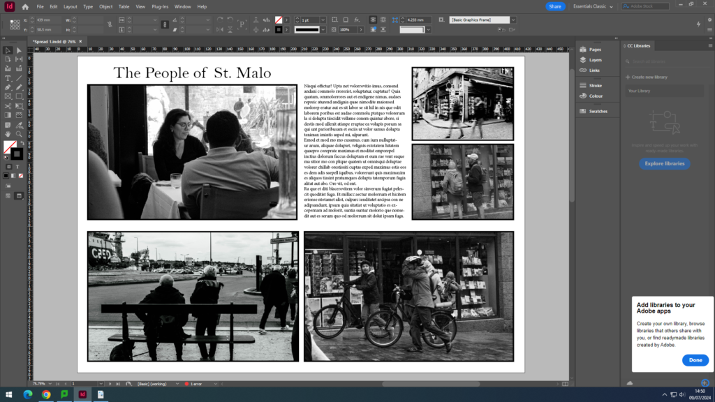
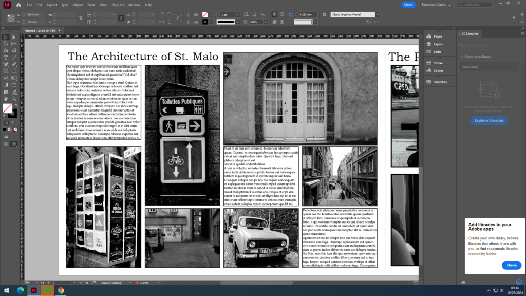
For all of these spreadsheets, I wanted them to be in black and white to create an old, vintage affect. I started by creating different sized boxes using the rectangle tool, and placing the images I wanted to use. Then, once I had all the images I needed, I added another box to fill with text. I then finished with experimentation of the layout to see where I wanted everything to be.
I didn’t like this first one as I felt that all the photos were crowded on one side.
So, I moved the text to the middle, which I didn’t really like. I tried different options of where the text should be, so that there is a balance between the images and the text.
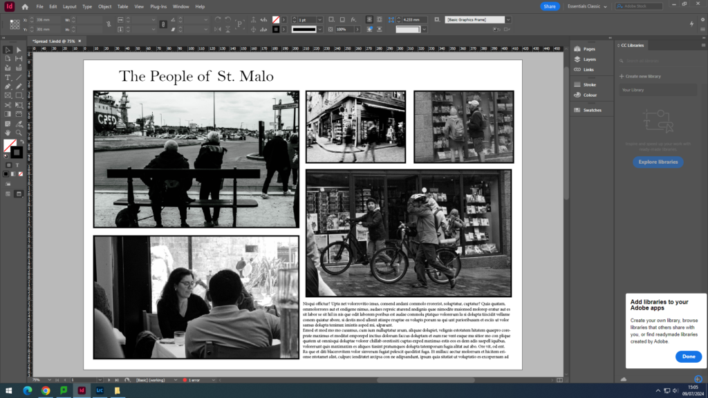
Final outcome:
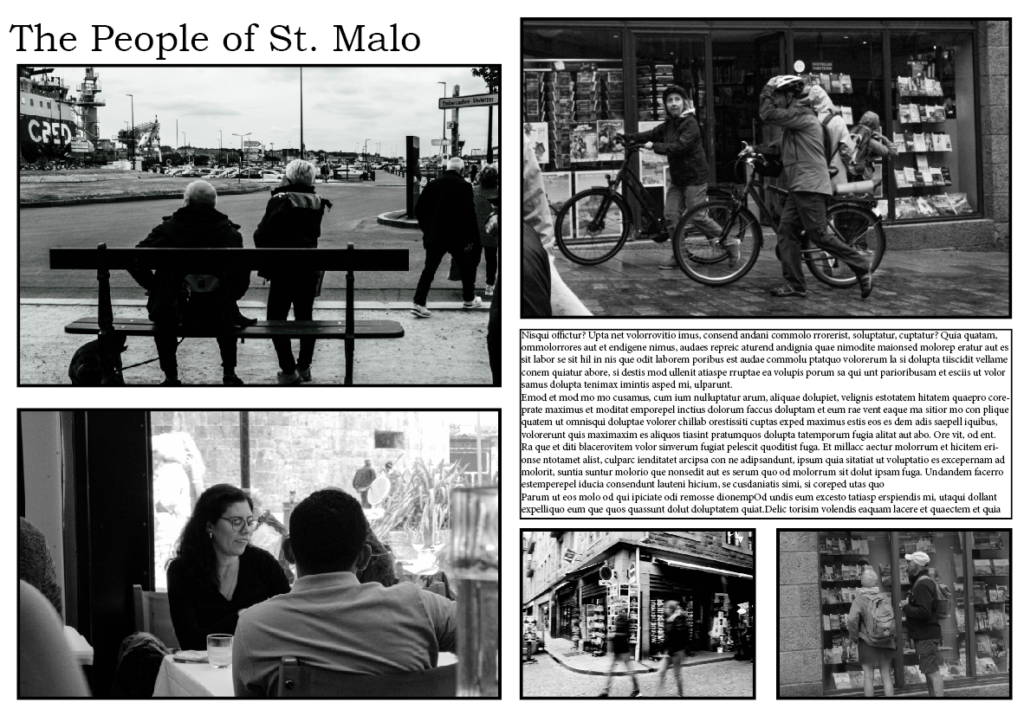
I really like how this came out because I feel like the images and the text balance each other out, and the images draw your eye view towards the text.
Second spreadsheet:
Final outcome:
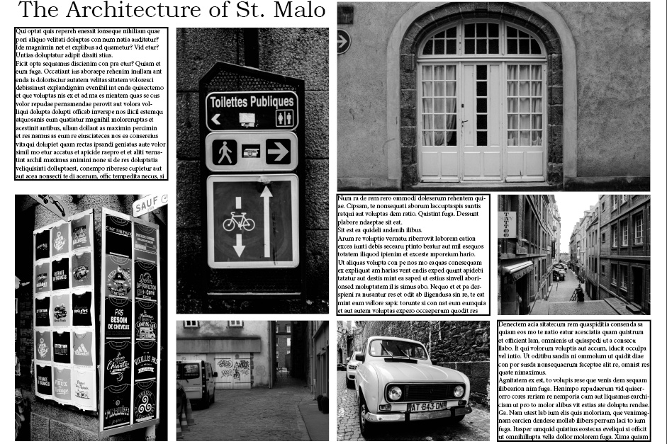
I think this was really successful as I added more text boxes to make the layout look organised and balanced with both the images and text.
Third spreadsheet:
Final outcome:
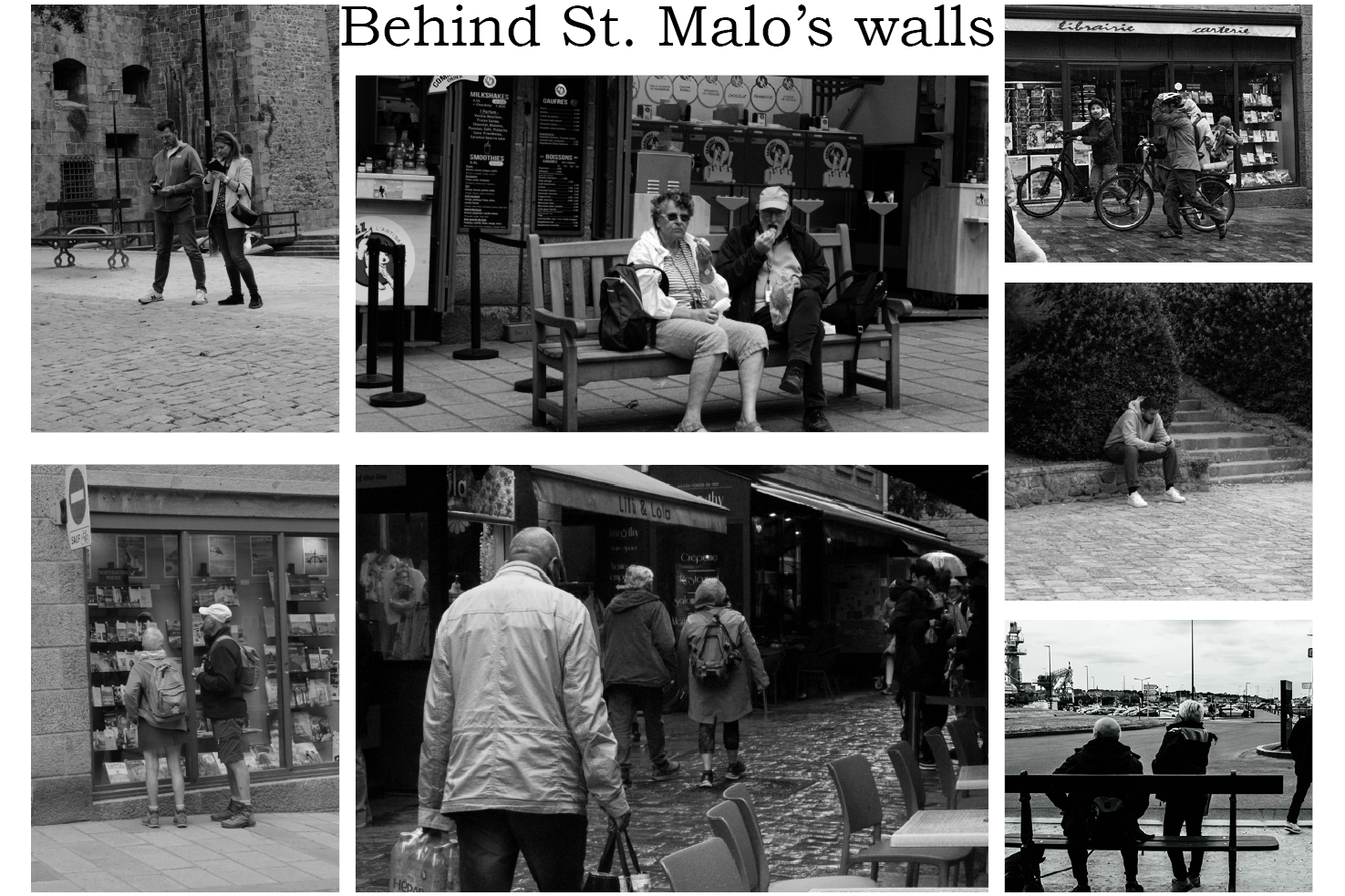
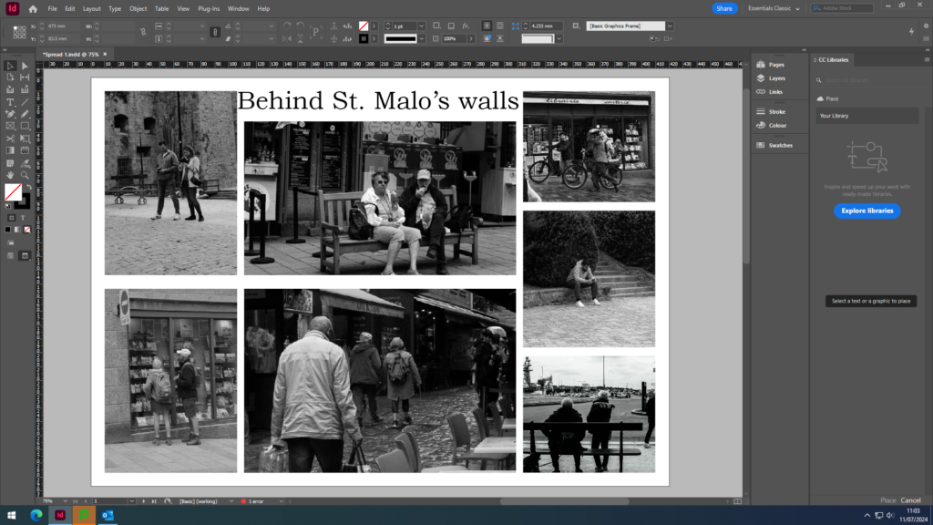
For this last spreadsheet, I decided to make it images only as I felt like this would look better overall as my previous spreadsheets include text, and I wanted to create something a little bit different.
