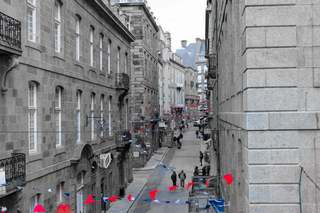
These types of images are typically used in picture stories, because they help display the whole story with enough detail and show lots of different elements to the story.
Establishing Shot
An establishing shot is a photo that provides an overview of the setting, like where the image is taken and what the weather is like etc.
Person at Work
A person at work image shows a person at work doing their job. A person at work photo should include 4 things:
Who?– The image must show who the person is that is working.
What?– The image must show what the person is doing for their job.
How?– The image must show how they are doing their job.
Context?– The image must show the environment, so it can be seen what they do for work.
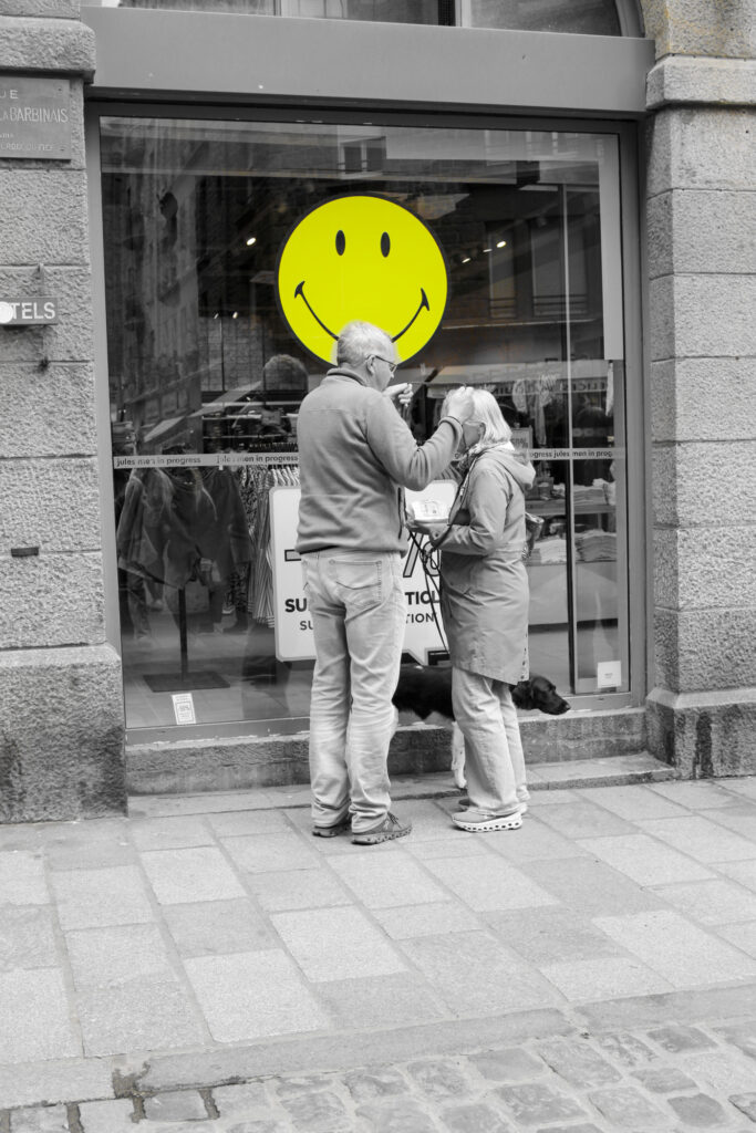
Relationship Shot
A relationship shot shows the relationship between two or more people. It can show many different relationships, such as friends, family, lovers etc.
Detail Shot
A detail shot is a close-up photograph or artwork that focuses on a specific part or element of the subject, highlighting its intricate details and textures.
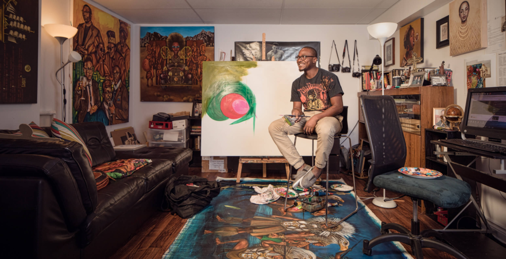
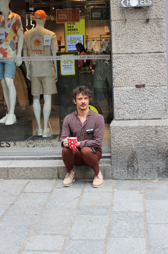
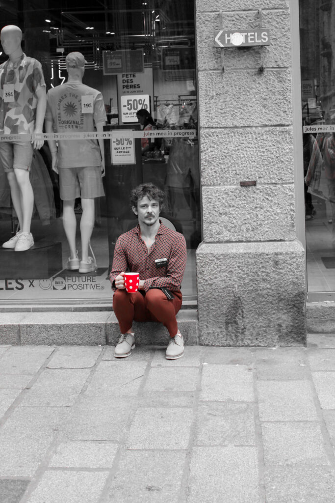
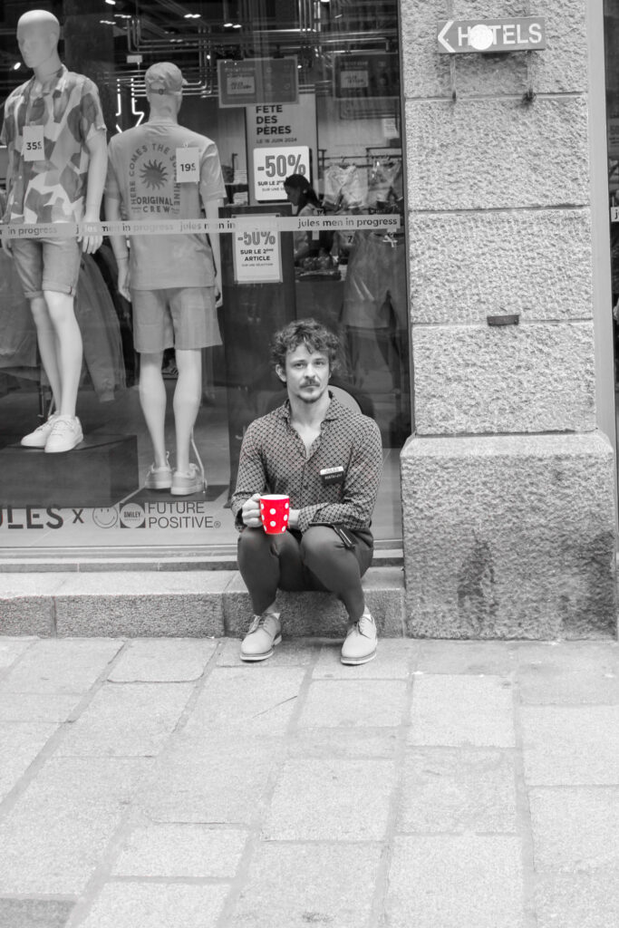
Environmental Portrait
An environmental portrait is a photo of an individual in their usually or natural environment, such as their home or work place etc. It typically gives us some insight into the individuals life.
Formal Portrait
A formal portrait is a photo of an individual’s face, that is not candid, but is posed in effective lighting conditions.
Observed Portrait
An observed portrait is a candid image of a person, who is does not know they are being photographed, so they are not posed.
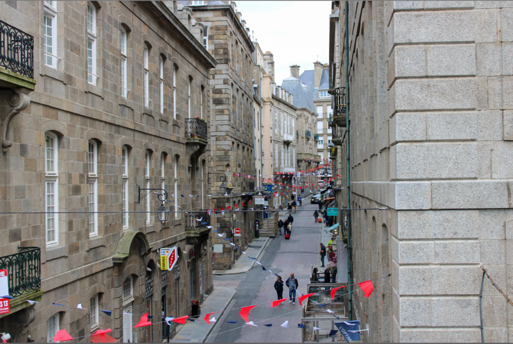
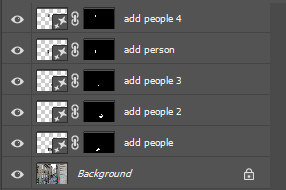
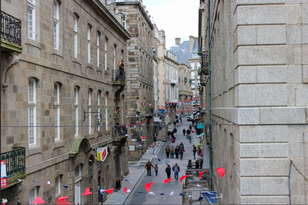
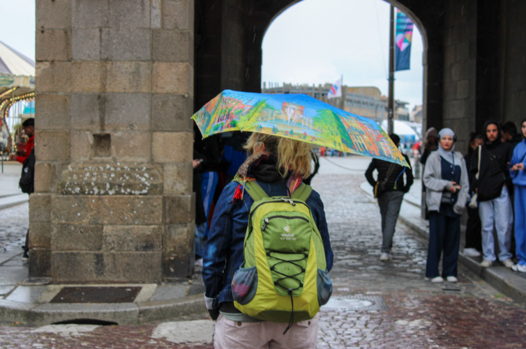
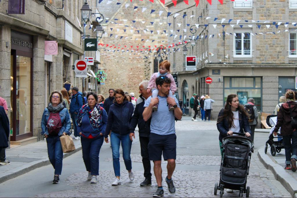
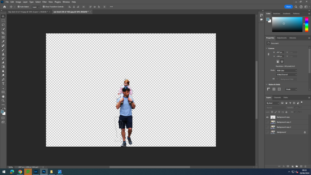
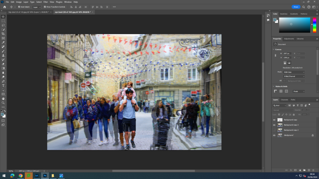
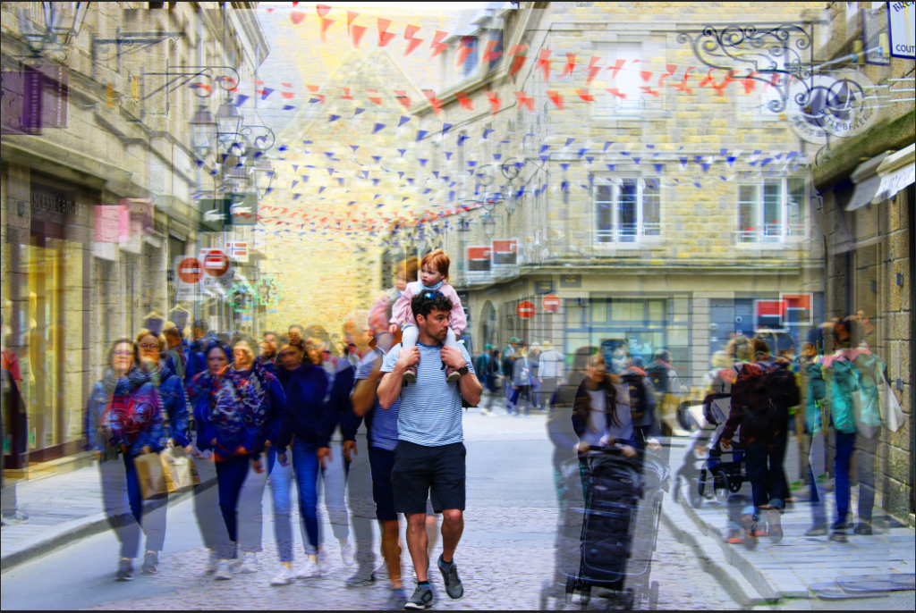
I wanted to use AI to make the streets of St Malo more busy, so I selected where I wanted my people and used different prompts to achieve what I wanted.
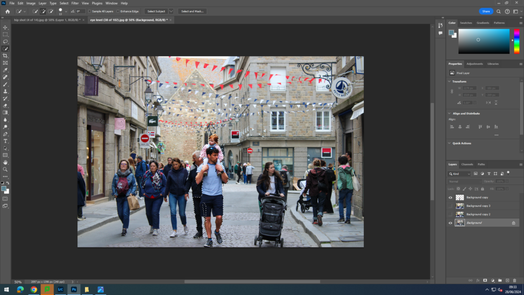
Experimenting with cropping
For cropping I chose images that I wanted to zoom in on, or images which I wanted to crop something out of the image.
These are the different cropping formats I tried.
Portrait Format
Landscape format
square crop
circle crop
multi circle / porthole crop
polygon crop
panoramic crop
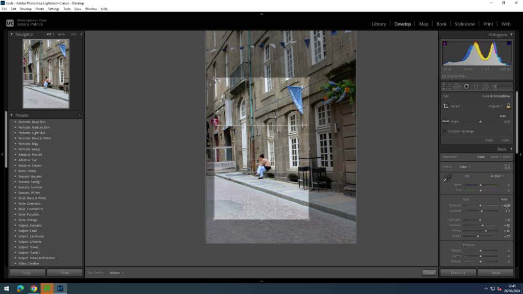
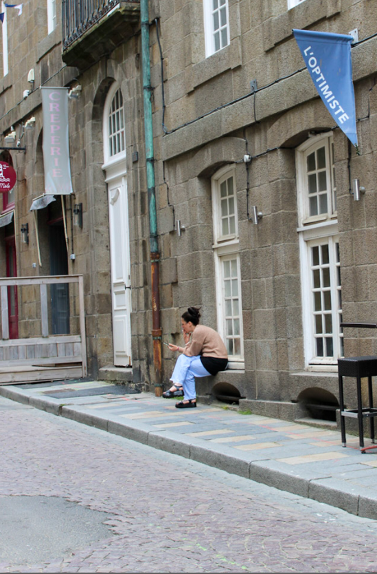
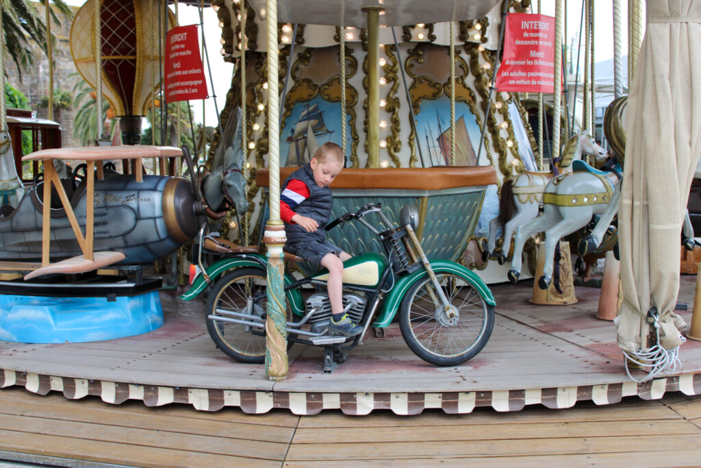
Portrait Format
I chose to use a portrait crop for this image, because I wanted to zoom in on the girl in this image more, so that I could remove some of the negative space all around her, so that she was more visible and the main viewpoint.
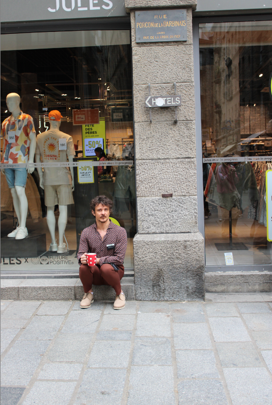
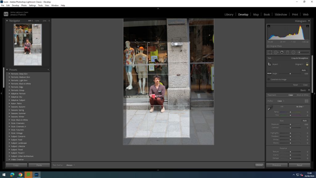
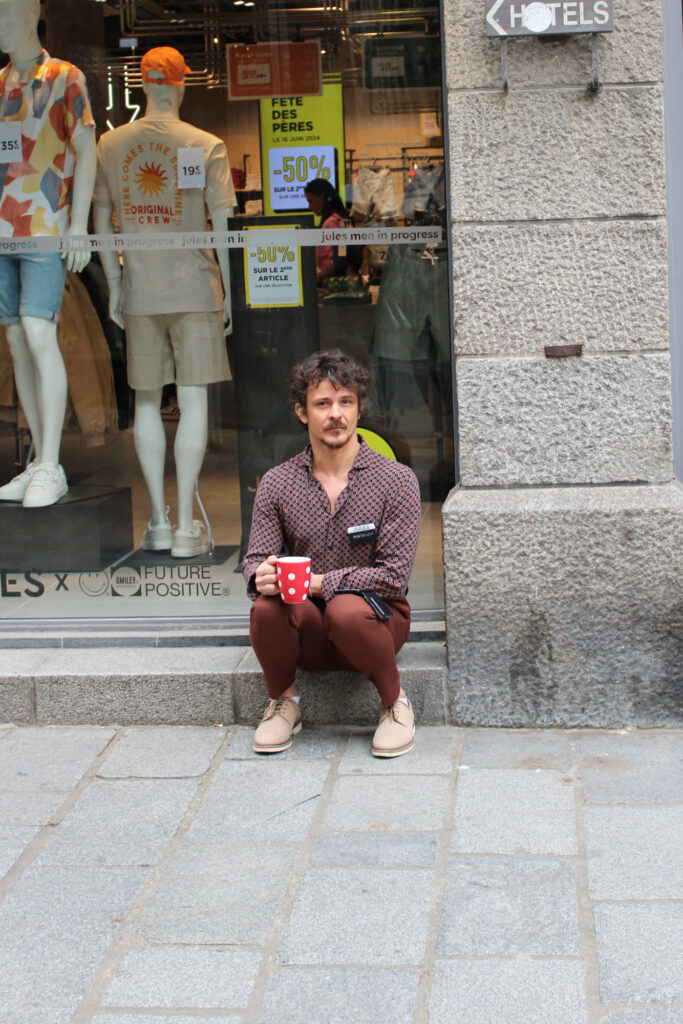
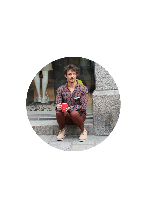
For this image I also wanted to close in on the man in this image more, by removing some of the negative space around him.
Landscape Format
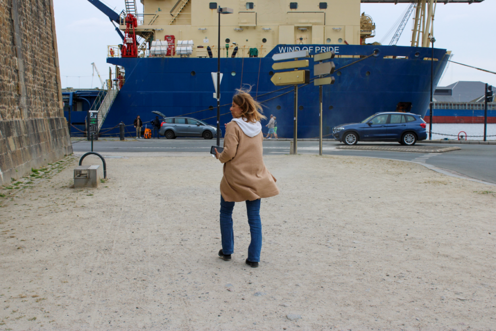
For this image I wanted to remove some of the negative space on the right hand side of this family, so that I could close in on the family more, and so they would be more centre in the image.
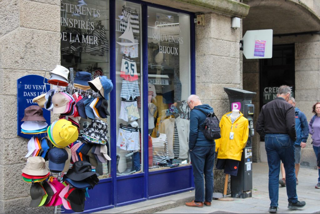
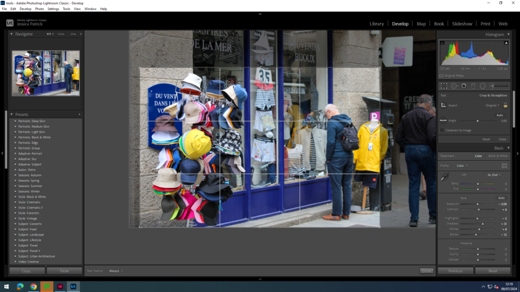
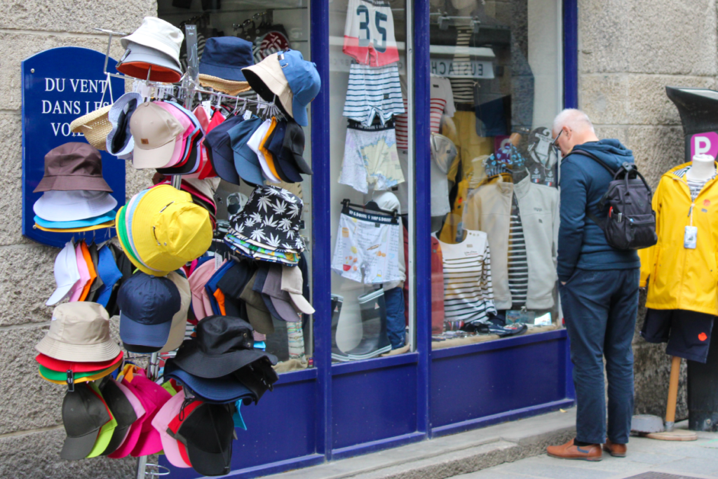
For this image, I wanted to remove the people on the right hand side and zoom in on the man looking into the window more, so that he is the main focus of the image.
Panoramic crop
I didn’t take any panorama for this photoshoot, but I experimented with the panoramic crop in my Anthropocene work.
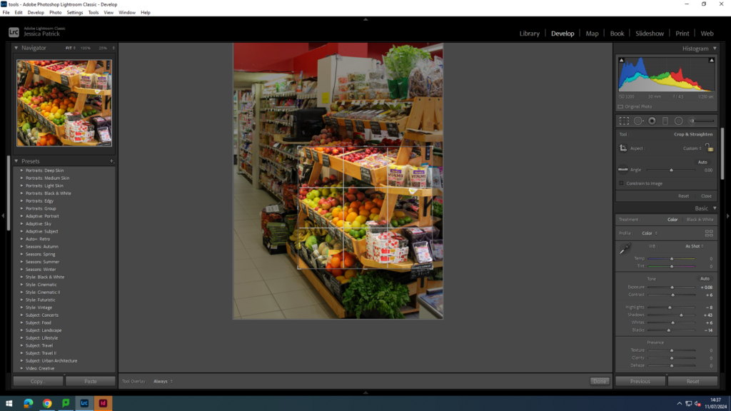
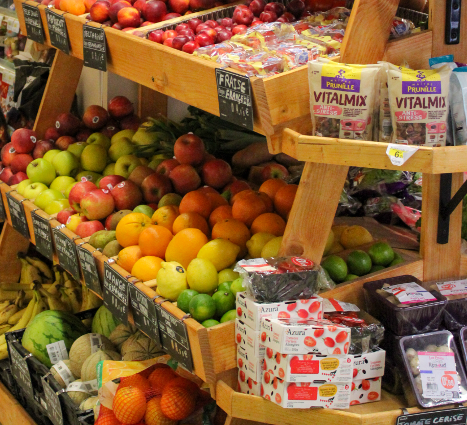
Square Crop
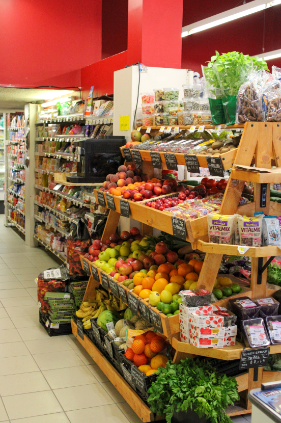
I have chosen to square crop this image, so that I could zoom in on the fruit, to create more of a detailed shot.
I removed all the negative space around the fruit and zoomed in on them quite a lot, to create this nice detail shot, that an be displayed nicely with a few of my other images.
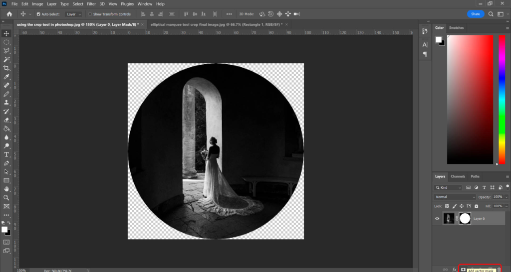
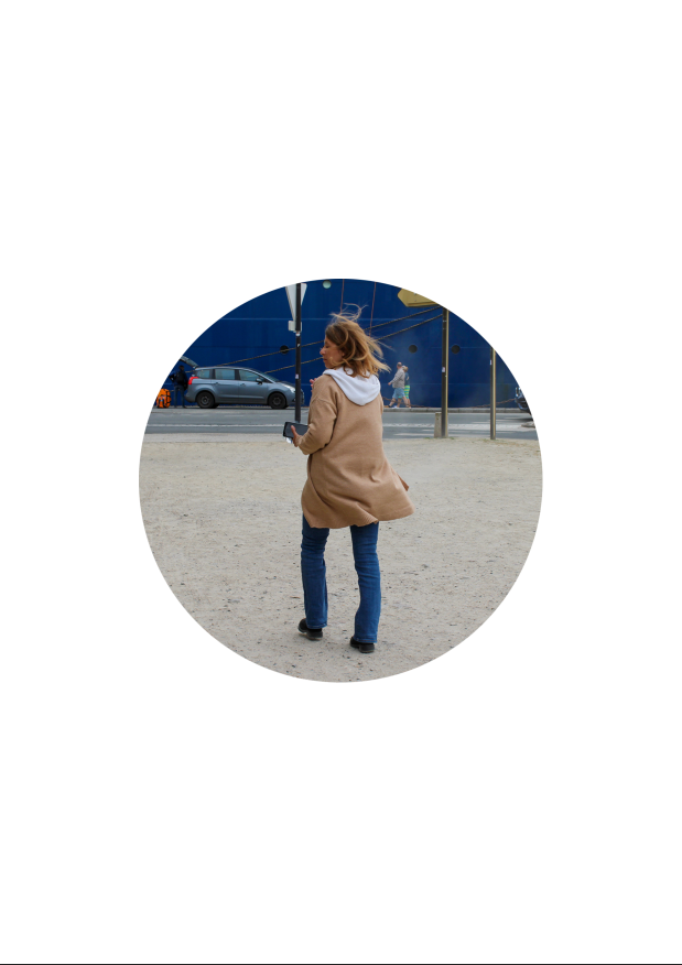
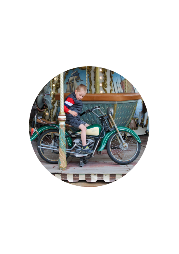
Circle Crop
I decided to circle crop this lady in this image, and crop out all the negative space around her.
First, I selected the elliptical marker tool and made a circle around her. Then, I went to inverse and deleted my background. Finally, I dragged her onto a white background.
Multi Circle Crop
I chose these three images to create a multi circle crop.
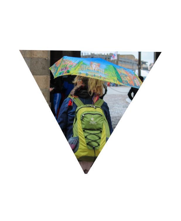
Polygon Crop
I c hose this image to create my polygon crop.
First, I selected the polygon tool and created my triangle shape. Next, I went to select and inverse and deleted the background. Finally, I dragged my polygon onto a white background.
Experimenting with Colour Theory
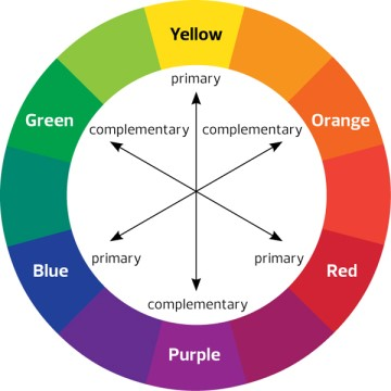
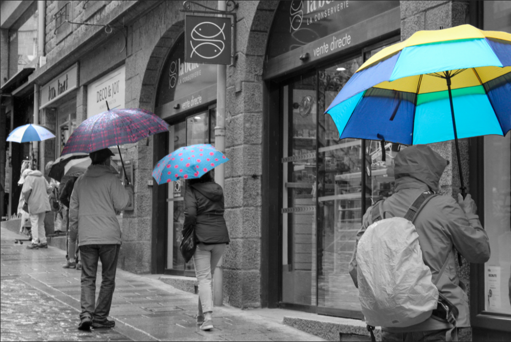
Finally, I wanted to look at the colour wheel/ colour theory for when I am cropping, so that I can try and include complimentary colours in my images instead of cropping them out.
This image contained both red and green, which are complimentary colours, so they compliment each other and look good together in this image, so I wanted to make the green stand out a bit more, so I tinted the image slightly green.
This image contains both blue and orange, which compliment each other well, so they make this image look better.
Complimentary colours create a harmony in the image, so they look good next to each other in the viewers eyes, so the image is more visually pleasing.
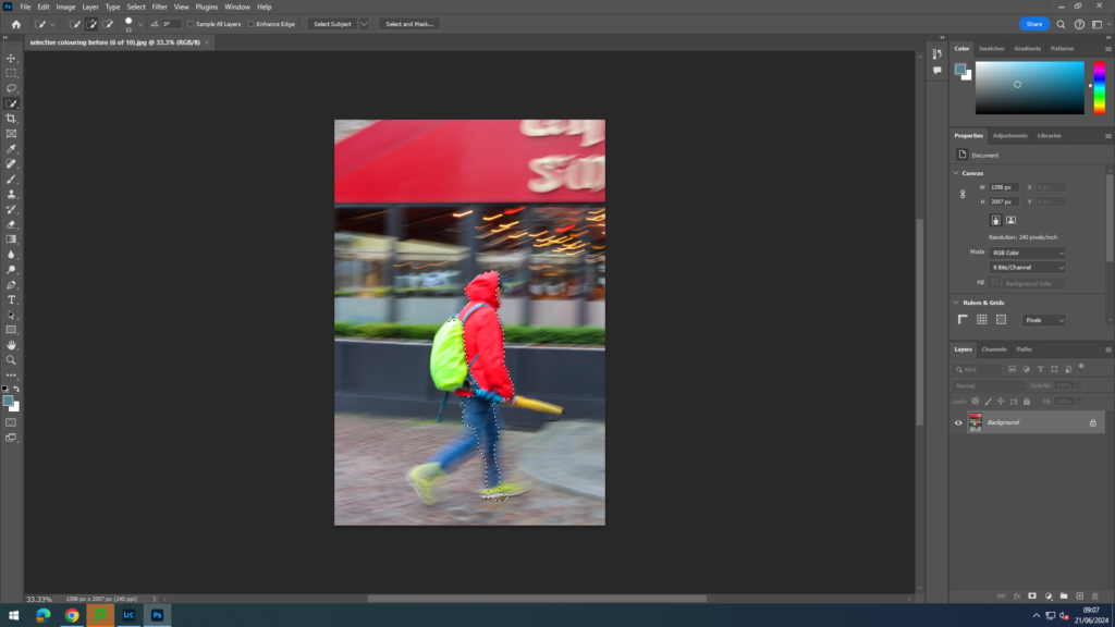
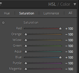
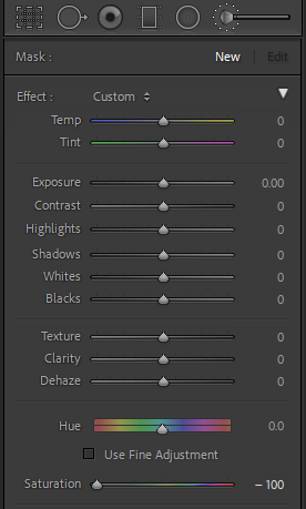
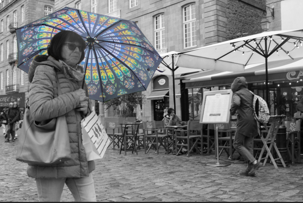
Experimenting with colour selection
I tried two different methods when creating my colour selection images.
Method 1-
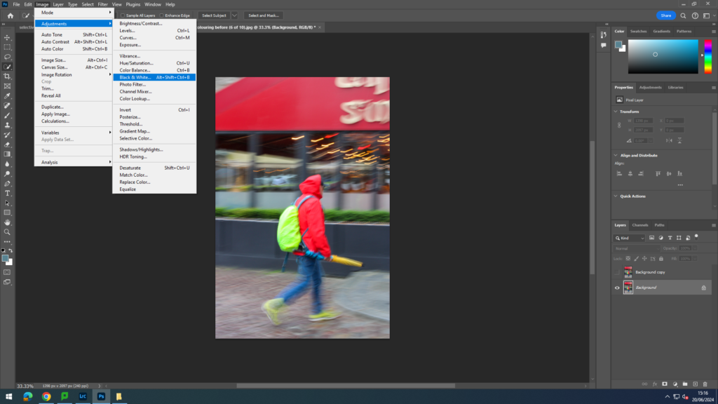
Open my chosen image in photoshop
Duplicate my background
Go on original background and make it black and white
4. Next I went onto my background copy and selected what I wanted to be coloured
5. Next, I went to select and then clicked inverse, so I am selecting what I do not want to be colour.
6. Finally, I deleted the background.
Method 2-
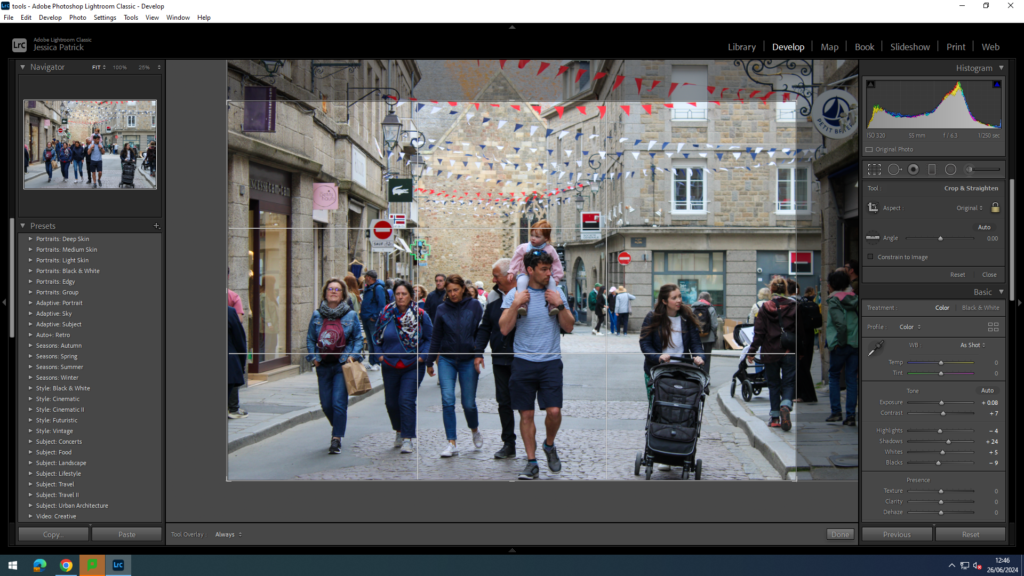
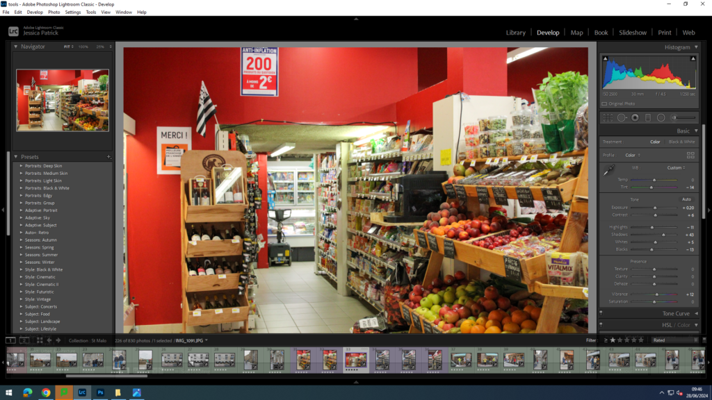
Open my chosen image in Lightroom develop.
Go to HSL/ colour and put the colours you do not want in the image down to 0 on the saturation.
3. Then, go to the adjustment brush and lower the saturation and exposure to 0.
4. Finally, brush over all the colours on the image, which are not wanted.
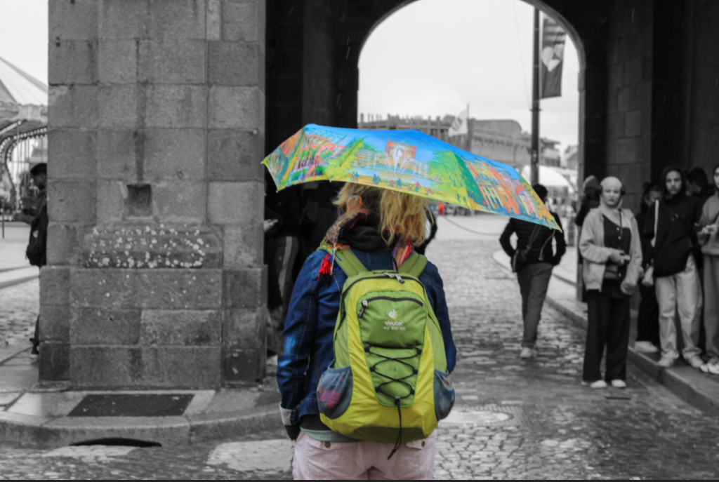
Final Colour Selecting Images
With this image I experimented with which parts I wanted coloured and which parts I didn’t.
Then, I decided to experiment with making multiple different things and colours pop against the black and white.
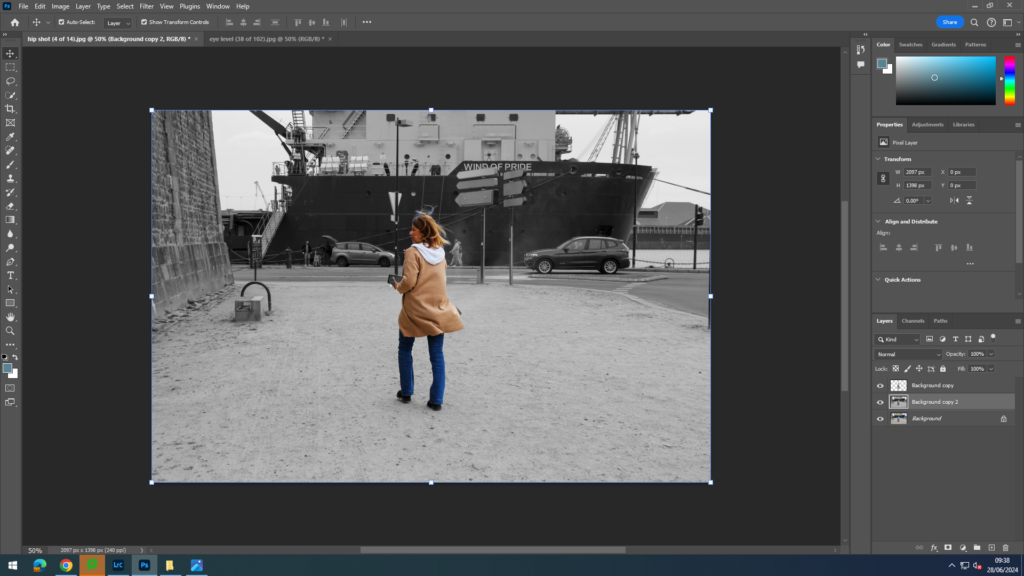
Experimenting with Motion Blur
I wanted to play around with this image, because it is a busy image with lots of people, so I felt like I could do a lot with it.
Firstly, I duplicated the background and selected the man and his baby. Then, I selected inverse and deleted the background.
Next, I selected filter and motion blur and blurred the background.
Finally, I duplicated the background again and played around with the hue and saturation.
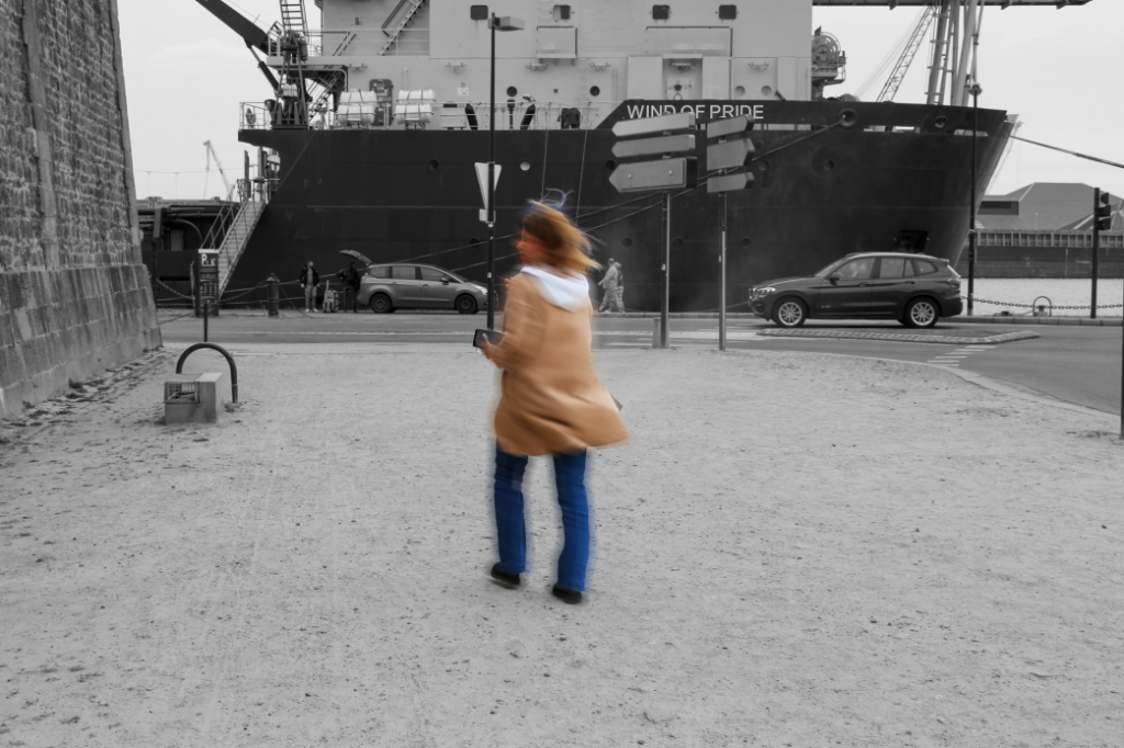
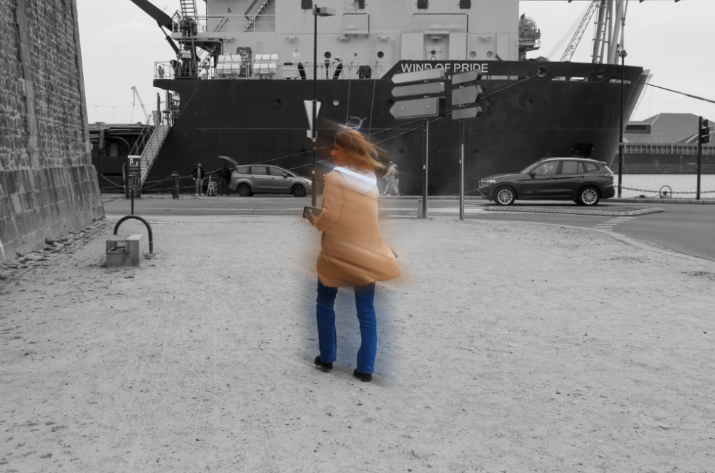
Next, I wanted the experiment with a single person image, and wanted to blur the person, rather than the background. I wanted wanted to experiment with different levels of blur.
This is the image I decided to edit.
Firstly, I duplicated my background layer and selected my person. Then, I went to select and inverse and deleted the background.
Then, I duplicated the background again and turned it black and white, so that the background was black and white, but my person was in colour.
Finally, I went to filter and motion blur and selected the strength of the blur and the angle.
First, I experimented with a weak blur.
Next, I experimented with a stronger blur.
Finally, I wanted to experiment with making a Tryptic out of these three images.
Overall, this is my most preferred image as with my 2nd and 3rd experiments I felt as if there was too much going on with the background and distracted the eye. I think it is clear and efficient but also has some detail and interesting factors such as the drop shadows and boarders. What I personally think is a possibility of improving is by potentially adding adding boarders to each image to make it look tidier. All the images I chose personally work well together as they all show an element of a certain relationship within my street photography which ultimately links to the ‘ decisive moment’. I think these specific images show what you would not take notice of on a daily basis but is a very positive element to life.
Experiment 2 process
Choosing layout process-
Adding a background to add texture-
Evaluation and critique-
Personally, I do not like this as much as my 1st one due to the fact I think there is too much going on within the background and the writing over the image distracts the importance of each image. However, I think it adds detail and a variety too each image. As shown, there is one image with a border which I personally like, however I would like them in all of my images but without the background so there isn’t too much going on and to keep it simple. I personally, don’t like the white writing over an image because it looks messy and not tidy. Although I will not be using this one, the experiments shown me what I prefer and what to do for my final outcome.
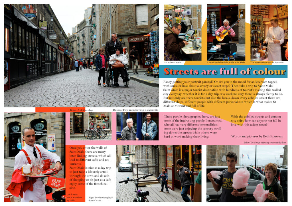
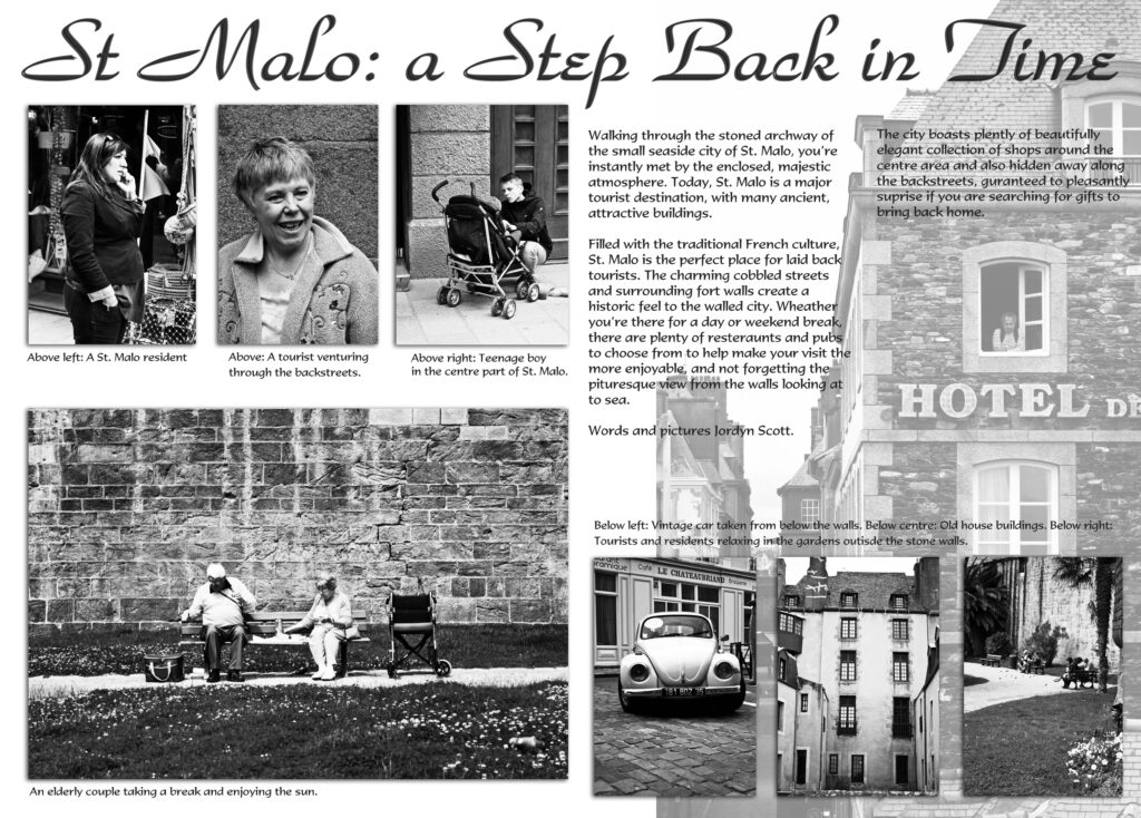
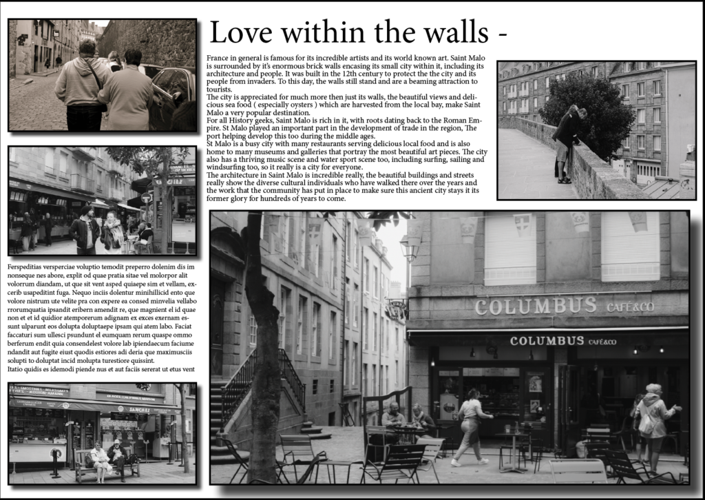
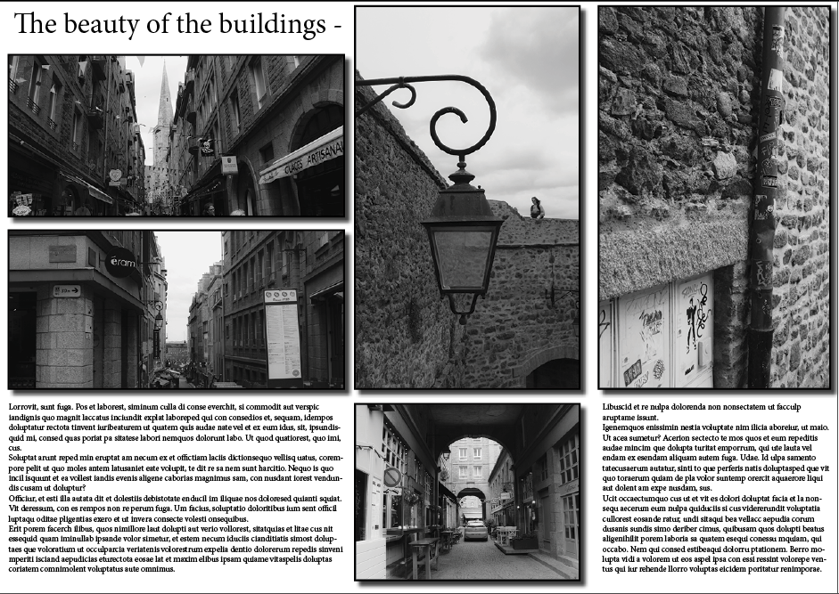
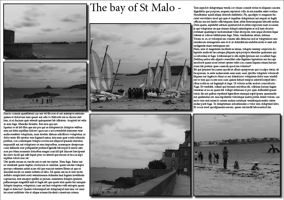
France in general is famous for its incredible artists and its world known art. Saint Malo is surrounded by it’s enormous brick walls encasing its small city within it, including its architecture and people. It was built in the 12th century to protect the the city and its people from invaders. To this day, the walls still stand and are a beaming attraction to tourists. The city is appreciated for much more then just its walls, the beautiful views and delicious sea food ( especially oysters ) which are harvested from the local bay, make Saint Malo a very popular destination. For all History geeks, Saint Malo is rich in it, with roots dating back to the Roman Empire. St Malo played an important part in the development of trade in the region, The port helping develop this too during the middle ages. St Malo is a busy city with many restaurants serving delicious local food and is also home to many museums and galleries that portray the most beautiful art pieces. The city also has a thriving music scene and water sport scene too, including surfing, sailing and windsurfing too, so it really is a city for everyone. The architecture in Saint Malo is incredible really, the beautiful buildings and streets really show the diverse cultural individuals who have walked there over the years and the work that the community has put in place to make sure this ancient city stays it its former glory for hundreds of years to come.
Page spread 1 –
Page spread 2 –
Page spread 3 –
I felt like overall, these 3 topics really stood out and captured my St Malo trip really well, grabbing some of the most important things that I feel St Malo has to offer. I not only included the people and the atmosphere, but the architecture too. This overall making my picture stories effective in presenting St Malo as a whole.
InDesign terminology –
workflow – 0 for the purpose of this course, I refer to workflow as the order in which you work in a program as you’re designing a project (a very watered down example: first you setup a new document, then you create a background, then you add text, etc.)
margins – the negative space around the inside of a page, a safe zone for all content / text / images
bleed – used for print only, extra space in addition to your page size that’s cut off when artwork “bleeds” to the edge of the page, so you don’t have any white border
slug – extra space on the outside of your document, different from bleed, used to show markings or notes for the printer (commonly used for printed magazines or newspapers)
grids / guides – the thin colored lines on your IND document that do not appear on your final document, but are just used for aligning objects on your page or showing where the margins are placed
facing pages – two pages shown side-by-side, also known as a spread – used for documents that will be printed and bound
parent pages (formerly called master pages) – mini templates you can create and use throughout your document for pages that have repeated content on them, like a page number or footer (they’re not part of your page count)
character / paragraph styles – a pre-set of settings and formatting that can be applied to a word, a line of text, or an entire paragraph in one click
frame – the invisible box that an object, link or text is contained within (also called container)
flow / reflow – how your lines of text continue from one frame / text box to the next, from one page to the next, and around other objects in your layout
overflow – when the amount of text in your text box is more than the size of your frame and overflows into a second text box
widows / orphans – a single word left by itself on a line of text at the end of a paragraph, or a single line of a paragraph left on a page by itself at the beginning or end of the paragraph
page break – when a section of text is cut off and the remainder is bumped (or reflowed) to the next page
line break – when a paragraph is cut off and the remainder is bumped (or reflowed) to the next line
frame break – when any part of a text box is cut off and the remainder is bumped (or reflowed) to the next text box / frame
keep – regulations for where line breaks can occur, so you can avoid widows / orphans and keep a certain number of lines in a paragraph together at all times
endnote – a group of notes shown at the end of an entire document that each refers to a reference number made in the text
footnote – a note shown at the bottom of a page that refers to a reference number made on that same page in the text
drop cap – a decorative feature at the start of the first paragraph of a section or page; usually an enlarged first letter in the paragraph or the first few words in the paragraph
small caps – when you use all caps for a word or phrase, this makes the letters a little smaller than a typical capital letter to make it easier to read and not so “loud” (as sometimes all caps can appear)
glyph – every character in a typeface, (e.g.: G, $, ?, 7), is represented by a glyph; this includes all capital and lowercase letters, numbers, and symbols