For this experimentation, I used Adobe InDesign to create a newspaper-like layout to display my images. On InDesign I created a 4-columned layout to organise my photos in a way where they could all be seen, but emphasising the establishing shots so they were most out-standing to the viewer. Essentially, these photos are the ones I wanted to catch the viewers eye with the most, and I think having other smaller images surrounding them helped create a successful dynamic with an overall interesting aesthetic.
Variation 1:

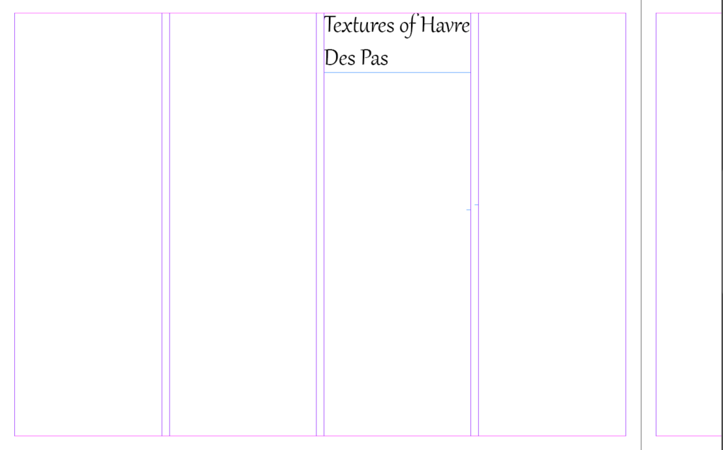
The first thing I did was create my columns in order to layout my photos successfully. I also chose where I wanted to place my title before adding any images because I believe it is the most important element on the page spread, as it tells the viewer what they’re looking at and shows my intentions.

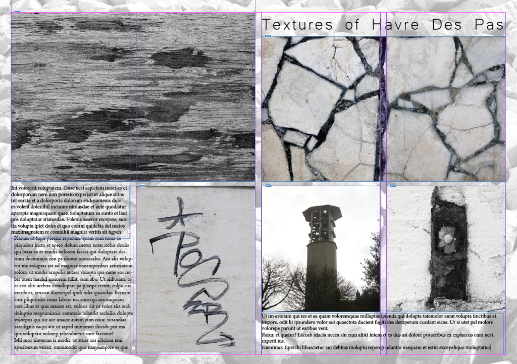
Next, I added in my establishing shots before any smaller images because they introduce the scenes and set up a point of view.

After this, I added in my best smaller images that link to my establishing ones, but not too much. I did this because I wanted to create an intriguing contrast between the two, showing a range of textures and abstract photographs throughout the landscapes topic.

Finally, I added placeholder text into my text box, to give me an idea of how my completed page spread will look when I have wrote my own text. Additionally, I changed my font for my title as I didn’t think the first font suited the aesthetic of my images.
Variation 2:

For my second experimentation, I first changed my top right photo into monochrome like the rest of the images on the display. This was a better decision as it helps give the overall page spread an overall theme of history, as well as showing the different textures within all the images to add to the old aesthetic.

I added another text box for additional writing and details of my photos. I think this is useful as it allows me to go into more depth with my images, which will ultimately give the viewer a clearer idea of my aim. I also changed my top left photo into monochrome like the rest of the images on the display. This was a better decision as it helps give the display an overall theme of history, as well as showing the different textures within all the images to add to the old aesthetic.
Variation 3:

This is my final variation for this page spread specifically. I like the layout of this version as it includes more text than the previous experiments, which can give a more detailed description of my work and what I am trying to achieve for future references. However, I believe the layout is very top-heavy as it includes both of my establishing shots at the top of the page. This could be a problem due to the viewers eye being drawn to the top of the picture story only, which is defeating the rest of the page spread.
Variation 4:

This is my last variation for this experiment, and I added a black box instead of my background to see if it would add more character into the page spread. Although I think this looks appealing due to the pop of colour, I had to change the colour of some of the text to white so it was still visible, however I do think this looks successful because it helps bring out the white tones in some of the images which help bring the outcome together. Finally, I added a drop shadow to my title to emphasise it against the images.
Evaluation:
Overall, I believe all 4 variations of my page spread are unique and successful in different ways. Such as the layout on each one outstands a different image, which allows me to choose which image looks best as the most eye-catching one. I also liked how I could experiment with the background of each one
My favourite variation of this experiment was number 3. This is because I had a beneficent balance of images and text, and I think the background compliments my image and completes the overall aesthetic of history. Despite my picture story being very top-heavy due to my establishing shots both being at the top, I believe this gives the smaller images a chance to also stand out as they are all the same size.
My least favourite variation of my page spread is my number 4. This is because I played with a different background compared to the others, and I feel it stands out too much and takes away from the text and the images.


