Page Spread Planning and Designs
After being introduced to InDesign in class, I played around with the tools to become familiar with the Software and this is what I created. As you can see, I have inserted some random images. These images won’t be the selection that I will use for my final design, I just used them to learn how to add images and move them around.

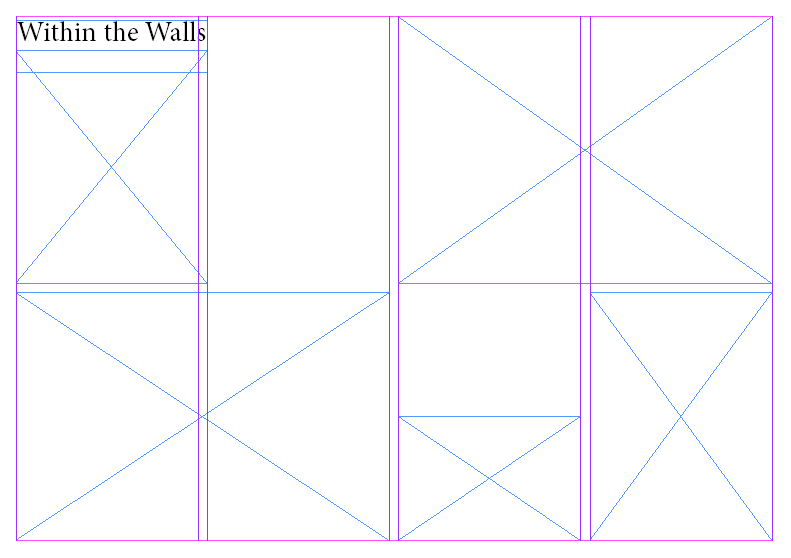
These are some other layouts which I came up with and, as you can see, I have decided to go for the title ‘Within the Walls’. Another good title would be ‘St Malo through Phone’ as I took these images using my iPhone as it is more distinct, however, I think this title would be informal and doesn’t look as good.


I then added some placeholder text in the areas which I am planning on putting text within my Page Spreads.

I also added the French flag behind one of my layouts by using coloured shapes and sending them to the back.

Another layout option which I tried was to have an image behind the text. I inserted this image like I would any other then moved it to back and lowered the transparency to 24%.

I also added some borders around my images which are the colour of the French flag as it is much more minimal than having it as the entire background. I did this by making the edges of the images have a 3pt border then colouring the borders to be like the French flag.

I designed another layout with some more smaller images, rather than having a clear establishing shot. This will allow me to display more of my images and works better for my images as the majority of them are vertical.

After this, I added images to one of my design layouts, as seen below:

Here is my reasonings for each of the images’ positions:

I also tried this same layout in B&W to see what I think would look best:

I have decided that I am going to keep the images in colour as I believe that it is more pleasing to the eye and St Malo is a very colourful place so it represents it well.
After this, I put an image of a woman eating ice cream behind the text to see how it would look, however, I think that it just looks a bit messy.


Here is another image layout which I have created:

I made this page spread monochrome by exporting it and putting it into Lightroom, rather than using B&W images.

Once again, I think that I prefer in colour as it strips the character from the images when in B&W.
These are the 2 layouts for me to choose between:


I have decided to go for the second layout as I think it is a better way of positioning the text and will allow me to write 2 separate paragraphs on different topics, rather than one big one. One the other hand, there are some images which I don’t think quite fit with the rest, therefore I am going to change them.

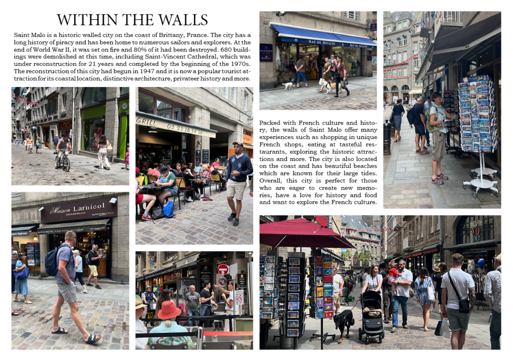
I have swapped the image with the church to the one where the man is walking past the 2 ladies sipping their drinks. I prefer this layout much more now compared to how it was before and I think that this image is a better representation of the decisive moment.
I then made another change to my images as I thought the image of the woman eating the ice cream didn’t really fit in so I replaced it with the image of the man cycling and replaced that image with people walking their dogs. I strategically placed these images here as they draw your eyes into the page spread.

This is the text I would like to add to my page spread:
1st text box:
Saint Malo is a historic walled city on the coast of Brittany, France. The city has a long history of piracy and has been home to numerous sailors and explorers. At the end of World War II, it was set on fire and 80% of it had been destroyed. 680 buildings were demolished at this time, including Saint-Vincent Cathedral, which was under reconstruction for 21 years and completed by the beginning of the 1970s. The reconstruction of this city had begun in 1947 and it is now a popular tourist attraction for its coastal location, distinctive architecture, privateer history and more.
2nd text box:
Packed with French culture and history, the walls of Saint Malo offer many experiences such as shopping in unique French shops, eating at tasteful restaurants, exploring the historic attractions and more. The city is also located on the coast and has beautiful beaches which are known for their large tides. Overall, this city is perfect for those who are eager to create new memories, have a love for history and food and want to explore the French culture.
Here are my layouts with text:


I have decided to go for the first text option as I think that it best fits the boxes I have left for text and also matches the title as they are both serif fonts. I have also put made sure that the text was displayed with my most recent layout. Here is my final result:

