Experimentation 1, 2,3,4 and 5 of picture story 1 :
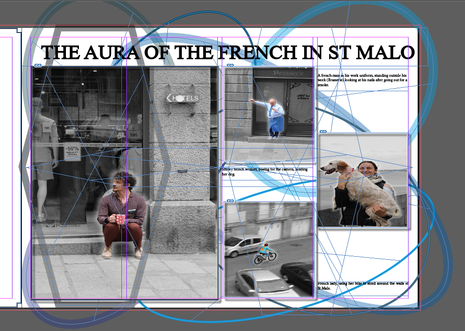
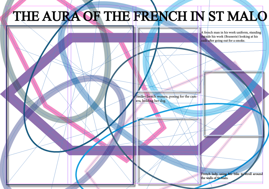
1: in this experiment, I layered a bunch of different shapes with a various of shades of blue, thickness and opacity and although I liked the blue, I found it overwhelming therefore started to add different shades and colours. I also didn’t really like how the shaped overlapped the images, so this was rejected. I stuck with the title throughout the whole of the experiment because I really liked it.
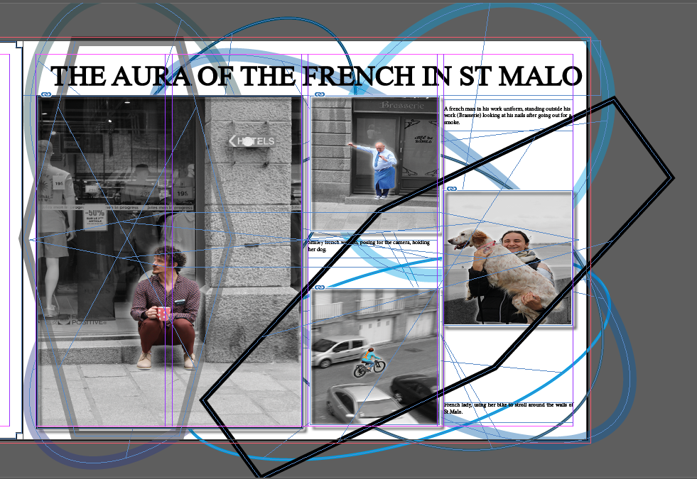
2: For this experiment, I stayed with the blue shapes and didn’t change much from the first experiment however decided to add a black shape but immediately disliked it.
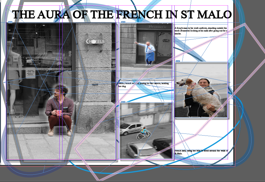
3: I started to find what I actually wanted to create with this picture story, in this experiment. I played with different colours like pink and grey and also played with the opacity and thickness. I liked how colourful it was getting and realised that I wanted to make it colourful so I carried on with the experimentation with colours.
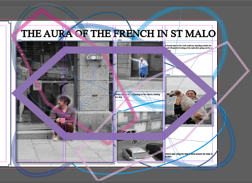
4: Now her was where I was really having fun with the colours, I liked the contrast between the feminine colours and masculine colours and the different shapes. However I still did not like how the shapes were overlapping the images so thus was rejected.
5: This was my final product. I had finally figured that the coloured shapes would stay as the background and the pictures would overlap the shapes. I also decided to ass some shading and frames that coordinated with the images to enhance the images and really highlight the title in the mention of ‘aura’
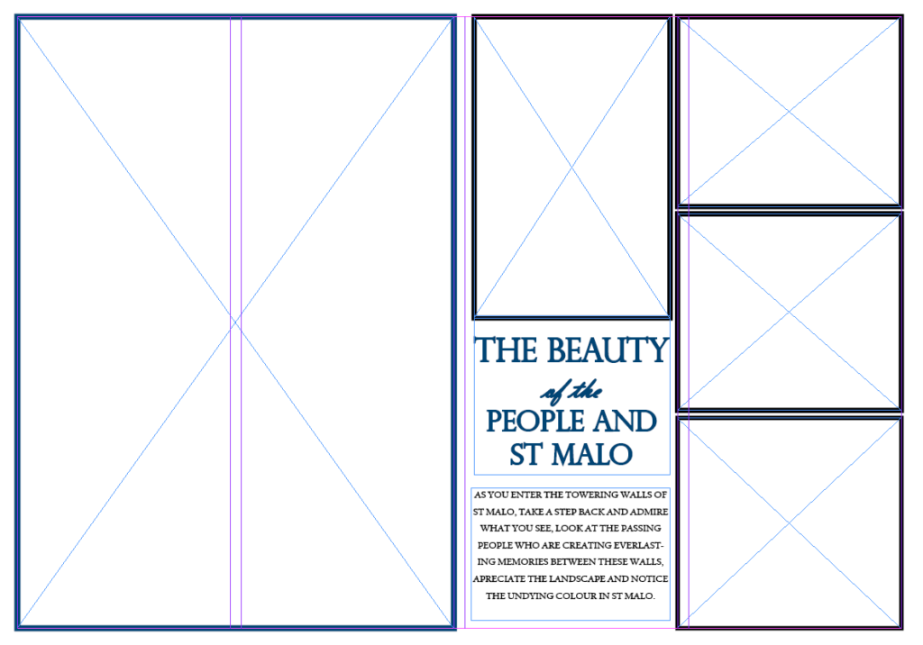
Experimentation of picture story 2 (didn’t really experiment as I just went with the flow and liked the end products so kept it like that)I did however, play with the colours of the outlines of the photo frames. I debated wether the left side should be black and the right side all blue, however my main picture had lost of blue, so I put the larger frame on the left as blue to form a correlation between the image and frames. I also played with the thickness of the title especially the part where is is cursive. I thought the cursive words gave it a ‘Chique’ tone to it:
Experimentation 1 and 2 from the 3rd picture story :
1: with this experimentation, I played with the title in terms of size and font. I really liked the font and the size of it, especially the thickness and as seen on further blog posts, this ends up being my final product. I noticed that lots of my images in this picture story had brown in it so decided that I would put the frames for the image in brown.
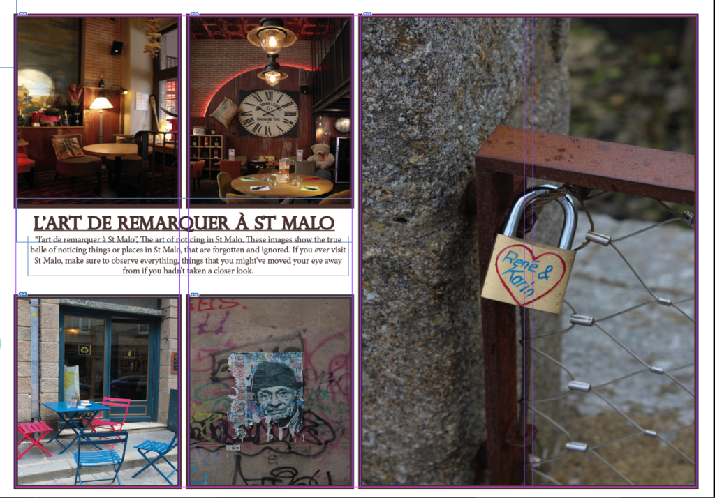
2: in this experimentation, I changed the thickness and font of the title to see if it gave it a more rustic look to it however, I did not like the look that the font made the picture story look like. It made it look like really messy and childish, therefore it was rejected.

