Picture story 1 ANALYSIS and DECONSTRUCTION:

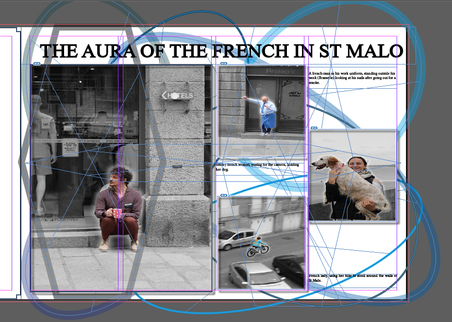
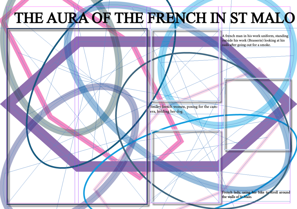
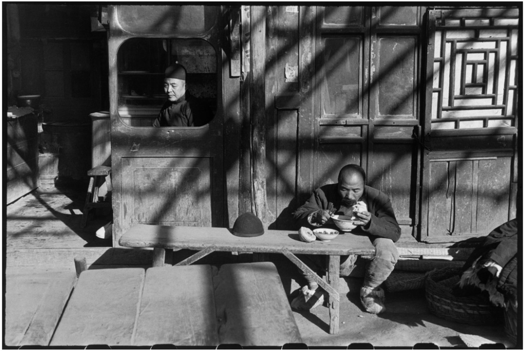
For the layout of this picture story, it was solely meant to show the the people or specifically the French people of St Malo, highlighting the aura they carry hence the title. The title gives the picture story a more clear storyline which is something that I really like. All the images relate because it shows people and tells a story by illuminating them, making them ‘important’. In this picture story there are multiple of types of shots used. They’re are major, minor and portrait. This diversity allow my picture story to stand out and be different. The major shot is the man with a mug on his hand, sat on the pavement. This is my major shot as its an image that Is really satisfying because the man is almost centred and symmetrical which is something that peeks interest. My minor images are the woman on the bike and the chef. This is because the images are quite far away and edited so that they are zoomed in. The images are still quite satisfying but not enough to be my major shot on my picture story. Lastly the portrait I have is of the lady holding her dog. This portrait isn’t a major shot on my picture story because the image is quite silly and candid, I wanted my major image to be more professional and constructed.
Picture story 2 ANALYSIS and DECONSTRUCTION:

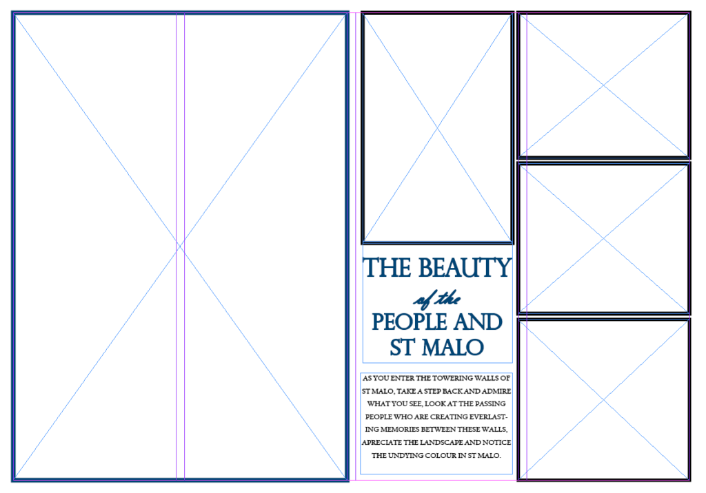
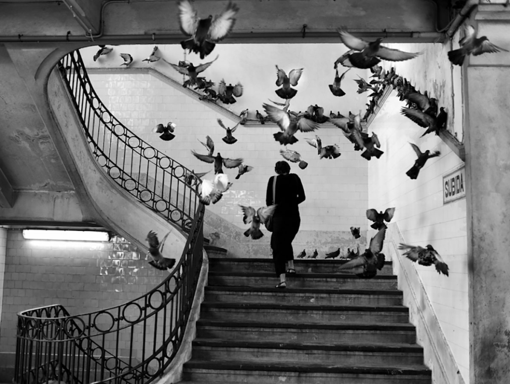
For this layout I wanted to highlight the insane beauty and people that St Malo shows hence the title. The title is clear and unique as it has different fonts and Although my first Picture story shows people, for this picture I wanted to incorporate an image of A beautiful street in St Malo, seen on the major shot on the picture story which is the large image in colour, illuminating the colour blue. Although some may argue, all my images in this picture story relate. The major shot sided with images of different people is meant to show the tory of how these people have lost likely roamed the street show on the left, highlighting the fact that although all these people are from the same town and have walked the same streets, they have most likely not met each other, the term Sonder may come to thought as it is the ‘realisation that each passerby’s life is just as complex and unique as ones own’. The minor images which is the image of the kids playing on the beach, the girl in the umbrella and the man working in hospitality, are small and almost zoomed in.This is to show that even though they are important images, the image on the left is much more important.
Picture story 3 ANALYSIS and DECONSTRUCTION:

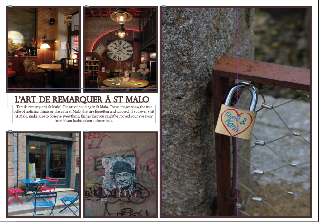
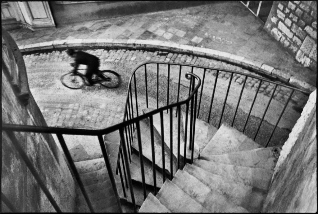
For the layout of this picture story is meant to show and zoom into the details within St Malo, hence the title which means the art of noticing. The images relate to each other because it shows details that some may ignore or looked over. It tells a storyline because it slowly shows images with more detail and images that are more zoomed in. There are many types of images in my picture story which promotes diversity. The major photo in this picture story is the picture of the lock. This was done because I believe that this image shows how the art of noticing is beautiful and how a lock like this on a fence wire is easily ignored, considering it the only lock on that fence. This major image really highlighted my title so I had to make it my major shot. The minor shots in my picture story are the two images on the left at the bottom. This is because it shows two images that have relatively close colouring to each other which is something I noticed and had to put on the picture story. Lastly the two environmental images on the left which shows parts of a restaurant were put on the picture story to show how I noticed that this restaurant had rustic and old pieces which if I hadn’t taken a minute to look, I wouldn’t have noticed.
Final picture stories:
Picture story 1:

Picture story 2 :

Picture story 3 :

Evaluation:
Overall, I’m really satisfied with my outcomes. The pictures story really show what St Malo means to me and it shows how I see St Malo or how I can portray and manipulate it.
When it comes to editing, I believe my editing is one of my strengths. This is because the editing in all my images really enhance my images and bring my images to life. My editing in my images manipulate what St Malo looks like to me. The images before editing were quite bland but using photoshop and Lightroom really helped me show a wider audience how I interpret St Malo and how the colours within St Malo are much more significant to me and are seen differently. It shows my innovation.
When it comes to layout, I also believe that it is one of my strengths. This is because all of my layout in my 3 picture stories, really compliment each other. The layout is diverse but meaningful. The layout has a meaning which is to show how many different parts of St Malo are connected in so many different ways. This is something that I clearly show in my layouts in my picture stories therefore I believe that my layout is consistent and powerful.
Lastly, I do believe that my picture stories lack unification. Although my picture stories solely focus in what consumes and consists of St Malo, which was my aim, I believe that I could’ve somehow linked my pictures stories by using a repetitive pattern. This could be having a continuous sticker or colour in my picture stories. Or even using the same layout to show consistency.