

Selection and Editing
While selecting images, I found that a few of my images would work very well together as doubles to each other.
Double 1
Before

After

For this photo, I decided to crop the image so that the colour of the street met both corners of the photo. This is so that the image looks cleaner and more controlled. I also thought that the photo was very underexposed and badly coloured, so I fixed this by bringing up the exposure, shadows and vibrancy in Lightroom. Later, I had the idea to colour some parts of my photos black and white in order to make them appear more striking. This is the first example of this that I did, where I coloured the man and the pictures in the shop, and made everything else black and white. This makes the photo more focused on what the pictures in the shop actually are and what the man is admiring.
Before

After

For this photo, I cropped the top of the photo slightly to remove the white blind in the top left corner as I felt it made the photo look too spacious and inconsistent. Then I decided to bring up the shadows and the saturation to bring out the blue and red in the photo. I then applied the same technique as before, this time making the two subjects of the photo black and white and only letting the red and blue stand out.
I then combined the two to present them as a double in the virtual gallery. I also decided to flip the second photo vertically because I found that the streets in both images lined up well.

Double 2
Before

After

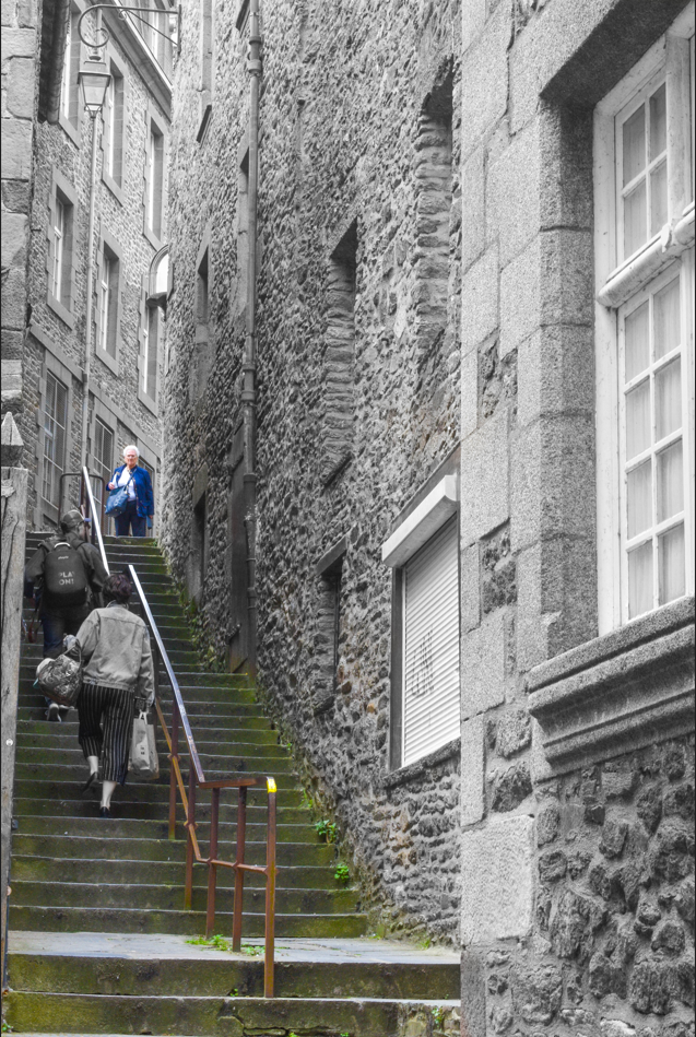
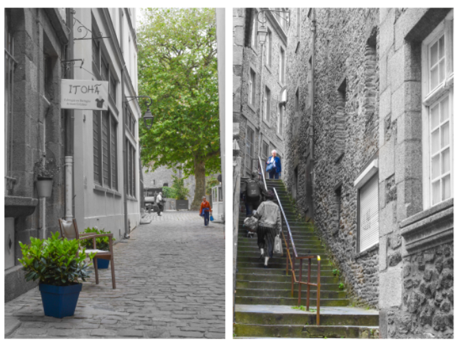
For this photo, my focus was to make the stairs look daunting to the old woman standing at the top. Firstly, I brought up the saturation and vibrancy to exaggerate the green and blue. I then cropped the image using the rule of thirds to place the right side of the image perfectly into a third of the image. In addition to this, I made the buildings and the people travelling up the stairs black and white, which blended the colour of the buildings together. In turn, this made the buildings negative space, and also makes the stairs look even more daunting for the old woman.
Before

After

In this photo, I wanted to create a similar effect to the previous image. To do this, I brought up the exposure and shadows just to make the colour look neater and more consistent. I then made the building, street and people in the far background black and white. This creates a similar negative space to the previous photo, as these objects become less apparent to the viewer.
When combined, I think these photos work fairly well together. However, I think this is the worst out of the selection because, although the images look good standalone, when put together they don’t significantly relate to each other.

Double 3

For this double, I combined two photos I got of this very lonely looking man. I then made everything except him black and white. Also I cropped the second image so that both photos lined up perfectly. I feel that this image shows his perspective, he is clearly thinking in his own mind and separated from the world around him.
Double 4
Before

After

I found that this image was very underexposed and the greens weren’t as apparent as I wanted them to be. To fix this, I brought up the exposure and saturation. Also, I cropped the photo slightly to make it a little less spacious.
Before

After

For this photo, I found that it was underexposed and the colours weren’t as vibrant as I wanted them. I brought up the shadows, exposure and saturation to fix this. I also cropped the photo to remove some negative space above and on the sides of the photo.
When combined, I think that these are the best images out of all. Although they do not relate to each other on a surface level, I feel that the positioning of both couples in the bottom left of each photo creates a connection between the two.

Virtual Gallery


Your coursework now requires urgent and thorough updates.
Remember…you should be completing and submitting a minimum of 1 x blog post per week!