For this experimentation of my images from the St Malo shoot, I used partial inspiration from Stephanie Jung in addition to Henri-Cartier Bresson.
HER WORK:
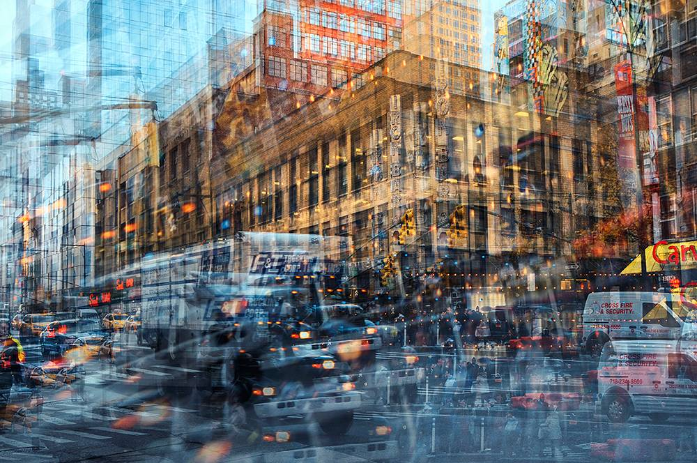
Stephanie Jung is known as a fine art photographer who is based in Germany. Studying in Visual Communications until 2010, she discovered her passion for this experimental form of photography. Since 2012 she is working as a freelance photographer, focussing on fine art photography.
Stephanie Jung’s work is known to consist of cityscapes in a double exposure manner, either created through shooting multiple exposures directly within the camera or processing multiple images after in a combinative manner. I really wanted to create this effect experimentally with my St Malo images initially inspired by Henri-Cartier Bresson as I believe that these images symbolise the ‘hustle and bustle’ alongside the rapid pace of life within cities, with things consistently changing and people always moving.
MY IMAGES:
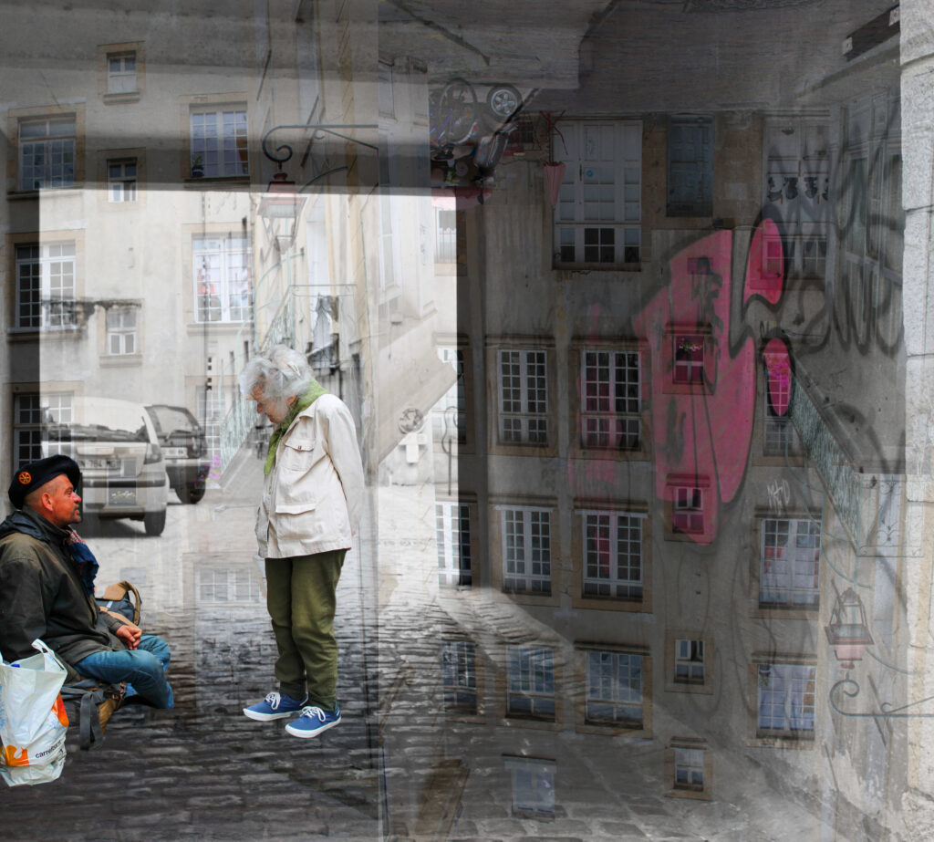
This is my favourite experimental piece using double exposure because I feel that all the images involved have worked very cohesively and I am really pleased with the outcome. I feel that this encapsulates many different parts of St Malo and ties all together nicely to show the culture.
First of all, I used my image of a graffitied alleyway and used colour selection to select only the large hot pink design as this was the main focal point and the most establishing piece of the image. I then created 2 layers of a low-shot building I took and reduced the opacity, flipping one version upside down and onto the right. I did this because I thought it would add a deeper texture and context of St Malo. I then opened up an image I took of an elderly woman conversing with a homeless man in a kind nature, used the quick selection tool (defining it using the Alt button) and imposed it into the image into the left corner as if it took placed within the alleyway.
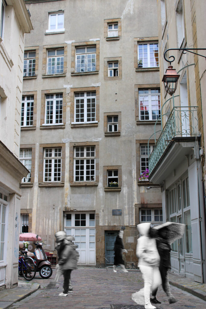
The subjects within this image were taken as double exposure through a slow shutter speed within the camera, however I thought it would be appropriate to add this image into here. I created this by simply using the quick selection tool and selecting different subjects walking through the street and dragged them into the image, playing around with the sizing to make it appear more realistic and fit to scale. I chose to use this as my background image because not did I like the low angle I used, facing up towards the top of the building to make it appear as if it is towering over the camera – distorting the depth of the image – but I really liked the composition within in it. For example, a classic motorbike peeking out from another building’s corner alongside and old fashioned café placed ever-so-slightly behind, only just visible. Alongside this, I really liked the way the buildings gave off a rustic tone, looking old-fashioned and filled with memories, having flowers placed onto the windowsills. It looked like a location that would’ve been around many years ago, standing still in time.
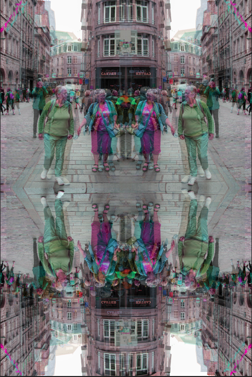
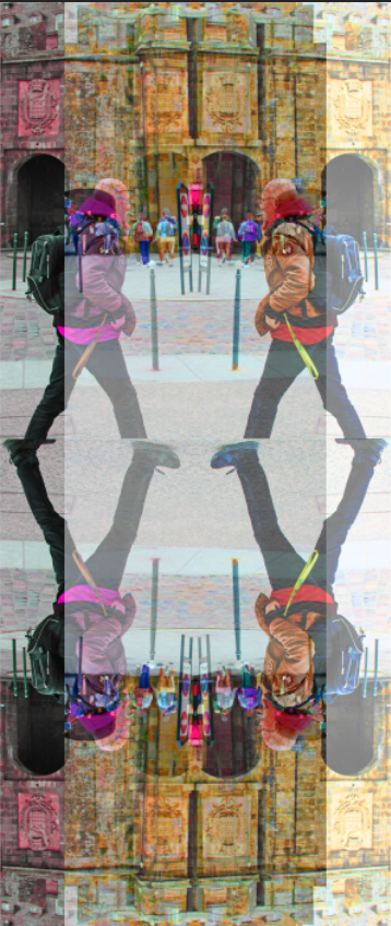
For this image, I duplicated the layers and increased the tonality and saturation of one. I then arranged these into a distorted way to give the effect of a double exposure. Afterwards, all I had to do was duplicate each layer over again until I could create a mirrored reflection.
I think this worked really nicely as not only does it appear as if they are more people in the image, making it busier and more chaotic, but it adds vibrancy and volume to the image in a ‘bounced’ way.
Similarly:
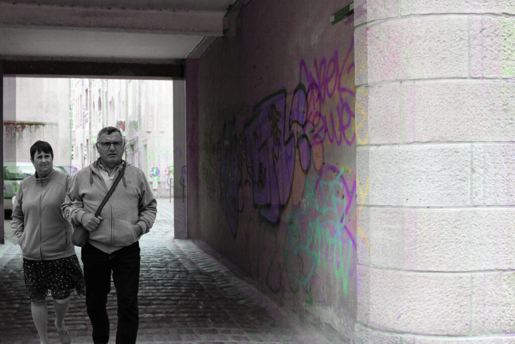
For this image, I used the same technique of duplicating the layers and changing the tonality of one, then slightly shifting it. However, I then opened up a separate image of this couple in black and white. I used the quick selection tool as traced around them, using the Alt button to go back and make miniscule fixes. I then inversed the selection and cut them out, and brought them across onto my street image.
I think this worked really well because the contrasted shift between the neon colours adjacent to the black and white figures can be looked at as if they are frozen in time.
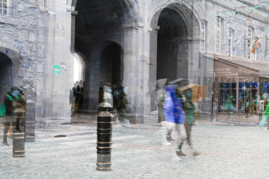
For this image, I made one layer monochrome whilst the other in a bright neon tonality because I felt that this would add a more urban edge to it, nodding to the bright graffiti fond through the alleyways within St Malo streamed across the grey walls. This was already a double exposure image due to the slow shutter speed used when it was taken, however I wanted to create it over the top in Photoshop as it makes it look even more chaotic. I particularly like the way the stop sign located towards the left hand sign of the image looks because it appears unusual and is completely wrong.
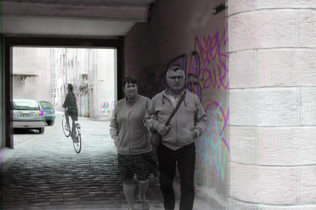
I used the same background I used on my second image and made the subjects in it appear more translucent as I felt this would add an ominous and almost ghostly effect.
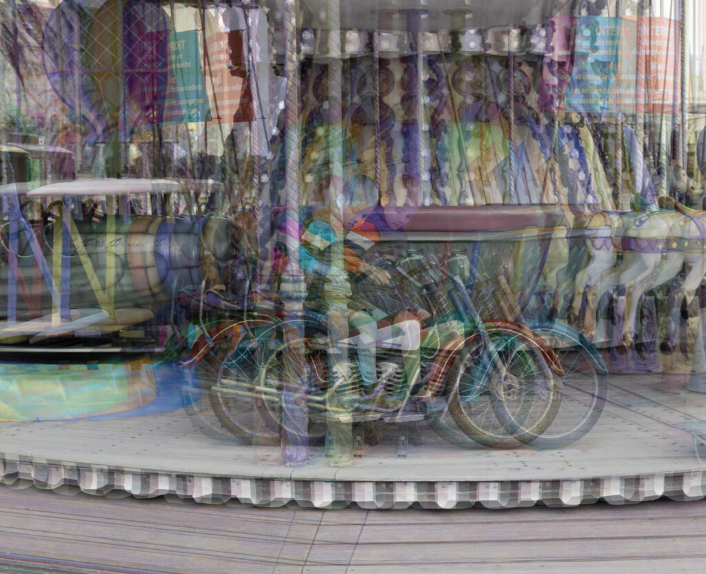
For this experimentation, I used my image of a small boy on a carousel looking down at his pocket whilst he goes past. I duplicated this layer 3 times, making each layer less visible and a different scale of tonality. I arranged them placed slightly behind each other as I felt this would give a motion blur yet in the theme of a carousel, something associated with bright colours, music and happiness.
