For this experimentation, I wanted to play around with different formats of presentation for my images, arranging them in different ways to usual:
PORTRAIT:
Original:
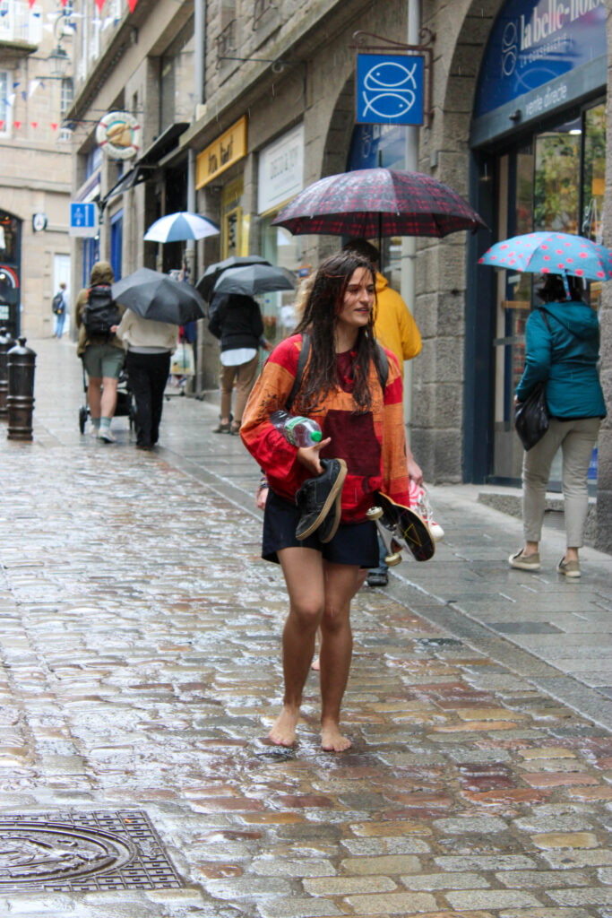
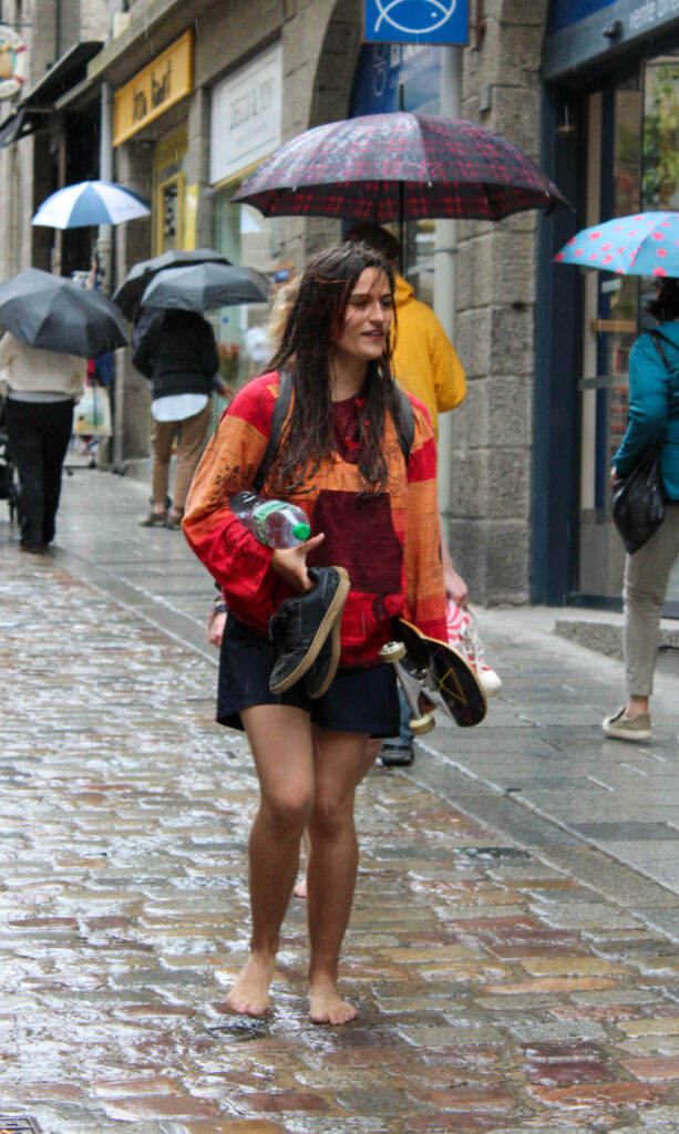
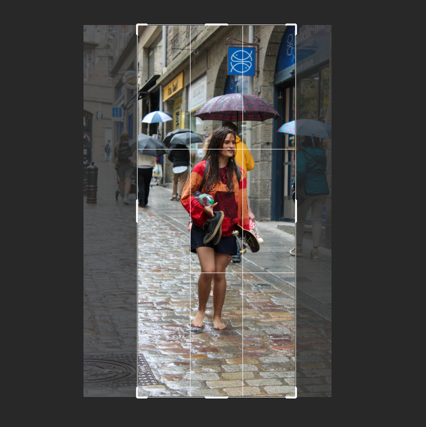
This removed any vacant space around the subject, making her the centre and appear closer to the camera.
Process..
LANDSCAPE:
Original:
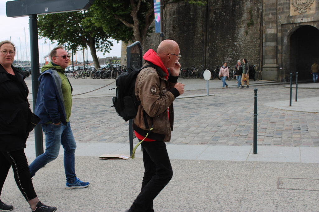
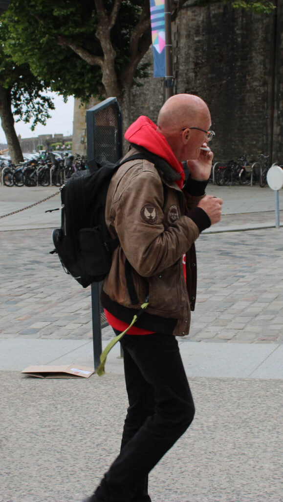
Process…
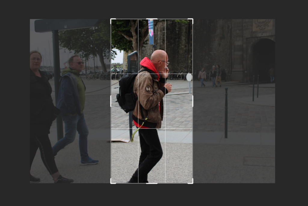
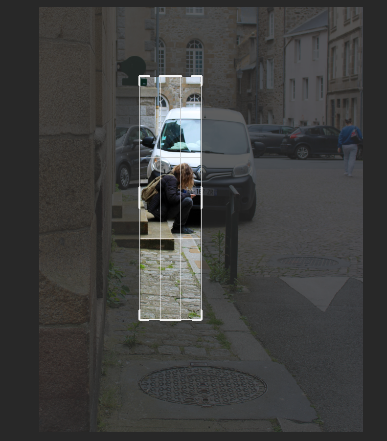
PANORAMICS:
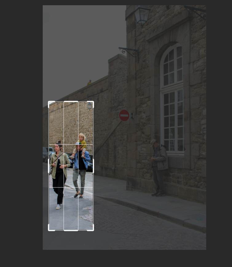
Vertical:


The process of each:
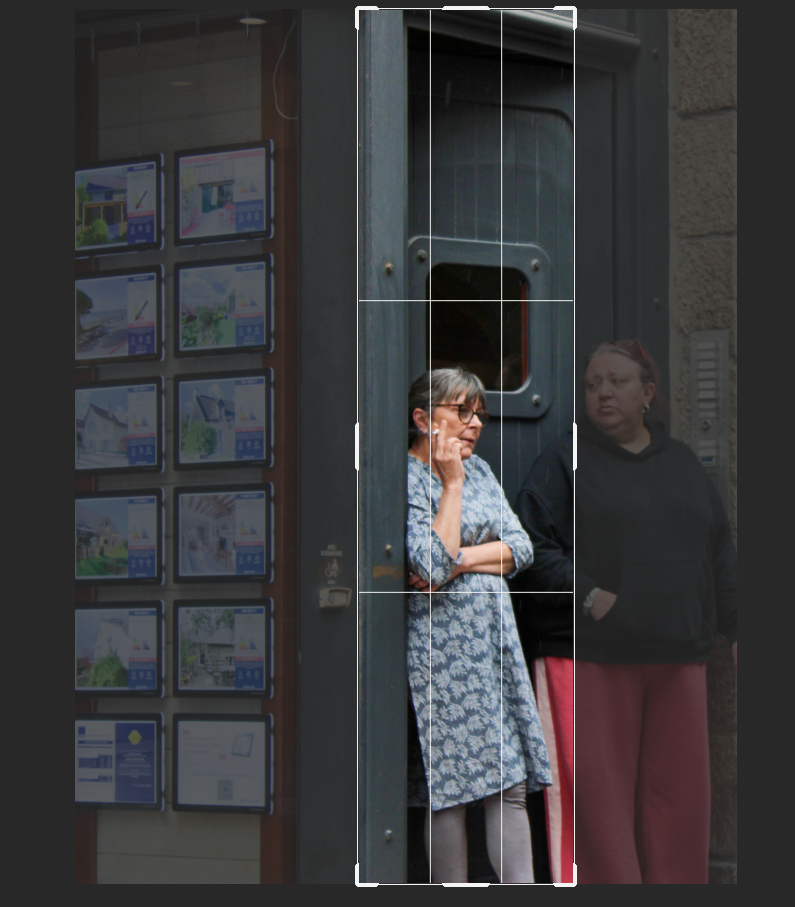
Horizontal:


The process of each:
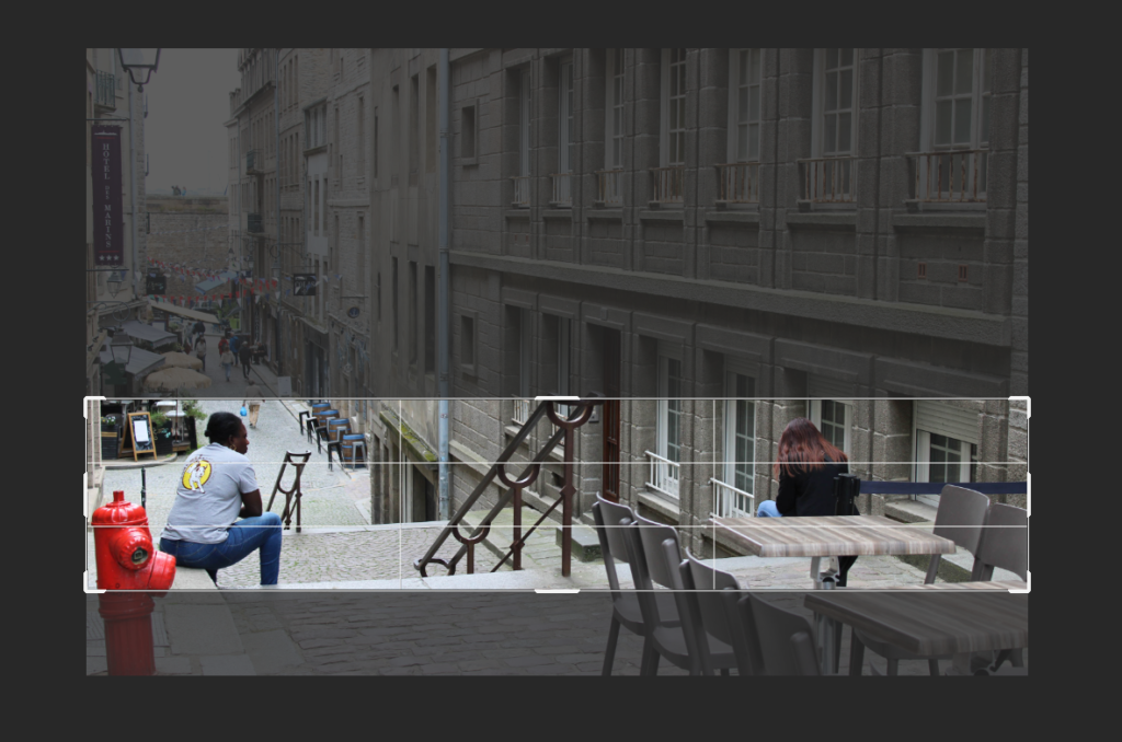
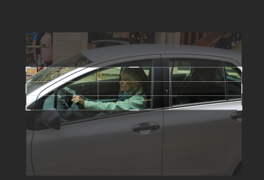
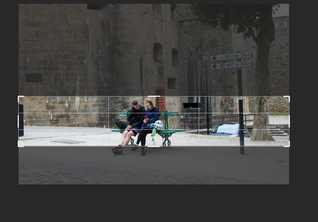
SQUARE CROPPING:
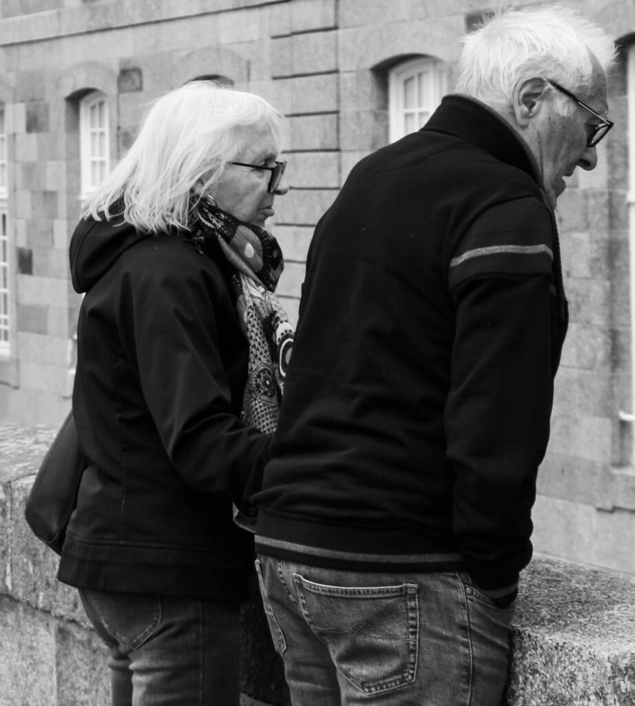
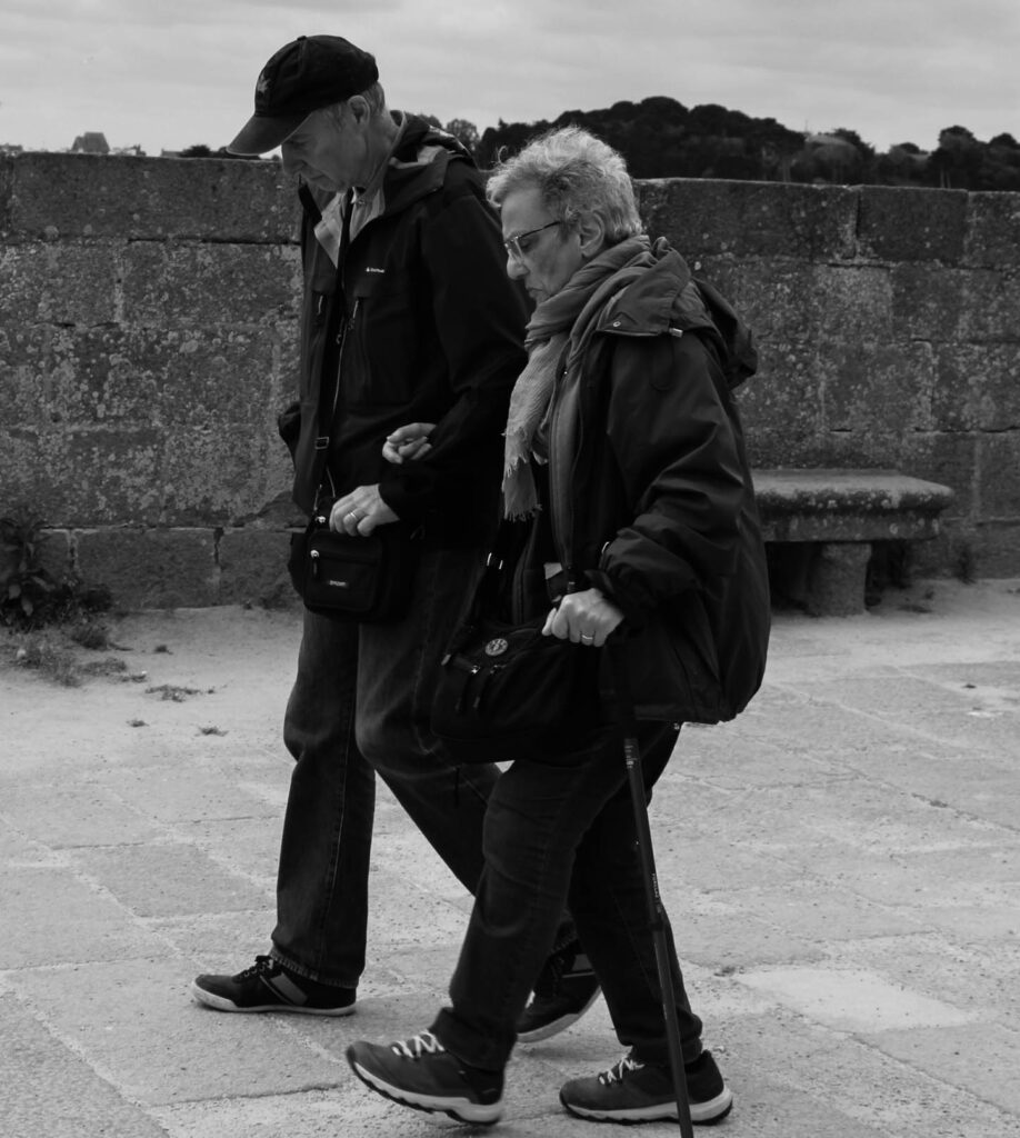
The process:
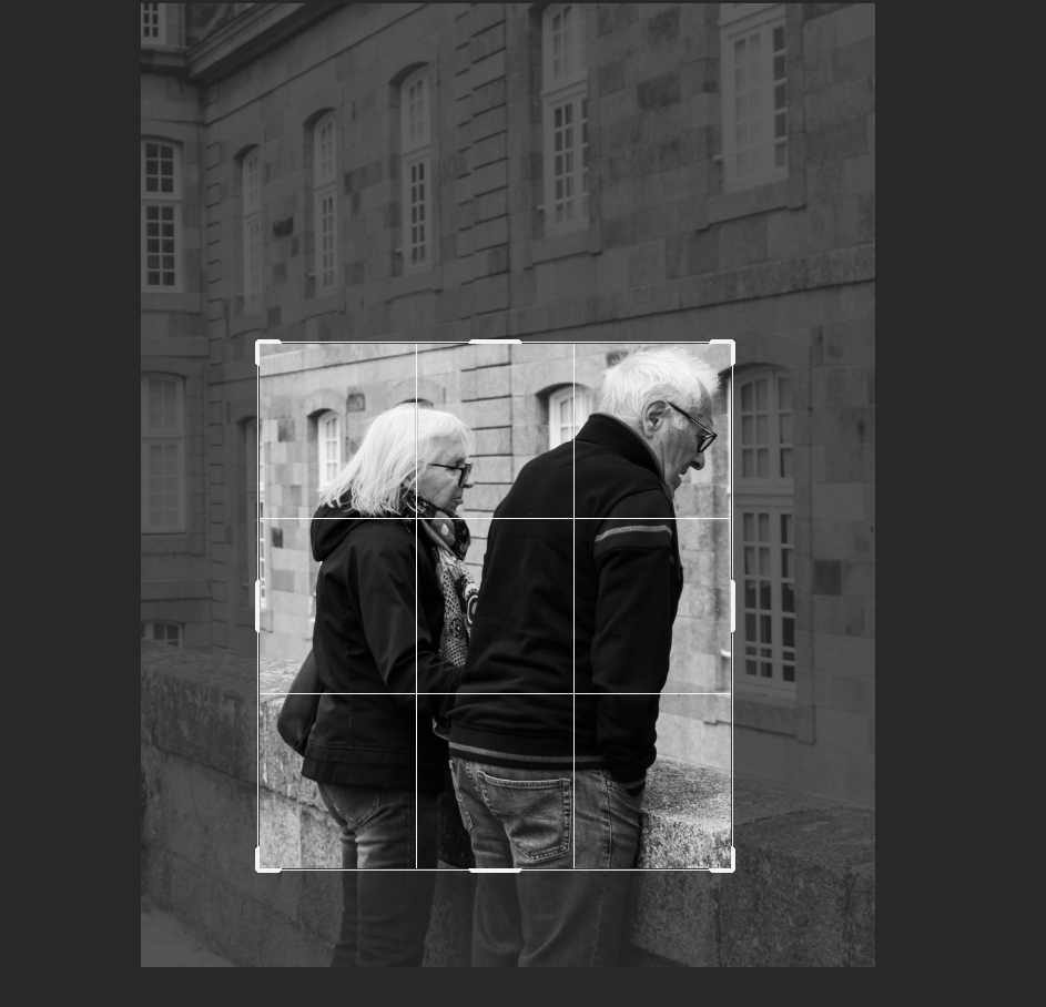
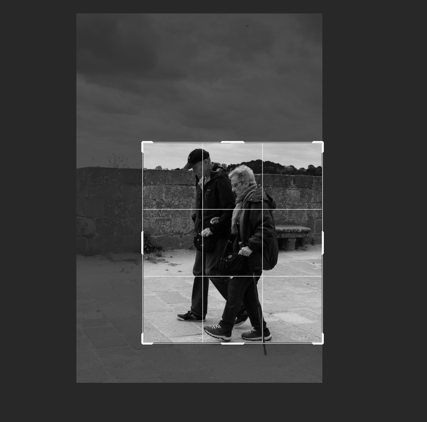
CIRCLE CROPPING:
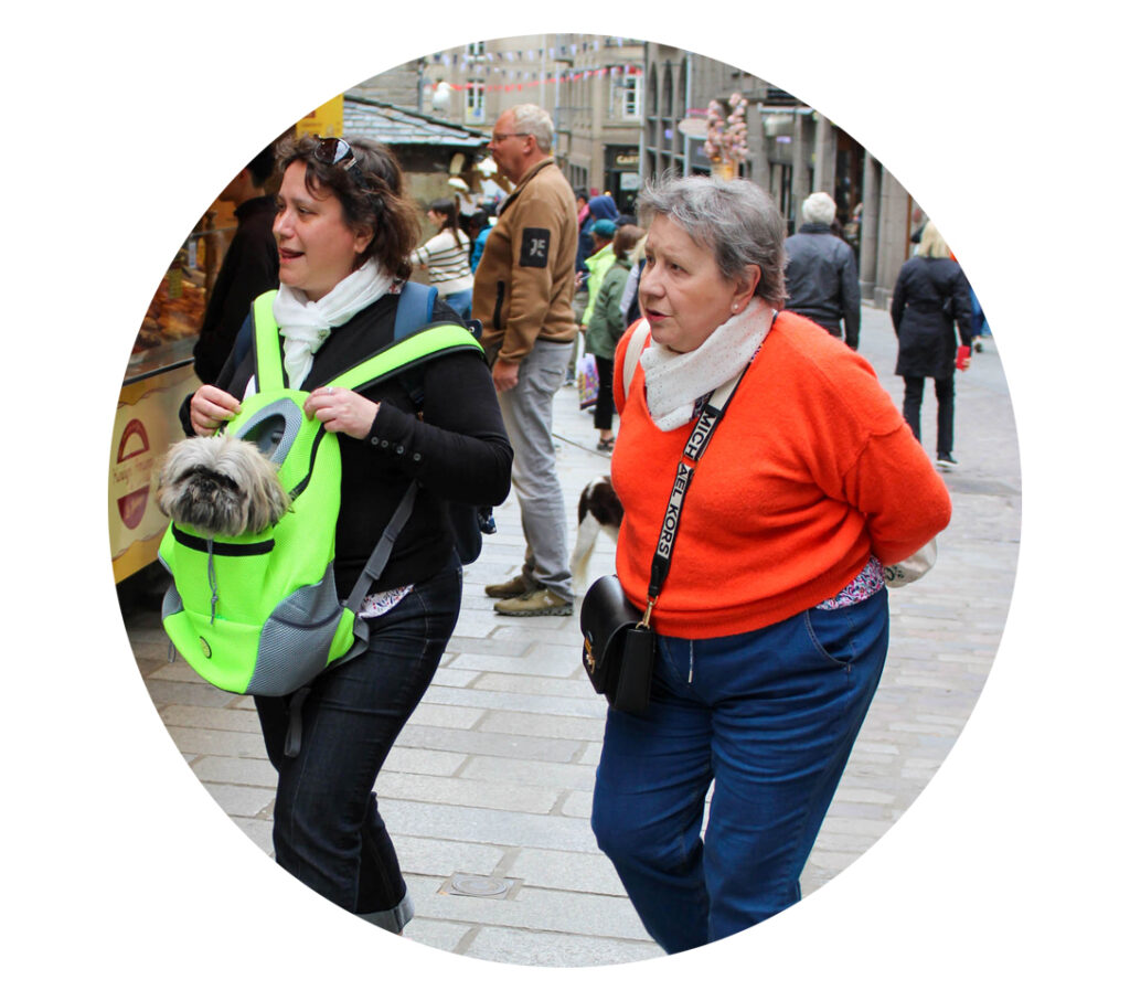
The process:
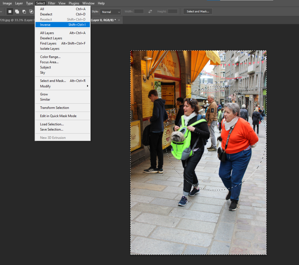
For this format of cropping, I used the elliptical marquee tool to select a circular outline of my image. I then inversed this selection and pressed delete to remove the entire background and keep what I selected. I put this onto a white square for the background so that the colour wouldn’t be disruptive of the image.
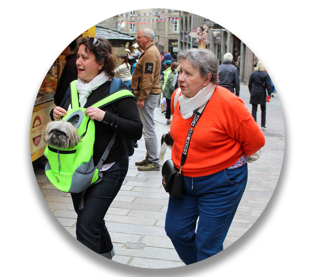
Afterwards, I went back into layer style and added a drop shadow, manoeuvring around with the angle, size, distance, and opacity I wanted. By doing so, this meant that the image looks more 3 dimensional and comes to life.
After using the circle crop, I wanted to experiment more with the different ways I could merge images using different cropping techniques.
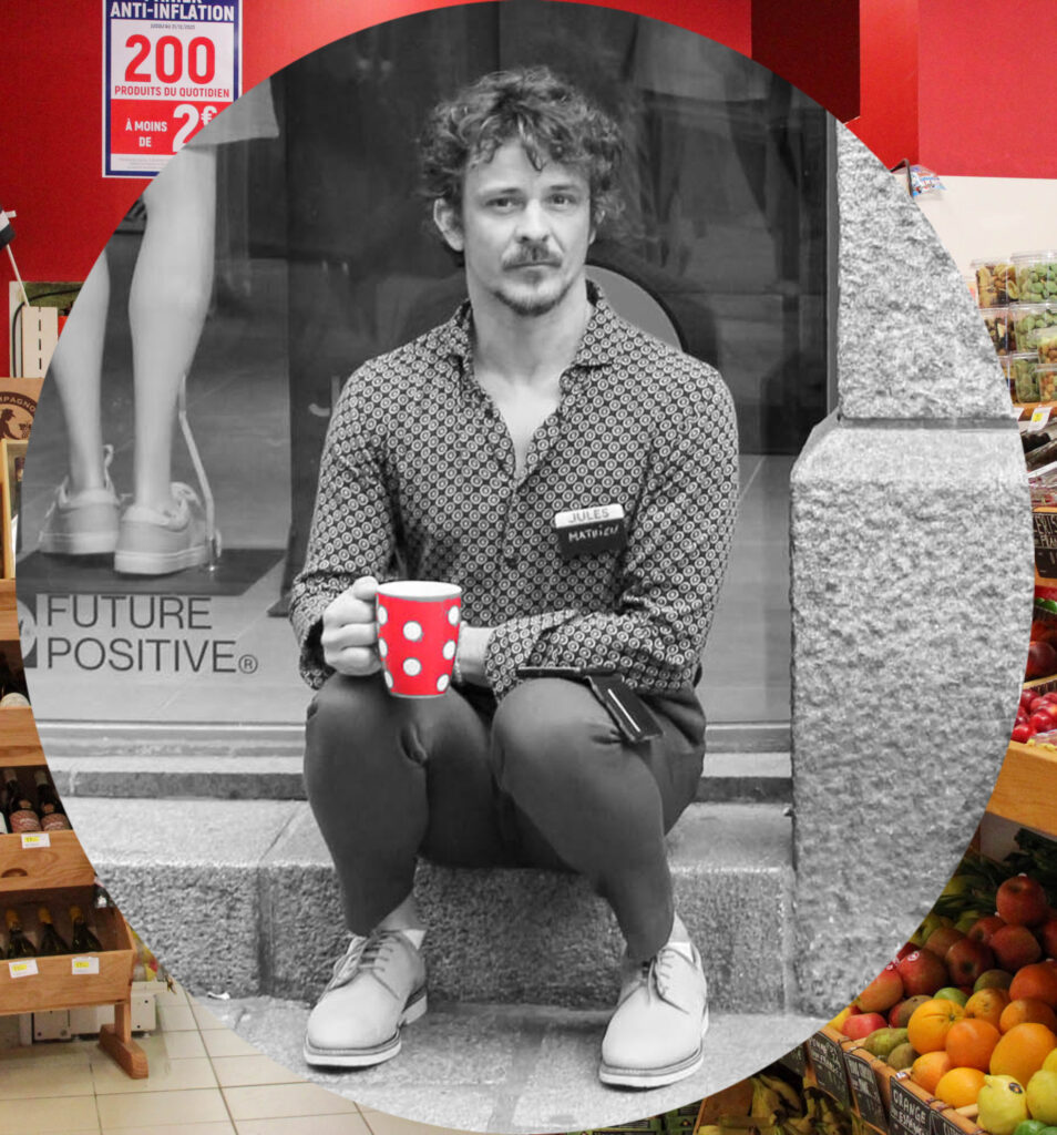
I chose an image with red in the background to match the red illustrated on the subjects mug.
MULTI-CIRCLE/PORTHOLE CROP:
For this format, I decided to use a combination of 3 – 9 images and lay them onto another image. The process was the same as the circle cropping just more images are added.
Anonymity:
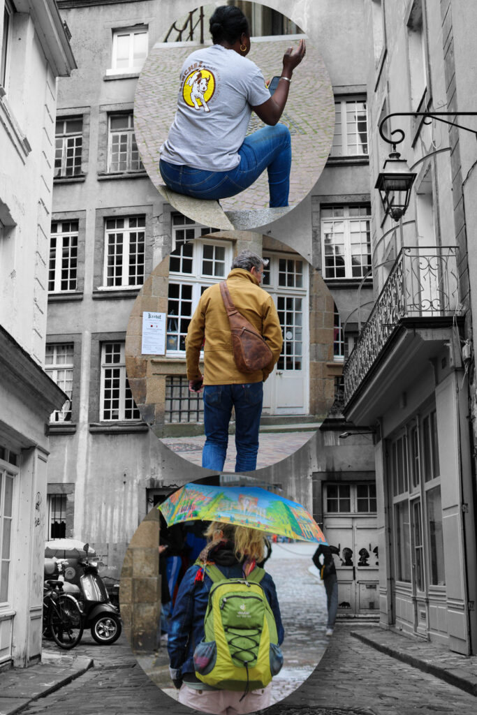
I chose images of people with their back turned away from the camera to create an image filled with anonymity and confidentiality, as if they are hiding away their identities, living in a small city where everybody knows everybody.
I added a slight drop shadow to each image to ensure that they didn’t blend into the background and still stood out to the viewer.
Relationships:
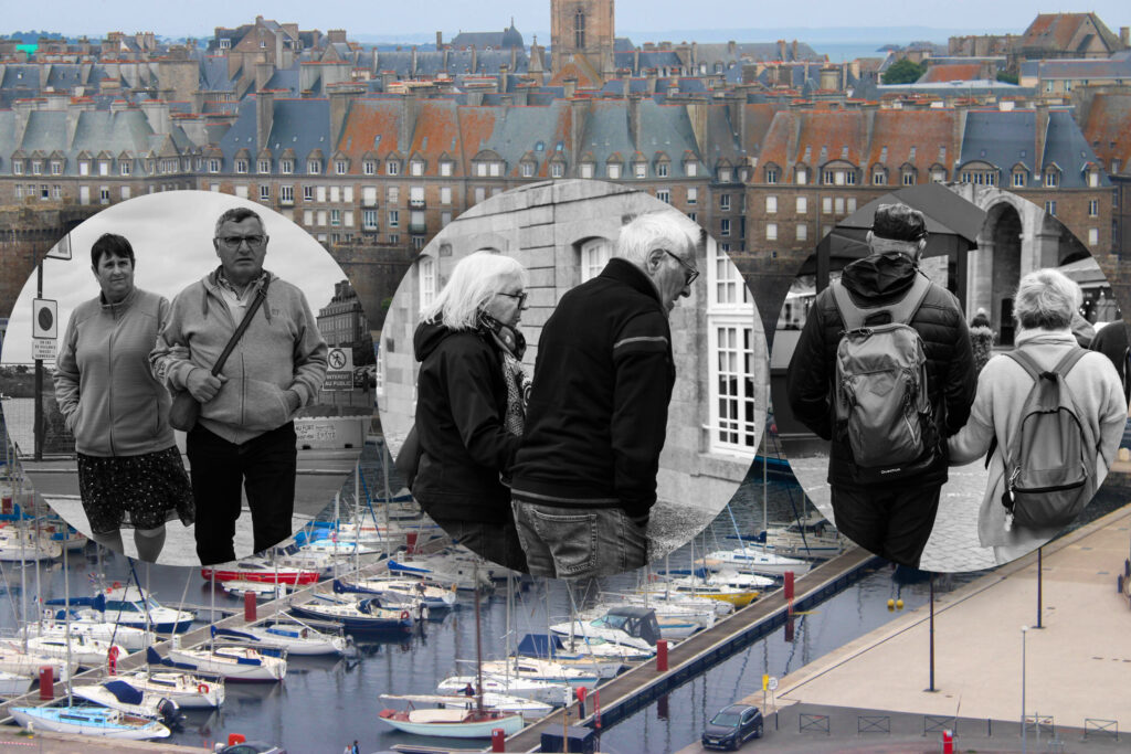
I really like the way that there are 3 images from 3 different perspectives – front, side and behind – because it’s as if the subject are turning slightly within each image. I turned up the saturation of the harbour of St Malo to make it more colourful and contrasting stronger to the black and white cropped images. I chose this for the background as it is a vitally historic aspect of the culture there so I felt that it was important to involve this too.
POLYGON CROPPING:
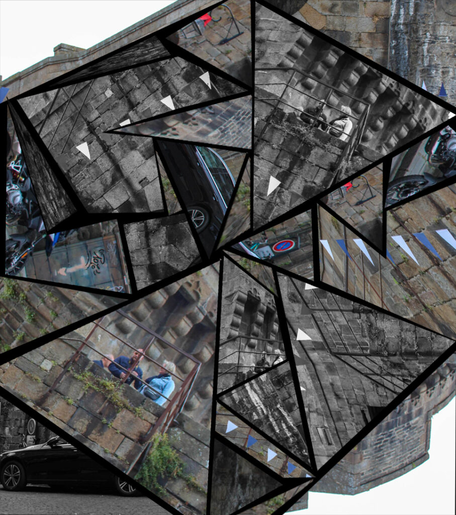
The process:
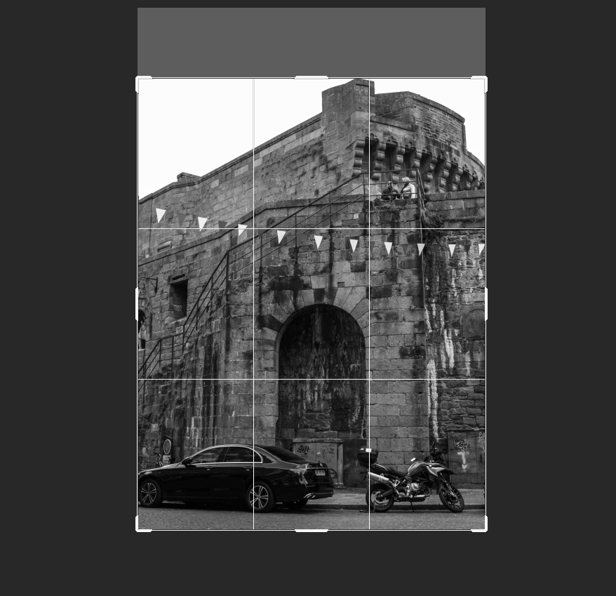
To create this, I firstly opened two versions of the same image, one in black and white and one in colour. I then cropped each image to get rid of blank space as this wouldn’t have contributed to the finished outcome of the polygon cropping as I was selecting small, triangular sections of detail to rearrange the structure of this building.
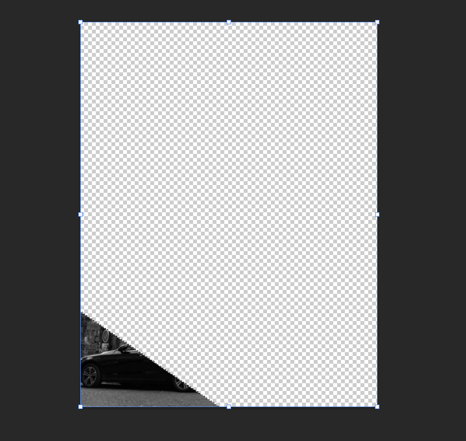
I did this in the same way as my circular cropping, using the inverse button on my selection so that I could pick out specific areas. However, I used the freehand selection tool as this allowed me to choose the height and width freely, while also using different features of the free transform button to stretch and distort the section I had created.
After this, I opened up another document of a black background in order to lay out the desired result, being able to rearrange them to fit into place with one another like a puzzle.
