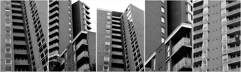
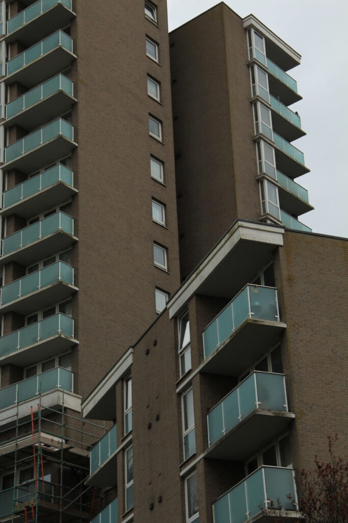
The geometric nature of these post-war modernist buildings drew my eye to them as their repetition was mesmerising but also strikingly contrasting to the natural world’s arbitrary shapes.
The human obsession with uniformity I find very unsettling, especially when realising how dominating it is in built up and man-altered natural landscapes. I’ve tried to highlight the dominance of and cramped living spaces in the buildings by filling the frame, worms eye view and the black and white theme because it emphasises the grid-like lines and boxy arrangements.
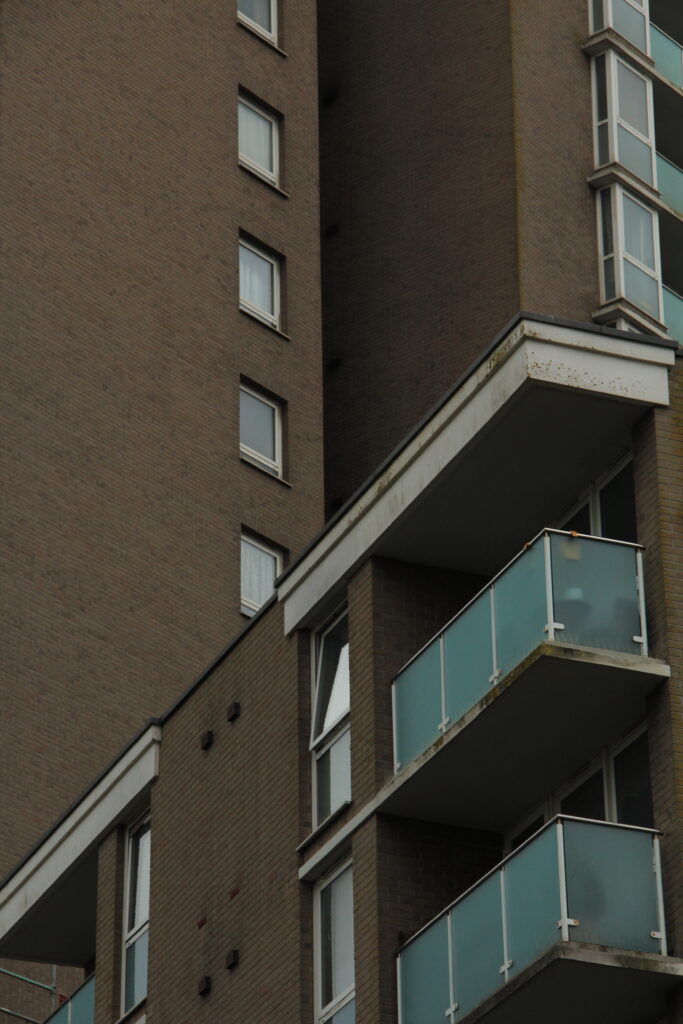
The mid-tones make up most the images but to balance this out I made sure to increase the presence to add depth to the bricks and windows.
For extra texture I added grain which is a subtle but nice touch to make the photo look more worn, something that exaggerates their age and brutal style.
The final edits are moody and brutal which was the idea I thought fit the images best. Put in black and white and unsharpened, they give a murky impression. The colour would have almost glamorised these buildings when in actuality I find them all to be just eyesores that are perceived across much of town.
Formalism and Brutalism
Virtual Gallery
Evaluation
Overall I’m satisfied with my final set of images, the composition, ideas and editing achieved more than I expected they would. Though a small focus, I believe I have successfully delivered the message of Anthropocene in my work by displaying the towering and cramped feel of how we’ve designed our own living conditions and how we’ve transformed natural materials into these brutal and unnatural blocky buildings which shows the disconnected relationship between some of humanity and nature.
These 2 pipes going into and from the incinerator at La Collette. I decided to emphasise the reflective and battered texture of the pipes by increasing the overall presence, shadows and whites of the image. This also helped the lens flare stand out on the left pipe.
The beautiful clouds in the background of the image gave nature a presence in an image of mostly manmade components. To reveal them I lowered the exposure of the sky using the LRC masking brush.
Just to add a bit more tone contrast I used a graduated filter to the bottom with -2 exposure.
Like Albert Renger-Patzsch, I’ve made the most of the subjects fundamental shapes and lines photographing the pipes at a warped perspective.
The bricks, cracks and metal rail going up this chimney are all made more interesting and given more depth with the use of the shadow that takes half of the left half of the chimney. It’s important that the shadow isn’t too dark that it hides the bricks.
Similarly to Renger-Patzsch, the shadows on the underside of the pipes are just bright enough to see the detail of the scratches and welding, whilst the bright light hitting the top and right of the pipe reflects onto the underside making the tubes less flat. Additionally, the symmetry is broken with the same rail looking thing on the side.
Renger-Patzsch wanted to capture objects as interestingly and objectively as he could. Compared to my image, the blending between tones is smoother and tonal range is lesser so the environment doesn’t effect the subject too much. Though I have included a lens flare and brightened the highlights, the environment doesn’t effect the subject too much and still gives an accurate representation of the pipes.
#2
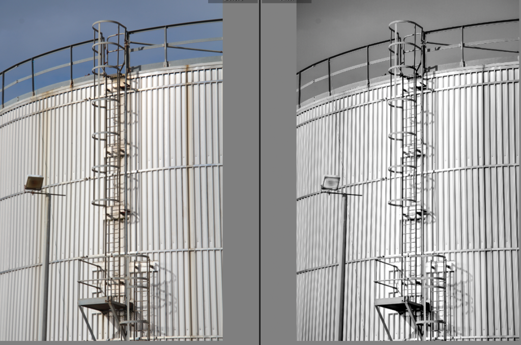
Initial before and after
My next few photos take some influence from Hilla and Bernd Becher as I wanted to capture the texture and shapes within the industrial structures but with a less dead pan and more cropped approach.
[Hilla and Bernd Becher ->]
To uniquely enhance the grate-like texture on this container of sorts I increased the highlights and blacks of the shadows of the image. Because this was quite harsh and unbalanced I added a brush mask around the ladder not only to draw your eye to it but to lower the exposure.
Additionally the spotlight was too dark so I made it sharper and brighter with a brush mask.
The crop gives more attention to the lamp post and ladder with the grate-like texture in the midground being quite distracting to the eye.
Slightly blending a navy blue in the shadows and mid-tones actually softened the grate-like texture further whilst giving it a more metallic appearance.
Final edit
I think the composition of my image takes great influence that of Hilla and Bernd Becher, but emphasises the lines that wrap around the industrial structures.
My use of shadows is more similar to that of André Kertész in this image here. The shadows almost paint over the scene.
#3
Initial before and after
The subtle blue added to the mid-tones makes the image whiter and cleaner.
The final B&W version came from an edited copy of the original
Final edit
In comparison to Hilla and Bernd Becher, I’ve tried to include sharp shadows to add contrast and add lines in my photos. Whereas their photos feature quite diffused and blob-like shadows.
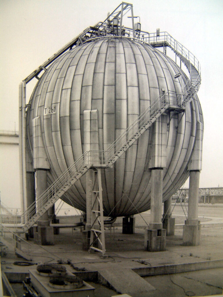
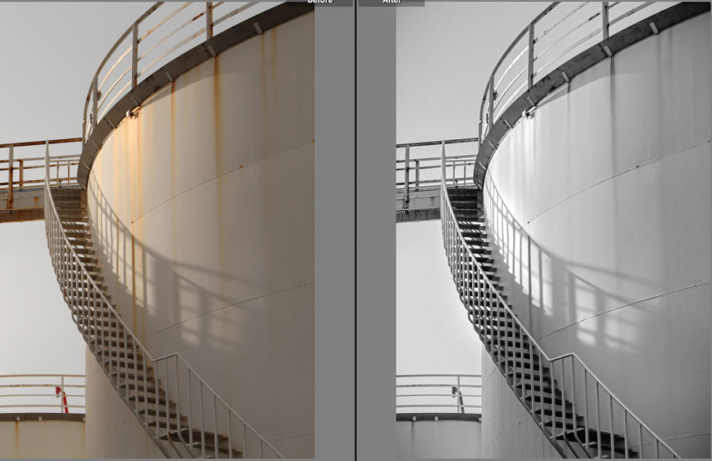
#4
Originally cropped to focus on the the shadow of staircase
Initial before and after
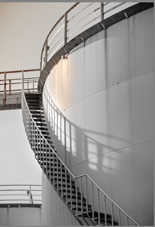
After this version I realised a splash of colour made the image more interesting. Colour grading the mid-tones an aqua blue gave the de-saturated cream a cleaner, whiter hue.
Final edit
Looking back at the original composition of this image made me realise the negative space was important in effectively establishing the forms of the subjects in my image. The new coloured area proved to help the negative space give depth to the structures and divide the image into two sections. Additionally, the added warm colours narrates the direction of the light source some more.
The basic geometric shapes around La Collette’s flats intrigued me after seeing a variety of architecture photography on Instagram. My final images are going to be from this photoshoot.
15.3.24
This photoshoot was based around Havre Des Pas and La Collette with the photography duo Bernd and Hilla Becher in mind.
9.3.24
I was attempting to do some HDR photos with this photoshoot but it didn’t go to plan as the lighting, some of the composition and exposure settings weren’t at all very good.
I narrowed down my overall collection of images to these 6, but to by removing images one and two my final images could focus more on the geometry of the flats. This is because otherwise I find the other 2 less interesting and irrelevant when it comes to analysis.