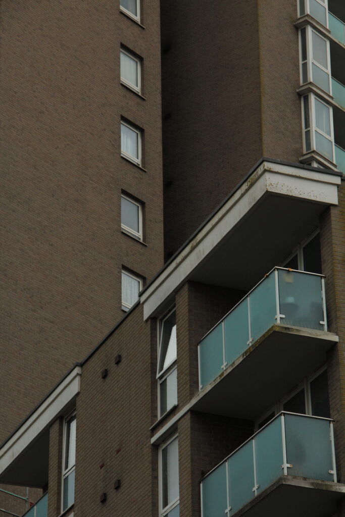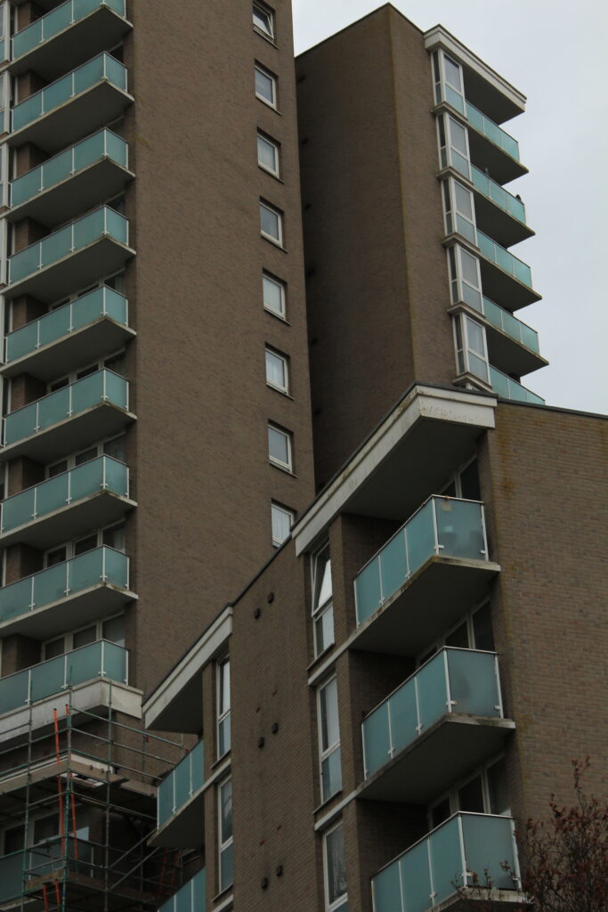

The geometric nature of these post-war modernist buildings drew my eye to them as their repetition was mesmerising but also strikingly contrasting to the natural world’s arbitrary shapes.
The human obsession with uniformity I find very unsettling, especially when realising how dominating it is in built up and man-altered natural landscapes. I’ve tried to highlight the dominance of and cramped living spaces in the buildings by filling the frame, worms eye view and the black and white theme because it emphasises the grid-like lines and boxy arrangements.


The mid-tones make up most the images but to balance this out I made sure to increase the presence to add depth to the bricks and windows.
For extra texture I added grain which is a subtle but nice touch to make the photo look more worn, something that exaggerates their age and brutal style.


The final edits are moody and brutal which was the idea I thought fit the images best. Put in black and white and unsharpened, they give a murky impression. The colour would have almost glamorised these buildings when in actuality I find them all to be just eyesores that are perceived across much of town.
Formalism and Brutalism
Virtual Gallery


Evaluation
Overall I’m satisfied with my final set of images, the composition, ideas and editing achieved more than I expected they would. Though a small focus, I believe I have successfully delivered the message of Anthropocene in my work by displaying the towering and cramped feel of how we’ve designed our own living conditions and how we’ve transformed natural materials into these brutal and unnatural blocky buildings which shows the disconnected relationship between some of humanity and nature.
