Final Piece Evaluation:

In my final piece exam period I learned how to manage my time better so that I have time to manage every single step.

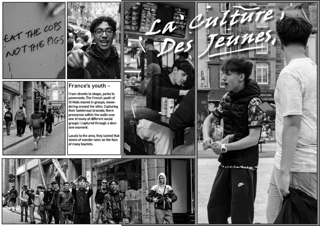
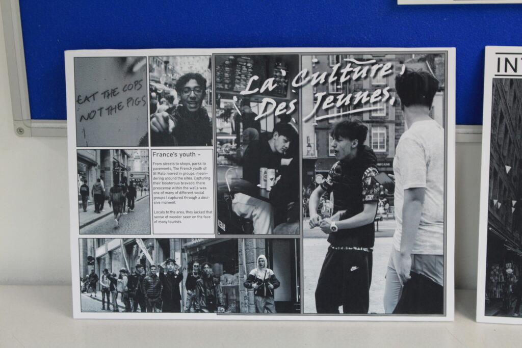
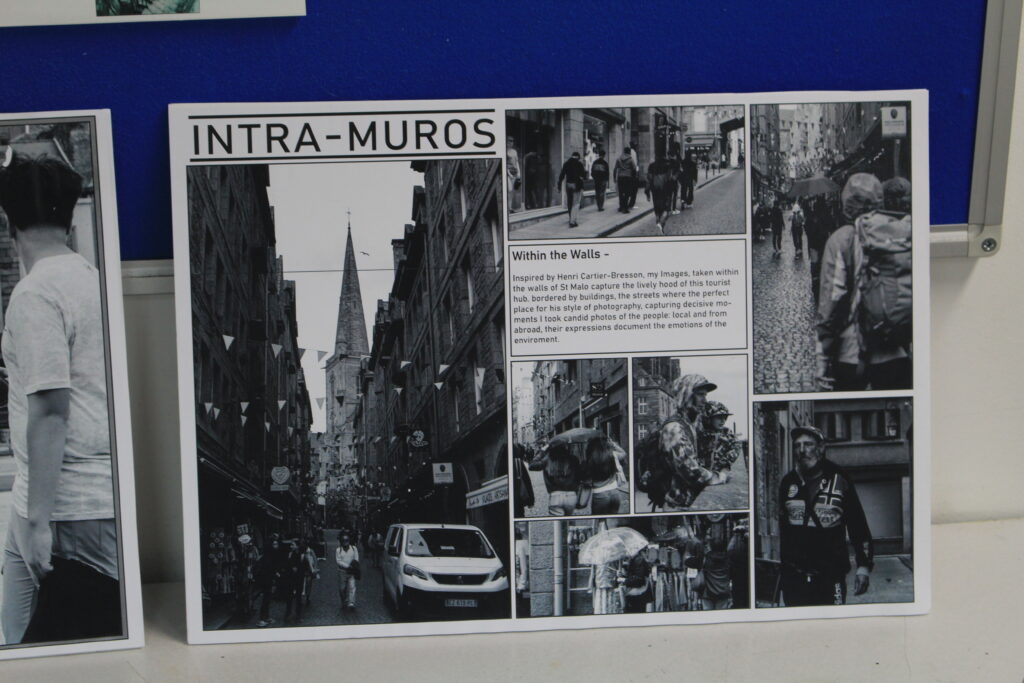
In order to cut the photographs to a satisfactory measurement, I used a Kraft knife and the metal paper trimmer as well as a long ruler to balance the other subject in a straight line. As well as using black thick card used to border the photographs and white mount board on all my final pieces.

Anthropocene Final Pieces:

Firstly, I focused on my Anthropocene photographs and decided to layer them horizontally on top of each other. I mounted them up with white behind so that the colour can pop and so that the photographs aren’t all over the place. The presentation of the photographs mean that they are easily seen by the viewer and they look interesting in the way they are put as there’s only three of them not four.

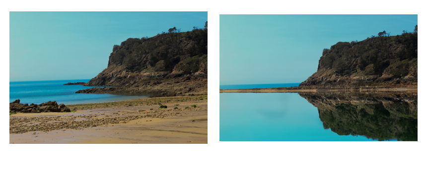
Presented in the image at the top, I decided to include a photograph I took at the reservoir in St Ouens and I used Photoshop’s artificial intelligence to dry up the highlighted water area in order to make it appear in a different time, potentially something as a result of the climate’s impacts. In the middle photograph I placed two images side by side to contrast each the as the image on the left is of nature and the yellowy branches, whereas the image of the right of it is of the zoomed-up La Collette tower flipped. I thought it was especially interesting to flip this as the black and white imaged flipped looked like some sort of structure that can be climbed up or some sort of puzzle.

Lastly, the image at the bottom is taken in a near by beach near St Brelades called Beauport. Along the trail there is a cliff which ha been photographed, in this photograph on the left where there are normally fields upon fields I artificially placed some virtual houses over looking the bay. I believe these houses look realistic despite being the opposite.

Landscape Photographs:

I placed and bordered my landscape photographs in white mount board to level my image as well as to have a white border around.

In terms of my landscape photographs I focused on taking them in a different positioned and direction despite being in the same location around.

I like the fact they are in black and white as it adds to the photographs and they’re textures, layers and other aspects like the outlines contrasting with the white elements.

I found it important that the photograph is close up as the structures of the land and nature are more prominent whereas if it were at a further distance the detail would not be that clear, there is one photograph which is photographed from a higher perspective and more distanced, on this occasion the photograph is further away but there are details which make the image more elaborate and full.

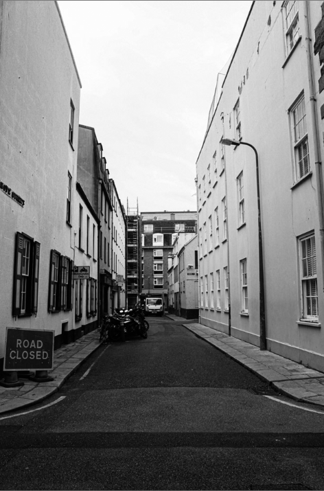
Urban Landscape Photograph:

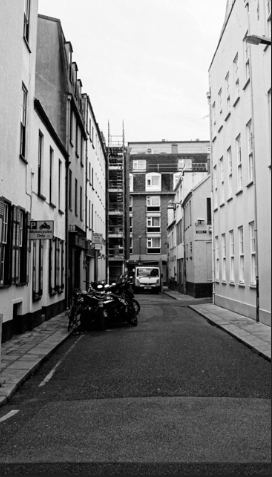
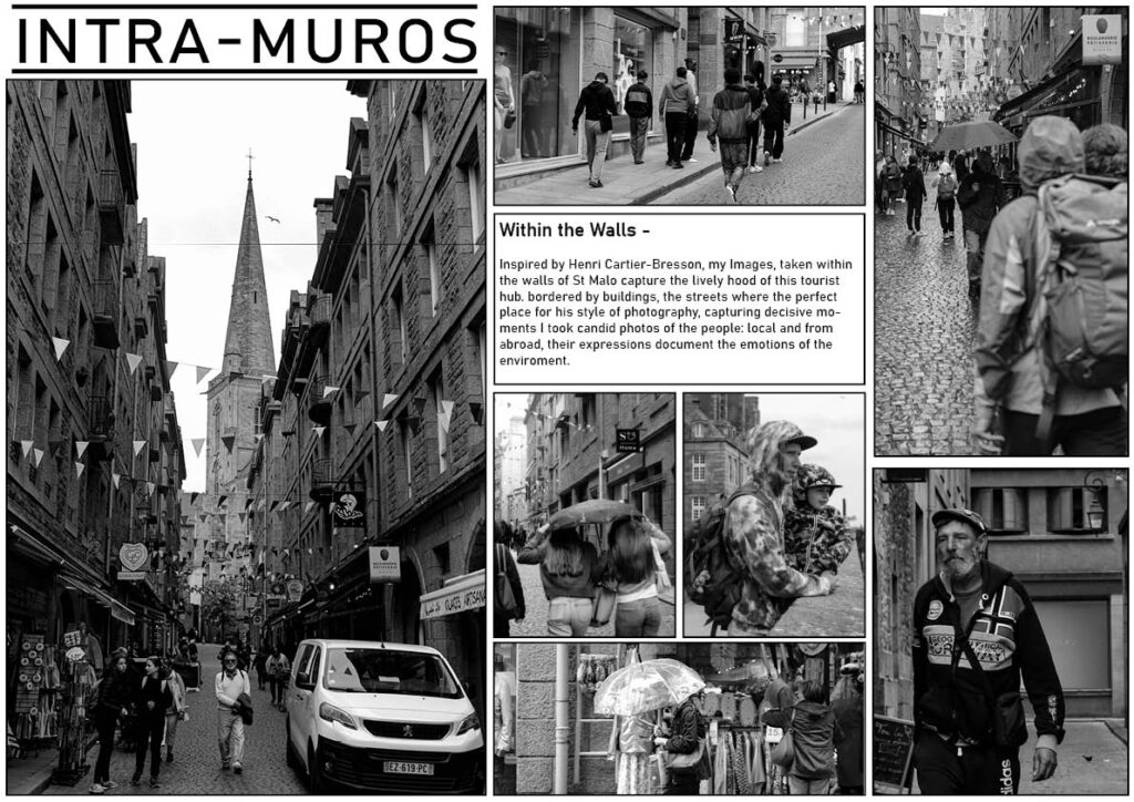
In my urban landscape photograph I decided to present this individually as I think it is effective singularly. I mentioned in my plan that I would have presented it by itself.

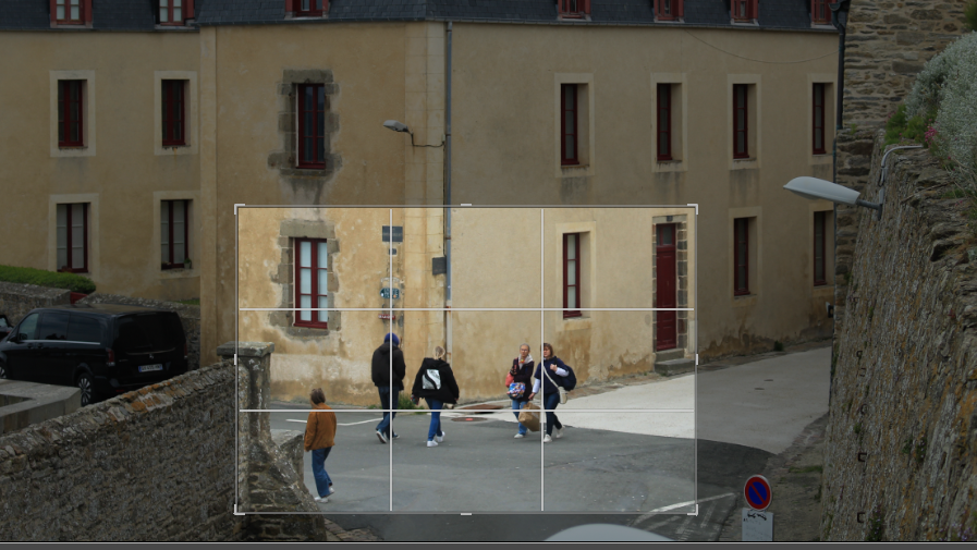
Cropping

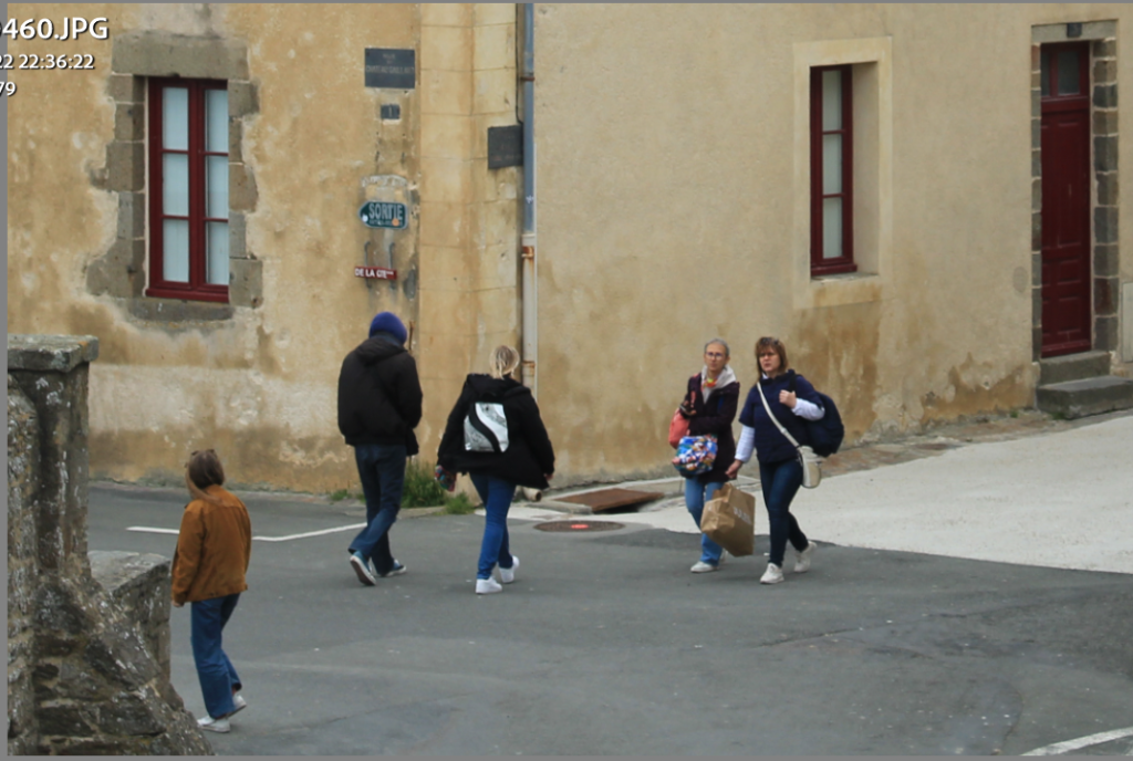
cropping an image can drastically change an images impact. it allows the photographer to entirely effect the composition or an image in order to frame elements more effectively.

Picture stories: research and analysis

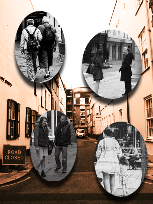
Picture stories are meant to show a story through pictures and not actually the words therefore the writing shouldn’t really be a source to rely on, the naked eye should be attracted to the picture, figure out which photo is the main source of information.

here are some samplers of picture stories, these examples looks very differed from one another as they all have different stories behind them, they all represent a different meaning. Each one has a different colour that can symbolise different things such as emotions, a countries flag colours and what colour makes there chosen photos to stand out. I really like the black and white photos with a brown and yellow background, it has a strong powerful meaning and really helps to engage the viewers eyes onto those photos. I don’t really like the stories that have many different colours and shapes in the background as it distracts the viewers attention away from the photos, it make the photo look less important. However some could view it as the colours attract the naked eye towards the photos, makes them look noticeable especially if they are in black and white as there isn’t any other colours to direct the eye towards.

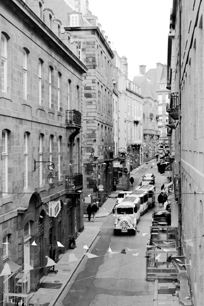
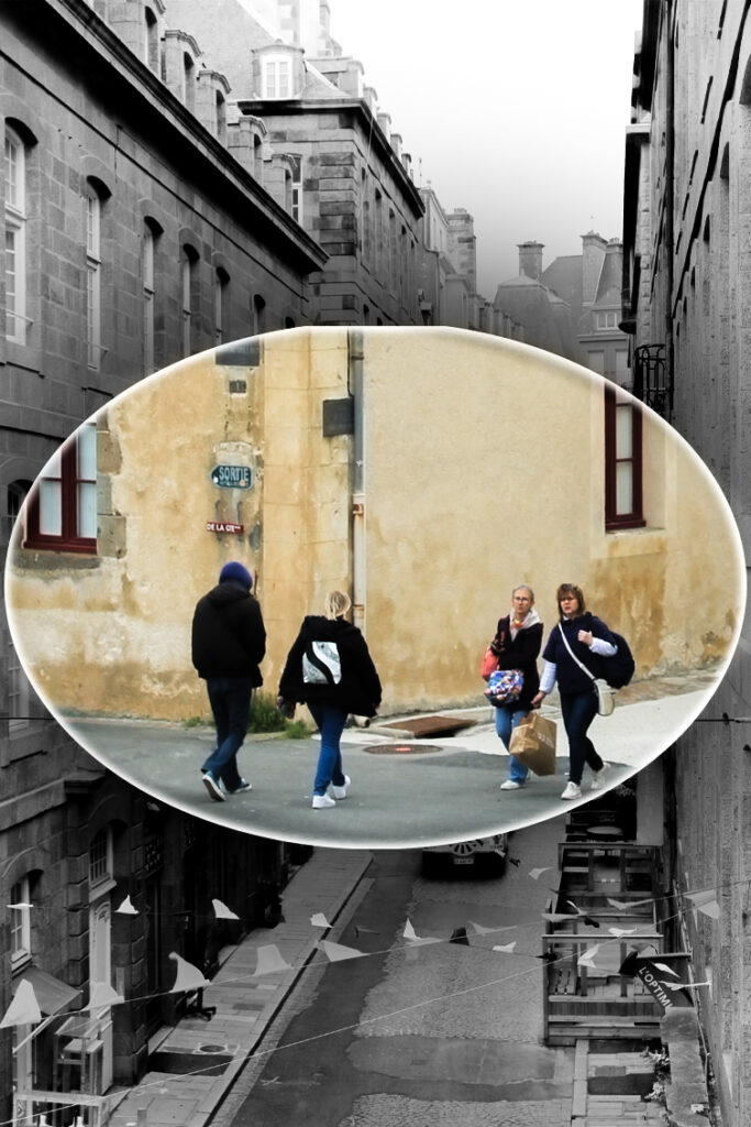
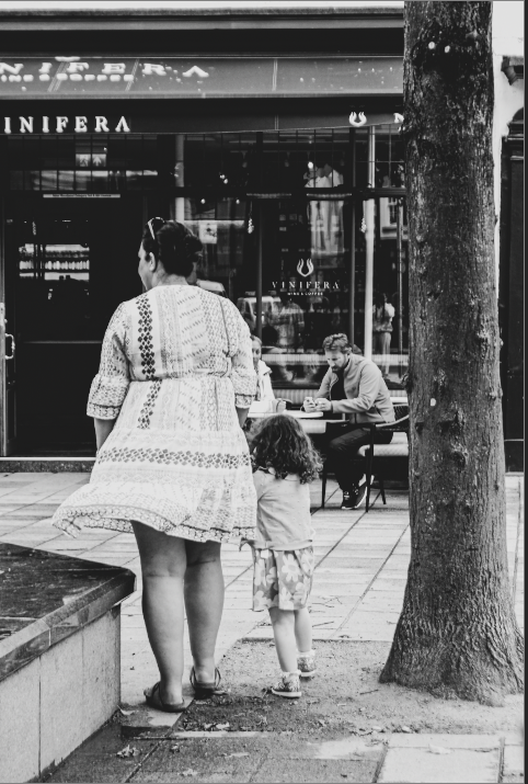
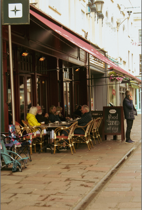
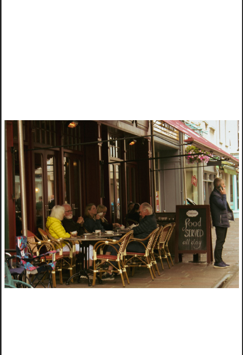
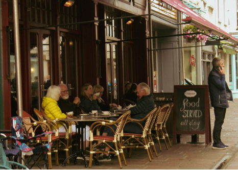
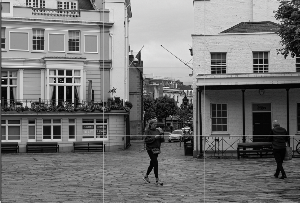
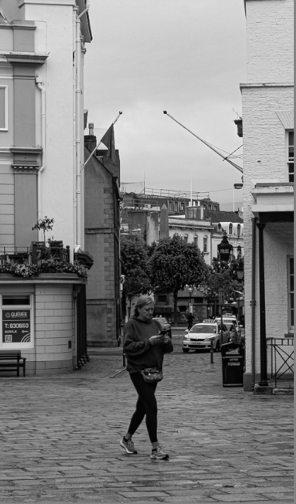
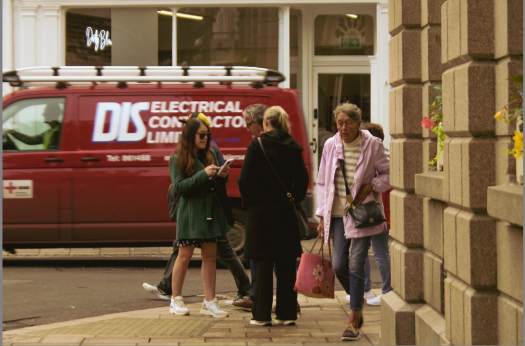
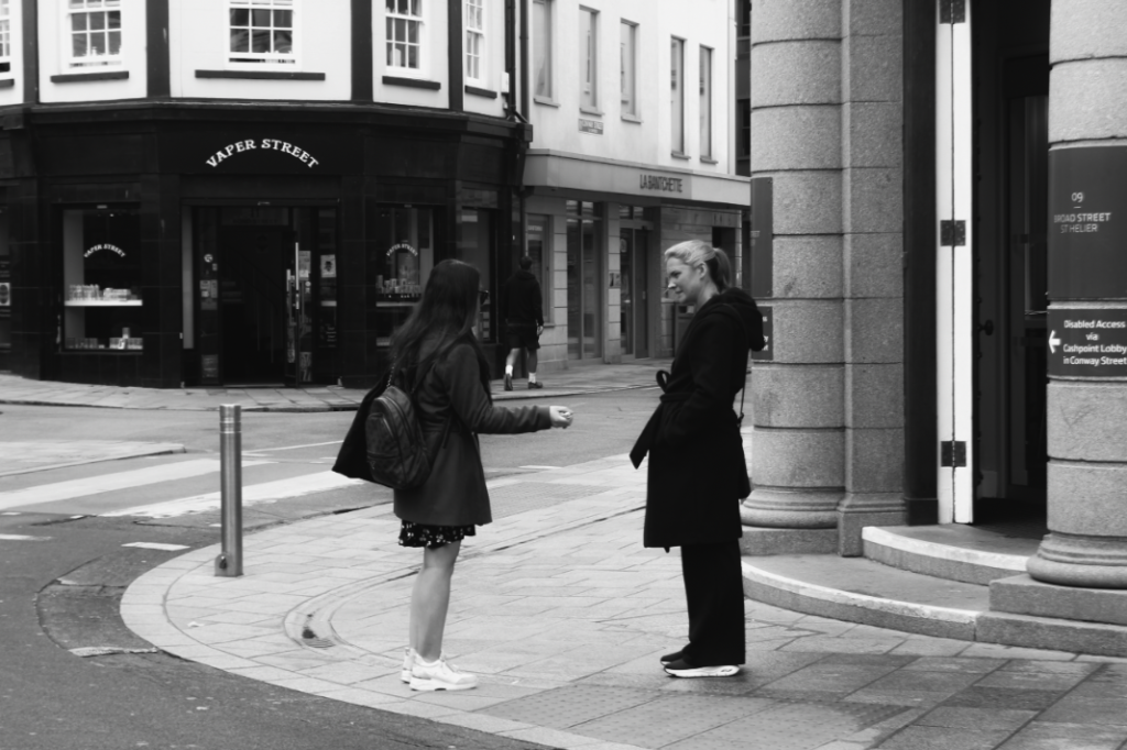
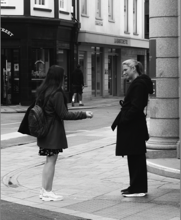
Cropping Street Photography

Basic landscape+Portrait crop

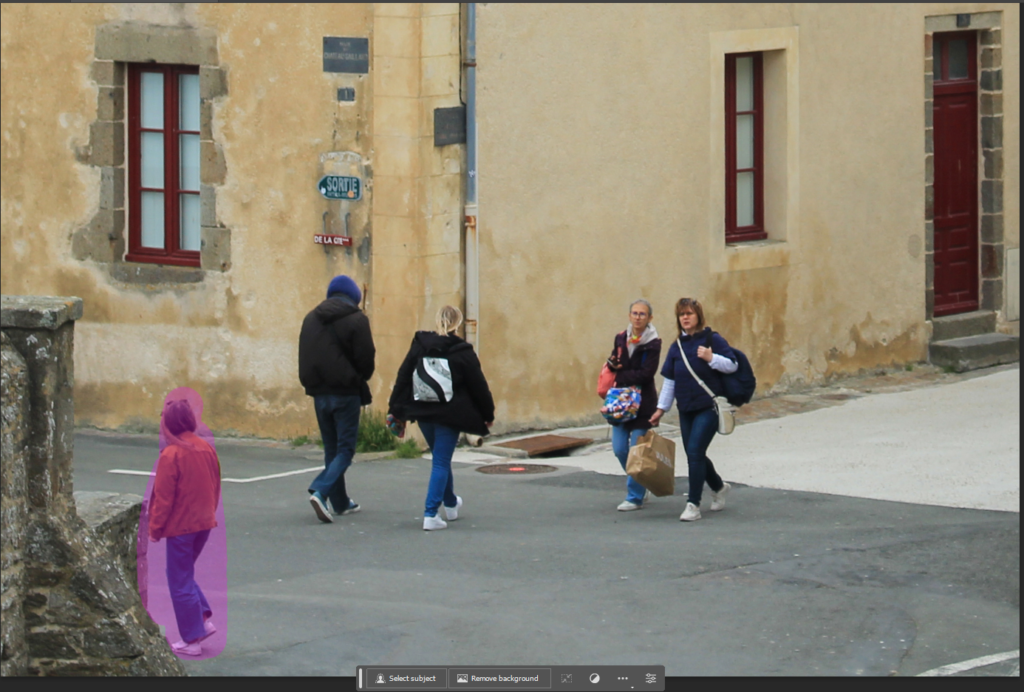
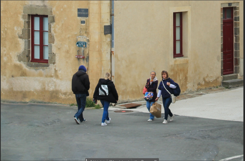
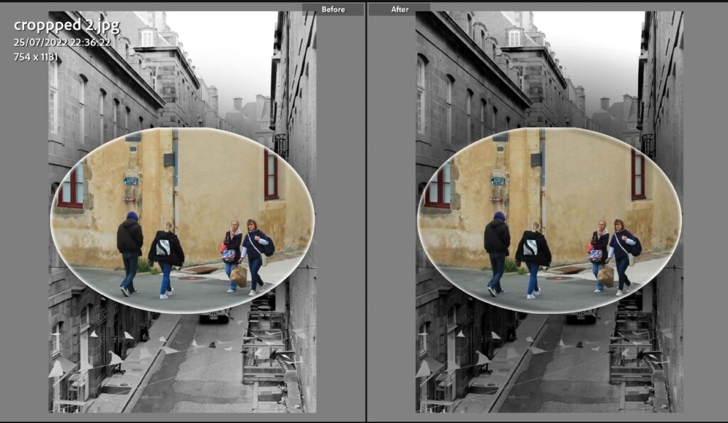
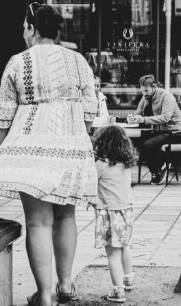
Before V after

Panoramic crop

Square crop

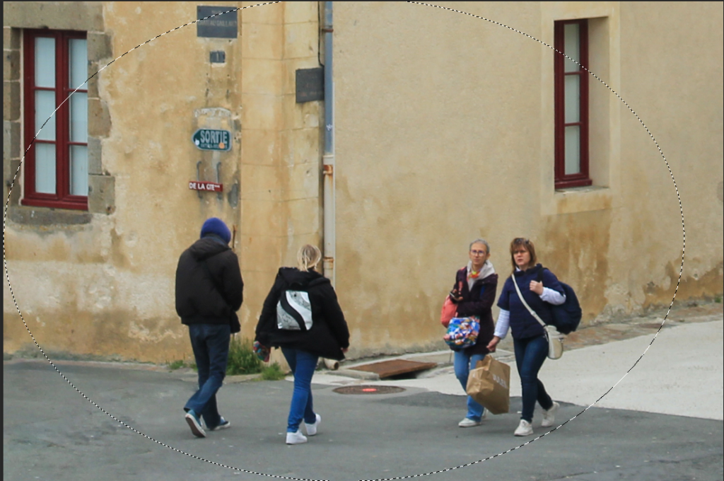
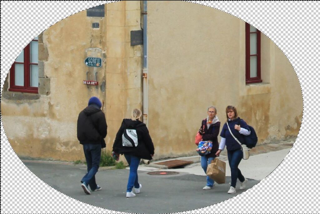
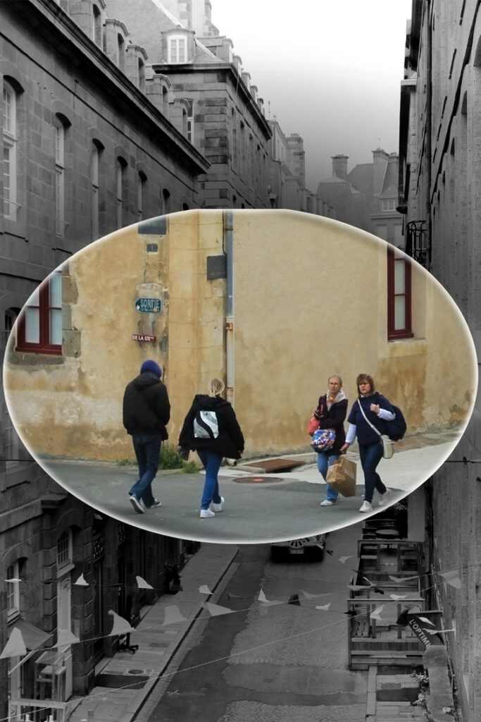
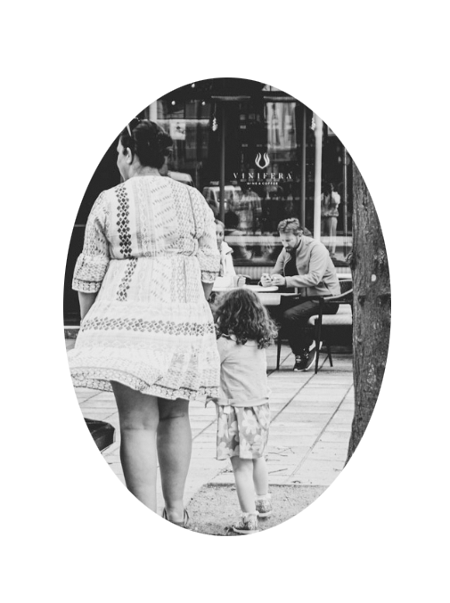
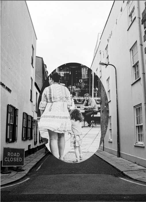
Circle crop

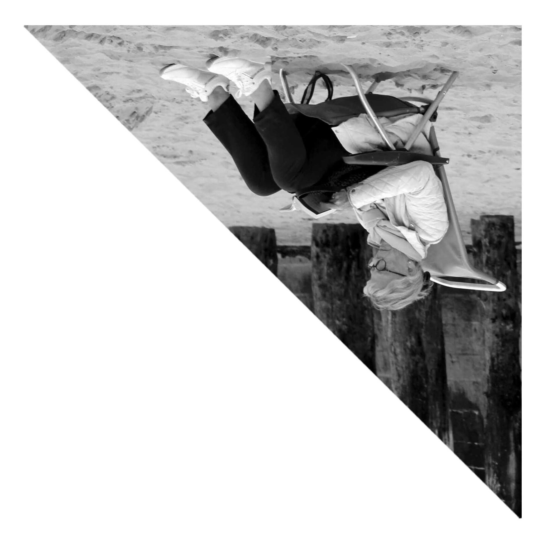
Polygon crop

I decided that for the triangle crop I wanted to to use an image where there would be a triangle type of shape already. I first tried with this lady sitting at a bench when I was figuring out how to make a triangle. Since she was in the bottom corner of the frame I chose a right angle triangle. It looked like the triangle was too long however since there wasn’t anything happening to either side of the woman so I adjusted the image so that it matched her position instead so that the bench filled the bottom and the lady filled the corner. This worked out better and is how I went about cropping other images.

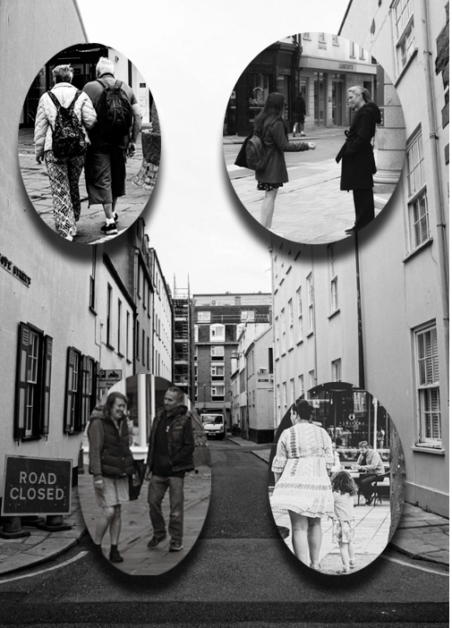
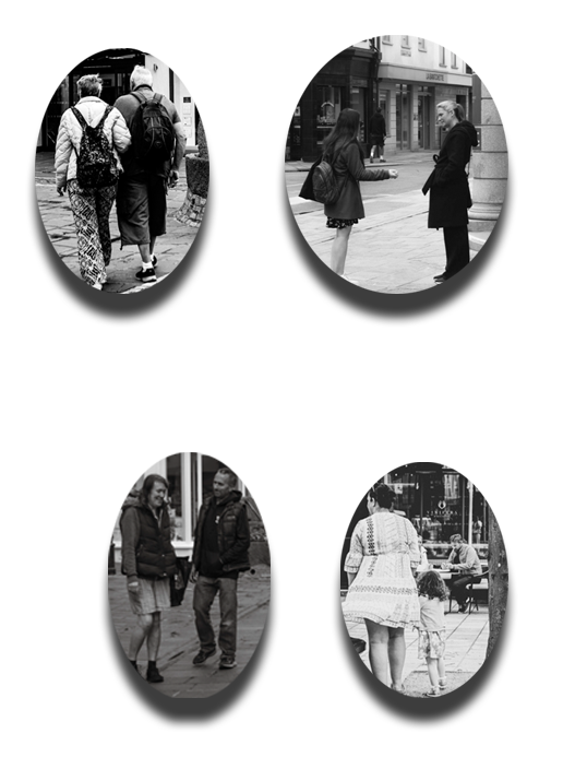
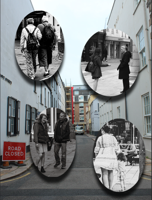
I tried another type of triangle which I didn’t like as much and decided to create shapes by combining 4 different crops.

I think that arranging these into shapes can create interesting arrangements which I like the look of. I plan to create a large topology of triangles with different colours and subjects for the final presentation of this project. I will print the triangles onto A5 and experiment with levels like this:

I would like to use more images and create a larger piece however this is how I plan the final outcome to be produced. Some triangles will be mounted, some will be on the board and some will be below still. I might try some blank triangles also in some of the gaps too. I think that maybe I could create a gradient where one side is higher up and by the other end of the image all the triangles are lower down or it will just be a random arrangement.

street photography-cropping images

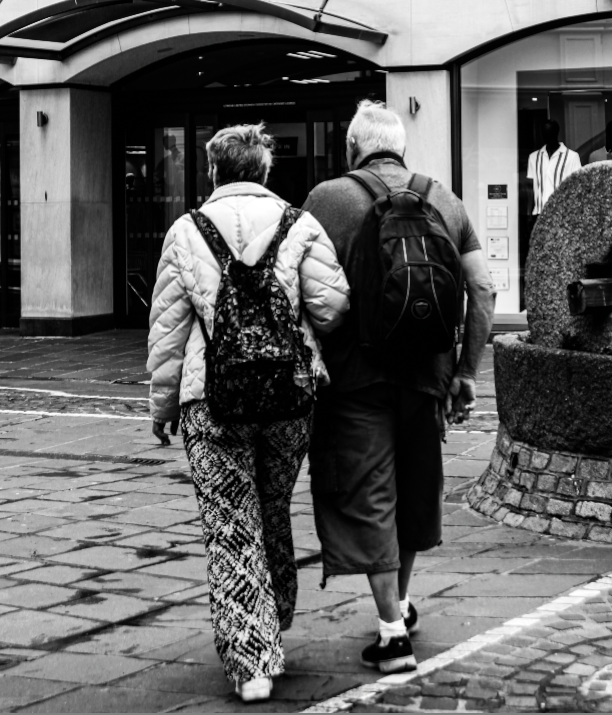
square crop:

I used the square crop for this image because I think that it suited it the best as I was able to zoom in on this couple and make them the main focus of the image and it also helped make the image look more like a polaroid image which is what I wanted to go for.

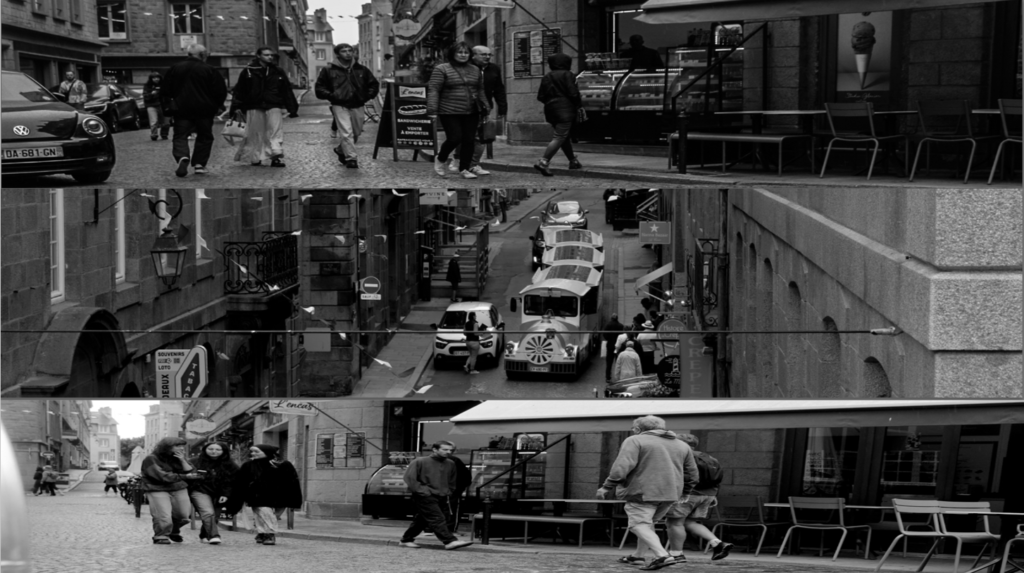
panoramic crop:

I think the panoramic crop was ideal for this image as it helps zoom in something in the image that makes it look more interesting to look at instead of having a bunch of empty space in the photo making it less appealing to look at.

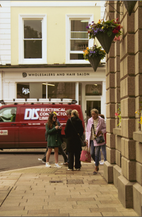
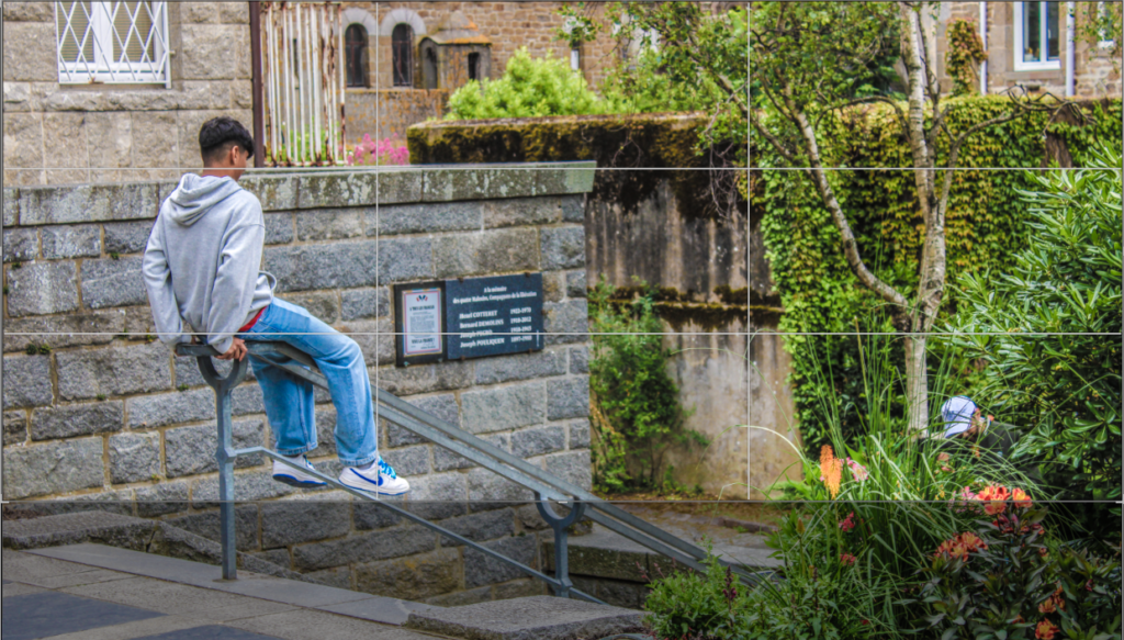
landscape crop:

I believe that the landscape photo was appropriate for this image as it helps focus on the person in the image as it got a lot less of the space underneath the railing with the bright leaves which most people would probably be drawn to as they are very loud colours

combined cropped images:

Picture stories; Research and analysis

Mood Board:

I chose these 6 images for my mood board because I feel I can use the most inspiration from them compared to the rest of the ones I looked at, as well as them easily standing out. Despite them all being very different to one another, I feel they are all equally as successful as they incorporate different moods throughout due to the different colours and shades that are used. Within this mood board there is a large variety of colour, space, texture and the amount of text on them, which I will review closely so I can decide on how I want to approach these elements.

My favourite picture story on this mood board is the top middle one, because it has more space than the others. I like this because it doesn’t give the aesthetic of it being too crowded, which can often happen if too many photos are used. By spacing the images out, this helps the viewers eye wonder throughout all the images separately, as the space differentiates the photos. One of my favourite factors within this picture story is the large image on the right that takes up a whole A4 page. This caught my eye as it immediately told me that this was the main shot of the page spread, and it implies that the photographer was emphasising that this was the most important image. Finally, I like how this image is the only one with a border, which again helps it stands out against the other images as well as the white background

Anthropocene Evaluation And Virtual Galleries

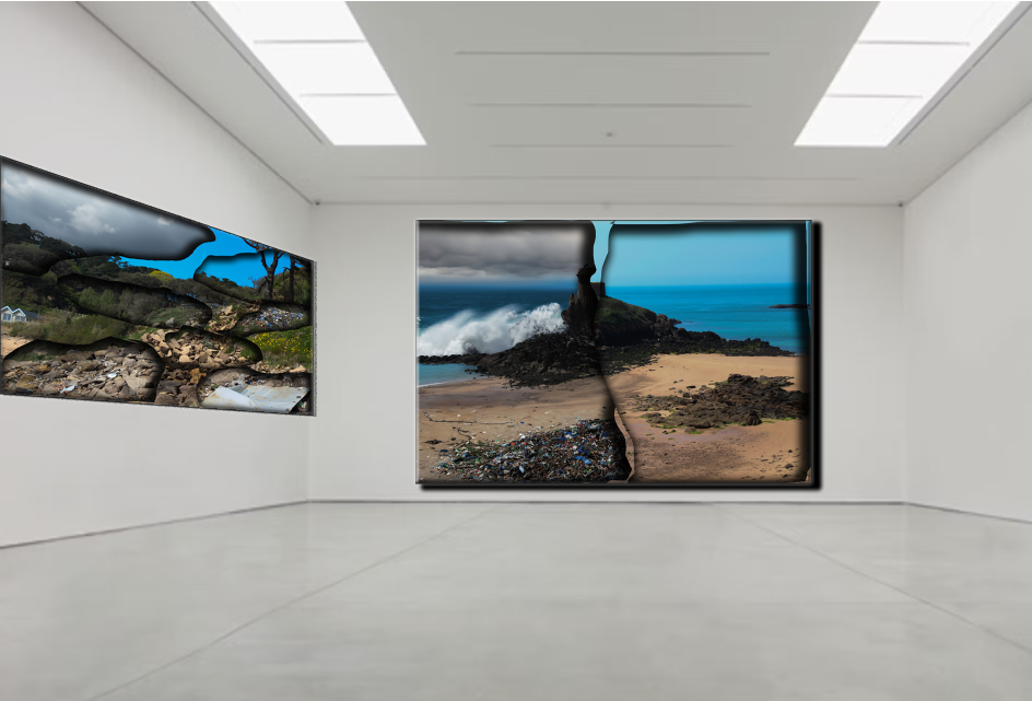
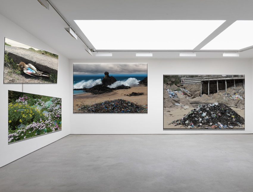
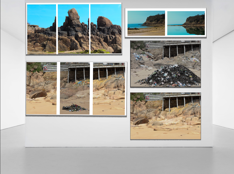
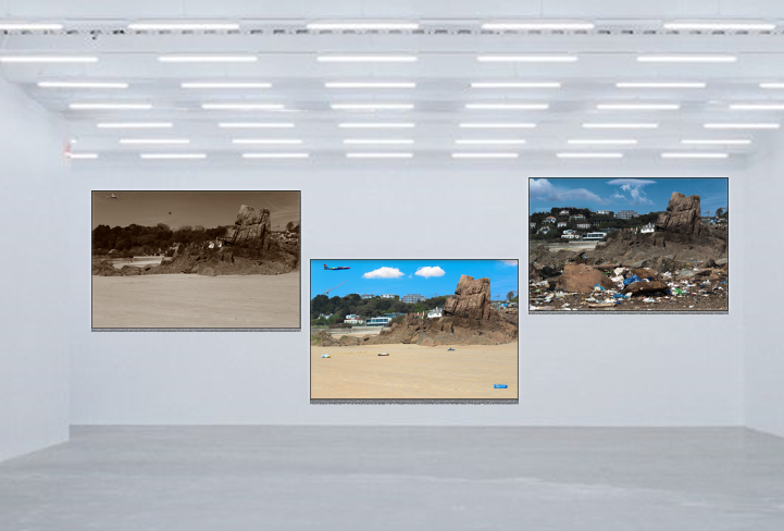
I have presented my galleries as if they are all in one gallery and you are walking through it so I can tell a story.

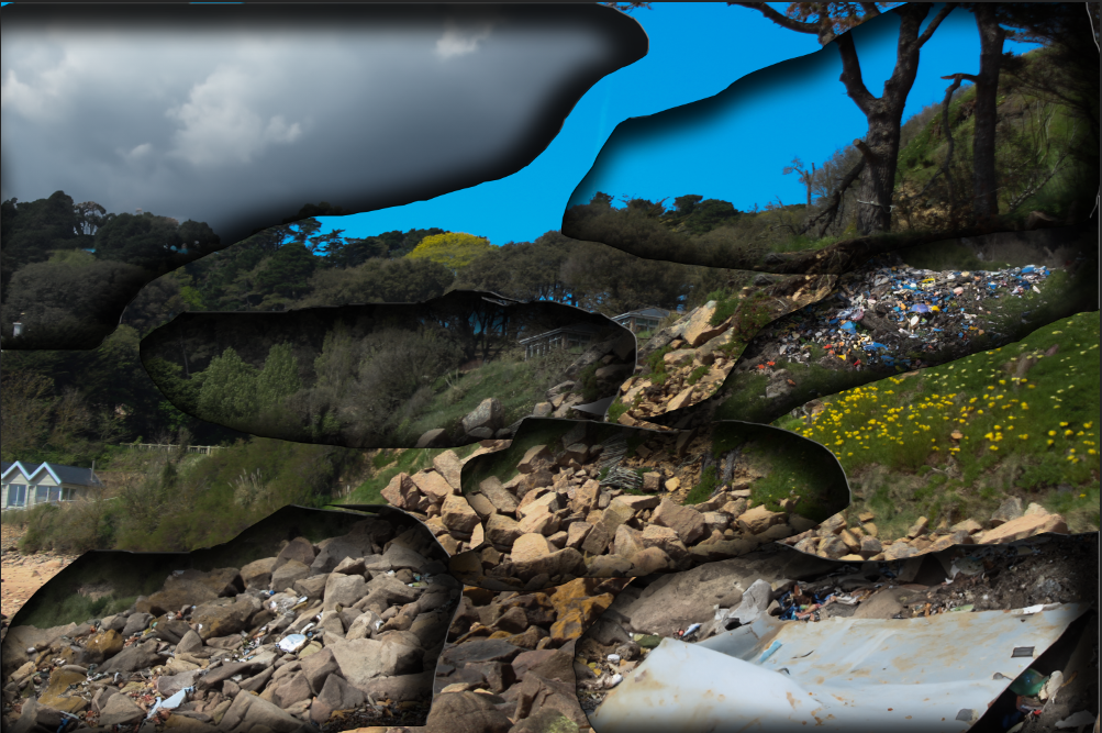
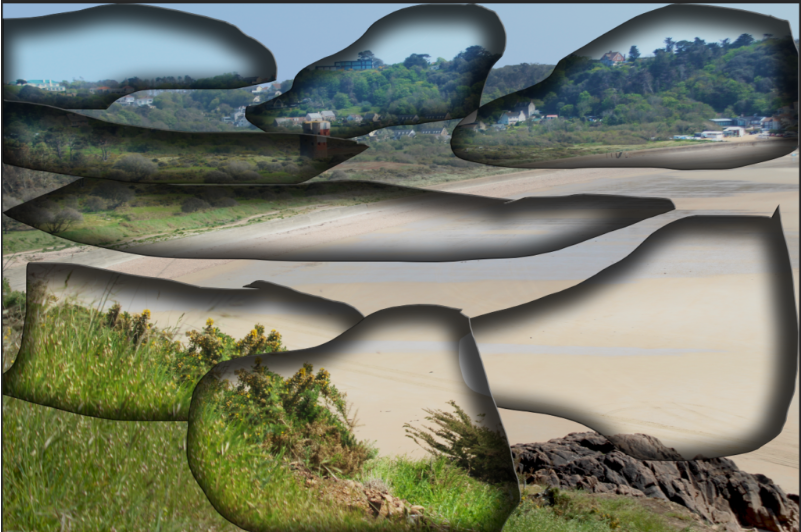
This is my first virtual gallery, it shows the story of my images that are presented like Dafna Talmar, the whole topic was about Anthropocene and I found that an intriguing topic to show my thoughts on it, as Anthropocene is open to a lot of different things, I wanted to show the side of pollution, littering and damage to out planet, and to show it in ways where you can see the damage and also the beauty. It was very important to me to never take away from the beauty of this island. I like these and how they came out, I really like the one in the middle and that is why I had it in full presentation, so it draws the eye, I thought it shows very well what I was trying to present, showing half a destroyed bad weather, littered beach then it was cut in half next to a beautiful sunny clean beach. The dream next to the nightmare. I also liked the way I cut it and blacked the edges to give the burn affect I feel like this gave the idea of the picture being ripped or even if u rip away the beauty you can actually see the dark truth of what the world will become, but I still feel it is very open to interpretation. Parts I didn’t like about this image was the ripping and burning affect, not only that it was hard but I think it would have looked cooler to have actually taken images and really ripped them and burnt them as I think it would give an affect better.

This is my next virtual gallery, so the next party you would see as you walk through, this part is almost showing into the future or like the bird one and the flowers one on how the world is, and even in things that are beautiful and that we all love there is rubbish, and how we should appreciate stuff more, I feel like this is specifically shown in the flower one because everyone loves flowers and thinks there gorgeous and summery yet you can see the destruction happening to them so if people where to my image they would realise they need to not only appreciate the beauty but do something about it to make it stay like that and not end up like the middle images which is the way we are headed. I didn’t love that this virtual gallery looks a bit dark and gloomy but also these images needed that affect because bright sunny weather isn’t going to happen in the future when the world is so polluted. when editing in al the litter I didn’t think it always look the most realistic, but that is how things are going to be and I was showing the future and overexaggerating to give a more powerful aspect of my image, expect the worst and people might actually try their best to fix this planet. My images show a lot of damage that will happen as I think it fits very well into Anthropocene and the litter side, and I was using artist studies as references to do my images similarly or to show the same idea of the damage and disgrace that will happen to this planet as I care a lot about it and feel peoples eyes need to be opened, and photography is a great way to do so as I am catching things that are happening, its not all made up its real this is life and we need to help it, so I think my images are very good in that aspect.

This is the next part of my gallery, and I really like it because it is more happy, when my other images are dark and gloomy showing damage to the world this one is showing beauty and presenting the nice parts of it. Obviously there are images of me showing the litter and what could happen, but its almost like giving hope to anyone viewing my image that it isn’t always doom and gloom and there is a beautiful side, of unlittered beaches and sees and sunny hot weather. I like all these images because I like to capture beauty and I think they are colourful and just bright happy images, I also liked the way they were presented which was similar to Michael Marten I just thought this was a cute way to present with the cuts in-between the images or the before and after of the high tide and low tide. They also aren’t my favourite images because i think some of them are quite boring and not eye opening or creative like my others as there isn’t much to them.

This is the final party of my gallery which is a past present and future version of the same image, this is the final send off for people to see, on how things used to be, clean, sunny, full of trees and nature, Then showing the developed meant of littering and population with more houses and just on how things have developed like a plane. the final image is how things will be if we continue with more clouds, darker weather, more houses then trees and more litter then beach.

Comparisons

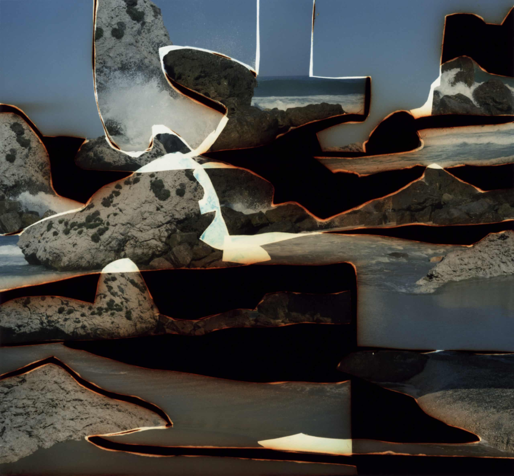
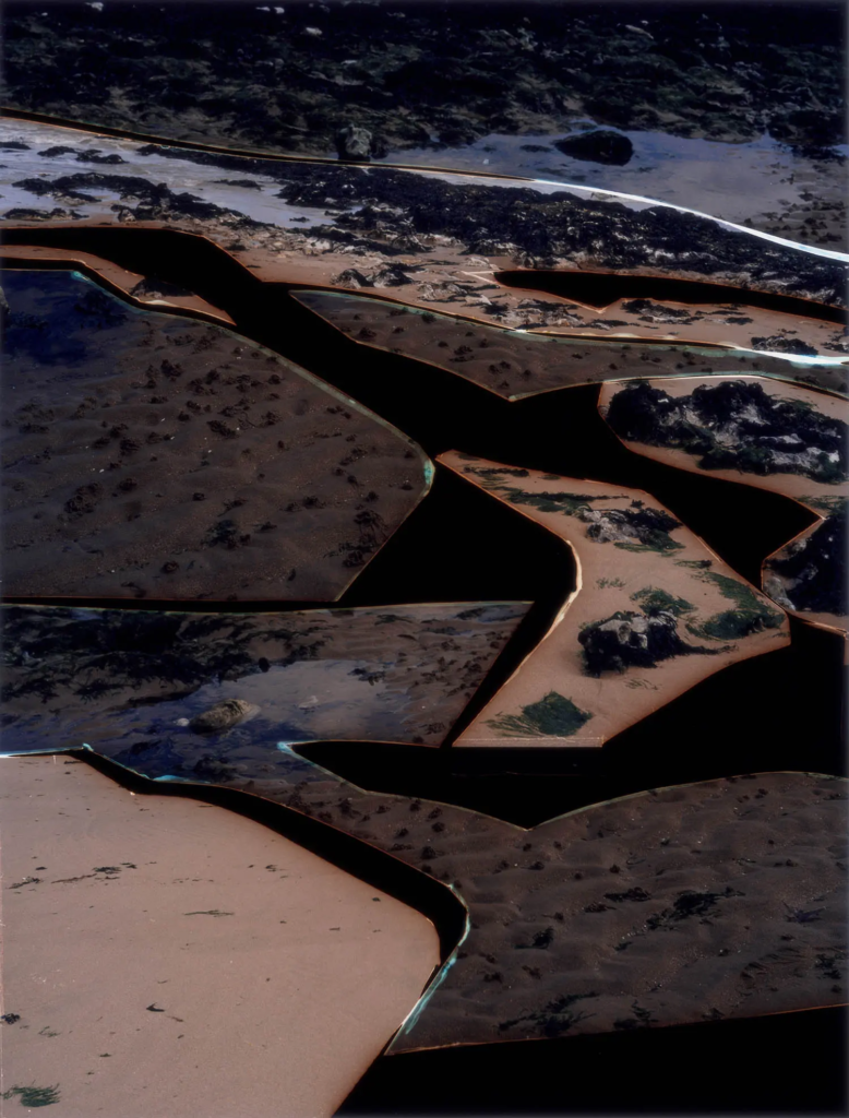
Dafna Talmar was on of my artists study’s as I liked the way her photos where presented and wanted to attempt the same with my final images.

Here is one of my final images I attempted to do like Dafna Talmar, with my image it is slightly different as I edited and cut different images with pollution onto my sunny nice image. It is similar to Dafna Talmar because it has all the cut out pieces of the images stuck back on and burnt black edges around the side, its slightly different to Dafna as I did mine virtually using photoshop to burn around the edged instead of actually doing so like how she did.

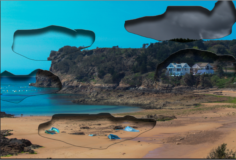
This is another version of a Dafna Talmar inspired image, it is also a similar vibe to my photo above as I have cut in different weathers and litter into the image giving the burn affect around the edge, its still not exactly like Dafna Talmar because I liked her way of burning the edges and cutting up all the images in a scruffy yet unique and beautiful way, which I also wanted to do for my images, where it is burnt and cut and scruffy but still able to see the message I was try to present and the beauty of the world as well as the ugly.

This photo was probably my most similar to Dafna Talmar as I am not changing and adding anything to the image to do with pollution I am simply just cutting up one image and placing git in a similar or same place to create the burnt and cut up look, with Dafna Talmar though when she cuts its up you cant really make out what’s in the image when with mine you can.

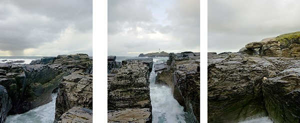
This is an image from Michael Marten which I really like because again I liked the way he presented it, with the same image cut up and split apart, almost like its telling a story.

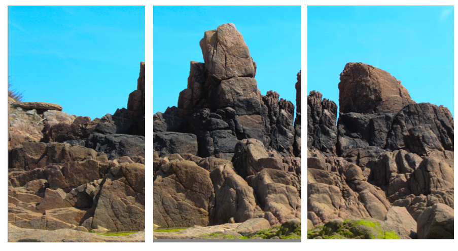
This one one of my attempts doing the same thing, I don’t think it is the most exciting but I just like the way it is presented and think there is a lot you can do with it. My image is similar to Michael Martens because it is also of rocks at a beach, and the image is cut up and presented with breaks between them/

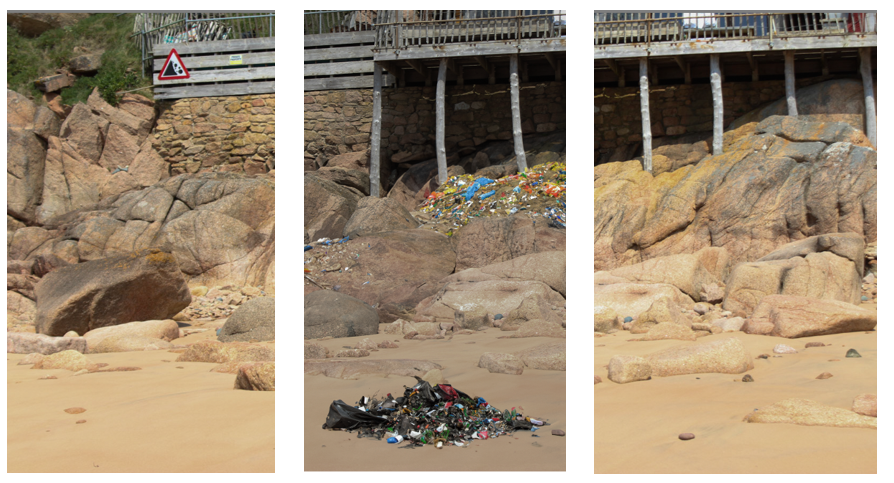
This is another attempt of work similar to his, it is similar in the way that its one image cut into three separate section next to each other to tell a story, this one is slightly different though because I edited the the middle one to have litter and show something different in the same place for more affect, that could be similar to Michael Marten in a way because in some images he shows the same place but with the tide up or down, I haven’t done exactly that but I have shown the same place just slightly different to show what can and will happen to our planet.

This is also what Michael marten does in a lot of images because he likes to show ‘sea change’ so I have attempted to present the same thing in this image of the exact same place but one when the tide is high and the other when the tide is low.

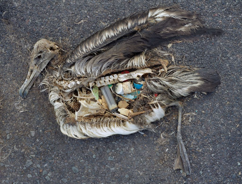
This is an image from Chris Jordan I only attempted one image similarly to Chris Jordan, and that is because he used a real bird cutting it open and putting plastic inside, mine is edited from photoshop because I thought his images where cool and was a great way to get my message across.

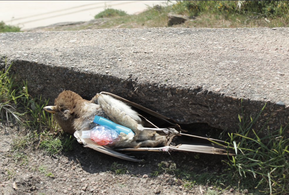
This is my version of his image, i think it is very good and similar to his image as it is both dead birds on the ground with plastic spewing out of their stomachs, other then that the only difference is that mine is edited and they are different birds.