Here I will show the design process of how I made my page spreads of my images from St Malo.
Layout arrangement –
1st design –
After arranging out a design I liked, as well as adding the images I believed best suited with it, I left a gap for text to be included.
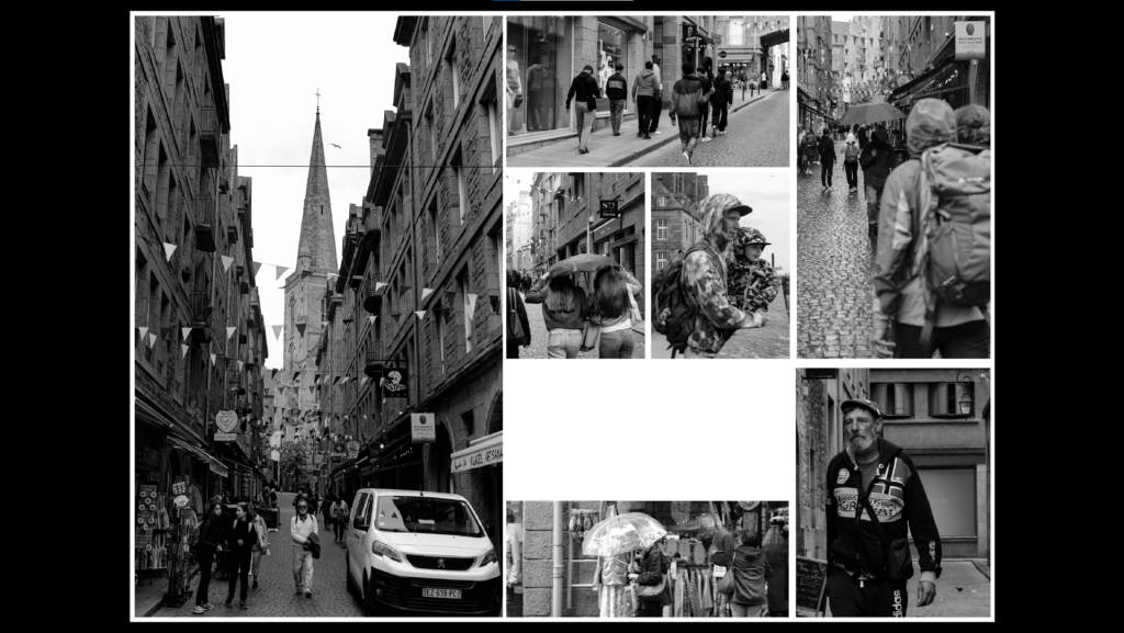
By adjusting the Images again I made some room for my page spread title, by also moving my text box higher up this made it closer to the top of the page and more easier for the eyes to be guided when looking at the work. Inside Its text, I wrote about my inspiration, Henri-Cartier Bresson.
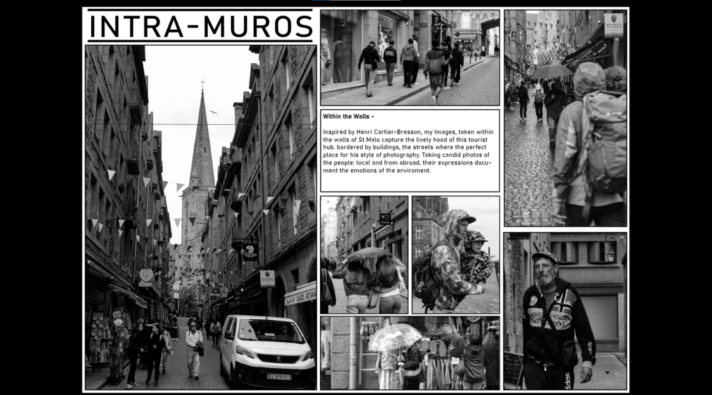
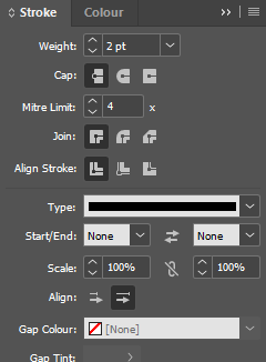
Adding stroke borders, This help defines the image more on the page and matches to the text box, which also contains a bordered.
2nd design –
Designing the layout of the second design, I focused on the examples of male youth culture/hooliganism I saw within St Malo. Through selecting my edited images I have composed a similar aesthetic between these images inside this picture story page spread.
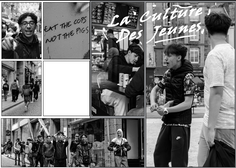
Whilst in St Malo I noticed that graffiti was quite common in the area, with masculine connotations being a quite common idea behind the idea of graffiti, I decided to include this in my work. Using a font that to me looked like it was created with a spray can, I used the pencil tool to add a rough level of detail of paint marks to further generate my impression of my title.
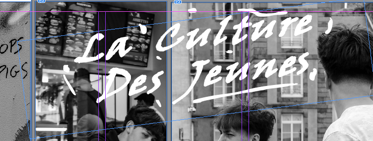
With the final text added, This came out quite well in my opinion and creates an interesting composition around the aesthetic I chose to present.
Final Outcome of Image:

