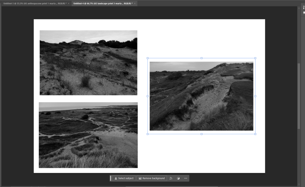
In my final piece plan I plan to present my three black and white landscape photographs mounted and presented. I feel that the triangular composition looks effective and playful as it’s an odd number of images so it’s not exactly symmetrical yet the outcome still looks interesting and unique.
I believe that the composition between the photographs is good as the white blank space breaks apart from the rest of the photographs.
I decided to do this arrangement/composition of these photographs as it would have looked not as effective having the three landscape photographs individually mounted and presented by itself.

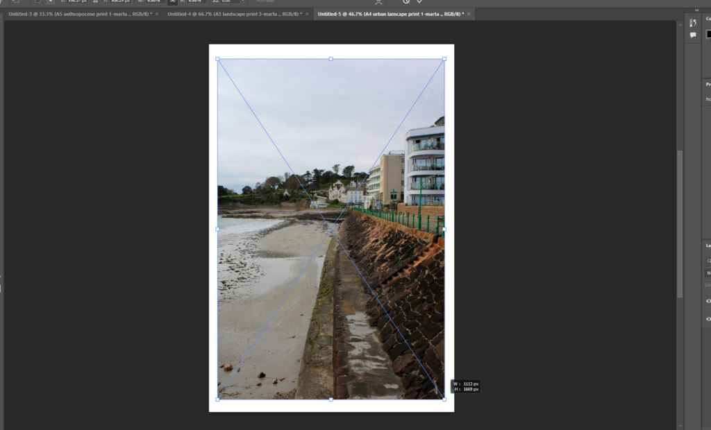
In this urban landscape image I decided to present it on it’s own as it would add to the photograph, not collaging/grouping the photograph means that it would be singular and individual compared to the others, that’s how it would be different and therefore make it unique.
I like the idea of presenting it by itself as there are many colours and textures included in the photograph which don’t need to be paired with any other image to add to it.
The image almost looks split as the coast line is directly contrasted from the sand textures from the bottom of the image to more than half way through it.
The opposing locations look symbolic and deserve to be individualised in this composition as it is presented better.

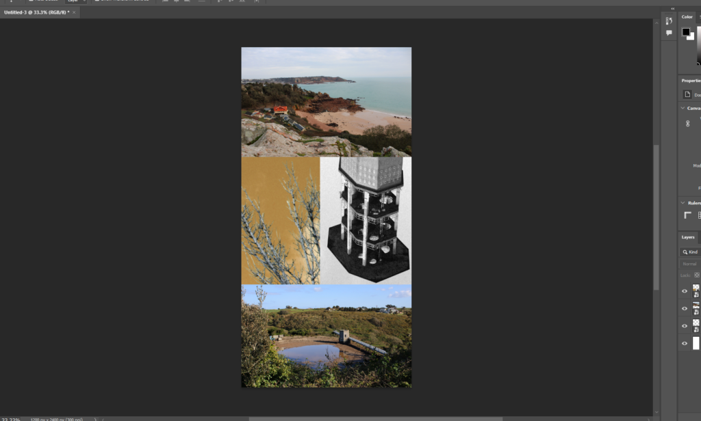
In terms of the anthropocene photographs, I’m planning to present the photographs mounted up and in a collage with the anthropogenic AI impacted images and in between those two image, I plan to put photoshop made collage as a contrast to the naturally coloured anthropocene photographs.
I believe this will look interesting as despite all three of the images being from the same topic, I feel that the black and white/ yellow coloured collage will oppose the other two images and will appear fascinating.
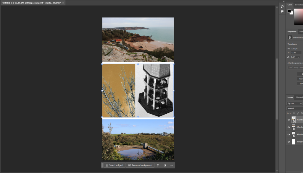
The screenshot above demonstrates what I may do, I will either separate the images and keep the white border around them as it may look effective rather than keep it all together.

Each of the photographs has a different colour scheme despite being similar structures/ land. The photograph in the middle counterbalances the others as the middle image is of a tower similarly to the one at the bottom photograph despite the in in the middle being more close-up, flipped as well as in black and white and the nature of the middle left
