Nick Frank Inspired Anthropocene Edits

I was inspired by these photos because I like how the colour in the background is used to make the buildings stand out and is clear that they are the main subject in the photo. However, though the main subject of the image is the buildings, it could also be interpreted that these images are focussed on the sky. He may have created these images to portray that the sky is polluted and he has shown this with colour in attempt to create a happy image even though it is showing us the disasters that are happening in the world in terms of pollution.

These images were inspired by Nick Frank who focussed on the idea of creating images where the focus is on the buildings and not the foreground or the background. He made the background of the images a different colour which I have done here.

On photoshop, I started by levelling my image to ensure that the buildings stood out and weren’t white washed. I then took the quick selection tool to select the background. I had to zoom into some parts of the picture and make the quick selection tool brush smaller to be more precise especially in the trees. After I did this, I right clicked and selected layer via copy to create a layer on top of the background layer. Before I did anything else I made sure I was on the layer that I had copied. I then took selected the colour picker and chose what colour I wanted, I then proceeded to select the paint bucket tool to colour in the background by selecting the sky.

I like how my images turned out because I like the bright colours which make the images stand out. I have done my own twist on these images related to Anthropocene to show that the air is polluted with all the toxic fumes that are being released on human’s terms. I have made the colours stand out where the sky was because it infers that the sky is being hidden by something pleasant and aesthetically pleasing and shows that as humans, we are oblivious to the things we do in our day-to-day life that is polluting our air.

Street Photography Artist research: Henri Cartier Bresson

Henri Cartier Bresson was most known for his photo at Place de l’Europe Behind Gare Saint Lazare which is when his “decisive moments” project really grew popular . He would say that he would like to connect humanity through photos.

he would bring a camera everywhere with him in order to capture every/any millisecond in a moment. He described his camera as an extension of him as if he was hunting so he needs to be patient wait for that perfect shot.

His camera

Henri Carter Bresson was particularly fond of using a Lecia Rangefinder this is because it was considered one of the most inconspicuous of the cameras. That was because they were a lot smaller than most other cameras available at the time it also didn’t have a loud sound when it took the photo. This helped him with his photos as his aim was to get candid photos so the more invisible he could be the better. He was also very fond of using a 50mm lens as he felt that it offered the most realistic point of view as its what’s closest to our eye.

His background

Henri grew up quite wealthy with his family in France which is where he was introduced to art.to begin with he had a big interest in painting however he later found that photography is what he was most passionate about. He found photography to be an extension of the eye.

He felt this was able to interreact the world with his camera which lead him to start travelling he went to Europe, Africa, China, Indonesia, India, Burma, Pakistan and many more… The experiences he got out of his travels influenced him to start his project “decisive moment”

image analysis

leading lines-

In the photo you can see that he’s using leading lines from the railings to draw attention to the man in the image. Although you can argue it doesn’t draw your eyes perfectly because it does kind of draw your attention off the page if you were to follow the railing it does help frame the image and then I find that the ladder of the left of the man helps to draw attention to him.

framing and negative space-

I find in this image it uses negative space really effectively it frames the subject really well drawing a lot of attention to it due to it being really calm and not having much going on. It helps balance out the image as the middle has lots going on and has lots of detail so the calming upper and lower sections helps it feel more organised and less chaotic. I also find the shadow and the clock really help balance out the image as they are both on leading lines but opposite sides of the photo making it look more even and aesthetic pleasing otherwise for example it might look too top heavy.

Colour and texture-

In his photos he has them in black and white this is because at the time technology had not advanced enough to have a camera ion colour. However I think the having it in black and white really works the viewer tends to see more detail within the actual I’m age this way as they are not being distracted by colours.

I think due to there being no colour in the image i think it helps with texture as it draws more attention to it and makes it stand out. you can see all the texture on the walls and the ground very clearly

Camera techniques-

In this image you can tell that he has used a small aperture as there lots of depth in in his image. This meant that everything in the image was in focus including the foreground and the background.

You can also tell he uses a fast shutter speed because for the time the image was taken its considered very sharp so he would have had to use that fast shutter speed to be able to capture the quick movement.

Lighting-

You can tell that this image is really relying on natural lighting and you can tell that it was most likely mid day when he took this photo based off the man shadow in the water. Some people can struggle with taking photos midday because of how bright the sun can be making it more difficult as it can cast some very harsh shadows however instead of fighting that Henri Carter Bresson leant into that and wanted to capture those shadows.

Symbolism-

Henri Carter Bresson focused on the deceive moment which he achieved very successfully he started the shift from very staged photos to these spontaneous candid images which shows the human experience a lot more as people are unaware they are trying to look a certain way or do a certain thing for the camera is people is their true and raw form.
Anthropocene Photoshoot 3

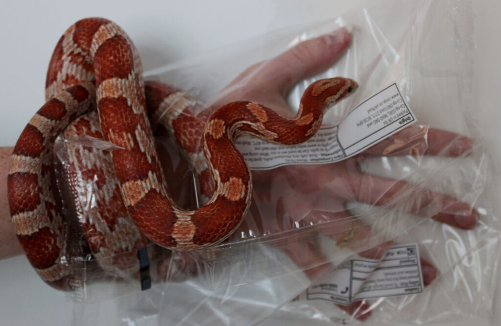
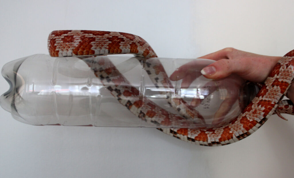
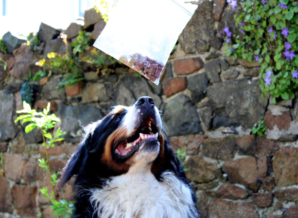
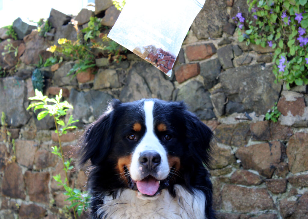
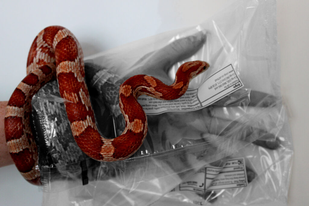
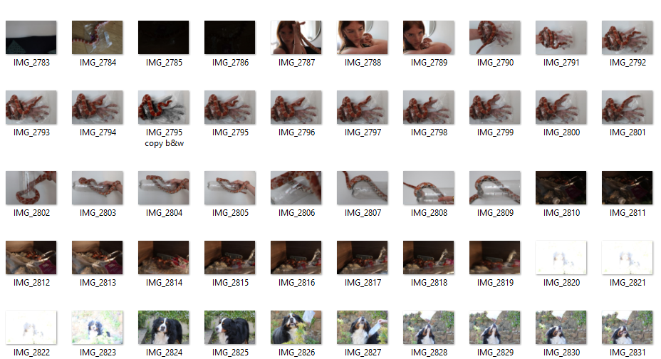
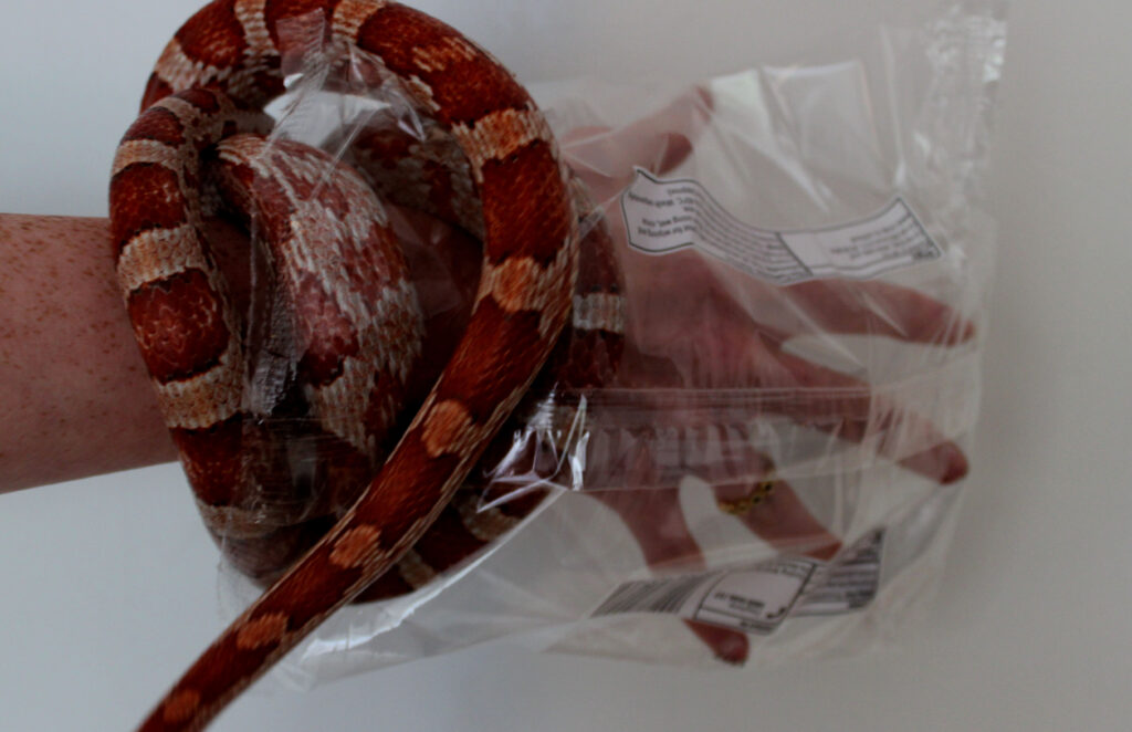
For this photoshoot, I used a dog and a snake to create a a sense of empathy. I used plastic to wrap the snake around to create the idea that a snake is surrounded with plastic all the time in their normal life. For the images of the dog, I

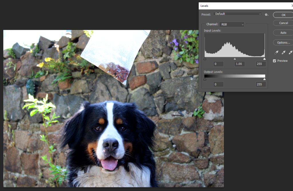
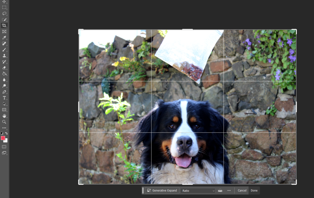
These are my final images that I have edited. For these images, I downloaded them on photoshop and started by cropping them to cut out any of the empty space around. I then levelled to achieve a good level of brightness and contrast.

I decided to expand on this photoshoot and so I edited one of the pictures of the snake. I started off by taking a picture that was already levelled and cropped and then proceeded to take the quick selection tool to select the plastic bag and the part of the snake which was inside the plastic bag. Once I had selected the part of the image I wanted, I then pressed shift, Ctrl, U which made the selected part of the image black and white. I did this to portray that the part of the snake that was inside the bag was suffocating and turning black.

This was my final edited image:

Anthropocene Photoshoot 2

For these images, I went outside to an area with grass and brought bits of rubbish with me. I placed the rubbish in the grass and lay them out in a nice circle. I took the pictures from different angles to see which one I like best.

I like how these images turned out because I placed them in a circle to represent the earth which is circular. I tried to make a point that if we don’t stop using the amount of plastic that we do, then this is what the earth will eventually look like. The background of this image is green which links to nature and how this is what colour a healthy world would look like, however the main subject of these photos is white and pink which are not natural colours of our world.

Anthropocene photoshoot 1

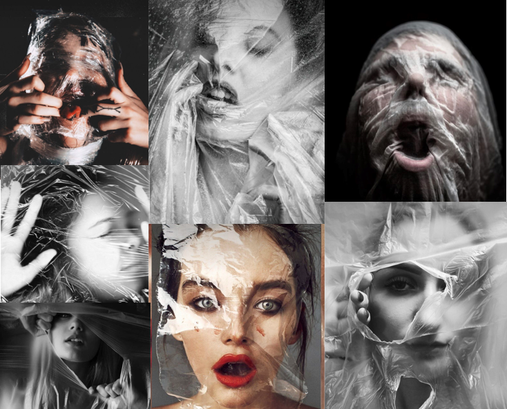
I was inspired by these images which are taken by different artists and photographers. I was inspired by these images because they have a clear link to Anthropocene in terms of plastic. These images show that plastic is polluting our world and that we are being suffocated by the amount of plastic that is in our planet.

For this photoshoot, I went into the studio and used artificial lighting to create these images. For the props I used a black plastic bag and cling film. I used these to cover face of the model, I also made it seem as though the model was in pain to create an expression of distress. I did this photoshoot to portray the idea that plastic is a problem in the world and that plastic is polluting the world. In these photographs the model looks as though they are suffocating and shows that the plastic in the world is killing humans and animals.
Anthropocene mind map & mood board

This photographer has taken this image to show the dramatic problem of plastic. This image shows a bird who has ingested plastic and has unfortunately died. However, the photographer has added more plastic onto the dead bird to emphasise the idea that plastic is killing the animals. Photographers want to create awareness as to what dangers result from our waste products and that we should recycle and advise others too as well to save the animals.

This image shows all the plastic waste that has been collected. The photographer of this image has portrayed this image as happy and bright because of the different colours, however the back story of this image has a different meaning. If you think deeper about this image it actually shows us the amount of plastic we use and shows us that plastic is killing our planet. This plastic gets burned and the fumes will pollute the earth.

What is Anthropocene ?

Anthropocene is the time in which humans had a substantial impact on the planet. Photographers have started to spread awareness on the dangers of climate change, over population, pollution, deforestation, global warming and many more. Photographers have started documenting different images of the issues on the planet for everyone to explore an in depth understanding of the reality of the world.

ANTHROPOCENE

These are some images from photographers who have taken a interest in representing the disasters in the world. Something that most of these images have in common is that they are filled with bright colours. Bright colours are usually associated with happiness however this significantly contrasts with what the images are actually made for. Anthropocene is awareness of the dangers in our planet such as cars, plastic and toxic fumes that we pollute the air with. Anthropocene photographers take pictures of these disasters to warn people of the damage us, as humans are causing to our world. I really like the topic of Anthropocene because as young people we are the ones that have to try to help change the way we live.

I particularly like this image, this is because it shows the consequences of our actions when it comes to plastic. This image shows a bird that has unfortunately died and the body is full of plastic. The photographer who took this image wanted to show people how dangerous plastic is and if we don’t recycle or reduce our use of it, this is what will happen to all of us.

Landscape topic photo gallery

Editing Process

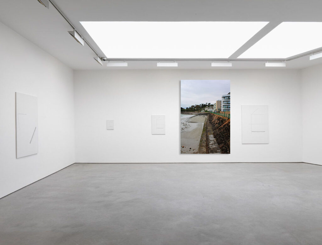
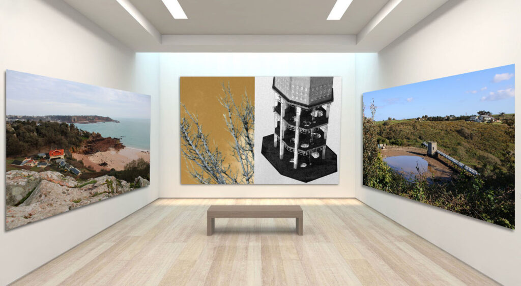
To create one of my online photo gallery’s all that I have to do is find a picture of a blank gallery room like this. Then I just need to find the images that are the most successful then I will drag them onto the gallery in photoshop. After that i can play around with the perspective as in order for it to look more natural it needs to be able to bend and follow the wall. Finally after doing that I like to add a boarder around my images to make it look like a photo frame so I will add “stoke” in FX and then I also like to add “drop shadow” as it give it more dimension

Anthropocene

Landscapes

Topographics

Storm Damage

Overall opinion

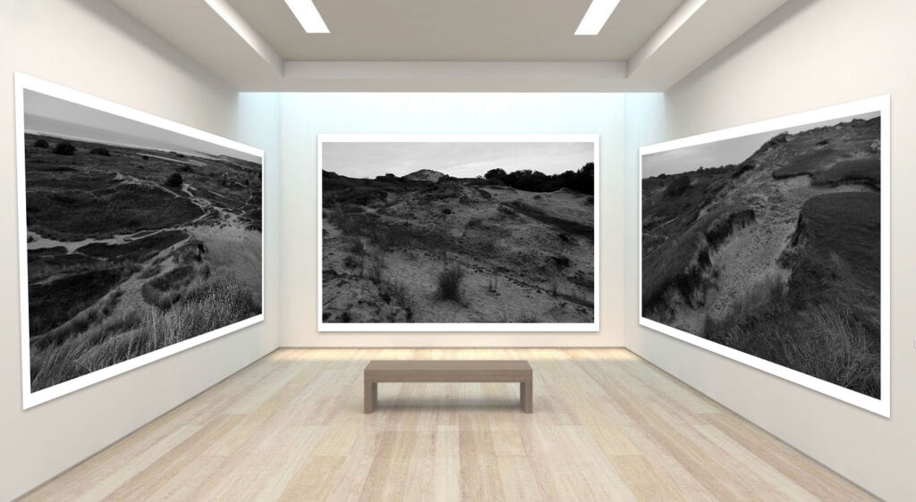
I picked all of these photos the way I did because I wanted each “room” to have a certain look to them so I didn’t really want any coloured photos in the same room as a black and white one so if I were to want just one of two in colour and the rest black and white I would create a whole new “room” for it otherwise it wouldn’t look cohesive and would just look quite messy.

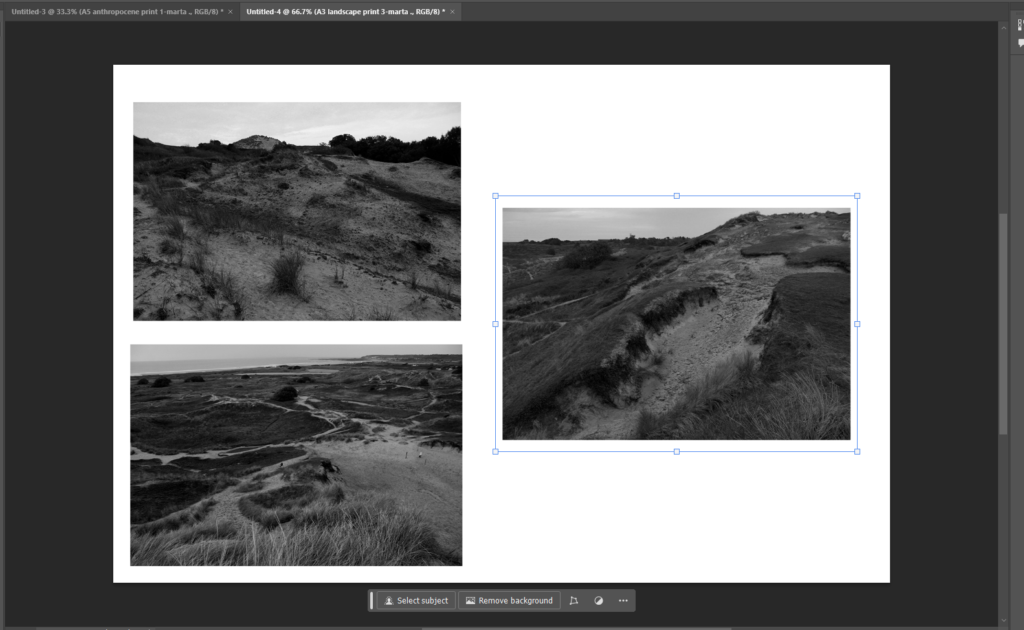
For the photos I picked only some of the very best I wanted to make sure it was only my strongest photos in order to make it look so successful. I feel like even though the image look quite small because of the way they are laid out you can still see lots of the detail within the images I believe having them in black and white helps that because they colours contrast so well making it appear more dramatic and making it stand out.

I think my favourites would be the topographic images as I feel the AI photos tell a story so clearly and successfully them being right next to each other so you can clearly see the similarities and the differences works so well.

Final piece plan

For these final pieces all I will be doing is taking these individual images and splitting them up and sticking them onto a larger piece of card so that they tell a story and look cohesive together.

For the mounting I will be using a large black sheet of card and the a slightly smaller white sheet on top of the to create that small boarder around both the white and black card. Then I will be sticking the images onto that top layer of white card with even spacing in-between.

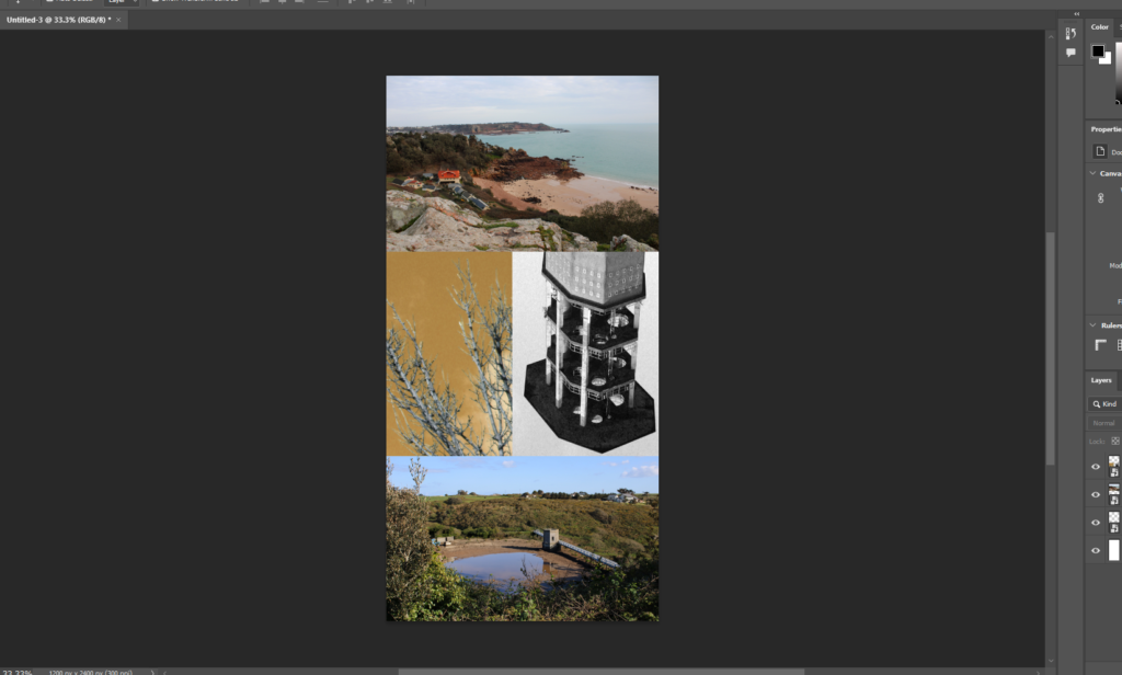
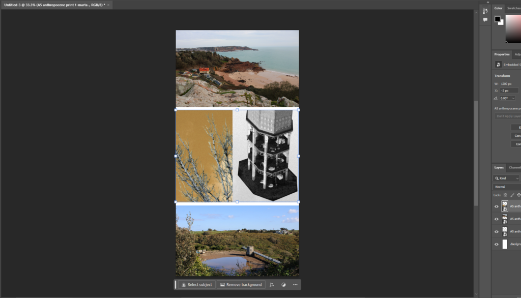
I have chosen to use these three photos for one of the final pieces based on Anthropocene. I picked these three as I felt they showed off the main idea of anthropecne as you can see how the natural beach has now had lots of additions like the buildings because of us. You can see the structure that’s already been built on the left and then the middle is a close up of a section of that structure then the last image on the right is of construction machine which suggests that there will be more built on top of the beach.

I would also like to have my final piece of landscapes to look like this although it doesn’t tell a story I feel as if by having both of them together it helps it look more cohesive and less random I also think having both the black and white backing card works well with the images as there are in black and white so its monochromatic and also having just white makes the image a lot brighter and the sky from the photo can kind of blend in but by having the black behind it creates this contrast which really helps.

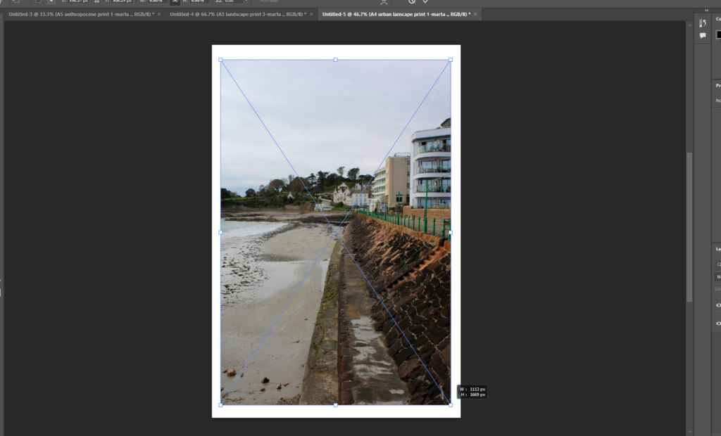
This will be my last final piece which is for Anthropocene for this is similar to the landscape final piece as I don’t feel as if its trying to tell a story however having those two images which are quite different locations and yet they look so similar works. It shows how built up and overcrowded it actually is in jersey.