Photoshoot 1: Pollution favourite images (Waste, fly tipping)
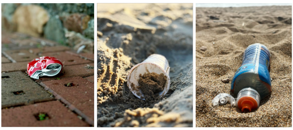
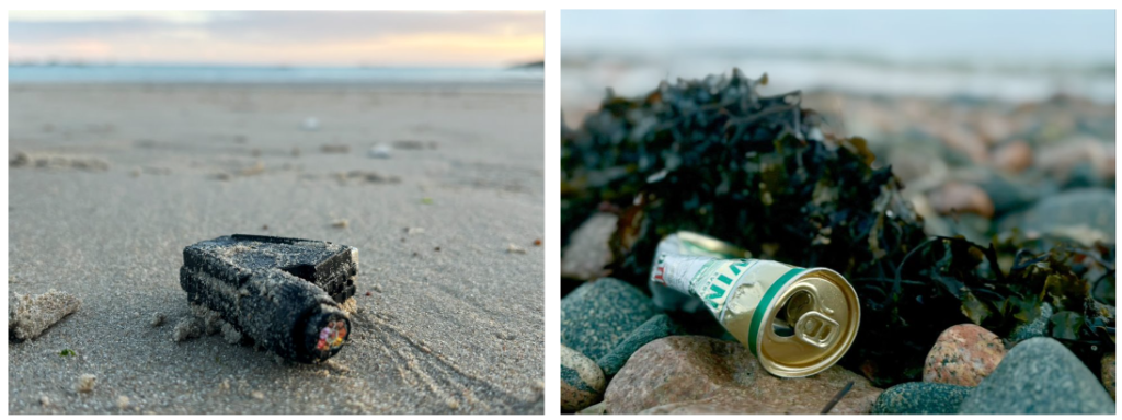
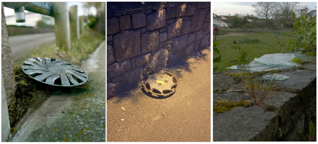
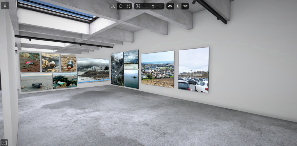
For this photoshoot, I decided to focus on each individual piece of waste on its own and not group them together. I think this worked well because it meant I could capture many angles of the waste and make sure that that was the main aspect of the image. I focussed on places such as beaches or sides of roads. the beaches were the main location in chose as you can find so much as they are large locations and we have loads of beaches on the islands. the main waste product I came across was plastic, this worked well as I wanted to focus on plastic the most, however, discarded drinking cans were also a popular finding. One thing I liked about my image is how in each photo I used a shallow depth of field. I think this worked well as it meant the image fully focuses on the main piece of waste. though the background is blurred it can also be clear to the viewer where the location is. For fly tipping, my pictures mostly consisted of discarded car pieces, however, I did not manage to capture many photos in this topic.
Edits: My original images were taken by phone camera and after I had gathered the images I wanted I first edited them on the photos app by focussing the image on the object by generating portrait mode and it then produced my image by blurring the background. After transporting the images onto my computer I used photoshop to auto edit the levels and curves of the image and then adjusted it if it didn’t work well. I had to crop some of the images as the object was off-centred on some of the images which didn’t look right.
Final piece plan: I am planning to print the top 5 photos out on A5 and put them all together to create one piece. Ima planning to arrange them like they are arranged above however this may change depending on what fits the best
Photoshoot 2: Overpopulation
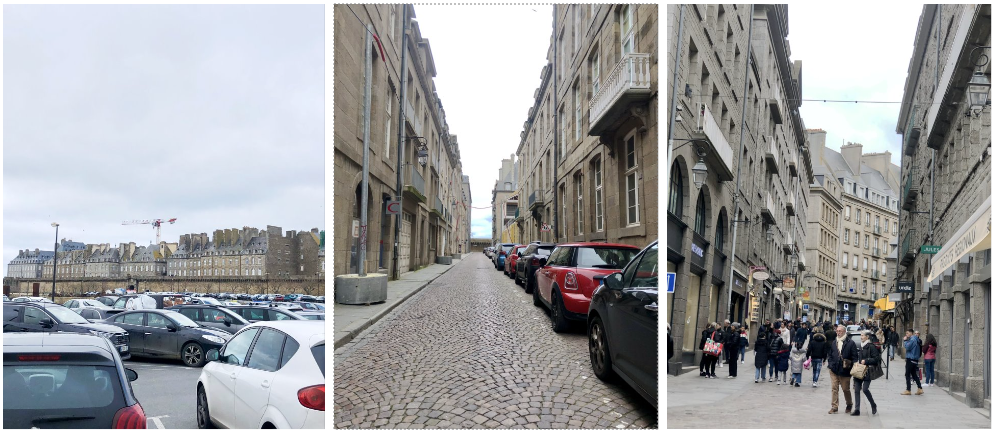
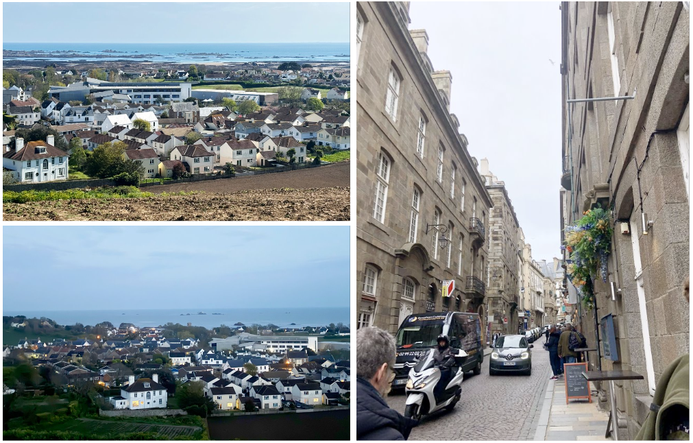
For this photoshoot I looked at a few different types of overpopulation including people, cars and buildings. the first photo shows a large group of cars in a car park which shows overpopulation quite clearly because of how busy/packed the carpark is. the presence of the cars also destroys the view of the buildings behind which hold historical meanings. This can also be a contribution to pollution since cars do have a part in the cause of air pollution.
Edits: The edits I made to these photos were fairly simple as I put them onto photoshop and edited the levels and curves. The bottom left photo was produced quite dark so that was brightened when I edited it
Final piece plan: I am planning to use the car park photo and the two house landscapes from above. I want to use these to create one piece by putting the car park photo beside the two house ones.
Michael Marten Inspired photoshoot (& AI)
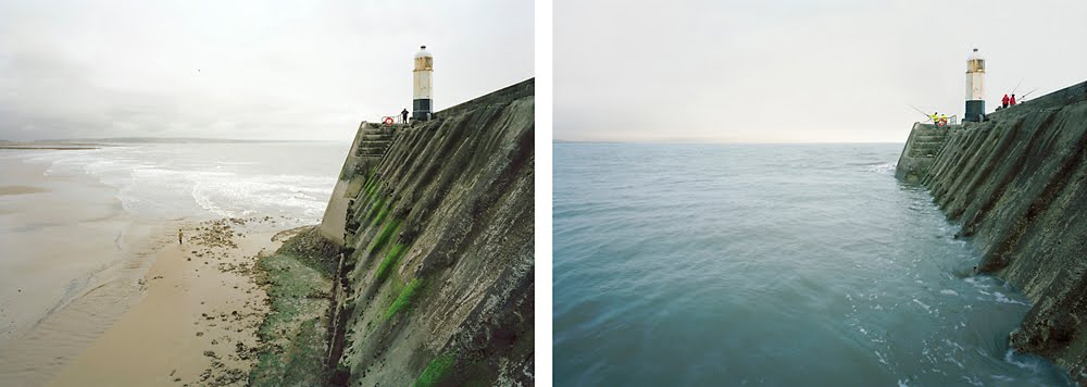
Inspired Photo from Michael Marten
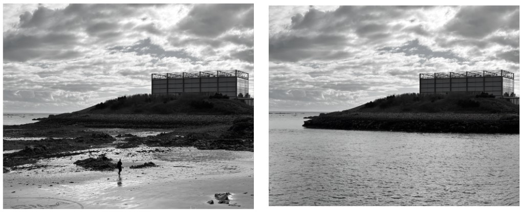
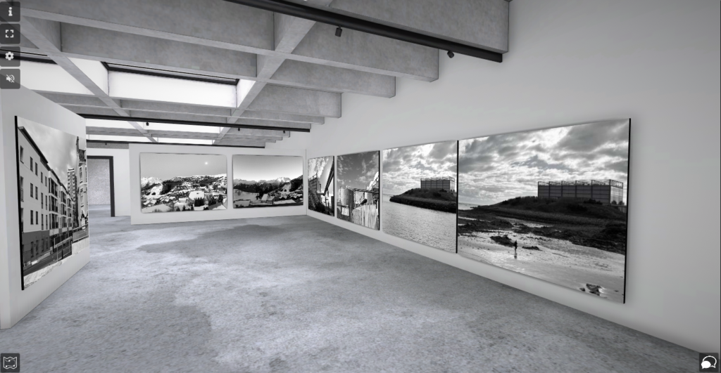
For this photoshoot I needed to photograph the same location twice at different times. the main different of each photo is the tides being out and being in. However, this was one of my creations using the AI generator on photoshop. I chose to use this photograph as my favourite as I think it turned out quite well even though its not real. I also like the original photo itself as well because I think the black and white works well to make the clouds stand out more.
Edits: The main image of the right image was the AI generator by adding the sea to the original photo. I decided to turn both photos to black and white so that I made my own change to Marten’s photographs as he doesn’t use black and white frequently. I also chose to use black and white to further try and hide the AI and to make it look more natural even though its not.
Final Piece plan: I am planning on printing these out on A5 as I think if I went bigger the quality wouldn’t be that good. I want to put them side by side on foam board.
Photoshoot 4: Glass houses
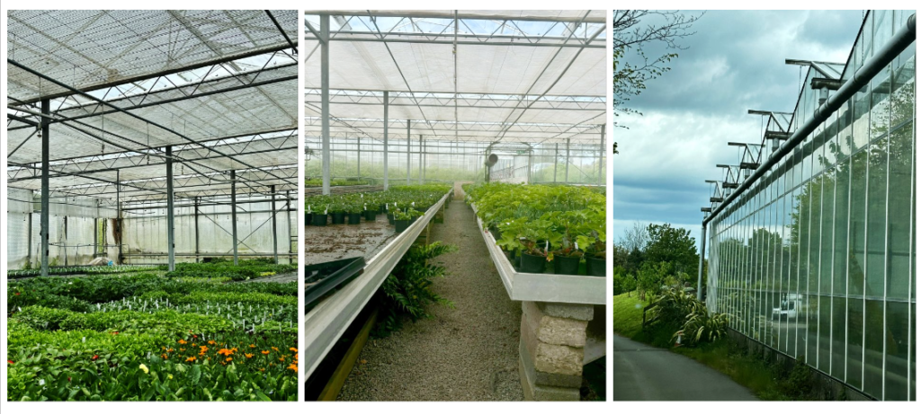
This photoshoot didn’t consist of many photos as I didn’t go to any greenhouses other than this shop. I don’t really like this photoshoot as the main focus was meant to be abandoned green/glasshouses and the one I took a photo of is currently in use as its a shop. However I do like the right photo with the reflections coming off the side of the glasshouse. I could’ve done better to take time with the photographing as you can see in the middle image it is wonky so the photo doesn’t look good. I think I took photos too quick and that limited the quality of images.
Edits: I edited these images on photoshop by changes the levels ands curves and also lowered or heightened the brightness. the left photo was originally more zoomed out but i think the corner is the part of the green house that may link with the theme of abandoned.
Virtual Gallery:
