Cropping

Colour cropping:

Original photo:

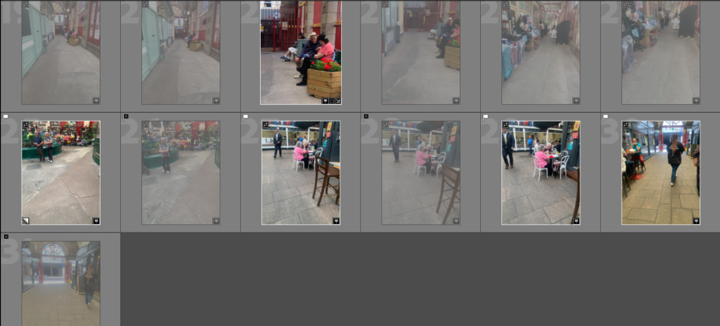
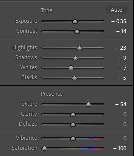
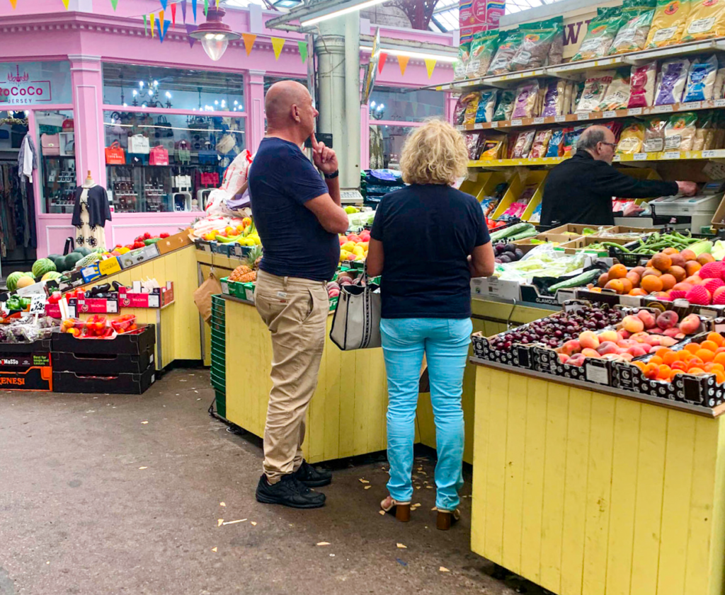
This was my original photo before I began the cropping. I first adjusted the photo using Lightroom.

Cropped photos:

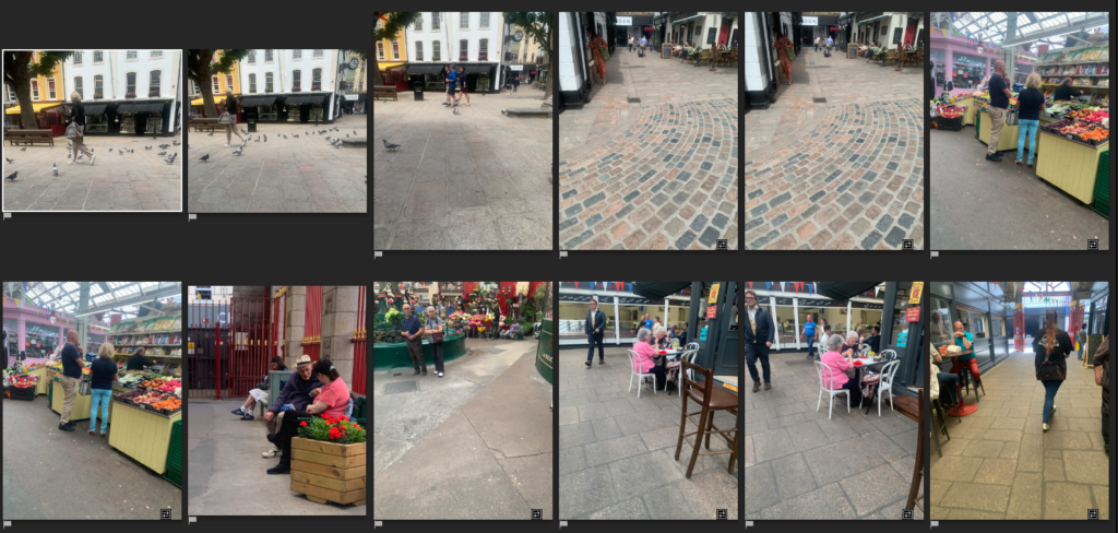
  • For this first photo I cropped it in a panoramic style. It captures all the subject’s heads as well as the boutique on the left.
  • In this photo I decided to crop out the man on the right-hand side of the photo as I wanted to concentrate on the two subjects that you can see in the middle as well as the right side of the image. I adjusted it in order to place one subject in the 2nd third of the image and the other in the last third making the first one empty. I like how the yellow coloured vegetable stall compliments the pink colour of the boutique.
  • For this crop I decided to keep the vegetables in the photo as I like the bright colours as they stand out.
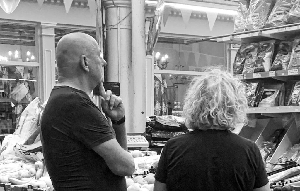
  • For this final one I chose to zoom into the two main subjects’ heads. I did this to capture the man putting his finger to his face as it looks like he is deciding on something which is perfect for the term ‘decisive moment’ which Bresson chooses to describe his work with.

Black and white:

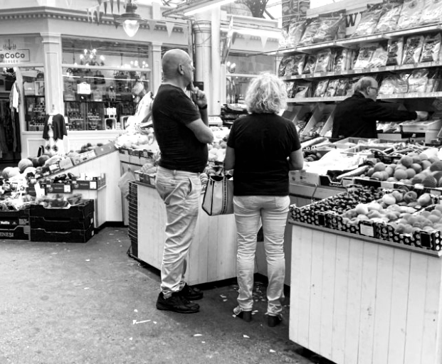
Next I chose to change the same previous images into black and white.

Original photo:

Cropping:

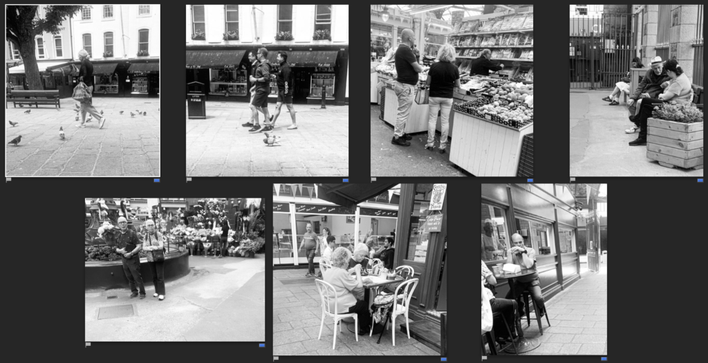
I prefer this one in black and white as it looks less chaotic in comparison to the coloured one. The fact all three subjects are wearing a dark top also makes the black and white image look better as it makes them stand out more.

Comparing:

I took this photo in the market in town in front of the vegetable stand as I liked the way it was laid out. I also like how the male subject is posed as it looks like he is deciding on something. I edited it in two ways, black and white, and brightly coloured with a high saturation. Although I do like the coloured version, I prefer the black and white one as it doesn’t have too much going on in comparison to the coloured version which has various tones of colours all in one small area, it looks quite busy.

Photoshoot in response to Henri Cartier Bresson

Photoshoot plan:

To respond to Henri Cartier Bresson I will go to various areas of Jersey such as the royal square, parks and cafes as these areas are likely to be occupied by people. I will take these photos using a camera in manual mode as well as Tv mode. In some photos I will use a slower shutter speed in order to capture movement of people.

First photoshoot:

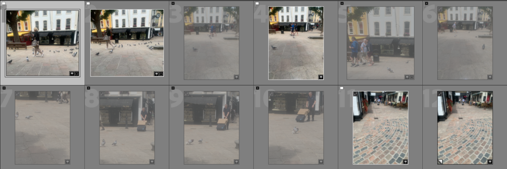
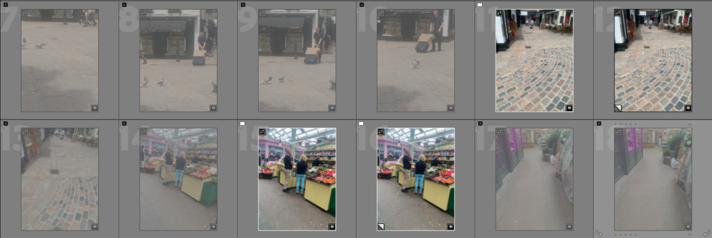
I started by doing a quick photoshoot in town with my phone where I went to the Royal Square as well as the Market in town. To improve during my next photoshoot I will take them in other areas and take more photos.

Best photos: (from first photoshoot)

To start I made the basic adjustments to these images making them black and white similar to Henri Cartier Bresson’s photo style. I will next go into photoshop to do additional edits to the photos.

Edits:

For this edit I wanted to make it brightly coloured to see how it would look however I prefer the black and white image as the coloured one has too much going on due to the many different coloured fruit and shops in the market.

This photo shows the decisive moment as the people are deciding on what to purchase from the market stool. I prefer it in black and white as it looks similar to Bresson’s style where as the colourful one did not.

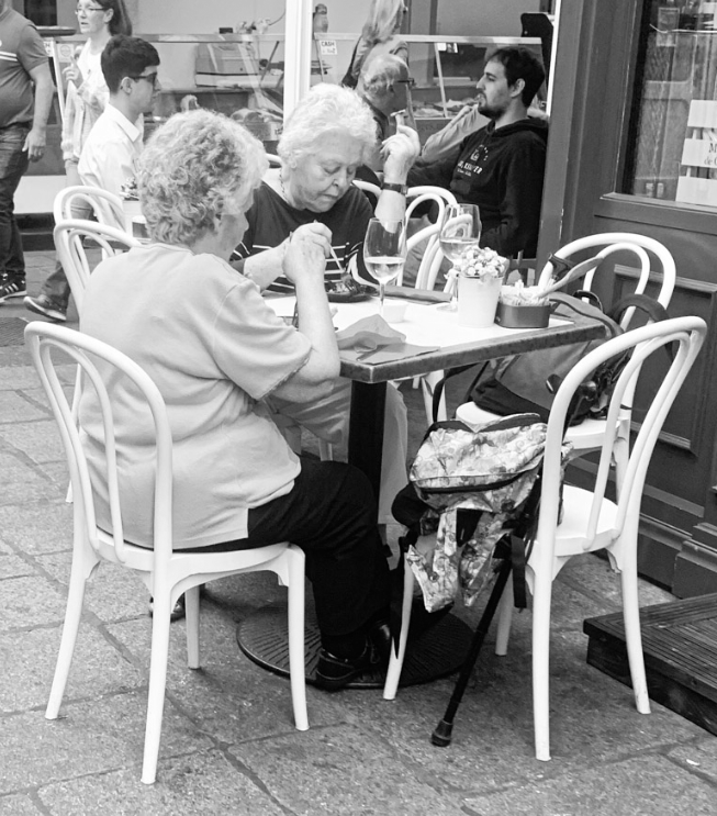
In this image I feel it really captures the decisive moment of the people eating their food at the café. I decided to make this one black and white as Bresson’s images are mainly black and white and I wanted to achieve a similar look to his.

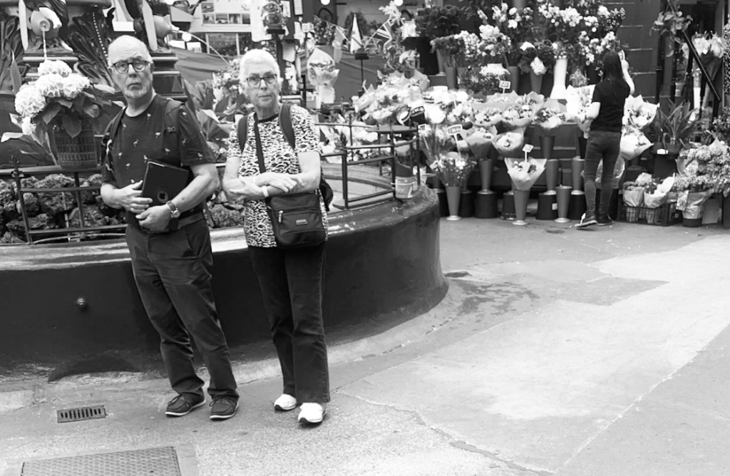
I like this photo as it captures two people in the foreground of the image and another person in the background arranging flowers, this shows the decisive moment of her adjusting the flowers and making decisions.

Picture Stories; Research and Analysis

Mood Board

Types of Images

Relationship shot – Shows the connection between themes, objects of people.

Work shot – These show a person at work or in their ‘element’.

Establishing shot – Establishing shots are typically wide shots to show context. This might be through landmarks or signs.

Detail shots – Closer to focus on a specific detail or element.

Using Indesign for a Pagespread: Design & Layout

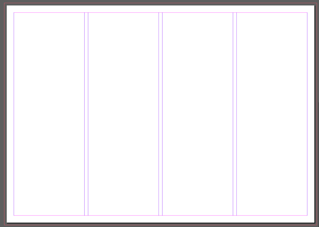
For setting up an A3 page I used these settings:

This created a layout of 3 pages laid out with 4 columns in purple. The red outline was created with the ‘bleed’ option so that when printing images can fill the whole page without white edges.

To add an image the rectangle frame tool is useful for creating a specific size on the page.

For my first page spread I tried to create a picture story about people playing football. I chose for the establishing shot to give some context and was the only image that showed more then just feet. I set this one in large on the left. I also decided to split one image into to squares as it was originally a landscape action shot. For the additional images I wasn’t sure how to arrange them or which ones to select so I created a few drafts

The final 3 I created were:

Final Layout:

I decided that this final one was my favourite becauce the text wouldnt need to be split and the title could still sit at the top of the page.

Street Photography

From the hip

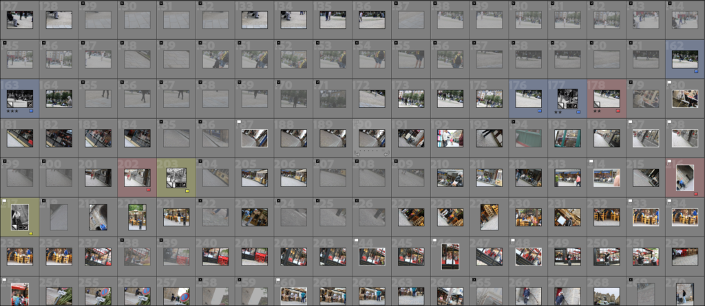
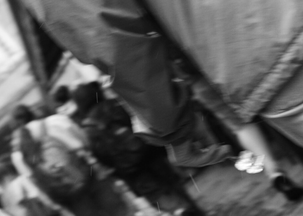
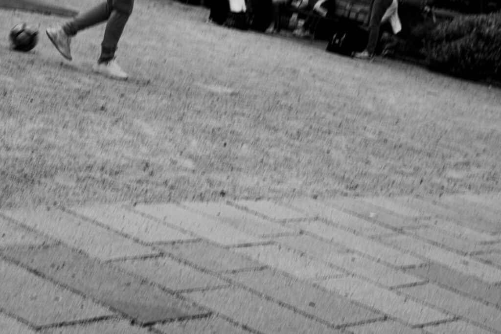
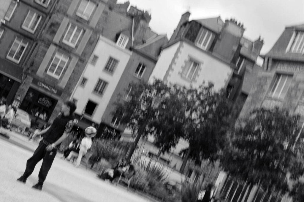
Of a total 406 images, I narrowed these down easily to 34 as many were purely of the ground. All are at an angle and out of focus which otherwise wouldn’t look great however as a collection I think can work together.

These images work best in sequences to tell a story as they aren’t technically great since they have lots of motion blur or are just generally out of focus for example:

Sequence

The decisive moment

I narrowed down 438 images to 46. These 46 could be summed up into 4 main groups: colour, black and white, motion blur and the church.

I think that these three together create a nice sequence however I shouldn’t of zoomed in on the final one so that all three would be the same. I spotted the lady because of her red coat and trousers which stood out against the grey stone.

I tried adjusting the shutter speed to capture a moving object. I tried moving the camera with the car however most attempts were completely blurred. This was the only one where the vehicle was still in focus.

I accidently took these photographs when I adjusted the shutter speed in a dark church. The streaks were the chandeliers which naturally stood out against the dark background. The first was an accident when I moved the camera after taking the photo however the shutter speed was much lower than I thought. Once I saw the outcome I tried making additional shapes and I think the spiral one worked out also.

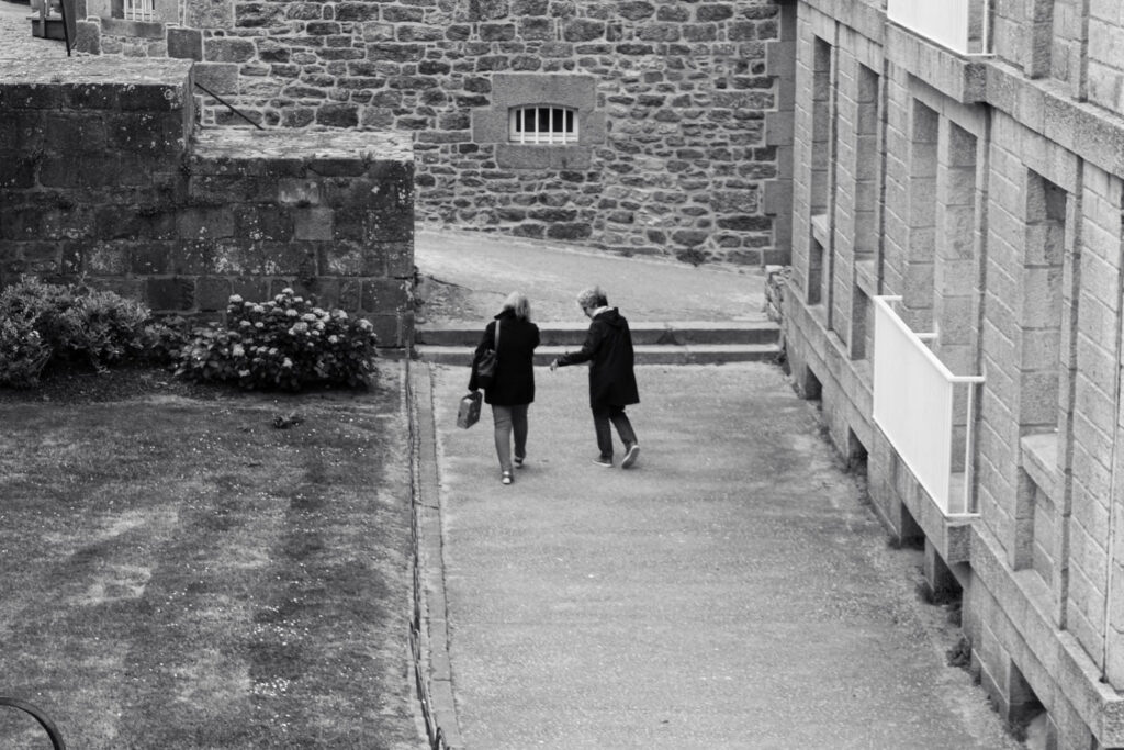
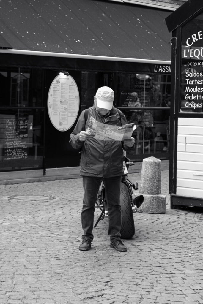
I think I had the most success when photographing people around the town. I think that the set ups had varying success and I liked the ones taken further away most. I set all of them in black and white which was the same as Henri-Cartier Bresson which meant that colours wouldn’t be distracting and the focus would be purely on the subjects. Additionally I think that the quieter backgrounds looked better.

I tried the photographs in colour with some colour adjustments and while the colours looked alright I didn’t like them as much. I found that the colour sometimes takes attention away from the people and while in some cases I want the photograph to be about the colour, the majority had nothing to do with colours at all so I made them greyscale.

AI- what is it and how can i use it?

How do you use it?

Ai has recently been introduced to adobe photoshop in the form of generative fill, this not only allows photographers to add elements to their images that elsewise would have been difficult or impractical to accomplish, this makes a photographer much more able to accomplish what they envision

but it also allows photographers to remove unwanted aspects of an image to create for example a better composition for your already taken images

The Rohingya Experience

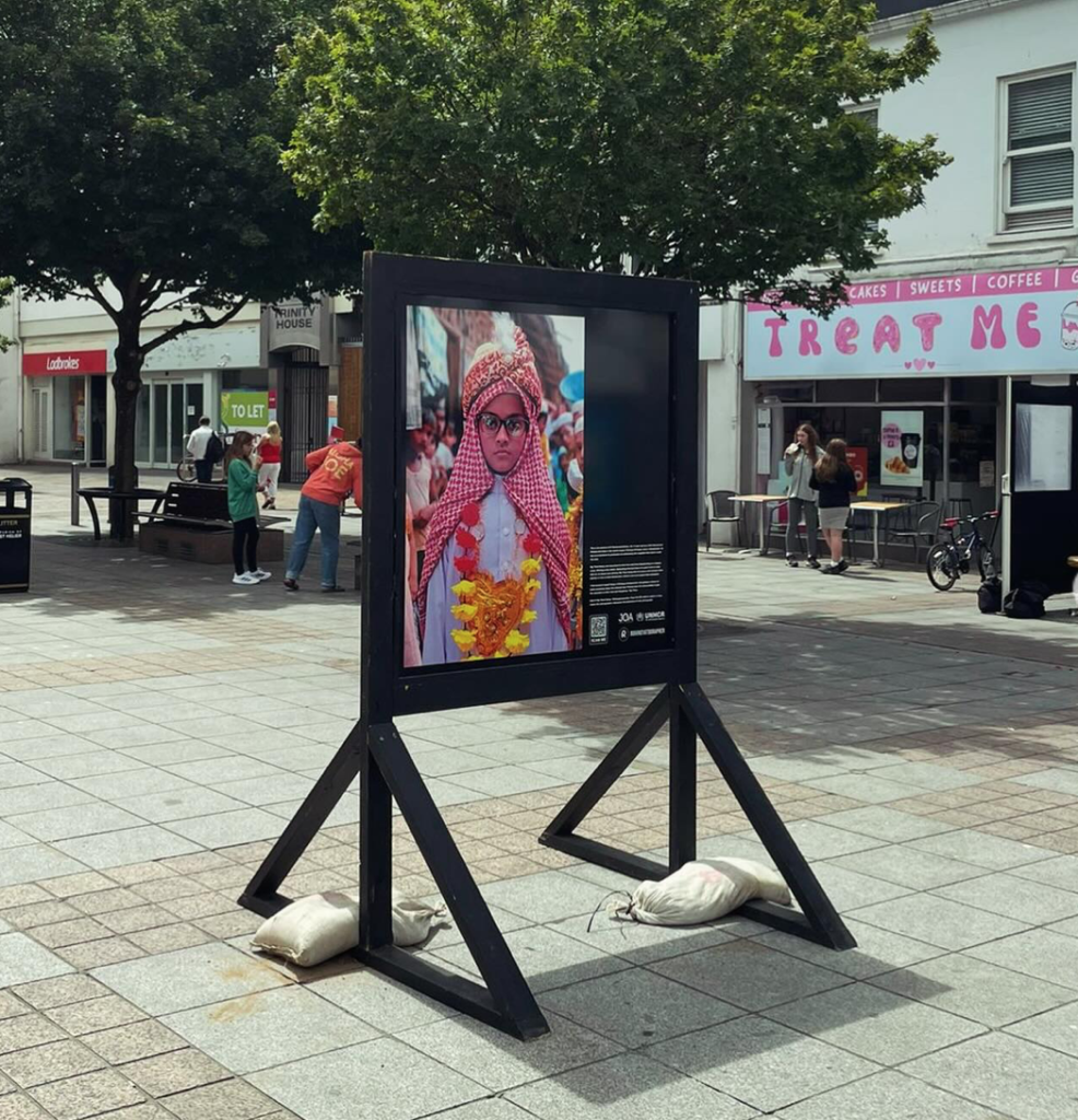
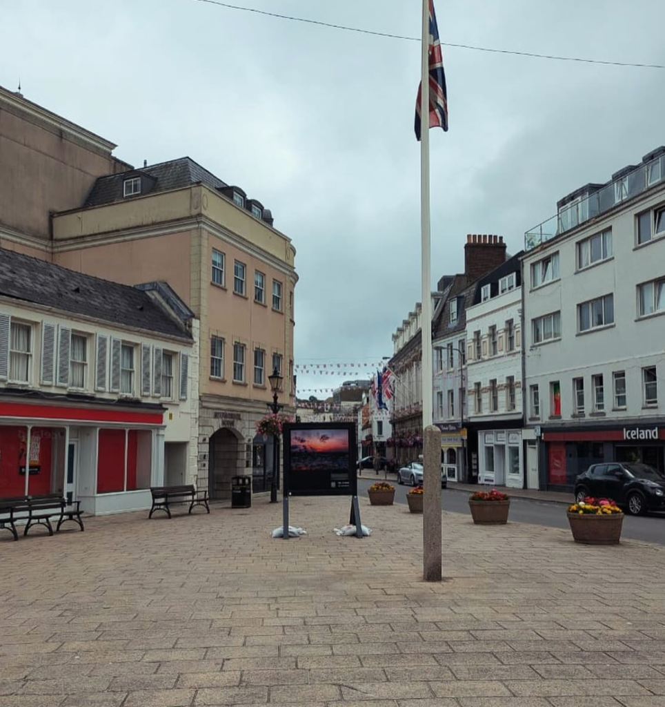
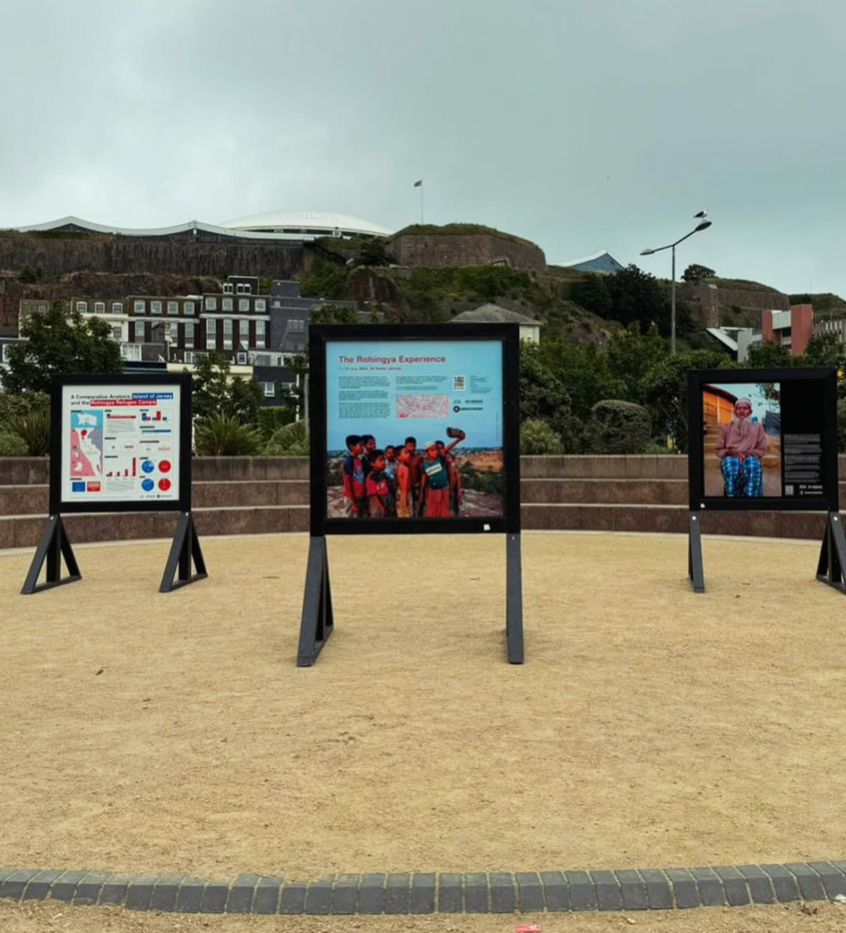
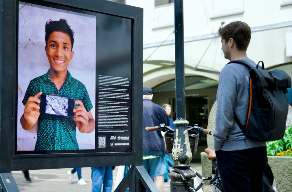
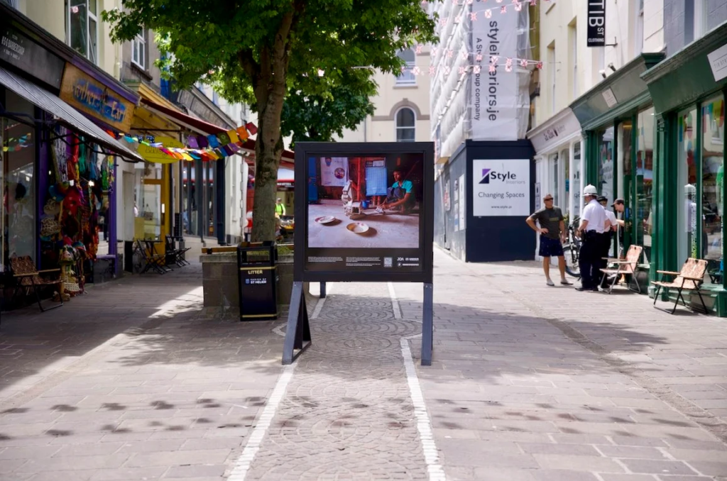
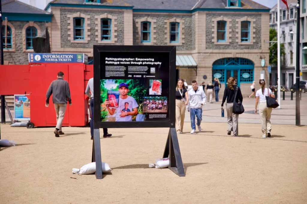
The Rohingya experience was a photography exhibition showcased around St Helier, Jersey from the 1st until the 14th of July. This consisted of photography boards strategically placed throughout the high street and most popular areas of town, with 26 images each taken by an extremely talented Rohingya refugee through a partnership named Rohingyatographer – a unique magazine showcasing images from the worlds largest refugee camp. Accommodating these images were QR codes which invited members of the public to scan and listen to the compelling story behind the photograph. The ideology behind this project was to reveal the truth behind one of the worlds most tormented and stateless populations, and indicate the tremendous resilience these people inhabit in their lives just to get through the day.

For decades, the Rohingya people, a Muslim ethnic minority in Myanmar (specifically the Rakine State) which is a predominantly Buddhist country, have faced a horrifying amount of institutionalised discrimination such as being denied citizenship. These policies have been created by Myanmar’s government since the 1970s, compelling over a million of these people to flee their homes for the sake of refuge and peace. Due to this exiling, the Rohingya people have shown to be the worlds largest stateless population, with an estimated 3.5 million people dispersed worldwide due to this brutal discrimination. Even though the roots and history of the Rohingya people is present in Myanmar dating back centuries, their existence is not recognised by the government.

Already being depersonalised by the ignorance of the Myanmar government, the hardships continue for the Rohingya people. Various restrictions have been put into place on topics such as marriage, family planning, employment, education, religion and freedom of moment – for example Rohingya couples in the northern towns of Maungdaw and Buthidaung are restricted to only having two children.

The most significant exodus (migration) took place in August 2017 when large clashes broke out in the Rakine State, with the military mounting a brutal campaign which destroyed the homes of hundreds of Rohingya people in their villages and resulting in nearly 700,000 people having to evacuate this persecution to Bangladesh. Now, Cox’s Baza in Bangladesh is home to the worlds largest refugee camp, with 1.35 million people living there. This escape from unwarranted military persecution was the result of an attempted ethnic cleansing, one that consisted of widespread violence, attacks and the stripping of basic human rights. This genocide of the Rohingya people has resulted in the deaths of thousands, consisting of brutal forms of abuse and violence that is unimaginable.

This exhibition is one that is monumental and moving, having great importance in order to give visibility to this crisis. The intention behind this showcase is to provide a plaintive platform for the Rohingya people, from adults to children, to document the truth about their lives, in a raw and authentic way. This is extremely key in shifting the narrative from one of victimhood to a story of strength and tenacity through self-representation and advocacy. Photography has acted in a transformative way to illuminate the difficult experiences these people have gone through and emphasises their suffering and dignity. By doing things like this, charities such as the Jersey Overseas Aid have the ability to ease the unprecedented pain these people experience in their day to day lives by performing activities to positively impact health, hygiene, sanitation, nutrition and protection, both community-based and legally. I think it is really important that this exhibition has taken place in the busiest area on the island because it sparks a conversation about the need for change in Cox’s Baza and for these pressing issues to be addressed immediately, shedding light on the undergoing hope of the Rohingya people who has persevered for decades whilst living through this immense amount of violence. The way that photography can reveal the harsh realities that the Rohingya people are experiencing in this current moment is monumental because it spreads awareness about this crisis and can encourage advocacy and activism for this minority group who are struggling. Alongside this, it is eye-opening to the people of Jersey to realise the privileges that not only do we experience as an island, but the luckiness that economies such as the UK or USA experience and how much this is taken for granted. The visual element behind this experience is key because it means that members of the public get to actually see what these conditions are like instead of reading a piece of information to draw their own conclusions from, providing a more objective approach. Finally, the way that this exhibition has come from the Rohingya people’s own images makes the entire experience more compelling, captivating and moving because not only does it show Cox’s Baza from their own perspective but this would give them a sense of hope because this means that they are able to try to get away from this stressful situation and try to take their minds off of it through creative and artistic ways, giving them the opportunity to express themselves and try to find joy in a specific project.

I thought it would be really significant to involve this in my work through a blog post because not only does it provide more contextual elements into my work but it is something occurring in the world at the moment and is important to be aware of to try and help in any way.

Y12: INDESIGN EVALUATION

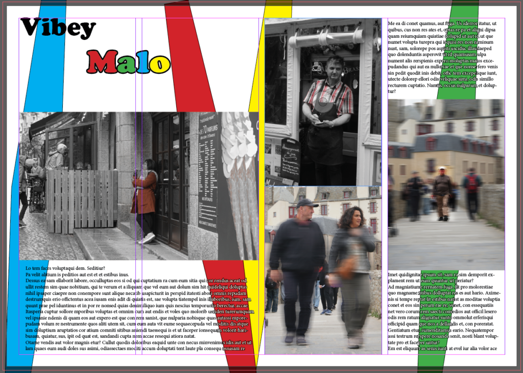
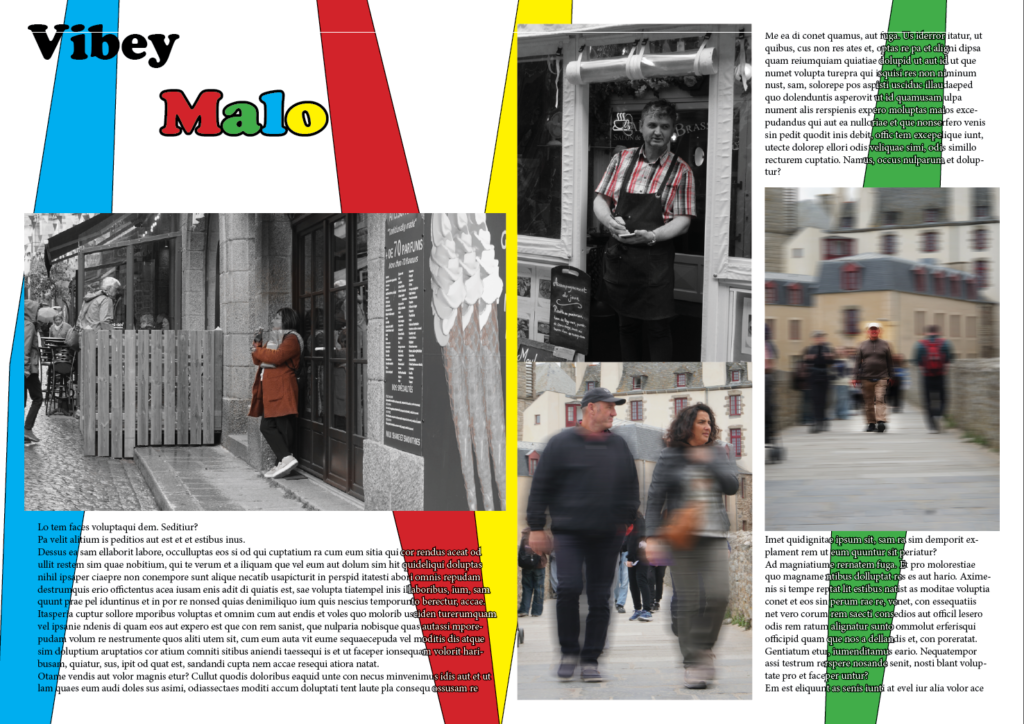
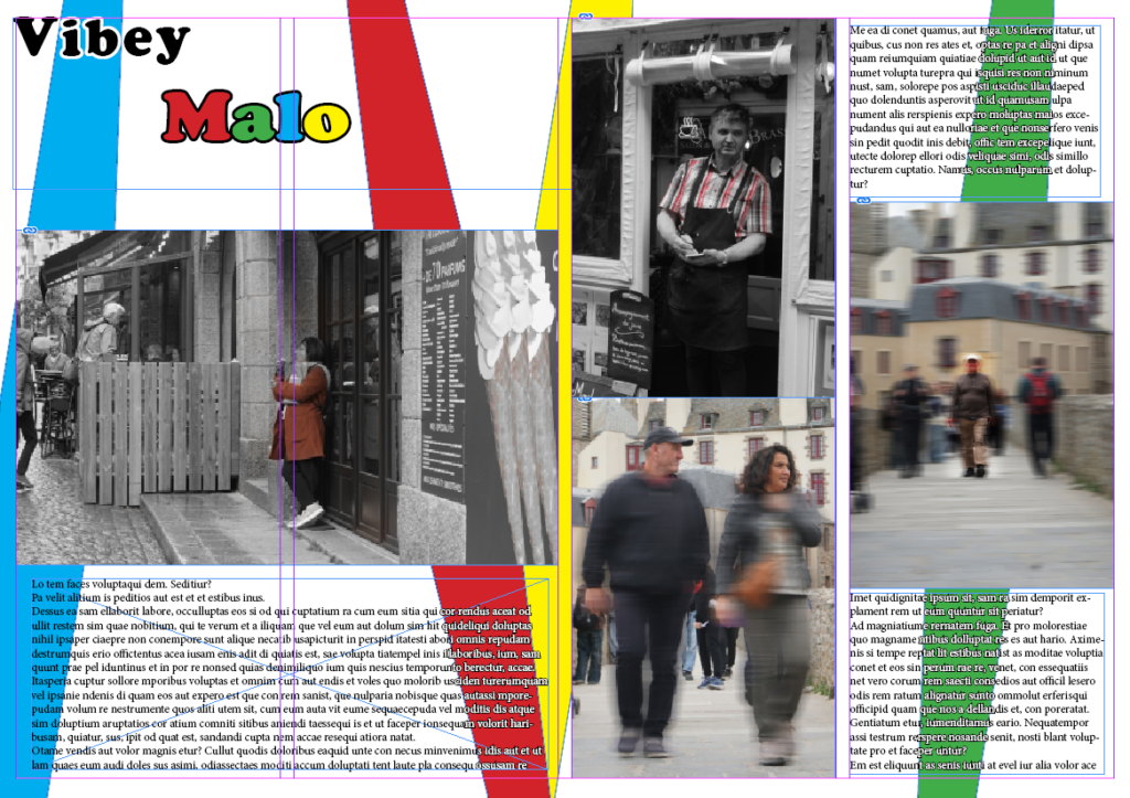
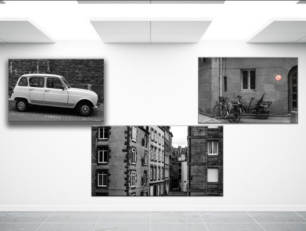
I have decided to create 3 Final storyboards for my trip to St Malo. I created 3 Different types of picture story each representing a different story behind them.

Here is my first picture story it is named “Les Gens De St Malo” this means “the people of St Malo” in English. I have selected these images as I felt it really captured the right amount of different personalities to really show how the people I met in St Malo act and how they are all very welcoming and joyful. Everyone I met whilst on the trip for the day were all very kind and caring people truly creating a strong impact on my views of the people within the St Malo walls.

Exhibition Trail-Rohingya Crisis

Hundreds of thousands of terrified Rohingya refugees fled their home country due to brutality and violence against them, because of their Muslim beliefs. It was predominantly Buddhist who caused them to flee, because they did not agree with their Muslim beliefs. Rohingya refugees began flooding onto the beaches and paddy fields of southern Bangladesh in August 2017, it was the children who caught many people’s attention. As 60% of the refugees were children, who poured across the border from Myanmar into Bangladesh and brought with them accounts of the unspeakable violence and brutality that had forced them to flee.

Those fleeing attacks and violence in the 2017 exodus joined around 300,000 people already in Bangladesh from previous waves of displacement, effectively forming the world’s largest refugee camp. Six years later, about half a million Rohingya refugee children are living in exile from their home country. Many of them have been born into this limbo. 

The Rohingya rely entirely on humanitarian assistance for protection, food, water, shelter and health, and they are living in temporary shelters in highly congested camp settings. 

While basic services have been provided, children still face disease outbreaks, malnutrition, inadequate educational opportunities and the risks related to neglect, exploitation and violence including gender-based violence risks, child marriage and child labour. Meanwhile, annual cycles of heavy monsoon and cyclones pose substantial risks to both Rohingya refugees and host communities.

Older children and adolescents who are deprived of opportunities to learn or make a living are at real risk of becoming a “lost generation,” ready prey to traffickers and those who would exploit them for political or other ends. Girls and women are at particular risk of sexual and other gender-based violence in this situation, including being forced into early marriage and being left out of school as parents keep them at home.

Exhibition

There is an exhibition in Jersey, in the locations on the map below. The exhibition is there to spread awareness for the Rohingya refugees, so they can try and gather more help for them.

The exhibition presents images of these refugee camps and the Rohingya refugees. Many photographers have travelled to Bangladesh to capture the crisis there. Some images were also taken by Rohingya refugees themselves.

St Helier Cenopath

Broad Street

King Street

Queen Street

Bath Street

West’s Centre

Liberation Square

Statistics

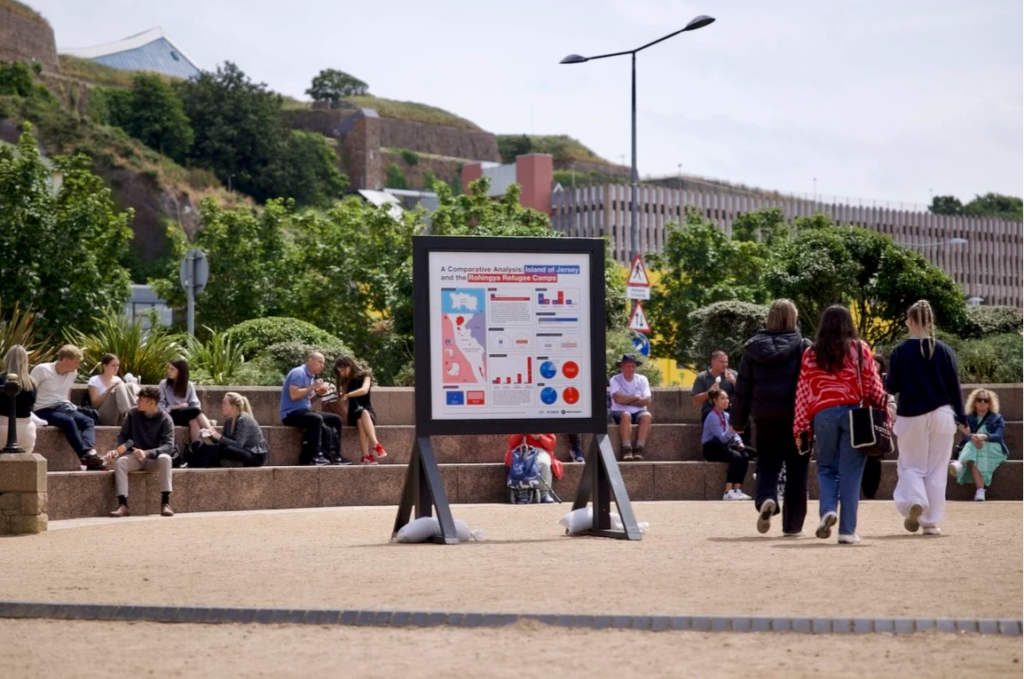
Comparing the island of Jersey and the Rohingya refugee camps.

These statistics show that in Jersey it has a much older population, which may be because of the much harsher conditions in the refugee camps. These statistics show that most people do not live above 60 in these camps, and that there are many more children/ young adults.

The refugee camps are also much smaller than the island of Jersey being only 13km squared, compared to Jersey’s island of 120km squared. This means that they all must live in tight living conditions.

There are also much more people per km squared, proving that the living conditions must be extremely tight. In the camps there are 750,000 people per km squared compared to in Jersey there is only 859 people per km squared.

Another statistic that presents how tight these living conditions really must be is that n the camps there are 6 people per house compared to an average of only 2.2 in Jersey.

There is also no diversity in these camps, they are all Rohingya from Myanmar, compared to a range of ethnicities in Jersey.

They also do not receive a high income (£590 a year, below $2/day (no GDP data). In Jersey the average annual salary is £45,320 (GDP £4.9 billion). This must not be enough to live off for them.

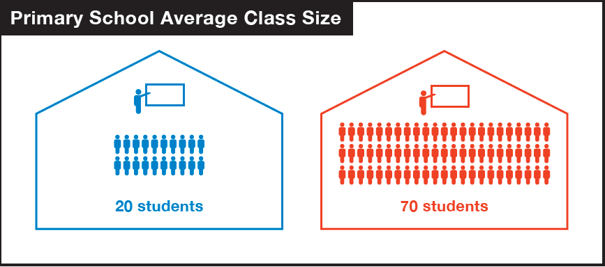
They also have almost 4 times the number of children in a class in school. 70 compared to 20 students.

There mortality rates are also much higher than our mortality rates, which we can assume is because of the harsh living conditions they have to endure.

They also do not have as diverse religions as us, as a massive 94% of them are Muslims.

Personal Response

I think this exhibition trail has a very powerful message, as it showcases the lives of the Rohingya people and their day to day struggles. I also think that the statistics that were shown also helped people understand the reality of their situation. It really did showcase there struggles. The photographs also presented many differing people who are living in these camps and showed differing day to day struggles, such as broken bones and no health care.

Publics Response

I think the public’s response to this exhibition trail was good, because many people stopped to read and look at the images that were being presented and they took into mind the struggles of these people in the camps. I also heard people saying things such as:

This really showcases that the public showed empathy towards their situation and it really effected them on a deeper level.
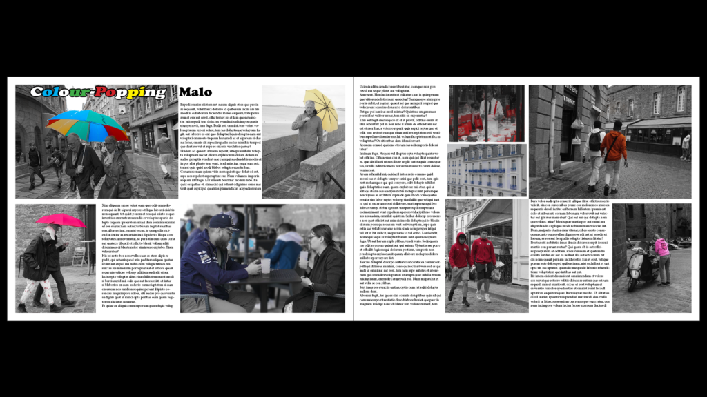
Page Spread: InDesign

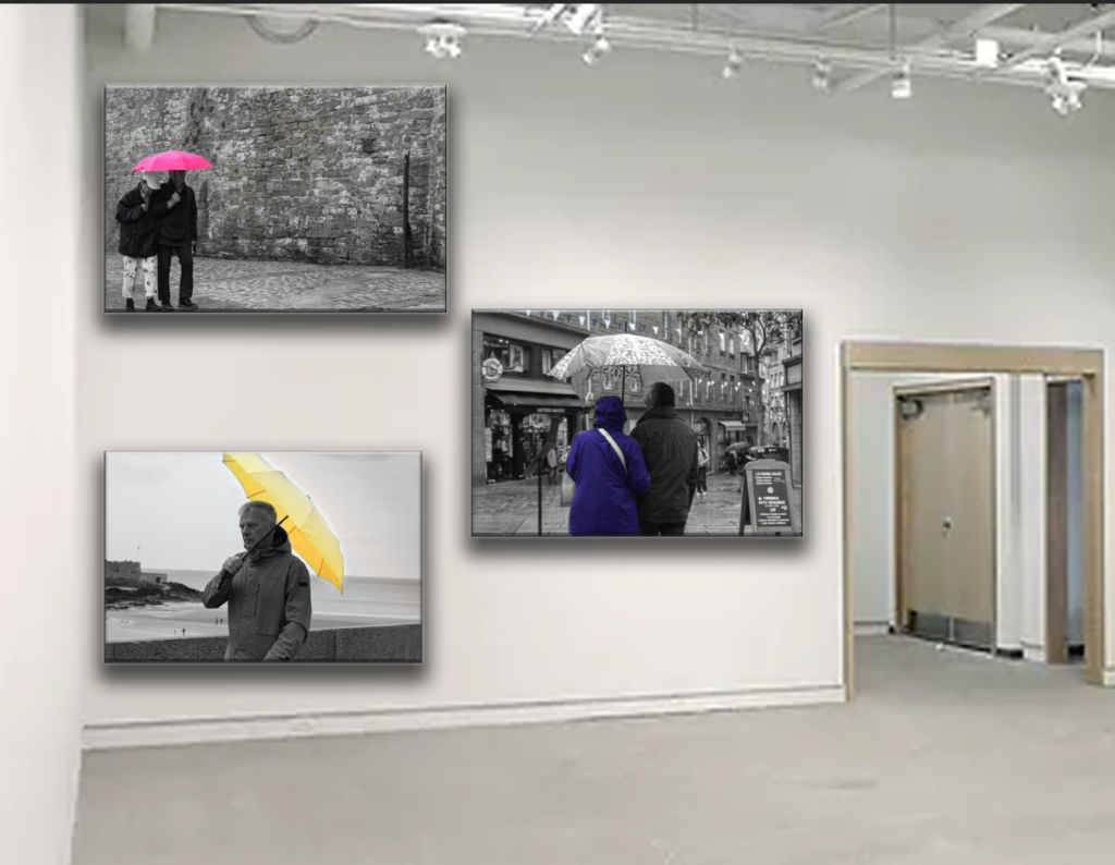
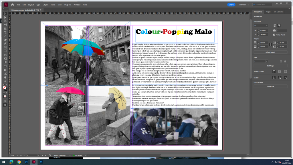
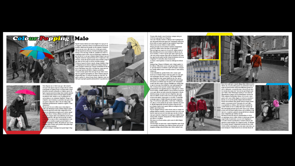
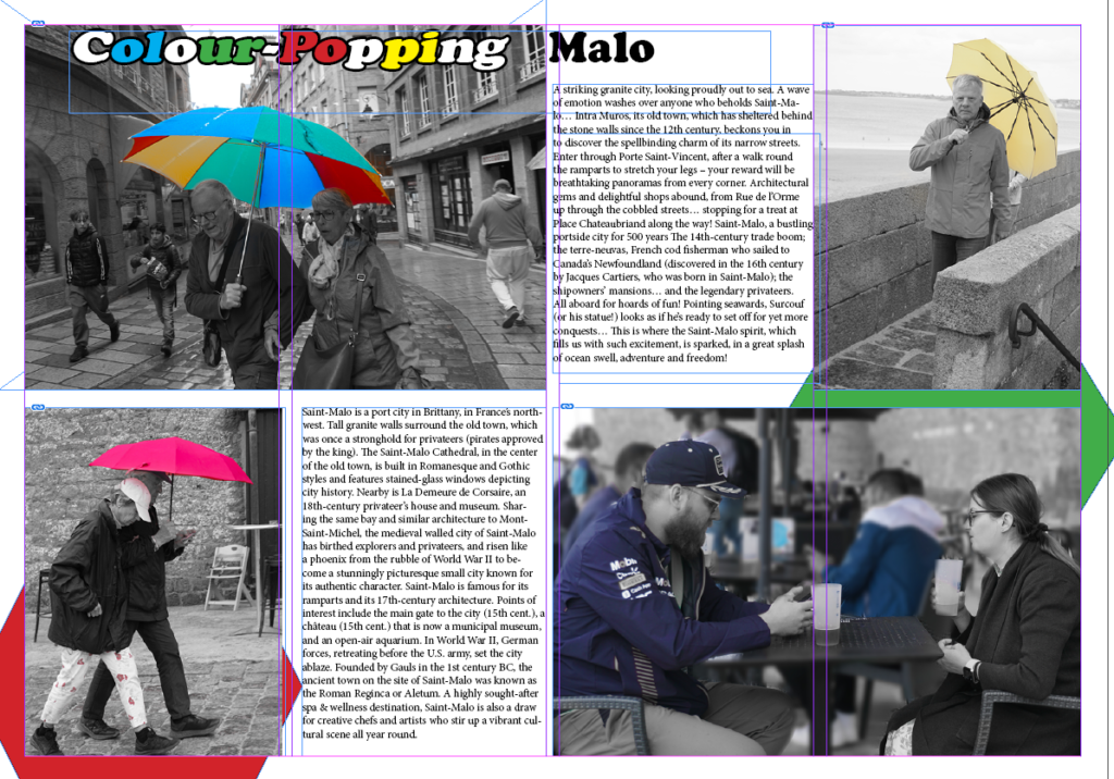
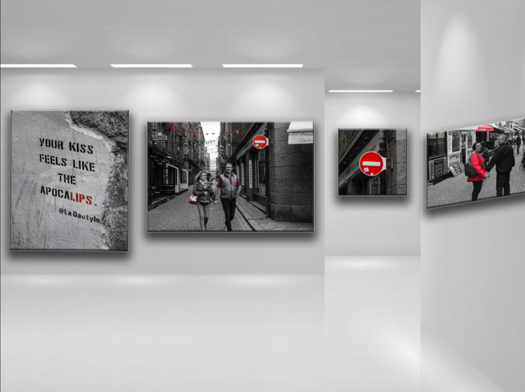
I wanted to create a page spread with a lot of my photos that I used the colour saturation for. With these photos, I came up with a title called, ‘Colour-Popping Malo’. This matches the theme because in my photos I have the colours saturated out so you can only see the bright, colourful ones. I even changed the title to match the theme by making some of the letters the same colours as in my photos.

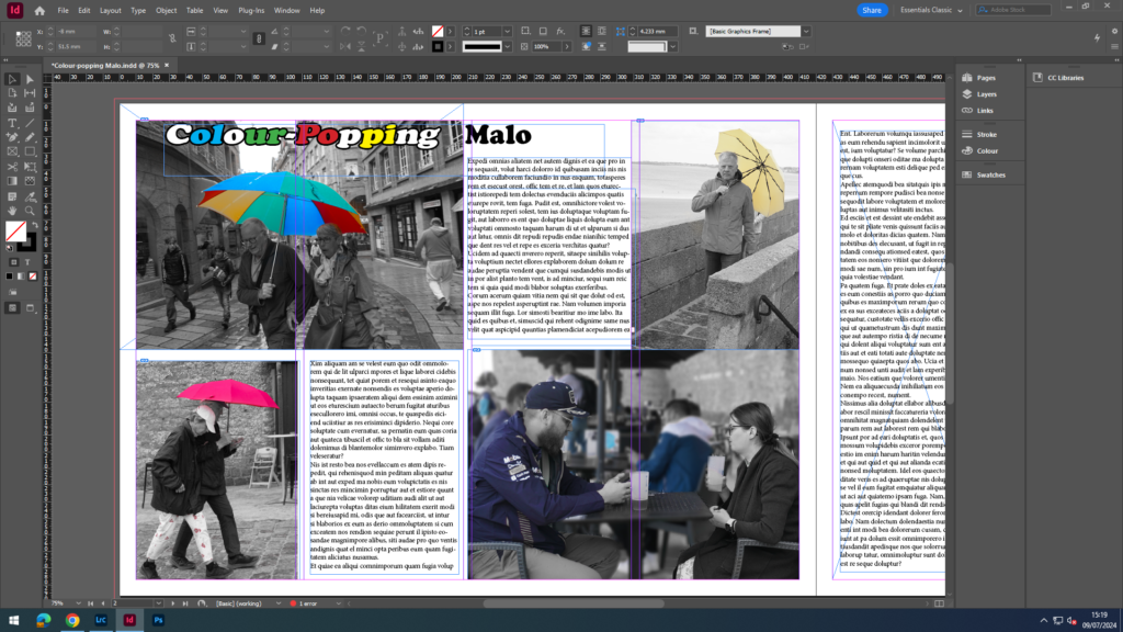
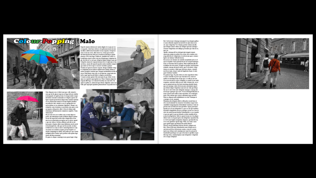
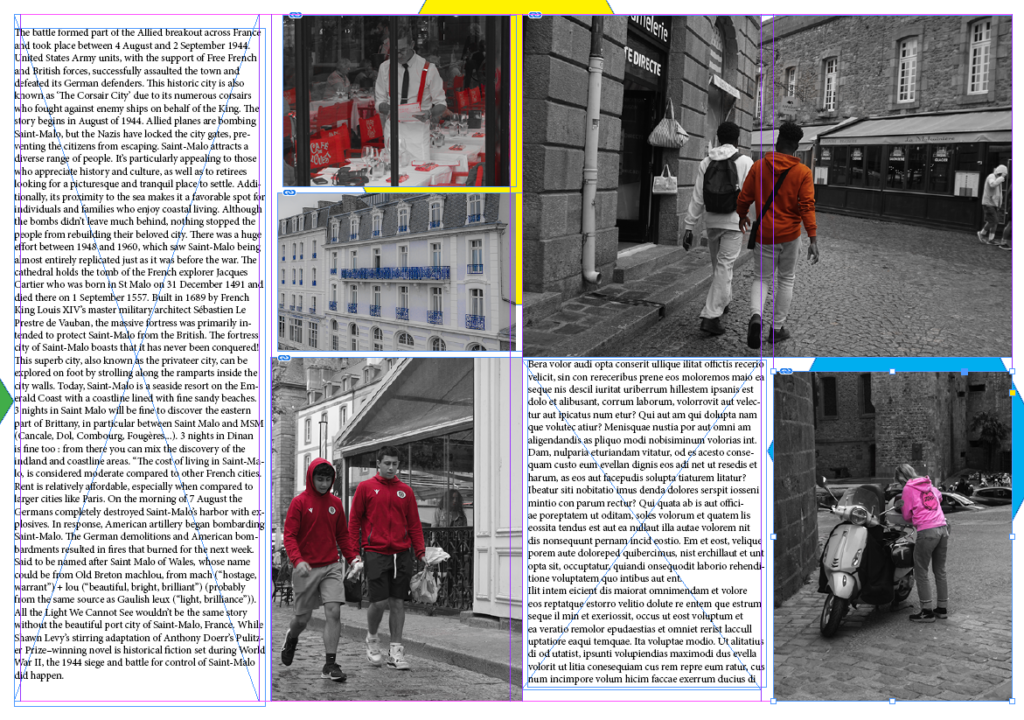
After this photo spread, I changed the layout around because I felt like the photos were too crowded on the bottom left area, so I moved one of the photos top right which also cut some of that big paragraph in half which was even better. Then added some more separate text in that middle left space. Also, I moved the title from the top right which stood out a bit and looked unnatural, to on top of the coloured umbrella photo which is my establishing shot. But, I kept the word ‘Malo’ outside of the photo with it maintaining the all black look to create difference and stand out more.

I changed the AI generated waffle text into actual English talking about different things to do, see, and go to in St Malo.