St Malo
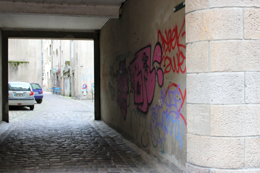
St Malo is mainly a tourist destination, so it was ‘normal’ for the locals to see us taking pictures with our cameras. We also saw many other tourists who were not with us taking photos with either their phones or cameras. There were many different shops and food stalls in St Malo, which attracted many tourists. There was also the Ferris-wheel.
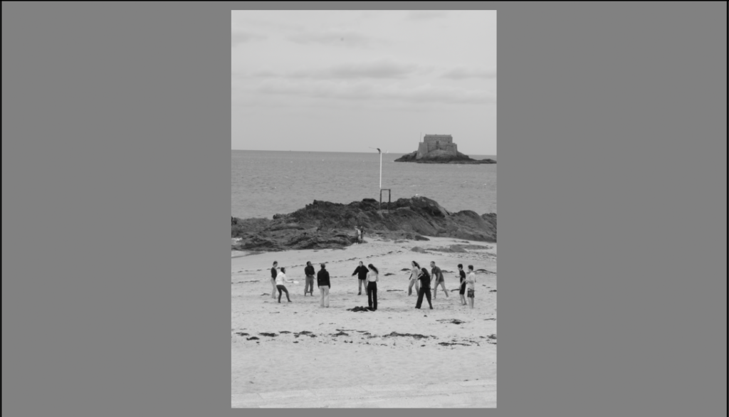
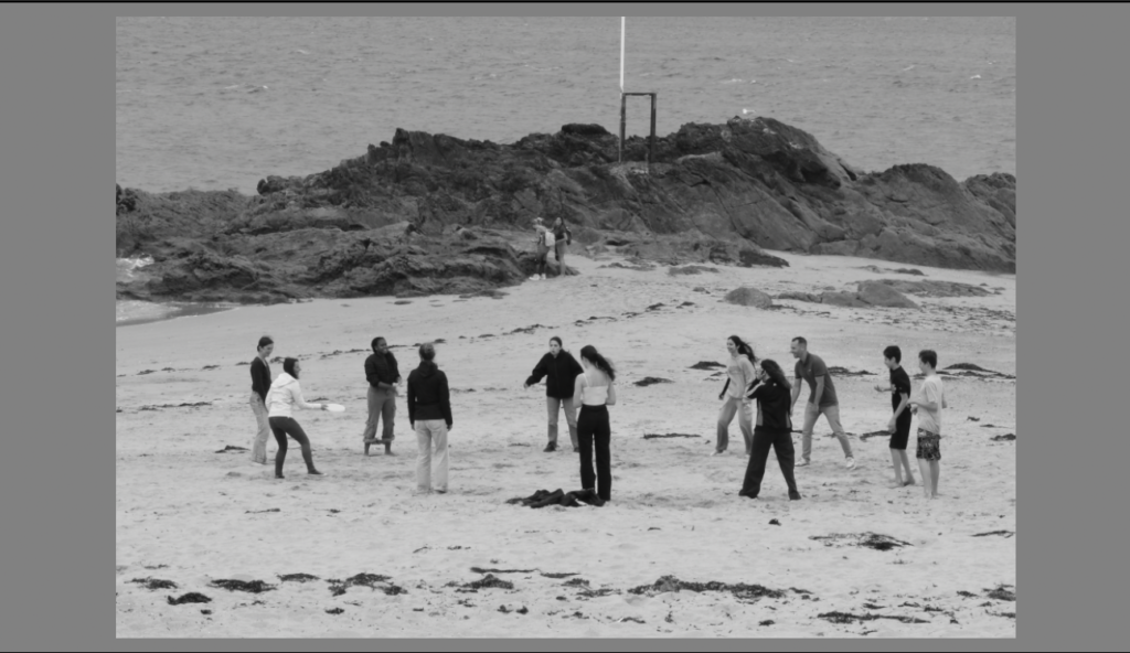
Contact Sheet
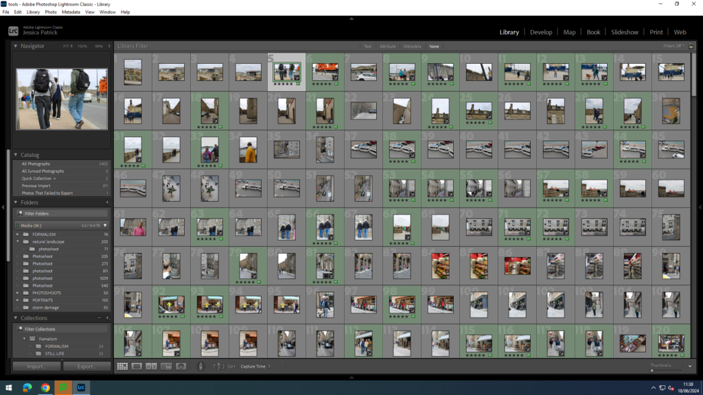
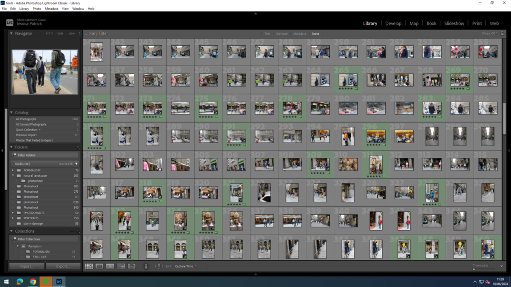
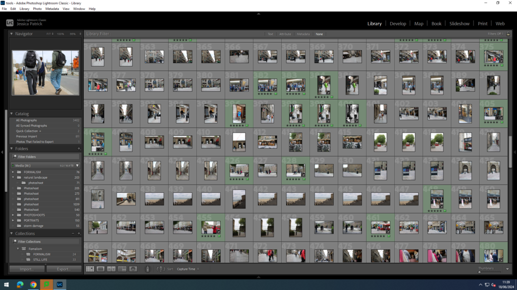
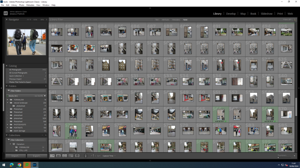
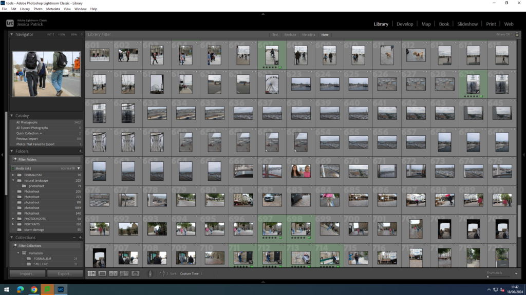
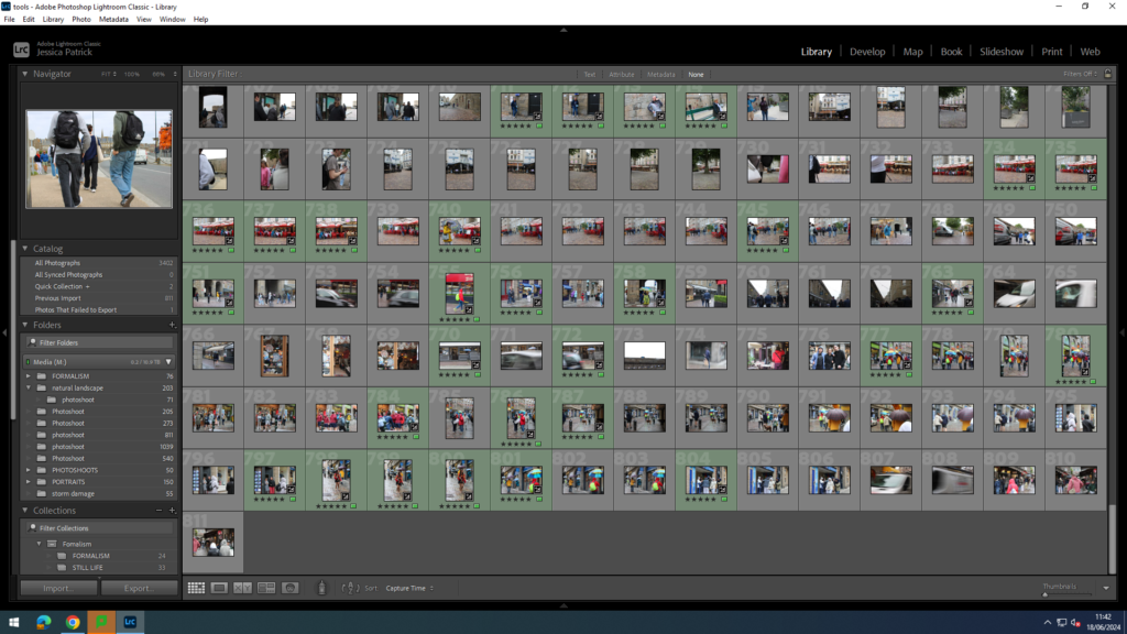
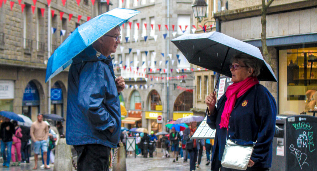
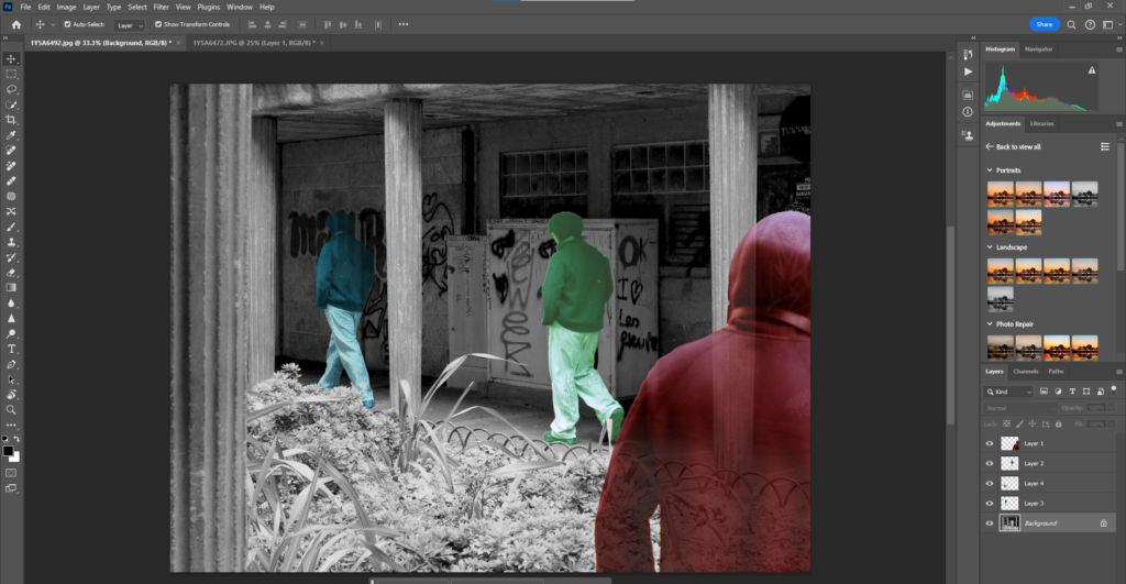
The images that are highlighted green are my best images and the images I have decided to edit, because they show people’s every day lives the best, while have the best composition. They are also the different types of images I have experimented with.
Edits
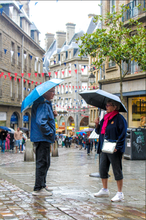
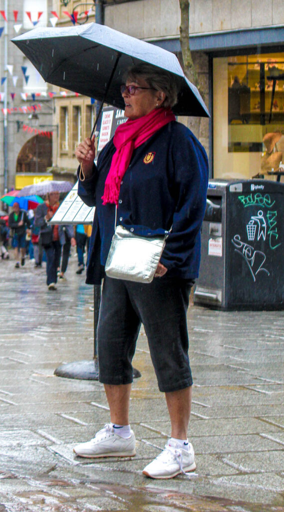
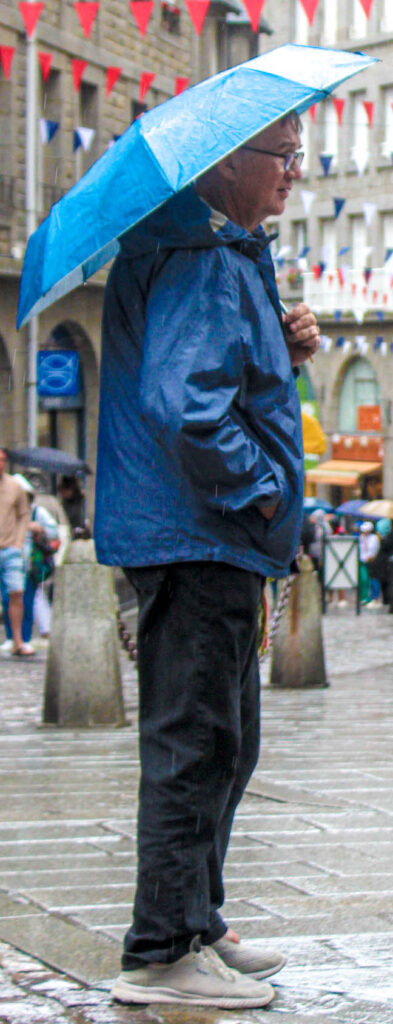
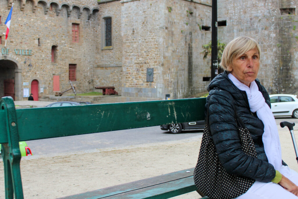
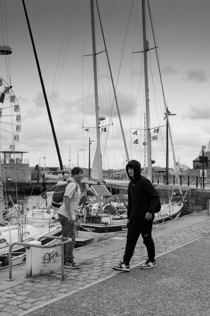
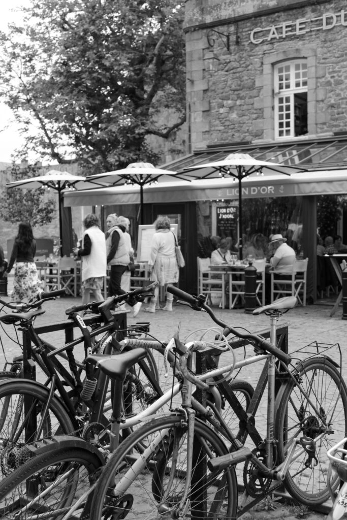
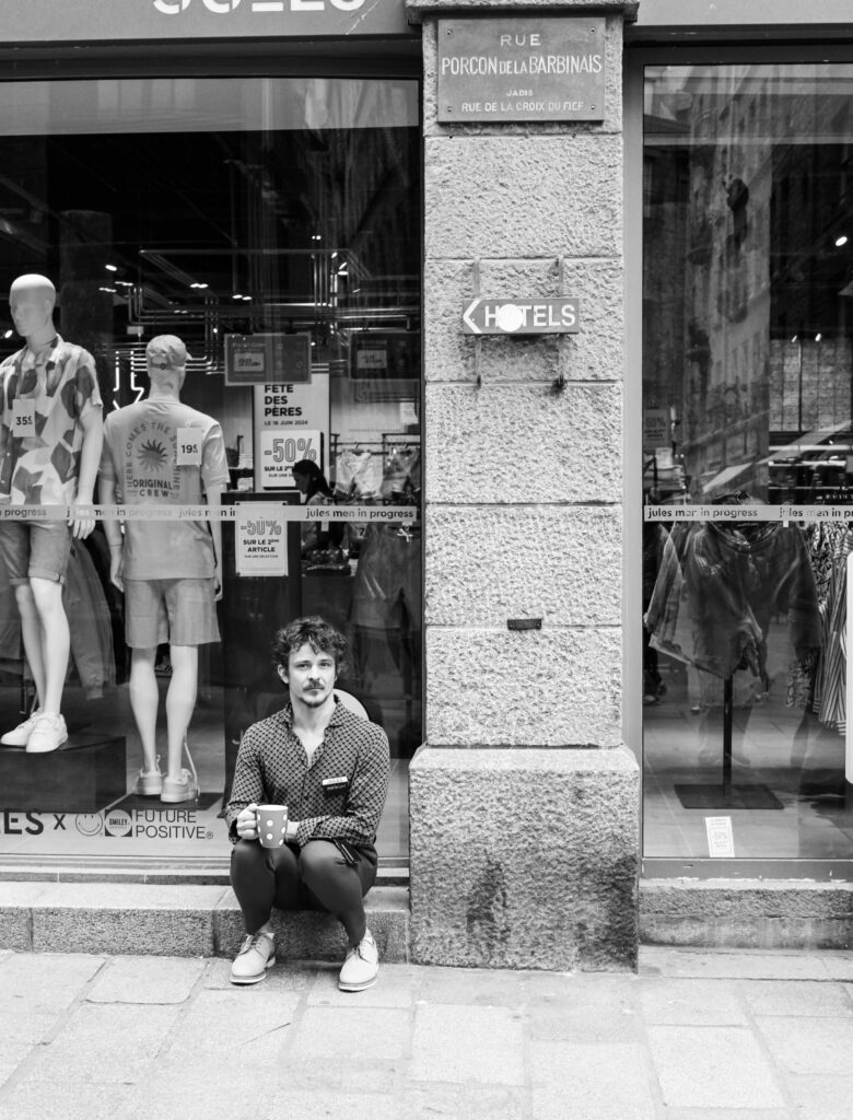
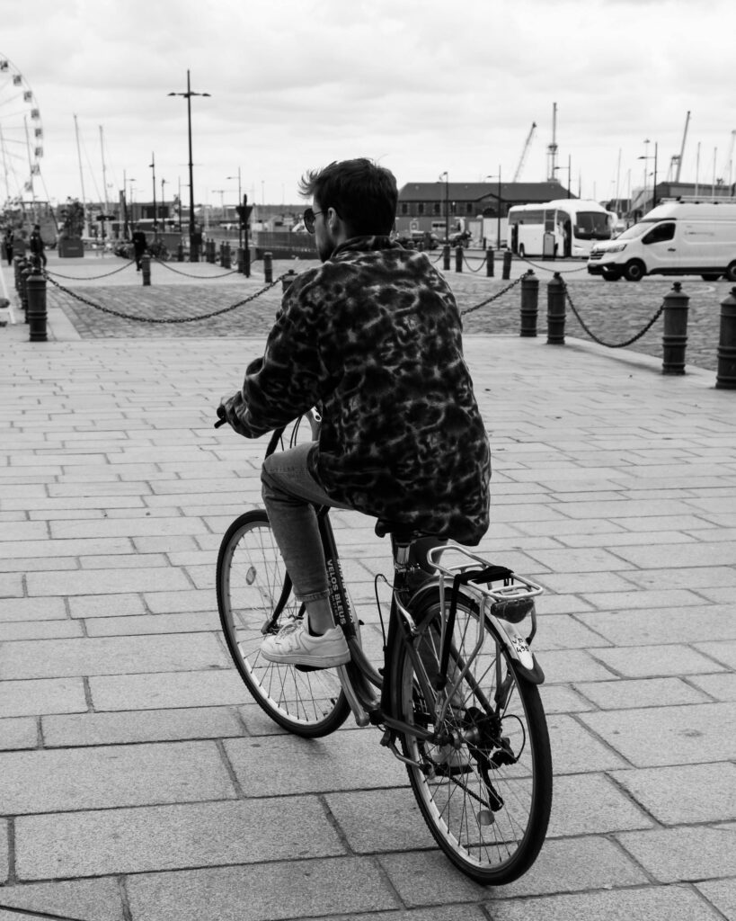
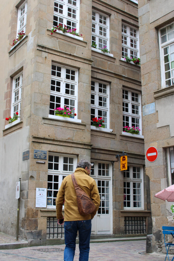
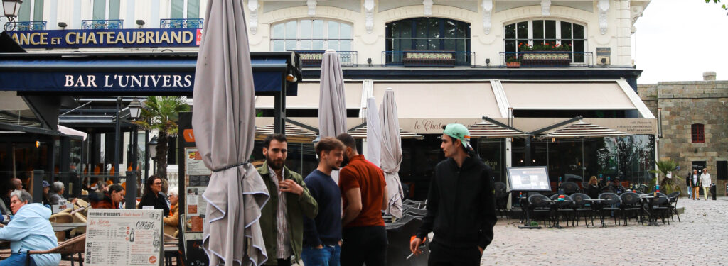
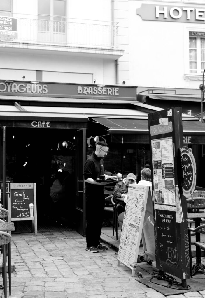
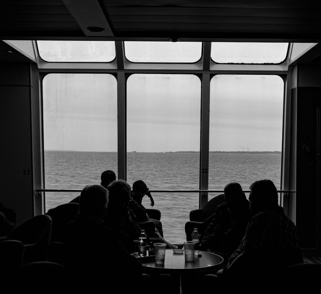
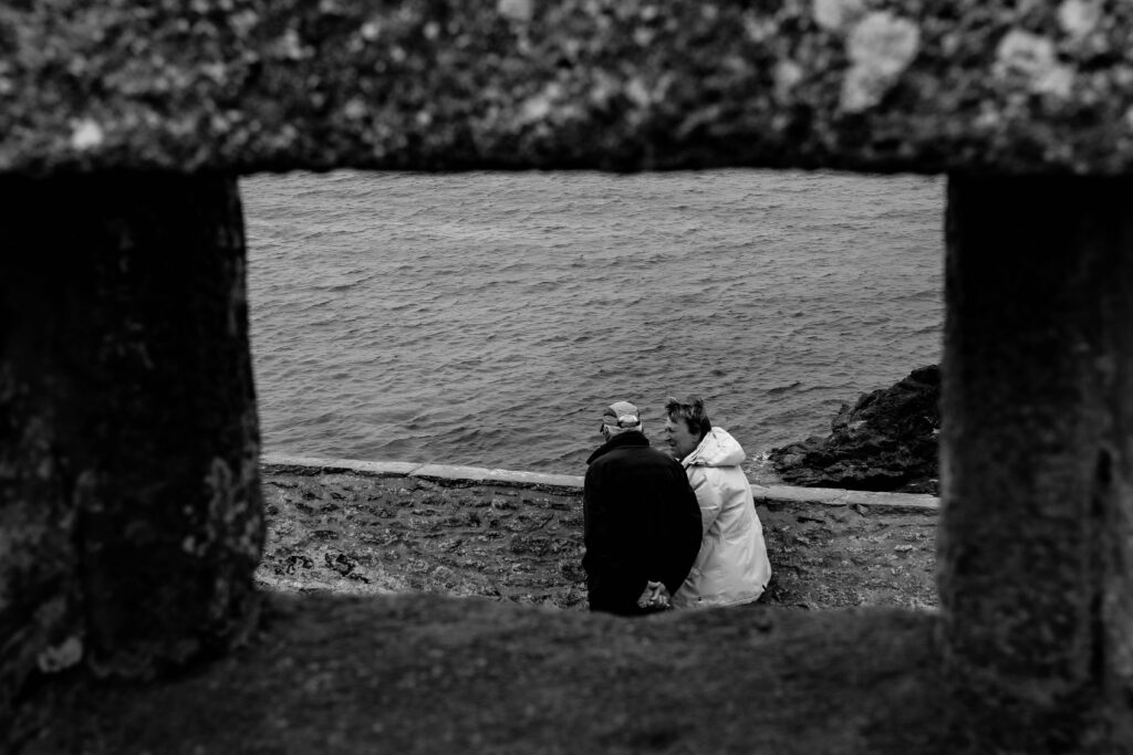
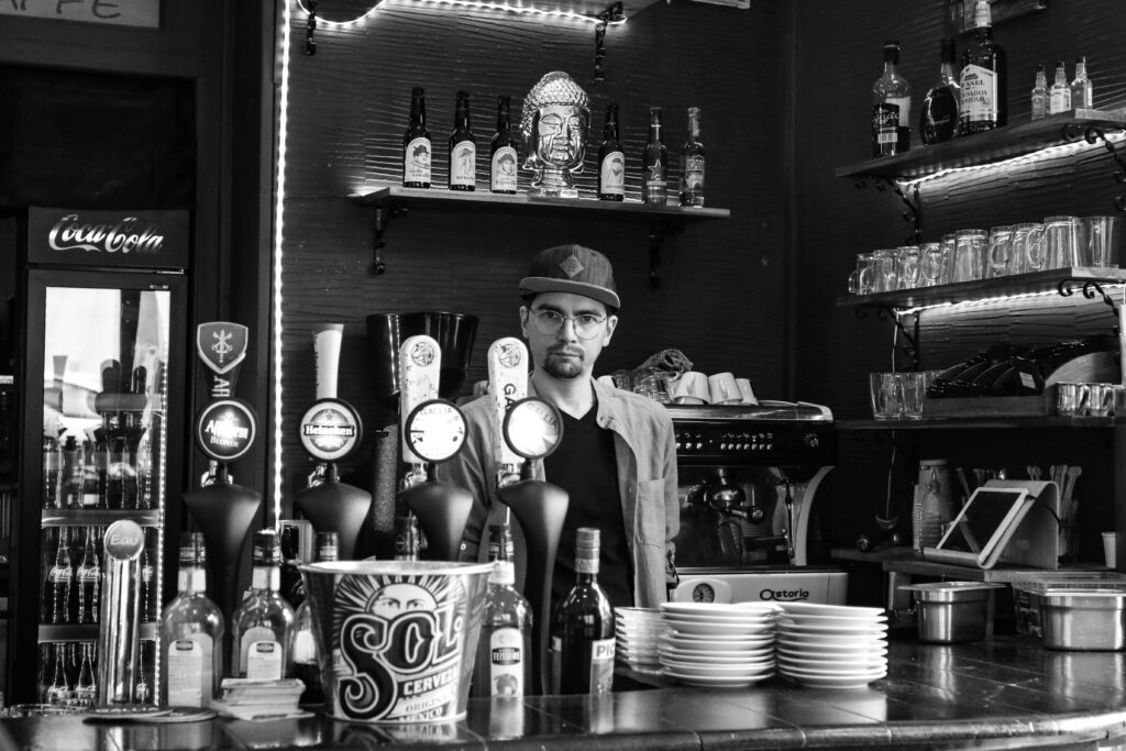
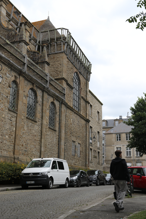
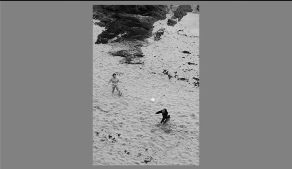
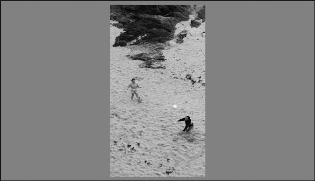
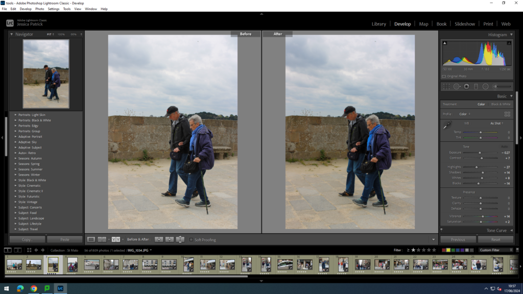
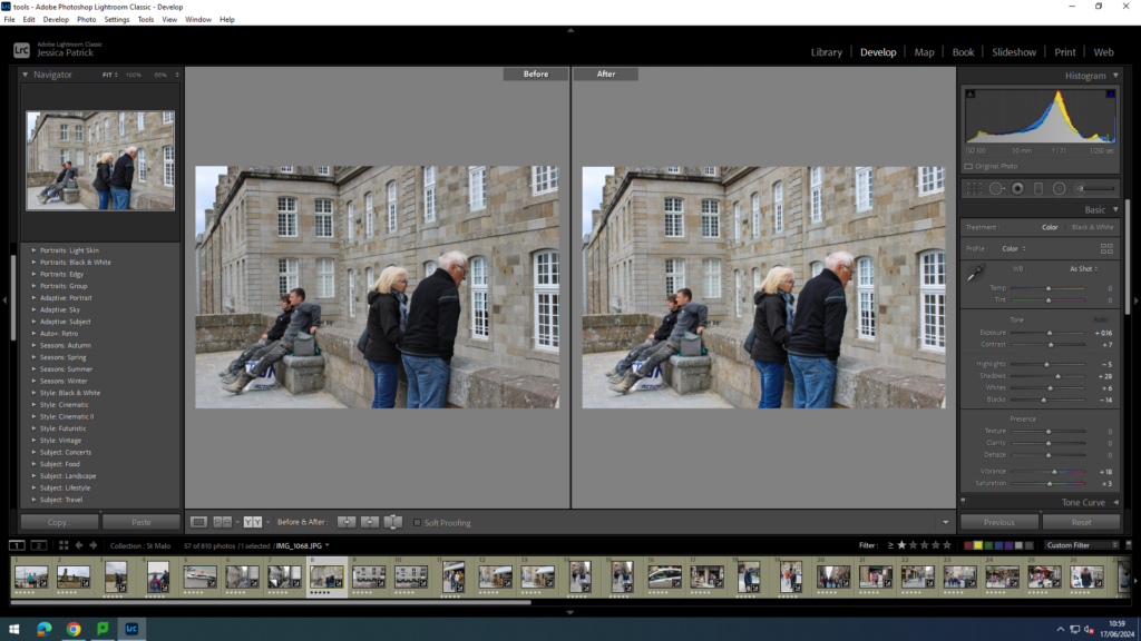
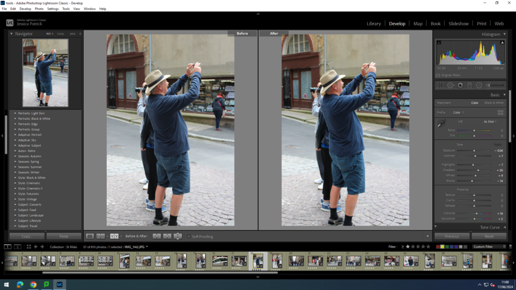
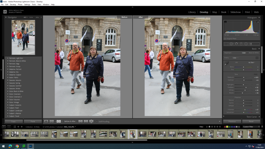
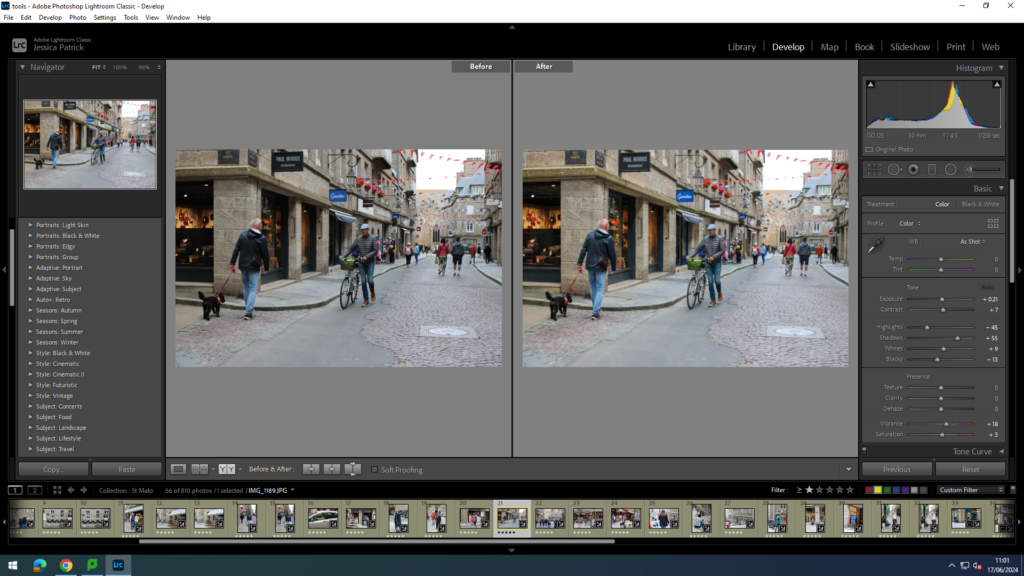
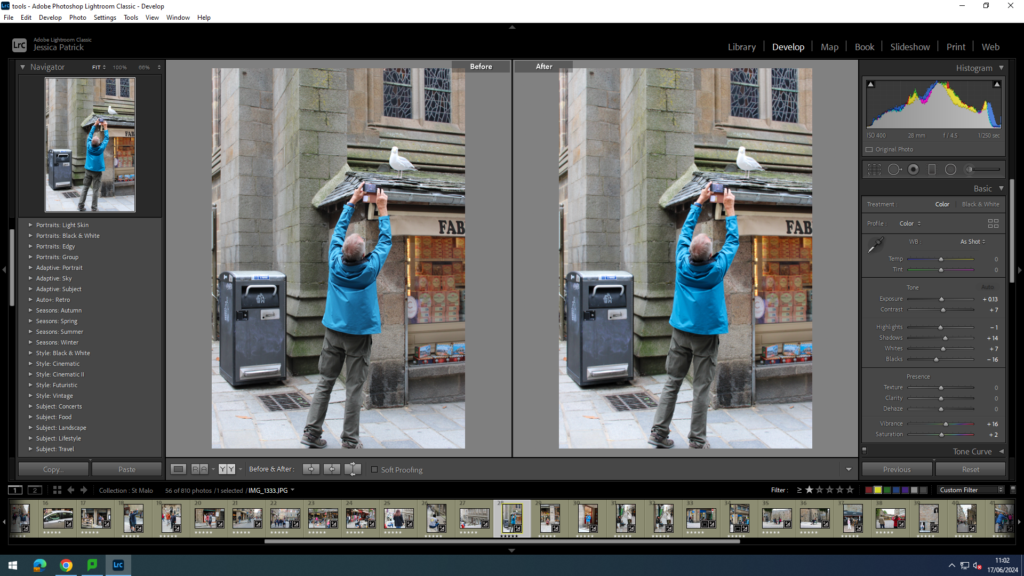
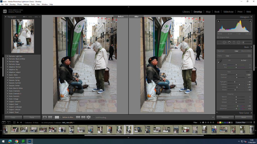
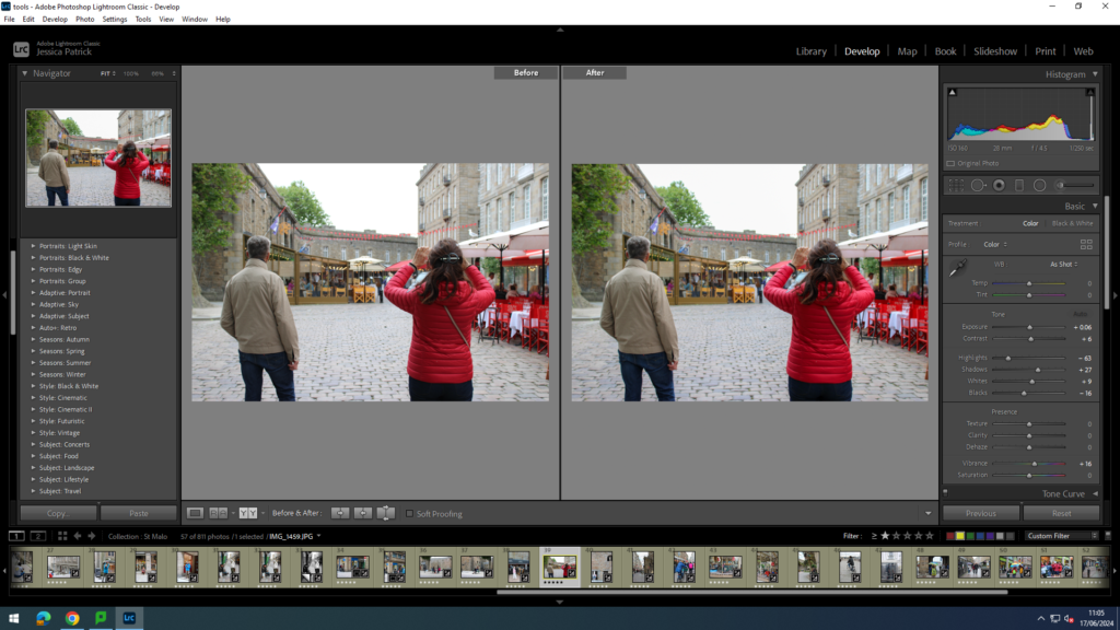
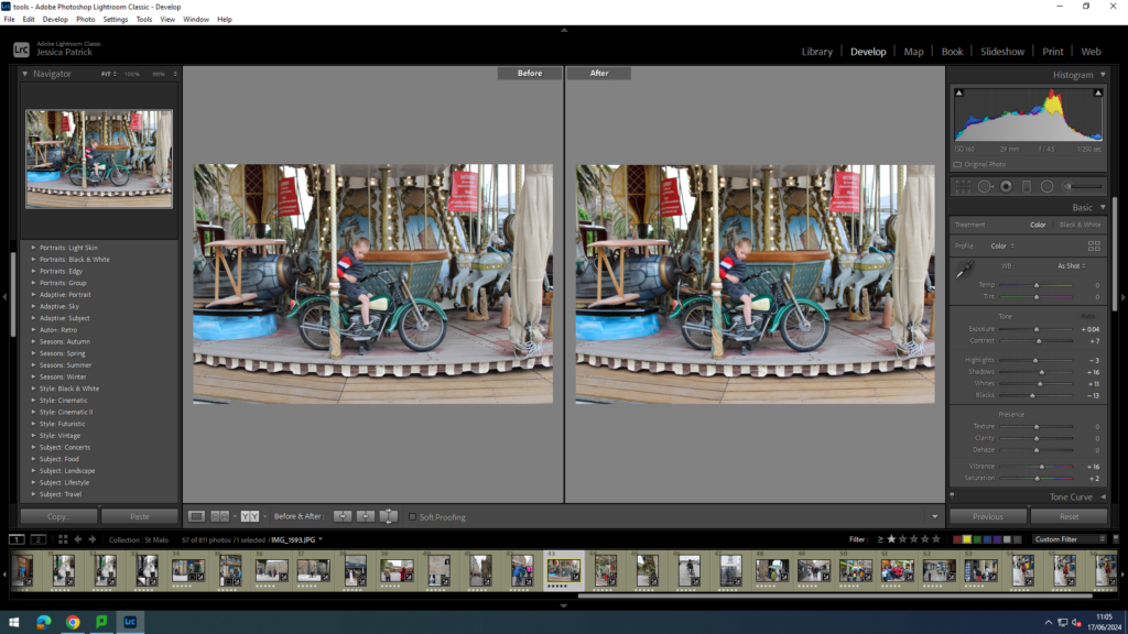
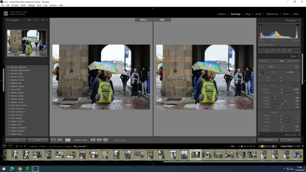
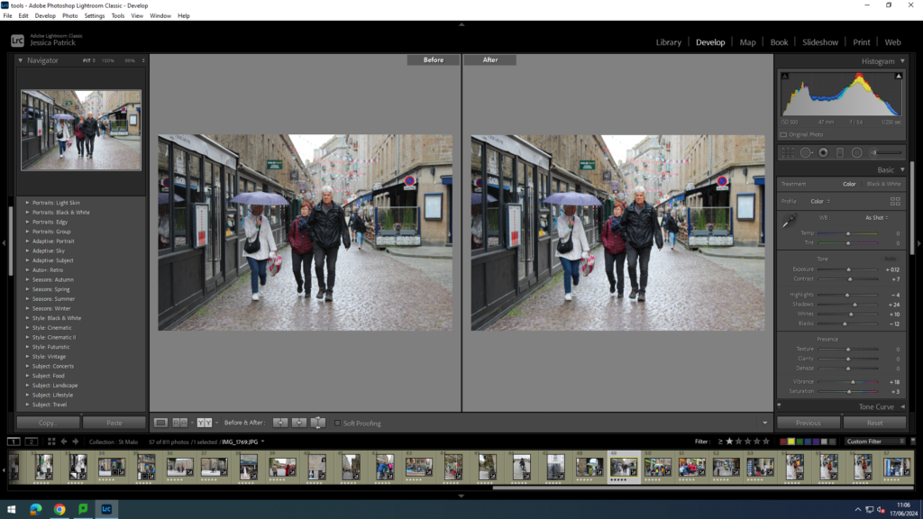
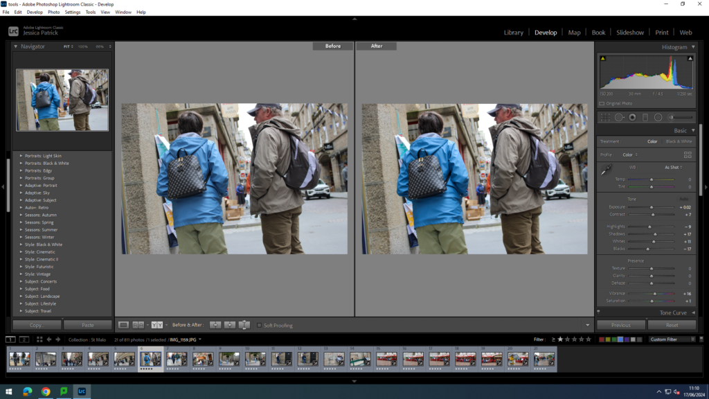
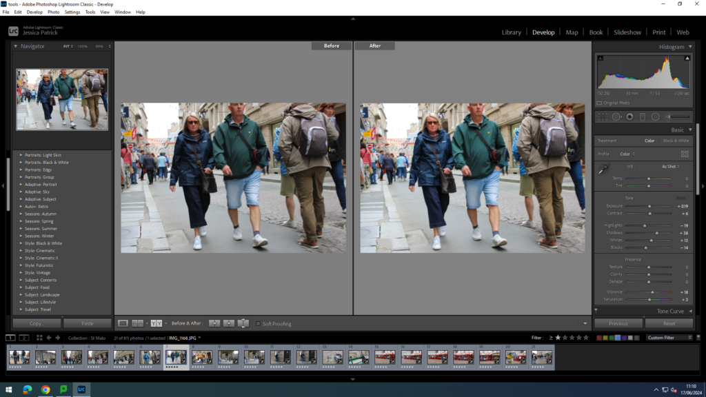
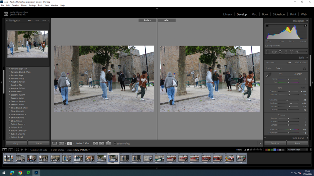
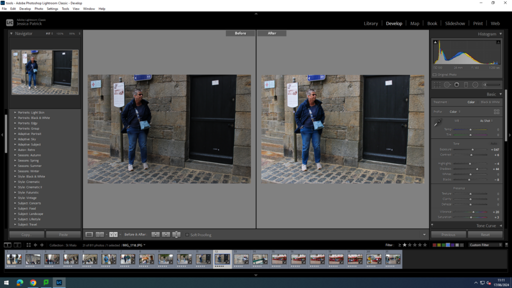
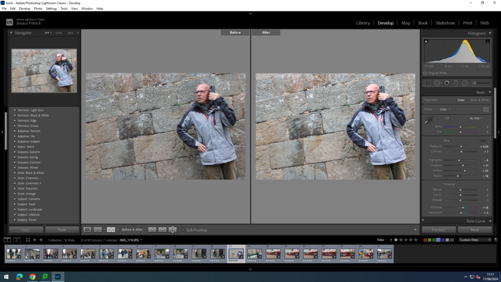
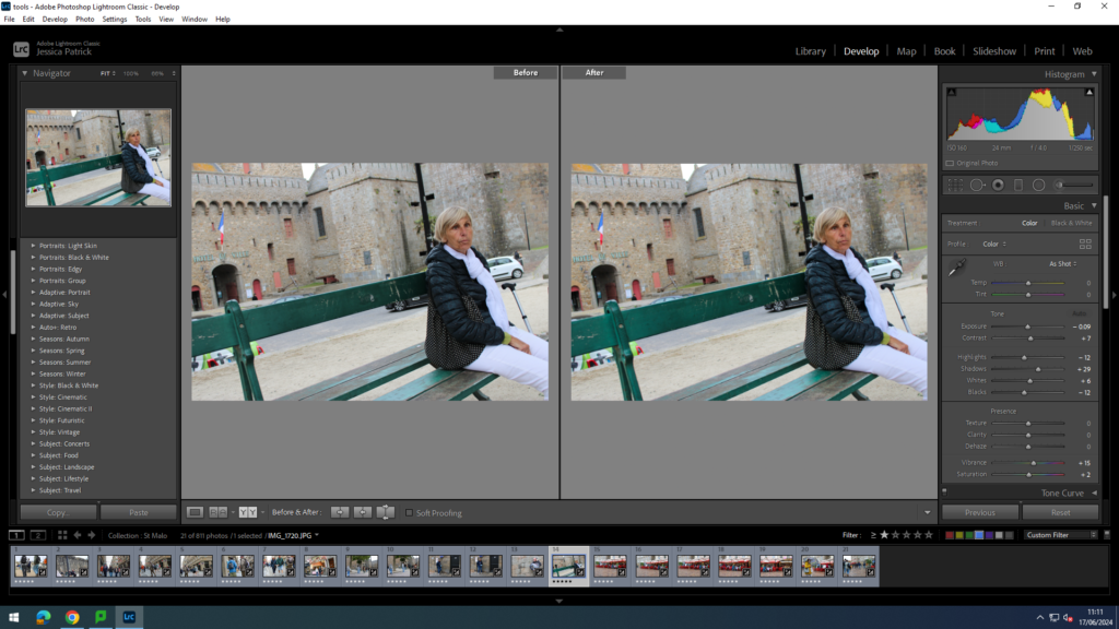
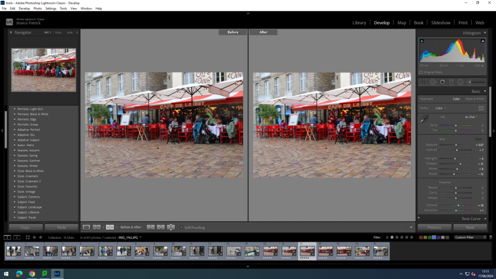
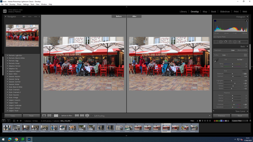
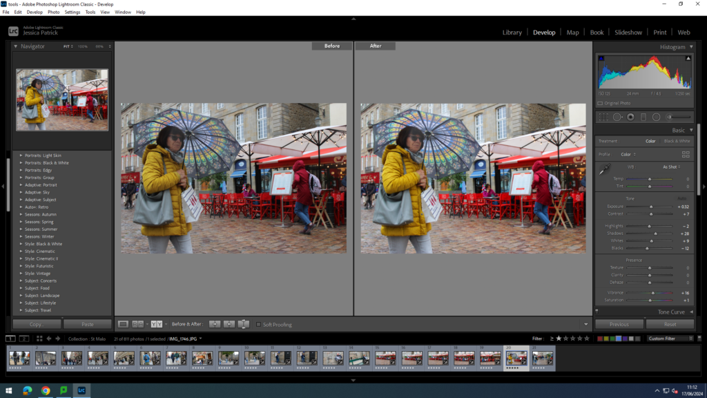
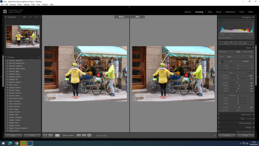
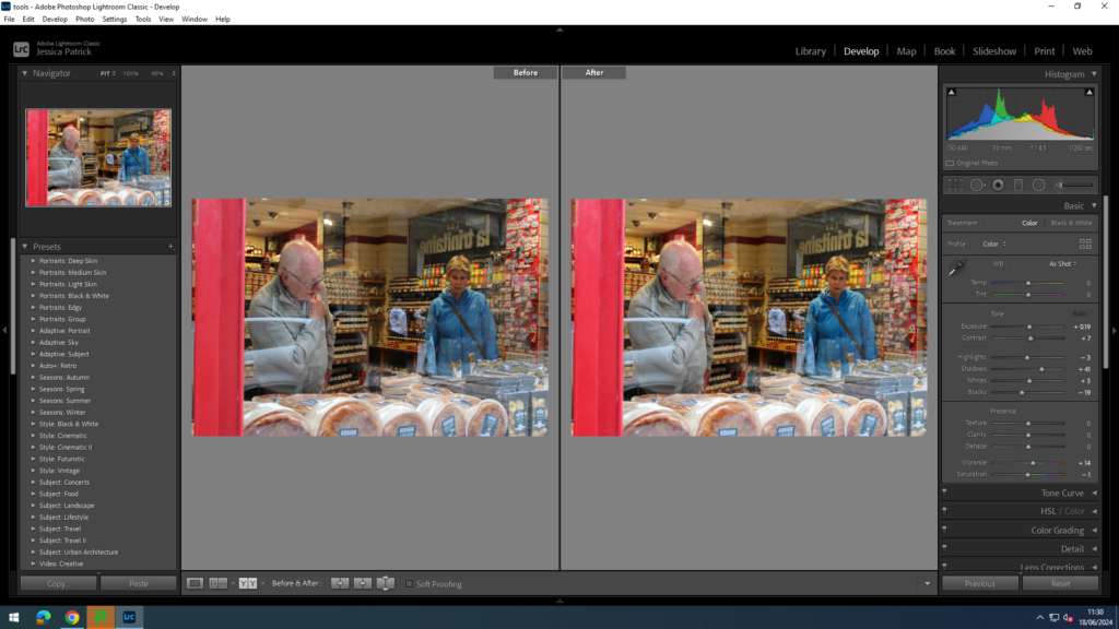
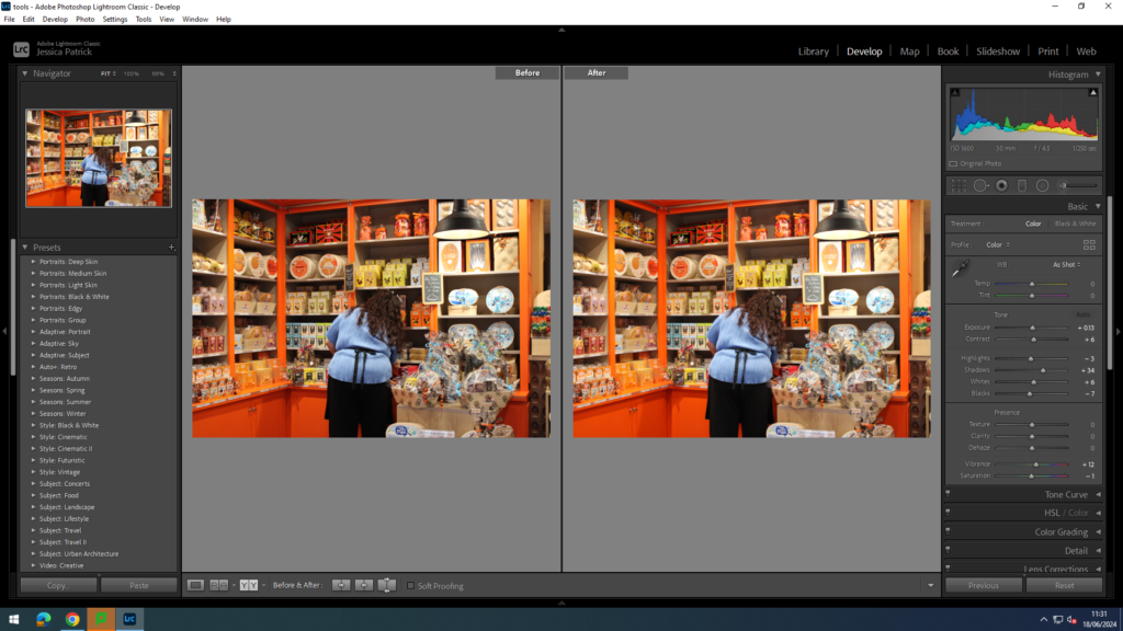
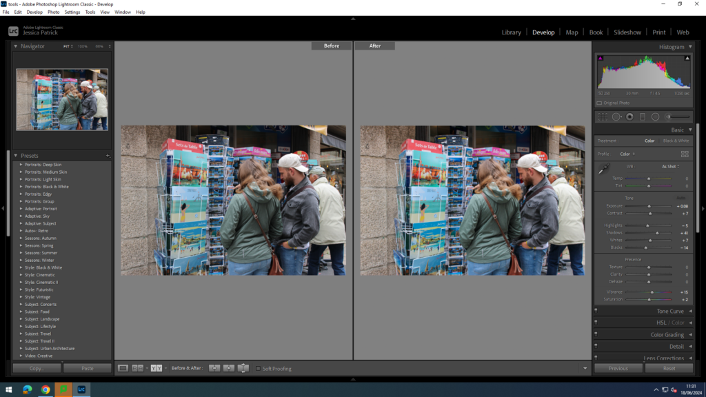
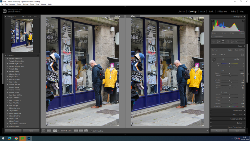
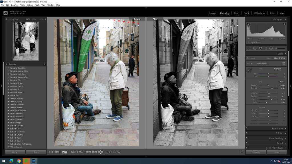
These images are images I have taken with the camera at eye level, so people knew I was taking photos in these.
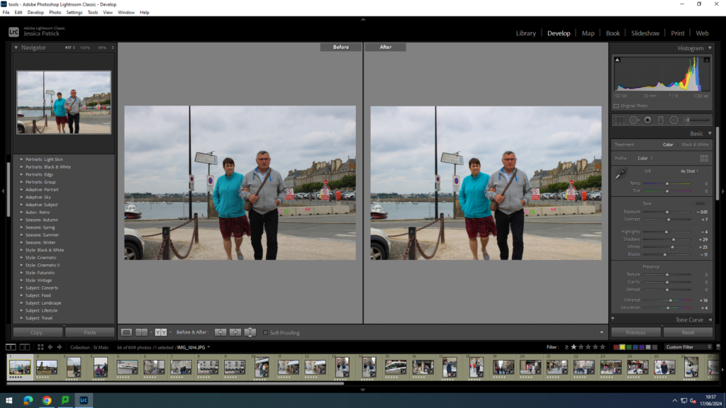
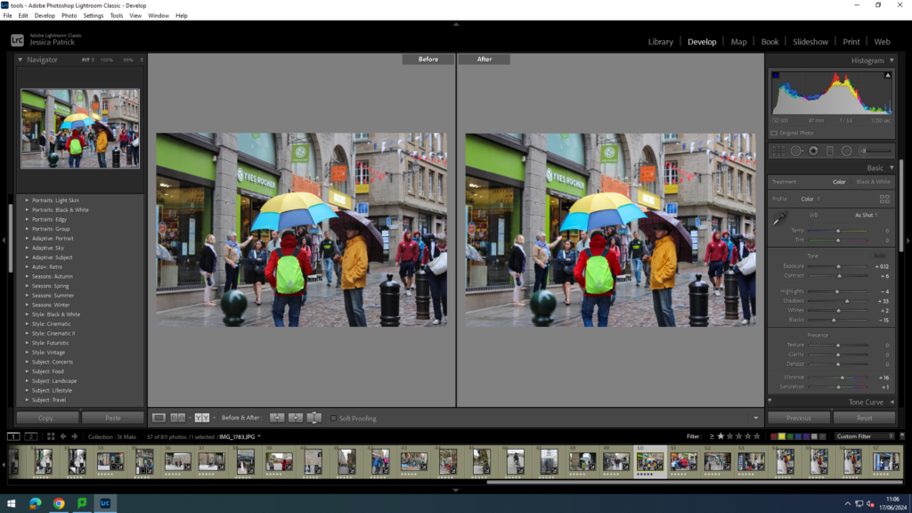
I edited this image by increasing the contrast, shadows, whites, vibrancy and saturation, while decreasing the exposure, highlights and blacks. I did this, so that the image would have better lighting and be more vibrant.
I edited this image by increasing the contrast, shadows, whites, vibrancy and saturation, while decreasing the exposure, highlights and blacks. I did this, so that the image would have better lighting and be more vibrant.
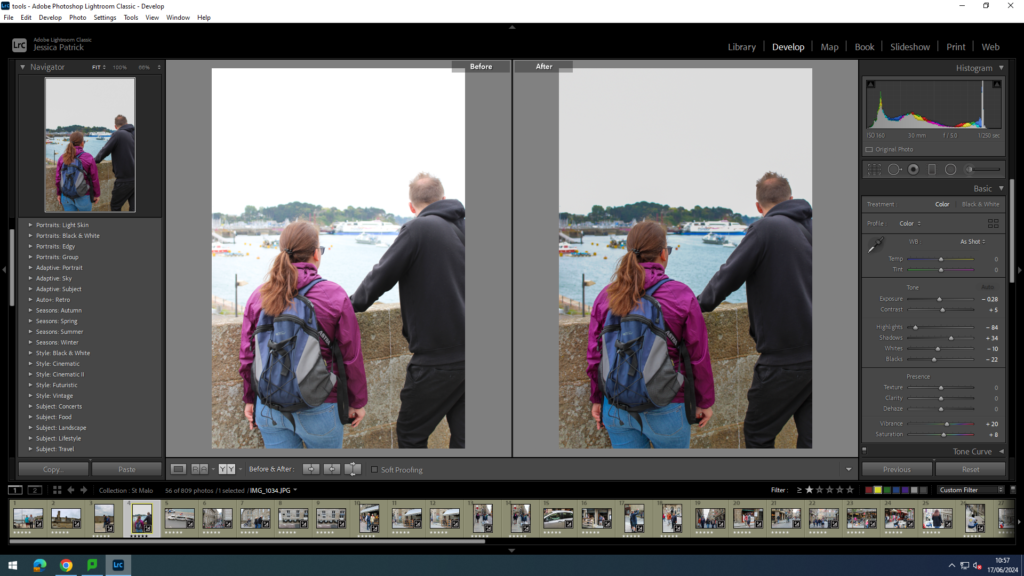
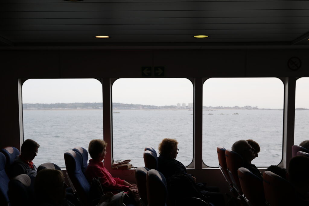
I edited this image by increasing the contrast, shadows, vibrancy and saturation, while decreasing the exposure, highlights, whites and blacks. I did this, so that the image would have better lighting and so the background of the sea and boats would be more visible and eye capturing.
I edited this image by increasing the contrast, shadows, whites, vibrancy and saturation, while decreasing the exposure, highlights and blacks. I did this, so that the image would have better lighting and be more vibrant.
I edited this image by increasing the contrast, shadows, whites, vibrancy and saturation, while decreasing the exposure, highlights and blacks. I did this, so that the image would have better lighting and be more vibrant.
I edited this image by increasing the contrast, shadows, whites, vibrancy and saturation, while decreasing the exposure, highlights and blacks. I did this, so that the image would have better lighting and be more vibrant.
I edited this image by increasing the contrast, shadows, whites, vibrancy and saturation, while decreasing the exposure, highlights and blacks. I did this, so that the image would have better lighting and be more vibrant.
I edited this image by increasing the contrast, shadows, whites, vibrancy and saturation, while decreasing the exposure, highlights and blacks. I did this, so that the image would have better lighting and be more eye capturing.
I edited this image by increasing the contrast, shadows, whites, vibrancy and saturation, while decreasing the exposure, highlights and blacks. I did this, so that the image would have better lighting and be more vibrant.
I edited these images by increasing the exposure, contrast, shadows, whites, vibrancy and saturation, while decreasing the highlights and blacks. I did this, so that the images would be more vibrant and eye capturing.
I edited this image by increasing the contrast, shadows, whites, vibrancy and saturation, while decreasing the exposure, highlights and blacks. I did this, so that the image would have be brighter.
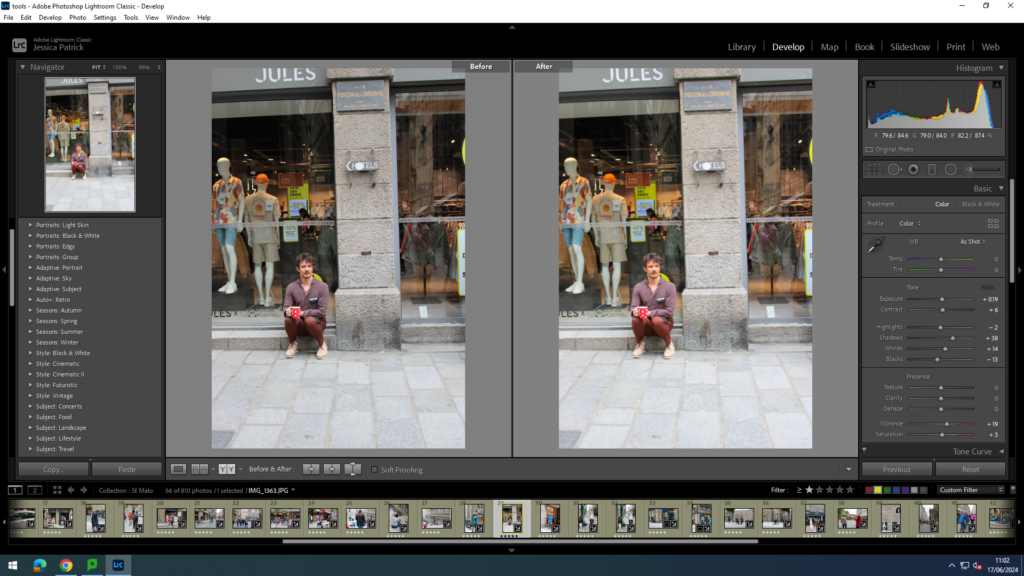
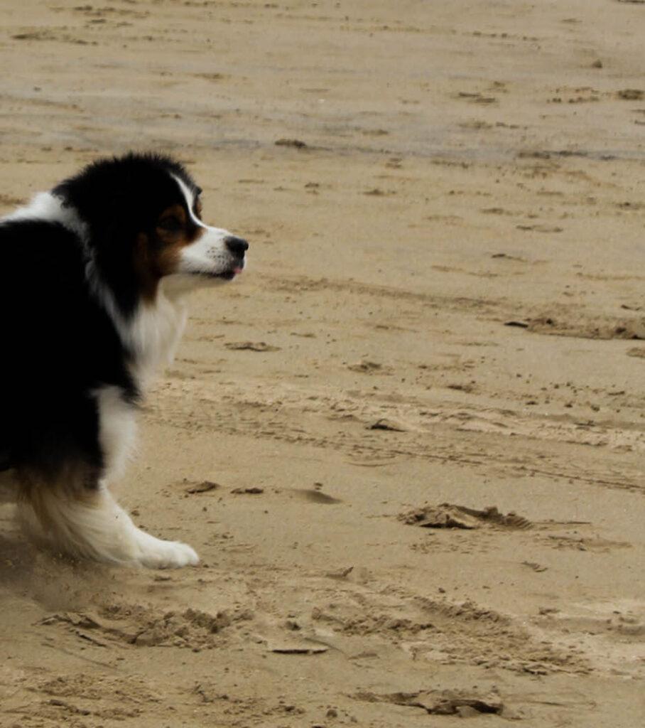
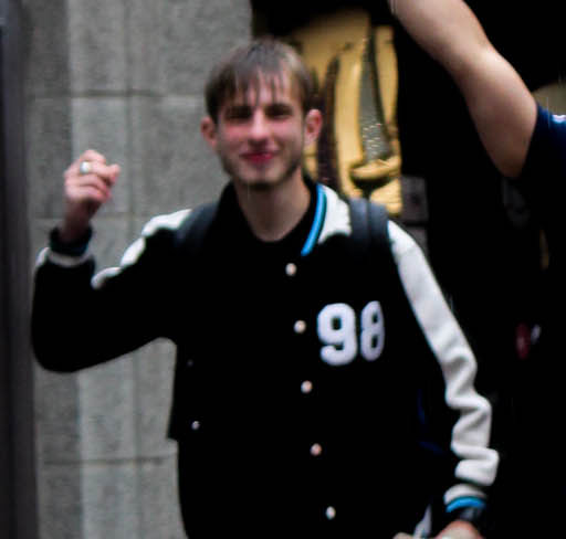
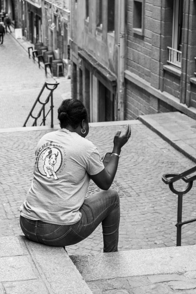
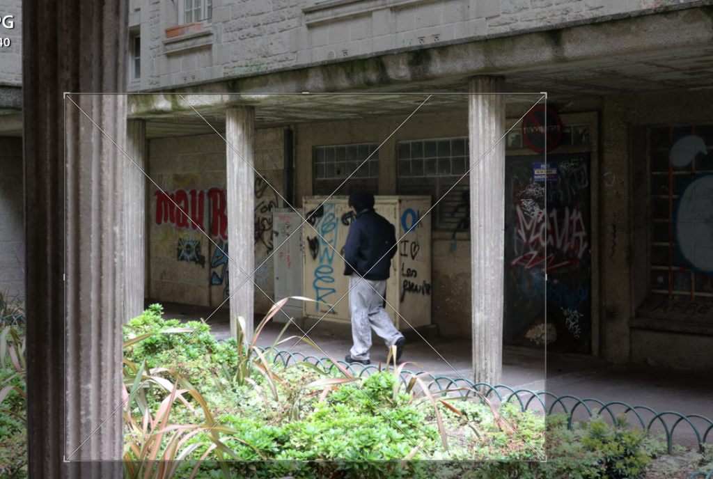
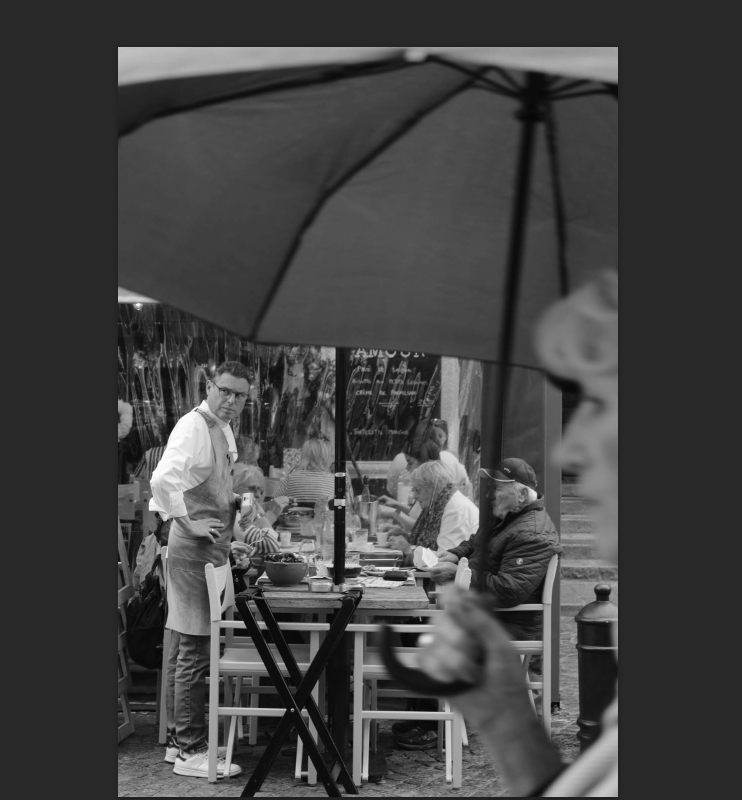
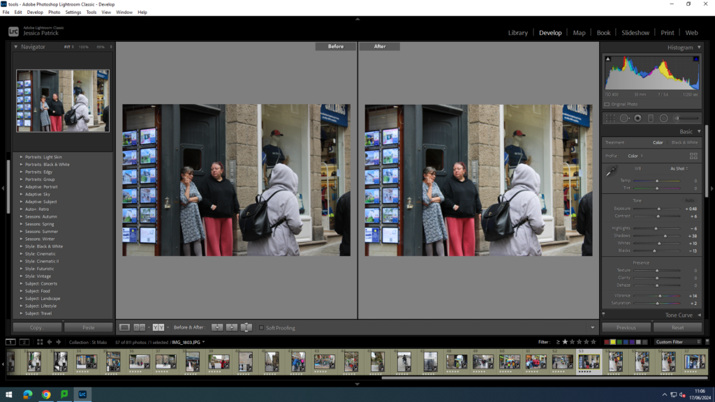
I edited this image by increasing the contrast, shadows, whites, vibrancy and saturation, while decreasing the exposure, highlights and blacks. I did this, so that the person in this image would stand out more.
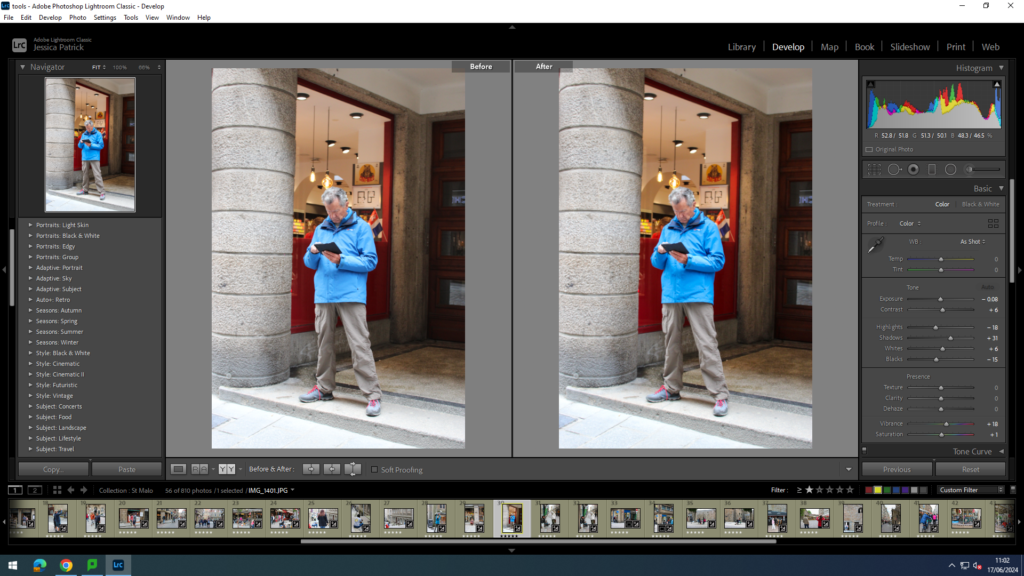
I edited this image by increasing the contrast, shadows, whites, vibrancy and saturation, while decreasing the exposure, highlights and blacks. I did this, so that the image would have better lighting.
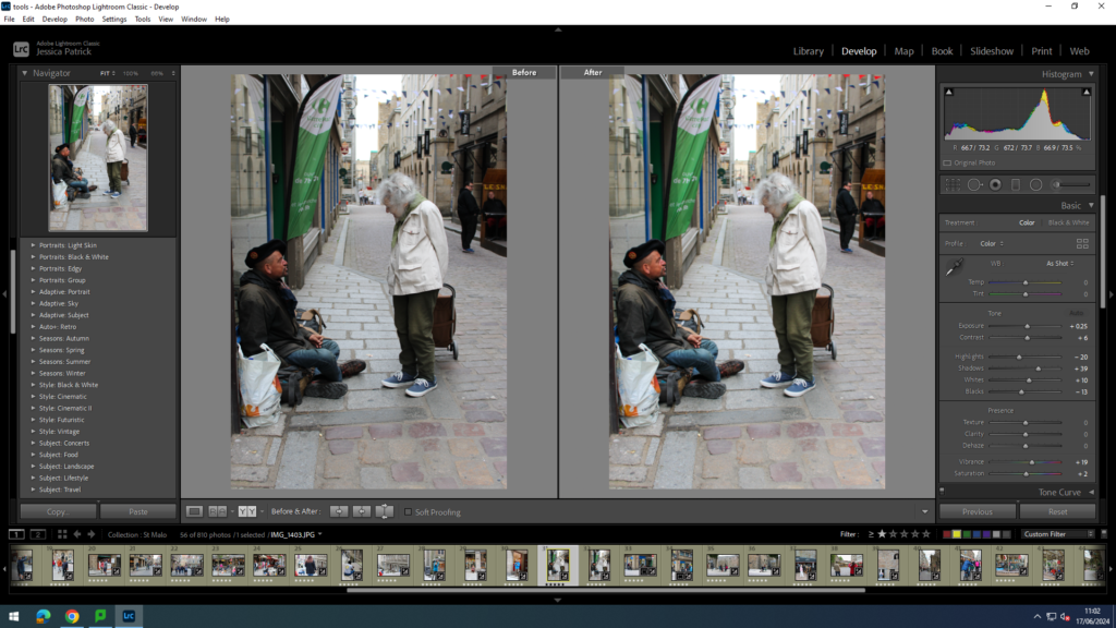
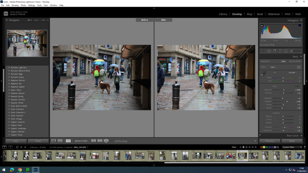
I edited these images by increasing the contrast, shadows, whites, vibrancy and saturation, while decreasing the exposure, highlights and blacks. I did this, so that the image would have better lighting and be more eye capturing. Also so the people would stand out more.
I edited this image by increasing the contrast, shadows, whites, vibrancy and saturation, while decreasing the exposure, highlights and blacks. I did this, so that the image would have better lighting and be more vibrant.
I edited this image by increasing the contrast, shadows, whites, vibrancy and saturation, while decreasing the exposure, highlights and blacks. I did this, so that the image would have better lighting and be more vibrant.
I edited this image by increasing the contrast, shadows, whites, vibrancy and saturation, while decreasing the exposure, highlights and blacks. I did this, so that the image would be brighter.
I edited this image by increasing the contrast, shadows, whites, vibrancy and saturation, while decreasing the exposure, highlights and blacks. I did this, so that the image would be brighter.
I edited this image by increasing the contrast, shadows, whites, vibrancy and saturation, while decreasing the exposure, highlights and blacks. I did this, so that the image would have be more vibrant and all the colours on the caracal would pop more.
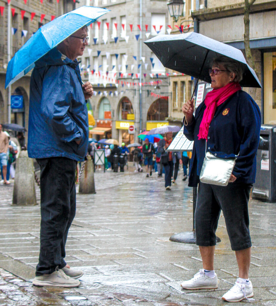
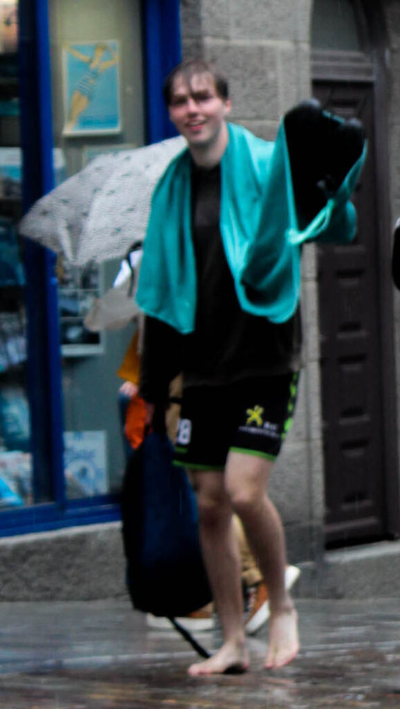
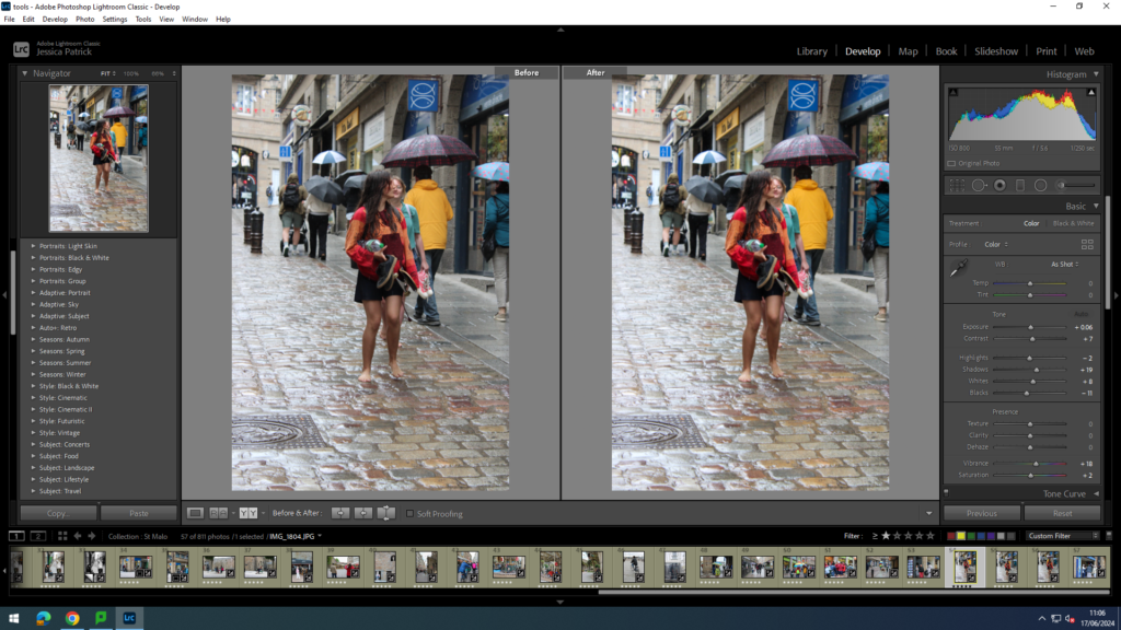
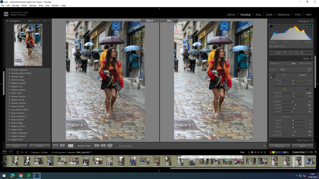
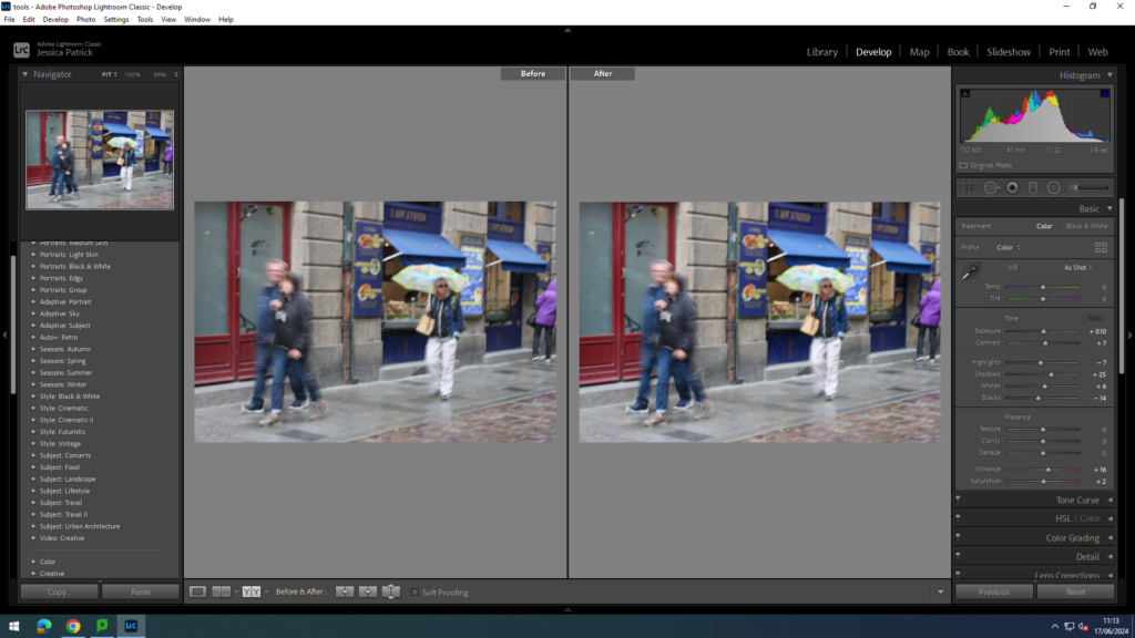
I edited this image by increasing the contrast, shadows, whites, vibrancy and saturation, while decreasing the exposure, highlights and blacks. I did this, so that the lady’s bag and umbrella would pop more and be the main focus.
I edited this image by increasing the contrast, shadows, whites, vibrancy and saturation, while decreasing the exposure, highlights and blacks. I did this, so that the image would have better lighting.
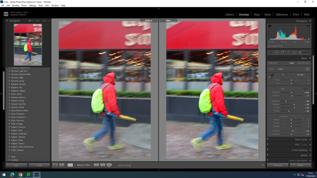
I edited this image by increasing the contrast, shadows, whites, vibrancy and saturation, while decreasing the exposure, highlights and blacks. I did this, so that the coloured umbrella and backpack would pop more and be more eye capturing.
I edited this image by increasing the contrast, shadows, whites, vibrancy and saturation, while decreasing the exposure, highlights and blacks. I did this, so that the image would have better lighting.
I edited this image by increasing the contrast, shadows, whites, vibrancy and saturation, while decreasing the exposure, highlights and blacks. I did this, so that the image would have better lighting.
I edited this image by increasing the contrast, shadows, whites, vibrancy and saturation, while decreasing the exposure, highlights and blacks. I did this, so that the image would have better lighting and be more vibrant.
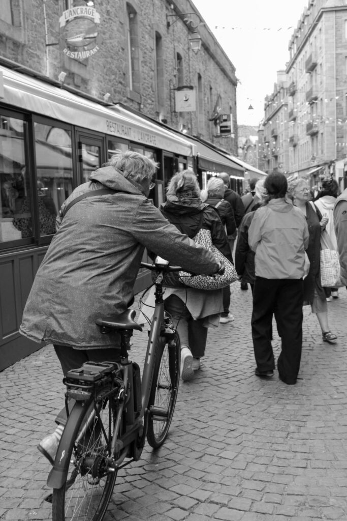
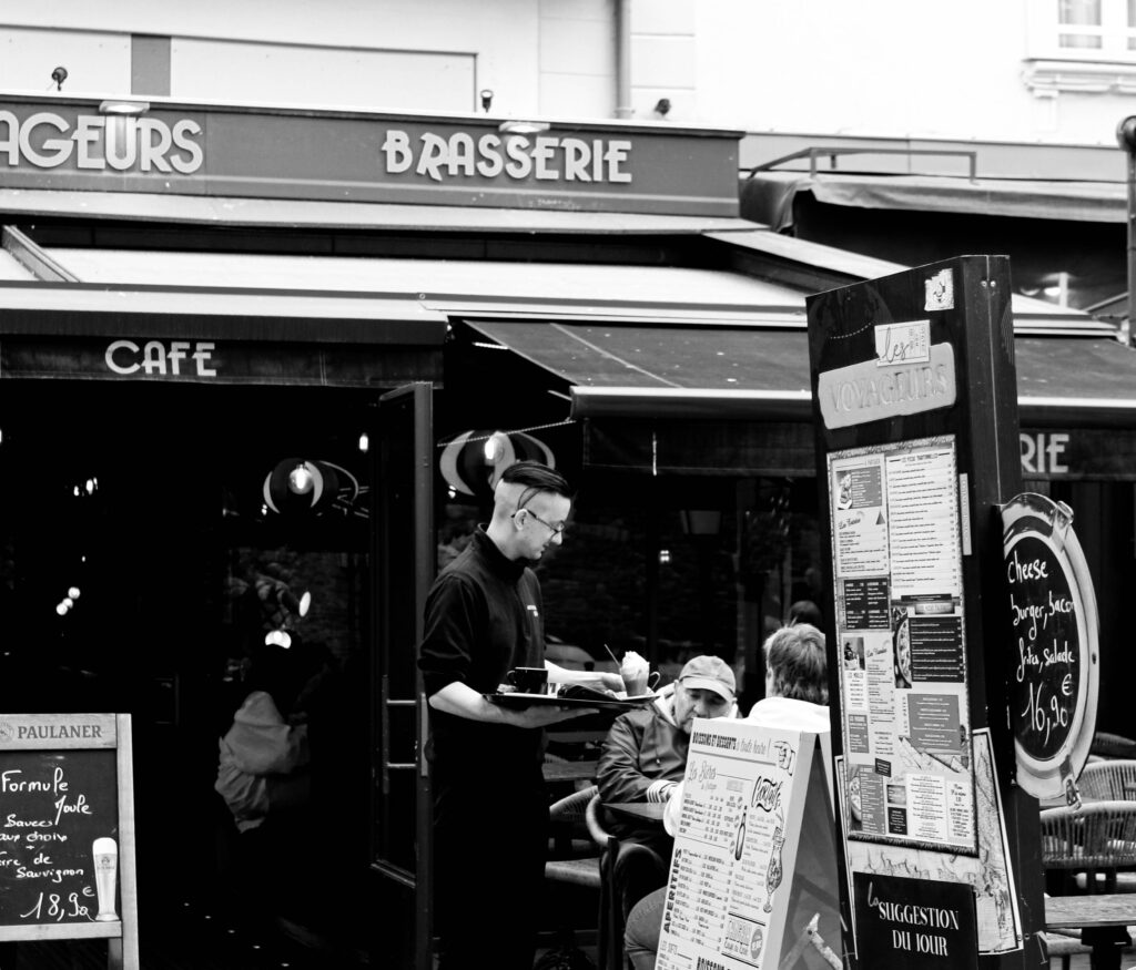
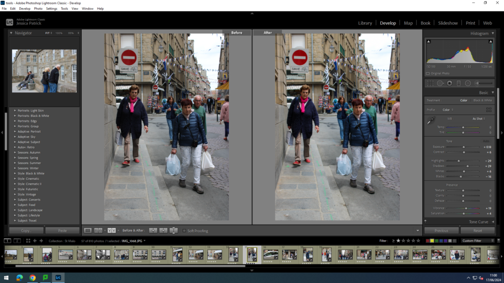
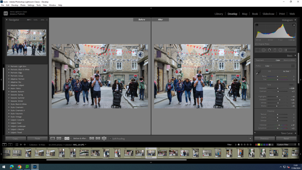
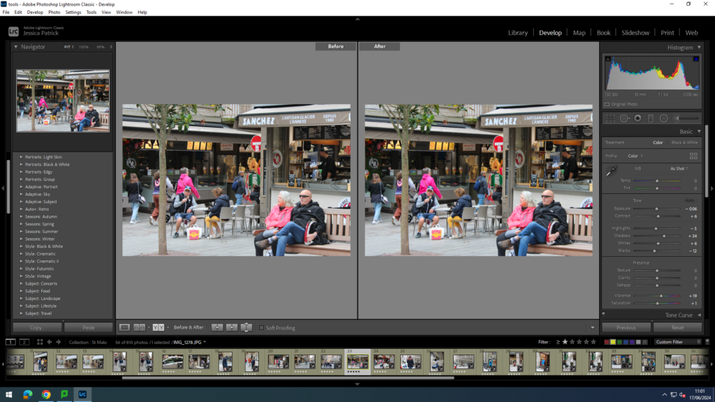
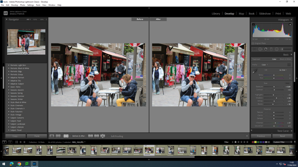
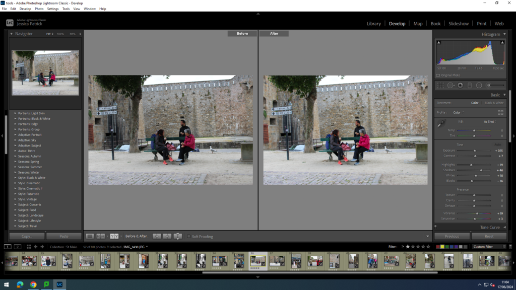
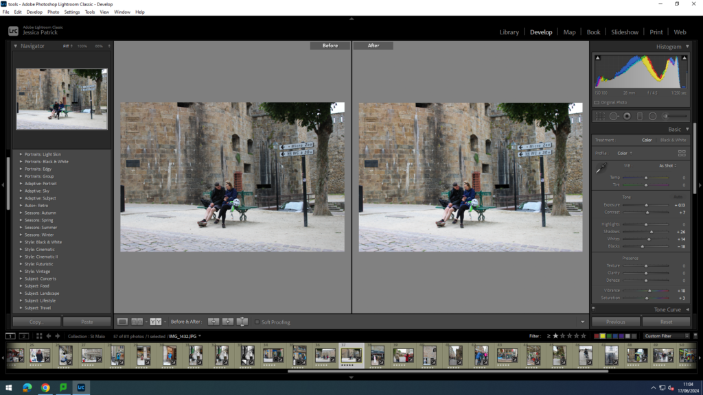
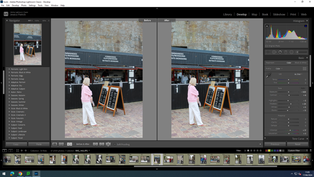
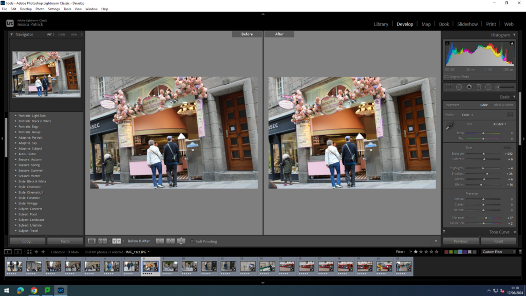
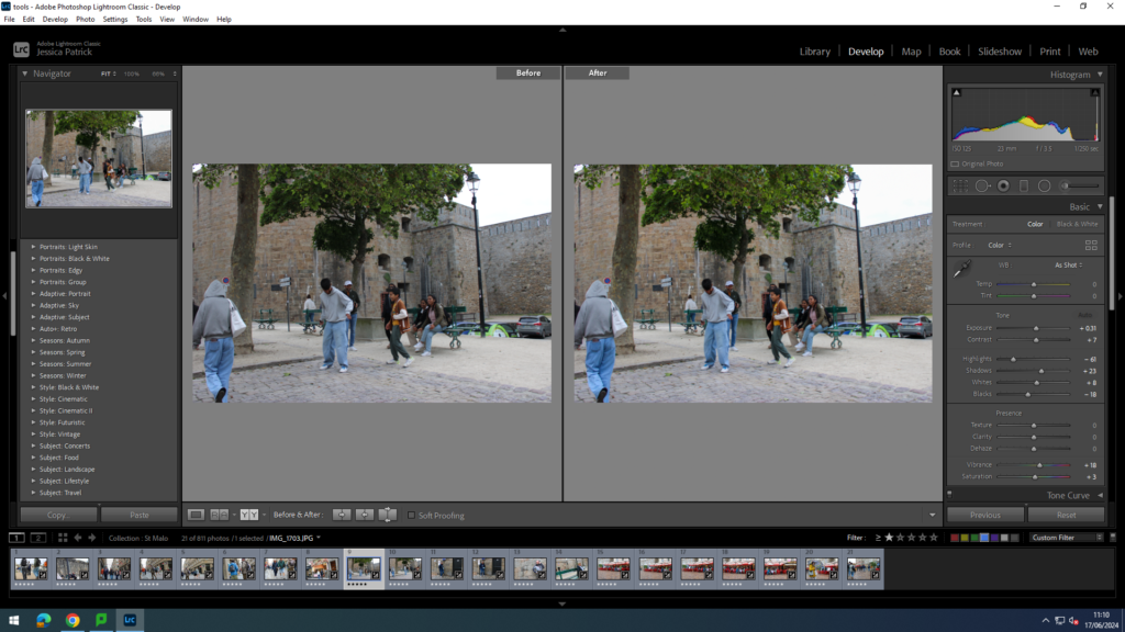
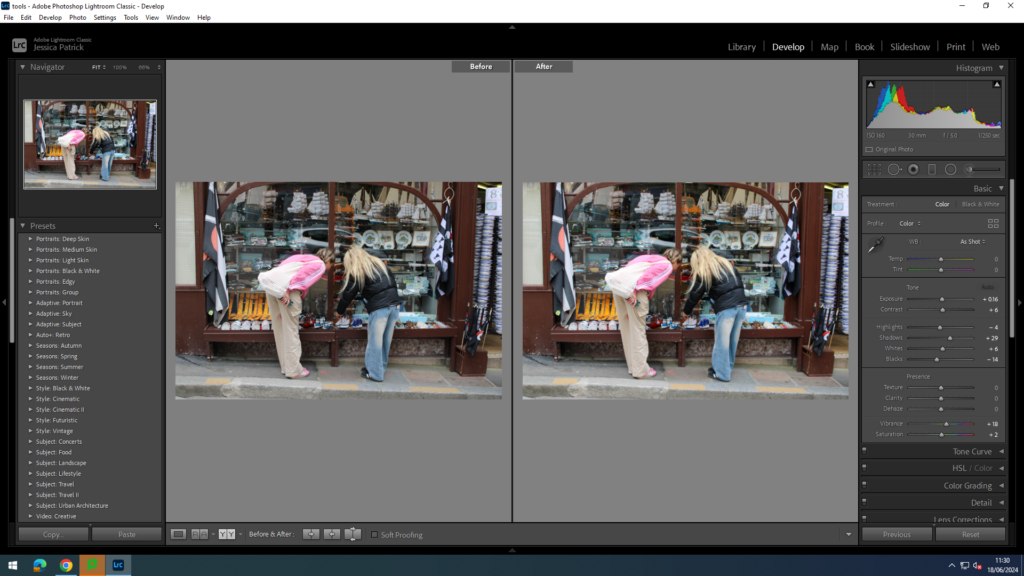
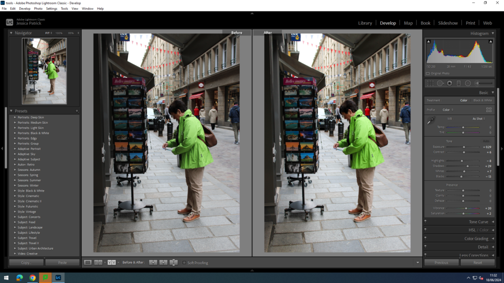
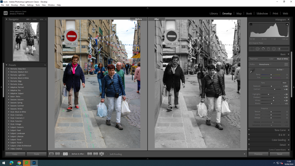
Hip Shots
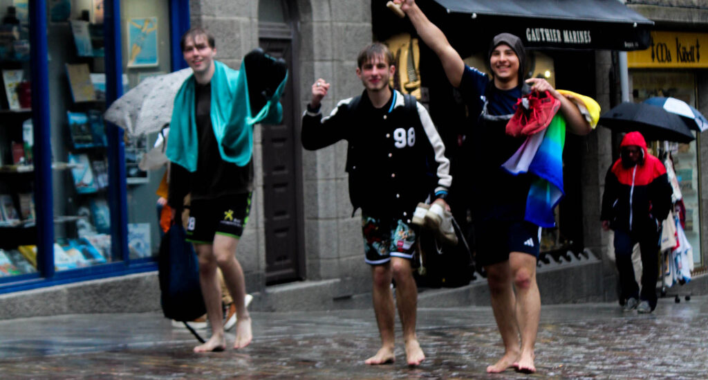
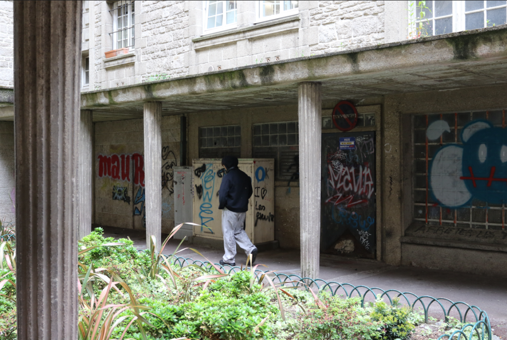
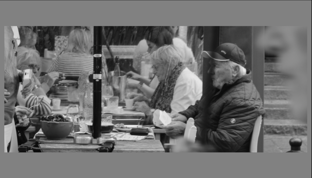
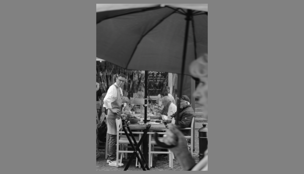
These are images I have taken with the camera at hip level, so it is less visible that I am taking photos, so that people will not change their expressions or actions when I am taking the photos.
I edited this image by increasing the contrast, shadows, whites, vibrancy and saturation, while decreasing the exposure, highlights and blacks. I did this so the image was more vibrant and had better lighting.
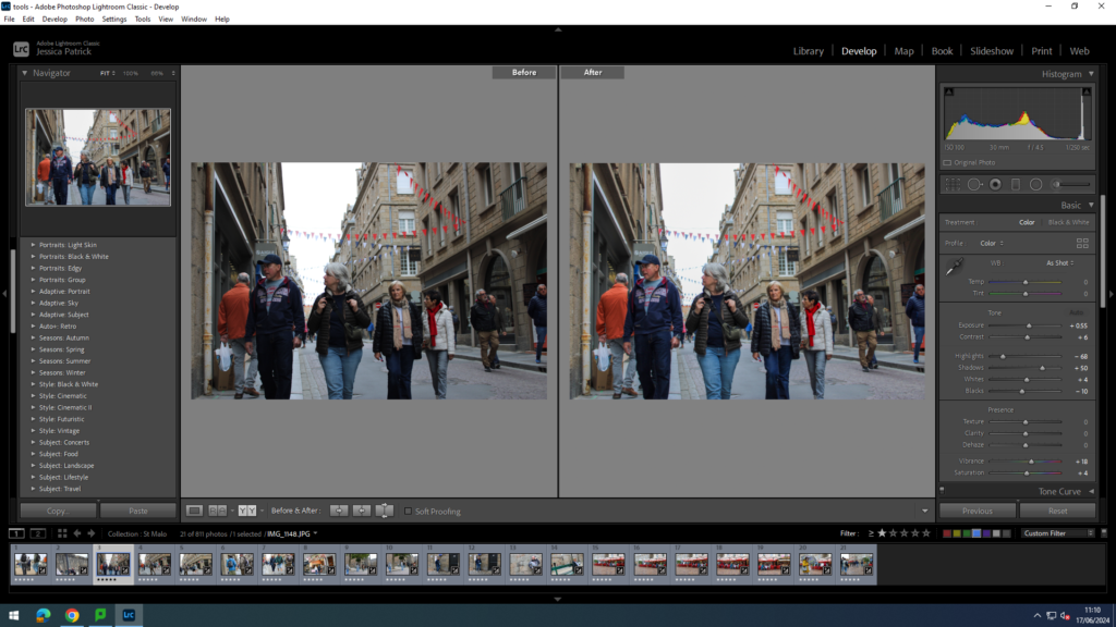
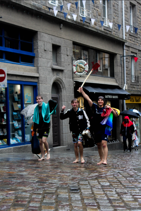
I edited this image by increasing the exposure, contrast, shadows, whites, vibrancy and saturation, while decreasing the highlights and blacks. I did this so the colours in the image would pop more and be more vibrant, such as the flags and coloured clothing.
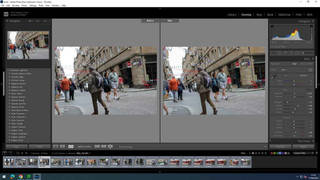
I edited this image by increasing the contrast, shadows, whites, vibrancy and saturation, while decreasing the exposure, highlights and blacks. I did this so the coloured clothing and flags in this image would pop more, and so the image was slightly brighter.
I edited this image by increasing the contrast, shadows, whites, vibrancy and saturation, while decreasing the exposure, highlights and blacks. I did this so the image was more vibrant and had better lighting. Also, so the ladies coat was more vibrant and stood out more.
I edited this image by increasing the contrast, shadows, whites, vibrancy and saturation, while decreasing the exposure, highlights and blacks. I did this so the image was more vibrant and had better lighting.
I edited this image by increasing the contrast, shadows, whites, vibrancy and saturation, while decreasing the exposure, highlights and blacks. I did this so the image was more vibrant and had better lighting.
I edited these images by increasing the contrast, shadows, whites, vibrancy and saturation, while decreasing the exposure, highlights and blacks. I did this so the images were brighter.
I edited this image by increasing the exposure, contrast, shadows, whites, vibrancy and saturation, while decreasing the highlights and blacks. I did this so the image was brighter and had better lighting.
I edited this image by increasing the exposure, contrast, shadows, whites, vibrancy and saturation, while decreasing the highlights and blacks. I did this so the image was brighter and had better lighting.
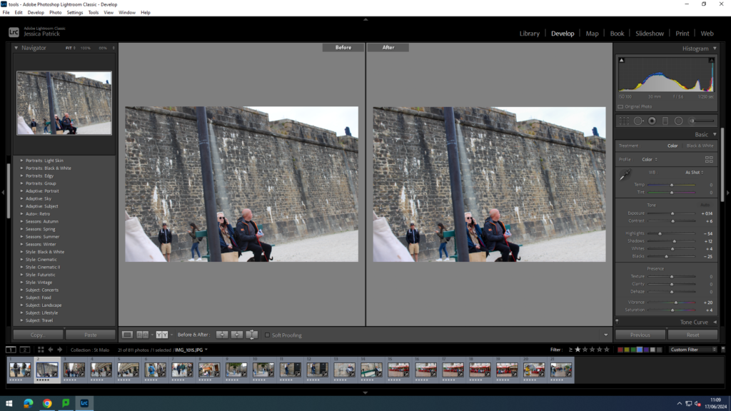
I edited this image by increasing the contrast, shadows, whites, vibrancy and saturation, while decreasing the exposure, highlights and blacks. I did this so the image was brighter and had better lighting, and so the green bench was slightly more vibrant.
I edited these images by increasing the contrast, shadows, whites, vibrancy and saturation, while decreasing the exposure, highlights and blacks. I did this so red furniture would pop more and be more vibrant, so that it was eye capturing. I also wanted the lighting to be better.
I edited this image by increasing the exposure, contrast, shadows, whites, vibrancy and saturation, while decreasing the highlights and blacks. I did this so all the different colours in this image, such as the red furniture and her coloured umbrella would pop more and be more vibrant, so that the image was more eye capturing. I also wanted the image to be slightly brighter, so that the lighting was better.
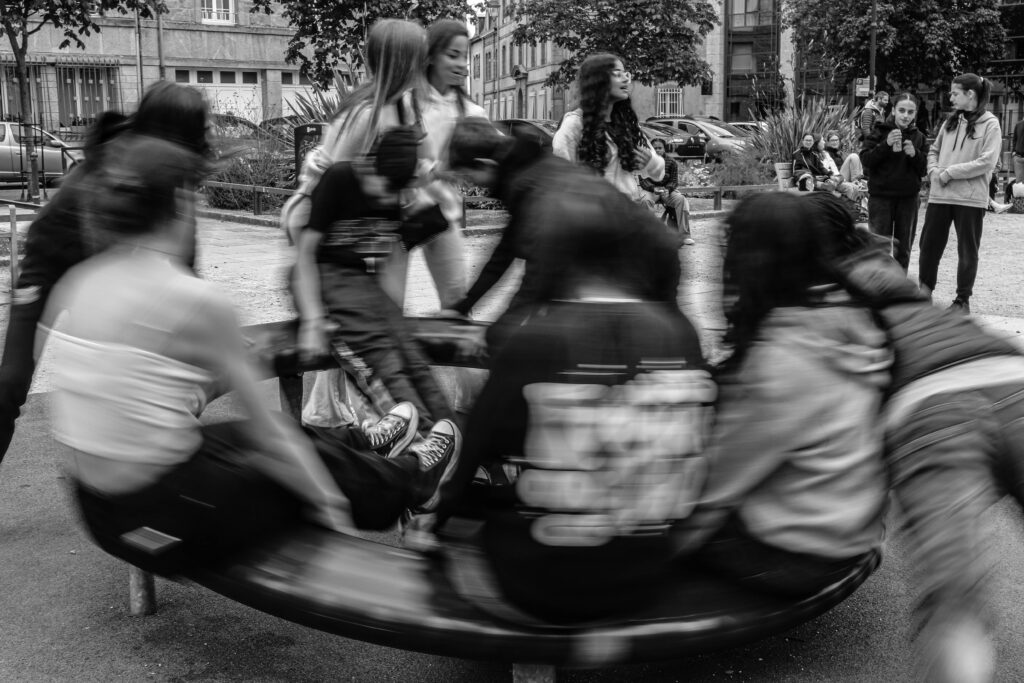
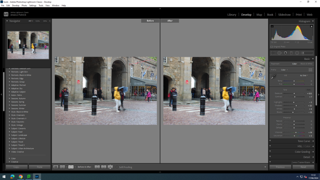
Blurry Images
For these images I experimented with the shutter speed by slowing it down, so that anyone or thing that is moving will be slightly or very blurry, while I am stood still taking the images.
I edited this image by increasing the contrast, shadows, whites, vibrancy and saturation, while decreasing the exposure, highlights and blacks. I did this so the colours in this photo would be more vibrant and the lighting would be better.
I edited this image by increasing the exposure, contrast, shadows, whites, vibrancy and saturation, while decreasing the highlights and blacks. I did this so the different colours in this image would be much more vibrant.
I edited this image by increasing the exposure, contrast, shadows, whites, vibrancy and saturation, while decreasing the highlights and blacks. I did this so the image was brighter and had better lighting.
I edited these images by increasing the contrast, shadows, whites, vibrancy and saturation, while decreasing the exposure, highlights and blacks. I did this so the image had better lighting.
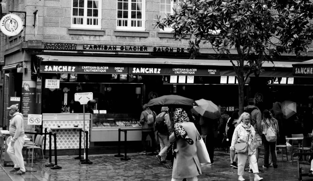
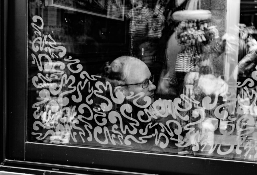
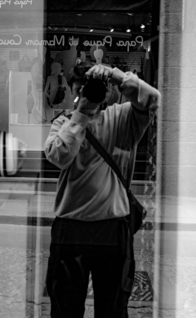
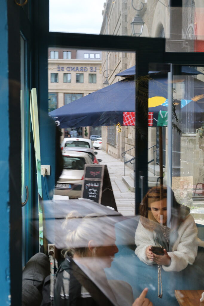
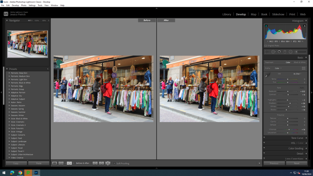
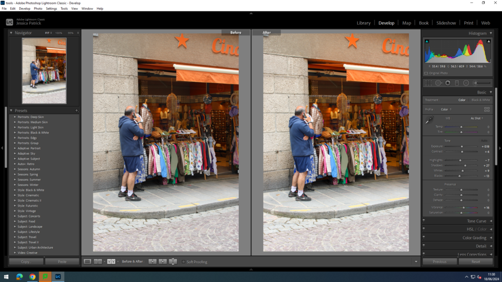
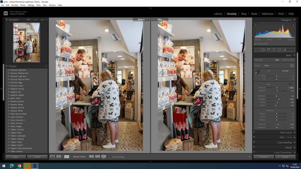
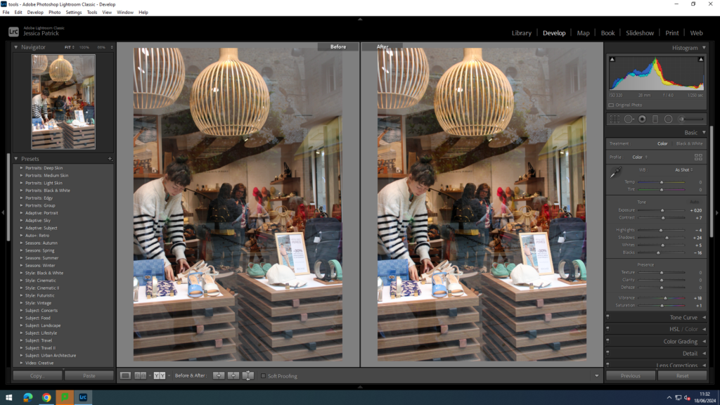
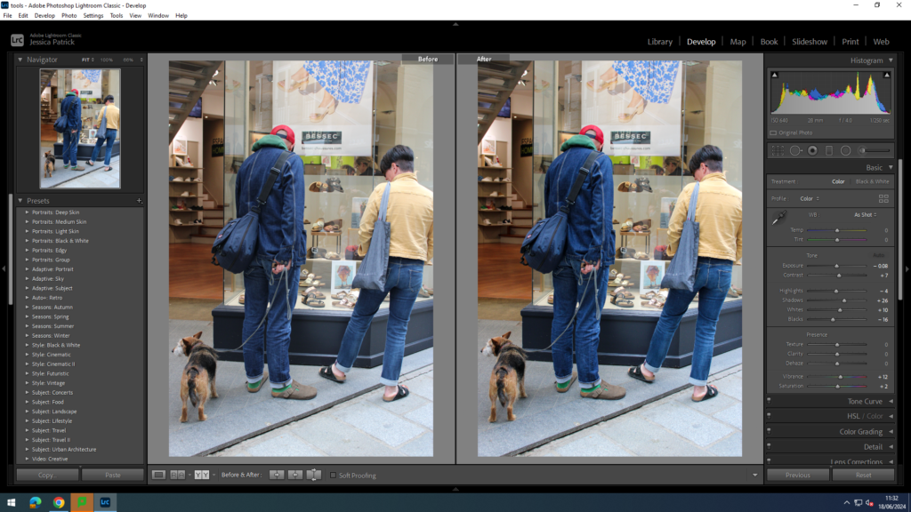
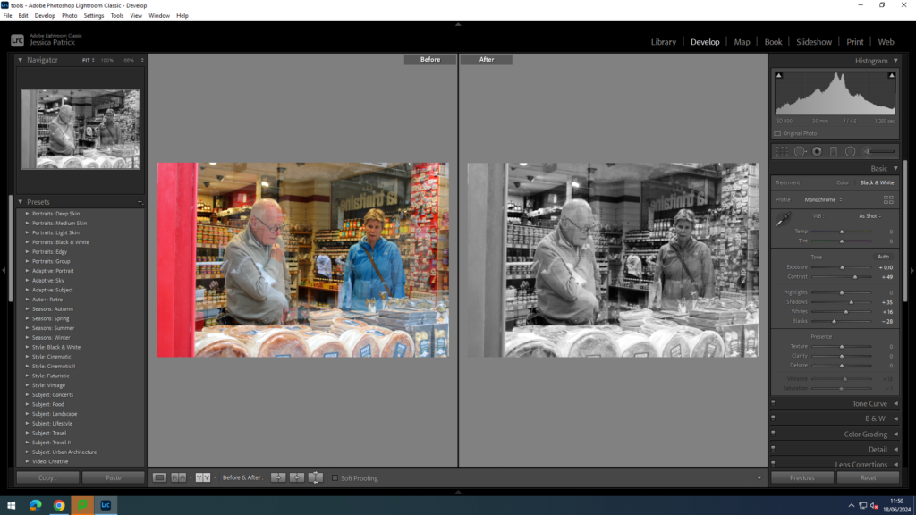
Shop windows/ Reflections
For these images I experimented with using shop windows/ reflections, so I took pictures of people inside the stores from outside the window. I also just took images of people shopping and browsing.
I edited this image by increasing the contrast, shadows, whites and vibrancy, while decreasing the exposure, highlights and blacks. I did this so that the lighting would be better and their brightly coloured coats more vibrant.
I edited this image by increasing the exposure, contrast, shadows, whites and vibrancy, while decreasing the highlights and blacks. I did this so that the lighting would be better and all the brightly coloured clothing would be more vibrant.
I edited this image by increasing the exposure, contrast, shadows, whites and vibrancy, while decreasing the highlights and blacks. I did this so that the lighting would be better and the colours in the image would pop more.
I edited this image by increasing the exposure, contrast, shadows, whites, saturation and vibrancy, while decreasing the highlights and blacks. I did this so that the lighting was better.
I edited this image by increasing the exposure, contrast, shadows, whites and vibrancy, while decreasing the highlights saturation and blacks. I did this so that the image was brighter and the people could be seen better.
I edited this image by increasing the exposure, contrast, shadows, whites and vibrancy, while decreasing the highlights, saturation and blacks. I did this so that the lighting was better and all the colours were more vibrant.
I edited this image by increasing the exposure, contrast, shadows, whites, saturation and vibrancy, while decreasing the highlights and blacks. I did this so that the image had better lighting.
I edited this image by increasing the contrast, shadows, whites and saturation, while decreasing the exposure, vibrancy, highlights and blacks. I did this so that the colours would pop more.
I edited this image by increasing the exposure, contrast, shadows, whites, saturation and vibrancy, while decreasing the highlights and blacks. I did this so that the lighting was better.
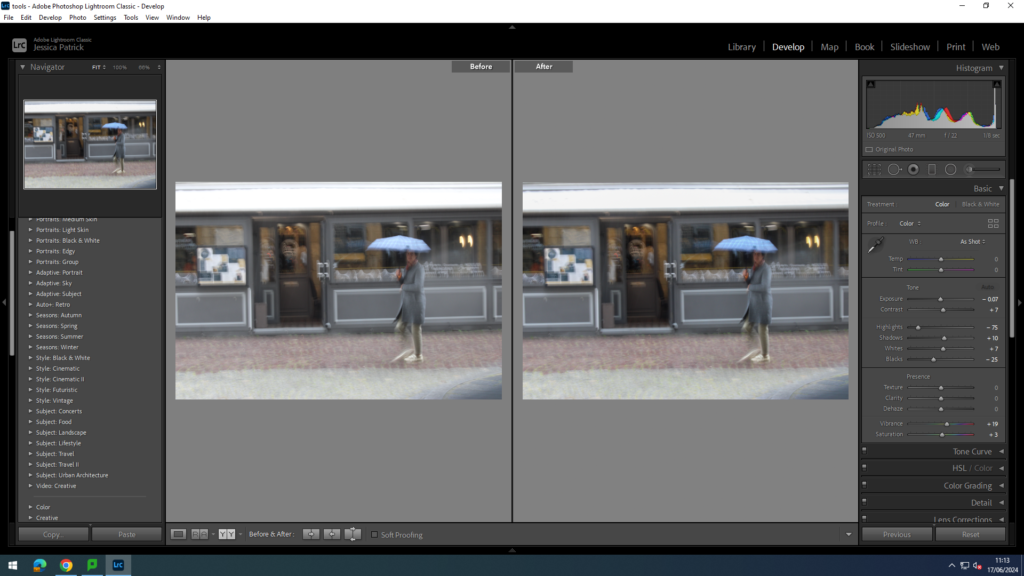
I edited this image by increasing the exposure, contrast, shadows, whites, saturation and vibrancy, while decreasing the highlights and blacks. I did this so that the lighting was better and the person could be seen more clearly through the window.
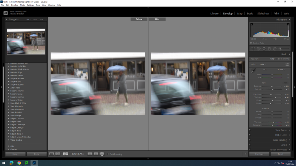
I edited this image by increasing the exposure, contrast, shadows, whites, vibrancy and saturation, while decreasing the highlights and blacks. I did this, so the image is brighter and her neon coat more vibrant.
I edited this image by increasing the contrast, shadows, whites, vibrancy and saturation, while decreasing the exposure, highlights and blacks. I did this so the lighting was better in these images.
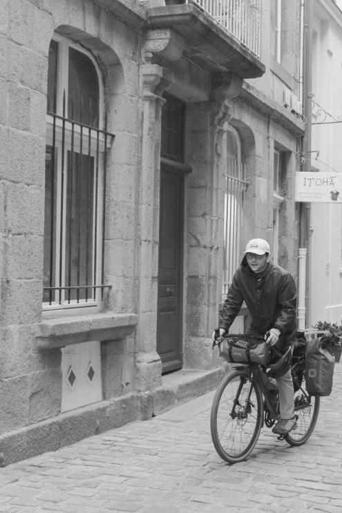
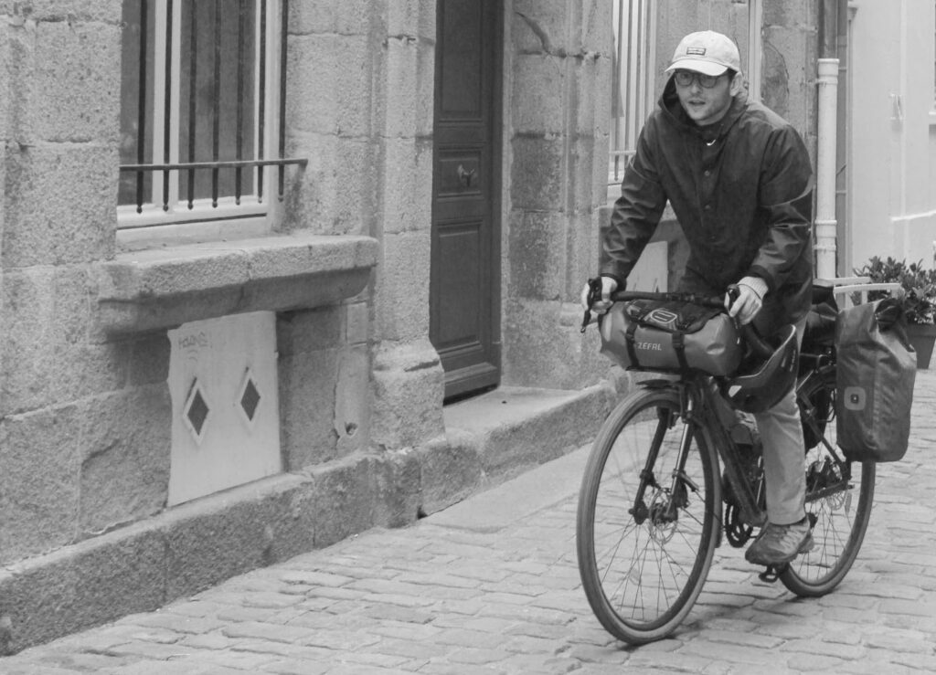
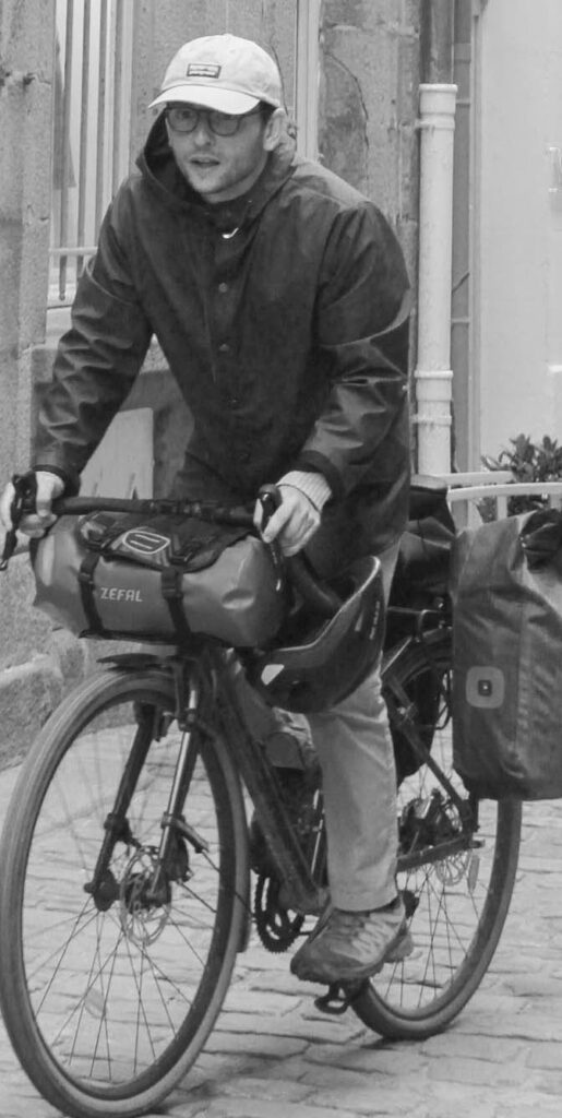
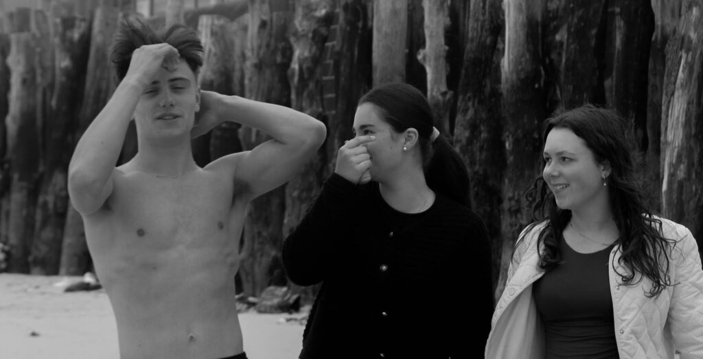
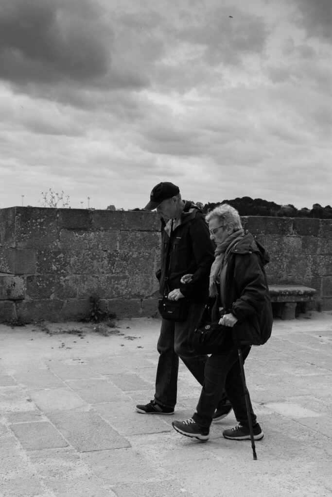
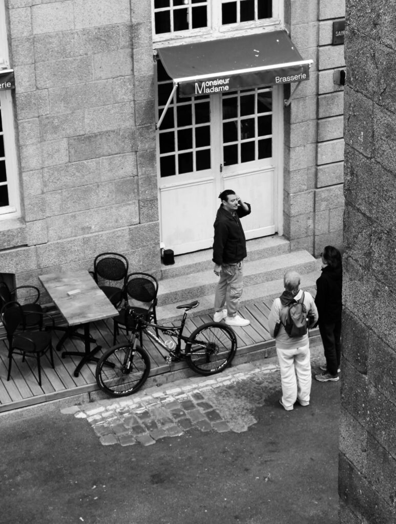
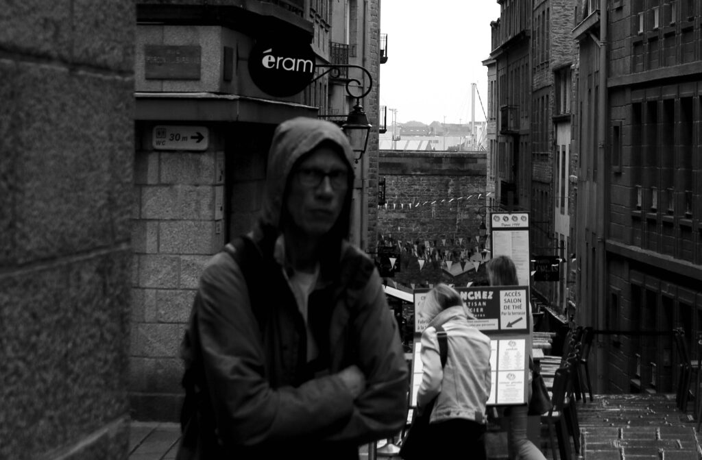
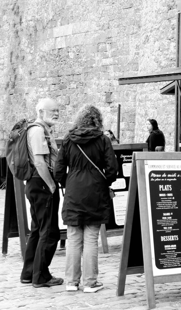
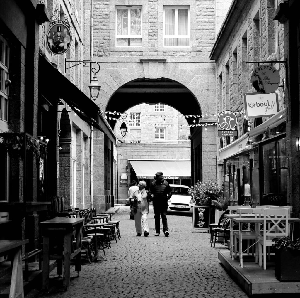
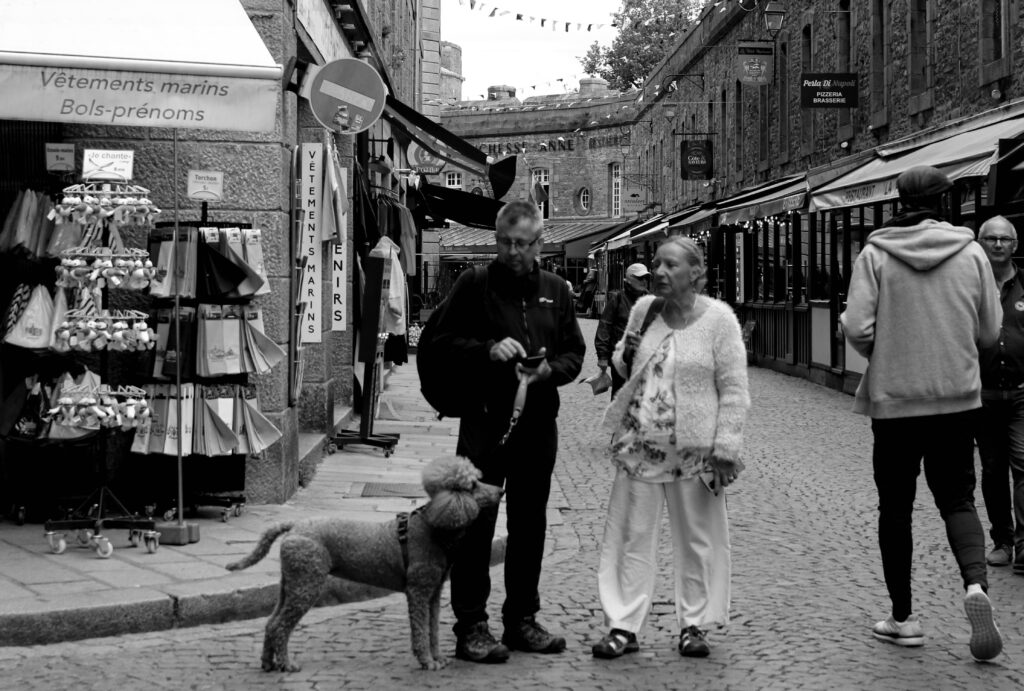
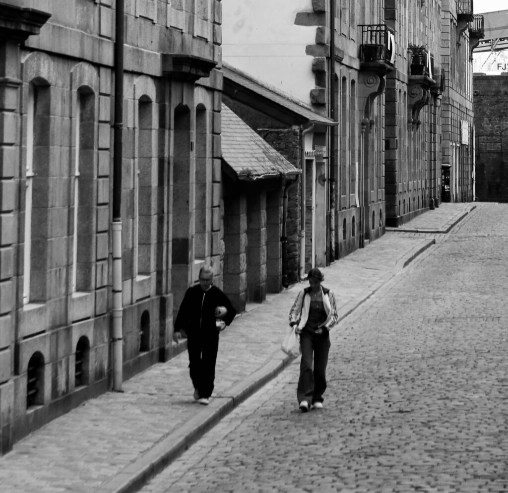
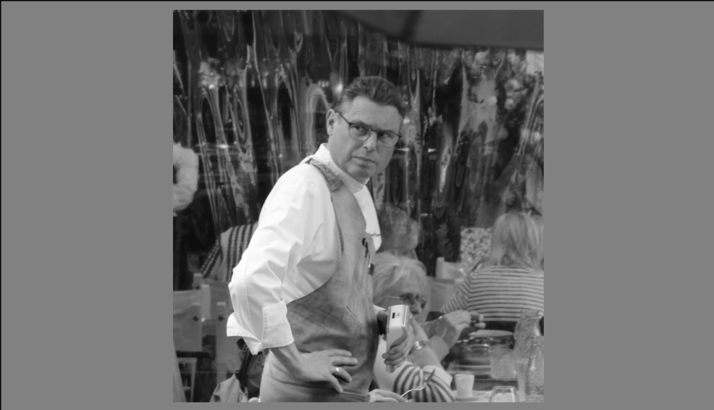
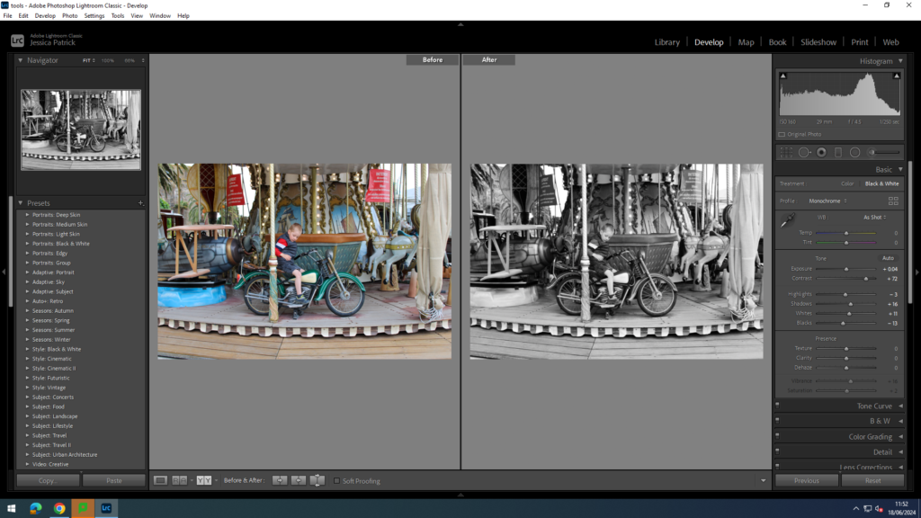
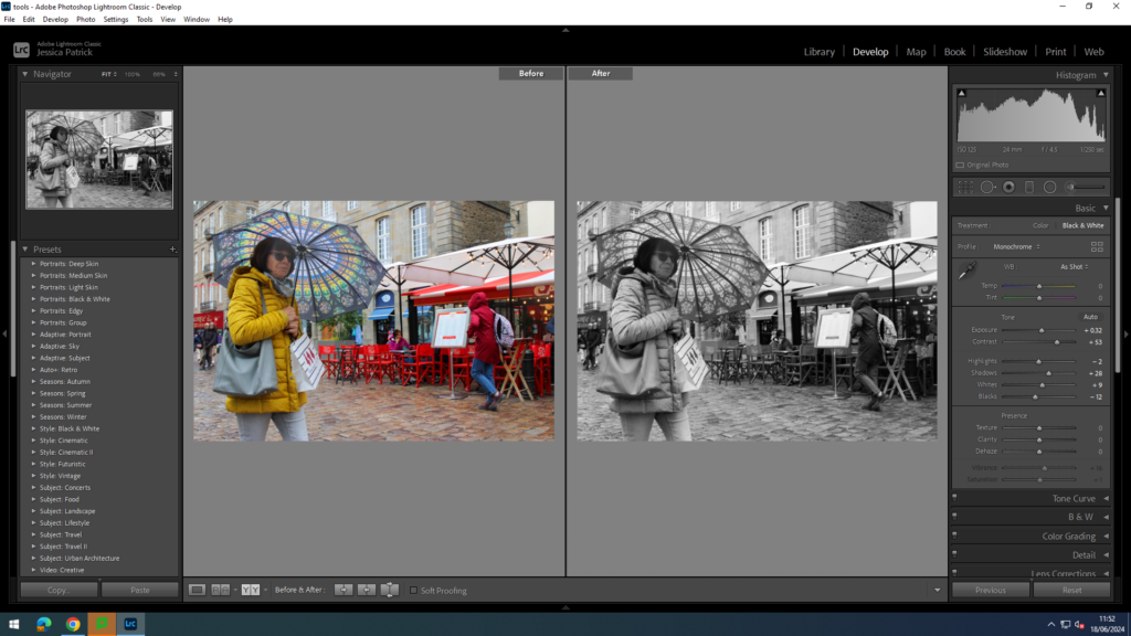
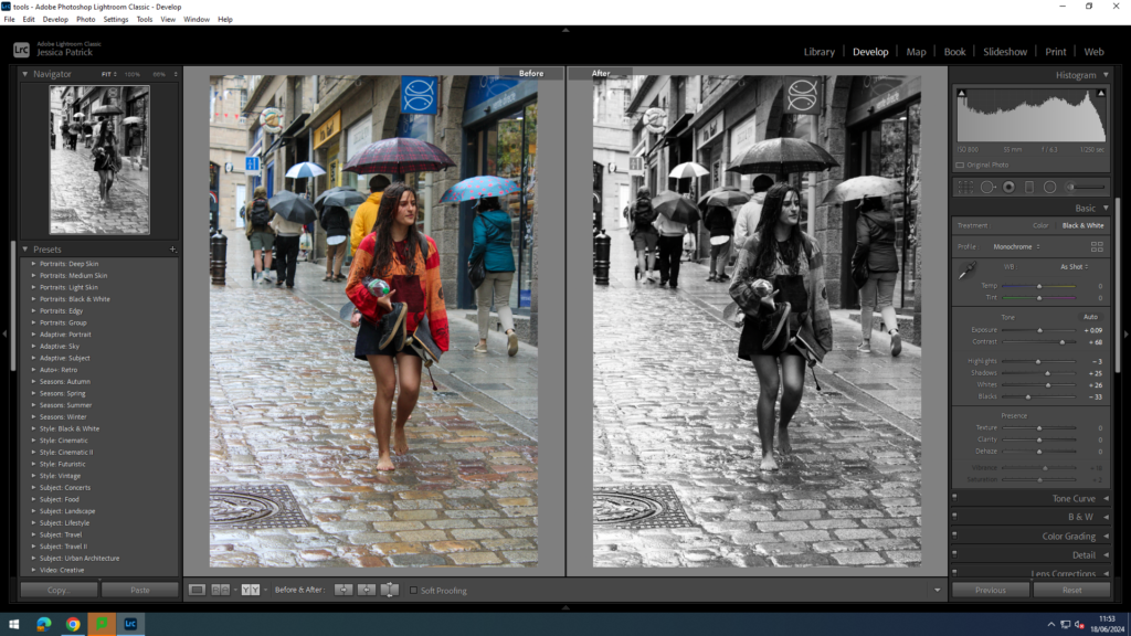
Experimenting with Black and White Images
I made all these images by making a virtual copy of the final edited images. Then, I edited them more so after they’ve been made black and white if need so.
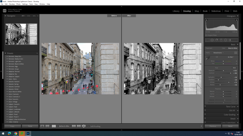
I edited this image even more after turning it black and white, by increasing the contrast and whites more, while decreasing the highlights, shadows and blacks more. I did this so there was lots of contrast.
I edited this image even more, by increasing the contrast, shadows and whites more, while decreasing the highlights and blacks more. I did this so the image would have more contrast.
I edited this image by increasing the contrast, shadows and whites more and decreasing the blacks and highlights more. I did this so there was more contrast and the reflection in the window was more apparent.
I edited this image more by increasing the contrast, shadows, highlights and whites more, while decreasing the blacks more. I did this so there is more contrast.
I edited this image by increasing the contrast, shadows and whites, while decreasing the highlights and blacks more. I did this to create more contrast.
I edited this image by increasing the contrast, shadows and whites, while decreasing the highlights and blacks more. I did this to create more contrast.
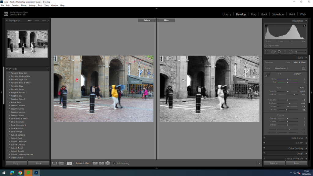
I edited this image by increasing the contrast, shadows and whites, while decreasing the highlights and blacks more. I did this to create more contrast.
I edited this image by increasing the contrast, shadows and whites, while decreasing the highlights and blacks more. I did this to create more contrast.