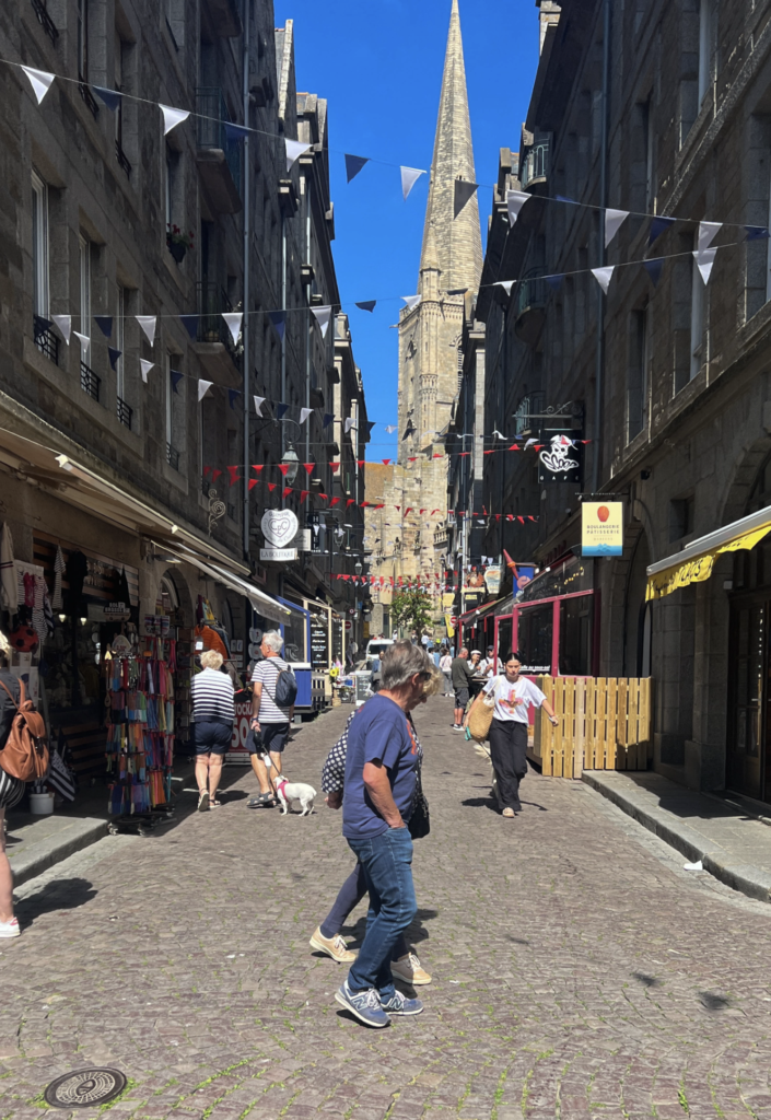
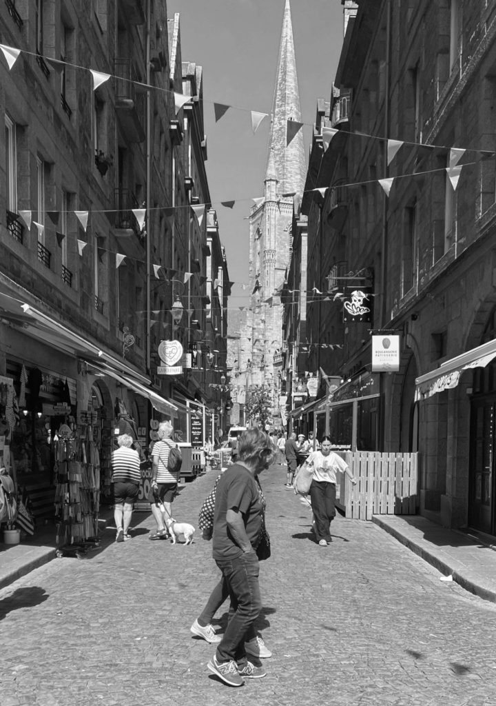
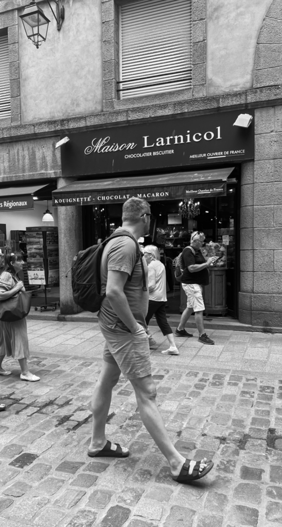
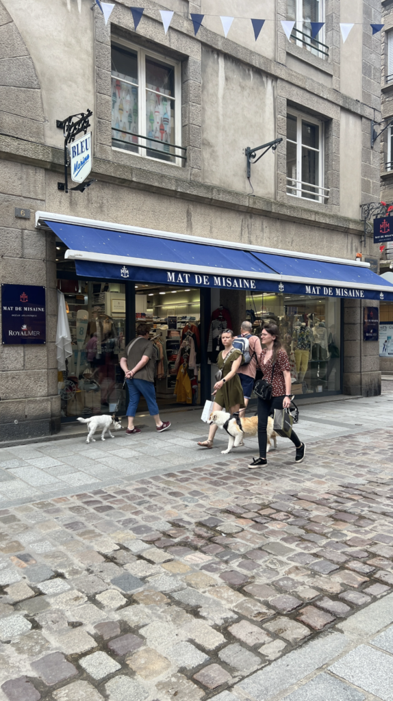
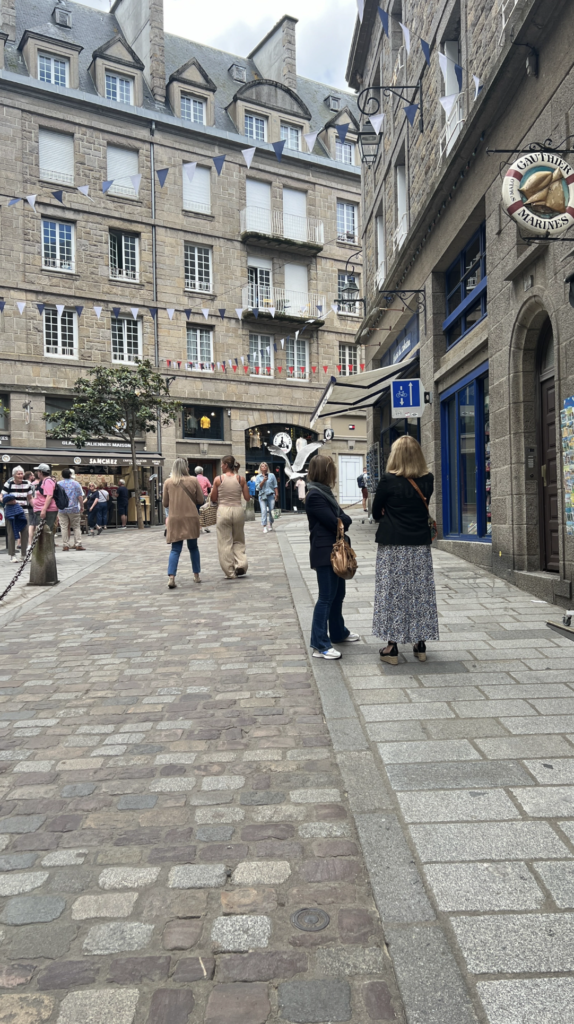
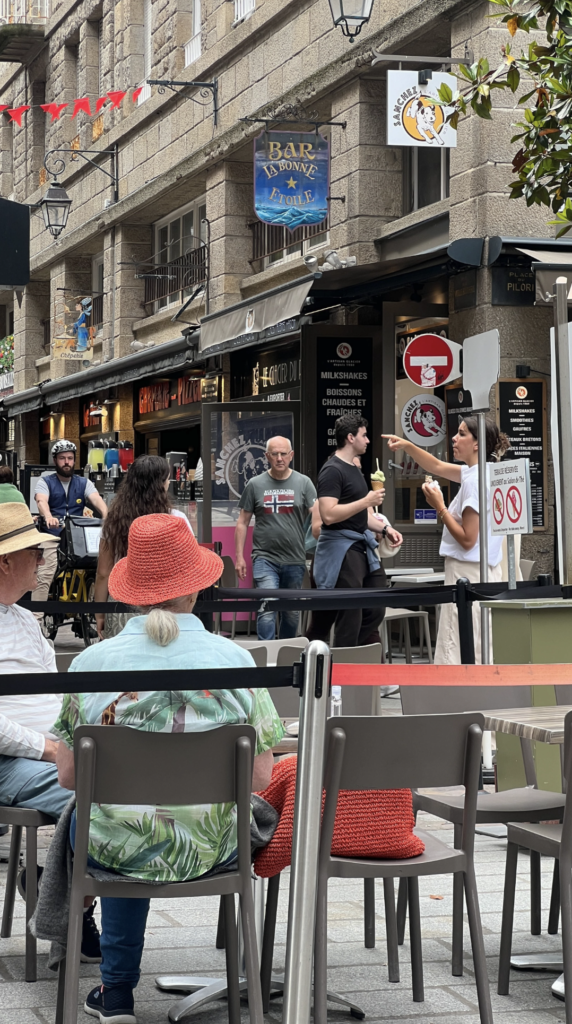
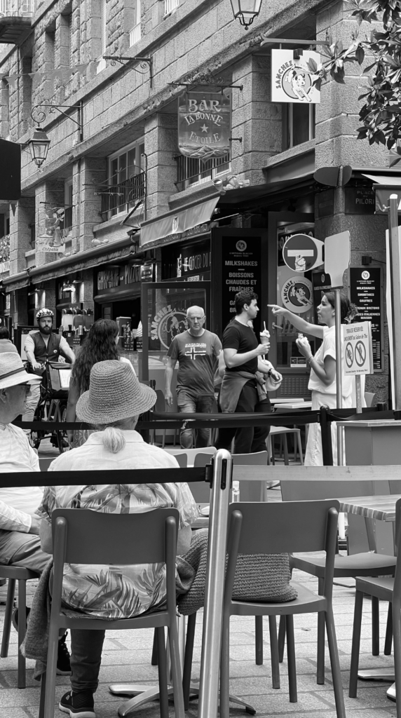
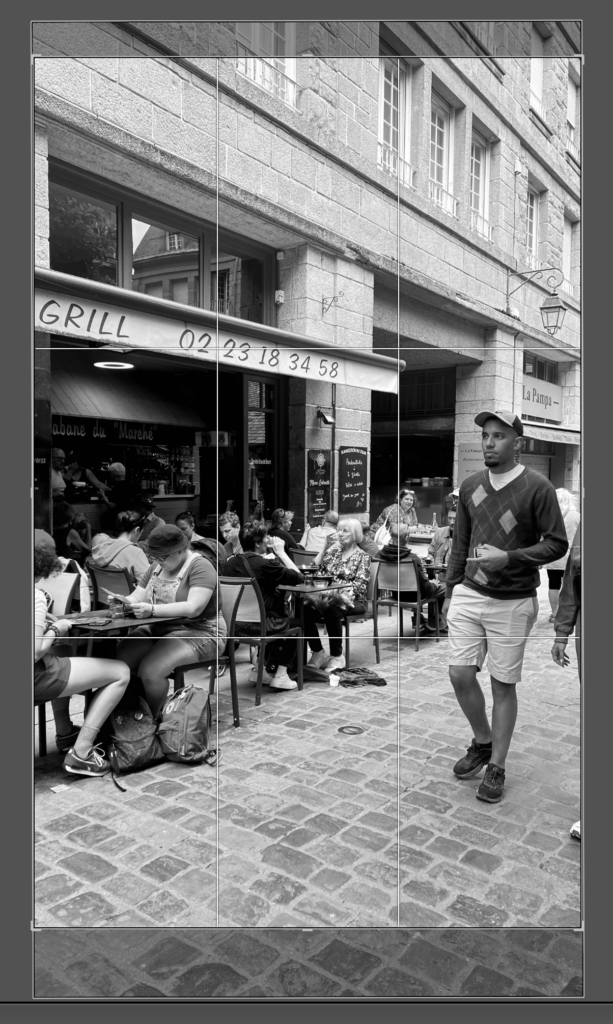
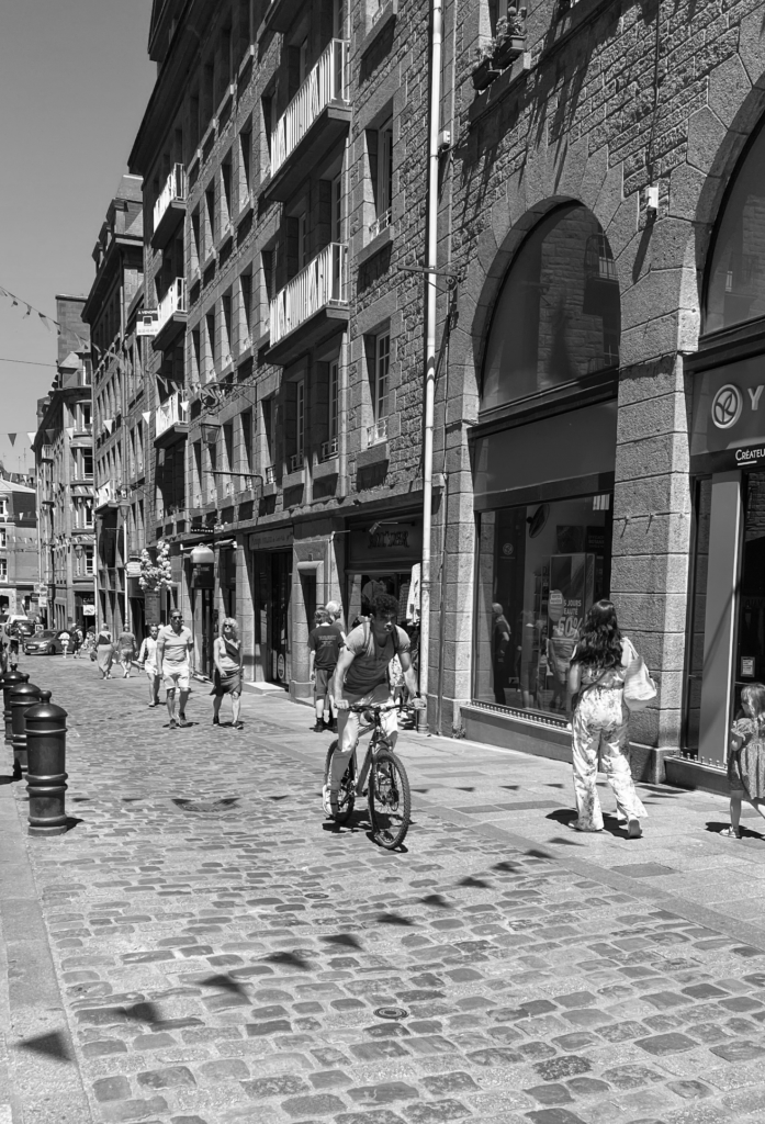
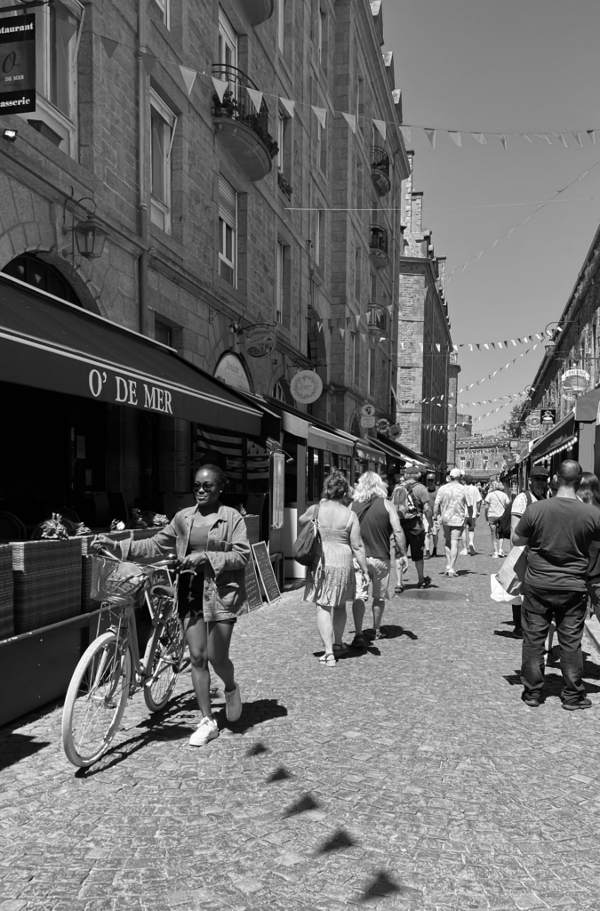
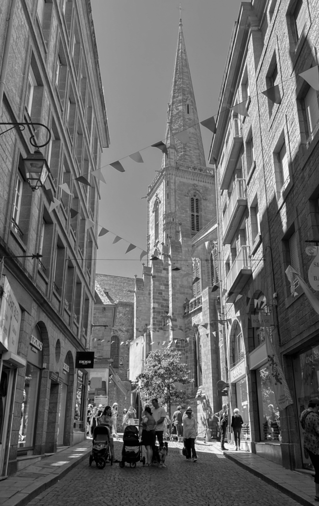
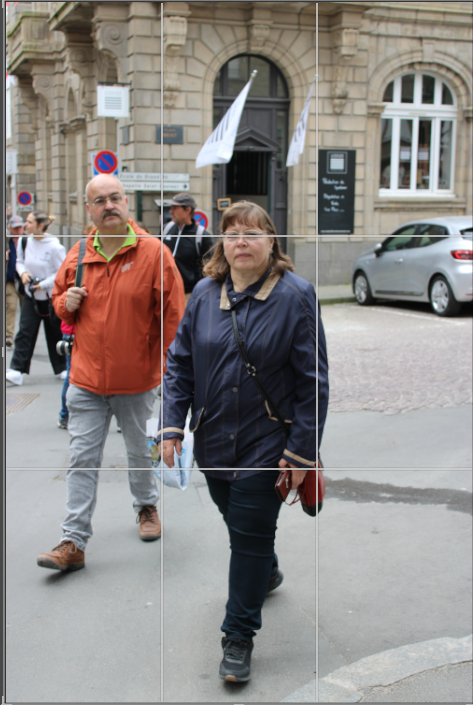
My plan for this photoshoot is to go on a trip to St Malo and observe and photograph people in attempt to get images which present the decisive moment, inspired by Henri Cartier Bresson.
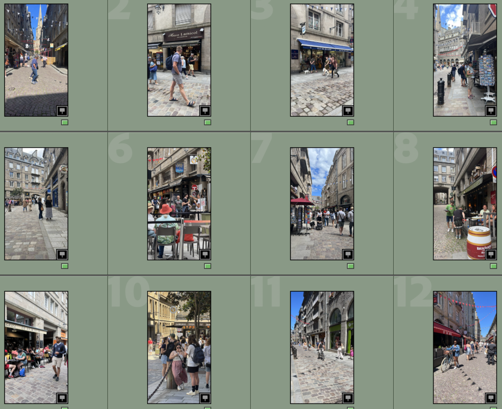
Contact Sheet/Image Selection
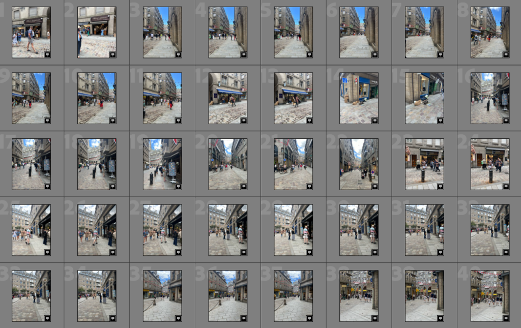
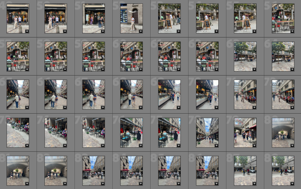
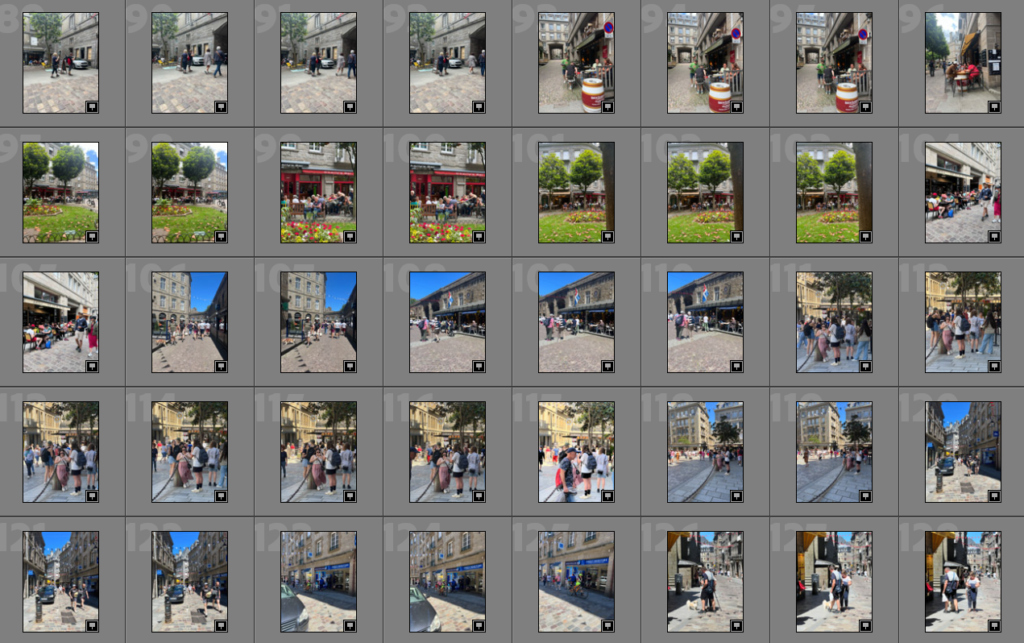
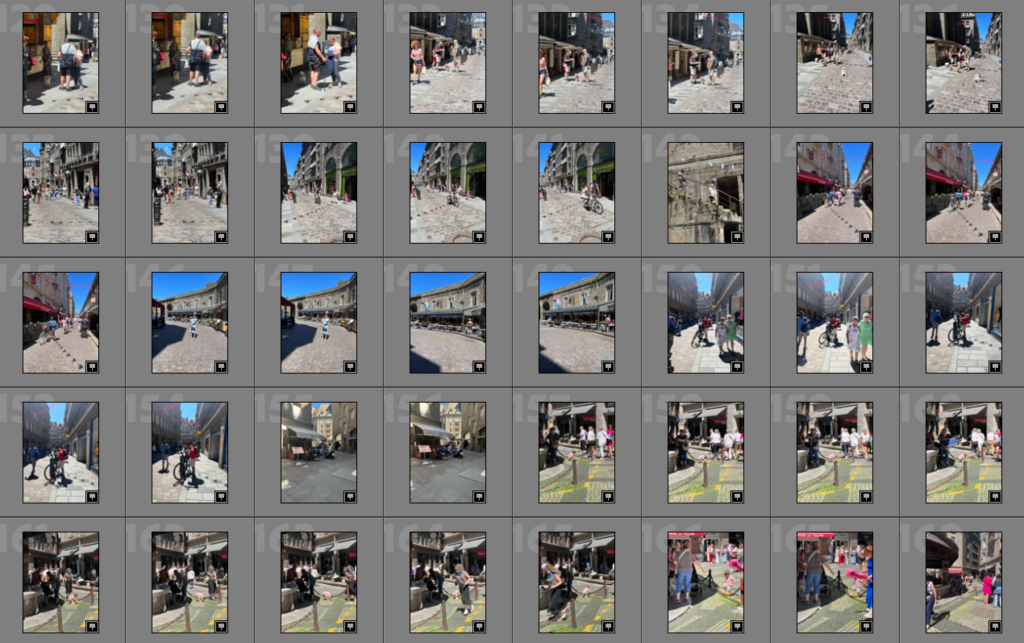
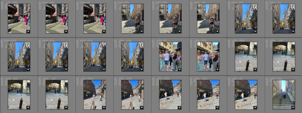
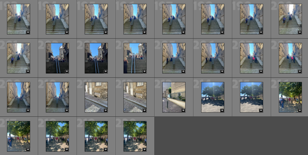
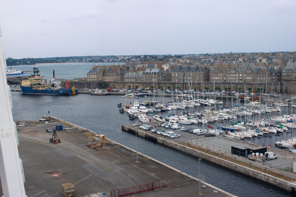
Contact Sheet
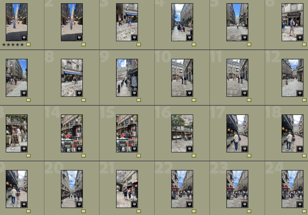
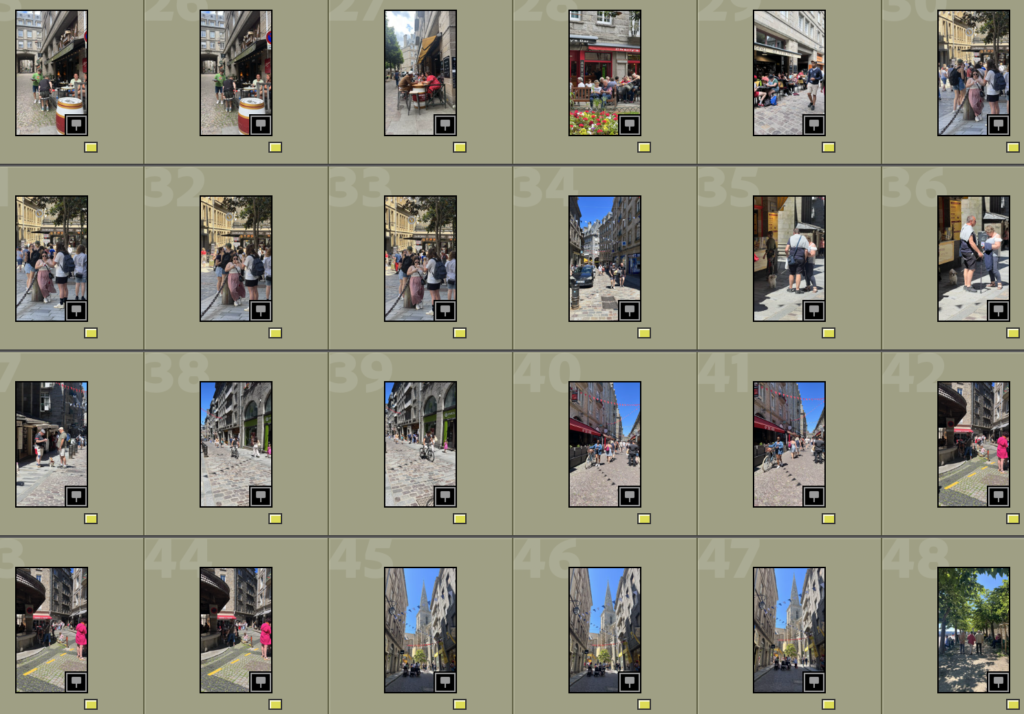
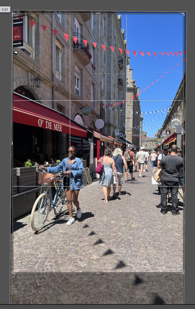
Image Selection
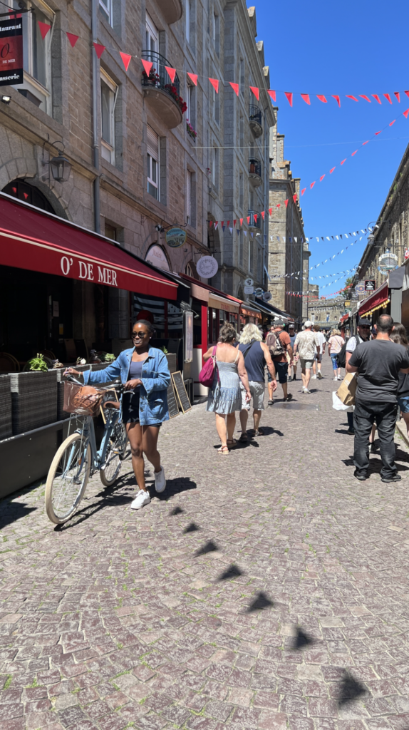
I started off selecting my images by colour labelling the ones yellow which I think have good potential.
Selecting Best Images
I then looked through the images I selected and selected the best ones.
For this AI edit I decided to select all the area of land surrounding the big ship and used a prompt of “the ocean” and created the land into the ocean.
Edit 2
Original
Edited version
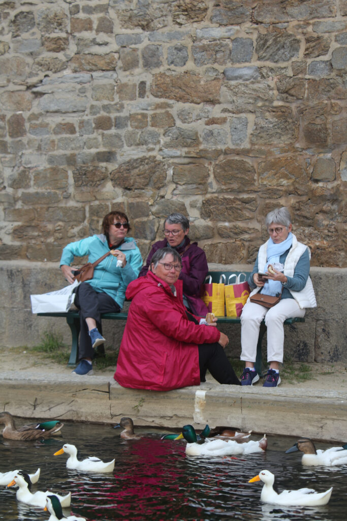
For this image I decided to use the prompt “a pond with ducks” to create a decisive moment of ducks swimming and the ladies enjoying their lunch while one admires the ducks.
Edit 3
Original
Edited Version
For this image to create a decisive moment I decided to use the prompt “flock of birds flying” into the original image to form a plain image into one of a decisive moment.
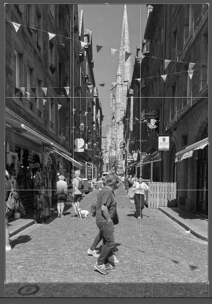
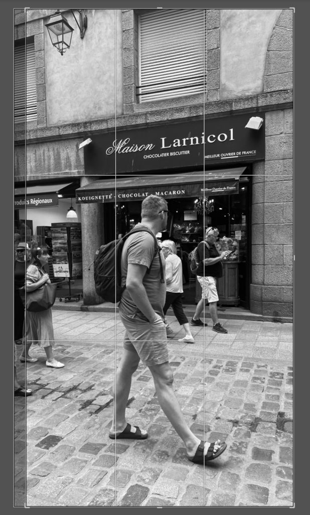
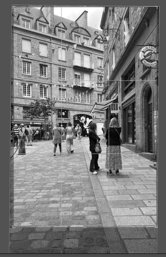
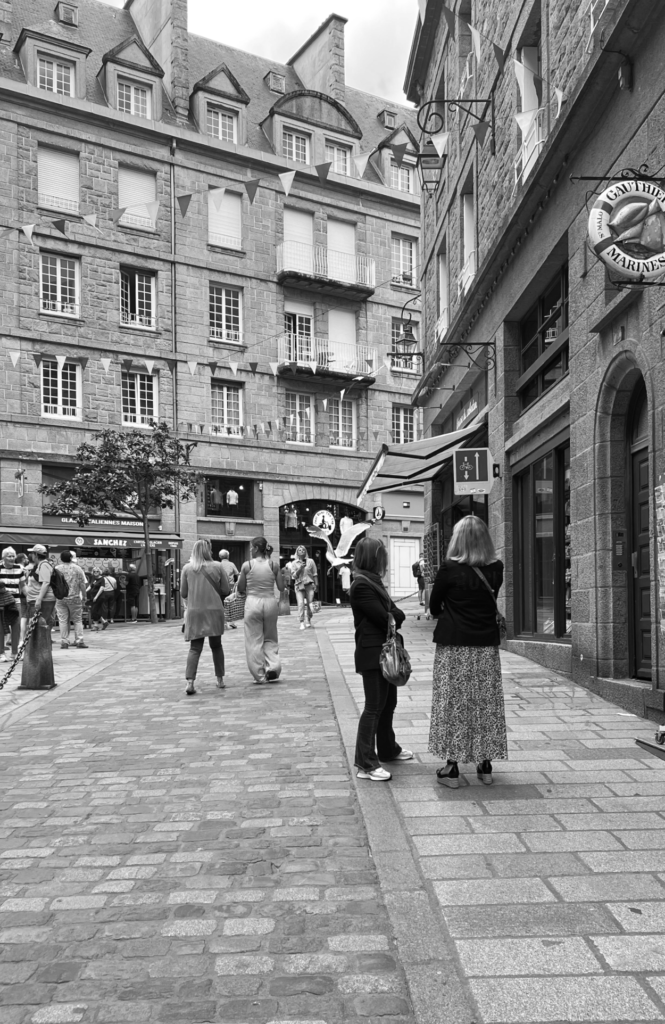
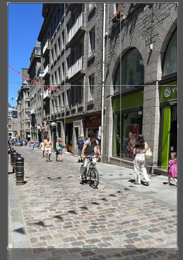
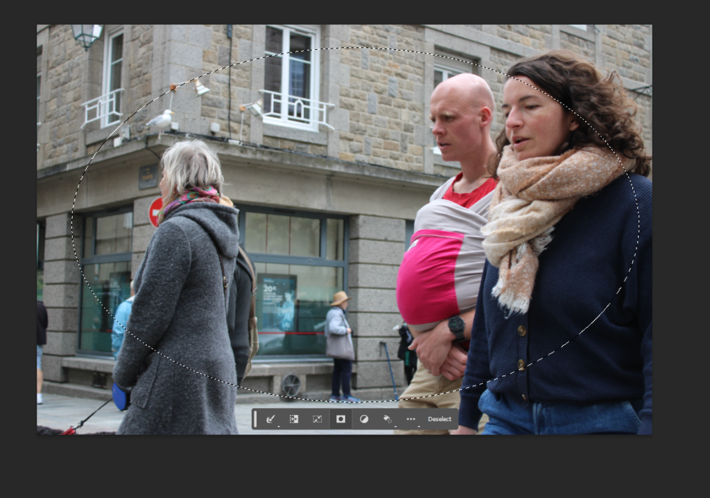
There are many different ways to crop images such as a photo, landscape, portatif and many different shapes. This style of photograghy is interesting and can outline a point in the photo that you are trying to go for.
The discovery of background elements you didn’t realize were there. Issues with the framing or composition. To better focus on your subject, such as this..
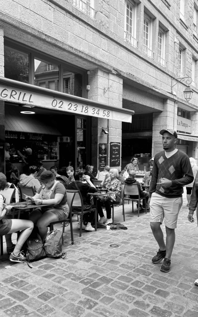
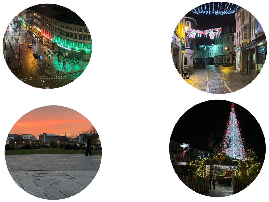
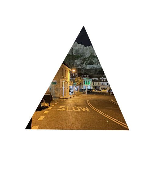
Here is some of my own photos taken in St-Malo cropped and changed into different angles and shapes.
Here’s a few before and afters.
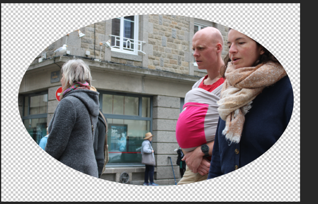
Here it is as a circle, before and after.
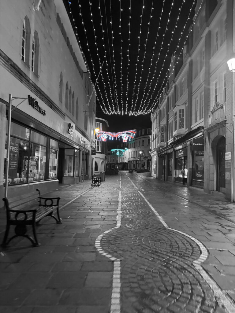
Here its done with loads of black and white colour/filter.
Here is a double imagine and a triangle image.
I did this on photoshop.
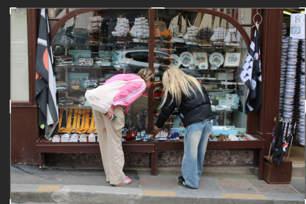
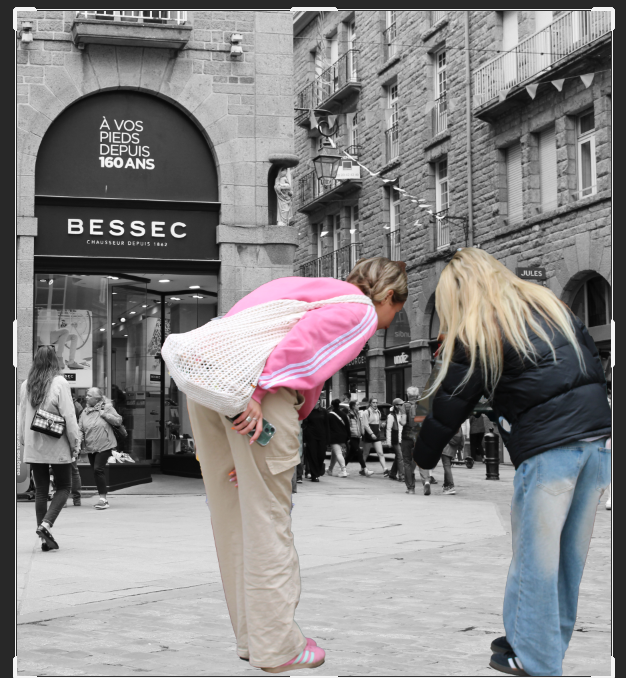
I just changed the colour of the background to black and white and moved the picture onto this image to get affect of us looking down on the people as we are ‘bigger’ which gives a cool illusion and affect onto the St-Malo project.
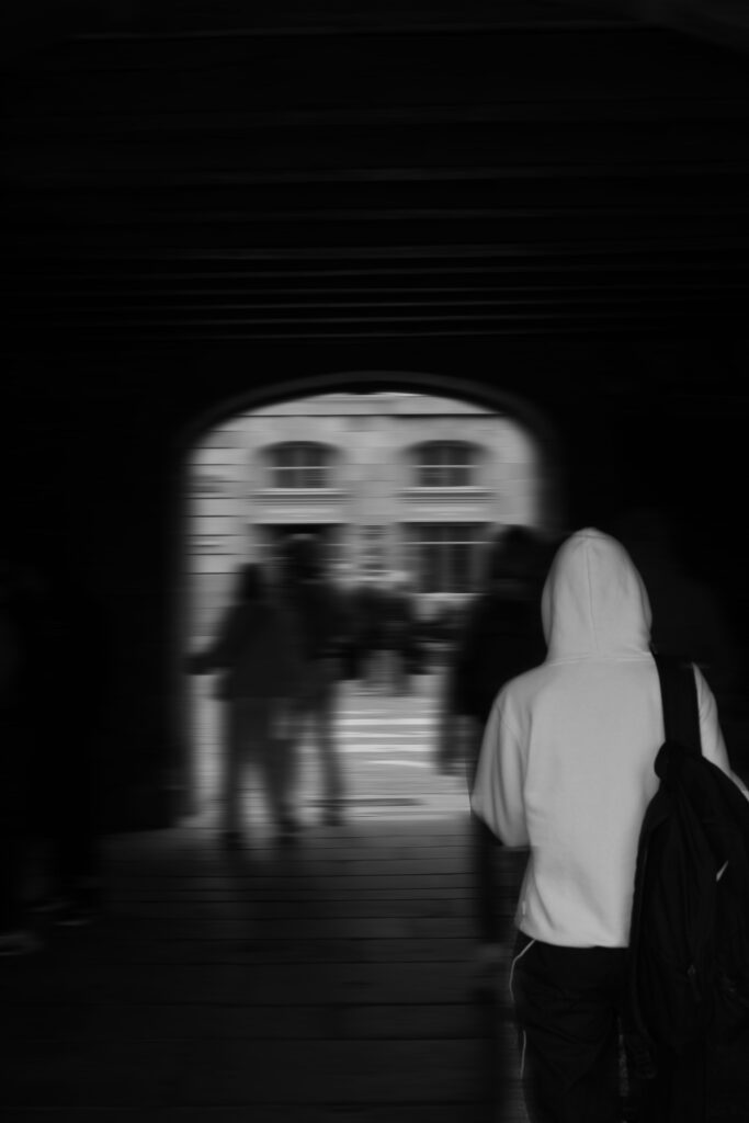
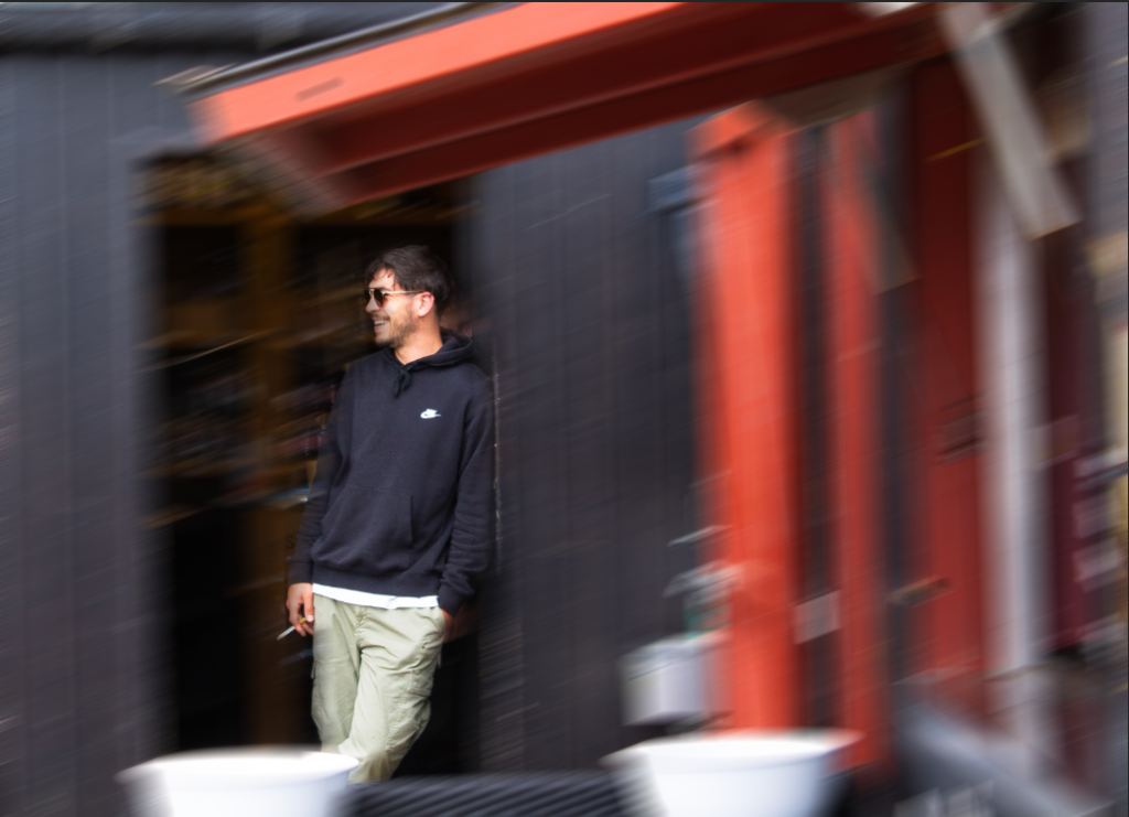
First I started with this image and used the quick selection tool to select everything but the person in the foreground. I than layered via copy to allow me to use the motion blur filter to make the whole background blurry. I then changed both layers to be black and white as I found it made the image look better and more meaningful. This is my final image;
I think this image works really well with the motion blur however, the person in the foreground doesn’t stand out as much as I anticipated so I am going to experiment, using the same technique, with other photographs I have taken.
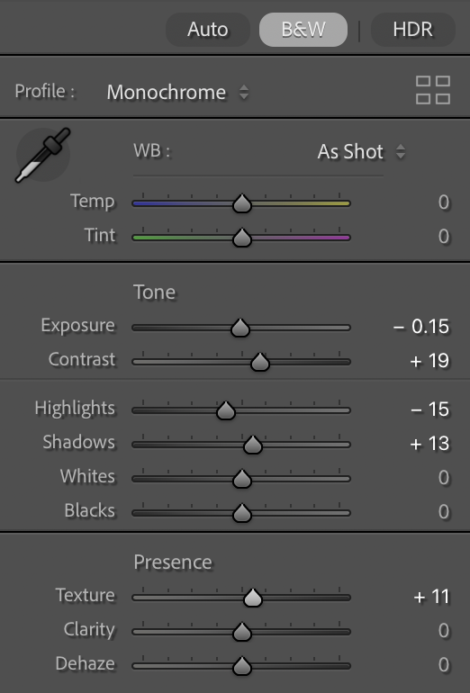
Here I used Lightroom to only saturate parts of the image with the specific colour I want. Then using the brush tool (with settings that make the selected parts of the image unsaturated/black and white) I went over parts of the image which also had that colour in and turned made those parts black and white. This is a effective method as it forces the eyes to the main subject.
Motion Blur:
For the 2 top images I added motion blur after on photoshop by selecting the subjects, Inverting the selection and duplicated it. Then on the duplicated layer I added Motion blur, adjusting its angle to make it look more realistic, as if my camera was locked onto the subjects while I was moving. Since it was busy when we went, there where many other people in the background where they viewers eyes could drift off to which isn’t ideal, so by blurring the background it makes the subject(s) stand out more. For the bottom Image the person has real motion blur because I increased the shutter opening time. This also makes the image very bright so to combat this I increased the f-stop and decreased the ISO. I think this is a nice effect as it shows movement in the walls of the town, making it feel more alive in my photos.
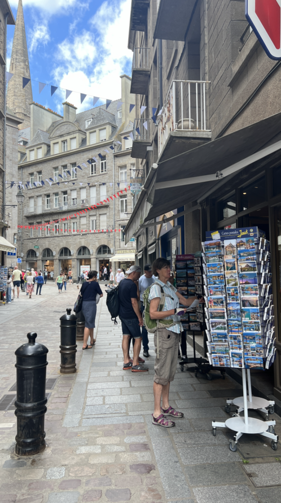
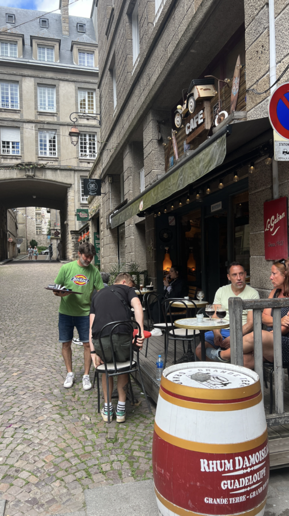
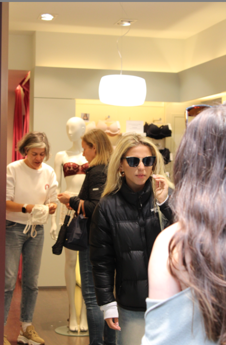
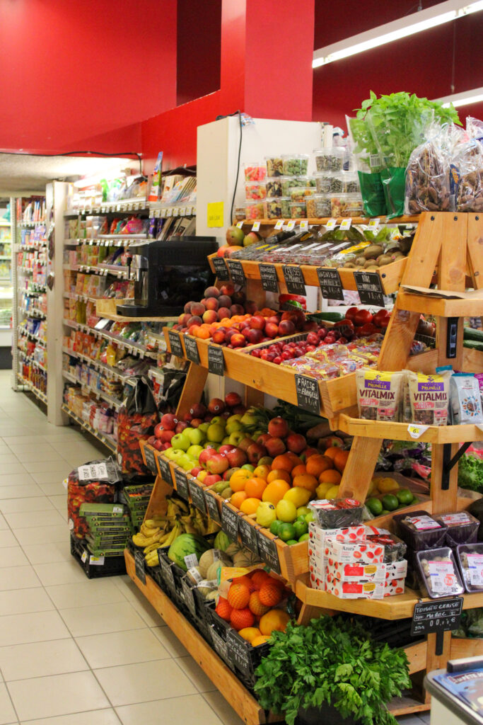
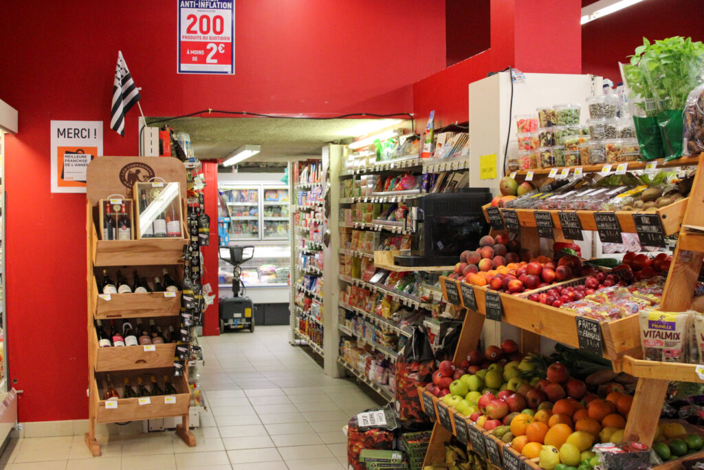
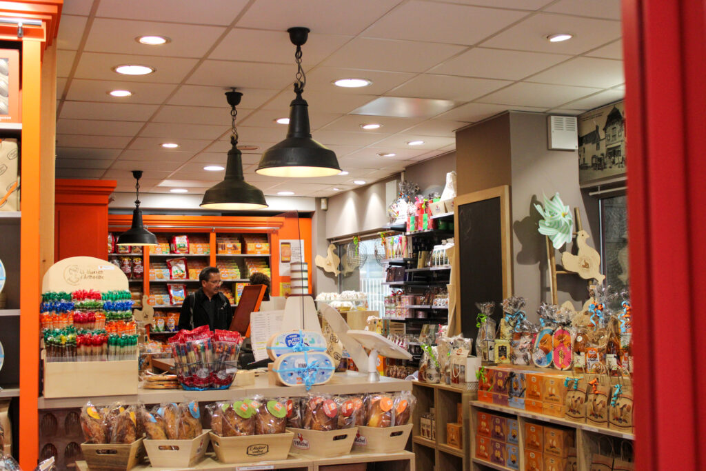
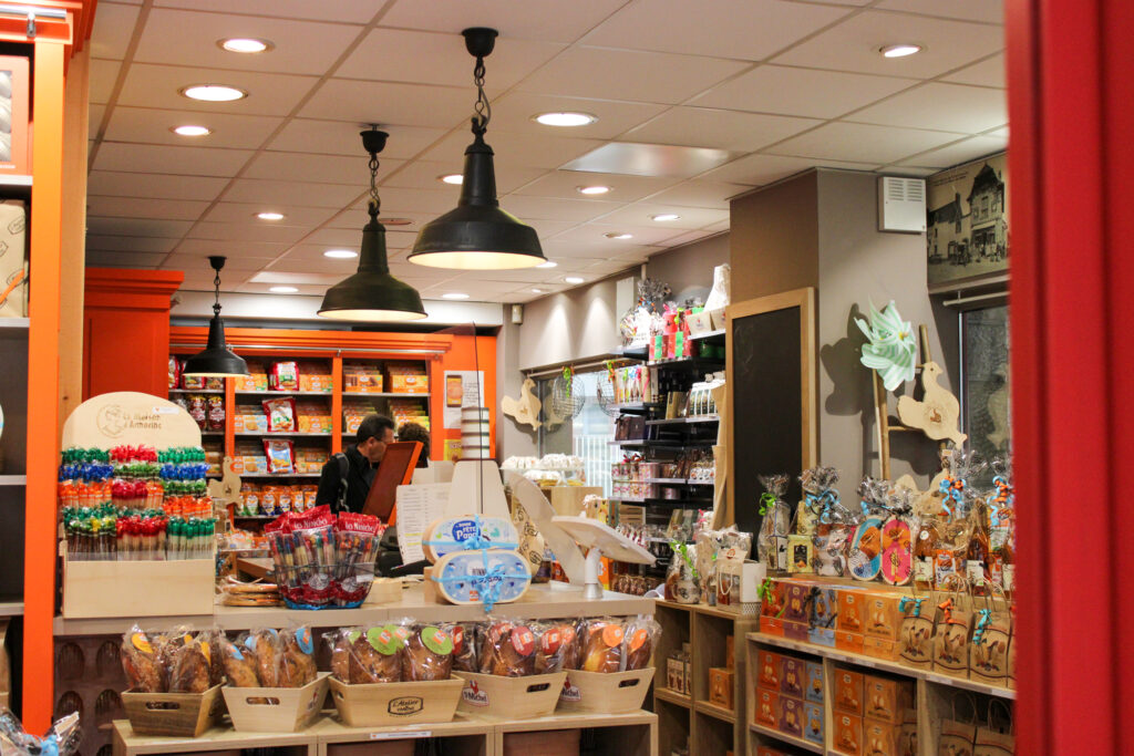
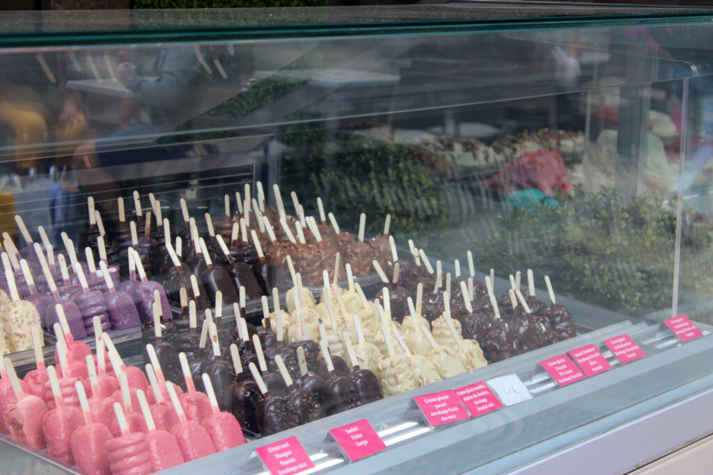
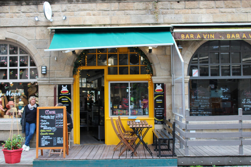
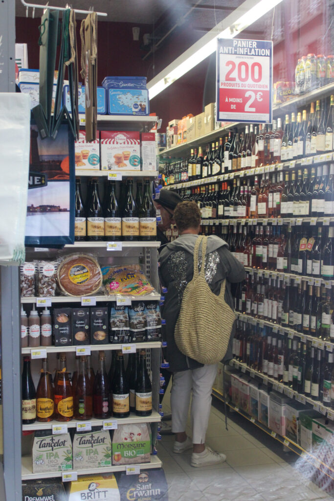
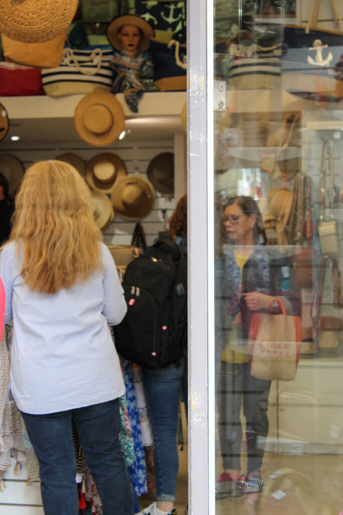
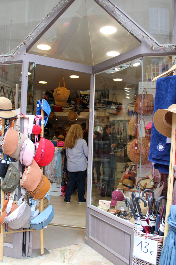
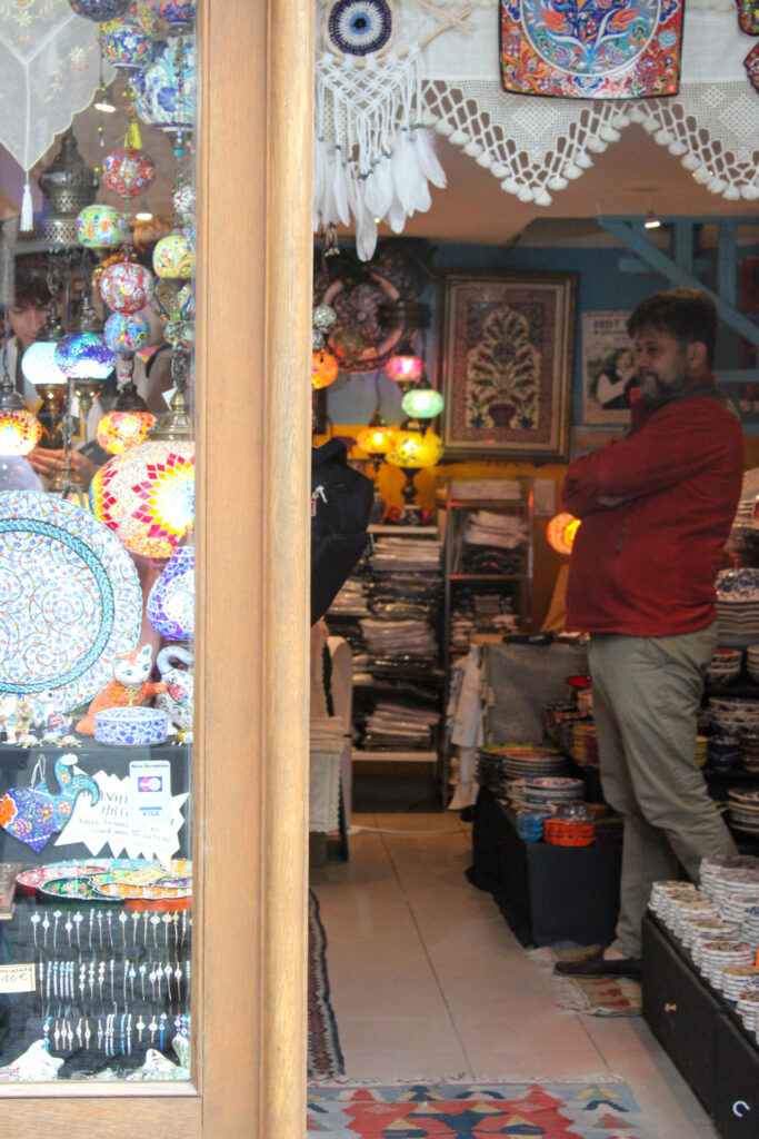
While in St Malo I wanted to experiment with taking photos of shops, items inside the shops and using the reflection in the shop window etc. I wanted to do this, because the shops in St Malo were very different to the shops that we have in Jersey, so this really interested me. St Malo was full of small own business shops and there was very little high end designer or branded shops. This intrigued me, because all of the shops were quite unique.
Items
Analysis
I think these images came out well, because they display how the shops offer different items and things to Jersey shops, as well as each other, as they all offer different things. These photos also display how even the food is different in St Malo compared to Jersey.
These images also have good composition and lighting and have been edited well in my opinion.
How do these images relate to Henri Cartier-Bresson?
These images don’t necessarily relate Henri, but they do show the lives of the people living in St Malo and how their lives differ from ours back at Jersey.
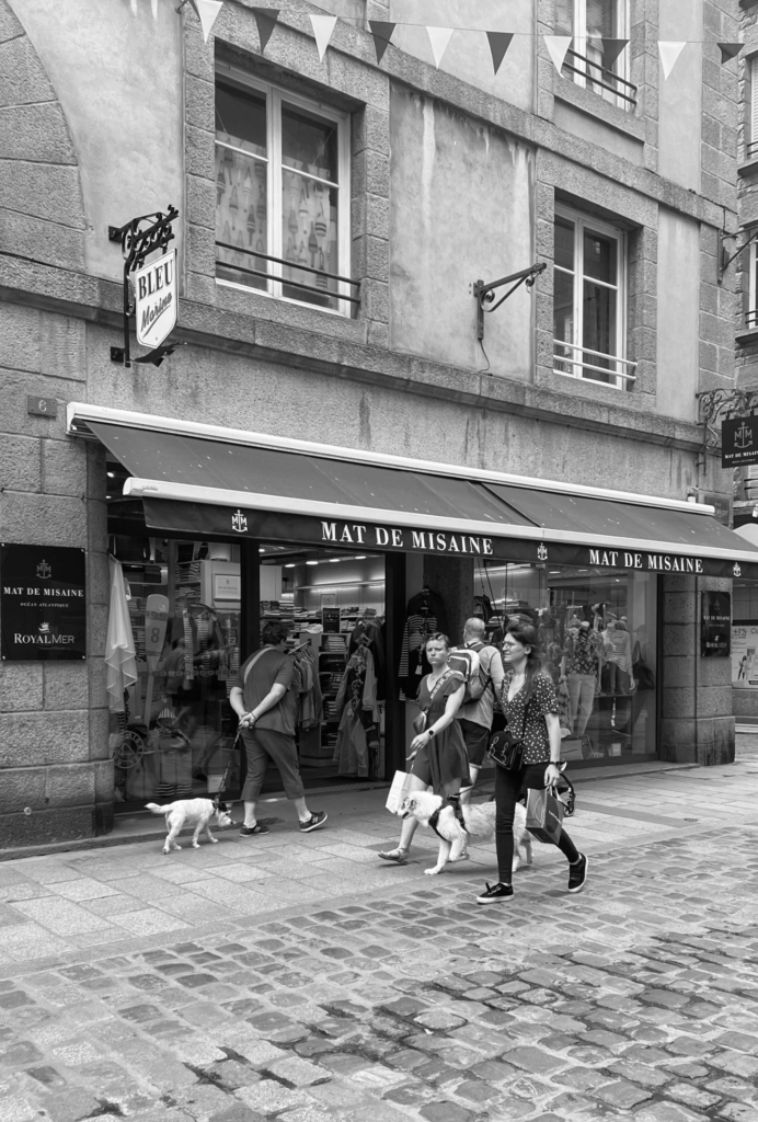
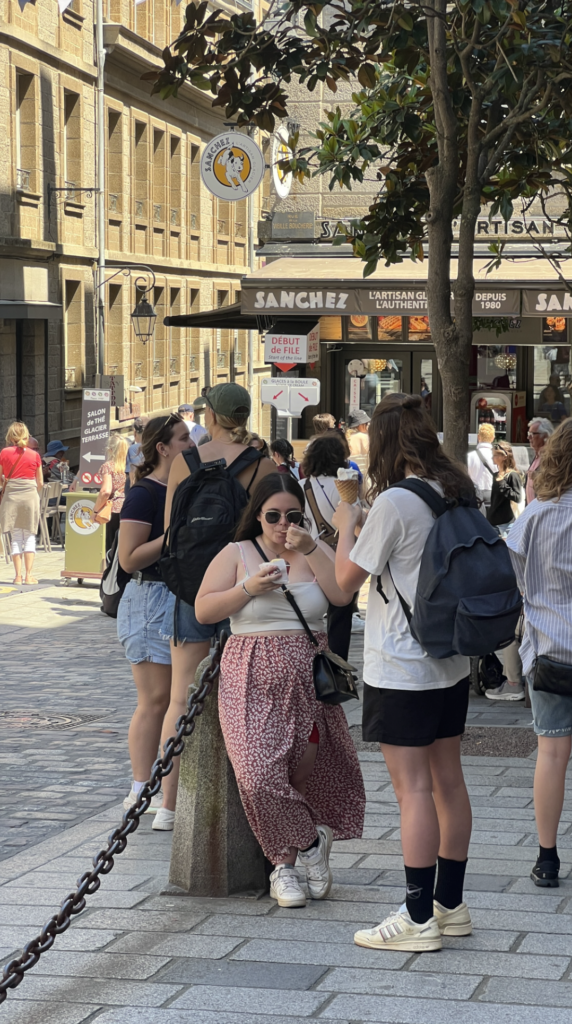
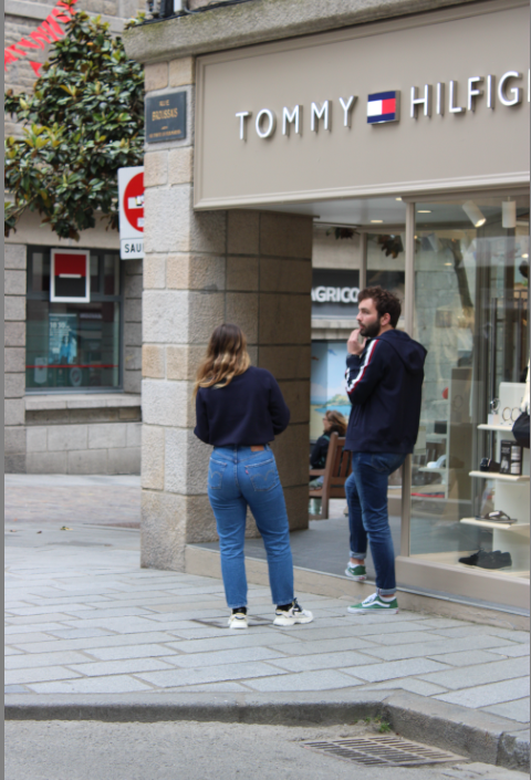
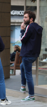
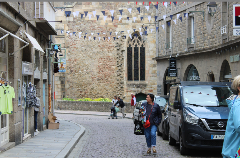
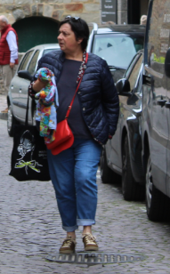
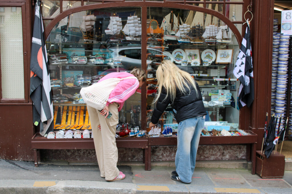
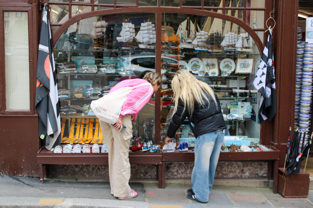
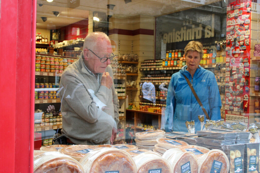
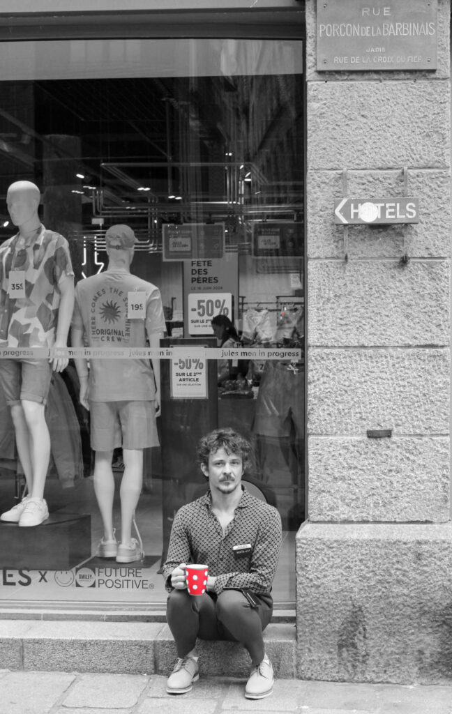
People
Analysis
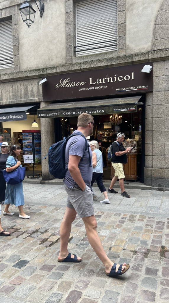
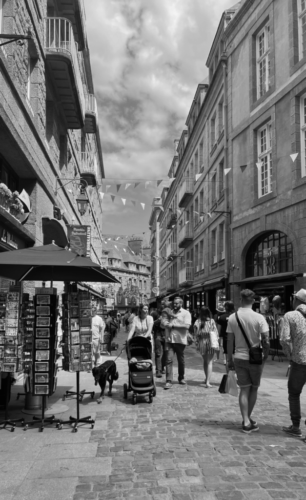
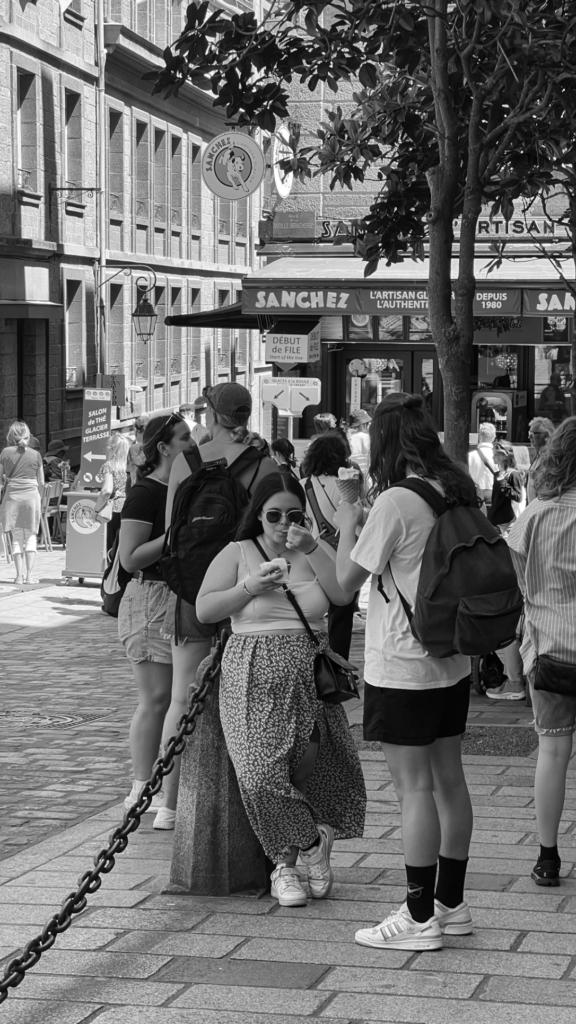
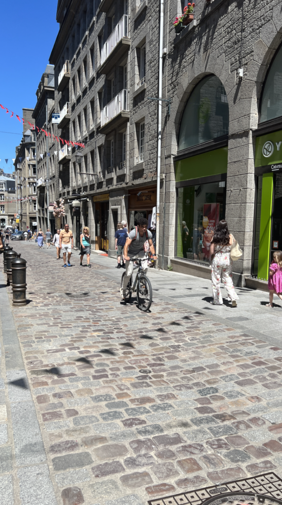
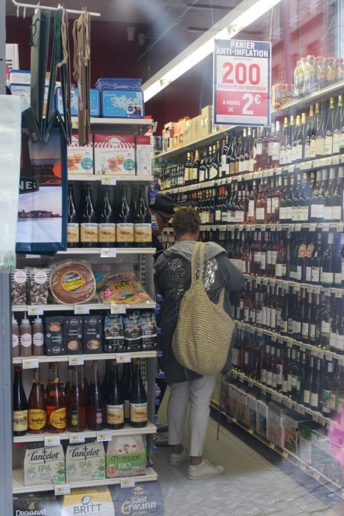
These images display the lives of the locals in St Malo, as I have snapped images of them living their day to day lives (candid photos). These images also display all different types of people, eg: young, old, male, female. I have also tried to use shop windows to my advantage, by capturing people through the windows without them seeing me and using the window reflection to my advantage.
The composition of these photos are also good, even though they all have different compositions. The lighting and editing are also good in these images.
How do these images relate to Henri Cartier-Bresson?
These images relate to Henri Cartier-Bresson, because I was observing the peoples day to day lives in these images (mostly without them knowing) and waiting for the decisive moment, which is what Henri did. I took candid shots of these people, which is what Henri did, while he walked the streets observing the people.
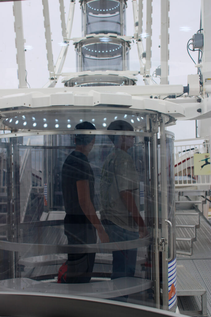
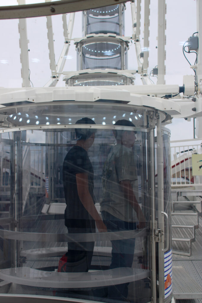
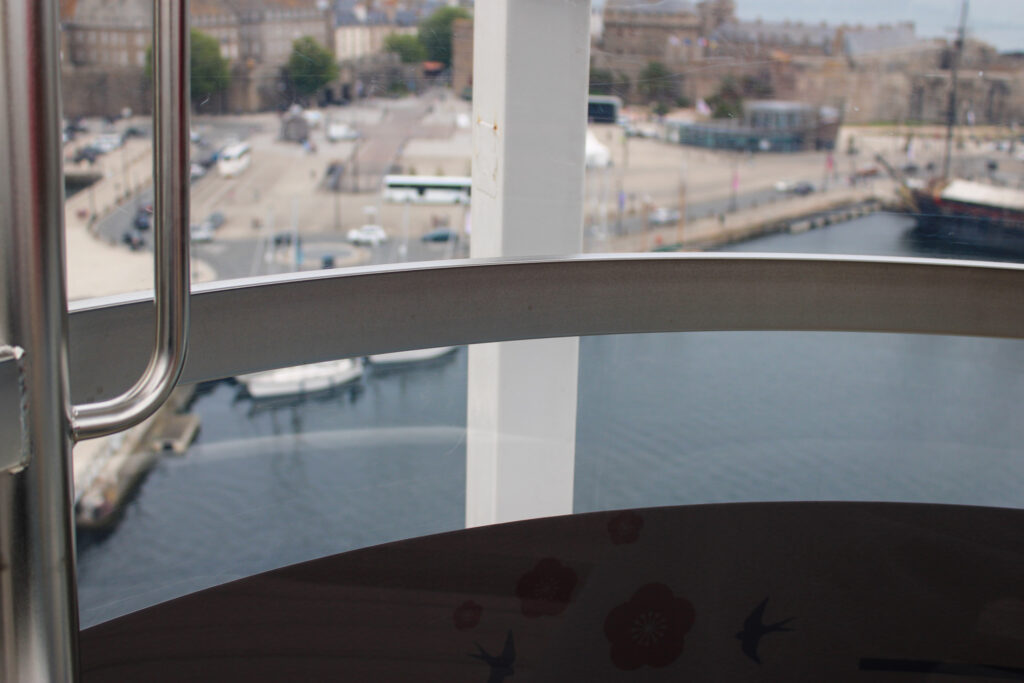
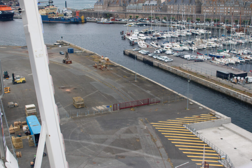
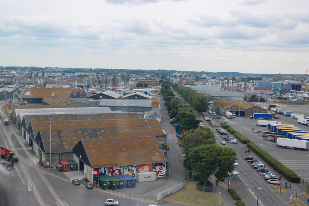
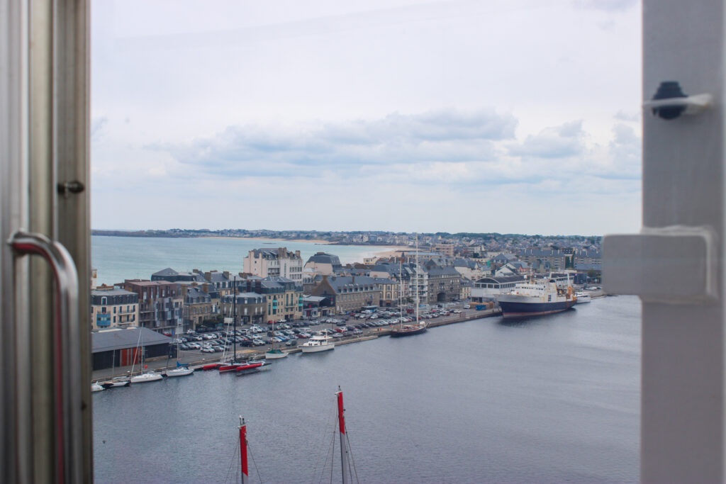
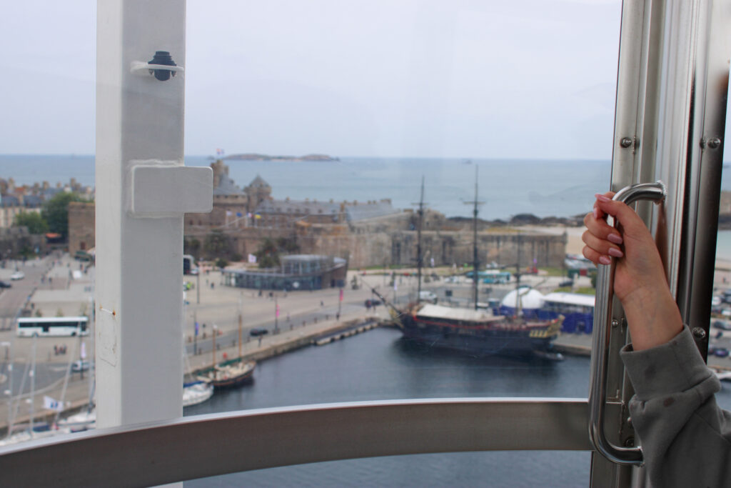
Ferris-wheel
Analysis
I like these images, even though they are a different style. I like these photos, because they produce different angles of St Malo and the people from St Malo. I was able to achieve higher up angles for my photos and did capture a few landscape shots. I was also able to capture other people on the Ferris-wheel with us. I also had fun on the Ferris-wheel and I don’t think anyone else really went on it.
How do these images relate to Henri Cartier-Bresson?
These images don’t necessarily relate to Henri, but I had fun taking them. They also do show life in St Malo from other angles and the lives of people from other angles.
Bringing the People of St Malo to life
I wanted to experiment with bringing the people, who are still in these images to life. I wanted to do this by using motion blurring.
First, I duplicated my background and selected my person. Then, I selected inverse and deleted the background.
Next, I went to filter and motion blur and selected how blurry I wanted it and what angle I want the blur to be.
If my person got too transparent I would also duplicate the layer with only my person, before I motion blur it, so there is always an opaque copy.
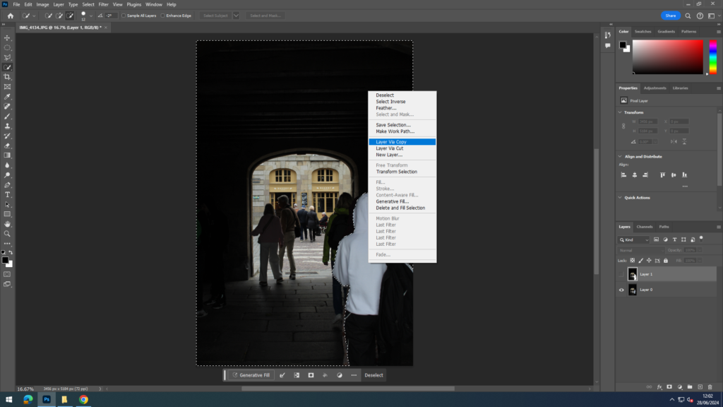
I wanted to also experiment creating different scenes in St Malo, so I used AI to do this. I also used AI to create more shop windows and reflections, so I could experiment with that even more.
First, I selected an image I wanted to use and selected where I wanted the AI to go. Then, I selected generative fill and typed in the prompts that I wanted and finally selected which one I thought looked best.
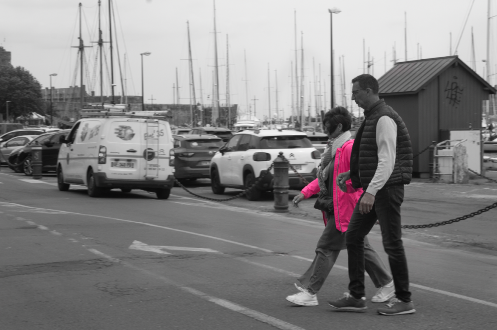
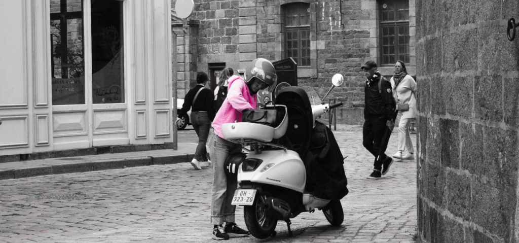
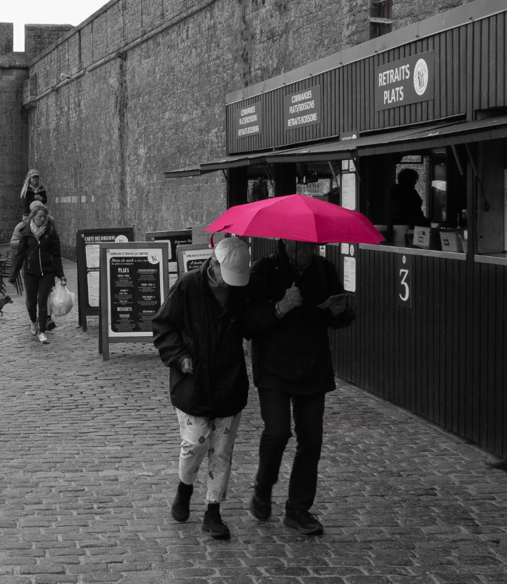
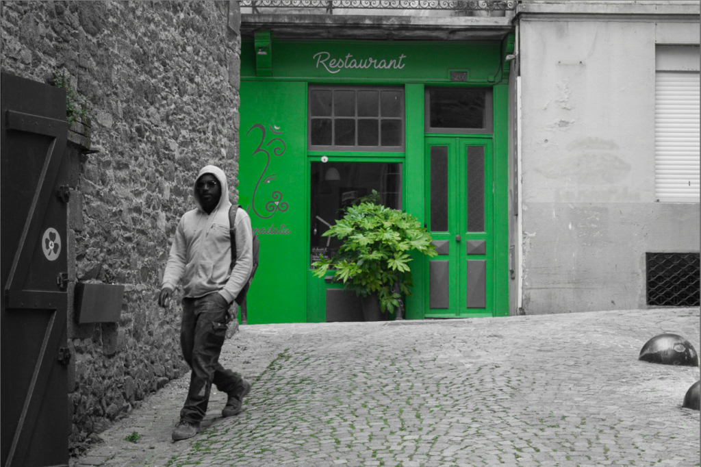
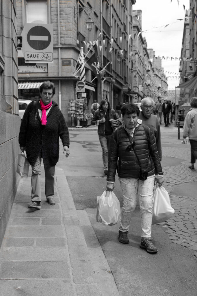
I used colour selection for some of my St Malo images, ones with people involving significant colours or were close to the camera. For each one, I wanted to ensure subtlety was involved as this way, it wouldn’t entirely draw attention away from the purpose or intention behind the photo. As well as this, it meant that there was still a bright pop of colour amongst the grey tones.
I also created this on a selection of hot pink graffiti as this is something that is frequently spotted around St Malo, becoming a part of the small town’s culture.
HOW I DID IT:
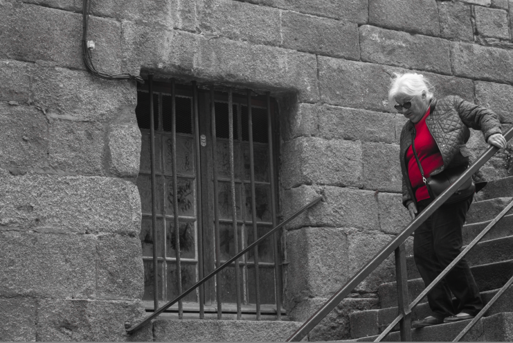
To complete this experimentation, I duplicated the layers of the same image to begin. I then made one layer black and white:
After I concealed the black and white layer, I selected the layer which was still in colour and went to colour range:
Here, I could select a variety of different tones and colours found in a specific area. By doing this, I would keep these colours saturated whilst the unselected components remained black and white:
After grabbing each tone of red on the woman’s jacket using the positive eyedropper, I inverted the layers so that the red jacket would pop out:
This was the final result once I rubbed out any imperfections picked up: