These images are the photos I have decided to put into the print folder and will mount onto black or white board for display.
A3 IMAGES.
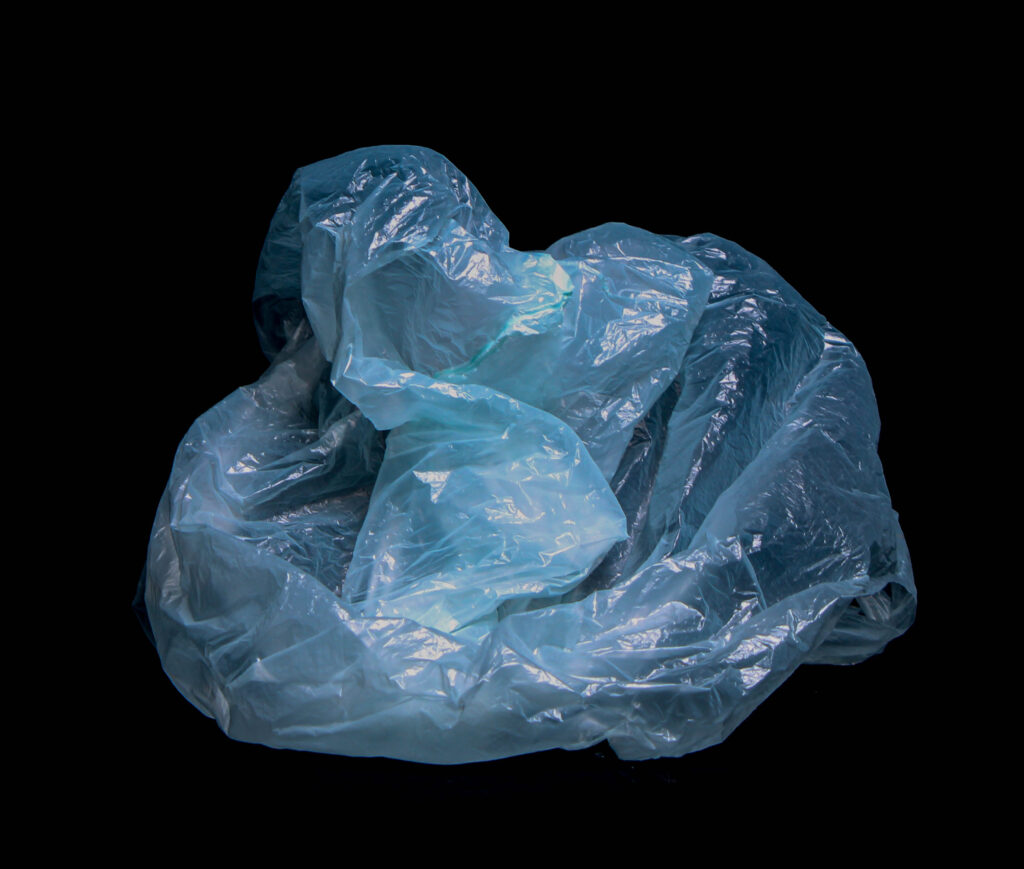
I chose this image from my studio photoshoot of plastic bags I had collected from the beach. I think this image was my strongest photograph because the effect of the bag floating with no background apart from a plain black background creates a very vivid effect of how the bag would look floating in the sea. I also like how clear the image is and you can see the detail of the bag.
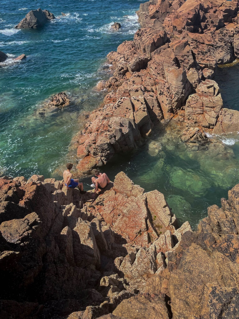
This photo was taken from my romanticism and the sublime section of this landscape project. I particularly think this image this into the sublime as the two people sat on the rock, from a high angle look very insignificant compared to the vast beautiful landscape behind them. I like the bright colours and think it would suit a white background to help bring out the colour even more.
A4 IMAGES.
These two image are some of the AI edits I made on Photoshop, this displays the possible effects of urbanisation, overpopulation and Anthropocene in Jersey and how it could affect the planet. I chose these two as they are some of the more realistic looking and stronger images I edited. I like these photos as I think they are effective in conveying the idea of human takeover becoming extremely transformative and dangerous for the earth.
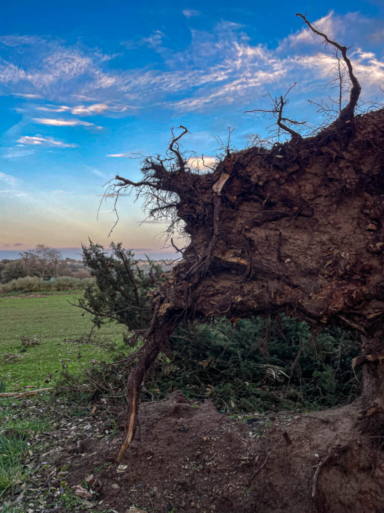
This photo was from my Storm Ciaran photoshoot where I capture a fallen tree due to the storm. I really like the bright background and how the blues and yellows, and whites contrast with the dark browns and blacks of the tree, the roots are also an interesting component as it shows the age and time the tree was there for before being destroyed.
These three images are also part of the AI edits I have done on Photoshop. These photos will be arranged in the triptych order of ‘in a row’ in the order above and display Jersey in a more positive way.
1- Currently
2- Without cars and machinery
3- The road is replaced with a field and greenery
A5 IMAGES.
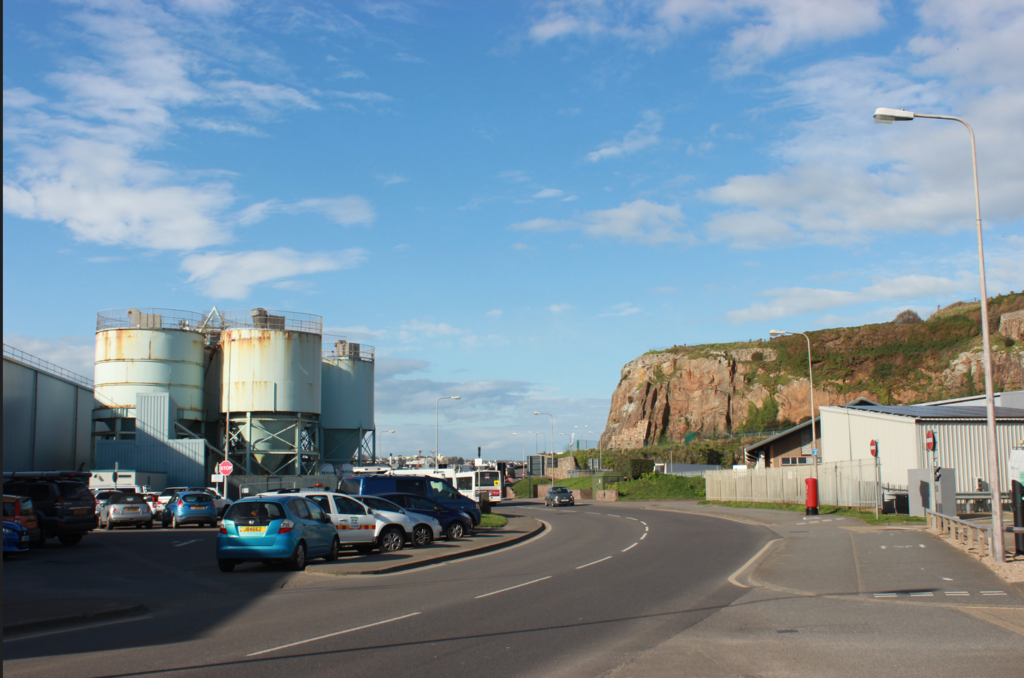
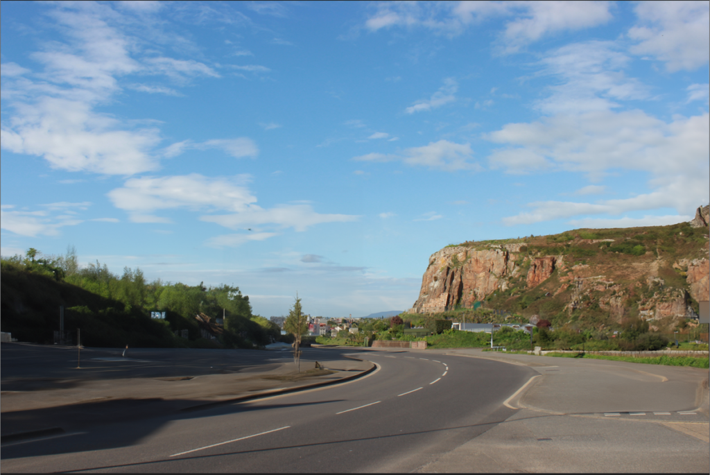
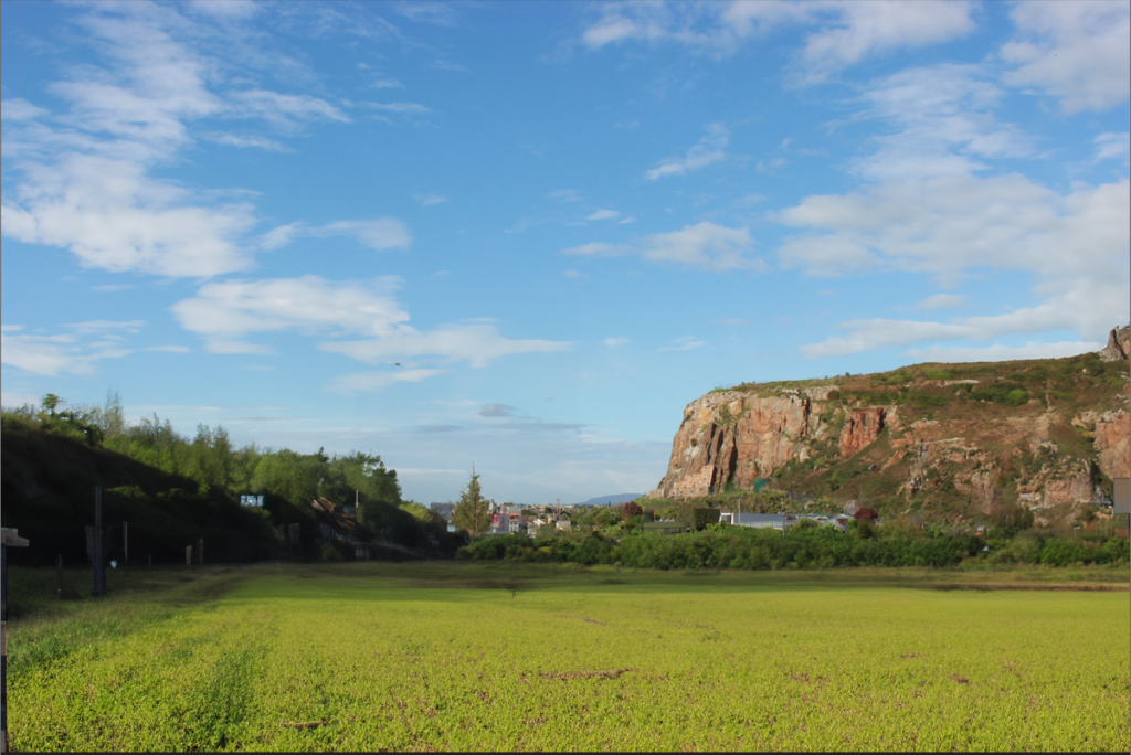
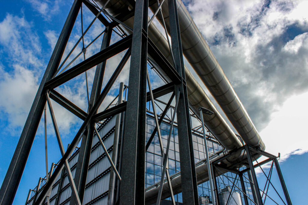
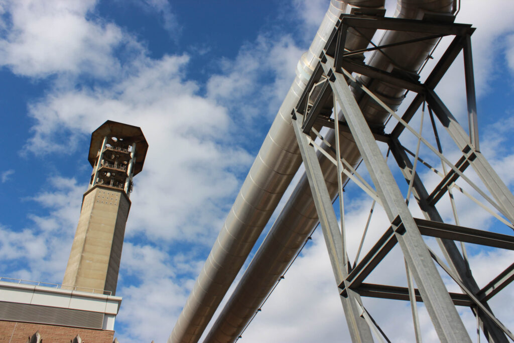
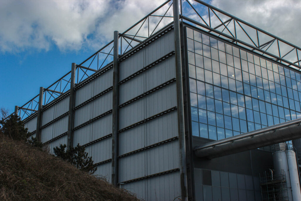
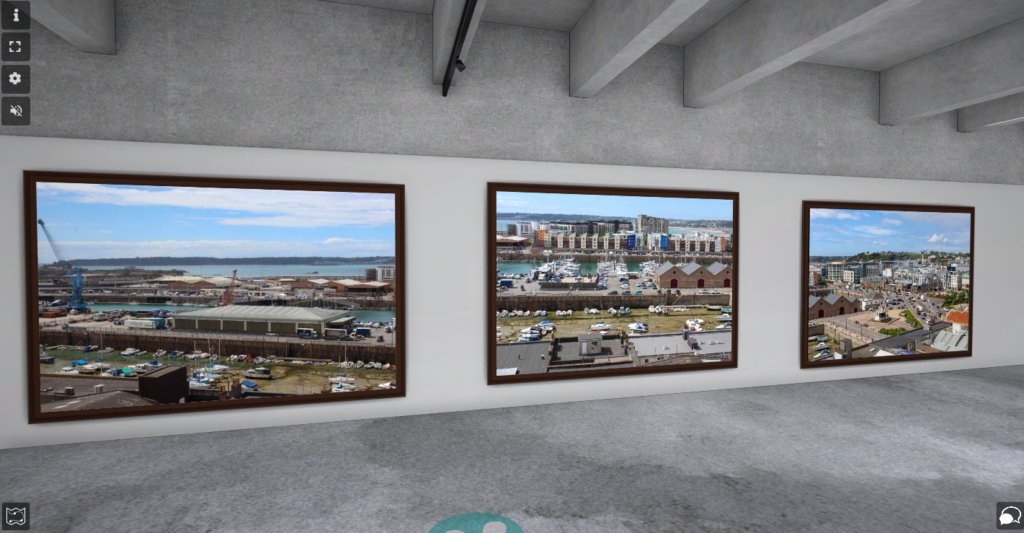
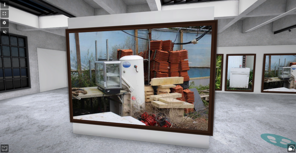
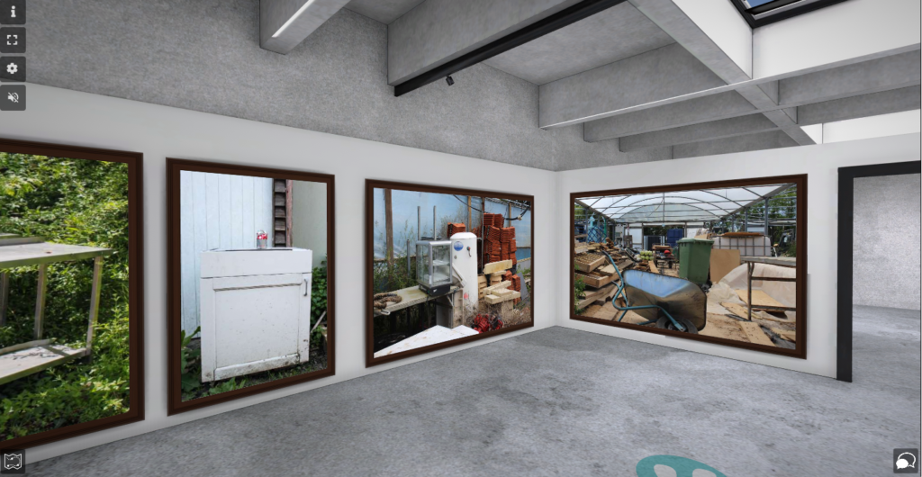
These photos I took on my Harve Des Pas photoshoot, where I captured images of the machinery in the relation to urbanised locations and new topographic. These photos I think would look strong in a triptych arrangement as they all tie in with a blue cloudy sky, grey machinery and a landscape camera shot.
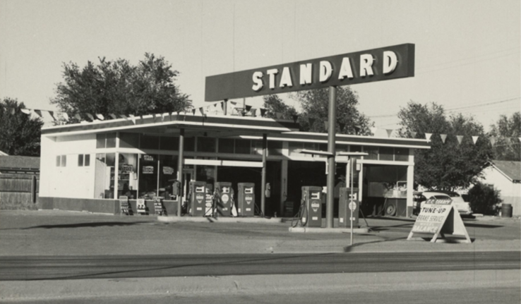
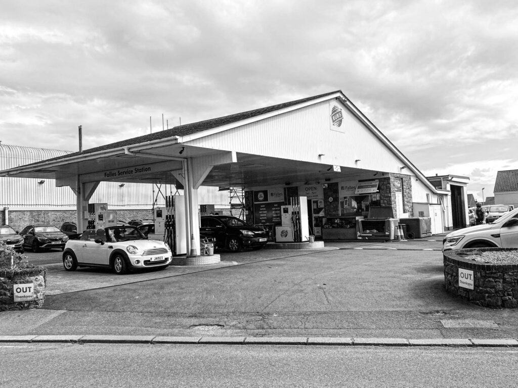
Ruscha’s work in photography includes a large photoshoot of old petrol stations, with lots of empty space surrounding it. This is due to him mainly photographing Los Angeles and Oklahoma City. My photographs contrast to this because many of the petrol stations in Jersey are significantly smaller than ones in America, leaving less empty space surrounding them. A similarity between mine and Ruscha’s outcomes is the angle in which the image is taken. Both of us take our photos from a deadpan angle, which allows the whole setting to be shown in the image, I also like this angle because gives the image an overall sense of simplicity, without over complicating which elements to include in the shot. It seems as though Ruscha takes his photographs on a main road to get everything in the shot, I also tried this approach because I wanted to be able to do the same.
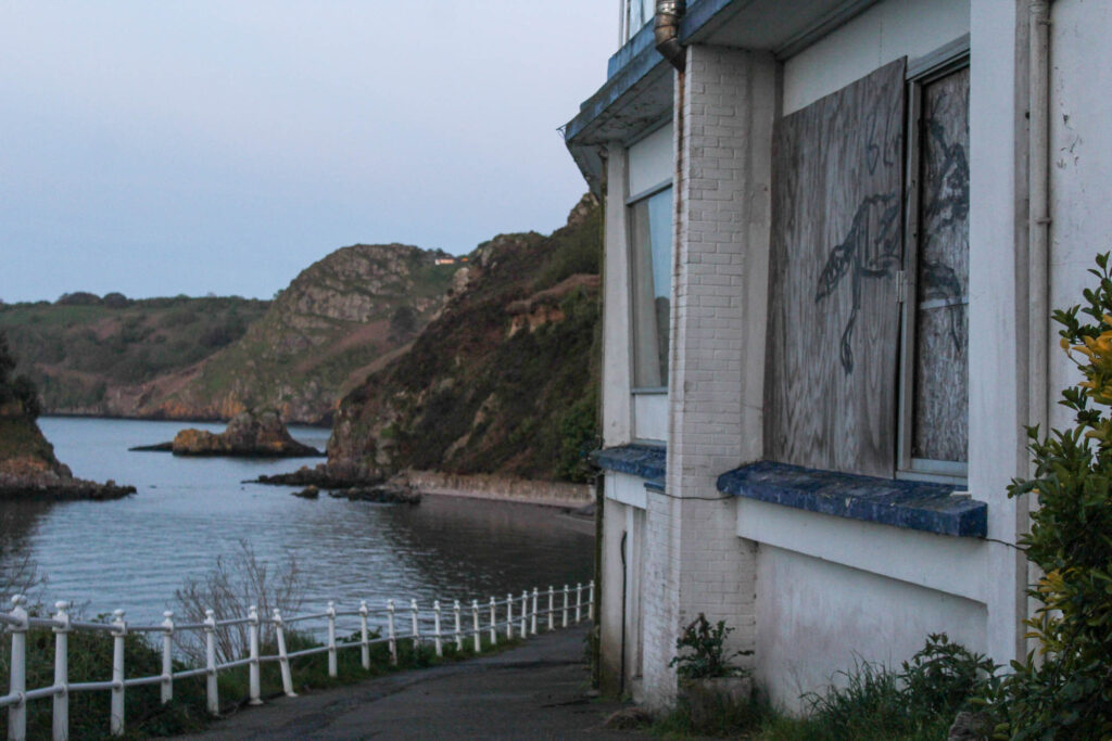
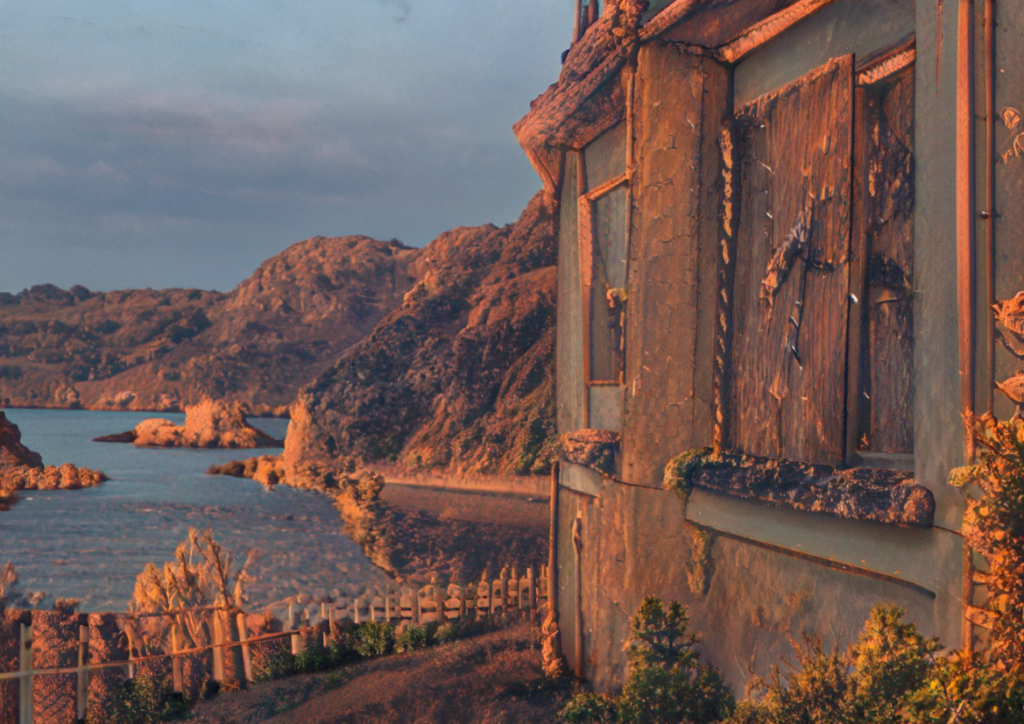
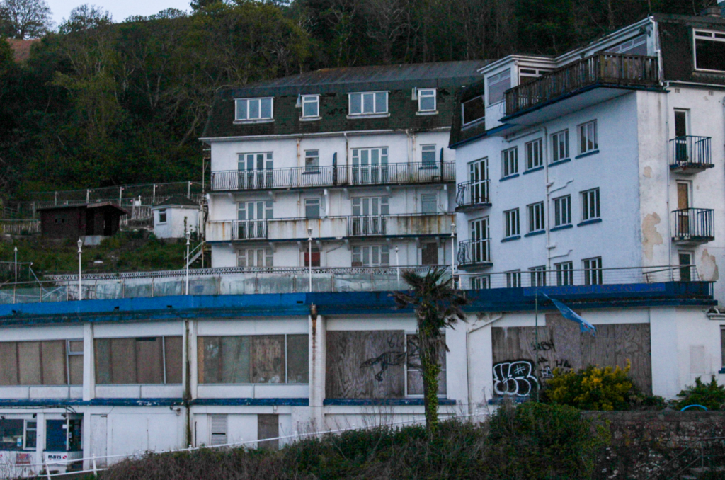
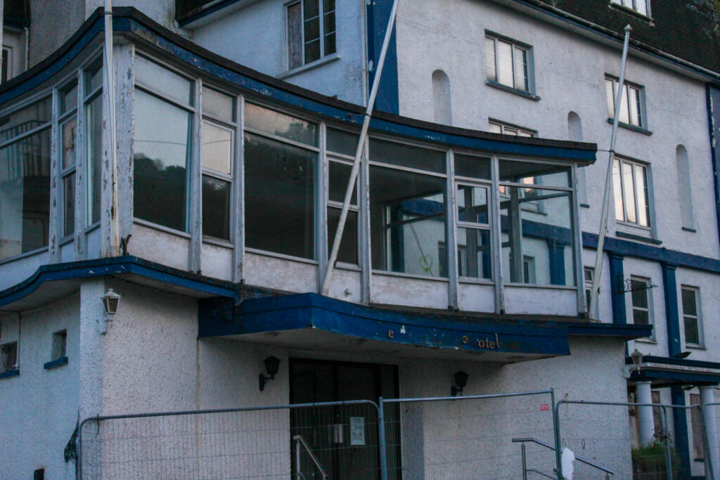
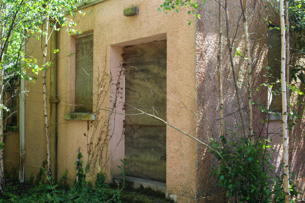
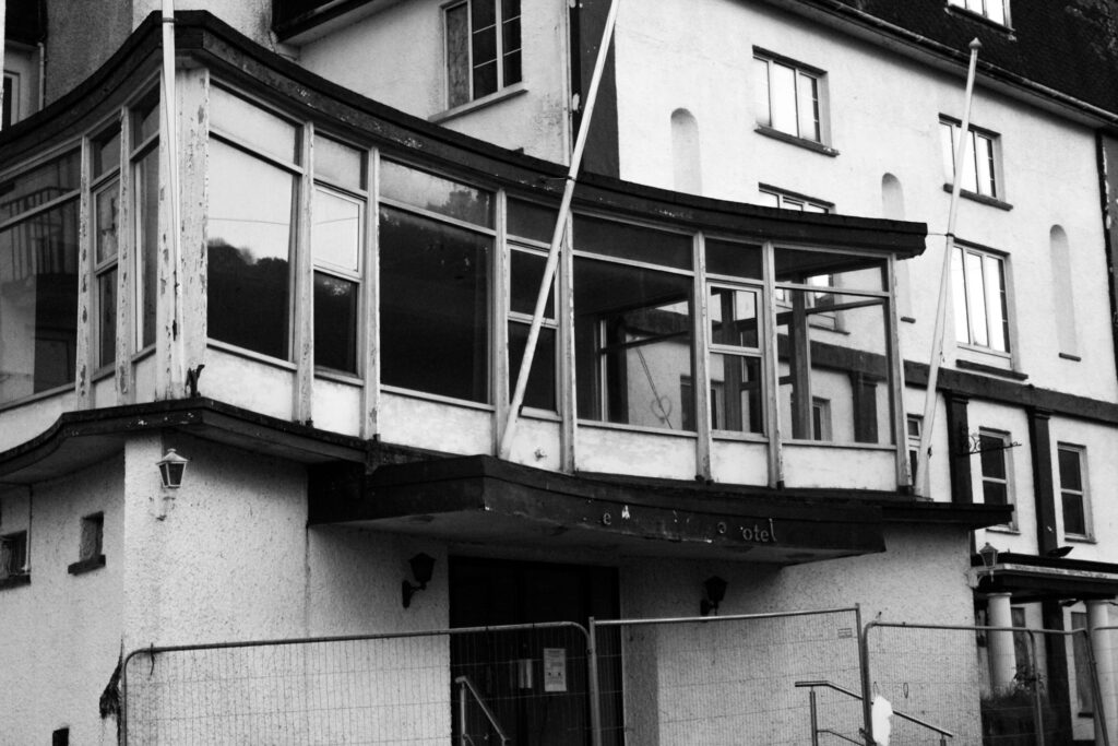
I used AI in photoshop to edit images of the abandoned hotel at Bouley Bay, so that I could give it a more rustic look, so that it looks much older and more destroyed. I did this by selecting the image I wanted to use and dragging it to photoshop. The image I used was;
I used this photo, because it captured both the abandoned building, as well as the natural environment surrounding it. It also captured the graffiti, which is often left on abandoned buildings.
Next, I went to filter and selected neutral filters. Then, I downloaded the landscape tab and selected a colour theme that would be suitable. Lastly, I adjusted the strength and saved the image.
Then, I experimented with some different colour themes.
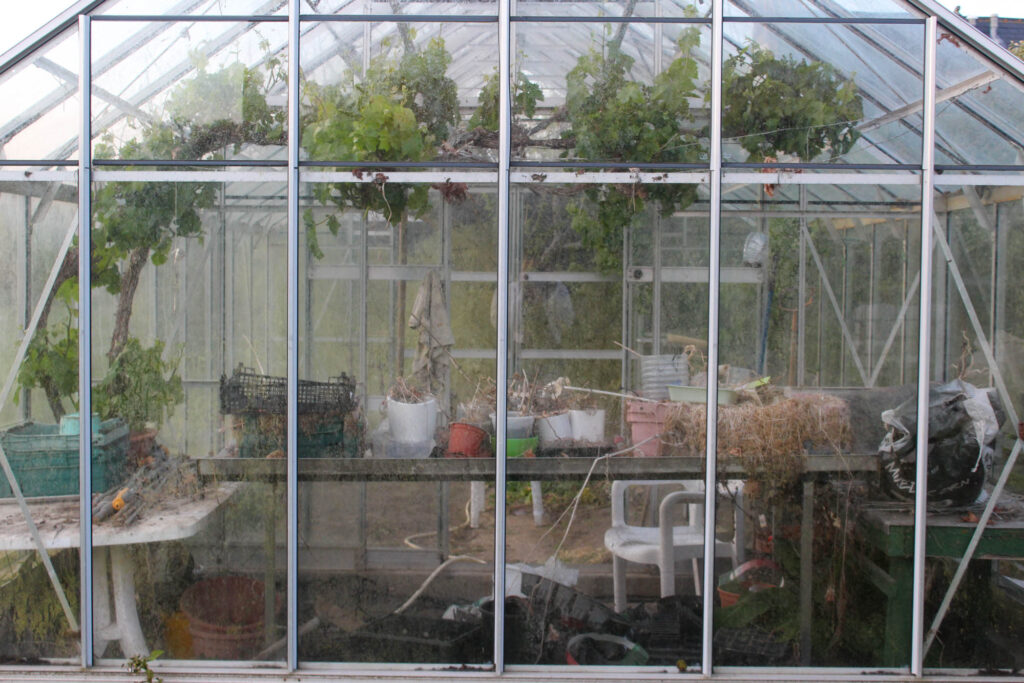
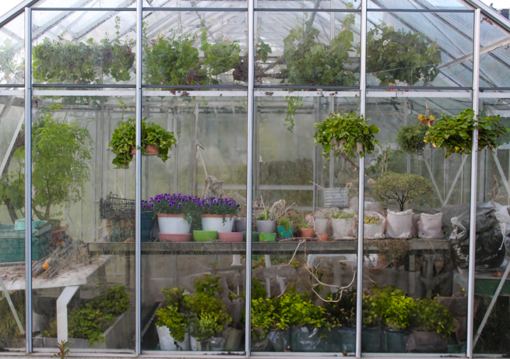
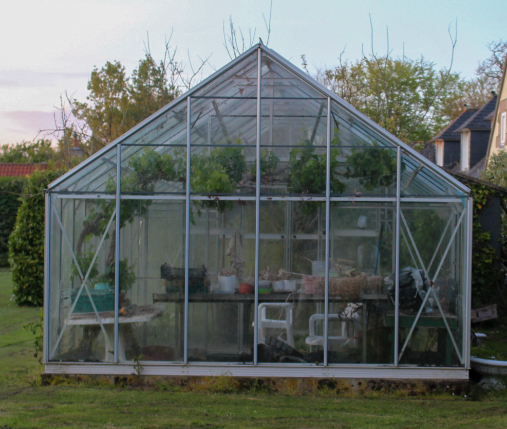
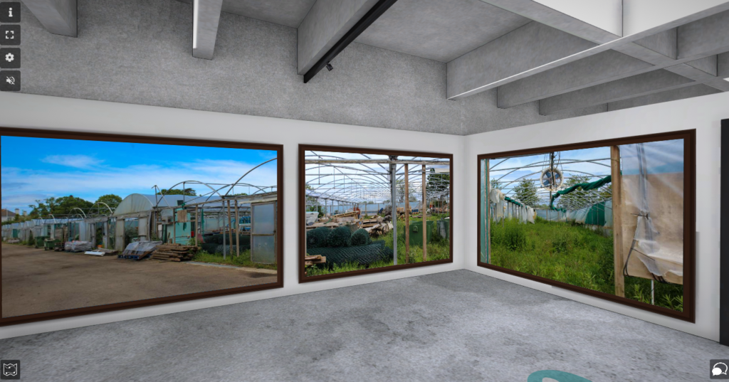
Greenhouses
I used AI to experiment with my greenhouse images, because I wanted to display how greenhouses should be used, and how they used to be used very often. I did this by using AI to add more greenery, bushes, flowers etc. to my greenhouse. The prompts I have used are below.
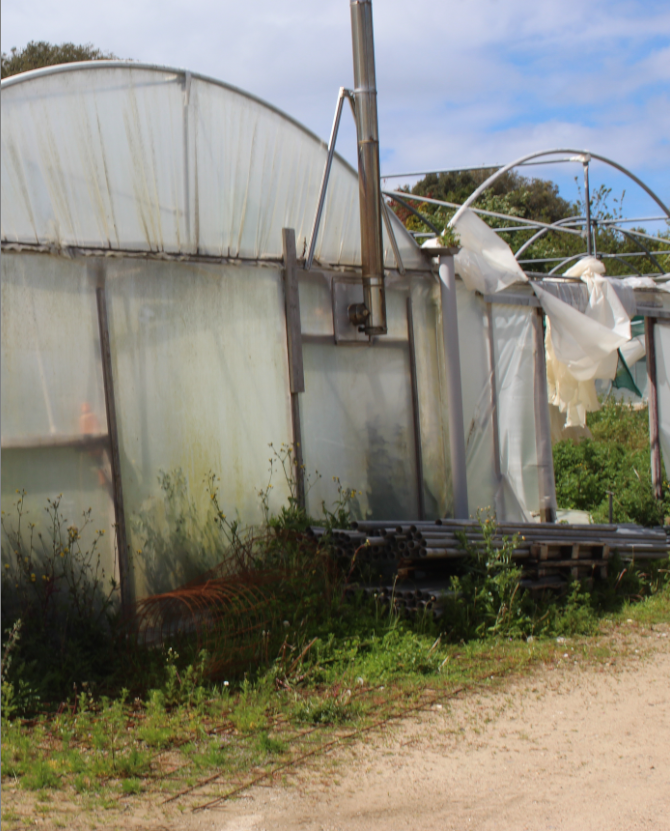
The original picture is a sad greenhouse, which has nearly no green in it, because it was rarely used. It also has quite a few dead plants.
The image with AI shows how greenhouses used to look and how they should look today.
I used AI to go into the past here, by adding more greenery, more alive plants and bushes.
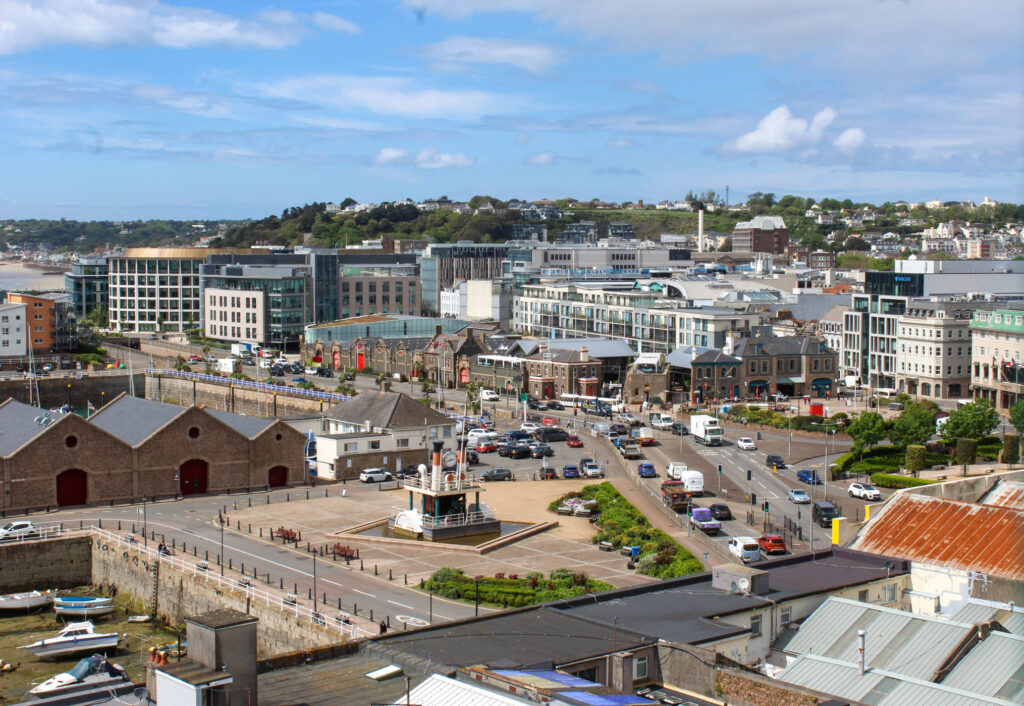
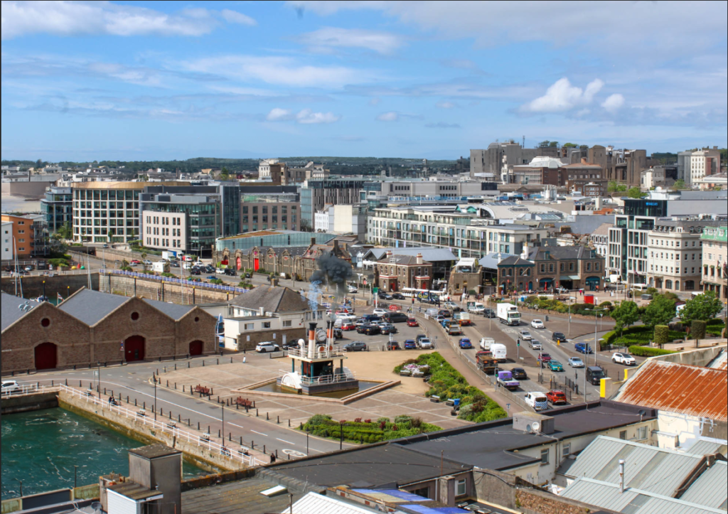
Industrialisation
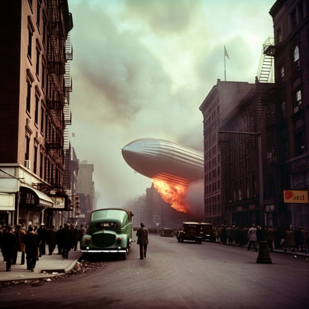
For Industrialisation, I decided to go into the future, to see what our town would look like in a few years. I used AI in the same way to do this, by adding different prompts:
These are examples of the prompts I have used to edit this image.
This is the original image of a popular recognisable place in St Helier.
I wanted to edit the picture to show what this place will look like eventually, if things do not change and people continue to damage the earth.
There are many more buildings, because of industrialisation, as well as over population, which is also why there is more cars. There is smoke to represent air pollution, as well as the water in the bottom left harbour to represent rising tides and how much they will rise due to global warming and ice bergs melting. The changes are very subtle, but they present of huge message.
Cropping
Cropping images can be important for many different reasons. You may want to crop something or someone out of an image, or you may want to zoom in closer on the main view point of the image. Cropping also allows us to explore the negative space in an image, by cropping it out.
There are also many different ways you can crop images;
Portrait Format
Landscape Format
panoramic crop (vertical or horizontal)
square crop
circle crop
polygon crop
etc
Portrait Format
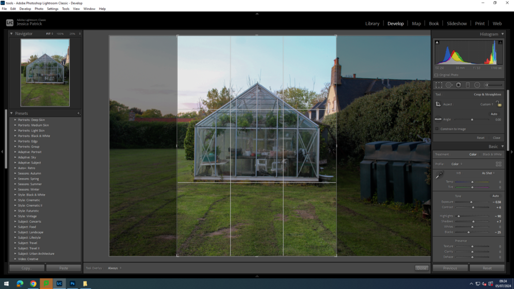
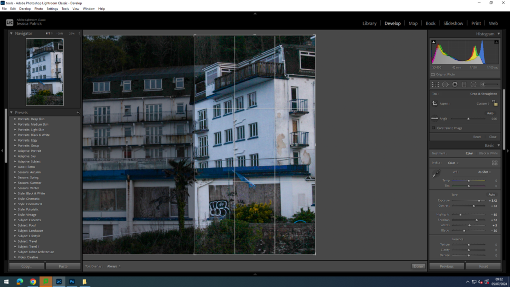
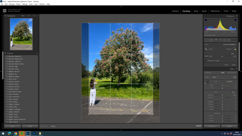
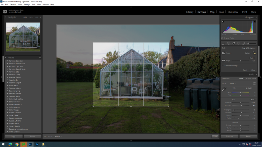
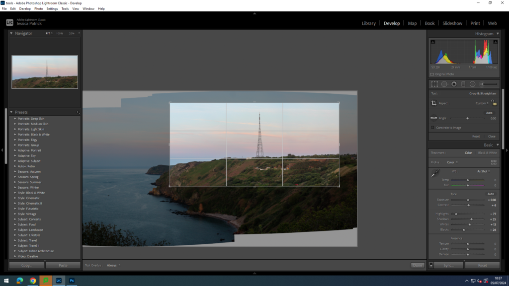
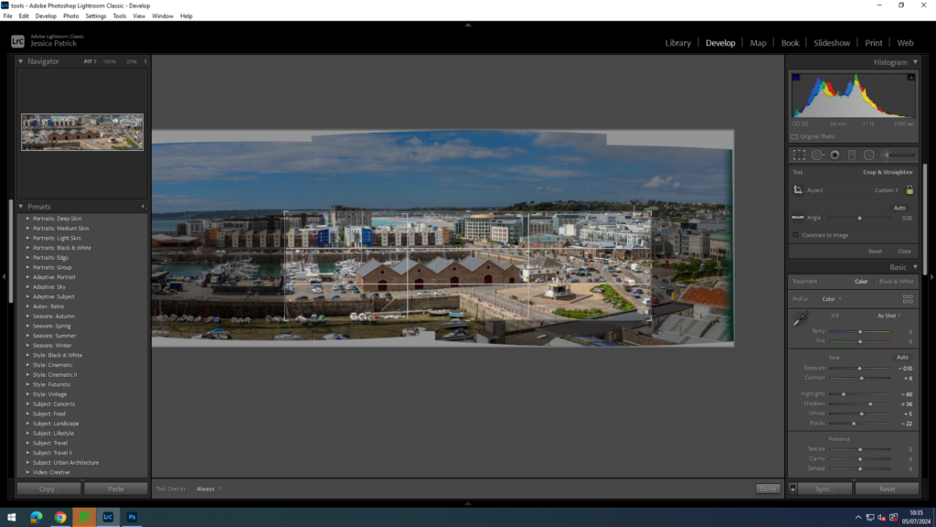
Firstly, I am going to experiment with portrait format. I am going to be using Lightroom to crop these images.
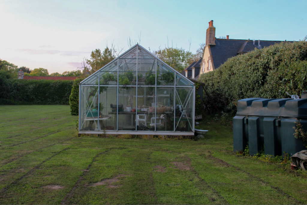
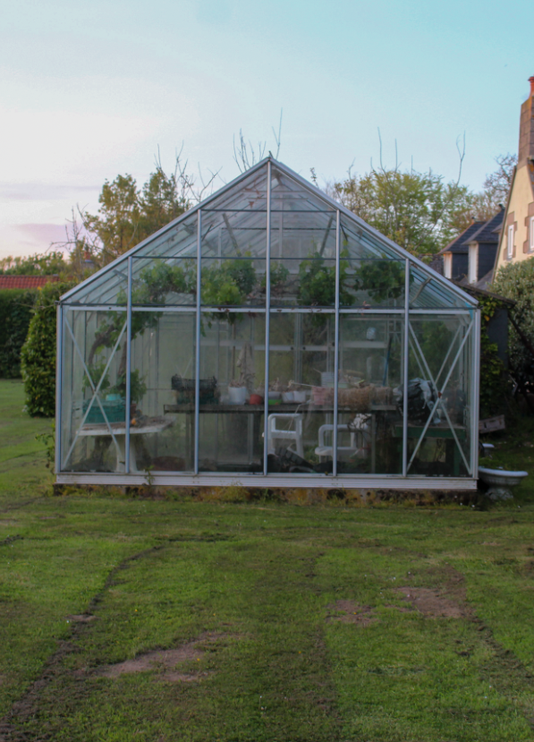
This is the image I have decided to crop, so that I can crop out the negative space around the greenhouse, so that I zoom in on the greenhouse more, which is my main viewpoint.
This is how my final image came out after that first crop.
Next, I decided to crop out the negative space at the grass a bit more, so that I could zoom in on the greenhouse even more so.
I also experimented using a portrait format for a few other images.
This is the next image I used.
I used the cropping tool on Lightroom to do this.
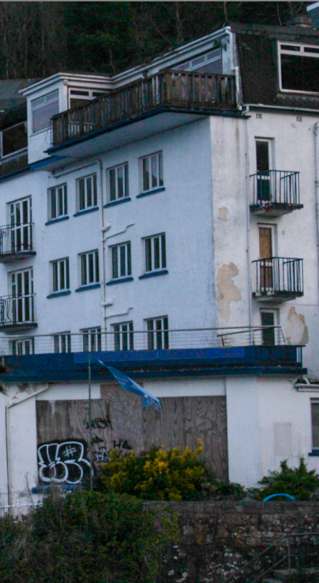
I wanted to crop the image in this way, so that I could really zoom in on the abandoned building, so all the damage was more visible.
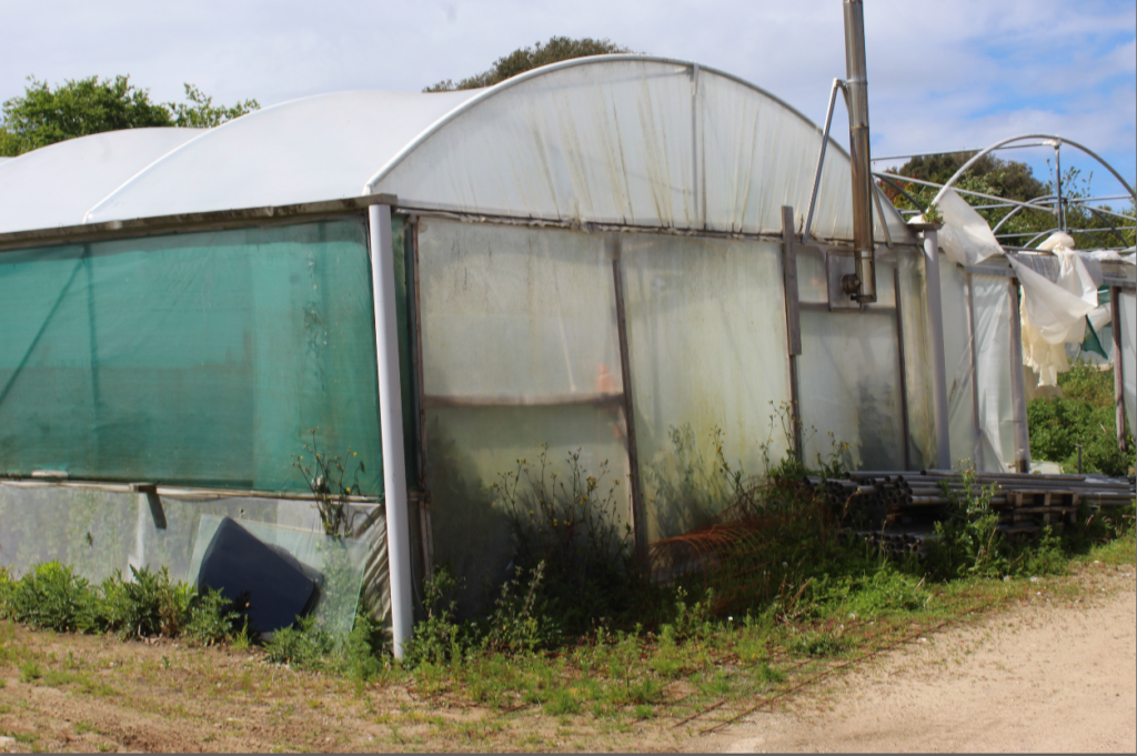
I cropped the negative space on the left out of this image, so that I could zoom in on the damaged section of the green house more, as that is my main viewpoint for this topic.
Next, I wanted to try and experiment with a person in one of my images.
I cropped out the negative space either side of the main viewpoint and also a little bit of negative space below the viewpoint, so that is was more in balance with the negative space above the viewpoint.
Final Portrait Format Images
Before
After
Before
After
Before
After
Before
After
Analysis
I think portrait format images work best for when you want to remove negative space from either the right or the left of the main viewpoint, as it allows the image to zoom in more on the main view point. I think the portrait format worked well on my images, but I do think it worked best on the image with a person, so I do think it could be better used for people.
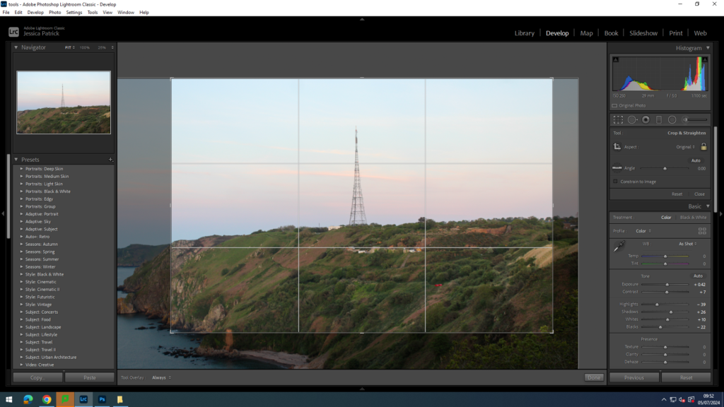
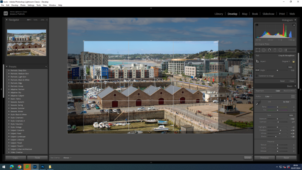
Landscape Format
Landscape cropping will be useful for cropping out negative space that is either above or below the main focus of the image. I also think landscape format cropping will work better for my images as they are landscape images.
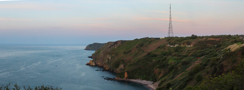
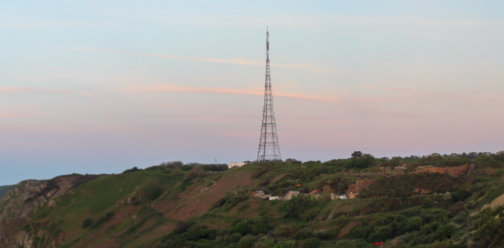
This is the image I have chosen to crop in Lightroom in landscape format, because it is a beautiful landscape shot and I think this format would work best for it.
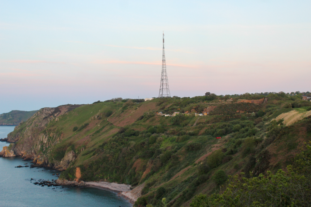
I wanted to zoom in on the tower more, as that is the main viewpoint and the main part of my topic. I also wanted to crop out some of the negative space below and around the tower, so that there was less distractions.
Next, I experimented with other images.
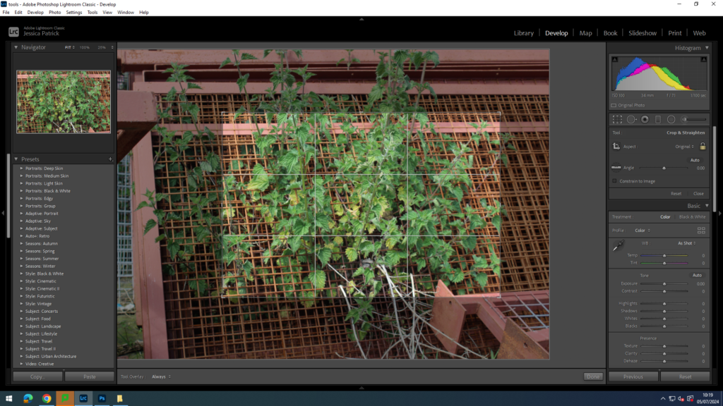
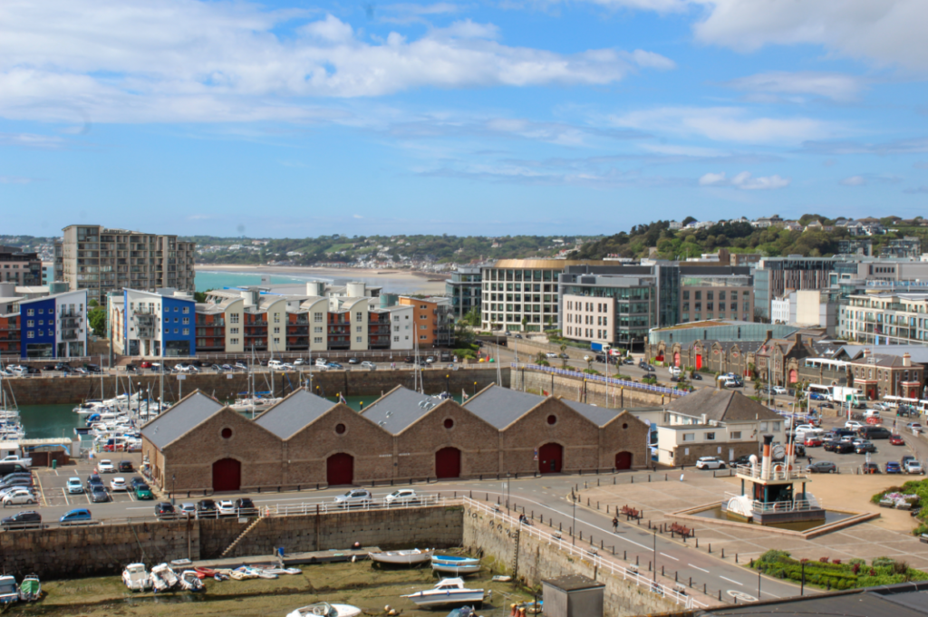
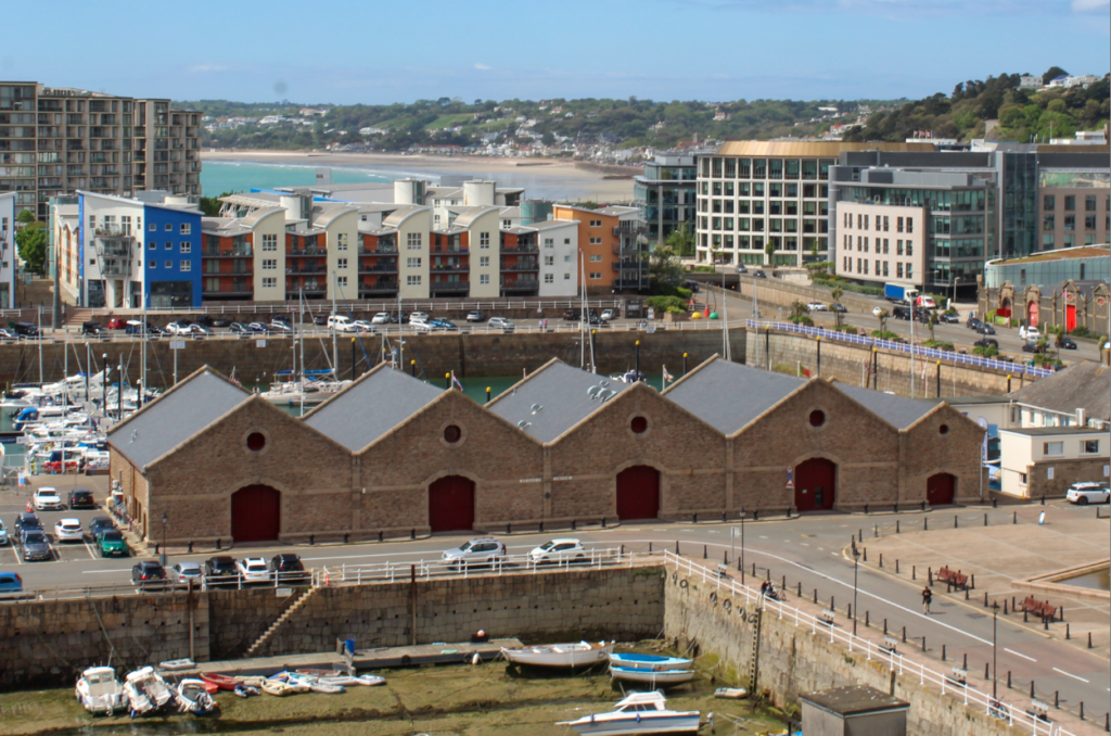
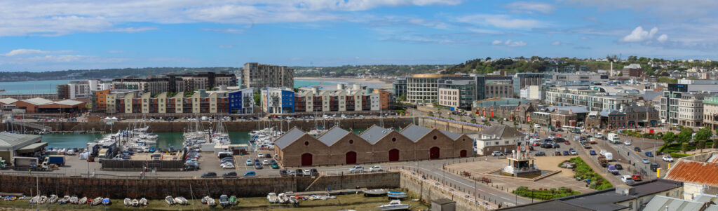
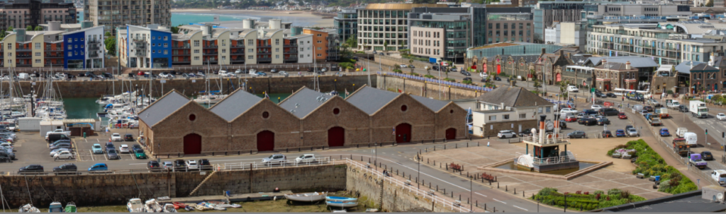
Next, I experimented with a more busy landscape image.
I wanted to zoom in on the 5 building in a line, as they were the main view point of the image.
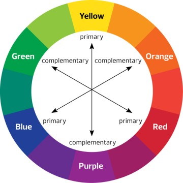
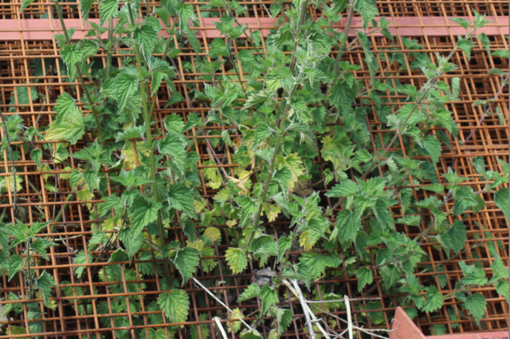
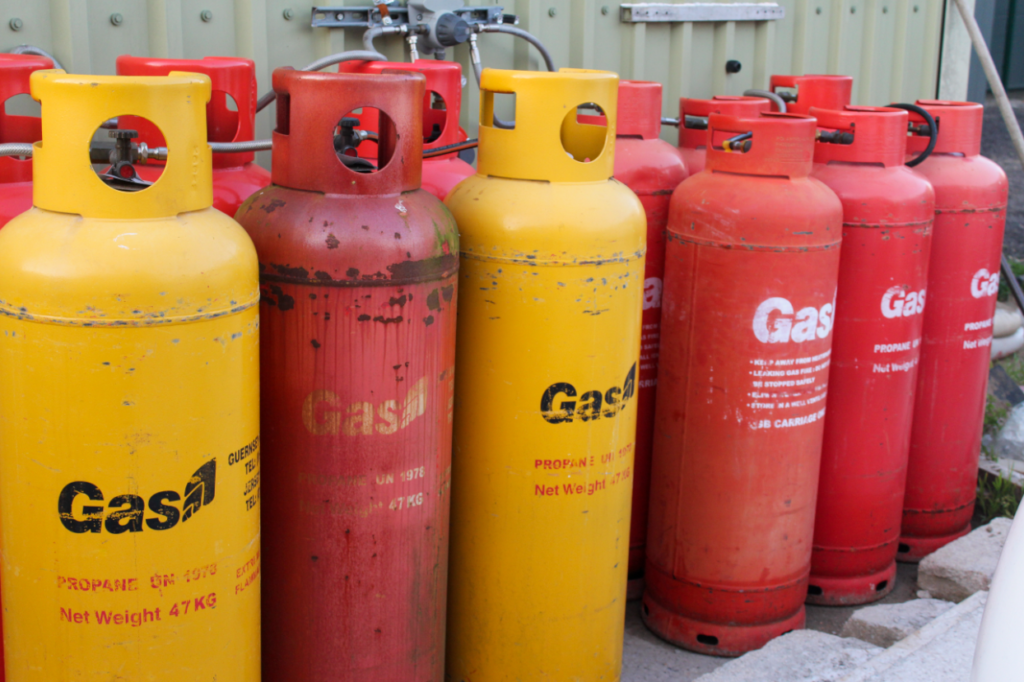
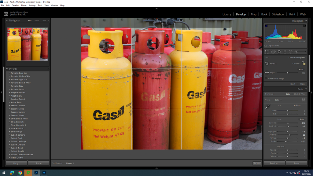
Next, I wanted to experiment with complimentary colours, while cropping.
These green and red colours compliment each other, as they are opposite sides of the colour wheel, I wanted to zoom in on the colours so I could get a closer up.
Final Landscape Format Images
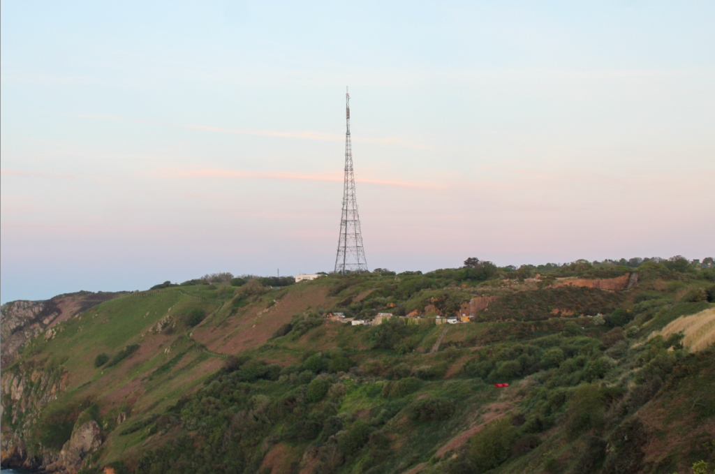
Before
After
Before
After
Before
After
Analysis
I think the landscape format images worked well for my landscape images as it allowed me to crop out the negative space and zoom in on my main view point. Using complimentary colours ad cropping to zoom in on them worked very well, as they complimented each other and created some harmony in the image.
Square Crop
I think square cropping will be useful to crop out all the negative space in an image, so it is only the main viewpoint that is in the image. It will also be useful to create an equal amount of negative space all around the main view point, so that it is centre.
I used this same Image for my square crop, because I wanted to zoom in on the greenhouse even more, and present how one image can look entirely different, just by the way it is being cropped.
I used the cropping tool on Lightroom to do this.
I used the square cropping tool to zoom in on my main view point.
Final Square Crop Images
Before
After
Before
After
Analysis
The square cropping worked well for removing all negative space from my images, so I could create close up images.
Panoramic crop
I cut the jagged edges off this image previously and now I have cropped out the negative space, so I can zoom in on the tower.
I cropped off the jagged edges to this previously and now I have decided to really zoom in on the busiest section on this panorama.
Analysis
These cropping work well, but I do not see the full point of them after making a panorama from a series of images, which will look like the ones I am cropping.
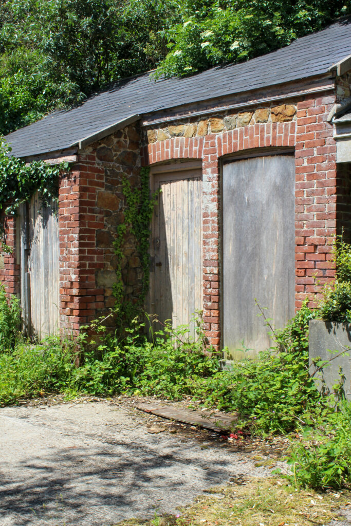
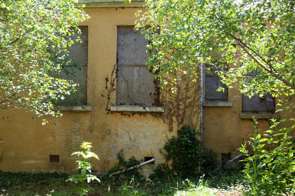
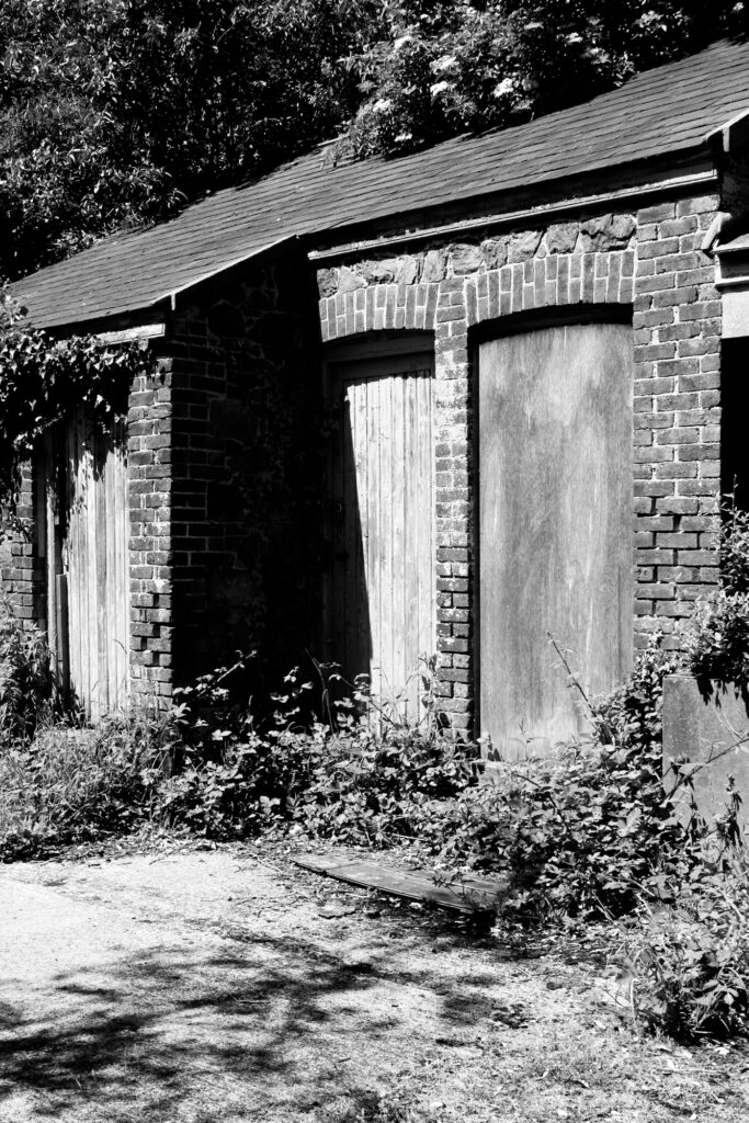
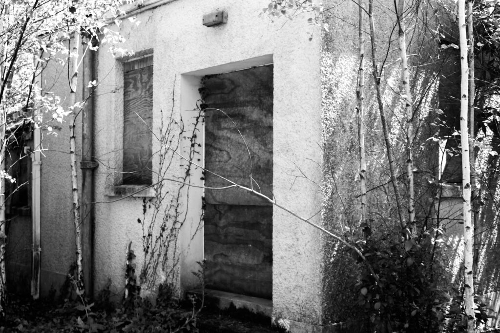
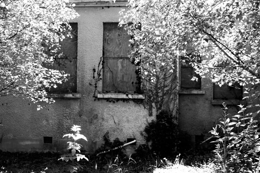
Black and White Images
I edited these images:
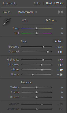
I did this by creating virtual copies of each image and making them black and white in Lightroom. Then, I experimented with contrast, whites, blacks, highlights etc. until I was happy with the images.
Analysis
I think making these images black and white worked very well, especially with the abandoned building images, because it gave it almost an eerie vibe. I also prefer black and white images to ones with colour, so I prefer these images.
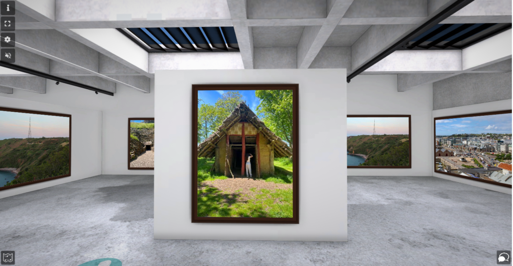
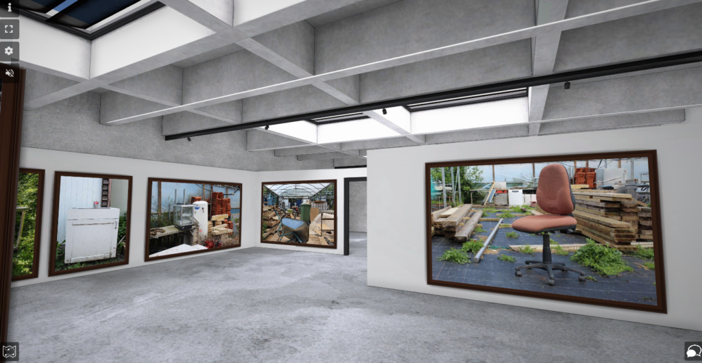
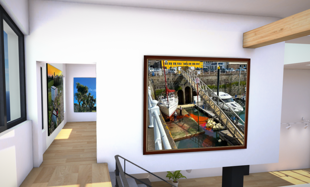
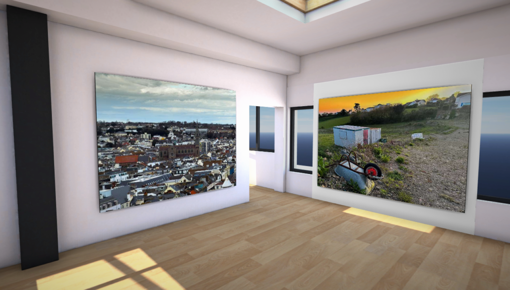
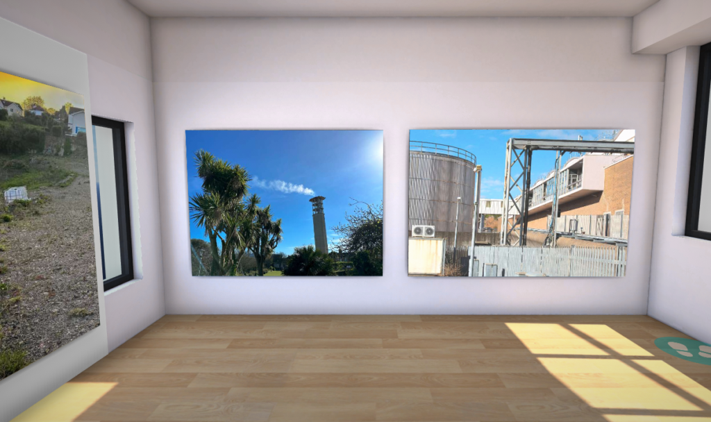
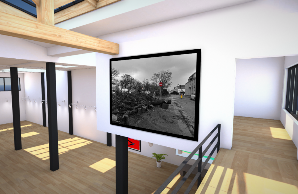
Virtual Gallery
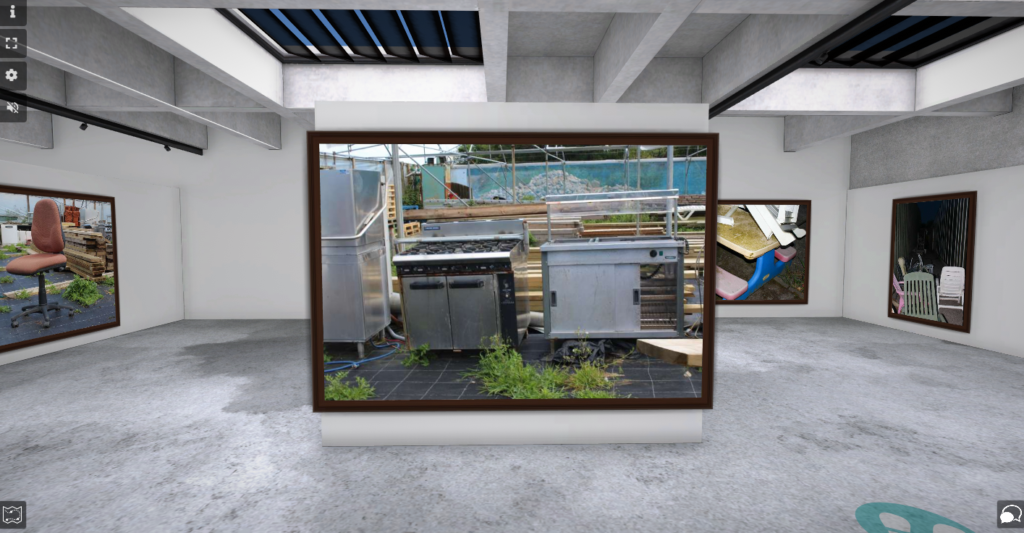
Industrialisation
I used ArtSteps to create my virtual gallery. I first chose the gallery I wanted and then imported all the images I wanted to use into the gallery. Then, I positioned them where I wanted the images and then finally added the dark brown frames to them.
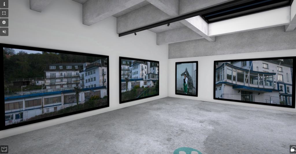
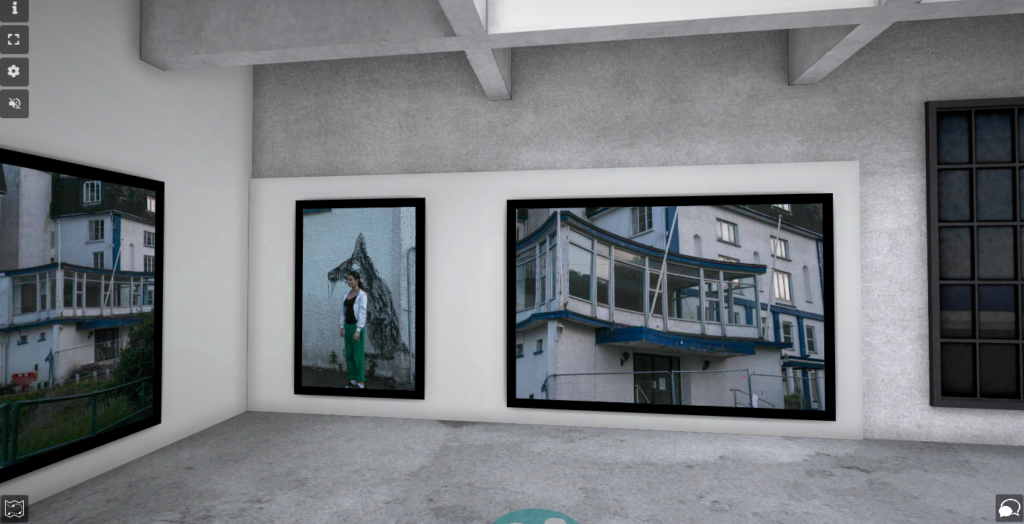
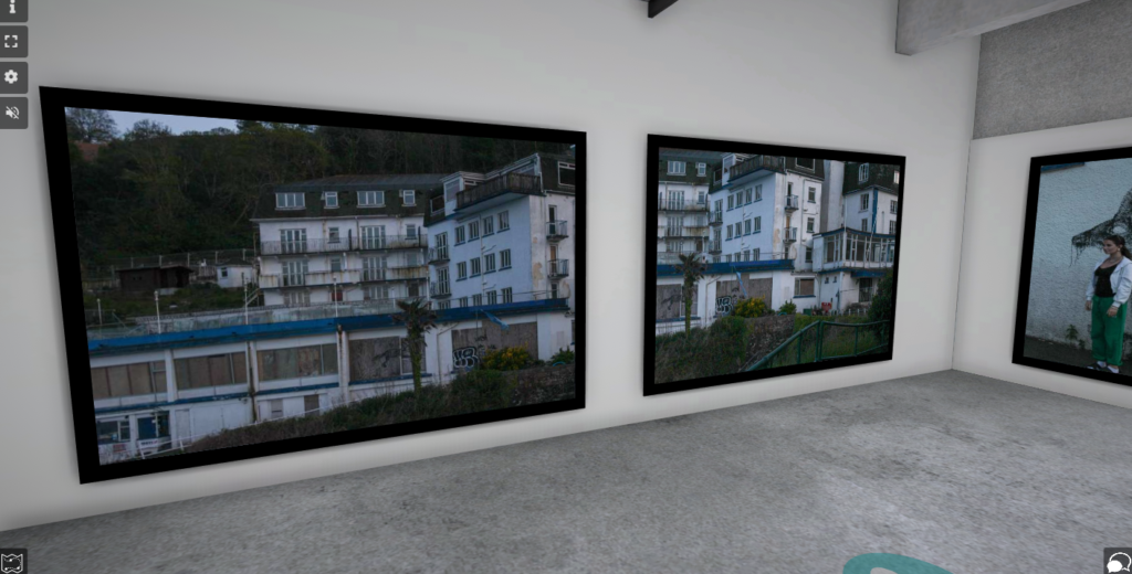
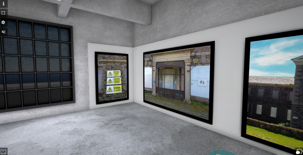
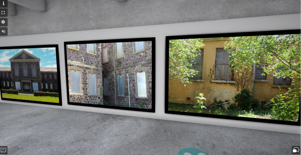
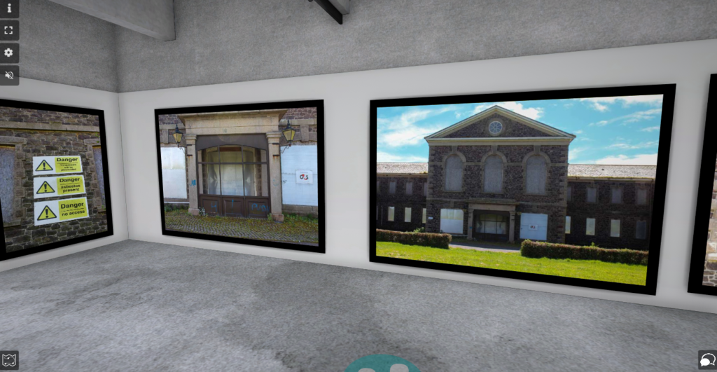
Abandoned Buildings
I used ArtSteps to create this virtual gallery and added black frames, because I thought they went with the images the best.
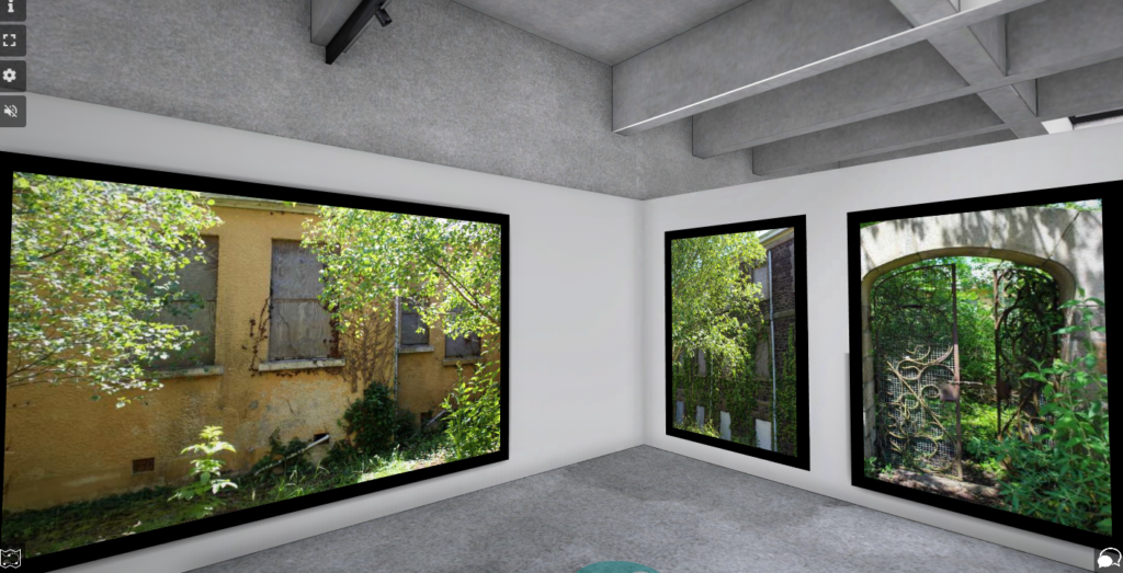
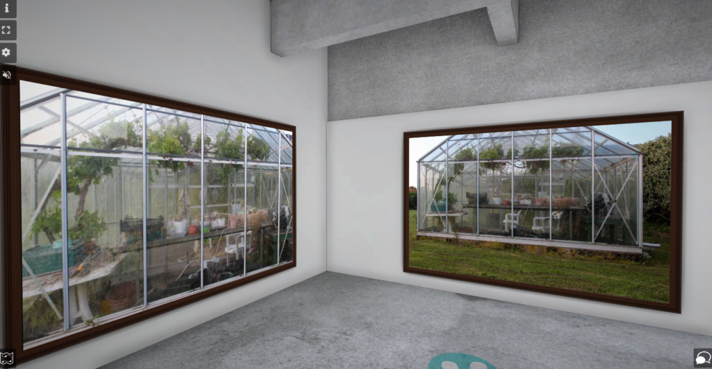
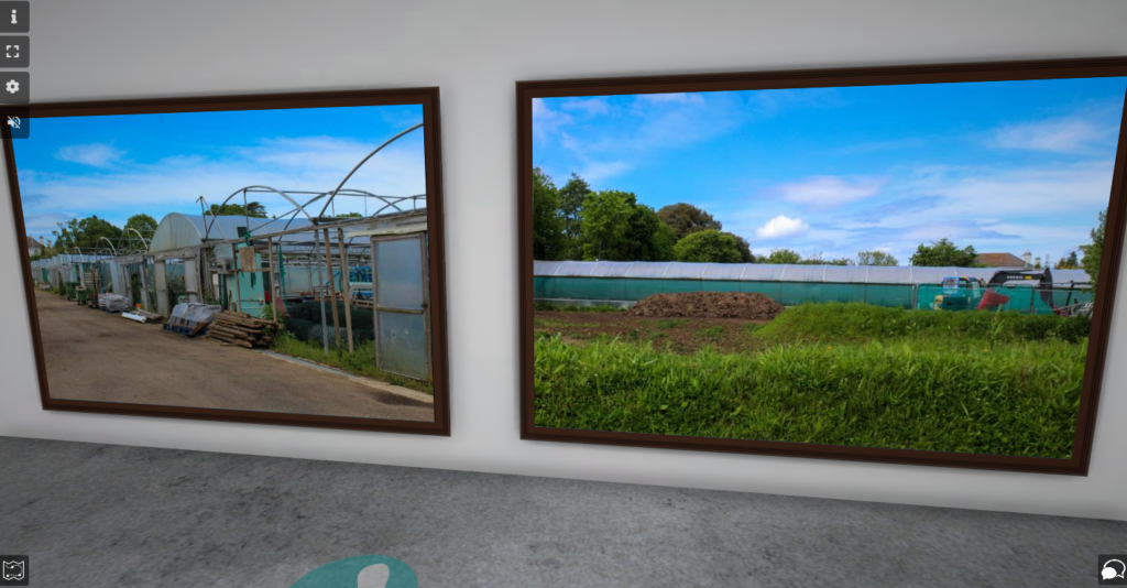
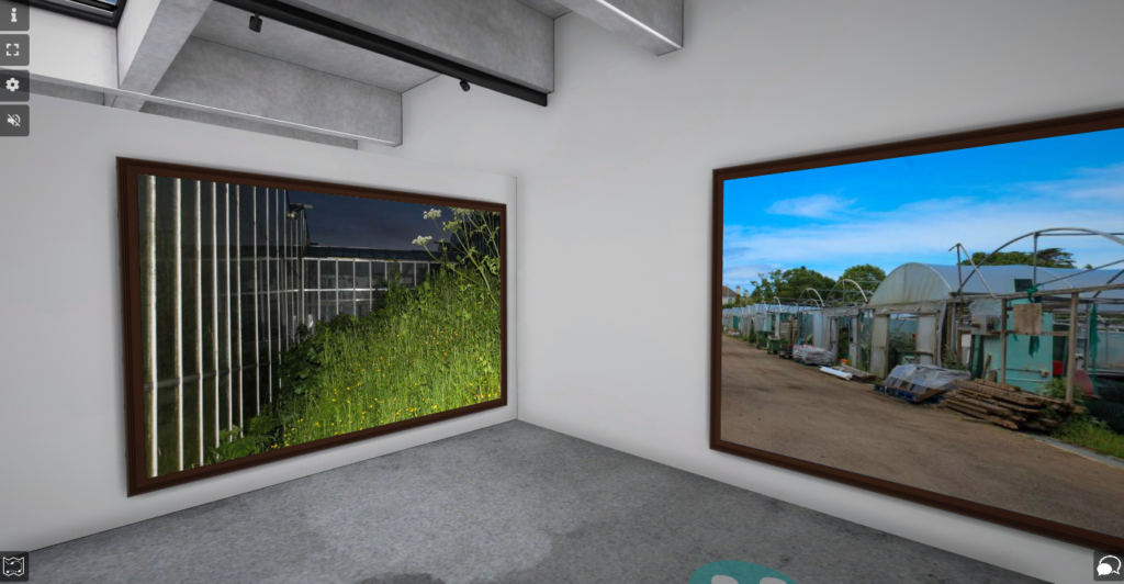
Greenhouses
I used ArtSteps to create this virtual Gallery and added a dark brown colour, similar to a tree trunk, because I thought it fit with the theme well.
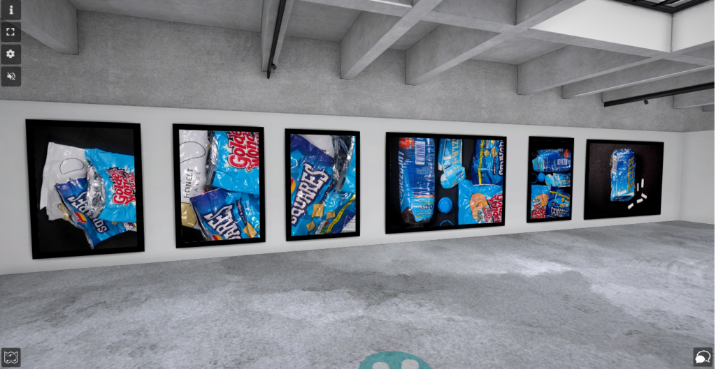
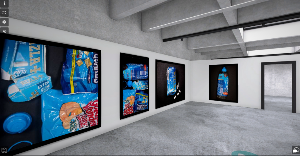
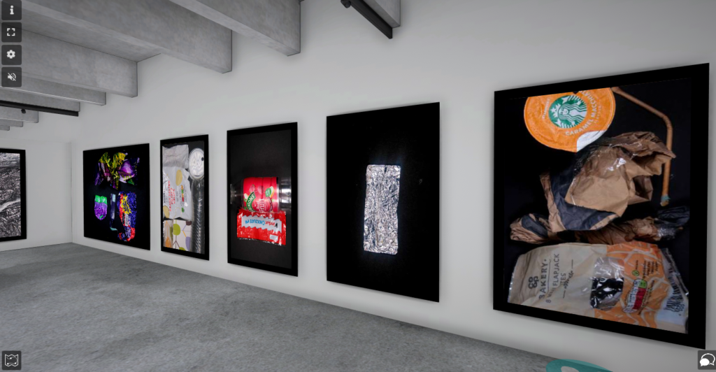
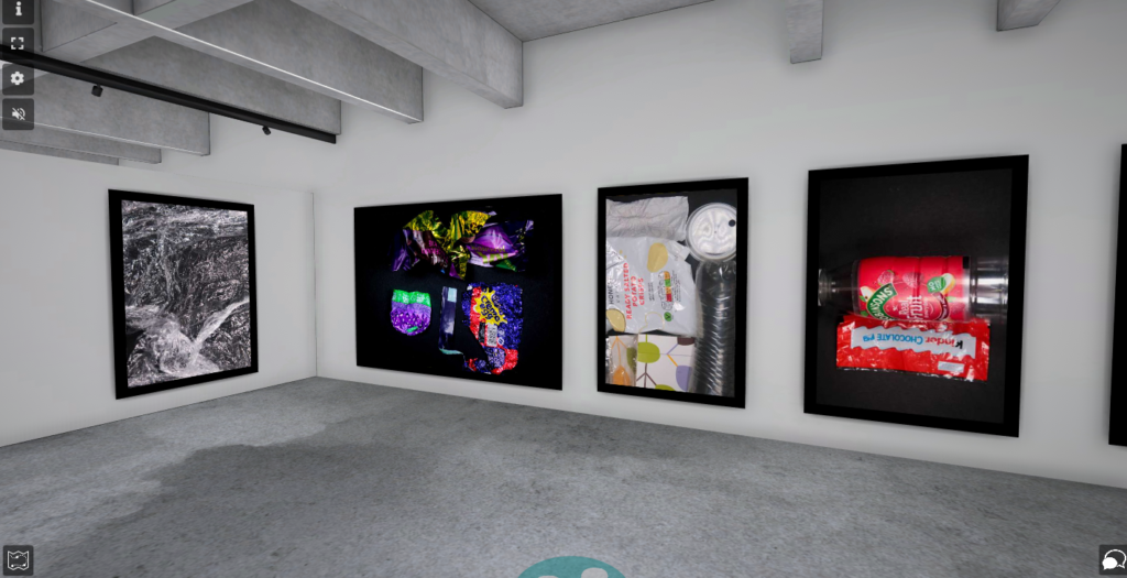
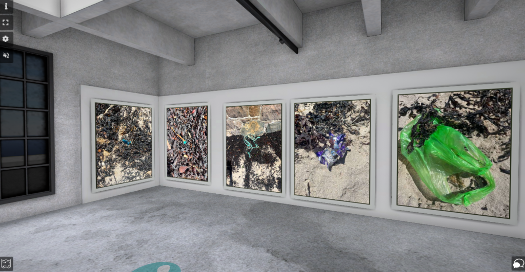
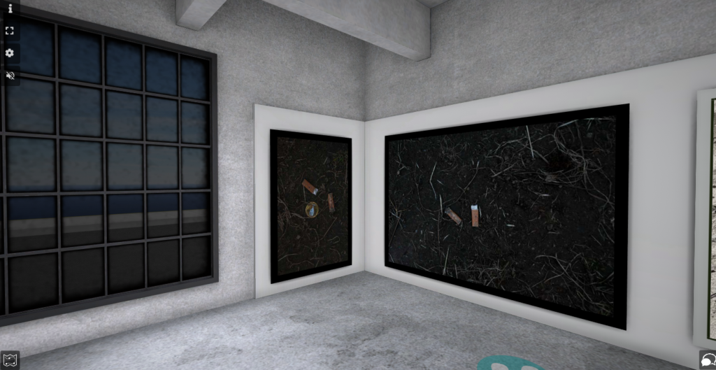
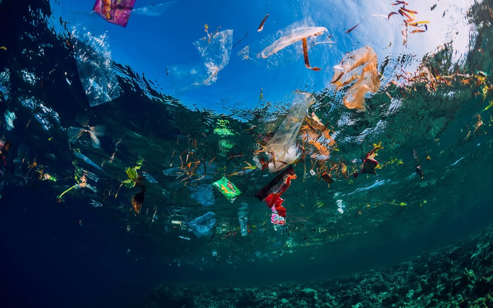
Discarded Plastics
I used ArtSteps to make this virtual gallery and I added black frames, because I thought they looked best with the black background.
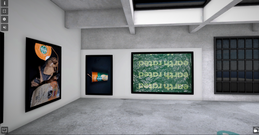
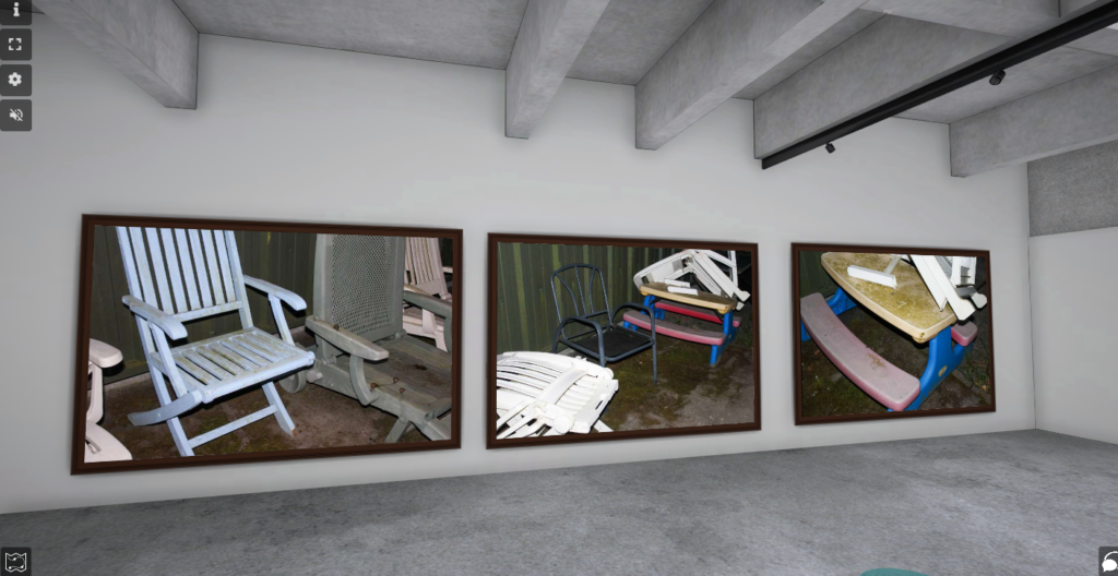
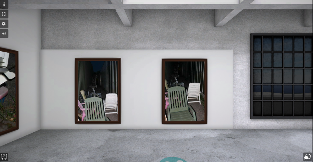
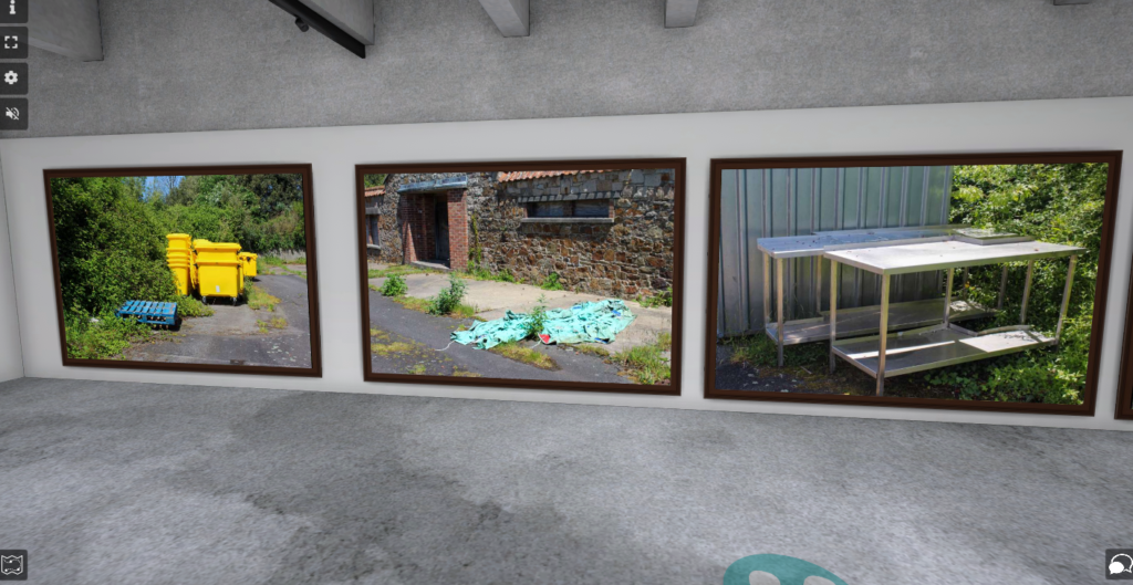
Fly Tipping
I used ArtSteps to create my virtual gallery and I added dark brown frames to each image, because I thought it was the most aesthetically pleasing.
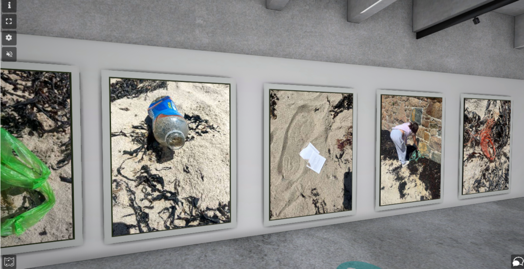
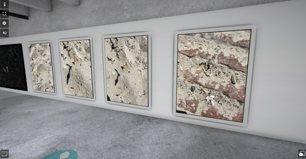
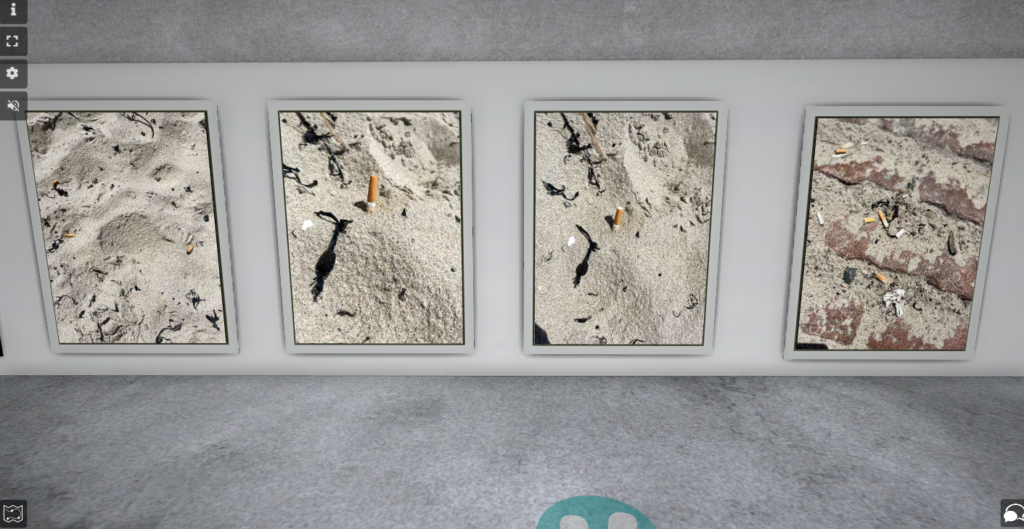
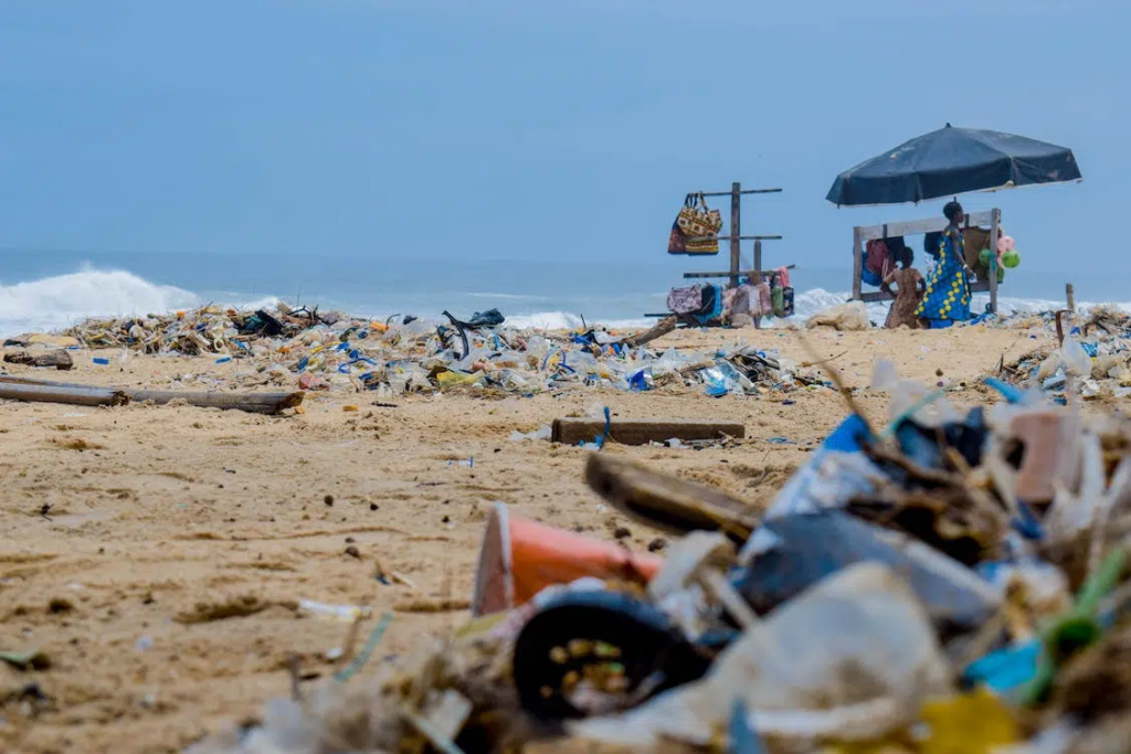
Litter
I used ArtSteps to create this virtual gallery and I used white frames, because I thought it looked better with the sand colour and made the colour of the litter pop more against it, as it didn’t take any attention way from the litter.
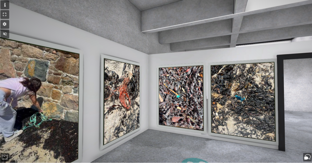
MinimalisticApproach
I used ArtSteps to create this virtual gallery. I added black frames to the darker images and white frames to the sand images, because they blended in more and looked better. They also didn’t take the focus off the image, even though the items in the images were smaller and less noticeable.
Tourism has a huge affect on the environment and planet. Components consist of:
Air Emissions
Noise
Solid waste and littering
Releases of sewage, oil and chemicals,
Architectural/visual pollution
Heating
Car use
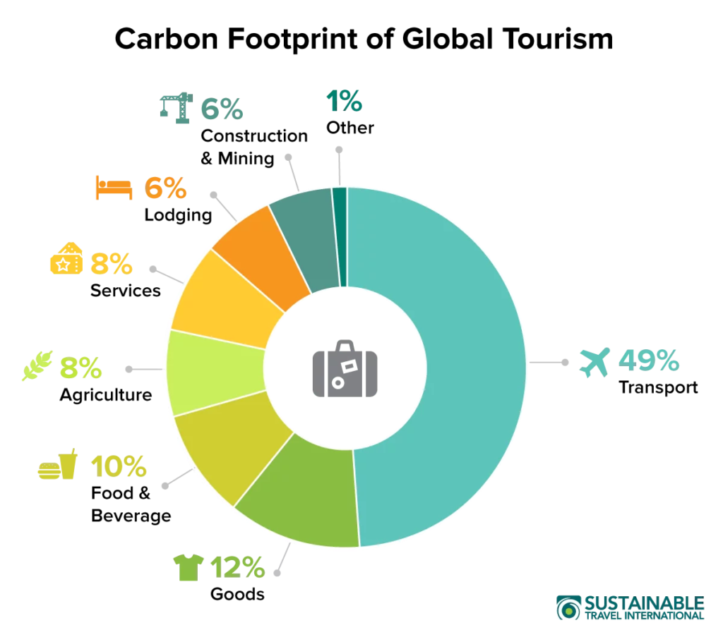
According to sustainabletravel.orgtourism is responsible for around 8% of the world’s carbon emissions. transportation is tourism’s main source of greenhouse gas emissions. Planes and cars generate the most CO2 per passenger mile, with tour buses, ferries, and trains following, this means that every individual that ravels, is contributing to Anthropocene around the world.
45 arrivals every second
There are over 1.4 billion tourists arriving at their destination every year. That’s 45 arrivals every single second.
Having people visiting a different place in the world, causes the depletion of local natural resources, pollution and waste problems. Tourism also adds on huge stress onto local land use, this can lead to the erosion of soil and therefore increase pollution. There are also habitats lost and the likelihood of poaching increased, which affects non endangered and endangered species.
Spanish Mass Tourism.
Mass tourism to the Spanish costa’s has been occurring for a long time. Millions of tourists have been coming to Spain every year since the 1960s. Due to the constant restoration, construction and replenishment of new hotels and resorts, many destinations along the Spanish coast are beginning to be affected by horizon pollution. Due to the fact, there are rows and rows of apartments resorts and hotels that are packed on these coastlines, front accommodations have a sea view. However, the outdated apartments and hotels tent to attract young tourists that want an affordable place to stay, this does not positively impact the environment due to the large and high scale amount of young travellers.
Impacts.
Throughout Mallorca, there is a higher amount of water that is extracted from underground to provide for tourism, than there is generated by rainfall. Also, due to the proximity of the ocean there is a large amount of salt water that makes its way into the soil ad therefore ends up in this groundwater. There is also a substantial amount of plastic being produced in these areas, due to suitable drinking water for tourists being constantly produced. There is also a huge scale of disposable and one time use plastics, constantly being imported from other countries in order to cater for tourist needs, which affects the environment by not recycling these products, and the transport it takes to arrive to their destination. A tourist produces 50% more waste than a local resident. According to the internet a Spanish citizen uses around 250 litres of water per day, however, tourists use an average of 900 litres of water per day due to activities such as swimming, drinking water and hygiene reasons. This is a substantial difference as these areas are already suffering from the scarcity of water. The waste water from hotels and other tourist facilities is also not handled well: this is dumped into the sea a few kilometres from the coast.
To prevent this, businesses and companies must focus on building their accommodations along clear environmental lines, water purification, prioritizing positive waste disposal, environmentally friendly public transport.
In a coastal town in Mallorca, named Calviá their is around 11 million overnight stays per year. This huge tourism rate deems them a mass scale tourism hotspot. Due to this huge populatiry, Calviá must stay attractive and interesting to tourists, the government must take extra measures and care to ensure of this. For example as Calviá is so highly attended, the government have ensured there are 5 different water treatment plans so that their seawater stays as clean as possible. There is also blue flags along beaches which represents that it is environmentally friendly. Older, traditional and less popular hotels are no longer being demolished to be replaced by expensive and luxurious resorts, only to attract more tourists. This means that an effort is being made to restore nature and the Balearic Islands are striving for a more environmentally friendly approach to tourism to prevent Anthropocene.
Photoshoot Mood board.
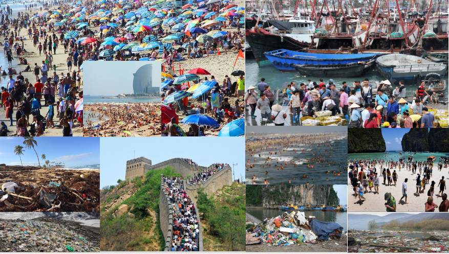
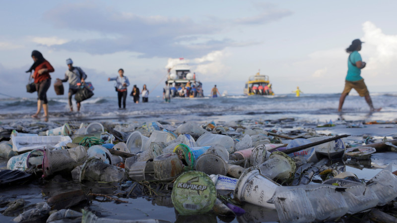
This mood board represents what I would like to display in my photoshoot. Whilst visiting Spain I intend to do 1 or 2 photoshoots, on tourism in the country and how it affects the wellbeing of people and the planet. I hope to visit locations such as streets, beaches, hotels, shopping areas and other densely populated areas in order to capture a raw, authentic visual representation of what goes on throughout the year and the waste, overcrowding and increasing carbon footprints that take place. These photos will display both people and landscapes on how they have been altered from human activity and tourists. I hope these will create an effect on how large of a difference is made from ‘seemingly meaningless’ everyday habits such as throwing litter on the floor, wasting water and travelling in a convenient but not helpful way.
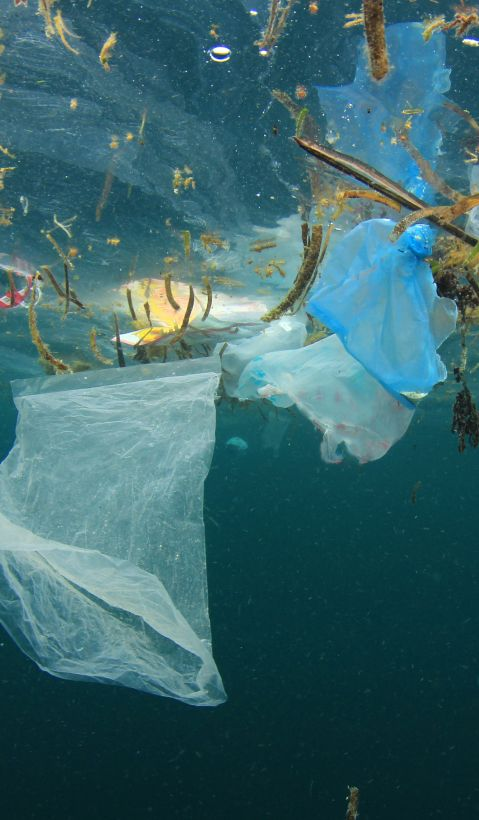
Underwater Photos.
I also hope to get some underwater photos using a waterproof case in order to capture the overpopulation, decrease in coral reefs, rising sea levels and floating waste in the ocean.
For this project, I learnt a lot and gained lots of knowledge on what Anthropocene ‘actually is’ and the true deeper meaning beyond the definition. I think the most interesting and informative part was the artist research I did and also going out to take my own photos to see Anthropocene actually taking place in the Island I live on. Overall I created 5 photoshoots of different sizes during this project From visiting beaches, in the studio and in the parish I live in. I think my most successful photoshoot I completed was the school trip to Havre des Pas where I could take around 220 photos capturing multiple elements of Anthropocene in the natural and urban landscapes Jersey. I also created a successful photoshoot in the lighting studio at school and photographed single items of rubbish I had collected at the beach. I liked this photoshoot a lot because the fully black background make the object look like it was floating which looks especially effective.
Another photoshoot I did was of the rubbish I found around the area I live in. I set myself a task of walking around for 15 minute and attempting to photograph every piece of rubbish I came across, this was time consuming and a lot of effort as there was a huge amount of rubbish. However, I really think I could’ve succeeded more with this photoshoot as many of the photos were low quality and blurry, which I was unable to use. To improve on this next time, I need to take more time to take a photo and have a steady hand in order to have higher quality image.
My favourite part of this entire topic in Photography was using Ai and generative fill on Photoshop. I found it really interesting to analyse my images and decide what I wanted to add into my image to make it overly dramatic or do the opposite and strip back all urbanisation and industrialisation in the photos I had created. I enjoyed particularly adding buildings and hotels etc into my images to show a realistic and possible way the Island could be contributing to Anthropocene in the future as it is a tourist orientated destination and may soon struggle with overpopulation, resulting in more accommodation spots needing to be built in order to house them.
My favourite artist/ photographer to learn about and research through this project was Naomi White. This is because I found these images would be challenging but manageable to attempt to replicate. Nicki’s work explored the different weights, materials and thickness of plastic bags she would find and how every bag reacts and contracts differently. I found that although this idea seems basic and uninteresting, if photographed the correct way, these images can become beautiful, vibrant and almost angelic as the white background makes them look even more minimal and simplistic. To improve on my take on her would, I would choose o next time use a white background, although black was the only one available. This would have brightened up my images and made them look more similar to hers.
I displayed all my final images using foam boards and window mounts to arrange them into collections of either one, two or three photo arrangements. I also produced and printed images in either A3, A4 or A5 to have a variation of different sizes and shapes to all be slightly different. I struggled with creating a realistic and high quality window mount but eventually succeeded. I attempted to take special care when choosing which images I wanted to group or pair together and which arrangement to put them in as I think this is an essential element when pre-planning my mounting up.
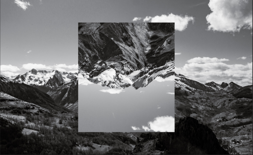
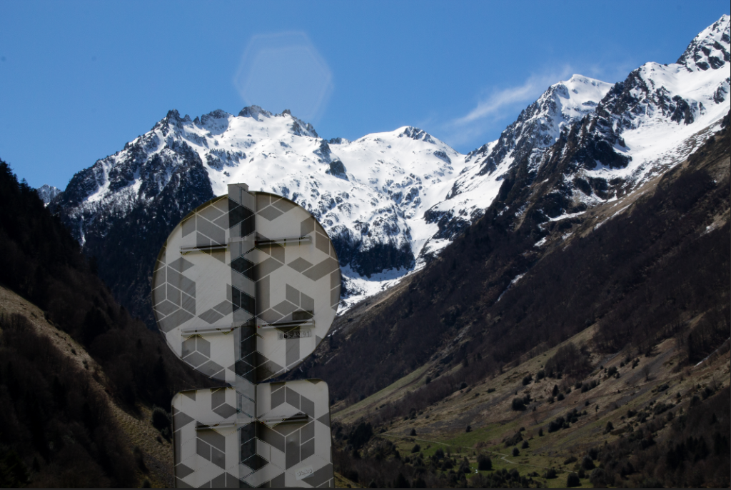
Here are two images I took in the Pyrenees that I spiced up a little using photoshop. For the first image I used multiple exposure and flipped the centre of the image 180 degrees, making this image stand out more. For the second Image I highlighted the sign and used a geometric pattern to colour in the backside of it. This also makes the image stand out more to the viewer because the geometric shapes contrast the natural landscape in the back.
I compiled my final images from the last few topics and placed them in a virtual gallery to simulate what my photos would look like in a real gallery as a way of presenting them.
You should provide evidence that fulfils the four Assessment Objectives: AO1 Develop ideas through sustained and focused investigations informed by contextual and other sources, demonstrating analytical and critical understanding AO2 Explore and select appropriate resources, media, materials, techniques and processes, reviewing and refining ideas as work develops AO3 Record ideas, observations and insights relevant to intentions, reflecting critically on work and progress AO4 Present a personal and meaningful response that realises intentions and, where appropriate, makes connections between visual and other elements.
OBSERVE
VERB
a person who watches or notices something.”to a casual observer, he was at peace.
a person who follows events closely and comments publicly on them.”some observers expect interest rates to rise”
a person posted in an official capacity to an area to monitor political or military events.”elections scrutinized by international observers”
SYNONYMS: spectator, onlooker, watcher, voyeur, looker-on, fly on the wall, viewer, witness, eyewitness, bystander, sightseer, commentator, onlooker, reporter, blogger, monitor.
SEEK
VERB
attempt to find (something):“they came here to seek shelter from biting winter winds” SIMILAR: look for, be on the lookout for, search for, try to find, look about for.
ask for (something) from someone:“he sought help from the police” SIMILAR: ask for, request solicit, call on, invite, entre, beg for
(SEEK SOMEONE/SOMETHING OUT)search for and find someone or something:“it’s his job to seek out new customers” SIMILAR: discover, detect find (out), unearth, uncover, disinte
CHALLENGE
NOUN
a call to someone to participate in a competitive situation or fight to decide who is superior in terms of ability or strength:“he accepted the challenge” SIMILAR: dare, provocation, summons
a call to prove or justify something:“a challenge to the legality of the banning order” SIMILAR: opposition, defiance, ultimatum, confrontation with.
VERB
invite (someone) to engage in a contest:“he challenged one of my men to a duel” · “organizations challenged the government in by-elections” SIMILAR: dare, summon, invite,bid, throw down the gauntlet, to defy someone to do something
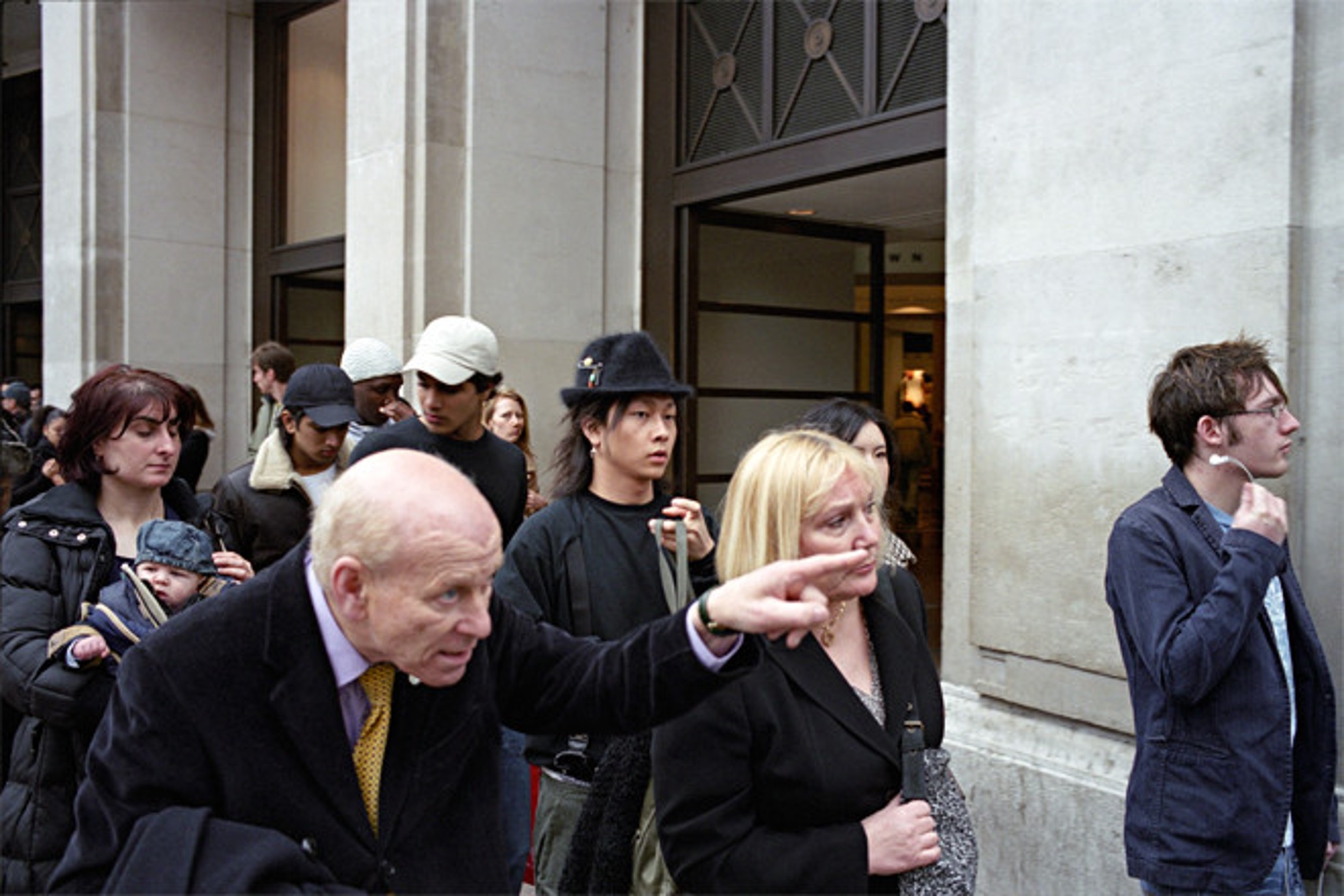
WEEK 1: 10 – 16 June St Malo Trip and Street Photography
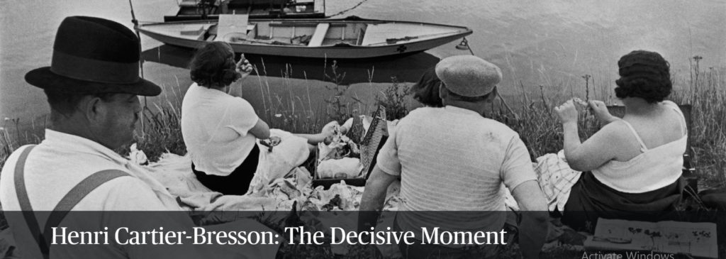
Blog post: THEORY & CONTEXT > Henri Cartier-Bresson and the ‘decisive moment’
Mon: THINK, PAIR, SHARE
1. Establish talk partners
2. Ask question: How does Henri Cartier-Bresson view the act of photography?
Name 3 things and write on Show Me Boards (SMB)
Watch first film: 5 mins make notes on SMB
For example: Why is a camera an extension of the eye? What is the physical pleasure in making photographs? How can photography be liken to hunting?
3. Thinking time: 30 sec
4. Talk in pairs: 2 mins & SMB
5. Sample students responses: Cold-calling
Tue: THINK, PAIR, SHARE
1. Ask question: Describe Cartier-Bresson’s theory of The Decisive Moment.
“The simultaneous recognition, in a fraction of a second, of the significance of an event as well as the precise organization of forms which gives that event its proper expression.”
Watch second film: 5 mins make notes on SMB
2. Cold calling to sample answers.
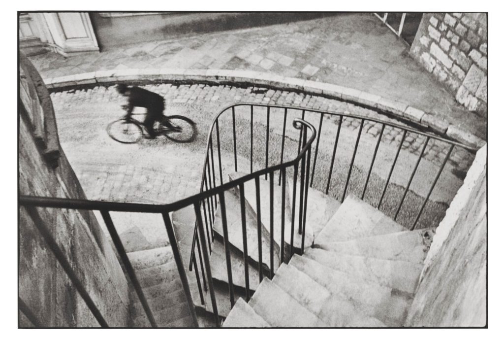
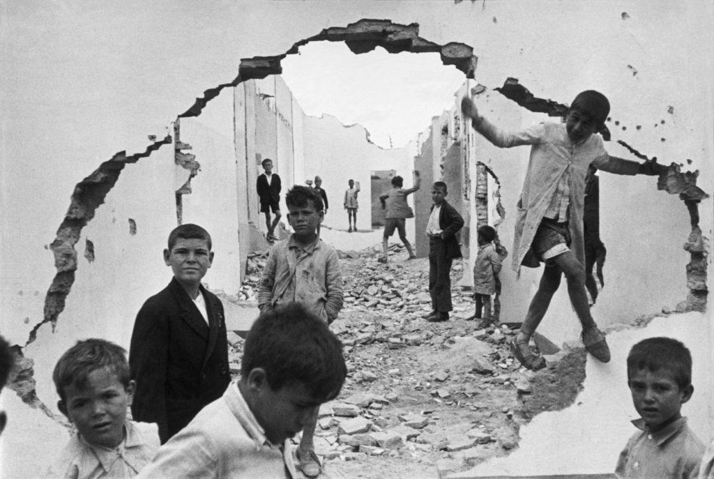
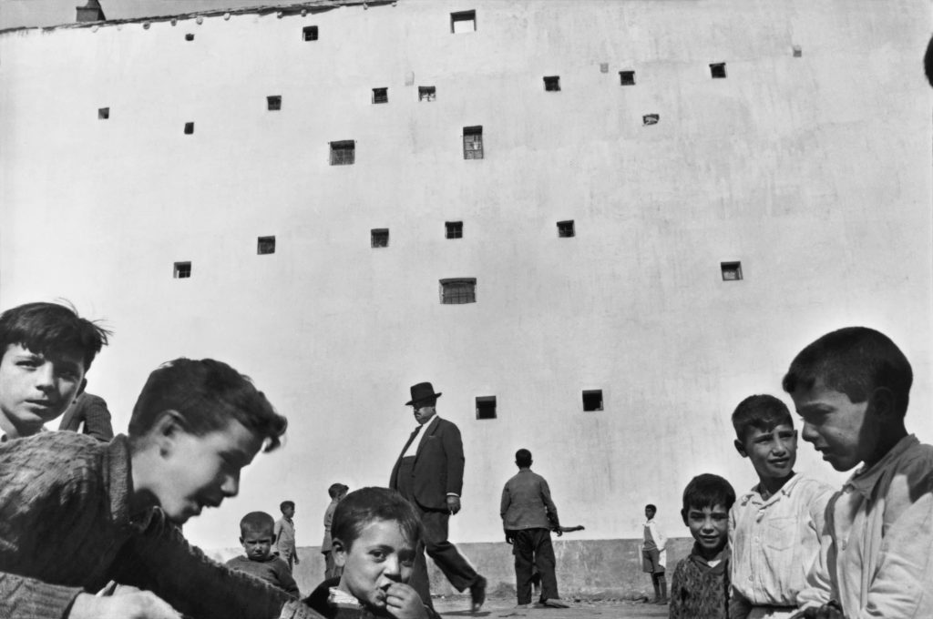
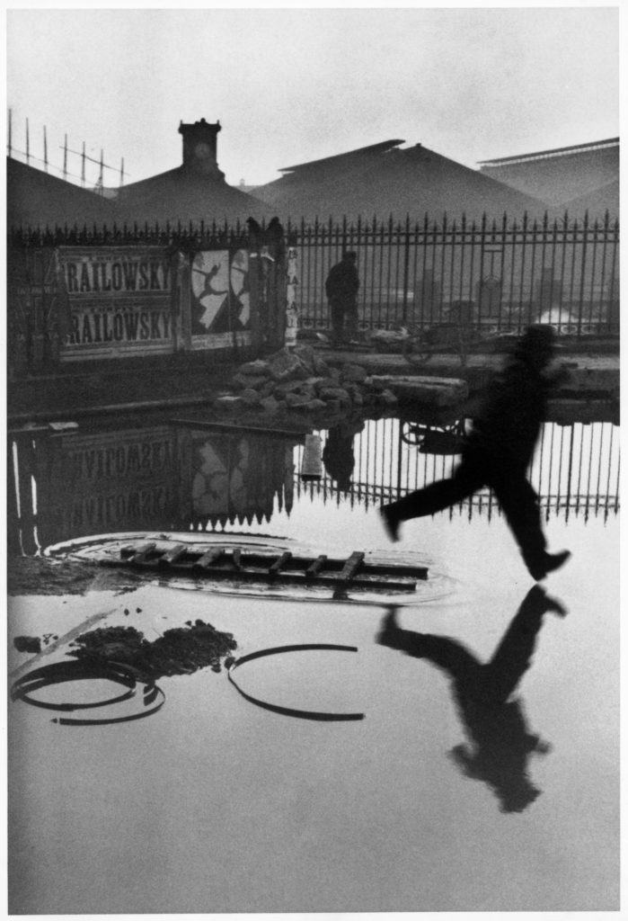
3. Task: In your pairs, describe Henri Cartier-Bresson’s theory of the decisive moment using direct quotes from his own text. Select one image of his work and apply the theory to your understanding of the photograph with detailed analysis of its form(what it looks like), composition(how it is arranged) and capturing a moment(essence of movement) .
The decisive moment is particularly concerned with the overall structure and composition of the photograph, such as shapes, geometry, patterns, action and movement. Comment on these elements as well as other formal elements such as:
The seven formal elements are commonly known as:
– Line – Shape & Form – Pattern – Tone – Colour – Texture – Space
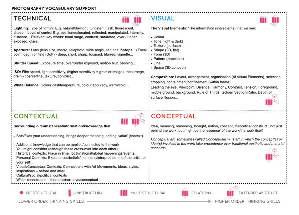
Also make use of other specialist photography vocabulary such as, rule of third, depth of field – see Photography Vocabulary below.
4. Circulate classroom
5. Cold calling to sample answers.
6. Add the above new knowledge about the decisive moment, including analysis of one his images to your blog post on Cartier-Bresson. If you don’t complete in lesson time, make sure you complete it outside of lessons in your study periods or as homework .
Wed: THINK, PAIR, SHARE
1. Ask question: Which camera techniques are useful for street photography and capturing ‘decisive moments’?
2. Thinking time: 30 sec
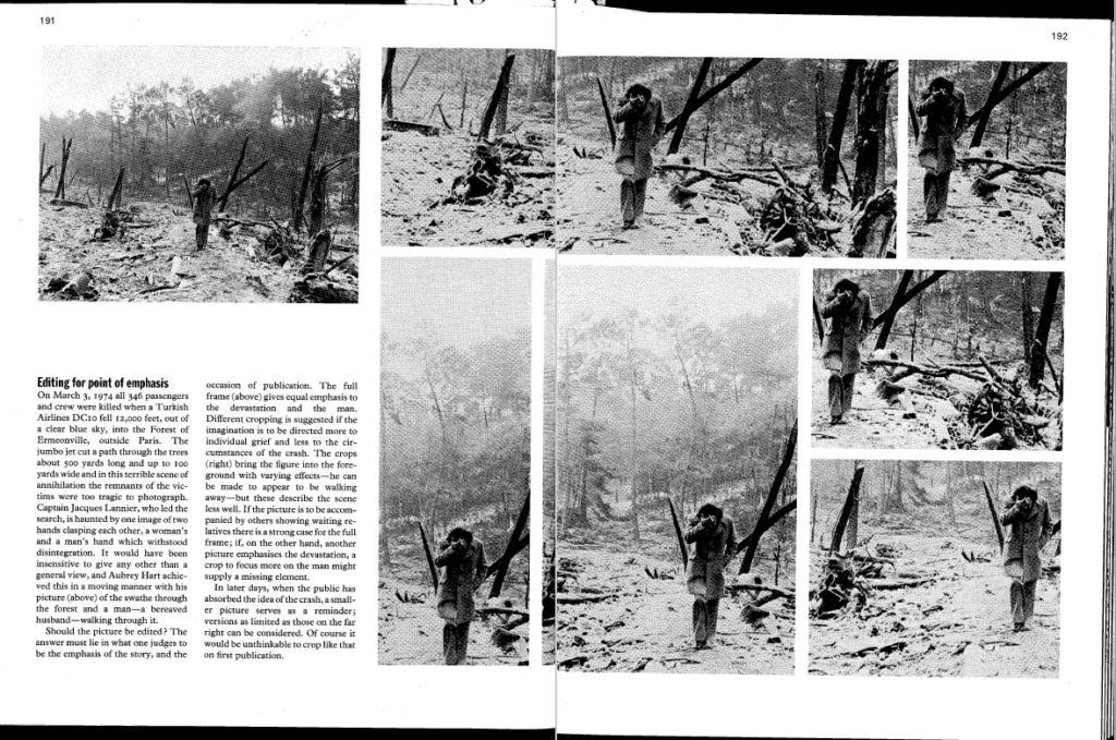
3. Talk in pairs: 2 mins & SMB
4. Sample students responses: Cold-calling
5. TASK: In pairs use a camera and explore techniques discussed above. 15 Mins of shooting, return to classroom, upload images in Image Transfer folder below:
“Your eye must see a composition or an expression that life itself offers you, and you must know with intuition when to click the camera.” – Henri Cartier-Bresson
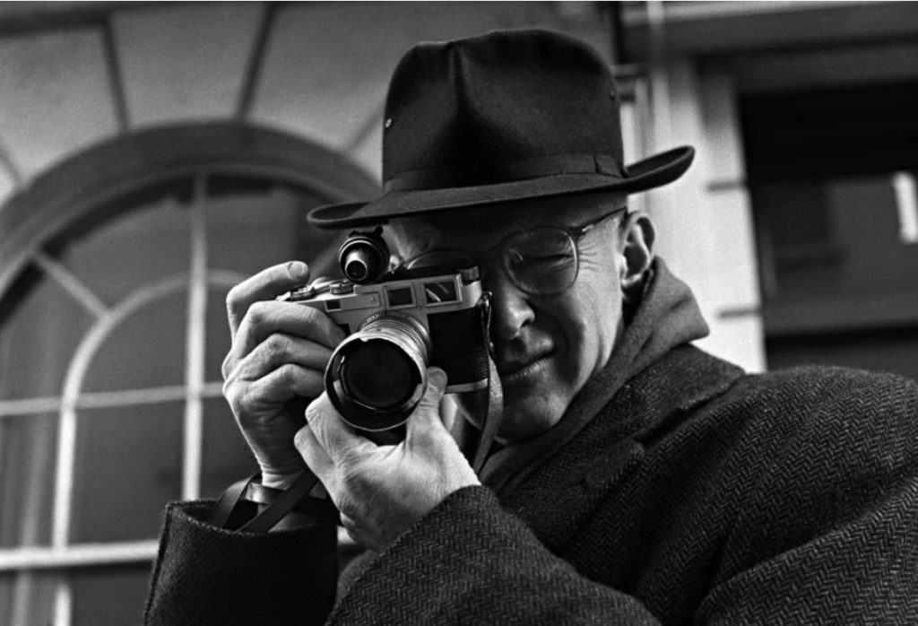
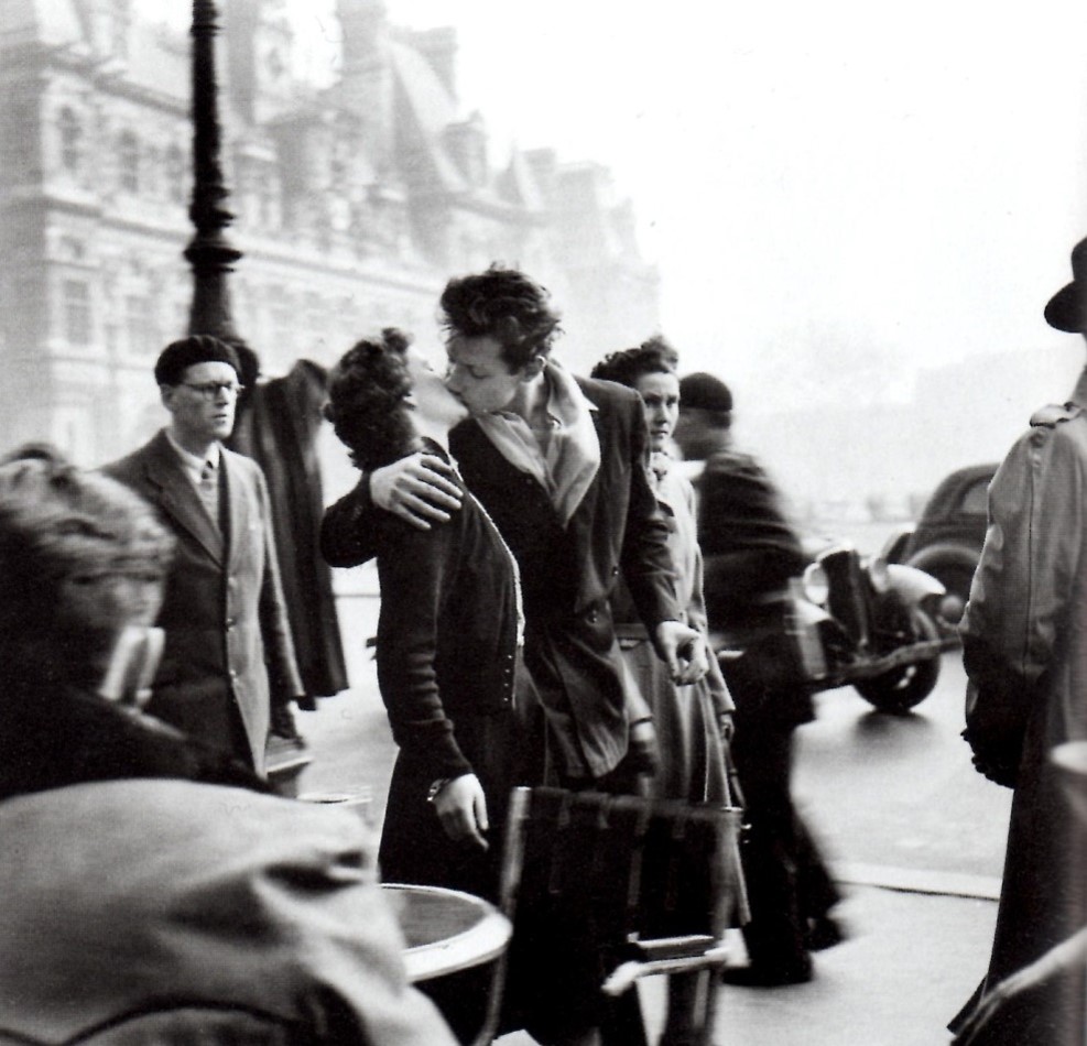
Henri Cartier-Bresson (1908-2004), a French photographer who is considered to be one of the fathers of photojournalism and masters of candid photography. He sought to capture the ‘everyday’ in his photographs and took great interest in recording human activity. He wrote,
“For me the camera is a sketch book, an instrument of intuition and spontaneity, the master of the instant which, in visual terms, questions and decides simultaneously. In order to ‘give a meaning’ to the world, one has to feel involved in what one frames through the viewfinder. This attitude requires concentration, discipline of mind, sensitivity, and a sense of geometry. It is by economy of means that one arrives at simplicity of expression.”
As a reporter and co-founder of the Magnum photography agency, Cartier-Bresson accepted his responsibility to supply information to a world in a hurry. He documented the liberation of Paris, the collapse of the Nationalist regime in China, Gandhi’s funeral and the partitioning of Berlin. Cartier-Bresson helped develop the street photography style that has influenced generations of photographers that followed. He was influenced by Surrealism and began his career in film working with renowned French director, Jean Renoir as second assistant director to films such as La vie est à nous (1936) and Une partie de campagne (1936), and La Règle du Jeu (1939 – considered one of the most influential films in 20th century.
“The simultaneous recognition, in a fraction of a second, of the significance of an event as well as the precise organization of forms which gives that event its proper expression.”
Henri Cartier-Bresson’s precise definition of ‘the decisive moment’
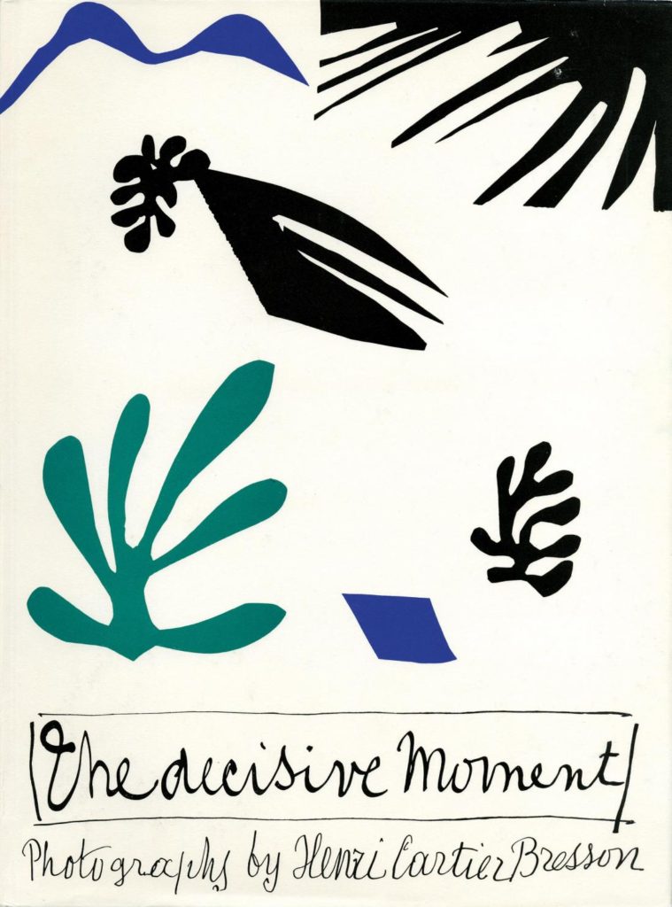
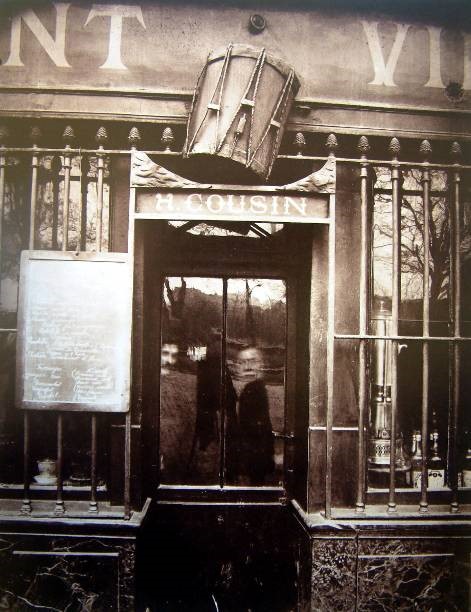
Henri Cartier-Bresson, Images à la sauvette (The Decisive Moment), 1952
The Decisive Moment, Henri Cartier-Bresson’s influential publication, is widely considered to be one of the most important photobooks of the twentieth century. Pioneering for its emphasis on the photograph itself as a unique narrative form, The Decisive Moment was described by Robert Capa as “a Bible for photographers.” Originally titled Images à la Sauvette (“images on the run”) in the French, the book was published in English with a new title, The Decisive Moment, which unintentionally imposed the motto which would define Cartier-Bresson’s work. The exhibition details how the decisions made by the collaborators in this major project—including Cartier-Bresson, French art publisher Tériade, American publisher Simon & Schuster, and Henri Matisse, who designed the book’s cover—have shaped our understanding of Cartier-Bresson’s photographs.
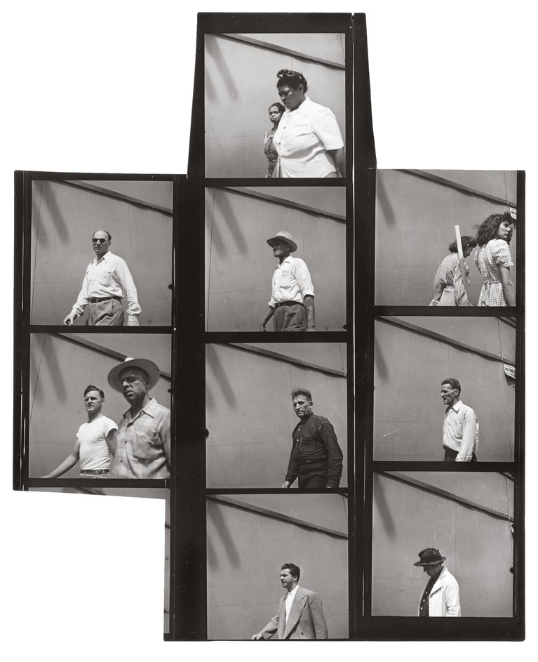
Thurs 13 June: PRACTICE & RECORDING > St Malo photoshoot (250-400 images)
“Stare. It is the way to educate your eye, and more. Stare, pry, listen, eavesdrop. Die knowing something. You are not here long.”
Walker Evans, ca. 1960 from Afterword in Many Are Called, a photobook featuring Evans’ snapshots of subway riders in New York.
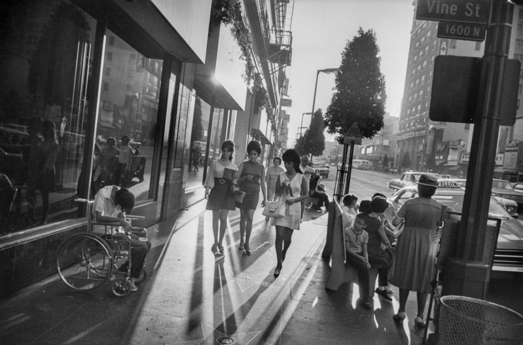
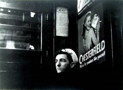
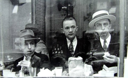
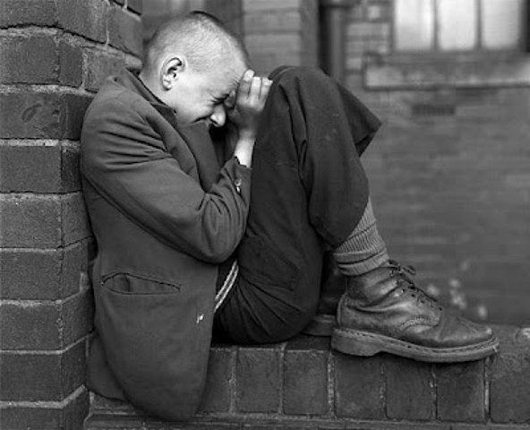
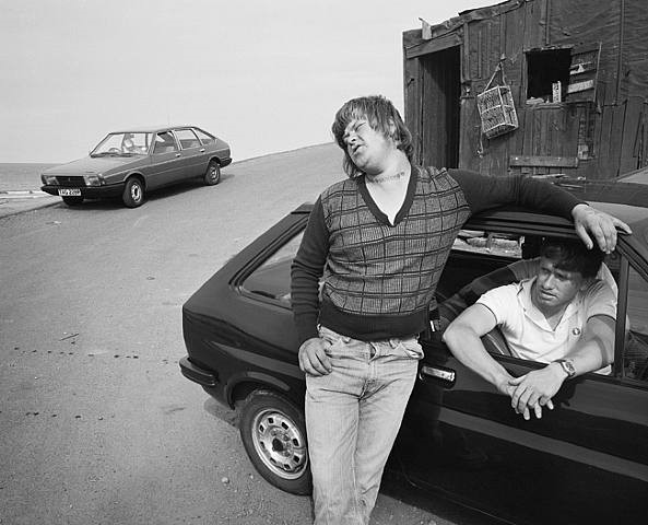
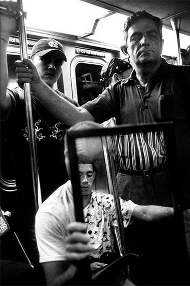
Street Photography:the impulse to take candid pictures in the stream of everyday life. Street photography is a form of documentary but it is decidedly not reportage and rarely simply tells a story. Sometimes a street photographer captures something truly unusual – an extraordinary face, an accident, or a crime in the making. But more often a good street photograph is remarkable because it makes something very ordinary seem extraordinary.
Flaneur: The street photographer is the archetypal flaneur, an urban type popularised by the French poet Charles Baudelaire in the mid-nineteenth century, around the same time that photography itself came into popular circulation. Baudelaire defined the flaneur as ‘a botanist of the sidewalk’ an apt description for most of street photographers. Read more here
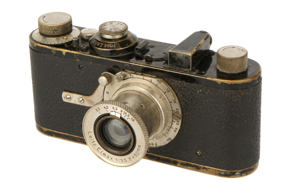
Technology: The Leica handheld camera, commercially available as of 1924, was the ticket to allowing a photographer to be on the move, as well as to capturing movement. A 35-mm film camera, the Leica had a wide aperture that required a short exposure time, especially for pictures taken outdoors, and it could advance quickly, which allowed the photographer to take numerous pictures of a subject in quick succession. Read more here on the history of the Leica camera
The Leica became the camera of choice in the 1930s for photographers such as André Kertész, Ilse Bing, Henri Cartier-Bresson, and others, all of whom worked primarily in Europe. Those photographers did not call themselves street photographers even if some of their subject matter fit the genre’s current definition, but instead they identified themselves as photojournalists, fashion photographers (many worked for magazines), or simply as experimenters with a new medium. The Leica continued to be the go-to device for photographers after World War II, especially for New York City photographers such as Roy DeCarava, Lisette Model, William Klein, and Helen Levitt. Robert Frank, who is best known for his book The Americans (1959) and was the leading influence on street photographers of the succeeding generation, documented culture throughout the United States and in Europe. Street photography took off in Mexico as well, with Manuel Álvarez Bravo and Graciela Iturbide. Paris had Robert Doisneau, Czechoslovakia had Josef Koudelka, and London had Bill Brandt.
An exclusive interview with photographer William Klein and a first-ever glimpse behind the scenes at his Paris studio.
Hunting for characters on the Streets of New York City with Magnum Photographer Bruce Gilden.
A preview of the exhibition Diane Arbus: In The Beginning, on view at The Met Breuer from July 12 through November 27, 2016.
Finding Vivian Maier Official US Theatrical Trailer #1 (2013) – Photography Documentary HD
In this episode, I try to take photos like Vivian Maier.
Photo-assignment: St Malo and decisive moments
American street photographer Gary Winogrand famously said that, ‘I photograph things to see what they look like photographed.’
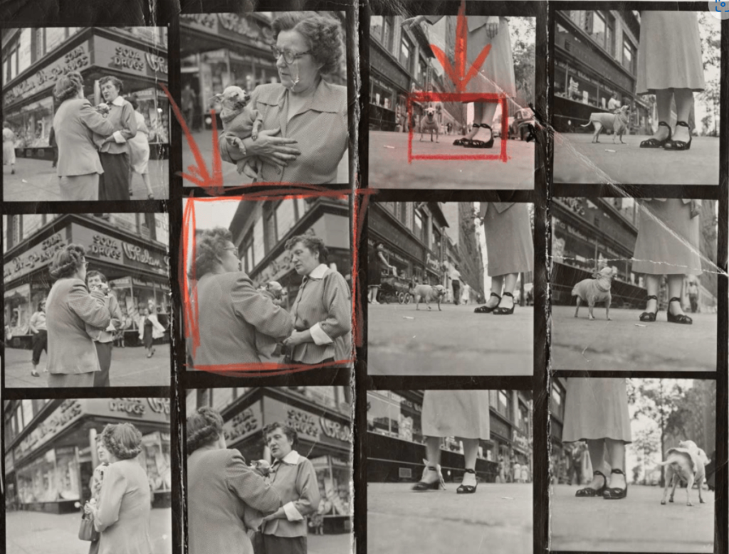
Using Cartier-Bresson’s theory of ‘the decisive moment’ try and capture images where the overall composition and visual elements are combined with an essence of movement. Find a location or spot that works as a compositional structure and anticipate or wait for something to happen within the photographic frame, eg. movement of people, a passer-by, or a dog, or some other fleeting moment of street life. Consider the following:
SUBJECT MATTER/ CAPTURING A MOMENT> people and humanity, theatre of everyday life, poetics of streets, comic absurdities and humour, small acts of kindness, scenes of unexpected beauty, ordinary moments, visual pun and humour, gestures and poses, faces and crowds.
LOCATIONS & PLACES > inside the walls and on the ramparts, back alleys and sidewalks, beaches and coastal promenades, parks and public spaces, cafes and shops, street corners and intersections, signs and advertising, facades and architecture.
POINTS OF VIEW > low/ high/ canted angles, deadpan approach, light and shadows, intensity of colour, reflections in shop windows, shoot through glass, frame within a frame, focusing and un-focusing, up-close and details, shallow depth of field, artful and funny juxtapositions, geometry and space, lines and form, textures and patterns, signs and shop windows, advertising and graphics, reflections and mirrors.
APPROACH > capturing decisive moments, candid portraits, informal snapshots, inobtrusive observations (Cartier-Bresson style), interactive and confrontational (William Klein approach), spontaneous and subconscious reactions, poetic possibilities, inquisitive mind and roaming eye, looking and prying, shoot from the hip, serendipity and good luck.
CAMERA HANDLING >Lenses (focal length): use wide (18-35mm) to standard lenses (50mm). Focusing: automatic or manual – whatever you prefer. Exposure mode: S or T mode – (shutter-speed priority). Shutter-speeds: experiment with fast (1/125-1/500) and slow shutter-speeds (1/15-1/60). ISO: 100 (sunny weather), 200-400 (overcast ), 800-3200 ISO (inside or evening/ night). White Balance: auto
For further inspiration see the work of historical and contemporary street photographers below. Or, for a comprehensive Powerpoint presentation with many examples of street photographers, styles and approaches – go to folder here:
WEEK 2: 17 – 23 June Editing > Selecting Photo-shoots from St Malo
PHOTO-SHOOTS: Upload new images from St Malo to M:drive and begin to edit in Lightroom. Follow these instructions:
EDITING:
Save shoots in folder on M:drive and import into Lightroom
Organisation: Create new Collection Set: St Malo Create a new Collection from new shoot inside Collection Set: St Malo
Editing: select 10-12 images from your shoot.
Experimenting: Adjust images in Develop, both as Colour and B&W images appropriate to your intentions.
Make sure you have standardised all the pictures in terms of exposure, brightness/ contrast, colour balance using Sync Settings
Export images as JPGS (1000 pixels) and save in a folder: BLOG
Create a Blogpost with edited images and an evaluation; explaining what you focused in your shoot and how you intend to develop your next photoshoot.
Analyse a couple of your best shots and describe the Decisive Moment within the images
Select one image and compare with an image from Henri Cartier-Bresson in relation to the theory of the Decisive Moment
EVALUATING: Upon completion of photoshoot and experimentation, make sure you evaluate and reflect on your next step of development. Comment on the following:
How successful was your photoshoot and experimentation?
What references did you make to artists references? – comment on technical, visual, contextual, conceptual?
How are you going to develop your project from here? – comment on research, planning, recording, experimenting.
What are you going to do next? – what, why, how, when, where?
WEEK 3: 24 – 30 June Developing > Experimenting Cropping and AGI: Artificial Generative Intelligence
This week you have some time to catch up with work not completed, such as:
Experiment 1: CROPPING: Using cropping tool only begin to make some radical changes by selecting areas of your images for a different visual impact. Produce at least 3 different crops for 6 images.
Experiment 2: AI Produce a set 10 AI generated images / variations using text prompts > 1 blog post with annotation
Compare camera-based images with AI generated images > 1 blog post
Inspirations: Case Study 2 on artist(s) using AI as part of their image-making process > 1 blog post
Review, improve or complete any outstanding research, analytical/ contextual blog posts on Henri Cartier-Bresson and the decisive moment > 1 blog post
Essay >deadline Mon 10 July
If all above is completed, begin research task below collecting a variety of picture-stories as inspiration for your page-spread design.
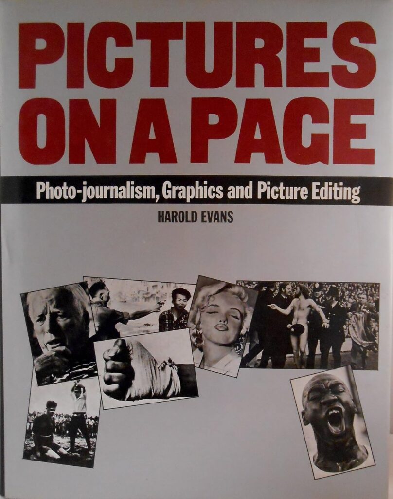
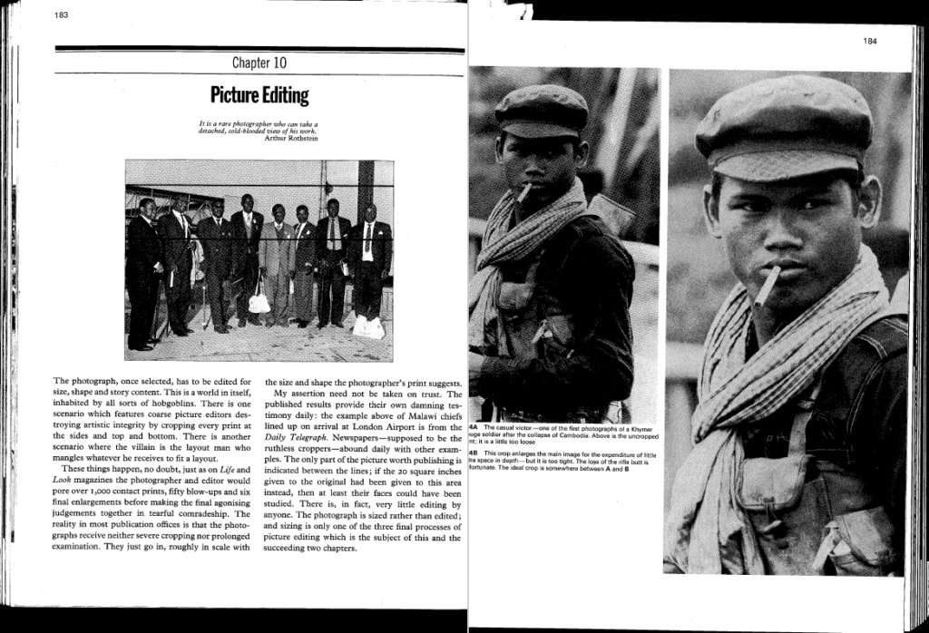
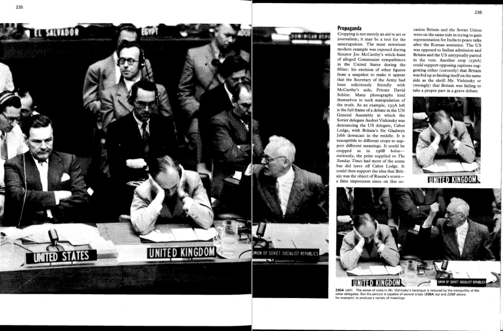
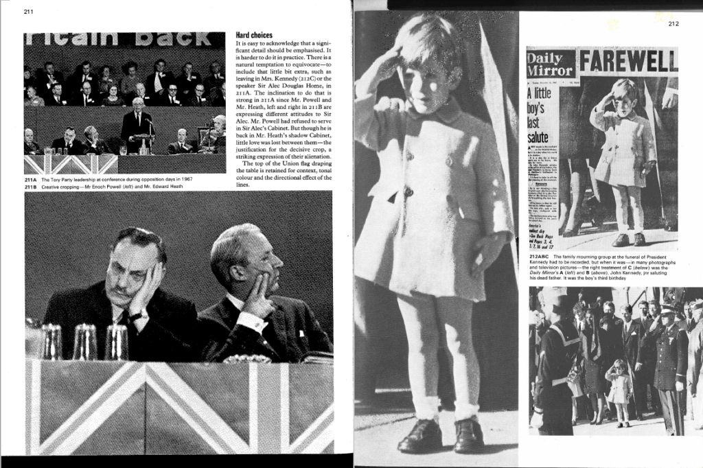
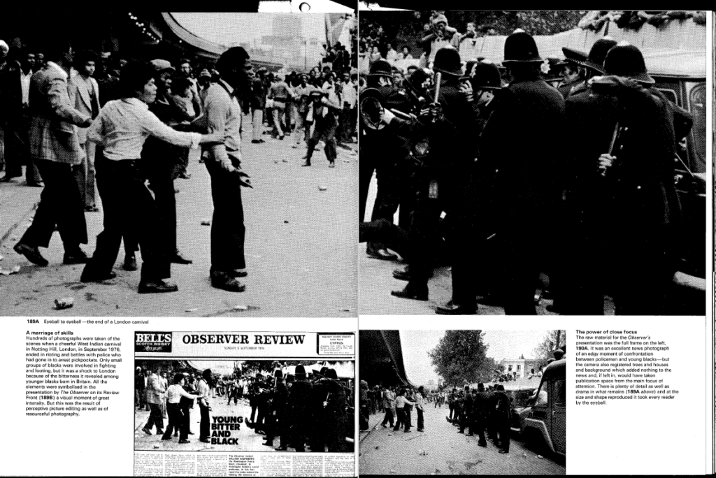
CROPPING
One of the founding fathers of Documentary Photography Walker Evans used cropping as part of his work. Another pioneer of the photo-essay, W. Eugene Smith also experimented with cropping is his picture-stories.
There are many different types of crops used for different effects. The way in which a photo is cropped can add or alter the meaning significantly, especially in photojournalism. Sometimes, artistic qualities within photos are destroyed by careless cropping in order to make it fit into a particular layout in a newspaper or magazine for example.
For more history and context see Pictures on a Page, written almost 50 years by legendary newspaperman, Harold Evans who was the Picture Editor for The Sunday Times Magazine. Pictures on a Page, generally considered the definitive text on photojournalism, graphics and picture editing. Read more here
AI EXPERIMENTATION
AI EXPERIMENTING > Using your images from St Malo as inspiration produce a variety of AI generated images (at least 10 variants) using Photoshop AI, DreamStudio or Midjourney. Explore your experiences in St Malo and generate AI images inspired by street photography and Cartier-Bresson’s theory around the decisive moment. Either ‘train’ AI on your original images or recreate street photographs using relevant text prompts linked to your photo-assignment last week – see above. Use key terminology, such as specific words and phrases linked to subject matter, capturing moment, locations & places, points of view, approaches, composition and formal analysis, camera handling and techniques.
Show creative process using a combination of screen grabs and annotation > 1 blog post
ARTISTS REFERENCES > INSPIRATIONS
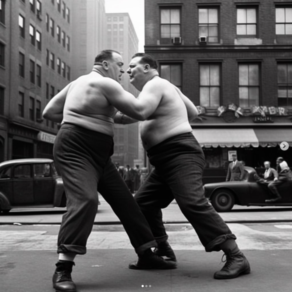
Philip Toledano: I’ve noticed a lot of work uses ai to recreate photography as it is now-some sort of reflection of reality -but what’s utterly intriguing is that AI has its own voice. For instance, this image of the two men fighting I would argue is much more interesting than the one I posted yesterday (can you see what’s different ?) because (metaphorically) I allowed ai to have a say -now this image asks more questions (which is ALWAYS a good thing in art)
I’m also surprised to see how it handles the animal images I’ve been doing -especially the monkeys and apes-the images have such emotion in them -and finally, I’m very much enjoying the way in which you can abstract the human form …
From his series, another America …
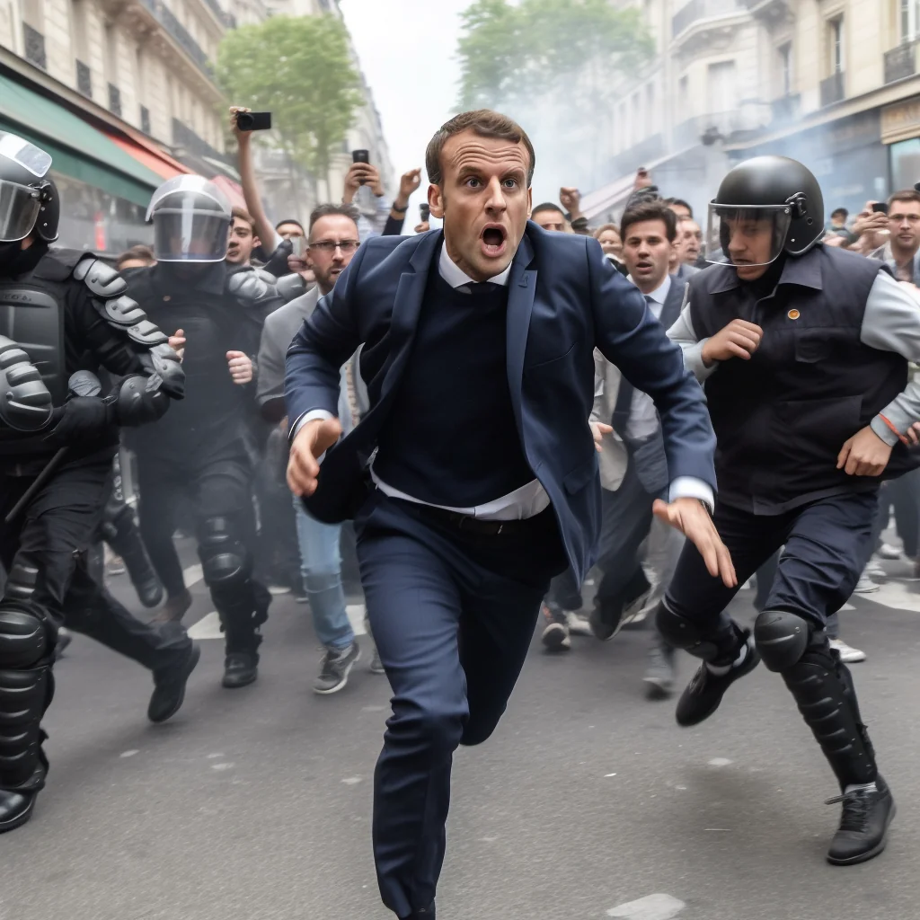
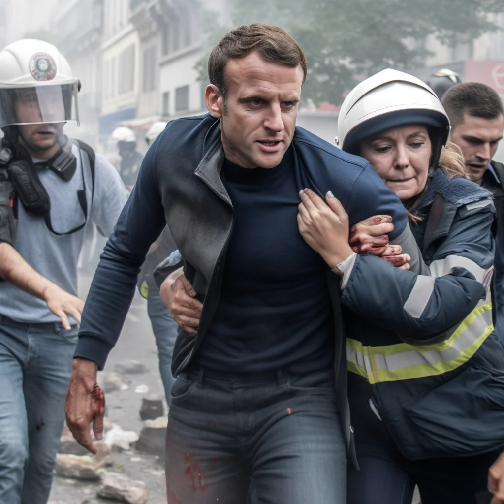
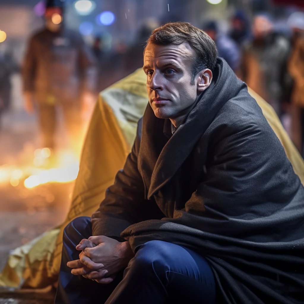
Photos courtesy of the latest version of Midjourney, an AI program which generates realistic deepfakes – Copyright Reddit – Twitter. Read article here
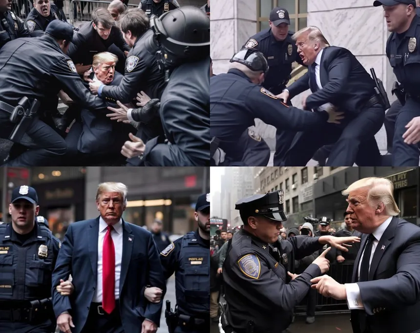
AI-created images of Donald Trump, shared by @EliotHiggins’s account. – Twitter – Midjourney
AI-created images of Donald Trump, shared by @EliotHiggins’s account. – Twitter – Midjourney
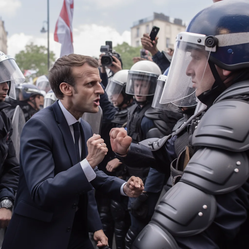
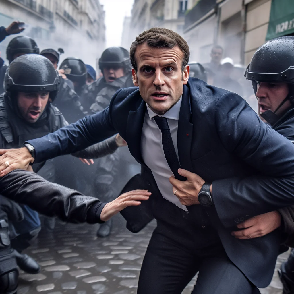
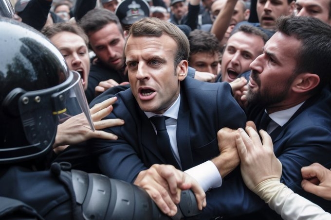
David Fathi: False image generated by photographer David Fathi via Midjourney showing Emmanuel Macron in contact with police officers. Credit: David Fathi / Midjourney
AI Image generating software: DreamStudio, Midjourney, DALL-E 2, Dream by Wombo, Craiyonand new version of Photoshop with AI
Photoshop AI
A general tip in Photoshop is just to get familiar with Layers, Selections, Masking, and Groups. Almost every complex task just involves being better at these and most problems proceed from small misunderstandings in them. There are free videos explaining any of these, for people who want targeted learning there is a short video on every tool available on Phlearn. The site will try and get you to pay for Premium Content, but there’s loads of free stuff.
For example, these are all free/quick, the presenter is great, and most contain free sample files to practice on.You can teach yourself a good standard of Photoshop just by following along. Click here for tutorials.
Introduction from Adobe to Photoshop AI: Nearly three and a half decades since we first brought Photoshop to the world, we’re writing a new chapter in our history with the integration of Generative AI and Adobe Firefly into Photoshop. Today we deliver an incredible new capability into creators’ hands that empowers them to work at the speed of their imagination while fundamentally transforming the experience into something more natural, intuitive and powerful.
Generative Fill – Adobe Photoshop Quickly create, add to, remove or replace images right in Adobe Photoshop with simple text prompts powered by Adobe Firefly generative AI.
Learn the basics of Generative Fill that is now integrated into the Beta version of Adobe Photoshop. This technology allows you to write simple text prompts to enhance your own images directly in Photoshop.
What’s new in Photoshop
The new features introduced to Photoshop are designed to accelerate everyday creative workflows, streamline complex tasks, and reduce clicks.
Adjustment Presets
Adjustment Presets are filters that speed up complex tasks by enabling you to preview and change the appearance of images in just a few steps to achieve a distinctive look and feel, instantly.
There are 32 new presets in the Adjustments panel that you can hover over to see what your image would look like with each preset applied before selecting it. Once a preset is selected, it can be further refined by editing the automatically created adjustment layers in the layers panel.
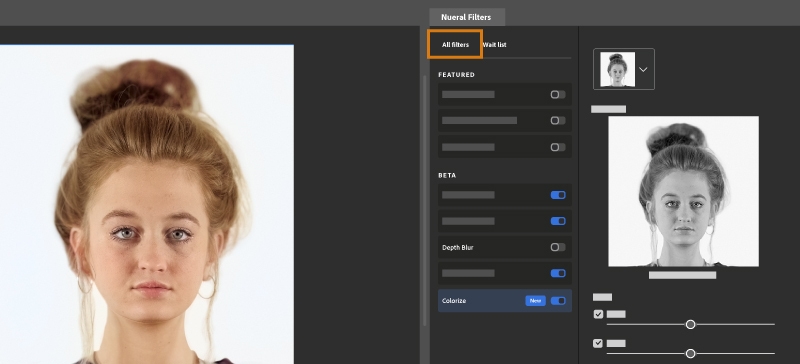
Neural Filters is a new workspace in Photoshop with a library of filters that dramatically reduces difficult workflows to just a few clicks using machine learning powered by Adobe Sensei. Neural Filters is a tool that empowers you to try non-destructive, generative filters and explore creative ideas in seconds. Neural Filters helps you improve your images by generating new contextual pixels that are not actually present in your original image.
Click here for a tutorial on how to use Generative Fill
Gradients update
The Gradients feature has been significantly improved, and the workflow has been expedited.
The feature enables you to create gradients in just a few steps and now includes new on-canvas controls which help you have precise controls over many aspects of the gradient in real-time. A live preview that’s created automatically shows you instantly how the changes you make affect your image.
You can now also make non-destructive edits to your gradients, which means you can go back and make changes to your gradient without permanently altering your original image.
The Remove Tool is an AI-powered feature that enables you to replace an unwanted object by simply brushing over it, preserving the integrity of nearby objects and providing an uninterrupted transition on complex and varied backgrounds.
The Remove Tool is particularly powerful when removing larger objects and matching the smooth focus shift across the image. For example, the tool can remove an entire building or car from an alpine landscape image while seamlessly maintaining the fidelity of the progression from meadow to mountains.
Use the Remove tool for:
Big objects
An object near other objects
An object on a varied-focus background
An object with structure behind it (think lines, like a fence or horizon)
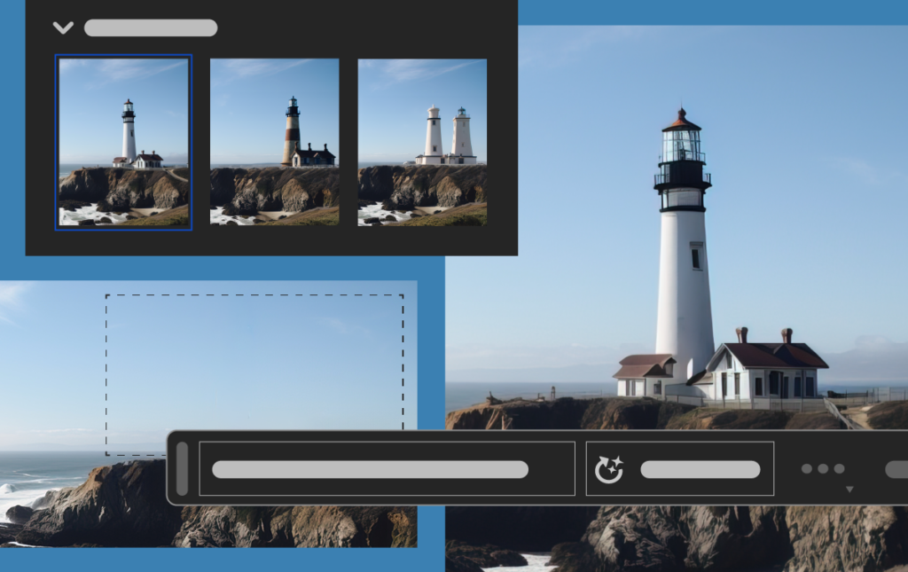
The Contextual Task Bar is an on-screen menu that recommends the most relevant next steps in several key workflows, reducing the number of clicks required to complete a project, and making the most common actions more easily accessible.
For example, when an object is selected, the Contextual Task Bar appears below your selection and suggests actions for selection refinement that you might want to use next, such as Select and Mask, Feather, Invert, Create Adjustment Layer, Fill Selection, or generate something with the new Generative Fill capabilities.
The revolutionary and magical new suite of AI-powered capabilities grounded in your innate creativity, enabling you to add, extend, or remove content from your images non-destructively using simple text prompts. You can achieve realistic results that will surprise, delight, and astound you in seconds.
Click here for a tutorial on how to use Generative Fill
DreamStudio
Tutorial as we explore the amazing capabilities of DreamStudio, from creating realistic portraits to coming up with prompts and structuring your work for maximum impact,
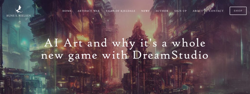
Follow more advanced tutorial hereExplore AI artist: Rune S Nielsen site here
Some experiments with realistic portraits. Image credits: created with Midjourney V5 by CineDScreenshot from the Midjourney Bot on Discord, highlighting the correct use of the “v 5” parameterThe result of requesting an image in the style of Vincent van Gogh. Image credit: created with Midjourney V5 by CineDOn the left: the old output from V4. On the right: the result of the same prompt in the new V5. Image credits: created with Midjourney by CineDAn example of a picture generated in Cinemascope by adding “–ar 21:9” to the prompt. Image credit: created with Midjourney V5 by CineD
DALL-E and DALL-E 2 are deep learning models developed by OpenAI to generate digital images from natural language descriptions, called “prompts”. DALL-E was revealed by OpenAI in a blog post in January 2021, and uses a version of GPT-3 modified to generate images. In April 2022, OpenAI announced DALL-E 2, a successor designed to generate more realistic images at higher resolutions that “can combine concepts, attributes, and styles”.
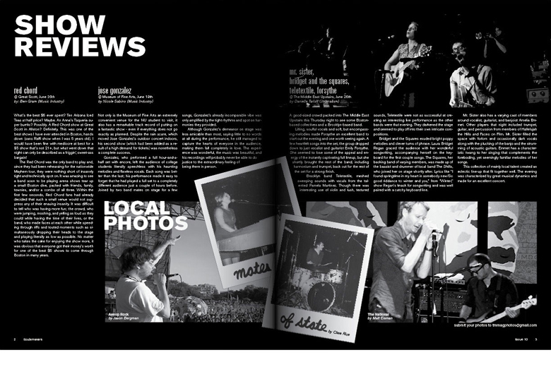
WEEK 4 – 6:1 – 19 July Picture story: design a page spread
Make A3 page spreads based on images made in-camera (analogue/ observational) and/or AI generated images (digital/ constructed). Follow the steps below:
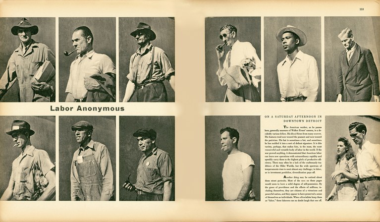
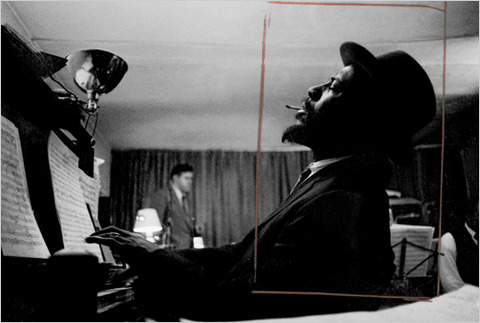
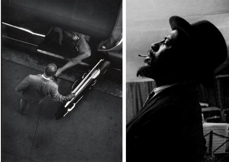
1. Research Picture-Stories: Produce a mood board of newspaper layouts and magazine style picture stories. For reference use look at local stories from the JEP as well as international stories from magazine supplements in UK broadsheets newspaper ( e.g. The Sunday Times, The Guardian, The Telegraphs, Financial Times etc). Look at also at digital picture stories from the internet (see photo-agency websites: Lensculture, Magnum Photos, World Press Photo, AgenceVU, Panos Pictures. Alec Soth’s LBM Dispatch
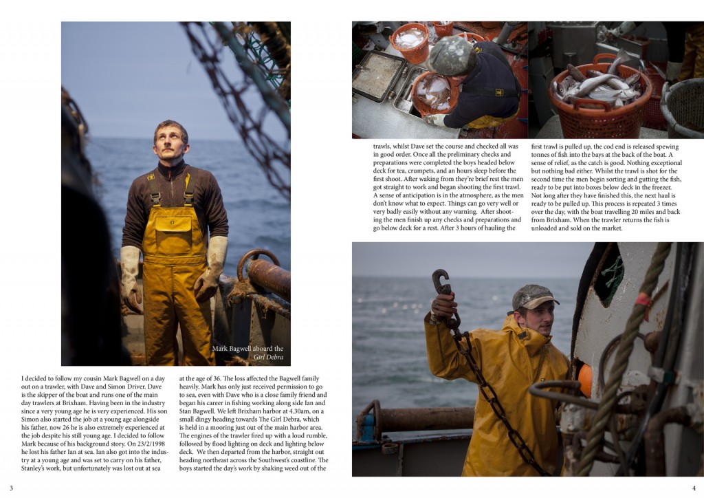
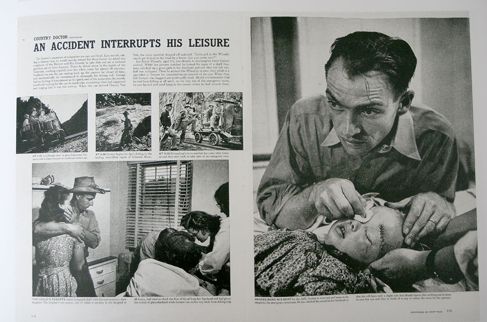
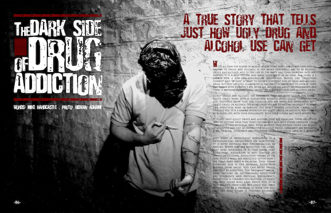
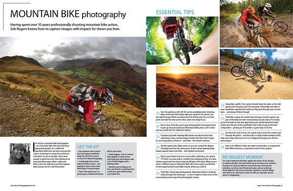
Find picture-stories here in this folder: M:\Radio\Departments\Photography\Students\YR 13 OBSERVE, SEEK, CHALLENGE 2024-2025\Picture-stories
2. Analysis and deconstruction: Look at the layout of pictures and analyse how individual pictures relate and tell a story according to the construction of a traditional picture-story. Identify what types of pictures are more important than others e.g. which are major (establishing shots) or minor pictures (detail, relationship shot), and which types of portraits are used (formal, informal, environmental and person at work) see Powerpoint: A Traditional Picture Story below for further guidance. Analyse also the use of headline, text and captions to convey and construct a particular meaning or point of view.
Blogpost: Produce 1 Blogpost with moodboard of picture stories + analysis of one in relation to Traditional picture story
3. Headline, text, captions: Think of a creative title and write a selection of headlines that tell your story. Write also an introduction/ abstract that provide further context for your pictures story. Also write captions for each picture: who, what, where, when and put into a new post
4. A3 Page-Spread Designs: Produce at least two different designs/ picture-stories from your photographs. Class tutorial on page design using InDesign. Be creative in your layout and experiment with different ways to communicate your message by clever cropping, sequencing, juxta-positioning, typography, use of graphics etc. Think of catchy headline and also write a short text (50-100 words) and captions for images. Start with a rough sketch of how the page might work and begin to lay out pictures, major and minors.
a) Design a traditional newspaper layout b) Design a magazine double-page spread
5. Experimentation: Edit your final layout and designs – make sure you show experimentation in your blog of different design and layout ideas combining images, graphics and typography in a personal and creative manner. Produce at least 3 versions of each design
Blogpost: Produce 1 Blogpost which shows evidence of you design process using screen grabs and annotation.
6. Evaluation: Reflect on your final design ideas and explain in some detail how well you realised your intentions and reflect on what you learned/ What could you improve? How?
7. Presentation: Print, mount and present final designs and any other final outcomes, such your best 3-5 images and present as final print.
Blogpost: Produce 1 Blogpost with your final page-spreads and write an evaluation.