Edit Settings:
For my edits, I have focused on mainly on altering on Saturation, Clarity and Texture. Through examples I will show their slight variations, depending on the subjects within the frame, such as movement, lighting and distance.
Due to numerous edits containing similar settings, I will break down some of the main types of edits I’ve made to the majority of my images.
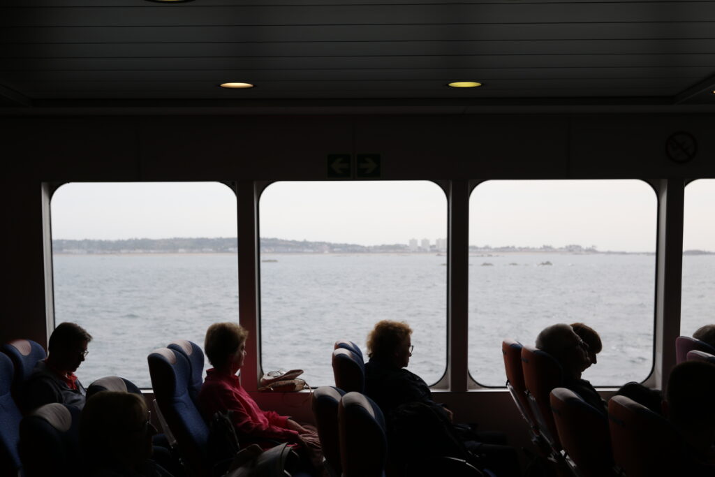
Example 1 – Low light:
Since in the original image, limited light was within the foreground of the images contents, I aimed to highlight this through editing by creating more depth to it through editing.
Camera Settings:

Before:
Editing process:
Through cropping my image to centralise the composition of windows and subjects, I converted my image into greyscale through removing the saturation. By altering other features such as clarity and texture, and settings within its tone, I edited this image with the focus on making the light standout from its outside source, and highlighting the woman in pinks appearance due to her singular action of looking out the window.

Final image:

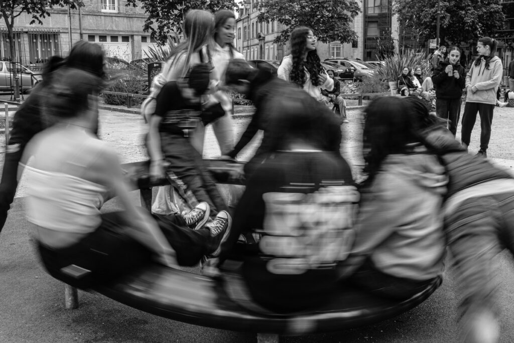
Example 2 – Motion:
Inspired by Cartier-Bresson’s image of a cyclist I decided to try and create something similar within St Malo using motion.
Camera Settings:

Before:

Editing process:
By adjusting the texture, clarity and haze, I tried to create a sharp but also an intentionally blurred image.

Final Image:
Example 3 – Distance:
Edit 1 –
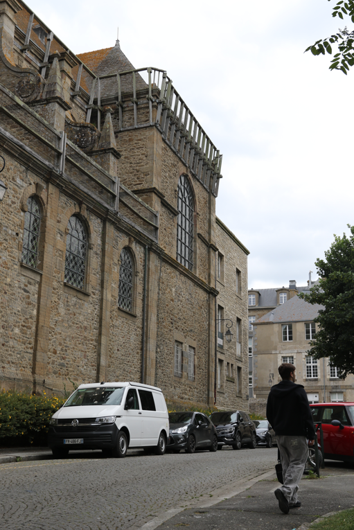
With Cartier-Bresson’s images of large infrastructure, dwarfing their surrounding subjects, I took inspiration from this in my own work and tried to recreate it.
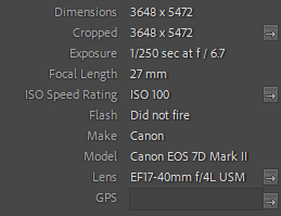
Camera Settings:
Before:
Editing Process:
After turning into black and white, to add more pop and character to the image I attempted to make a tonal shift between shades. With lots of distance into the image it can be seen that it contains lots of different tones that can pop out once edited.

Final Image:

Edit 2 –
In the next image I did something similar with a more busy street.
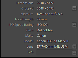
Camera Settings:
Before:

Editing process:
To edit this image, and incorporate those variants in tone from colour when converted to greyscale, I prioritised making the small details in the lower half of the image stand out more with dehazing and white and black balance.
Final image:

Example 4 – Cropping:
By shortening down the original image, Cropping can help create a more effectively deeper meaning to its contents.
Camera Settings:

Before:
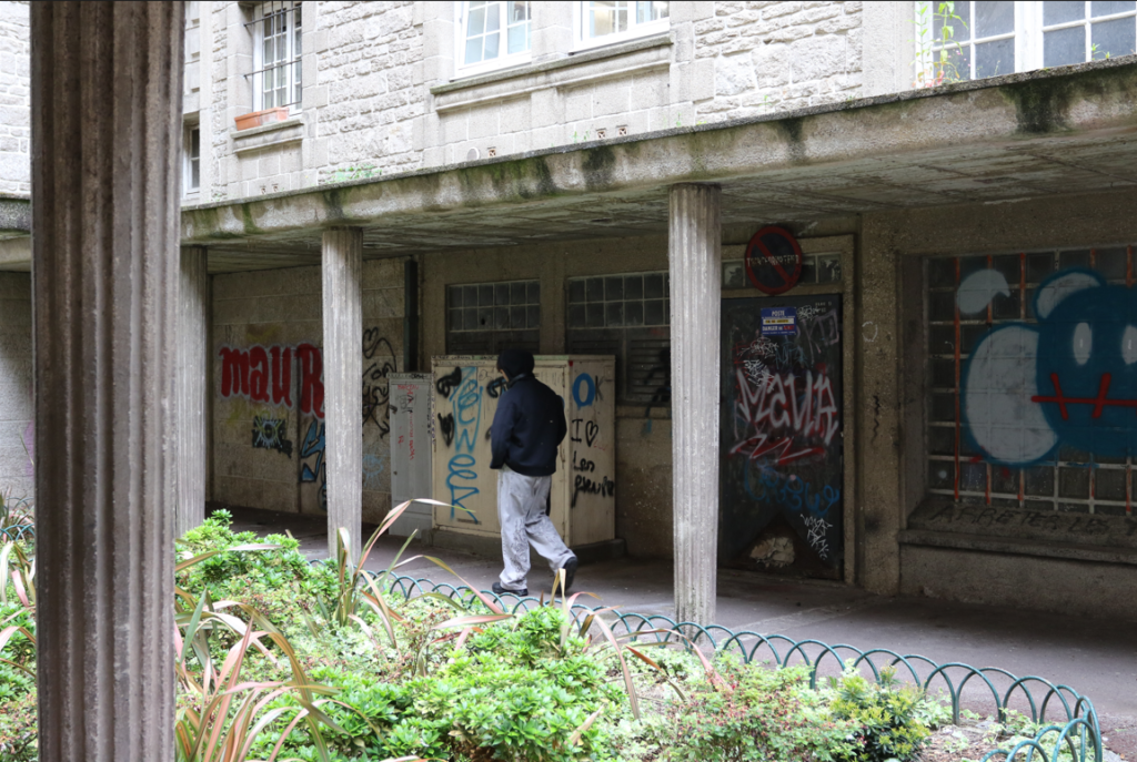
Editing process:
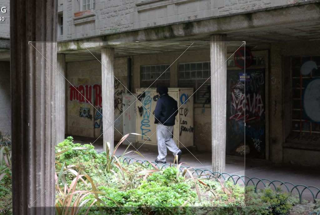
adding additional shots, I wanted to further detail this image by overlying multiple images. By adding different angles, changing their colours and opacity, I think this adds more detail and exclusiveness to the image.
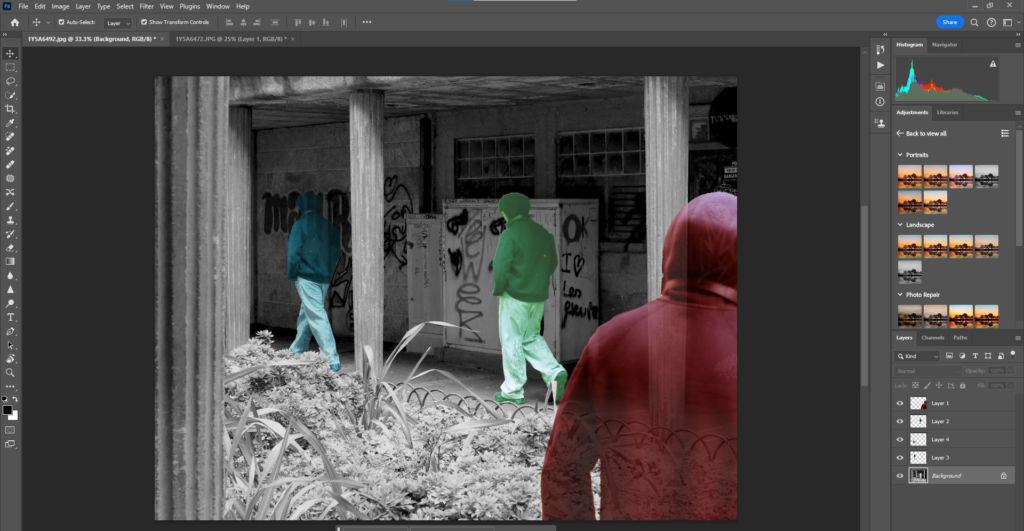
Final Image:

Example 5 – Reflections:


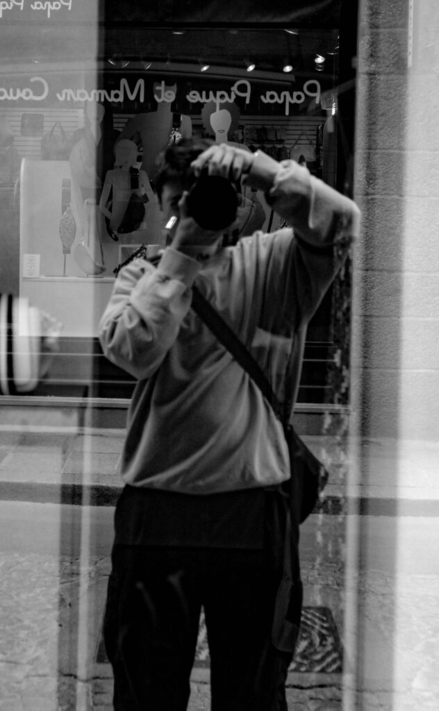
Edit 1 –
Capturing a few photos where Reflections where caught in them, I liked how they came out a lot and can be said to capture 2 moments in one image without the use of artificial alterations.
Camera Settings:
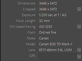
Before:

Editing process:
To make sure both reflection and subject within the image where able to be recognisable I mainly used highlights and contrast to make them both stand out.

Final image:

Edit 2 –
Camera Settings:
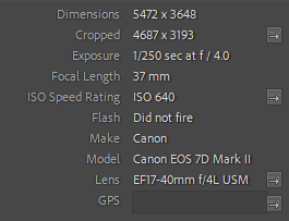
Before:

Editing process:
Due to the unedited version being slightly out of focus but a lot of the tonal settings being alright, I mainly used the dehazing and clarity to make the image look nicer in greyscale.

Final image:

Edit 3 –
Camera settings:

Before:
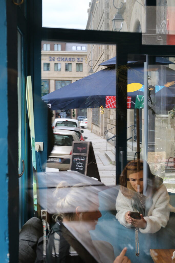
Editing process:
Editing this image, like before I focussed more so on clarity and dehaze, this was to differentiate the subjected reflections within the original image.

Final image:

