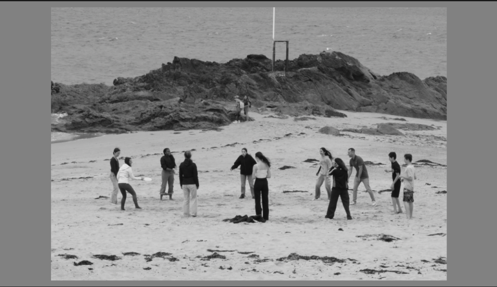
1 x landscape crop
Before:
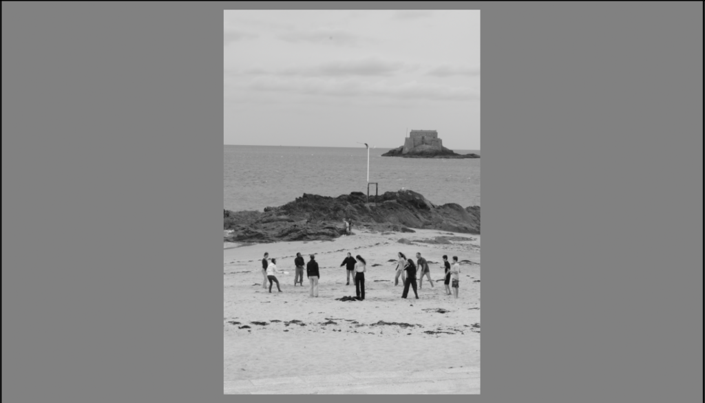
After:
1 x portrait crop
Before:
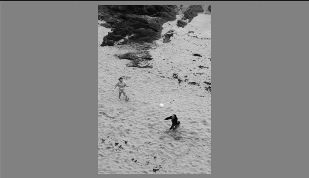
After:
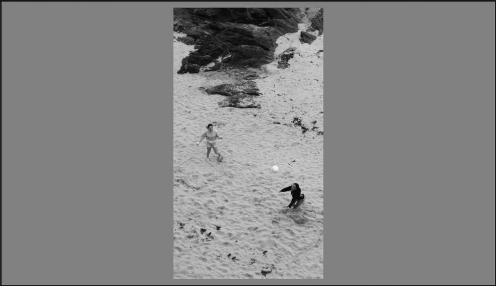
1 x panoramic crop
Before:

After:
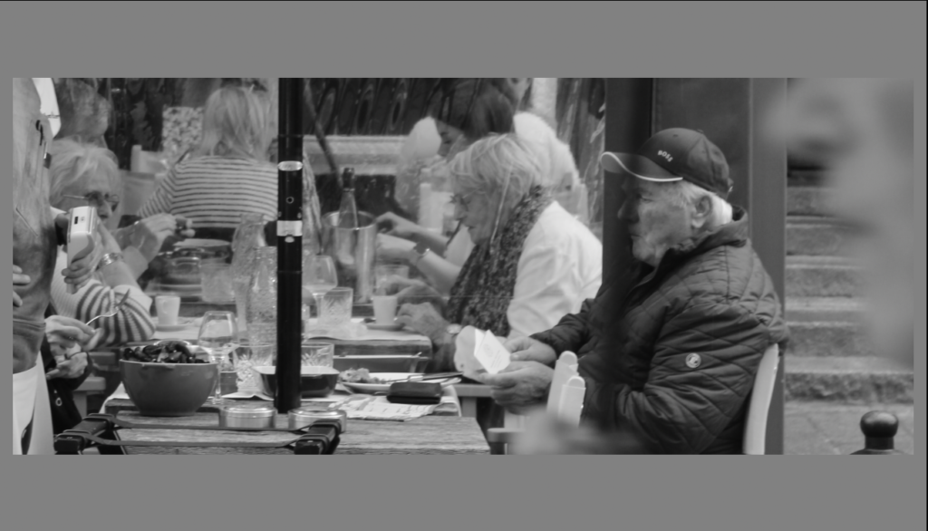
1 x square crop
Before:
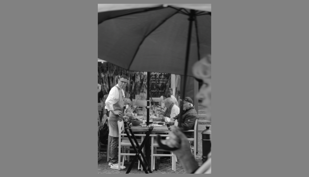
After:
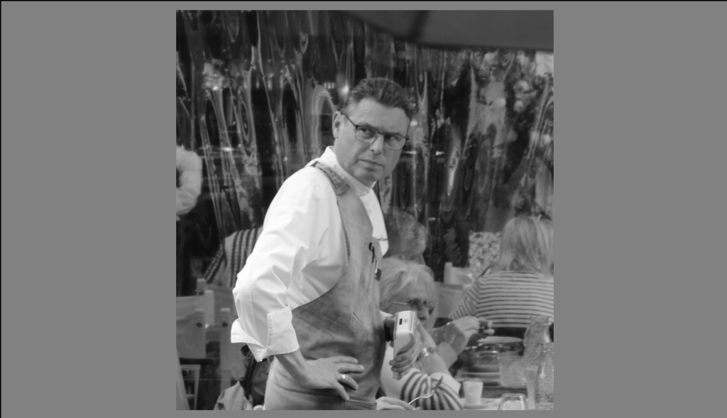
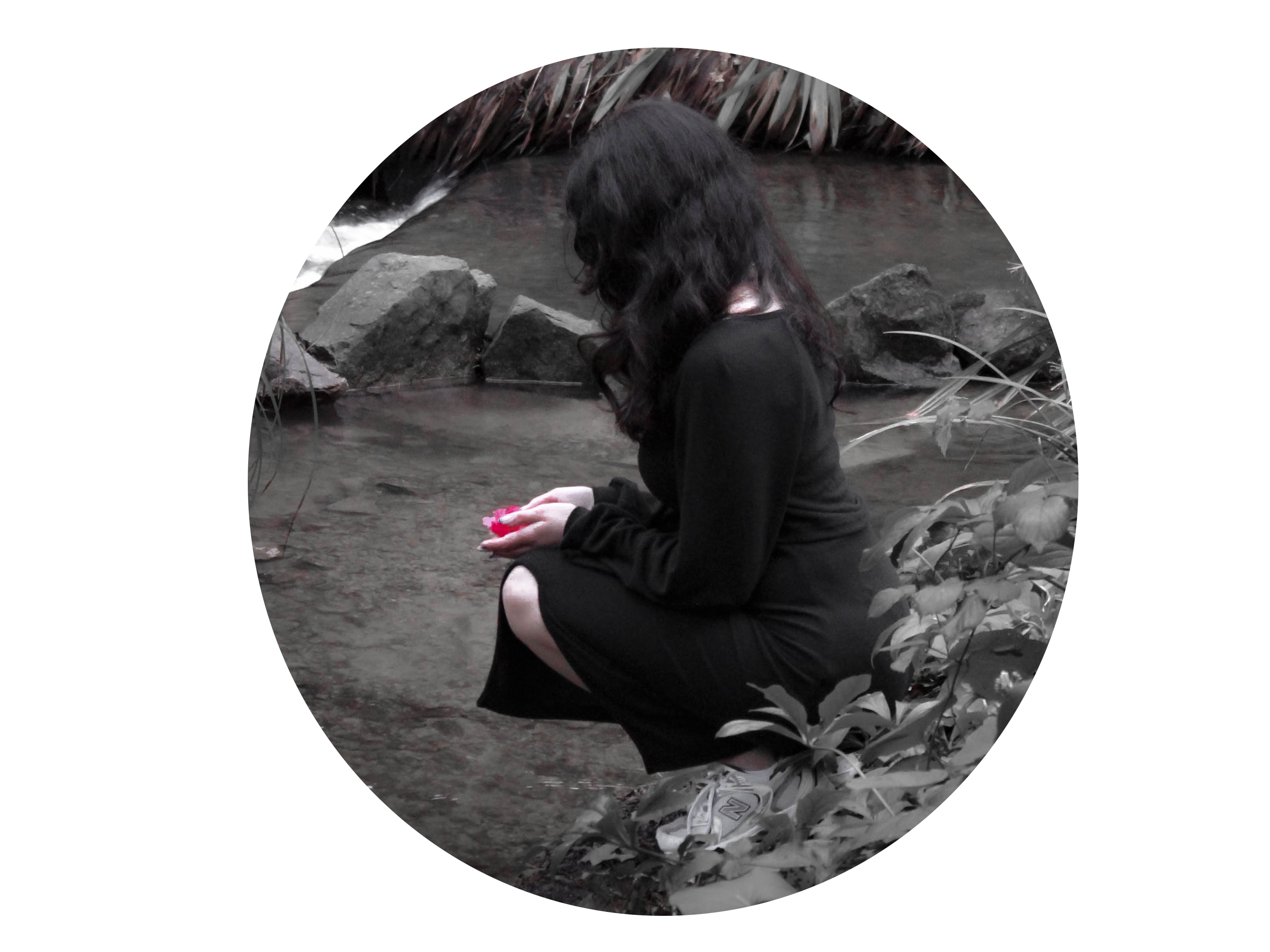
1 x circle crop:
Before:
After:
1 x multi – circle/porthole crop

1 x polygon crop
Before:
After:
1 x landscape crop
Before:

After:

1 x portrait crop
Before:

After:

1 x panoramic crop
Before:

After:

1 x square crop
Before:

After:

1 x circle crop:
Before:

After:

1 x multi – circle/porthole crop

1 x polygon crop
Before:

After:


Outcomes:
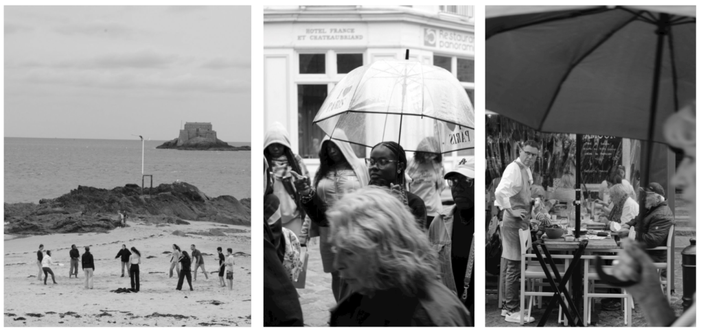
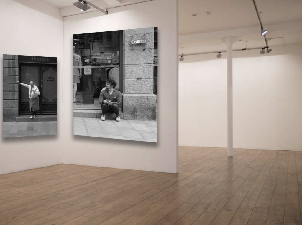
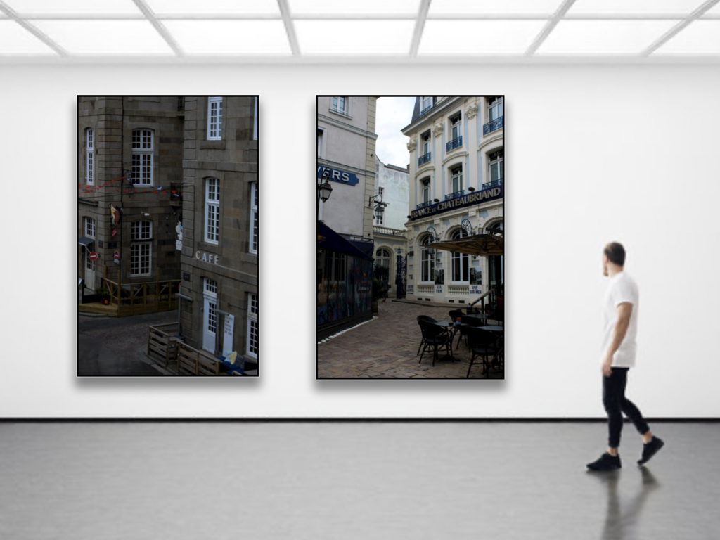
Presentation (virtual gallery):
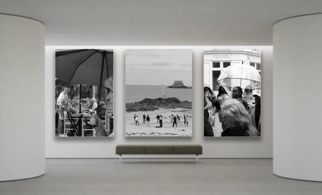
Evaluation:
Overall, I really like my outcomes and presentation which are shown as a virtual gallery. My images are clear and of quality which showcase what street photography means to me and how I portray it to such audiences.
When it comes to editing, my editing is clear and enhancing. It is very clear that a black and white theme is there which is intentional since I believe that black and white compels an image and can majorly expand an image in so many ways. The images that do have colour are purposely in colour to showcase the colour that is captured within my images. The highlight of colour really brings my images to life which is something that I really like and believe is a strength of mine.
The mixture of building and people is also something I really like in my outcomes. I think that It shows creativity because it shows that to me street photography isn’t just about the people but the places and building that are occupied by these people.
Another one of my strengths is my virtual galleries/ presentation. My virtual galleries really bring my images to live and make them seem real. The editing I did in these virtual galleries are really accurate and raw. I really like how I’ve created these virtual galleries, it makes my images feel more professional, it is the cherry on top.
Lastly, a weakness I have in my outcomes is lack and creativity. The editing is quite minimal with a sole purpose to enhance the images. I think that next time I will use photoshop to create collages or create obstruct set of images. I could join two images together or show a juxtaposition between two images.
Editing:


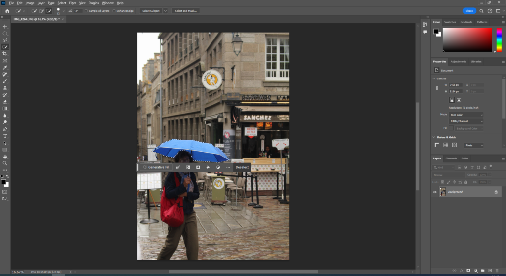
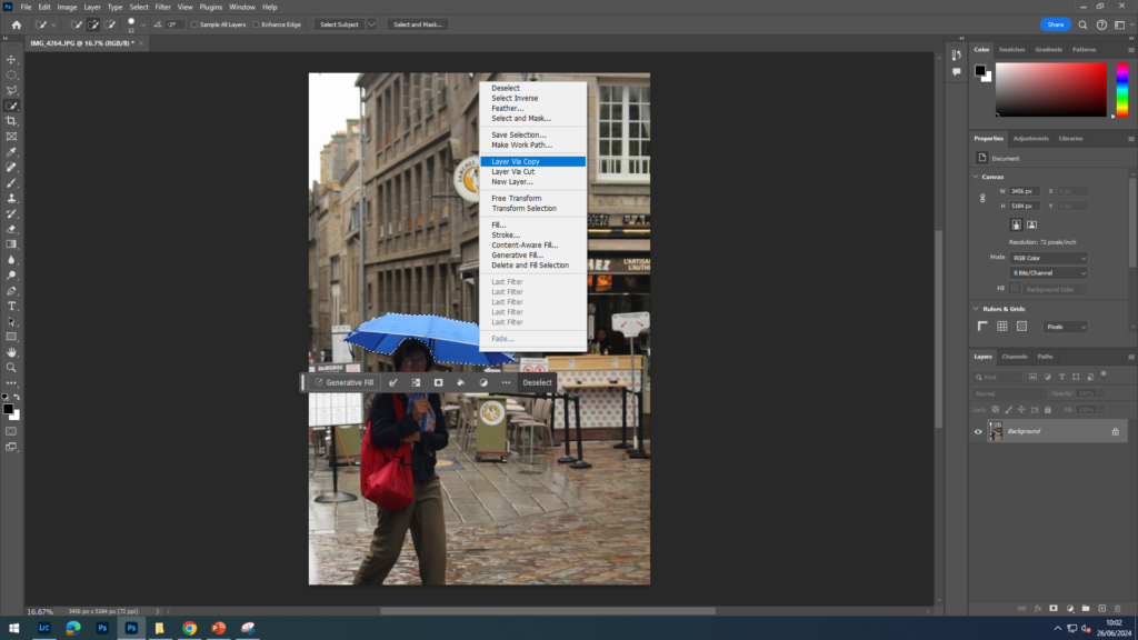
To make my photographs appear more appealing, I have decided to edit some in a way that makes a specific part of the image stand out. To make the colour splash photos, I first used the quick selection tool to cut out what I wanted to stay in colour, I then selected that area and layered via copy this copied the area I had cut out. I then changed the original image to black and white, making sure my copy of the umbrella I cut out , was the top layer.
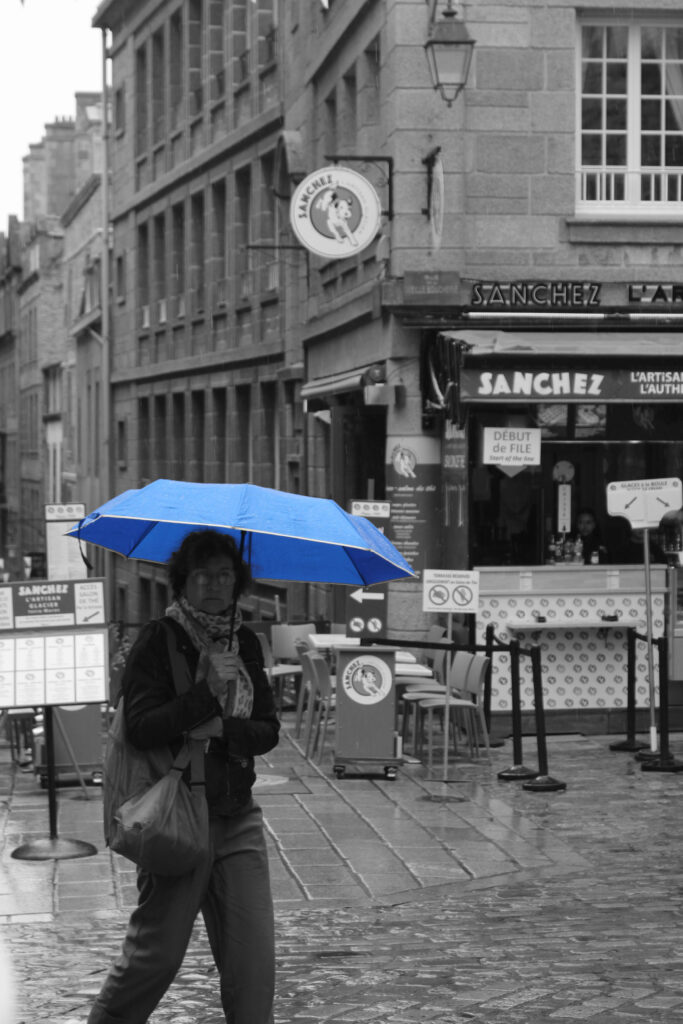
This is the final image. I think it turned out really well, the cut out of the umbrella looks very smooth and I think that it was a good idea to use the umbrella as the colour popping out as it is really bright and stands out well against the black and white.
Other edits:
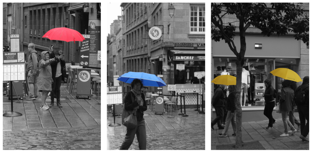
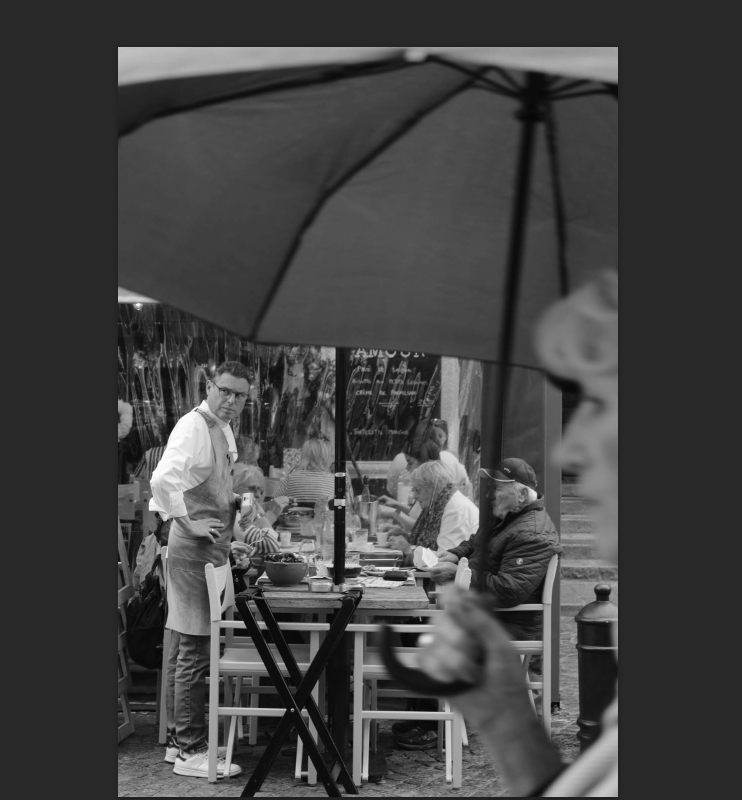
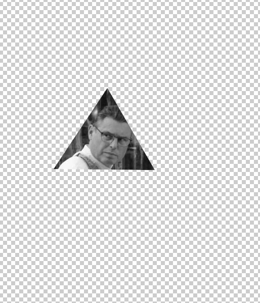
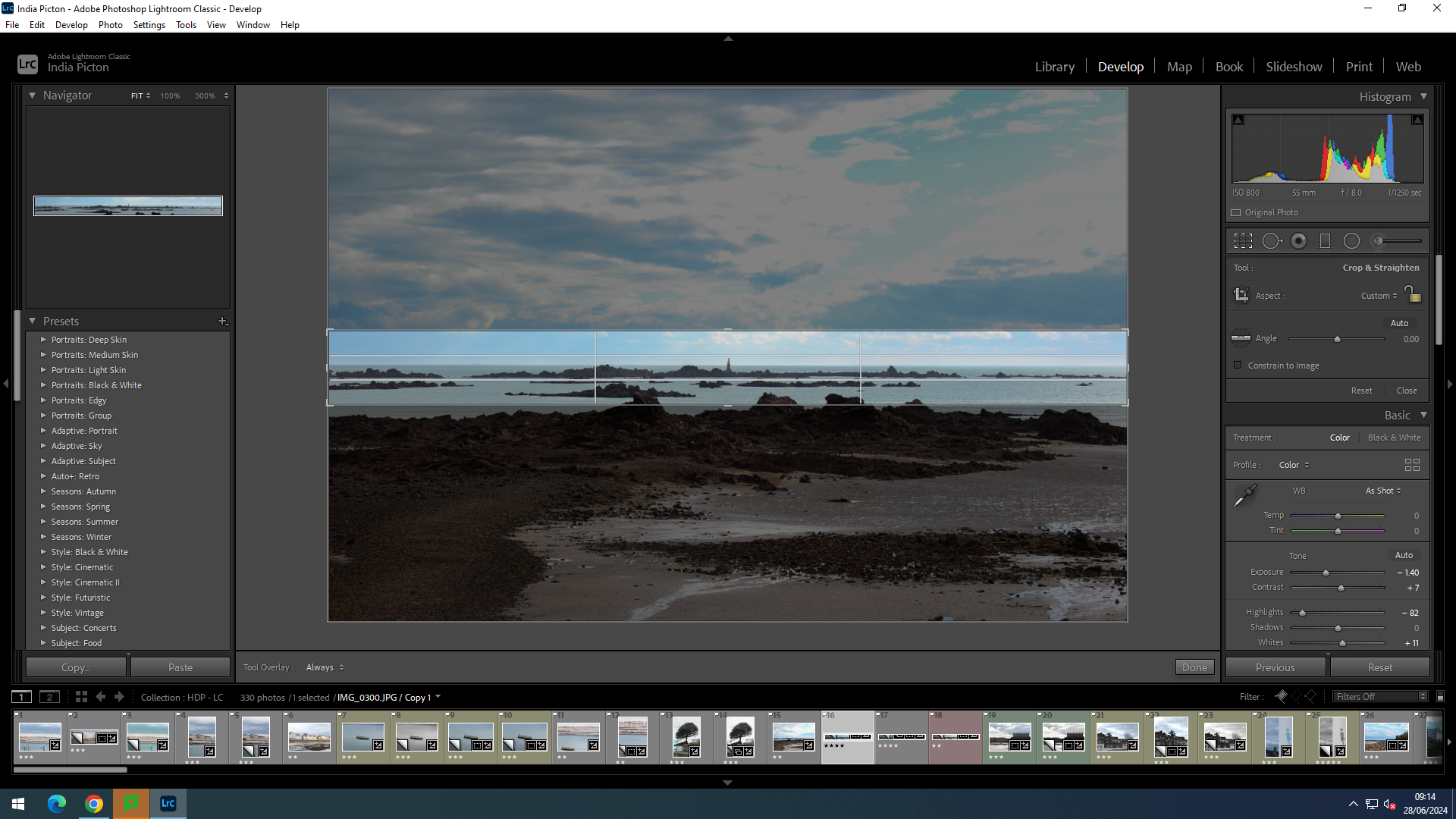
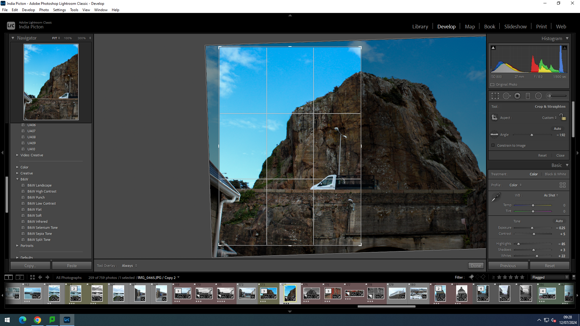
To “crop” an image is to remove or adjust the outside edges of an image (typically a photo) to improve framing or composition, draw a viewer’s eye to the subject, or change the size or aspect ratio. In other words, photo cropping is the act of improving an image by removing unnecessary parts. Here is me trying to crop my images to improve them in different ways.


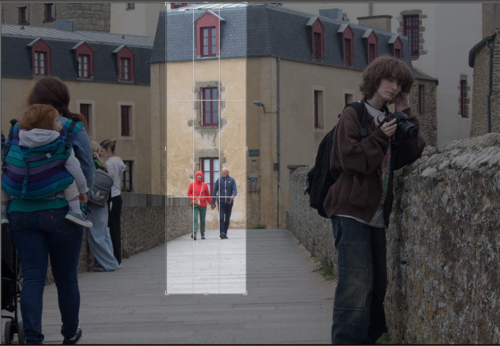
I think the landscape format crop works better for this image as the walls around the people act as a border, forcing the eyes towards the subject more and cropping the image landscape will not waste this feature. However, the pebbles on the ground that can be seen on the portrait image, leads the eyes towards the subjects, as they get smaller and smaller. I edited this photo in black and white too keep with match the style of Bresson.



Here I did wide crops of 2 images, on vertically and one horizontally. I think the first image works well for a wide, horizontal crop because there is a lot of empty or unimportant detail that does not add to the overall image so I cropped it out. It also makes the main subject take up more of the image. The second image works well with a vertical crop because it keeps only one subject in the photo, and creates an interesting photo with all the windows behind taking up the background of the image.


With a rectangular crop, the eye has a tendency to move across the image until it finds its focal point; with a square crop the eye moves around the image. This shift in the dynamic, from fluid to static, presents you with a great setting for capturing the serene. Striking still lives with plain backgrounds and posed portraits work a treat in a square frame.
Centred subjects have a tendency to look flat and dull in a rectangular frame, but that circular eye motion that we make with square-cropped images means that they don’t lose their impact. This is clearly being show in this image of the car, as its headlights take the centre stage and stand out. All the people before now being cropped out further adds to the impact this car has. (I have edited this image in black and white to further stand out the little Renault).

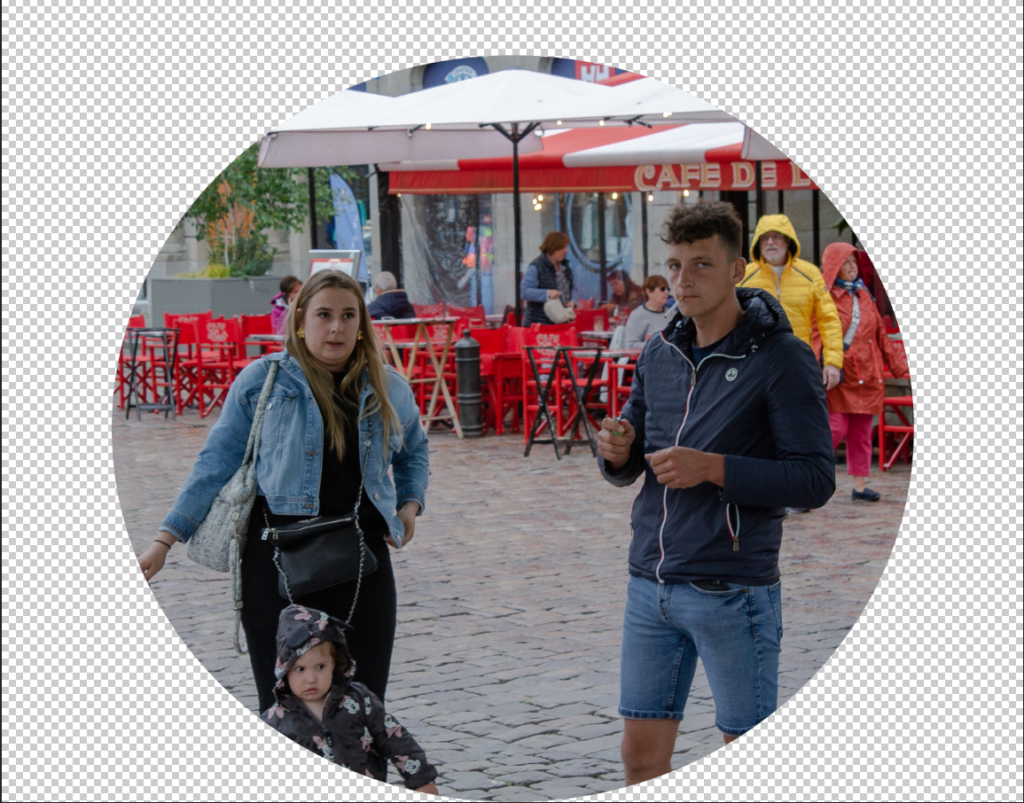
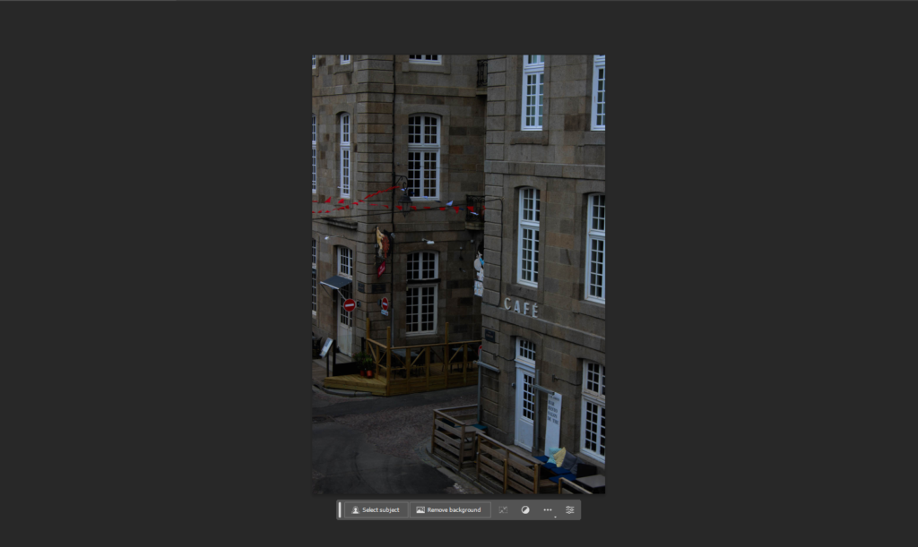
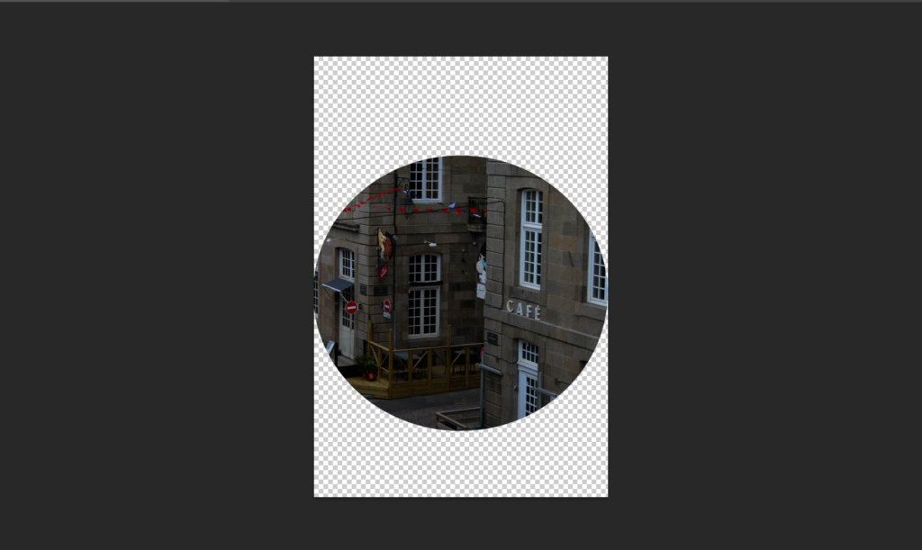
Here I cropped this image in a mostly circular format in photoshop. I did this more for the contrast as most circle cropped images are happy and exciting but this one is the complete opposite, with this young kids parents having a fag.

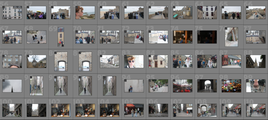

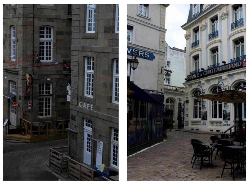
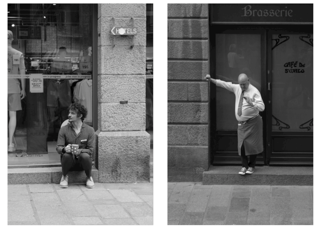
Our school travelled to St Malo for street photography. St Malo is a walled city on the English channel coast and is a popular tourist centre and has a lot of historical value. We where trying to capture the ‘decisive moment’, coined by Henri Cartier-Bresson. This is where there was little planning involved (the furthest I planned was waiting at specific areas where I think an interesting moment could happen). I was looking for photos that looks classically ‘French’ as we where in France after all. I also did a few photos of just the French architecture, with their colourful French shutters and bright doors. Here are a few of my favourite photos with a small amount of colour editing:

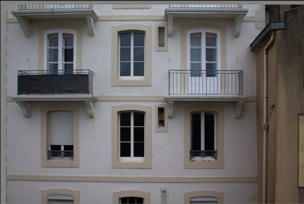


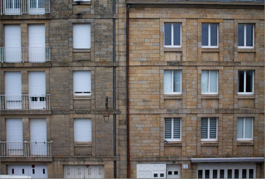

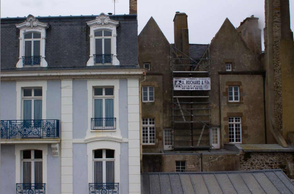

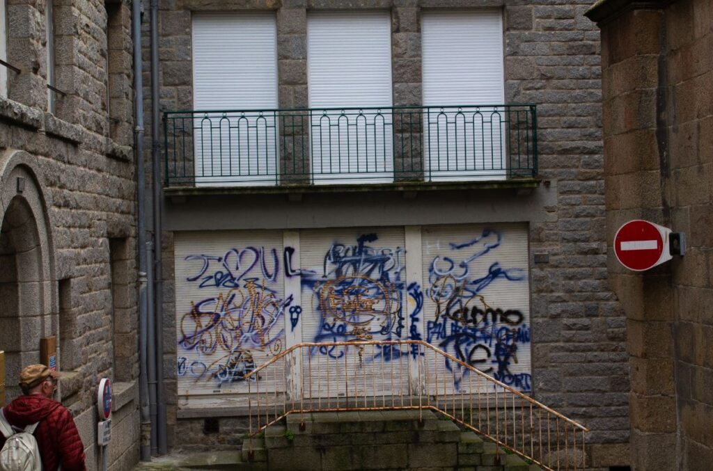

These photos would go very well together in a topology so I have edited them with similar settings so I can do this later on. I tried to capture the unique buildings in St.malo, that maybe had so moss growing, old paint, graffiti, and more to give the images more life.
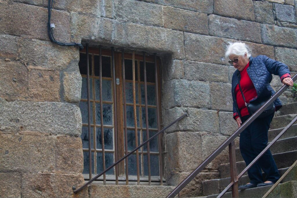

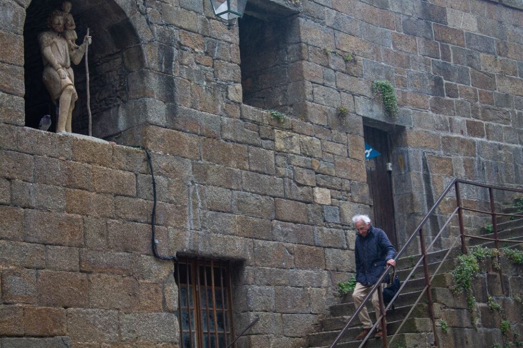

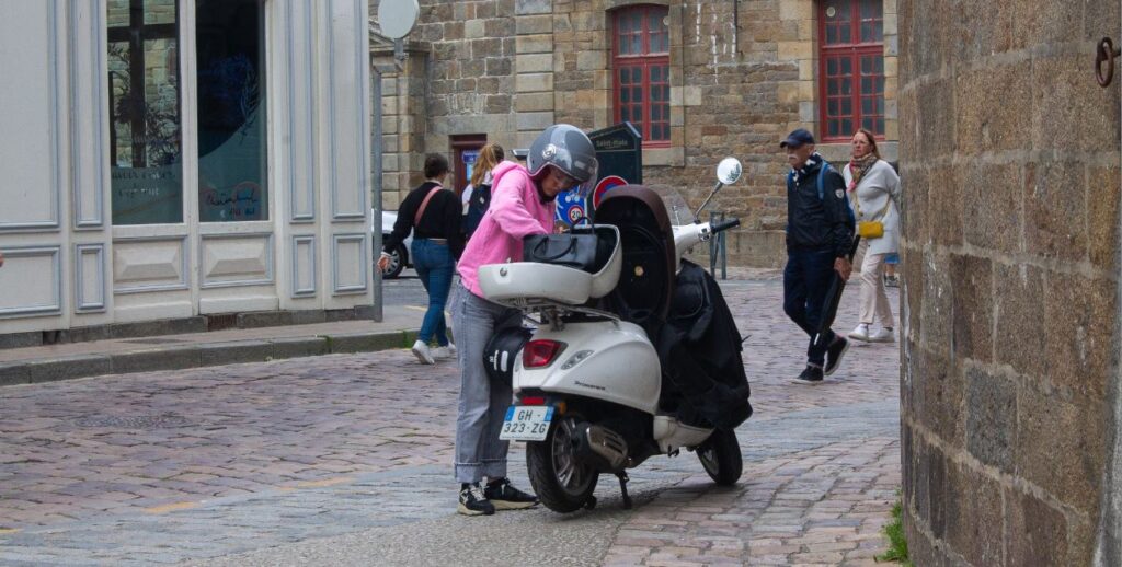


Here I mostly cropped to keep to the rule of thirds, making the subject more prominent, However with some cases I thought it looked better to forget about the rule of thirds, like when the subject is moving quickly off the scene. I have a few strong images that I will edit further and try a ‘Bresson style’ B&W photo.
Cropping images can alter an photos meaning. By changing the focus you can create a new photo, which in many cases this could make a photo better.
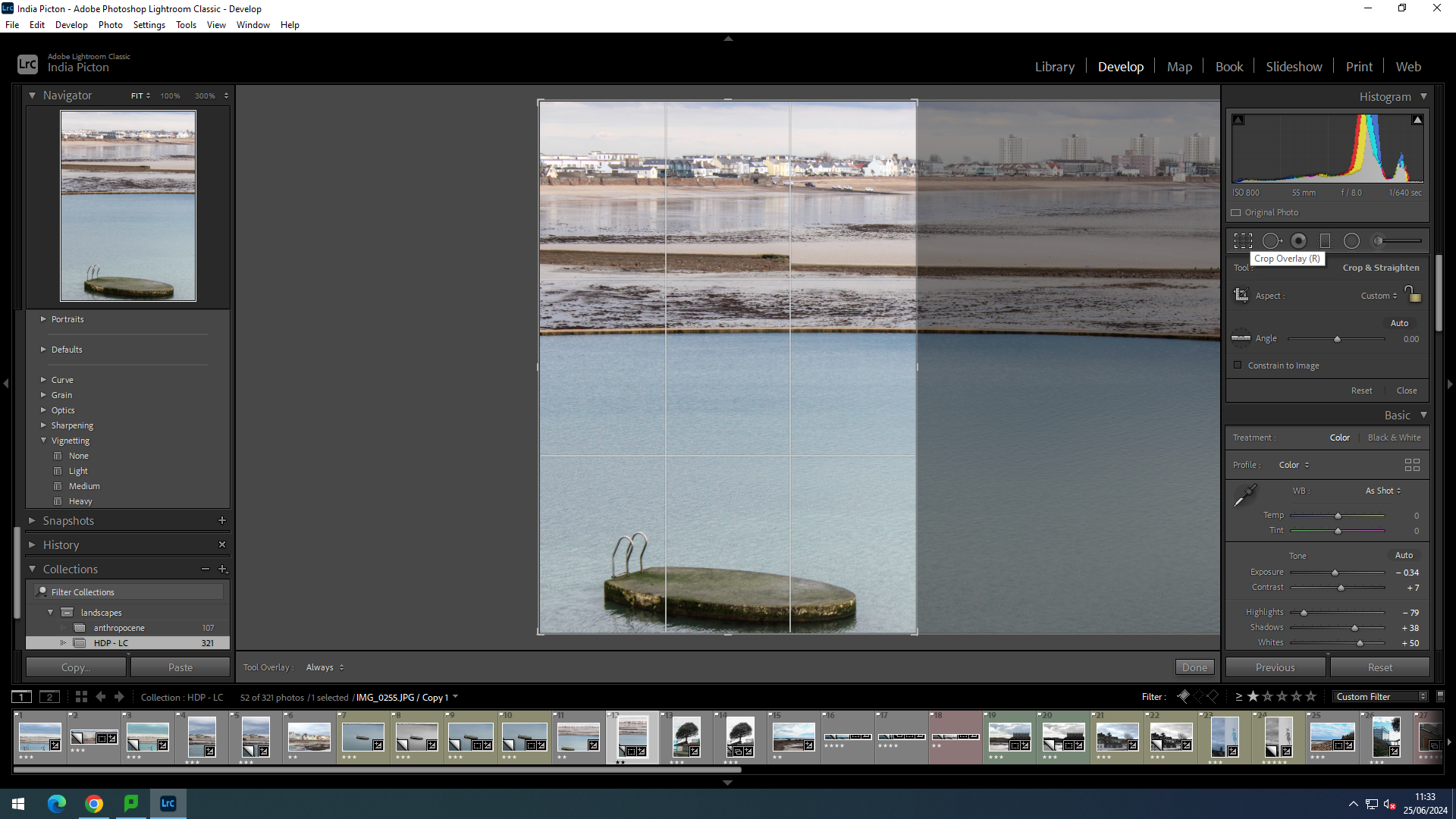
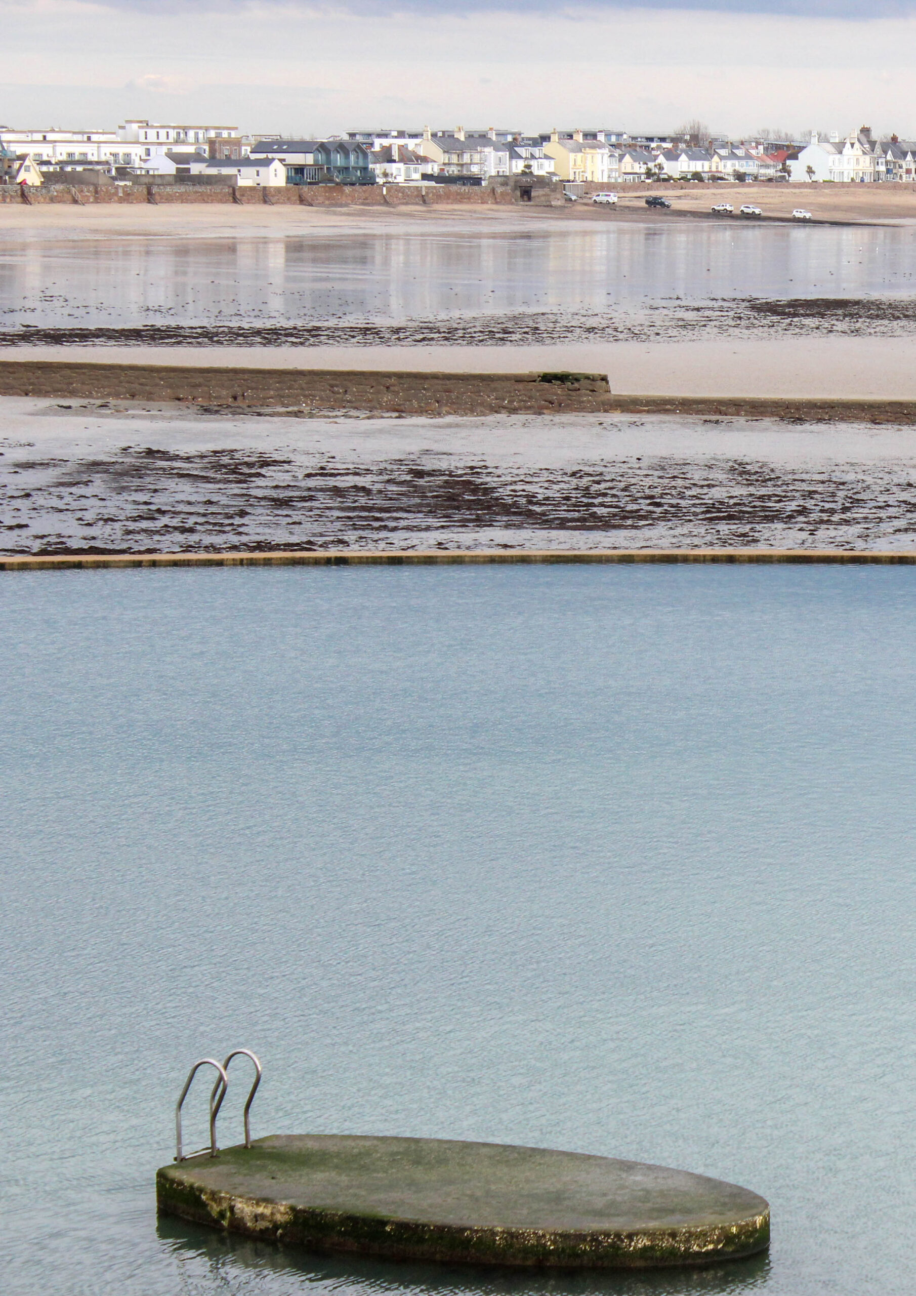
By cropping this image to have the line of focus go from the dive platform to the water to the beach, then town and then the sky,
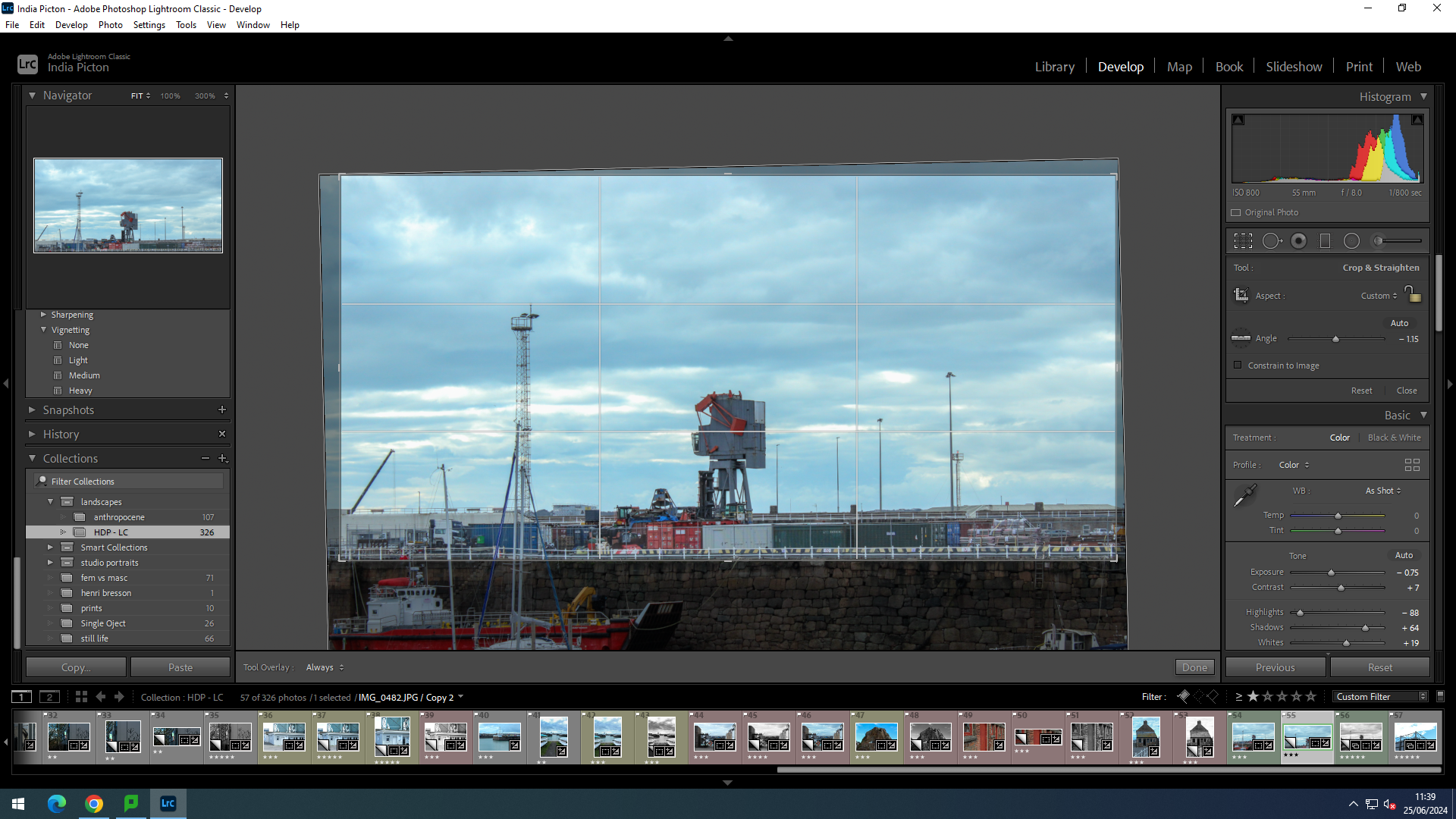
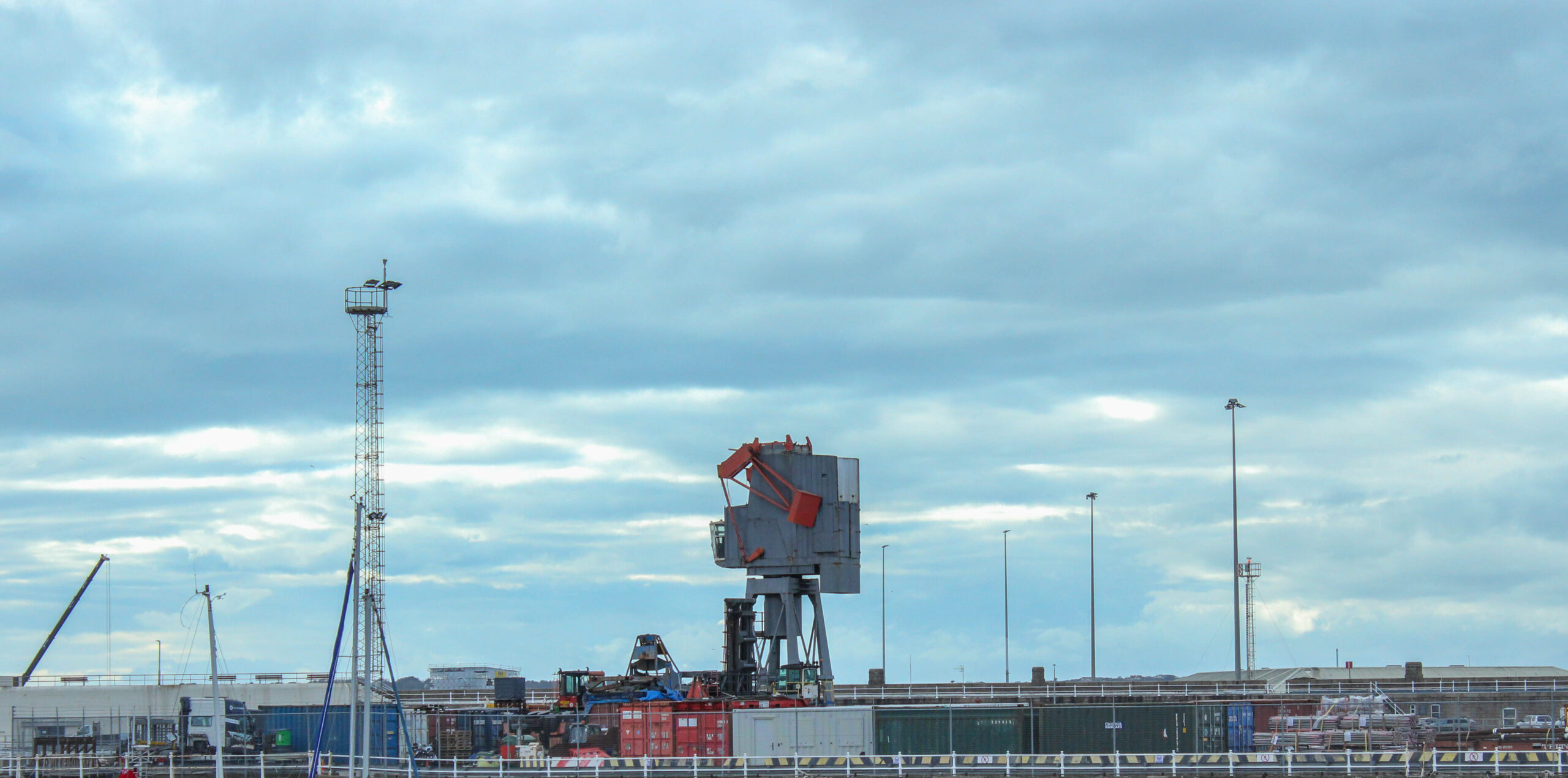
With this one I have brought the bottom of the photo to the the barrier. By doing this I have made uses of the sky, to make the towers and cranes stand out.
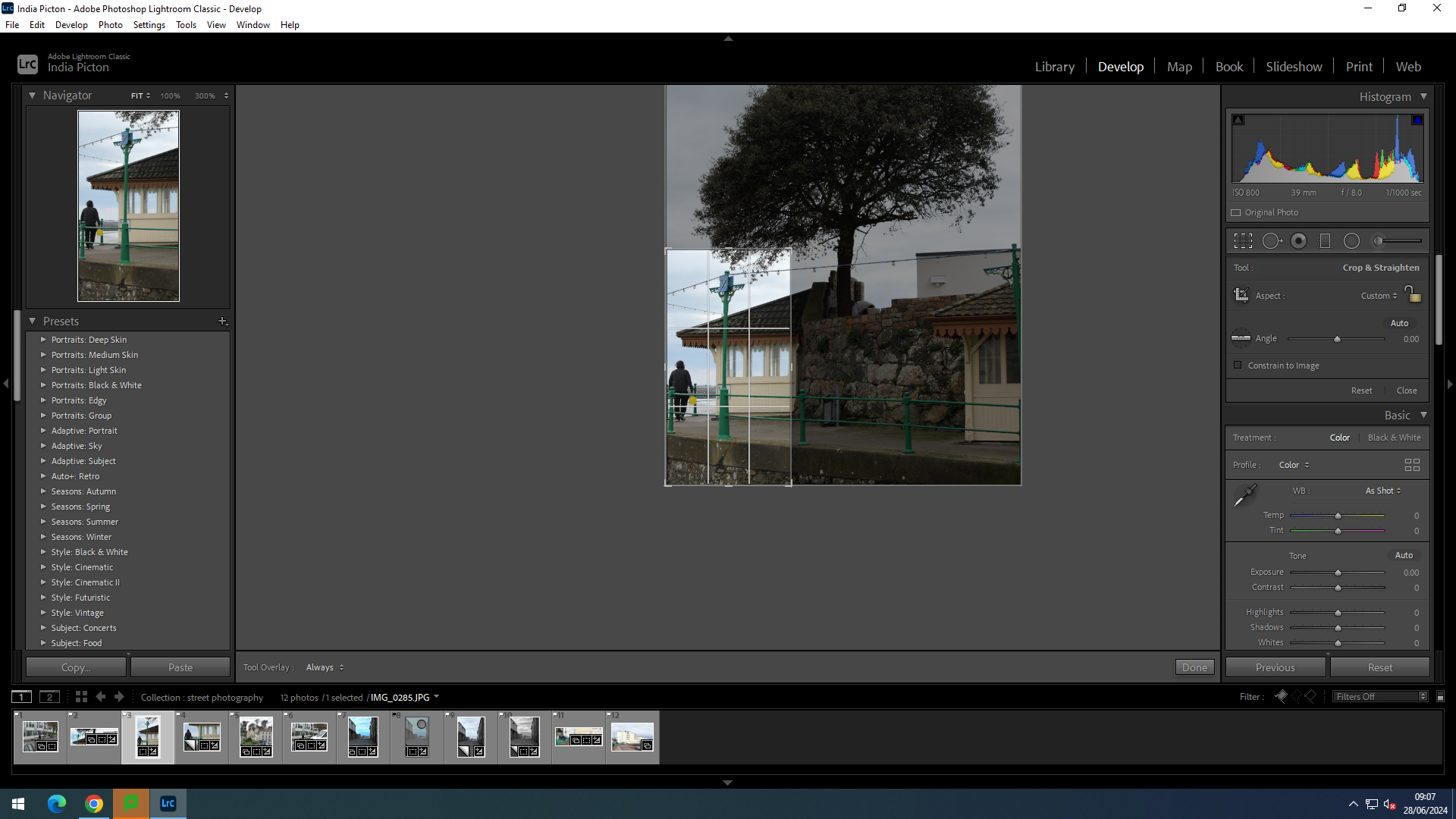
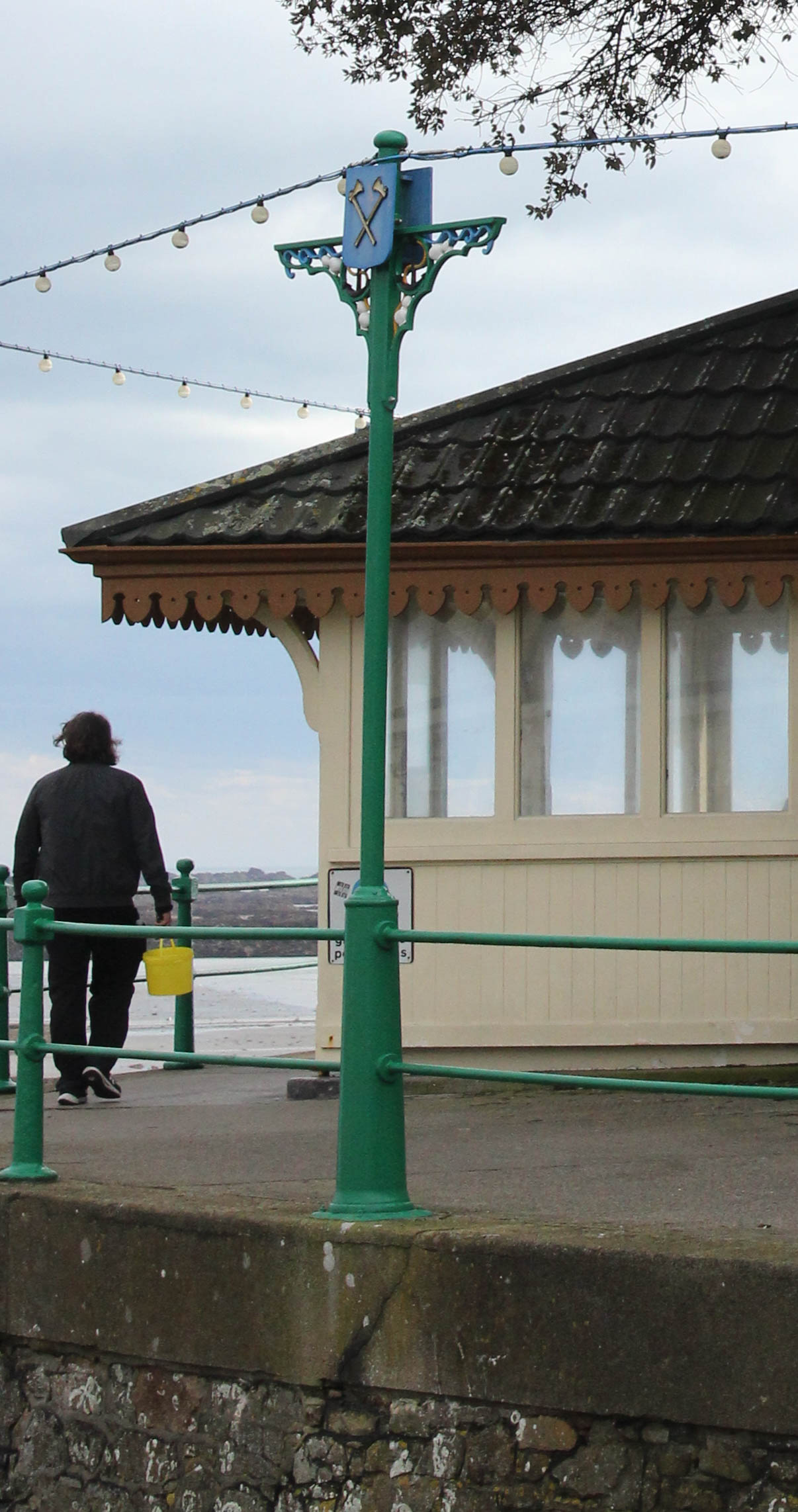
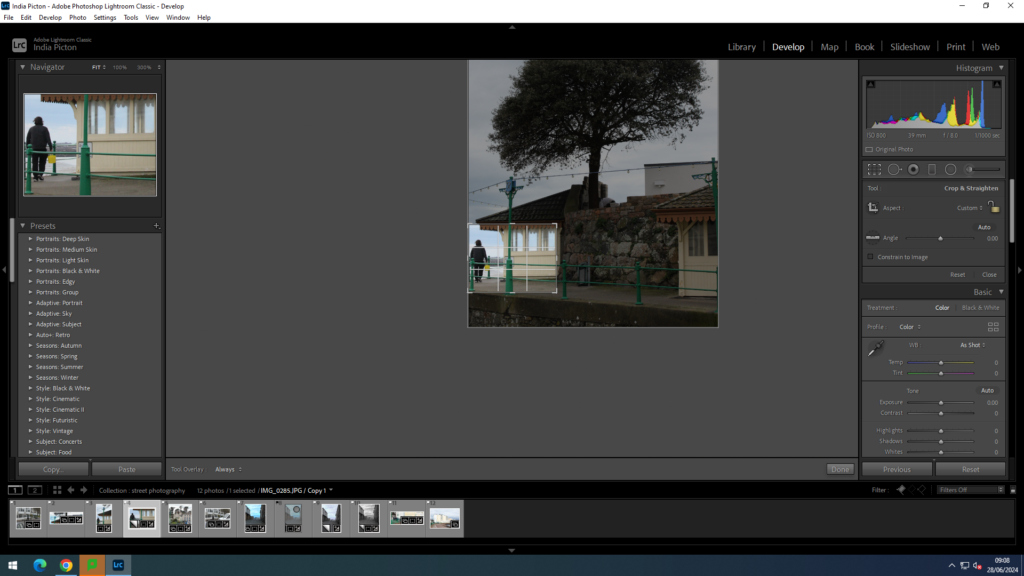
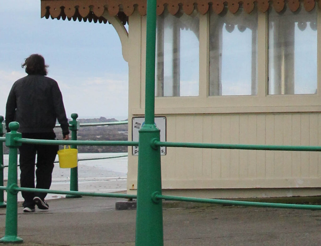
These two are from the same original photo. by cropping the image smaller and smaller the way the photo and the man in the photo is viewed changes and someone’s idea about the man changes. the first photo has more in the foreground which makes it seam more busier, whilst, the second one appears more lonely to me. the way that the man is solitary on his journey.

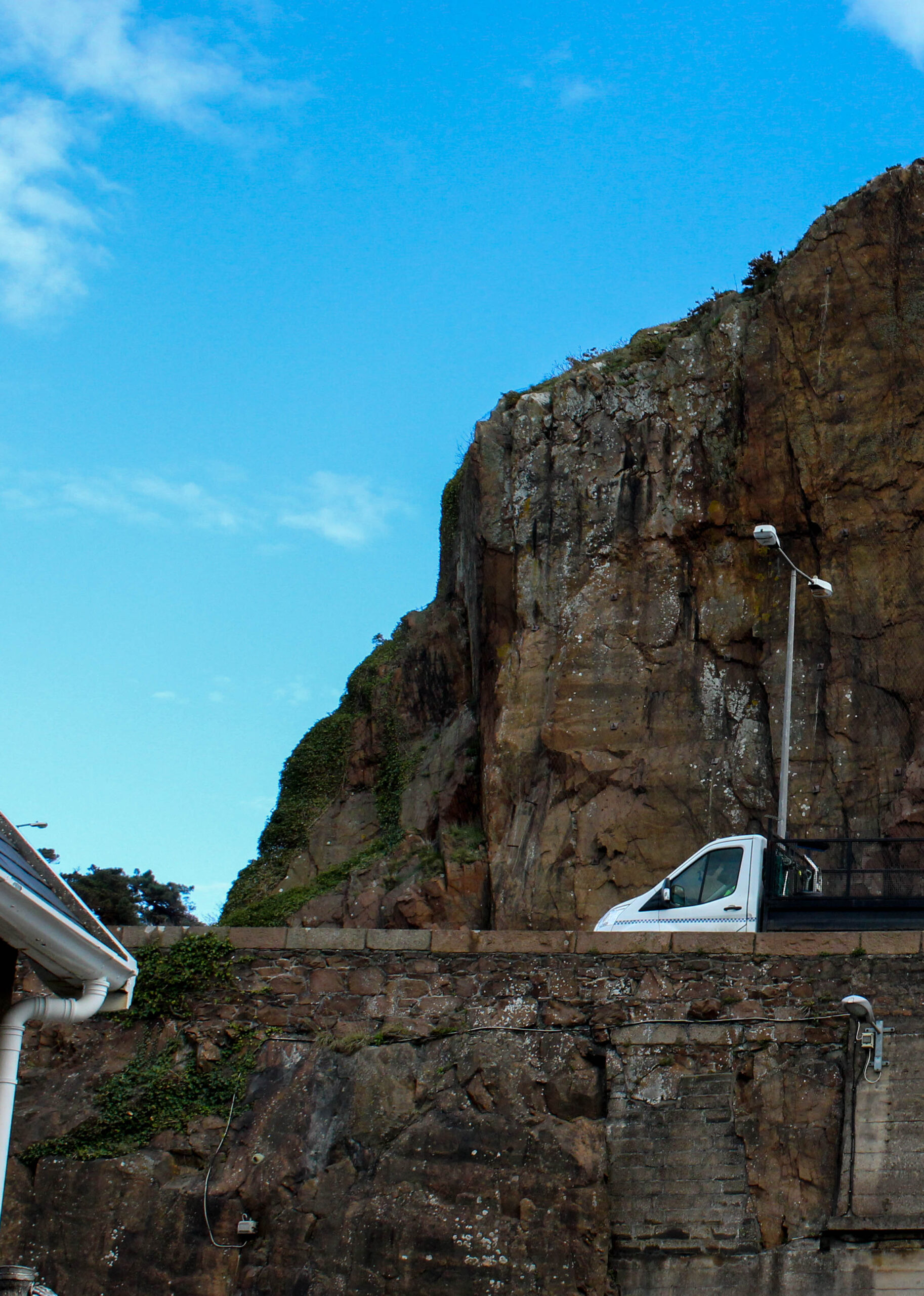
Cropping can also alter the way a photo is perceived. This photo below is already quit elegant and ethereal.
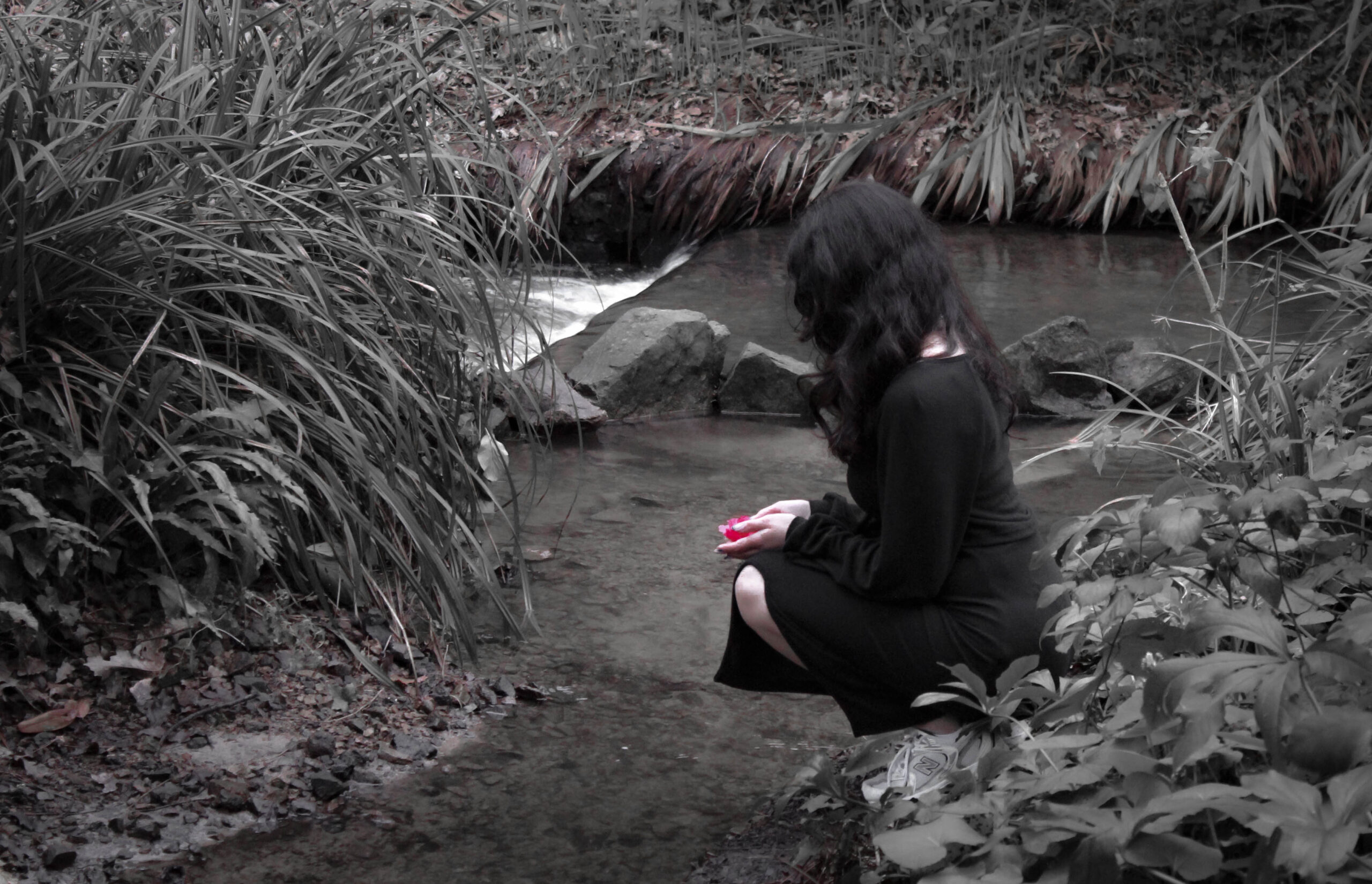
However, when the model is put in a circle crop the viewer and focus in on her and their mind can explore the possibilities of who she is and where she is from.
