
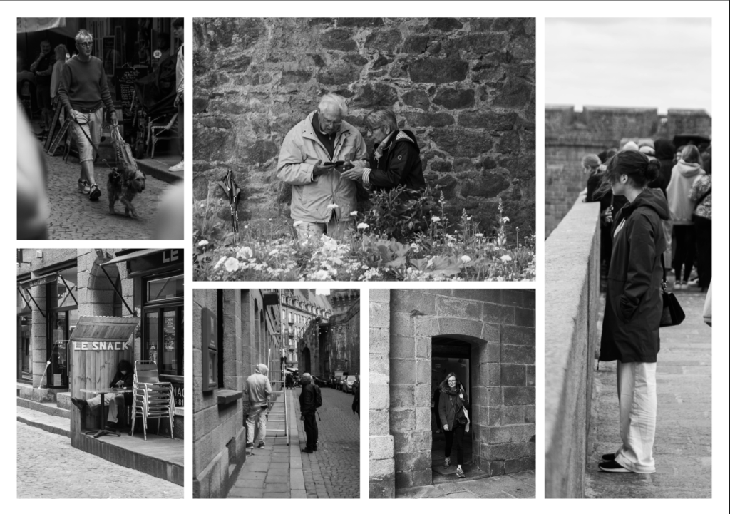
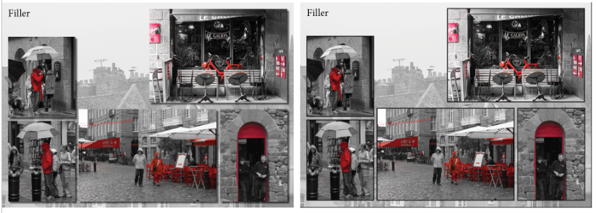
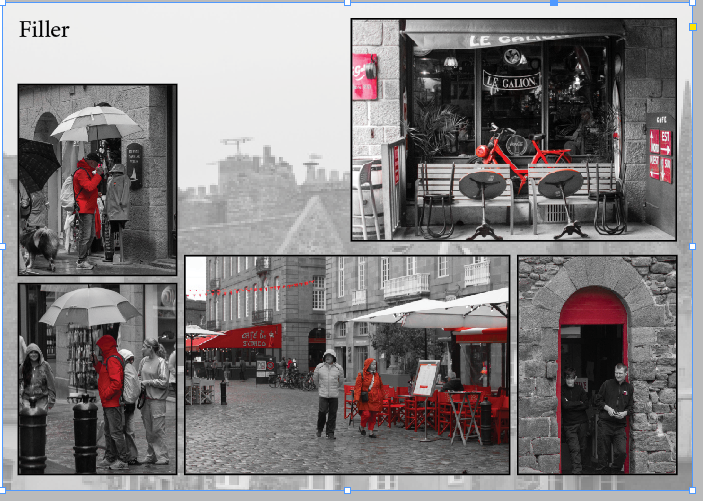
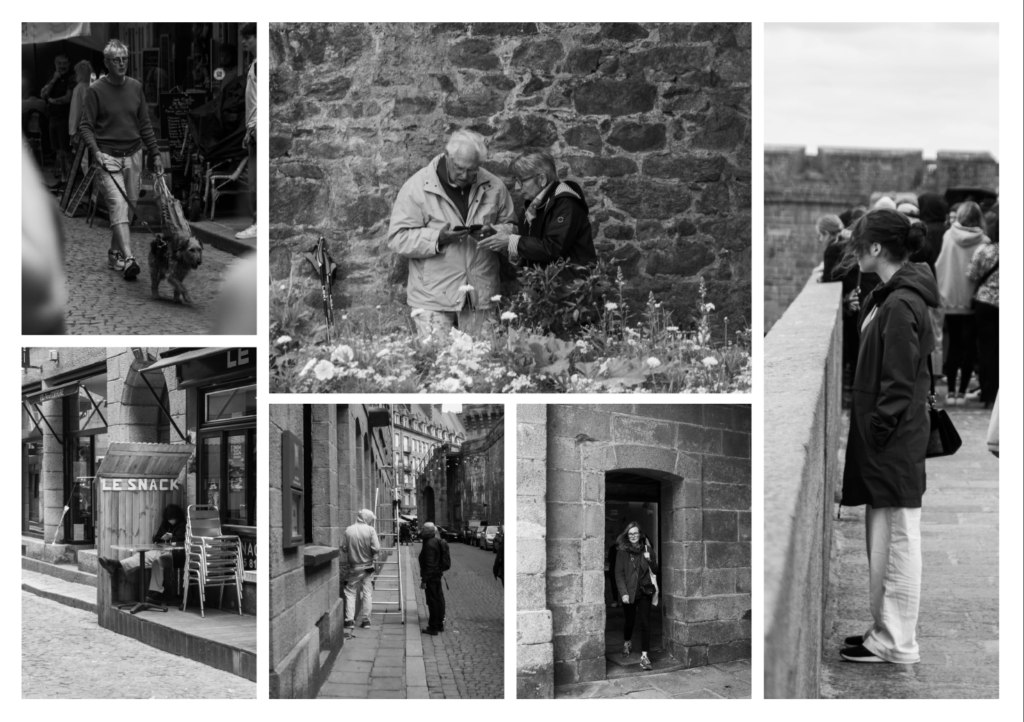
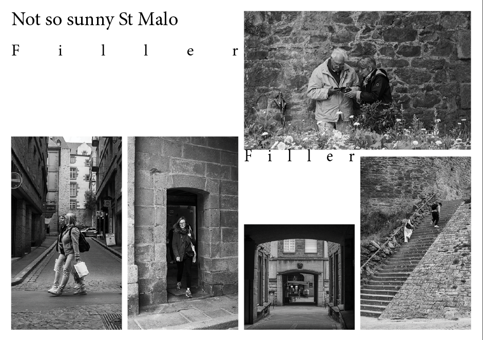
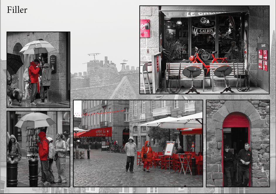
Another way of presenting images, is creating page spreads. This allows for many photos to been seen at once with text providing context. I have selected good photos from the St Malo day trip, already edited to use in the process of creating page spreads. I will look to pair and match similar photos ether compositionally or narratively, this will help create a joined, polished page spread. My aim is to describe St Malo through photos, from the walled city to the shopping streets to the exposed nature of rough rocks and sandy beaches, capturing how people interact with all theses elements.
A3 Page-Spread Designs:
InDesign
Create new document
width: 420mm
height: 297
pages: 3
orientation: landscape
columns: 4
column gutter: 5mm
margins: top, bottom, inside, outside: 10mm
bleed: top, bottom, inside, outside: 3mm
Short cuts
CNTRL D – place photo
Shift W – preview
W – remove margins
CRTRL -/+ – zoom in and out
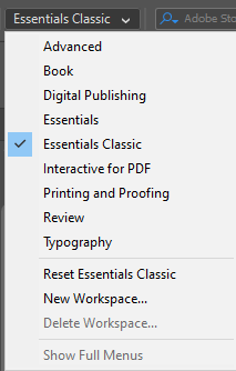

Move Image-use centre of photo to pull photo

Make box, for photo.
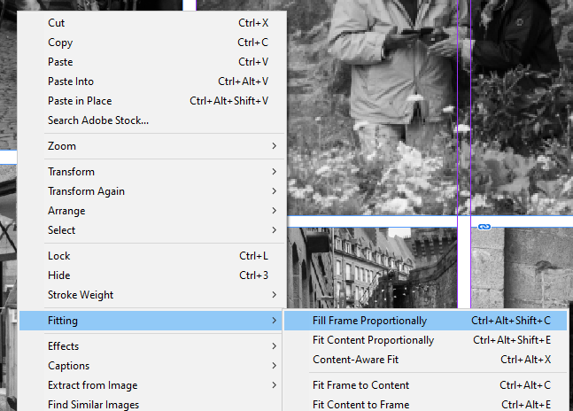
Right Click – fitting – fill frame proportionally
This is my first attempt working out how to use the different tools to import and aline photos.
Adding to Photos
To add borders I selected the photo using the arrow tool and then increased the size of the border to add make it more visible.
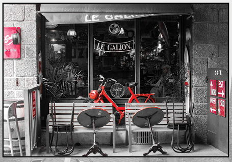

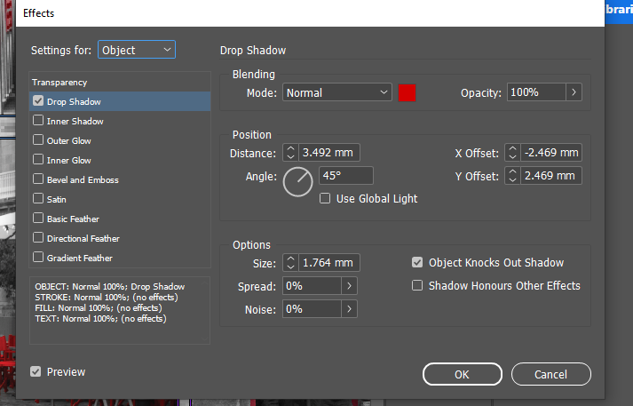
To add drop shadow to photos I used the same process just selecting the drop shadow tool rather than the border weight.
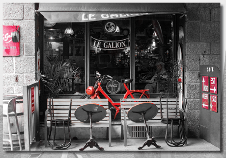
By trying both, drop shadow and borders on the photos it has given me a chance to compare what creates a stronger presentation and what would make a weaker one. I like both results but the bordered one helps make emphasis on the individual photos not just the page spread as a whole.
Backgrounds
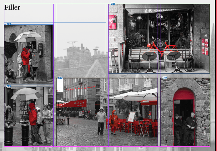
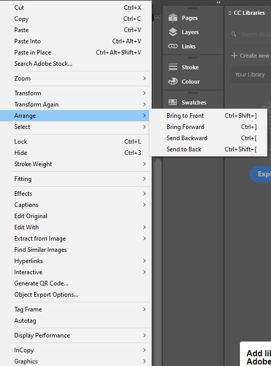
To keep the background from being blank I added another photo from the same shoot that complemented the others without taking away from them. To do this I created a box over the whole page and then imported my photo, right clicked and selected arrange, SEND TO BACK to move the photo behind the rest. I then used the opacity slider to reduce the opacity and make the photo duller and less distracting.
Opacity Slider

Editing Text
Design Ideas
Final Designs
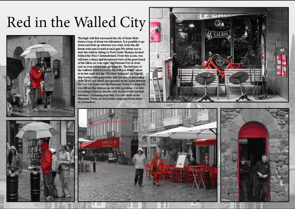
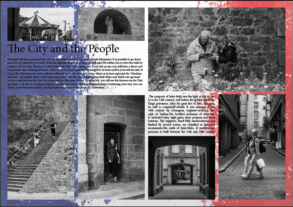
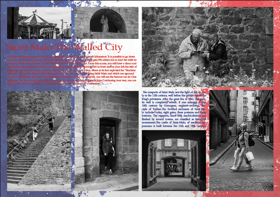
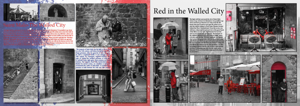
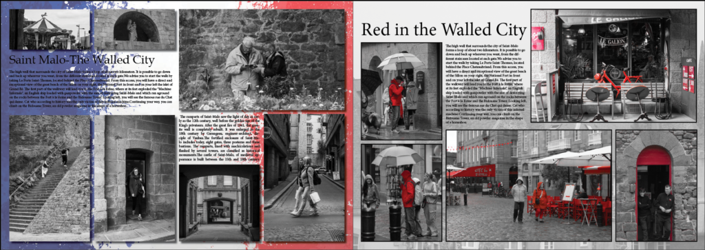
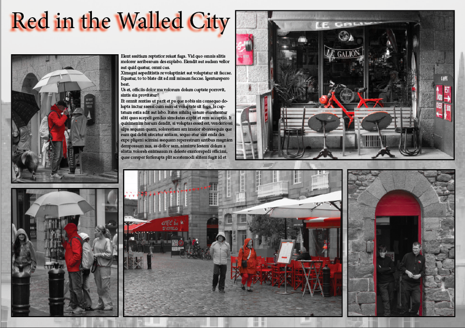
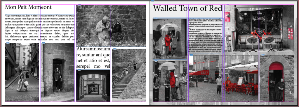
I tried many different options for my page spreads, this allowed me to experiment and create new content. I ended up with a double page spread of two different styles but using the red in both to tie the pages together. By the page on the left having the French flag as the background it is obvious to the viewer this is France, made more clear with the title ‘Saint Malo the walled city’. By using an establishing shot in the top right corner I draw the viewers eye to the text surrounding it then the rest of the smaller photos. The red is also on the under the establishing shot as other than that’s the way the flag is it draws the viewer to the other page spread, ‘red in the walled city’ which is a progression on an overview of the city, delving deeper into the colour that is often seen and used in France. Overall the pages are successful and provide knowledge as well as dynamic photos to keep the viewer interested, I also used border weight and drop shadow, backgrounds etc to emphasise the significance of each picture and keep them from becoming flat to the background.