
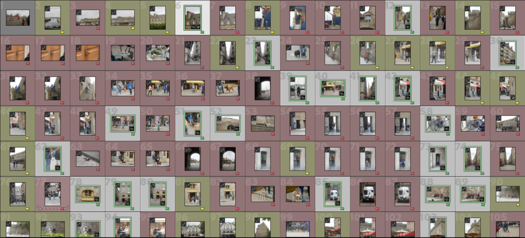
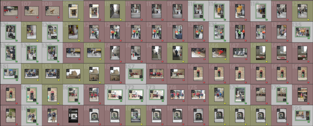
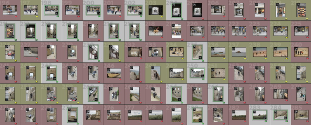
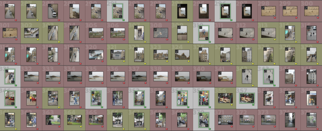
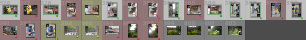
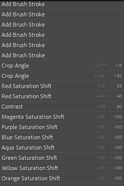
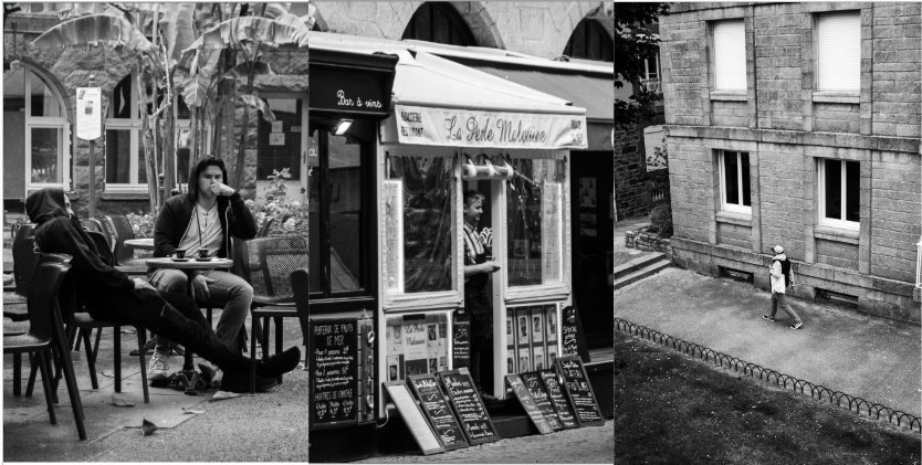
Out of the nearly 400 photos I took this day many were not ones I deemed useable hence the red colour, some I marked in yellow to check again as I liked elements but they weren’t the strongest. The green ones were my strongest images and the ones I will go on to edit.
Best Photos
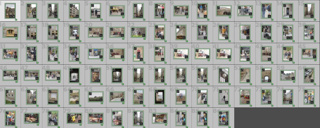
These are all photos I think are strong compositionally, capture Saint Malo and are in a similar style to Henri Cartier Bresson. As they are the best ones they are the ones I will edit and use for picture stories.
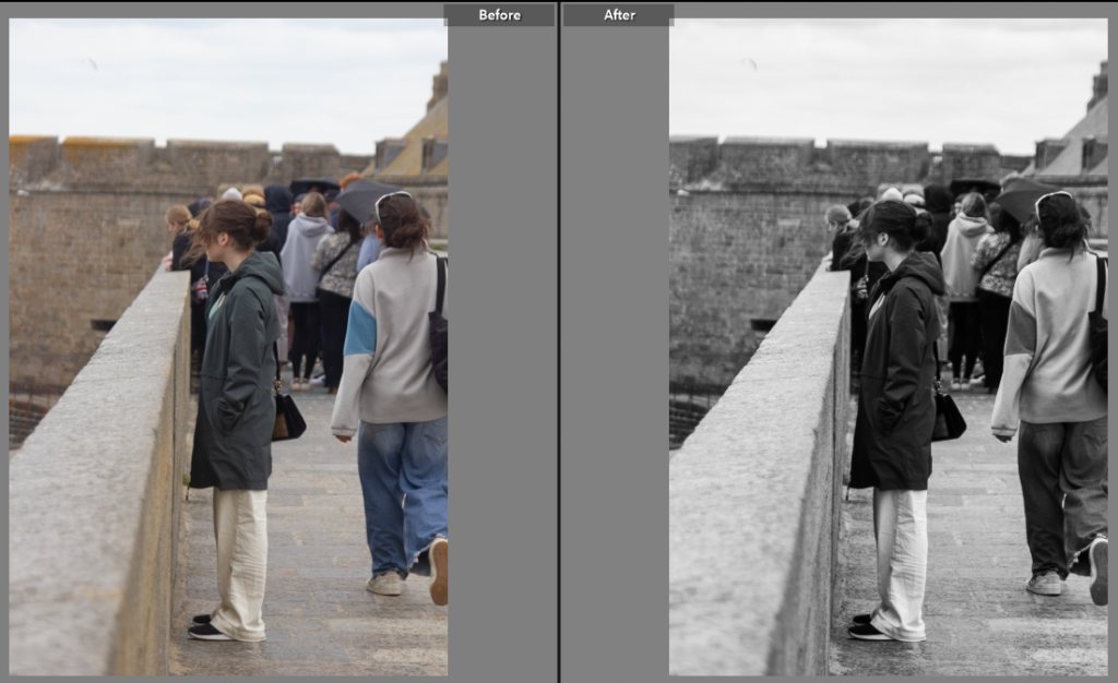
Edit One
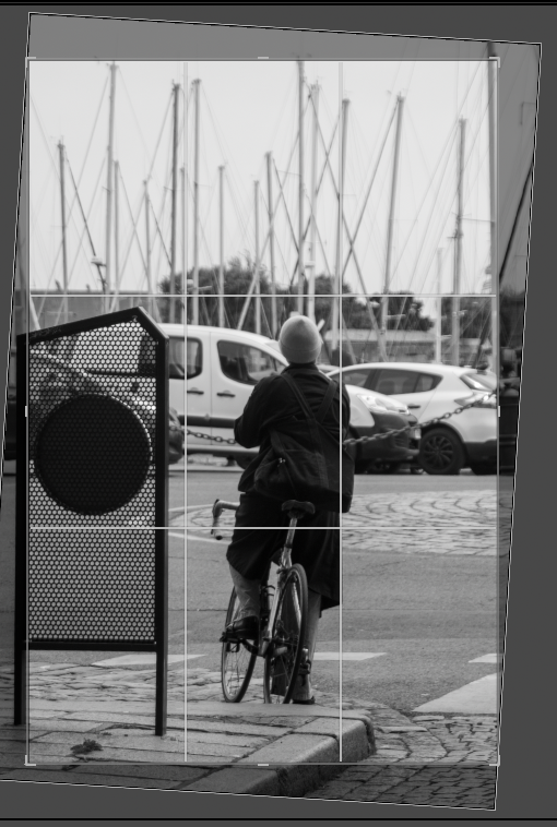
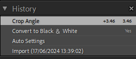
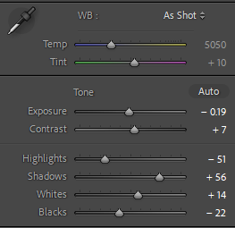
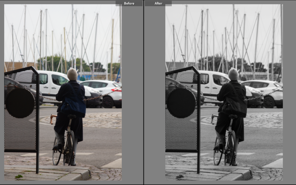
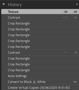
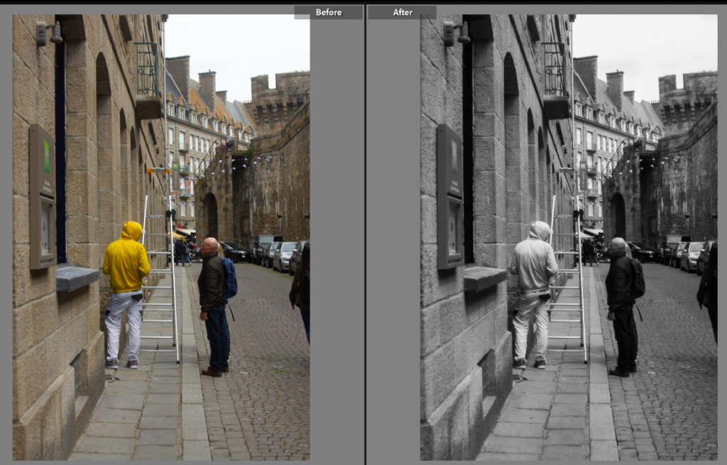
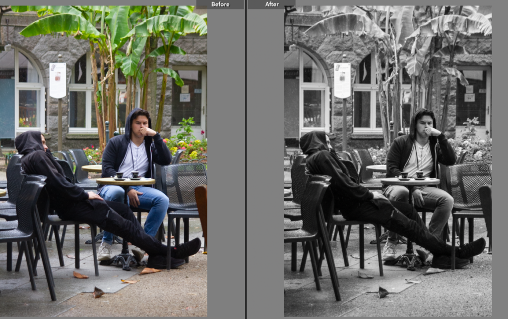
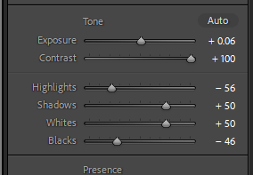
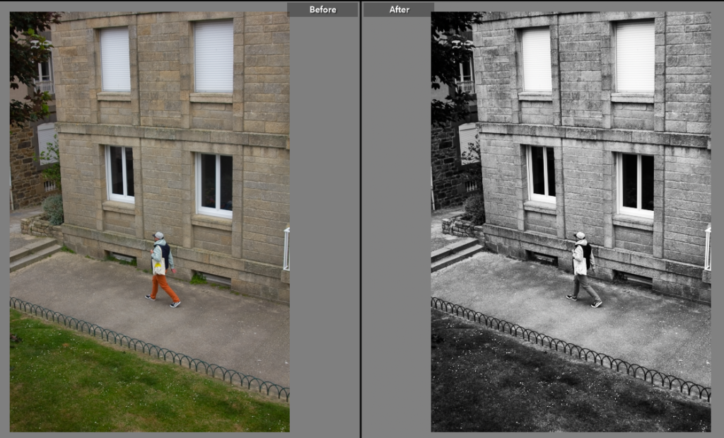
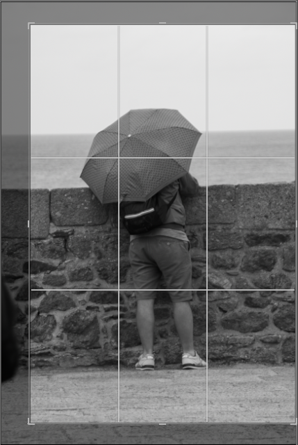
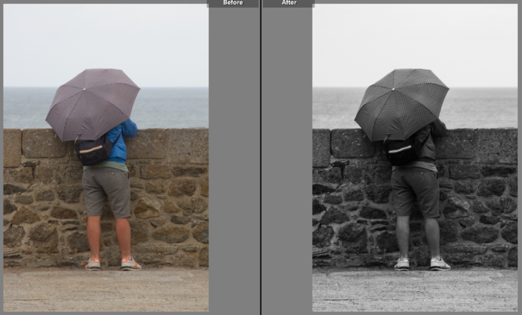
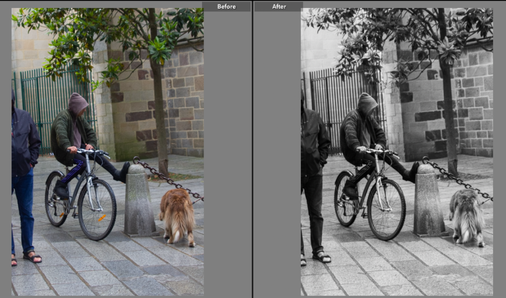
This is my first edit for this photoshoot, the original was taken on a slight angle so I used the crop tool to balance the photo, I then used the black and white feature to turn the photo black and white, in the style of Henri Cartier Bresson. This benefitted the photo as the dark outfit contrasted with the white van and light sky and round about.
Edit Two
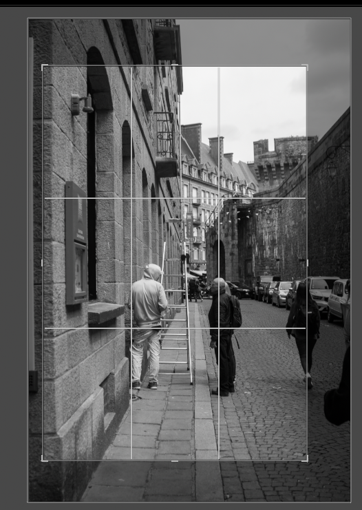
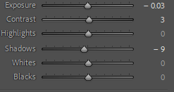
For this shot I pulled the crop in a bit closer to use the edge of pavement and ladder as a central leading line from a close depth of field to the sky with the chimney pots. I also changed the exposure to make it more obvious that the line splits the middle of the photo and that the left of the line is a lighter grey not only the buildings, but the people also on each side of the line the guy on the right is darker matching the shadow and building and the guy on the other side is lighter again matching the building.
Edit Three
For this shot I wanted to emphasis the diagonal line created by the guy sitting on the left. The next thing I did was reduce the highlights so the sign was dulled down a bit as it was distracting from darker grey and black hoodies.
Fourth Photo
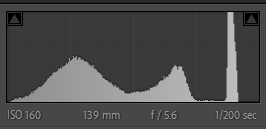
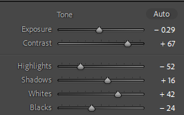
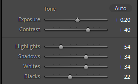
This photo I took at a wider angle including more of the background to help use this I adjusted the exposure and shadows etc. I felt it needed more to pull away from the grey scale tone to get a better, higher contrasted black and white so I used the brush tool on Lightroom with a small adjustment to the shadow slider so when I coloured over the subject it made them a little darker without altering the whole image.
Fifth Photo
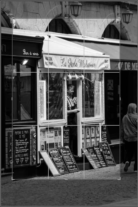
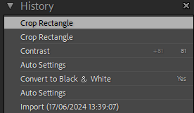
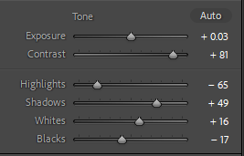
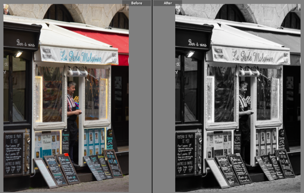
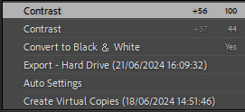
I liked how this shot was composed with subject being in the door way so he was framed in the centre. By adjusting the photo to black and white again I then increased the contrast to make the blackboards and environment around the subject darker while he remained framed by the white door frame. I also cropped the image down to remove some of the extra stuff in the photo that draw away from the subject.
Sixth Photo
For this photo I really liked how the person is stepping while being in the middle of the two windows. It has a symmetrical and undenounced feel to it, to emphasis this and help it fit with my other photos I used the contrast slider to increase the darker areas.
Seventh Photo
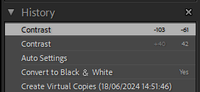
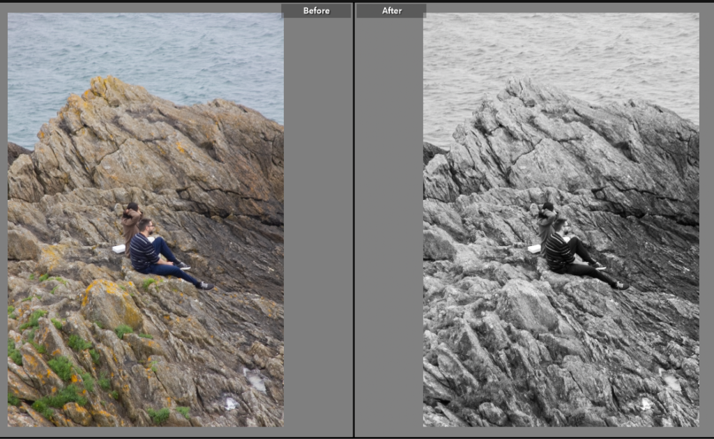
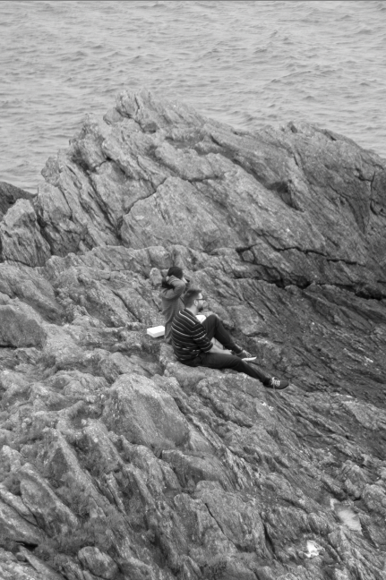
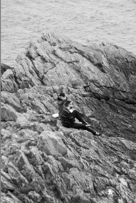
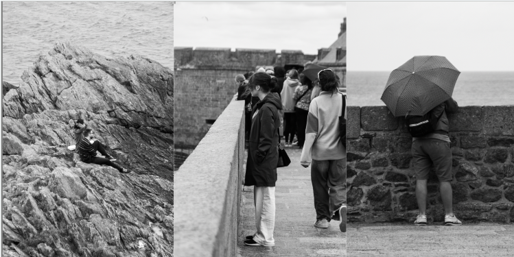
For this one I produced two final photos, one with higher contrast and one with lower contrast. The lower contrast looks better individually as the rocks don’t have a s much texture, however to suit the rest of the photos and follow the Bresson style I increased the contrast the get the pockets of darker grey which added the texture back to the rocks but also the subject.
Eighth Photo
Ninth Photo
Tenth Photo
Selective Colour Editing
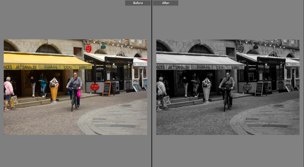
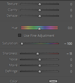
Selective colour editing is when the photographer edits the photo by making everything except a certain colour black and white. This adds a pop of colour to the photo, making the photo black and white adds to the contrast and atmosphere to the photo while the splash of colour adds a dynamic element to the photo. I will edit a few of mine in this style picking a certain colour as I think it would make a great trio of photos to present.
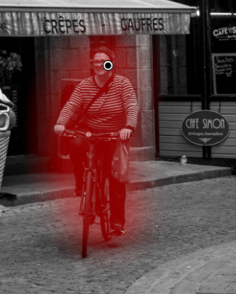
Photo One
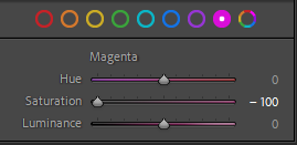
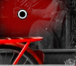
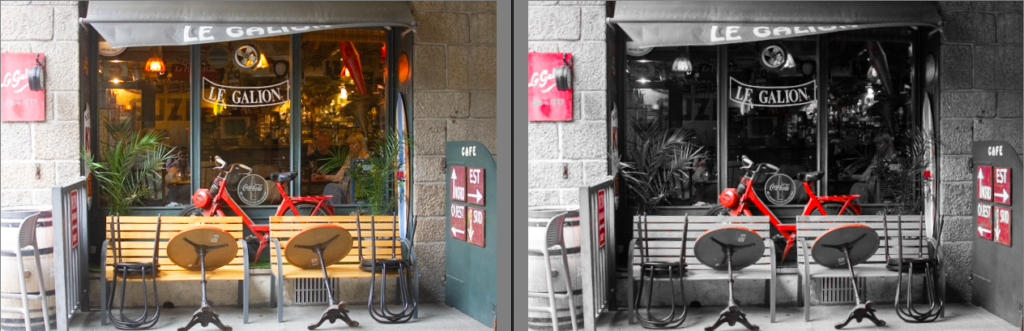
This was the photo I edited first in the colour pop style. I started by selecting HSL colour and reducing all the colours except red to make the rest of the photo, minus the red areas, black and white. To then complete the photo I used the brush tool with 0 saturation to remove reds parts that just didn’t work in the photo.
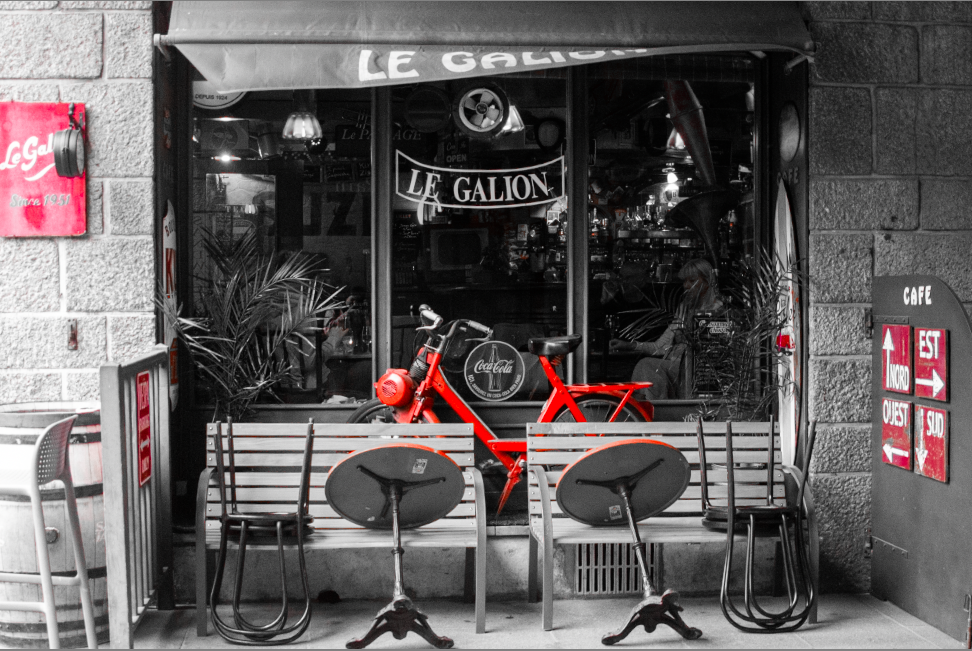
Edit two
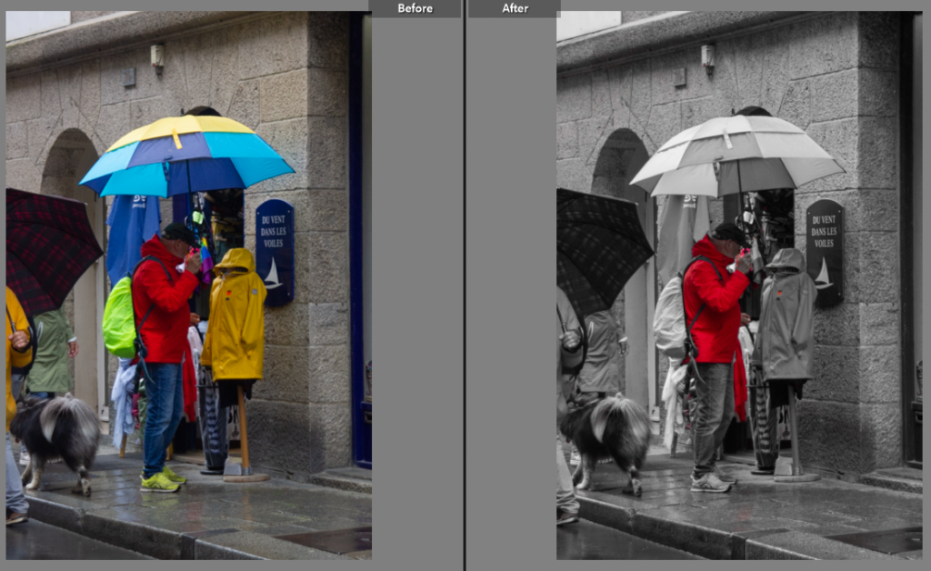
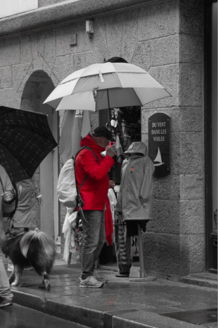
This is the second photo I edited in the same style I chose to select red colour in photos so make a trio of photos. Again I desaturated the entirety of other colours that weren’t red to make the photo black and white with a element of colour. This has been very successful for this image as the red coat ties into the rest of the image with the added section of red on the opposite coat.
Edit Three
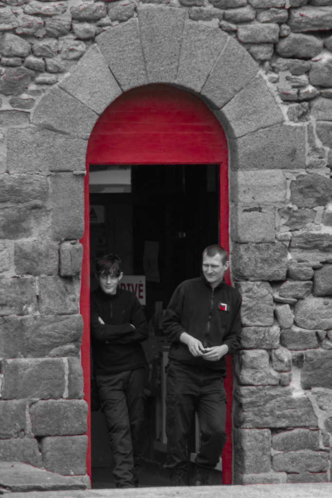
This photo I did the same again with the saturation. With this photo particularly I used the small sections of red to pull the photo together with the section on the guys jumper and the text on the sign behind the other guy frames and makes them fit into the photo well with the red door frame.
Final Colour Pop Edits
Final Photos
Final Evaluation
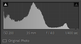
For this photoshoot, it was actually a day trip to St Malo so required some planning before hand to make sure I had the right equipment. I took my cannon 550D with a 24-105 mm zoom lens. This is a very versatile lens that meant I could grab quick shots close to me or wait and use the zoom to be unnoticed. Street photography was new to me but this was a successful day of quick snapshots and planned shots waiting for the perfect moment. I kept the camera at sinker settings all day Tv, 1/400 shutter speed and auto iso and f stop. In the end I picked my six best shots all of which had similar features, the subject was centred and unaware they were being photographed. Overall I am pleased with the results especially after editing the photos have captured Saint Malo very well from the busy shops to a peaceful moment on the rocks surrounding the old town. I think I created a successful photoshoot inspired by Henri Cartier Bresson’s theory of ‘the decisive moment’ deciding which precise moment exactly, while much easier with modern cameras still remains a complex mixture of angles, lighting and covertness. I will now go onto use some of the images in a picture story, describing Saint Malo in images.