Abandoned Buildings
Analysis
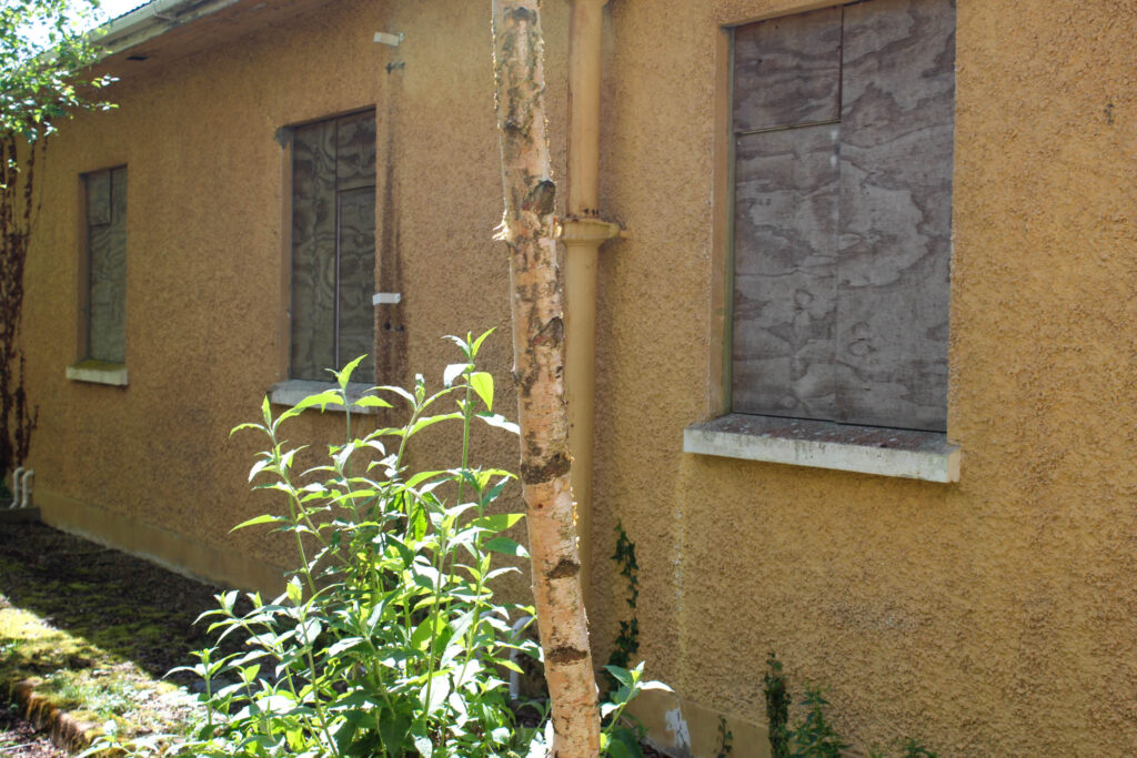
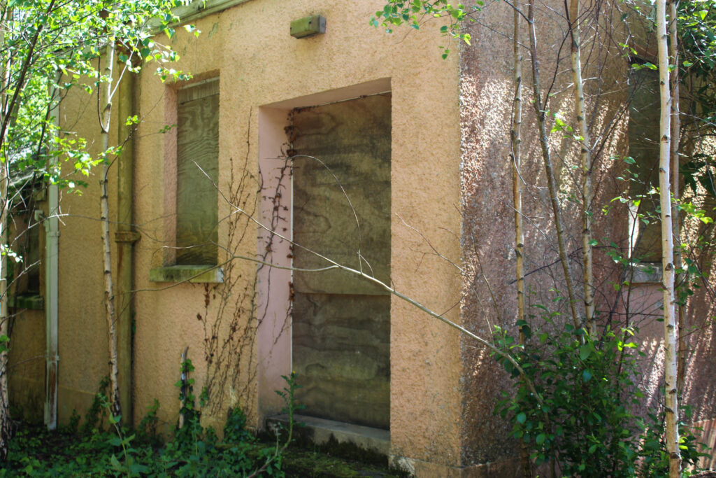
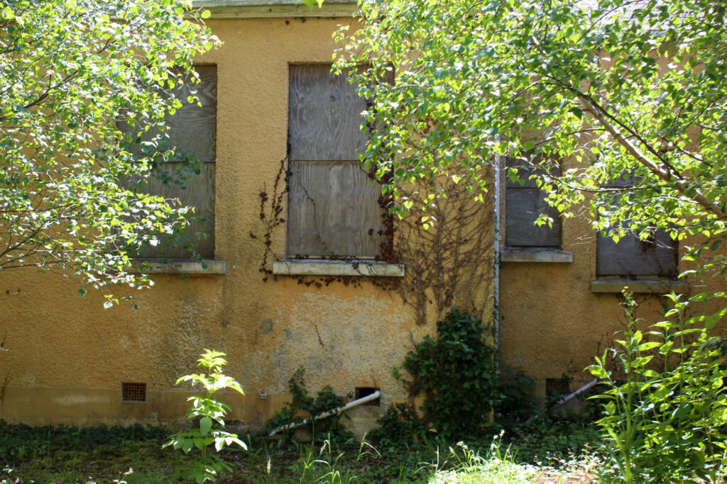
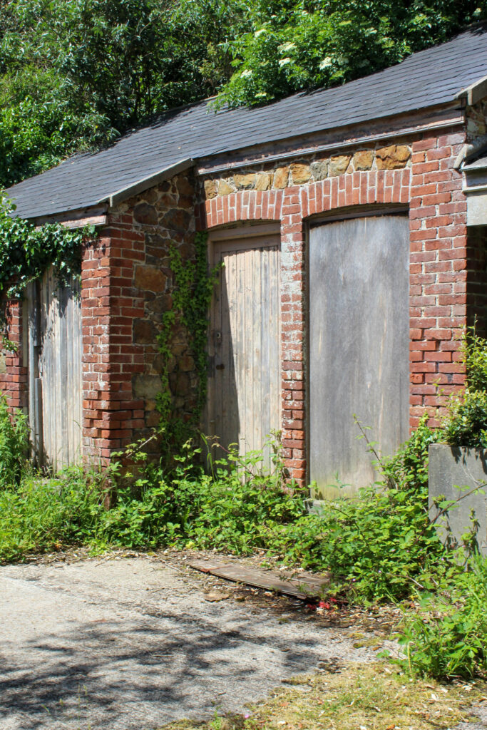
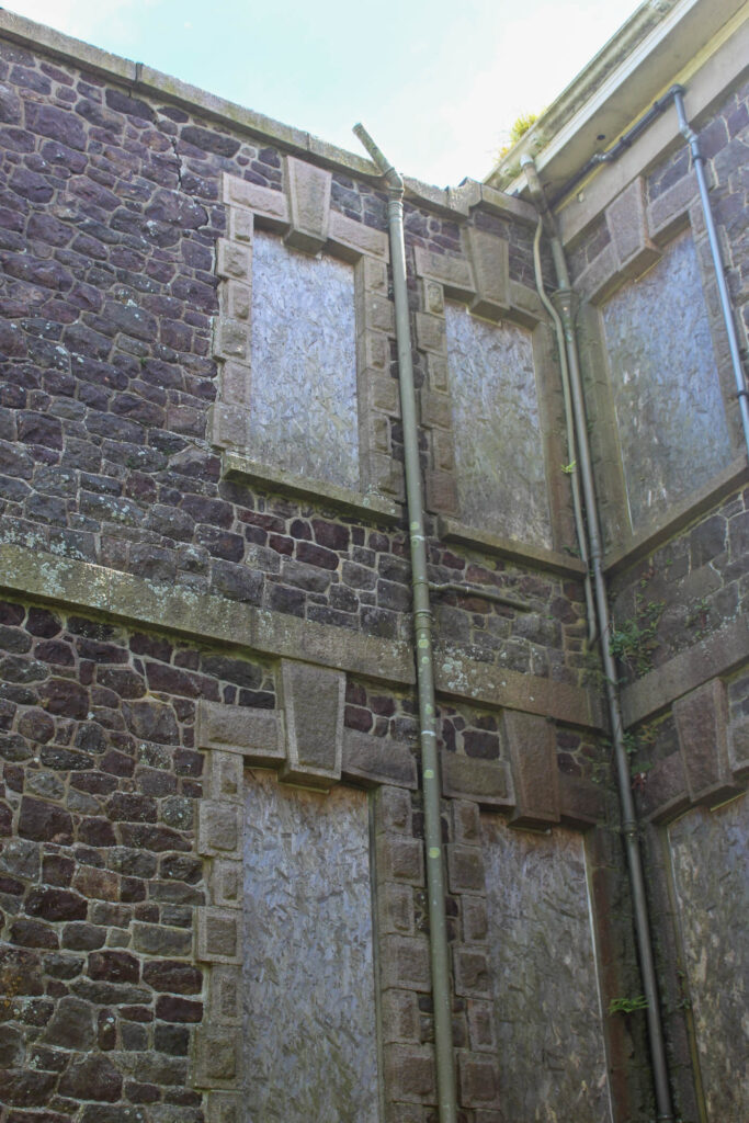
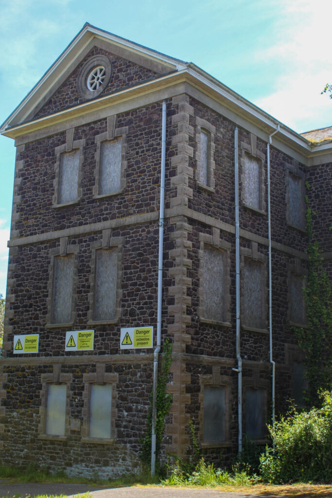
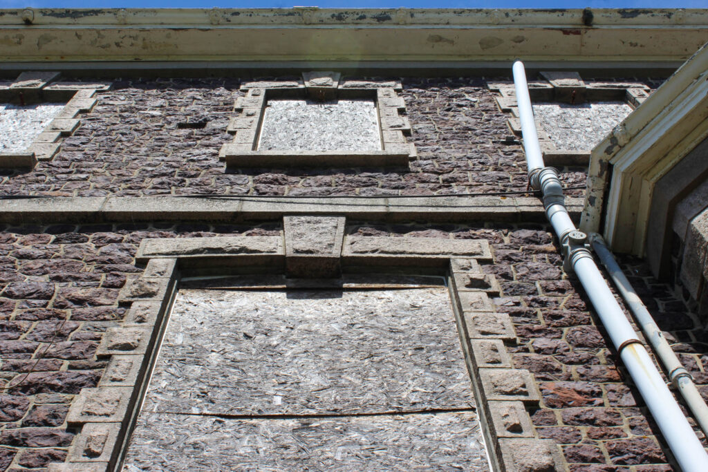
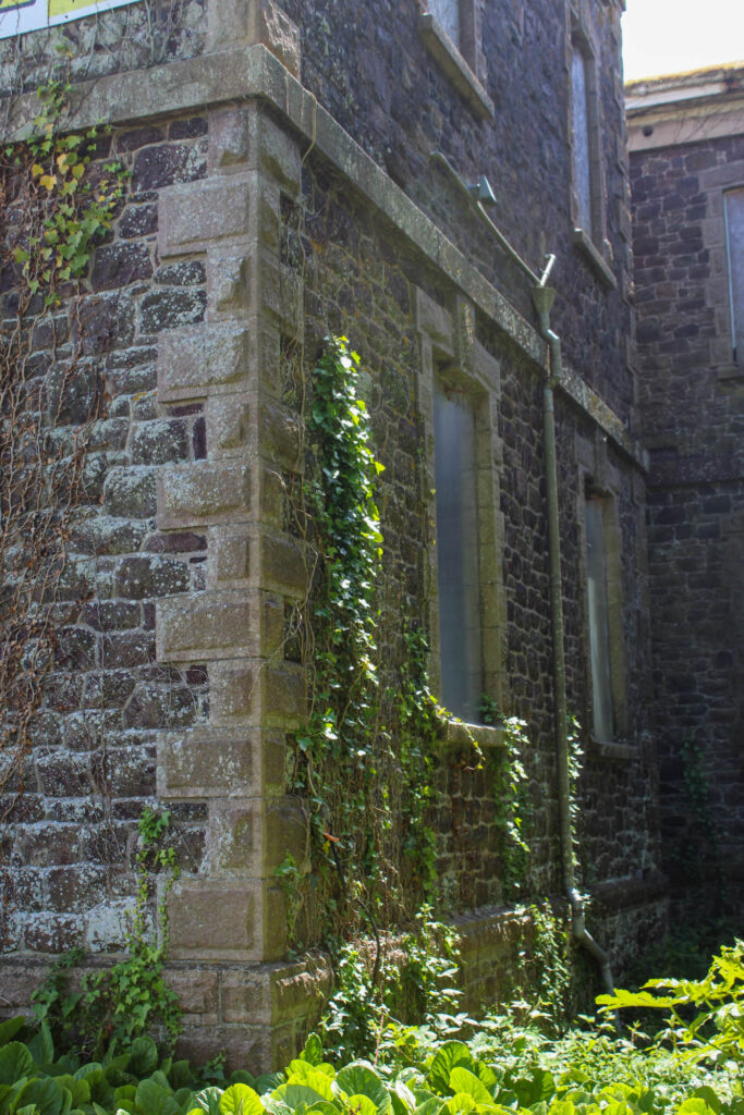
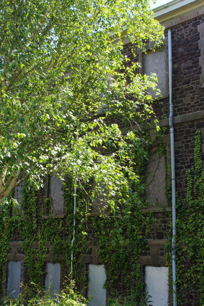
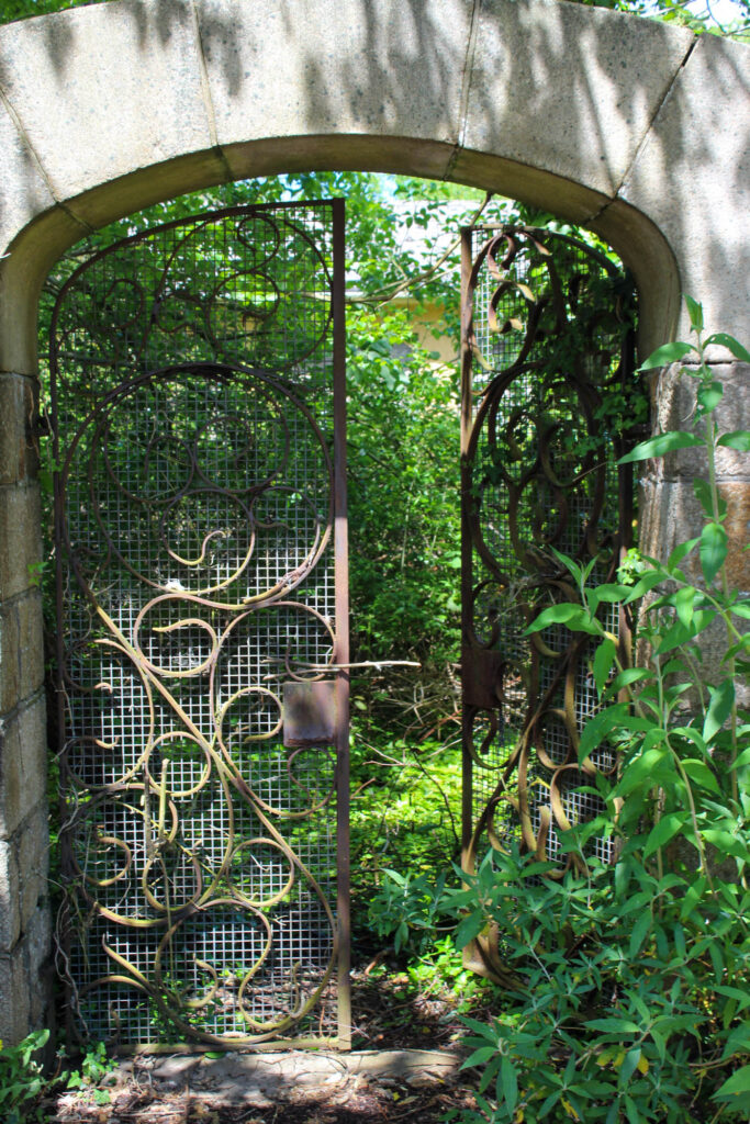
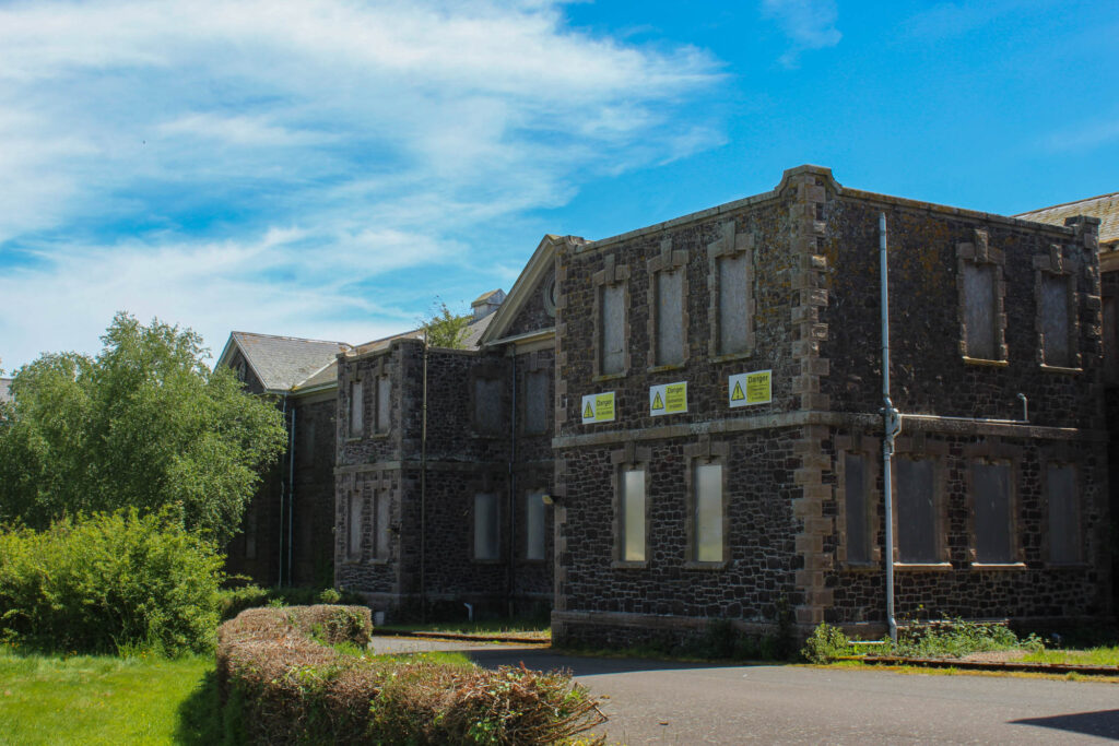
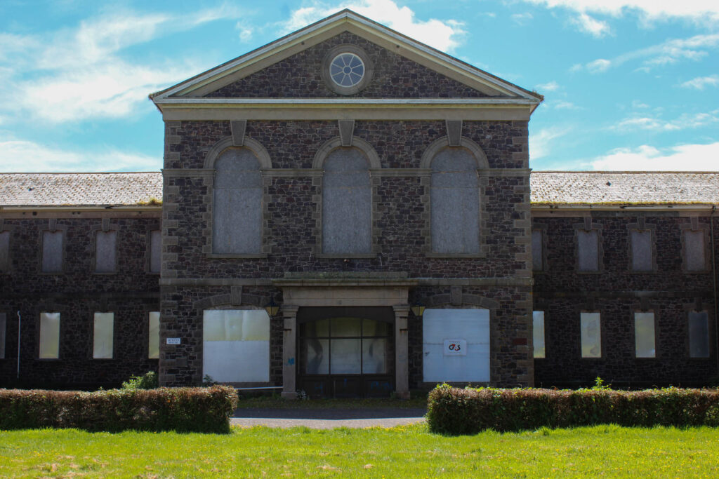
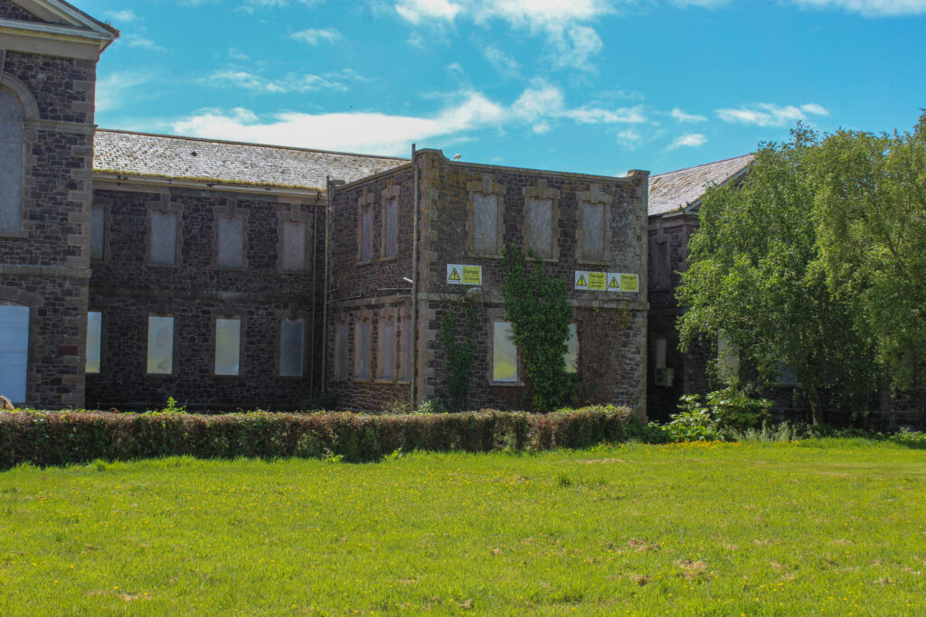
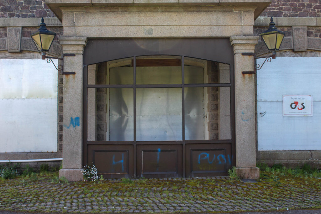
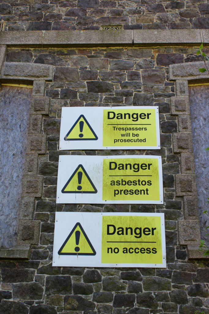
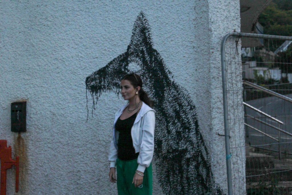
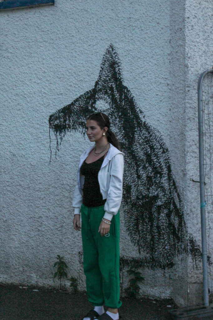
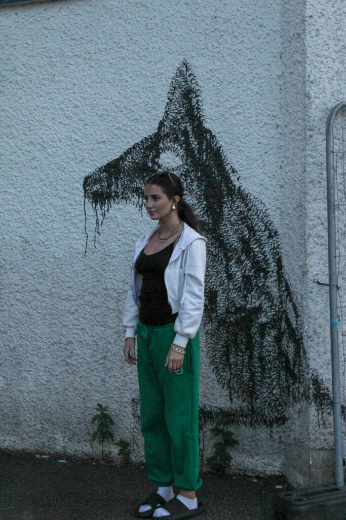
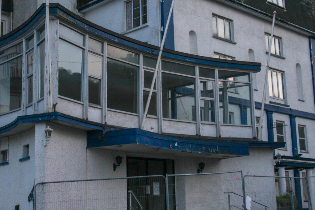
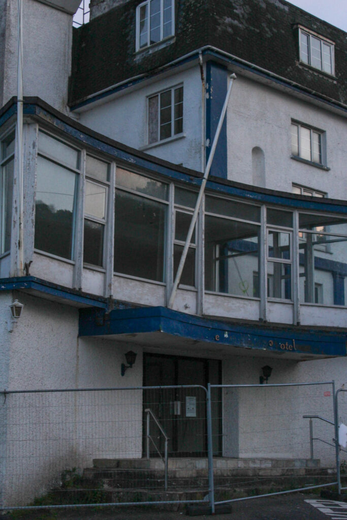
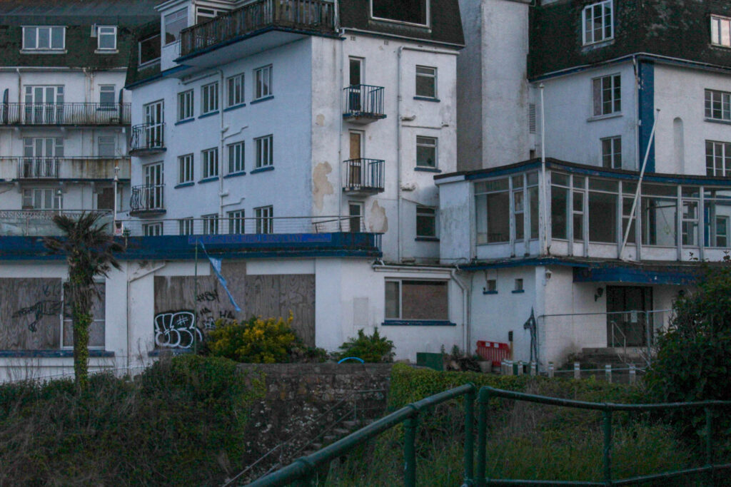
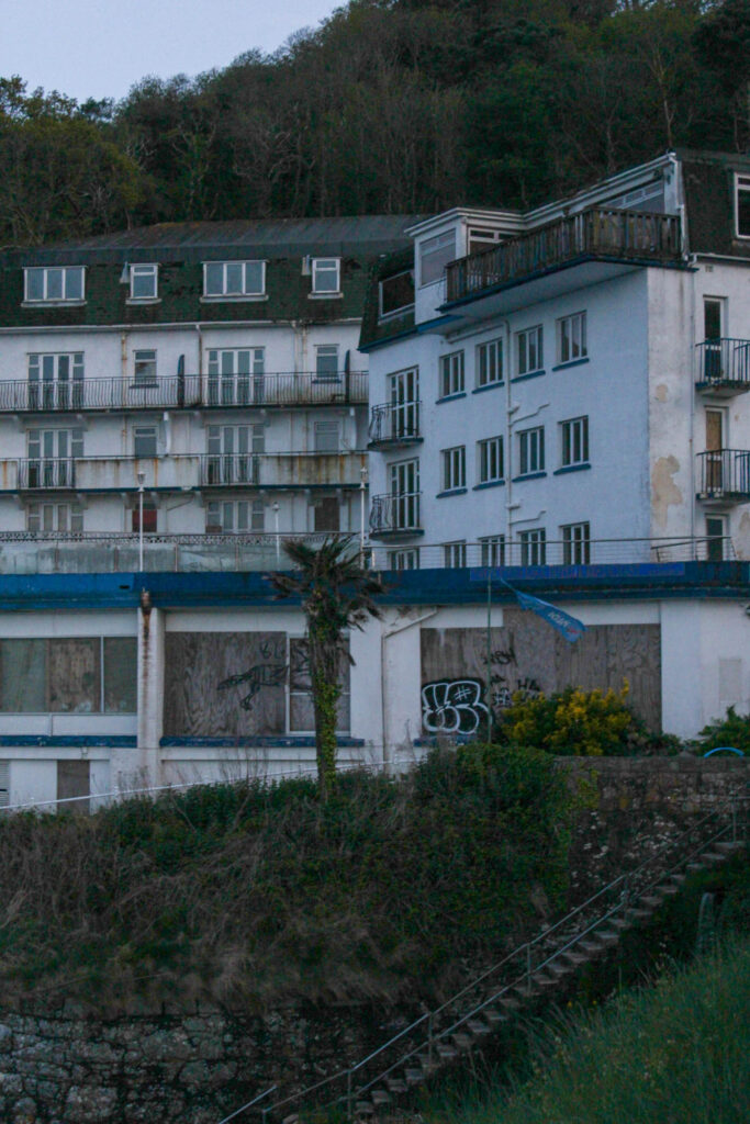
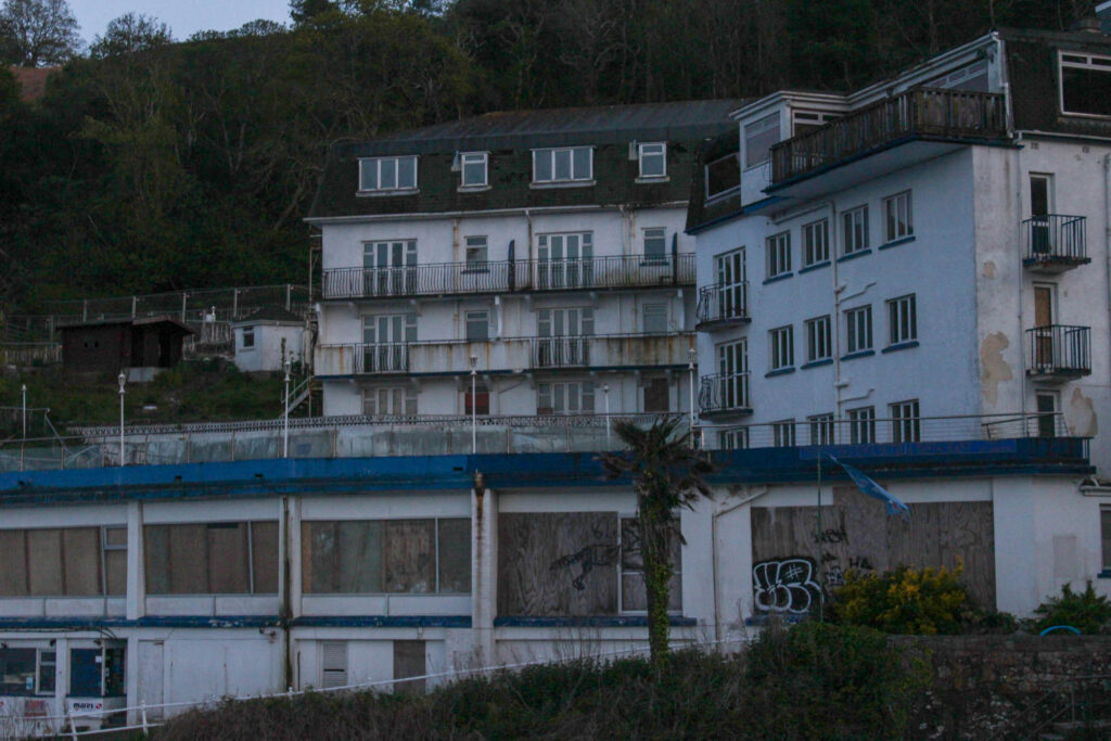
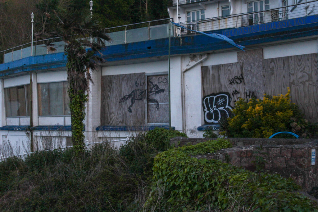
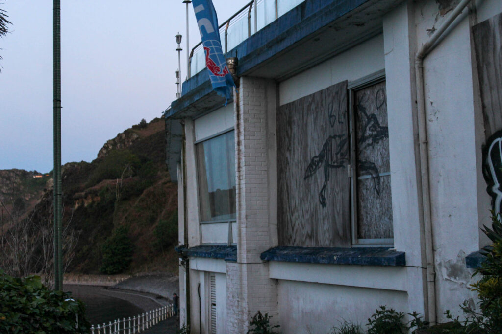
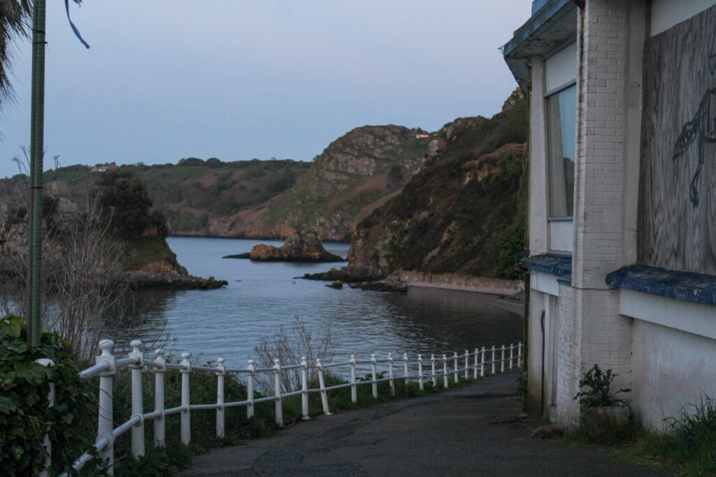
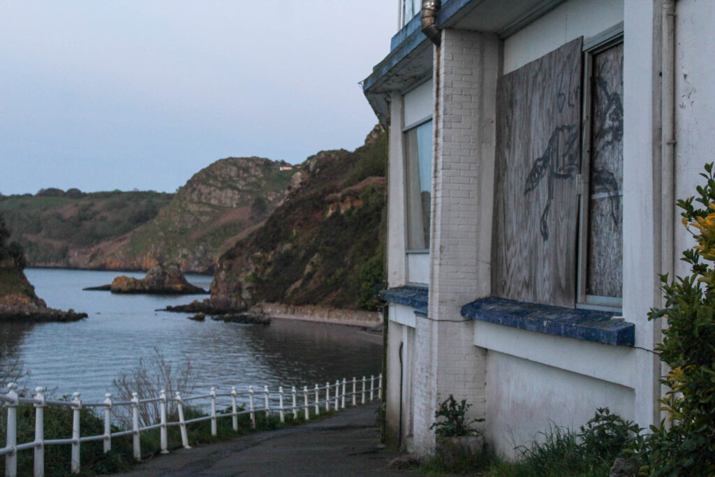
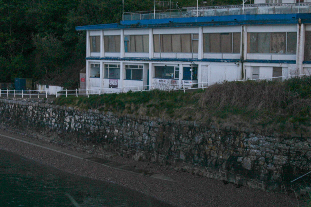
I think my final images came out well and they have been edited well. However, I prefer the St saviours hospital photos more, because they have better lighting. Next time, I would visit Bouley Bay again, but when its lighter, so that the images come out less dark. However, I did edit the images well, to increase the exposure. This was the lighting in the images before the editing:
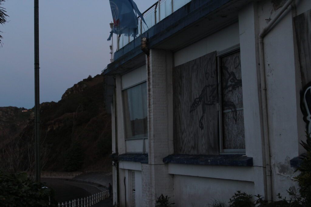
I also like have I have sets of images that go together with both the St Saviour’s hospital and Bouley Bay.
Greenhouse
Analysis
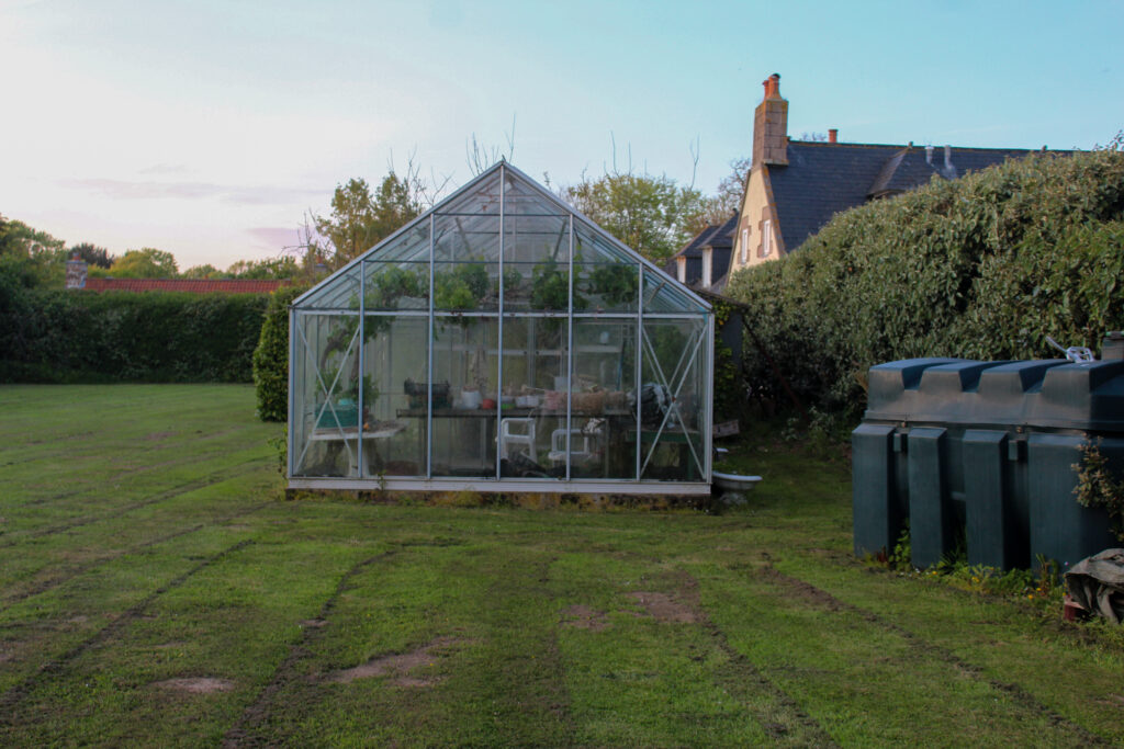
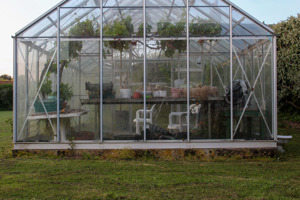
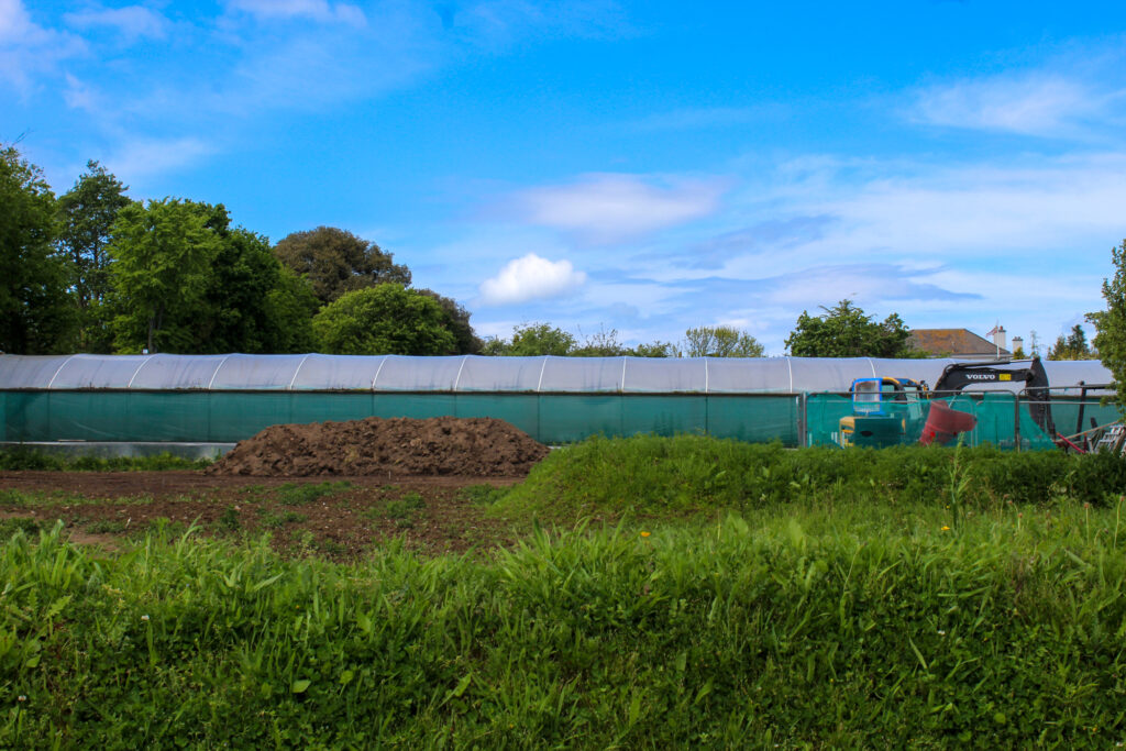
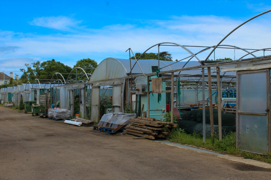
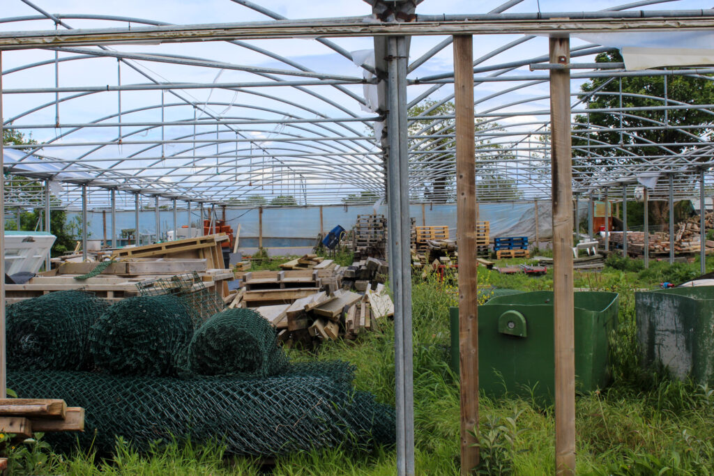
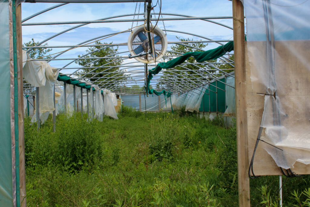
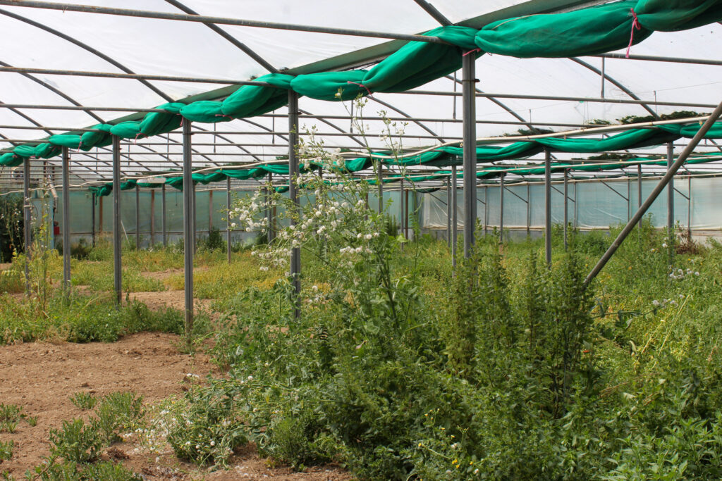
I love the images of the smaller greenhouse, because it presents what’s inside the greenhouse very well and has a good composition. It also has good contrast between the green of the grass and the dull dirt on the greenhouse walls and the colour of the greenhouse.
The image at Trinity is a good photo, but it was quite dark when the photos were taken, so if I were to do this again I would visit Trinity again, but when it is lighter, so the lighting is better. However, I edited the image well, so it had more exposure.
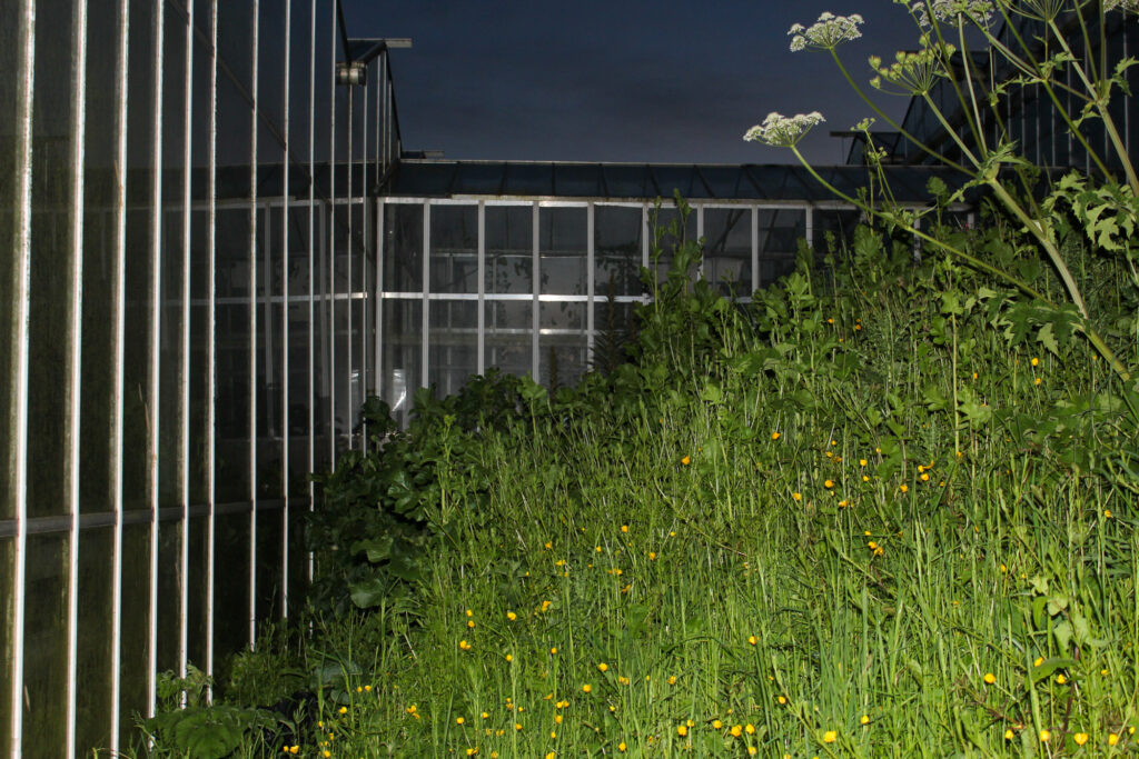
The images of the larger greenhouse are very vibrant and there is lots of green colours, which pop and make the image much more eye appealing. These images also have good lighting and composition.
If I were to ever photograph greenhouses again, I would love to experiment with flash lights and different coloured gels more, when the sun is starting to set, because I think the images would turn out very good, but when I tried it this time it was very difficult to make it work, so I will have to be more prepared with a plan and bigger, more powerful flashlight.
Discarded Plastic
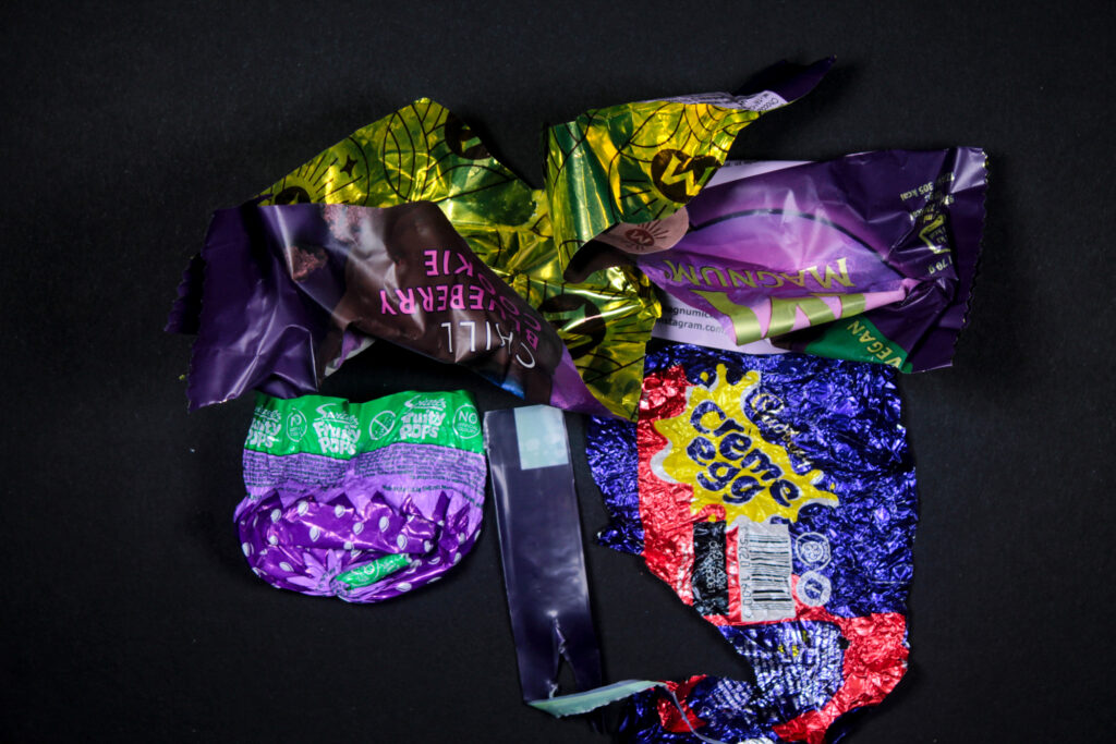
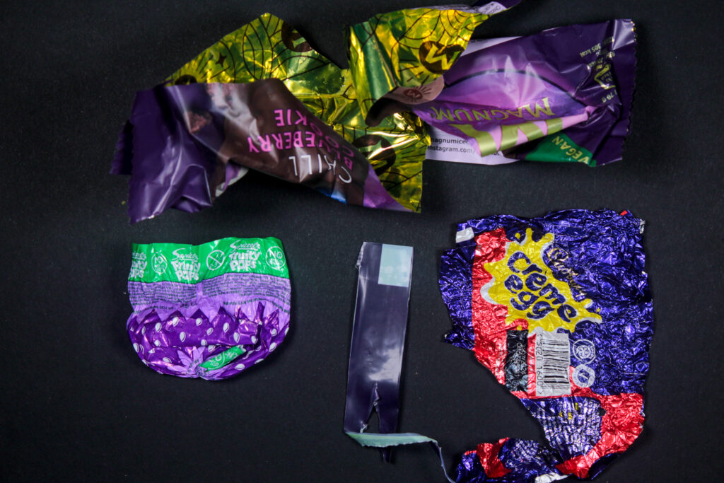
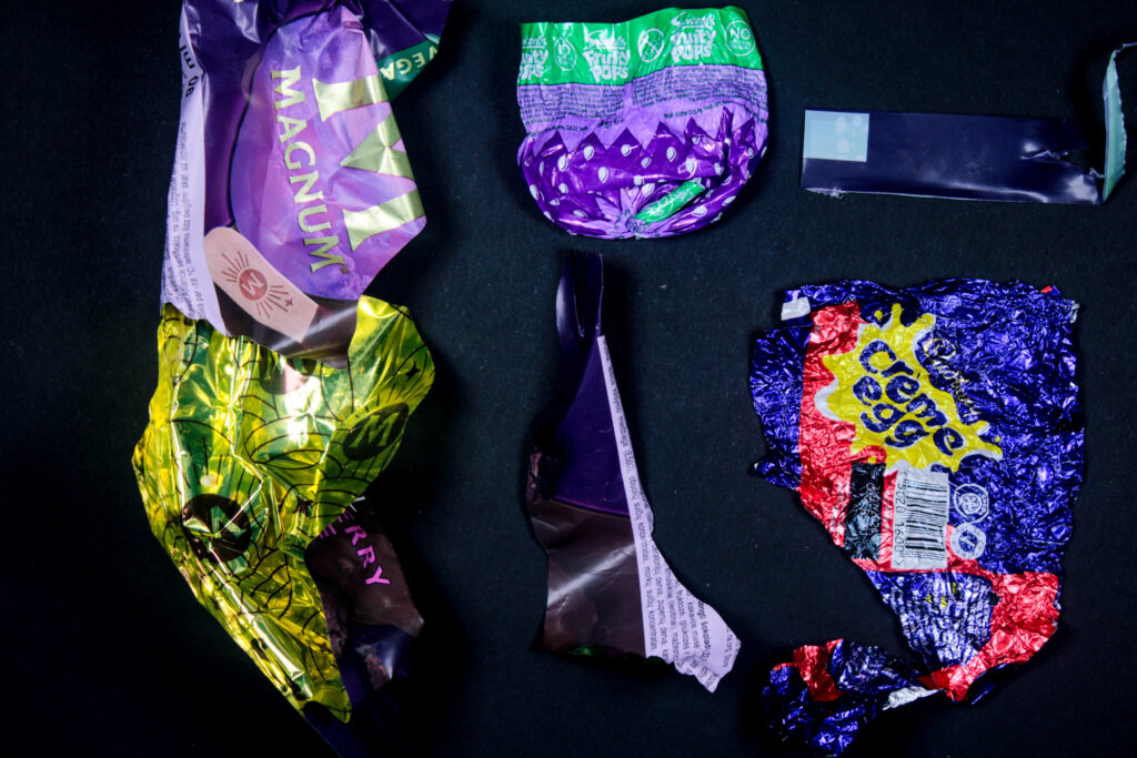
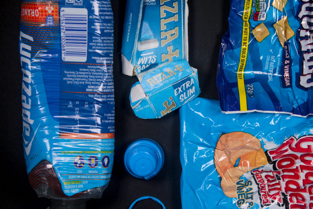
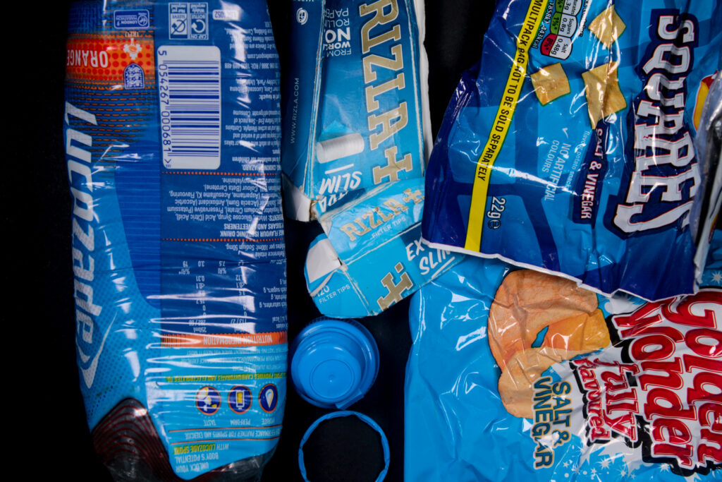
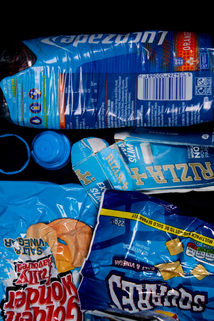
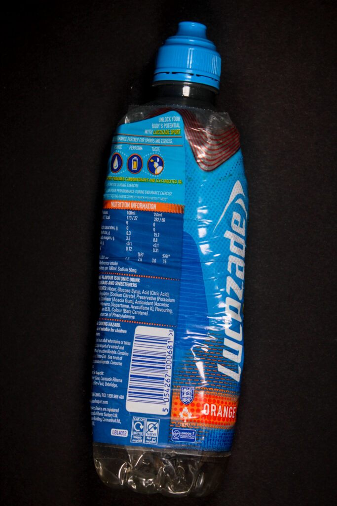
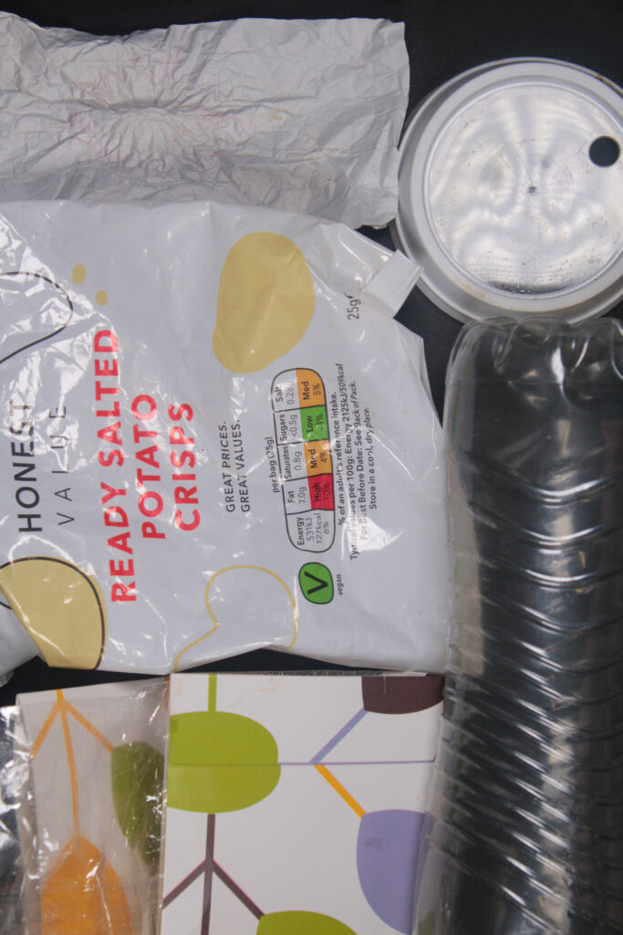
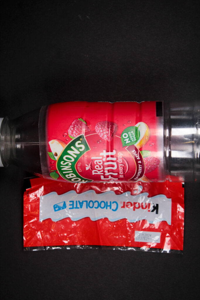
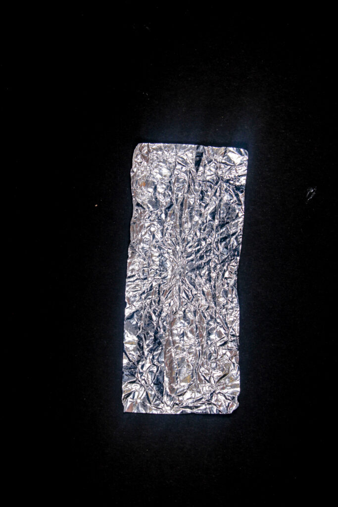
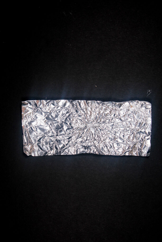
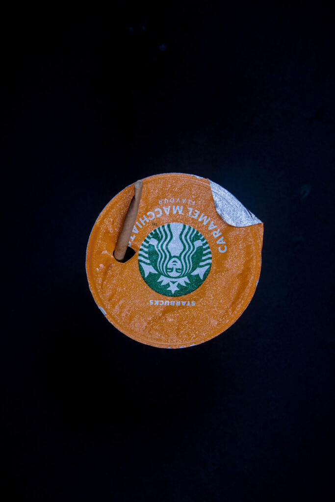
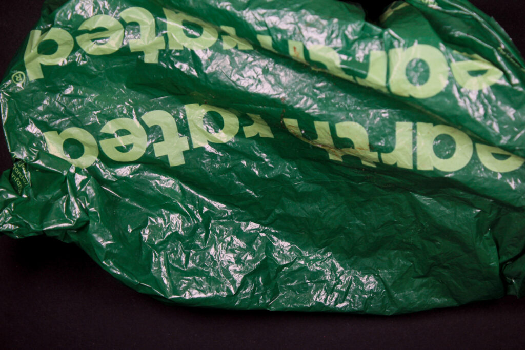
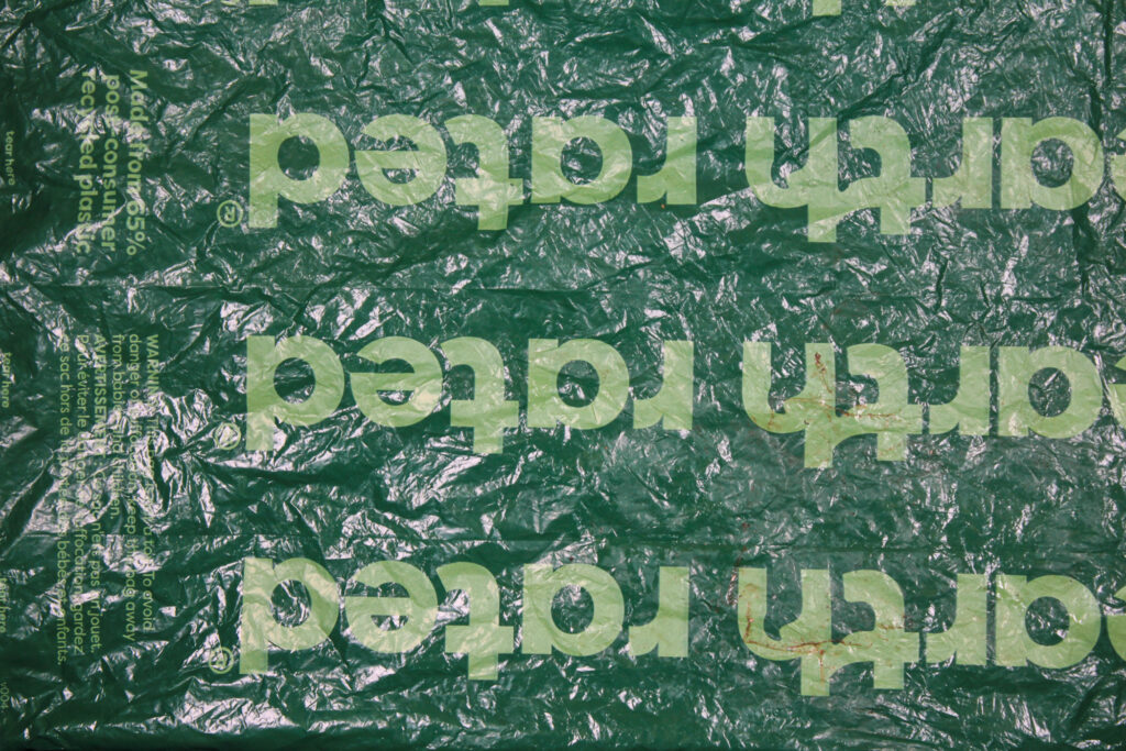
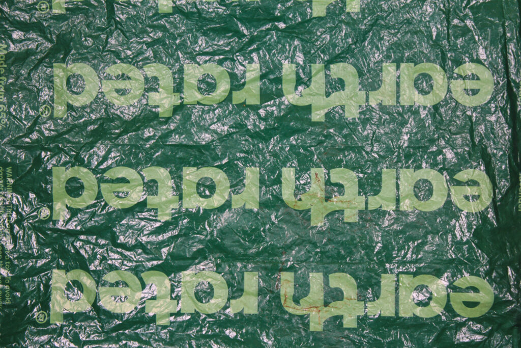
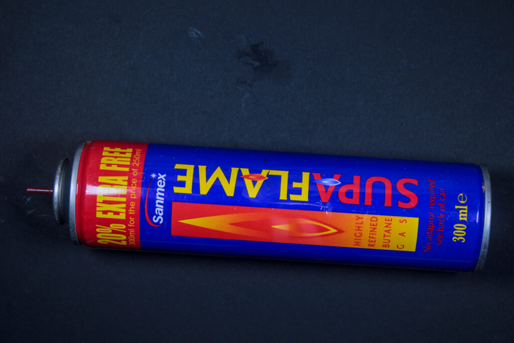
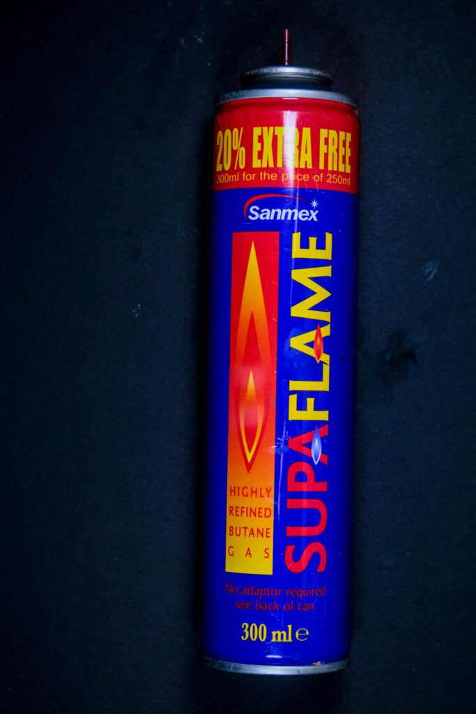
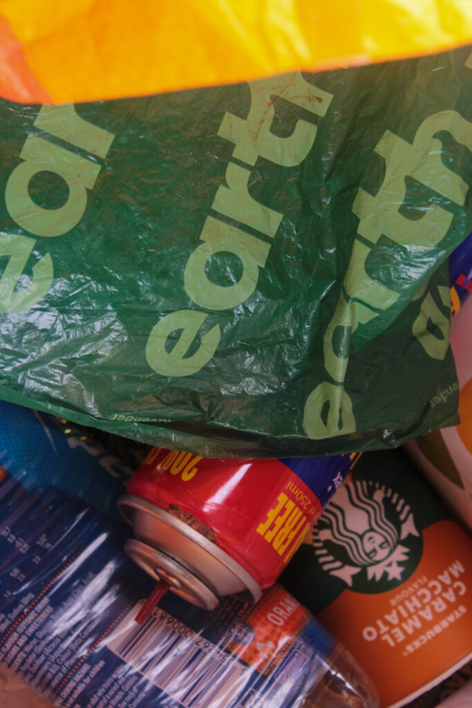
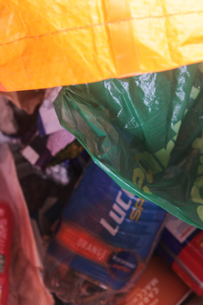
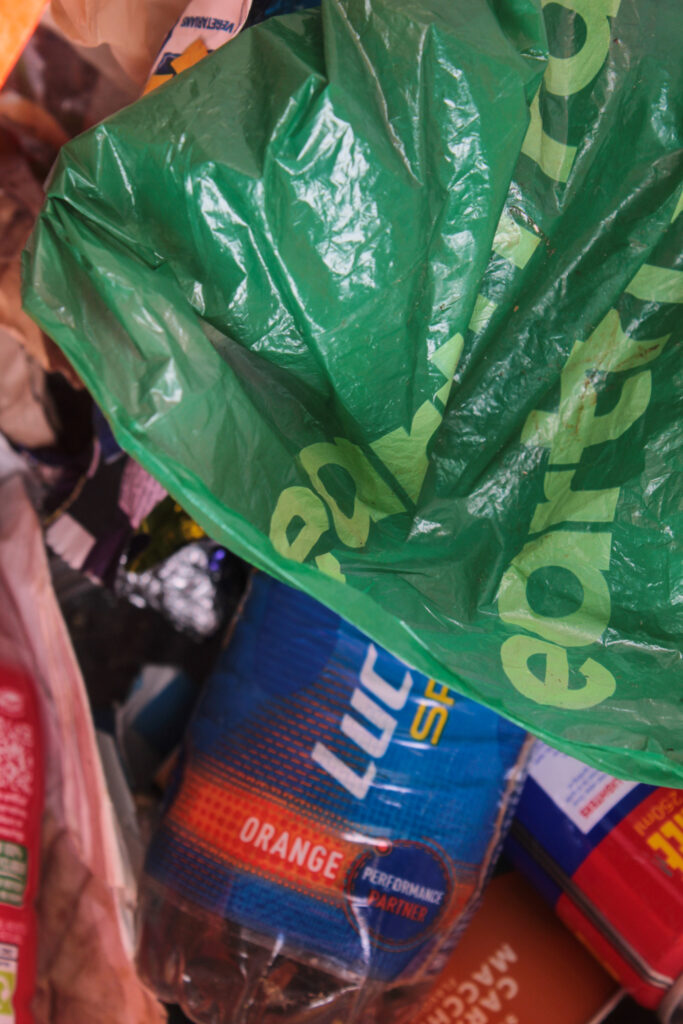
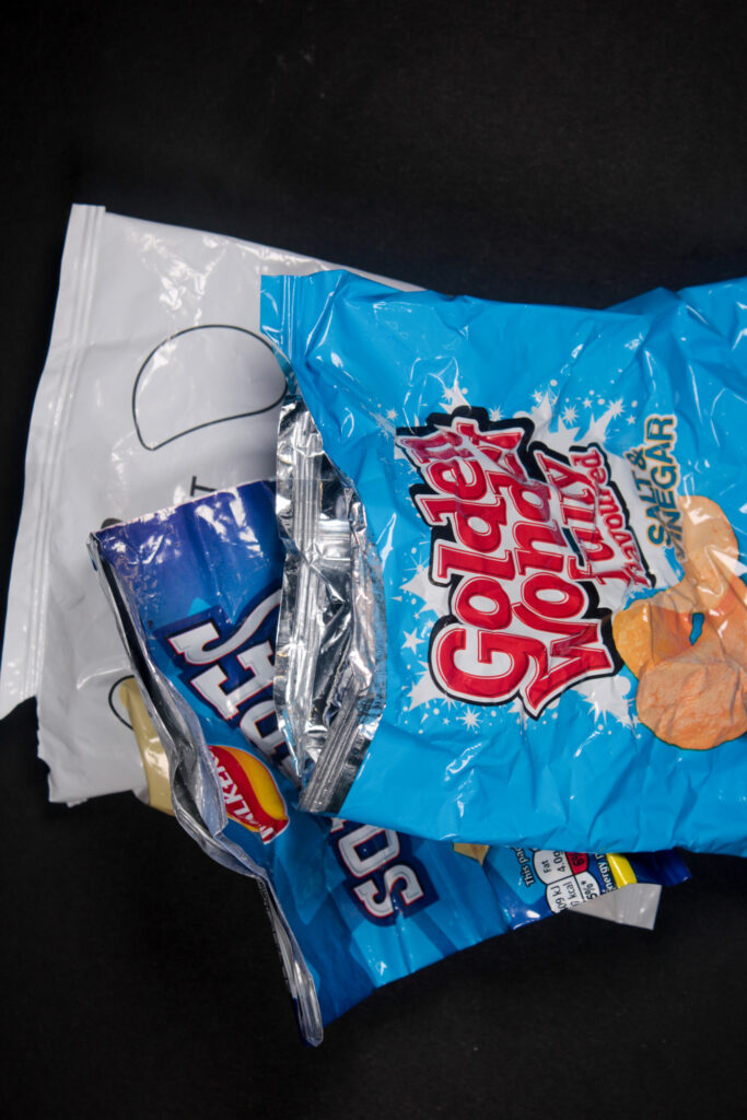
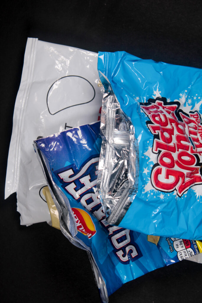
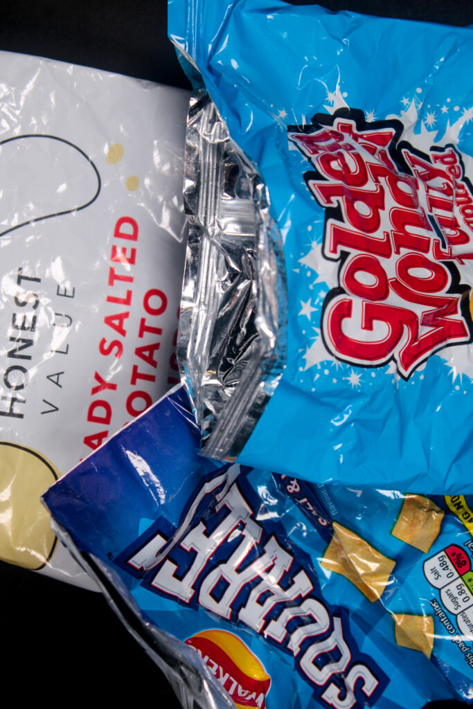
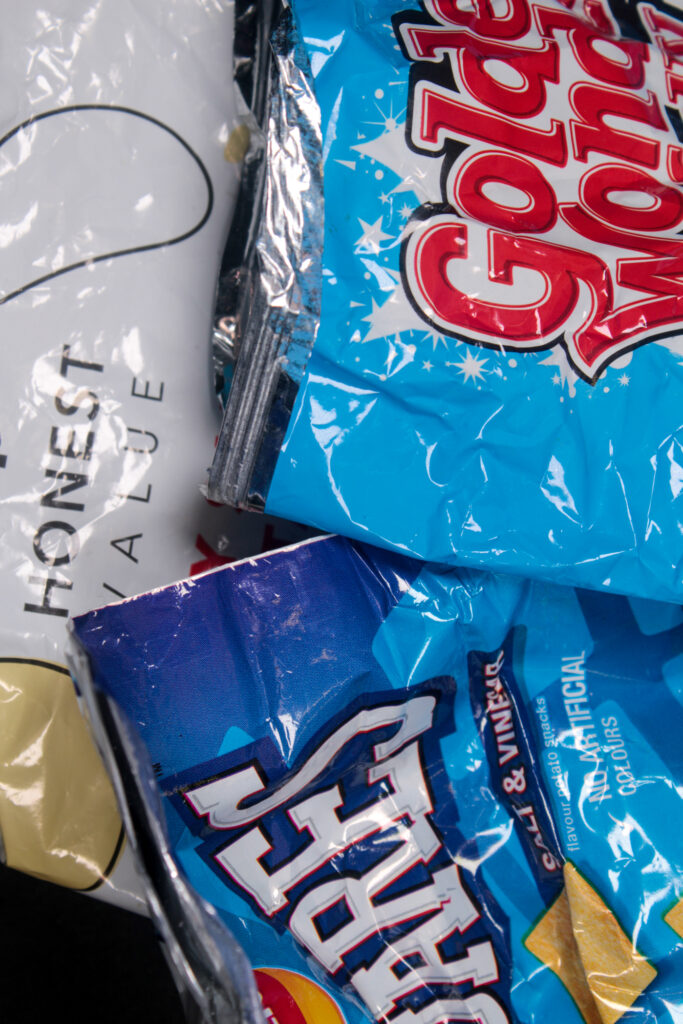
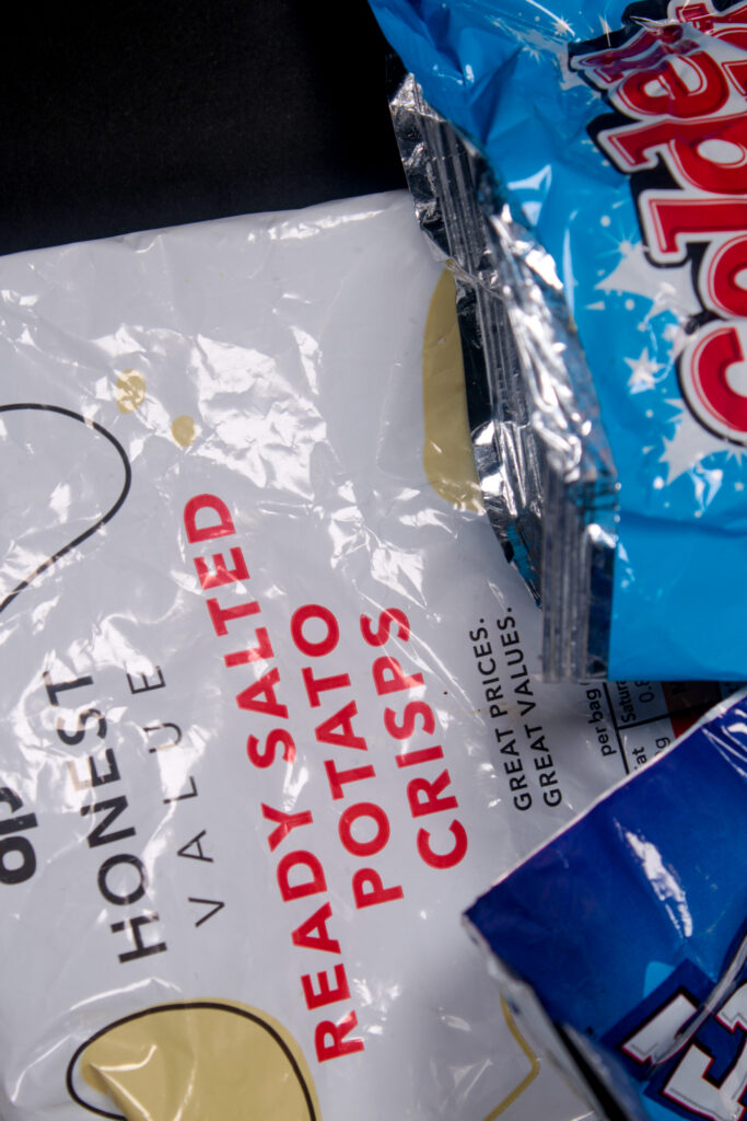
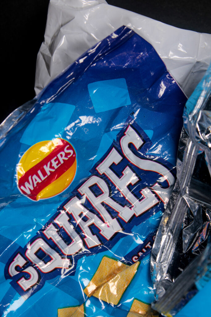
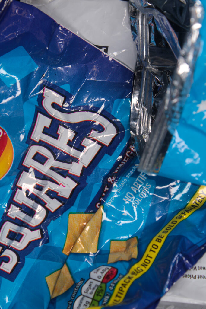
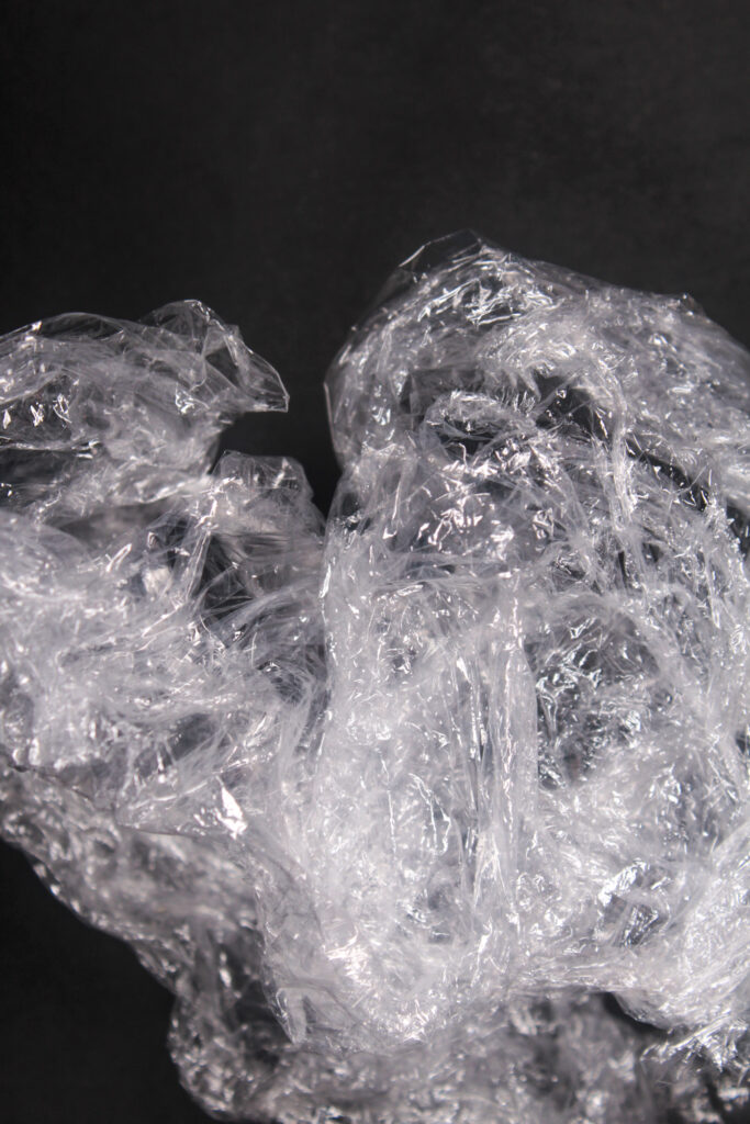
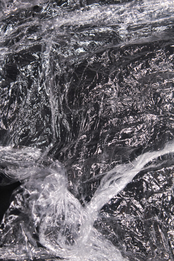
Analysis
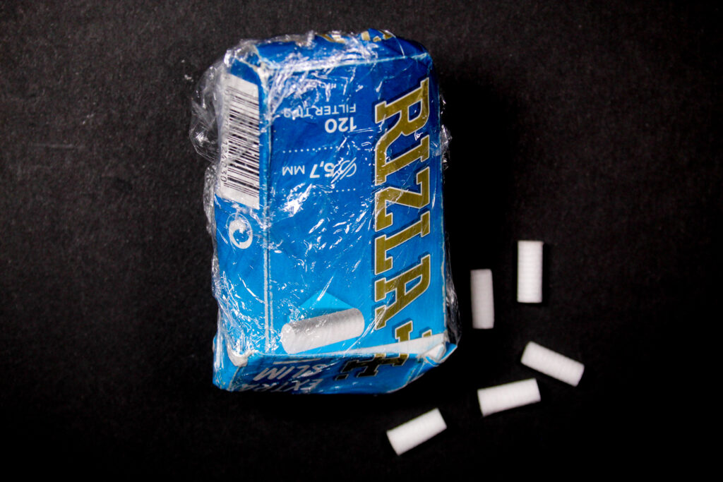
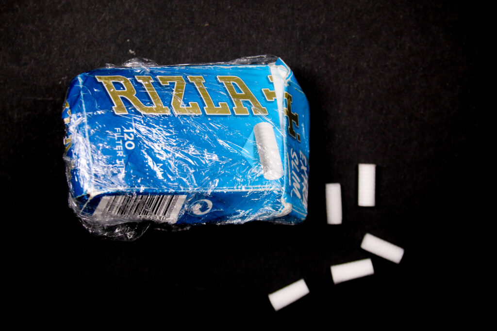
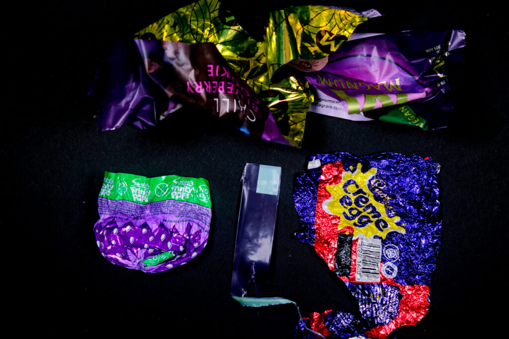
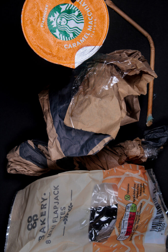
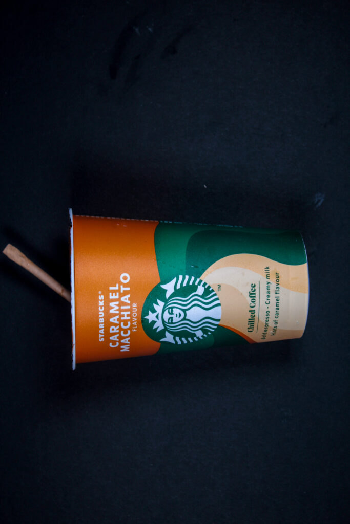
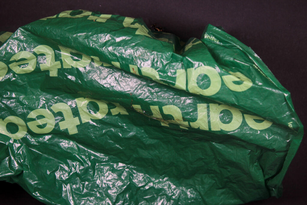
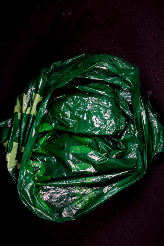
I liked the discarded plastic photoshoot and thought the rubbish looked good against the black background and really stood out. However, if I were to do this again I’d want to collect more rubbish and place the camera further away so I can make larger patterns with my colour coordinated litter.
The single item images came out well, as it made them stand out lots and be more eye appealing, especially against the black background.
Litter
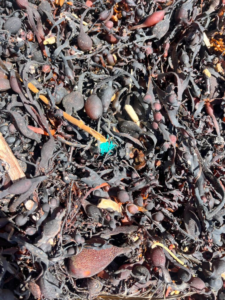
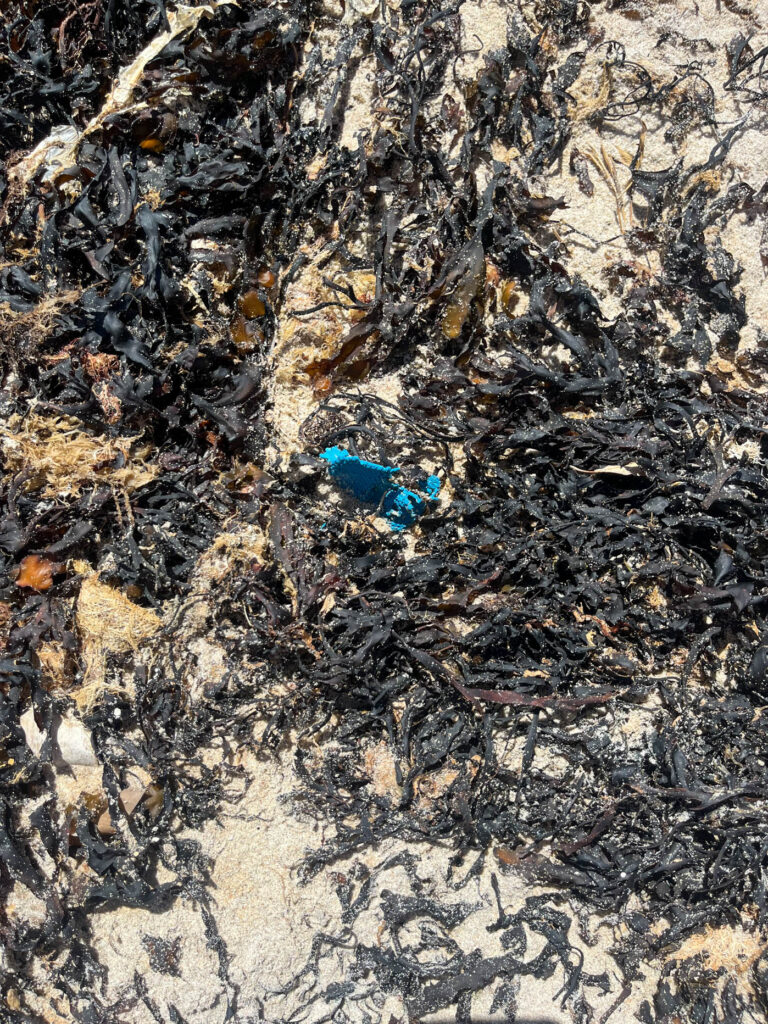
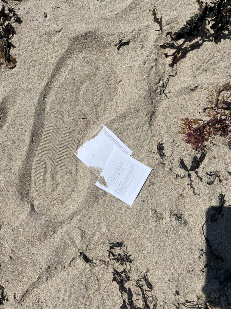
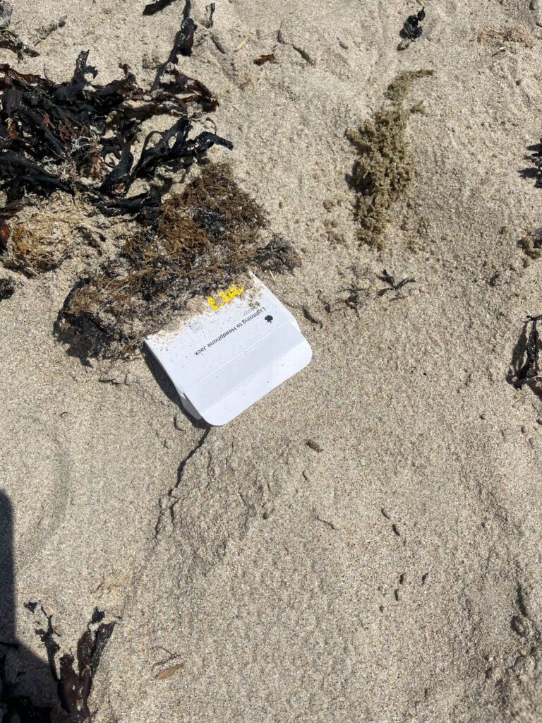
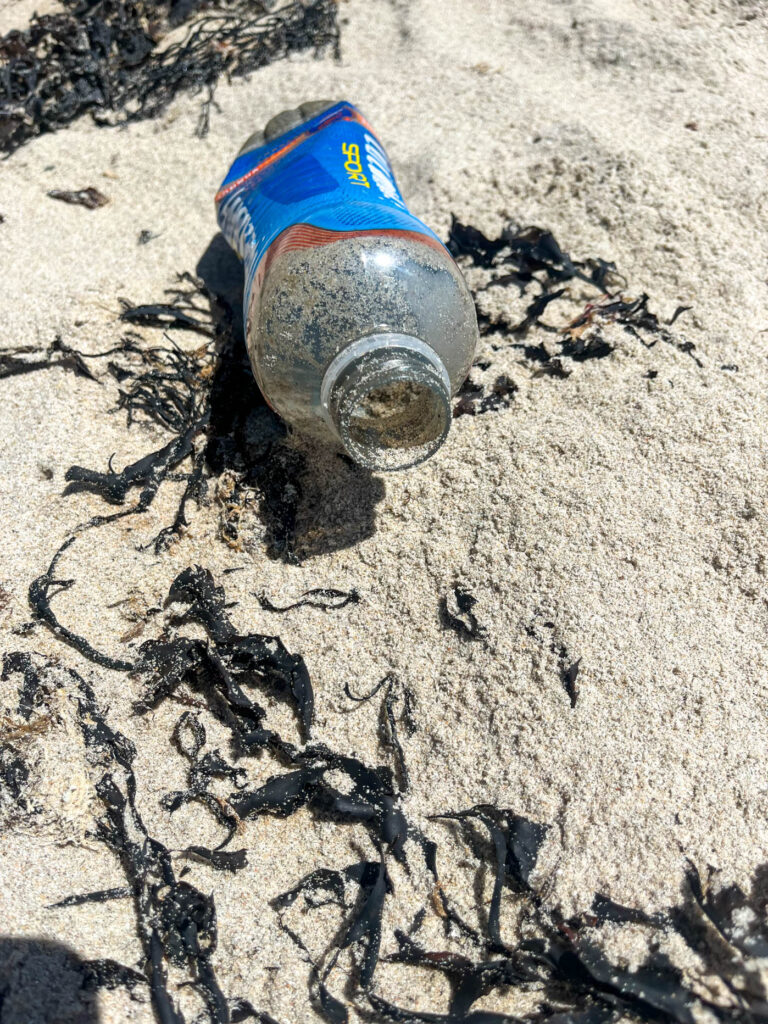
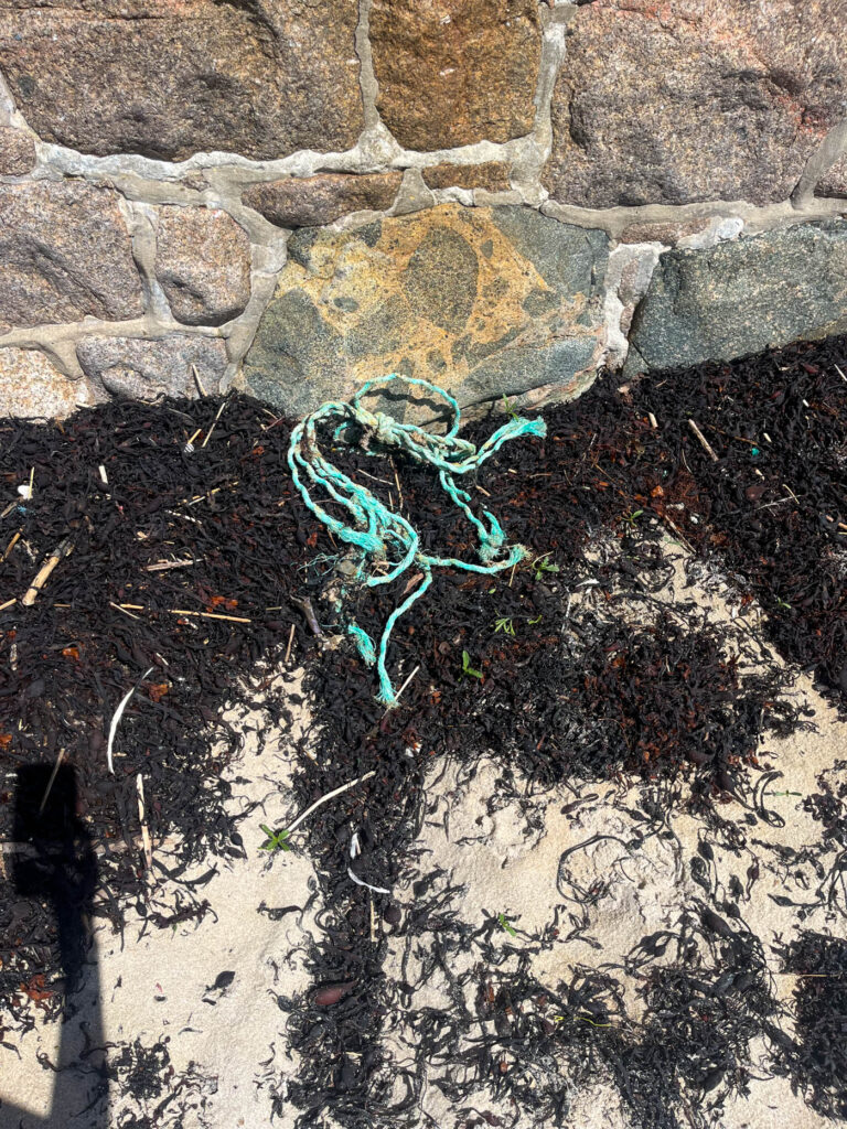
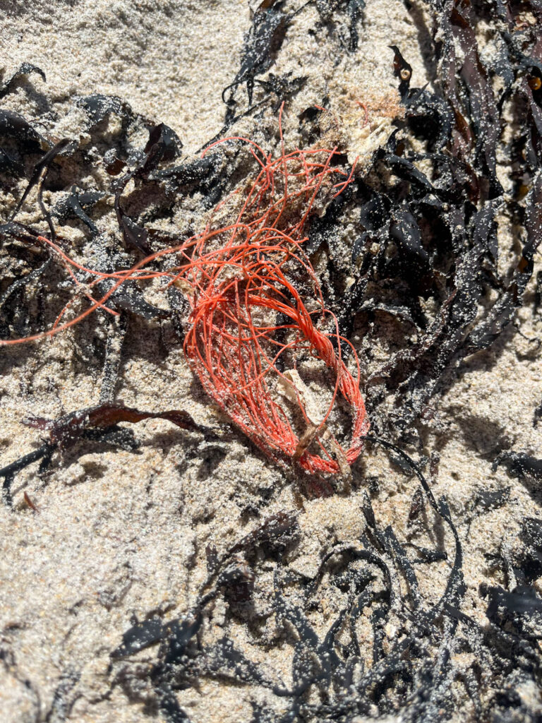
Analysis
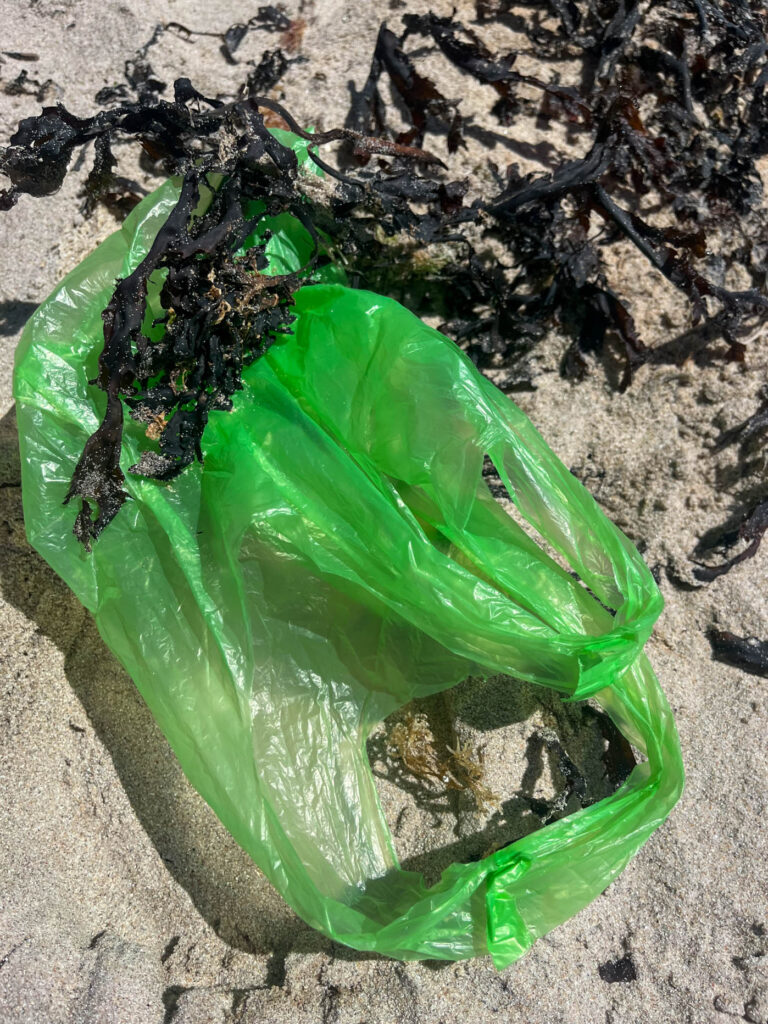
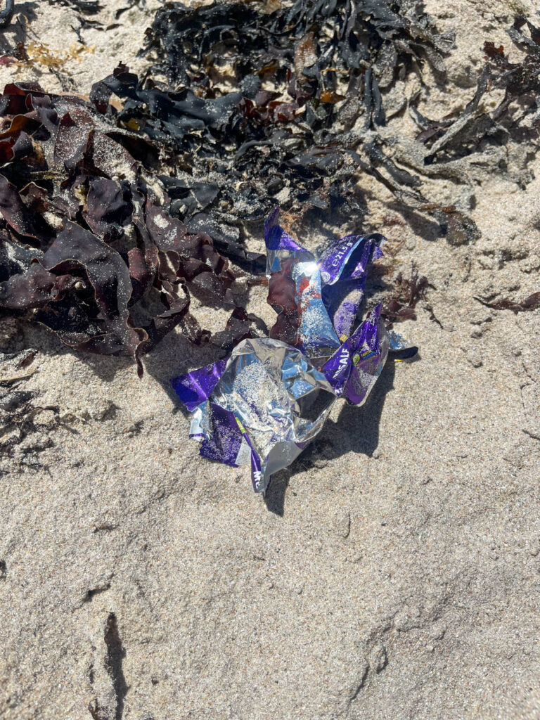
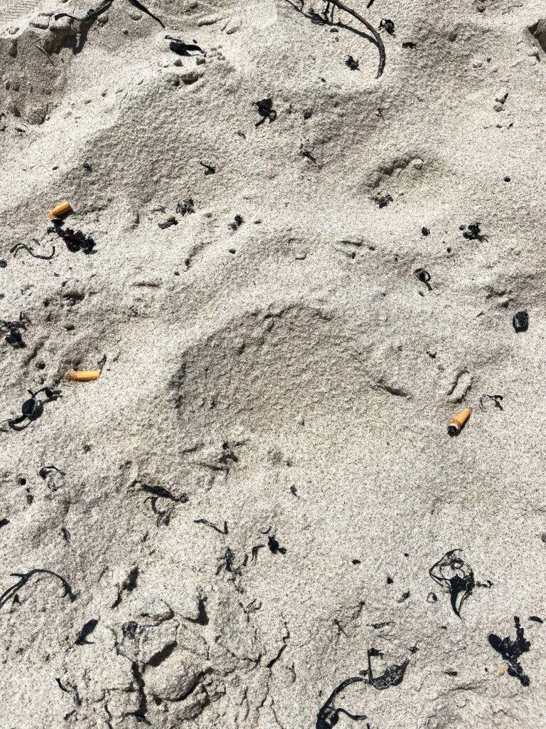
I liked the photoshoot of litter found on the beach, because it really presented how much litter there is in these natural environments, which habitat animals. However, if I were to do this next time I would remember to put a card in my camera, so that the images had better quality. I would also experiment more, so there were no shadows of my phone or camera.
Industrialisation
Analysis
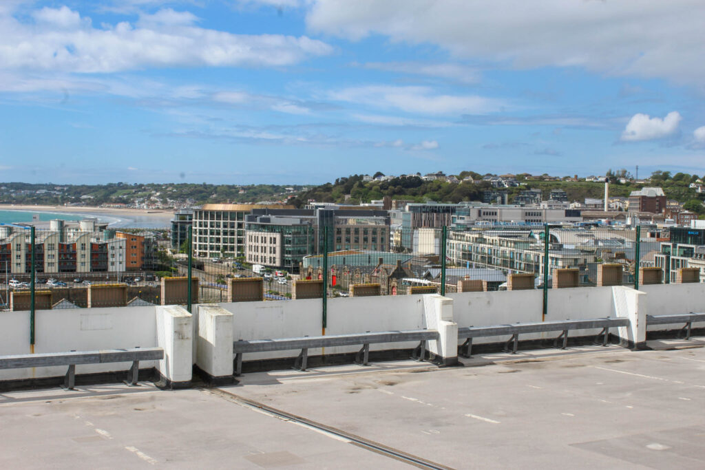
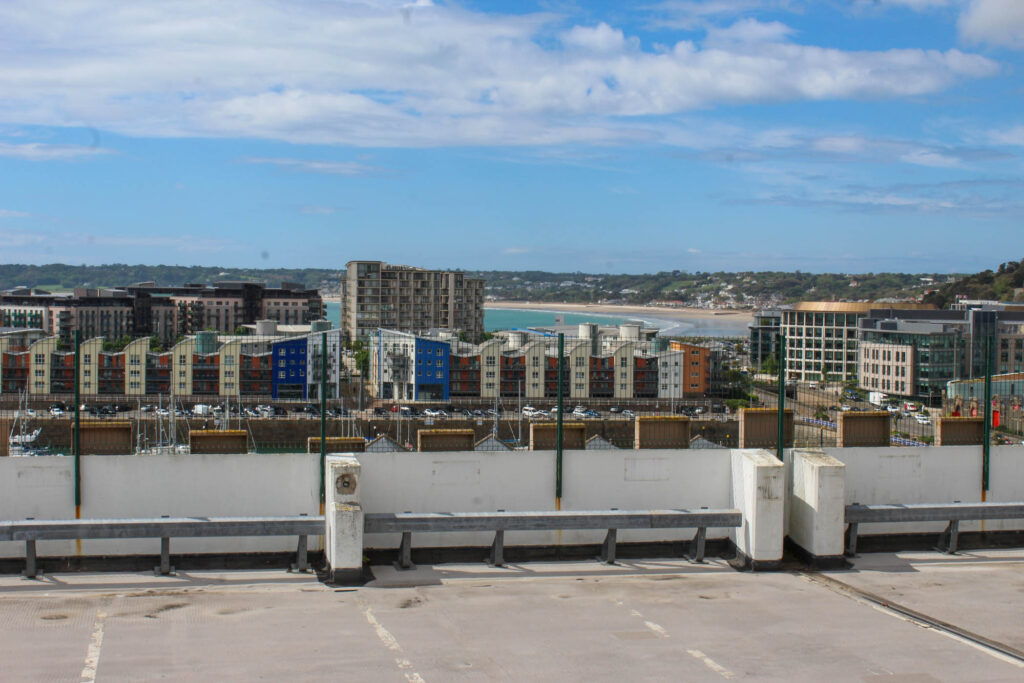
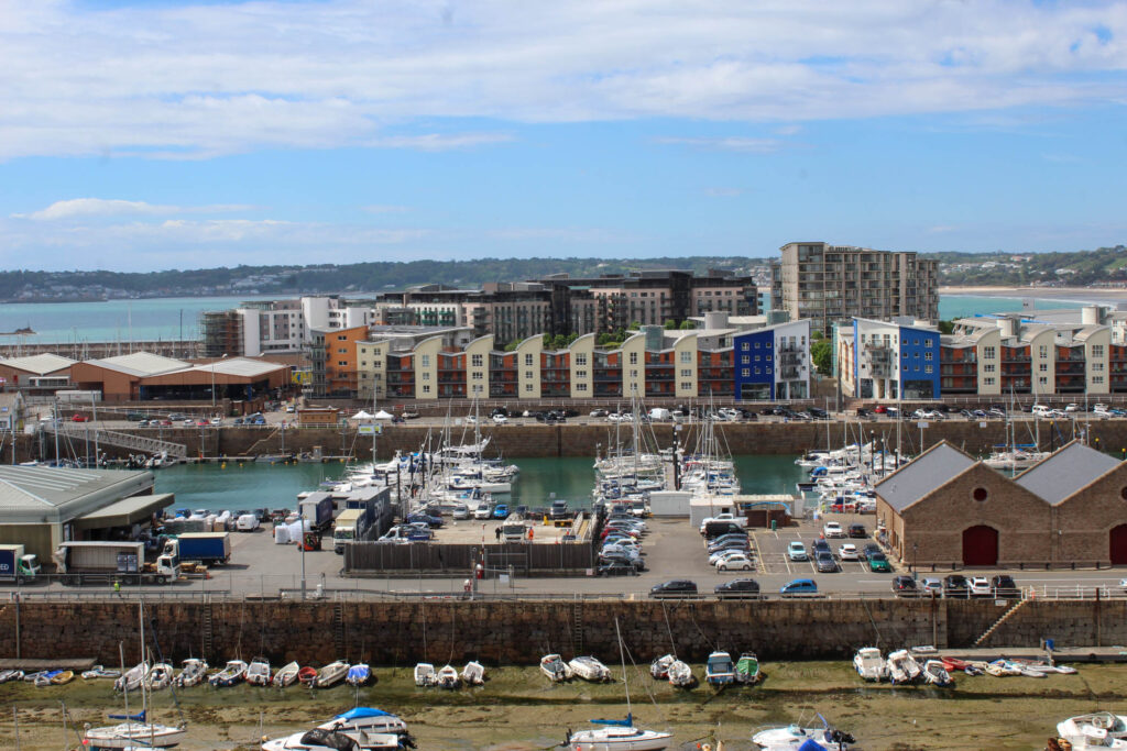
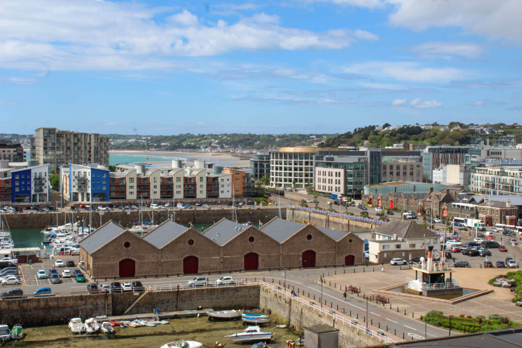
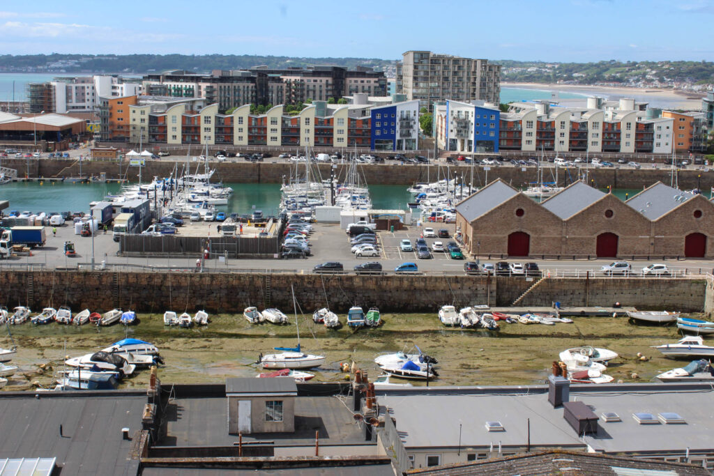
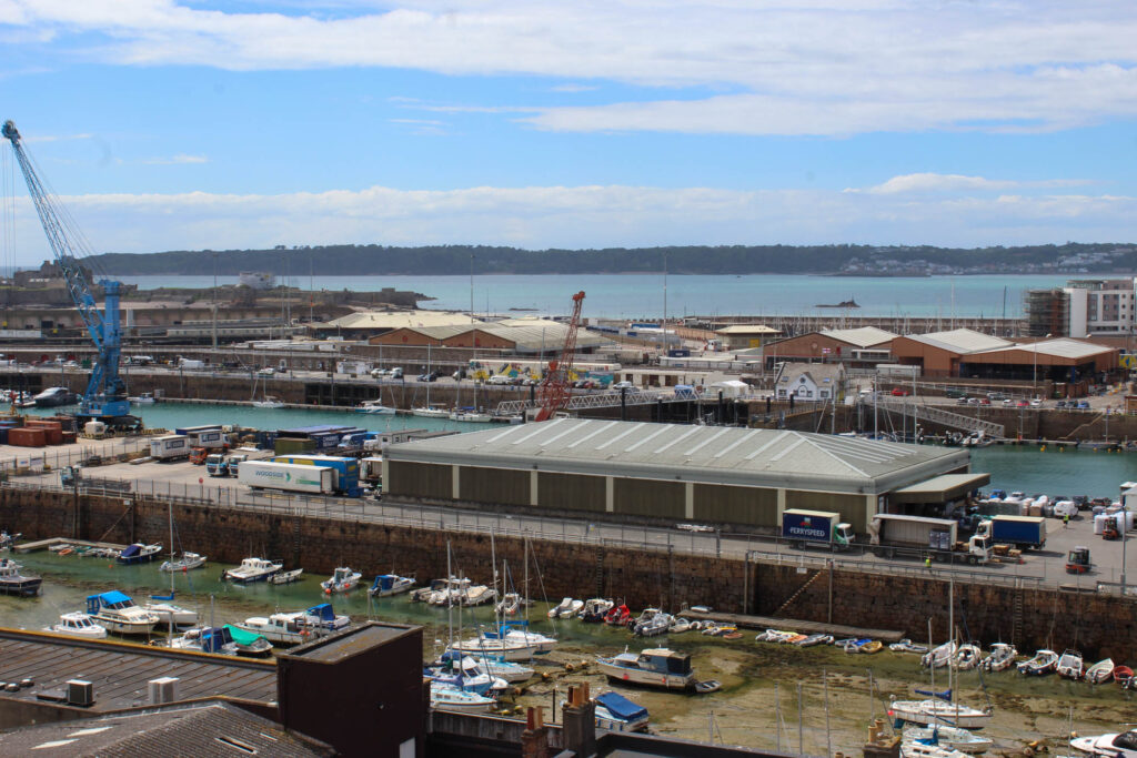
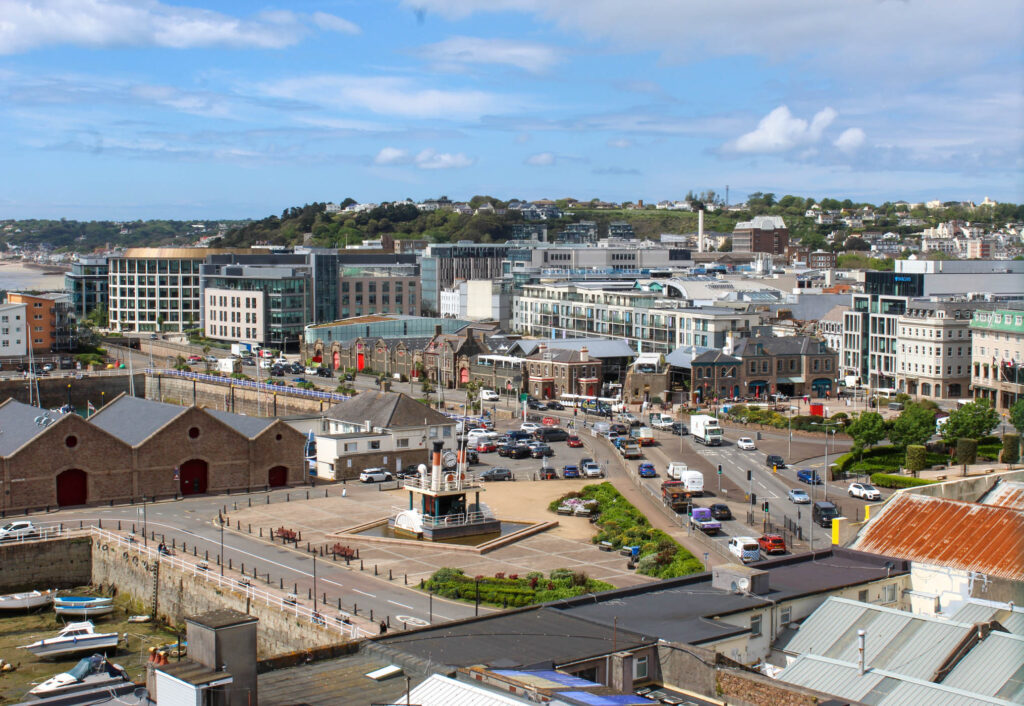
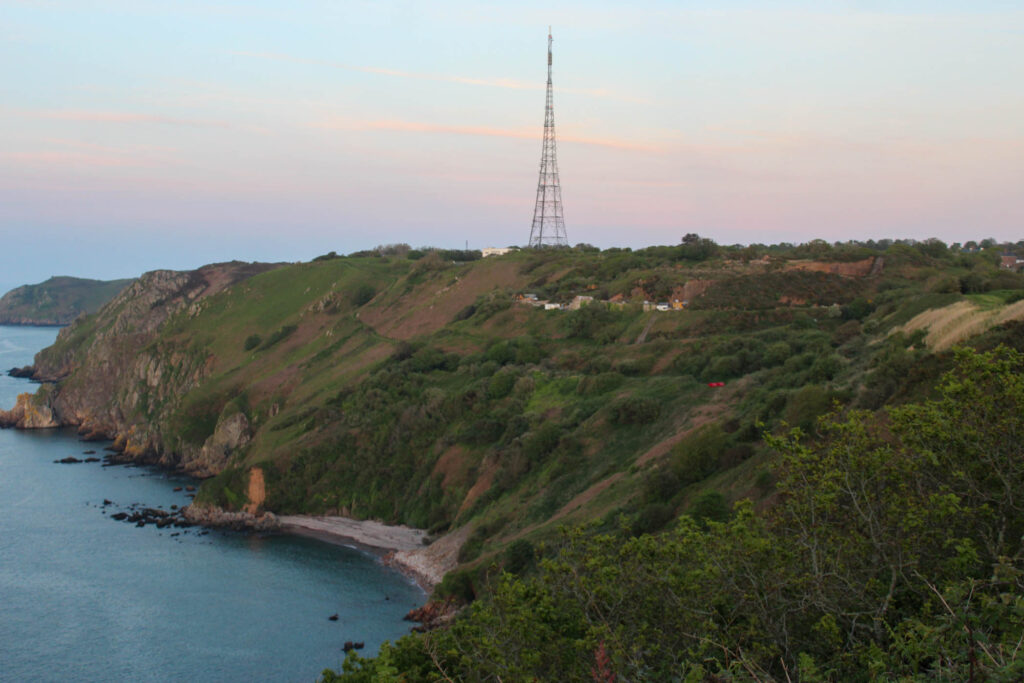
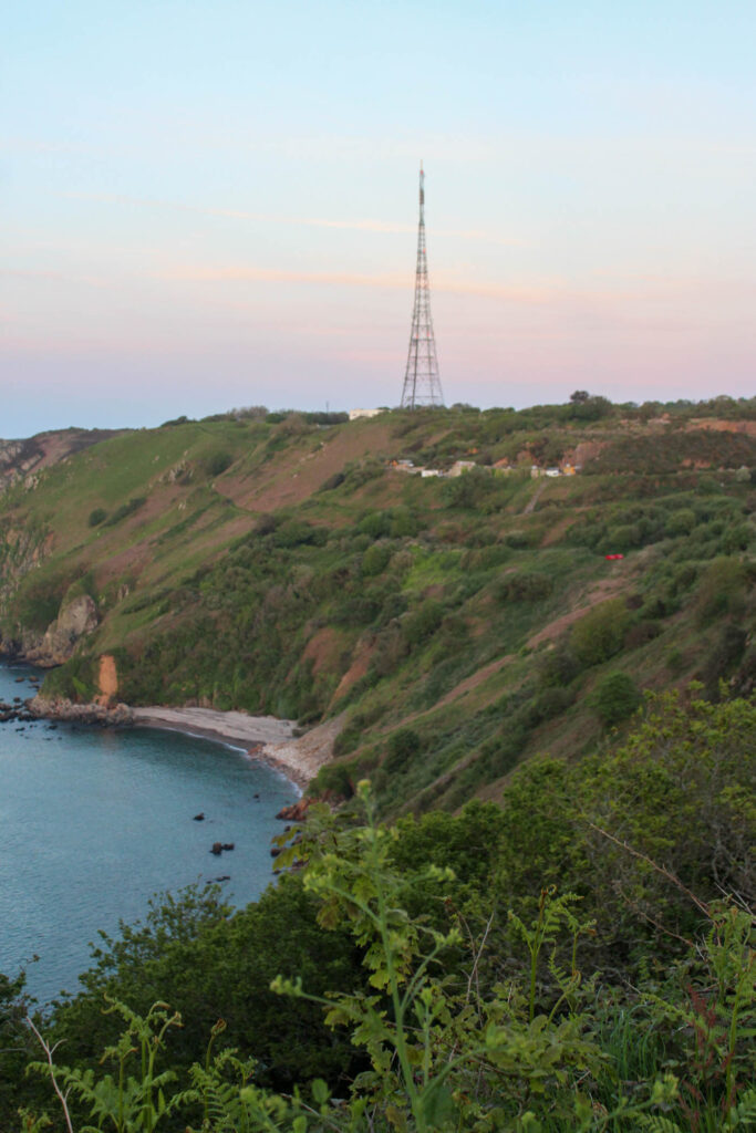
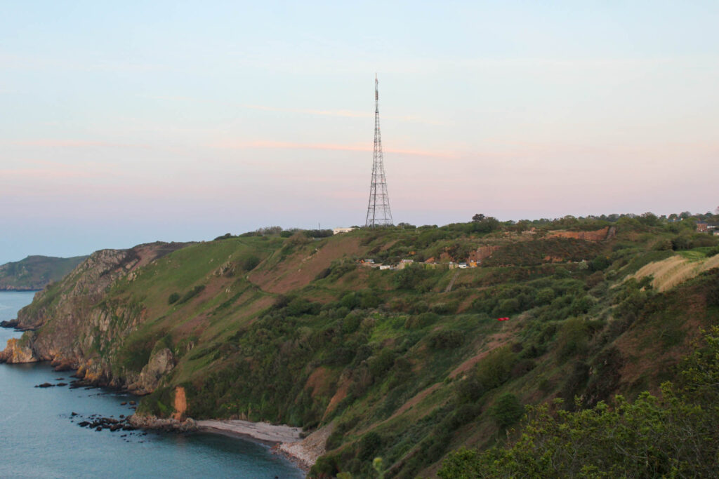
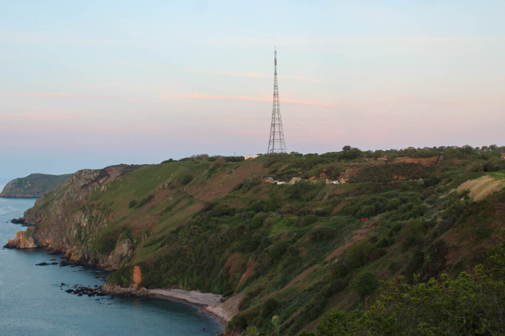
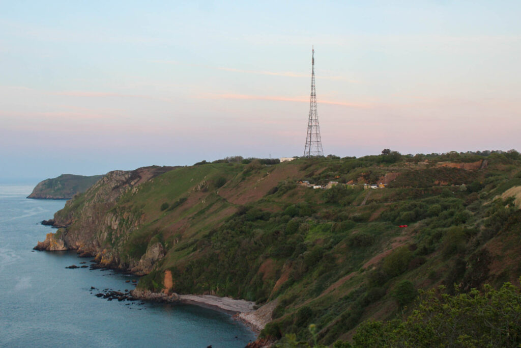
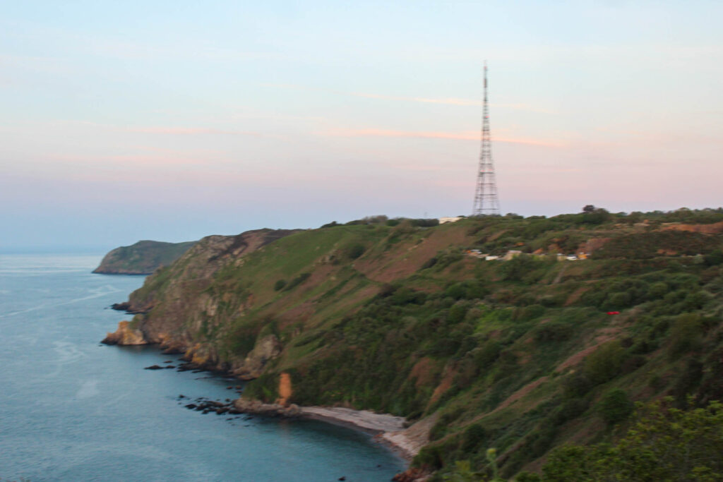
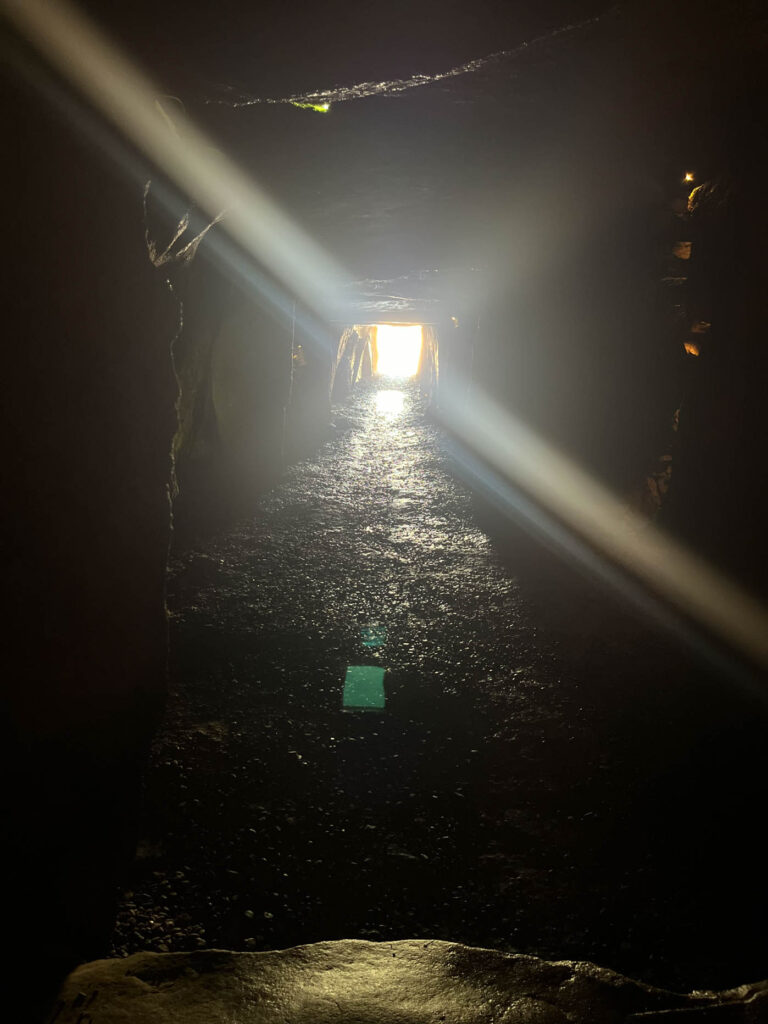
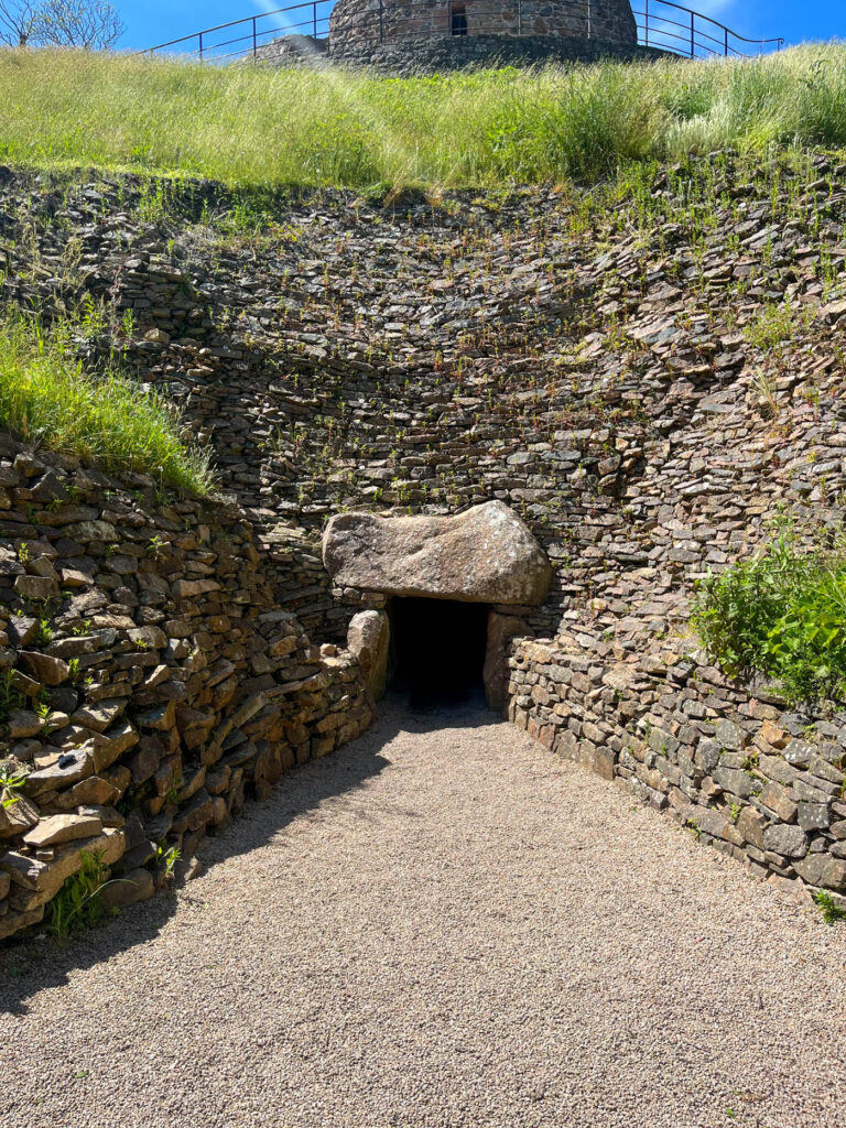
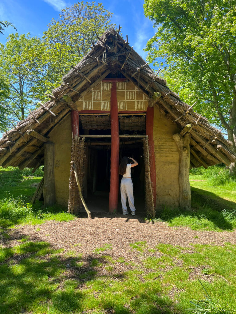
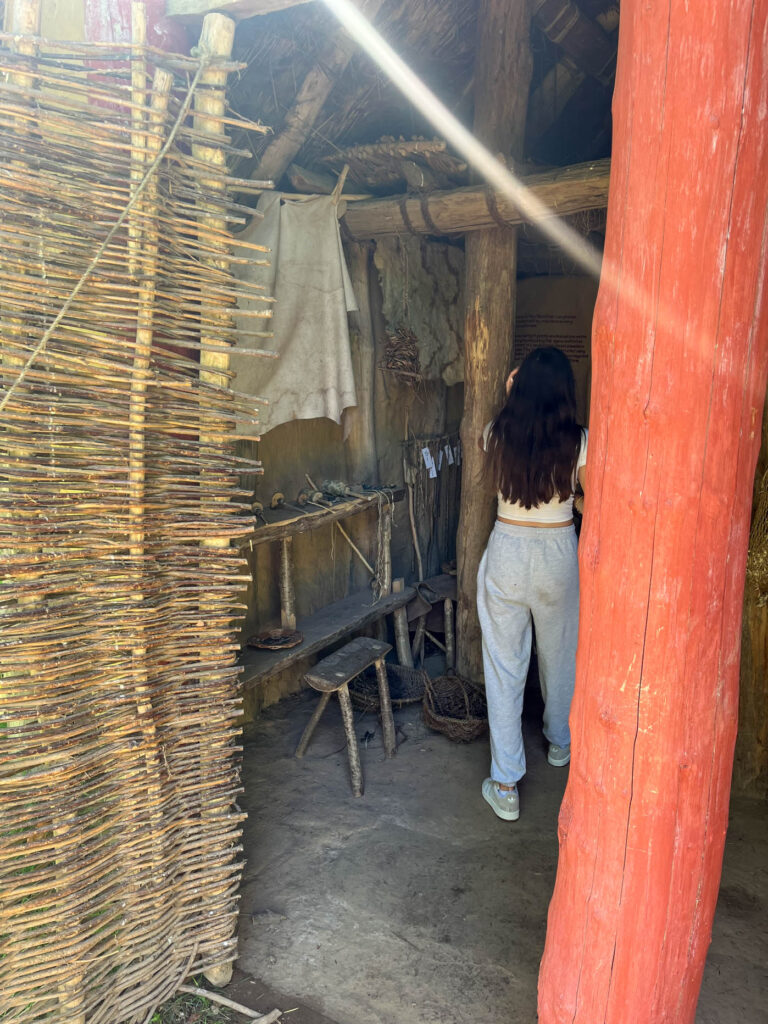
I really liked this industrialisation photoshoot, because it allowed me to explore different places, and it allowed me to explore how industrialisation has changed and developed over time. It also showed me how many built up places there are in Jersey, never mind the rest of the world. It also gave me an idea of how the world is developing and what it is going to be like in the future.
Fly Tipping
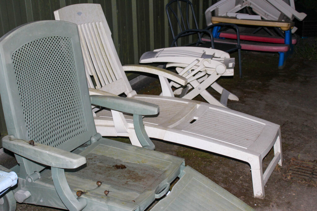
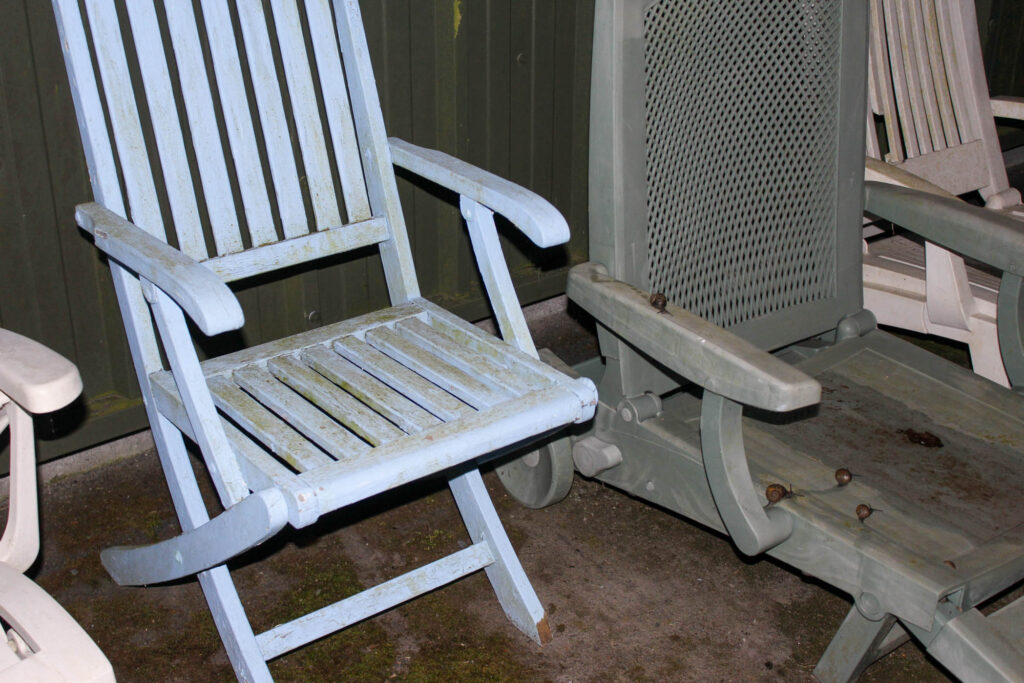
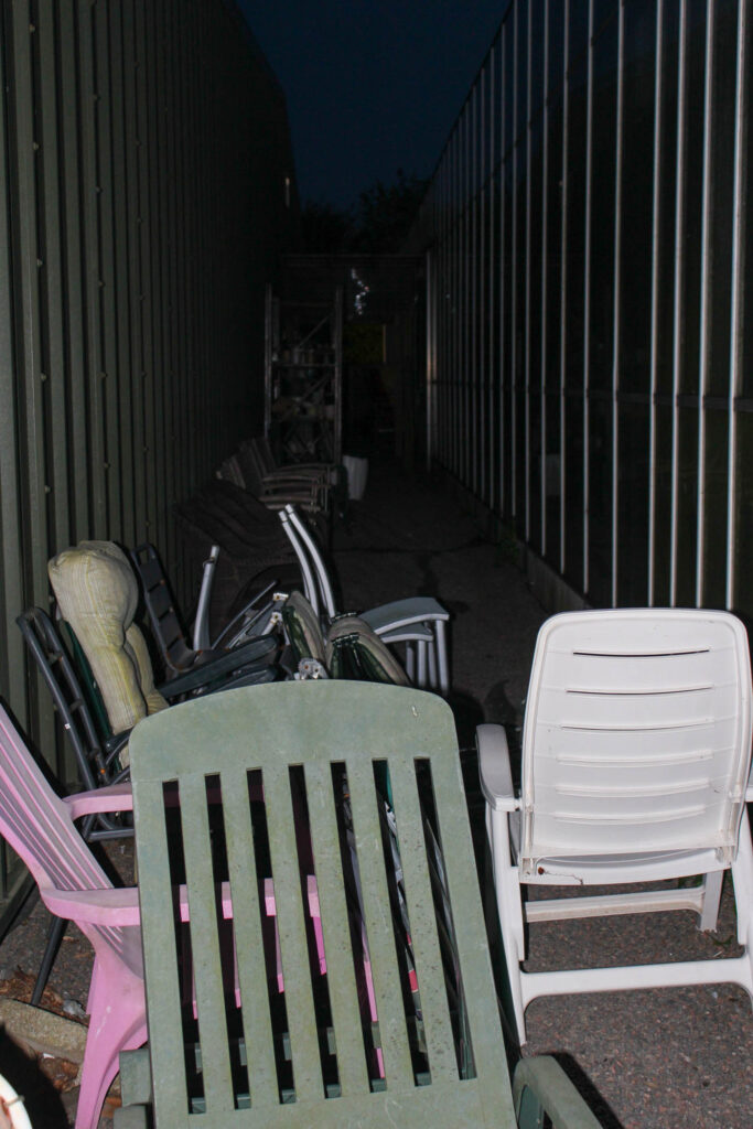
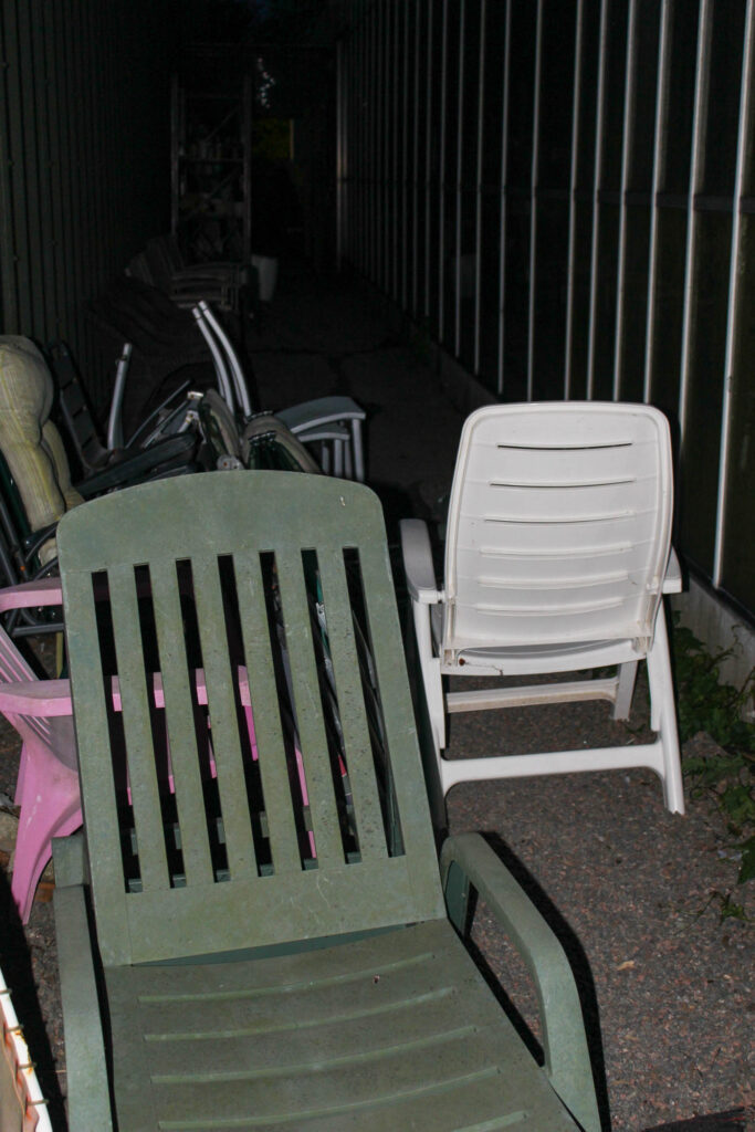
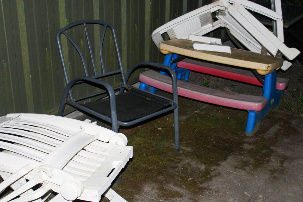
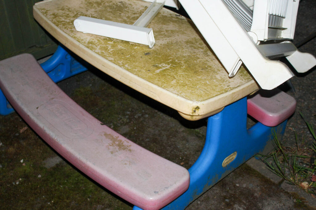
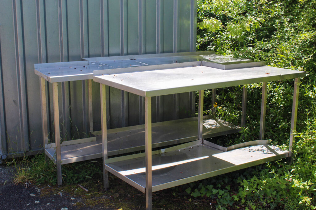
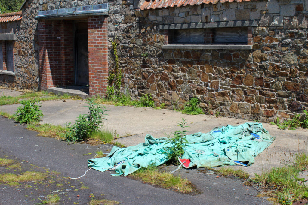
Analysis
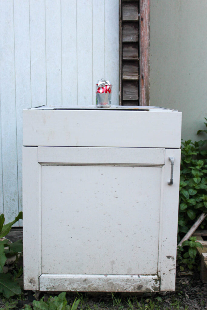
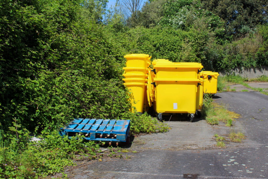
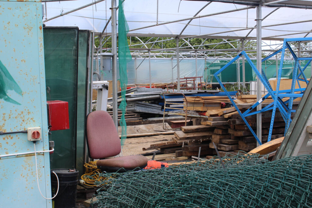
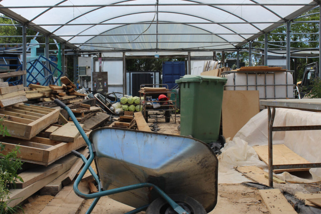
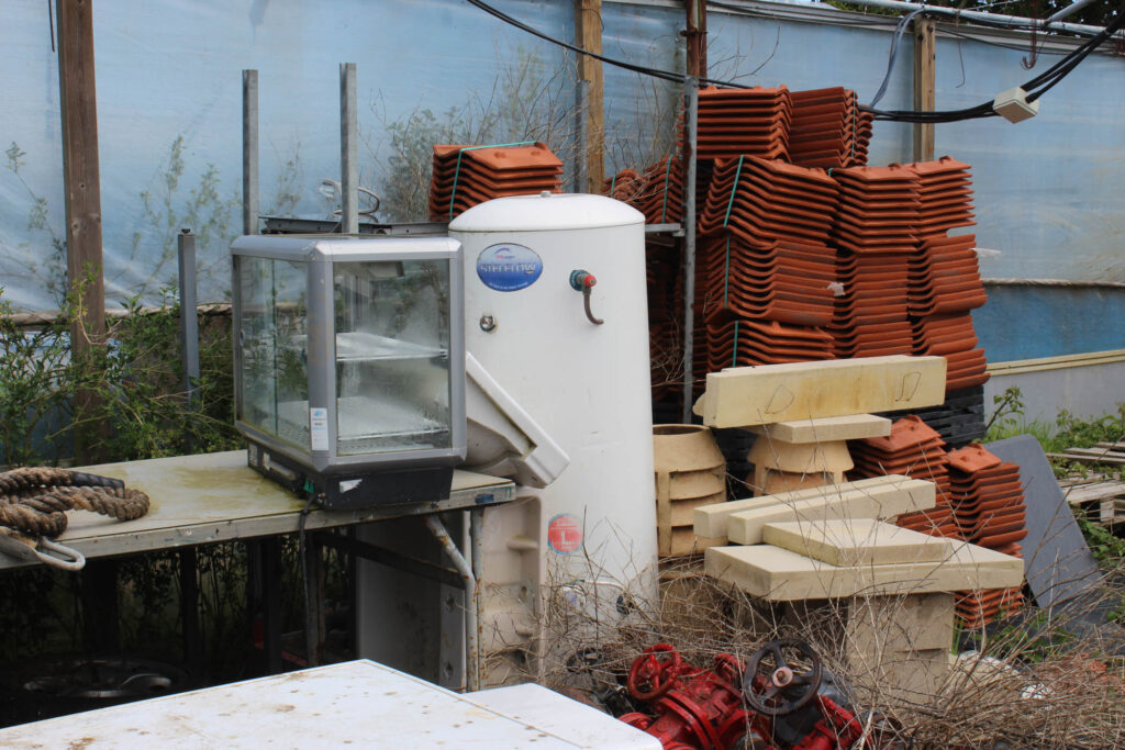
My images showed fly tipping very well, as there were lots of furniture items that were just discarded. I also enjoyed this photoshoot, because I didn’t think that fly tipping happened that often in Jersey, but this photoshoot really opened my eyes.
Minimalistic Approach
Analysis
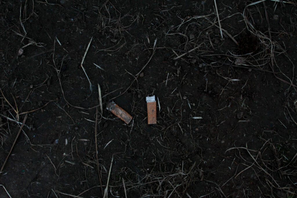
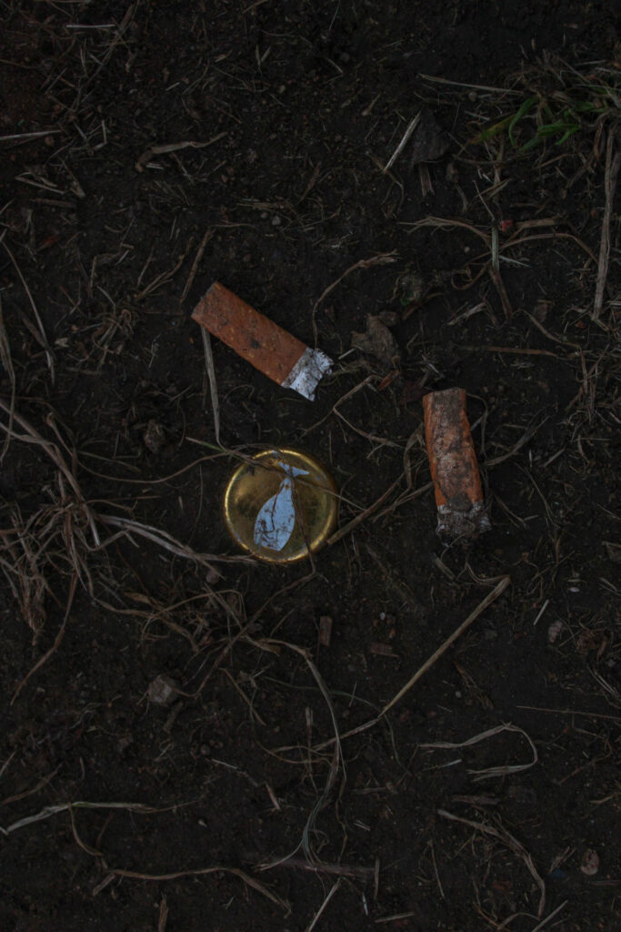
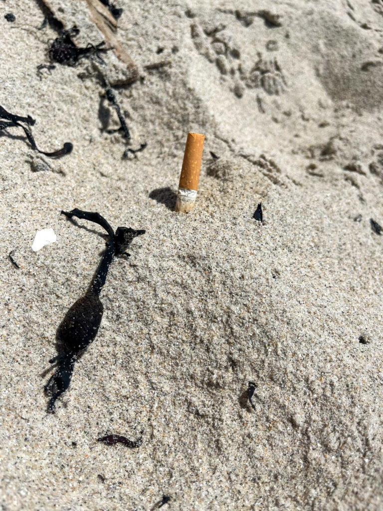
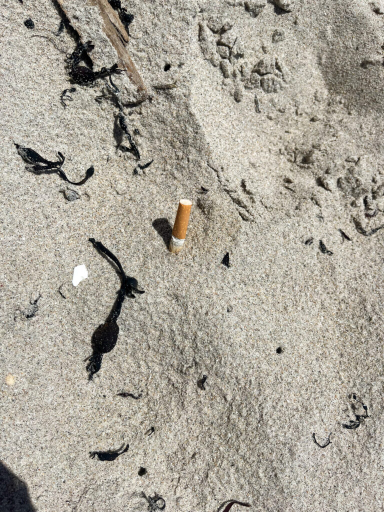
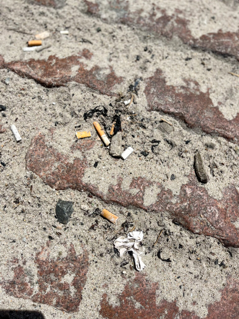
I really enjoyed this photoshoot, because these images show how there are smaller pieces of litter, such as cigarettes, which do effect the earth, because there are so many of them, but people do not really notice this, or worry about it, when it does actually have a huge impact and I think this photoshoot presents this. If I were to do this photoshoot again, I would use a camera instead of my phone, so that the quality is better.
