Virtual gallery
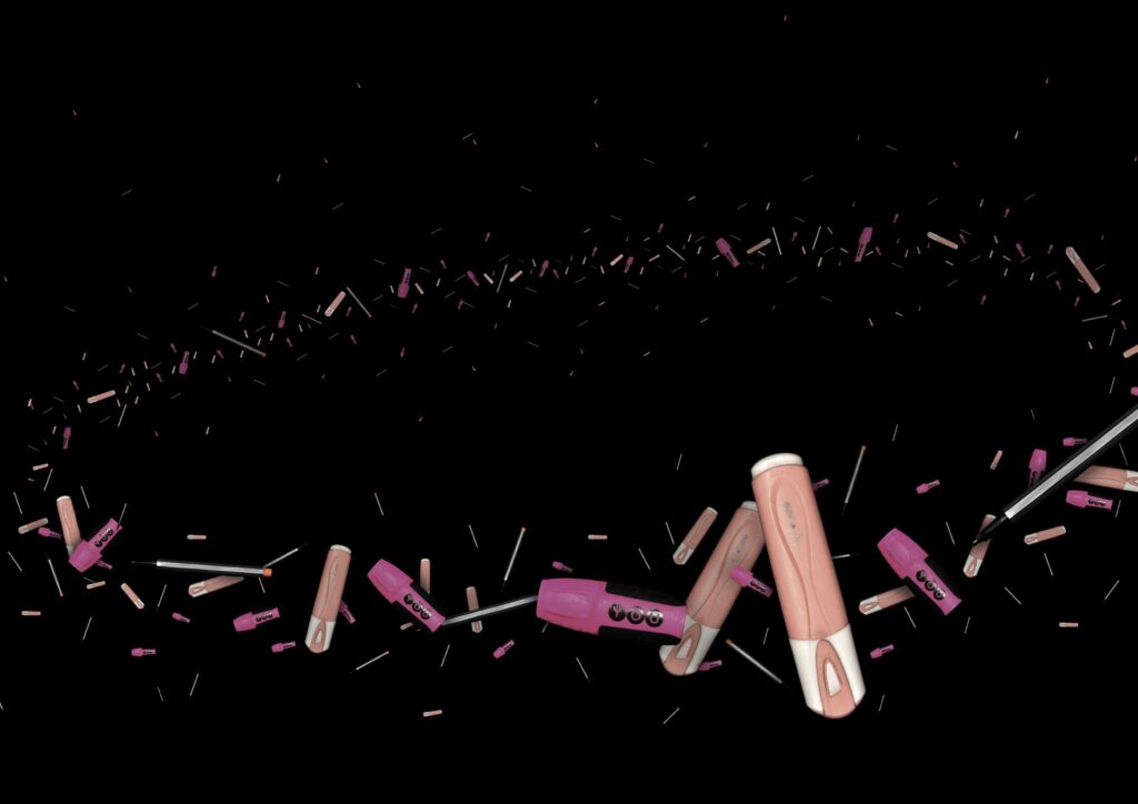
For my final Images I wanted at least one image from each section. I decided on one Anthropocene, 4 industrial and 5 natural landscapes. I experimented with a virtual gallery on arrangements and sizes etc. I was going to create one triptych in A5, one diptych in A4 and 5 single images presented in both A4 and A3. I didn’t like all the industrial ones together and the Anthropocene image I pictured in A3 however there was too much plain black so I decided to try and fit it in a circular shape instead. I like the idea however I should have created it with the shape in mind initially so the ring would fit the frame better. I ended up printing it as a square since I didn’t arrange it properly to fit in a ting.
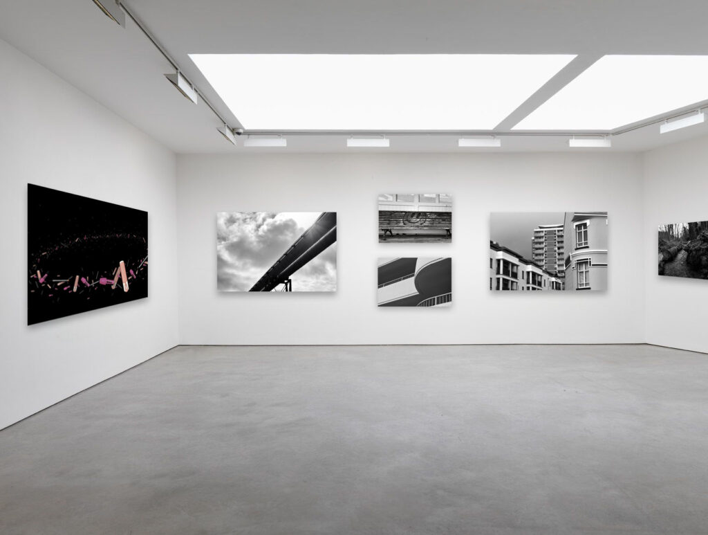
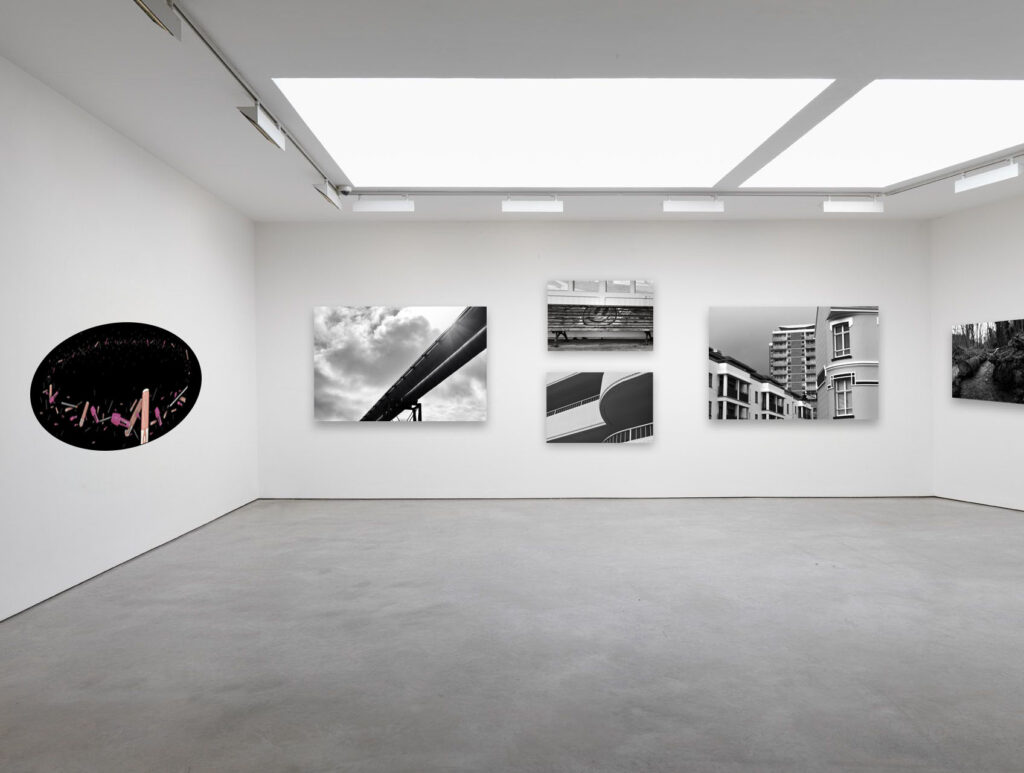
After deciding on the sizes of each Image the arrangement was much easier. Aside from the triptych and diptych on the left wall all the others are going to be framed on their own.
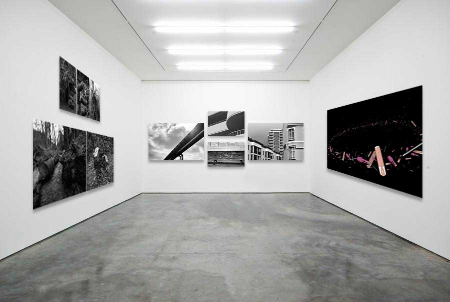
Final Images
I arranged my final images into groups:
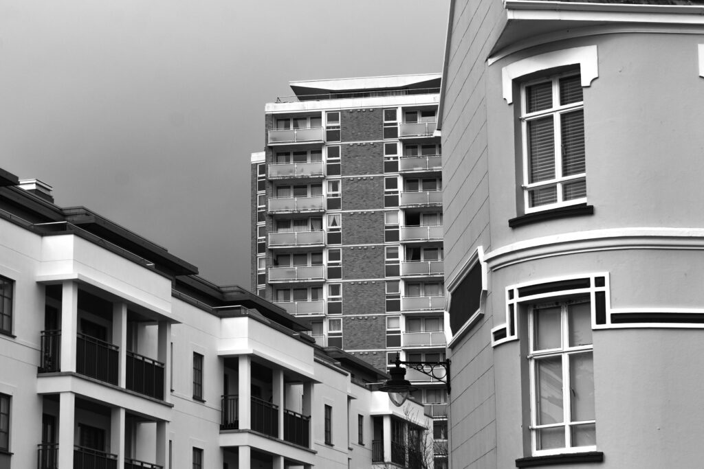
1- New Topographics
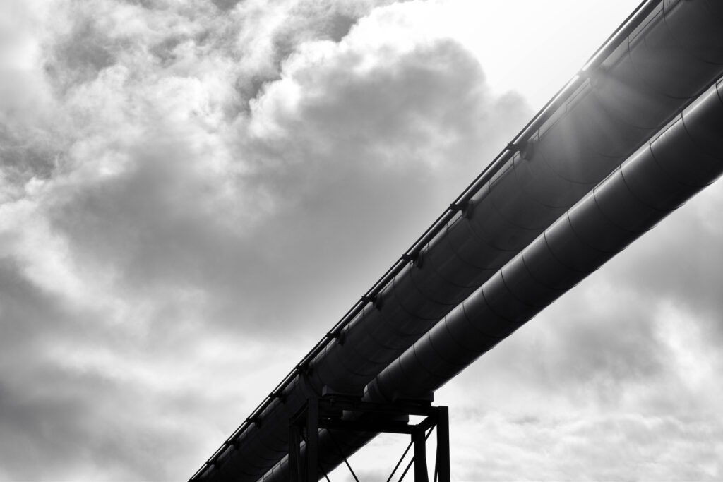
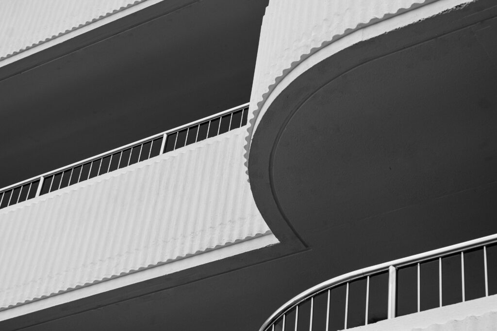
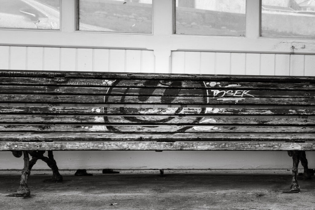
2 – Landscapes
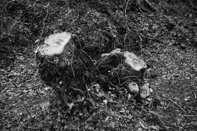
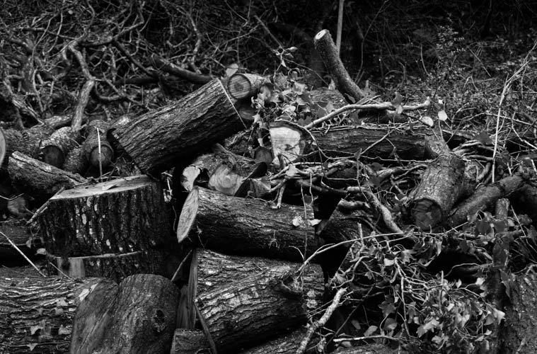
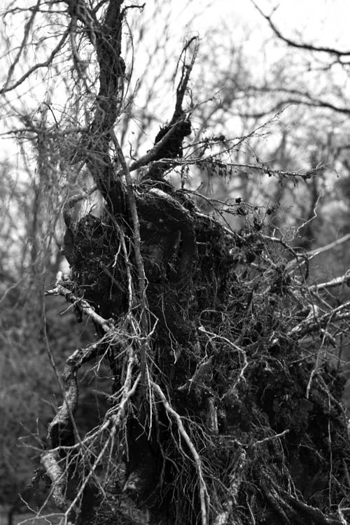
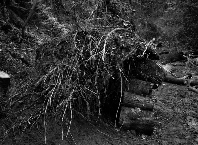
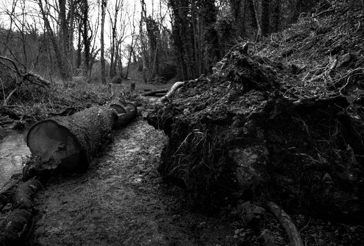
3 – Anthropocene
Evaluation
I think that I understood new Topographics the best and created images based on my interpretation of these ideas. This was the most successful outcome in my opinion as each final outcome showed a different aspect of new Topographics such as deadpan, industrial structures and the changing urban landscape. I think that while I explored some ideas I could have created more inspired or creative outcomes.
For Anthropocene I think that the stationary donut turned out better than I thought. Looking back I wish I created it in a circle frame or used some additional pieces. Stationary is a wasteful industry from the large packaging to the harmful plastics used in disposable items which I believe has the same themes as Mandy Barkers photographs without going out and finding these items washed up on the beach which is originally why the images are supposed to appear like underwater currents however I instead just used waste before it was thrown away. Each piece of stationary I photographed was single use and would have ended in some sort of waste outlet regardless.
As a response to romanticism I wanted to photograph the damage caused by storm Kieran. I focused on fallen trees as they have heavily impacted the landscape but didn’t take photographs of the new bare landscapes. I don’t think these photographs turned out very well as I didn’t have much direction when going out to take the photographs. This came across clearly in the final outcomes. I also photographed some landscapes without the theme of the storm and I think these turned out better since I wasn’t focusing on a specific theme. I used these photographs mostly when experimenting with AI because the large spaces allowed for generative fill and remove also. Although I didn’t originally have much direction and was simple practicing the tools, these also turned out better then the storm. I chose not to print these ones out as final images because they weren’t saying enough to be framed and presented.
