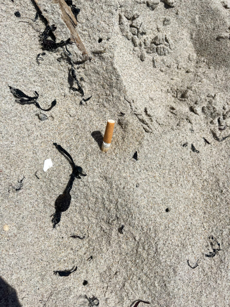
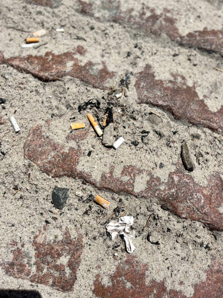
These images do not relate to any of my chosen artists, but I spotted these things, while out on my photoshoot and thought they related very well to the theme of Anthropocene.
Contact Sheet
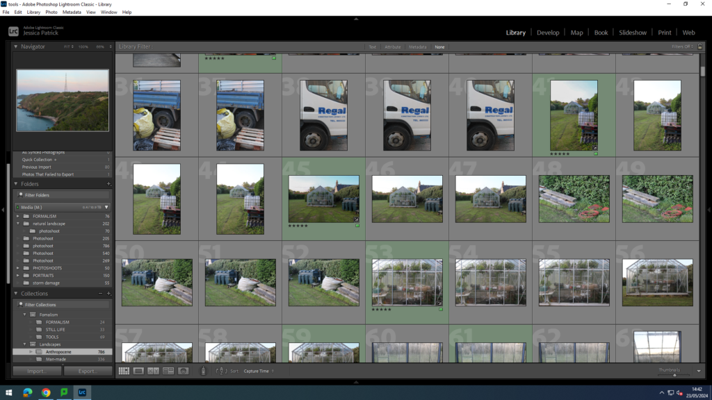
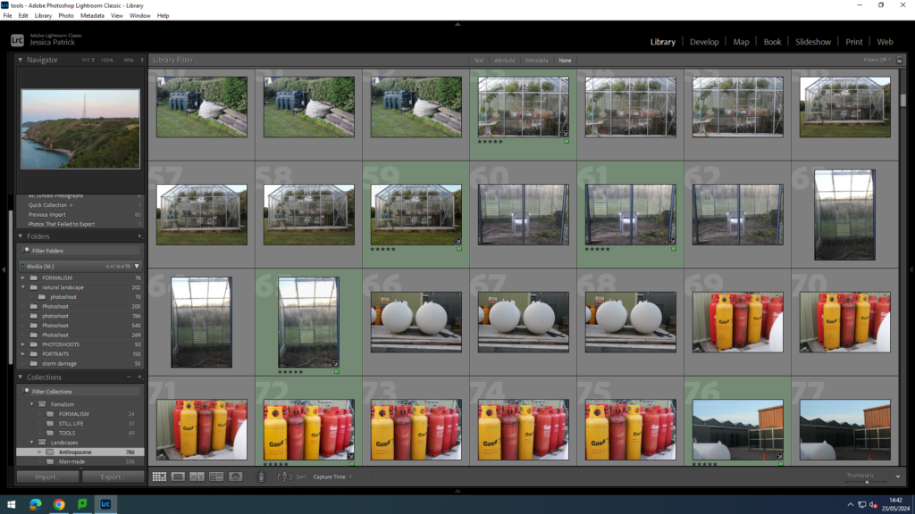
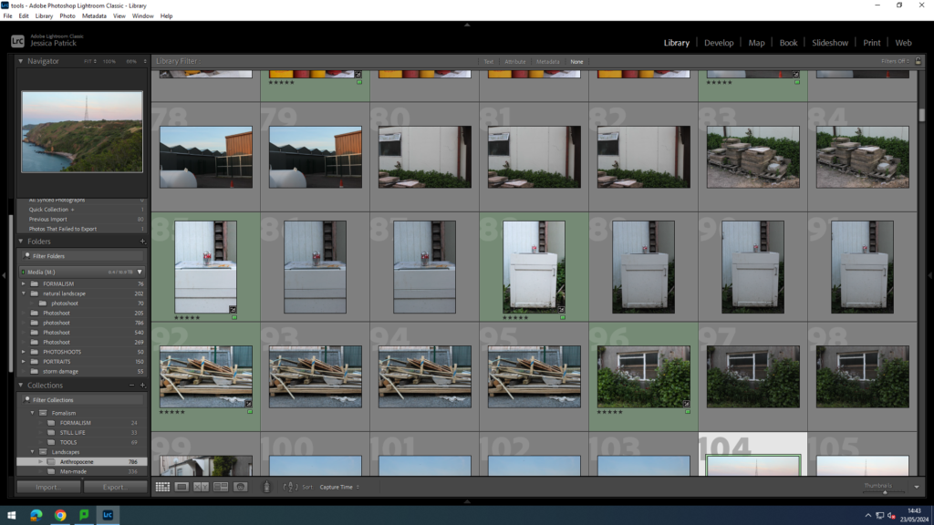
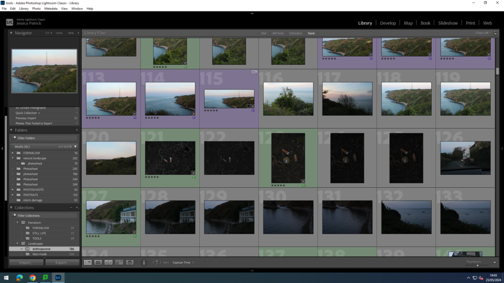
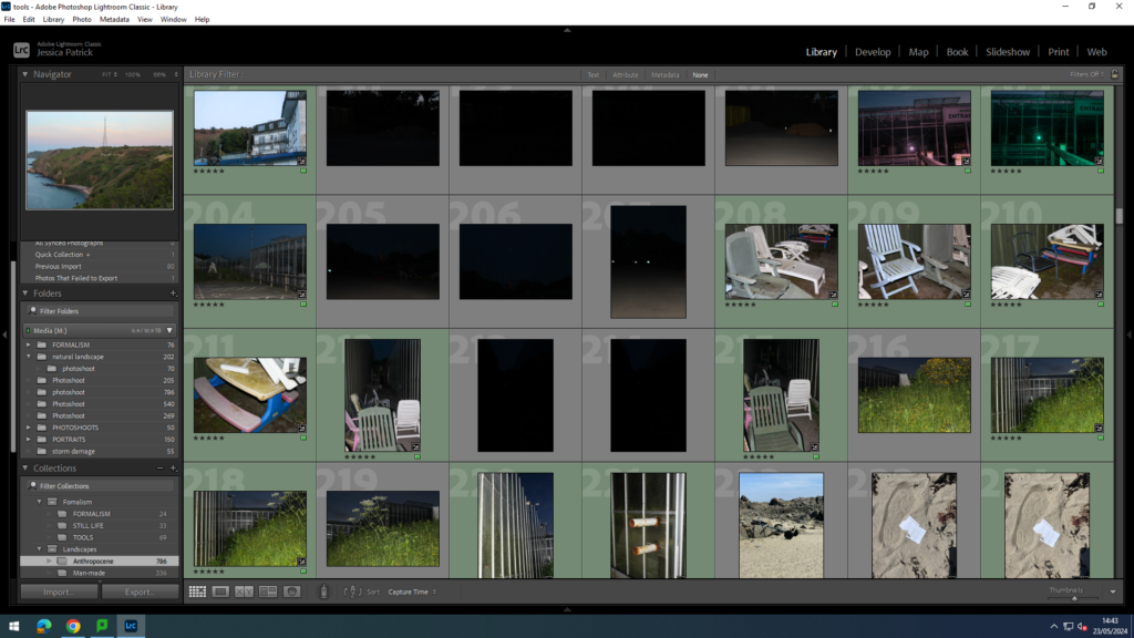
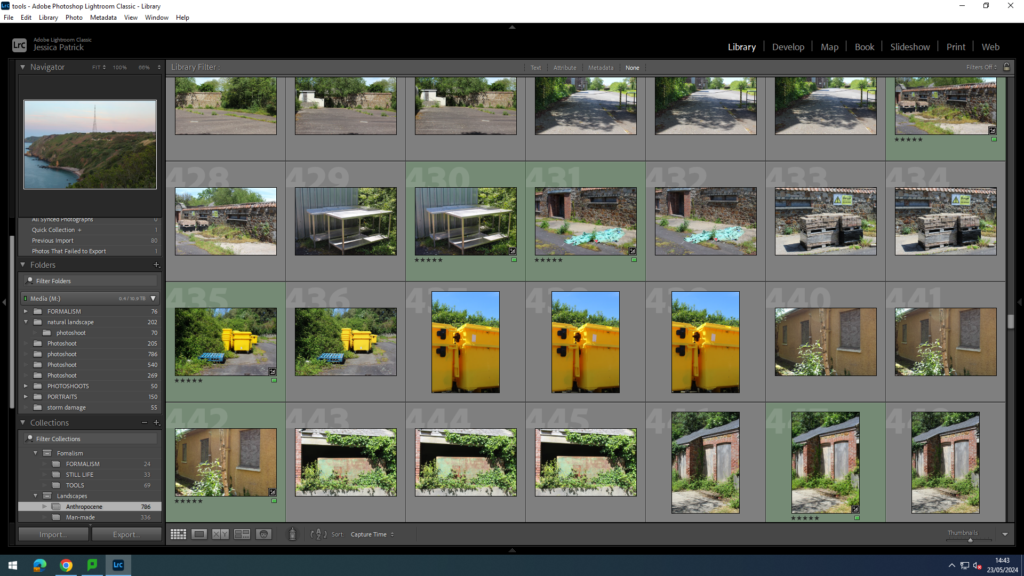
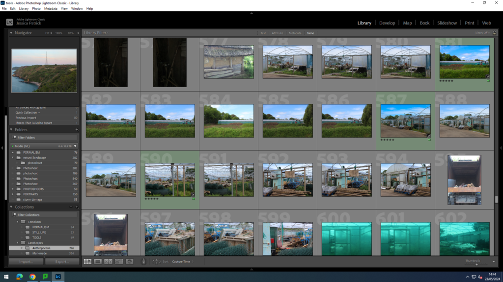
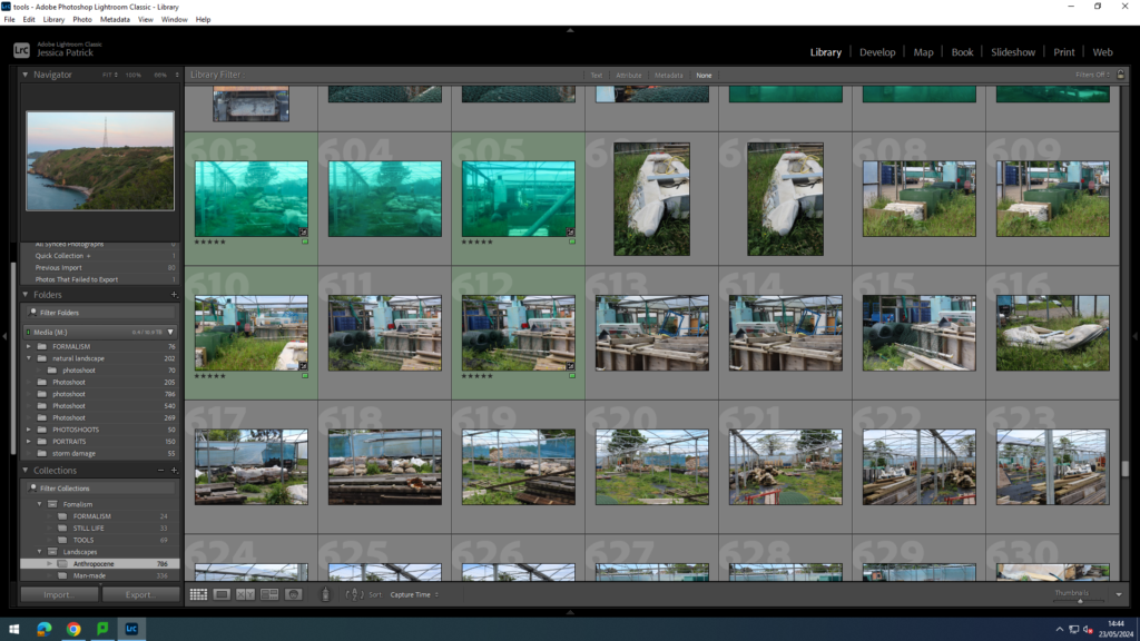
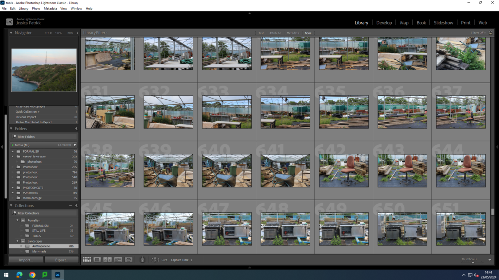
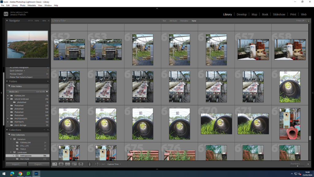
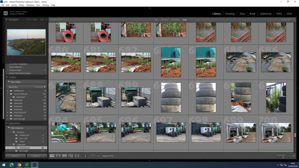
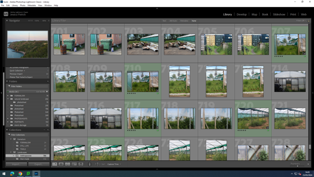
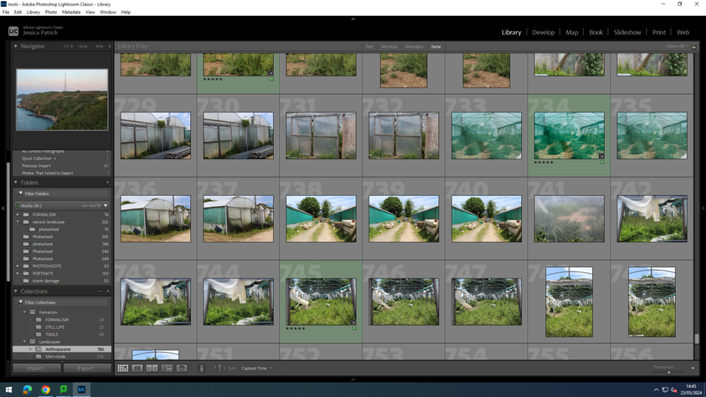
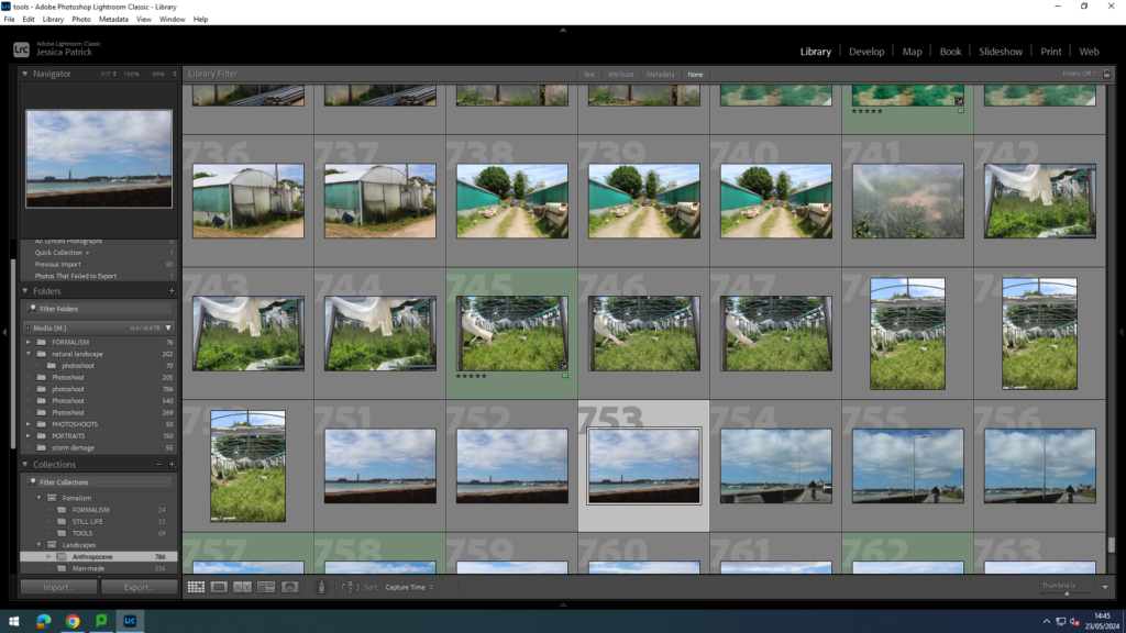
The images which are highlighted green are the images I have chosen to edit, because I think they display Anthropocene in the best way. They also do not relate to any of my artists, but I feel like they are a really important aspect of Anthropocene, because they are not looked at a lot, but cause massive negative effects to the earth. These images also have the best lighting and composition.
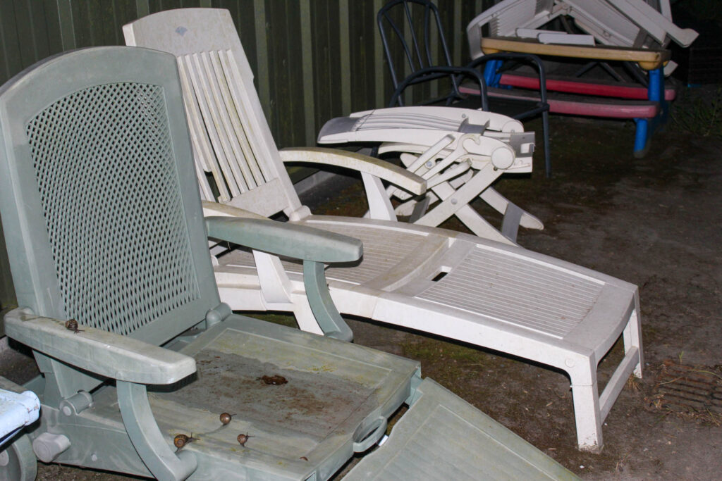
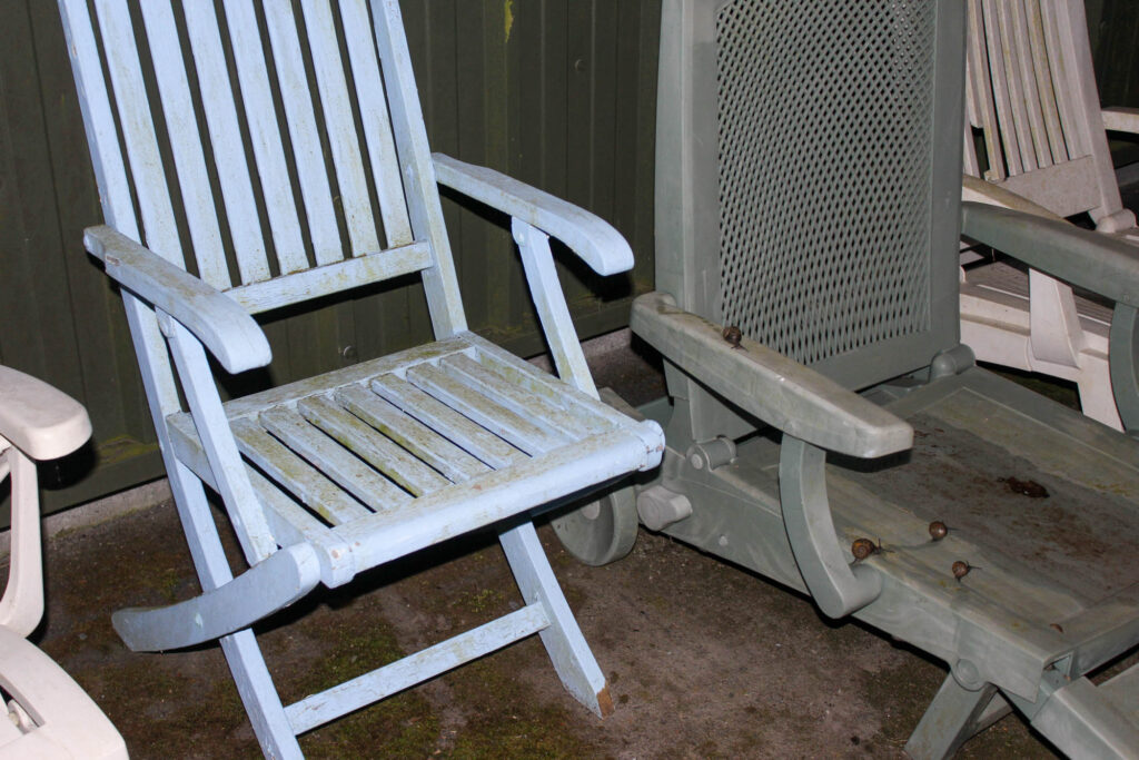
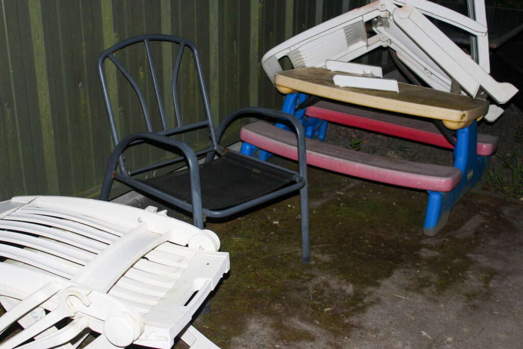
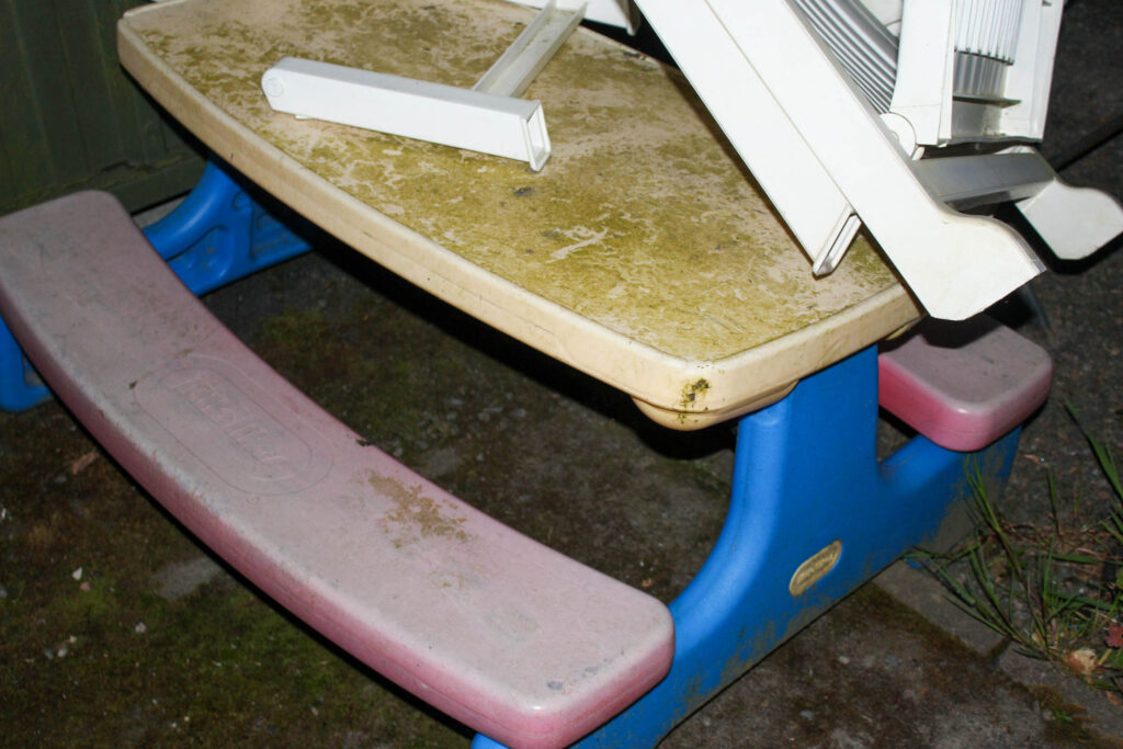
Fly Tipping
I took these images at a construction site near St John, as well as Trinity, near the Trinity Arms. Fly tipping relates to the theme of Anthropocene, because many of the most common items that are fly tipped have a high plastic content, so they are non-biodegradable. This means that they will remain there for hundreds of years. These parts of plastic will over time sink into the earth and pollute the soil.
The plastic from these items is also dangerous for animals, that may be living in this area, especially if they eat it.
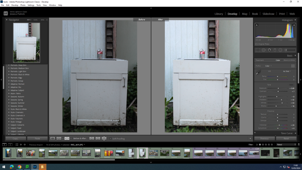
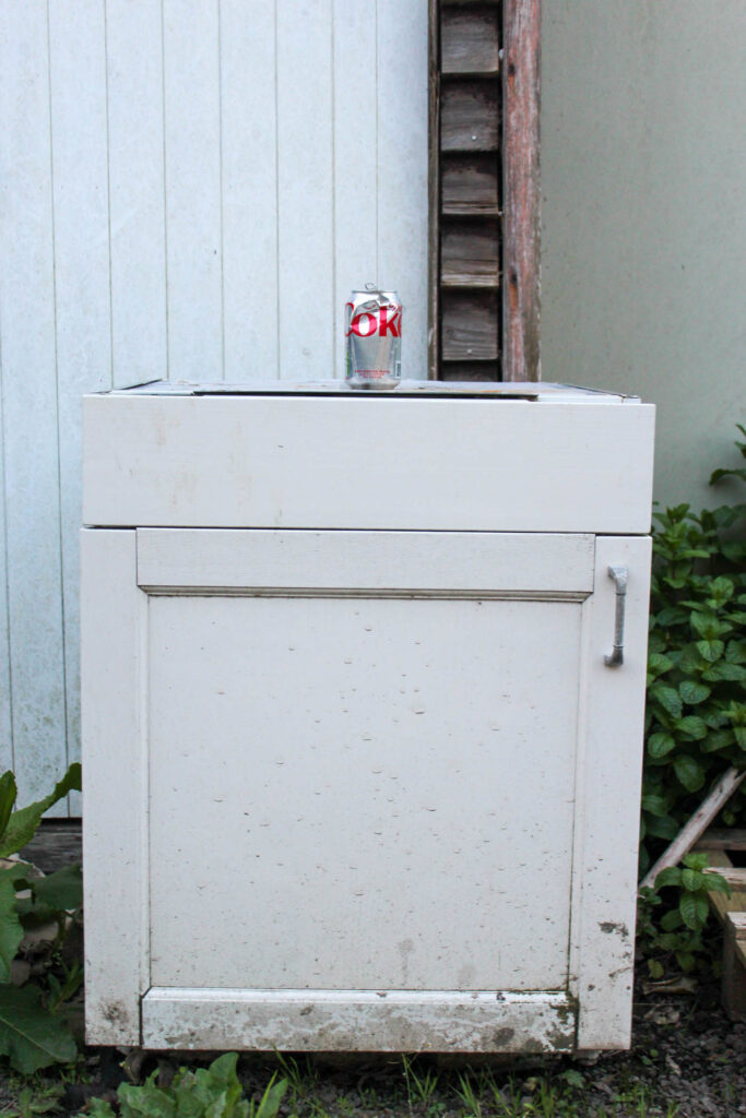
I edited this image by increasing the exposure, contrast, shadows, whites, saturation and vibrancy, while decreasing the highlights and blacks, so that the image would have greater exposure and be brighter. Also so the coke can was more prominent and the white drawer it was sat on was more of a true white colour, rather than a greyer white.
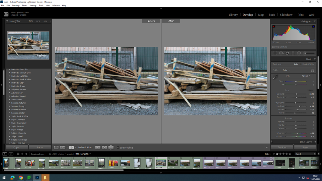
I edited this image by increasing the exposure, contrast, shadows, whites, saturation and vibrancy, while decreasing the highlights and blacks, so that the image would have better lighting.
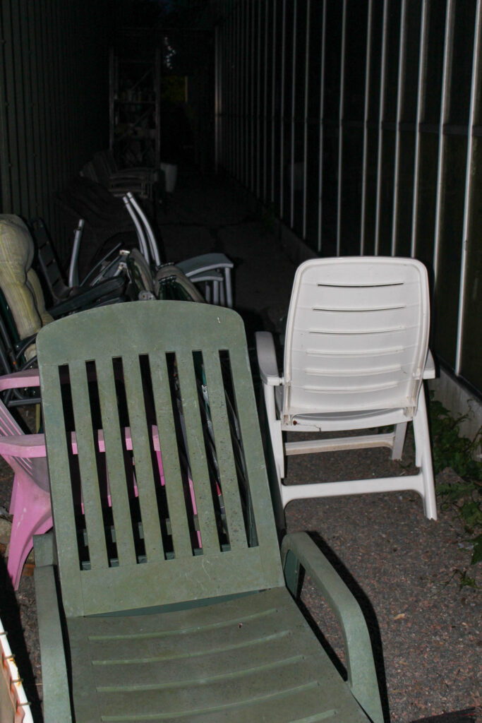
These next images were taken in Trinity near the Charity shop.
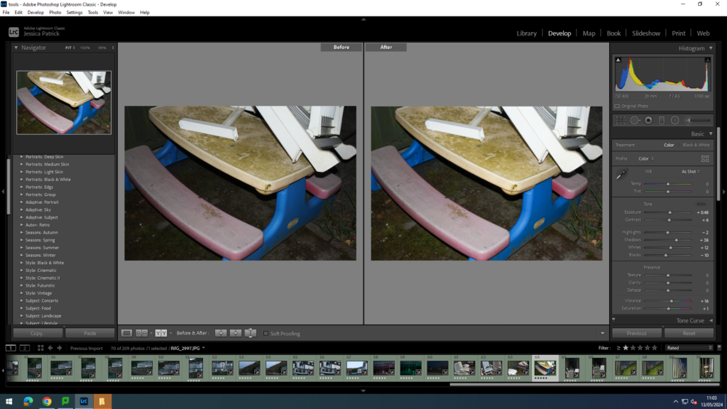
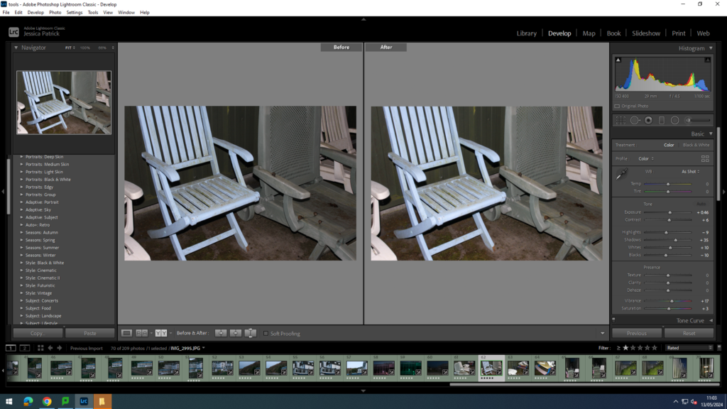
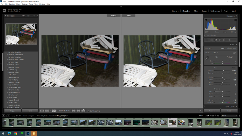
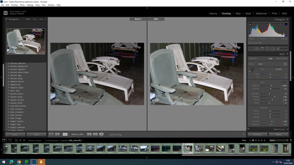
I edited these images by increasing the exposure, contrast, shadows, whites, saturation and vibrancy, while decreasing the highlights and blacks, so the images would have better lighting, as it was quite dark at this point.
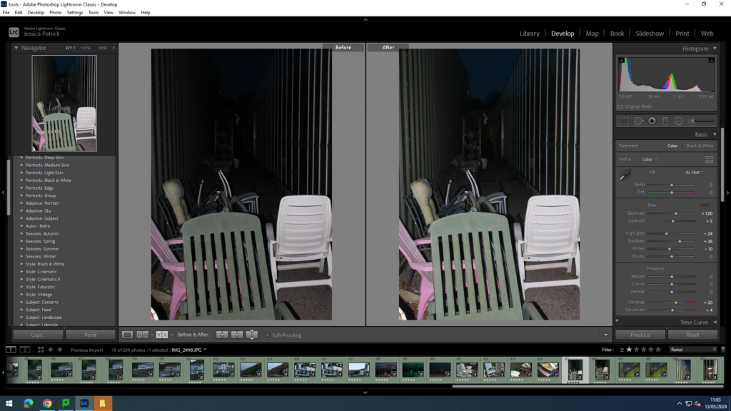
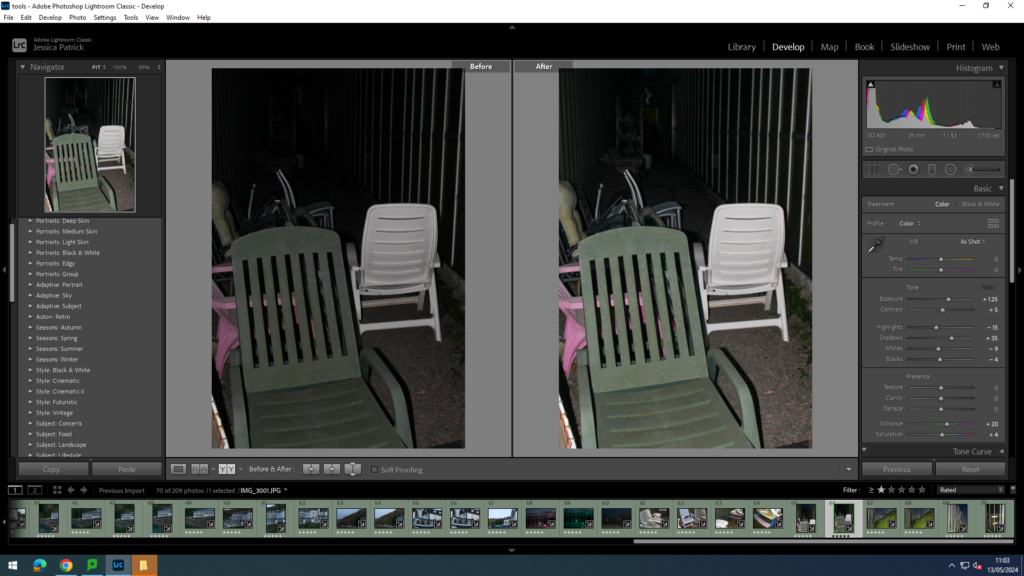
I edited these images by increasing the exposure, contrast, shadows, whites, vibrancy and saturation, while decreasing the highlights and blacks, so the image would have more exposure, and therefore be brighter, as it had gotten really dark by the time me and Katie were taking these images.
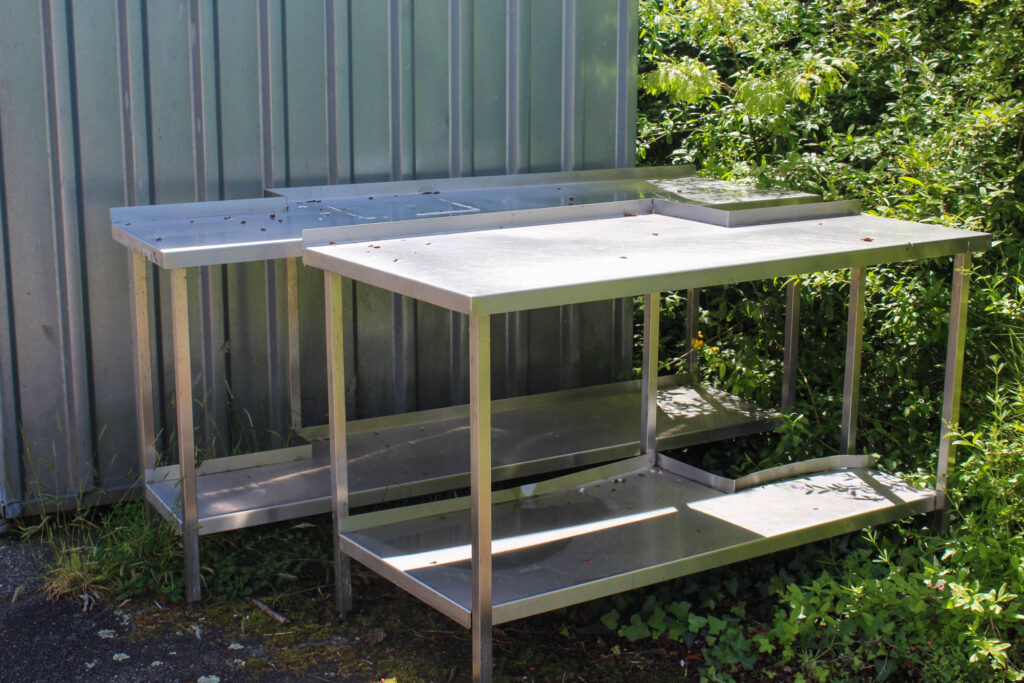
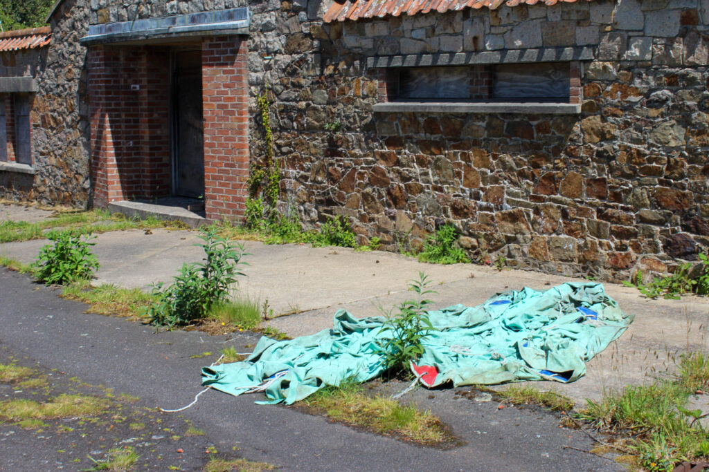
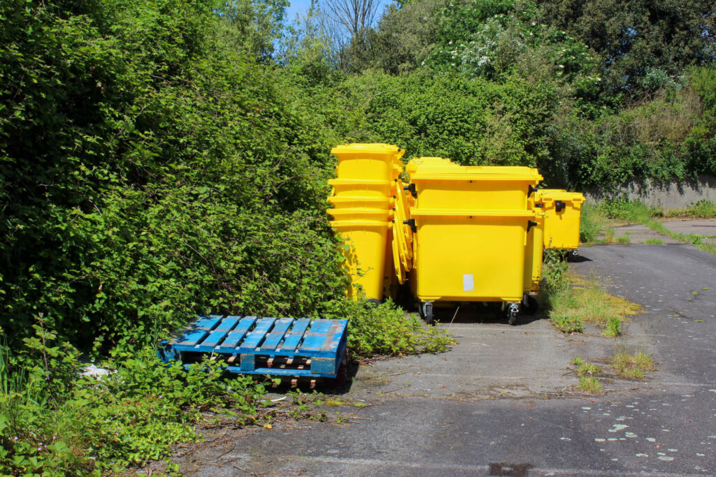
These next images were taken at St Saviours abandoned hospital. These were things from the hospital that were left and abandoned along with the hospital.
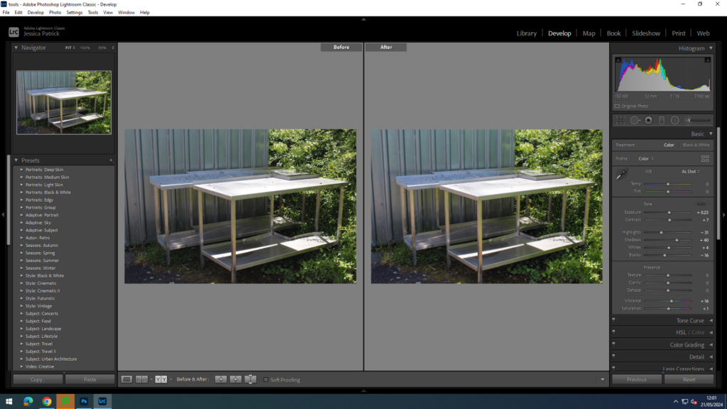
I edited this image by increasing the exposure, contrast, shadows, whites, vibrancy and saturation, while decreasing the highlights and blacks, so that the lighting was better.
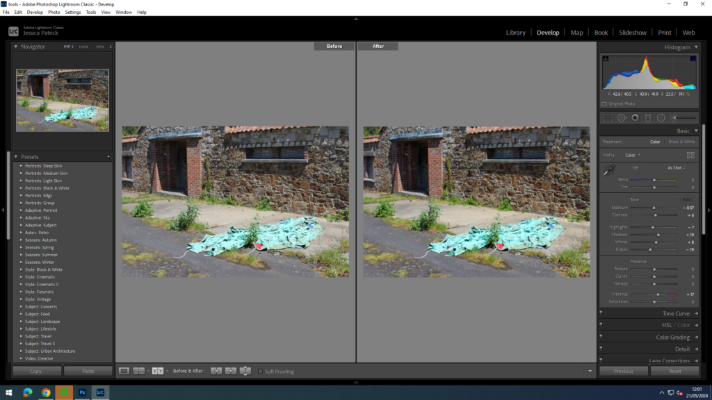
I edited this image by increasing the exposure, contrast, shadows, whites and vibrancy, while decreasing the highlights and blacks, so that the green tarp was more vibrant.
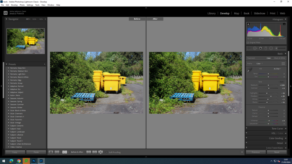
I edited this image by increasing the exposure, contrast, shadows, whites and vibrancy, while decreasing the highlights and blacks, so that the blue and yellow colours were more vibrant, as well as the greenery around them.
Top 9 Final Images
Greenhouses
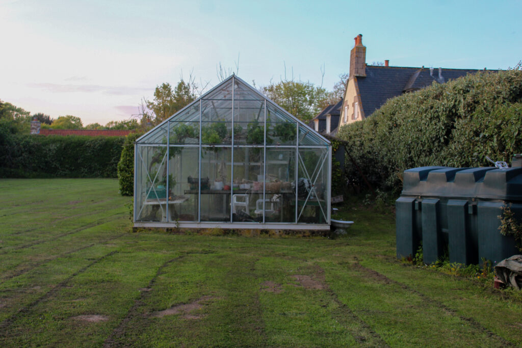
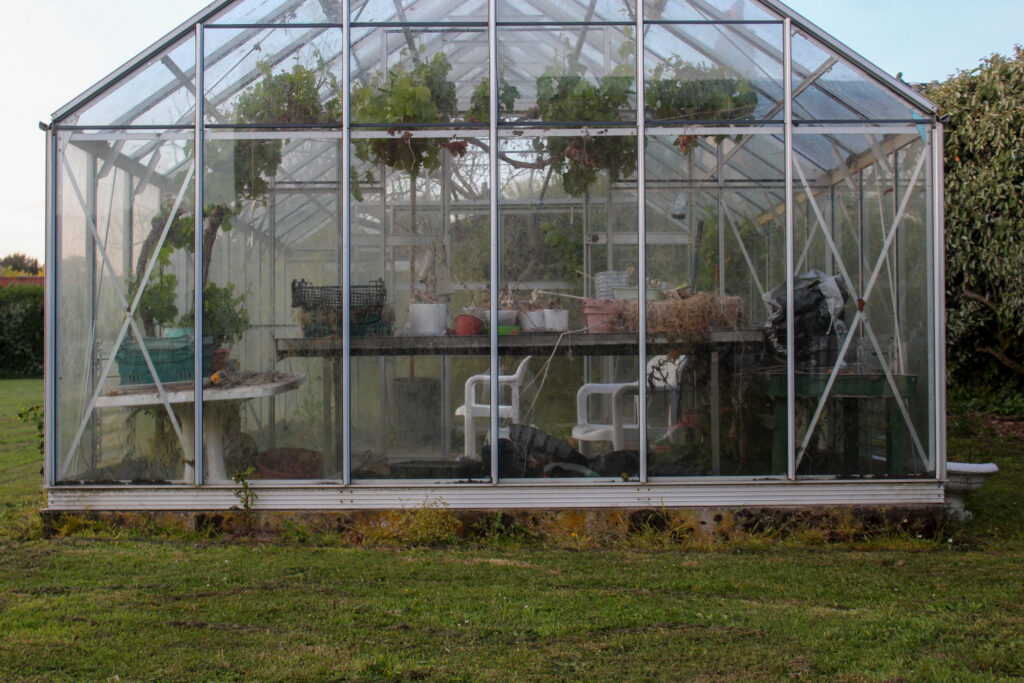
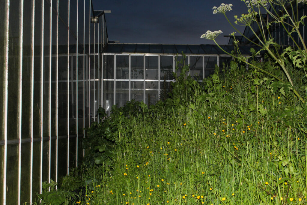
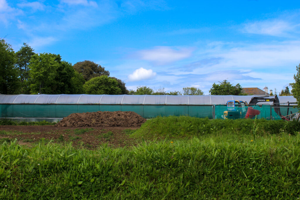
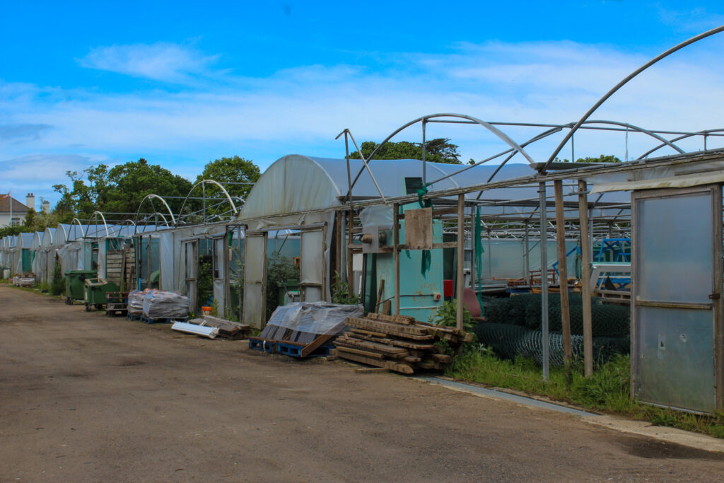
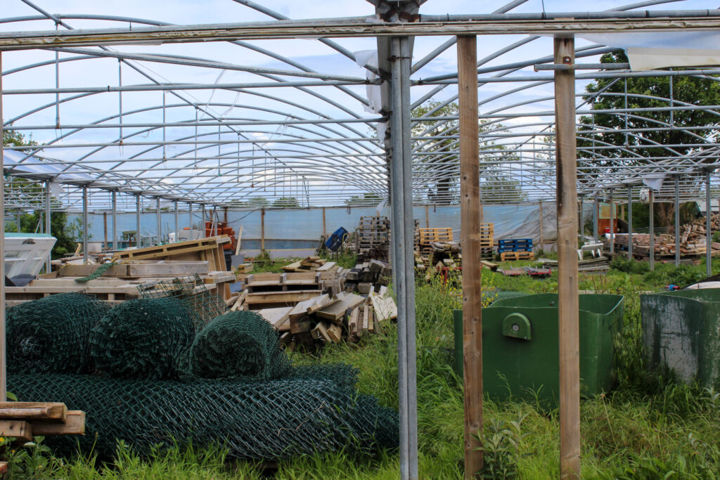
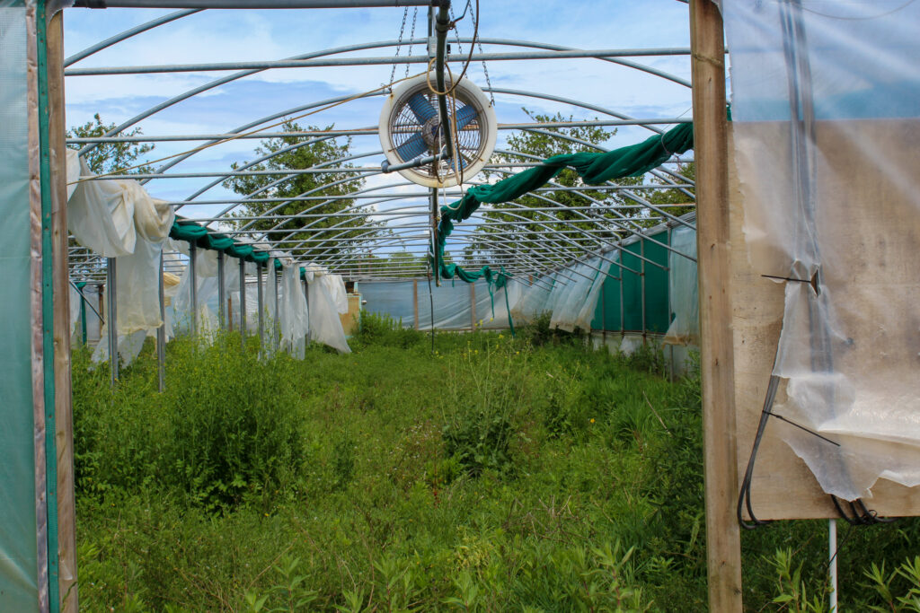
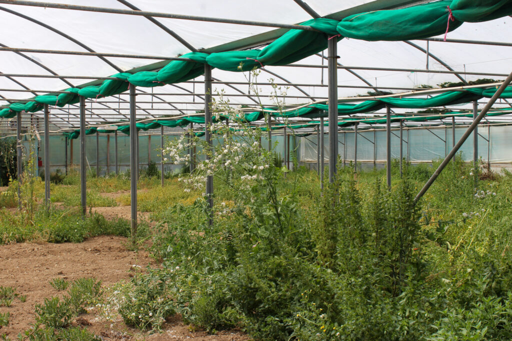
I took these images at a construction site near St John and the hospice charity shop in Trinity. Greenhouses relate to the theme of Anthropocene, because derelict greenhouses around Jersey was used for tomato and potato farming around the island. However, due to mechanical and chemical-based farming, they are no longer in use as human development has leaned more towards using synthetic fertilizer. This is a technique that relies heavily on synthetic fertilizers and pesticides to boost yields and control pests, which can have negative impacts on the environment and human health but produces higher yields in the short-term due to greed. This leaves the greenhouses vacant to catch dirt and sit there, not allowing the environment to thrive, instead forcing it to decay. On the 20th of January 2023, the Chief Minister stated:
“When glasshouses are redundant to the horticultural industry or are derelict, they should be removed, and the land restored to agricultural use.”
The current Bridging Island Plan, which covers 2022 to 2025, has a distinct policy on derelict and redundant glasshouses, which states that their redevelopment for non-agricultural use will not be supported. This means that the construction of more properties will be denied in order to salvage these spaces if they are truly redundant derelict greenhouses.
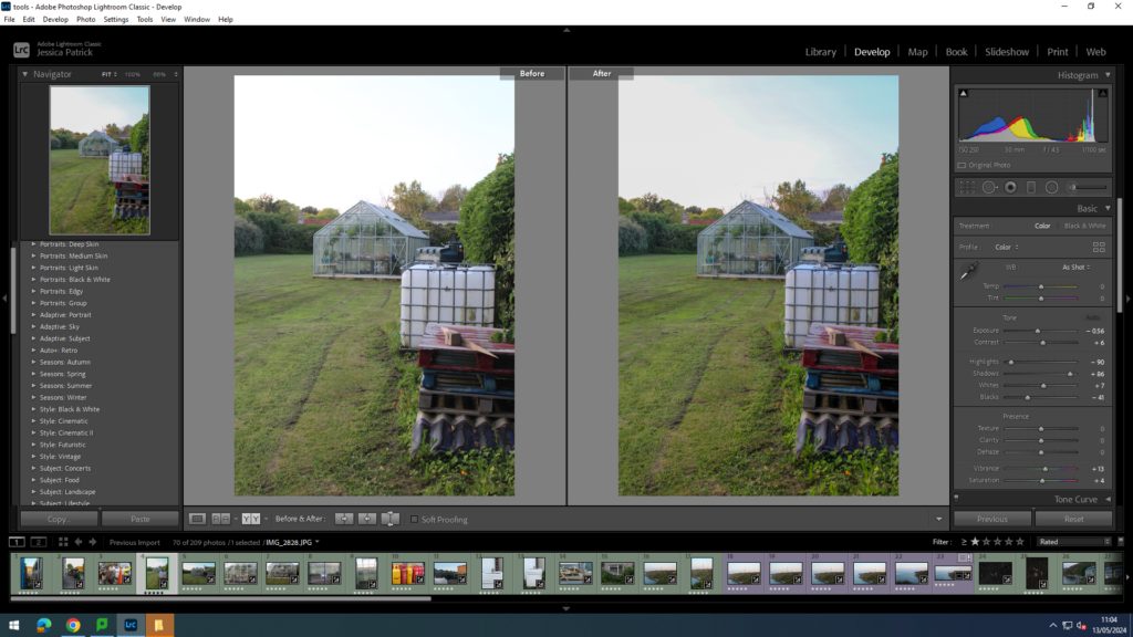
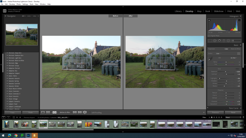
I edited these images by increasing the contrast, shadows, whites, vibrancy and saturation, while decreasing the exposure, highlights and blacks, so that the lighting was better, so the sky was less white and bright, but also so the greenery was more vibrant.
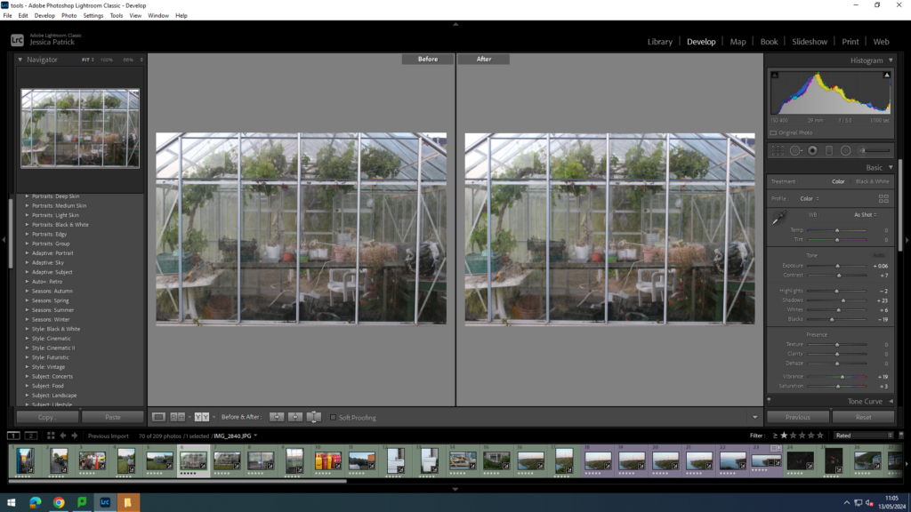
I edited this image by increasing the exposure, contrast, shadows, whites, vibrancy and saturation, while decreasing the highlights and blacks, so that the lighting was better, so that the viewer can see the contents inside the greenhouse better.
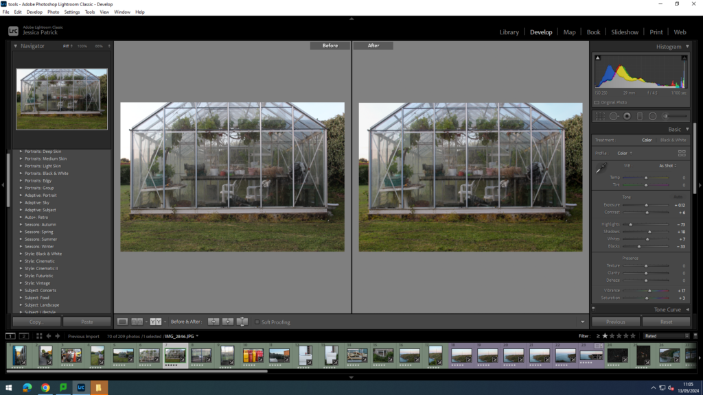
I edited this image by increasing the contrast, shadows, whites, vibrancy and saturation, while decreasing the exposure, highlights and blacks, so that the lighting was better, so the contents inside the greenhouse could be seen better, as well as making all the greenery more vibrant.
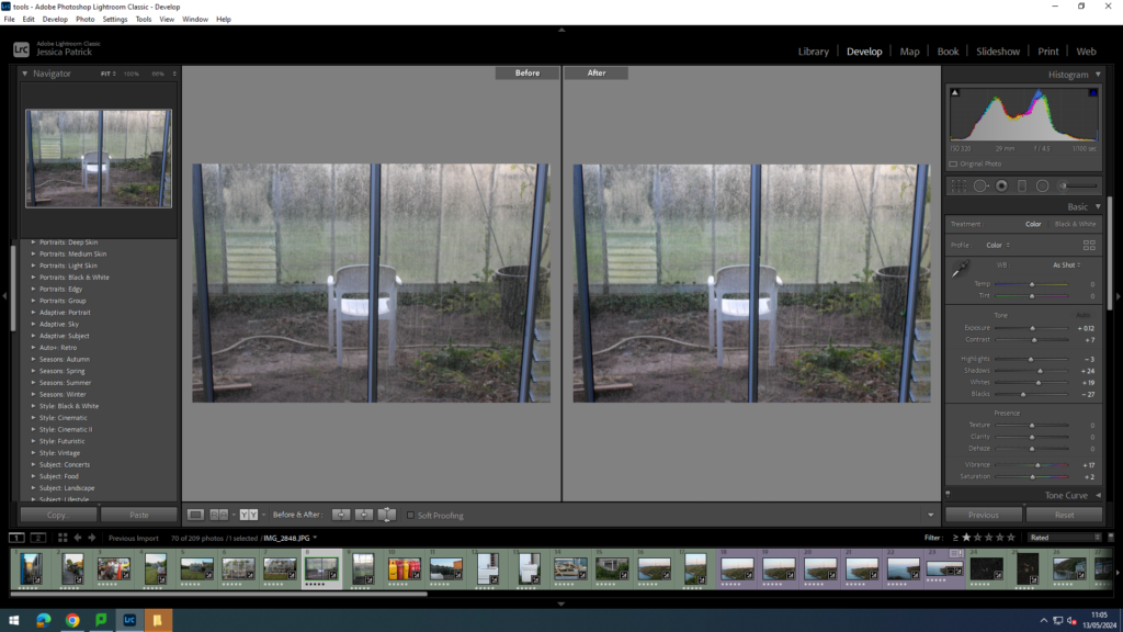
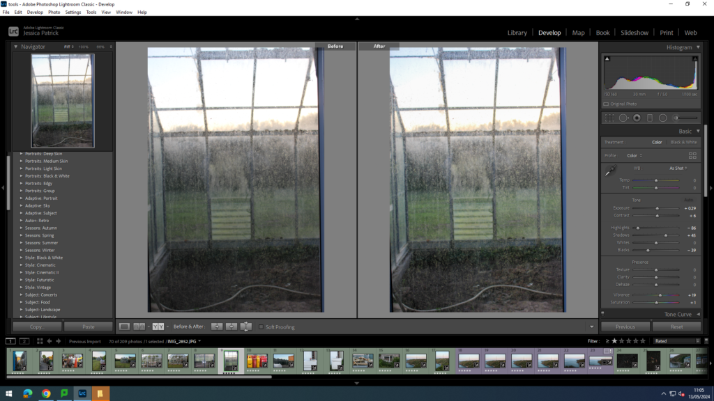
I edited this image by increasing the exposure, contrast, shadows, whites, vibrancy and saturation, while decreasing the highlights and blacks, so the dirt on these greenhouses could be seen better. I want the dirt on these glass walls to be seen better, to really stress how uncared for and used these greenhouses now are.
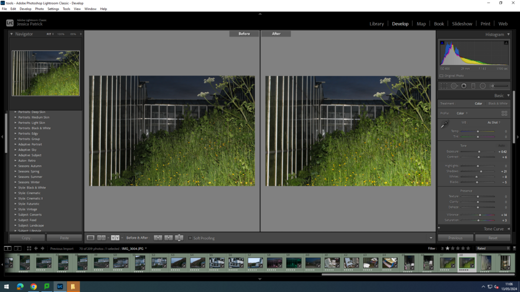
I edited this image by increasing the exposure, contrast, shadows, whites, vibrancy and saturation, while decreasing the highlights and blacks, so the image would be brighter, as it had gotten very dark by the time these photos were taken. I also wanted the greenery surrounding this green house to be more vibrant.
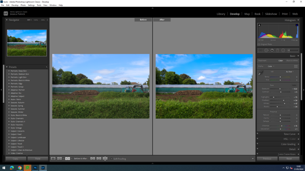
I edited this image by increasing the contrast, shadows, whites, vibrancy and saturation, while decreasing the exposure, highlights and blacks, to make the image more vibrant.
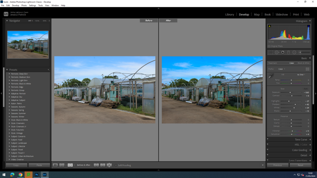
I edited this image by increasing the contrast, shadows, whites, vibrancy and saturation, while decreasing the exposure, highlights and blacks, so the image had more contrast and was more eye capturing.
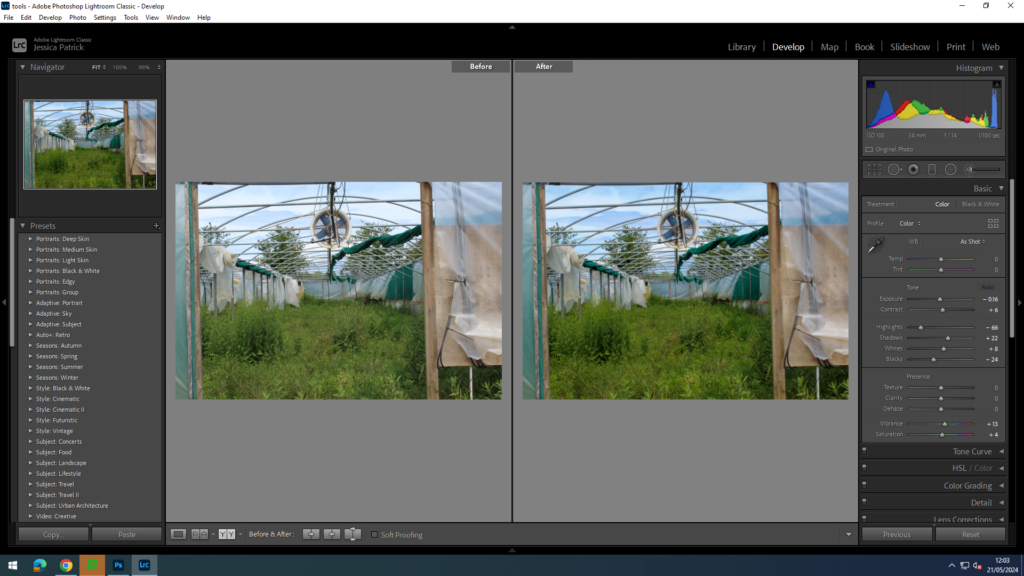
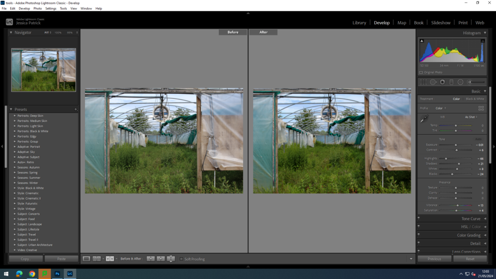
I edited these images by increasing the contrast, shadows, whites, vibrancy and saturation, while decreasing the exposure, highlights and blacks, so the image had better lighting and more vibrancy.
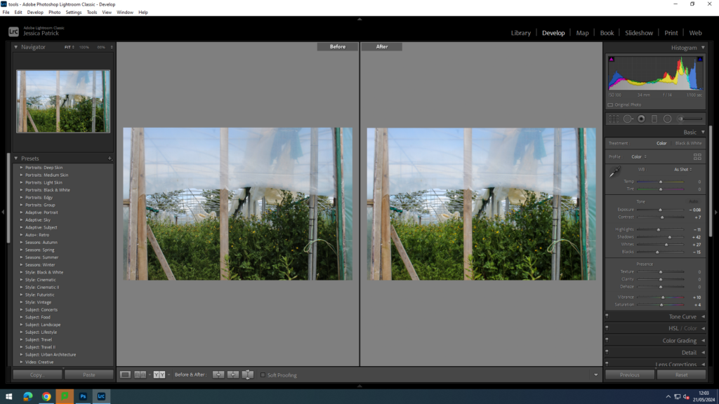
I edited this image by increasing the contrast, shadows, whites, vibrancy and saturation, while decreasing the exposure, highlights and blacks, so the lighting was better and the greens more vibrant.
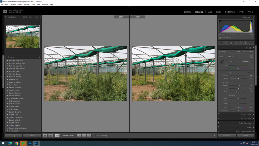
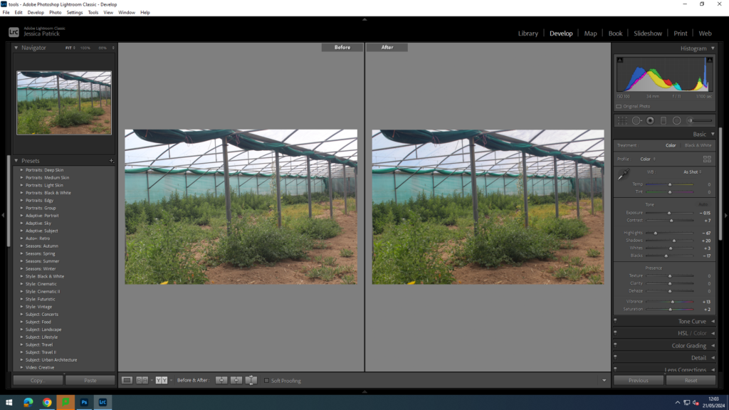
I edited this image by increasing the contrast, shadows, whites, vibrancy and saturation, while decreasing the exposure, highlights and blacks, so the greens were more vibrant, so it created more of a contrast between the greenery, green house walls, and the brown dead floor.
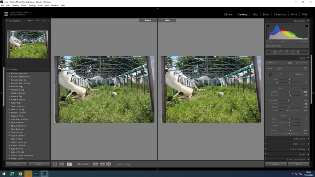
I edited this image by increasing the contrast, shadows, whites, vibrancy and saturation, while decreasing the exposure, highlights and blacks, there was more contrast between the more vibrant greenery and the damaged white tarps that are blowing in the wind.
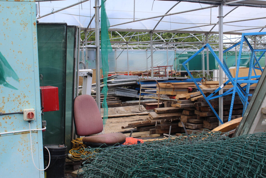
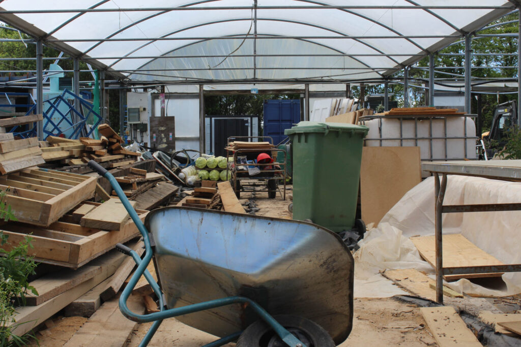
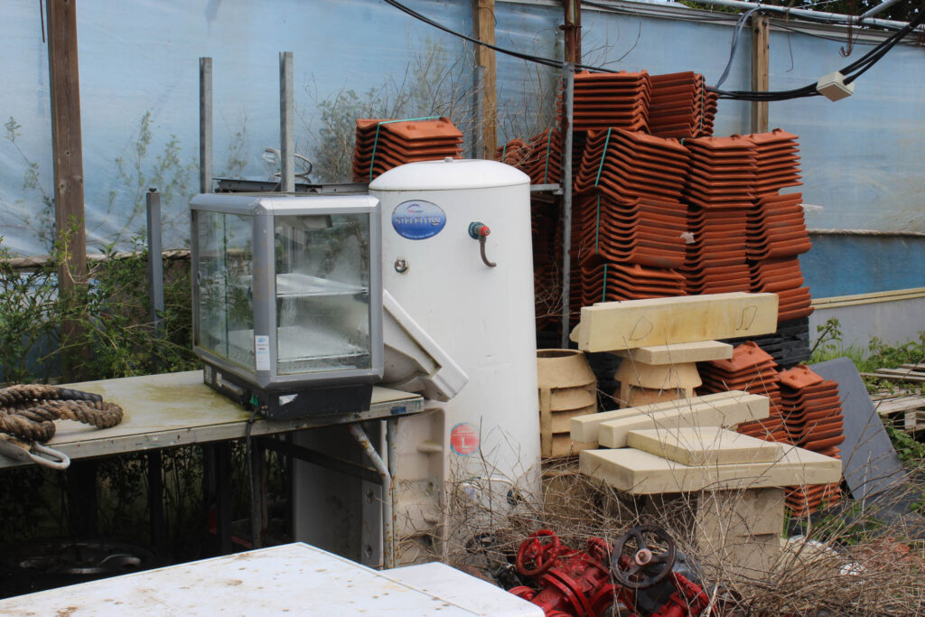
I prefer these last few images of greenhouses, because they really show how uncared for these green houses are and how they are no longer used. These greenhouses were extremely damaged and were not even used as greenhouses anymore, but used for storage instead, as can be seen below.
Top 8 Final Images
A minimalistic approach
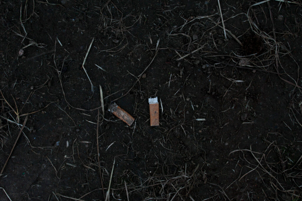
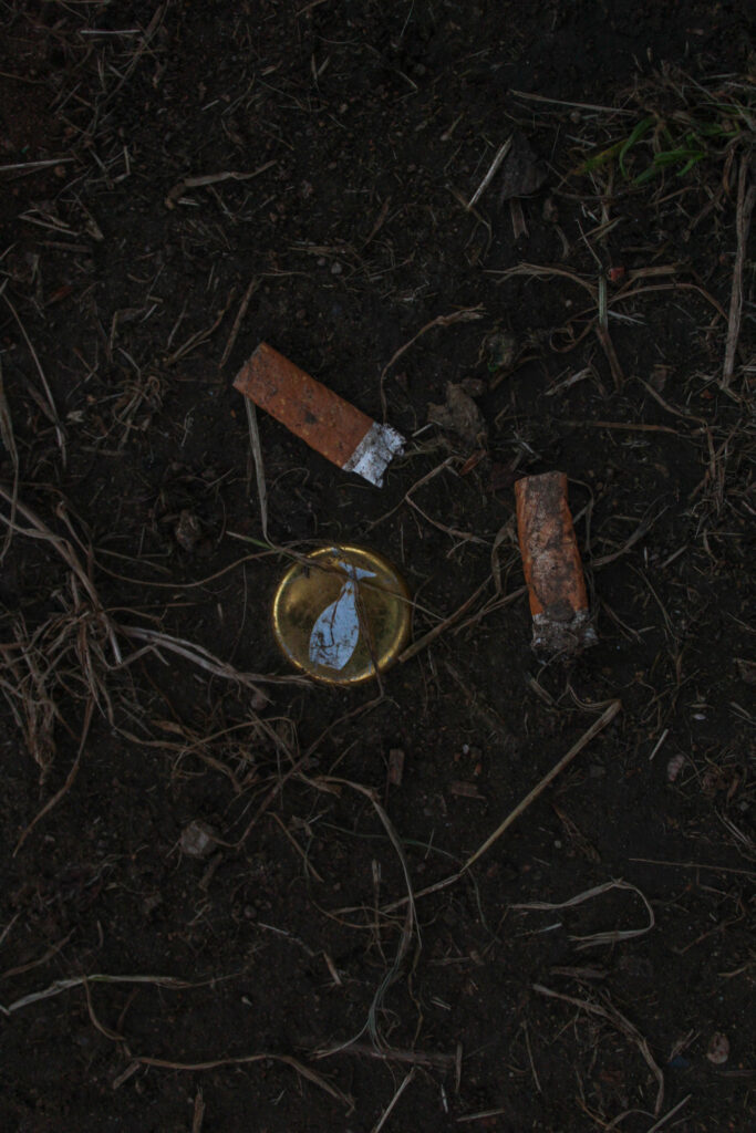
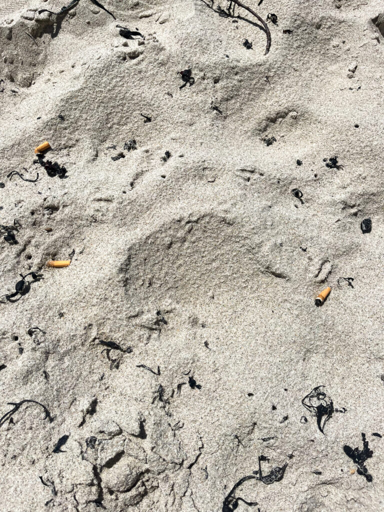
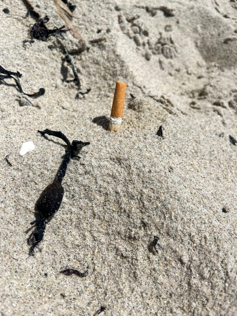
For this approach I took pictures of smaller pieces of rubbish that people don’t usually think about, such as cigarette butts and bottle caps etc. but make a huge impact on our environment, because they build up a lot. These are also very harmful for animals, because these things are small enough for animals to eat, but they are not the right source of food for protein, and they are nearly impossible to digest.
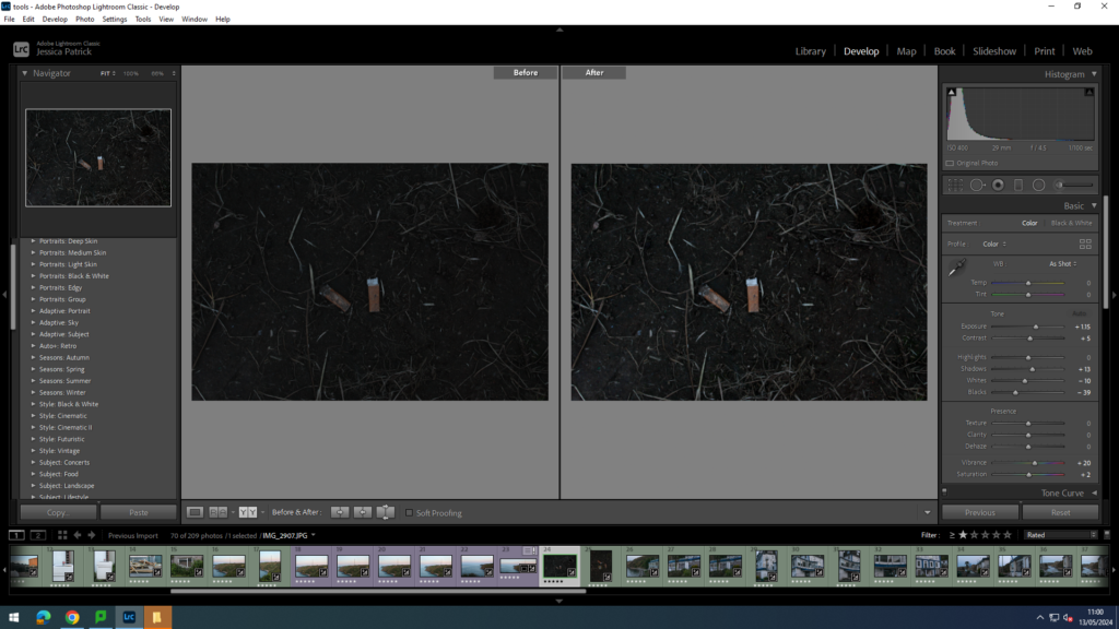
I edited this image by increasing the exposure, contrast, shadows, vibrancy and saturation, while decreasing the whites and blacks. I did this, so that the cigarette butts would stand out more against the dark mud and in the dark lighting.
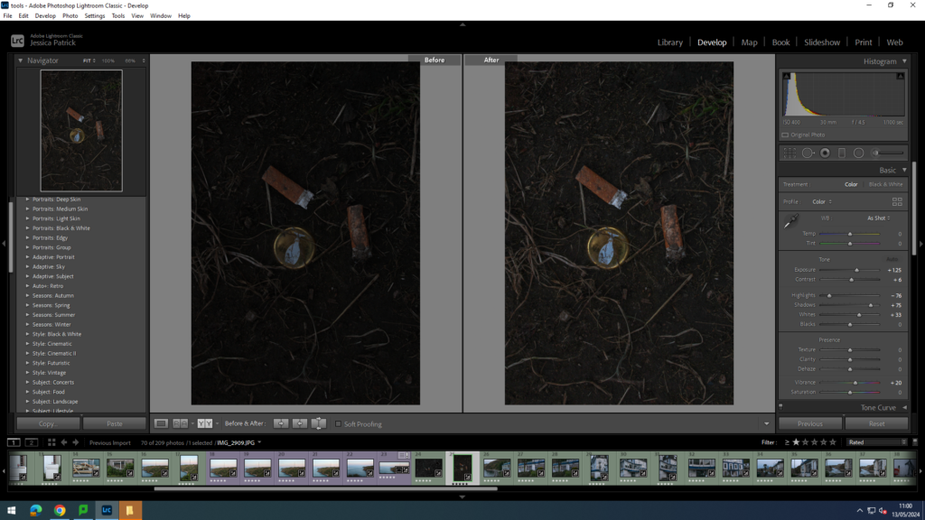
I edited this image by increasing the exposure, contrast, shadows, vibrancy and whites, while decreasing the highlights. I did this, so that the cigarette butts and bottle cap would stand out more against the dark mud and in the dark lighting.
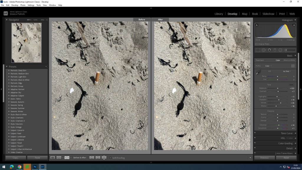
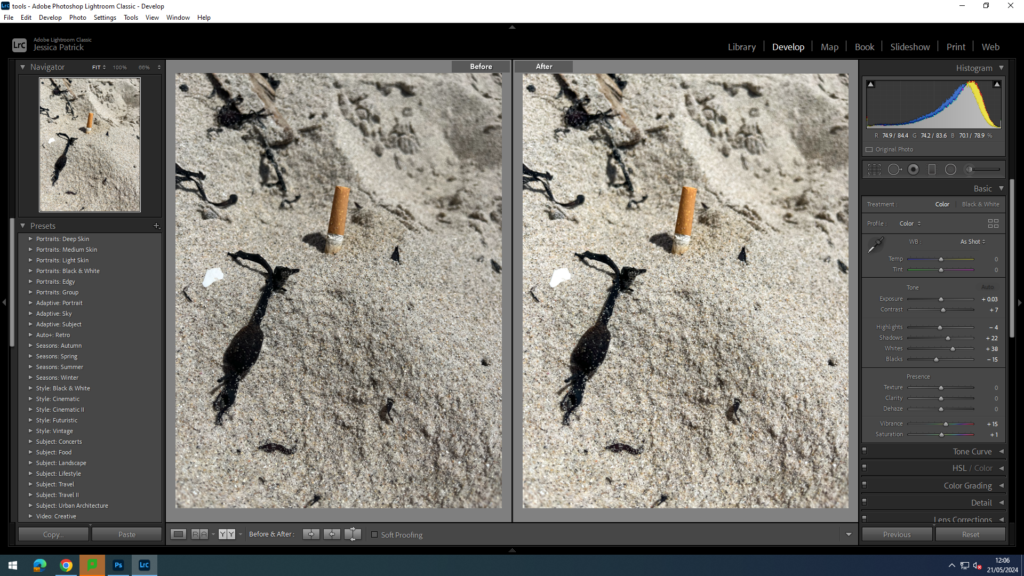
I edited this image by increasing the exposure, contrast, shadows, whites, vibrancy and saturation, while decreasing the highlights and blacks. I did this, so that the cigarette butts would stand out more and be more vibrant.
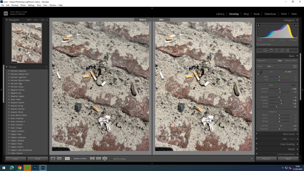
I edited this image by increasing the exposure, contrast, shadows, whites, vibrancy and saturation, while decreasing the highlights and blacks. I did this, so that the cigarette butts would stand out more and be more vibrant.
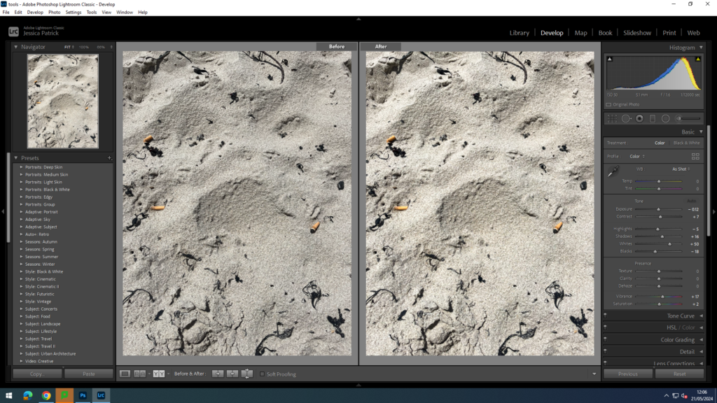
I edited this image by increasing the contrast, shadows, whites, vibrancy and saturation, while decreasing the exposure, highlights and blacks. I did this, so that the cigarette butts would stand out more and be more vibrant against the beige sand.
How Do these Images Relate to the Theme of Anthropocene?
These images relate to the theme of Anthropocene, because they show that even the smallest bits of rubbish, that rarely anyone thinks about does still make a massive different, especially cigarette butts, because so many people smoke them, so they are on such a large scale being littered.
Top 6 Final Images
