Anthropocene Virtual Gallery and Evaluation

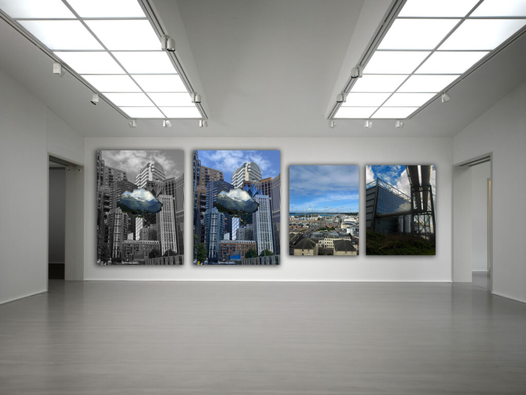
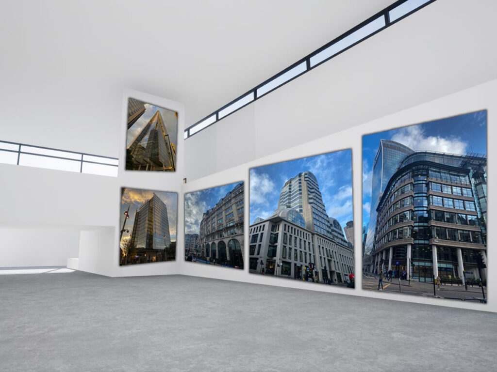
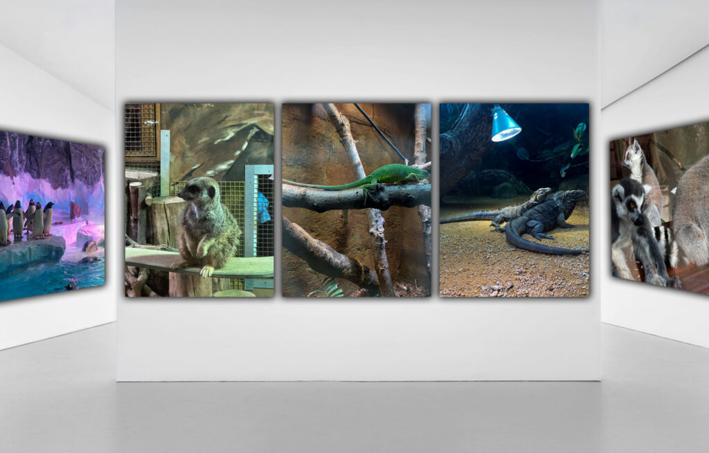
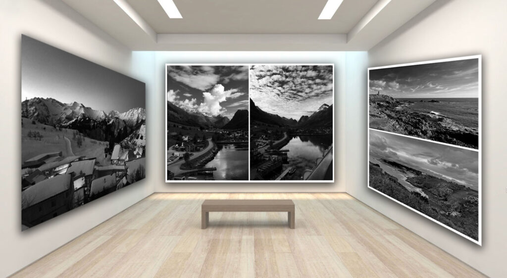
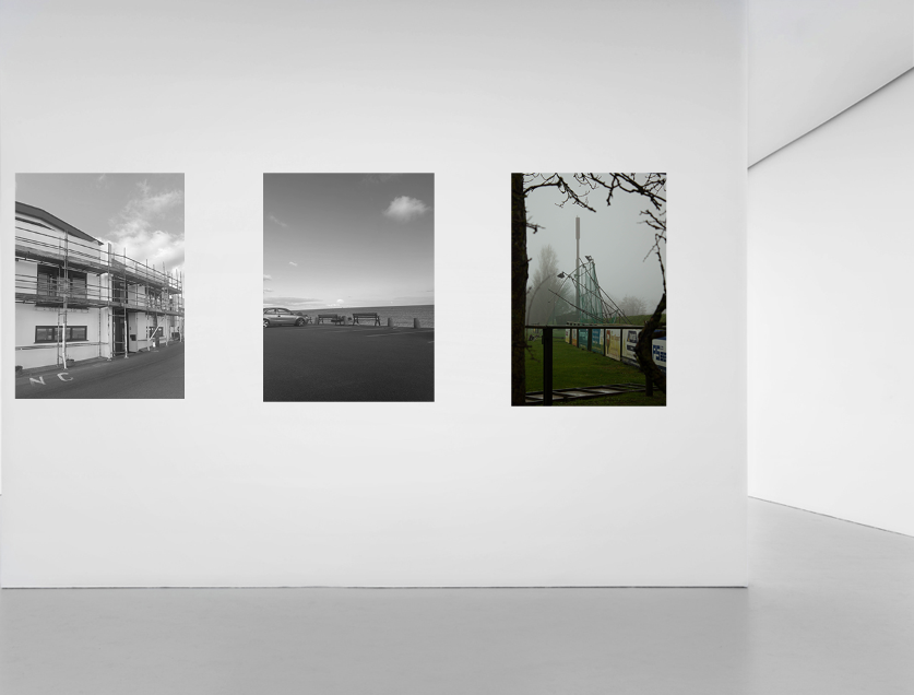
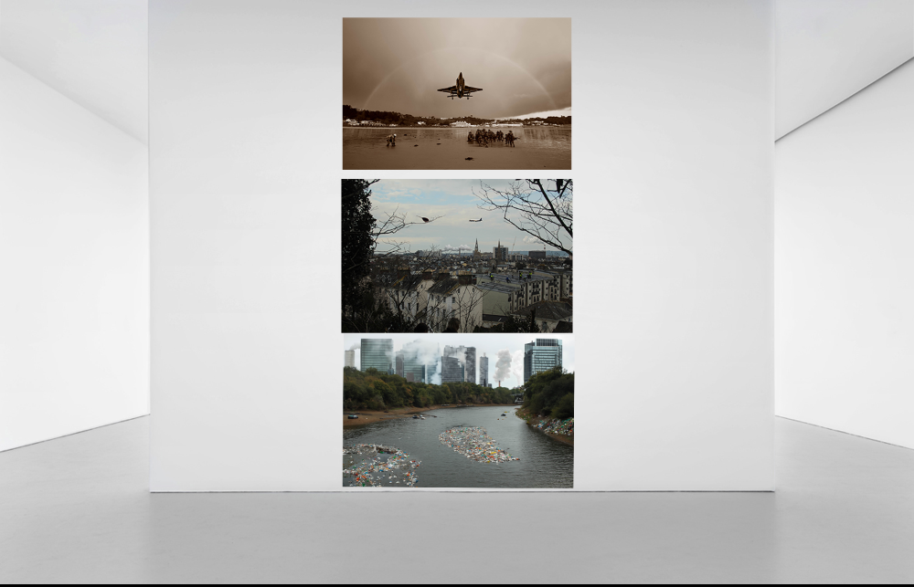
Throughout the time I have spent learning and researching about Anthropocene, I feel like I have gained a good understanding on the topic and understand what the word means (human kinds impact on the Earths natural environment). For my Anthropocene project, I decided to focus on urbanisation, industrialisation, overpopulation, natural landscapes and artificial animal habitats. For urbanisation and overpopulation. I decided to take photographs of what I saw whilst in central London, to which I captured many buildings all clustered together and crowds of people everywhere. This highlighted to me how severely humankind have expanded and built on the earth; stripping it of its natural beauty. Additionally, for industrialisation, I went down to Havre Des Pas and carried on walking along the side of it until I reached La Collette. From here, I took photographs of the incinerator and waste disposal building. Next, for the natural landscape images, I visited various beaches/ cliffsides around Jersey and photographed the view. I decided to take these images as a way to spread hope for future generations and hopefully inspire people to help them realise that we can have this natural beauty and beautiful views if we stop harming the planet so much. Finally, I took photographs of different animals in their artificial habitats in the zoo. This idea was inspired by Zed Nelson who does something similar and I found it ironic how humans are stripping animals of their real, natural environments in order to put them in artificial ones, simply so we can be entertained.

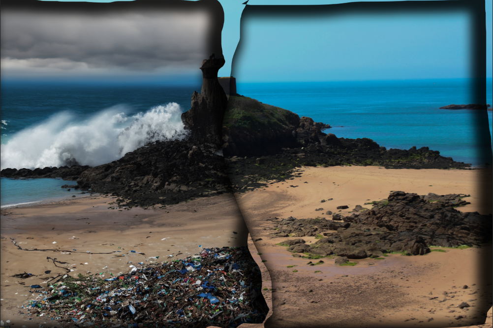
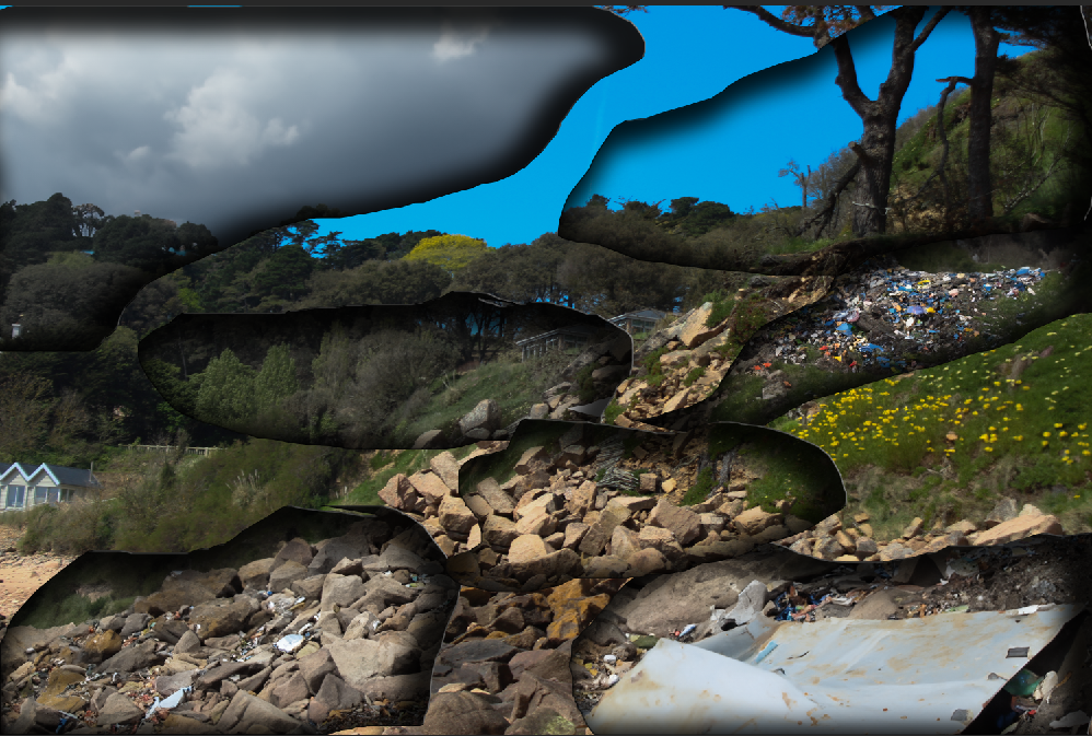
Overall, I like how these images came out as they are in focus and the majority have good lighting. The images with lots of buildings stacked on top of each other was inspired by Giacomo Costa. I felt this linked to the theme of Anthropocene as it is almost exaggerating further how overbuilt and crowded our planet is. However, this may not be an exaggeration but a reality for what our planet is going to look like in the future if we don’t stop building and expanding so much. I then decided to further experiment with this idea by adding a crack like shape into the centre of the image and then adding one of my natural landscape images behind it, creating a clear comparison between the two different types of landscapes. Finally, I wanted to further emphasise the difference between the two landscapes and so I decided to make the building layer black and white then the natural landscape layer coloured.

This photoshoot was inspired by Zed Nelson. In order to create these photographs, I went to different zoos in London and Jersey. I then focused on taking photographs of animals with unnatural backgrounds eg paintings of real landscapes or artificial lights. I tried to place my camera as close to the glass as possible in order to minimise any glare or reflections but this wasn’t always possible. However, I think having some of the images with visible glare/ reflection is successful in reminding the people who are looking at these images that these animals are stuck behind glass and in cages, restricting them from the real world. Therefore, by reminding people of the conditions these animals are in, it may lead to people wanting to help them and hopefully provoking positive changes. I think these images turned out well as the focus and detail is good and I think it successfully replicates the work of Zed Nelson and links to the theme of Anthropocene by highlighting how humans are destroying animals natural habitats just to recreate them in an artificial way.

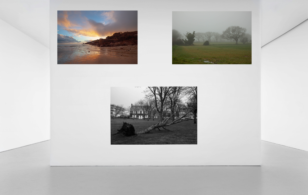
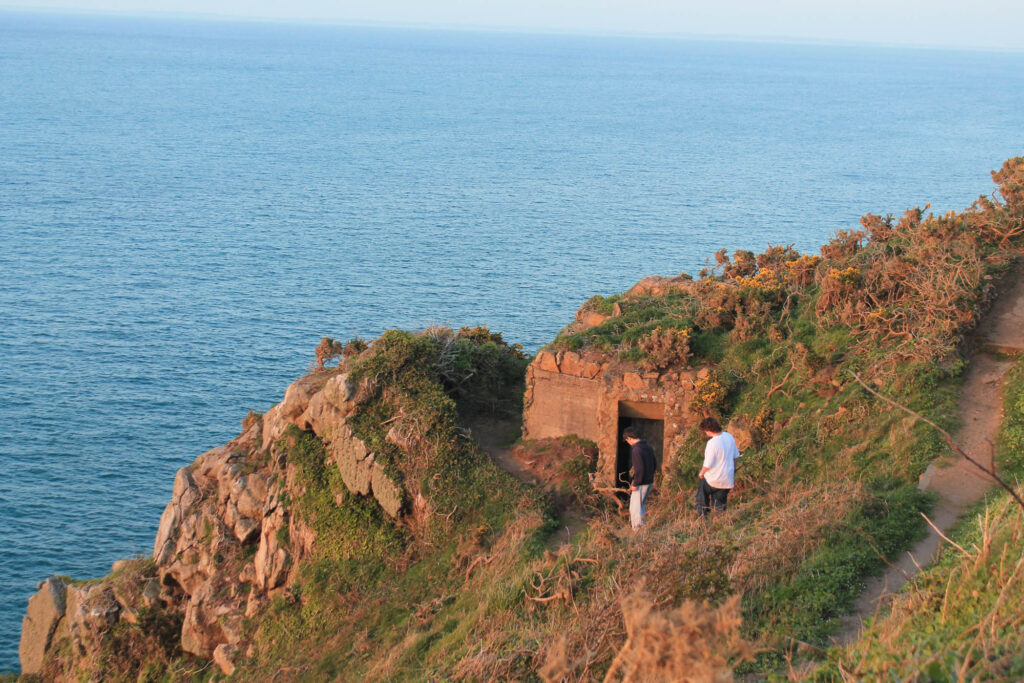
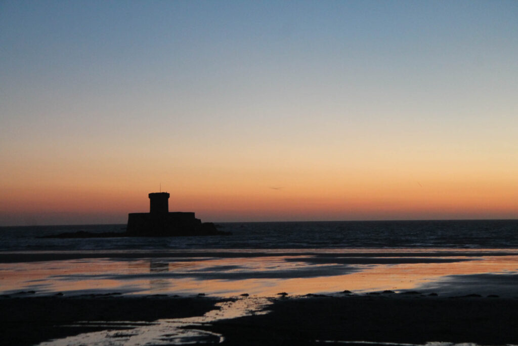
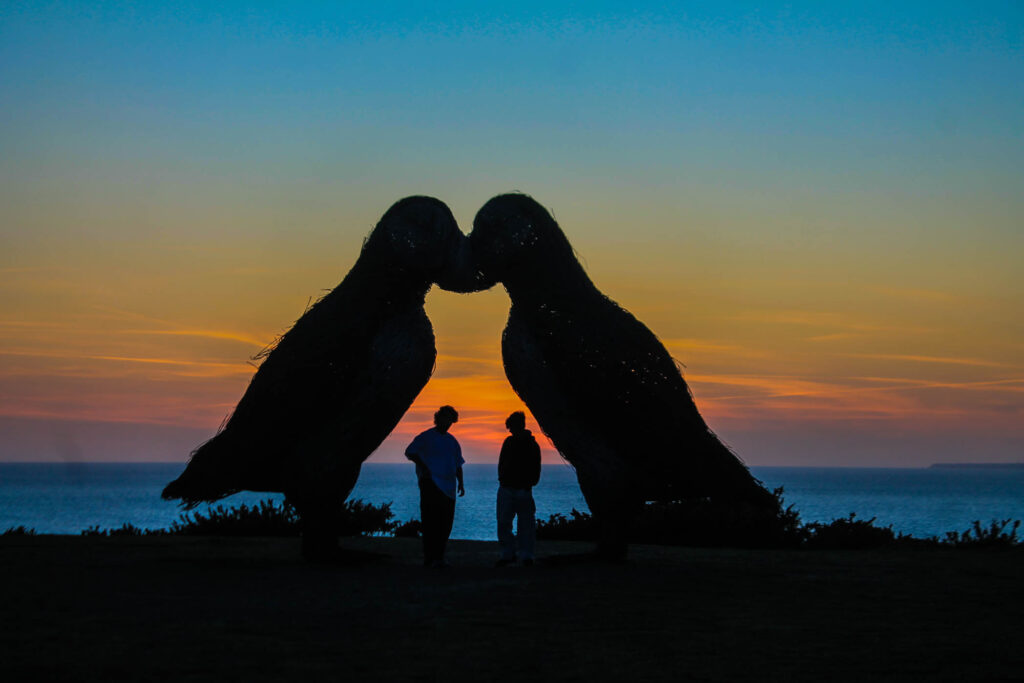
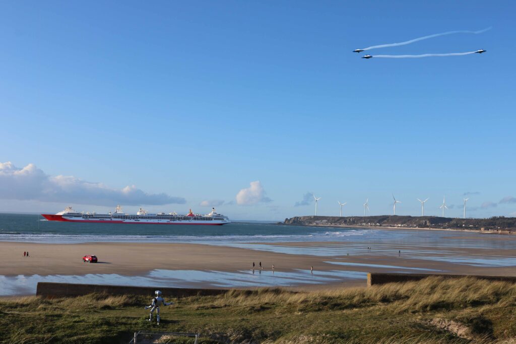
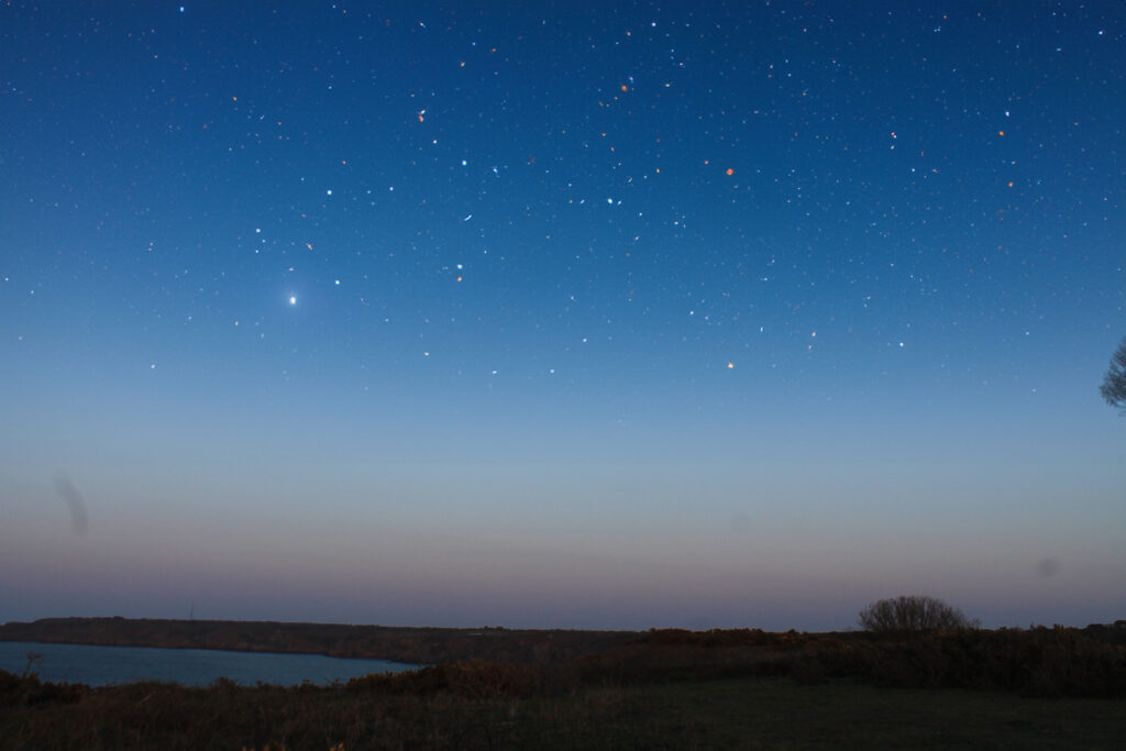
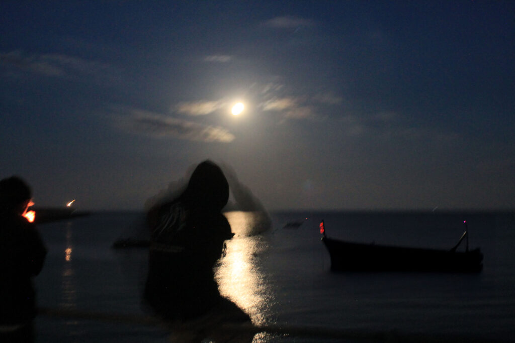
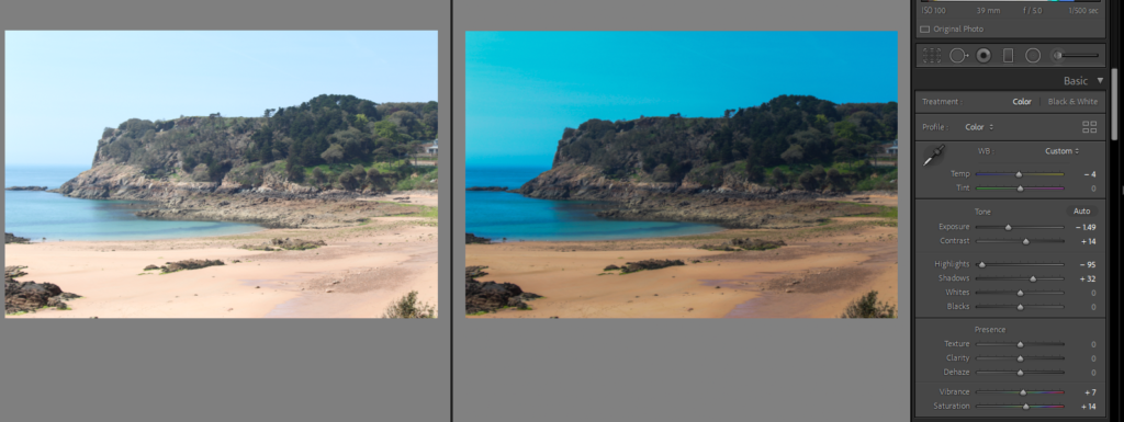
For this photoshoot, I wanted to capture the natural beauty of the Earth. These images were taken in many different places like Norway, France and Jersey. I decided to take these more positive images as a way to bring hope to people who are looking at them. By highlighting the natural beauty our planet already has, it may hopefully cause a realisation for people that by building such vast amounts of buildings, we are hiding beautiful views. I also wanted to capture some manmade structures in some of my images to portray the idea that we can live simultaneously together and it doesn’t mean that humans should just demolish everything we’ve built but instead compromise and protect certain places from being built on and destroyed. Overall, I think this photoshoot came out well as I think I managed to successfully capture the beauty of the landscapes I was photographing. Some of my images were also inspired by Ansel Adams and romanticism as I turned the images black and white and manipulated the sky into making the clouds more prominent and powerful, creating a different kind of vibe to the image.

Anthropocene photoshoots –

photoshoot 1 ( pollution ) –

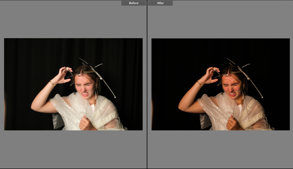
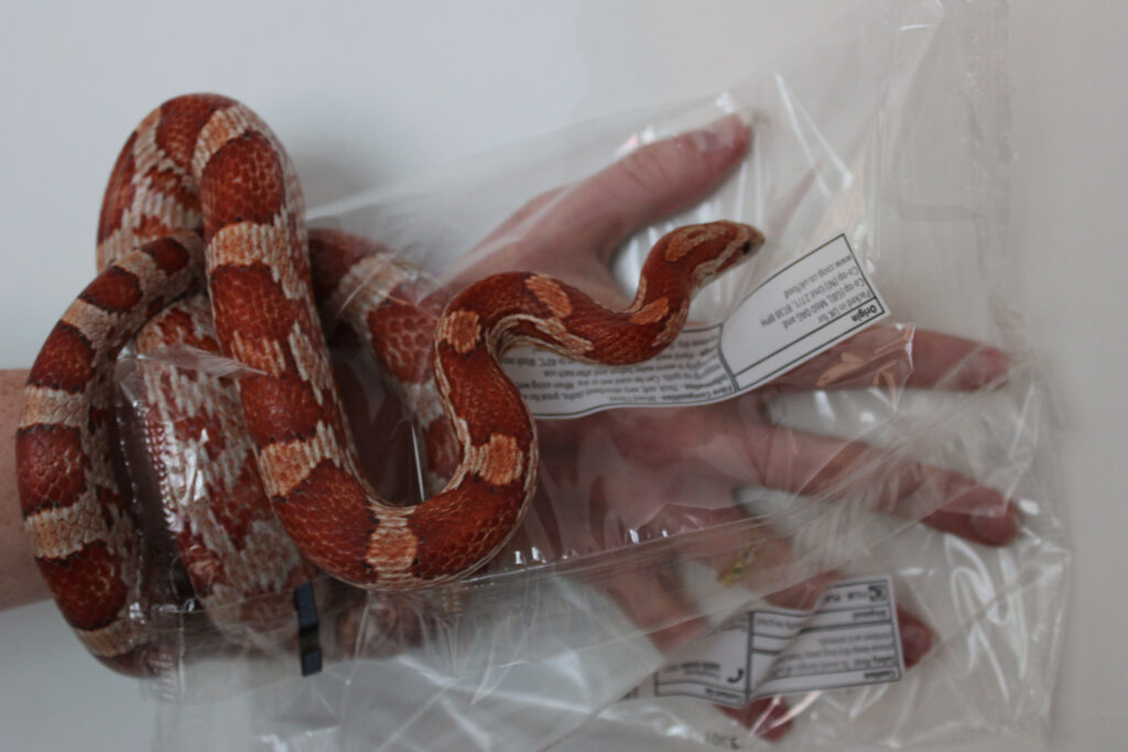
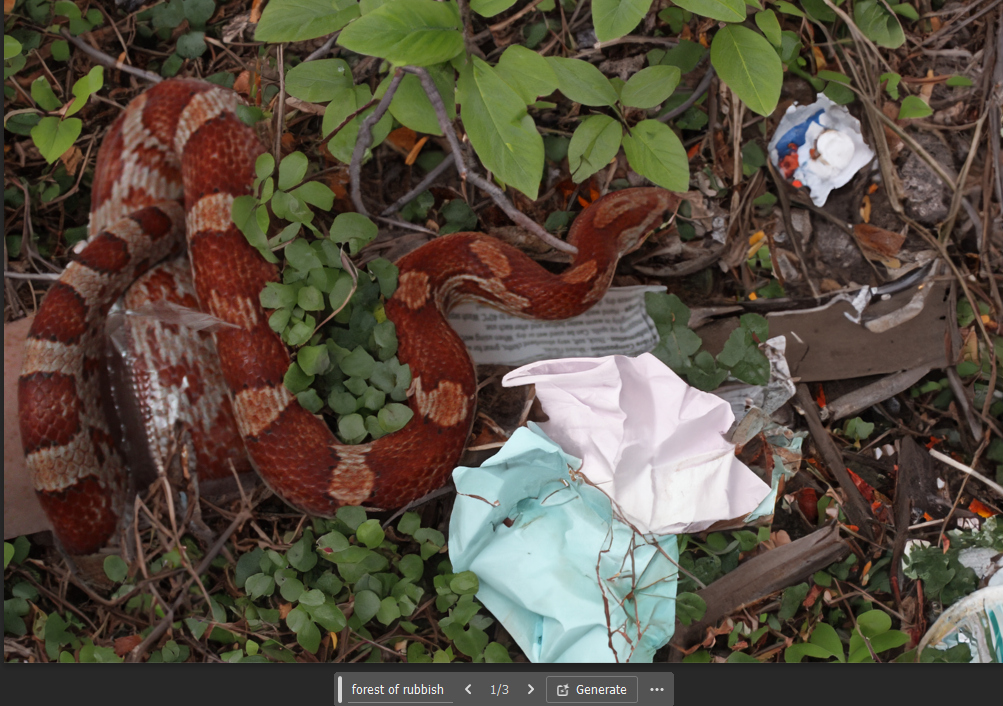
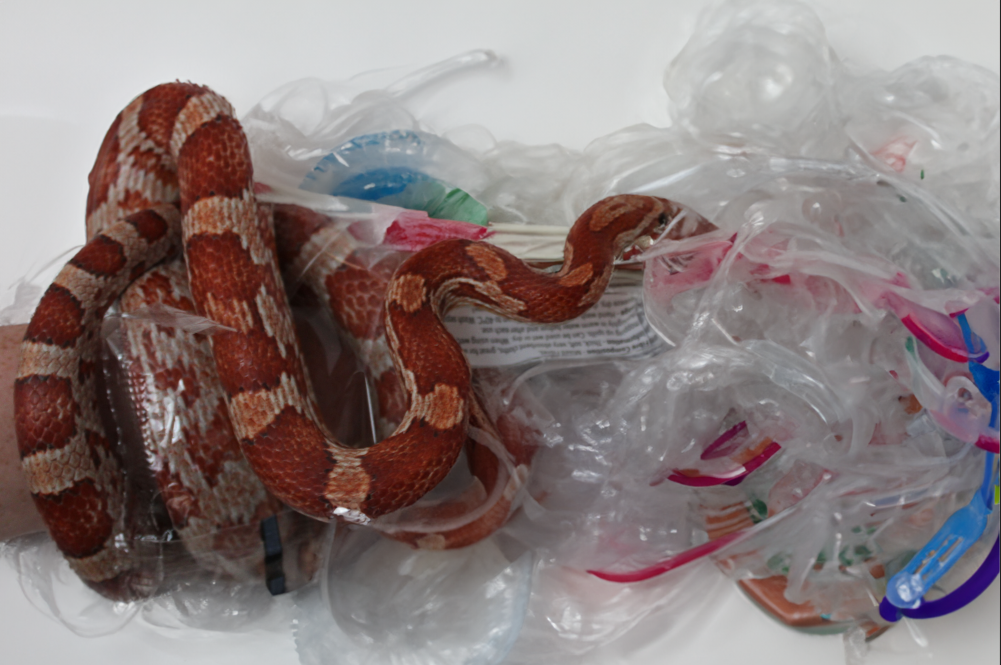
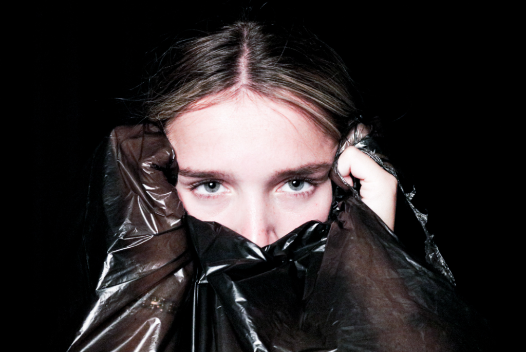
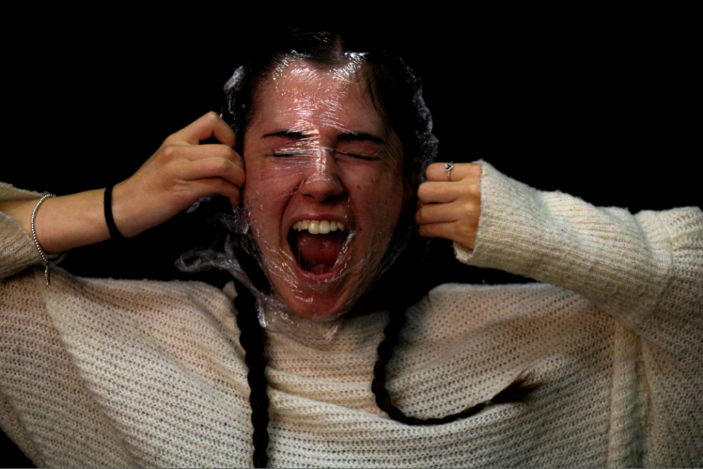
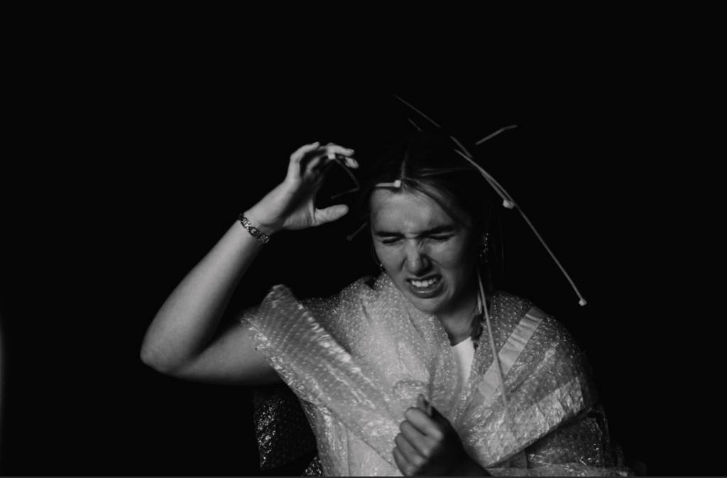
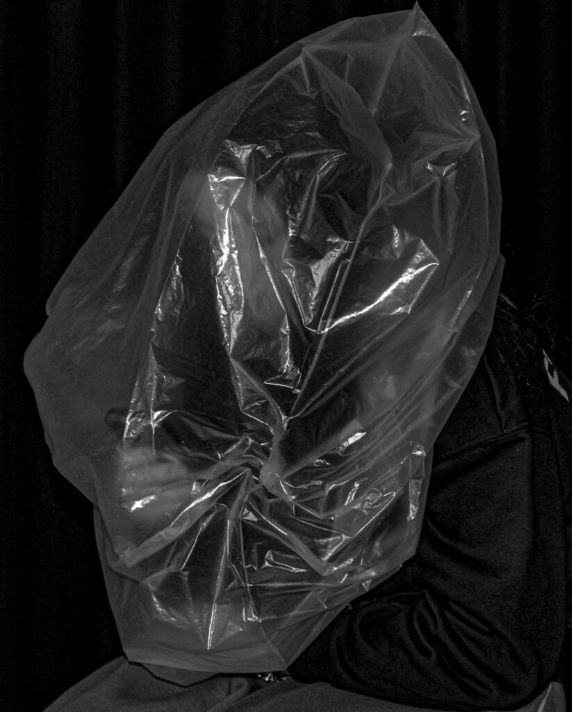
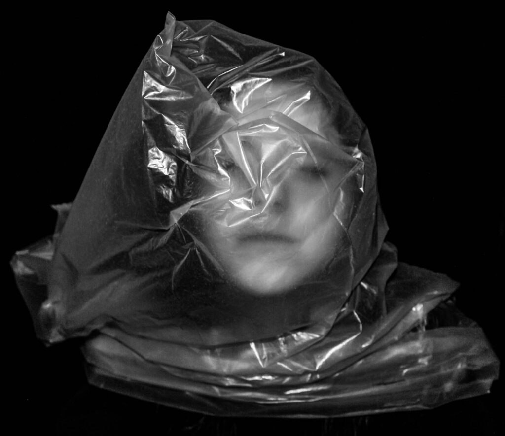
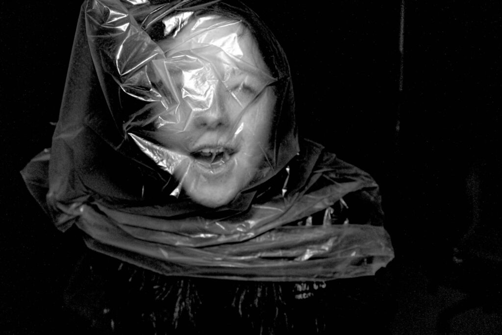
For this photoshoot, I wanted to include portraiture as well as including the issues from my topics. I wanted the use of plastic bags and zip ties to not only show the excess of plastic and pollution in the world but also the restraint that it has on the human race and the advancement that could be, if it wasn’t as big of an issue. The zip ties were a perfect way of showing the world being ‘held back’ and restrained because of the grip that zip ties have, and the difficulty that comes with taking them off. The zip ties signify the lasso that plastic and pollution have around the world and the major worldwide issues that it causes.
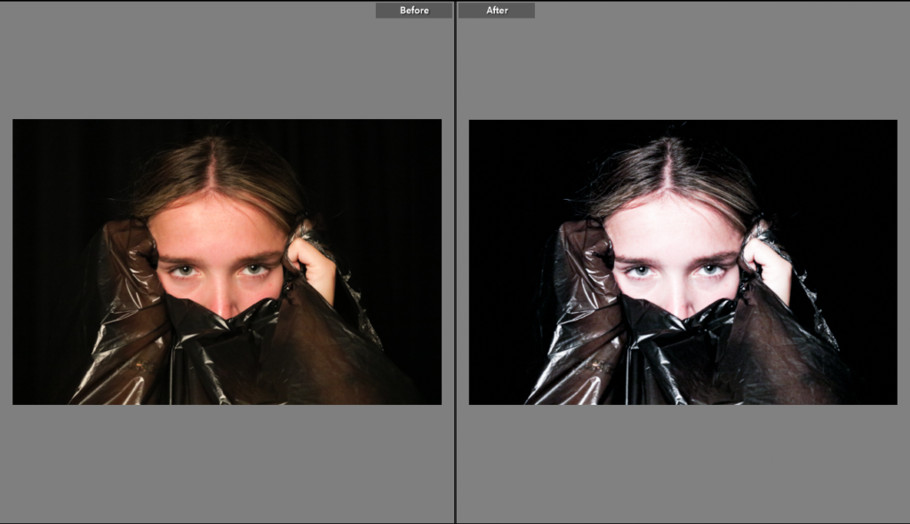
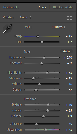
For this first photograph, I wanted to give almost a lifeless and colourless tone to it to show a feeling of hopelessness and despair.

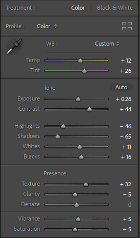
The use of intensifying the highlights and lowering the shadows, was to offer a feeling of almost being lost. This would hopefully show how lost we are at the thought of the state that our world is in and the damage that has been created. I wanted to enhance the vibrancy to almost give a hue of colour to the photo to show that there is hope for the world.

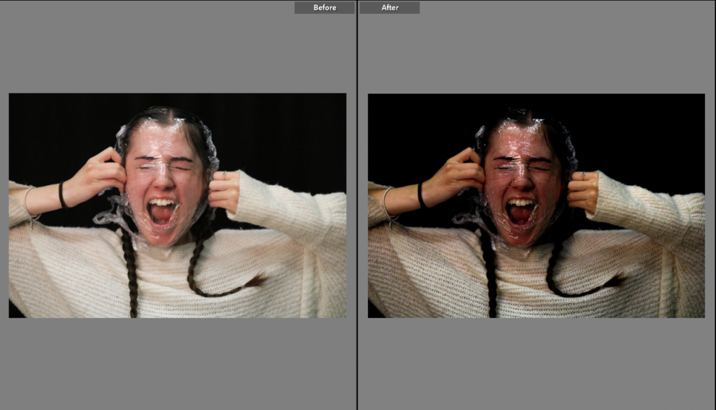
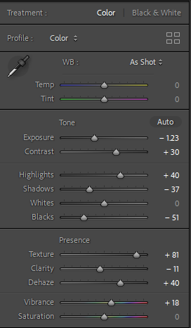
This photo has a similar feel to it and the idea of breaking away from the issues that we’ve caused in the natural world today. The use of cling film was to show the plastic almost being like a barrier that we need to get past before we are able to be ‘okay’, and a stable environment again.

For this photo in particular, I wanted to accentuate the texture to show the unfiltered model ( Lila ) to expand on the idea that this issue is not something to joke about and is in fact a real life problem that millions are facing. I still wanted to lower the shadows because of the idea that we are fearful and almost stuck with this problem till we do something about it.

I didn’t do many changes to this photo due to the photo itself being quite straightforward in showing the problems I’m talking about and trying to show.

I wanted to make this photo overall clearer and almost warmer. This is to show the global warming side of the issue. I lowered the shadows to show that these issues shouldn’t be hidden any longer and the fact that higher powered people in society are hiding the extremity of these problems are almost as damaging as the problems itself.
Photoshoot 2 ( over crowding ) –

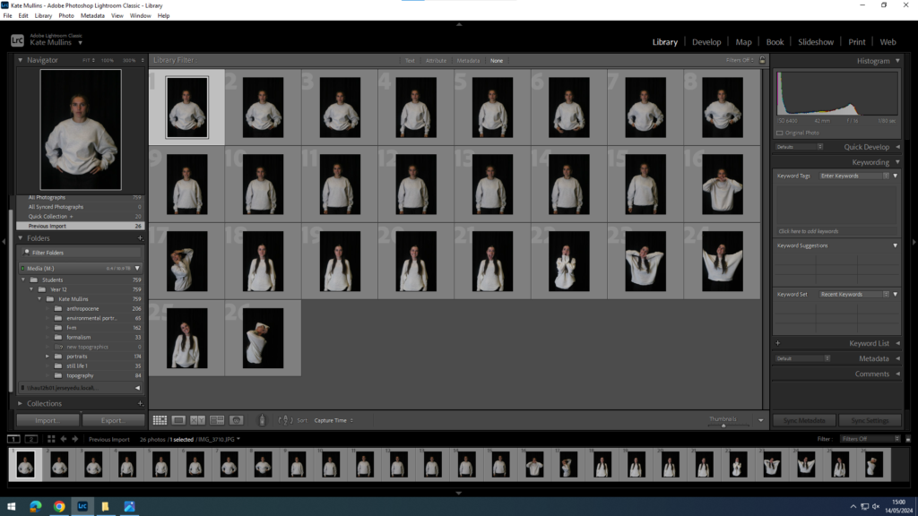
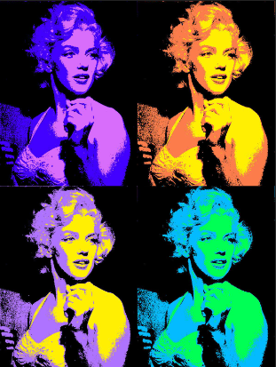
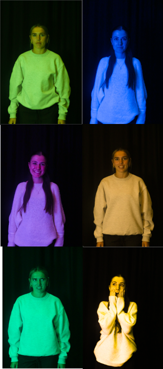
For this photoshoot, I limited the amount of photos I took because I wanted it to be as natural as possible and almost not a staged photoshoot. I stemmed the design/layout idea back to the idea of including Topographics ( repeated photos, or similar photos ) I was looking into Andy Warhol and his designs of his paintings and collages, and I thought this would be a great way to show my ideas and also make them more prominent visually.

Photograph 1 –

Photograph 2 –

Photograph 3 –

Photograph 4 –

Photograph 5 –

Photograph 6 –

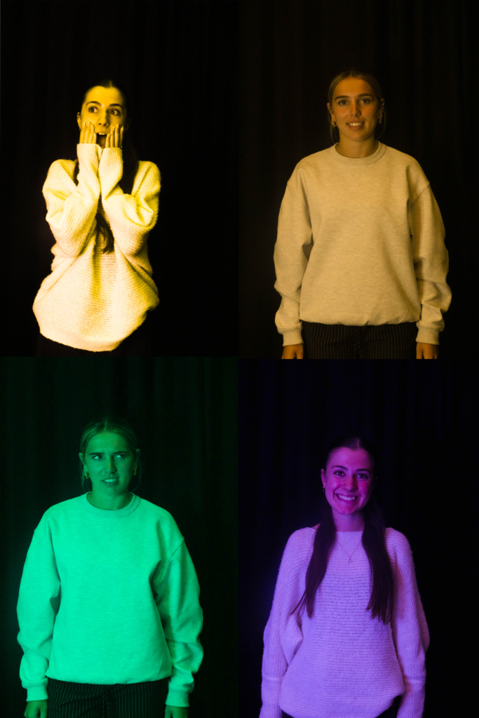
My idea for these photos is I am going to assort them into a collage of 6 photos, each model having three photos that match the expression of each other, on each photo.

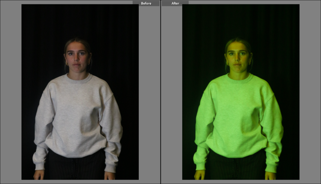
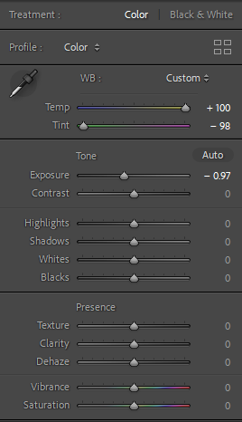
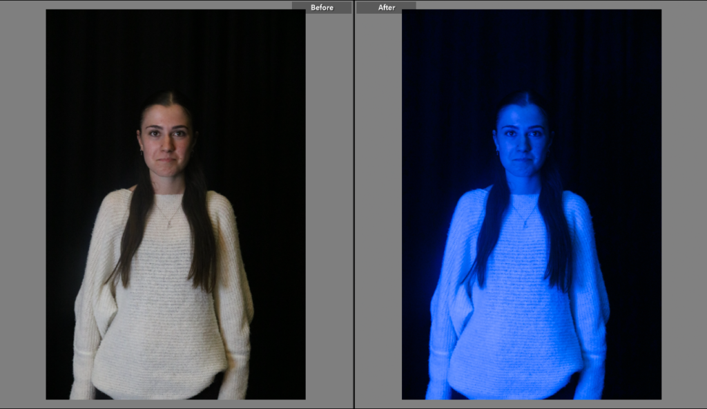
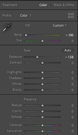
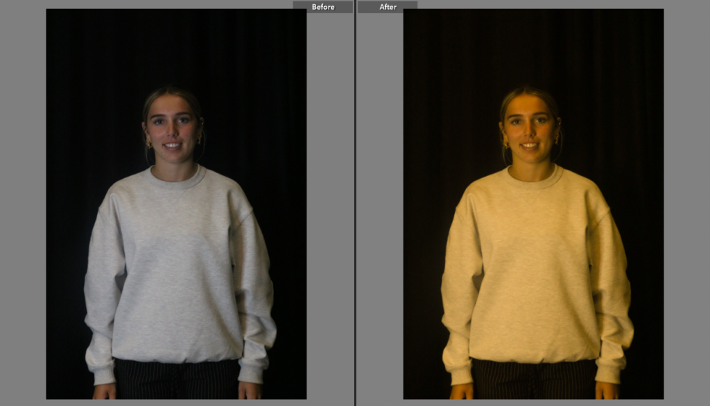
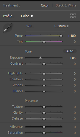
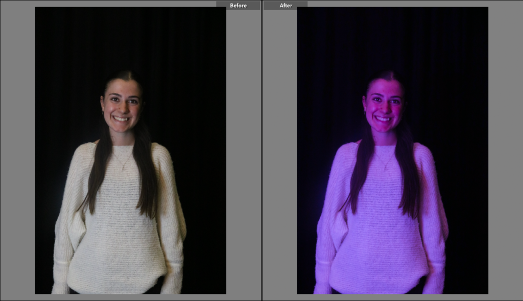
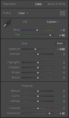
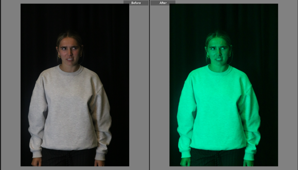
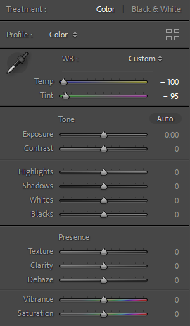
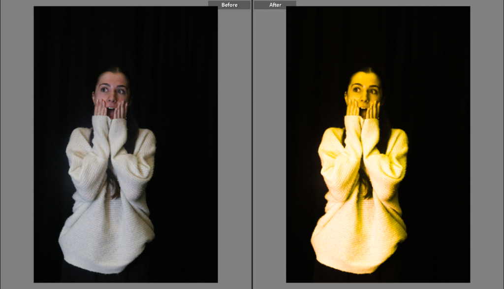
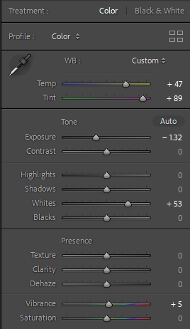
I’ve placed a colour over each photograph and changed the saturation, vibrance, tint, exposure, some of the tones and temperature of each photo too, to give variety and almost show contrast in different ways.

I’m going to place all photos in a 2/6 grid with each expression opposite each other in almost a similar way to this photo :

Photoshoot 3 pollution –

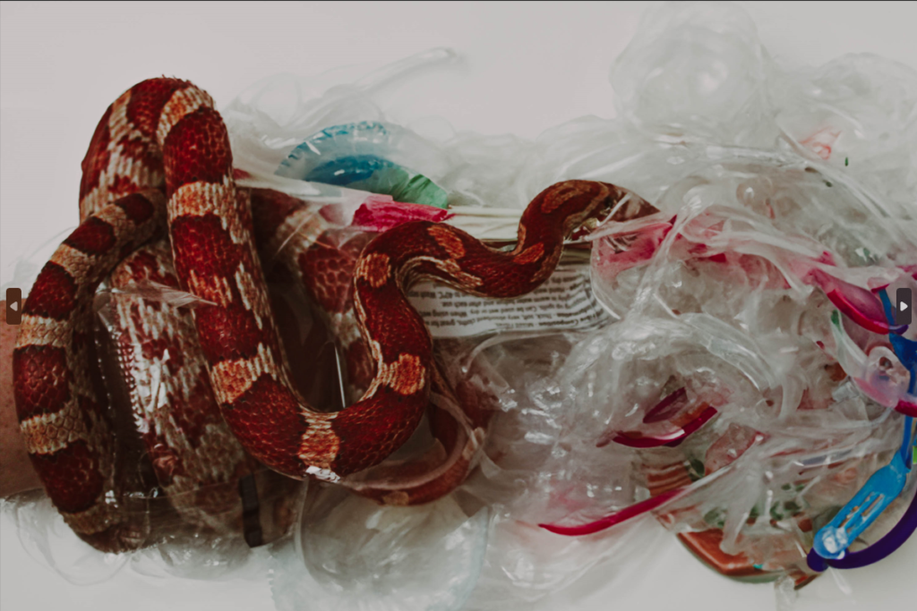
I decided to include the idea of animals in my photoshoot because not only does pollution affect the human population and how we live, but it also affects the animal habitat and how animals live their lives and the struggles that they have to live with due to the poor decisions that we make as a race concerning the environment.

photograph 1 –

This photo symbolises the idea that people have the power for this problem to not affect animals and their habitats however we just decide not too.

All I wanted for this photo was to enhance the clarity to make the photo better overall and make it look a little more put together since the photo was difficult to get in the first place.

Photograph 2 –

Edits –

For this edit, I wanted to use an AI generator to help morph ideas together but for this edit in particular it didn’t work very well but I am going to make a few drafts.

With this edit I thought the idea of still having the human hand in the edit would be quite a good idea, because humans have full control over the issue at hand.

My final photo’s for overpopulation –

For my final photo, I wanted to include emotions into the photo to not only make it more eye-catching and almost more expressive. The issues that the photo portrays can cause a variety of emotions depending on the person and I though that including multiple expressions could help the viewer connect with the photo on not just a physical level, but an emotional level too.

Final photo’s for Pollution –

Henri Cartier-Bresson and the ‘decisive moment’

 “The legacy of exploration is not measured in material possessions but in the impact we leave on the world,”

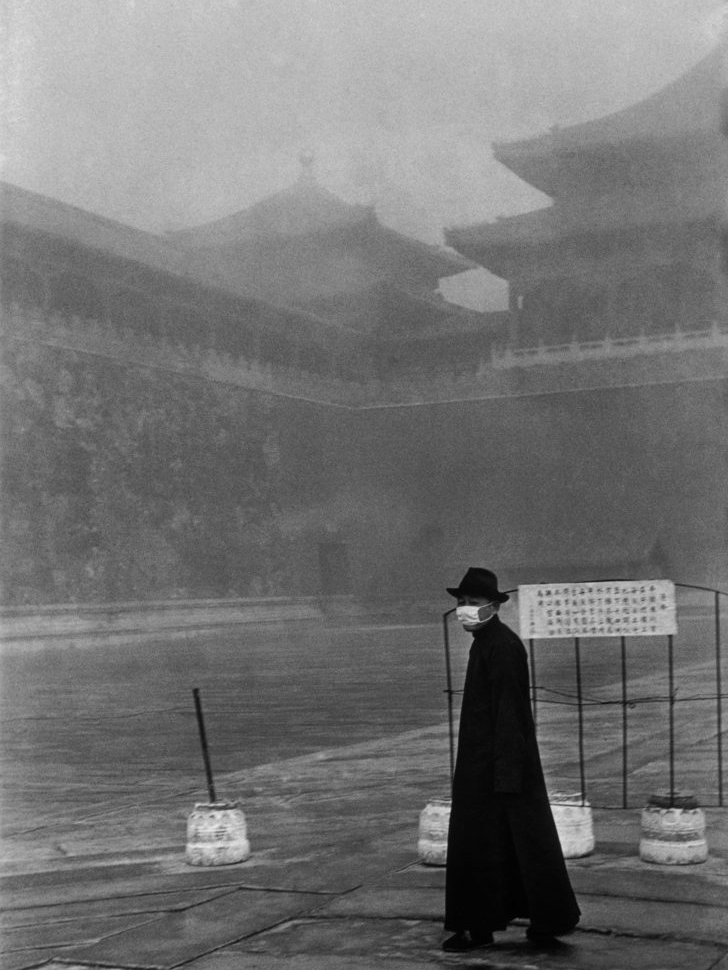
Henri Cartier was a famous humanist photographer who was known for taking candid photographs. His type is photography is street photography and he has a theory known as ‘decisive moment’, when its the right time to take the photo. Henri liked to describe this as hunting without killing the thrill of waiting for the next person to walk by to capture into the photograph. Henri’s photography tends to link humanity together while other photographers tend to look for the horror in the world to capture. Its also described as an extension of the eye, Henri tends to look deeper into the photo and almost expresses a story in the photograph. He’s creating these images that create meaning without any words. another thing he added to his photography was the black and white effect as Henri believed that colour was a threat and was inferior and aesthetically limiting. This helped to add a dramatic effect to the photo. The decisive moment is meant of capture the true beauty of the moment, whole meaning of candid was to take a picture without posing, the opposite of a formal photograph where the person sits still and posses for their photo, the photo taken by Henri Cartier-Bresson were mainly picture of people walking by, these people had n idea that they would be getting photographed, that’s the beauty of it, people cant pose or try to look their best as the photo is taken in the moment, that’s why Henri Cartier-Bresson had to be very decisive of when to capture the specific photo as no one was prepared for it.

these photos above are all examples of the ‘decisive moment’, they are all pictures of people walking or standing around which shows that these people had no clue they were being photographed and these images are the best as no one can pull a face and do any signs as we would do now, these are all natural photos, The reason this is called the decisive moment is because Henri Cartier-Bresson always had to be in the right place to be able to take these photos, he had to be discrete so that no one would notice that he was taking images of people, most people when they see they are being photographed they would smile or do a pose where as these images above show that they aren’t aware of the photo, one reason is that none of them are actually looking towards the camera. The whole idea of the decisive moment is to capture a precise moment hat creates a story without knowing anything about the photograph, its the way everything is paced around and layered. All these photos were taken without the person knowing making the photo more sentimental and meaningful, there aren’t any people posing and changing the whole point and perspective of the photo. All these photos were transformed into black and white images which helps to capture the events on the street, allowing him to shape the way that major events and everyday life were captured and photographed. Henry stated that the aim of the decisive moment is to capture something that may never happen again is frozen in the frame.

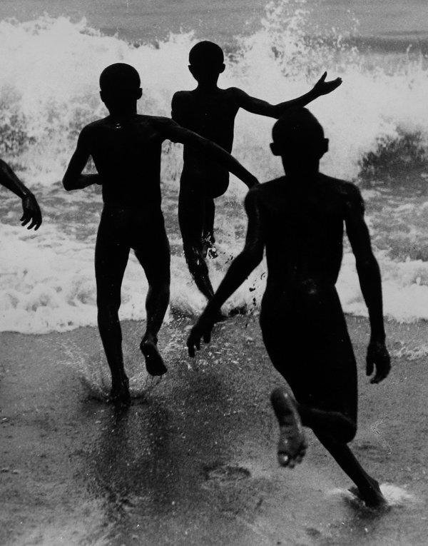
This photo shows a good example of decisive moment as it displays a moment that will most likely not happen again. These kids will supposedly grow up and not remember this moment and move in, this captures this moment and keeps its secure. This photo shows someone’s childhood and nostalgia, the black and white effects the photo by making it seem old and untouched, the colour would distract the viewer and change the whole perspective. This photo shows how precise and accurate the timing was to capture the right image, for example the way the persons foot hits the ground and makes the water splash everywhere, this shows a representation of the wave they are about to hit, they seem to be exited and happy to go into the sea, the way they are swaying their hands in the air, the image makes me feel as though they’re screaming and cheering to go swimming. The viewpoint is straight on to the children, its almost showing the same view point as the children based on the height, the camera is slightly taller than the children but still shows a similar perspective that the children may be seeing. The waves in the picture shows a different type of texture, it almost gives of a rough texture compared to the sand being soft, this could be a representation, the and is soft which is what they seem to be standing on whereas the sea is rough and cold, that’s where they are running to, this could portray the ide that the sea is there future and it doesn’t seem to be too bright, they are going to have a difficult future compared to their childhood.

Extra Images Relating to the Theme of Anthropocene

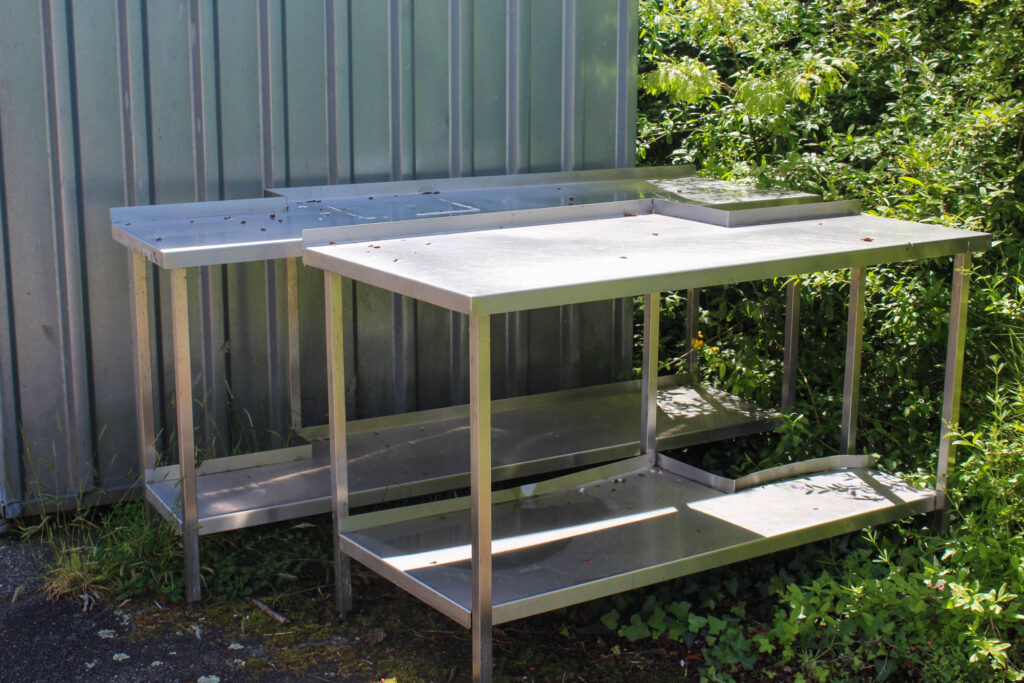
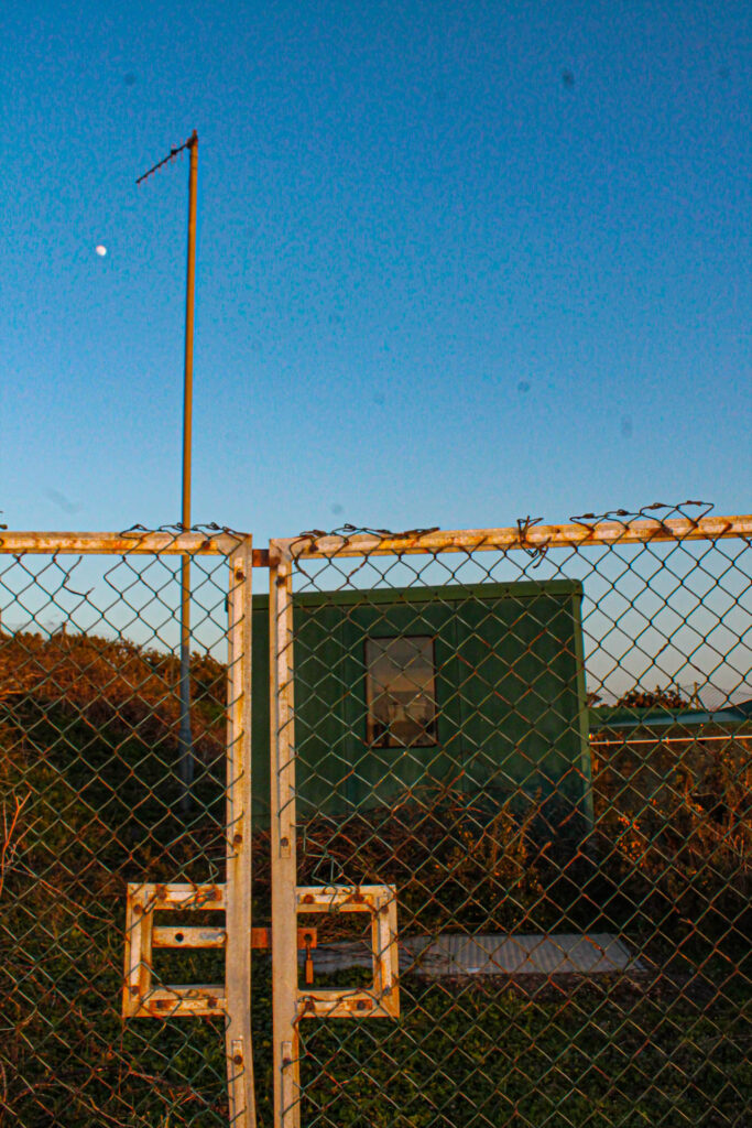
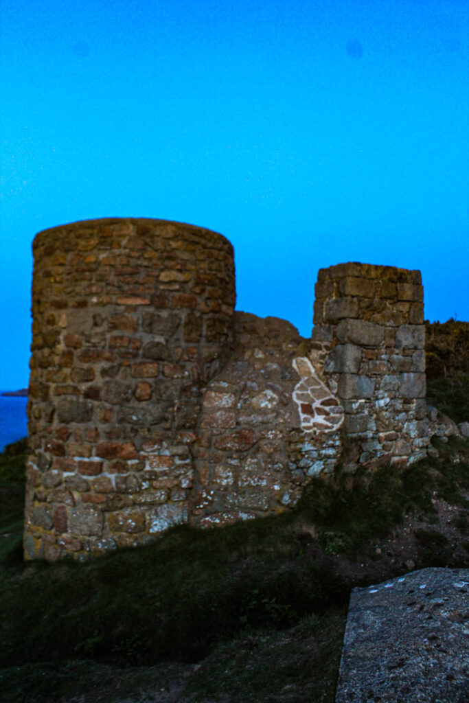
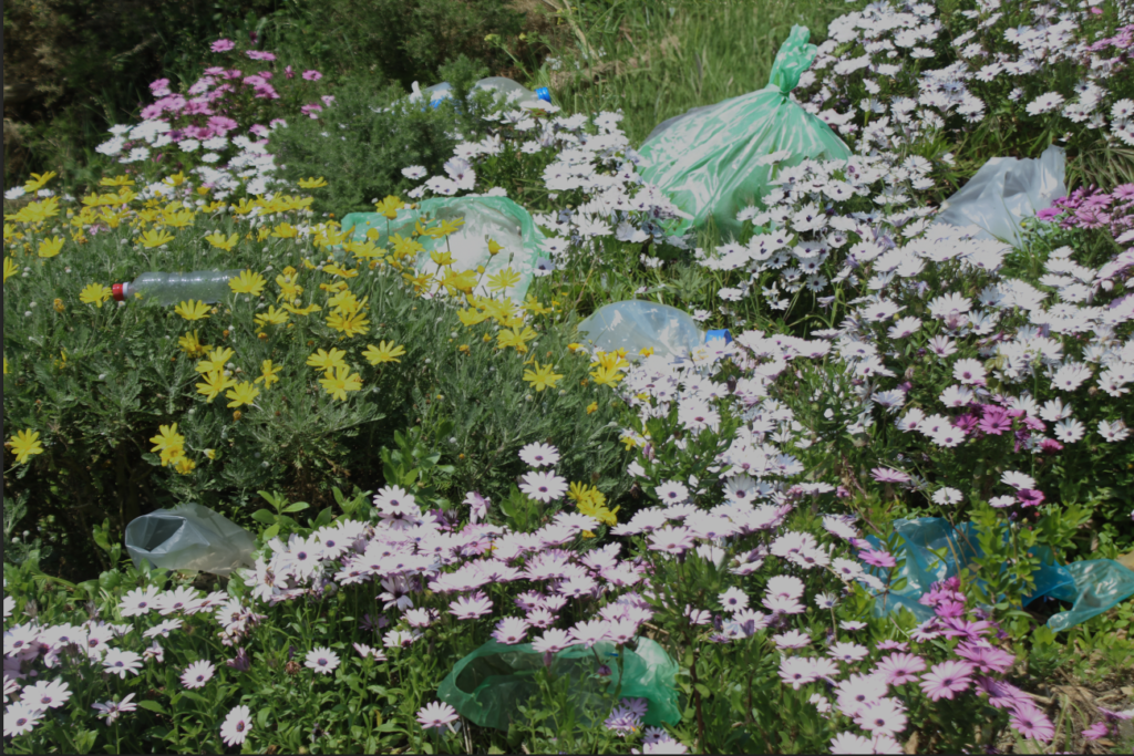
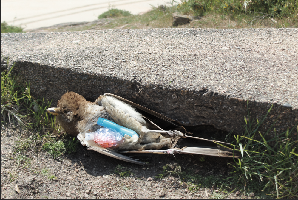
These images do not relate to any of my chosen artists, but I spotted these things, while out on my photoshoot and thought they related very well to the theme of Anthropocene.

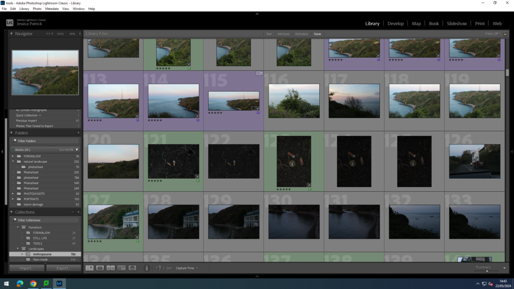
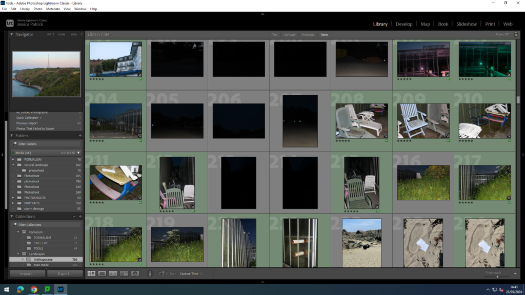
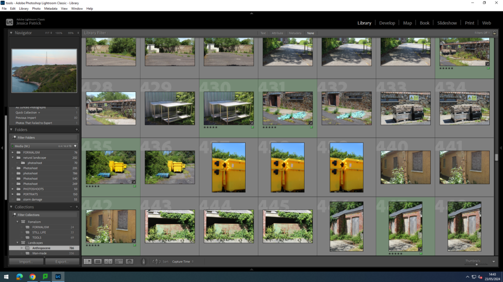
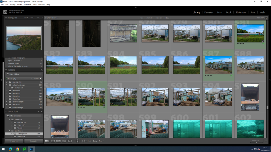
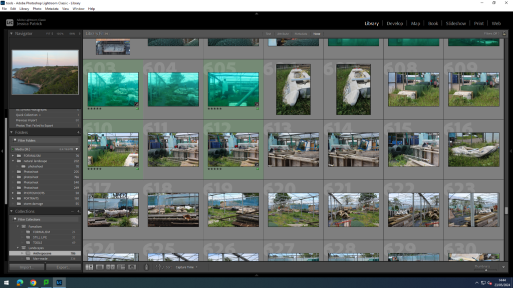
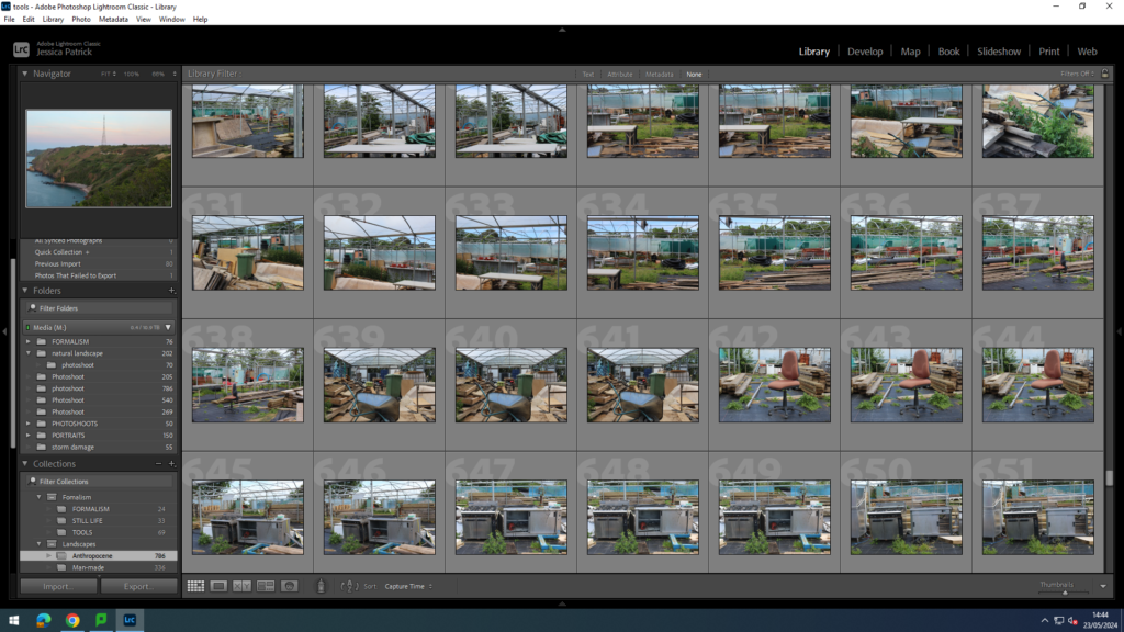
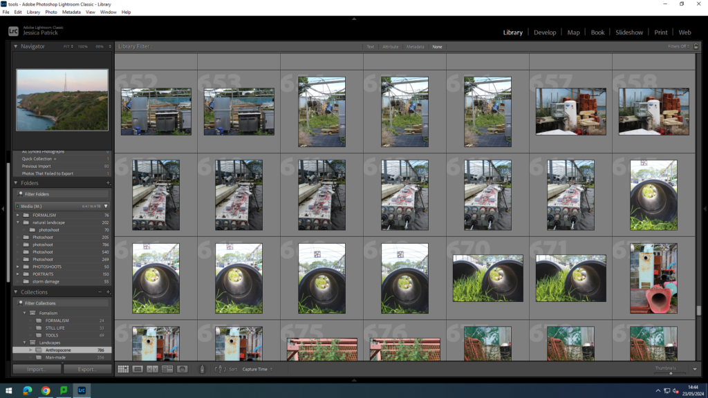
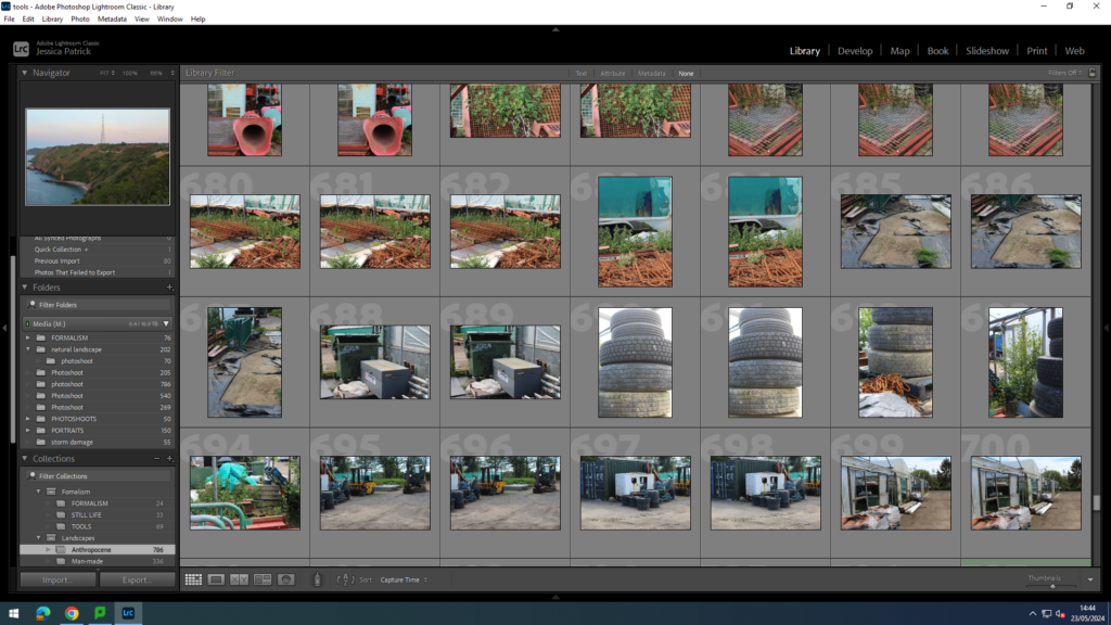
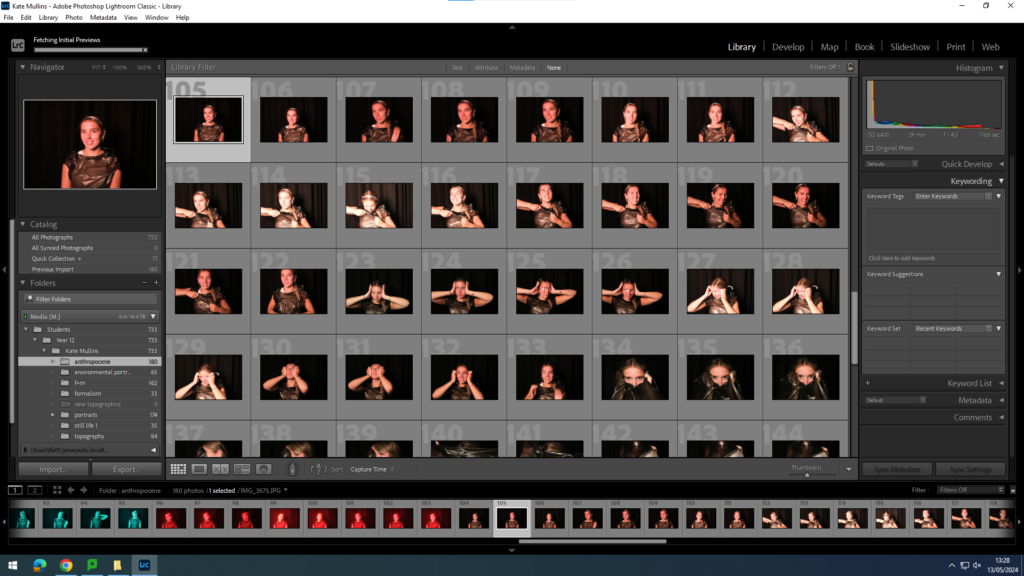
Contact Sheet

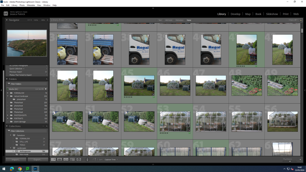
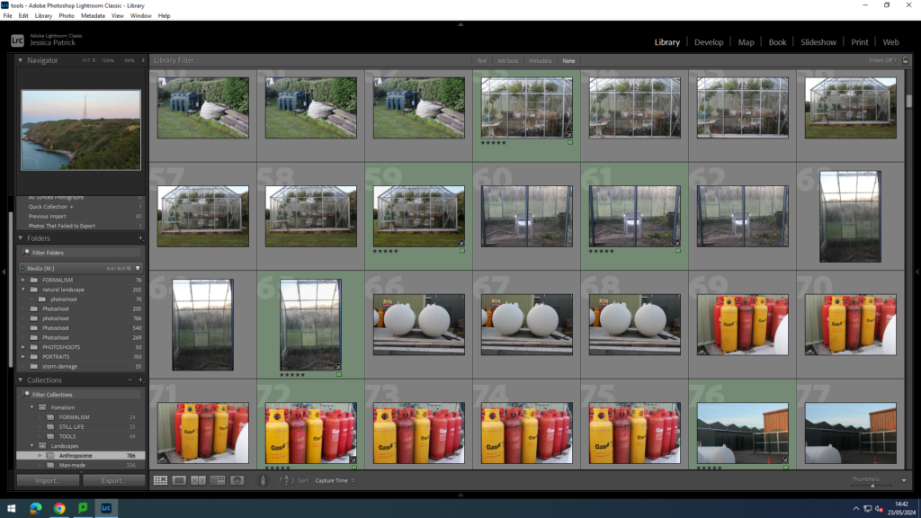
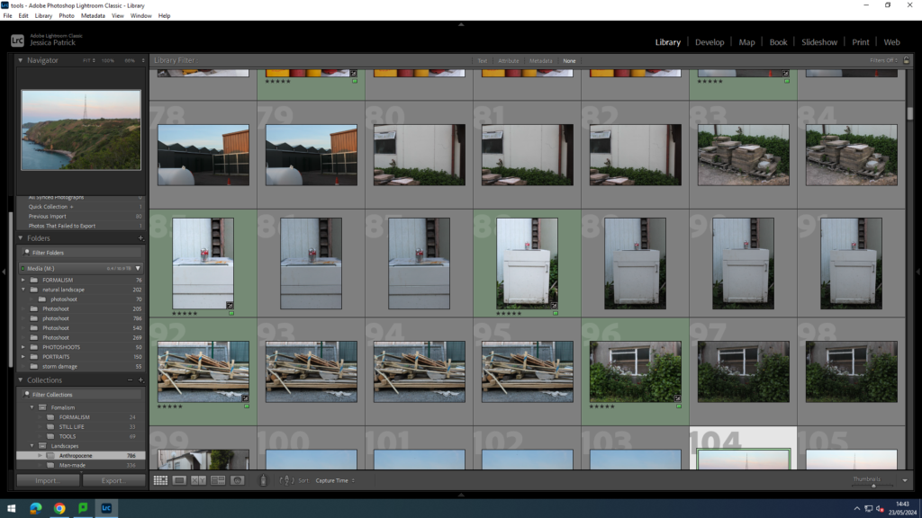
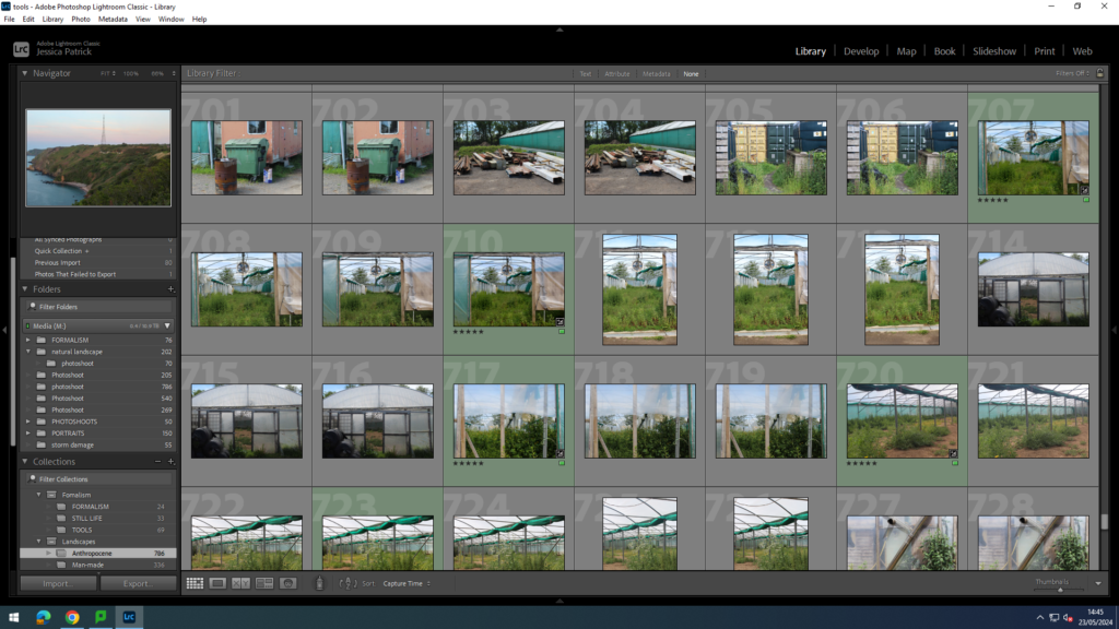
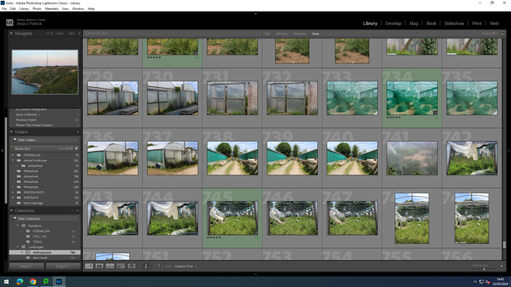
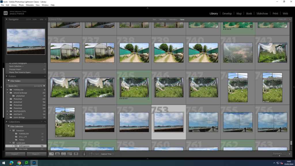
The images which are highlighted green are the images I have chosen to edit, because I think they display Anthropocene in the best way. They also do not relate to any of my artists, but I feel like they are a really important aspect of Anthropocene, because they are not looked at a lot, but cause massive negative effects to the earth. These images also have the best lighting and composition.

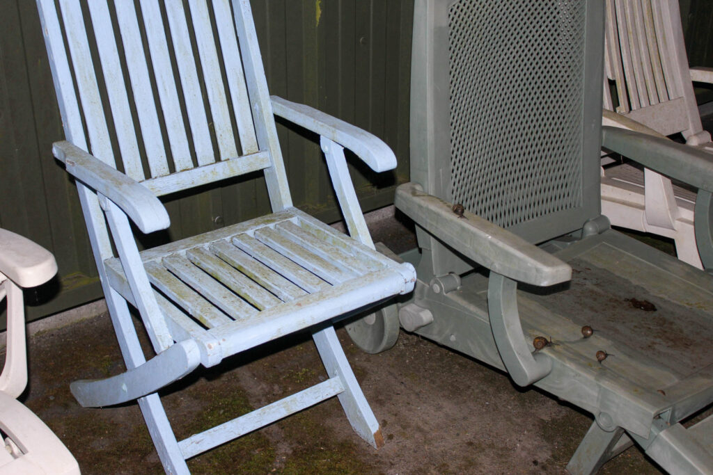
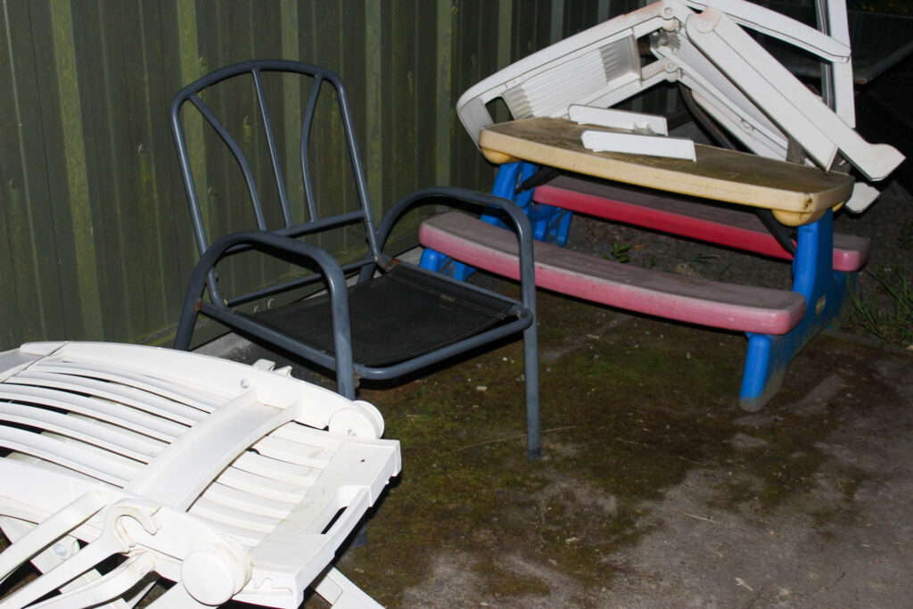
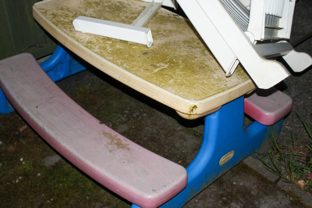
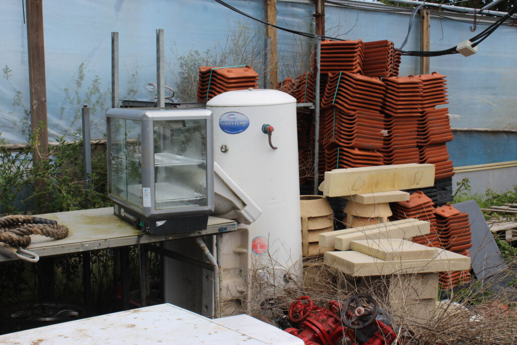
I took these images at a construction site near St John, as well as Trinity, near the Trinity Arms. Fly tipping relates to the theme of Anthropocene, because many of the most common items that are fly tipped have a high plastic content, so they are non-biodegradable. This means that they will remain there for hundreds of years. These parts of plastic will over time sink into the earth and pollute the soil.

The plastic from these items is also dangerous for animals, that may be living in this area, especially if they eat it.

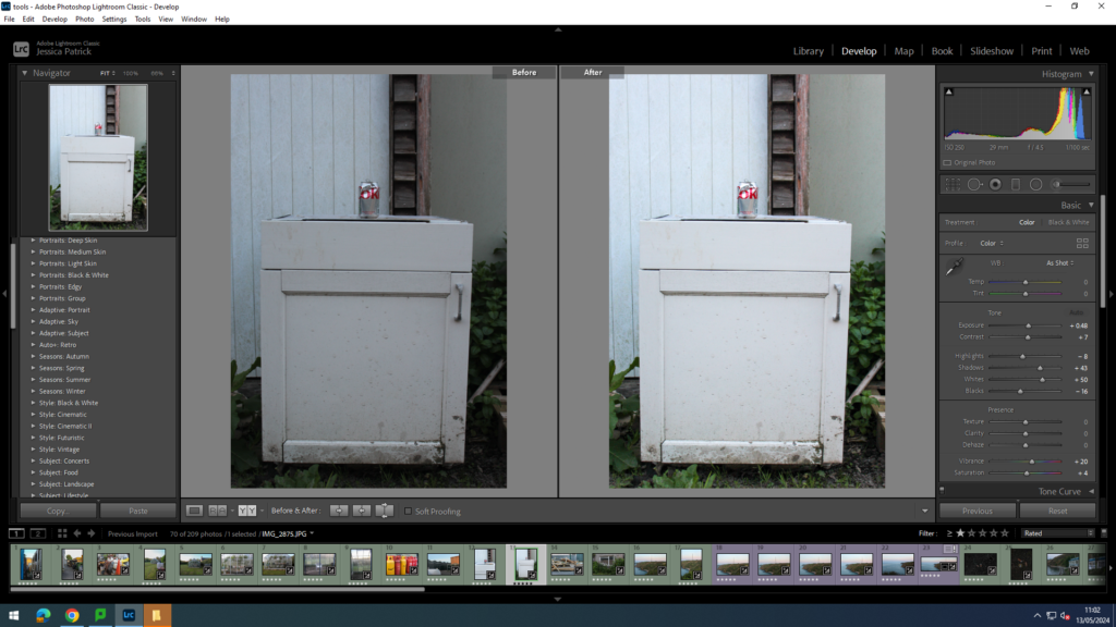
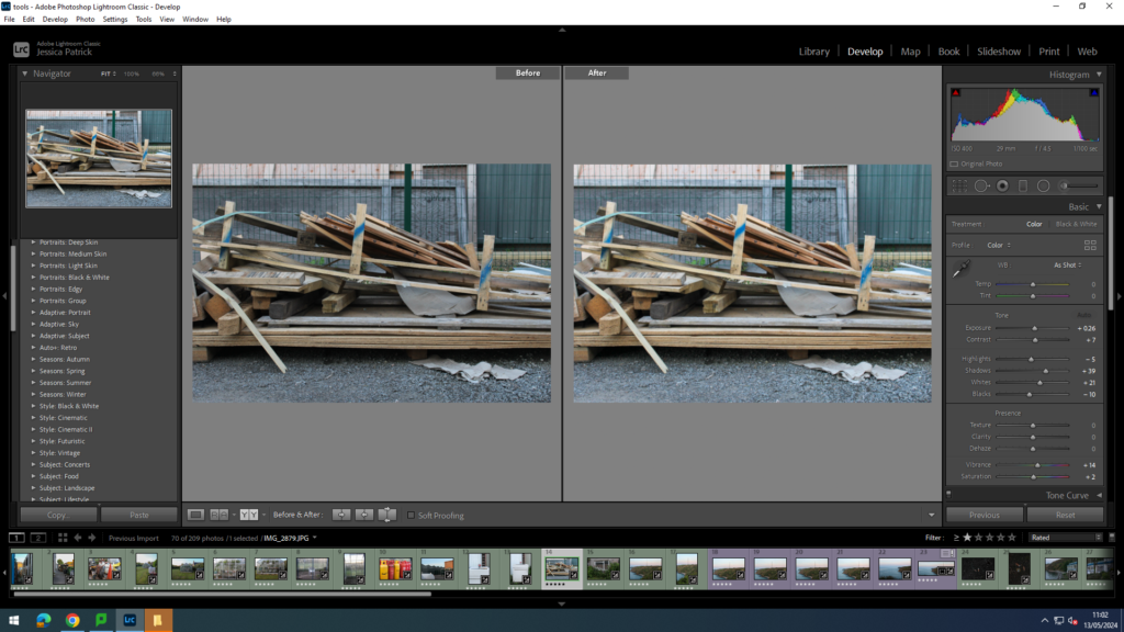
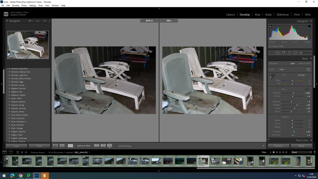
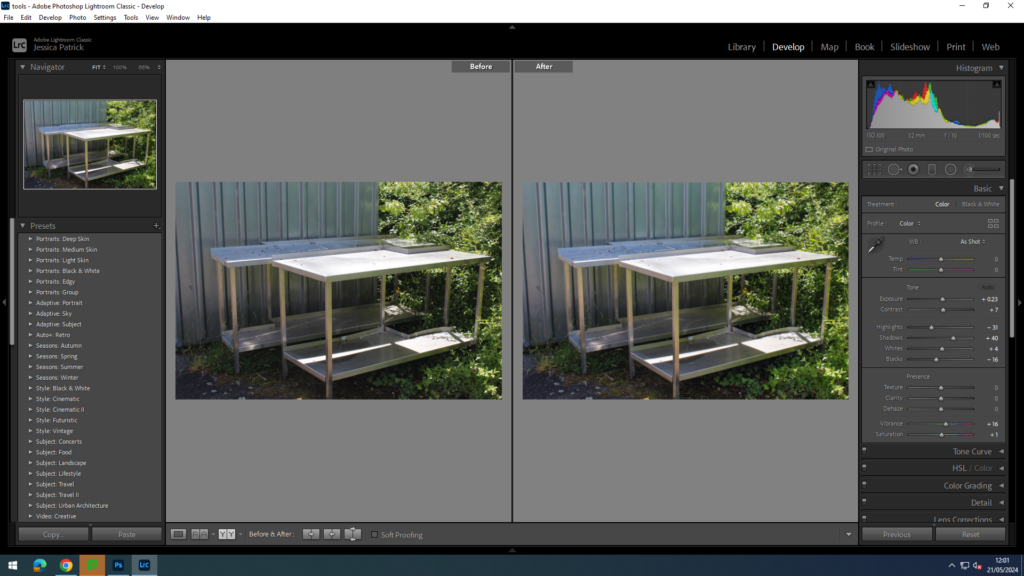
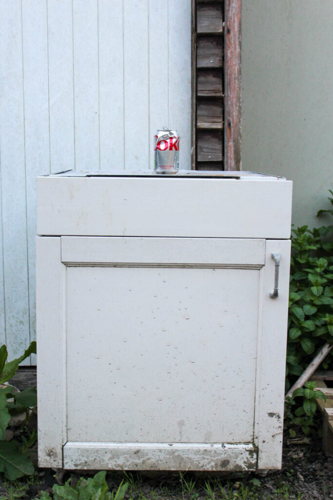
I edited this image by increasing the exposure, contrast, shadows, whites, saturation and vibrancy, while decreasing the highlights and blacks, so that the image would have greater exposure and be brighter. Also so the coke can was more prominent and the white drawer it was sat on was more of a true white colour, rather than a greyer white.

I edited this image by increasing the exposure, contrast, shadows, whites, saturation and vibrancy, while decreasing the highlights and blacks, so that the image would have better lighting.

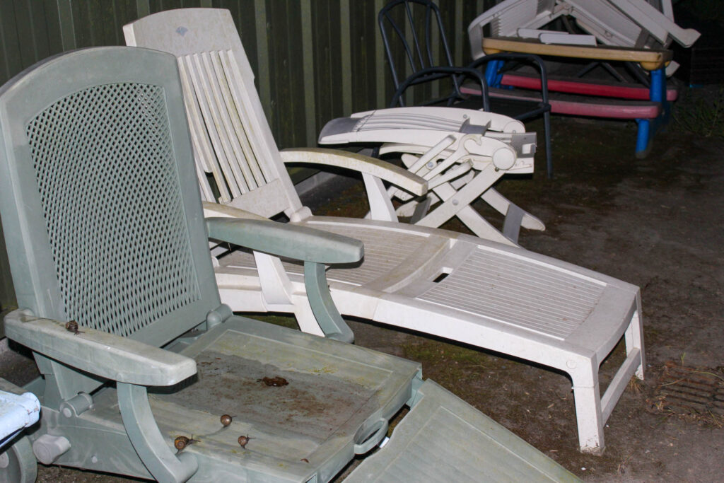
These next images were taken in Trinity near the Charity shop.

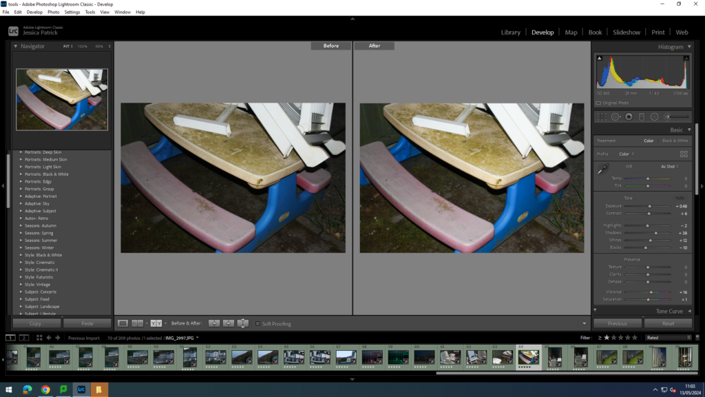
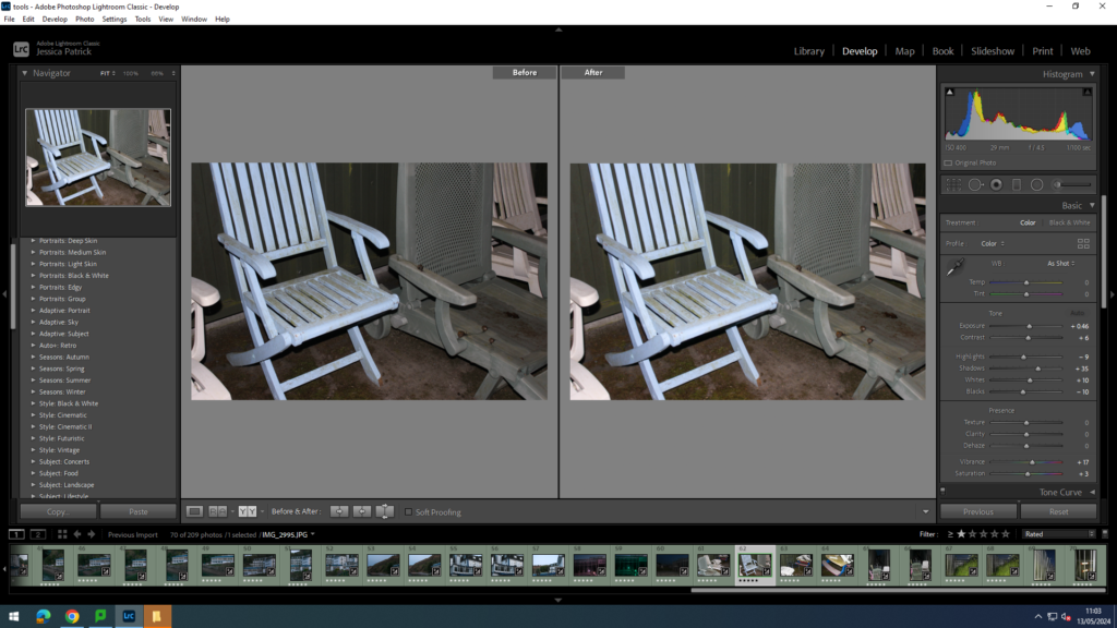
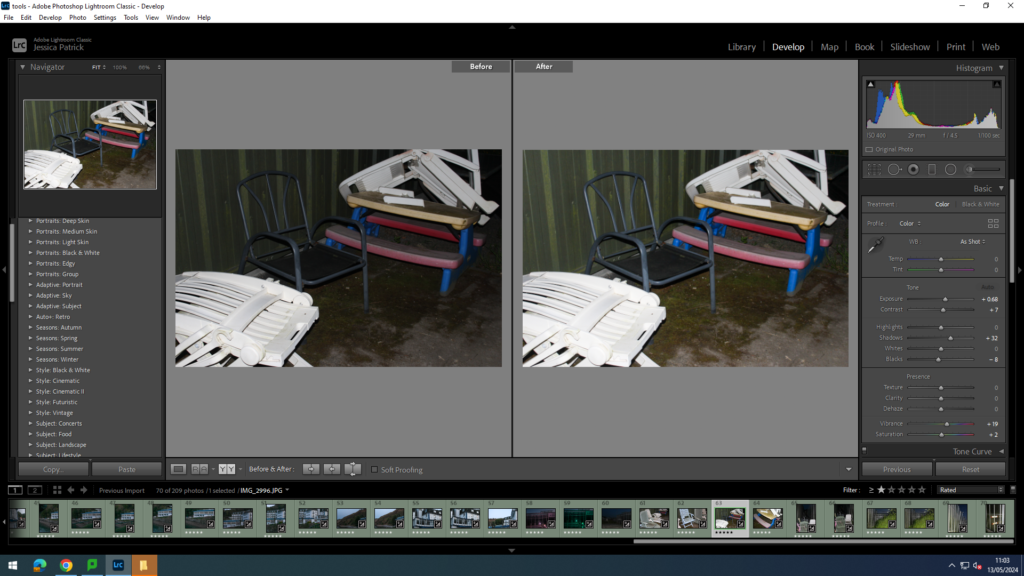
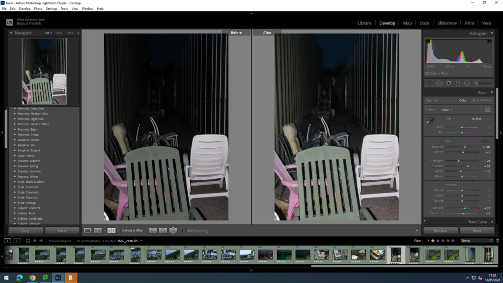
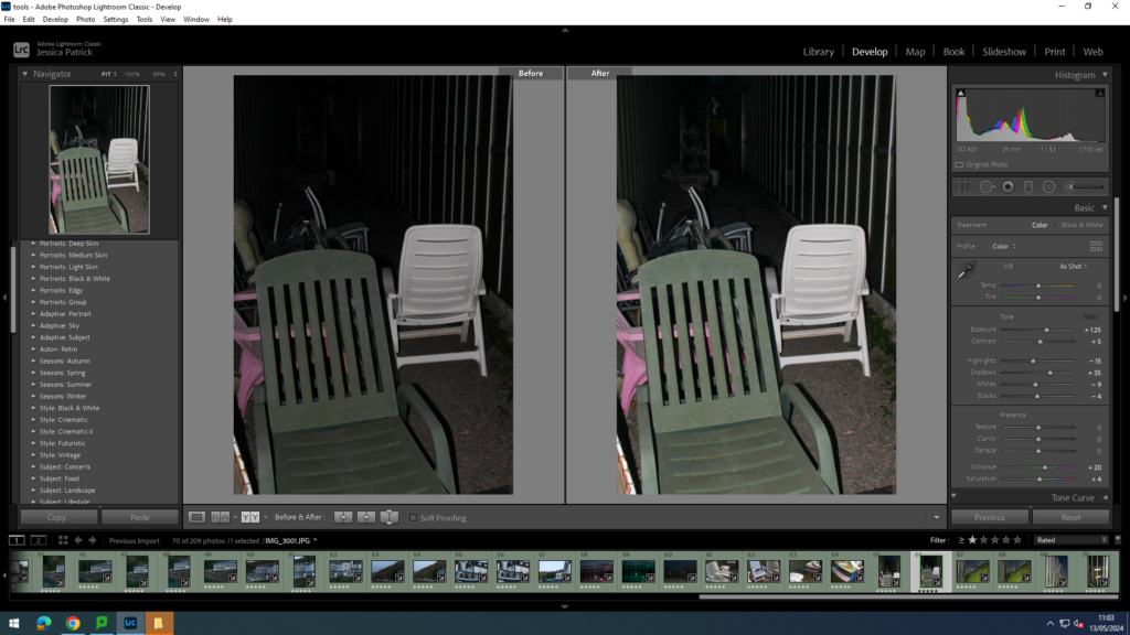
I edited these images by increasing the exposure, contrast, shadows, whites, saturation and vibrancy, while decreasing the highlights and blacks, so the images would have better lighting, as it was quite dark at this point.

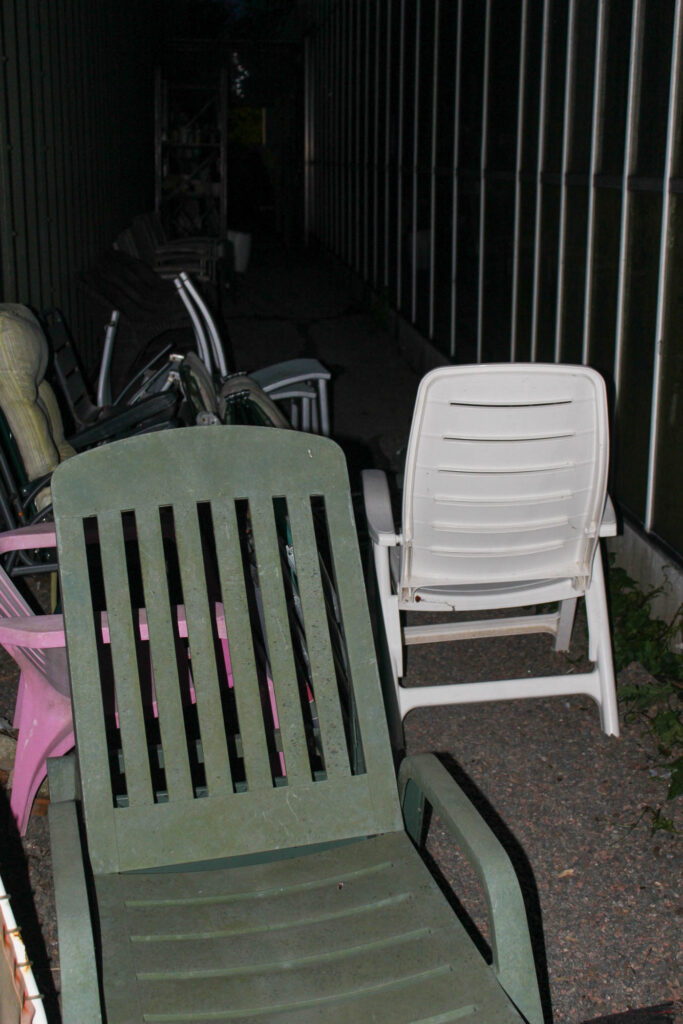
I edited these images by increasing the exposure, contrast, shadows, whites, vibrancy and saturation, while decreasing the highlights and blacks, so the image would have more exposure, and therefore be brighter, as it had gotten really dark by the time me and Katie were taking these images.

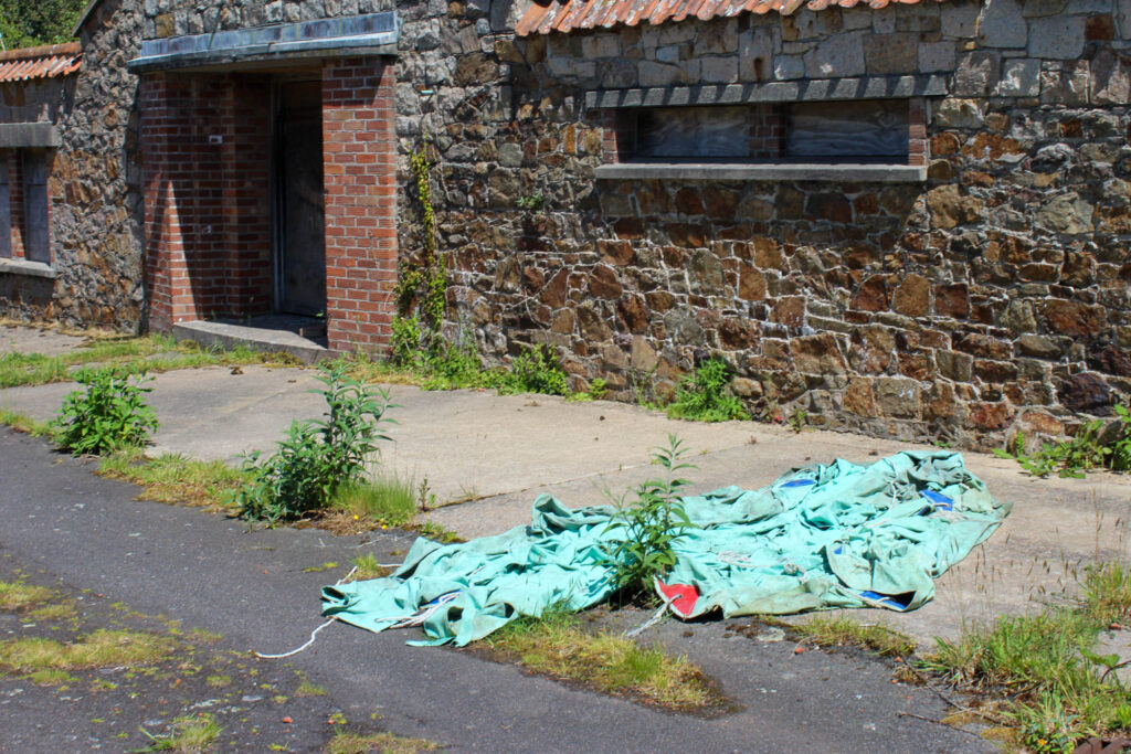
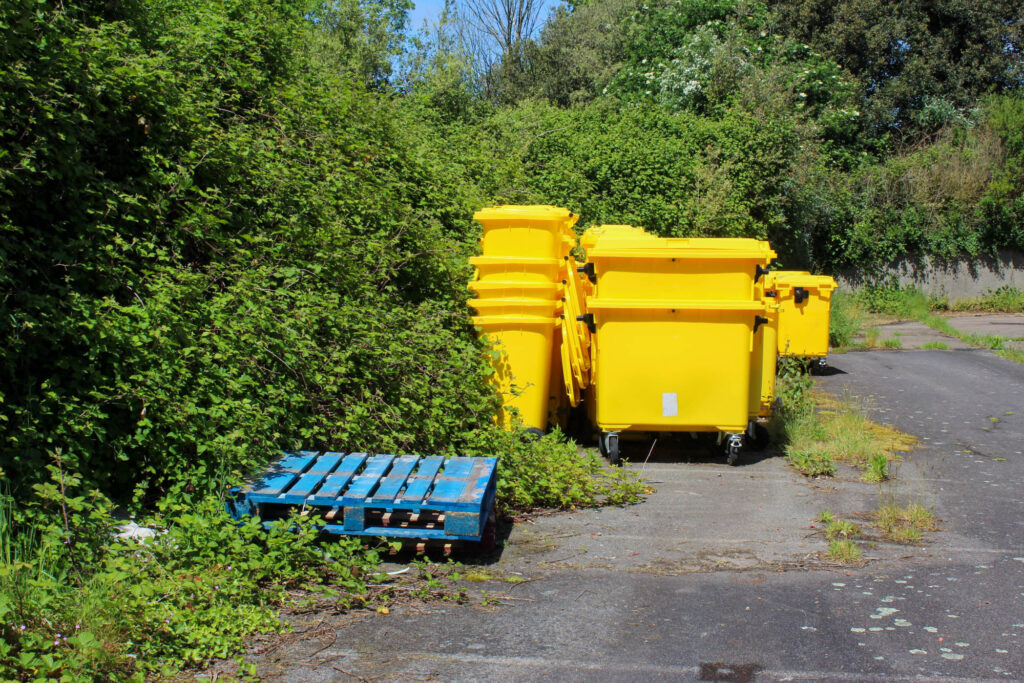
These next images were taken at St Saviours abandoned hospital. These were things from the hospital that were left and abandoned along with the hospital.

I edited this image by increasing the exposure, contrast, shadows, whites, vibrancy and saturation, while decreasing the highlights and blacks, so that the lighting was better.

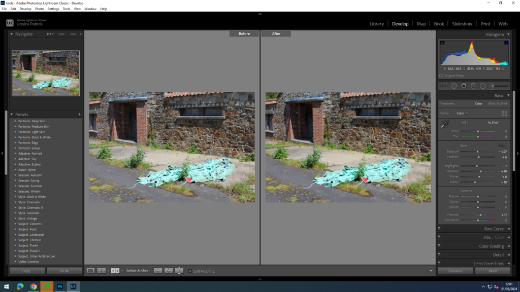
I edited this image by increasing the exposure, contrast, shadows, whites and vibrancy, while decreasing the highlights and blacks, so that the green tarp was more vibrant.

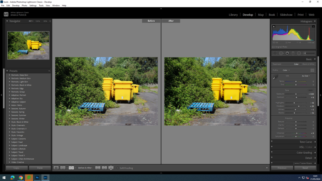
I edited this image by increasing the exposure, contrast, shadows, whites and vibrancy, while decreasing the highlights and blacks, so that the blue and yellow colours were more vibrant, as well as the greenery around them.

Top 9 Final Images

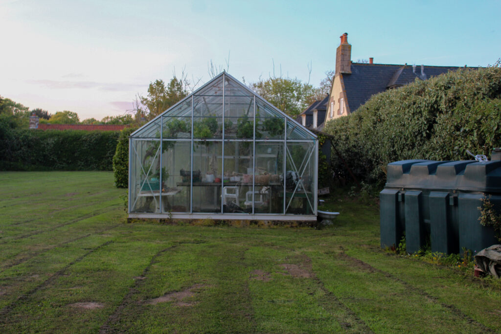
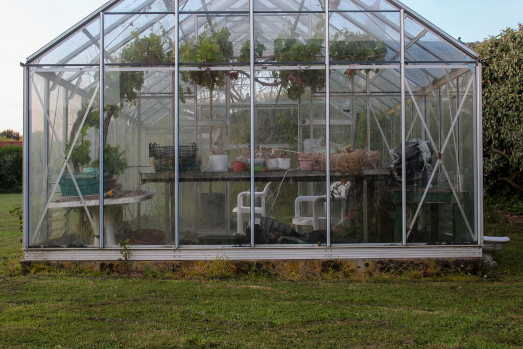
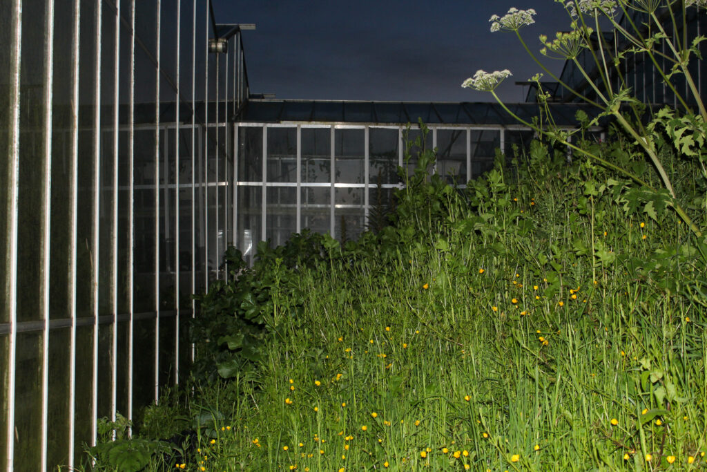
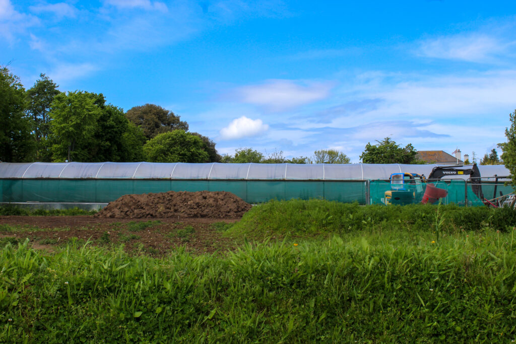
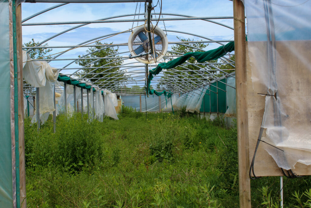
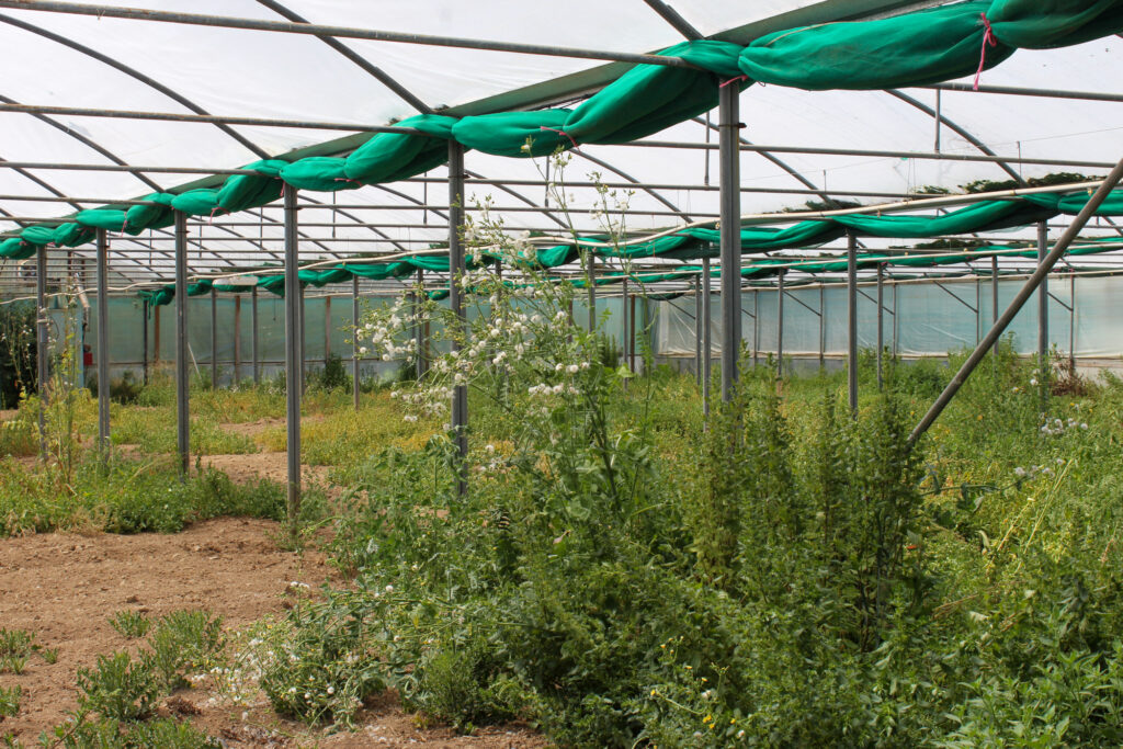
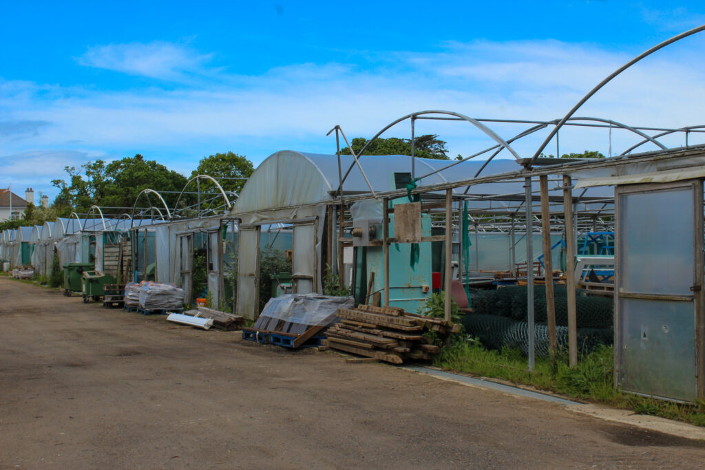
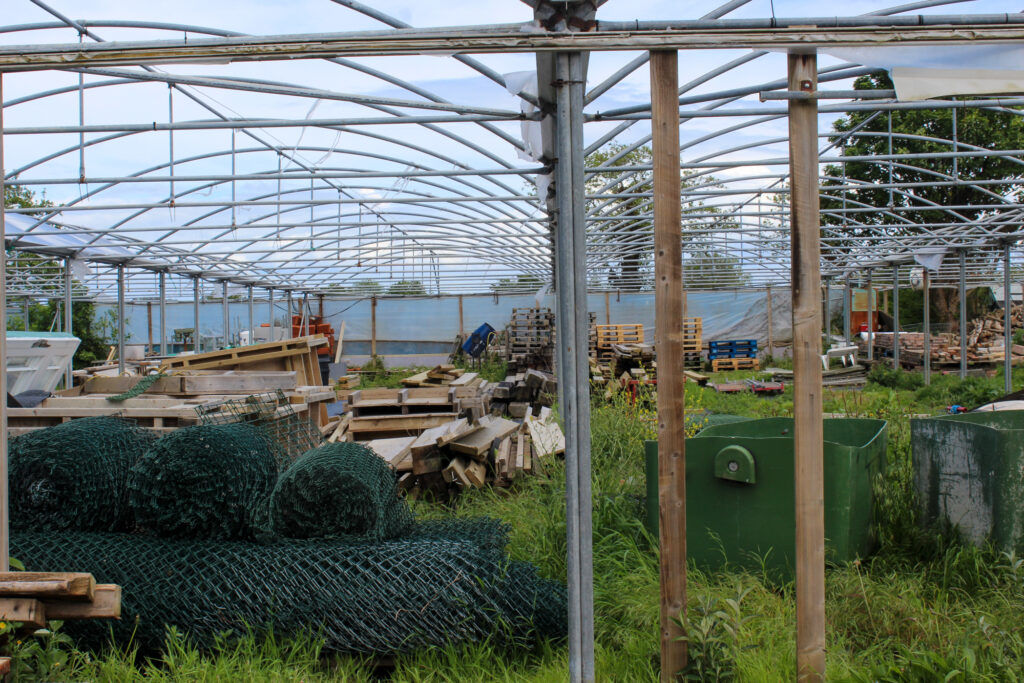
I took these images at a construction site near St John and the hospice charity shop in Trinity. Greenhouses relate to the theme of Anthropocene, because derelict greenhouses around Jersey was used for tomato and potato farming around the island. However, due to mechanical and chemical-based farming, they are no longer in use as human development has leaned more towards using synthetic fertilizer. This is a technique that relies heavily on synthetic fertilizers and pesticides to boost yields and control pests, which can have negative impacts on the environment and human health but produces higher yields in the short-term due to greed. This leaves the greenhouses vacant to catch dirt and sit there, not allowing the environment to thrive, instead forcing it to decay. On the 20th of January 2023, the Chief Minister stated:

The current Bridging Island Plan, which covers 2022 to 2025, has a distinct policy on derelict and redundant glasshouses, which states that their redevelopment for non-agricultural use will not be supported. This means that the construction of more properties will be denied in order to salvage these spaces if they are truly redundant derelict greenhouses.

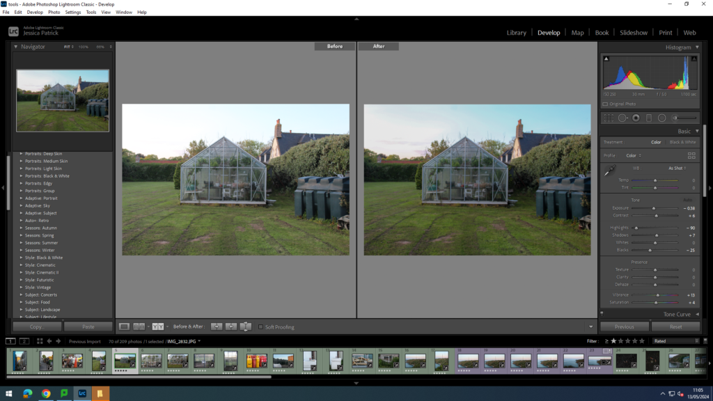
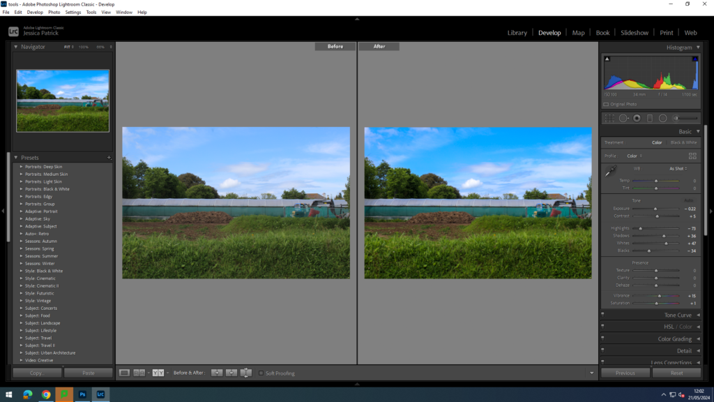
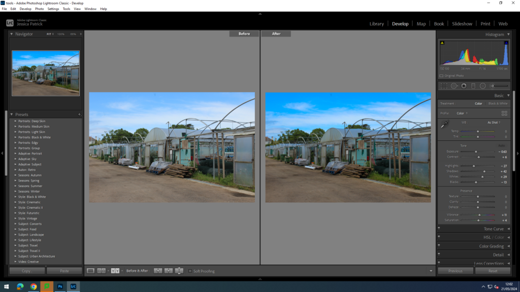
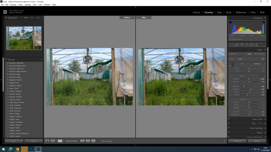
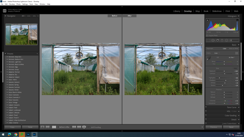
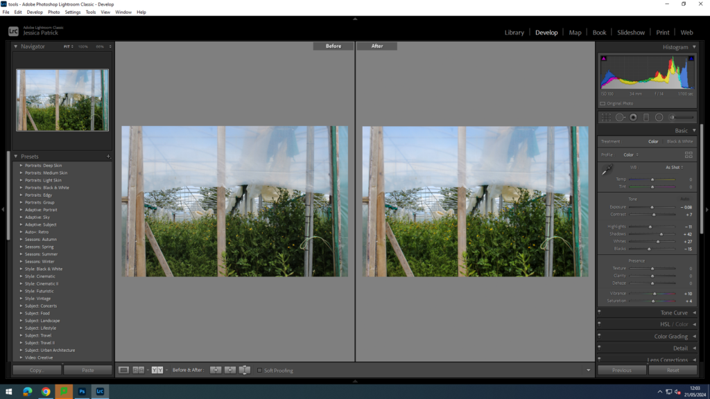
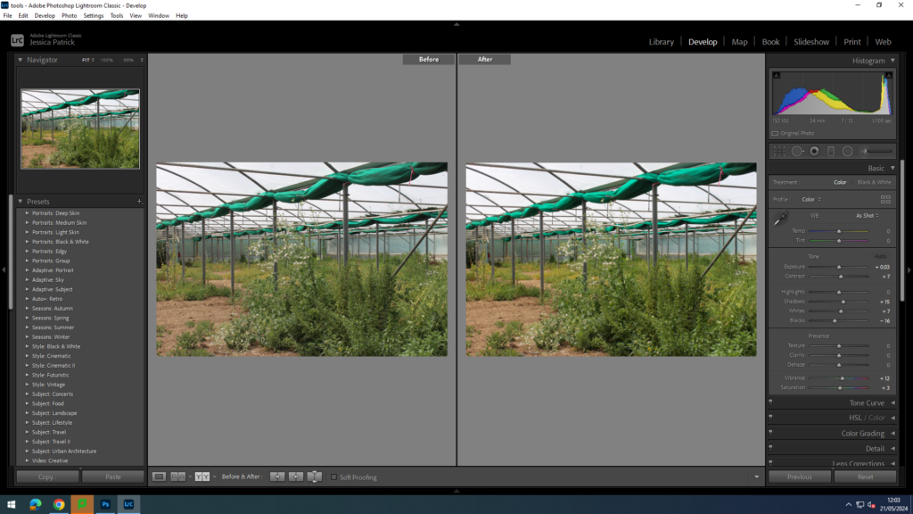
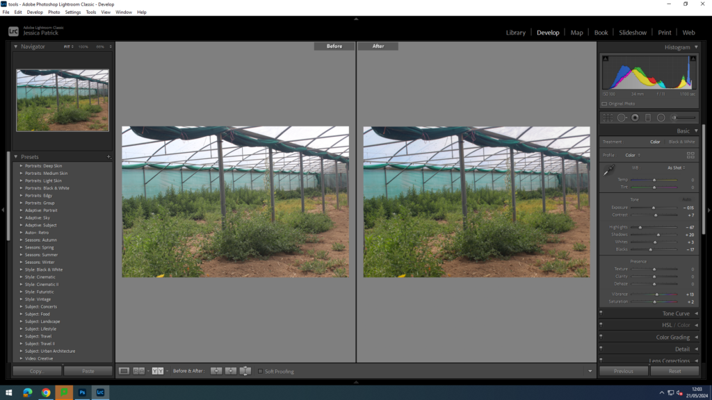
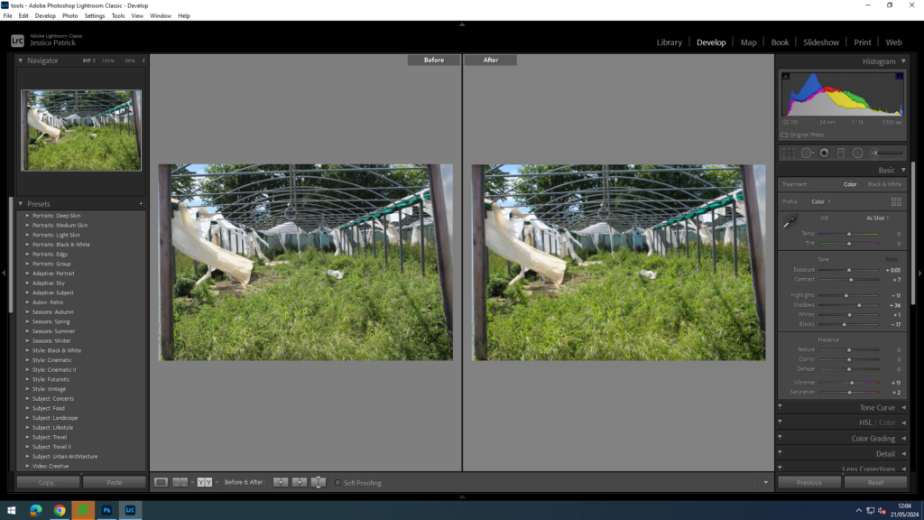
I edited these images by increasing the contrast, shadows, whites, vibrancy and saturation, while decreasing the exposure, highlights and blacks, so that the lighting was better, so the sky was less white and bright, but also so the greenery was more vibrant.

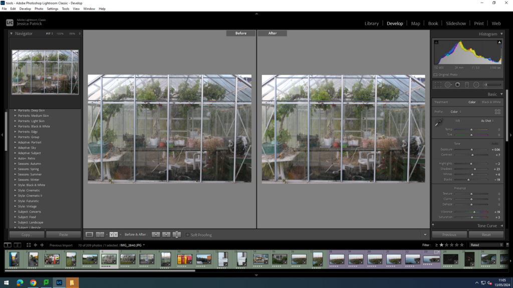
I edited this image by increasing the exposure, contrast, shadows, whites, vibrancy and saturation, while decreasing the highlights and blacks, so that the lighting was better, so that the viewer can see the contents inside the greenhouse better.

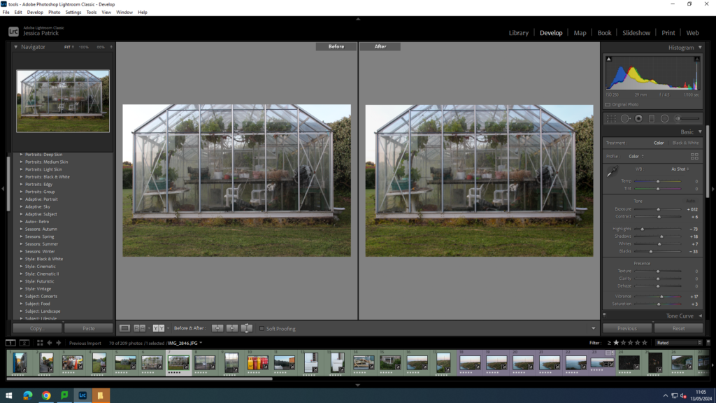
I edited this image by increasing the contrast, shadows, whites, vibrancy and saturation, while decreasing the exposure, highlights and blacks, so that the lighting was better, so the contents inside the greenhouse could be seen better, as well as making all the greenery more vibrant.

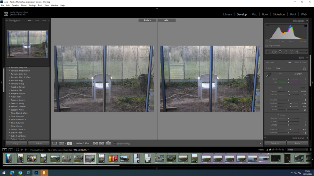
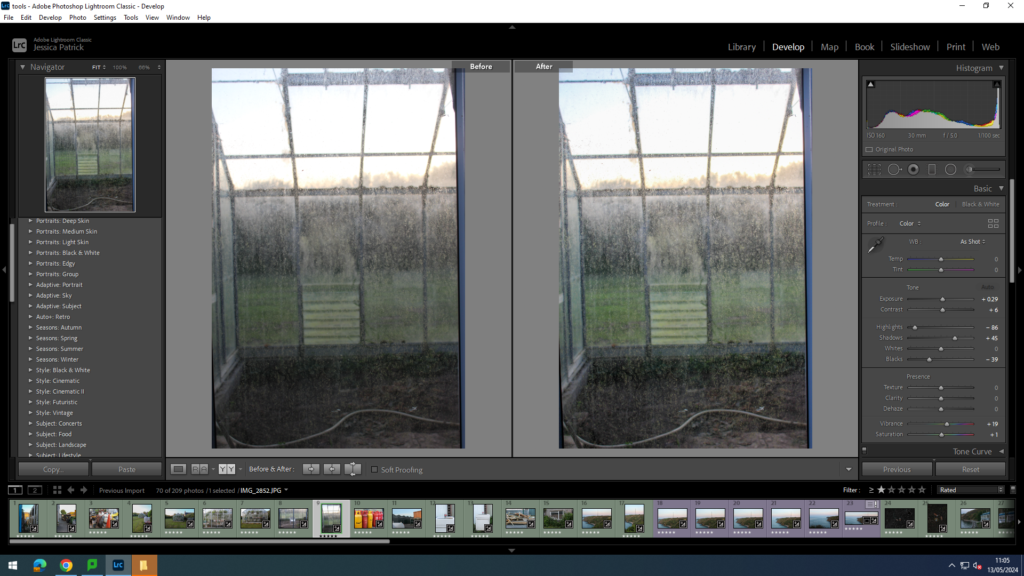
I edited this image by increasing the exposure, contrast, shadows, whites, vibrancy and saturation, while decreasing the highlights and blacks, so the dirt on these greenhouses could be seen better. I want the dirt on these glass walls to be seen better, to really stress how uncared for and used these greenhouses now are.

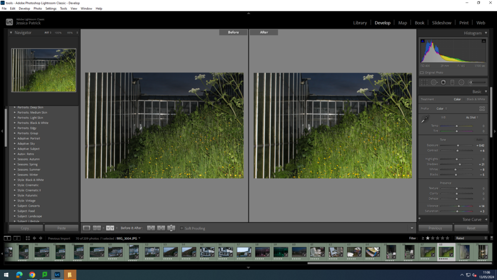
I edited this image by increasing the exposure, contrast, shadows, whites, vibrancy and saturation, while decreasing the highlights and blacks, so the image would be brighter, as it had gotten very dark by the time these photos were taken. I also wanted the greenery surrounding this green house to be more vibrant.

I edited this image by increasing the contrast, shadows, whites, vibrancy and saturation, while decreasing the exposure, highlights and blacks, to make the image more vibrant.

I edited this image by increasing the contrast, shadows, whites, vibrancy and saturation, while decreasing the exposure, highlights and blacks, so the image had more contrast and was more eye capturing.

I edited these images by increasing the contrast, shadows, whites, vibrancy and saturation, while decreasing the exposure, highlights and blacks, so the image had better lighting and more vibrancy.

I edited this image by increasing the contrast, shadows, whites, vibrancy and saturation, while decreasing the exposure, highlights and blacks, so the lighting was better and the greens more vibrant.

I edited this image by increasing the contrast, shadows, whites, vibrancy and saturation, while decreasing the exposure, highlights and blacks, so the greens were more vibrant, so it created more of a contrast between the greenery, green house walls, and the brown dead floor.

I edited this image by increasing the contrast, shadows, whites, vibrancy and saturation, while decreasing the exposure, highlights and blacks, there was more contrast between the more vibrant greenery and the damaged white tarps that are blowing in the wind.

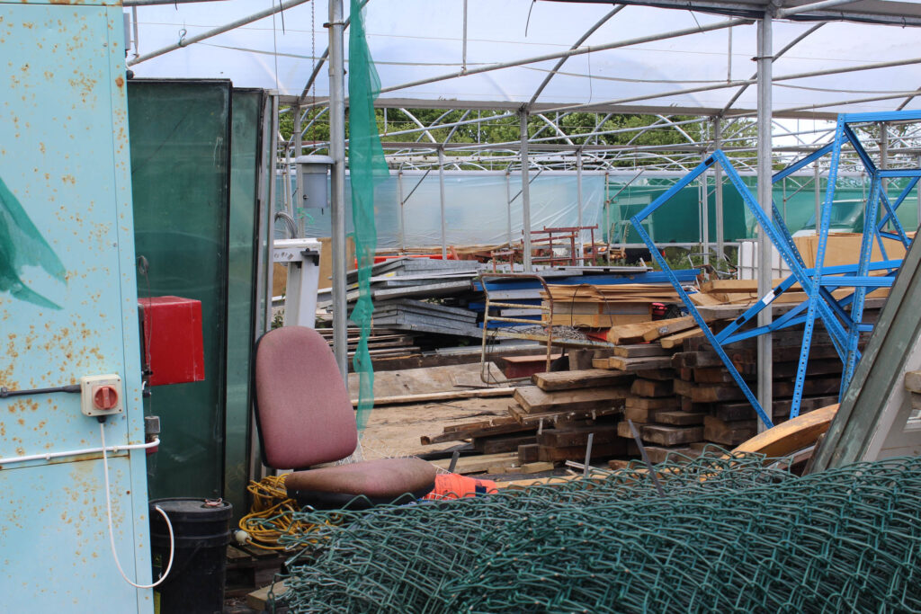
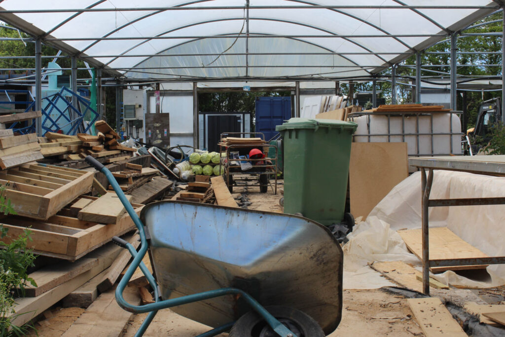
I prefer these last few images of greenhouses, because they really show how uncared for these green houses are and how they are no longer used. These greenhouses were extremely damaged and were not even used as greenhouses anymore, but used for storage instead, as can be seen below.

Top 8 Final Images

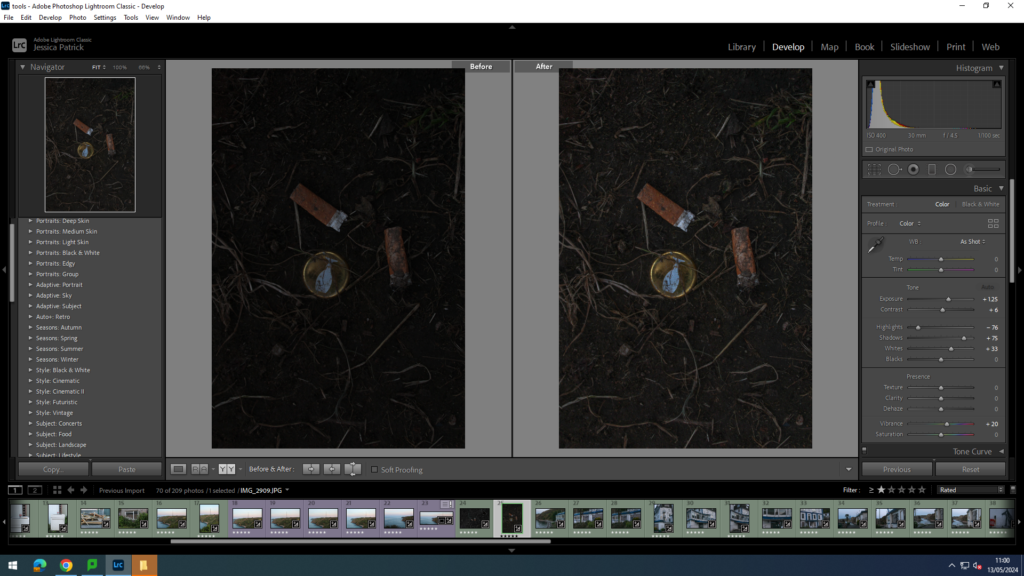
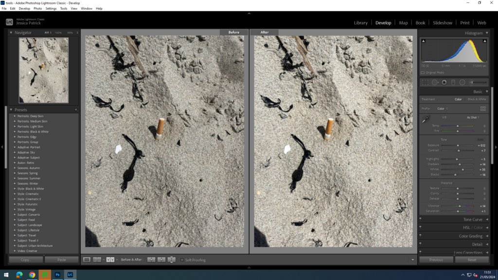
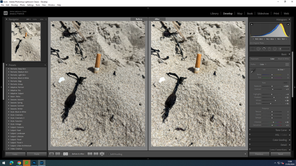
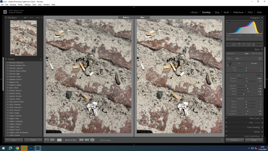
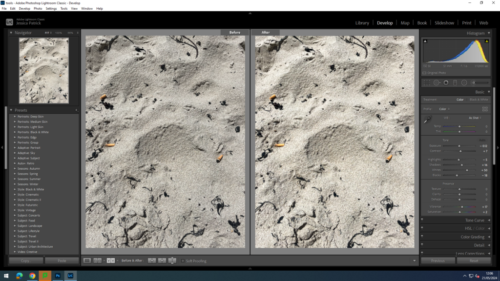
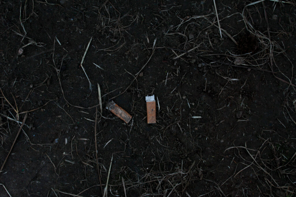
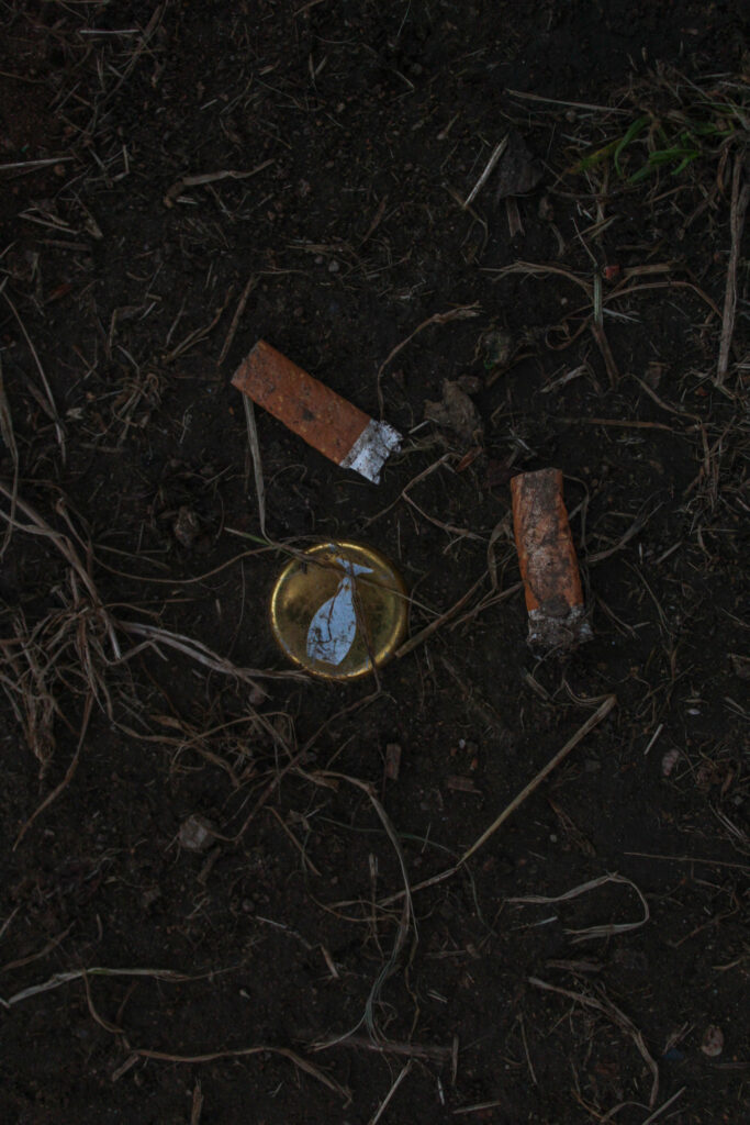
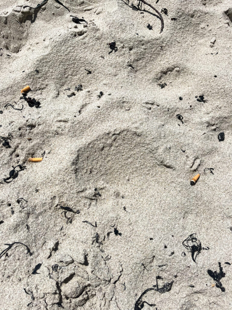
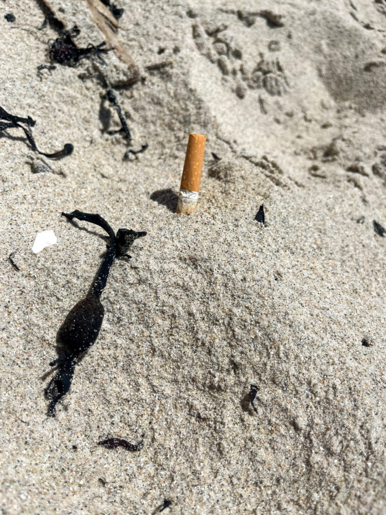
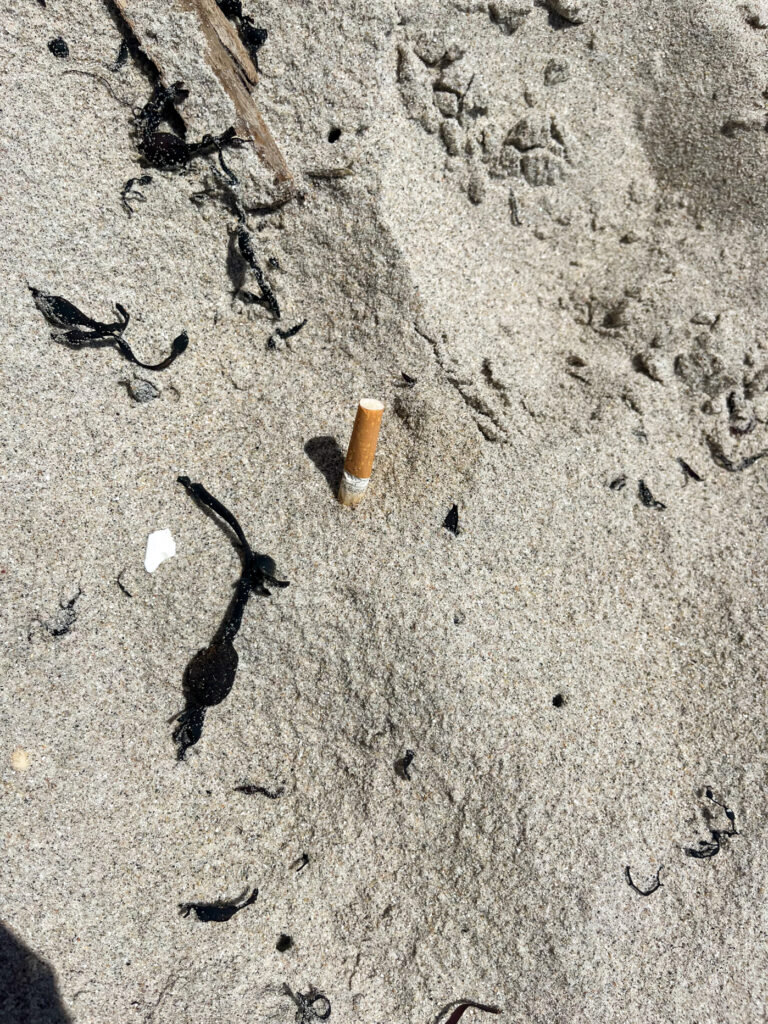
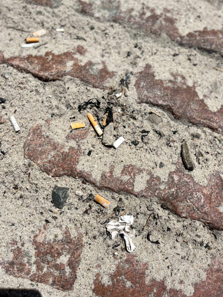
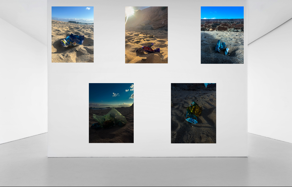
For this approach I took pictures of smaller pieces of rubbish that people don’t usually think about, such as cigarette butts and bottle caps etc. but make a huge impact on our environment, because they build up a lot. These are also very harmful for animals, because these things are small enough for animals to eat, but they are not the right source of food for protein, and they are nearly impossible to digest.

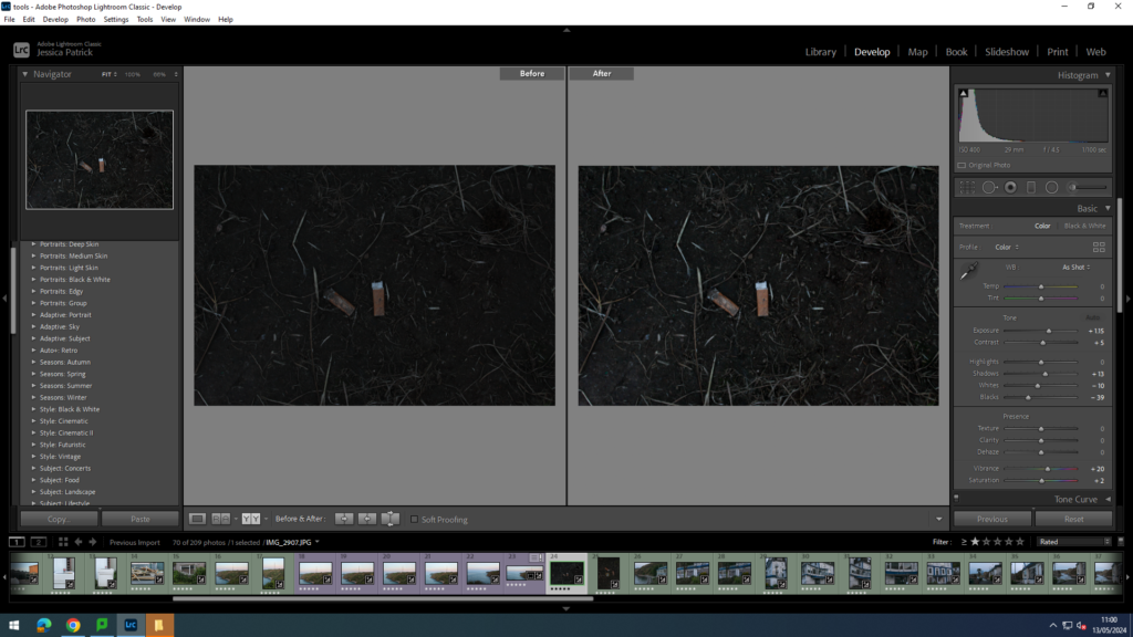
I edited this image by increasing the exposure, contrast, shadows, vibrancy and saturation, while decreasing the whites and blacks. I did this, so that the cigarette butts would stand out more against the dark mud and in the dark lighting.

I edited this image by increasing the exposure, contrast, shadows, vibrancy and whites, while decreasing the highlights. I did this, so that the cigarette butts and bottle cap would stand out more against the dark mud and in the dark lighting.

I edited this image by increasing the exposure, contrast, shadows, whites, vibrancy and saturation, while decreasing the highlights and blacks. I did this, so that the cigarette butts would stand out more and be more vibrant.

I edited this image by increasing the exposure, contrast, shadows, whites, vibrancy and saturation, while decreasing the highlights and blacks. I did this, so that the cigarette butts would stand out more and be more vibrant.

I edited this image by increasing the contrast, shadows, whites, vibrancy and saturation, while decreasing the exposure, highlights and blacks. I did this, so that the cigarette butts would stand out more and be more vibrant against the beige sand.

How Do these Images Relate to the Theme of Anthropocene?

These images relate to the theme of Anthropocene, because they show that even the smallest bits of rubbish, that rarely anyone thinks about does still make a massive different, especially cigarette butts, because so many people smoke them, so they are on such a large scale being littered.

Top 6 Final Images

Typologies-artist reference

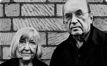
Bernd and Hilla Becher

Why are Bernd and Hilla Becher important?

The German artists Bernd and Hilla Becher (1931–2007; 1934–2015) changed the course of late twentieth-century photography. Working as a rare artist couple, they focused on a single subject: the disappearing industrial architecture of Western Europe and North America that fuelled the modern era. They began collaborating together in 1959 after meeting at the Kunstakademie Düsseldorf in 1957. Bernd originally studied painting and then typography, whereas Hilla had trained as a commercial photographer. After two years collaborating together, they married.

What did they photograph?

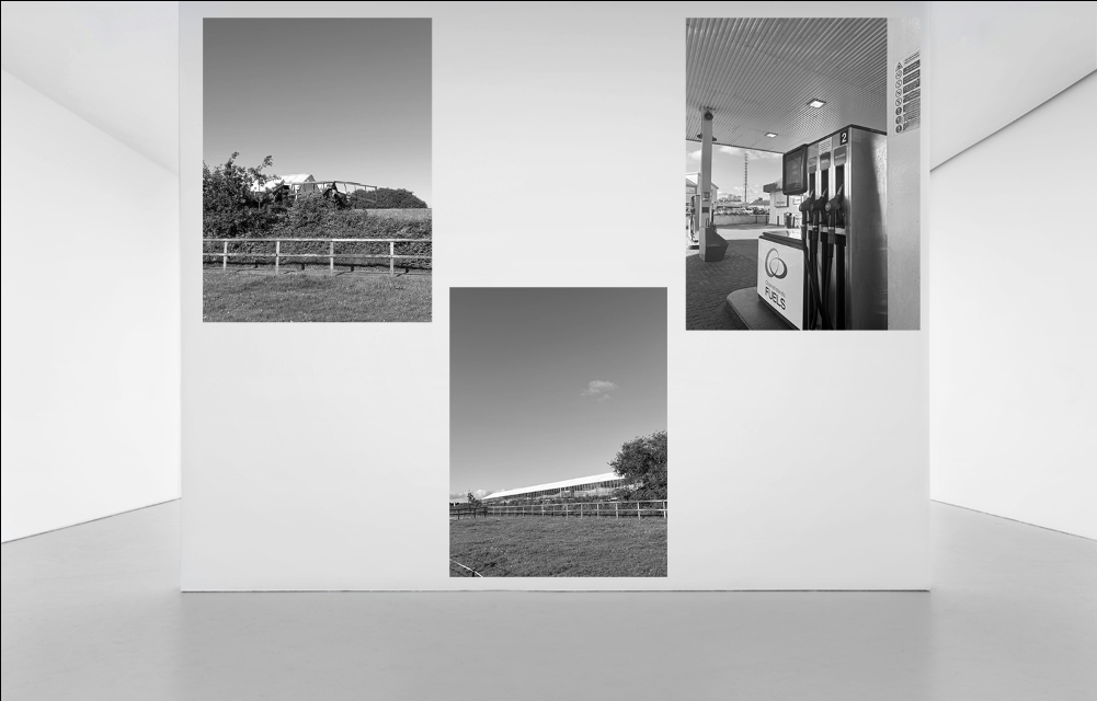
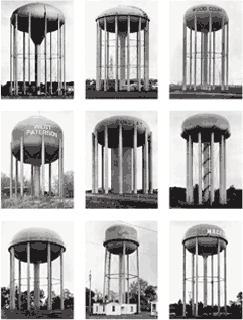
Industrial structures including water towers, coal bunkers, gas tanks and factories. Their work had a documentary style as their images were always taken in black and white. Their photographs never included people.

They exhibited their work in sets or typologies, grouping of several photographs of the same type of structure. The are well known for presenting their images in grid formations.

What were their key works?

Their first photobook Anonymous Sculptures was published in 1970 and is their most well-known body of work. The title is a nod to Marcel Duchamp’s readymades and indicates that the Becher’s referred to industrial buildings as found objects.

The book consisted of an encyclopaedic inventory of industrial structures including kilns, blast furnaces and gas-holders categorised into sections (the pot, the oven, the chimney, the winch, the pump, and the laboratory.

Bernd and Hilla Becher
Water Towers USA, 1988

Edited Photoshoot

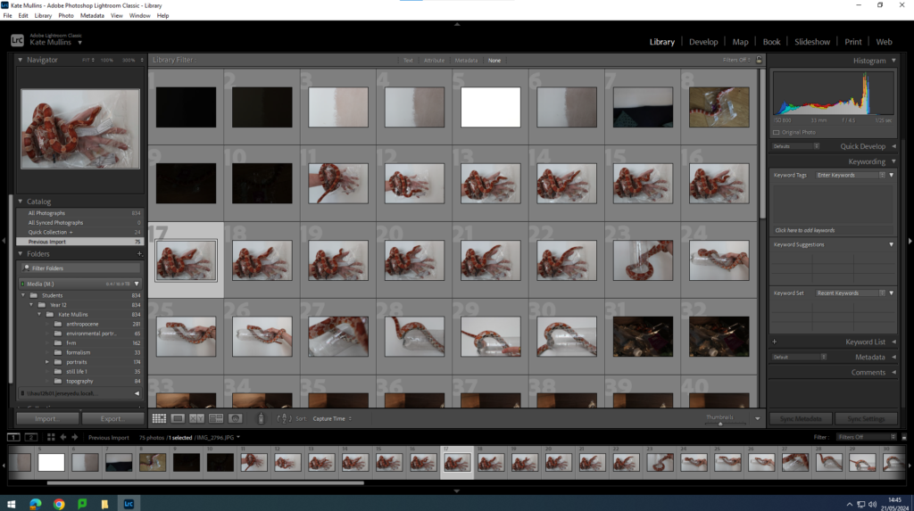
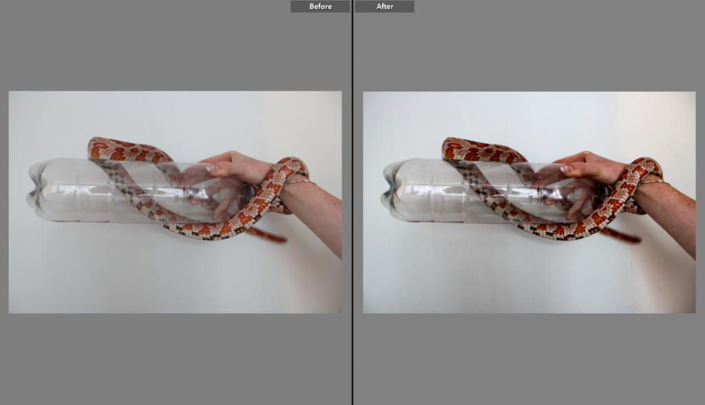
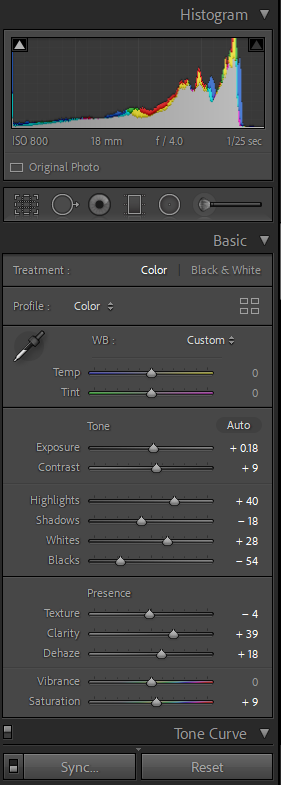
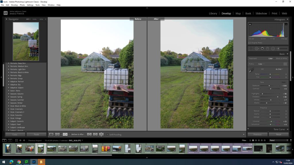
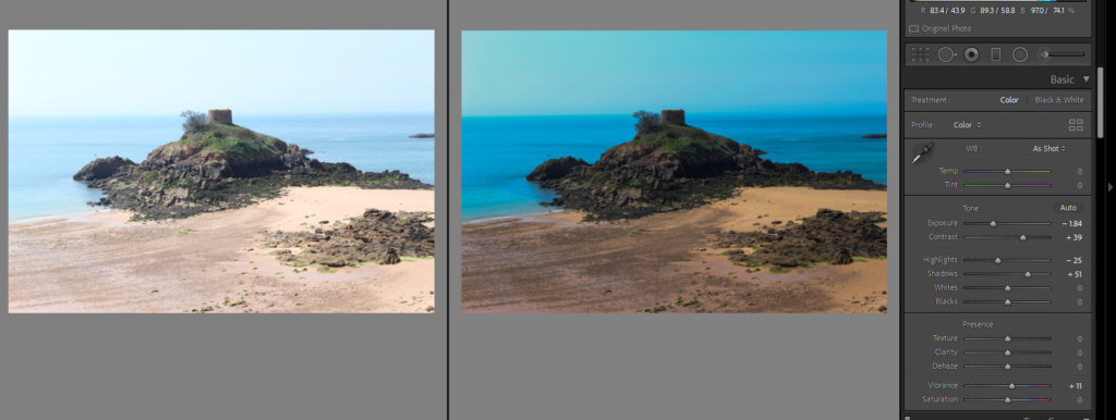
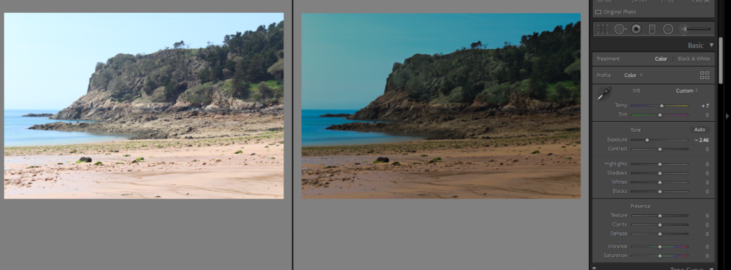
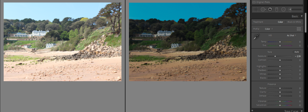
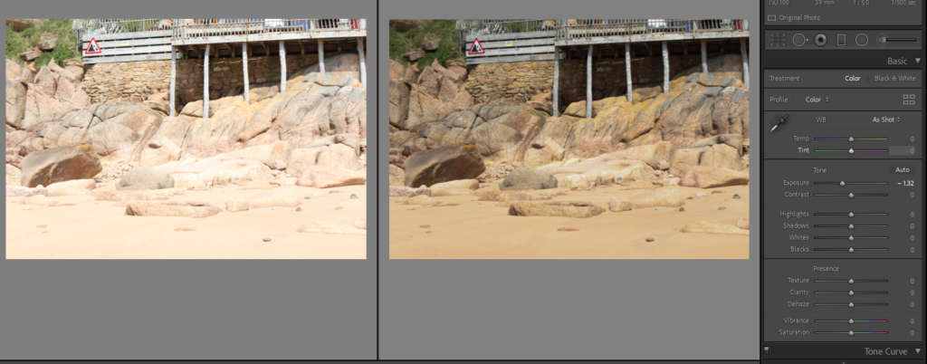
My first editing in Adobe Lightroom:

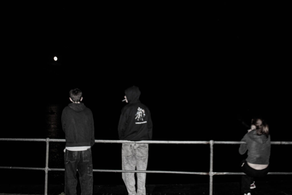
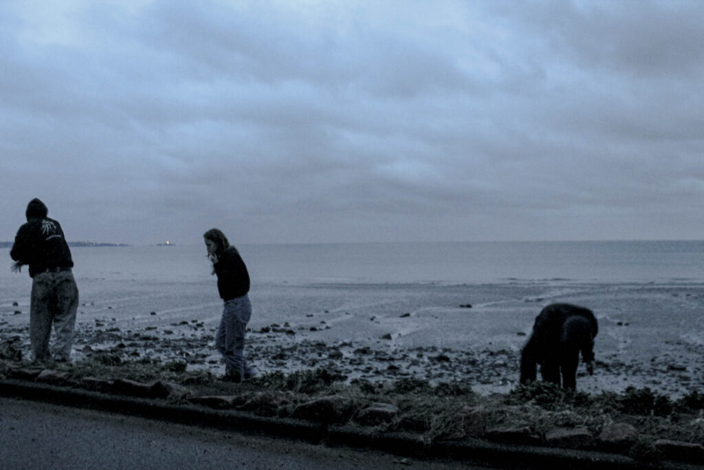
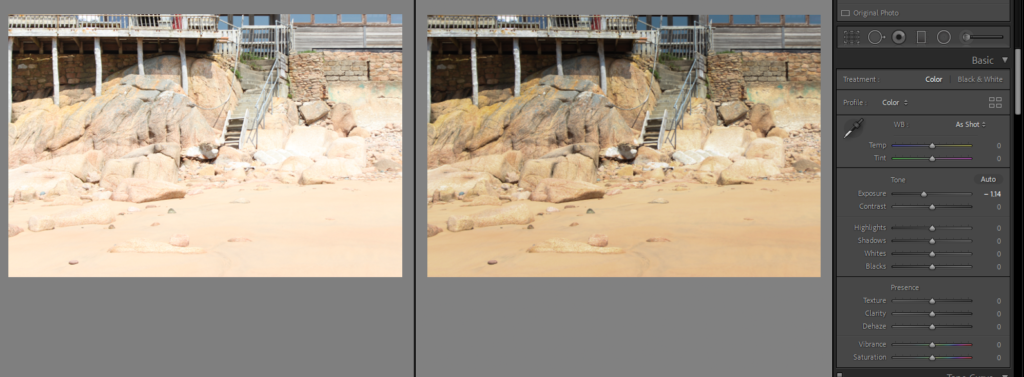
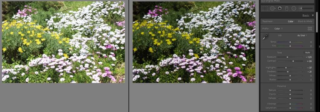
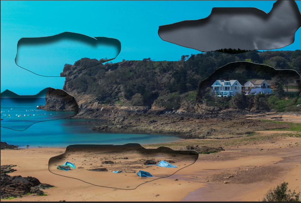
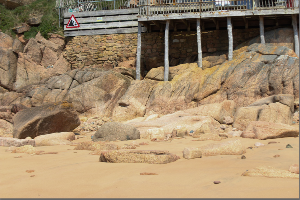
After Editing my photos in Lightroom by just lowering the exposure mainly, I then moved them to Photoshop to add the real edits to make it more like my artist studies and creative idea.

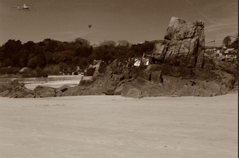
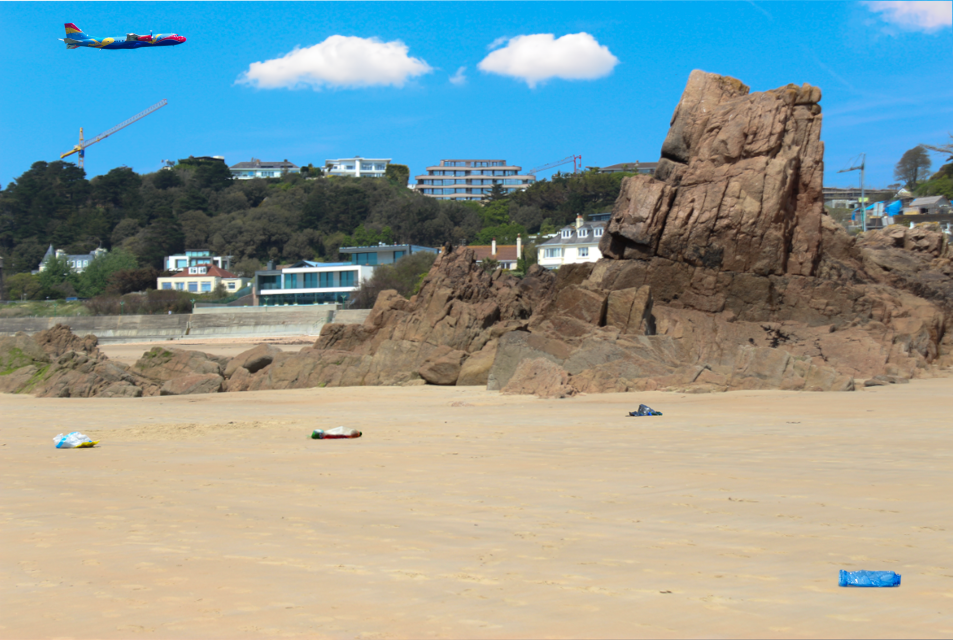
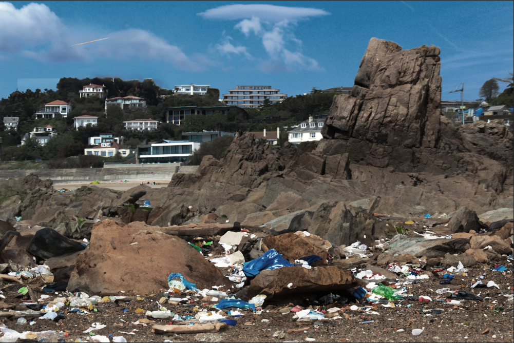
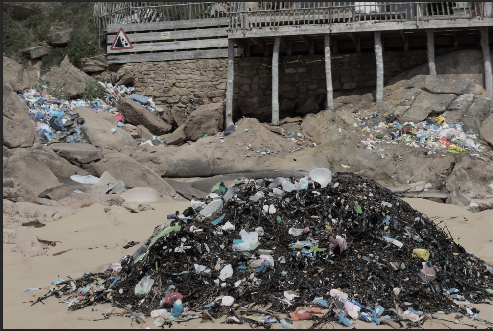
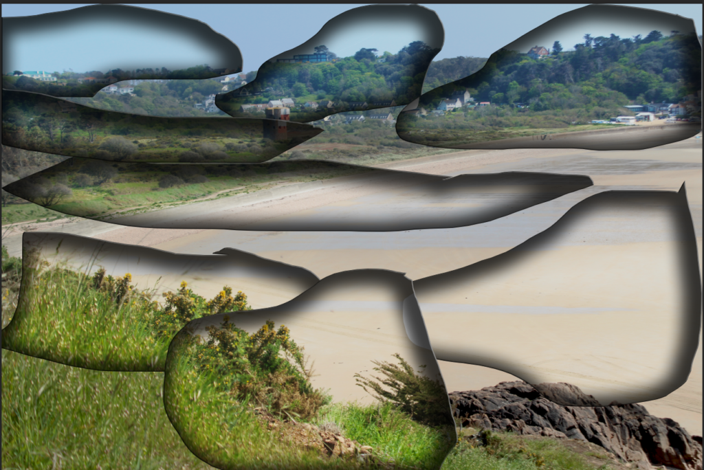
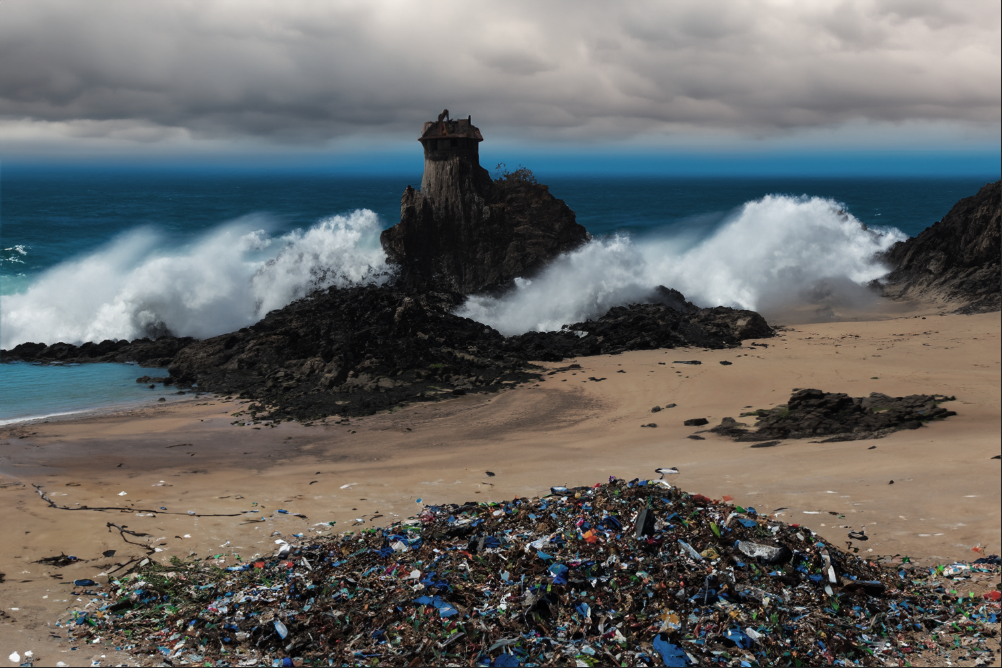
These are most of my final edits, I completed them in photoshop using AI and cutting different parts of different images then sticking them onto other ones.