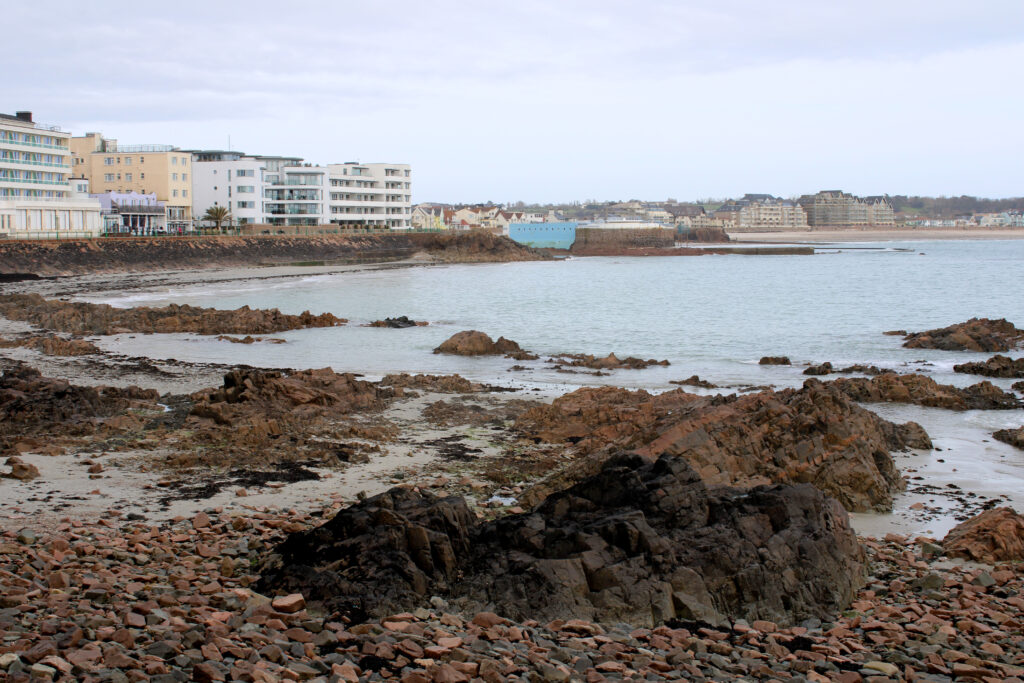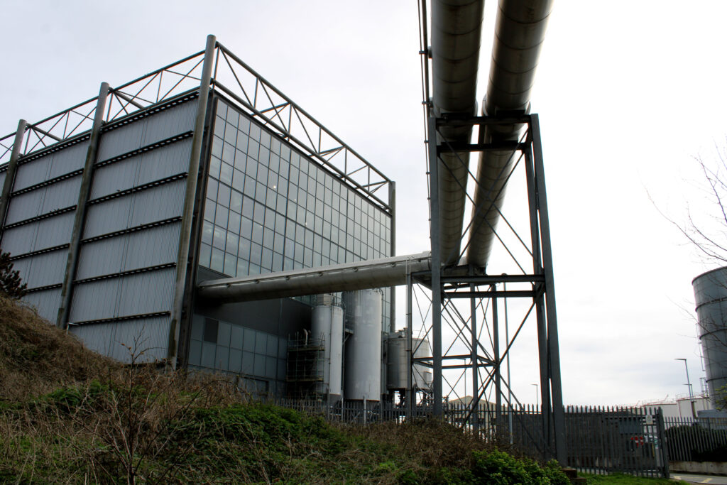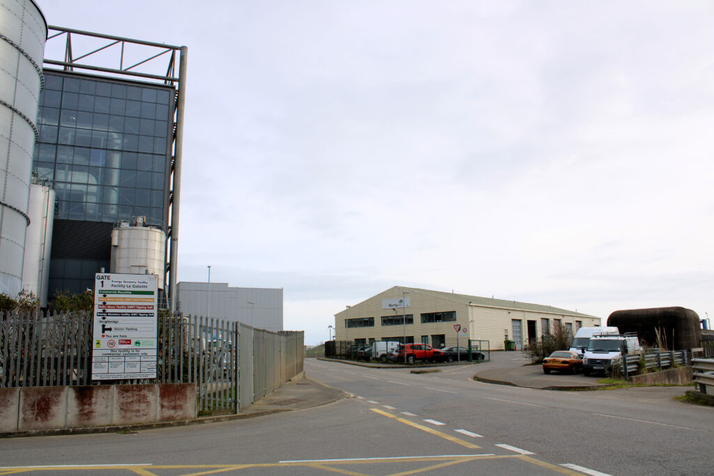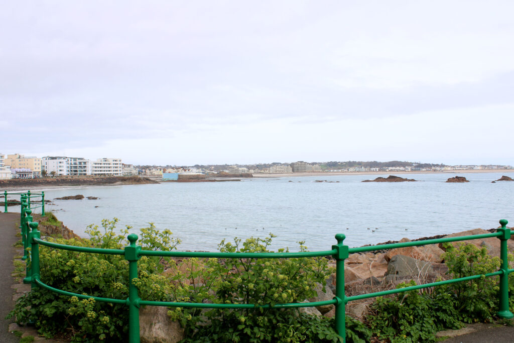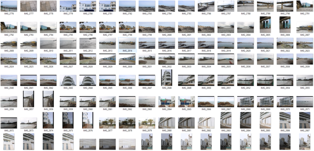

Contact sheet linking to photoshoot:
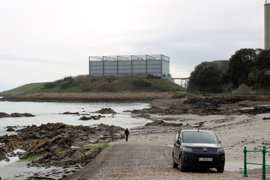
For this photoshoot I decided to present my contact sheet of photographs I took on the walk around from Havre des pas beachy and old contrasting to modern building textures, as well as the more machine-like buildings around la Collette like the jersey electricity centre, the disposal centre and the jersey marina where the viewpoints of the man made boats and structures of buildings contrasts with the nature and the ocean itself, this collision of the “New Topographics” is evident in my photographs presented below.
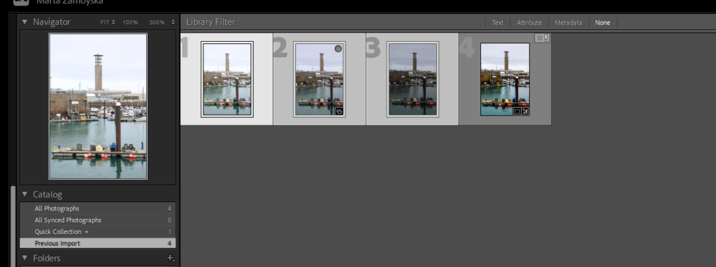
In the screenshot presented above I have demonstrated the HDR merging of my photographs specifically the one where the marina is present with the colourful and the nature as well as the La Collette Chimney being present in the photograph above.
I believe that the use of this HDR merging makes the images look a lot more vibrant and modern as it makes them appear alive, bolder and more saturated the combinations of the images together of the landscapes.
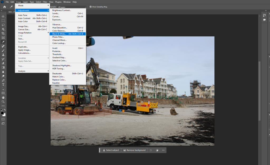
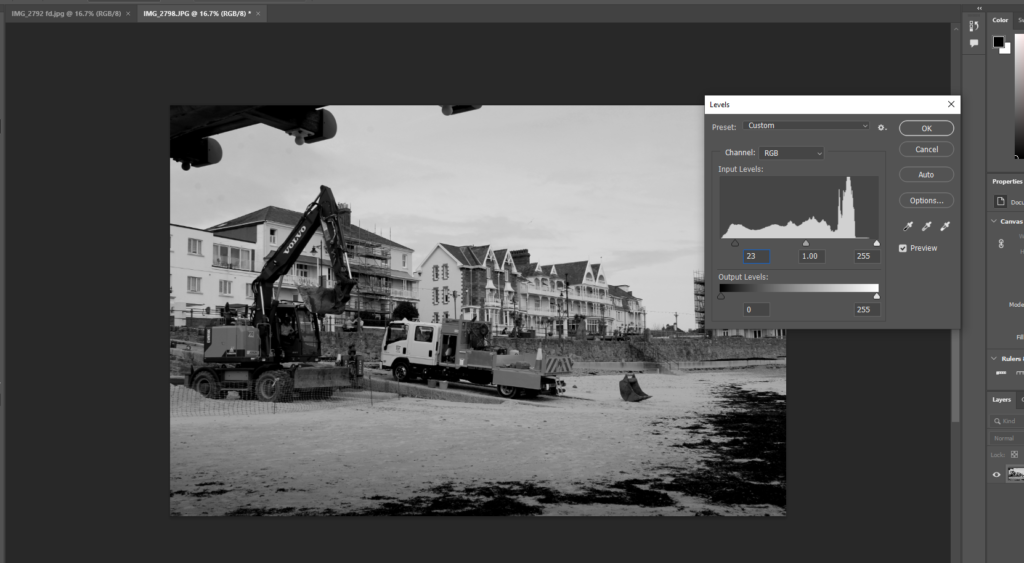
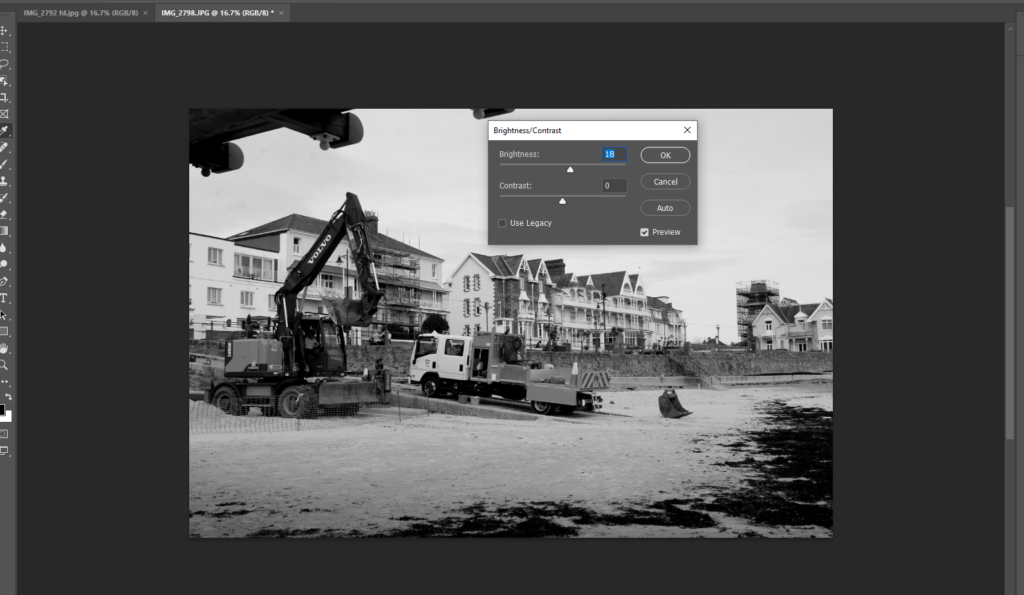
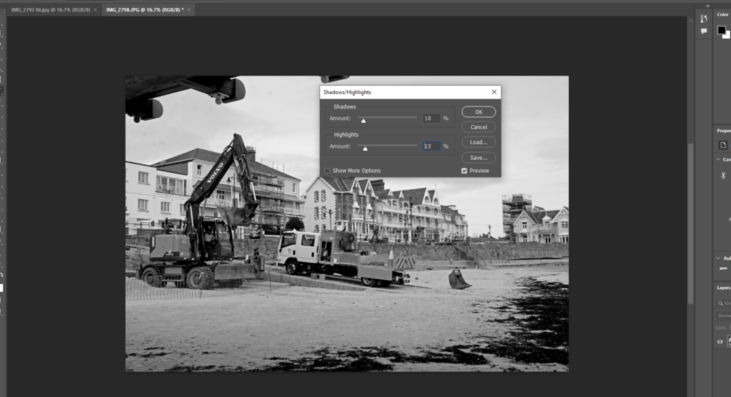
How I edited the photograph through photoshop:
- Desaturate / B&W
- Levels and adjustments
- Adjusted brightness and the contrast the same
- Compared the shadows and highlights.
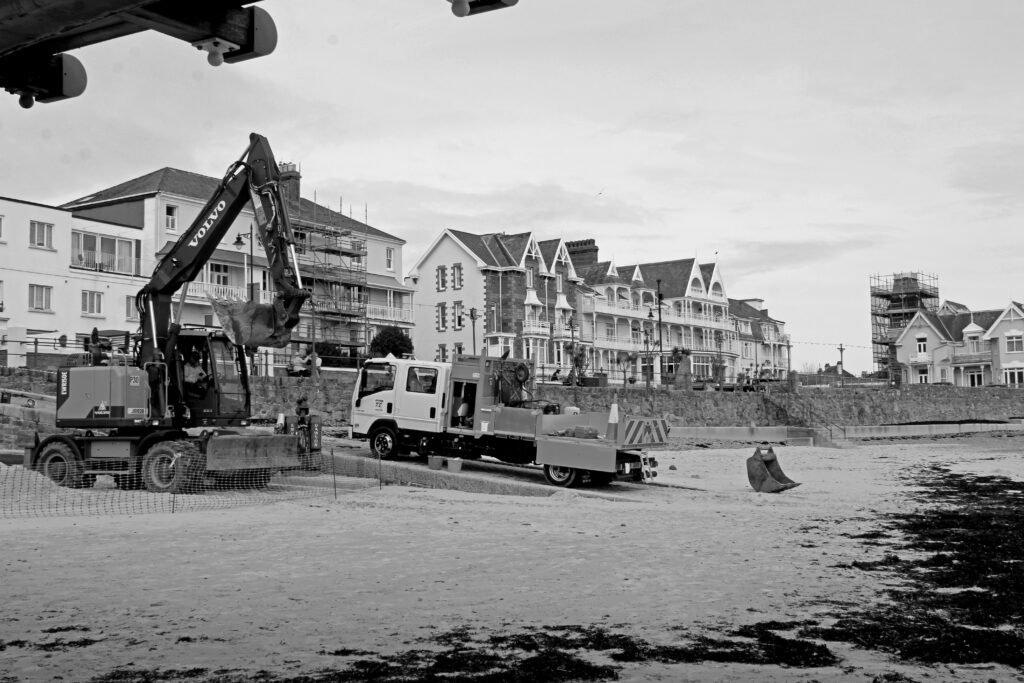
In the photograph above I tried to include the machinery on the beach as well as the buildings and strictures in the background. The lower and higher part of the image challenges these ideas of textures in “The New Topographics”. The idea that in new Topographics the contribution of the man made and natural elements in one image presents the change of architecture and general human activity change. The idea that “ecosystems are damaged or destroyed…suburbia expands, encroaching ever more on the last refuges of the original, pre-European invasion landscape”.
New Topographics Photographs:
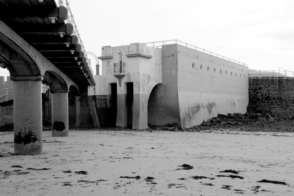
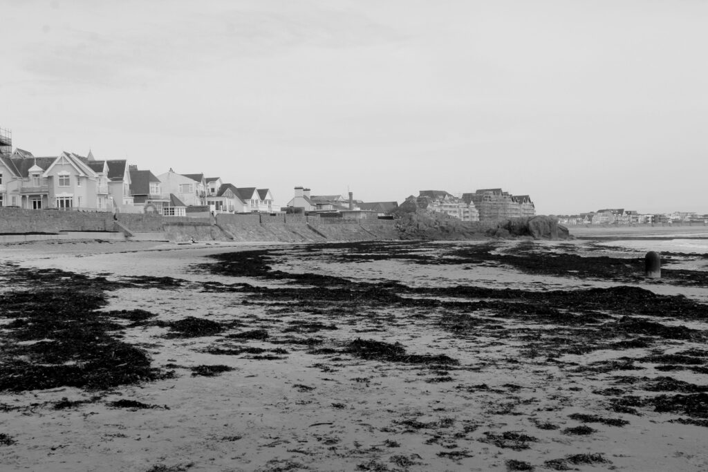
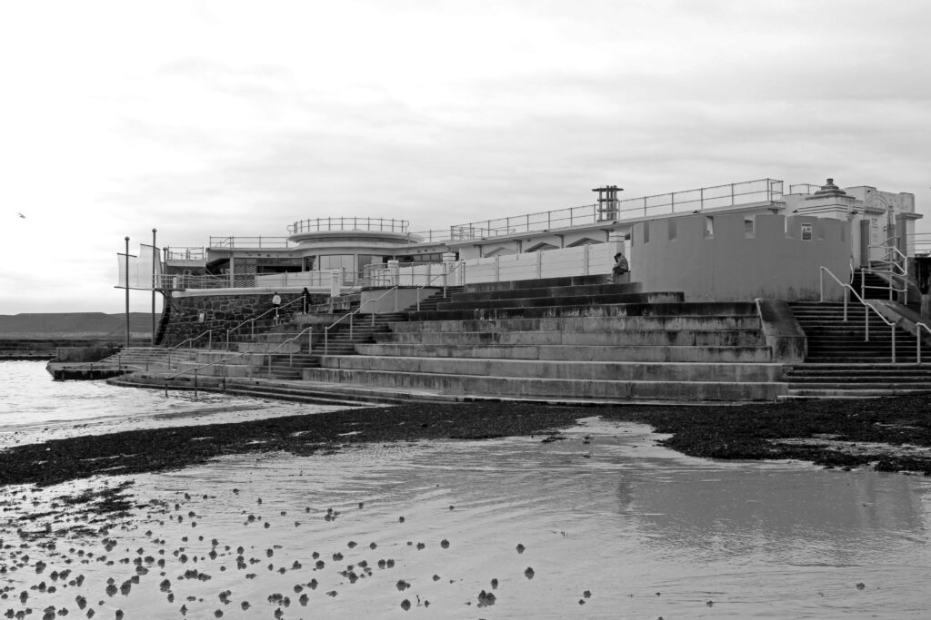
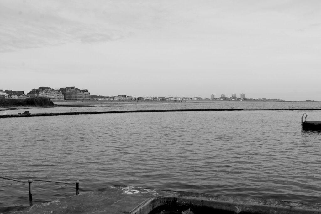
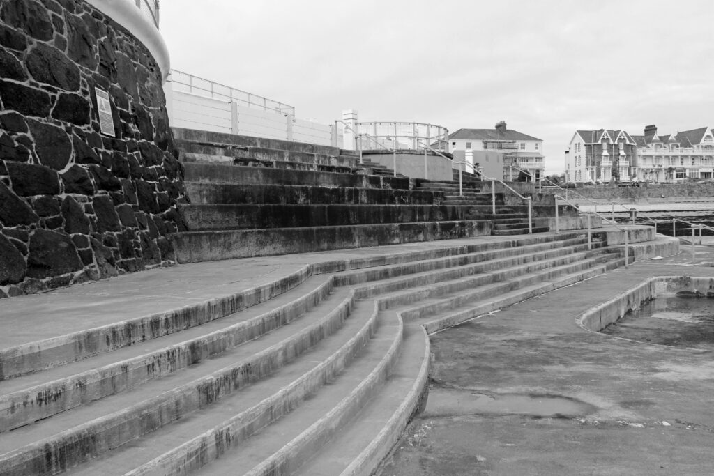
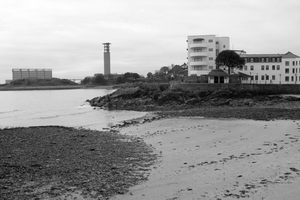
In these images above I took I focused where the contrast between again ” natural and manufactured” features as well as when the darker and brighter/lighter tones appeared in the photograph. From the sea’s waved pattern in the cracks and creases in the Havre Des Pas swimming pool structure to the appearance of finish of the stairs presented going down to the swimming pool.. The clear slit between the darker and light areas makes the image appear more interesting to look at and looks engaging as it looks unconventional; the way the tonalities are positioned in some of the photographs for example the first image and the second to last image.
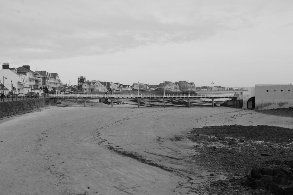
In this photo I wanted to show the composition of the image where a good 3/4 of Havre Des Pas is presented including the direction of the clouds presented in the top of the image itself.
I believe the image presents this landscape well, despite the image being in a monochrome tone. I think the clouds at the top work well coming from the left corner direction.
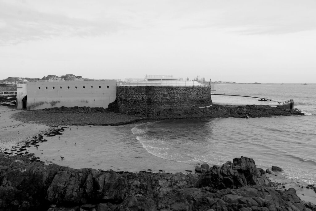
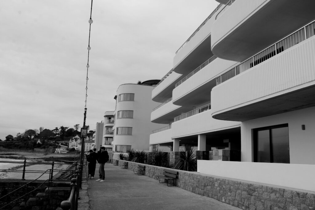
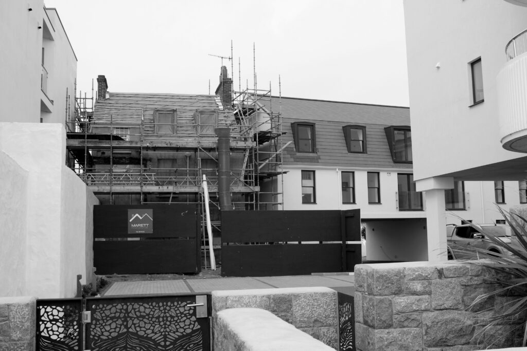
In the photograph especially on the left I feel as though the tones are presented well like mentioned before the clear contrast between the much darker textures and the much lighter ones. I n many of Lewis Baltz photographs the influence of human activity and control/reflection is clear, I tried to present this in my own photoshoot.
The Leica camera which was used by Lewis himself to shoot his photographs whereas to take my photographs I used a canon dslr camera. I aimed to take inspiration from his work despite using the canon dslr, the Leica has ” better results” and is “far easier/faster to shoot”. (https://www.kenrockwell.com/leica/m9/sharpness-28mm.htm)
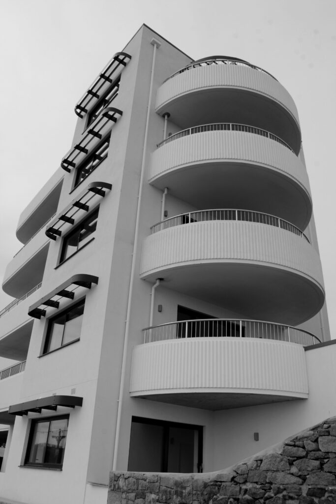
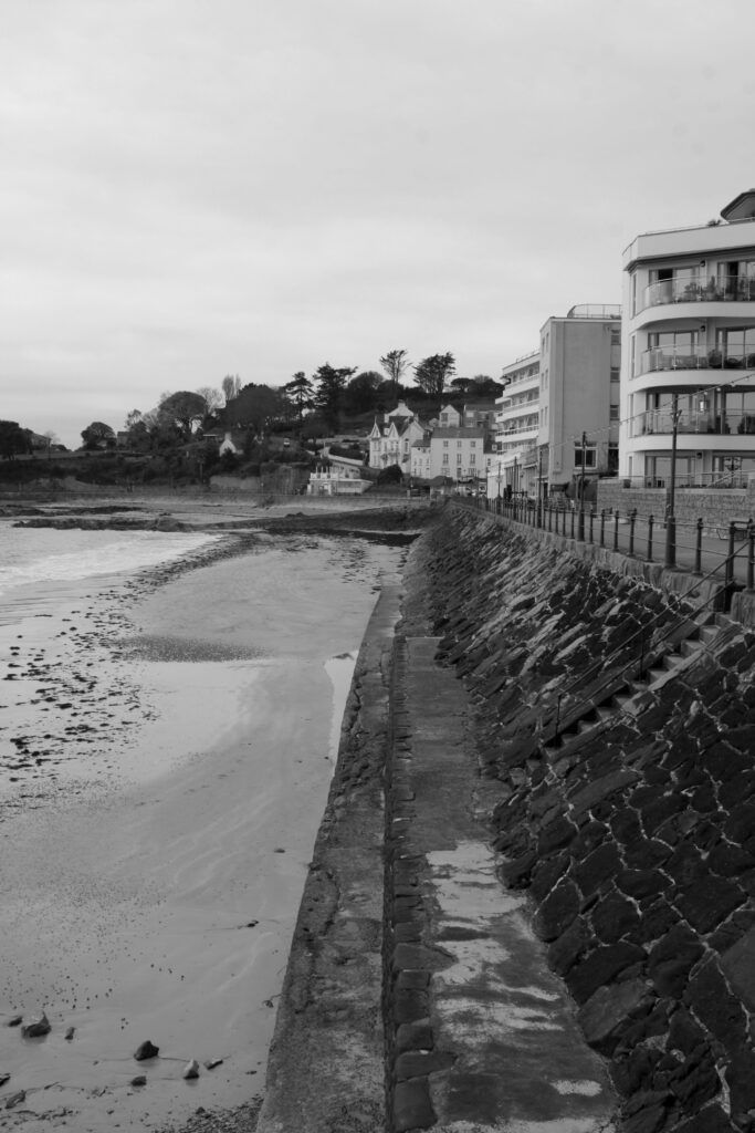
In the photographs above I looked specifically at the textures and the buildings and the difference between the modern buildings and for example the contrast between the newer and older building having construction.
In the photograph on the left presents the building with many different layers and the shadows presented below each layer, I think this plays well into the photoshoot as the different tones are highlighted as well as the rock texture in the bottom right corner.
I like the photograph specifically on the right especially as there is an evident split of colours and nature vs urban scenery. Most of the darker tones are presented on the right side which looks similar , the split, to Lewis Baltz photographs where the black and white contrast is clear and looks very sharp as well as clean.
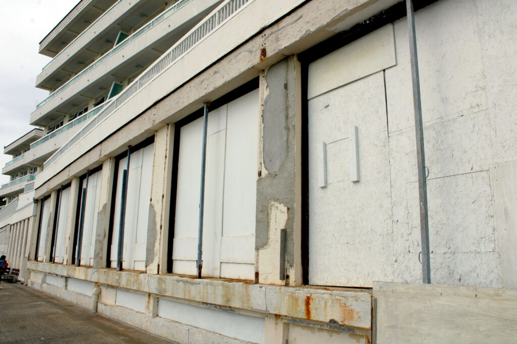
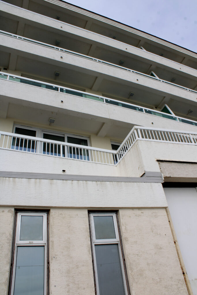
In the photograph above I think the different textures work well. The building looks a bit worn out and the colour looks plain, no vibrant colours show up so the image fits with the theme of new Topographics and the less interesting landscapes.
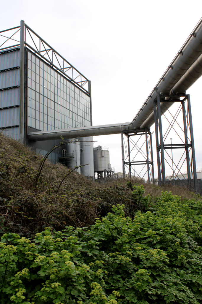
In the photograph above I think the industrial elements play a part alongside with the nature and greenery. The contrast looks interesting as it’s almost split, the juxtaposing features look unusual as below in the lower part of the image it appears brighter than the top half creating the effect and opposition of life vs man made clear.
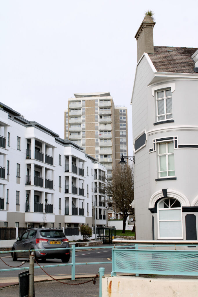
In the photograph above I think that the contrast between the different buildings looks quite interesting with the distinct appearance of each one, the landscape differentiates as the three different appearing structures are all in the frame and look unique as they all have different window panes, different structures, shades and heights as seen above.
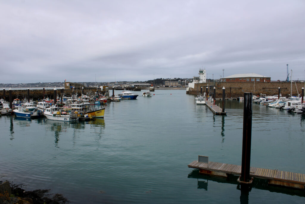
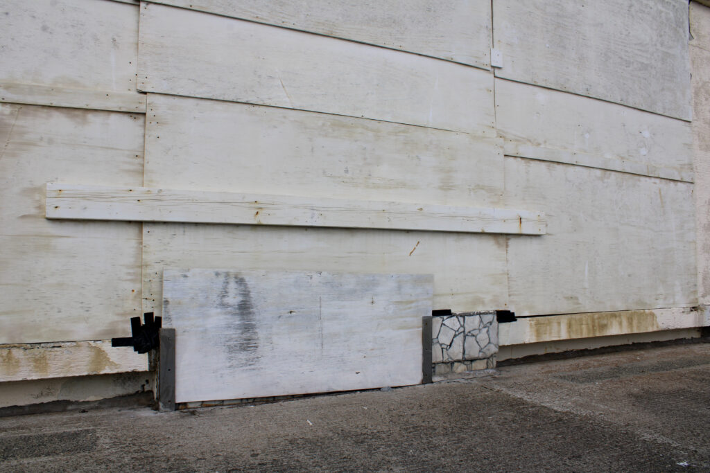
Following the topics of New Topographics I think that the two images above present it well, with the first image at the marina, it presents the water with the land in the background as well as the boats either side of the image framing it an interesting element.
