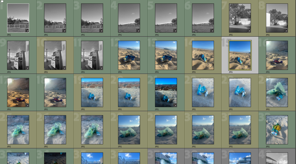
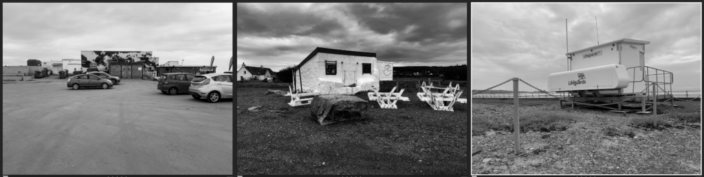
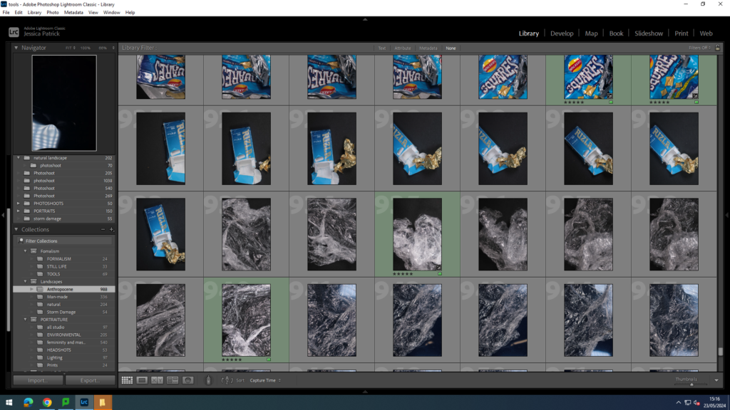
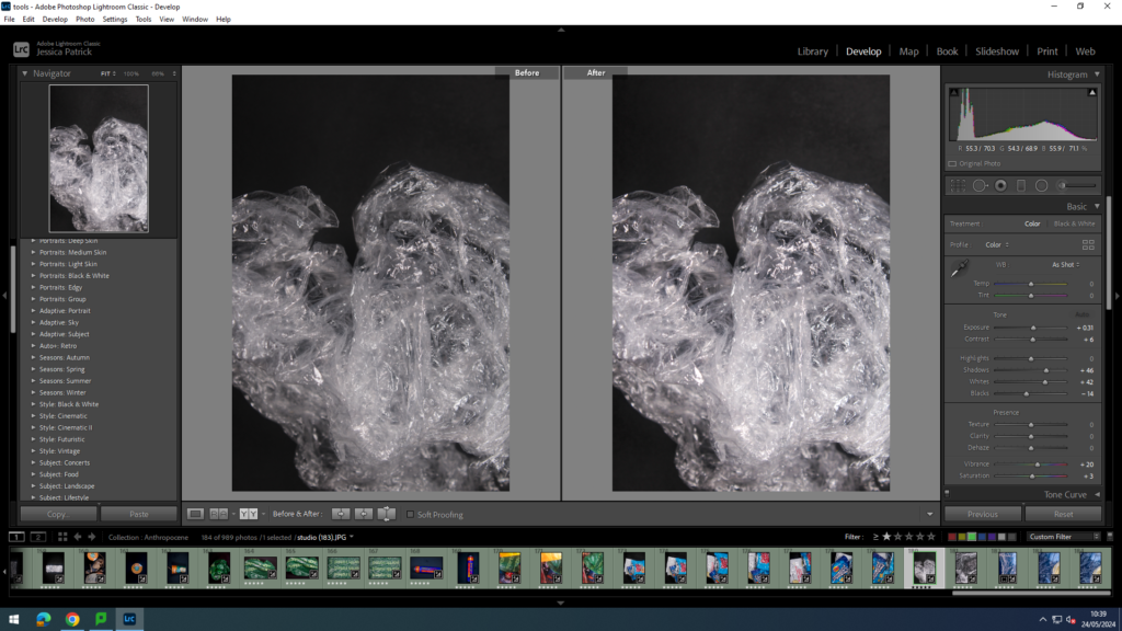
These are some of my images from my photoshoot. I colour labelled them to know which ones were good, and which ones weren’t as good.
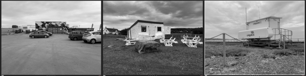
These are my final edited images.
I took this picture at a beach, this is because my artist reference also did similar. I like how the colours are vibrant, how the sun reflects off the wrapper, and how the sand looks golden as if it was glorifying littering.
In this image, I like how the colour of the chewing gum packet, nearly matches the colour of the sky. I also like how the shadow enters the picture, as if it was coming in to the whole photo. This gives off a negative, depressing view on littering.
I like the different colours in this picture. I also like the simple but bold statement this photo gives off.
In all my photos, I tried to be as dramatic as possible as Andy Hughes also was in his pictures. I like these images best as I think they look best to represent Andy Hughes work. I liked working with the same style he used as it is different and fun, but also shows a deep meaning in to how our world is affected through human input.
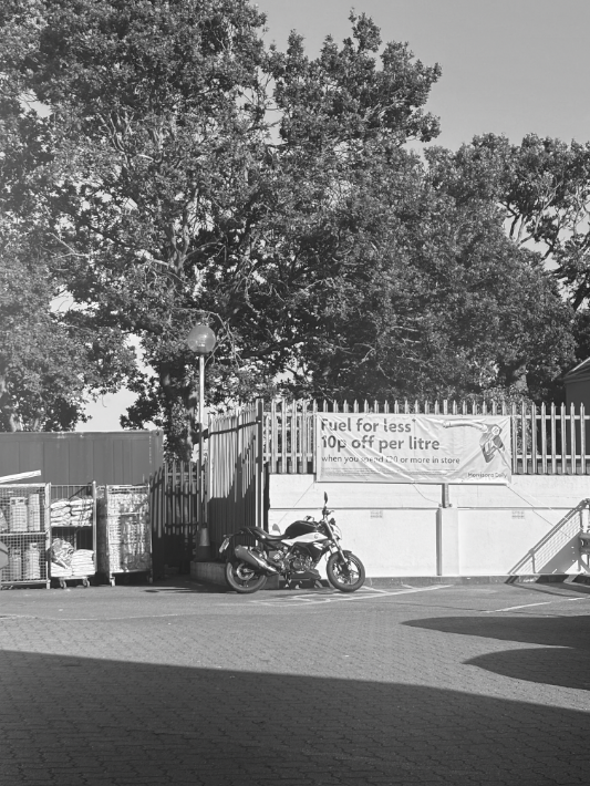
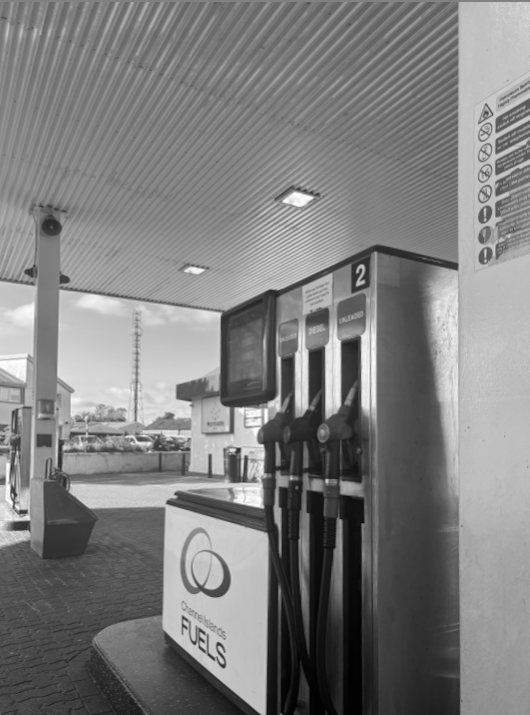
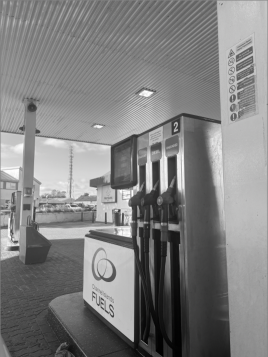
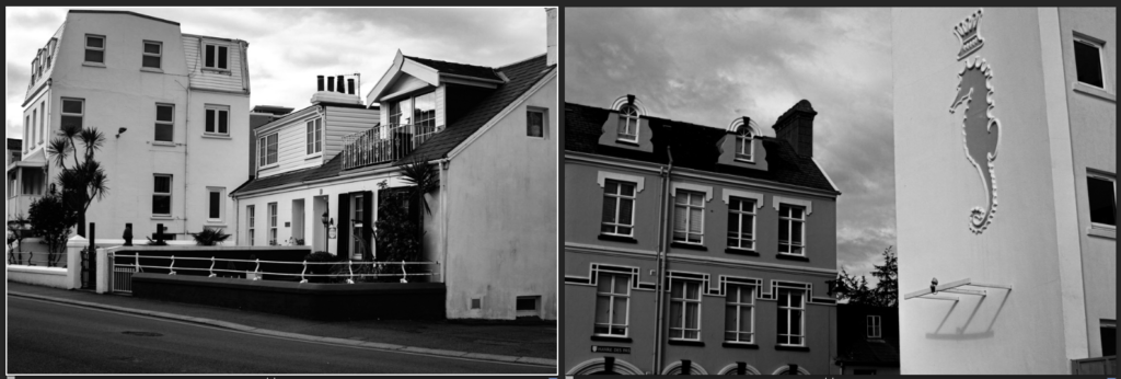
For all my images, I put a black and white filter on. This was a recurring theme throughout all my photos as in typologies, you’ll notice that it is a well known fact that most typology images are black and white. I believe it gives a much better effect for the photo, and will most definitely draw in peoples eyes. For pictures 1&2, I found an abandoned looking green house. The reason it looked abandoned was due to the storm. I like these 2 images as the contrast of fencing, grass and the shed, all relate to each other, almost as if it could tell a story within itself. For pictures 3&4, I took a picture of the green house from a different angle, getting the whole building in it. Personally, they are my two favourites out of all my typologies images. This is as they show typologies well. For picture 5, I liked how there was quite a few things included(motorbike, fencing, trees, storage etc), but also how the black and white filter keeps it all the same. Pictures 6&7 were taken at a petrol station. I like that the photo gives off a rustic feel. Picture 8 is also one of my favourites. I like how the two benches are alone, but are also the most focused on part of the image. I like how it’s simple but effective. For my final image, I took a picture of scaffolding around a house. I liked this as it gives an industrial look.
AI stands for Artificial intelligence it is the science of making machines that can think like humans. It can do things that are considered “smart.” AI technology can process large amounts of data in ways, unlike humans. The goal for AI is to be able to do things such as recognize patterns, make decisions, and judge like humans.
What is AI used for?
Artificial intelligence is widely used to provide personalised recommendations to people, based for example on their previous searches and purchases or other online behaviour.
Examples of what AI can do:
Create and generate images by using prompts.
create texts of any kind
help make websites
create products
design games
My Experimentation with AI
Original image:
First Use of AI editing
In this first try of my AI editing I chose to add some small and discrete differences to the image so that people would have to look closer at the image to see the changes I have made within it. For this image I added some windmills and more crowded buildings to the foreground on the left hand side of the image to represent what the island may look like in roughly about 5-10 years time due to all the overpopulating and crowding.
Second version of the edit:
As described in the above edit I have tried making the second version of the edit more crowded and more of what the island may look like in roughly 10-15 years due to the overpopulating of the world and on island due to the size of the island and the amount of people coming to live here.
This is my Mandy Barker Virtual Gallery. I chose these images because they represent her work the best and relate to the theme of Anthropocene because they relate to plastic pollution and just how much plastic there is in the oceans.
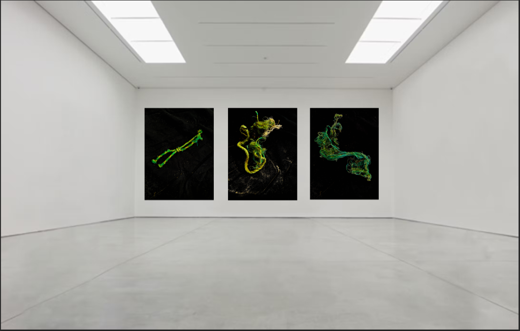
Anthropocene Light Pollution Virtual Gallery
This is my Anthropocene virtual gallery. I chose these images because they capture light pollution the best and showcase what light pollution represents. The balance between the natural light and the artificial light contrasts really well making the concept of the image balanced.
A photographic typology is a body of work that visually explores a theme or subject to draw out similarities and differences for examination. Through the methodical photography and presentation of a specific subject or theme, a typological photographer makes a space that invites a viewer to simultaneously identify both consistencies and distinctions in a series, building up a more nuanced whole.
The typology is a genre built on differences and correlations. Visual classification according to a specific type has historically been applied in sectors ranging from architecture to botany, with carefully laid out illustrations distributed across a page to illuminate key aspects of a subject. As photography developed, so did the execution of photographic typologies – photographers gathered subjects and/or themes in a cohesive presentation deliberately designed for motivating comparisons within similar visual content for identification and insight.
Illustrated typologies from Goldsmith’s Animated Nature (1774)
August Sander – The Face of Our Time
August Sander’s father was a mine carpenter and, later, the family ran a small plot of farmland. Sander first discovered photography at the local mine, while helping carry the equipment of a company photographer. His son Gunther said, that looking through a camera ‘transfixed him – and not just for that instant’. He spent his military service (1897–99) as a photographer’s assistant and went on to set up his own photography studio in Cologne in 1909.
In the mid-1920s, Sander began his highly ambitious project ‘People of the 20th Century’. In it, Sander aimed to document Germany by taking portraits of people from all segments of society. 40,000 negatives were destroyed during WWII and in a fire. The project adapted and evolved continuously, falling into seven distinct groups: ‘The Farmer’, ‘The Skilled Tradesman’, ‘The Woman’, ‘Classes and Professions’, ‘The Artists’, ‘The City’ and ‘The Last People’. Sander categorised his portraits according to their profession and social class.
Sander once said ‘The portrait is your mirror. It’s you’. He believed that, through photography, he could reveal the characteristic traits of people. He used these images to tell each person’s story; their profession, politics, social situation and background
Seen together, Sander’s images form a pictorial mosaic of inter-war Germany. Rapid social change and newfound freedom were accompanied by financial insecurity and social and political unrest. By photographing the citizens of the Weimar Republic – from the artistic, bohemian elite to the Nazis and those they persecuted – Sander’s photographs tell of an uncertain cultural landscape. It is a world characterized by explosions of creativity, hyperinflation and political turmoil. The faces of those he photographed show traces of this collective historical experience.
Sander’s methodical, disciplined approach to photographing the world has had an enormous influence on later photographers, notably Bernd and Hilla Becher. This approach can also be seen in the work of their students Thomas Struth and Thomas Ruff. Other photographers who have explored this idea include Stephen Shore, Gillian Wearing, Nicholas Nixon, Martina Mullaney and Ari Versluis.
Bernd & Hilla Becher – Typologies of industrial architecture
The German artists Bernd and Hilla Becher, who began working together in 1959 and married in 1961, are best known for their typologies (grids of black-and-white photographs) of variant examples of a single type of industrial structure. To create these works, the artists travelled to large mines and steel mills, and systematically photographed the major structures, such as the winding towers that haul coal and iron ore to the surface and the blast furnaces that transform the ore into metal. At each site the Bechers also created overall landscape views of the entire plant, which set the structures in their context and show how they relate to each other. The typologies emulate the clarity of an engineer’s drawing, while the landscapes evoke the experience of a particular place. The exhibition presents these two formats together; because they lie at the polar extremes of photographic description, each underscores the creative potential of the other.
For close to fifty years, they documented architectural forms they collectively referred to as “anonymous sculpture.” Their extensive series of water towers, blast furnaces, coal mine tipples, framework houses of mine workers, and other vernacular industrial architecture—often technologies on the verge of obsolescence—comprise an in-depth study of the intricate relationship between form and function. The Bechers produced black and white photographs, using a large-format camera carefully positioned under overcast skies to record shadowless front and side elevation views of their subjects. Arranging these matched photographs in a grid, the Bechers grouped buildings by function, underscoring the similarities and differences between structures.
Bernd Becher studied painting and lithography, and Hilla Wobeser trained as a commercial photographer. The two met in Düsseldorf, and began collaborating, photographing industrial sites Bernd knew from his childhood. The Bechers went on to teach at Kunstakademie Düsseldorf, where they influenced a generation of photographers including Andreas Gursky, Thomas Ruff, Candida Höfer, and Thomas Struth.
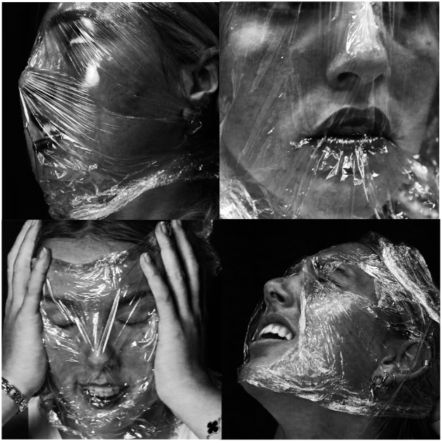
For Anthropocene, I decided to stick to the theme of plastic to focus on for my edited images, so the photos would all link to one theme.
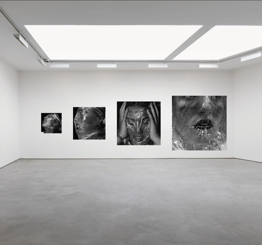
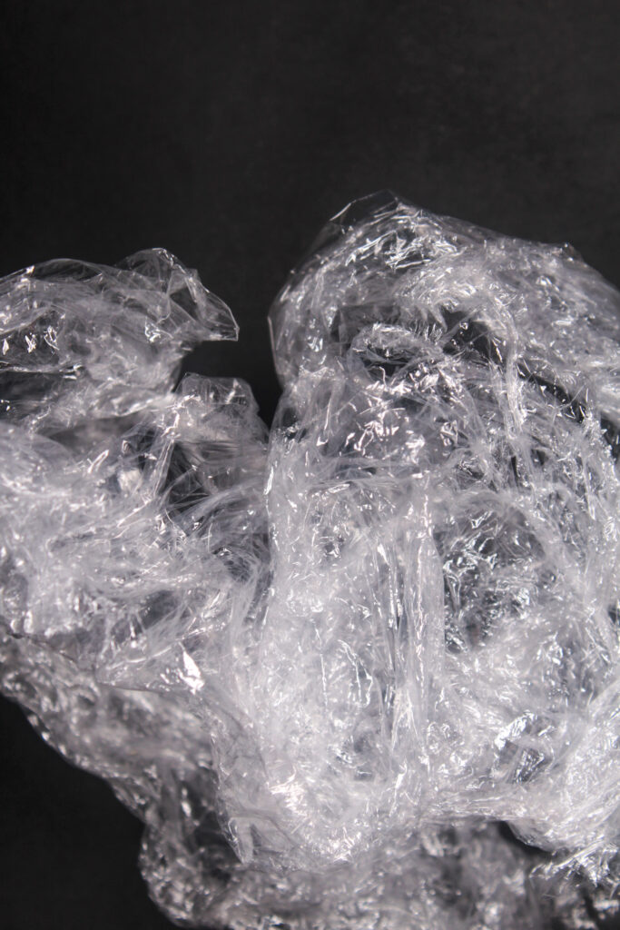
I really like these images and how they were all the same but portraying different emotions, but I wanted to add more. So, I then made them black and white using Adobe Photoshop:
Whilst editing, I increased the brightness and contrast to clearly show the textured lines within the plastic around her face. I also increased the red hue to exaggerate the colour of her lips and cheeks. I really liked these images so I continued further to crop the photos to make them square, and add them into a grid layout.
I think these are really successful images, and I’m happy with the structure of using a grid to produce them. I’m using these photos for my final images because I really like the black and white contrast and how the light reflects off the plastic, so the crumpled texture is clear to see.
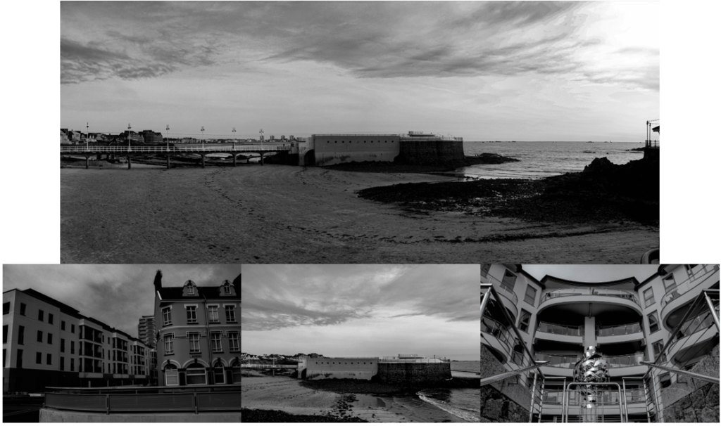
Landscapes:
I only chose to use two photos for my final images as I felt they were my strongest and best images I edited. I also think that none of my other photos would link as well as these ones do together.
Topographics:
I really like these images because I edited them similarly, so it shows that they were all taken on the same day. I chose to edit them in black and white because I was inspired by the photographer Robert Adams, who focuses on landscape photography and edits his photos into black and white.
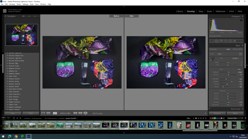
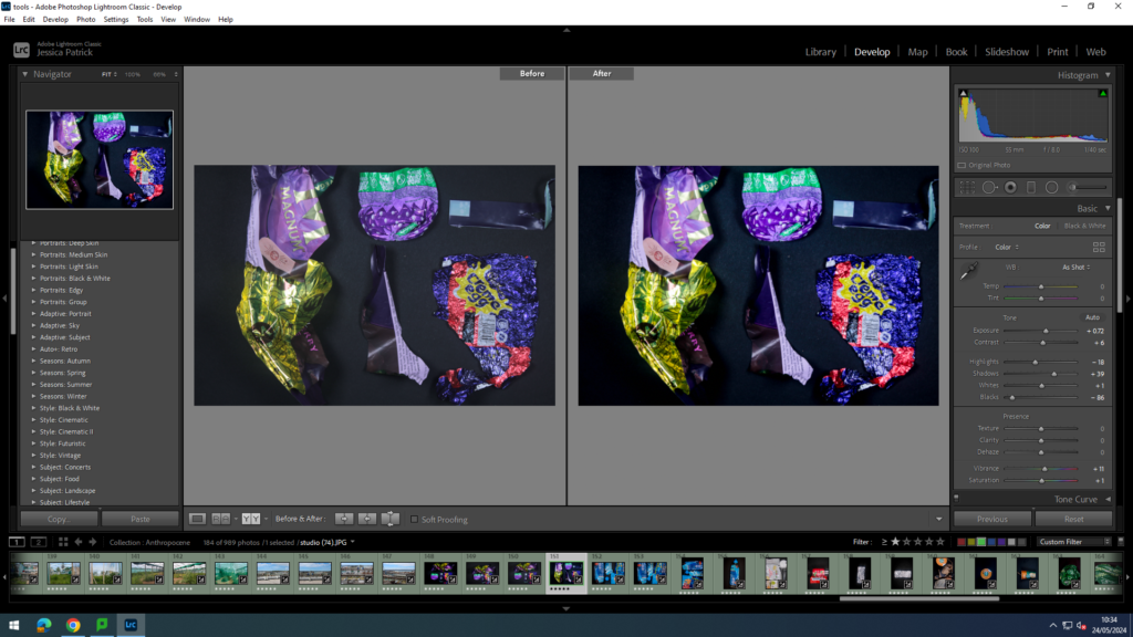
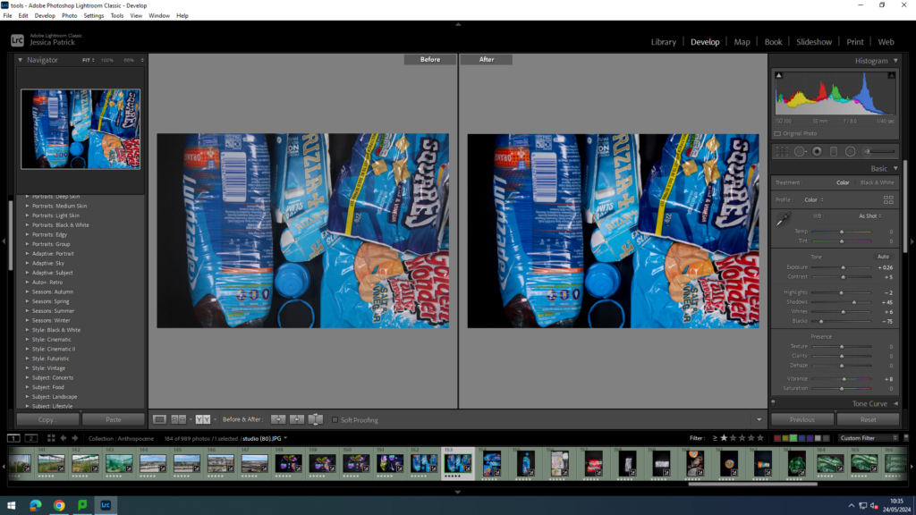
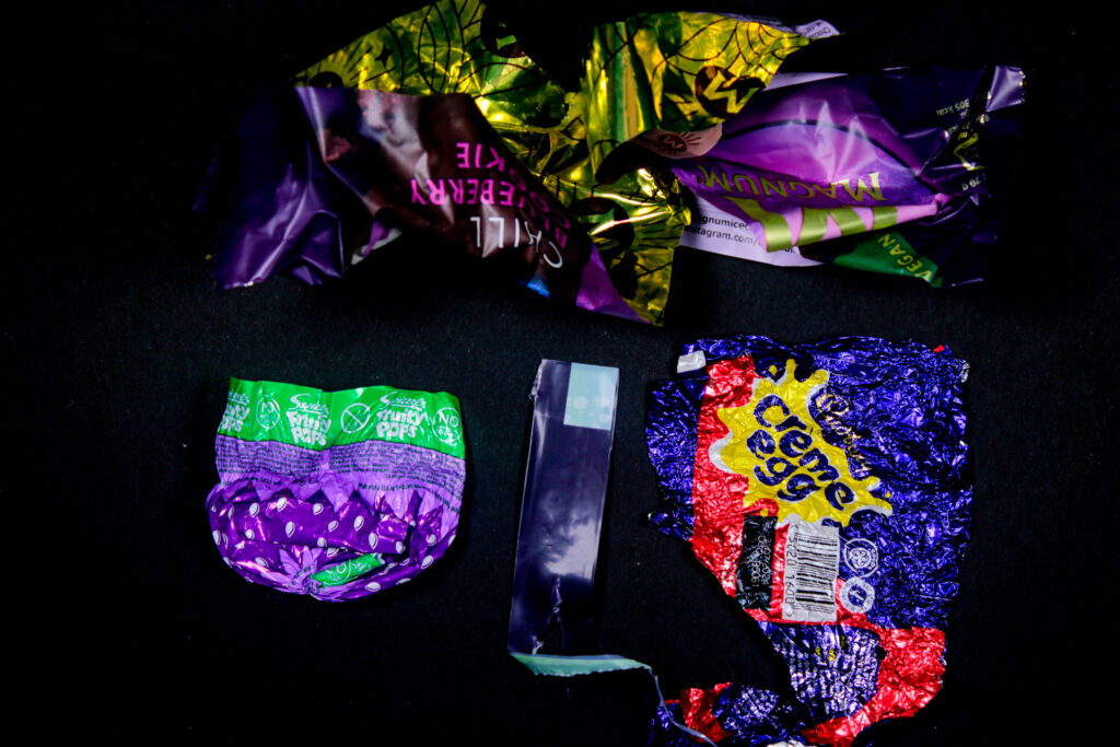
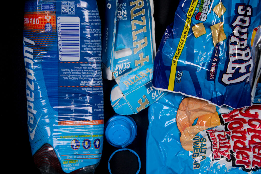
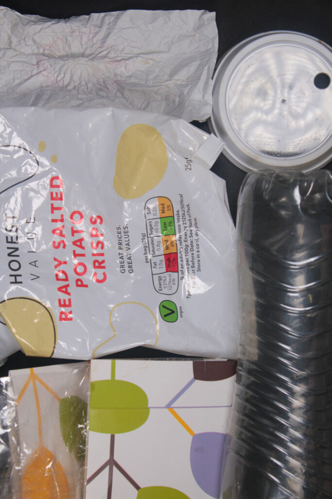
For this photoshoot, I used all the discarded plastic that I had collected from my response to Edward Burtynsky at Harve de Pas beach and Green Street Cemetery. I used the schools studio for these images and I displayed my discarded plastics out on a black sheet in a pattern, with different colours.
Edits
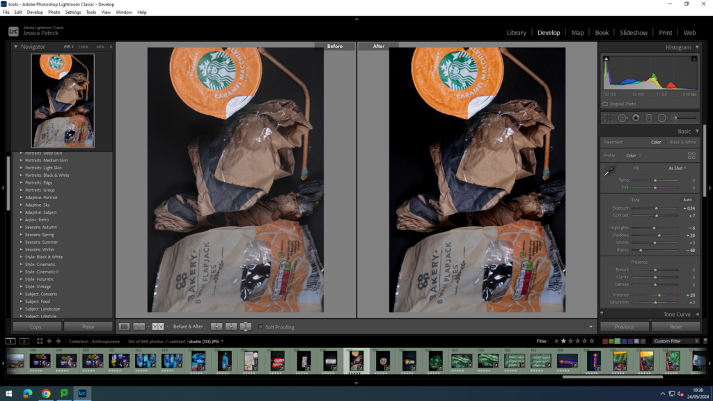
I edited this image by increasing the exposure, contrast, shadows, vibrancy and saturation, while decreasing the highlights and blacks. I did this, so the black background was more of a solid black, instead of having greyer tones. I increased the vibrancy, so that the blue litter would be more vibrant and stand out more against the black background.
I edited this image by increasing the exposure, contrast, shadows, vibrancy and saturation, while decreasing the highlights, whites and blacks. I did this, so the black background was more of a solid black, instead of having greyer tones. I also wanted to make the purple litter pop more and be more vibrant against the black background.
I edited these images in the same way, but I experimented with the placement of the discarded litter, so that I could find the most aesthetic pattern.
I edited this image by increasing the exposure, contrast, shadows, white and vibrancy,, while decreasing the highlights and blacks. I did this, so the black background was more of a solid black, instead of having greyer tones. I also wanted to make the blue litter stand out more and be more vibrant and eye catching.
I then experimented with the way I presented the litter, so I could find the most appealing pattern.
I edited this image by increasing the exposure, contrast, shadows, whites, vibrancy and saturation, while decreasing the highlights and blacks. I did this, so the black background was more of a solid black, instead of having greyer tones. I wanted the white and clear colours to stand out more especially against the black background. I especially wanted the clear rubbish to stand out more, as it can be very hard to be seen.
I edited this image by increasing the exposure, contrast, shadows, vibrancy and saturation, while decreasing the whites, highlights and blacks. I did this, so the black background was more of a solid black, instead of having greyer tones. I also wanted the red colours to stand out more and be more vibrant.
I edited this image by increasing the exposure, contrast, shadows, vibrancy and saturation, while decreasing the highlights and blacks. I did this, so the black background was more of a solid black, instead of having greyer tones. I also wanted the beige tones to stand out more, as they are not as eye capturing or vibrant.
Next, I experimented with single object photos, which Barry Rosenthal did not really do.
I edited these images by increasing the exposure, contrast, shadows, whites, vibrancy and saturation, while decreasing the highlights and blacks. I did this, so the black background was more of a solid black, instead of having greyer tones. I wanted the metallic silver to stand out more and look more metallic and shiny.
I edited this image by increasing the exposure, contrast, shadows, whites, vibrancy and saturation, while decreasing the highlights and blacks. I did this, so the black background was more of a solid black, instead of having greyer tones. I wanted the blue and orange colours in the bottle to be more vibrant and stand out more against the black background.
I edited this image by increasing the exposure, contrast, shadows, vibrancy and saturation, while decreasing the whites, highlights and blacks. I did this, so the black background was more of a solid black, instead of having greyer tones. I wanted this beige/ orange colour to stand out more, as it is not very vibrant.
Then, I experimented with different angles of this.
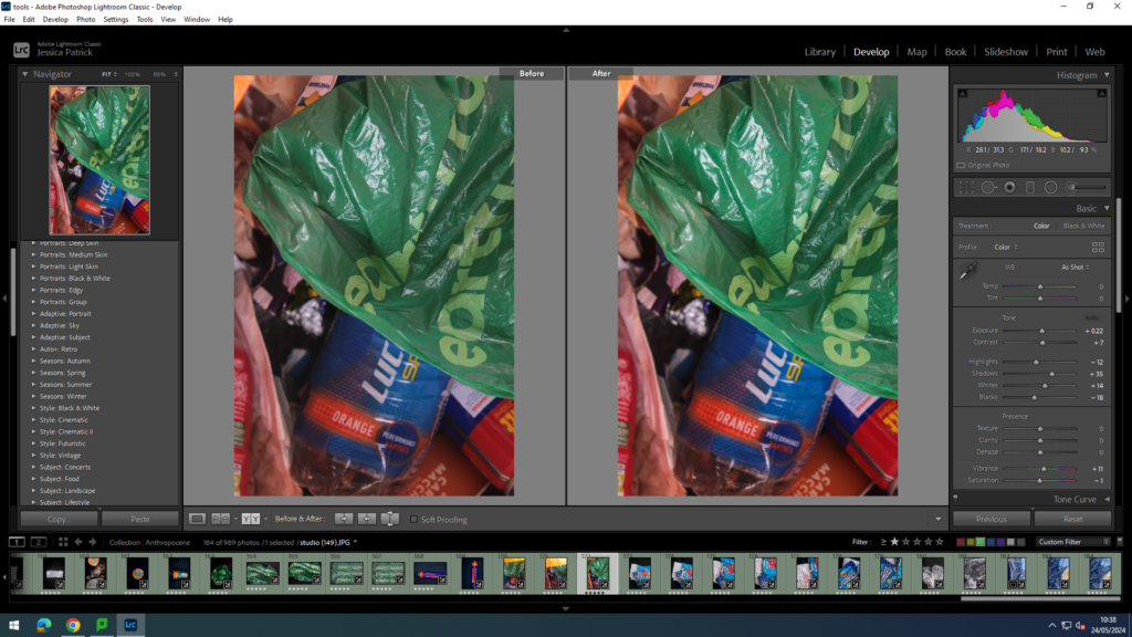
I edited this image by increasing the exposure, contrast, shadows, whites, vibrancy and saturation, while decreasing the highlights and blacks. I did this, so the black background was more of a solid black, instead of having greyer tones. I also wanted the green and orange colours to stand out more.
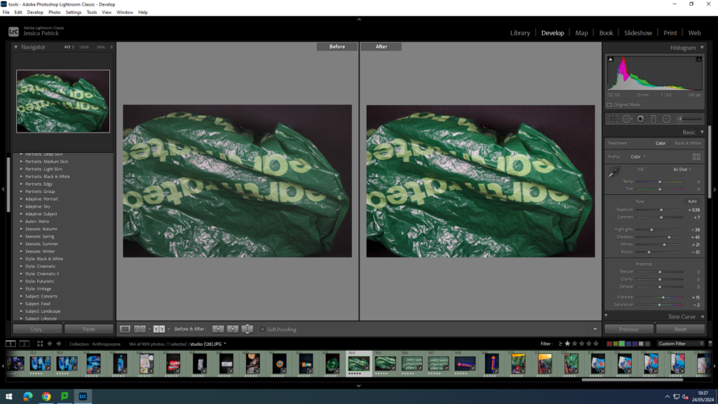
I edited this image by increasing the exposure, contrast, shadows, whites, vibrancy and saturation, while decreasing the highlights and blacks. I did this, so the black background was more of a solid black, instead of having greyer tones. I also wanted to make the bag much more vibrant and more of a darker green.
I edited these images in the same way, but experimented with different angles.
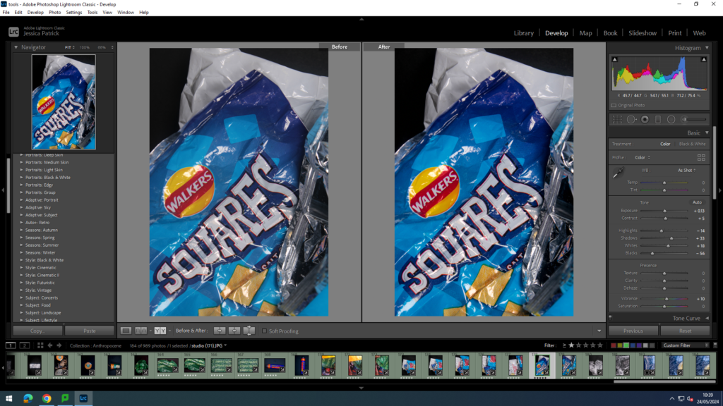
I edited this image by increasing the exposure, contrast, shadows, vibrancy and saturation, while decreasing the whites, highlights and blacks. I did this, so the black background was more of a solid black, instead of having greyer tones. I wanted the colours to be much more vibrant as well, as there is many colours on there.
I edited this image by increasing the exposure, contrast, shadows, vibrancy and saturation, while decreasing the highlights and blacks. I did this, so colours would be much more vibrant, as there is so many colours displayed.
I edited this image by increasing the exposure, contrast, shadows, vibrancy and saturation, while decreasing the highlights and blacks. I did this, so the black background was more of a solid black, instead of having greyer tones. I wanted the different range of blues and colours to be more vibrant.
I edited these in the same way, but experimented with the placement of the rubbish.
I edited this image by increasing the exposure, contrast, shadows, whites, vibrancy and saturation, while decreasing the highlights and blacks. I did this, so the black background was more of a solid black, instead of having greyer tones. I also wanted the white sections of the cling film to be more of a purer white, rather than more grey.
Experimenting
Me and Katie then experimented with the litter by trying to create a natural environment artificially by using the litter. We tried creating a beach scenery using cling film, yellow rubbish and blue gels.
I edited this image by increasing the exposure, contrast, shadows, whites, vibrancy and saturation, while decreasing the highlights and blacks. I did this so the white would be a purer white and the blue more vibrant, like the ocean.
I edited this image by increasing the exposure, contrast, shadows, whites, vibrancy and saturation, while decreasing the highlights and blacks. I did this so the white would be a purer white and the blue more vibrant, like the ocean. I also wanted to gold/yellow rubbish to be more vibrant and more yellow.
I edited these two images the same, but experimented with my placement of the ‘sand.’
Process
I collected this plastic from Harve Des Pas Beach with Katie.
We collected all the rubbish into a plastic bag and brought it into school. We then arranged the rubbish into patterns and colours on a black card and took photos from a birds eye angle. We also took single shots of the rubbish.
How does this relate to the Theme of Anthropocene
These images relate to the theme of Anthropocene, because it shows the amount of discarded plastic that is littered along our beaches. It also somehow creates beauty out of the discarded plastic, by creating patterns and colour coordinating them. I think the message behind this is that most people do not recognise the effect it is having on the environment, just as they do not recognise the pictures are of discarded plastic at first glance.
How this photoshoot relates to Barry Rosenthal
This photoshoot relates to Barry Rosenthal, because she took photos of discarded plastics that she had found and colour coordinated it and created visually pleasing patterns out of them. She also used a birds eye view as well as a black background in most of her images. However, I also wanted to try create something of my own. Barry Rosenthal created beauty out of this plastic, so me and Katie tried to create a beach setting out of our litter, as we find the beach beautiful as well. I also took single shots of the discarded plastic, which Barry Rosenthal didn’t really do.
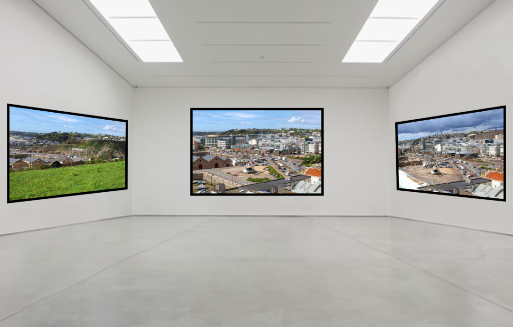
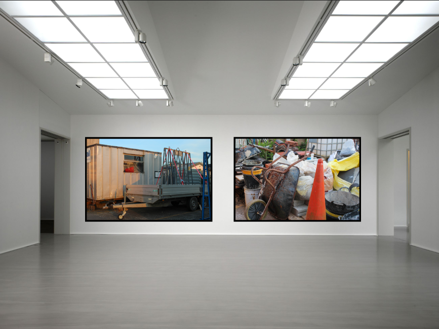
I made a virtual gallery for each theme I have explored within the Anthropocene:
INDUSTRIALISATION:
OVERPOPULATION & URBANISATION:
(AI DEPICTIONS)
CONSTRUCTION:
ST SAVIOURS HOSPITAL:
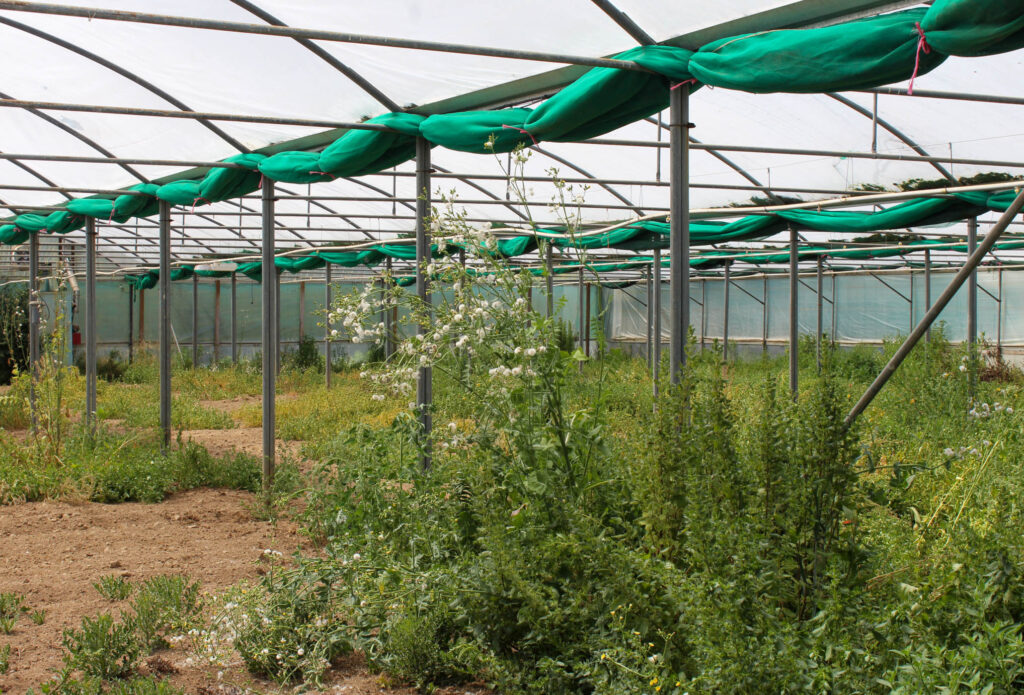
DERELICT GREENHOUSES:
WATER POLLUTION:
The images I’ve selected are the ones I am using for my final prints as I feel that these are the most successful from my five photoshoots.
EVALUATION & CRITIQUE:
Overall, I think that I explored the theme of landscape in a thorough way however I think I was able to really develop and get creative within Anthropocene as I could experiment and investigate different environmental issues within it. I found that my research on the Anthropocene for context really helped me explore different factors contributing to climate change, especially using the work of George Marazakis and Edward Burtynsky to aid my understanding. I feel that my final images that I have produced not only apply to the Anthropocene in a detailed way but I think that they share awareness of issues within the environment that are ignored and looked upon nonchalantly. I chose to keep these images in colour as I find that it depicts these issues in a more realistic and relevant way, making each image tell a story and create a nice composition. My intentions for each photoshoot were successfully shown and correlate with my artist references; my depictions of derelict greenhouses inspired by George Marazakis alongside industrialisation inspired by Bernd and Hilla Becher as well as Joe Deal. Whilst I enjoyed taking images of different aspects of the landscape, I like the way I have been able to use plastic to create an illusion of waves for water pollution as I could represent this in a way that I came up with entirely on my own and could freely experiment with. The next steps I would take if I repeated this theme would be to use black and white tones in some of my images to give my work some variance. As well as this, I would have liked my idea of recreating George Marazakis image of the greenhouse with artificial lighting next to natural lighting to have worked. I attempted to set up a photoshoot in this way using coloured gels however I couldn’t find a suitable location for this around the island so it couldn’t work.
Within the Anthropocene topic, I studying many different artists work to get an in-depth understanding of the different perspectives and opinions on these geographic and environmentally-concerned approaches. This consisted of the work of Ansel Adams, Edward Burtynsky, George Marazakis, Joe Deal and Bernd and Hilla Becher. By studying through their great compilations of research and images of the nature of the Anthropocene, I was enabled to find my own ideas on how to represent this issue. However, my work was especially inspired by the work of George Marazakis in ‘A Cure for Anthropocene’ alongside Bernd and Hilla Becher within their work on Typologies, investigating an industrial environment. Not only did these artists intrigue me, but I really enjoyed the way that they both look at Anthropocene from entirely different perspectives – George Marazakis looking at desolation and decay whilst Bernd and Hilla Becher document the fast paced urbanization stemming from industrialisation.
GEORGE MARAZAKIS:
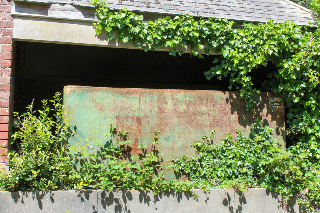
As one of my first artist references, I came across George Marazakis and selected him specifically based on the nature of this derelict greenhouse. I felt that this was an extremely great representation of how it isn’t just the compacted cities receiving backlash from climate degradation, it’s also these rural areas which are scarce, forgotten about and become consumed by nature warping around the structure, mostly due to society progressing through the years at such a fast rate that the area/ structure is no longer needed yet still leaves a mark and impact on the environment around it, restricting growth and areas for ecosystems to thrive in. I also selected this as one of my main references within my work because I felt that the muted colour scheme showed the death and decay that the world is under, however remains unnoticed and ghostly.
This was my first attempt at the recreation of his image, my initial plan was to use artificial lighting alongside coloured gels to idolise the sunset in George Marazakis image, shining through the greenhouse and outlining the desolation from within – plants twisting and winding alongside the stains from dirt wiped down the windows. However, this didn’t particularly go to plan due to the light not being as great and powerful as the one George Marazkis used.
However:
In light of my initial image not working, I decided to take this idea of derelict greenhouses and move towards taking images of those which had appeared more violent in contrast with George Marazakis image:
Whilst these were relatively different from George Marazakis work, I still feel that there is a correlation between them through the untended growth of weeds, sand and dirt. I also feel this still has a correlational aspect through the areas which involve decay, whether that be through the streaks painted across what is left of the greenhouse or in the dried up patches of dirt smeared across the ground, a likely area where chemicals have been placed and cause the refusal of seeds growing there. If I were to use George Marazkis’ work again within this project, I would have liked to have potentially found an alternative way to recreate his sunset-reflection of the greenhouse if I were able to find an appropriate location which was more similar to his. Alongside this, I would have liked to incorporate some of his other images in areas such as the sand dunes as I feel that these could’ve provided greater representation of how climate degradation impacts rural, countryside locations and not just urban areas. Whilst Marazakis’ image is muted and ominous, mine has reacted in a more violent and aggressive way, however I feel that this may represent the anger many people feel about approaching a point that could result in practical ‘self-extermination’.
From this, I was able to explore the idea of desolation impacting the environment within the Anthropocene through the topic of abandoned structures, forced to be home to an overgrowing population of plants due to them being restricted from growing naturally because of the unused and ignored nature of the structure:
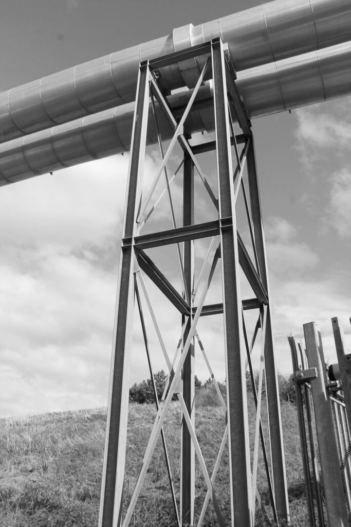
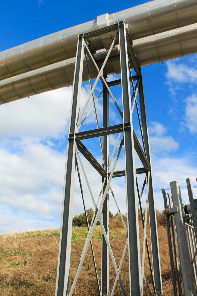
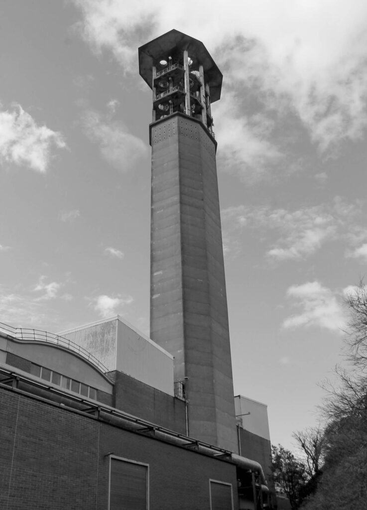
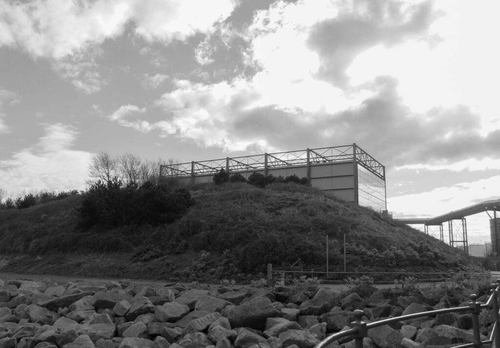
BERND AND HILLA BECHER:
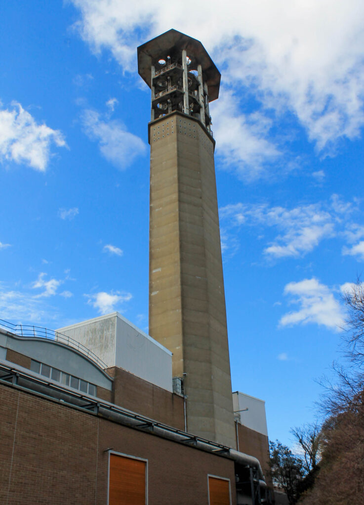
In an early introduction to landscape photography, I looked into Bernd and Hilla Becher’s work on Typologies, documenting the industrialised structures to address the effect of the industry on the economy and the environment. When we moved towards Anthropocene, I wanted to include aspects of their work into my images because through the anonymity and use of dead-pan shooting, I felt that this was a stern message about the fast pace at which society progresses, producing more and more materials by using harmful chemicals and techniques.
I feel that there is a strong correlation between my work with Bechers’ due to the strong industrial tone set throughout. Whilst I didn’t use the deadpan approach like their work, I still feel that this as worked very well due to the angles from a distance, below, and in-line with these industrial structures as it made the natural hit off of the metal in the perfect angle for me to capture it with a glowing effect following along the building. I created virtual copies of them in colour alongside a monochrome format so that not only was this burst of light and colour more visible but they still were established with the black and white aesthetic that Bernd and Hilla Becher used within their typologies. In future if I had ever used Bechers’ typologies again, I would have liked to be able to get some deadpan images of the act of industrialisation because I feel that these would have been a more minimalistic approach to Anthropocene that could have been really powerful. Through this, I then had the ability to represent the dynamic which society progresses and how this constant deconstruction and reconstruction of areas has severe impacts on the planet.
Overall:
Overall, I am really happy with the artists references I chose and the images in which I selected as inspiration as not only did they help me to produce images that followed the Anthropocene in a thoughtful way, but they also enabled me to come up with ideas of my own and develop them – for example, my initial ideology behind using George Marazakis’ image didn’t work how I intended, however this led me onto shooting greenhouses from a contrasting perspective as well as investigating abandoned buildings and structures around the island.