Zed Nelson-case study

Zed Nelson, is a talented documentary photographer who is based in London. He is famous for the way he tackles significant global social issues. Multiples of his projects have be exhibited worldwide where he has earned numerous awards for his contributions to photography.

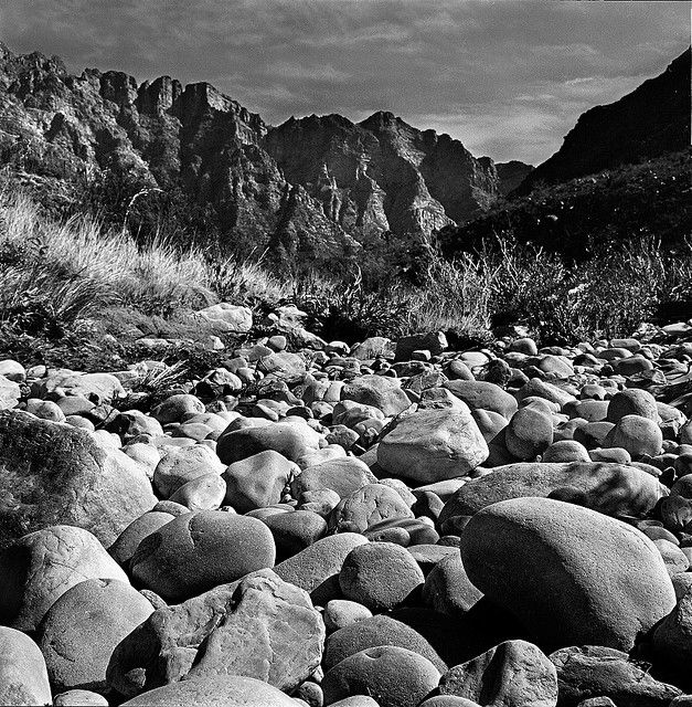
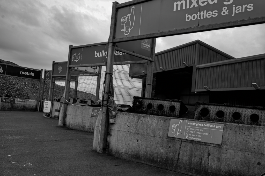
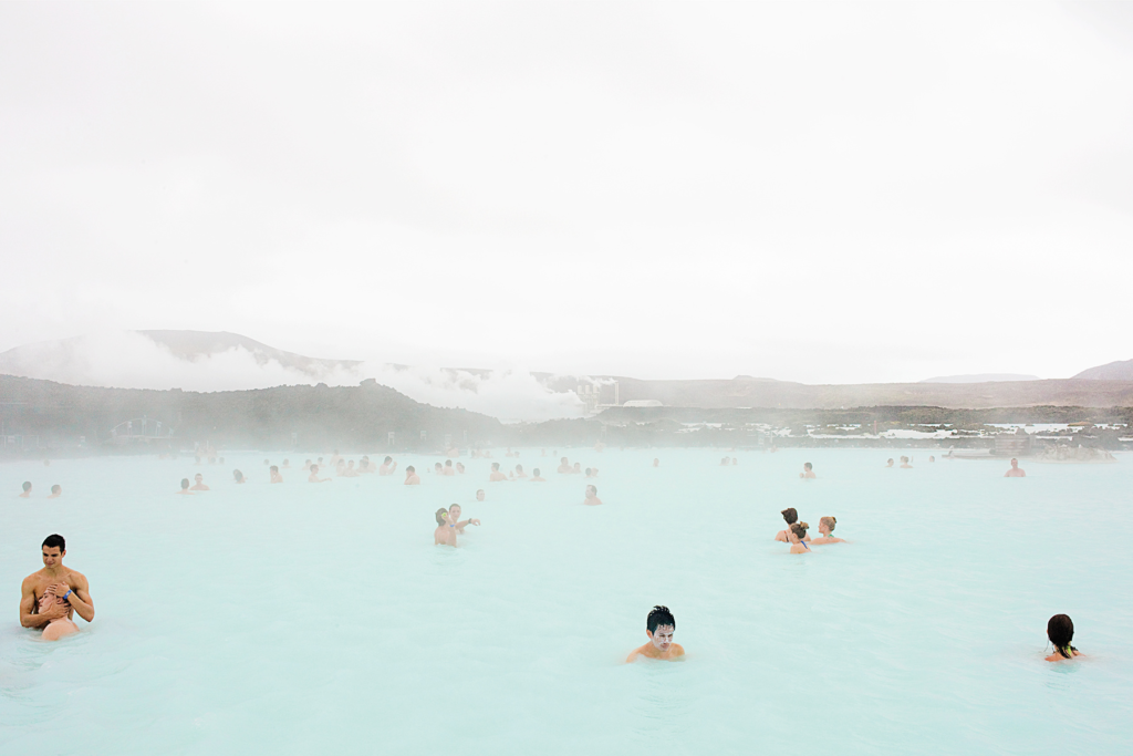
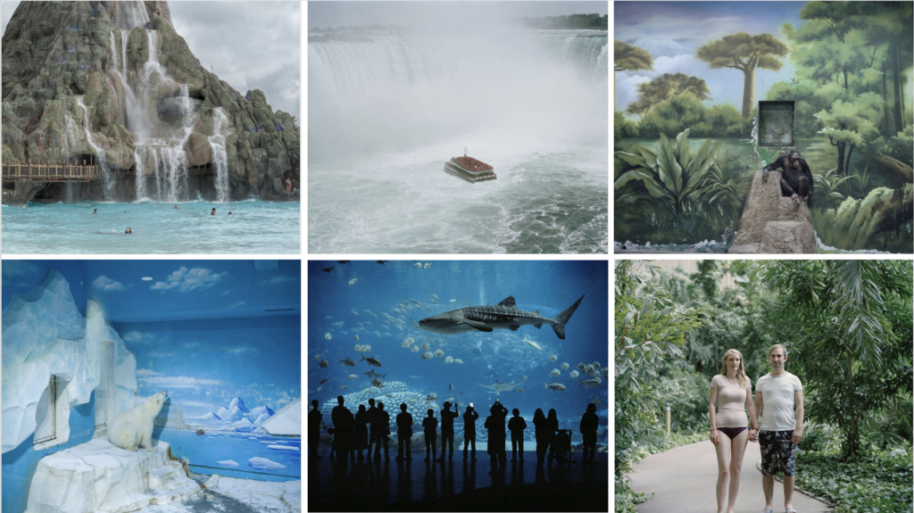
Nelsons recognition within audiences majorly succeeded in his latest project called “The Anthropocene Illusion”. In this project, it is evident that Nelson dug into the relationships between nature and humanity. It highlights how us human species have normalised curating and managing an artificial experience of nature while concurrently causing irreversible harm to the natural world. This project was only recently completed, 2024, and it took approximately 5 years to realise fully.

Nelson incredible work has acquired him several photography awards, Some including, CAP prize (Contemporary African Photography prize), The First Prize in the World Press Photo Competition, The Alfred Eisenstaedt Award (USA) and so much more.

His project “The Anthropocene Illusion” was debuted in the International Photography Festival “Xposure” in Sharjah. It illuminated the showcased work as a testament to humanity’s separation from nature, which arises destruction, while yearning refuge in the world of artificial intelligence as a means to getaway the malice reality.

Xposure is an ultimate photography and film extravaganza festival that offers unparalleled opportunities for growth and connection where you can immerse yourself in captivating photography talks, engage with renowned photographers and release your inner creativity with stimulating workshops. It is a festival where it welcomes filmmakers to showcase their talent and connect with industry professionals.

In more technical terms, Nelsons, mention allude to the concept of Anthropocene epoch. This is where human species have become a dominant force in shaping the planets geological and ecological systems. His exhibitions, hence dispenses a critical view of the human nature relationships, begging for reconsideration of humans approach to conservation and sustainability.

  1. Why have you chosen this artist?

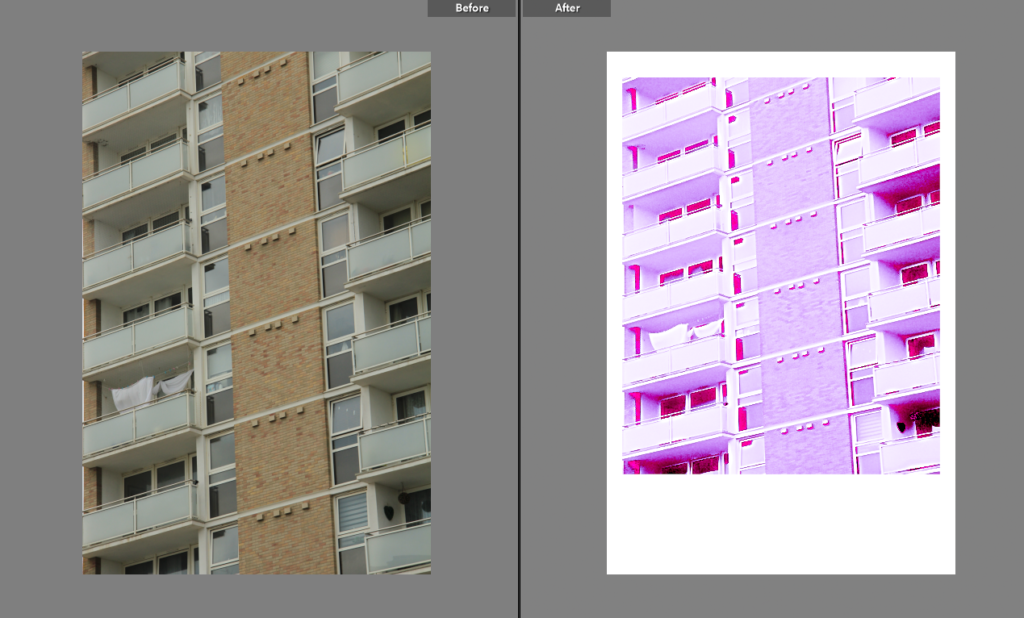
I have chosen this artist because I really like how unique his interpretation of Anthropocne is. The way he bring awareness to how silly humans are when it comes to animals in captivity is really admiring and eye opening. He shows the stupidity of the fact that us humans distort nature and then try to revert such irreversible damage to nature. I also just really like how he out of all artists, is highlighted due to the fact he brings awareness in such a way that is not commonly thought of.

2. What interests you about their work?

I like how his work has a depth and how different it is. I admire how his work has succeeded in such incredible ways and how his photos are breathtaking. His work is also quite humorous. He almost mocks humans for holding anime captive and then to ‘make it all better’, creating a habitat that looks nothing and feels nothing like their actual true habitat.

3. How does the work relate to the theme of Anthropocene?

He shows how humans over time has normalised the curating and managing artificial experience of nature while causing extreme amounts of damage to nature.

4. What are you going to do as a response to their work?

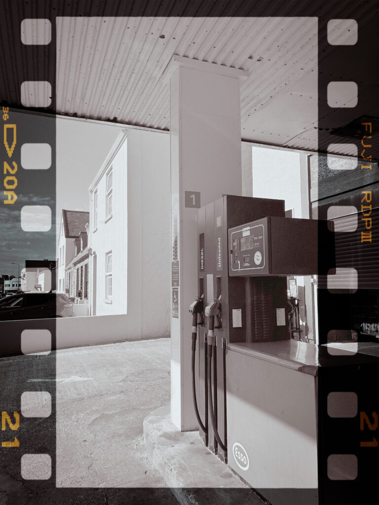
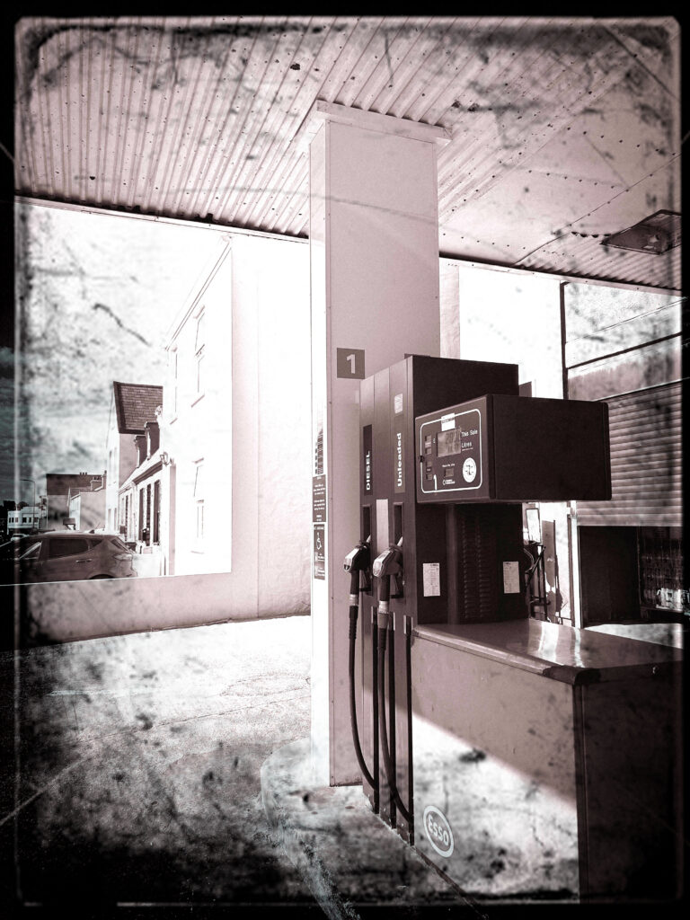
I’ll create similar picture like he has where it show animals held in captivity where their habitat is painted or artificial. I will also try to photograph parts of nature where humans consistently explore and gain profit from it because they see it as something that makes profit not something that is made to stay in the nature, untouched.
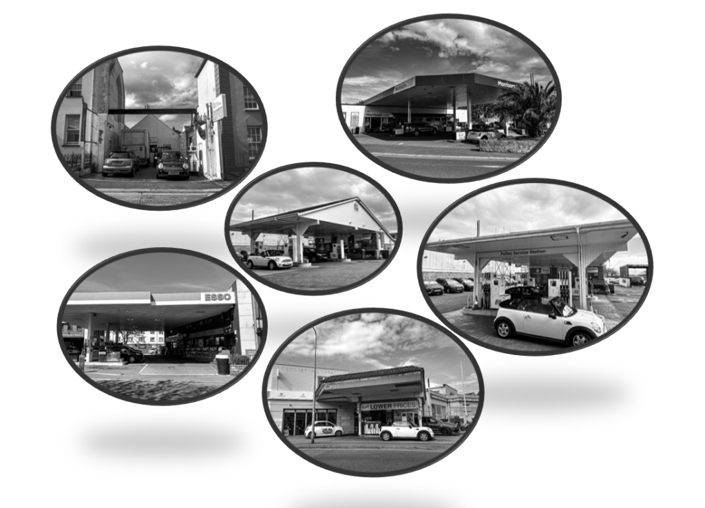
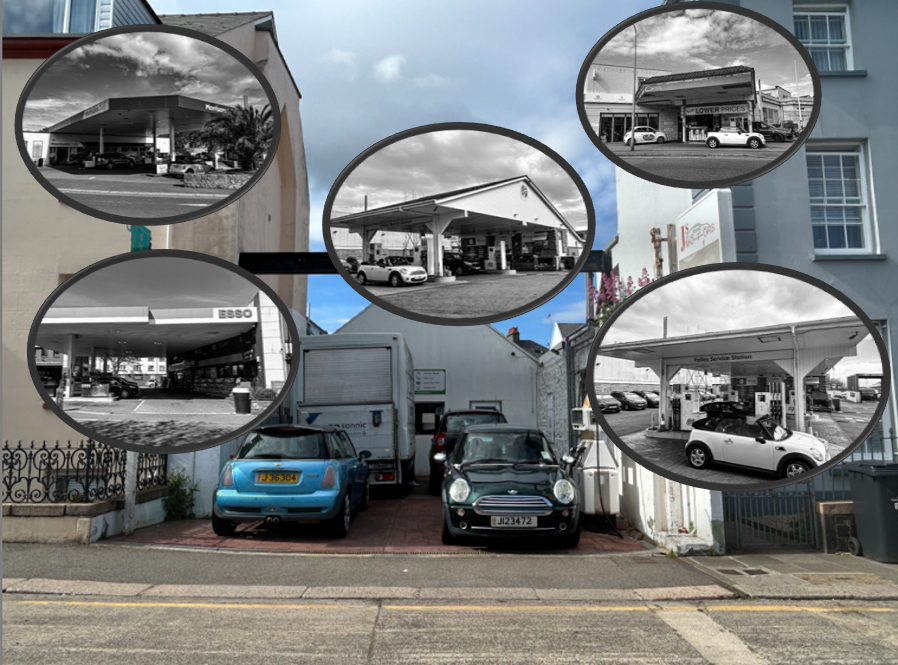
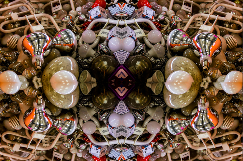
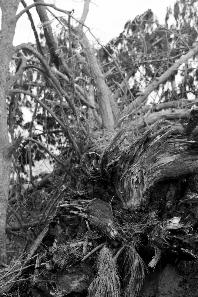
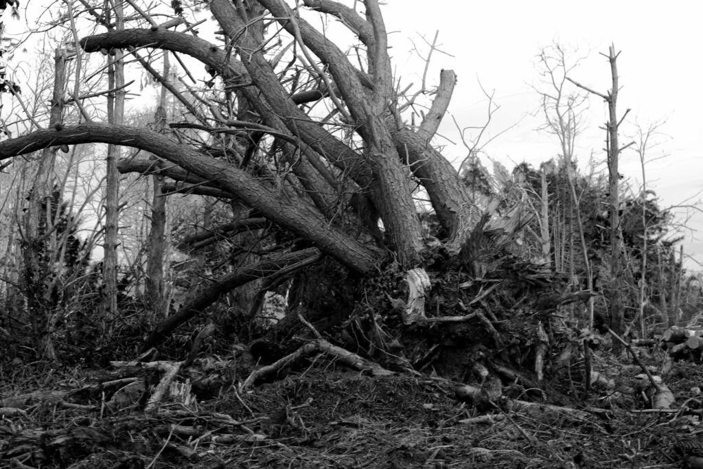
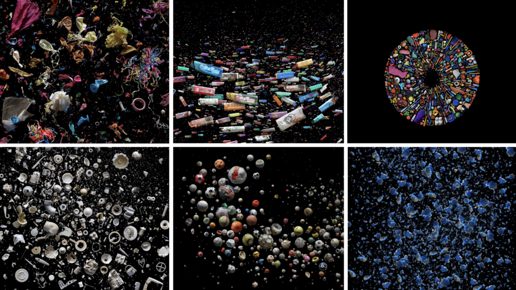
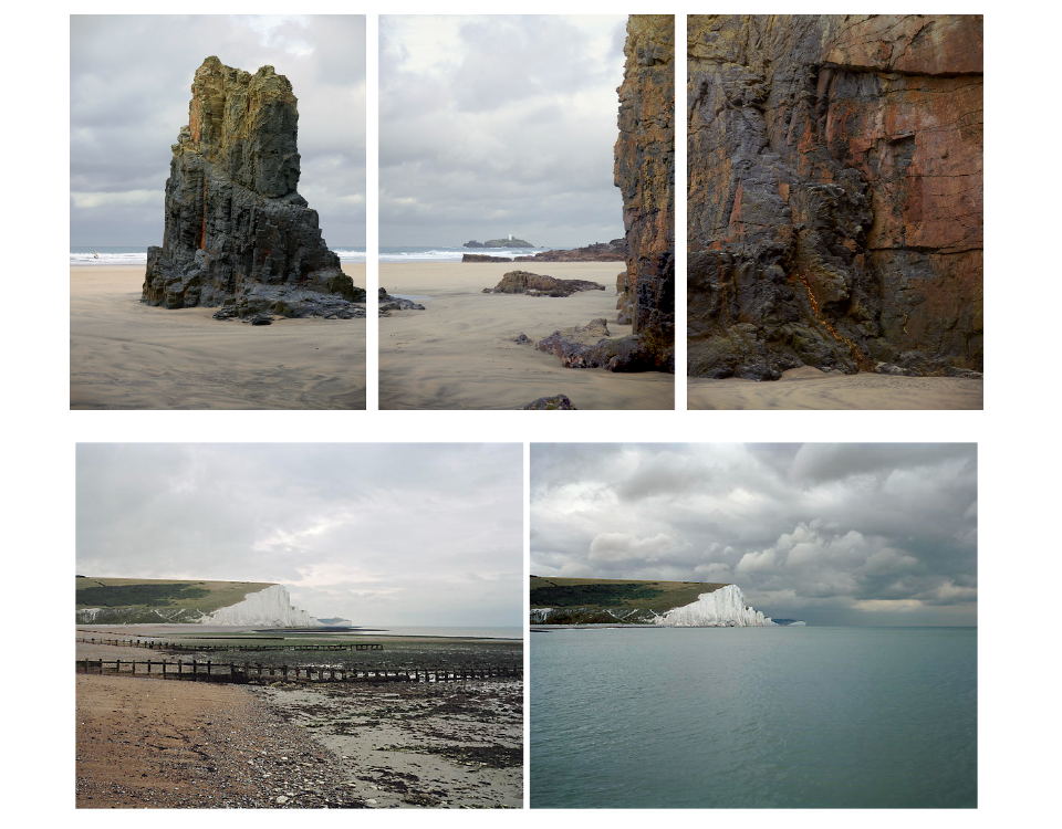
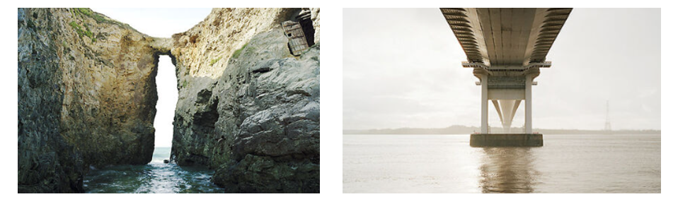
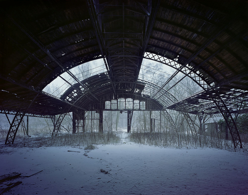
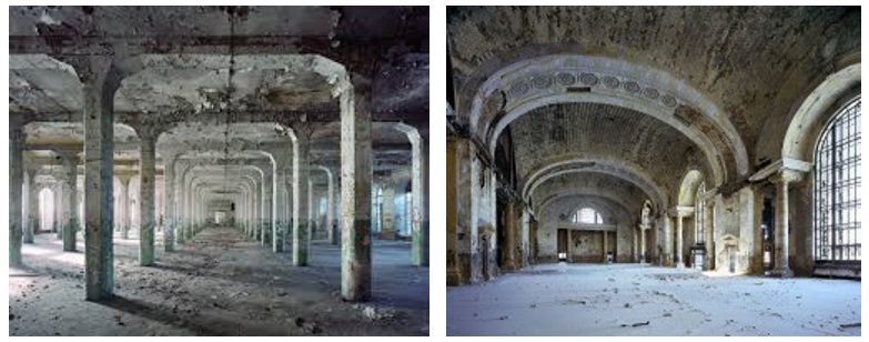
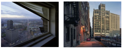
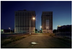
MOOD BOARD:

LINKS:

https://sharjah24.ae/en/Articles/2024/02/29/Nelson-urges-humans-to-alter-false-way-toward-sustainability

Photoshoot & Edits in relation to Ed Ruscha- Anthropocene

Why did I choose Ed Ruscha?

I personally chose Ed Ruscha in relation to the Anthropocene as I wanted to focus on the cause rather than the subject itself within how human activity impacts the earth. Ed Ruscha was a perfect artist for inspiration as he is known for taking images of twenty six gas stations. This significantly links to the Anthropocene as the petrol and gas humans use massively effect the air pollution. Therefore, my idea was to take images of petrol stations in the modern aesthetic and attempt to edit it to make them look vintage and nostalgic. This is effective as it isn’t normally an every day thought when it comes to people filling up their car. Although this was not Ruscha’s aim, it is my aim to focus on the impact of petrol and gas specifically within the sector of air pollution. For context a typical passenger vehicle emits about 4.6 metric tons of CO2 per year. This assumes the average gasoline vehicle on the road today has a fuel economy of about 22.2 miles per gallon and drives around 11,500 miles per year. Every gallon of gasoline burned creates about 8,887 grams of CO2. So, instead of taking photos of animals becoming extinct or suffering due to air pollution e.g. polar bears in Antarctica. As Anthropocene is a project to show through art and photography the effect on the earth because of humans or what it could be potentially if us as humans began to make better choices. I wanted to significantly instead show the effects and impacts itself but the cause. I think this will benefit my project as it is different and links well to an artist reference.

What is my intention and aim?

My intention and aim is to significantly edit my images to look old and in a rusty aesthetic so it looks like Ruscha’s work which may be significantly harder to do so as everything has evolved to be modernized whereas Ruscha actually took the images in the 1960’s. Aside from that, my next step would to put them into a typology to add another technique towards my work as Ruscha sometimes did that. I want to keep my images dull and simple so it does not draw away the main factor to the image which is simply to remind the viewers that every-day basis factors that us as humans do not give a second thought about actually massively impact the earth. This links to Ruscha as in his famous book ‘ Twenty-six gas stations’ he kept it simple with little words and only the image to keep it interesting and eye catching to make the viewers focus on one thing; his photographs. Ruscha kept them in black and white potentially because he chose too or because colour was only beginning to evolve. I will edit some images in black and white to relate to his work but I will also keep some in colour to compare and contrast the modernized and vintage aesthetics. To keep it from being too dull and boring, I personally think putting it into a typology technique will significantly add an interesting and eye catching feature. Overall, my aim is too to show the causes of the damages not the damages through photography.

My Photoshoots and edits

Contact sheet-

Edits in Lightroom & Photoshop-

Typology

How this became my outcome-

Firstly, I began in light room by making sure the exposure and contrast was correct to my aim and put a tint on it to make it look old and vintage to try replicate Ruscha’s camera in the 1960’s. I did this through ‘presets’ and chose ‘cinematic 2 VN07’ as it had a warm tone that I personally preferred the most. My next step was to find a frame and add a layer onto my original images on photoshop. I blended them by merging them together and chose one that wasn’t standing out too much. I then chose the rubber tool to make the original layer the main focus of the image not the frame itself. I repeated this with different layers to experiment and see my preferred one. I kept them in black and white as my aim is to pretend that I have taken these images on old images.

What I could of improved on

Personally, I think I could of improved on texture to make it look more realistic. To do this, I would have to photoshop and edit to make my images grainy with a old and bad camera aesthetic. This would make my images more believable as I think my images are very clearly modern day looking. However, this may be challenging as it is very hard to make my images look grainy and vintage because of how much cameras have evolved and became so complex. This makes difficulty to try replicate Ed Ruscha’s. I also think I could of improved on my images itself within my first step. I think it would of been more beneficial for my typologies to execute a similar thing as Ruscha to take photographs of multiple gas stations. Therefore, each image would be the same thing however a different type. This would ultimately make my typology a lot more eye catching and draw attention to the eye as it is a lot more to look at and the viewer can compare and contrast each petrol station. To improve, I will take images of multiple gas stations and edit them to make them look realistic and old and put them into a typology to try and replicate Ed Ruscha’s famous book.

What I liked about my photoshoot vs his work

What I liked about my work was how it is a typology but however each image is the same. But I personally like how each edit is diversified which significantly keeps attention to my images for a viewer. This also creates creativity and experimentation to be able to figure out which my preferred style is and helps me learn from my mistakes or recent work to benefit for my future work. I loved the frames I added in photoshop as it added an old aesthetic and interesting feature which was needed as the images I chose were the same so it was not too dull and simple. Conversely, I liked his work as it was realistic and not edited in a book but also not too dull and boring as he diversified the gas stations by taking images of multiple gas stations rather than editing which kept it very simple, however mine was simple but in another factor. However, to try to improve and benefit my work I will try replicate his work but with my photoshop and editing to make it more my work and diversify it. I also liked how he kept his work in black and white to keep an old aesthetic but also so colour will not draw any attention to his images.

Experiments

Landscape | Experimental Editing

In an attempt to get any work done in photography I have resorted to creatively destroying my work by creating the worst images possible.

This is a photo i captured at the new flats at Havre de Pas. In the beginning I turned tint and exposure fully up and decreased blacks and whites fully.

After messing around with the colour grading I brightened the highlights and gave it a hazy effect. I really enjoy the chaotic composition of the balconies.

After maximising and minimalising most of these values I had made the image monochromatic.

All the low-mid to high values have been boosted.

Finally I adjusted the position of the photo.

It turned out like an optical illusion comprised of lines, stripped of any depth or colour it had in the original.

This image went over a similar process to the other photos with some additional grain.

Random parameters being removed or maxed out.

As the image was heavily overexposed I took away as much as I could from the midtones and shadows.

I’ve also positioned the image to give a polaroid style position. This is obviously really out of place on purpose because otherwise the image would look entirely unfamiliar and the loss of the detail and sparkly pink reminds me of the y2k photography aesthetics.

This photo reminds me of what could’ve been old colourised photo from the 19th century because the vignette and overall image looks quite smudged. The vignette also almost adds a subtle fish eye effect.

I found these settings gave it quite a ghostly appearance.

I was curious as to how following the general slope of the histogram would look which gave it a similar output to the pink polaroid photo.

HSL and colour grading was again me trying to figure out the most appropriate and jarring colours.

I actually genuinely really liked the original photo as it obeyed the rule of quarters and has a lot of interesting textures but I find the colours to be quite cumbersome. But I thought, ‘time to ruin it’.

I won’t talk through any of the changes I have made already to other photos.

I wasn’t happy with the natural distortion of vignetting on the original image so to give the photo more character I changed that.

I added this grain as a final touch to add to the worn and torn look of the image.

This original image was cropped and I made two edits of it. I thought it kind of looked like a western concept of cyberpunk skyscrapers because of the confirmative and geometric shapes. I leaned into this idea by darkening the shadows and adding a dirty-dusk colour scheme.

Ansel Adams related photoshoot (Anthropocene)

My plan:

For this photoshoot I have decided to go to Plemont beach as this beach has a lot of texture to it and would look really similar to Ansel Adams work as his images are full of texture and different heights, shapes and shades which I think I would be able to capture at this location.

My contact sheet:

Edit 1:

Edit 2:

For these edits I have used a greyscale chart otherwise known as the zone system to show where the different areas of colour and shades are within the images. There are a range of different areas of lighting, the darker areas being the areas where your eyes immediately are drawn to, and the lighter areas being a feature within the image that makes it stand out as it has a variety of different shades it helps bring out the structure and shapes that lie within the image and makes them really stand out compared to an image with no volume or areas of different colour.

Photo Comparison :

Here you can see the comparison between mine and Ansel Adams photoshoot the images are very similar and it shows that I have taken into consideration how he presents his images and tried to replicate them in the best way possible.

PHOTOSHOOT 1

CONTACT SHEET:

I explored with different filters to add onto the same image to see which ones I prefer or look the best. Here are a few examples that I chose to lay out in a grid:

This photo shows the contrast between the old water tanks that were built many years ago in St. Helier compared to the grassy cliff on the opposite side of the photograph.

I like these edits because it links back to topographics also. I think having presented this images in a grid, the photo has become more interesting and bright rather than the initial photo which is dull and colourless.

Initial edit:

Final edit:

I experimented with montaging different edits of the same image to create one final photo. I think this is quite successful and I really like the way this came out because it shows the different ways to edit images using different filters and tones.

Before:

After:

At first, I edited this image to make the colours more vibrant and illuminous, rather than lifeless and monotonous. Then, I cropped the image to the size I wanted it including the wanted contents of the image. I created four copies and flipped them four times in opposite directions to create this final outcome.

landscape photoshoot 1

Contact Sheet

This is my contact sheet from my first landscape photoshoot where I went to one of the forest near Noirmont point around the coast where they had lots of damages due to storm Ciaran. I took some inspiration from Ansel Adams with the editing style.

editing process

For this photoshoot I took my originally photos and in Photoshop I went into the black and white section and then I was able to change the specific colours in them. So I could adjust the different colours in my photos and make some appear quite dark and then could make others in my image appear very bright and white.

while editing I tried to focus on the zone system that Ansel Adams would use for his images. The zone system is basically different shades of black 0 being the darkest, with that shade you don’t end up seeing any texture and it kind of ends up as negative space. Then you have 10 being the lightest its often the light source or sometimes the reflection in the image. What made most of his images so great was that he would every “zone” in his photos. It creates these dramatic and intense contrasts which work really well.

Final Edits

I think these photos turned out really good I added lots of the dramatic editing which Ansel Adams liked to use in his photos. I believe it worked really well with the photos because they were all of these really dramatic damage which works well with the theme of the sublime. It kind of appears very overwhelming and almost scary due to the sheer size .However if you think about the actual act of for these trees falling over and destruction it has caused on the environment around it can be kind of daunting.

I think my favourite photo would be the one underneath of the root of a fallen tree. Due to the editing style I used you can see so much detail like the strands from the roots where its just been harshly ripped out of the ground.

Mandy Baker- Case study

The international award-winning photographic artist, Mandy Barker, whose work consisted of marine plastic debris for more than 14 years. Her success has reached global recognition and her work with scientist is to bring awareness about the harmful truth of plastic pollution in the world’s oceans where it highlights climate change, the harmful affect on marine life and ultimately ourselves, which leads the viewer to take action.

Mandy extraordinary pieces of art has been published in over 50 different countries which consists of: TIME magazine, The new scientist, national geographic magazine, The guardian, Smithsonian etc..

Her work has been exhibited world wide from MoMA Museum of Modern Art, and the United Nations headquarters in New York, the Victoria & Albert Museum London, and the Science & Technology Park Hong Kong. She was shortlisted for the Prix Pictet award SPACE in 2017, which is the worlds leading photography award for sustainability, and she was also nominated for the magnum award for the Magnum doundation fund, LOBA award and the Deutsche Börse Foundation Photography Prize 2020.

She is a legatee of the 2018 National Geographic Society Grant for Research and Exploration. Her first ever book was called ‘Beyond Drifting: Imperfectly Known Animals’. It was was rightfully chosen as one of the Ten Best Photography Books of 2017, by Smithsonian, and her the other book ‘Altered Ocean’ was chosen by The Royal Photographic Society as one of the most desired titles and top 10 Photobooks of 2019. Mandy is proudly a member of the Union of Concerned Photographers UCP for short. This union is dedicated in using the power of imagery to highlight the urgency of environmental concerns.

In 2012 Mandy was awarded The Royal Photographic Society’s Environmental Bursary which enabled her to join a bunch of scientists in a research expedition which sailed from Japan to Hawaii. Its purpose being to acknowledge the build up of marine plastic debris, in the tsunami debris field in the Pacific Ocean.

She states “The aim of my work is to engage with and stimulate an emotional response in the viewer by combining a contradiction between initial aesthetic attraction along with the subsequent message of awareness. The research process is a vital part of my development as the images I make are based on scientific fact, essential to the integrity of my work. The impact of marine plastic is an area I have documented for more than 10 years and am committed to pursuing through visual interpretation, and in collaboration with science I hope it will ultimately lead to positive action in tackling this increasing environmental problem, which is currently of global concern”. 

  1. Why have you chosen this artist?

I have chosen this artist because I think that her work and dedication is extradordinary. I really like how she manages to transform something like a normal image with a black background, into something that has so much depth and meaning. I also really love how much awareness she brings with her images and how she manages to manipulate the audiences attention by producing an image which is only garbage but making it unique and something that peeks interest and therefore bring out recognition towards environmental concerns.

2. What interests you about their work?

How much depth the photos have. How she is able to intrigue audiences by controlling how she decides to portray her ideas. Instead of blandly displaying pictures of plastics, she creates this distinctive image which at a glance looks like an art piece but in more profundity, it is a masterpiece that also brings perception towards plastic litter.

3. How does the work relate to the theme of Anthropocene?

Her work evidently relates to the theme of Anthropocene because it shows the damage and negative change that human species have caused towards the planet. She does this by taking pictures of scary amounts of plastic litter, found around the world.

4. What are you going to do as a response to their work?

I’m going to create a set of images of types of litter that is most commonly found around the world, and display them in a black background like she does with her pictures. I think I also plan on producing an image where I create a type a circle, representing earth, but the circle will be created with all types of litter/trash to bring awareness of what earth is becoming. I want to also produce and image where I show how long it takes for pieces of litter to disintegrate.

MOOD BOARD:

LINKS:

https://www.mandy-barker.com

The Land and Us Exhibition

Photographer Analysis Alexander Mourant

Mourant is a Jersey born artist, educator, curator and writer based in London. His practice and research centres on photography, writing, performance and sculpture, with a particular interest in the legacies of agriculture, Land Art and Arte Povera.

For the exhibition, Mourant had created a new sculpture, “An Image That Holds Its Heat”. The artwork abstracts an original photograph depicting the effects of the weather upon a tomato crop (September, 1963).

That Holds Its Heat 1, 2 and 3, 2023

The structures, taking the form of barn cloches used for growing vegetables, reference the history of photography in the 19th century when collodion photographs were made on glass negatives. Built on some of the most fertile land in Norway.

Maroesjka Lavigne

Here I’m planning to go round places where its not very busy and everything is very subtle, however my photoshoot will look very different as it wouldn’t be snowing when I take these photos, it will most likely be sunny or raining, I would like to find a single house planted in the middle of no where as it adds such mystery to the house and why it may be there. I also chose a photograph that seems to have an effect to it which makes it look very unusual, I could round to a neighbourhood and take pictures of the houses scattered around and simply add an effect to it after, however if I wanted to make it look different I could go when the sun is setting or rising to make the effect look different and have different levelling of the colours.

Mariska Lavigne has a photoshoot called lost lands where she takes photos of different buildings that may give off a lost sensation. There are many buildings that are in the middle of nothing, and unusual leaves that just look out of this world, Lavigne created images of anything that looked “different” and didn’t fit to the normal standard of todays world which shows us that everyone, everything is different.

She had been Travelling through Iceland for four months, a country she was unfamiliar with: The light was bright, colours were vivid, and by the end of my trip the sun kept on shining all night long. Snow still held the country in its veil, creating a big white void. she states that this has a way of cleaning up the landscape, the scenery gets more graphic. she always wondering how this scene would look like in wintertime to see how different the sky and the environment would look, she had decided to go back for another month in January. The country turns blue at dusk in wintertime. All colours fade. Cities look like scale models seeking shelter from the weather in the shadow of the mountains. It was her intention to express the dazzling moment, she wanted to get different point of views of the different season around them and how differently the world may look if the sun is out or if the sky if full of gloomy clouds.

Lavignes photos look very unusual, and scary, they give a weird vibe to the world, almost as if something was wrong, everyone in that photo knows that something is gong on but you as the viewer have to try and piece the puzzle and figure out what is wrong. The colours in the photo look really dull and gloomy and give the impression that possibly something is in the water, creeping up to the people in the surroundings. There aren’t many bright colours in the photo either which changes the mood completely, if there were bright colours then the photo would look almost as if it was a normal sunny day but the foggy effect makes the photo look peculiar and odd fitting.


Maroesjka Lavigne (b.1989, Belgium) gained her Masters in Photography at Ghent University in the summer of 2012. Her work has been shown internationally at the Foam Talent exhibition in Amsterdam, The Robert Mann Gallery in New York, Galerie Hug in Paris and Museum Saint Guislain in Gent, Belgium, among others. She self-published a book called ‘ísland’ in 2012 that sold out. In 2014 she published a postcard version of this book. In 2015 she made a commissioned work ‘Not seeing is a Flower’ in collaboration with the Flanders centre in Osaka. This was published in the catalog called Facing Japan. Her latest project ‘Land of Nothingness’ is made in Namibia and exhibited in the Robert Mann Gallery in New York.

ANTHROPOCENE ARTIST REFERENCES

MICHAEL MARTEN

Michael was born in 1947 in London, United Kingdom (age 77 years). Michael Marten started taking photographs as a teenager and has been involved with photography ever since. His first job was caption writer at the Camera Press photo agency. He also was formerly a graduate student in the Department of Islamic and Middle Eastern Studies, University of Edinburgh, and now teaches at SOAS. In 1973 he was one of a group who published ‘An Index of Possibilities’, an alternative encyclopedia of ideas. In 1979 he started the specialist photo agency, Science Photo Library. He has co-authored several books of scientific imagery, including ‘Worlds Within Worlds’ (1978) and ‘The Particle Odyssey’ (2002).

Sea Change:

High quality use of diptych and triptych and exploring low vs excessive tides to peer how it adapts to a panorama scene.

Since 2003 Michael Marten has travelled to unique elements of the British coast to picture equal perspectives at high and low tide, six or eighteen hours apart. His unexpected pics monitor how the two times day by day rhythm of ebb and flood can dramatically rework the landscape. Also in 2003 Michael has concentrated on landscape photography. His first major series was ‘Sea Change’ (2003-12). A second project, ‘Godrevy’, was exhibited and published in 2015.

Why have I chosen this artist?

I have chosen this artist because I love the atmosphere that each images creates and how its set. I like the way he takes three different pictures but all in the same place but just different angles, it makes it more interesting.

Who was Michael Marten inspired by?

Michael had loads of inspirations but the main people that inspired him was David Stanley, Tony Mamic and Bruce Percy.

“Finally, inspiration comes from many sources (most listed on his website but stand outs being David Stanley, Tony Mamic and Bruce Percy).”

why did Michael marten mostly take photographs of the sea?

Michael Marten says – “I am interested in showing how landscape changes over time through natural processes and cycles. The camera that observes low and high tide side by side enables us to observe simultaneously two moments in time, two states of nature“.

How does this work relate to the theme of Anthropocene?

YVES MARCHAND & ROMAIN MEFFRE

The ruins of Detroit:

Until the 1960s, Detroit became one in all America`s maximum crucial cities. It became a hub of enterprise with a populace of virtually million and a skyline to rival that of any U.S. city. Furthermore, its homes have been monuments to its achievement and energy within side the first 1/2 of of the 20th century. However, on the begin of the twenty-first century, the ones identical monuments are actually ruins: the United Artists Theatre, the Whitney Building, the Farwell Building. And the as soon as ravishing Michigan Central Station (unused in view that 1988) nowadays appearance as though a bomb had dropped on Motor City, leaving at the back of the ruins of a as soon as notable civilization. So, in a chain of weekly photographic announcements for Time mag called “Detroit`s Beautiful, Horrible Decline,” photographers Yves Marchand and Romain Meffre had been revealing the size of deterioration in Detroit. “The kingdom of break is basically a brief scenario that occurs at a few point, the unstable end result of extrude of generation and the autumn of empires,” write Marchand and Meffre. “Photography regarded to us as a modest manner to maintain a bit little bit of this ephemeral kingdom.” As Detroit’s white centre magnificence maintains to desert the metropolis middle for its dispersed suburbs, and its downtown high-rises empty out, those remarkable images, which deliver each the imperious grandeur of the metropolis’s structure and its sincerely surprising decline, maintain a second that warns us all the transience of super epochs.

Why have I chosen this artist?

The quality of their work cannot be disagreed, and they have added great value to the medium of photography. I like the way they take photos of completely different places, places that no one hardly goes. Where its nice and calm or sometimes messy but still calm and peaceful.

Who was Yves Marchand & Romain Meffre inspired by?

Marchand and Meffre are both influenced by the typological and full aspects of the work of Bernd and Hilla Becher and the German photographers of Industrie-Kultur, as well as the large-format images of Robert Polidori.

“Now these cathedrals of industry lie shattered, broken and forgotten, tombs to man’s hubris, a reminder that nothing lasts forever, a reminder that we all will perish and rot one day.”

How does their work relate to the theme of Anthropocene?

It relates to Anthropocene because they take pictures of mostly abandone places and that shows how places can be detroyed or not wanted anymore because of the environment, could also be because of war or other any reason.