London Photoshoot
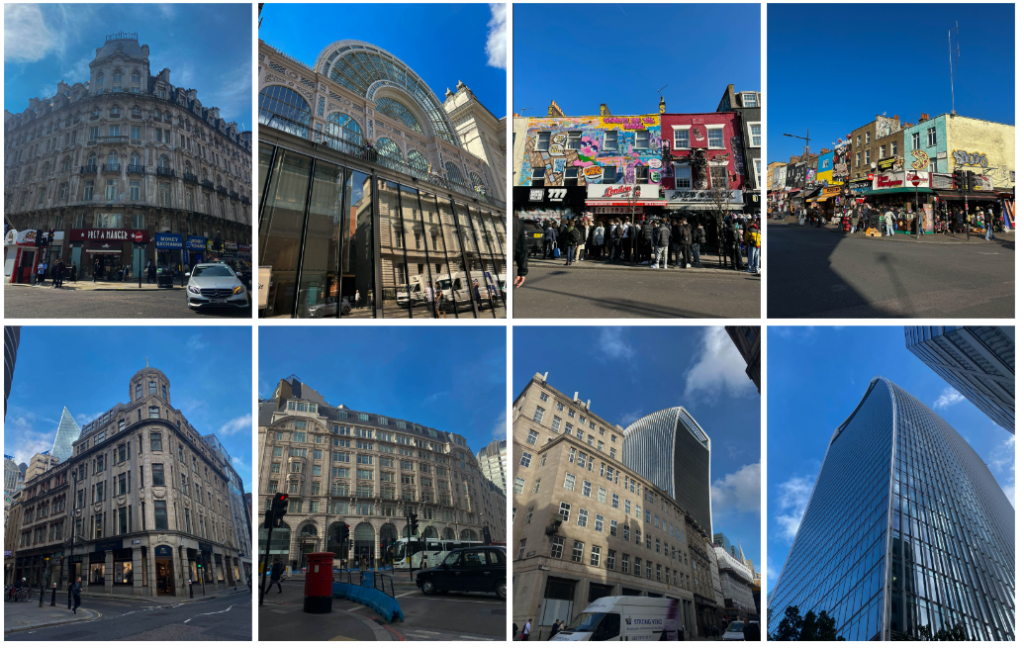
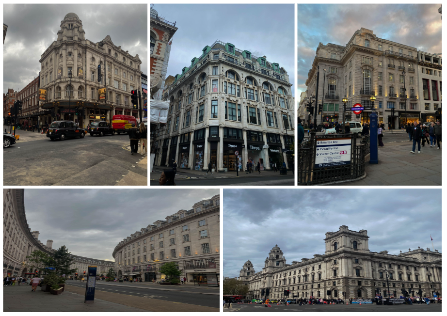
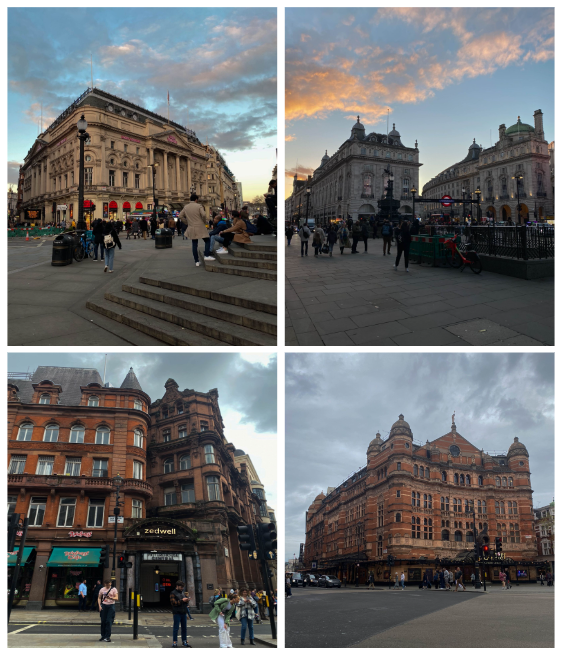
For this photoshoot, I decided to photograph central London as it is a very heavily built area which I think successfully shows how human kind have expanded and built on the Earth, destroying it of its natural beauty- that has to be ruined in order to make room for these masses of buildings. I focused on photographing areas with lots of buildings joined next to one another

In order to cut down on the amount of photos I would use as my final images, I completed a series of steps. First, I imported them into Lightroom and then gave each image either a white flag or a black flag depending if I wanted to use them or not. The white flag symbolised that I did want to use it and the black no.

I then used the filter in order to only bring up my white flagged images. Next, I rated each of my images out of 5. Any images below 3 stars I decided to not use. Finally, I gave them a colour rating (green being the best and red being the worst). This enabled me to find my best images out of the bunch and ensured that I only edited these ones as to not waste time.


Overall, I think this photoshoot was successful in highlighting how much natural land had to be flattened and animal’s habitats destroyed in order to make room for these vast amount of buildings. I noticed as I was taking pictures that the buildings looked like they kept going on forever, which made me realise just how largely humans have expanded on the Earth, ripping it of its natural beauty. Although these buildings provide us with entertainment and places to shop and eat, the long lasting effects of building so much and destroying the trees that provide us with oxygen, outweighs the positives significantly.
Another thing that I noticed when taking my images, is that the streets were extremely busy, making it difficult to even get from one place to another. There was also a vast amount of rubbish scattered throughout the streets and the underground, highlighting to me how bad the issue of pollution is in these busy cities. I found it difficult to take images of this rubbish and crowds of people due to people being right behind me, causing a disruption if I were to of stopped to take an image.
I think that these massive, impressive buildings are built in a way to cause people to turn a blind eye to the actual harmful effects of such buildings, so that we as a society don’t really care to notice that we have natural beautiful landscapes underneath all of this construction. This has inspired me to do another photoshoot in which I will take photographs of the natural beauty seen in Jersey in order to show to people what our planet could look like if we stop destroying these places and expanding on them.
Favourite images:


Giacomo Costa Inspired Photoshoot

For this photoshoot, I was inspired by Giacomo Costa. In his work, he stacks multiple buildings on top of one another. To me, this shows how we as a species have expanded so much on the Earth and it feels very crowded. It could even suggest that if we keep building new buildings at the rate we are, we may even have to start stacking them on top of each other as seen in his images, making a fake image a reality.

In order to recreate his work, I first chose a photograph I had previously taken of buildings with a gap between them (to which I would then fill in with other buildings). I then adjusted the levels and curves of this images and used the quick selection tool in order to cut out only the buildings. Once I had highlighted the area needed, I then pressed layer via copy. I did this to ensure that the buildings I would be adding to the image wouldn’t overlap and be in front of it, making it look unnatural. Next, I opened up a new image of a building that I had taken and used the quick selection tool to cut out only the building, pressing layer via copy afterwards. I then dragged the cut out onto my original images and used ctrl t in order to adjust the building to make it fit in more. I repeated this step again and again until I had a sufficient amount of buildings. I often had to change which level each cut out was on in order to make it look more seamless and natural. Finally, I decided to experiment with using black and white in my image, making one of my images fully black and white and the other with normal coloured buildings and a black and white sky.

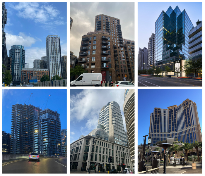
These were the different images of buildings that I used in my final edit.

I am going to layout my final image like this, with the three different images next to one another. Overall, I like how this idea came out as I think I successfully managed to recreate the work of Giacomo Costa and highlight the extent to which we are expanding on the Earth and how destructive this is and bad for our environment. One thing I would change about this image is one of the buildings I used as it is very reflective unlike the rest of them, making it look unnatural and not blend in as seen in Giacomo Costa’s images. I could experiment further with this idea by potentially printing out 2 of each image but printing one as an A5 and the other as an A4 then stacking them on top of one another. On the other hand, I could also print out 2 of each image and then cut out certain buildings on the 2nd image and then use mount board in order to raise it, giving my final piece more depth.

