The Sublime Final Evaluation – Landscapes

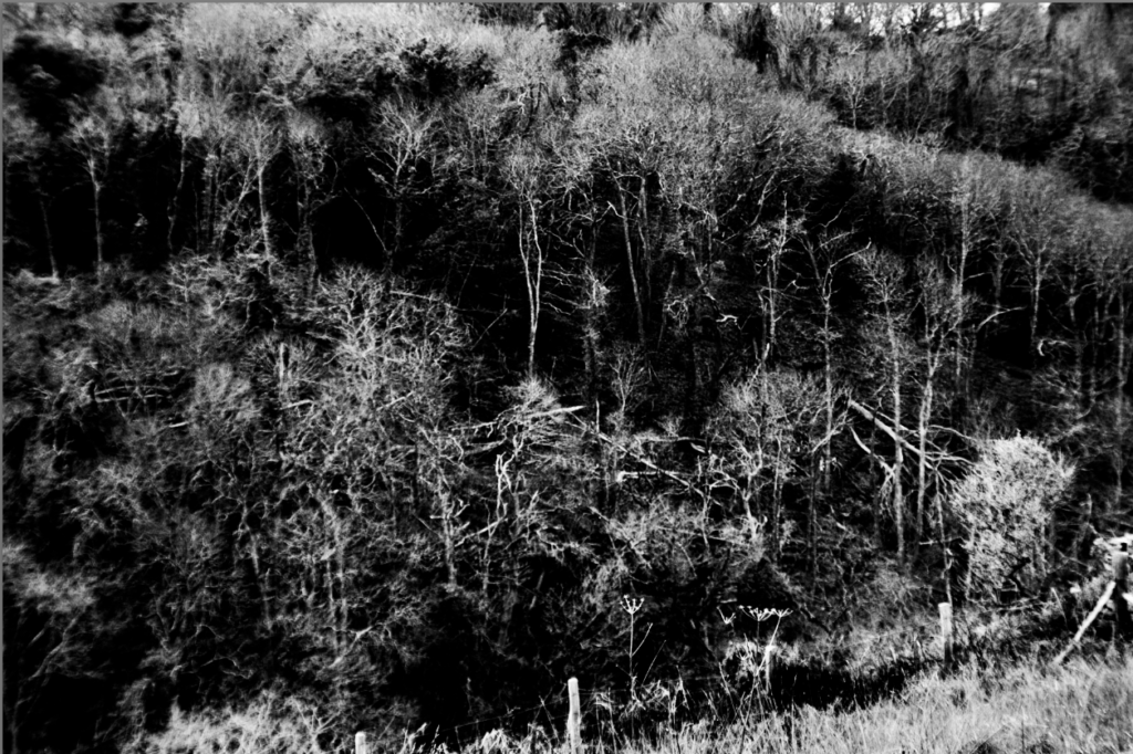
This is one of my favourite shots from my project into the sublime. The composition of the shot appears rather abstract at first with the high contrast black and white and trees creating rough patterns. It really is a great reflection of the sublime, inspired by Ansel Adam’s work of the sublime with the harsh lines and broad scenery but also pulling on previous work of mine capturing the aftermath of Storm Ciaran, both to me represent the sublime from the sheer beauty and vastness in Ansel Adam’s work to the violence and damage nature can reap on itself. This shot in particular reminds me of an x-ray, as though I have captured the bare bones of the world around us truly showing us it’s power and the devastation it can bring, for me tis is a true representation of the sublime.

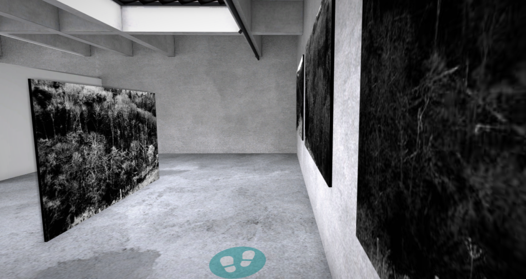
To finish this project I put the final images in a virtual gallery, by choosing to place the three most similar images on one wall and the final image behind it I have created a feeling of the sublime within the gallery going from the expanse of three photos of large areas of scenery next to each other on the wall to one single photo showcasing how the scenery can change overnight. I also placed the three photos in order of progression from the photo with the stormy sky, to the photo with damage to a few trees to the the photo with fallen trees and fence lines, this further emphasises the effect of the sublime.

Anthropocene Evaluation

Light Pollution

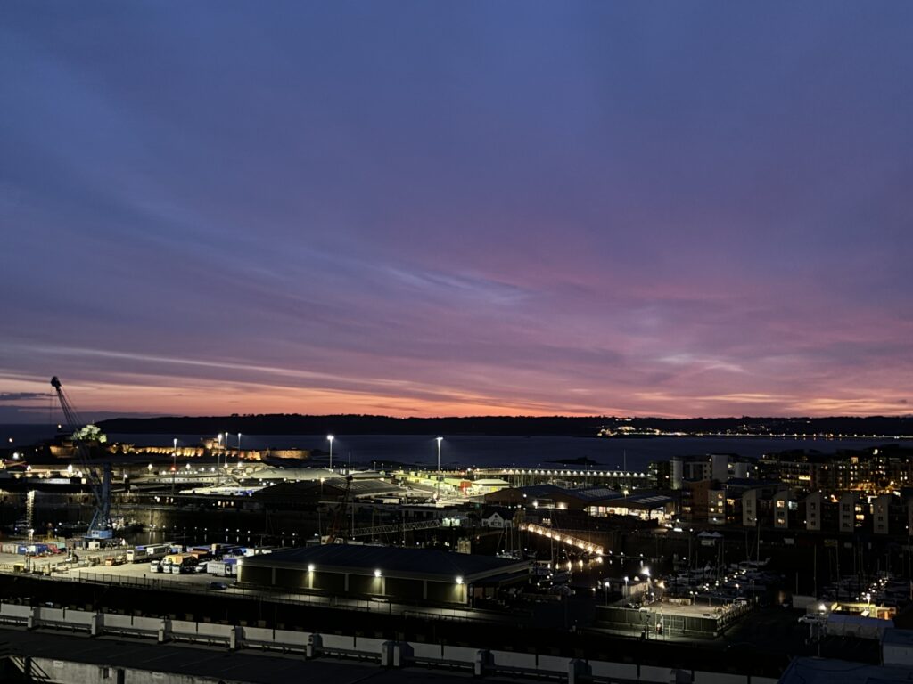
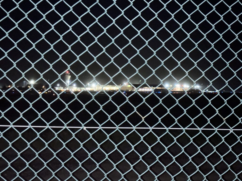
For this photoshoot I took photos of the sunset above fort Regent that overlooked the town and the harbour and the image presented both natural light and artificial light. The photos were taken at sunset at about nine o clock and so the buildings are all in shadow and the sky had the sunset colours which gave a really nice contrast between light and dark. I also took photos of the lights on the runway by the airport, I captured this image through a wire fence which looked really interesting as you could see the coloured bright lights through the diamond shaped gaps in the fence.

My Favourite Images

Mandy Barker

For my Mandy Barker photos I collected plastic and bits of rope from the beach and took photos of them on an all black background, then on photoshop I used all the different photos I took and layered them on top of each other and changed the opacity of the ones in the background to make the image look fuller and to make it look like there is a lot more plastic waste in the ocean. Then I kept on layering the edits until it became a montage of edits.

My Favourite Images

Overall I think my Light Pollution photos were the strongest because they capture what light pollution is and they look the closest to the image I was trying to recreate. I think my Mandy Barker inspired photos could of been stronger by collecting a lot more objects along the beach and getting a bigger variety of images but I do think they represent Mandy Barkers images well and when they were layered up as a montage the final result looked similar to one of Mandy Barkers montage images.