These are my final images.


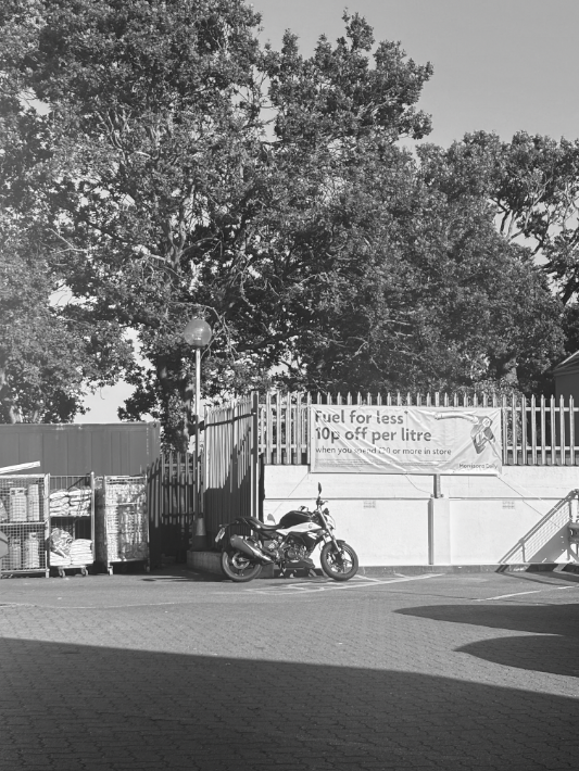
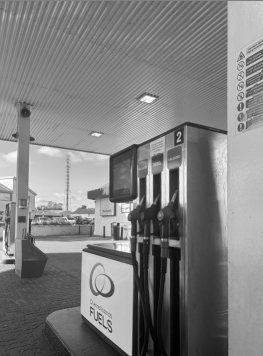
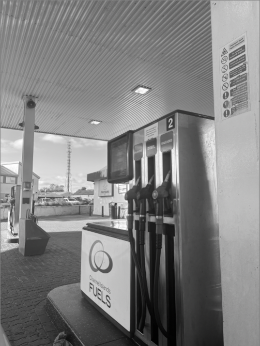
For all my images, I put a black and white filter on. This was a recurring theme throughout all my photos as in typologies, you’ll notice that it is a well known fact that most typology images are black and white. I believe it gives a much better effect for the photo, and will most definitely draw in peoples eyes. For pictures 1&2, I found an abandoned looking green house. The reason it looked abandoned was due to the storm. I like these 2 images as the contrast of fencing, grass and the shed, all relate to each other, almost as if it could tell a story within itself. For pictures 3&4, I took a picture of the green house from a different angle, getting the whole building in it. Personally, they are my two favourites out of all my typologies images. This is as they show typologies well. For picture 5, I liked how there was quite a few things included(motorbike, fencing, trees, storage etc), but also how the black and white filter keeps it all the same. Pictures 6&7 were taken at a petrol station. I like that the photo gives off a rustic feel. Picture 8 is also one of my favourites. I like how the two benches are alone, but are also the most focused on part of the image. I like how it’s simple but effective. For my final image, I took a picture of scaffolding around a house. I liked this as it gives an industrial look.
